windows 8 xaml based metro apps with visual studio
TRANSCRIPT
Windows 8 XAML-based metro apps with Visual Studio
2012 and Blend 2012
Lars-Håkan Jönsson
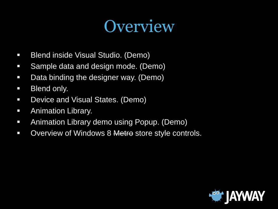
Overview
Blend inside Visual Studio. (Demo)
Sample data and design mode. (Demo)
Data binding the designer way. (Demo)
Blend only.
Device and Visual States. (Demo)
Animation Library.
Animation Library demo using Popup. (Demo)
Overview of Windows 8 Metro store style controls.
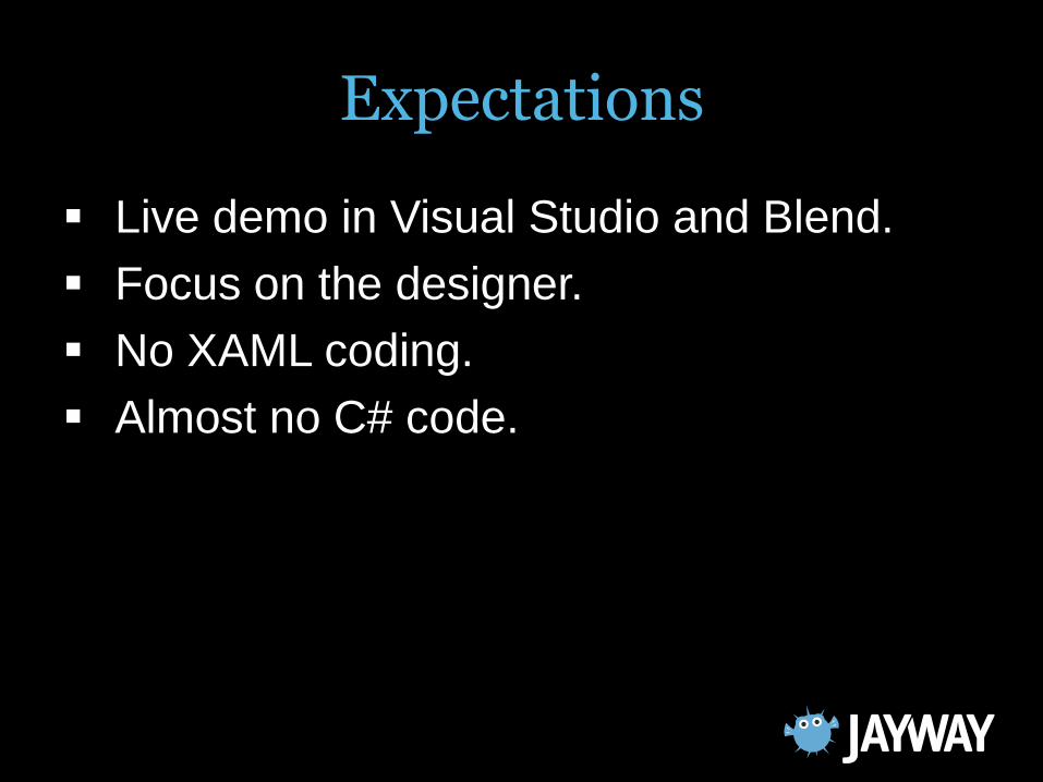
Expectations
Live demo in Visual Studio and Blend.
Focus on the designer.
No XAML coding.
Almost no C# code.
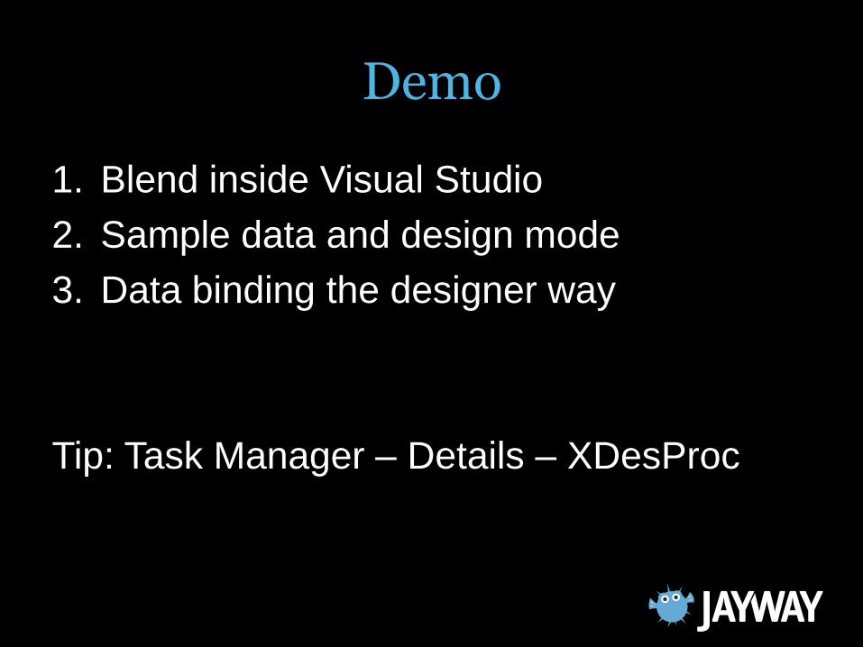
Demo
1. Blend inside Visual Studio
2. Sample data and design mode
3. Data binding the designer way
Tip: Task Manager – Details – XDesProc
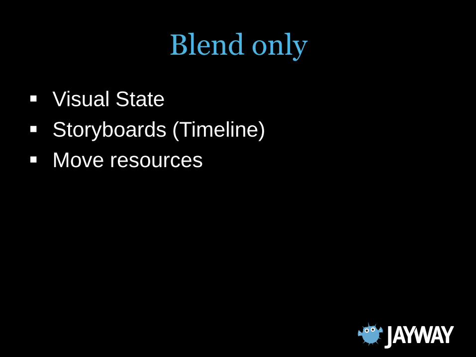
Blend only
Visual State
Storyboards (Timeline)
Move resources
Device and Visual States
Demo
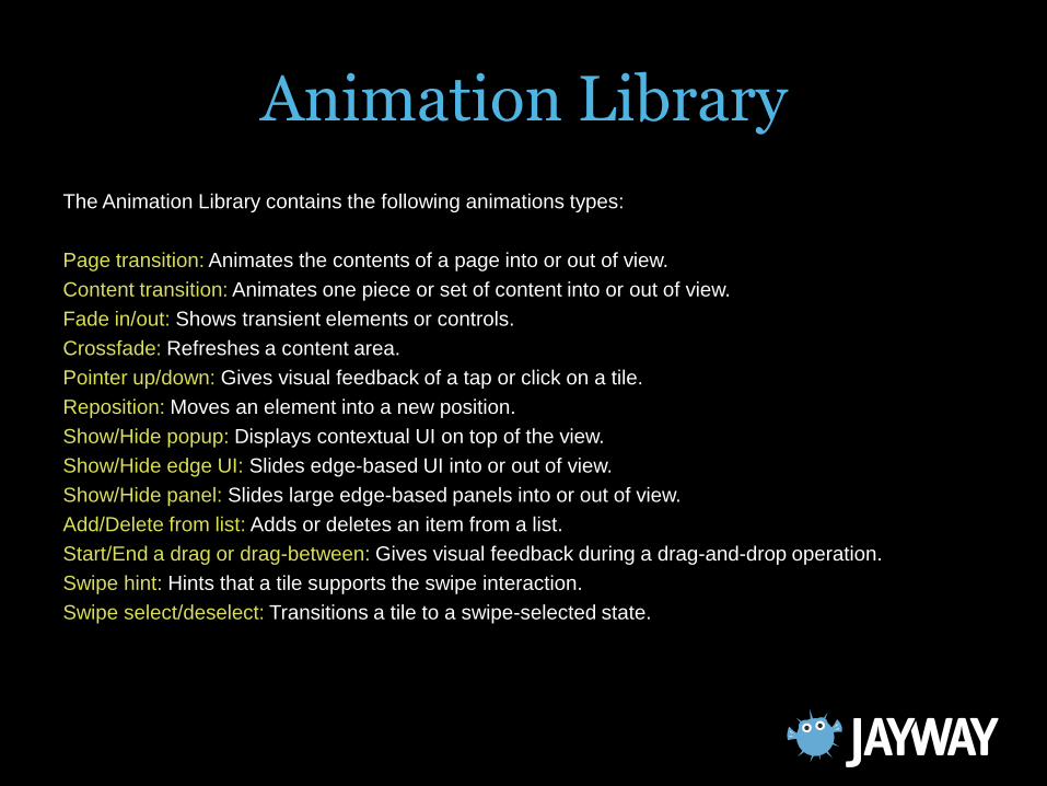
Animation Library
The Animation Library contains the following animations types:
Page transition: Animates the contents of a page into or out of view.
Content transition: Animates one piece or set of content into or out of view.
Fade in/out: Shows transient elements or controls.
Crossfade: Refreshes a content area.
Pointer up/down: Gives visual feedback of a tap or click on a tile.
Reposition: Moves an element into a new position.
Show/Hide popup: Displays contextual UI on top of the view.
Show/Hide edge UI: Slides edge-based UI into or out of view.
Show/Hide panel: Slides large edge-based panels into or out of view.
Add/Delete from list: Adds or deletes an item from a list.
Start/End a drag or drag-between: Gives visual feedback during a drag-and-drop operation.
Swipe hint: Hints that a tile supports the swipe interaction.
Swipe select/deselect: Transitions a tile to a swipe-selected state.
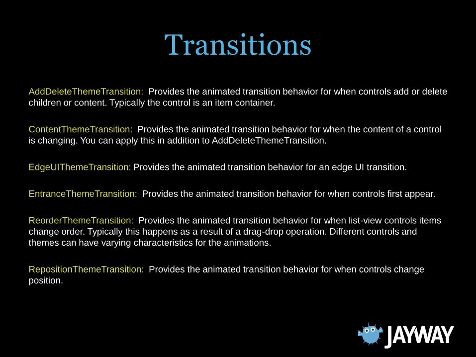
Transitions
AddDeleteThemeTransition: Provides the animated transition behavior for when controls add or delete
children or content. Typically the control is an item container.
ContentThemeTransition: Provides the animated transition behavior for when the content of a control
is changing. You can apply this in addition to AddDeleteThemeTransition.
EdgeUIThemeTransition: Provides the animated transition behavior for an edge UI transition.
EntranceThemeTransition: Provides the animated transition behavior for when controls first appear.
ReorderThemeTransition: Provides the animated transition behavior for when list-view controls items
change order. Typically this happens as a result of a drag-drop operation. Different controls and
themes can have varying characteristics for the animations.
RepositionThemeTransition: Provides the animated transition behavior for when controls change
position.
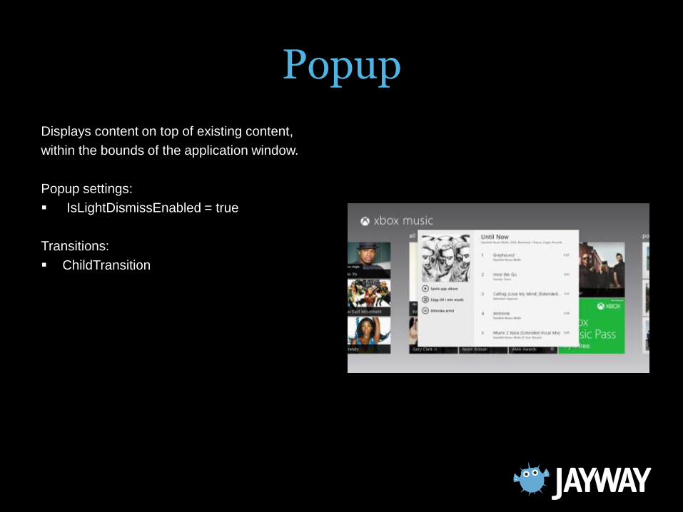
Popup
Displays content on top of existing content,
within the bounds of the application window.
Popup settings:
IsLightDismissEnabled = true
Transitions:
ChildTransition
Transitions
Demo Animation Library using Popup
Overview of Windows 8 Metrostore style controls
GridView
ListView
FlipView
Scroll viewer
Popup
SemanticZoom

Start with
Binding the DataContext on pageRoot to the
ViewModel.
Then…
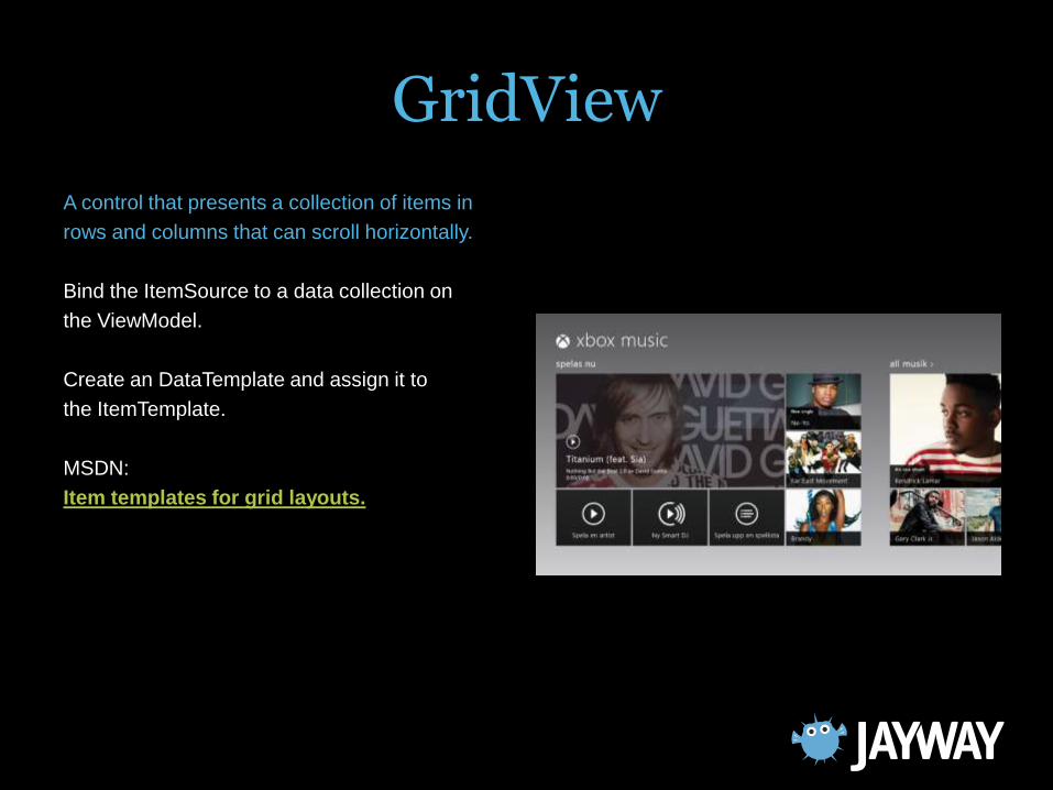
GridView
A control that presents a collection of items in
rows and columns that can scroll horizontally.
Bind the ItemSource to a data collection on
the ViewModel.
Create an DataTemplate and assign it to
the ItemTemplate.
MSDN:
Item templates for grid layouts.
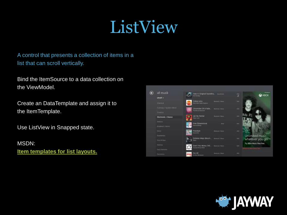
ListView
A control that presents a collection of items in a
list that can scroll vertically.
Bind the ItemSource to a data collection on
the ViewModel.
Create an DataTemplate and assign it to
the ItemTemplate.
Use ListView in Snapped state.
MSDN:
Item templates for list layouts.
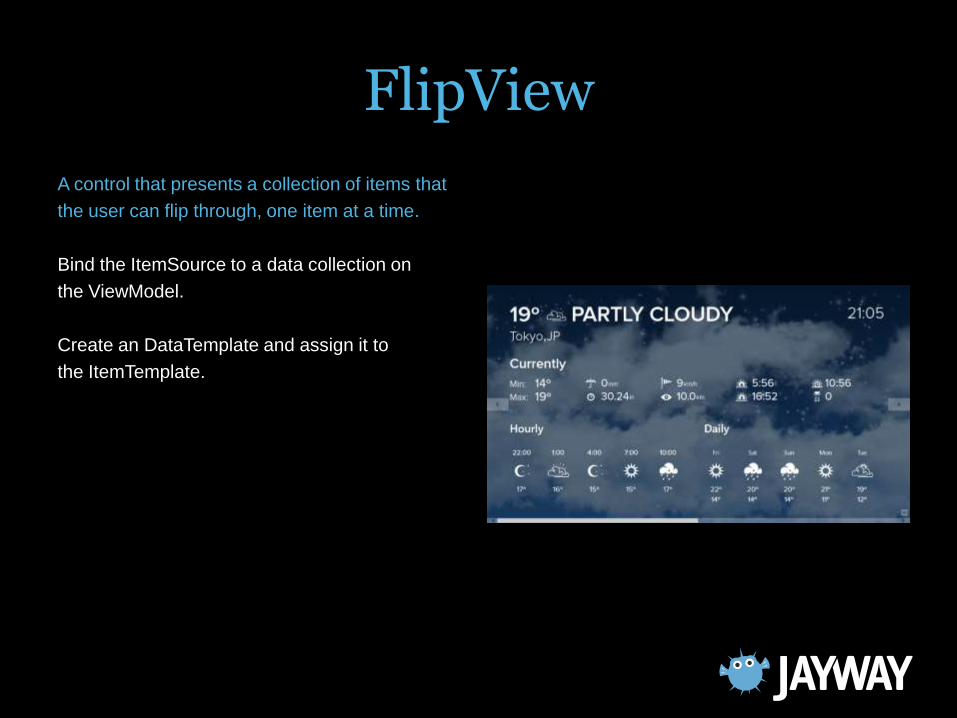
FlipView
A control that presents a collection of items that
the user can flip through, one item at a time.
Bind the ItemSource to a data collection on
the ViewModel.
Create an DataTemplate and assign it to
the ItemTemplate.
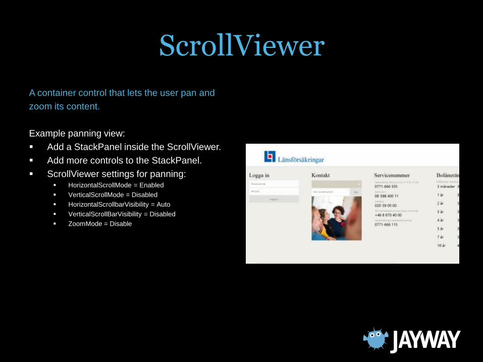
ScrollViewer
A container control that lets the user pan and
zoom its content.
Example panning view:
Add a StackPanel inside the ScrollViewer.
Add more controls to the StackPanel.
ScrollViewer settings for panning: HorizontalScrollMode = Enabled
VerticalScrollMode = Disabled
HorizontalScrollbarVisibility = Auto
VerticalScrollBarVisibility = Disabled
ZoomMode = Disable

Popup
Displays content on top of existing content,
within the bounds of the application window.
Popup settings:
IsLightDismissEnabled = true
Transitions:
ChildTransition
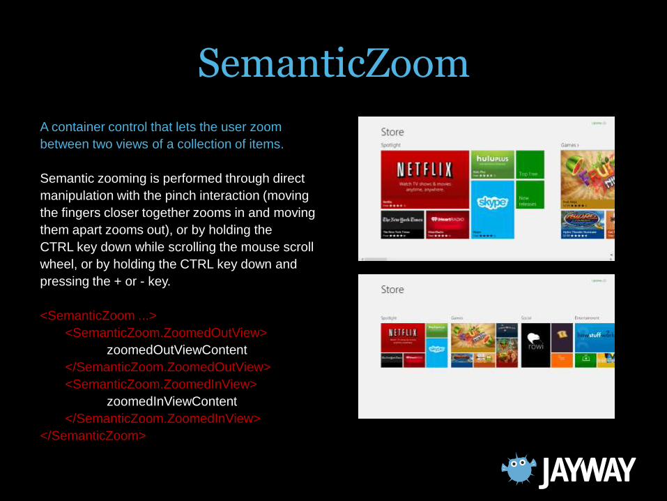
SemanticZoom
A container control that lets the user zoom
between two views of a collection of items.
Semantic zooming is performed through direct
manipulation with the pinch interaction (moving
the fingers closer together zooms in and moving
them apart zooms out), or by holding the
CTRL key down while scrolling the mouse scroll
wheel, or by holding the CTRL key down and
pressing the + or - key.
<SemanticZoom ...>
<SemanticZoom.ZoomedOutView>
zoomedOutViewContent
</SemanticZoom.ZoomedOutView>
<SemanticZoom.ZoomedInView>
zoomedInViewContent
</SemanticZoom.ZoomedInView>
</SemanticZoom>
SemanticZoom
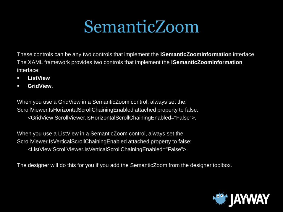
These controls can be any two controls that implement the ISemanticZoomInformation interface.
The XAML framework provides two controls that implement the ISemanticZoomInformation
interface:
ListView
GridView.
When you use a GridView in a SemanticZoom control, always set the:
ScrollViewer.IsHorizontalScrollChainingEnabled attached property to false:
<GridView ScrollViewer.IsHorizontalScrollChainingEnabled="False">.
When you use a ListView in a SemanticZoom control, always set the
ScrollViewer.IsVerticalScrollChainingEnabled attached property to false:
<ListView ScrollViewer.IsVerticalScrollChainingEnabled="False">.
The designer will do this for you if you add the SemanticZoom from the designer toolbox.
Summary
Learn the designer.
Use the designer.
Design time data is a must. Fake or live
data.
Use animations to make your Windows 8
store application feel alive.

Thank you!
www.jayway.com
www.oredev.org