will alsop unusual forms - alessi.com€¦ · will alsop unusual forms sommella’s reflections ......
TRANSCRIPT
EXTRAORDINARY METAL:GIOIELLIA TAVOLA
WILLALSOP
UNUSUALFORMS
SOMMELLA’SREFLECTIONS
UN STUDIOTruffles on Podium
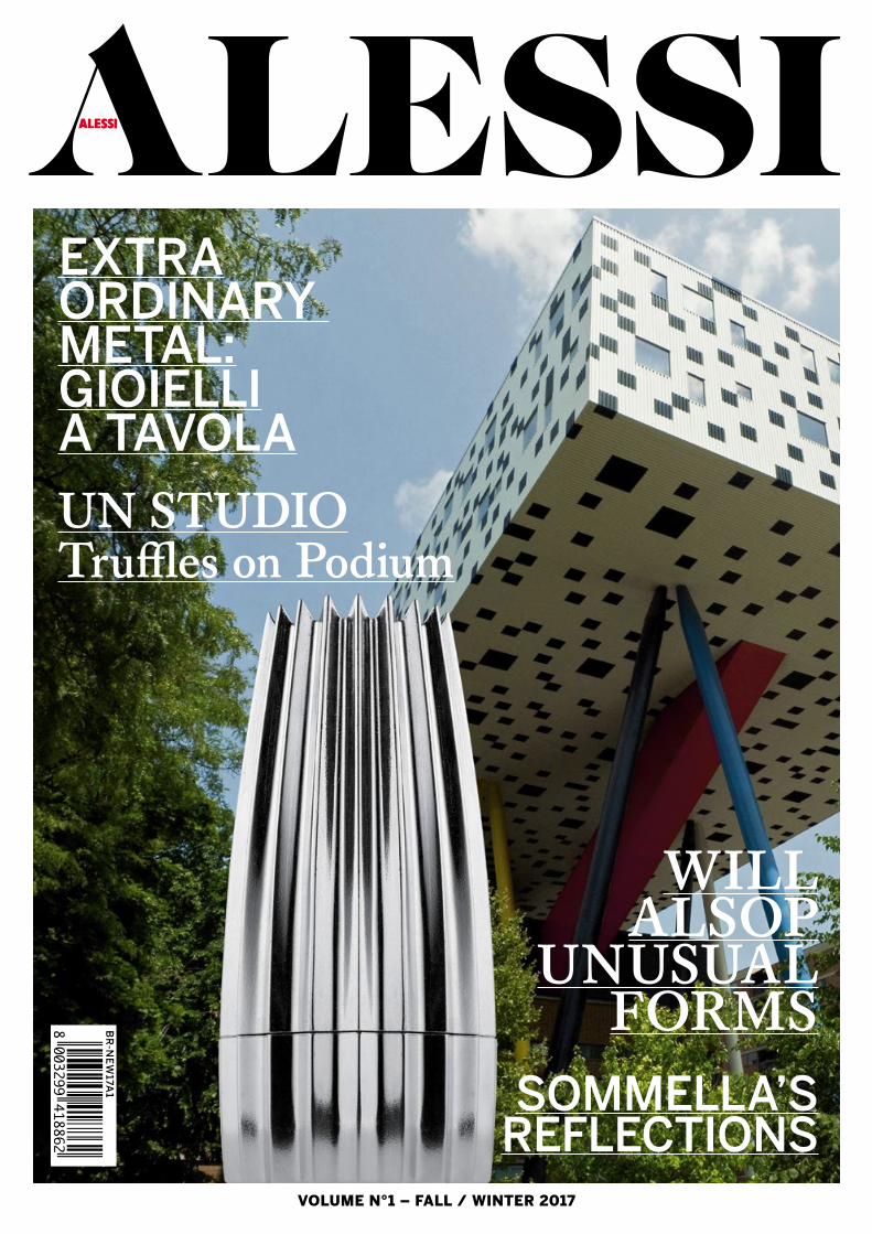
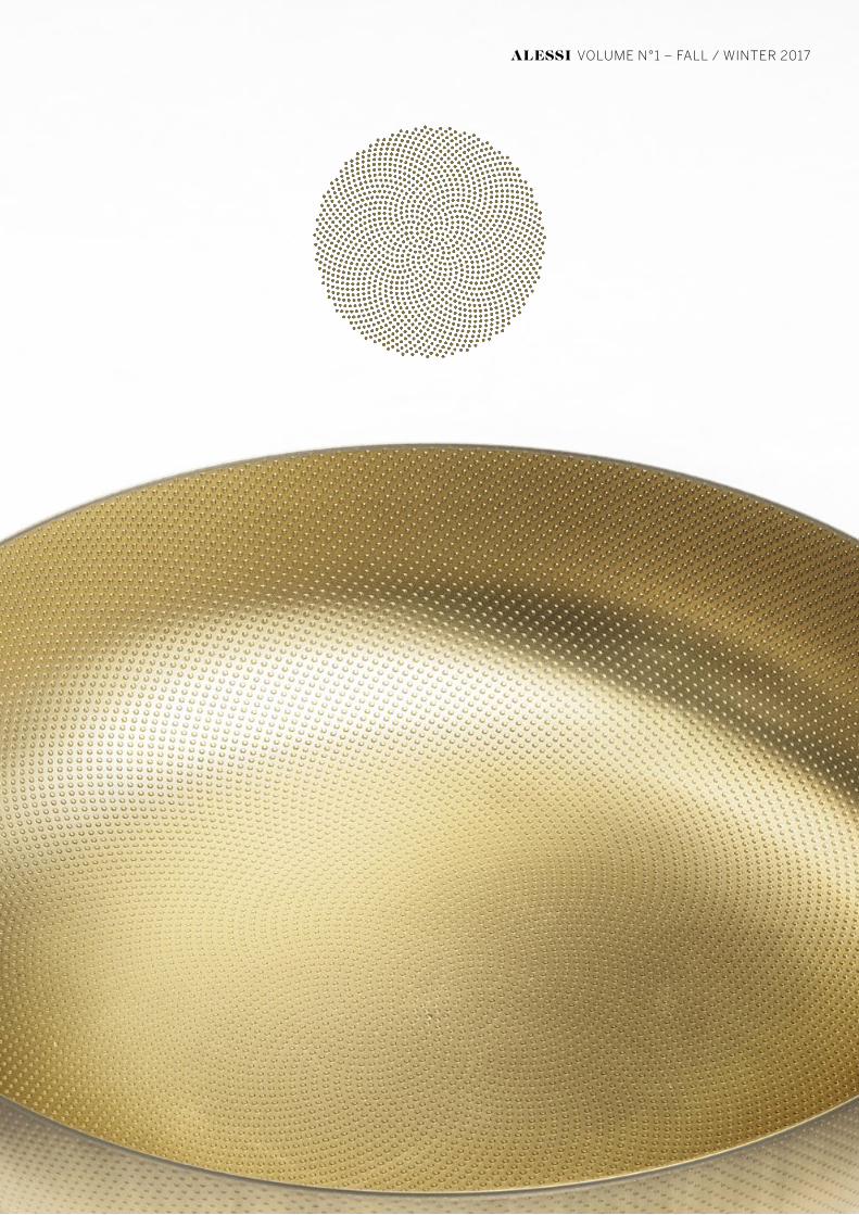
VOLUME N°1 – FALL / WINTER 2017
BR
-NE
W17A
1

www.alessi.com follow us on

1
EDITORIALE.EDITORIAL.
Questa NUOVA veste del nostro MAGAZINE si presenta come leggerete arricchita nei contenuti con l’intenzione di illustrare le principali novità del semestre in arrivo: non solo come è avvenuto finora le novità di prodotto ma anche le principali azioni di marketing e di comunicazione, in modo da dare una visione più completa delle attività complessive della Alessi su questi fronti nei prossimi mesi. Un’altra novità, di natura istituzionale, che mi fa piacere rendervi nota è l’ottenimento della la certificazione di B CORP (www.bcorporation.net) lo scorso maggio. Essa attesta per l’appunto che la Alessi è entrata a far parte di un movimento globale di imprese le quali, convinte che la propria finalità non si esaurisce nel perseguimento di un profitto, vedono il business come uno strumento per incidere positivamente sulla comunità. Un modo diverso per ridefinire la parola “SUCCESSO” nel mondo del business.È una bella conferma di QUELLO CHE PER NOI È IL SENSO DEL “FARE IMPRESA”: cioè perseguire attraverso il bene dell’azienda anche quello della società, grazie alla costante ricerca di un equilibrio tra prodotto, persone e profitto.
The new role of our magazine, as you are about to read, features enriched content intended to illustrate the major new products scheduled to come out the overcoming six months. Additionally however, unlike previous issues, the scope has been broadened to include a focus on our work in the fields of marketing and communication in order to give a more complete picture of Alessi’s overall activities for the coming months.I’m also pleased to report news, of an institutional nature, that we were granted the B Corporation certification (www.bcorporation.net) last May. It attests to Alessi’s having become part of a global business movement that believes its purpose goes beyond the simple pursuit of profit, viewing business as an instrument that can have a positive impact on a community. A different way of redefining the word “success” in the business world.It is welcome confirmation of what, for us, is the true meaning of “doing business”: pursuing the good of society through the good of the company, which is fruit of constantly searching for a balance between products, people and profit.
ALBERTO ALESSI
Art Direction / Graphic Design Christoph Radl, Laura Capsoni Coordination Alessi Marketing and Communication DepartmentPhoto Luca De Santis, Michele De Vita, Davide Dutto, Alessandro Milani, Leonardo Scotti 3D artist Giordano EmmanueleStyling Dimitra Louana Marlanti, Laura Taccari Thanks to Archikey.com, Dedar, Seemsoap, Society Limonta, Texturae, ZanottaIn copertina / On the cover Sharp Centre for Design, Alsop Architects - Toronto, Canada - ph: Thomas KrijnenAlessi S.p.A. Via Privata Alessi 6 28887 Crusinallo (Vb) Italy
testo/text RAFFAELE PANIZZA — fotografie/photos LEONARDO SCOTTI, ALESSANDRO MILANI
WILLALSOP
UNUSUALFORMS
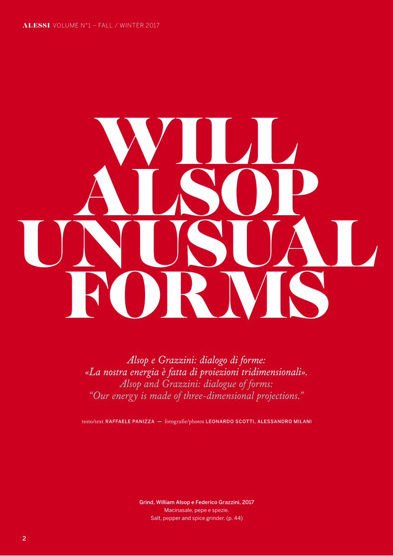
Alsop e Grazzini: dialogo di forme:«La nostra energia è fatta di proiezioni tridimensionali».
Alsop and Grazzini: dialogue of forms:“Our energy is made of three-dimensional projections.”
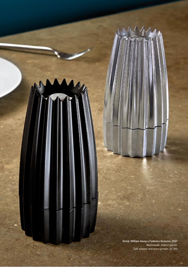
Grind, William Alsop e Federico Grazzini, 2017
Macinasale, pepe e spezie.
Salt, pepper and spice grinder. (p. 44)
2
ALESSI VOLUME N°1 – FALL / WINTER 2017

3
ALESSI VOLUME N°1 – FALL / WINTER 2017

4
Will Alsop Portrait ph: aLL Design
Tea&Coffee Towers, ph: Carlo Lavatori
Peckham Library, London ph: Christian Richters
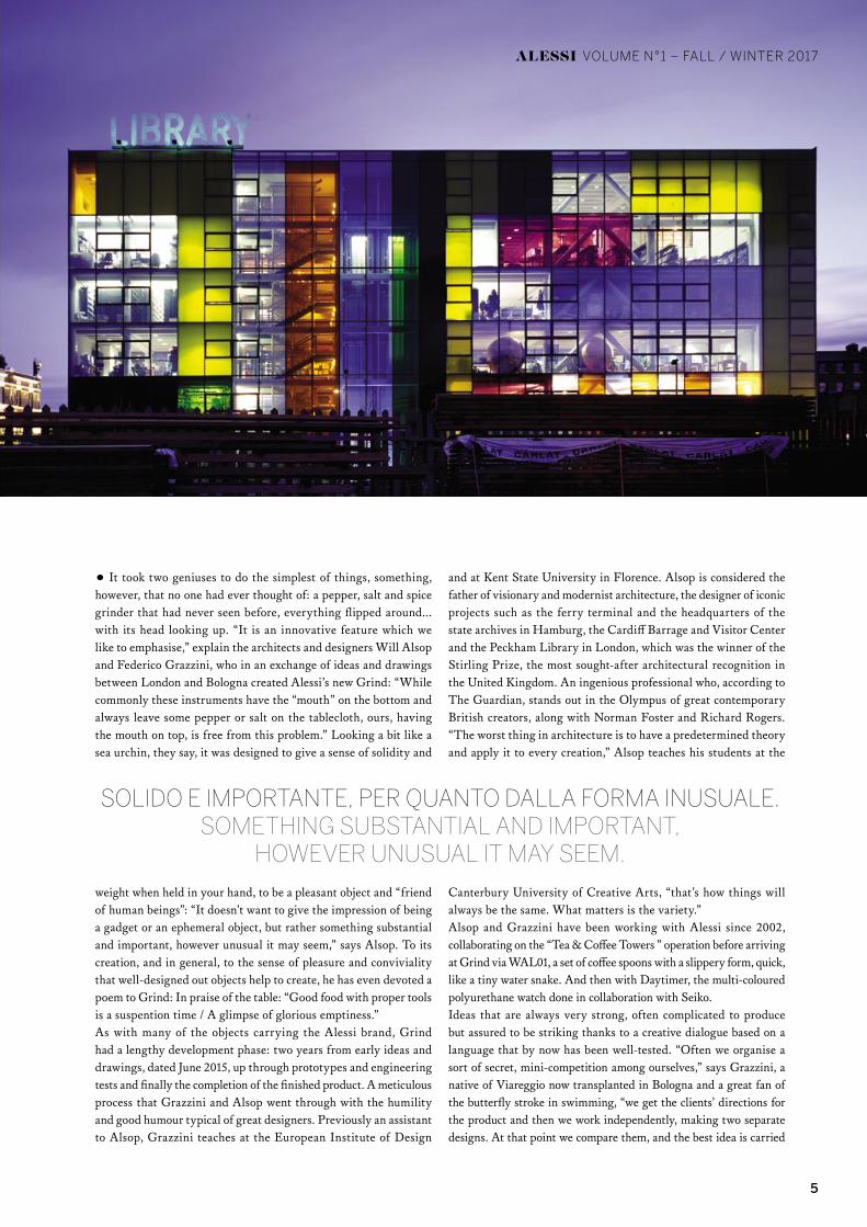
Ci volevano due geni per far la cosa più semplice, alla quale però non aveva pensato nessuno: un macinapepe, macinasale e macinaspezie mai visto prima, tutto capovolto, e con la testa all’insù. «È una caratteristica innovativa che ci piace sottolineare» spiegano gli architetti e designer Will Alsop e Federico Grazzini, che
in uno scambio di idee e disegni sull’asse Londra-Bologna hanno dato vita al nuovo Grind di Alessi: «Mentre comunemente questi strumenti hanno la “bocca” in basso e lasciano sempre un po’ di pepe o sale sulla tovaglia, il nostro, avendo la bocca in alto, non crea nessun problema è esente dal problema». Assomiglia un po’ a un riccio di mare, dicono, concepito per dare un senso di consistenza e peso una volta impugnato, per essere un oggetto piacevole e “amico degli esseri umani”: «L’impressione che deve regalare non è quella di un gadget, o di un oggetto effimero, ma di qualcosa di solido e importante, per quanto dalla forma inusuale» dice Alsop. Che alla sua creazione, e in generale al senso di piacere e convivialità che gli oggetti ben pensati aiutano a creare, ha persino dedicato a Grind la poesia In lode alla tavola: «Del buon cibo assaggiato/Con uno strumento adeguato/È una sospensione del tempo/È un lampo di vuoto glorioso». Come accade per molti degli oggetti firmati Alessi, anche Grind ha impiegato due anni di lavoro, per nascere: dalle prime idee e disegni, datati giugno 2015. Fino ai prototipi e alle prove ingegneristiche, e alla realizzazione del prodotto finito. Un processo certosino a cui Grazzini e Alsop si sono sottoposti con l’umiltà divertita e l’entusiasmo tipica dei grandi: già assistente di Alsop, Grazzini insegna all’Istituto Europeo di Design e alla Kent State University di Firenze. Alsop è considerato il padre dell’architettura visionaria e modernista, autore di progetti iconici come il terminal dei traghetti e la sede dell’archivio di stato ad Amburgo, il Cardiff Barrage and Visitor Center e la Peckham Library a Londra, che gli è valso la vincita dello Stirling Prize, il più ambito riconoscimento architettonico del
Regno unito. Un professionista geniale che secondo The Guardian svetta di diritto nell’Olimpo dei grandi creativi british contemporanei, insieme a Norman Foster e a Richard Rogers. «La cosa peggiore, in architettura, è avere una teoria prestabilita e applicarla ad ogni creazione» insegna Alsop ai suoi studenti dell’University of creative arts di Canterbury, «in quel modo nascono sempre e solo cose uguali. Ciò che conta, invece, è la varietà».Insieme ad Alessi, Alsop e Grazzini lavorano dal 2002, collaborazione partita con l’operazione “Tea & Coffee Towers” e arrivata fino a Grind passando per WAL01, un set di cucchiaini da caffè dalla forma sgusciante, veloce, da serpentello acquatico. E poi con Daytimer, l’orologio in poliuretano multicolore realizzato con la collaborazione di Seiko.Idee sempre molto forti, spesso di complicata realizzazione ma di sicuro effetto, nate grazie a un dialogo creativo che si basa su un linguaggio ormai rodato. «Spesso organizziamo tra noi una sorta di microconcorso segreto» racconta Grazzini, viareggino trapiantato a Bologna e grande appassionato di nuoto a delfino, «riceviamo dal cliente le indicazioni per il prodotto e poi ci mettiamo al lavoro separatamente, facendo due disegni distinti. A quel punto li confrontiamo, e l’idea migliore viene portata avanti». Usano parole comprensibili solo a loro due: «Questo lo facciamo zigozago» dicono ad esempio, quando vogliono una forma irregolare, come quella utilizzata per Grind. Oppure, «questo deve essere un po’ blob» se immaginano una sorta di rigonfiamento, come se l’oggetto fosse in dolce attesa, e contenesse qualcosa. Sono i loro archetipi. I loro emoticon. Sillabe che poi possono tradursi in facciate di palazzi, scalinate, oggetti d’arredo: «La nostra energia», dicono in coro, «è fatta di proiezioni tridimensionali».
5
and at Kent State University in Florence. Alsop is considered the father of visionary and modernist architecture, the designer of iconic projects such as the ferry terminal and the headquarters of the state archives in Hamburg, the Cardiff Barrage and Visitor Center and the Peckham Library in London, which was the winner of the Stirling Prize, the most sought-after architectural recognition in the United Kingdom. An ingenious professional who, according to The Guardian, stands out in the Olympus of great contemporary British creators, along with Norman Foster and Richard Rogers. “The worst thing in architecture is to have a predetermined theory and apply it to every creation,” Alsop teaches his students at the
Canterbury University of Creative Arts, “that’s how things will always be the same. What matters is the variety.”Alsop and Grazzini have been working with Alessi since 2002, collaborating on the “Tea & Coffee Towers ” operation before arriving at Grind via WAL01, a set of coffee spoons with a slippery form, quick, like a tiny water snake. And then with Daytimer, the multi-coloured polyurethane watch done in collaboration with Seiko.Ideas that are always very strong, often complicated to produce but assured to be striking thanks to a creative dialogue based on a language that by now has been well-tested. “Often we organise a sort of secret, mini-competition among ourselves,” says Grazzini, a native of Viareggio now transplanted in Bologna and a great fan of the butterfly stroke in swimming, “we get the clients’ directions for the product and then we work independently, making two separate designs. At that point we compare them, and the best idea is carried
SOLIDO E IMPORTANTE, PER QUANTO DALLA FORMA INUSUALE.SOMETHING SUBSTANTIAL AND IMPORTANT,
HOWEVER UNUSUAL IT MAY SEEM.
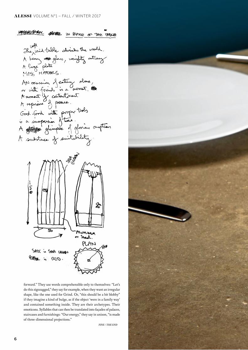
• It took two geniuses to do the simplest of things, something, however, that no one had ever thought of: a pepper, salt and spice grinder that had never seen before, everything flipped around... with its head looking up. “It is an innovative feature which we like to emphasise,” explain the architects and designers Will Alsop and Federico Grazzini, who in an exchange of ideas and drawings between London and Bologna created Alessi’s new Grind: “While commonly these instruments have the “mouth” on the bottom and always leave some pepper or salt on the tablecloth, ours, having the mouth on top, is free from this problem.” Looking a bit like a sea urchin, they say, it was designed to give a sense of solidity and
weight when held in your hand, to be a pleasant object and “friend of human beings”: “It doesn’t want to give the impression of being a gadget or an ephemeral object, but rather something substantial and important, however unusual it may seem,” says Alsop. To its creation, and in general, to the sense of pleasure and conviviality that well-designed out objects help to create, he has even devoted a poem to Grind: In praise of the table: “Good food with proper tools is a suspention time / A glimpse of glorious emptiness.”As with many of the objects carrying the Alessi brand, Grind had a lengthy development phase: two years from early ideas and drawings, dated June 2015, up through prototypes and engineering tests and finally the completion of the finished product. A meticulous process that Grazzini and Alsop went through with the humility and good humour typical of great designers. Previously an assistant to Alsop, Grazzini teaches at the European Institute of Design
ALESSI VOLUME N°1 – FALL / WINTER 2017
6
ALESSI VOLUME N°1 – FALL / WINTER 2017
forward.” They use words comprehensible only to themselves: “Let’s do this zigozagged,” they say for example, when they want an irregular shape, like the one used for Grind. Or, “this should be a bit blobby” if they imagine a kind of bulge, as if the object ‘were in a family way’ and contained something inside. They are their archetypes. Their emoticons. Syllables that can then be translated into façades of palaces, staircases and furnishings: “Our energy,” they say in unison, “is made of three-dimensional projections.” FINE / THE END
7ALESSI
Grind, William Alsop e Federico Grazzini, 2017
Macinasale, pepe e spezie.
Salt, pepper and spice grinder. (p. 44)
8
ALESSI VOLUME N°1 – FALL / WINTER 2017
testo/text RAFFAELE PANIZZA — fotografie/photos LUCA DE SANTIS
VALERIOSOMMELLA:
RIFLESSI IN 3D
«Amo lavorare l’acciaio in modo da esaltarne la tridimensionalità».“I love working with steel to enhance its three-dimensionality.”

9ALESSI
Bibo, Valerio Sommella, 2017
Set di accessori da tè e caffè.
Tea and coffee accessories set. (p.44)

10 ALESSI
ALESSI VOLUME N°1 – FALL / WINTER 2017
ALESSI VOLUME N°1 – FALL / WINTER 2017
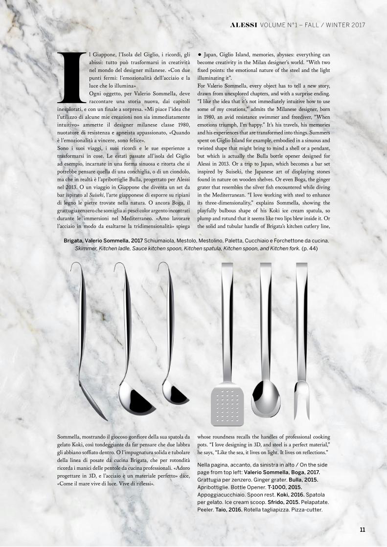
Nella pagina, accanto, da sinistra in alto / On the side page from top left: Valerio Sommella, Boga, 2017. Grattugia per zenzero. Ginger grater. Bulla, 2015. Apribottiglie. Bottle Opener. T-1000, 2015. Appoggiacucchiaio. Spoon rest. Koki, 2016. Spatola per gelato. Ice cream scoop. Sfrido, 2015. Pelapatate. Peeler. Taio, 2016. Rotella tagliapizza. Pizza-cutter.
Il Giappone, l’Isola del Giglio, i ricordi, gli abissi: tutto può trasformarsi in creatività nel mondo del designer milanese. «Con due punti fermi: l’emozionalità dell’acciaio e la luce che lo illumina»Ogni oggetto, per Valerio Sommella, deve raccontare una storia nuova, dai capitoli
inesplorati, e con un finale a sorpresa. «Mi piace l’idea che l’utilizzo di alcune mie creazioni non sia immediatamente intuitivo» ammette il designer milanese classe 1980, nuotatore di resistenza e apneista appassionato, «Quando è l’emozionalità a vincere, sono felice».Sono i suoi viaggi, i suoi ricordi e le sue esperienze a trasformarsi in cose. Le estati passate all’isola del Giglio ad esempio, incarnate in una forma sinuosa e ritorta che si potrebbe pensare quella di una conchiglia, o di un ciondolo, ma che in realtà è l’apribottiglie Bulla, progettato per Alessi nel 2013. O un viaggio in Giappone che diventa un set da bar ispirato al Suiseki, l’arte giapponese di esporre su ripiani di legno le pietre trovate nella natura. O ancora Boga, il grattugiazenzero che somiglia ai pesci color argento incontrati durante le immersioni nel Mediterraneo. «Amo lavorare l’acciaio in modo da esaltarne la tridimensionalità» spiega
Sommella, mostrando il giocoso gonfiore della sua spatola da gelato Koki, così tondeggiante da far pensare che due labbra gli abbiano soffiato dentro. O l’impugnatura solida e tubolare della linea di posate da cucina Brigata, che per rotondità ricorda i manici delle pentole da cucina professionali. «Adoro progettare in 3D, e l’acciaio è un materiale perfetto» dice, «Come il mare vive di luce. Vive di riflessi».
• Japan, Giglio Island, memories, abysses: everything can become creativity in the Milan designer’s world. “With two fixed points: the emotional nature of the steel and the light illuminating it”.For Valerio Sommella, every object has to tell a new story, drawn from unexplored chapters, and with a surprise ending. “I like the idea that it’s not immediately intuitive how to use some of my creations,” admits the Milanese designer, born in 1980, an avid resistance swimmer and freediver, “When emotions triumph, I’m happy.” It’s his travels, his memories and his experiences that are transformed into things. Summers spent on Giglio Island for example, embodied in a sinuous and twisted shape that might bring to mind a shell or a pendant, but which is actually the Bulla bottle opener designed for Alessi in 2013. Or a trip to Japan, which becomes a bar set inspired by Suiseki, the Japanese art of displaying stones found in nature on wooden shelves. Or even Boga, the ginger grater that resembles the silver fish encountered while diving in the Mediterranean. “I love working with steel to enhance its three-dimensionality,” explains Sommella, showing the playfully bulbous shape of his Koki ice cream spatula, so plump and rotund that it seems like two lips blew inside it. Or the solid and tubular handle of Brigata’s kitchen cutlery line,
whose roundness recalls the handles of professional cooking pots. “I love designing in 3D, and steel is a perfect material,” he says, “Like the sea, it lives on light. It lives on reflections.”
Brigata, Valerio Sommella, 2017 Schiumaiola, Mestolo, Mestolino, Paletta, Cucchiaio e Forchettone da cucina.
Skimmer, Kitchen ladle, Sauce kitchen spoon, Kitchen spatula, Kitchen spoon, and Kitchen fork. (p. 44)
ALESSI VOLUME N°1 – FALL / WINTER 2017
11
12
ALESSI VOLUME N°1 – FALL / WINTER 2017
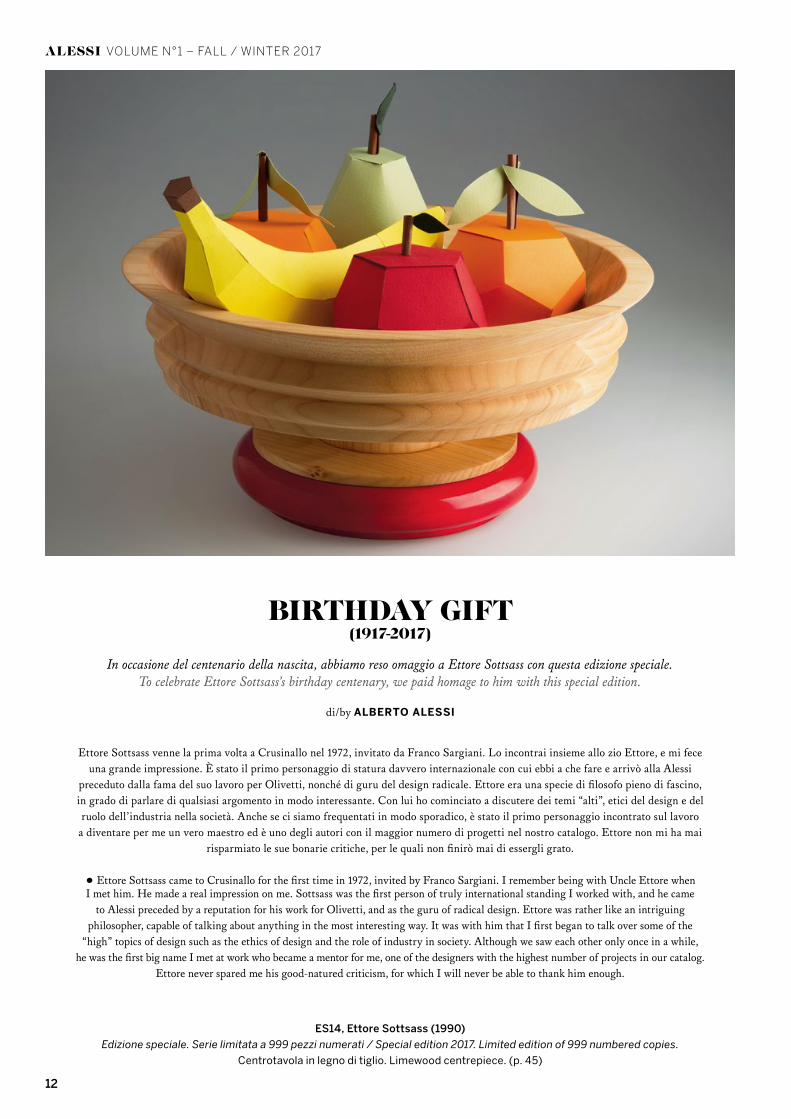
Ettore Sottsass venne la prima volta a Crusinallo nel 1972, invitato da Franco Sargiani. Lo incontrai insieme allo zio Ettore, e mi fece una grande impressione. È stato il primo personaggio di statura davvero internazionale con cui ebbi a che fare e arrivò alla Alessi
preceduto dalla fama del suo lavoro per Olivetti, nonché di guru del design radicale. Ettore era una specie di filosofo pieno di fascino, in grado di parlare di qualsiasi argomento in modo interessante. Con lui ho cominciato a discutere dei temi “alti”, etici del design e del ruolo dell’industria nella società. Anche se ci siamo frequentati in modo sporadico, è stato il primo personaggio incontrato sul lavoro
a diventare per me un vero maestro ed è uno degli autori con il maggior numero di progetti nel nostro catalogo. Ettore non mi ha mai risparmiato le sue bonarie critiche, per le quali non finirò mai di essergli grato.
• Ettore Sottsass came to Crusinallo for the first time in 1972, invited by Franco Sargiani. I remember being with Uncle Ettore when I met him. He made a real impression on me. Sottsass was the first person of truly international standing I worked with, and he came
to Alessi preceded by a reputation for his work for Olivetti, and as the guru of radical design. Ettore was rather like an intriguing philosopher, capable of talking about anything in the most interesting way. It was with him that I first began to talk over some of the
“high” topics of design such as the ethics of design and the role of industry in society. Although we saw each other only once in a while, he was the first big name I met at work who became a mentor for me, one of the designers with the highest number of projects in our catalog.
Ettore never spared me his good-natured criticism, for which I will never be able to thank him enough.
ES14, Ettore Sottsass (1990)
Edizione speciale. Serie limitata a 999 pezzi numerati / Special edition 2017. Limited edition of 999 numbered copies.
Centrotavola in legno di tiglio. Limewood centrepiece. (p. 45)
BIRTHDAY GIFT(1917-2017)
In occasione del centenario della nascita, abbiamo reso omaggio a Ettore Sottsass con questa edizione speciale.To celebrate Ettore Sottsass’s birthday centenary, we paid homage to him with this special edition.
di/by ALBERTO ALESSI

13
ALESSI VOLUME N°1 – FALL / WINTER 2017
“IO FACCIO TANTI LAVORI DIVERSI, FACCIO FOTOGRAFIE,
‘DISEGNINI’, ARCHITETTURE ENORMI, SCRIVO. ALTRIMENTI SONO
SICURO CHE LA MIA ANIMA SI ANNOIEREBBE”
“I DO MANY DIFFERRENT THINGS, I TAKE PHOTOGRAPHS, I DRAW,
I PLAN HUGE ARCHITECTURE, I WRITE, OTHERWISE MY SOUL WOULD
GET BORED”
ETTORE SOTTSASS

Alba, Ben van Berkel/UNStudio, 2017
consulenza / advice Centro Nazionale Studi Tartufo e Ente Fiera Internazionale del Tartufo Bianco d’Alba
Affettatartufi. Truffle slicer. (p. 44)
a destra / on the right, Ristorante Larossa, Alba
testo/text BEN VAN BERKEL e ALESSANDRA COPPA — fotografie/photos MICHELE DE VITA, DAVIDE DUTTO, ALESSANDRO MILANI
L’ALBA DEL TARTUFO
“Abbiamo lavorato a lungo per trovare la migliore posizione ergonomica e il giusto equilibrio del peso nel momento in cui l’affettatartufi è tenuto in mano. Per consentire la migliore ergonomia durante l’operazione di taglio e ridurre la pressione sul polso abbiamo creato un angolo di 18 gradi tra l’impugnatura e la lama. L’applicazione di questi parametri ha permesso
di combinare una forma scultorea con un uso pratico”.“Extensive consideration was given to finding the best ergonomic position
and balance of weight when the slicer is held in the hand. To enable better ergonomic slicing and reduce pressure on the wrist, there is an 18
degree angle between the handle and the blade. This combination of parameters enabled a sculptural form with a practical use.”
ALESSI VOLUME N°1 – FALL / WINTER 2017
14
15ALESSI
ALESSI VOLUME N°1 – FALL / WINTER 2017

16
ALESSI VOLUME N°1 – FALL / WINTER 2017
Enrico Crippa, chef del ristorante 3 stelle Piazza
Duomo ad Alba. 3 Michelin star chef Enrico Crippa
Piazza Duomo restaurant, Alba
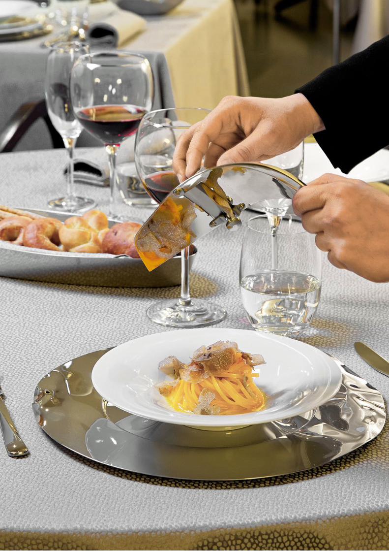
La radula è una lama posta in diagonale, sostenuta da una sottile tavoletta di noce larga sei dita e lunga dodici a cui è fissata con dei perni posti da una parte e dall’altra ai suoi margini. Il taglio sarà sollevato dalla liscia superficie del legno, ma in modo
quasi impercettibile, e al di sotto la tavoletta è aperta: da qui scendono, una uguale all’altra, le sottili fette rasate dal bulbo.”G.B. Vigo, Tubera terrae Carmen, 1776, v. 865Contestualmente all’origine del tartufo (Tuber magnatum Pico), l’abate Gian Bernardo Vigo, professore di eloquenza latina nel Settecento torinese, nel Carmen narra di un primordiale “affettatartufi”. Fino al 1776 non esiste una citazione chiara sull’impiego dell’oggetto per affettare il tartufo, ma solo delle indicazioni nelle ricette in cui il tartufo, solitamente bollito, era tagliato a fette sottili ricoprendo la superficie del piatto per una necessità anche olfattiva.Oggi la tipologia dell’affettatartufi ritorna nell’Enciclopedia Alessi: dopo UT0244 disegnato da Ettore Sottsass nel 1991, sarà messo in produzione un nuovo oggetto progettato da Ben van Berkel.L’occasione di questo nuovo progetto nasce dalla collaborazione di Alessi con l’Ente Fiera Internazionale Tartufo Bianco
d’Alba. Un binomio di eccellenze: l’unicità di un prodotto del territorio, il Tartufo Bianco d’Alba e quella del design.Il progetto di Ben van Berkel è l’esito di un workshop a inviti sviluppato in due anni al quale hanno partecipato quindici progettisti: William Alsop e Federico Grazzini, Michel Boucquillon & Donia Maaoui, Gabriele Chiave, Michele De Lucchi, Odile Decq, Monica Förster, Doriana e Massimiliano Fuksas, Anna e Gian Franco Gasparini, Martí Guixé, Giulio Iacchetti, Piero Lissoni, Sakura Adachi, Valerio Sommella, Ben van Berkel/UNStudio, Patricia Urquiola.Nell’intento di celebrare - in una sorta di “rappresentazione teatrale” - l’atto di servire il tartufo, affettandolo e disponendolo con eleganza nel piatto durante una cena raffinata, van Berkel ha pensato a un affettatartufi dalla forma avveniristica.Il tartufo bianco d’Alba ha una forma tendenzialmente globosa, a volte irregolare o con molti bitorzoli, caratteristiche che rendono molto più complesso sia il lavaggio sia la lamellatura. Le dimensioni possono variare da pochi grammi fino al chilo.Per agevolare il taglio, van Berkel ha creato un oggetto dalla scultorea forma in torsione che sembra generata dall’intreccio delle radici degli alberi dove il tartufo nasce. Tuttavia questo innovativo affettatartufi non si caratterizza solo per la pura valenza iconica, ma anche per quella funzionale. Alla bellezza e alla potenza della forma, Alba – il cui nome rappresenta un omaggio al territorio del tartufo – unisce l’attenzione per l’ergonomia che ne consente un taglio agevolato e perfetto.
«Per celebrare la drammaturgia di servire il tartufo: una rara e preziosa delizia culinaria»“For celebrating the dramaturgy of serving truffles: a rare and precious culinary delight”
“• “The radula is a blade placed diagonally on a thin plank of walnut wood, six fingers wide and twelve in length, to which it is attached with pins on both sides along its edges. The cutting edge is slightly raised above the smooth surface of the wood, almost imperceptibly, while on the bottom side the board is open: from here, the uniformly thin shavings fall from the bulb” (GB Vigo, Tubera terrae Carmen, 1676, v. 865). Concurrently with the origin of the truffle (Tuber magnatum Pico), abbot Gian Bernardo Vigo, a 17th-century professor of Latin in Turin, tells of a rudimentary “Affettatartufi” (truffle slicer) in the Carmen text.Until 1776 there was no clear mention of a specific object for slicing truffles, only occasional indications in recipes where truffles, usually boiled, were shaved into thin slices covering the surface of the dish, also for olfactory reasons.Today the typology of the Truffle slicer returns to the Encyclopedia Alessi: after UT0244 item designed by Ettore Sottsass in 1991, a new truffle slicer designed by Ben van Berkel is now being presented.This new project came out from the collaboration between Alessi and the International White Truffle Fair of Alba. A coupling of leaders in their respective fields: the uniqueness of the region’s natural product, the white truffle of Alba, combined with cutting-edge design.Ben van Berkel’s project is the outcome of a two-year
invitational workshop, featuring fifteen designers: William Alsop and Federico Grazzini, Michel Boucquillon & Donia Maaoui, Gabriele Chiave, Michele De Lucchi, Odile Decq, Monica Förster, Doriana and Massimiliano Fuksas, Anna and Gian Franco Gasparini, Martí Guixé, Giulio Iacchetti, Piero Lissoni, Sakura Adachi, Valerio Sommella, Ben van Berkel/UNStudio, Patricia Urquiola. With the intention of celebrating — in a sort of “theatrical representation” — the act of serving truffles, slicing them and placing them elegantly on the plate for a refined dinner, van Berkel envisioned a truffle slicer with a futuristic form. White Alba truffles have a tendentiously globular shape, sometimes irregular or with many lumps, which makes washing and slicing them all the more complex. Their size may vary from a few grams to a kilo. To facilitate slicing, van Berkel created an object with a sculptural, twisted form that seems to have been generated by the intertwined roots where truffles grow. However, this innovative Truffle slicer is not only characterised by its value as an icon but also by its functional value. In addition to the beauty and power of its shape, Alba (the name is a tribute to the land of the truffle) is the result of scrupulous attention to ergonomics, making each slice smooth and perfect.

17ALESSI
ALESSI VOLUME N°1 – FALL / WINTER 2017

18
ALESSI VOLUME N°1 – FALL / WINTER 2017
EXTRAORDINARY
METAL
GIOIELLIA TAVOLA
testo/text CARLO ALBERTO GASPARINI — fotografie/photo LUCA DE SANTIS — 3D artist GIORDANO EMMANUELE
Una tra le più antiche e affascinanti tecniche orafereinterpretata in chiave industriale.
One of the oldest and most fascinating goldsmith techniques,interpreted from an industrial point of view.
19ALESSI
ALESSI VOLUME N°1 – FALL / WINTER 2017
20
ALESSI VOLUME N°1 – FALL / WINTER 2017
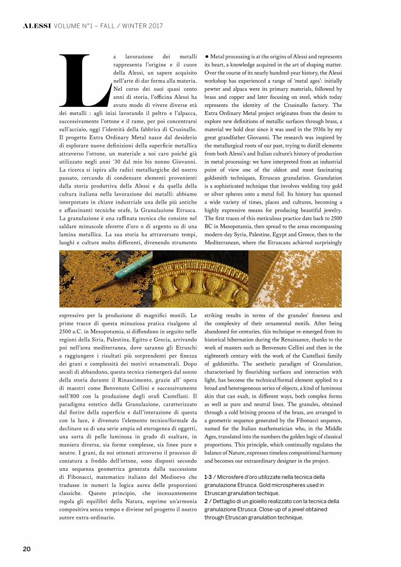
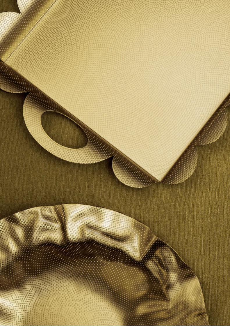
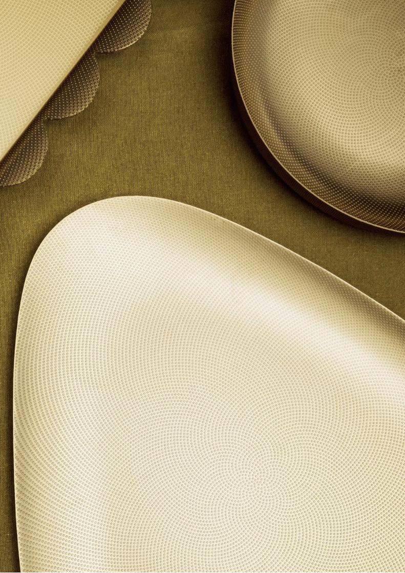
La lavorazione dei metalli rappresenta l’origine e il cuore della Alessi, un sapere acquisito nell’arte di dar forma alla materia. Nel corso dei suoi quasi cento anni di storia, l’officina Alessi ha avuto modo di vivere diverse età
dei metalli : agli inizi lavorando il peltro e l’alpacca, successivamente l’ottone e il rame, per poi concentrarsi sull’acciaio, oggi l’identità della fabbrica di Crusinallo. Il progetto Extra Ordinary Metal nasce dal desiderio di esplorare nuove definizioni della superficie metallica attraverso l’ottone, un materiale a noi caro poiché già utilizzato negli anni ‘30 dal mio bis nonno Giovanni. La ricerca si ispira alle radici metallurgiche del nostro passato, cercando di condensare elementi provenienti dalla storia produttiva della Alessi e da quella della cultura italiana nella lavorazione dei metalli: abbiamo interpretato in chiave industriale una delle più antiche e affascinanti tecniche orafe, la Granulazione Etrusca. La granulazione è una raffinata tecnica che consiste nel saldare minuscole sferette d’oro o di argento su di una lamina metallica. La sua storia ha attraversato tempi, luoghi e culture molto differenti, divenendo strumento
espressivo per la produzione di magnifici monili. Le prime tracce di questa minuziosa pratica risalgono al 2500 a.C. in Mesopotamia, si diffondono in seguito nelle regioni della Siria, Palestina, Egitto e Grecia, arrivando poi nell’area mediterranea, dove saranno gli Etruschi a raggiungere i risultati più sorprendenti per finezza dei grani e complessità dei motivi ornamentali. Dopo secoli di abbandono, questa tecnica riemergerà dal sonno della storia durante il Rinascimento, grazie all’ opera di maestri come Benvenuto Cellini e successivamente nell’800 con la produzione degli orafi Castellani. Il paradigma estetico della Granulazione, caratterizzato dal fiorire della superficie e dall’interazione di questa con la luce, è divenuto l’elemento tecnico/formale da declinare su di una serie ampia ed eterogenea di oggetti, una sorta di pelle luminosa in grado di esaltare, in maniera diversa, sia forme complesse, sia linee pure e neutre. I grani, da noi ottenuti attraverso il processo di coniatura a freddo dell’ottone, sono disposti secondo una sequenza geometrica generata dalla successione di Fibonacci, matematico italiano del Medioevo che tradusse in numeri la logica aurea delle proporzioni classiche. Questo principio, che incessantemente regola gli equilibri della Natura, esprime un’armonia compositiva senza tempo e diviene nel progetto il nostro autore extra-ordinario.
• Metal processing is at the origins of Alessi and represents its heart, a knowledge acquired in the art of shaping matter. Over the course of its nearly hundred-year history, the Alessi workshop has experienced a range of ‘metal ages’: initially pewter and alpaca were its primary materials, followed by brass and copper and later focusing on steel, which today represents the identity of the Crusinallo factory. The Extra Ordinary Metal project originates from the desire to explore new definitions of metallic surfaces through brass, a material we hold dear since it was used in the 1930s by my great grandfather Giovanni. The research was inspired by the metallurgical roots of our past, trying to distill elements from both Alessi’s and Italian culture’s history of production in metal processing: we have interpreted from an industrial point of view one of the oldest and most fascinating goldsmith techniques, Etruscan granulation. Granulation is a sophisticated technique that involves welding tiny gold or silver spheres onto a metal foil. Its history has spanned a wide variety of times, places and cultures, becoming a highly expressive means for producing beautiful jewelry. The first traces of this meticulous practice date back to 2500 BC in Mesopotamia, then spread to the areas encompassing modern-day Syria, Palestine, Egypt and Greece, then to the Mediterranean, where the Etruscans achieved surprisingly
striking results in terms of the granules’ fineness and the complexity of their ornamental motifs. After being abandoned for centuries, this technique re-emerged from its historical hibernation during the Renaissance, thanks to the work of masters such as Benvenuto Cellini and then in the eighteenth century with the work of the Castellani family of goldsmiths. The aesthetic paradigm of Granulation, characterised by flourishing surfaces and interaction with light, has become the technical/formal element applied to a broad and heterogeneous series of objects, a kind of luminous skin that can exalt, in different ways, both complex forms as well as pure and neutral lines. The granules, obtained through a cold brining process of the brass, are arranged in a geometric sequence generated by the Fibonacci sequence, named for the Italian mathematician who, in the Middle Ages, translated into the numbers the golden logic of classical proportions. This principle, which continually regulates the balance of Nature, expresses timeless compositional harmony and becomes our extraordinary designer in the project.
1-3 / Microsfere d’oro utilizzate nella tecnica della
granulazione Etrusca. Gold microspheres used in
Etruscan granulation techique.
2 / Dettaglio di un gioiello realizzato con la tecnica della
granulazione Etrusca. Close-up of a jewel obtained
through Etruscan granulation technique.

21ALESSI
ALESSI VOLUME N°1 – FALL / WINTER 2017
21VIEW ON ALESSI
Sitges, Lluís Clotet, 2003
Sottopiatto. Placemat. (p.47)
ALESSI VOLUME N°1 – FALL / WINTER 2017
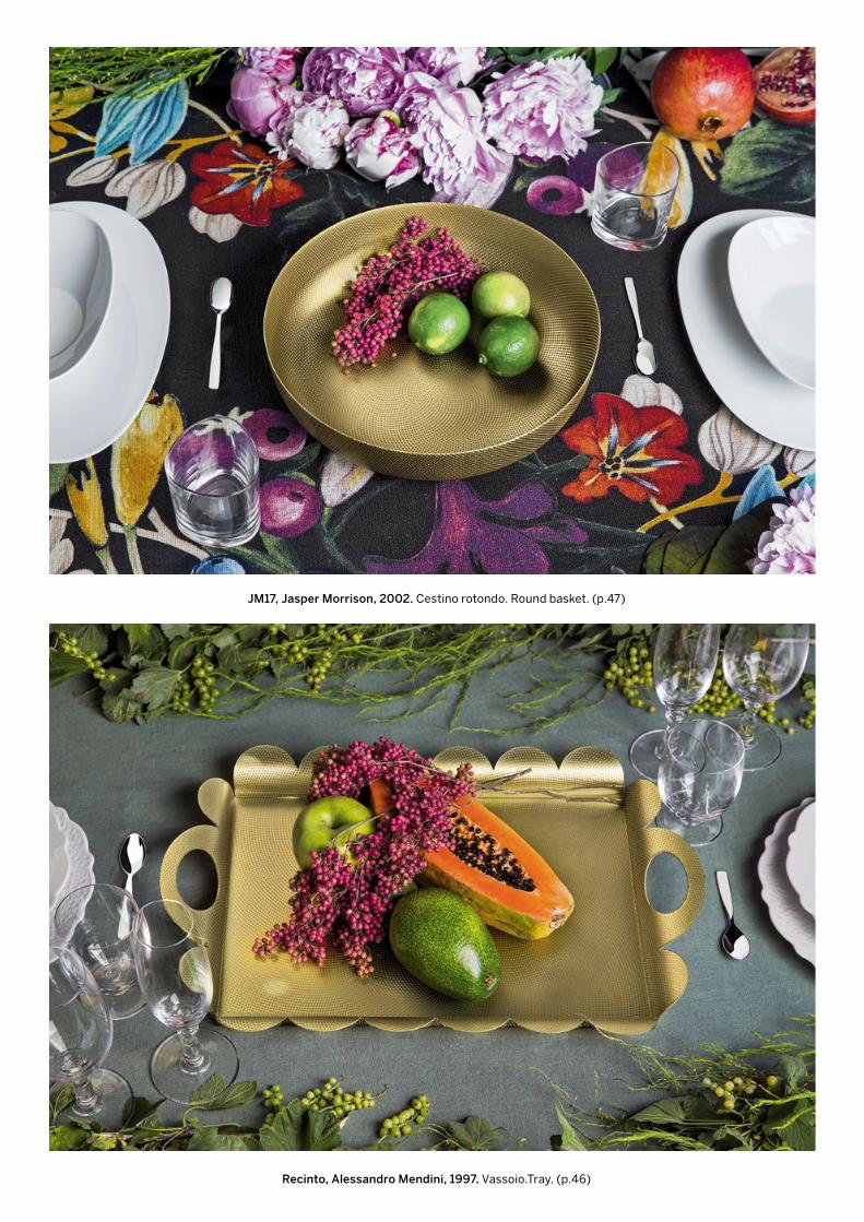
JM17, Jasper Morrison, 2002. Cestino rotondo. Round basket. (p.47)
Recinto, Alessandro Mendini, 1997. Vassoio.Tray. (p.46)
ALESSI VOLUME N°1 – FALL / WINTER 2017
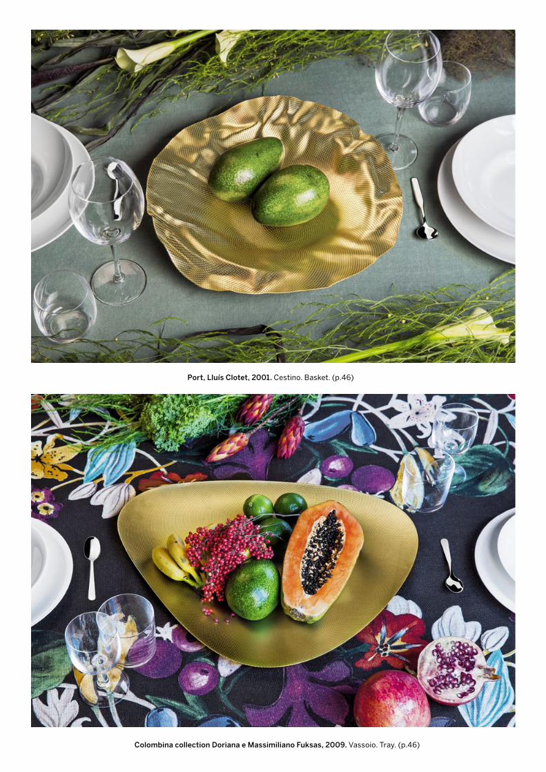
Port, Lluís Clotet, 2001. Cestino. Basket. (p.46)
Colombina collection Doriana e Massimiliano Fuksas, 2009. Vassoio. Tray. (p.46)
26
ALESSI VOLUME N°1 – FALL / WINTER 2017
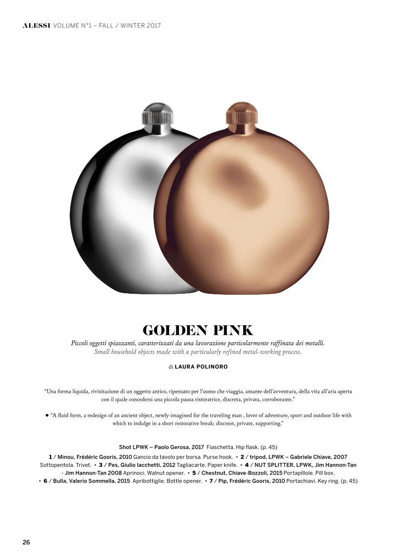
“Una forma liquida, rivisitazione di un oggetto antico, ripensato per l’uomo che viaggia, amante dell’avventura, della vita all’aria aperta con il quale concedersi una piccola pausa ristoratrice, discreta, privata, corroborante.”
• “A fluid form, a redesign of an ancient object, newly-imagined for the traveling man , lover of adventure, sport and outdoor life with which to indulge in a short restorative break: discreet, private, supporting.”
Shot LPWK – Paolo Gerosa, 2017 Fiaschetta. Hip flask. (p. 45)
1 / Minou, Frédéric Gooris, 2010 Gancio da tavolo per borsa. Purse hook. • 2 / tripod, LPWK – Gabriele Chiave, 2007
Sottopentola. Trivet. • 3 / Pes, Giulio Iacchetti, 2012 Tagliacarte. Paper knife. • 4 / NUT SPLITTER, LPWK, Jim Hannon-Tan
- Jim Hannon-Tan 2008 Aprinoci. Walnut opener. • 5 / Chestnut, Chiave-Bozzoli, 2015 Portapillole. Pill box.
• 6 / Bulla, Valerio Sommella, 2015 Apribottiglie. Bottle opener. • 7 / Pip, Frédéric Gooris, 2010 Portachiavi. Key ring. (p. 45)
GOLDEN PINKPiccoli oggetti spiazzanti, caratterizzati da una lavorazione particolarmente raffinata dei metalli.
Small household objects made with a particularly refined metal-working process.
di LAURA POLINORO

27
ALESSI VOLUME N°1 – FALL / WINTER 2017
4 /
7 / 5 /
3 /
1 /
2 /
6 /

28 ALESSI
ALESSI VOLUME N°1 – FALL / WINTER 2017
testo/text ANTONIO ARICÒ, LAURA POLINORO — fotografie/photos ALESSANDRO MILANI
ARICÒIN
BLUE
29ALESSI

30
ALESSI VOLUME N°1 – FALL / WINTER 2017
Nella pagina, accanto, da sinistra in alto / On the side page from the top left:
“Blue Christmas” LPWK - Antonio Aricò, 2017
Decorazione per albero di Natale. Christmas tree ornament.
Decorazione natalizia. Christmas ornament.
Mug. (p. 48)
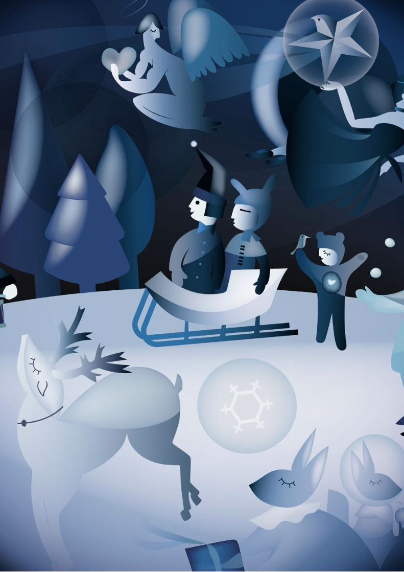
Blue Christmas è un elogio immaginifico agli archetipi del Natale e alle figure oniriche del secolo scorso nella cultura occidentale, mescolando figure araldiche naturali a figure chimeriche, un tuffo in un mondo magico, carico di poesia e di surrealtà. Amore, grazia, sogno, questo è il sentimento
narrato a tratti in questo paesaggio. Il soldatino che incontra la ballerina, il Babbo Natale, l’angelo e la renna, sono gli archetipi natalizi in un mondo naturalista, narrato dai bimbi e da piccoli scoiattoli, con un tratto che ci ricorda le pitture di Chagall. Palle lucenti di Natale, figurine e mug per i sognatori di tutti i tempi”.
• “Blue Christmas is an imaginative tribute to the archetypes of Christmas and the dreamlike figurines from the last century in Western culture, mixing natural, heraldic figures with chimeric figures, a leap into a magical world filled with poetry and surrealism. Love, grace, dreams, these are the feelings that surface at times in this landscape. The soldier meeting a ballerina; Santa Claus; the angel and the reindeer; they are all Christmas archetypes in a naturalistic world, narrated by children and small squirrels, with traits that remind us of a Chagall painting. Shiny Christmas baubles, figurines and mugs for the dreamers of all times”.
LAURA POLINORO
“NATALE IN BLU
Una notte… Buia e blu.Storie fantastiche di
AMORE, REGALI, GIOCHI E SOGNI.
Un ragazzo soldato si INNAMORA di una ragazza ballerina.Degli scoiattolini si scambiano REGALI di Natale.
Dei Bambini che si intrattengono con GIOCHI divertenti.Una Renna serena SOGNA nel cielo blu.
Eleganti ma allo stesso tempo giocosi, questi personaggidiventano parte della Blue Christmas COLLECTION”
ANTONIO ARICÒ
“CHRISTMAS IN BLUE
A night ... Dark and blue.Fantastic stories of
LOVE, GIFTS, GAMES AND DREAMS.
A soldier boy FALLS IN LOVE with a ballerina.Tiny squirrels exchange CHRISTMAS GIFTS.
Children busy themselves by playing with fun GAMES.
A serene reindeer DREAMS in the blue sky.Elegant but at the same time playful, these characters
Become part of the Blue Christmas COLLECTION”ANTONIO ARICÒ
“

ALESSI VOLUME N°1 – FALL / WINTER 2017

32
ALESSI VOLUME N°1 – FALL / WINTER 2017
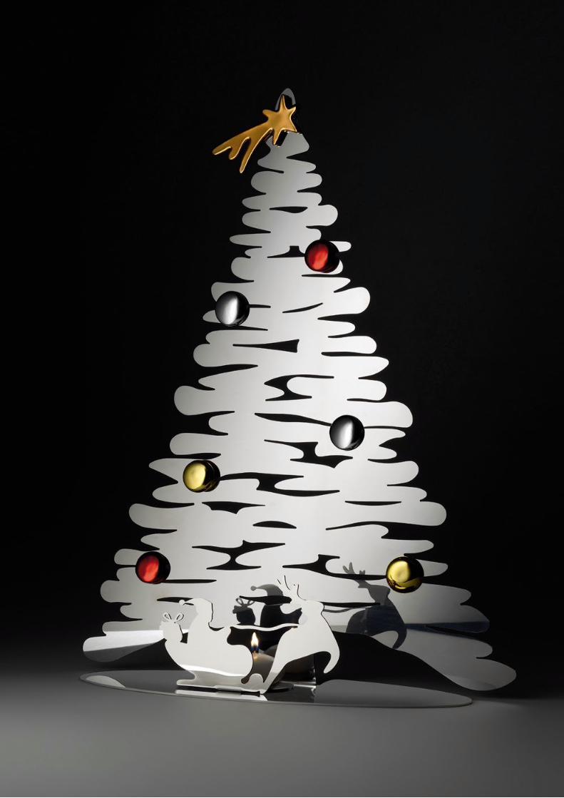
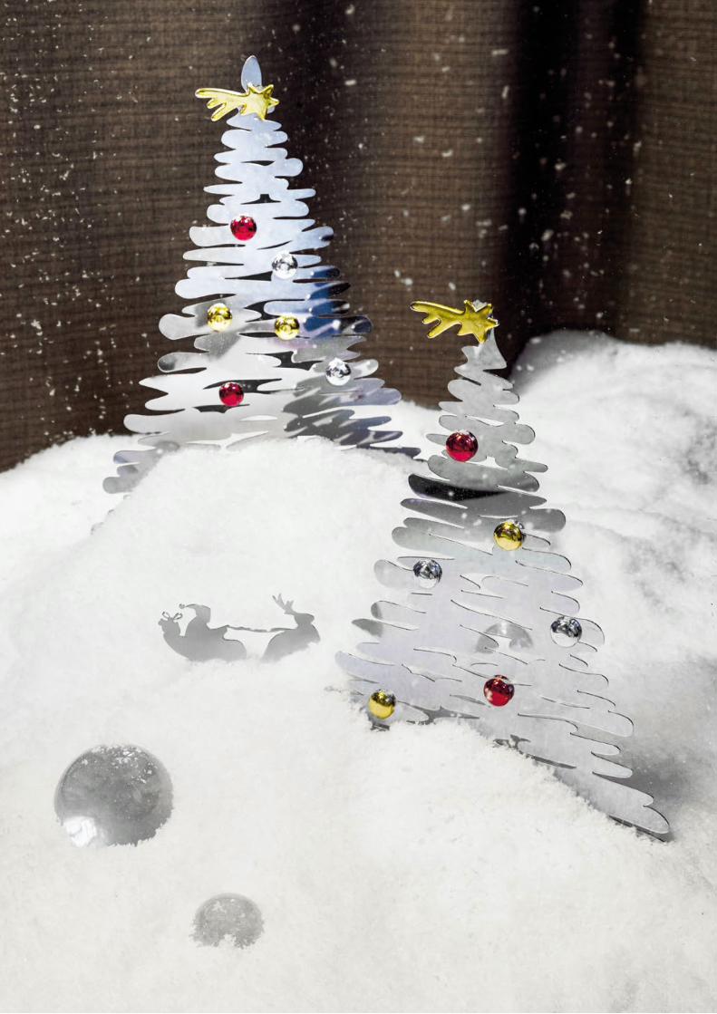
Michel Boucquillon & Donia Maaoui, 2017
Barksled, Decorazione natalizia. Christmas ornament. (p. 49)
Nella pagina accanto / On the side page:
Barksled / Bark for Christmas, Decorazione natalizia. Christmas ornament. (p. 49)
32
BOUCQUILLONBARK TREE
BARK FOR CHRISTMAS é un albero di Natale compatto,ideale per spazi ridotti, negozi o alberghi.
I suoi rami sono piegati verso il basso sotto il peso della neve,la stella cadente color oro e le palline colorate hanno una calamita
che permette di posizionarle in modo libero.La base di BARK FOR CHRISTMAS é la scenografia ideale per
BARKSLED, piccoli e preziosi doni o altre decorazioni natalizie.
testo/text MICHEL BOUCQUILLON — fotografie/photos ALESSANDRO MILANI, LUCA DE SANTIS
33ALESSI
BOUCQUILLONBARK TREE
testo/text MICHEL BOUCQUILLON — fotografie/photos ALESSANDRO MILANI, LUCA DE SANTIS
34 ALESSI
ALESSI VOLUME N°1 – FALL / WINTER 2017
35
ALESSI VOLUME N°1 – FALL / WINTER 2017
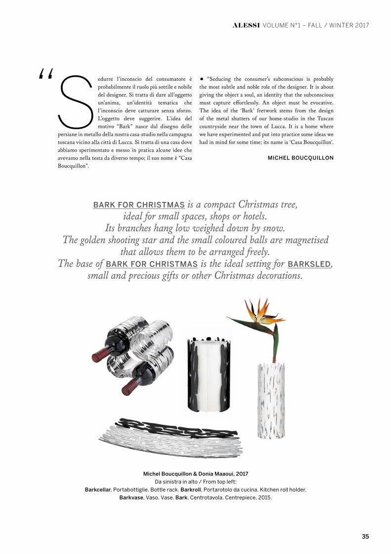
Sedurre l’inconscio del consumatore è probabilmente il ruolo più sottile e nobile del designer. Si tratta di dare all’oggetto un’anima, un’identità tematica che l’inconscio deve catturare senza sforzo. L’oggetto deve suggerire. L’idea del motivo “Bark” nasce dal disegno delle
persiane in metallo della nostra casa-studio nella campagna toscana vicino alla città di Lucca. Si tratta di una casa dove abbiamo sperimentato e messo in pratica alcune idee che avevamo nella testa da diverso tempo; il suo nome è “Casa Boucquillon”.
• “Seducing the consumer’s subconscious is probably the most subtle and noble role of the designer. It is about giving the object a soul, an identity that the subconscious must capture effortlessly. An object must be evocative. The idea of the ‘Bark’ fretwork stems from the design of the metal shutters of our home-studio in the Tuscan countryside near the town of Lucca. It is a home where we have experimented and put into practice some ideas we had in mind for some time; its name is ‘Casa Boucquillon’.
MICHEL BOUCQUILLON
BARK FOR CHRISTMAS is a compact Christmas tree,ideal for small spaces, shops or hotels.
Its branches hang low weighed down by snow.The golden shooting star and the small coloured balls are magnetised
that allows them to be arranged freely.The base of BARK FOR CHRISTMAS is the ideal setting for BARKSLED,
small and precious gifts or other Christmas decorations.
Michel Boucquillon & Donia Maaoui, 2017
Da sinistra in alto / From top left:
Barkcellar, Portabottiglie. Bottle rack. Barkroll, Portarotolo da cucina. Kitchen roll holder.
Barkvase, Vaso. Vase. Bark, Centrotavola. Centrepiece, 2015.
“
36
ALESSI VOLUME N°1 – FALL / WINTER 2017
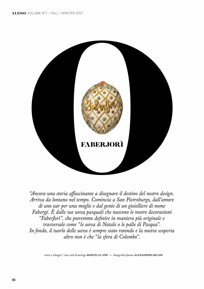
FABERJORÌ
testo e disegni / text and drawings MARCELLO JORI — fotografie/photos ALESSANDRO MILANI
“Ancora una storia affascinante a disegnare il destino del nostro design. Arriva da lontano nel tempo. Comincia a San Pietroburgo, dall’amore
di uno zar per una moglie e dal genio di un gioielliere di nome Fabergé. È dalle sue uova pasquali che nascono le nostre decorazioni
“FaberJorì”, che potremmo definire in maniera più originale e trasversale come “le uova di Natale o le palle di Pasqua”.
In fondo, il tuorlo delle uova è sempre stato rotondo e la nostra scoperta altro non è che “la sfera di Colombo”.
37ALESSI
testo e disegni / text and drawings MARCELLO JORI — fotografie/photos ALESSANDRO MILANI

38
39
ALESSI VOLUME N°1 – FALL / WINTER 2017
uesta nuova collezione di decorazioni natalizie, a mo’ di palle di Natale o anche di uova di Pasqua, è nata nell’immaginario di Marcello Jori come un omaggio al grande orafo russo Peter Carl Fabergé, gioielliere dello zar di tutte le Russie operante tra il
1882 e il 1917 a San Pietroburgo, Kiev, Odessa e Londra. L’opera di Fabergé, nota per la fantasia e la precisione e la ricchezza dei dettagli, spinse nel 1885 lo zar Alessandro III di Russia a commissionargli la realizzazione del primo uovo di Pasqua, in oro e pietre preziose, come regalo per la zarina Marija. Visto il successo del primo regalo lo zar nominò Fabergé gioielliere di corte e gli commissionò un altro uovo per l’anno successivo, con la condizione che ogni uovo doveva essere unico. Secondo la tradizione
della famiglia Fabergé nemmeno lo zar avrebbe conosciuto la sorpresa contenuta all’interno di ogni nuovo uovo: l’unica cosa certa era che, all’interno, doveva trovarsi una sorpresa. Lo zar successivo, Nicola II, da par suo ordinò due uova ogni anno, uno per la regina madre e uno per la moglie Aleksandra Fedorovna, e la tradizione proseguì sino alla Rivoluzione d’ottobre. La preparazione delle uova occupava un intero anno: una volta che un progetto veniva scelto, una squadra di artigiani lavorava per montare l’uovo. Nessun uovo venne fabbricato nel 1904 e nel 1905 per via delle restrizioni imposte dalla Guerra russo-giapponese.Questa è in sintesi la storia delle uova leggendarie che hanno reso l’autore famoso nel mondo, anche se la produzione delle stesse è stata estremamente limitata: ne sono conosciuti meno di un centinaio di pezzi che sono stati prodotti ognuno in esemplare unico, spesso molto elaborati e preziosi (come l’uovo della Transiberiana, dedicato nel 1900 alla costruzione della linea ferroviaria, decorato sulla parte esterna da una fascia grigia metallica con inciso il programma dell’itinerario della ferrovia e all’interno aveva un treno in oro in miniatura), oggi disseminati in alcuni musei e collezioni private.
• This new collection of Christmas decorations — part Christmas baubles, part Easter eggs — sprang from the imagination of Marcello Jori as a tribute to the great Russian goldsmith Peter Carl Fabergé, jeweler for the Tsar of All the Russias, who worked between the years 1882 and 1917 in St. Petersburg, Kiev, Odessa and London. Fabergé’s work, known for its imagination and the precision and richness of details, led Tsar Alexander III of Russia in 1885 to commission him with designing and crafting the first Easter egg, in gold and precious stones, as a gift for the Tsarina Marija. Given the success of the first gift, the Tsar appointed Fabergé as goldsmith to the Imperial Crown and commissioned another egg for the following year, on the condition that each egg be unique. According to the tradition of the Fabergé family, even the tsar would not know the surprise contained within each new egg: the only thing for certain was that inside, there had to be a surprise. The following tsar, Nicola II, ordered two eggs each year, one
for the queen and one for his wife Aleksandra Fedorovna, and the tradition continued until the October Revolution. Preparing the egg was a year-long process: once a project was chosen, a team of artisans worked to craft the egg and set its jewels. No eggs were manufactured in 1904 and 1905 due to restrictions imposed by the Russian-Japanese War.This is the brief history the of legendary eggs that made their designer famous the world over, even though their production was extremely limited — less than a hundred pieces are known to exist — each was produced as a one-of-a-kind piece, often very elaborate and precious (such as the Transiberian egg, dedicated in 1900 to the construction of the railway line, decorated on the exterior with a gray metallic band engraved with the railroad schedule and containing on the inside a miniature gold train), which are now scattered throughout museums and private collections.
“Another fascinating story that determined the destiny of our design.It comes from a long time ago. It begins in St. Petersburg,
from a czar’s love for his wife and the genius of a jeweler named Fabergé.It is from his Easter eggs that the “FaberJorì” decorations take
their inspiration, which we could define in a more original and transversalway as “Christmas Eggs or Easter Baubles”.
In the end, egg yolks have always been round and our discoveryis nothing more than a “Columbus Sphere”.”
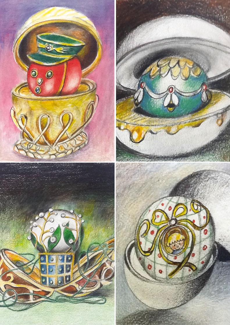
FaberJorì, Marcello Jori, 2017 Decorazione. Home
ornament. (p. 49) Nella pagina accanto, da sinistra, in
alto / On the side page from top left: Piacere, Pulcino il
Grande, Generale Corallo, Mughetti e Smeraldi,
Mongolfiera Reale, Ape dell’oro, San Bambino.

Alla fine degli anni ’80 Alessandro Mendini, prezioso suggeritore di nuovi talenti, con il suo solito fare discreto mi segnala due giovani architetti di Firenze. Stefano Giovannoni e Guido Venturini (i King-Kong) vennero da me molto emozionati, con una serie di schizzi.
Individuai tra i loro disegni un semplicissimo vassoio col bordo traforato da un motivo di omini, di quelli che si fanno da bambinicon le forbici. Da quel momento gli “omini” dei King-Kong hanno fatto la loro comparsa sui bordi di oggetti per noi “normali”,
appartenenti alla più remota tradizione Alessi e si sono moltiplicati, invadendo territori per noi ignoti. I due autori avevano azzeccatoil filone ludico e capito l’importanza di lavorare sui “codici affettivi”, sulla capacità degli oggetti di creare e rispondere alle emozioni.
• In the late 1980s, Alessandro Mendini, an invaluable conduit of new talents, in his usual discreet manner told me about two young architects from Florence. Stefano Giovannoni and Guido Venturini (the King-Kong) came to see me with some sketches— they were very excited and nervous at the same time. Among their drawings I found a very simple tray, its edge perforated with a “little man” motif, like the paper-chain shapes children cut out with scissors. After that, the King-Kong’s “little man” motifs began to turn upon the edges of objects that belonged to the most consolidated Alessi tradition and they multiplied, spreading to territories both familiar and unfamiliar. They instantly figured out the importance of a playful style as well as of working on “emotional codes,”
on the ability of objects to create and respond to emotions.
King-Kong (Stefano Giovannoni – Guido Venturini), 2017 Lampada da tavolo. Table lamp. (p. 48)
ROUND OF LIGHTGIROTONDO CANTA IL CORPO ELETTRICO / GIROTONDO SINGS THE BODY ELECTRIC
40
ALESSI VOLUME N°1 – FALL / WINTER 2017
di ALBERTO ALESSI
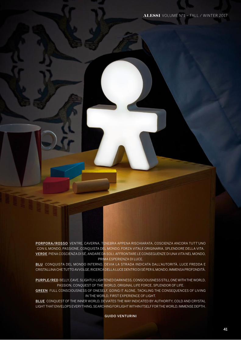
PORPORA/ROSSO VENTRE, CAVERNA, TENEBRA APPENA RISCHIARATA, COSCIENZA ANCORA TUTT’UNO
CON IL MONDO, PASSIONE, CONQUISTA DEL MONDO, FORZA VITALE ORIGINARIA, SPLENDORE DELLA VITA.
VERDE PIENA COSCIENZA DI SÉ, ANDARE DA SOLI, AFFRONTARE LE CONSEGUENZE DI UNA VITA NEL MONDO,
PRIMA ESPERIENZA DI LUCE.
BLU CONQUISTA DEL MONDO INTERNO, DEVIA LA STRADA INDICATA DALL’AUTORITÀ, LUCE FREDDA E
CRISTALLINA CHE TUTTO AVVOLGE, RICERCA DELLA LUCE DENTRO DI SÉ PER IL MONDO, IMMENSA PROFONDITÀ.
PURPLE/RED BELLY, CAVE, SLIGHTLY-LIGHTENED DARKNESS, CONSCIOUSNESS STILL ONE WITH THE WORLD,
PASSION, CONQUEST OF THE WORLD, ORIGINAL LIFE FORCE, SPLENDOR OF LIFE.
GREEN FULL CONSCIOUSNESS OF ONESELF, GOING IT ALONE, TACKLING THE CONSEQUENCES OF LIVING
IN THE WORLD, FIRST EXPERIENCE OF LIGHT.
BLUE CONQUEST OF THE INNER WORLD, DEVIATES THE WAY INDICATED BY AUTHORITY, COLD AND CRYSTAL
LIGHT THAT ENVELOPS EVERYTHING, SEARCHING FOR LIGHT WITHIN ITSELF FOR THE WORLD, IMMENSE DEPTH.
GUIDO VENTURINI
41
ALESSI VOLUME N°1 – FALL / WINTER 2017

42 ALESSI
ALESSI VOLUME N°1 – FALL / WINTER 2017
C
M
Y
CM
MY
CY
CMY
K
Alessi Natale ADV DEF 2 vers2.pdf 1 22/06/17 13:18

43
ALESSI VOLUME N°1 – FALL / WINTER 2017
Con la nuova operazione siglata con Hansa, azienda tedesca specializzata nella produzione di accessori per il Bagno e la Cucina,prosegue l’attività di esplorazione di Alessi in settori produttivi complementari al proprio ambito originario.
Presentato in anteprima mondiale in occasione della fiera ISH 2017 di Francoforte, il rubinetto da cucina ALESSI Swan by Hansa progettato da Mario Trimarchi è il risultato di questa prima collaborazione. ALESSI Swan by Hansa è un mixer da cucina unico per
design e tecnologia. Il suo disegno scultoreo è ispirato dalla bellezza della natura e dalla necessità di preservarla.
• With its new partnership entered into with Hansa, a German brand that specialises in the manufacturing of Bathroom and Kitchen accessories, Alessi’s exploration activities into ancillary production sectors to its own original field of expertise, continues.
Presented in a world preview on the occasion of the ISH 2017 trade fair in Frankfurt, the ALESSI Swan by Hansa kitchen tap designed by Mario Trimarchi is the result of this initial partnership. ALESSI Swan by Hansa is a kitchen mixer tap that is unique in both its
design and its technology. Its sculptural appearance draws its inspiration from the beauty of nature and the need to preserve it.
DANCING SWAN ALESSI SWAN BY HANSA
Il rubinetto da cucina ispirato all’eleganza del cigno.“Le sue forme invitano ad un tocco dolce e ci ricordano che l’acqua è un dono prezioso,
da rispettare e utilizzare con cura ogni giorno”
The kitchen mixer inspired by the elegance of a swan.“Its forms call for a gentle a touch, reminding us that water is a precious gift,
to be respected and used with care, day after day.”
MARIO TRIMARCHI
44
ALESSI VOLUME N°1 – FALL / WINTER 2017 ABACUS.
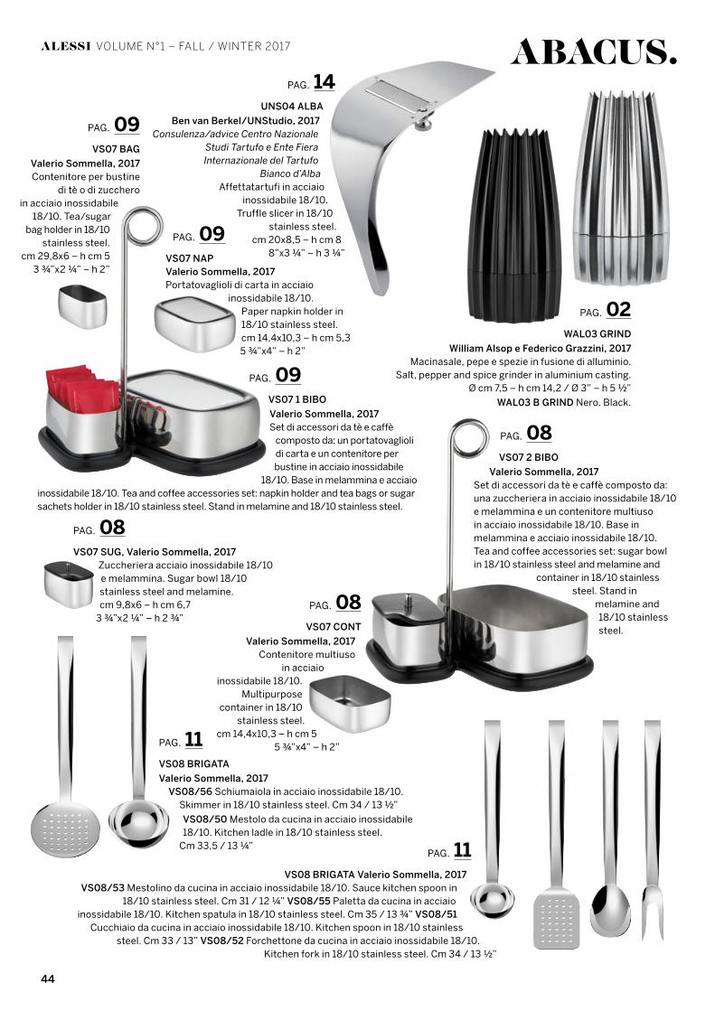
PAG. 02WAL03 GRIND
William Alsop e Federico Grazzini, 2017Macinasale, pepe e spezie in fusione di alluminio.
Salt, pepper and spice grinder in aluminium casting.Ø cm 7,5 – h cm 14,2 / Ø 3” – h 5 ½”
WAL03 B GRIND Nero. Black.
PAG. 11VS08 BRIGATA Valerio Sommella, 2017
VS08/53 Mestolino da cucina in acciaio inossidabile 18/10. Sauce kitchen spoon in 18/10 stainless steel. Cm 31 / 12 ¼” VS08/55 Paletta da cucina in acciaio
inossidabile 18/10. Kitchen spatula in 18/10 stainless steel. Cm 35 / 13 ¾” VS08/51 Cucchiaio da cucina in acciaio inossidabile 18/10. Kitchen spoon in 18/10 stainless
steel. Cm 33 / 13” VS08/52 Forchettone da cucina in acciaio inossidabile 18/10.Kitchen fork in 18/10 stainless steel. Cm 34 / 13 ½”
PAG. 11VS08 BRIGATA
Valerio Sommella, 2017VS08/56 Schiumaiola in acciaio inossidabile 18/10.
Skimmer in 18/10 stainless steel. Cm 34 / 13 ½”
VS08/50 Mestolo da cucina in acciaio inossidabile 18/10. Kitchen ladle in 18/10 stainless steel.
Cm 33,5 / 13 ¼”
PAG. 09VS07 1 BIBO
Valerio Sommella, 2017Set di accessori da tè e caffè
composto da: un portatovagliolidi carta e un contenitore per bustine in acciaio inossidabile
18/10. Base in melammina e acciaio inossidabile 18/10. Tea and coffee accessories set: napkin holder and tea bags or sugar sachets holder in 18/10 stainless steel. Stand in melamine and 18/10 stainless steel.
PAG. 09VS07 BAG
Valerio Sommella, 2017Contenitore per bustine
di tè o di zuccheroin acciaio inossidabile
18/10. Tea/sugar bag holder in 18/10
stainless steel.cm 29,8x6 – h cm 5
3 ¾”x2 ¼” – h 2”
PAG. 08VS07 SUG, Valerio Sommella, 2017
Zuccheriera acciaio inossidabile 18/10 e melammina. Sugar bowl 18/10 stainless steel and melamine.cm 9,8x6 – h cm 6,7
3 ¾”x2 ¼” – h 2 ¾”
PAG. 09VS07 NAPValerio Sommella, 2017Portatovaglioli di carta in acciaio
inossidabile 18/10.Paper napkin holder in 18/10 stainless steel.cm 14,4x10,3 – h cm 5,35 ¾”x4” – h 2”
PAG. 08VS07 CONT
Valerio Sommella, 2017Contenitore multiuso
in acciaioinossidabile 18/10.
Multipurpose container in 18/10
stainless steel.cm 14,4x10,3 – h cm 5
5 ¾”x4” – h 2”
PAG. 14UNS04 ALBA
Ben van Berkel/UNStudio, 2017Consulenza/advice Centro Nazionale
Studi Tartufo e Ente Fiera Internazionale del Tartufo
Bianco d’AlbaAffettatartufi in acciaio
inossidabile 18/10.Truffle slicer in 18/10
stainless steel.cm 20x8,5 – h cm 8
8”x3 ¼” – h 3 ¼”
PAG. 08VS07 2 BIBO
Valerio Sommella, 2017Set di accessori da tè e caffè composto da: una zuccheriera in acciaio inossidabile 18/10 e melammina e un contenitore multiusoin acciaio inossidabile 18/10. Base in melammina e acciaio inossidabile 18/10. Tea and coffee accessories set: sugar bowl in 18/10 stainless steel and melamine and
container in 18/10 stainless steel. Stand in
melamine and 18/10 stainless steel.
45
ALESSI VOLUME N°1 – FALL / WINTER 2017
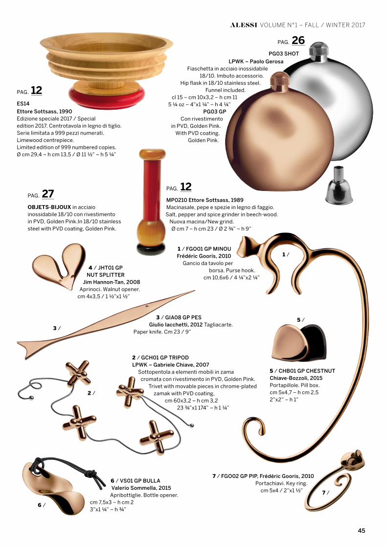
7 / FGO02 GP PIP, Frédéric Gooris, 2010Portachiavi. Key ring.
cm 5x4 / 2”x1 ½”
PAG. 27OBJETS-BIJOUX in acciaio inossidabile 18/10 con rivestimentoin PVD, Golden Pink.In 18/10 stainless steel with PVD coating, Golden Pink.
1 / FGO01 GP MINOUFrédéric Gooris, 2010
Gancio da tavolo per borsa. Purse hook.
cm 10,6x6 / 4 ¼”x2 ¼”
PAG. 12ES14
Ettore Sottsass, 1990Edizione speciale 2017 / Special edition 2017. Centrotavola in legno di tiglio.Serie limitata a 999 pezzi numerati.Limewood centrepiece.Limited edition of 999 numbered copies.Ø cm 29,4 – h cm 13,5 / Ø 11 ½” – h 5 ¼”
PAG. 12MP0210 Ettore Sottsass, 1989Macinasale, pepe e spezie in legno di faggio.Salt, pepper and spice grinder in beech-wood.
Nuova macina/New grind.Ø cm 7 – h cm 23 / Ø 2 ¾” – h 9”
1 /
3 /
6 /
2 /
5 /
7 /
PAG. 26PG03 SHOT
LPWK – Paolo GerosaFiaschetta in acciaio inossidabile
18/10. Imbuto accessorio.Hip flask in 18/10 stainless steel.
Funnel included.cl 15 – cm 10x3,2 – h cm 11
5 ¼ oz – 4”x1 ¼” – h 4 ¼”PG03 GP
Con rivestimentoin PVD, Golden Pink.
With PVD coating,Golden Pink.
4 / JHT01 GPNUT SPLITTER
Jim Hannon-Tan, 2008Aprinoci. Walnut opener.
cm 4x3,5 / 1 ½”x1 ½”
2 / GCH01 GP TRIPODLPWK – Gabriele Chiave, 2007
Sottopentola a elementi mobili in zamacromata con rivestimento in PVD, Golden Pink.
Trivet with movable pieces in chrome-plated zamak with PVD coating,
cm 60x3,2 – h cm 3,223 ¾”x1 174” – h 1 ¼”
6 / VS01 GP BULLAValerio Sommella, 2015
Apribottiglie. Bottle opener.cm 7,5x3 – h cm 23”x1 ¼” – h ¾”
3 / GIA08 GP PESGiulio Iacchetti, 2012 Tagliacarte.
Paper knife. Cm 23 / 9”
5 / CHB01 GP CHESTNUTChiave-Bozzoli, 2015 Portapillole. Pill box.cm 5x4,7 – h cm 2,52”x2” – h 1”
46
ALESSI VOLUME N°1 – FALL / WINTER 2017
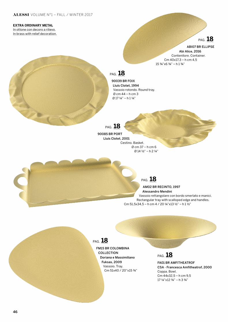
PAG. 1890039 BR FOIX
Lluís Clotet, 1994Vassoio rotondo. Round tray.Ø cm 44 – h cm 3
Ø 17 ¼” – h 1 ¼”
PAG. 18AM02 BR RECINTO, 1997
Alessandro MendiniVassoio rettangolare con bordo smerlato e manici.
Rectangular tray with scalloped edge and handles.Cm 51,5x34,5 – h cm 4 / 20 ¼”x13 ½” – h 1 ½”
PAG. 18FM15 BR COLOMBINA
COLLECTION
Doriana e Massimiliano
Fuksas, 2009Vassoio. Tray.Cm 51x40 / 20”x15 ¾”
PAG. 1890085 BR PORT
Lluís Clotet, 2001Cestino. Basket.
Ø cm 37 – h cm 6Ø 14 ½” – h 2 ¼”
PAG. 18FA01 BR AMFITHEATROF
CSA - Francesca Amfitheatrof, 2000Coppa. Bowl.Cm 44x32,5 – h cm 9,517 ¼”x12 ¾” – h 3 ¾”
PAG. 18ABI07 BR ELLIPSE
Abi Alice, 2016Contenitore. Container.
Cm 40x17,3 – h cm 4,515 ¾”x6 ¾” – h 1 ¾”
EXTRA ORDINARY METALIn ottone con decoro a rilievo.In brass with relief decoration.
47
ALESSI VOLUME N°1 – FALL / WINTER 2017ABACUS.
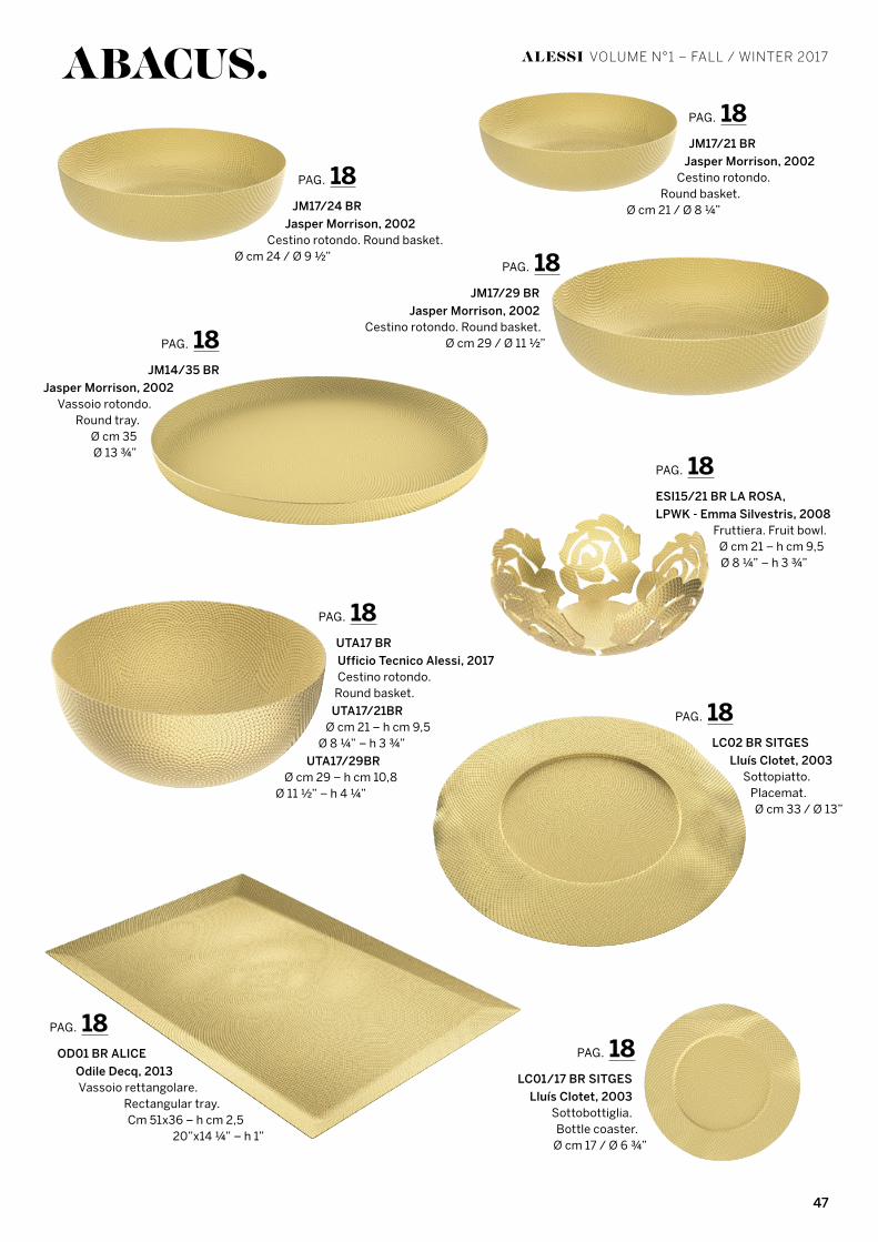
PAG. 18LC01/17 BR SITGES
Lluís Clotet, 2003 Sottobottiglia.Bottle coaster.
Ø cm 17 / Ø 6 ¾”
PAG. 18LC02 BR SITGES
Lluís Clotet, 2003Sottopiatto.
Placemat.Ø cm 33 / Ø 13”
PAG. 18UTA17 BR
Ufficio Tecnico Alessi, 2017Cestino rotondo.
Round basket.
UTA17/21BRØ cm 21 – h cm 9,5
Ø 8 ¼” – h 3 ¾”
UTA17/29BRØ cm 29 – h cm 10,8
Ø 11 ½” – h 4 ¼”
PAG. 18ESI15/21 BR LA ROSA,
LPWK - Emma Silvestris, 2008Fruttiera. Fruit bowl.
Ø cm 21 – h cm 9,5Ø 8 ¼” – h 3 ¾”
PAG. 18OD01 BR ALICE
Odile Decq, 2013Vassoio rettangolare.
Rectangular tray.Cm 51x36 – h cm 2,5
20”x14 ¼” – h 1”
PAG. 18JM14/35 BR
Jasper Morrison, 2002Vassoio rotondo.
Round tray.Ø cm 35Ø 13 ¾”
PAG. 18JM17/24 BR
Jasper Morrison, 2002Cestino rotondo. Round basket.
Ø cm 24 / Ø 9 ½”
PAG. 18JM17/21 BR
Jasper Morrison, 2002Cestino rotondo.
Round basket.Ø cm 21 / Ø 8 ¼”
PAG. 18JM17/29 BR
Jasper Morrison, 2002Cestino rotondo. Round basket.
Ø cm 29 / Ø 11 ½”
48
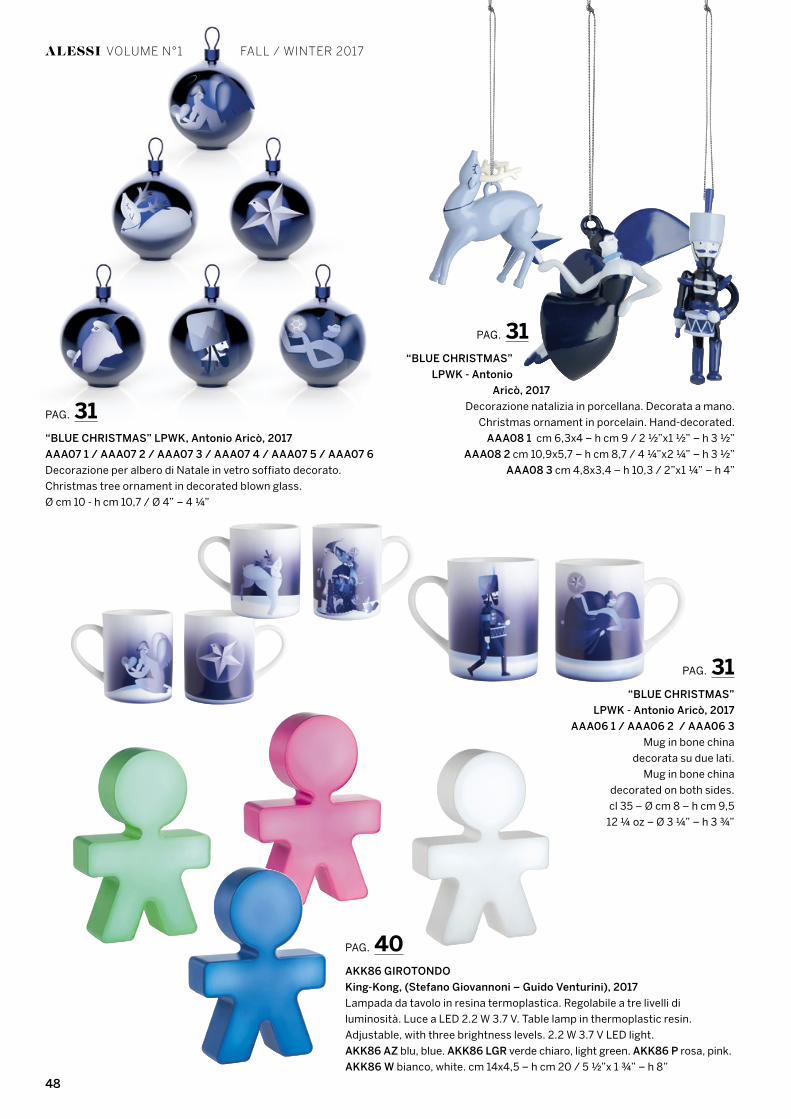
PAG. 31“BLUE CHRISTMAS”
LPWK - Antonio
Aricò, 2017
Decorazione natalizia in porcellana. Decorata a mano.
Christmas ornament in porcelain. Hand-decorated.
AAA08 1 cm 6,3x4 – h cm 9 / 2 ½”x1 ½” – h 3 ½”
AAA08 2 cm 10,9x5,7 – h cm 8,7 / 4 ¼”x2 ¼” – h 3 ½”
AAA08 3 cm 4,8x3,4 – h 10,3 / 2”x1 ¼” – h 4”
PAG. 40AKK86 GIROTONDO
King-Kong, (Stefano Giovannoni – Guido Venturini), 2017
Lampada da tavolo in resina termoplastica. Regolabile a tre livelli di
luminosità. Luce a LED 2.2 W 3.7 V. Table lamp in thermoplastic resin.
Adjustable, with three brightness levels. 2.2 W 3.7 V LED light.
AKK86 AZ blu, blue. AKK86 LGR verde chiaro, light green. AKK86 P rosa, pink.
AKK86 W bianco, white. cm 14x4,5 – h cm 20 / 5 ½”x 1 ¾” – h 8”
PAG. 31“BLUE CHRISTMAS” LPWK, Antonio Aricò, 2017
AAA07 1 / AAA07 2 / AAA07 3 / AAA07 4 / AAA07 5 / AAA07 6
Decorazione per albero di Natale in vetro soffiato decorato.
Christmas tree ornament in decorated blown glass.
Ø cm 10 - h cm 10,7 / Ø 4” – 4 ¼”
ALESSI VOLUME N°1 FALL / WINTER 2017
PAG. 31“BLUE CHRISTMAS”
LPWK - Antonio Aricò, 2017
AAA06 1 / AAA06 2 / AAA06 3
Mug in bone china
decorata su due lati.
Mug in bone china
decorated on both sides.
cl 35 – Ø cm 8 – h cm 9,5
12 ¼ oz – Ø 3 ¼” – h 3 ¾”
49
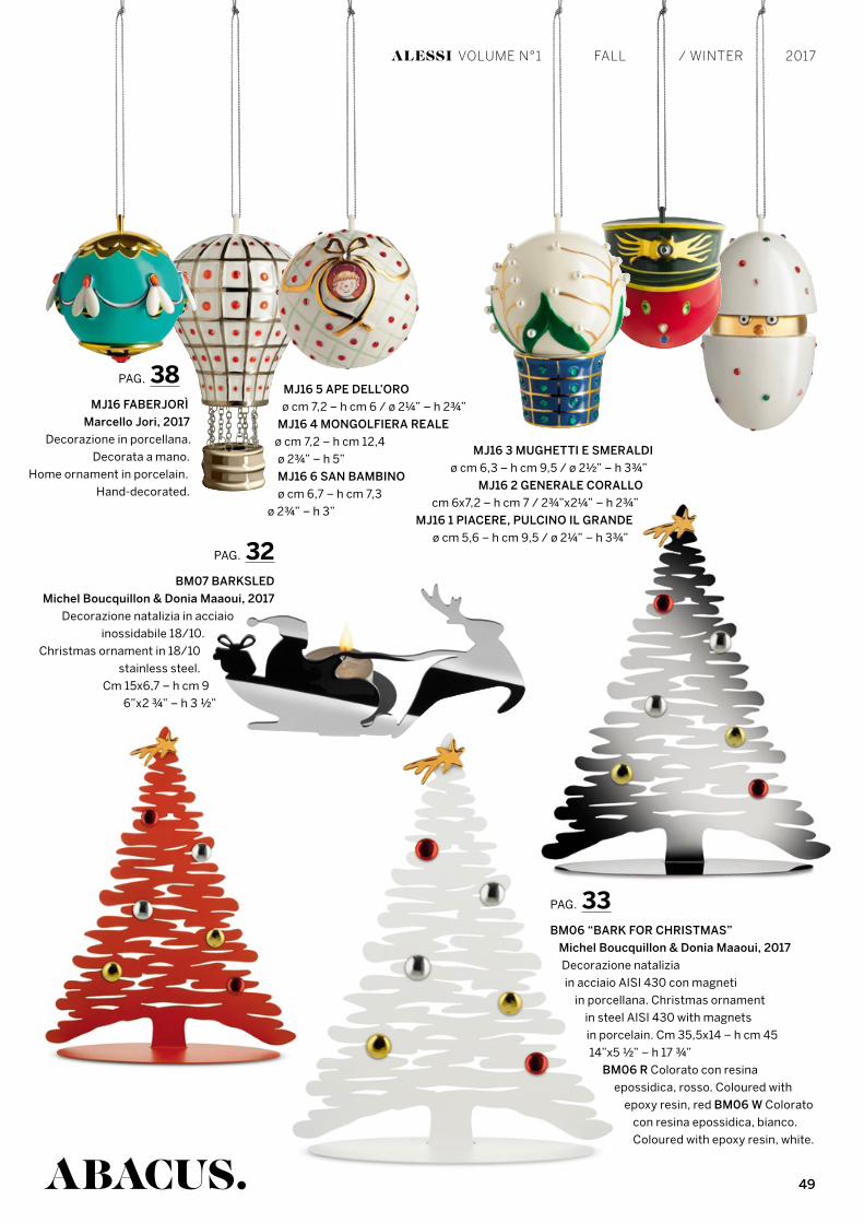
PAG. 33BM06 “BARK FOR CHRISTMAS”
Michel Boucquillon & Donia Maaoui, 2017
Decorazione natalizia
in acciaio AISI 430 con magneti
in porcellana. Christmas ornament
in steel AISI 430 with magnets
in porcelain. Cm 35,5x14 – h cm 45
14”x5 ½” – h 17 ¾”
BM06 R Colorato con resina
epossidica, rosso. Coloured with
epoxy resin, red BM06 W Colorato
con resina epossidica, bianco.
Coloured with epoxy resin, white.
MJ16 5 APE DELL’ORO
ø cm 7,2 – h cm 6 / ø 2¼” – h 2¾”
MJ16 4 MONGOLFIERA REALE
ø cm 7,2 – h cm 12,4
ø 2¾” – h 5”
MJ16 6 SAN BAMBINO
ø cm 6,7 – h cm 7,3
ø 2¾” – h 3”
MJ16 3 MUGHETTI E SMERALDI
ø cm 6,3 – h cm 9,5 / ø 2½” – h 3¾”
MJ16 2 GENERALE CORALLO
cm 6x7,2 – h cm 7 / 2¾”x2¼” – h 2¾”
MJ16 1 PIACERE, PULCINO IL GRANDE
ø cm 5,6 – h cm 9,5 / ø 2¼” – h 3¾”
PAG. 38MJ16 FABERJORÌ
Marcello Jori, 2017
Decorazione in porcellana.
Decorata a mano.
Home ornament in porcelain.
Hand-decorated.
PAG. 32BM07 BARKSLED
Michel Boucquillon & Donia Maaoui, 2017
Decorazione natalizia in acciaio
inossidabile 18/10.
Christmas ornament in 18/10
stainless steel.
Cm 15x6,7 – h cm 9
6”x2 ¾” – h 3 ½”
ABACUS.
ALESSI VOLUME N°1 FALL / WINTER 2017

C
M
Y
CM
MY
CY
CMY
K
Alessi Natale ADV DEF OK.pdf 1 22/06/17 12:54
C
M
Y
CM
MY
CY
CMY
K
Alessi Natale ADV DEF OK.pdf 1 22/06/17 12:54