where poor renters live in our cities stuart rosenthal
TRANSCRIPT

Joint Center for Housing Studies Harvard University
Where Poor Renters Live in our Cities
Stuart Rosenthal March 2007
RR07-2
Prepared for Revisiting Rental Housing: A National Policy Summit
November 2006 © by Stuart Rosenthal. All rights reserved. Short sections of text, not to exceed two paragraphs may be quoted without explicit permission provided that full credit, including © notice, is given to the source. Any opinions expressed are those of the author and not those of the Joint Center for Housing Studies of Harvard University or of any of the persons or organizations providing support to the Joint Center for Housing Studies.


Acknowledgement Support for this research from the John D. and Catherine T. McArthur Foundation, the Ford Foundation, and the Joint Center for Housing Studies at Harvard University is gratefully acknowledged. I thank Eric Belsky for many valuable comments. Excellent research assistance has been provided by Mike Eriksen and Shawn Rohlin. Any errors are mine alone.

Abstract Where the poor live and why has an enormous impact on access to jobs, decent quality schools, and other local attributes that affect a family’s ability to rise up out of poverty. Low-income families also rely disproportionately on rental housing for their accommodations. Accordingly, because rental housing support programs affect the location opportunities for the poor, it is important to consider the broader set of factors that drive where poor neighborhoods are found. Failure to do so could undermine the effectiveness of well intended initiatives. With that in mind, this paper provides a framework and evidence that helps to characterize where poor neighborhoods tend to be found, and why. Results indicate that many neighborhoods exhibit considerable persistence in poverty levels over the 1970 to 2000 period, but many other neighborhoods do not. Persistence is by far the highest among communities with poverty rates below 15 percent: roughly 80 percent of these communities retain their low poverty status between 1970 and 2000. Other neighborhoods however, display much less persistence. Among very high poverty tracts (tracts with over 40 percent poverty), persistence between 1970 and 2000 is just 43 percent. Thus, over half of the highest poverty neighborhoods in 1970 were of lower poverty status thirty years later. What contributes to this variety of experience? Further analysis in the paper suggests that change in local poverty rates arise from four very different mechanisms: access to public transit, the presence of aging housing stocks, local spillover effects arising from social interactions, and the presence of place-based subsidized rental housing (i.e. public and LIHTC housing). Together, these factors explain a considerable portion of the one-decade ahead change in census tract poverty rates. However, on balance, it is still difficult to anticipate where the poor will live several decades out into the future. Yet place-based subsidized housing is both spatially fixed and long lived. For that reason, at least with respect to implications for location opportunities, flexible tenant-based rental housing support programs appear to offer advantages.


Introduction
Policies designed to improve rental housing opportunities for the poor differ from other
low-income support programs in many ways, but one in particular stands out: housing programs
have a direct impact on where poor families can live. This is perhaps self-evident. Nevertheless,
where poor families live affects their access to jobs, school quality, and other factors that
influence a family’s ability to rise up out of poverty. For these reasons, development of low-
income housing policy should take into account market forces that govern where the poor live
and why. Failure to consider such forces could undermine the effectiveness of low-income
housing policies, or at a minimum, increase the cost of attaining goals that prompted housing
support policies in the first place. With this in mind, the primary focus of this paper is to assess
and measure those factors that drive the location of poor communities, and especially poor
communities in which rental housing is the dominant mode of accommodation. Some further
background is in order.
For several decades, federal low-income housing programs have been dominated by two
quite different strategies, “place-based” construction programs and “tenant-based” voucher
(certificate) programs.1 From 1937 to the early 1980s, the dominant Federal low-income housing
program was that of public housing. Under this program, the federal government built roughly 1.3
million housing units in multifamily projects, and then delegated management of these projects to
local (but federally funded) housing authorities. Roughly 1 million of these units were still in
service in 2005. The more recent Low Income Housing Tax Credit (LIHTC) program, begun in
1986, provides construction subsidies to private for-profit developers provided that at least 40
percent of a project’s units are leased to low-income families (other rules also apply). As of 2005,
over 1.4 million units have been built though the LIHTC program. In contrast, Section 8 housing
vouchers allow beneficiaries to seek housing in the private market with the assurance that the
federal government will pay a portion of their rent (up to an amount stipulated by the terms of the
voucher). In 2005, over 1.8 million families received Section 8 vouchers.
A fundamental difference between new-construction versus voucher-type programs is
their effect on where the poor can live. Because of the durability of housing, Public and LIHTC
1Concerns that place-based programs may crowd out private investment (Murray (1983, 1999), Sinai and Waldfogel (2005), Eriksen and Rosenthal (2007)) are well known. The possibility that voucher programs may cause market
1

housing programs dictate for years to come where an important fraction of the low-income
housing stock will be found within a city. In addition, especially in the case of public housing,
there is a tendency to concentrate the poor in low-income areas, reducing access to middle-
income amenities, including schools, job networks, and the like. Although the LIHTC program
is based on a partnership between government and for-profit entrepreneurs, that program also
retains a tendency to concentrate the poor, although arguably, less so than with Public housing.2
Voucher-type programs do the opposite by enabling low-income families to search across an
expanded set of neighborhoods that lie within their voucher-enhanced economic reach. In
principle, this could improve the ability of low-income families to live in neighborhoods with
better schools, lower crime rates, and stronger job networks. This could be especially important
if job locations or other location-specific opportunities shift over time. Voucher recipients can
react quickly to such changes by relocating to a different neighborhood. But place-based
subsidized housing lives on at its original site.
This paper provides background evidence that will be useful in thinking about the spatial
fixity associated with place-based housing strategies as compared to the spatial flexibility of
tenant-based programs. If the poor are restricted to a limited set of neighborhoods for reasons
unrelated to the provision of subsidized rental housing, that would reduce any benefits arising
from the spatial flexibility of tenant- versus placed-based programs. On the other hand, if the
poor are able and willing to live in a wide range of areas throughout a city, then the gains
associated with the more spatially flexible voucher-type programs will be greater.
In considering these issues, I pay special attention to four mechanisms that drive the
location of the poor within individual cities. First, “standard” urban economic theory describes a
tension between commuting costs on the one hand and housing demand on the other. The
argument is that housing demand rises more quickly with an increase in income than do
commuting costs. In a monocentric city framework – with all employment in the downtown –
the rich then derive more net benefit from suburban locations with lower house prices and longer
commutes than do the poor. As a result, the rich outbid the poor for space in the suburbs, and
rents to rise is also apparent (Sussin (2002)). These are important issues, but they will not be the focus of this paper. 2In part, that is because 15 percent of occupants of LIHTC housing in the U.S. are not of low-income status. In addition, LIHTC housing is really more moderate-income as opposed to low-income housing, and nearly one-fourth
2

the poor occupy the central cities.3 For many years, this was the textbook explanation for why
the poor are disproportionately concentrated in the central cities. Recently, however, Glaeser,
Kahn, and Rappaport (2000) have argued convincingly that empirical estimates of the sensitivity
of housing demand and commuting costs to changes in income do not support the standard story.
Instead, they argue that housing demand is relatively insensitive to increasing income but
commuting costs are likely very sensitive – at least to the extent that individuals value their time
at a rate approximately equal to their wage. Under these conditions, the poor should occupy the
suburbs and the rich should locate in the central cities.
Glaeser, Kahn and Rappaport (2000) resolve this seeming discrepancy by taking the role
of public transit into account. They note that public transit is more cost effective in densely
populated areas that allow for economies of scale in the provision of transit services. For that
reason, public transit is naturally and disproportionately concentrated in the central cities. The
poor meanwhile, are not wealthy enough to own cars and must live in neighborhoods with good
access to public transit – irrespective of housing demand. For this reason, the poor are
disproportionately drawn to areas that provide access to public transit, including and especially
the central cities.4
A second process that affects where the poor are found concerns aging of the housing
stock. As a stylized fact, apart from subsidized housing, the poor occupy older homes built
originally for higher income families (e.g. Rosenthal (2006), Brueckner and Rosenthal (2006)).
As those homes age, they tend to deteriorate despite maintenance efforts (e.g. Harding,
Rosenthal, and Sirmans (forthcoming)) and are eventually passed down to families of lower
income status. This is the filtering model of housing markets and filtering has long been
recognized as the dominant manner in which the private market supplies housing to the poor.
This model predicts that the poor will live where older homes are found.5
A third mechanism arises from social dynamics and related externalities. One way this
occurs is when families care about the attributes of their neighbors, as with race/ethnicity and
of the LIHTC projects are located in census tracts in the upper third of the income distribution, with another fourth of the projects in the second third (Eriksen and Rosenthal (2007)). 3The standard monocentric city model is often attributed to separate works by Alonso (1964), Mills (1967), and Muth (1969), sometimes referred to as the AMM model. 4Leroy and Sonstelie (1983) make a similar argument.
3

income. This can lead to “tipping” phenomenon (e.g. Schelling (1971)). For example, if some
white families in a community harbor discriminatory preferences for neighbors, in-migration of
minority families could cause such families to relocate, further increasing the minority share in
the neighborhood. That in turn could cause white families with more mild discriminatory
preferences to move, reinforcing the trend. Because minority incomes are lower, on average,
relative to white families, this suggests that racial segregation in the housing market will tend to
concentrate poverty in select areas of a city. Moreover, this tendency may be further reinforced
when individuals behave in ways that generate social capital or costs. Suppose, for example, that
low-income families commit more crimes, and criminal activity causes higher income families to
flee. Then the presence of low-income families will lower rents. That in turn, will attract a
greater concentration of low-income families to the area, further reducing the economic status of
the community. This suggests that poverty may itself attract more poverty.
The fourth and final mechanism that will be considered is the presence of place-based
subsidized rental housing, or more precisely, public and LIHTC housing. Both of these
programs mandate that low-income families occupy the units (or at least a portion of the units in
the case of the LIHTC program). The presence of these projects, therefore, has the potential to
affect where the poor will be found.
Although each of these mechanisms likely affect where the poor will live, they differ in
the degree to which they imply systematic patterns regarding where and when the poor may be
found. Social interactions, for example, clearly affect who may want to live in a neighborhood,
but have little direct implication for where poor neighborhoods will be found. Similarly,
although public and LIHTC housing is restricted to low income families (or, partly so in the case
of LIHTC projects), that in itself does not dictate where those units will be sited. This differs
from the role of filtering, which says that the poor will move to different neighborhoods over
extended periods of time as they follow the older and lower valued housing stocks. Similarly,
the need to access public transit suggests that the poor will be disproportionately concentrated in
densely developed areas, and especially in the central cities.
5Moreover, because cities develop and redevelop from the center outwards over time, this model implies that there are very long-running (decades long) cycles governing where the poor are found as they follow slow-moving waves of aging housing throughout a metropolitan area.
4

A primary goal of this paper is to provide empirical evidence that each of these
mechanisms affect where the poor are found and to shed further light on the nature of these
effects. To do so, I will draw upon census tract data from 1970, 1980, 1990, and 2000. These
data have all been coded to year-2000 census tract boundaries and can be used, therefore, to
follow neighborhoods over time. A detailed description of the data is provided in Rosenthal
(2006), Brueckner and Rosenthal (2006), and Eriksen and Rosenthal (2007). Throughout the
paper, a census tract is treated as a neighborhood.
Using these data, I will first establish a set of “stylized facts” that will help to describe
the location of poor rental neighborhoods, both in the present and over time. For these purposes,
it is helpful to define at the outset what constitutes a poor household. This is not entirely straight
forward because poverty depends not only on a family’s level of income, but also on other
household factors that affect a family’s needs. Bearing this in mind, I will use the census tract
poverty rate as defined by the Census Bureau as the measure of poor families in a given
neighborhood – specifically, the number of families in a tract deemed below the poverty line
divided by the total number of families in the tract.
In focusing on the Census definition of poverty two considerations should be noted. First,
an important goal of this paper is to shed light on not just where low-income families and
neighborhoods are found, but also where low-income rental housing is needed. In this regard, an
implicit assumption is that where poverty rates are high, the need for adequate rental housing is
also high. Table 1 provides indirect evidence on this point. The table reports U.S. rental rates in
2000 among families below the poverty line based on household level data from the Decennial
Census. The sample used to measure rental rates was further restricted to households that do not
live in mobile homes and was weighted to ensure that the rental rates are representative of the
entire country.6 Observe that for the entire U.S., the rental rate among households living in poverty
was 68.67 percent. As would be anticipated, that rate is lower in non-MSA areas (55.25 percent)
and more rural portions of identified metropolitan areas (63.88 percent). Among central city
residents, the rate is much higher, 80.8 percent. Partly for that reason, in the empirical work
throughout this paper, I focus on neighborhoods in metropolitan areas. As the measures in Table 1
suggest, for these regions poverty is closely associated with the need for adequate rental housing.
6These data were obtained from the Integrated Public Use Micro Sample (IPUMS) over the web (www.ipums.org).
5

Second, as will become apparent, much of the analysis in the paper will include
comparisons of local poverty rates across decades. Comparability in the definition of poverty
over time is therefore important. In that regard, note that the U.S. Census definition of whether a
family lives in poverty is based on an “absolute poverty line.”7 The intent in defining that
absolute measure is to identify a threshold below which families are believed to lack sufficient
resources to meet the minimum requirements of food, shelter, and clothing necessary for a
healthy existence. For this reason, Census varies the definition of the poverty line across
households depending on family size, number of children under 18 years of age, and in earlier
decades, the gender of the family Head. Moreover, the Census definition of poverty has
remained largely unchanged since 1970 except for adjusting the relevant thresholds for
inflation.8 This facilitates comparisons of the location of poor families across time, families that
depend disproportionately on rental housing.
To illustrate, the current family income thresholds that define poverty are outlined in
Table 2, while Figure 1 displays the poverty rate in the United States from 1970 to 2005. Notice
that poverty rates have varied over this period: in 1970 poverty rates equaled roughly 11 percent.
That rate rose to 13 percent in 1980, 13.5 percent in 1990, and then dropped back to 11 percent
in 2000 following the economic boom of the 1990s.
Using the Census definition of poverty, in the empirical work to follow two exercises are
conducted. First, in Section 2, I sort neighborhoods into four categories based on whether the
individual census tracts exhibited low, moderate-low, moderate-high, or high levels of poverty in
1970. The propensity of each of these groups to transition to higher or lower poverty status by
the year 2000 is then examined. Several stylized facts emerge. Most striking, there is a very
high degree of persistence in poverty rates among low-poverty neighborhoods, and this holds
regardless of city size and also regardless of whether tract poverty is measured relative to overall
poverty rates in the MSA, or in absolute terms. Among other communities, however, there is
much less persistence, although very high poverty neighborhoods in large metropolitan areas do
tend to remain high poverty over the 30-year horizon from 1970 to 2000.
7See the U.S. Census Bureau website on poverty http://www.census.gov/hhes/www/poverty/poverty.html, for example. 8 In addition, in 1981 separate thresholds for “farm” and “female-household” families were eliminated and the largest family size was set to 9 or more. These changes create some differences in the definition of poverty for the
6

To help explain why some neighborhoods display high degrees of persistence in poverty
rates – and therefore, a persistent need for low-income rental housing – while other communities
do not, Section 3 describes in more detail each of the four mechanisms contributing to the
location of the poor. Sections 4 and 5 then present and estimate a series of econometric models
in which the dependent variable is the change in the absolute poverty rate at the census tract
level between decades. Control measures in these regressions include tract attributes that allow
one to directly address the influence of each of the four mechanisms outlined above.
Results from a variety of regression specifications confirm that there is no one single
factor governing where the poor are found. Just the opposite, all of the mechanisms described
above contribute, and in the anticipated ways. Thus, aging housing stocks do tend to shift the
location of the poor over time as the poor follow the older homes. The poor also are drawn to
areas with access to public transit. It is also clear that socio-economic attributes create spillover
effects that further influence where poor families are found. Finally, the poor are attracted to
locations with public and LIHTC housing, as would be anticipated.
To clarify these findings, in the section to follow, I demonstrate that while poverty and
the corresponding need for rental housing is very persistent in some communities, local poverty
rates are much more volatile in other neighborhoods. The question then is why, and this is the
focus of Sections 3 through 5. The paper concludes in Section 6 by commenting on the housing
policy implications of the empirical findings.
Persistence in Poverty at the Neighborhood Level
Is poverty persistent at the neighborhood level, or do local poverty rates change widely
from one decade to the next? The answer to this question could influence perceptions of the
viability of place-based versus tenant-based rental housing support programs. To address this
question, in this section, neighborhoods within each metropolitan area are sorted into four groups
based on communities with the lowest to the highest rates of poverty. This is done twice using
two different criteria. In the first instance, neighborhoods are sorted based on the 1st, 2nd, 3rd, and
4th quartiles associated with relative poverty rates within a given metropolitan area. In the
second instance, neighborhoods are sorted based on absolute levels of poverty: neighborhoods
1990 and 2000 tract data relative to 1970 and 1980 data. But especially given the focus in this study on urban areas (which largely preclude farm-based families), the differences are small.
7
with poverty rates below 15 percent, 15 to 30 percent, 30 to 45 percent, and above 45 percent.
An advantage of focusing on relative measures of poverty is that the number of census tracts in
each of the four quartiles is largely the same, and numerous. In contrast, in absolute terms, there
are relatively few very high poverty tracts but many neighborhoods with low poverty rates.9 An
advantage of focusing on absolute measures of poverty is that low-income housing policy is
predominantly driven by concerns about absolute levels of economic well being, although
certainly relative differences across society also contribute to policy initiatives.
For both sets of poverty measures, I document the degree to which high-poverty
neighborhoods in 1970 are still of high-poverty status in 2000. A similar exercise is performed
for the low-poverty neighborhoods in 1970, and those in between. These measures are reported
in Tables 3a through 3f for all metropolitan areas (Table 3a), very small cities (Table 3b), small
cities (Table 3c), medium sized cities (Table 3d), and large cities (Table 3e), respectively.10
Each of these tables also includes two panels, Panel A in which the focus is on shifts in the
relative level of poverty within communities, and Panel B in which the focus is on changes in the
absolute level of poverty at the neighborhood level. As will become apparent, these alternative
ways of characterizing neighborhoods provide complementary perspectives on the persistence of
local poverty rates.
In Table 3a – for all metropolitan areas – notice in Panel A that 61.64 percent of tracts with
relatively high poverty rates in 1970 were still of relatively high poverty status in 2000. Roughly
44 percent of relatively low poverty tracts in 1970 retain their status in 2000, but only about 33
percent of those tracts with “intermediate” levels of relative poverty in 1970 display similarly
intermediate levels of poverty thirty years later. Interestingly, the persistence of very low relative
poverty tracts and very high relative poverty tracts is more pronounced among the nation’s largest
cities – cities with 1,000 or more census tracts. In these metropolitan areas (Table 3e), roughly 51
percent of very low relative poverty tracts in 1970 are still of similar status in 2000, and roughly 68
percent of high relatively poverty tracts are still of high-poverty status.
9Among all MSAs in the U.S., for example, there were 35,210 census tracts in 1990 with poverty rates below 15 percent, 8,540 tracts with poverty rates between 15 and 30 percent, 3,279 tracts with poverty rates between 30 and 45 percent, and only 1,535 tracts with poverty rates above 45 percent. 10For these purposes, the definitions of city size are metropolitan areas with fewer than 100 census tracts, 100 to 500 census tracts, 500 to 1,000 census tracts, and more than 1,000 census tracts.
8

Consider next Panel B of the various segments of Table 3. In these panels neighborhoods
are characterized based on absolute levels of poverty. Close review of the summary measures
indicate that based on absolute measures of poverty, neighborhood poverty status is even more
persistent than when considering poverty relative to the MSA. Notice, for example, that in Table
3a (All Cities), 80.75 percent of neighborhoods with low poverty status in 1970 were still of low
poverty status thirty years later. The same degree of persistence among low-poverty
neighborhoods is evident in Tables 3b-3e for small to moderate sized cities. Among large
metropolitan areas, the corresponding level of persistence among low-poverty communities is
76.12 percent, slightly smaller, but still very high. Together, these patterns indicate that low-
poverty neighborhoods remain so for extended periods of time.
In contrast, higher poverty neighborhoods exhibit considerable change in their absolute
level of poverty between 1970 and 2000. In Table 3a (All Cities), for example, observe that the
main diagonal values for neighborhoods in 1970 with Moderate-Low poverty, Moderate-High
poverty, and High poverty are 38.96 percent, 41.80 percent, and 42.92 percent, respectively.
Thus, although roughly 40 percent of these neighborhoods retain their 1970 absolute poverty
status in 2000, approximately 60 percent do not. On the other hand, examining these
neighborhoods among cities of different size, once again, it is apparent that among larger cities
there is more persistence, especially among high-poverty tracts. In the largest MSAs, for
example (Table 3e), the main diagonal values for Moderate to High poverty status communities
are 39.50 percent, 57.51 percent, and 61.54 percent.
Overall, by how much do absolute neighborhood poverty levels change with each passing
decade? Table 4 provides evidence on this point. Note that for all MSAs, absolute poverty rates
within individual census tracts changed by roughly 4 percentage points in absolute value in each
decade from 1970 to 2000. Thus, the amount of variability in poverty rates from one decade to
the next has remained similar, on average, over the thirty year horizon from 1970 to 2000. But
that similarity, of course, does not do justice to the more complicated patterns of change in
Tables 3a-3e.
Summarizing, the patterns in Tables 3 and 4 provide several stylized facts. First, very
high-poverty tracts display considerable persistence in their poverty status over the 1970 to 2000
period. This is especially true when considering the absolute level of poverty in the
neighborhood. Second, among low- and middle-level poverty tracts, there is considerable
9

change in both the relative and absolute levels of poverty between 1970 and 2000. Third,
persistence in neighborhood poverty rates is most pronounced among the largest MSAs. Much
of the challenge in the remaining portion of this paper is to shed light on what drives these
different patterns, and also to highlight implications for where rental housing is needed.
Four Mechanisms that Determine Where the Poor Live
The previous section confirms that there is considerable variation across different types
of neighborhoods in the persistence of local poverty rates. This section elaborates on four
mechanisms described in the Introduction that influence where the poor live: filtering, access
to public transit, spillover effects from social interactions, and the location of public and
LIHTC housing.
As a starting point, consider Table 5. This table reports census tract average attributes in
1970 for five groups. The first group (column 1) contains all census tracts for which there was
data in 1970. The next two groups report tract attributes for neighborhoods that were of low-
poverty status in 1970. Of these, sample means for those neighborhoods that still retained their
very low-poverty status in 2000 are reported in column 2, while sample means for
neighborhoods that transitioned to high-poverty status by 2000 are reported in column 3. The
differences in these two columns (low in 2000 minus high in 2000) are reported in the adjacent,
fourth column. The remaining three columns in the table repeat the exercise focusing on census
tracts that were of high poverty status in 1970. In this instance, the last column in the table
reports the difference between tracts that remained of high-poverty status in 2000 minus means
from tracts that transitioned to lower poverty rates.
Several patterns are worth highlighting in this table. Consider first those tracts that were
of low-poverty status in 1970. In column 4, the difference in tract attributes between those tracts
that remained of low-poverty status minus those that transitioned to high-poverty status is
relatively small, at least when comparing sample means. In contrast, when viewing tracts that
were of high poverty status in 1970, sharp differences are evident between those communities
that remained of high poverty status and those that transitioned to low poverty rates.
In the far right column of the table, observe that of the high poverty tracts in 1970, those
that remained of high poverty status in 2000 were 45.88 percentage points more likely to have
good access to public transit. The persistently high-poverty tracts also had 16.49 percent fewer
10

newly built (age 0 to 9 years) homes, 18.96 percent more old homes (over age 30), and 46.6
more public housing units. In addition, most of the socio-economic indicators are more positive
for those neighborhoods that transitioned to low-poverty status. For example, the
homeownership rate in such neighborhoods was 24.94 percentage points higher than in other
high-poverty neighborhoods in 1970. The presence of African American families is also much
higher in those high-poverty tracts from 1970 that remain of high poverty status, 33.98 percent
versus 11.34 percent for tracts that transition to low poverty status. In part, these differences
appear to be indicative of the very different locations in which the two groups of neighborhoods
are situated: high poverty tracts in 1970 that transition to low-poverty status are 10.88 miles
further away from the CBD, on average.
These patterns are suggestive that several mechanisms likely account for where the poor
are found in our cities. Public transit, age of the housing stock, the presence of public (and by
implication, LIHTC) housing, and spillover effects arising from socioeconomic factors and
related dynamics, all may have a role to play. In addition, given the geographic expansion of
many cities over the 1970 to 2000 period and the well-known movement of the middle class to
the suburbs, it is perhaps not surprising to discover that many of the poorest tracts in 1970 that
experienced significant declines in poverty were, on average, 18.53 miles from the CBD based
on values indicated in Table 5. With these summary measures as background, consider now
each of the four mechanisms that might contribute to where the poor live.
Public Transit
Glaeser, Kahn, and Rappaport (2000) provide compelling evidence that poor households
are attracted to central cities in part because of their need for public transit. Table 6 provides
further perspective on this point. The table presents regressions in which the dependent variable
is the percent of occupied housing units in a census tract that own a car. The control measures
are the distance to the central business district (CBD) – a proxy for the density of the
development in the community – and also the census tract poverty rate. The first three columns
in Table 6 present results for 1980, 1990, and 2000 separately. Each of these regressions also
control for MSA fixed effects that capture MSA-wide unobserved factors that might influence
the tendency to own a vehicle.
11
Notice that in each regression, the coefficient on the distance variable is positive and
highly significant. This confirms that families living in less densely developed areas are more
likely to own a car. That result is anticipated since lightly developed areas provide limited
public transit opportunities.
Consider next the coefficients on tract poverty rates. If the coefficient on tract poverty rate
equaled – 1.0, that would imply that a tract in which everyone is below the poverty line would have
zero car ownership – consistent with the idea that families in poverty do not own cars. Relative to
that benchmark, the coefficient on the tract poverty rate is highly significant in each year, and
equals -1.04 in 1980, -0.87 in 1990, and -0.80 in 2000. In column 4, data are pooled in a balanced
panel of tracts from 1980 to 2000 and MSA*year fixed effects included in the model. The
coefficient on tract poverty rate in this model is -0.89. On balance, these results strongly confirm
that very low income families do not own cars, although the declining pattern of coefficients over
time suggests that this is less so today than in 1970. Overall, however, the results confirm that the
great majority of families living in poverty must live within walking distance of public transit.
Because public transit is most cost effective in the central cities, this implies that the poor will be
disproportionately concentrated in city center as well. This is the predominant thesis of the work
by Glaeser, Kahn, and Rappaport (2000).11 Additional evidence on the influence of proximity to
public transit on the location of poor neighborhoods is provided shortly.
Filtering
The argument that filtering influences where the poor are found is founded on several
core principles. The first of these is that, on average, homes tend to deteriorate over time.
Evidence on this point is found throughout the hedonic literature on house prices: a standard
result is that controlling for other factors, older homes sell and rent for less. More recently,
Harding, Rosenthal, and Sirmans (forthcoming), examined depreciation of housing capital
controlling for the influence of maintenance. They estimate the annual rate of depreciation for
single family homes is roughly 2.49 percent per year and that net of maintenance, homes
11I also estimated the car ownership model using the balanced panel from 1980 to 2000 including census tract fixed effects. The coefficient on tract poverty rate in that model equaled – 0.2936 with a t-ratio of 53.65. However, this estimate understates the overall relationship between poverty and car ownership because it does not take into account the attraction of very low-income families to locations close to public transit facilities.
12
depreciate at roughly 1.94 percent per year. Traditional hedonic price studies that do not strip
out the influence of maintenance often estimate housing depreciation rates between 0.5 and 1
percent per year (e.g. Margolis (1982). Again, these studies all confirm that the typical home
deteriorates over time, even allowing for maintenance and home improvement efforts.
A second principle underlying the filtering story is that housing demand increases with
income. This too has been well documented (e.g. Rosen (1979, 1985), Olsen (1987)). As homes
age, therefore, they are passed down to families of progressively lower economic status. This is
the standard filtering story.12 Rosenthal (2006) and Brueckner and Rosenthal (2006) then
emphasize that cities tend to develop – and subsequently redevelop – from the center outwards
over time. In large measure, this is because the oldest and most economically obsolete housing
stock is most ripe for redevelopment.13
Combining these assumptions implies that the location of older, lower-valued housing
stocks will cycle in waves emanating from the city center outwards over extended periods of time.
This has clear implications for where low-income families will live, and also implies that the
location of the poor will shift systematically over time as the location of older, lower-valued
housing stocks shift. Table 7 provides indirect evidence consistent with this view. Notice that the
standard deviation of the age of the housing stock in 2000 is smaller within individual census tracts
than in the cities in which those tracts are located.14 This is what would be expected to the extent
there is a link between the timing and location of development. Additional support for the role that
filtering plays in driving where poor neighborhoods are found is provided later in the paper.
Social Dynamics and Externalities
As discussed earlier, social dynamics create spillover (externality) effects on the
neighborhood for two different reasons: (i) some families may care about the attributes of their
12The seminal theoretical work is often attributed to Sweeney (1974). Additional important theoretical papers on filtering include Ohls (1974), Brueckner (1977, 1980), Sands (1979), Bond and Coulson (1989), and Arnott and Braid (1997). Important empirical studies include Jones (1978), Weicher and Thibodeau (1988), Baer (1986), Coulson and Bond (1990), Rothenberg et al. (1991) and Aaronson (2001). Galster (1996) provides a nice review of several of these papers, along with a number of additional studies in this area. 13See Rosenthal and Helsley (1994) or Dye and McMillen (2005) for empirical evidence on urban redevelopment. 14Observe that at the median, HouseAge
tractσ is 3.65 years less than HouseAgeMSAσ and at the 10th percentile, the differential is
9.47 years. To put that in perspective, the average age of the U.S. housing stock in 2000 was 33.09 years. Thus, homes within a given neighborhood tend to be of more similar age relative to the homes throughout the neighborhood’s broader MSA.
13
neighbors, as with race and (ii) some families may behave in ways that generate negative
spillovers as with crime or positive spillovers as with gardening. In the empirical work to
follow, controls are provided for a large number of census tract socio-economic factors that
proxy for spillover effects. Here, I highlight a couple of guiding principles.
Consider the tendency to behave in ways that provide social capital for the community.
Suppose also that such behavior is positively related to the financial and human capital resources
a family brings to the neighborhood. As such, the presence of prime-age workers and college
educated individuals are expected to attract higher income families to the neighborhood,
reducing a census tract’s poverty rate. This argument likely applies to homeowners as well.
Indeed, recent literature has argued that homeowners make better citizens (DiPasquale and
Glaeser (1999), Rhoe 2000)). DiPasquale and Glaeser (1999), for example, provide evidence
that homeowners are more likely to behave in civic minded ways, including knowledge of one’s
congressional representative, voting, and the like.15 One argument for why homeowners behave
in this manner is that they are financially invested in their neighborhoods. This is another
example in which individuals bring resources to the community. It is partly for this reason that
policy makers continue to advocate homeownership, even in low-income areas.16
Crime, in contrast, clearly imposes a negative social cost on a community. To the extent
that certain types of families commit more crimes, the presence of such households will discourage
investment in the community, lower property values, and shift the composition of the population
more towards low-income families. Recent work by DiPasquale and Glaeser (1999) and Glaeser
and Sacerdote (1999) suggest that cities are more subject to higher crime rates because criminals
are more difficult to apprehend in populous areas. This implies that densely developed
neighborhoods may be more subject to crime and related adverse negative social spillovers.
15DiPasquale and Glaeser (1999) recognize that homeowners stay in their homes and neighborhoods longer than renters, and that length of stay could actually be the salient factor rather than homeownership. However, when they control for length of stay, they still find evidence that homeowners pay more attention to their local communities than do renters. 16Cummings, DiPasquale, and Kahn (2002), for example, note that the City of Philadelphia has “… long encouraged homeownership as part of its overall community development strategy …” Further, a primary goal stated in the strategic plan of the Office of Housing and Community Development (OHCD) of the City of Philadelphia is “promoting homeownership and housing preservation. … to more effectively support economic development and reinvestment in Philadelphia, the City will continue to emphasize homeownership and preservation of the existing occupied housing stock” (OHCD 1997, p. 9; Cummings et al, 2002, p. 332).
14

If families choose to migrate into or out of a neighborhood because they care about a
neighborhood’s social status, this could further affect the future economic standing of the
neighborhood. A prominent example of this concerns the racial composition of the community.
“White flight” was first used to describe the huge numbers of white central city households who
moved to the suburbs following the race riots of the 1960s. Implicit in the phrase is the idea that
white families do not want to live in close proximity to African Americans. Because minorities
tend to be of lower economic status than whites, sorting by race and ethnicity has an indirect effect
on neighborhood economic status. To allow for such effects, in the regressions to follow, controls
are provided for the racial/ethnic composition of the neighborhood, specifically, the percent of the
neighborhood’s population that is African American and the percent that is Hispanic.
Public and LIHTC Housing
Place-based subsidized rental housing targets low-income families and has the potential
to influence where poor families are found. The most prominent of these programs is public
housing under which housing projects were built from 1937 to the early 1980s. These projects
were fully funded by the federal government. The location of these projects was therefore
determined through the political process rather than in response to economic incentives. In most
instances, public housing units were located in lower-income neighborhoods.
The sitting of Low Income Housing Tax Credit (LIHTC) units is quite different. Under
the LIHTC program, the federal government deeply subsidizes the construction of LIHTC
projects in partnership with for-profit developers.17 Developers own and manage the units and
receive the construction subsidy in exchange for commitments to lease out a minimum of 40
percent of the units to low-income families. In practice, 85 percent of LIHTC units are filled
with low-income families. While half of these units are situated in census tracts in the bottom
third of the income distribution, the rest are split roughly equally between census tracts in the
second and top thirds of the income distribution (see Eriksen and Rosenthal (2006)). This
program seemingly provides opportunities for lower-income families to live in higher income
17It should also be noted that Cummings and DiPasquale (1999) emphasize that many LIHTC units are in fact of high quality compared to other low-income housing.
15

communities, although some of that effect is likely offset by crowd out of projects that the
private market would otherwise have built.18
Although the public and LIHTC housing programs have very different features, they
share two overriding common traits. First, both programs, by virtue of their mandates,
accommodate low-income families, and second, because of the durability of housing, these units
are fixed to their existing locations. For that reason, the poor are expected to be attracted to
neighborhoods in which public and LIHTC housing is present.
Empirical Model
In the empirical exercises to follow, the primary dependent variable is the change in a
census tract’s poverty rate between decades. The primary control variables are selected to
address the influence of each of the four mechanisms described above. Although various
specifications of the empirical model will be presented, they are all variants of the same basic
structure. That structure is as follows:
, 1 , 1 2 , 1 3 , 1 4 , 1
, 1 6 1 , 1 2 , 15
LIHTC
it t msa i t i t i t i t
i t i i t i t it
y b PublicTransit b HouseAge b PublicH b
b SES b Distance y y e− − −
− − −
Δ = δ + + + +
+ + + θ + θ Δ +% %
−
(4.1)
where i denotes the census tract, and t is the “current” decade. The dependent variable,
, is the change in census tract poverty rate between periods t and t-1. The lagged
level of neighborhood economic status, y
, 1it it i ty y y −Δ ≡ −
i,t-1, is included to allow for mean reversion, while one
lag of the dependent variable is included to soak up serial correlation in the error term.
PublicTransit is a 1-0 dummy variable that equals 1 if ten percent or more of the census
tract population takes public transit. The idea here is that if at least 10 percent of the community
uses public transit, then the census tract must have access to such services, and it is access that is
being highlighted. HouseAge is a vector that describes the age distribution of the housing stock.
PublicH and LIHTC are the number of public housing and LIHTC housing units present in the
census tract. It is worth noting that because the LIHTC program only began in 1986, this variable
equals zero for decades prior to 1990. SES is a vector of one decade lagged level socioeconomic
18Sinai and Waldfogel (2005) estimate that for every 100 place-based units built, the private market reduces construction by roughly 50 units. Using different methods and taking both stigma and interactions across neighborhoods into account, Eriksen and Rosenthal (2006) estimate over a region broad enough for stigma effects to dissipate, the remaining crowd out effect is close to 50 percent.
16
attributes of the neighborhood that control for local externalities. All of these variables just
mentioned (PublicTransit, HouseAge, PublicH, and SES) are entered with lags in (4.1).
To complete the model, Distance is included in (4.1) to allow for correlation in the
location and timing of development, where distance measures the number of miles to the census
tract with the highest population density in year 2000. The model also includes a set of MSA
fixed effects, δt,MSA. These fixed effects strip away unobserved factors common to tracts in a
given MSA and given decade.19 Identification, therefore, is based on within-MSA variation
across census tracts for a given decade.
In the discussion to follow, some of the empirical models adhere closely to the
specification described in (4.1). Others, however, employ different levels of fixed effects (e.g.
no fixed effects, MSA*year fixed effects). Other models use more deeply lagged regressors, in
some cases up to thirty years in the past. These different specifications are used to highlight
various factors pertinent to the location of the poor.
One further consideration warrants special attention. It is possible that one-decade
lagged covariates could be endogenous to the future change in a census tract’s poverty rate. On
this point, it is worth noting that few families remain in their homes and neighborhoods longer
than ten years. For this reason, the one-decade change in a census tract’s poverty rate and its
socioeconomic attributes (the SES measures) are driven primarily by the influence of turnover in
the neighborhood’s population (in and out migration) as opposed to change in the economic
status of existing residents. This helps to reduce the degree to which the one-decade lagged SES
variables might be endogenous. Similarly, the one-decade lagged HouseAge variables reflect the
legacy of past construction decisions. This also helps to reduce the degree to which the
HouseAge variables might be endogenous.
Nevertheless, one cannot rule out the possibility that unobserved factors might cause
some one-decade lagged covariates to be endogenous. Suppose, for example, that in 1988 the
future construction of a noxious facility is announced, such as a land-fill, noisy rail line, or some
other facility that is unappealing to local residents. Forward looking investors might then build
LIHTC housing projects in the area in anticipation that market forces will tend to push low-
income families into such neighborhoods. Similarly, prospective middle-income homeowners
19This would include the city-wide level of income, racial segregation, fiscal policies, and broader macroeconomic conditions specific to the city that affect immigration, job turnover, etc.
17

might choose not to invest in such neighborhoods, lowering the current homeownership rate.
Analogous arguments could be given for many of the other covariates in the model as well.
Under these conditions, the one-decade lagged control variables may themselves reflect the
influence of anticipated change in the census tract poverty rate. This would bias estimates of the
causal effects of the control variables, potentially obscuring both the magnitude and even the
direction of their effects.
These examples illustrate the potential endogeneity problem but also suggest an appealing
solution. Lagging the covariates two, or even three decades, instead of one, likely eliminates much
of the remaining correlation with the model error term: it seems unlikely that investors in 1970, for
example, would have made decisions based on the anticipated change in poverty rates between
1990 and 2000. While appealing, use of deeply lagged regressors does not come without cost. The
major drawback is that the more deeply lagged the regressors, the weaker their direct influence on
the change in future poverty rates. Partly because of that tradeoff, several different modifications
of the specification outlined in (4.1) are presented below.
Results
Results from various specifications of (4.1) are presented in Tables 8 through 9.
Consider Table 8 first. This table presents estimates for three versions of (4.1). For each of the
three models, the dependent variable is the one-decade change in tract poverty rate as outlined in
(4.1). Note, however, that data are pooled for changes in tract poverty from 1980 to 2000. The
first column omits the MSA fixed effects, the second column includes MSA fixed effects, and
the third column includes MSA*Year fixed effects. Controlling for MSA fixed effects captures
unobserved features of the MSAs that were time invariant between 1980 and 2000. Controlling
for MSA*Year fixed effects allows those MSA-wide factors to change between decades.
Consider first the adjusted R-square values at the bottom of the table. Not surprisingly,
including additional fixed effects explains a greater share of the variation in change in poverty
rates across tracts over time. The magnitudes of these R-square values are important though. In
the No-Fixed-Effect model, the adjusted R-square is just shy of 20 percent. Thus, the various
control measures account for roughly 20 percent of the variation in change in tract poverty rates.
Adding in MSA-wide fixed effects improves that mark to 25.76 percent, while controlling
further for MSA*Year fixed effects increases the adjusted R-square value to 30 percent. These
18
patterns indicate that while MSA-wide factors are important, tract-specific attributes account for
the great majority of the change in census tract poverty rates between decades; this includes the
20 percent accounted for through the model’s observable covariates, and the residual 70 percent
that is unobserved.20
Consider next the public transit variable. In the No-Fixed-Effect model, this term has a
negative and significant effect. But upon controlling for MSA and MSA*Year fixed effects, the
influence of proximity to public transit becomes positive and again, highly significant. This
difference implies that cities with little public transit tend to have higher poverty rates. Because
the wealthy also use public transit, this is plausible, although it need not be the case. Regardless,
the MSA and MSA*Year fixed effects models are more robust and are favored for that reason.
These models also yield the anticipated result: access to public transit is positively associated
with an increase in a census tract’s poverty rate, all else equal. Concern remains, however, as to
whether estimates in these models may suffer from endogeneity bias. To address that issue,
focus on Table 9.
Table 9 presents four specifications of the model. The dependent variable in the first
three columns is always the one-decade change in census tract poverty rate between 1990 and
2000. The dependent variable in the fourth column is the two decade change from 1980 to 2000.
Apart from these differences, the specifications further differ in the year from which the
covariates are drawn. The first column uses 1990 control measures, the second uses 1980
controls, and the remaining two columns use control variables drawn from 1970. Relative to the
dependent variables, the lags implicit in this modeling strategy differ in a corresponding manner.
Bear in mind that the more deeply lagged the regressors, the more clearly exogenous the control
measures. This helps to ensure that the estimated qualitative effect (i.e. the sign) of these
controls is robust.
Consider again the public transit variable. In each of the models, proximity to public
transit increases the future tract poverty rate. This is true even in Model 3 which uses 1970
20To further explore this issue, the model was also estimated using census tract fixed effects. In this specification, each census tract contributes effectively only one observation – the change in poverty rate between 1980 and 1990 as compared to the change in poverty rate between 1990 and 2000. The corresponding adjusted R-squared was 64.78 percent, considerably higher than in the other models. This seemingly reinforces the idea that changes in census tract poverty rates are driven predominantly by changes in within-MSA census-tract specific conditions. However, family’s choice of census tract may be endogenous to anticipated future change in the tract poverty rate for reasons outlined earlier. For that reason, results from the tract fixed effect model are not emphasized above.
19

attributes to explain change in tract poverty rates in the 1990s. These patterns, therefore,
confirm that the poor are indeed attracted to neighborhoods that provide access to public transit.
Interpreting results based on the age distribution of the housing stock requires some
further explanation. First, for each of the models, the omitted category is the percentage of the
housing stock 30 or more years in age. Consider now estimates from the first column. Relative
to that omitted category, the presence of newly built homes (0 to 9 years in age), reduces the
one-decade ahead census tract poverty rate. The presence of housing age 10 to 19 years has a
small positive (and insignificant) effect, while housing age 20 to 29 years has a more positive
(and significant) influence. Comparing these results to column three based on 1970 covariates,
the signs on the age 0 to 9 and age 20 to 29 year old housing are reversed.
Figure 2 helps to interpret the patterns for the house age coefficients. The figure plots the
coefficients for the house age variables with age of the housing stock oriented along the
horizontal axis and the corresponding coefficient value on the vertical axis. The implicit
coefficient for the omitted age 30 and over category is set to 1 in each instance. Moreover, to
facilitate review, only estimates for the first and third models from Table 9 are plotted, those
with 1990 covariates and 1970 covariates, respectively. Recall that the dependent variable for
both of these models is the change in tract poverty rate between 1990 and 2000. A further point
to bear in mind is that, absent demolitions, housing from 1970 will be twenty years older in
1990. For example, age 20 to 29 housing in 1970 is age 40 to 49 in 1990.
In Figure 2, observe that relative to age 30 and older housing, when focusing on 1990
covariates, young housing reduces tract poverty rates between 1990 and 2000. Housing age 10
to 19 and 20 to 29 have positive effects, with the latter of larger magnitude. This is consistent
with the idea that very old (age 30 and over) housing stock is increasingly ripe for
redevelopment. When such housing is replaced, gentrification (e.g. Brueckner and Rosenthal
(2006)) often occurs. Very old housing stocks, therefore, forecast future renovation in the
community, and a reduction in tract poverty rates.
Compare these results now to those based on the 1970 covariates. Relative to homes age
30 and over, the presence of housing age 20 to 29 does the most to reduce tract poverty rates in
the 1990s. That housing, of course, is age 40 to 49 as of 1990, and as such, increasingly ripe for
renovation and/or demolition. Young housing in 1970, in contrast, is of middle age in 1990.
Such housing would not ordinarily be candidates for demolition but would have aged enough to
20
be subject to filtering effects. This could account for the positive and rising effects associated
with 1970 homes age 0 to 9 and 10 to 19. On balance, these results are exactly the patterns one
would anticipate to the extent that filtering and periodic redevelopment/gentrification influence
where the poor are found.
Returning to Table 9, the institutional structure of public and LIHTC housing provide
compelling reasons to anticipate that the presence of such housing will attract the poor. Consistent
with that view, the coefficients on these variables are positive and (with one exception), always
significant in each of the models. In the first model, with 1990 controls, observe also that the
coefficient on LIHTC housing is roughly twice the size of the coefficient on public housing. On
the surface, this could be interpreted as suggesting that LIHTC housing presents a greater attraction
to the poor than public housing. An alternative possibility that cannot be ruled out, however, is that
for-profit developers may site LIHTC housing in neighborhoods that are expected to experience an
increase in the concentration of the poor.21 This is the endogeneity issue arising again that was
discussed earlier. Regardless, and not surprisingly, the positive coefficient on the public housing
variable in the other models provides clear support for the idea that the poor are attracted to
neighborhoods in which such housing is present.
The socioeconomic variables in Table 9 proxy for the influence of spillover effects
arising from social dynamics as discussed earlier. These variables also perform as anticipated.
High density development always has a positive and significant effect on the future change in
tract poverty rate. This is consistent with the idea that high density development is associated
with high crime rates, congestion, and other disamenities, all else equal.
Evidence also supports the idea that individuals that bring human capital and financial
resources to a community lower future tract poverty rates. Relative to the presence of
individuals with less than a high school degree (the omitted education category), the presence of
individuals with high or college degrees always reduces the future tract poverty rate. This is in
keeping with the idea that educated individuals behave in more socially productive ways, and
21A feature of the tax credit program is that developers promise to house a minimum share of units with low-income families. Under some provisions of the program, developers can offer to charge lower rents and house larger shares of project units with low-income families in exchange for considerably more generous subsidies. For such projects, it is possible that developers could favor development in areas expected to retain high concentrations of poor families in order to meet their promised low-income occupancy levels.
21

that in turn, attracts higher income families to the neighborhood, lowering the future tract
poverty rate.
An analogous pattern is found with respect to the age distribution of individuals residing
in the tract. Prime aged potential workers – individuals aged 29 to 54 – bring financial resources
to a community, and possibly word-of-mouth job networks. The presence of such individuals
should, in principle, also strengthen a community, attracting higher income families, and
lowering future poverty rates. Results in Table 9 are largely consistent with that idea. When
using 1990 or 1980 control measures, for example, the coefficients on the included age
categories, less than age 15, age 15 to 29, and age 55 and over, all are positive and highly
significant. As an example, increasing the share of the population in 1980 that is aged 15 to 29
would increase the 1990 to year-2000 change in tract poverty rate by 1.76 percent.
Note also, that higher tract homeownership reduces poverty rates. Based on 1980 controls
(column 2), raising the tract homeownership rate from 0 to 100 percent would reduce the tract
poverty rate by 4.96 percentage points in the 1990s. This too is indicative of the positive spillovers
generated by individuals who bring resources to a community. In this case, those additional
resources are manifested in the wealth and time homeowners invest in their neighborhoods.
Race and ethnicity also appear to play a role. In all of the models, a higher initial
concentration of African Americans is associated with an increase in the future tract poverty rate.
This effect, however, is sizeable and significant only in the first two columns that use one- and
two-decade lagged attributes to explain change in the 1990s: an increase in the African American
population from 0 to 100 percent in 1980 would add 2 percentage points to the tract poverty rate
in the 1990s. On the other hand, the presence of Hispanic families has a negative and significant
effect on change in tract poverty rates in the 1990s: shifting from 0 to 100 percent Hispanic
status in 1980 would reduce the tract poverty rate by just under 1 percentage point in the 1990s.
For two reasons these results regarding the influence of African Americans and Hispanic
families should be viewed with caution. The first is that norms change over time, and especially
perhaps with respect to perceptions of race and ethnicity. The results noted above, therefore,
could be quite different in a different era. The second consideration is that Hispanic immigration
into the U.S. has been on a massive scale since 1980. As a result, the composition and character
of the Hispanic population in 1980 was different from the current Hispanic population.
22
Results also indicate that income mixing reduces future tract poverty rates. This is clear
from the interquartile range of the tract log income level – the IQR variable. Greater spread in
this variable implies the presence of individuals with incomes substantially above the tract
median. To the extent that such individuals serve as role models, or possibly sources of
information about job networks, their presence would be expected to create spillover effects that
reduce future tract poverty rates. It is partly for that reason that policy makers have increasingly
sought opportunities to foster mixed income development and communities.22
F-statistics at the bottom of Table 9 gauge the joint significance of the four groups of
variables that proxy for the four mechanisms that have been highlighted: the role of public
transit, the role of filtering as related to the age distribution of the housing stock, the presence of
public housing (and LIHTC housing), and the influence of socioeconomic factors. Notice that
regardless of how many decades the covariates are lagged, each of these four factors has a
significant influence on change in the census tract poverty rate in the 1990s (or nearly significant
in a few instances). These patterns underscore the broader point that all four mechanisms
contribute to the location of the poor.
Finally, distance from the central business district (CBD) is always associated with a
future decline in tract poverty rates. Having controlled for other factors, this could reflect the
attraction of higher income families to more lightly developed areas, suitable for single family
housing. However, this variable may also proxy for other unobserved factors characteristic of
suburban areas, including better schools, parks, and other attractive local public services.
Stratifying by Census Tract Poverty Status in 1990
Table 10 repeats the regression from the second column of Table 9 but stratifies the
sample by 1990 absolute poverty levels as in Table 2. Specifically, Table 10 uses 1980 census
tract attributes as the control variables, and examines the 1-decade change in tract poverty rate
from 1990 to 2000. This regression is run separately for census tracts with low, moderate-low,
22The LIHTC program, for example, stipulates that developers must rent at least 40 percent of their project units to lower income families. Similarly, the moving to opportunity (MTO) experiments conducted by HUD in five cities in the 1990s required low-income housing voucher beneficiaries to locate in middle income neighborhoods. Nehimiah experiments such as the ones in New York and Philadelphia also foster mixed income development by placing middle class homeowners in the middle of low-income neighborhoods. All of these programs have been developed in part with the hope that mixed income development will alleviate poverty traps.
23
moderate-high, and high levels of poverty as of 1990. Comparisons across columns enable one
to assess whether the four mechanisms driving the location of the poor have different effects
depending on the initial poverty status of the community.
The samples sizes for the different regressions in Table 10 are reported at the bottom of
the table. Observe that there are 35,210 low poverty census tracts, but 8,540, 3,279, and 1,535
census tracts for moderate-low, moderate-high, and high-poverty communities, respectively.
Given the relatively small sample sizes for the moderate and high-poverty tracts, we should
anticipate larger standard errors and noisier coefficient estimates in comparison to those obtained
from the low poverty sample. For this reason, the discussion below focuses on comparisons of
the qualitative effects of the covariates across columns rather than the point estimates.
Most striking, coefficients on the different control measures are often of the same sign
regardless of the initial level of poverty in 1990. For example, in the first row, notice that access
to public transit attracts poverty to a neighborhood in each of the samples. The same is true for
the impact of public housing (positive coefficients) and density (positive coefficients). For
homeownership and high school or college education, the coefficients are always negative.
One of the sharpest differences in qualitative effects across columns appears to pertain to
the presence of minorities. Broadly speaking, the presence of African American and Hispanic
families reduces poverty rates among the high poverty neighborhoods.23 In contrast, among
low-poverty neighborhoods the coefficients on African American and Hispanic presence are both
positive and clearly significant. On balance, it appears that the presence of African Americans
and Hispanic households attracts poverty in low poverty neighborhoods, but this is not the case
in higher poverty communities. Although these differences are important, the dominant pattern
in Table 10 is that the qualitative impact of the mechanisms driving local poverty rates are
broadly similar across communities with different initial levels of poverty.
Conclusions
Where the poor live affects their access to jobs, schools, and other local attributes that
influence their ability to rise up out of poverty. For that reason, and because housing support
23It should also be noted that estimates of the coefficients on African American presence are insignificant even based on a 1-tailed test.
24
programs influence where the poor can live, it is important to take into account the broad set of
factors that determine the location of poor neighborhoods when developing rental housing
support programs. This is especially relevant when considering the advantages of location
flexibility afforded by tenant-based voucher-type programs as compared to place-based
subsidized rental housing programs. This paper sheds light on this issue by first documenting
the degree to which poor neighborhoods shift location over time, and then considering the
mechanisms that give rise to such change.
Summary measures demonstrate that very low poverty census tracts display a high degree
of persistence. On average, roughly 80 percent of low-poverty tracts in 1970 are still of low-
poverty status in 2000. When focusing on high-poverty tracts, however, the patterns are more
variable. Across all cities in the U.S., roughly 43 percent of census tracts with poverty rates in
excess of 40 percent in 1970 retain such status in 2000; among the largest metropolitan areas, the
corresponding number is 62 percent. Thus, while poverty rates are very persistent in some
communities, they are subject to considerable more change in other neighborhoods.
Additional analysis provides compelling evidence that several mechanisms contribute to
change in where poor neighborhoods are found. It is clear that the poor are drawn to
neighborhoods filled with older housing and to locales that provide good access to public transit.
This suggests that when developing place-based subsidized rental housing programs, policy
makers should seek to anticipate where access to public housing and older housing stocks are
likely to be found decades ahead in the future. That task is complicated, however, by local
spillover effects arising from social interactions that affect in- and out-migration at the
neighborhood level. This includes how existing communities respond to the presence of
minorities, families of different socio-economic status, the presence of homeowners, and more.
Evidence in this paper indicates that such spillovers also drive change in local poverty rates.
On balance, these mechanisms explain 20 to 30 percent of the change in neighborhood
poverty rates from 1990 to 2000, and roughly 14 percent of the change from 1980 to 2000. This
confirms the importance of the mechanisms noted above. But the large unexplained share of
change in local poverty rates presents a challenge to policy makers. In part, that is because
evidence in this paper also confirms that Public and LIHTC housing attract the poor, consistent
with their mandates to cater to low-income families. The risk exists then that place-based
subsidized rental housing projects may be sited in areas that will not meet the needs of the future
25

poor. Of course, spatial flexibility is just one dimension of housing support programs and other
programmatic factors need to be considered when evaluating the relative merits of different
housing support strategies. Nevertheless, with regard to location opportunities, results in this
paper provide support for the idea that location-flexible tenant-based programs offer advantages
over placed-based subsidized rental housing.
26

References
Aaronson, Daniel, “Neighborhood Dynamics,” Journal of Urban Economics, 49, 1-32 (2001).
Alonso, William, Location and Land Use, Cambridge: Harvard University Press (1964).
Arnott, Richard and Ralph Braid, “A Filtering Model With Steady-State Housing,” Regional
Science and Urban Economics, 27, 515-546 (1997).
Baer, William, “The Shadow Market in Housing,” Scientific American, 255 (5), 29-35 (Nov.
1986).
Bond, Eric and Edward Coulson, “Externalities and Neighborhood Change,” Journal of Urban
Economics, 26, 231-249 (1989).
Braid, Ralph, “The Comparative Statics of a Filtering Model of Housing with Two Income
Groups,” 16, 437-448 (1986).
Brueckner, Jan, “The Determinants of Residential Succession,” Journal of Urban Economics, 4,
45-59 (1977).
Brueckner, Jan, “Residential succession and Land-Use Dynamics in a Vintage Model of Urban
Housing,” Regional Science and Urban Economics, 10, 225-240 (1980).
Brueckner, Jan and Stuart Rosenthal, “Gentrification and Neighborhood Cycles: Will America’s
Future Downtowns Be Rich?” working paper (2006).
Carter, William, Michael H. Schill, and Susan M. Wachter, “Polarization and Public Housing in
the United States,” University of Pennsylvania, Wharton Real Estate working paper,
(1996).
Coulson, Edward and Eric Bond, “A Hedonic Approach to Residential Succession,” Review of
Economics and Statistics, 433-443, (1990).
Cummings, Jean L., and Denise DiPasquale, “The Low-Income Housing Tax Credit: The First
Ten Years.” Housing Policy Debate 10 (2), 257-267 (1999).
Cummings, Jean L., Denise DiPasquale, and Matthew Kahn, “Measuring the Consequences of
Promoting Inner City Homeownership,” Journal of Housing Economics, 11(4), 330-359
(2002).
DiPasquale, Denise, Dennis Fricke, and Daniel Garcia-Diaz, “Comparing the Costs of Federal
Housing Assistance Programs.” FRBNY Economic Policy Review June, 147-165 (2003).
DiPasquale, D., and E. Glaeser, “Incentives and Social Capital: Are Homeowners Better
Citizens?” Journal of Urban Economics 45(2): 354-84 (1999).
27
Dye, Richard F. and Daniel P. McMillen, “Teardowns and Land Values in the Chicago
Metropolitan Area,” unpublished mimeo, December 2005.
Eriksen, Michael and Stuart Rosenthal, “Crowd-Out, Stigma, and the Dynamic Effects of Place-
Based Subsidized Rental Housing,” Syracuse University working paper, 2006.
Galster, George, “William Grigsby and the Analysis of Housing Sub-markets and Filtering,”
Urban Studies, 33, 1979-1805 (1996).
Geolytics website: www.geolytics.com
Glaeser, Edward L. and Joseph Gyourko, “Durable Housing, Urban Dynamics, and the Long,
Slow Death of Declining Cities,” 2001.
Glaeser, Edward L., Matthew E. Kahn, and Jordan Rappaport, “Why Do the Poor Live in
Cities?,” National Bureau of Economic Research working paper 7636, April 2000.
Glaeser, Edward L. and Bruce Sacerdote, “Why is There More Crime in Cities?” Journal of
Political Economy, 107(6), 225-258 (1999).
Harding, John, C. F. Sirmans, and Stuart S. Rosenthal, “Depreciation of Housing Capital,
Maintenance, and House Price Inflation: Estimates From a Repeat Sales Model,” Journal
of Urban Economics, forthcoming.
Jones, Colin, “Household Movement, Filtering and Trading up Within the Owner Occupied
Sector,” Regional Studies, 12, 551-561 (1978).
Leroy, Stephen F. and Jon Sonstelie, “Paradise Lost and Regained: Transportation Innovation,
Income, and Residential Location, Journal of Urban Economics 13, 67-89 (1983).
Lowry, Ira, “Filtering and Housing Standards: A Conceptual Analysis,” Land Economics, 36,
362-70 (1960).
Mills, Edwin S., “An Aggregative Model of Resource Allocation in a Metropolitan Area,
American Economic Review 57, 197-210 (1967).
Murray, Michael P., “Subsidized and Unsubsidized Housing Stocks 1961 to 1977,” Review of
Economics and Statistics, 65 (4), 590-597 (1983).
Murray, Michael P., “Subsidized and Unsubsidized Housing Stocks 1935 to 1987: Crowding out
and Cointegration,” Journal of Real Estate Finance and Economics, 18 (1), 107-124
(1999).
Muth, Richard F., Cities and Housing, Chicago: University of Chicago Press (1969).
28
Office of Housing and Community Development (OHCD), City of Philadelphia, 1997, “Year 23
Consolidated Plan (Fiscal Year 1998). City of Philadelphia Report: 9.
Ohls, James C., “Public Policy Toward Low Income Housing and Filtering in Housing Markets,”
Journal of Urban Economics 2, 144-71 (1975).
Olsen, Edgar, “The Demand and Supply of Housing Services: A Critical Survey of the Empirical
Literature,” in Handbook of Regional and Urban Economics, Edwin Mills, ed. North-
Holland, 1987.
Rohe, W., G. McCarthy, and S. Van Zandt. “The Social Benefits and Costs of Homeownership: A
Critical Assessment of the Research.” Research Institute for Housing America Working
Paper No. 00-01 (May, 2000).
Rosen, Harvey, “Housing Decisions and the U.S. Income Tax: An Econometric Analysis,”
Journal of Public Economics, 11, 1-24 (1979).
Rosen, Harvey, “Housing Subsidies: Effects on Housing Decisions, Efficiency and Equity,” in
Handbook of Public Economics, Alan Auerbach and Martin Feldstein, eds., North-
Holland, 1985.
Rosenthal, Stuart, “Old Homes, Externalities, and Poor Neighborhoods: A Dynamic Model of
Urban Decline and Renewal,” working paper (2006).
Rosenthal, Stuart and Robert Helsley. “Redevelopment and the Urban Land Price Gradient,”
Journal of Urban Economics, 35, 182-200 (1994).
Rothenberg, Jerome, George C. Galster, Richard V. Butler, and John Pitkin, The Maze of Urban
Housing Markets: Theory and Evidence. Chicago, IL: The University of Chicago Press
(1991).
Sands, Gary, “A Model for the Evaluation of Filtering,” Growth and Change, 20-24, (October
1979).
Schelling, T., “Dynamic Models of Segregation,” Journal of Mathematical Sociology, 1, 143-
186 (1971).
Sinai, Todd and Joel Waldfogel (2005), “Do low-income housing subsidies increase the
occupied housing stock?” Journal of Public Economics, forthcoming.
Susin, Scott (2002), “Rent Vouchers and the Price of Low-Income Housing,” Journal of Public
Economics 83 (1), 109–152.
29
Sweeney, James L., “A Commodity Hierarchy Model of the Rental Housing Market,” Journal of
Urban Economics 1, 288-323, (1974)
Weicher, John, and Thomas Thibodeau, “Filtering and Housing Markets: An Empirical
Analysis,” Journal of Urban Economics, 23, 21-40 (1988).
30

Table 1: Rental Rates Among Families Living in Poverty in the United Statesa
Entire U.S. Not In Metro Area In Metro Area
Outside Central CityIn Metro Area Central City
68.67% 55.25% 63.88% 80.82% aSample excludes families in mobile homes. Estimates are based on household-level data from the 2000 Decennial Census. Household weights are used to ensure results are representative of the entire U.S.
31
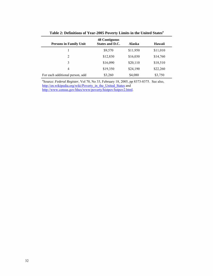
Table 2: Definitions of Year-2005 Poverty Limits in the United Statesa
Persons in Family Unit
48 Contiguous States and D.C. Alaska Hawaii
1 $9,570 $11,950 $11,010
2 $12,830 $16,030 $14,760
3 $16,090 $20,110 $18,510
4 $19,350 $24,190 $22,260
For each additional person, add $3,260 $4,080 $3,750 aSource: Federal Register, Vol 70, No 33, February 18, 2005, pp 8373-8375. See also, http://en.wikipedia.org/wiki/Poverty_in_the_United_States and http://www.census.gov/hhes/www/poverty/histpov/hstpov2.html.
32

Table 3a: ALL CITIES
Transition Rates of Census Tract Poverty Rate Between 1970 and 2000 (Estimates are Based on 43,896 Census Tracts from a Balanced Panel of 270 MSAs)
Panel A: Based on RELATIVE Poverty Rates within the MSA*
1st Quartile Low
Poverty in 1970
2nd Quartile
Moderate-Low Poverty in 1970
3rd Quartile Moderate-High Poverty in 1970
4th Quartile High
Poverty in 1970 Low Poverty in 2000 43.86 31.64 19.22 5.71 Moderate-Low Poverty in 2000 29.67 32.20 27.12 10.55 Moderate-High Poverty in 2000 19.83 25.54 33.11 22.10 High Poverty in 2000 6.64 10.62 20.55 61.64 Total Percent 100 100 100 100 *Tracts with poverty rates less than the MSA’s 25th percentile in the given year are defined as 1st Quartile. Tracts with poverty rates between the 25th and 50th percentiles are 2nd Quartile; tracts with poverty rates between the 50th and 75th percentiles are 3rd Quartile, and tracts with poverty rates above the 75th percentile are 4th Quartile.
Panel B: Based on ABSOLUTE Poverty Rates*
1st Tier Low
Poverty in 1970
2nd Tier
Moderate-Low Poverty in 1970
3rd Tier Moderate-High Poverty in 1970
4th Tier High
Poverty in 1970 Low Poverty in 2000 80.75 34.79 13.95 4.21 Moderate-Low Poverty in 2000 16.49 38.96 27.79 18.01 Moderate-High Poverty in 2000 2.48 22.60 41.80 34.87 High Poverty in 2000 0.28 3.66 16.45 42.92 Total Percent 100 100 100 100 *Tracts with absolute poverty rates less than 15 percent in the given year are defined as 1st Tier. Tracts with poverty rates between 15 and 30 percent are 2nd Tier; tracts with poverty rates between 30 and 45 percent are 3rd Tier, and tracts with poverty rates above 45 percent are 4th Tier.
33

Table 3b: VERY SMALL CITIES (Fewer than 100 census tracts)
Transition Rates of Census Tract Poverty Rate Between 1970 and 2000 (Estimates are Based on 7,488 Census Tracts from a Balanced Panel of MSAs)
Panel A: Based on RELATIVE Poverty Rates within the MSA*
1st Quartile Low
Poverty in 1970
2nd Quartile
Moderate-Low Poverty in 1970
3rd Quartile Moderate-High Poverty in 1970
4th Quartile High
Poverty in 1970 Low Poverty in 2000 45.40 30.60 20.86 6.26 Moderate-Low Poverty in 2000 27.51 31.03 27.38 13.01 Moderate-High Poverty in 2000 20.49 25.78 32.41 22.27 High Poverty in 2000 6.60 12.59 19.36 58.46 Total Percent 100 100 100 100 *Tracts with poverty rates less than the MSA’s 25th percentile in the given year are defined as 1st Quartile. Tracts with poverty rates between the 25th and 50th percentiles are 2nd Quartile; tracts with poverty rates between the 50th and 75th percentiles are 3rd Quartile, and tracts with poverty rates above the 75th percentile are 4th Quartile.
Panel B: Based on ABSOLUTE Poverty Rates*
1st Tier Low
Poverty in 1970
2nd Tier
Moderate-Low Poverty in 1970
3rd Tier Moderate-High Poverty in 1970
4th Tier High
Poverty in 1970 Low Poverty in 2000 80.69 41.17 18.24 1.90 Moderate-Low Poverty in 2000 16.68 39.16 31.31 21.43 Moderate-High Poverty in 2000 2.16 16.86 35.59 40.48 High Poverty in 2000 0.47 2.81 14.86 36.19 Total Percent 100 100 100 100 *Tracts with absolute poverty rates less than 15 percent in the given year are defined as 1st Tier. Tracts with poverty rates between 15 and 30 percent are 2nd Tier; tracts with poverty rates between 30 and 45 percent are 3rd Tier, and tracts with poverty rates above 45 percent are 4th Tier.
34

Table 3c: SMALL CITIES (Fewer than 100 to 500 census tracts)
Transition Probabilities of Census Tract Poverty Rate Between 1970 and 2000 (Estimates are Based on 17,571 Census Tracts from a Balanced Panel of MSAs)*
Panel A: Based on RELATIVE Poverty Rates within the MSA*
1st Quartile Low
Poverty in 1970
2nd Quartile
Moderate-Low Poverty in 1970
3rd Quartile Moderate-High Poverty in 1970
4th Quartile High
Poverty in 1970 Low Poverty in 2000 41.52 32.05 21.02 6.39 Moderate-Low Poverty in 2000 31.06 32.51 26.88 9.72 Moderate-High Poverty in 2000 20.71 26.30 32.68 20.79 High Poverty in 2000 6.71 9.15 19.42 63.10 Total Percent 100 100 100 100 *Tracts with poverty rates less than the MSA’s 25th percentile in the given year are defined as 1st Quartile. Tracts with poverty rates between the 25th and 50th percentiles are 2nd Quartile; tracts with poverty rates between the 50th and 75th percentiles are 3rd Quartile, and tracts with poverty rates above the 75th percentile are 4th Quartile.
Panel B: Based on ABSOLUTE Poverty Rates*
1st Tier Low
Poverty in 1970
2nd Tier
Moderate-Low Poverty in 1970
3rd Tier Moderate-High Poverty in 1970
4th Tier High
Poverty in 1970 Low Poverty in 2000 82.20 35.43 15.22 6.37 Moderate-Low Poverty in 2000 15.35 38.77 27.58 16.18 Moderate-High Poverty in 2000 2.25 21.85 40.63 29.41 High Poverty in 2000 0.19 3.95 16.58 48.04 Total Percent 100 100 100 100 *Tracts with absolute poverty rates less than 15 percent in the given year are defined as 1st Tier. Tracts with poverty rates between 15 and 30 percent are 2nd Tier; tracts with poverty rates between 30 and 45 percent are 3rd Tier, and tracts with poverty rates above 45 percent are 4th Tier.
35
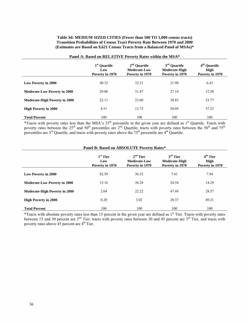
Table 3d: MEDIUM SIZED CITIES (Fewer than 500 TO 1,000 census tracts) Transition Probabilities of Census Tract Poverty Rate Between 1970 and 2000
(Estimates are Based on 9,621 Census Tracts from a Balanced Panel of MSAs)*
Panel A: Based on RELATIVE Poverty Rates within the MSA*
1st Quartile Low
Poverty in 1970
2nd Quartile
Moderate-Low Poverty in 1970
3rd Quartile Moderate-High Poverty in 1970
4th Quartile High
Poverty in 1970 Low Poverty in 2000 40.32 32.21 21.98 6.41 Moderate-Low Poverty in 2000 29.06 31.47 27.14 12.58 Moderate-High Poverty in 2000 22.11 23.60 30.83 23.77 High Poverty in 2000 8.51 12.73 20.05 57.23 Total Percent 100 100 100 100 *Tracts with poverty rates less than the MSA’s 25th percentile in the given year are defined as 1st Quartile. Tracts with poverty rates between the 25th and 50th percentiles are 2nd Quartile; tracts with poverty rates between the 50th and 75th percentiles are 3rd Quartile, and tracts with poverty rates above the 75th percentile are 4th Quartile.
Panel B: Based on ABSOLUTE Poverty Rates*
1st Tier Low
Poverty in 1970
2nd Tier
Moderate-Low Poverty in 1970
3rd Tier Moderate-High Poverty in 1970
4th Tier High
Poverty in 1970 Low Poverty in 2000 82.59 36.52 7.41 7.94 Moderate-Low Poverty in 2000 15.16 38.24 24.54 14.29 Moderate-High Poverty in 2000 2.04 22.22 47.69 28.57 High Poverty in 2000 0.20 3.02 20.37 49.21 Total Percent 100 100 100 100 *Tracts with absolute poverty rates less than 15 percent in the given year are defined as 1st Tier. Tracts with poverty rates between 15 and 30 percent are 2nd Tier; tracts with poverty rates between 30 and 45 percent are 3rd Tier, and tracts with poverty rates above 45 percent are 4th Tier.
36

Table 3e: LARGE CITIES (1,000 or more census tracts)
Transition Probabilities of Census Tract Poverty Rate Between 1970 and 2000 (Estimates are Based on 1,855 Census Tracts from a Balanced Panel of MSAs)*
Panel A: Based on RELATIVE Poverty Rates within the MSA*
1st Quartile Low
Poverty in 1970
2nd Quartile
Moderate-Low Poverty in 1970
3rd Quartile Moderate-High Poverty in 1970
4th Quartile High
Poverty in 1970 Low Poverty in 2000 51.20 31.26 11.53 2.26 Moderate-Low Poverty in 2000 29.04 33.97 27.51 6.90 Moderate-High Poverty in 2000 15.05 25.61 37.02 23.02 High Poverty in 2000 4.71 9.16 23.93 67.82 Total Percent 100 100 100 100 *Tracts with poverty rates less than the MSA’s 25th percentile in the given year are defined as 1st Quartile. Tracts with poverty rates between the 25th and 50th percentiles are 2nd Quartile; tracts with poverty rates between the 50th and 75th percentiles are 3rd Quartile, and tracts with poverty rates above the 75th percentile are 4th Quartile.
Panel B: Based on ABSOLUTE Poverty Rates*
1st Tier Low
Poverty in 1970
2nd Tier
Moderate-Low Poverty in 1970
3rd Tier Moderate-High Poverty in 1970
4th Tier High
Poverty in 1970 Low Poverty in 2000 76.12 16.65 6.22 0.00 Moderate-Low Poverty in 2000 19.83 39.50 17.62 3.85 Moderate-High Poverty in 2000 3.64 38.97 57.51 34.62 High Poverty in 2000 0.41 5.88 18.65 61.54 Total Percent 100 100 100 100 *Tracts with absolute poverty rates less than 15 percent in the given year are defined as 1st Tier. Tracts with poverty rates between 15 and 30 percent are 2nd Tier; tracts with poverty rates between 30 and 45 percent are 3rd Tier, and tracts with poverty rates above 45 percent are 4th Tier.
37
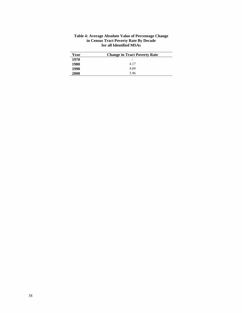
Table 4: Average Absolute Value of Percentage Change
in Census Tract Poverty Rate By Decade for all Identified MSAs
Year Change in Tract Poverty Rate 1970 - 1980 4.17 1990 4.09 2000 3.96
38

Table 5: Census Tract Attributes in 1970
Low and High Poverty Neighborhoods in 1970 that Transition to Opposite Status by 2000 Sample Restricted to Tracts in MSAs
All Tracts Low Poverty Tracts in 1970a High Poverty Tracts in 1970b
Year 1970 Tract Attributes In 1970 Low In 2000 High in 2000 Low-High High in 2000 Low in 2000 High-LowTract avg. Inc./MSA avg. Inc. 0.9986 1.3520 1.1250 0.2270 0.6973 0.8511 -0.1537 Poverty Rate 0.1055 0.0351 0.0415 -0.0065 0.2326 0.1805 0.0521 Access to Public Transit 0.2340 0.1420 0.0983 0.0437 0.5715 0.1127 0.4588 % Home 0 to 9 years 0.3322 0.4655 0.4892 -0.0237 0.1417 0.3066 -0.1649 % Homes 10 to 19 years 0.2357 0.2840 0.2943 -0.0103 0.1472 0.1927 -0.0455 % Homes 20 to 29 years 0.1217 0.0890 0.0925 -0.0035 0.1518 0.1311 0.0208 % Homes 30 or more yrs. 0.3104 0.1615 0.1240 0.0376 0.5592 0.3696 0.1896 Density (1,000 units/mile) 1.9590 0.8380 1.2447 -0.4067 4.2585 1.1180 3.1405 # Public Housing Units 9.9025 1.1020 3.7820 -2.6800 47.4301 0.7829 46.6472 Homeownership rate 0.6749 0.8358 0.7404 0.0955 0.4241 0.6735 -0.2494 % High school deg. (Heads) 0.4405 0.5151 0.5123 0.0028 0.3172 0.3848 -0.0677 % College degree+ (Heads) 0.1204 0.2152 0.1545 0.0607 0.0619 0.0807 -0.0187 % Married (Men 18+) 0.6642 0.7198 0.7077 0.0121 0.5428 0.6479 -0.1051 % Pop < age 15 0.2936 0.3142 0.3024 0.0119 0.2834 0.3048 -0.0214 % Pop age 15 to 29 0.2356 0.2089 0.2453 -0.0364 0.2583 0.2324 0.0259 % Pop age 30 to 54 0.2940 0.3342 0.3133 0.0209 0.2521 0.2780 -0.0259 % Pop age 55+ 0.1772 0.1427 0.1390 0.0037 0.2063 0.1849 0.0214 % African American (Heads) 0.0903 0.0097 0.0210 -0.0113 0.3398 0.1134 0.2264 % Hispanic (Heads) 0.0571 0.0296 0.0372 -0.0076 0.1002 0.0719 0.0283 IQR Log Inc (year 2000 $) 37.1623 46.5077 38.3973 8.1104 29.4160 34.3861 -4.9701 Distance to 2000 CBD (miles) 12.6583 11.9742 9.2185 2.7557 7.6522 18.5381 -10.8860 Observations: Distance 43,896 4,922 2,706 - 6,640 1,916 - Observations: Other variables 50,511 4,827 2,674 - 6,544 1,847 - a“Low” poverty in 1970 and 2000 is defined as tract poverty rates in the 1st quartile in the MSA in that year. “High” poverty in 2000 is defined as tract poverty rates in the 3rd and 4th quartiles in the MSA in that year. b“High” poverty in 1970 and 2000 is defined as tract poverty rates in the 4th quartile in the MSA in that year. “Low” poverty in 2000 is defined as tract poverty rates in the 1st and 2nd quartiles in the MSA in that year.
39

Table 6: Car Ownership and Poverty
(Dependent Variable: Percent of census tract occupied housing units that own a car)a
Individual Decades Balanced
Panel 1980 1990 2000 1980-2000 Tract Poverty Rate -1.0432 -0.8692 -0.8001 -0.8867 (-300.36) (-301.42) (-265.77) (-265.07) Distance to CBD 0.0022 0.0019 0.0015 0.0019 (61.51) (57.49) (47.62) (75.35) Constant 0.9711 0.9647 0.9657 0.9679 (1,340.51) (1,396.17) (1,374.65 (1,855.94) Observationsb 48,950 50,312 50,511 145,590 Adj. R-squared 0.7573 0.7510 0.7242 0.7380 MSA Fixed Effectsc 325 331 331 - MSA*year FEb - - - 975 at-ratios are based on robust standard errors. bSamples are restricted to census tracts in MSAs. cFixed effect values reflect deviations from the sample-wide constant.
Table 7: Standard Deviation of Age of the Housing Stock in 2000 (in Years)a
Percentile Within Individual Census
Tracts Within MSA to Which a
Tract Belongs
Difference Between Individual Tract and the
MSA to Which it Belongs 1 5.37 13.78 - 13.70 10 9.87 17.06 - 9.47 25 13.28 18.87 -6.69 50 16.99 21.02 -3.65 75 20.35 22.86 -0.79 90 22.98 22.86 1.38 99 25.99 23.78 4.67 aThe average age of the housing stock in 2000 was 33.09 years. Sample restricted to census tracts in MSAs.
40
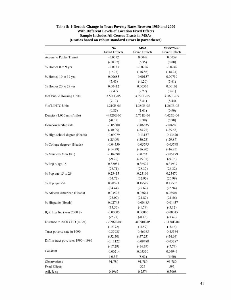
41
Table 8: 1-Decade Change in Tract Poverty Rates Between 1980 and 2000
With Different Levels of Location Fixed Effects Sample Includes All Census Tracts in MSAs
(t-ratios based on robust standard errors in parentheses)
No
Fixed Effects MSA
Fixed Effects MSA*Year
Fixed Effects Access to Public Transit -0.0072 0.0048 0.0059 (-10.87) (6.35) (8.00) % Homes 0 to 9 yrs -0.0083 -0.0226 -0.0246 (-7.06) (-16.86) (-18.24) % Homes 10 to 19 yrs 0.00685 -0.00157 0.00739 (5.43) (-1.20) (5.61) % Homes 20 to 29 yrs 0.00412 0.00365 0.00102 (2.47) (2.22) (0.61) # of Public Housing Units 3.500E-05 4.720E-05 4.360E-05 (7.17) (8.81) (8.44) # of LIHTC Units 1.210E-05 1.380E-05 1.260E-05 (0.85) (1.01) (0.90) Density (1,000 units/mile) -4.420E-06 5.731E-04 4.425E-04 (-0.07) (7.39) (5.90) Homeownership rate -0.05600 -0.06635 -0.06691 (-30.05) (-34.75) (-35.63) % High school degree (Heads) -0.09079 -0.13157 -0.13670 (-25.09) (-30.73) (-29.87) % College degree+ (Heads) -0.04350 -0.05795 -0.05798 (-14.79) (-16.90) (-16.85) % Married (Men 18+) -0.04598 -0.07631 -0.05179 (-9.76) (-15.01) (-9.76) % Pop < age 15 0.32081 0.36527 0.34937 (28.71) (28.37) (26.32) % Pop age 15 to 29 0.23415 0.23106 0.23470 (34.72) (32.92) (26.99) % Pop age 55+ 0.20573 0.18598 0.18576 (34.44) (27.62) (25.94) % African American (Heads) 0.03598 0.03641 0.03504 (23.07) (21.87) (21.56) % Hispanic (Heads) 0.02743 -0.00485 -0.01437 (13.56) (-1.79) (-5.12) IQR Log Inc (year 2000 $) -0.00005 0.00000 -0.00015 (-2.78) (-0.16) (-8.49) Distance to 2000 CBD (miles) -3.096E-04 -8.090E-05 -1.158E-04 (-15.72) (-3.59) (-5.16) Tract poverty rate in 1990 -0.35935 -0.46985 -0.45564 (-52.30) (-57.23) (-54.64) Diff in tract pov. rate: 1990 - 1980 -0.11122 -0.09488 -0.05287 (-17.29) (-14.39) (-7.74) Constant -0.00214 0.05350 0.04946 (-0.37) (8.03) (6.90) Observations 91,780 91,780 91,780 Fxed Effects - 325 595 Adj. R-sq 0.1967 0.2576 0.3008

42
Table 9: Change in Census Tract Poverty Rates With Lagged Covariates
Sample Includes All Census Tracts in MSAs (t-ratios based on robust standard errors in parentheses)
Change from 1990 to 2000 Change from 1980 to 2000
1990 Controls 1980 Controls 1970 Controls 1970 Controls Access to Public Transit 0.00401 0.00465 0.00573 0.01049 (3.84) (4.66) (6.04) (8.90) % Homes 0 to 9 yrs -0.01340 0.00171 0.00673 0.00680 (-7.13) (0.89) (3.38) (2.76) % Homes 10 to 19 yrs 0.00163 0.01432 0.01236 0.01761 (0.93) (6.98) (6.04) (7.02) % Homes 20 to 29 yrs 0.00832 0.01168 -0.00652 -0.00740 (3.53) (4.64) (-1.86) (-1.70) # of Public Housing Units 2.210E-05 1.850E-05 1.020E-05 4.050E-05 (4.26) (3.48) (1.49) (4.73) # of LIHTC Units 4.720E-05 - - - (3.29) - - - Density (1,000 units/mile) 7.315E-04 7.967E-04 1.129E-03 4.970E-04 (6.82) (6.18) (8.04) (2.99) Homeownership rate -0.05626 -0.04962 -0.02258 -0.03320 (-21.74) (-16.91) (-8.39) (-10.61) % High school degree (Heads) -0.09861 -0.06083 -0.00749 -0.03649 (-12.58) (-9.53) (-1.73) (-6.64) % College degree+ (Heads) -0.05852 -0.03438 -0.03253 -0.04716 (-10.01) (-8.61) (-10.10) (-11.96) % Married (Men 18+) -0.05617 -0.00904 0.04139 0.05763 (-7.43) (-1.18) (7.37) (7.88) % Pop < age 15 0.29759 0.17204 -0.05883 -0.06921 (15.73) (8.46) (-4.80) (-4.52) % Pop age 15 to 29 0.21288 0.17599 0.08317 0.11138 (17.15) (12.97) (8.01) (9.20) % Pop age 55+ 0.16042 0.11382 -0.01768 0.00391 (16.23) (9.40) (-1.95) (0.34) % African American (Heads) 0.02374 0.02011 0.00392 0.00038 (10.67) (8.18) (1.63) (0.13) % Hispanic (Heads) -0.01823 -0.00923 -0.00911 -0.00284 (-4.50) (-2.24) (-2.00) (-0.51) IQR Log Inc (year 2000 $) -0.00015 -0.00013 -0.00009 -0.00011 (-6.78) (-4.24) (-5.42) (-6.03) Distance to 2000 CBD (miles) -2.598E-04 -4.367E-04 -5.146E-04 -6.304E-04 (-8.56) (-13.64) (-15.05) (-14.07)
-0.45330 -0.35300 -0.17067 -0.16675 Tract poverty rate in 1990 (col 1-3) and 1980 (col 4) (-38.62) (-26.90) (-22.07) (-14.67) Diff in tract pov rate: 1990 - 1980 -0.09286 -0.05146 -0.16798 - (-8.55) (-3.82) (-15.98) - F(1,DF) for Public Transit 14.73 21.68 36.46 79.18 F(3, DF) for HouseAge Vars 18.17 12.11 2.21 22.34 F(1,DF) for Public Housing 36.88 27.98 15.30 19.25 F(11, DF) for SES Vars 261.06 153.07 102.41 130.77 Observations 48,566 48,564 43,153 43,153 MSA Fxed Effects 325 325 270 270 Adj. R-sq 0.3337 0.2833 0.2544 0.1403
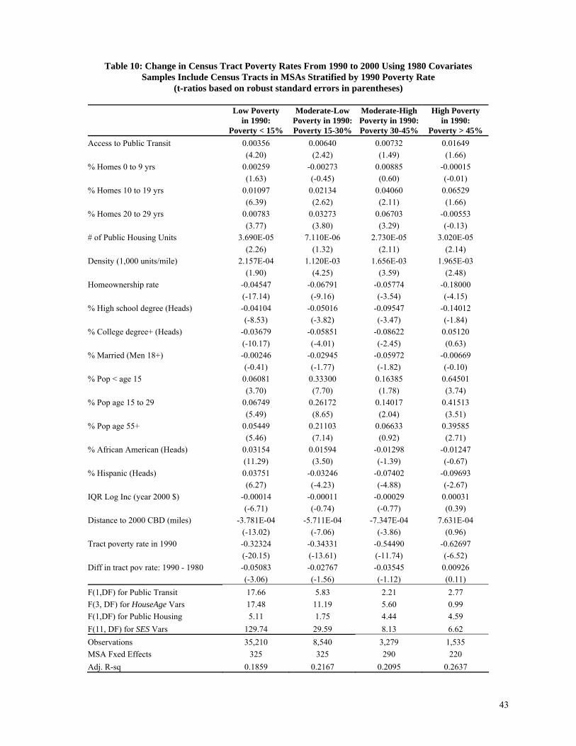
43
Table 10: Change in Census Tract Poverty Rates From 1990 to 2000 Using 1980 Covariates
Samples Include Census Tracts in MSAs Stratified by 1990 Poverty Rate (t-ratios based on robust standard errors in parentheses)
Low Poverty in 1990:
Poverty < 15%
Moderate-Low Poverty in 1990:Poverty 15-30%
Moderate-High Poverty in 1990: Poverty 30-45%
High Poverty in 1990:
Poverty > 45% Access to Public Transit 0.00356 0.00640 0.00732 0.01649 (4.20) (2.42) (1.49) (1.66) % Homes 0 to 9 yrs 0.00259 -0.00273 0.00885 -0.00015 (1.63) (-0.45) (0.60) (-0.01) % Homes 10 to 19 yrs 0.01097 0.02134 0.04060 0.06529 (6.39) (2.62) (2.11) (1.66) % Homes 20 to 29 yrs 0.00783 0.03273 0.06703 -0.00553 (3.77) (3.80) (3.29) (-0.13) # of Public Housing Units 3.690E-05 7.110E-06 2.730E-05 3.020E-05 (2.26) (1.32) (2.11) (2.14) Density (1,000 units/mile) 2.157E-04 1.120E-03 1.656E-03 1.965E-03 (1.90) (4.25) (3.59) (2.48) Homeownership rate -0.04547 -0.06791 -0.05774 -0.18000 (-17.14) (-9.16) (-3.54) (-4.15) % High school degree (Heads) -0.04104 -0.05016 -0.09547 -0.14012 (-8.53) (-3.82) (-3.47) (-1.84) % College degree+ (Heads) -0.03679 -0.05851 -0.08622 0.05120 (-10.17) (-4.01) (-2.45) (0.63) % Married (Men 18+) -0.00246 -0.02945 -0.05972 -0.00669 (-0.41) (-1.77) (-1.82) (-0.10) % Pop < age 15 0.06081 0.33300 0.16385 0.64501 (3.70) (7.70) (1.78) (3.74) % Pop age 15 to 29 0.06749 0.26172 0.14017 0.41513 (5.49) (8.65) (2.04) (3.51) % Pop age 55+ 0.05449 0.21103 0.06633 0.39585 (5.46) (7.14) (0.92) (2.71) % African American (Heads) 0.03154 0.01594 -0.01298 -0.01247 (11.29) (3.50) (-1.39) (-0.67) % Hispanic (Heads) 0.03751 -0.03246 -0.07402 -0.09693 (6.27) (-4.23) (-4.88) (-2.67) IQR Log Inc (year 2000 $) -0.00014 -0.00011 -0.00029 0.00031 (-6.71) (-0.74) (-0.77) (0.39) Distance to 2000 CBD (miles) -3.781E-04 -5.711E-04 -7.347E-04 7.631E-04 (-13.02) (-7.06) (-3.86) (0.96) Tract poverty rate in 1990 -0.32324 -0.34331 -0.54490 -0.62697 (-20.15) (-13.61) (-11.74) (-6.52) Diff in tract pov rate: 1990 - 1980 -0.05083 -0.02767 -0.03545 0.00926 (-3.06) (-1.56) (-1.12) (0.11) F(1,DF) for Public Transit 17.66 5.83 2.21 2.77 F(3, DF) for HouseAge Vars 17.48 11.19 5.60 0.99 F(1,DF) for Public Housing 5.11 1.75 4.44 4.59 F(11, DF) for SES Vars 129.74 29.59 8.13 6.62 Observations 35,210 8,540 3,279 1,535 MSA Fxed Effects 325 325 290 220 Adj. R-sq 0.1859 0.2167 0.2095 0.2637

Figure 1: Poverty Rates in the United State, 1970-2005
Source: http://en.wikipedia.org/wiki/Poverty_in_the_United_States, and http://www.census.gov/hhes/www/poverty/histpov/hstpov2.html
44

Figure 2: Dwelling Age Effects on Poverty Rates 1990-2000
-0.015
-0.01
-0.005
0
0.005
0.01
0.015
5 15 25 25+
Age of Housing Stock (years)
Influ
ence
of 1
per
cent
age
poin
t in
crea
se in
hou
sing
sto
ck o
n ch
ange
in p
over
ty ra
te
1970 Covariates 1990 Covariates
45