when you get to that link, don't open it. instead, right...
TRANSCRIPT
LESSON 8
SYLLABUS
SYLLABUS TITLE
Working With Shape Gradients
SYLLABUS DESCRIPTION
Gradients are Illustrator's version of a physical airbrush that can lay down smooth blends of color. You can use gradients on objects (shapes) for backgrounds or for shading. Once you know how to create your own gradients, you can add a 2.5D realism to any image.
OBJECTIVE
Use the Gradient tool and the gradient annotator to create, apply, and alter linear and radial gradients to
shapes.
CHAPTER 1
The downloads are at http://imageevent.com/prancingpixel/illustratorcs6/lesson08 For each image to download, you need to click the thumbnail at the bottom when you scroll down to make that thumbnail the main image. Then click the link under that large image that says Original PSD or Original PDF. A window opens that has a new link it. When you get to that link, don't open it. Instead, right click on Windows or CONTROL+CLICK the link on the Mac and download it to your hard drive.
Introducing Gradients
In the last lesson, you added some personality to Rhoda's cartoon figure by varying the stroke widths. In this
lesson, you'll add the gradient fill from the original drawing and also introduce some shading that the original
lacked. Then, you'll tackle a complete illustration project using gradients.
By the end of this lesson, you'll be able to:
• Create and apply gradient fills to shapes. • Create linear and radial gradients. • Add transparency to gradients. • Save a gradient fill to the Swatches panel. • Use the gradient annotator. • Create a gradient-based illustration.

Ready to get started? Then head over to Chapter 2.
CHAPTER 2
Creating Gradient Fills
I bought my first computer graphics program because of gradients (Deluxe Paint II on DOS; yes, that long ago. The
year was 1985). It let me create a ramp to make a sunset sky that went from deep blue to pink. I thought it was
the most amazing thing I'd ever seen. Now effects like that are so common that your eye barely notices them.
However, subtle ramps--gradients--of color can add depth and realism to a drawing.
The term gradient refers to a blending of colors—changing color A into color B (or C, D, or E), either slowly or in
abrupt steps. You create gradients in the Gradient panel, and you use the Swatches panel and the Color panel to
help you choose the colors.
Once you've created a gradient, you can add it to the Swatches panel and use it as a fill color. In Illustrator CS6,
you can even add gradients to strokes (which you'll do in the next lesson).
Let's look at the Gradient panel, and then we'll make a gradient. So you can follow along with me, create a new
document using the Web profile. Then create a large rectangle in that file. Next, click the Gradient panel in the
dock to open it or choose Window > Gradient. You'll see the image below.
L08-01.png CAPTION: Anatomy of the Gradient panel

The Gradient Fill box shows you the current gradient. Clicking the Gradient Menu allows you to choose an
available preset (also visible in the Swatches panel).
You can select a color stop simply by clicking it on the gradient strip. Color stops show which color appears at
that point in the gradient. The little black triangle above a color slider (visible over the black color stop below)
shows the selected color stop. You can reverse the order of the color stops and alter the opacity. The midpoint
indicator controls the rate at which two adjacent color stops blend into each other.
By default, Illustrator positions the midpoint midway between each pair of color stops. You can alter that
midpoint by clicking and dragging it to the left or right. When you work on this sunset project, you'll see what a
difference altering the midpoint makes.
Click the Gradient Fill box to add the gradient to your rectangle. Then take a few minutes to just move the dials
around in the Gradient panel to see what happens. When you see what each slider does, you can close the image.
Enough theory! Let's create the basic gradient for Rhoda's cartoon image.
Here's how:
1. Open either your saved version of Lila from Lesson 7 or my liladone.ai in the Lesson 8 Zip file. 2. This file lacks the default colors and gradients, so just to give us a starting point, choose Window >
Swatch Libraries > Default Swatches > Basic RGB. When the extra Swatches panel opens, click the black and white gradient swatch as shown below to transfer it to your document Swatches panel.
L08-02.png CAPTION: Black and white gradient swatch
You need to put the colors you want in your gradient into your Swatches panel before you start to define the gradient. Otherwise, you'll make things more difficult for yourself. Your open document has the gradient colors you need, so you just need to make swatches of them.

3. Choose the Eyedropper tool and click just a little bit above the bottom-right of the aqua gradient on the original drawing. Save that color as a new Swatch. The current gradient already contains white so you don't need to add white to your Swatches panel.
4. Open the Gradient panel (you can choose Window > Gradient if you can't find it). The panel should open to its full size, but if not, click the tiny icon to the left on the Gradient tab.
5. Click the Gradient Fill box to see the current color stops. Using the existing gradient as your starting point makes creating a gradient easier.
6. Double-click the black color stop (tool tip calls it the Gradient Slider, but Adobe documentation calls it a Color Stop). If you see the Color panel sliders, then click the icon for the Swatches panel on the left of the pop-out.
7. Choose the new aqua swatch you added. Click the ESC key to close the Swatches pop-out panel.
8. Click the Gradient menu and then click the Add to Swatches icon at the bottom right.
L08-03.png CAPTION: Add the new swatch to the Swatches panel
Tip
You can pick your color using either the Color panel or the
Swatches panel interface when you double-click a stop. The
palette icon opens the Color panel sliders, and the icon with
grayscale rectangles opens the Swatches panel interface. You
may also drag a swatch from the Swatches panel directly onto
the active color stop.

1. Target the template layer in the Layers panel and then click the New Layer icon. Name the layer gradient.
2. Choose the Rectangle tool. Place your cursor so that it intersects the top-right corner of the artboard and drag the rectangle to the bottom-right corner of the artboard.
3. Because the gradient is currently in the Fill color swatch on the Tools panel, the rectangle automatically contains the gradient fill, as you can see below. This gradient doesn't match the original Lila image, but it's a start.
L08-04.png CAPTION AND ALT TAG: Gradient fill
The gradient behind Lila has white at the top and the blue stops mid-calf. Let's see how to fix this.
1. First, choose the Selection tool and drag the bottom-center handle up until the box is the same size as the original.
2. Next, change the Gradient angle to -90 degrees. That puts the white at top and the aqua at the bottom.
That looks better, but the aqua still starts higher than on the original.

1. Target the white color stop. You should see Location 0% in the Location field. Click the arrow to the right of the Opacity field and choose 0% as the opacity. In the next image, you can see the checkerboard on the left of the Gradient slider that shows you've added transparency.
2. Then move the Midpoint slider to the right or left until you match the location at which color starts to appear in the gradient. I set the Midpoint slider to 41.63%. Lila looks a lot better now. Save the file but leave it open.
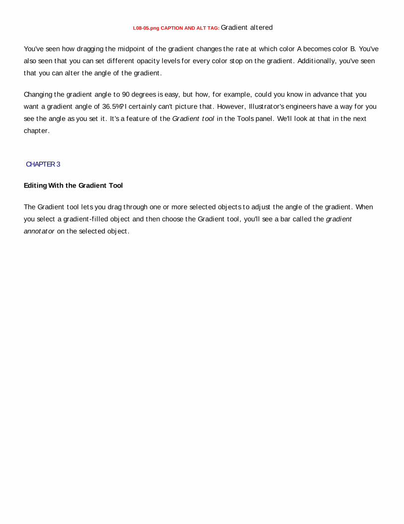
L08-05.png CAPTION AND ALT TAG: Gradient altered
You've seen how dragging the midpoint of the gradient changes the rate at which color A becomes color B. You've
also seen that you can set different opacity levels for every color stop on the gradient. Additionally, you've seen
that you can alter the angle of the gradient.
Changing the gradient angle to 90 degrees is easy, but how, for example, could you know in advance that you
want a gradient angle of 36.5%? I certainly can't picture that. However, Illustrator's engineers have a way for you
see the angle as you set it. It's a feature of the Gradient tool in the Tools panel. We'll look at that in the next
chapter.
CHAPTER 3
Editing With the Gradient Tool
The Gradient tool lets you drag through one or more selected objects to adjust the angle of the gradient. When
you select a gradient-filled object and then choose the Gradient tool, you'll see a bar called the gradient
annotator on the selected object.

L08-07.png CAPTION: Gradient Annotator ALT TAG: This illustration shows the features of the gradient annotator,
including color stops, midpoints, range control, and origin point.
This annotator is actually the equivalent of the gradient slider area in the Gradient panel. The small square is the
midpoint, and the color stops are set exactly as they were in the Gradient panel. You can see the midpoint and
stops only when your cursor's actually over the gradient annotator.
The two ends of the annotator work differently. If you grab the large circle end, you can move the location of the
gradient. The diamond end allows you to shrink and expand the range of the gradient (the amount of space it
covers as it changes from the first to the last color).
Let's see how you can use some pre-made gradient swatches and the Gradient Annotator to add some depth to
Lila's dress.
Gradient Libraries
Illustrator provides a collection of gradient libraries for you to use or modify. I especially like the Fades gradient
presets.
1. Your Lila image should still be open. 2. Lock all of the layers except for the Dress layer and target that layer. 3. Make the Swatches panel active. 4. Click the Swatch Libraries menu icon on the bottom left of the Swatches panel, and choose Gradients
from the menu. Scroll over to the submenu, and select Fades. 5. Select Lila's dress with the Selection tool and, in the Appearance panel, add a new Fill to the dress
object. That way, your new gradient reacts to the original Fill color and you don't need to add a new shape. Convenient, isn't it?
6. Drag the Gradient panel by its tab out of the dock so you can keep it open. 7. In the open Fades panel, click each of the gradients--one after the other--until you come to the first one
that contains red. As you click each one, notice what happens to the dress. Also notice the stops on the Gradient slider on the Gradient panel that change every time you click a different gradient.
8. Once you click each gradient, you can see it in the Swatches panel. At this point you can close the Fades panel because you no longer need it.
Vertical stripes might be OK for Lila, but I don't think the rolling gradient look is attractive.

L08-07 CAPTION AND ALT TAG: Current Swatches panel and dress gradient
1. With the new fill on the dress still selected, click the fourth of the new gradient swatches (on the image
above, it's the fourth one on the second row and its name is Fade to center black. This is a much better
"look" but it's too dark and the angle is wrong.
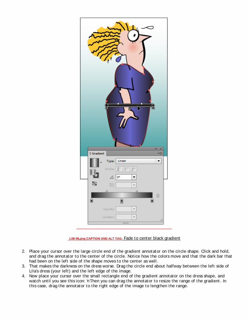
L08-08,png CAPTION AND ALT TAG: Fade to center black gradient
2. Place your cursor over the large circle end of the gradient annotator on the circle shape. Click and hold, and drag the annotator to the center of the circle. Notice how the colors move and that the dark bar that had been on the left side of the shape moves to the center as well.
3. That makes the darkness on the dress worse. Drag the circle end about halfway between the left side of Lila's dress (your left) and the left edge of the image.
4. Now place your cursor over the small rectangle end of the gradient annotator on the dress shape, and watch until you see this icon: Then you can drag the annotator to resize the range of the gradient. In this case, drag the annotator to the right edge of the image to lengthen the range.

5. Now place your cursor over the small rectangle end of the gradient annotator on the circle shape, and watch until you see this icon: Then you can rotate the gradient annotator to alter the angle of the gradient. You can see the angle I used below.
L08-09,png CAPTION AND ALT TAG: Rotate the Gradient Annotator
6. Finally, leave the angle you set but drag the circle end a bit beyond the left edge of the image and then drag the rectangle past the right edge of the image until you like the strength of the gradient.
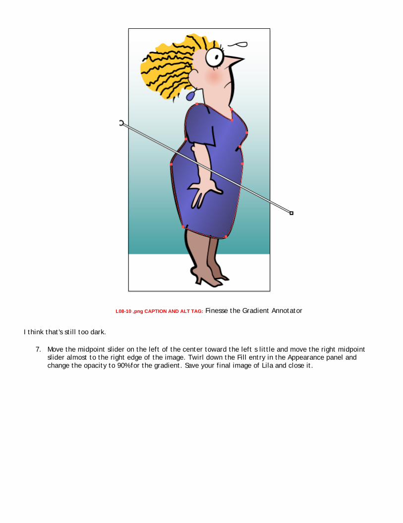
L08-10 ,png CAPTION AND ALT TAG: Finesse the Gradient Annotator
I think that's still too dark.
7. Move the midpoint slider on the left of the center toward the left s little and move the right midpoint slider almost to the right edge of the image. Twirl down the Fill entry in the Appearance panel and change the opacity to 90% for the gradient. Save your final image of Lila and close it.
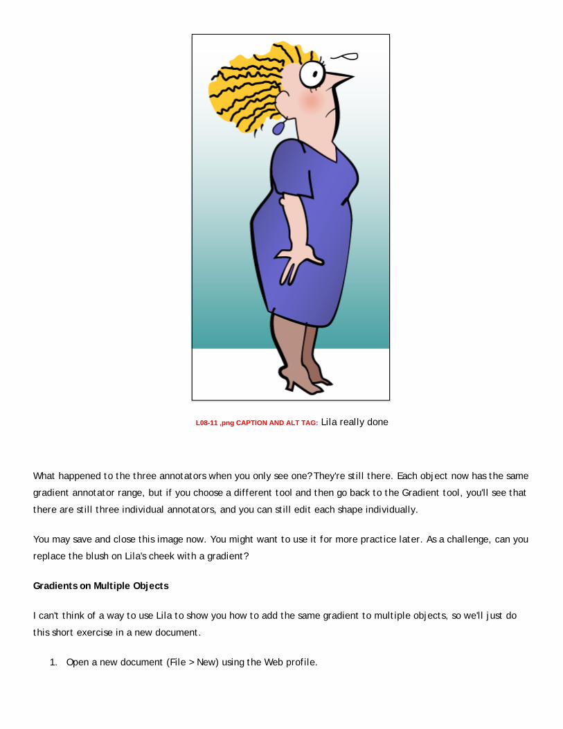
L08-11 ,png CAPTION AND ALT TAG: Lila really done
What happened to the three annotators when you only see one? They're still there. Each object now has the same
gradient annotator range, but if you choose a different tool and then go back to the Gradient tool, you'll see that
there are still three individual annotators, and you can still edit each shape individually.
You may save and close this image now. You might want to use it for more practice later. As a challenge, can you
replace the blush on Lila's cheek with a gradient?
Gradients on Multiple Objects
I can't think of a way to use Lila to show you how to add the same gradient to multiple objects, so we'll just do
this short exercise in a new document.
1. Open a new document (File > New) using the Web profile.

2. Add a rectangle, a circle, and a star to your image (the placement doesn't matter). 3. Press CTRL+A or COMMAND+A to select all three shapes. 4. Click the Library icon at the bottom of the Swatches panel and choose Gradients > Spectrums. I then
clicked the brightest rainbow, but you can pick the one you want. 5. Choose the Gradient tool. At this point, all three objects show the same gradient. 6. Place your cursor over the large circle end of the gradient annotator on the circle shape. Click and hold,
and drag the annotator to the center of the circle. Notice how the colors move and that the dark bar that had been on the left side of the shape moves to the center as well.
7. Now place your cursor over the small rectangle end of the gradient annotator on the star shape, and watch until you see this icon: Then you can drag the annotator to resize the range of the gradient. In this case, drag the annotator to the left to shorten the range.
8. Now place your cursor over the small rectangle end of the gradient annotator on the circle shape, and watch until you see this icon: Then you can rotate the gradient annotator to alter the angle of the gradient.
9. Finally, with all three objects still selected, click with the Gradient tool outside of the objects, and drag past them on the right. The objects now fill with the same gradient—but this time, you see the entire gradient placed as if all three objects were connected.
L08-12 ,png CAPTION AND ALT TAG: Three objects, one gradient
What happened to the three annotators when you only see one? They're still there. Each object now has the same
gradient annotator range, but if you choose a different tool and then go back to the Gradient tool, you'll see that there are still three individual annotators, and you can still edit each shape individually.
Close the image; there's no need to save it. In the next chapter, you'll create a realistic object using gradients.
CHAPTER 4
Creating a Realistic Image With Gradients
Darren Winder (Daz), the teaching assistant for this course, is a master at creating realism using gradients. In this chapter, you'll learn to add colors to gradients as you create a totally realistic Bic pen. For those of you too young to remember, the Bic was the first low-cost ballpoint pen.
1. Open the file pen.ai from the Zip for this lesson. I've already given you the basic pen shape (A rectangle 1568 points wide by 95 points high) and some critical guides for measurement.
You need to make a custom gradient for the pen body. So far, you've only created two color stops. The pen body gradient contains nine color stops. Here's how to add them:
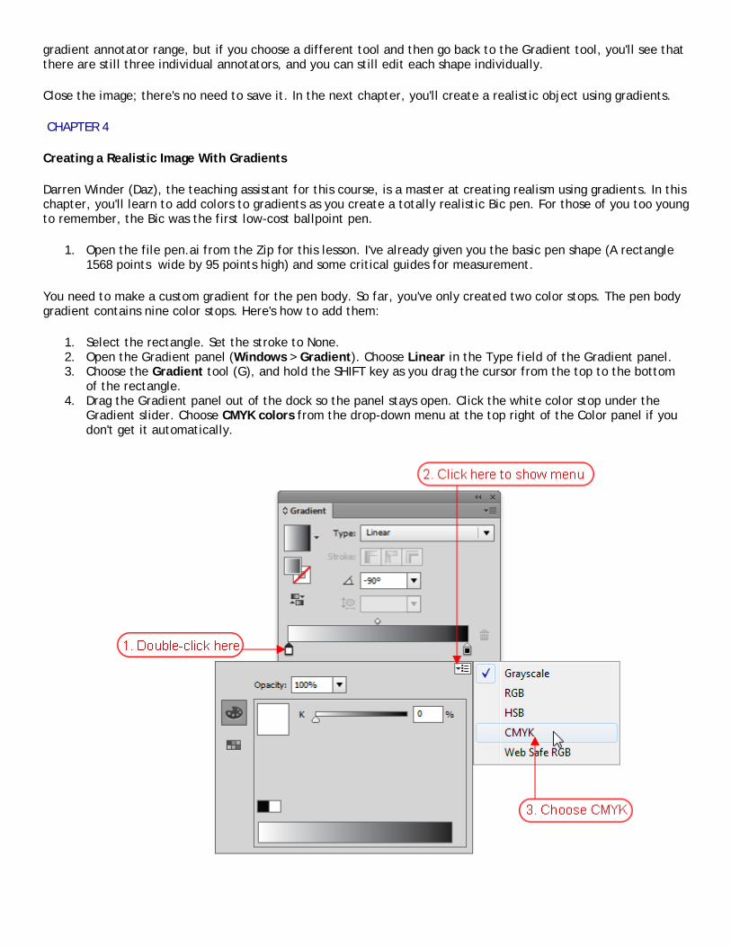
1. Select the rectangle. Set the stroke to None. 2. Open the Gradient panel (Windows > Gradient). Choose Linear in the Type field of the Gradient panel. 3. Choose the Gradient tool (G), and hold the SHIFT key as you drag the cursor from the top to the bottom
of the rectangle. 4. Drag the Gradient panel out of the dock so the panel stays open. Click the white color stop under the
Gradient slider. Choose CMYK colors from the drop-down menu at the top right of the Color panel if you don't get it automatically.

L08-14. CAPTION AND ALT TAG: Choosing CMYK colors
5. Change the black color stop to CMYK colors the same way if necessary.
Now let's set the colors for the gradient. Repeat these steps for each color stop.
1. For all but the first and last stops, click under the gradient slider on the Gradient panel to the right of the previous stop to add a new stop.
2. Enter the value from the chart below in the Location field for that stop the press the ENTER key. 3. Double-click the stop to open the Color panel. 4. Type the associated CMYK values from the chart below into the fields (don't use the sliders). Click the Tab
key after you enter each value. Press ENTER to return to the Gradient panel.
This is easier to follow as a table, so I've given you nine table entries (one for each new color stop). Enter the
first four items in the table and if you wish, then check under the table for your "get out of jail free" tip!
[GA, please set this table summary as an alt tag. Thanks. This chart shows details about each of the nine color
stops you'll set for the first gradient. The first column tells you the location of the stop, as a percentage. The
next columns tell you what percentages to set for cyan, magenta, yellow, and black. [GA, table summary ends
here.
Stop Location % % C: % M: % Y: % K:
0 0 40.78 100 0
31.87 5.88 54.12 100 0
38.46 0 40.78 100 0
81.32 5.88 54.12 100 0
85.16 0 35.69 99.33 0
87.36 0 34.9 89.8 0
90.66 0 27.84 81.57 0
93.96 5.88 54.12 100 0
100 0 27.84 81.57 0
chart CAPTION: Details about the color stops you'll set
***Get out of jail free*** You may, at this point, choose Window > Swatch Libraries > Other Libraries and open
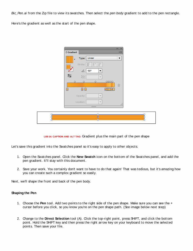
Bic_Pen.ai from the Zip file to view its swatches. Then select the pen body gradient to add to the pen rectangle.
Here's the gradient as well as the start of the pen shape.
L08-14. CAPTION AND ALT TAG: Gradient plus the main part of the pen shape
Let's save this gradient into the Swatches panel so it's easy to apply to other objects.
1. Open the Swatches panel. Click the New Swatch icon on the bottom of the Swatches panel, and add the pen gradient. It'll stay with this document.
2. Save your work. You certainly don't want to have to do that again! That was tedious, but it's amazing how you can create such a complex gradient so easily.
Next, we'll shape the front and back of the pen body.
Shaping the Pen
1. Choose the Pen tool. Add two points to the right side of the pen shape. Make sure you can see the + cursor before you click, so you know you're on the pen shape path. (See image below next step)
2. Change to the Direct Selection tool (A). Click the top-right point, press SHIFT, and click the bottom point. Hold the SHIFT key and then press the right arrow key on your keyboard to move the selected points. Then save your file.

L08-15. CAPTION AND ALT TAG: Adding and moving points on right end of the pen shape
Creating the End Cap for the Pen
Here's how to make a small round end cap for the pen.
1. Draw an oval with the Ellipse tool (L). Click the canvas to see the Ellipse Options. Enter 60 pt for the width and 92 pt for the height. Then click OK.
2. Choose the default black-to-white gradient again in the Swatches panel.
Stop Location % % C: % M: % Y: % K:
0 100 95 5 0
100 100 100 25 25
chart CAPTION: Color stops for the second gradient
This time, you'll make it a Radial gradient by changing the Type in the Gradient panel to Radial. Then choose the
Gradient tool. The Gradient Annotator is a bit different with a radial gradient. (See below)

L08-15.png. CAPTION AND ALT TAG: Anatomy of a radial gradient
Because the radial gradient really is a circle, its range is also a circle. The dotted lines above show this range.
The gradient annotator also has a small white circle just outside the gradient slider on the large-circle end. This
lets you rotate the gradient around either end of the annotator.
You can control the size of the dotted-line range in these ways:
• Drag the solid black dot on top of the dotted line closer to the center or farther away to make the dotted lines flatter or fatter.
• Drag the dot-within-a-2circles icon (shown on left above) to make the dotted lines wider or shorter. • Drag the diamond end of the annotator to make the range of the gradient grow or shrink evenly.
If you use either icon on the dotted line to alter the shape, you'll get an elliptical gradient. This is a form of
radial gradient, and the Type doesn't change. However, it's the difference between drawing a circle or an ellipse
with the Ellipse tool.
Let's drag the end cap in place and then adjust the gradient.
1. Press the CTRL or COMMAND key to temporarily activate the Selection tool and then move the shape until
it intersects with the right side of the pen (see a below).
2. Choose Object > Arrange > Send to Back to move the end cap below the pen body.

3. Now adjust the range on the Gradient Annotator so that it's the same shape as the object (drag each large
dot on the dotted range line as needed).
4. Move the Gradient Annotator slightly to the left (b below).
5. Rotate the Gradient Annotator slightly upward (c below).

L08-17.png. CAPTION AND ALT TAG: Set end cap and its gradient
3. Save this gradient into the Swatches panel, as you did with the pen gradient.
4. Save your work.
The Pointed End
Now it's time create the front of the pen.
1. Select the pen body object. Choose the Pen tool (P). Add a point at the top and bottom of the pen body shape where the vertical guide on your image intersects the pen body.
2. Choose the Direct Selection tool, and click the top-left point. Hold the SHIFT key, and press the down arrow key twice. Do the same for the bottom point, but this time, move it up by holding the SHIFT key and pressing the up arrow key twice.
L08-18.png. CAPTION AND ALT TAG: Tapering the left side
3. Select the blue end cap you previously created. Hold the COMMAND + OPTION keys on the Mac or the CTRL + ALT keys on Windows, and drag a copy of this shape to the guide on the pen body.
4. Choose Object > Arrange > Bring to Front. Change the fill to black. 5. With the oval still selected, choose Edit > Copy. Then choose Edit > Paste in Front. Change the fill to
green. Hold the SHIFT key and press the right arrow key one time. 6. Select both the ovals. Choose the Shape Builder tool. Hold the ALT or OPTION key and drag though the
green oval to remove it. 7. Hold the SHIFT key and press the left arrow key three times, release the SHIFT key and press the right
arrow three more times to move the barrel into position.
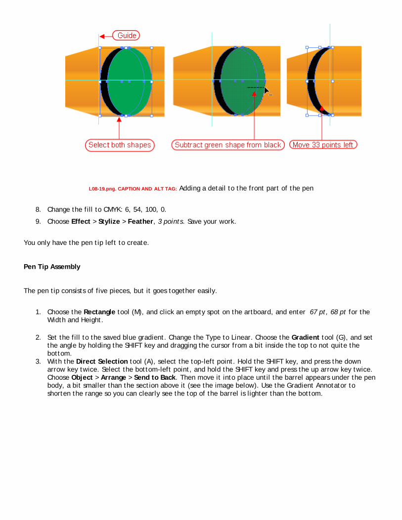
L08-19.png. CAPTION AND ALT TAG: Adding a detail to the front part of the pen
8. Change the fill to CMYK: 6, 54, 100, 0.
9. Choose Effect > Stylize > Feather, 3 points. Save your work.
You only have the pen tip left to create.
Pen Tip Assembly
The pen tip consists of five pieces, but it goes together easily.
1. Choose the Rectangle tool (M), and click an empty spot on the artboard, and enter 67 pt, 68 pt for the Width and Height.
2. Set the fill to the saved blue gradient. Change the Type to Linear. Choose the Gradient tool (G), and set the angle by holding the SHIFT key and dragging the cursor from a bit inside the top to not quite the bottom.
3. With the Direct Selection tool (A), select the top-left point. Hold the SHIFT key, and press the down arrow key twice. Select the bottom-left point, and hold the SHIFT key and press the up arrow key twice. Choose Object > Arrange > Send to Back. Then move it into place until the barrel appears under the pen body, a bit smaller than the section above it (see the image below). Use the Gradient Annotator to shorten the range so you can clearly see the top of the barrel is lighter than the bottom.

L08-20.png. CAPTION AND ALT TAG: Attaching the barrel
4. Select the barrel and choose Edit > Copy. Then choose Edit > Paste in Back. Lock the barrel path.
You need to create and apply a new gradient to this shape. Use the chart below to set the color stops then save the gradient.
This chart shows details about the color stops you'll set for this gradient. The first column tells you the
location of the stop, as a percentage. The next columns tell you what percentages to set for cyan, magenta,
yellow, and black.
Stop Location % % C: % M: % Y: % K:
11.54 37.45 41.57 81.96 10.59
32.42 5.1 14.12 35.69 0
65.38 37.45 41.57 81.96 10.59
81.32 47.45 59.61 76.86 40.39

chart CAPTION: Color stops for gradient
L08-21.png. CAPTION AND ALT TAG: New gradient
7. Hold the SHIFT key and drag the object left until its right edge is halfway between the center of the barrel and its right edge. Hold the SHIFT and ALT or OPTION keys and move the top-center handle on the bounding box down (both edges resize at the same time) until the nib is just a bit smaller in height than the barrel.
8. With the first part of the nib selected, choose Edit > Copy, and choose Edit > Paste in Back.
9. In the Layers panel, lock the other paths (but not the layer). Leave the new path (the lowest sublayer) selected. Hold the SHIFT key and drag the object left until its center snaps to the left edge of the nib.
10. Hold the SHIFT + OPTION keys on the Mac or the SHIFT + ALT keys on Windows and drag the center-top handle down until the object is slightly smaller than the nib and looks like the one below.
Fig19.png. CAPTION AND ALT TAG: Adding to the pen nibs

You're almost there! Only two more objects to create.
1. Choose the Ellipse tool. Click the canvas, and enter 48 pt for the width and 7 pt for the height. Use the same gradient fill as the pen nibs.
2. Choose Object > Arrange > Send to Back. Move it into place until it sticks out from inside the nibs. This is the writing tip of the pen.
3. The final step is to make a spot of ink at the tip. Create an ellipse 4.5 pt wide and 3 pt high. Fill it with blue. Drag it on top of the writing tip so it sticks out just a bit to the left. Add a 1 pt feather (Effect > Stylize > Feather 1 pt).
4. Save your work, and admire it!
Fig21.png. CAPTION AND ALT TAG: The pen tip and the finished pen
You can also open Daz's Bic_Pen.ai file to see his original drawing which is even more involved than the version
you've just created.
CHAPTER 5
Summary
In this lesson, you finally finished Rhoda's cartoon image. You practiced adding new color stops and adjusting the
color stops, the midpoints, and the gradient angle. You also saved your creations in the Swatches panel.
You applied radial and linear gradients to objects and adjusted their colors with the Gradient tool (G) and with
the gradient annotator.
In Lesson 9, you'll see how you can add a gradient to a stroke rather than to an object and explore several other
shading methods.
SUPPLEMENTARY MATERIAL

LINK
TITLE
Illustrator CS4 Gradients
URL
http://www.layersmagazine.com/illustrator-cs4-gradients.html
DESCRIPTION
This is one of my favorite gradients tutorials. Cheryl Graham of Layers magazine shows a fascinating
video of how she uses the new features to create an image of the planet Saturn. The process hasn't
changed in CS6.
LINK
TITLE
Gradient Reflection and Glossy Surface
URL
http://digitalapplejuice.com/illustrator-cs4-gradient-reflection-glossy-surface/
DESCRIPTION
Love the look of 3-D but have no idea how to do it? This tutorial shows how you can use gradients to
create fully lit and dimensional surfaces. This is a CS4 tutorial but it still works the same way in CS6.
LINK
TITLE
Creating a Dog Illustration Using Gradients
URL
http://vector.tutsplus.com/tutorials/illustration/how-to-create-a-festive-dog-illustration-in-adobe-
illustrator/
DESCRIPTION
If you've wondered how to get a complex image from a photo into Illustrator and how to simplify it in
the process, this tutorial will how you every step of the way. This is a print rather than a video tutorial
and it's extremely detailed. You'll see how the author gets from a piece of stock art to shapes and then
adds gradients or blends (something else you'll meet in Lesson 9) to do the shading. If you actually
wanted to follow along, it would take several hours, but just glance through this and save it to your
computer for a time when you really want to digest the material.
LINK
TITLE

The Table Tennis Tutorial
URL
http://vector.tutsplus.com/tutorials/illustration/table-tennis-illustration/
DESCRIPTION
Here's a tutorial that's a little simpler than the dog illustrator but also uses the 3D effect along with
gradients to create a realistic table tennis setup.
LINK
TITLE
Creating a Wallet Using Gradients
URL
http://vector.tutsplus.com/tutorials/illustration/realistic-leather-wallet/
DESCRIPTION
Tuts+ has a number of tutorials that show in detail how to create objects and add gradient shading. This
wallet is another of the simpler ones that I think you'll enjoy.
LINK
TITLE
A Day of the Dead Portrait
URL
http://blogs.adobe.com/adobeillustrator/2012/04/creating-a-day-of-the-dead-inspired-
portrait.html#more-711
DESCRIPTION
If you read nothing else of these supplementary materials, take a look at Step 11 in this tutorial. Sharon
Milne crates an amazing image from a photo and shows all the shading steps to get there. It's an
incredible use of gradients!
LINK
TITLE
Gradient Flower Icon in Illustrator
URL
http://veerle.duoh.com/blog/comments/gradient_flower_icon_in_illustrator/
DESCRIPTION
This is one of the few tutorials from an older version of Illustrator that's still valid. I think you'll be
fascinated by the thought and technique that Veerle Pieters uses to create what looks like a simple
multicolored abstract flower icon. You'll see that it's far from simple to do. As a preview of the next
lesson, this complex tutorial becomes a simple process when you use the new CS6 Illustrator feature of a
gradient on a stroke.

ASSIGNMENT
The Sunset
At the beginning of this lesson, I mentioned that I purchased my first computer graphics program because I was
totally enchanted with the idea of creating a sunset on the computer. Now you've learned a lot about gradients,
and I want to give you the chance to create your own sunset scene.
In the zip file for this lesson, I've placed a file, sunsets.jpg, that you may use for inspiration.
A08-01.png. CAPTION AND ALT TAG: sunset files
For this assignment, I'd like you to pick one of the sunset images (or a combination of several of them) or one of
your own sunset images and try to re-create it in Illustrator using gradients. You may also create black or dark
shapes to act as the trees or docks or background elements to the sunset (gives you a bit more practice creating
shapes!).
Please use your creativity. The scene may consist of multiple gradients overlaid upon each other. You can use a
mix of linear and radial gradients. You can change the opacity and blend modes of your shapes. You can add
transparency within a gradient. I'm excited to see what you create!

[ga: please inset note box
Note: If you feel that you need some help getting started on this, go to
http://imageevent.com/prancingpixel/illustratorcs6/lesson08?n=0 and click the link to open the
sunset_tutorial.pdf document. This is a short tutorial that I wrote to CS5, but it's still valid.
[end note
FAQS
Q: How can I use the gradients I saved in the Swatches panel in another document?
A: When you save a document (in .ai format), the Swatches panel is saved as a library panel in that document.
You can open this library panel by selecting Window > Swatch Libraries > Other Library. Select the filename
that contains the swatches you want, and click Open. A library panel with that same filename will open in your
new document. From there, use the library panel as we practiced in the lesson.
Q: When I learned about gradients in your Photoshop class, you showed how to create a fascinating gradient just
by applying and reapplying the same gradient in Difference mode at different angles and ranges. Can I do
anything like that in Illustrator?
A: Yes. Create your object, and apply the gradient fill. Then, in the Appearance panel, add a new Fill with the
same gradient. Twirl down the new Fill entry, and click Opacity to open the Opacity panel. Change the Mode to
Difference, and presses RETURN or ENTER. Use the Gradient tool to adjust the angle and range. You can continue
to drag that new Fill entry in the Appearance panel to the Duplicate Selected Item icon at the bottom of the
Appearance panel. Then, for each new fill, adjust the gradient; the mode's already set to Difference. You can
even go back and the change the gradient preset at any time you wish.
Q: When I sent my Illustrator drawing out to be printed, it developed distinct bands of color rather than giving
me a smooth blend. Why?
A: Take a look at this article on printing gradients from Adobe Help:
http://help.adobe.com/en_US/illustrator/cs/using/WS714a382cdf7d304e7e07d0100196cbc5f-64a7a.html
You won't know you need this information until you try to print a gradient and you see banding. This tip list from
Adobe is only moderately informative, but if you encounter a printing problem, it gives you a place to start.
Another tip: If you see a lot of banding, rasterize the gradient object, put it into Photoshop, and add small but
different amounts of noise to two or three of the CMYK channels or two of the RGB channels. That'll break up the
banding.