what is a mobile responsive website? · responsive web design from this blog post by google's...
TRANSCRIPT
1
More and more of your target audience is viewing websites using smart phones and tablets.
What is a Mobile Responsive Website?
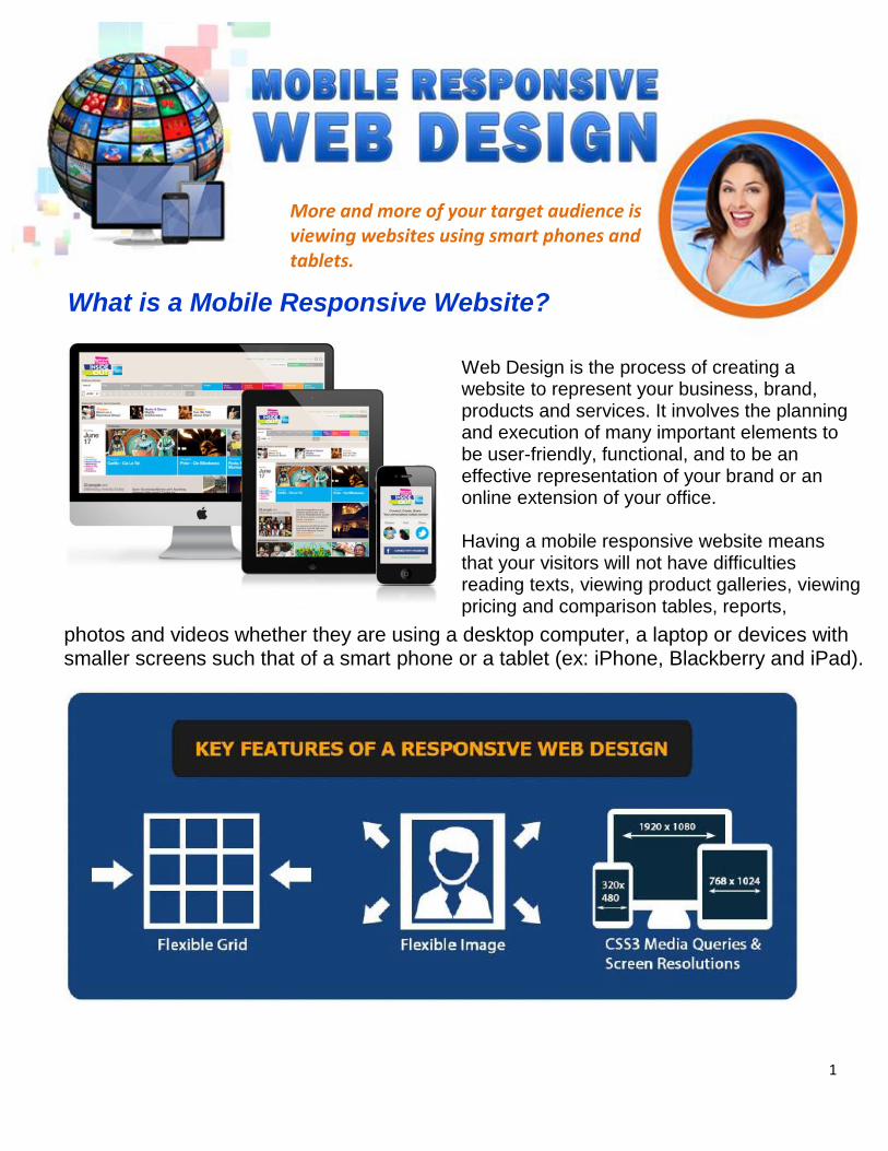
Web Design is the process of creating a website to represent your business, brand, products and services. It involves the planning and execution of many important elements to be user-friendly, functional, and to be an effective representation of your brand or an online extension of your office. Having a mobile responsive website means that your visitors will not have difficulties reading texts, viewing product galleries, viewing pricing and comparison tables, reports,
photos and videos whether they are using a desktop computer, a laptop or devices with smaller screens such that of a smart phone or a tablet (ex: iPhone, Blackberry and iPad).
2
A website classified as "mobile responsive" means that the website displays properly on all devices viewing the website. When you have a "mobile responsive" website you do not need a mobile version of your website just to make sure your website loads and appears properly on a mobile device. In essence, a mobile responsive website ensures that you only need ONE website and that you do not need to build different versions of your website to appear properly on different devices.
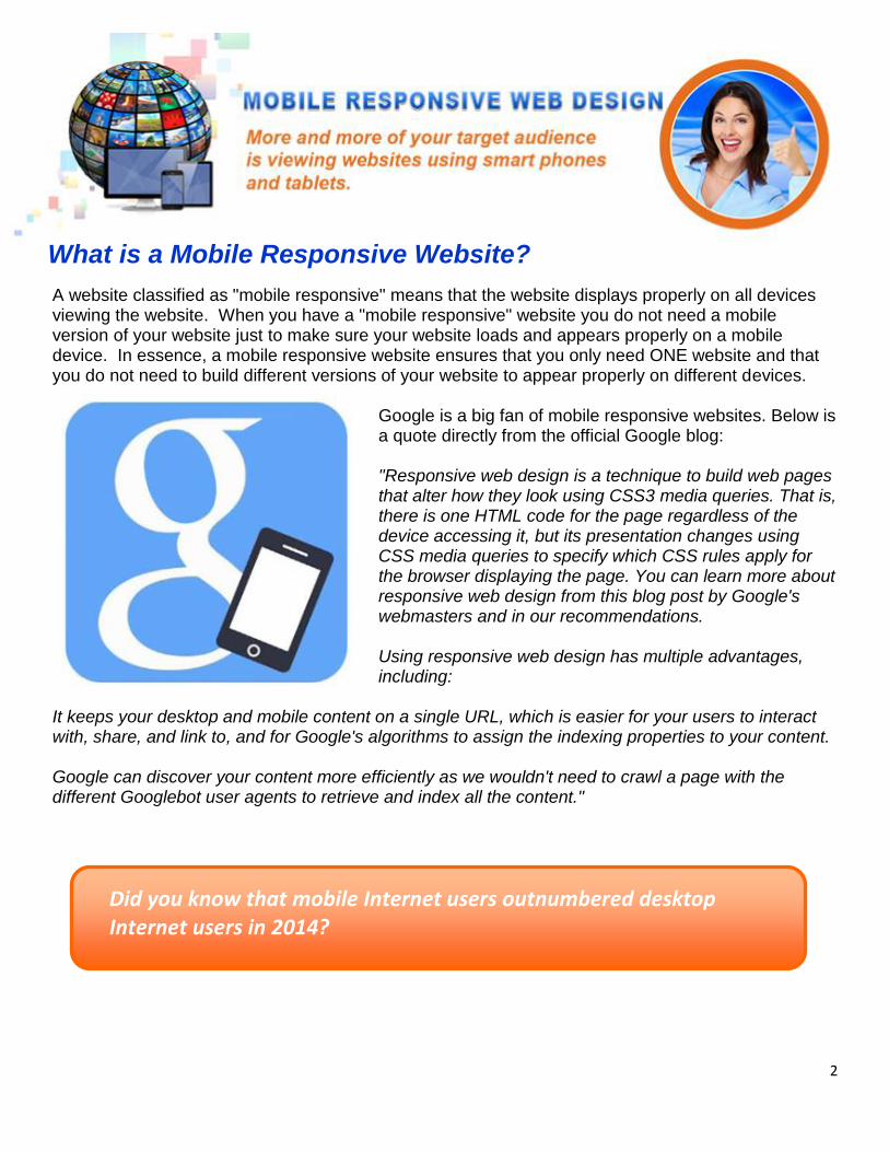
Google is a big fan of mobile responsive websites. Below is a quote directly from the official Google blog: "Responsive web design is a technique to build web pages that alter how they look using CSS3 media queries. That is, there is one HTML code for the page regardless of the device accessing it, but its presentation changes using CSS media queries to specify which CSS rules apply for the browser displaying the page. You can learn more about responsive web design from this blog post by Google's webmasters and in our recommendations. Using responsive web design has multiple advantages, including:
It keeps your desktop and mobile content on a single URL, which is easier for your users to interact with, share, and link to, and for Google's algorithms to assign the indexing properties to your content. Google can discover your content more efficiently as we wouldn't need to crawl a page with the different Googlebot user agents to retrieve and index all the content."
What is a Mobile Responsive Website?
Did you know that mobile Internet users outnumbered desktop Internet users in 2014?

3
People go online and visit websites to learn more about businesses, brands, products and services and to make business transactions. If you don't have a website, there's no question you need one. The only question is how fast we can build it for you! In today's world having a website is 100% necessary for 99% of all business owners. If you just started a business, a website should have been a part of your original business plan. If you already have a website, it may need some redesigning to improve its performance and to keep up with the times. Your website is your storefront online and depending on your business model, it may be your only storefront. Websites (and blogs) also serve as the central hub for online marketing where traffic is ultimately directed to convert into customers. Even social media traffic typically ends up converting into $$ once they hit your website. We use WordPress, the world's most popular website development platform, to build your website. WordPress' commitment to keep its platform current means your website will always have the capacity to be updated to keep up with current technology. All of your online marketing efforts, such as SEO, PPC, and Social Media Marketing will rely on a well-designed mobile-friendly website where your landing pages and blogs are built to convert traffic to leads and leads to customers.
What is the Importance of having an OUTSTANDING website?
4
Why Should You Have a Mobile Responsive Website?
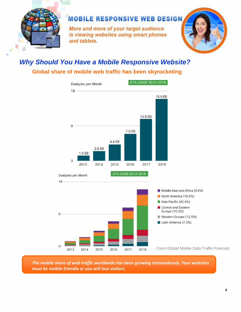
Global share of mobile web traffic has been skyrocketing
The mobile share of web traffic worldwide has been growing tremendously. Your websites must be mobile-friendly or you will lose visitors.
- Cisco Global Mobile Data Traffic Forecast
Why Should You Have a Mobile Responsive Website?
5
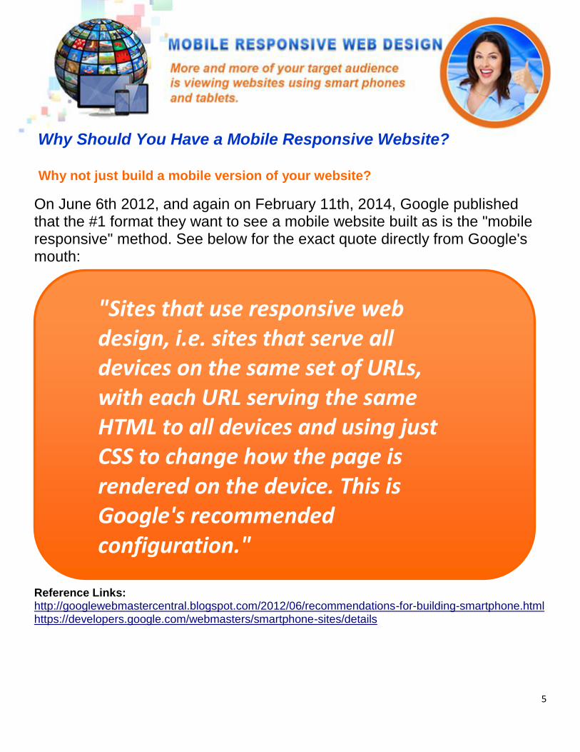
"Sites that use responsive web design, i.e. sites that serve all devices on the same set of URLs, with each URL serving the same HTML to all devices and using just CSS to change how the page is rendered on the device. This is Google's recommended configuration."
On June 6th 2012, and again on February 11th, 2014, Google published that the #1 format they want to see a mobile website built as is the "mobile responsive" method. See below for the exact quote directly from Google's mouth: Reference Links: http://googlewebmastercentral.blogspot.com/2012/06/recommendations-for-building-smartphone.html https://developers.google.com/webmasters/smartphone-sites/details
Why not just build a mobile version of your website?
Why Should You Have a Mobile Responsive Website?
6
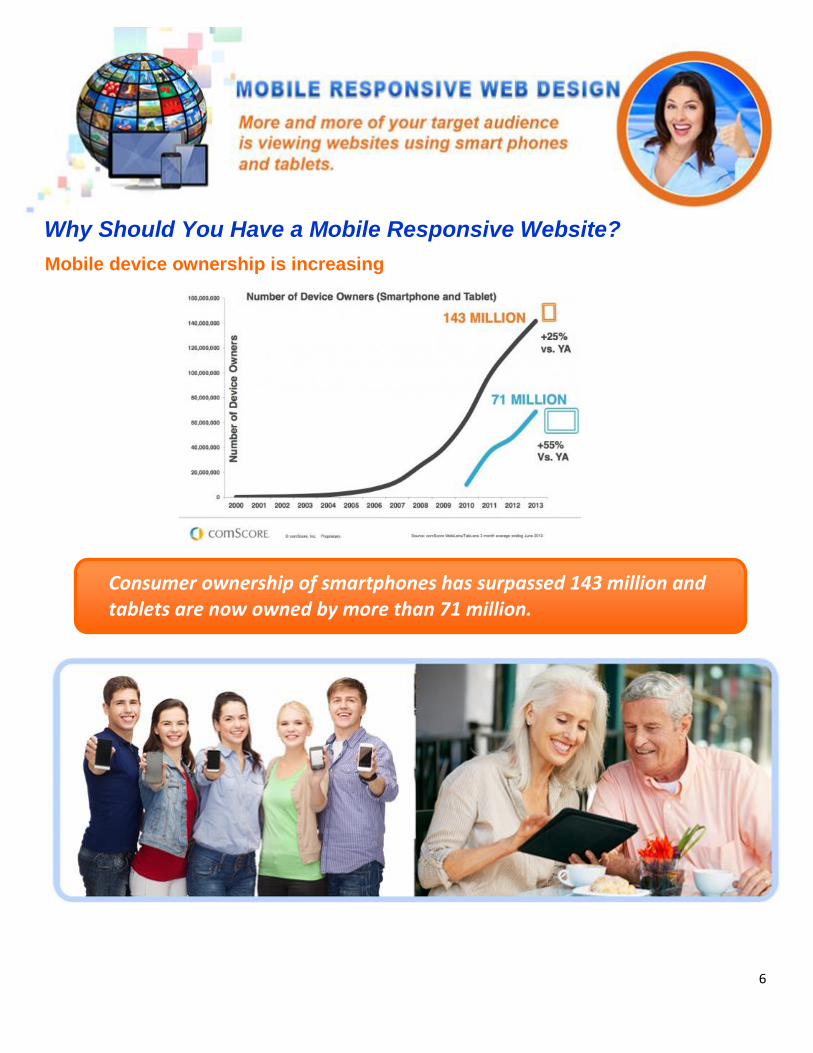
Consumer ownership of smartphones has surpassed 143 million and tablets are now owned by more than 71 million.
Mobile device ownership is increasing
Why Should You Have a Mobile Responsive Website?

7
Why Should You Have a Mobilve Responsive Website? Mobile device usage is increasing
8
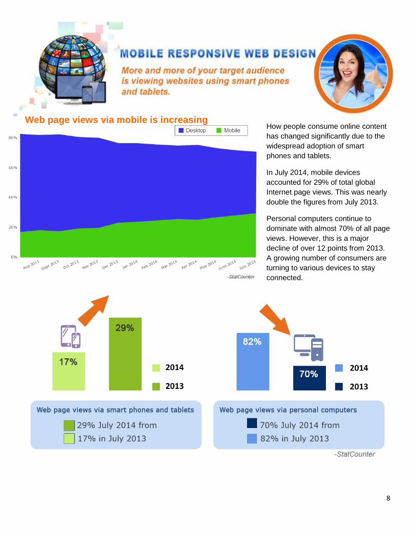
How people consume online content
has changed significantly due to the
widespread adoption of smart
phones and tablets.
In July 2014, mobile devices
accounted for 29% of total global
Internet page views. This was nearly
double the figures from July 2013.
Personal computers continue to
dominate with almost 70% of all page
views. However, this is a major
decline of over 12 points from 2013.
A growing number of consumers are
turning to various devices to stay
connected.
Web page views via mobile is increasing
Web page views via mobile is increasing

9
Mobile devices have been very instrumental to the growth of local search, social media and mobile
based e-commerce or m-commerce
Mobile usage has been changing market and consumer behavior

10
M-commerce accounted for 15% of retail e-commerce in 2013. It's share is expected to
double after 5 years.
Mobile Commerce share of
E-commerce sales in 2013
and projection for 2018
11
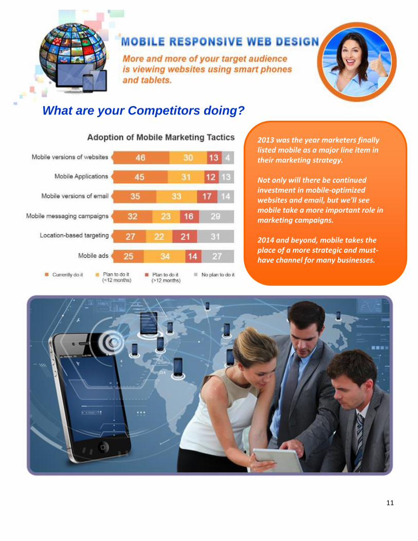
2013 was the year marketers finally listed mobile as a major line item in their marketing strategy. Not only will there be continued investment in mobile-optimized websites and email, but we'll see mobile take a more important role in marketing campaigns. 2014 and beyond, mobile takes the place of a more strategic and must-have channel for many businesses.
What are your Competitors doing?
12
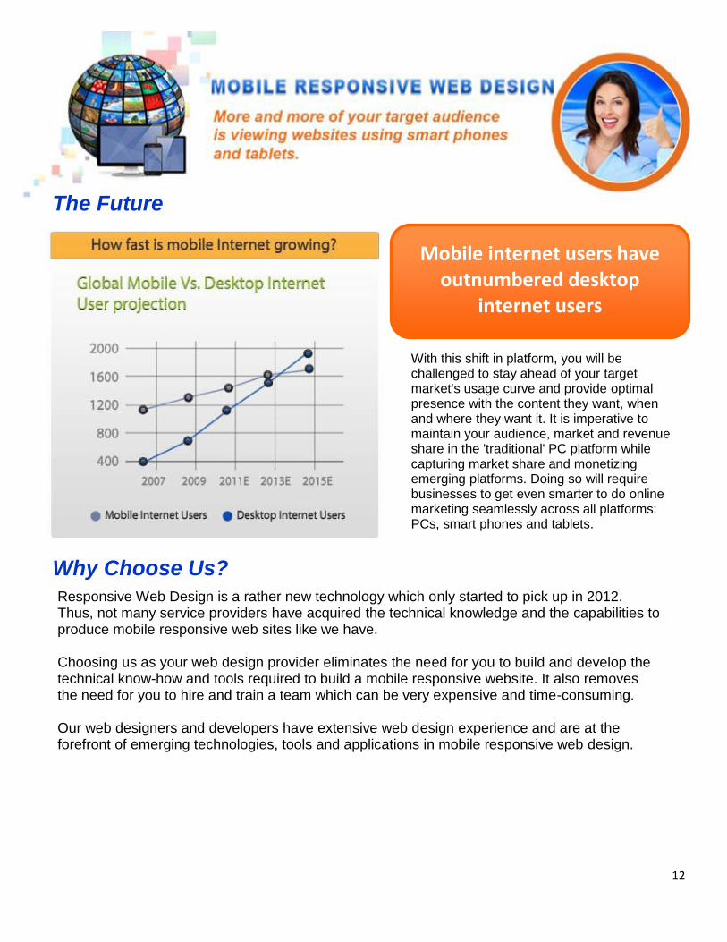
Mobile internet users have outnumbered desktop
internet users
With this shift in platform, you will be challenged to stay ahead of your target market's usage curve and provide optimal presence with the content they want, when and where they want it. It is imperative to maintain your audience, market and revenue share in the 'traditional' PC platform while capturing market share and monetizing emerging platforms. Doing so will require businesses to get even smarter to do online marketing seamlessly across all platforms: PCs, smart phones and tablets.
Why Choose Us? Responsive Web Design is a rather new technology which only started to pick up in 2012. Thus, not many service providers have acquired the technical knowledge and the capabilities to produce mobile responsive web sites like we have. Choosing us as your web design provider eliminates the need for you to build and develop the technical know-how and tools required to build a mobile responsive website. It also removes the need for you to hire and train a team which can be very expensive and time-consuming. Our web designers and developers have extensive web design experience and are at the forefront of emerging technologies, tools and applications in mobile responsive web design.
The Future

13
We believe that understanding our customers' needs and objectives are crucial to providing superior services and so we take the time to know your business, brand, products/services, target market, customers, and your competitors. We factor all of these into our web design strategy and recommend the right package for you. We follow a cycle beginning with in-depth consultation before we strategize and build the best mobile responsive website for you. We then measure and analyze results and listen to your feedback and apply continuous improvements to your web design as needed.
In-depth Consultation
14
Installation, Configuration and Customization
We will install and configure the latest version of WordPress on the web server as well as generate your
File Transfer Protocol (FTP) and Content Management System (CMS) access.
We will install your WordPress theme or custom WordPress design that will depict the layout and the
graphical interface of your site. Based on our consultation with you, we make sure that an appropriate
WordPress layout and design is chosen conforming to the intended purpose and function of your website.
The selected layout and design will also be in compliance with W3C and SEO standards. We will also
setup your WordPress blog and make sure it is seamlessly integrated with the rest of your website from a
design perspective.
Graphic Design and Mockups
Following content and design analysis, we will provide web design mockups (for custom websites) and
source relevant images and strategically embed these on your website. We make sure these images are
visually engaging and complement the overall aesthetics and the written content.
Contact Forms
We will install a fully functional basic contact form based on the pertinent information provided. The contact
form is your main tool for converting a casual site visitor into a lead or a potential customer.
Email Installation and Configuration
We will install your Google business email using the domain name of your website. Each of the 10 users
will have access to Google Mail, Google Calendar and Google Docs.
Website Backup, Migration and Installation
We will do a website backup and store it for you for 3 months just in case something happens on your live
website down the line. Data backups will offer benefits for you if you want to effectively store multiple
copies of web-based data in a secure location. We make sure that you will have easy access to your
backup files. We will then transfer all your integral website files to a new reliable host which will remotely
monitor the status of your site on their server. This service will cover all of the procedures and
prerequisites of a thorough website migration.
Summary of What We Do

15
Our Web Design Services include base packages that cover core client needs and add-ons that do
just about everything else.
Packages & Add-Ons Overview
16
What is the Next Step?
Send us an email or
give us a call to
schedule an
appointment.
Send us an email or
give us a call to
schedule an
appointment.