week02 responsive web design -...
TRANSCRIPT
VC 238 :: Week 02 1 of 5 03 October 2018
— Lecture Outline —
week::two Responsive Web Design
The Problem
How to deliver optimized Web experiences for desktops, tablets, and mobile (and future devices)—all at the same time.
o Goal is to avoid duplication of effort in content creation, technical resources, and URLs. o No forking!
Method of Delivering Web Sites to Mobile Devices
Deliver desktop version of the site o No extra effort o Perform basic compatibility testing o Can result in less-than-ideal experience for mobile users
Deliver desktop version with images and styles scaled back or removed o Uses less bandwidth; downloads faster; looks crappy.
Send visitors to a mobile-specific site o Much more work—sends different CSS and HTML o Allows for the most-customized user experience o URL is often different (with m. or mobile. prefix). Can make it cumbersome to share links
between mobile and desktop devices.
Deliver desktop version with mobile-specific style information o Can deliver a style sheet or rules based on the width or a browser window o HTML can remain the same; only appearance is altered o Uses CSS media queries o Is the preferred way to deliver mobile versions of a site. o It even has a name: Responsive Web Design.
Responsive Web Design (RWD)
What it is: o Techniques for crafting Web sites that are flexible, adapting to the media that renders them. o RWD about embracing the flexibility inherent to the web, without surrendering the control
we require as designers. We do this while using standards-based technologies, including new features of both HTML5 and CSS3. Source: Responsive Web Design by Ethan Marcotte
Follow on Twitter: o @RWD (Ethan Marcotte’s account for all things responsive)
Components
A Flexible Grid & Type
Flexible Images
Media Queries o Styling for different mediums and device widths
VC 238 :: Week 02 2 of 5 03 October 2018
— Lecture Outline —
First Attempt: Media Types
Defined o Loads a style sheet based on the type of device or media on which the site is displayed. o Been around for some time; Most common usage: Print style sheets
In Use o Use just ONE of the following:
§ HTML Code: <link rel="stylesheet" href="/common/css/print.css" media="print" />
§ CSS Code: @import url('landscape.css') screen;
o Some other media types: § all, braille, embossed, handheld, projection, screen, tv
Problems o Media types break down, however, because their definitions don’t always adequately
describe a device’s capabilities. § For example: Handheld—is an iPad a handheld or a desktop device?
o The solution: Media Queries
The Second, Better Attempt: Media Queries
Defined o Loads a style based on certain physical characteristics of a device.
§ width, height, device-width, device-height, orientation, color depth, aspect ratio, resolution, etc.
o Most commonly used: width and height § Measures the Viewport or browser window. § device-width and device-height measure the dimensions of the entire screen.
The Viewport
Defined o The function of the Viewport is to constrain the <html> element, which is the uppermost
containing block of your site. § On the desktop, the viewport is always 100% of the width of the browser.
Two Viewports o The visual viewport is the part of the page that’s currently shown on-screen. The user may
scroll to change the part of the page, or zoom to change the size of the visual viewport. o However, the CSS layout, especially perceptual widths, are calculated relative to the layout
viewport, which is considerably wider than the visual viewport.
Common Default Viewport Sizes o Safari iPhone: 980px o Opera: 850px o Android WebKit: 800px o IE: 974px
Viewport Control — Required for Responsive Design:
<meta name="viewport" content="initial-scale=1, width=device-width" />
VC 238 :: Week 02 3 of 5 03 October 2018
— Lecture Outline —
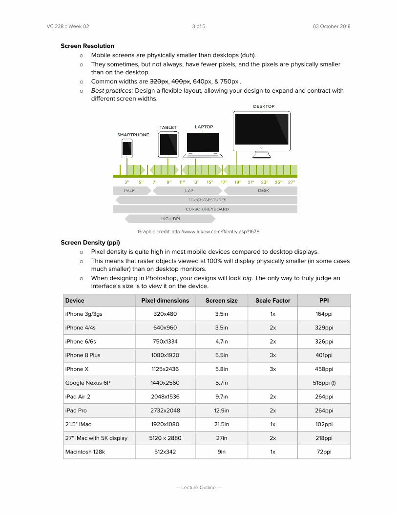
Screen Resolution o Mobile screens are physically smaller than desktops (duh). o They sometimes, but not always, have fewer pixels, and the pixels are physically smaller
than on the desktop. o Common widths are 320px, 400px, 640px, & 750px . o Best practices: Design a flexible layout, allowing your design to expand and contract with
different screen widths.
Graphic credit: http://www.lukew.com/ff/entry.asp?1679
Screen Density (ppi) o Pixel density is quite high in most mobile devices compared to desktop displays. o This means that raster objects viewed at 100% will display physically smaller (in some cases
much smaller) than on desktop monitors. o When designing in Photoshop, your designs will look big. The only way to truly judge an
interface’s size is to view it on the device.
Device Pixel dimensions Screen size Scale Factor PPI
iPhone 3g/3gs 320x480 3.5in 1x 164ppi
iPhone 4/4s 640x960 3.5in 2x 329ppi
iPhone 6/6s 750x1334 4.7in 2x 326ppi
iPhone 8 Plus 1080x1920 5.5in 3x 401ppi
iPhone X 1125x2436 5.8in 3x 458ppi
Google Nexus 6P 1440x2560 5.7in 518ppi (!)
iPad Air 2 2048x1536 9.7in 2x 264ppi
iPad Pro 2732x2048 12.9in 2x 264ppi
21.5" iMac 1920x1080 21.5in 1x 102ppi
27" iMac with 5K display 5120 x 2880 27in 2x 218ppi
Macintosh 128k 512x342 9in 1x 72ppi
VC 238 :: Week 02 4 of 5 03 October 2018
— Lecture Outline —
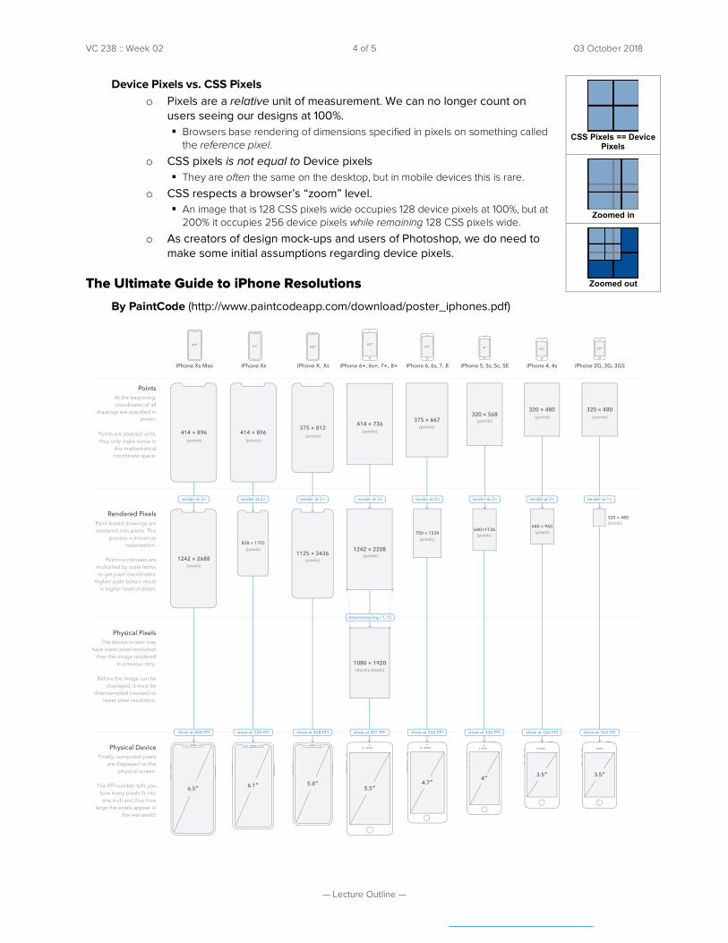
Device Pixels vs. CSS Pixels o Pixels are a relative unit of measurement. We can no longer count on
users seeing our designs at 100%. § Browsers base rendering of dimensions specified in pixels on something called
the reference pixel.
o CSS pixels is not equal to Device pixels § They are often the same on the desktop, but in mobile devices this is rare.
o CSS respects a browser’s “zoom” level. § An image that is 128 CSS pixels wide occupies 128 device pixels at 100%, but at
200% it occupies 256 device pixels while remaining 128 CSS pixels wide.
o As creators of design mock-ups and users of Photoshop, we do need to make some initial assumptions regarding device pixels.
The Ultimate Guide to iPhone Resolutions
By PaintCode (http://www.paintcodeapp.com/download/poster_iphones.pdf)
The device screen may have lower pixel resolution
than the image rendered in previous step.
Before the image can be displayed, it must be
downsampled (resized) to lower pixel resolution.
Physical Pixels
At the beginning, coordinates of all
drawings are specified in
Points are abstract units, they only make sense in
this mathematical coordinate space.
Points
Point-based drawings are rendered into pixels. This
process is known as rasterization.
Point coordinates are multiplied by scale factor to get pixel coordinates.
Higher scale factors result in higher level of detail.
Rendered Pixels
Finally, computed pixels are displayed on the
physical screen.
The PPI number tells you how many pixels fit into one inch and thus how
large the pixels appear in the real world.
Physical Device
points.320 × 480
3.5″
render at 1×
(pixels)
iPhone 2G, 3G, 3GS
3.5″
(points)
320 × 480
show at 163 PPI
320 × 480
640 × 960
3.5″
render at 2×
(pixels)
iPhone 4, 4s
3.5″
(points)
show at 326 PPI
320 × 568
640×1136
iPhone 5, 5s, 5c, SE
render at 2×
4″
4″
(points)
(pixels)
show at 326 PPI
375 × 667
750 × 1334
4.7″
render at 2×
(points)
(pixels)
show at 326 PPI
4.7″
375 × 812
1125 × 2436
5.8″
iPhone X,
render at 3×
(points)
(pixels)
show at 458 PPI
5.8″
Xs
414 × 736
1242 × 2208
1080 × 1920
5.5″
show at 401 PPI
(pixels)
(points)
(device pixels)
5.5″
render at 3×
downsampling / 1.15
414 × 896
828 × 1792
6.1″
render at 2×
(points)
(pixels)
show at 326 PPI
6.1″
iPhone XR
414 × 896
1242 × 2688
6.5″
iPhone Xs Max
render at 3×
(points)
(pixels)
show at 458 PPI
6.5″
The Ultimate Guide to iPhone Resolutions, by PaintCode
PaintCode is a unique vector drawing app that turns your drawings into Swift or Objective-C code. More info at PaintCodeApp.com
CSS Pixels == Device
Pixels
Zoomed in
Zoomed out
VC 238 :: Week 02 5 of 5 03 October 2018
— Lecture Outline —
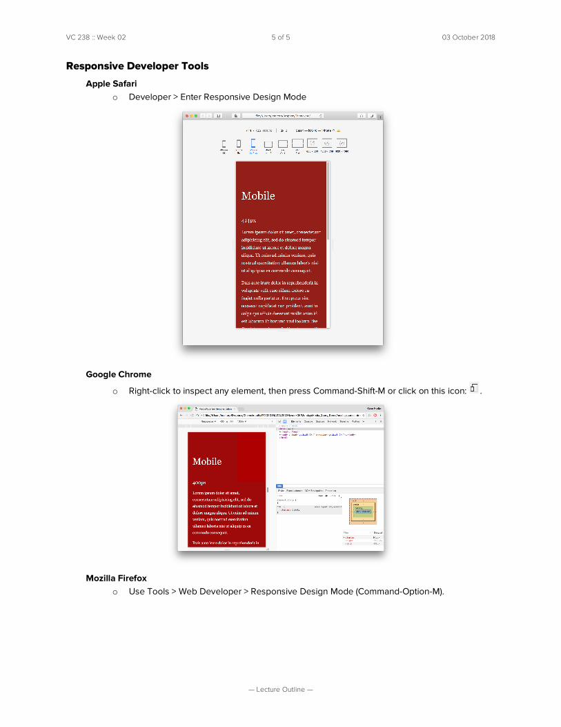
Responsive Developer Tools
Apple Safari o Developer > Enter Responsive Design Mode
Google Chrome
o Right-click to inspect any element, then press Command-Shift-M or click on this icon: .
Mozilla Firefox
o Use Tools > Web Developer > Responsive Design Mode (Command-Option-M).