week 1 understanding the web design environment. 1-2 html: then and now html is an application of...
TRANSCRIPT
Week 1
Understanding the Web Design Environment
1-2
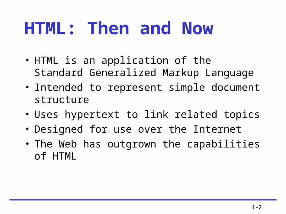
HTML: Then and Now
• HTML is an application of the Standard Generalized Markup Language
• Intended to represent simple document structure
• Uses hypertext to link related topics• Designed for use over the Internet• The Web has outgrown the capabilities of
HTML

1-3
HTML and the World Wide Web Consortium• The World Wide Web Consortium (W3C) is
the standards organization for the Web• Founded in 1994 at MIT• The W3C looks to expand and set standards
for the many new Web technologies

1-4
Using HTML for Structure
• HTML is a structured markup language that lets you identify common sections of a document
• The HTML markup tags indicate how the document sections appear in a browser
• The browser interprets the HTML markup elements and displays the results, hiding the actual markup tags from the user

1-5
Using HTML for Structure (continued)
• HTML is an open, nonproprietary, cross-platform compatible language
• HTML is not a What You See Is What You Get (WYSIWYG) layout tool
• HTML was intended only to express logical document structure, not display characteristics

1-6

1-7
1-8
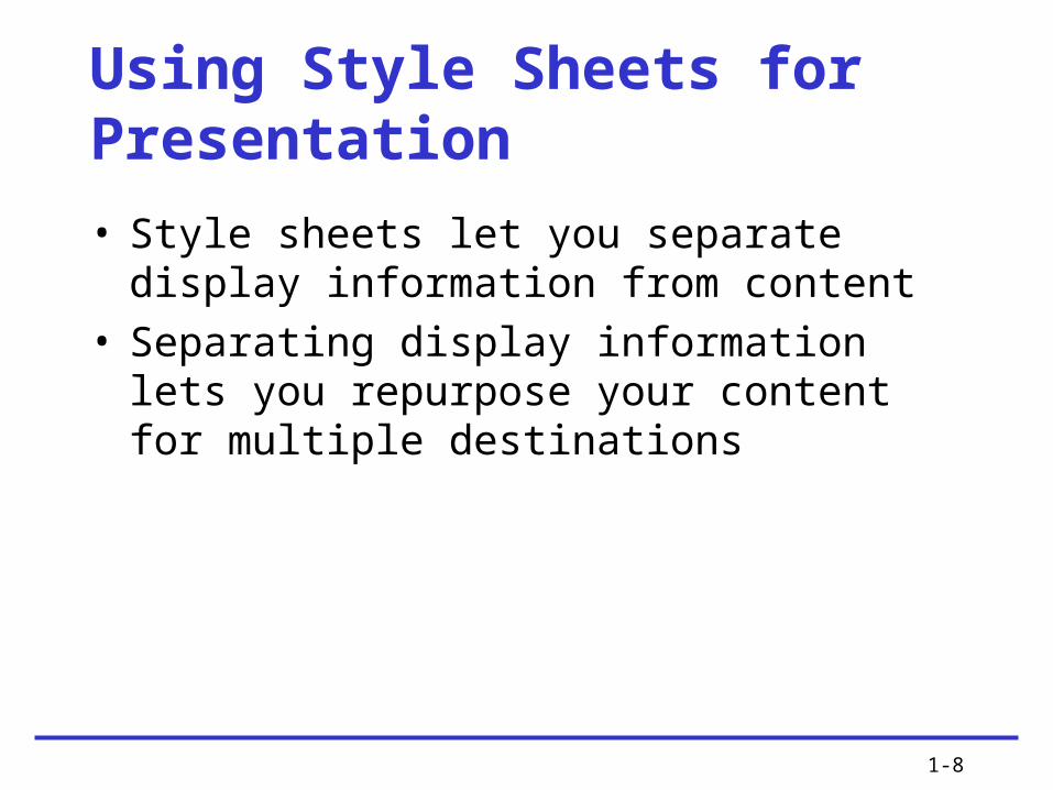
Using Style Sheets for Presentation
• Style sheets let you separate display information from content
• Separating display information lets you repurpose your content for multiple destinations

1-9

1-10
• Cascading Style Sheets (CSS) is a powerful display language for HTML
• CSS lets you state style rules in an external style sheet that is linked to every page on a Web site
• CSS lets you easily control the display characteristics of your Web site
• Newer browsers offer more complete CSS support
Using Style Sheets for Presentation (continued)

1-11
Organizing Information with Hypertext
• Information is linked on the Web using hypertext, a nonlinear way of organizing information
• Web users can quickly jump from one related topic to another
• As a hypertext author, you determine which terms to create as hypertext links

1-12
Moving from HTML to XHTML

1-13
A Brief Introduction to XML
• XML has no predefined elements such as <h1> or <p>
• XML is a metalanguage – a language that lets you create your own markup elements to meet your information needs
• XML code looks very similar to HTML code

1-14
Benefits of Moving to XHTML
• XHTML is a reformulation of HTML 4.01 in XML
• Brings data-handling benefits of XML to HTML
• Style sheets are required• Stricter syntax rules• 3 “flavors”: Strict, Transitional, Frameset
1-15
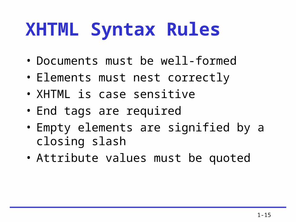
XHTML Syntax Rules
• Documents must be well-formed• Elements must nest correctly• XHTML is case sensitive• End tags are required• Empty elements are signified by a closing
slash• Attribute values must be quoted
1-16
Style Sheets are Required
• Because XHTML is an application of XML, you must use style sheets to render presentation information in XHTML
• The following two style sheet languages are currently available for use with XML or XHTML:– Cascading Style Sheets (CSS)– Extensible Style Language (XSL)

1-17
Migrating from HTML to XHTML• Evaluate existing code• Evaluate existing display information• Create coding conventions• Start using CSS• Test for backward compatibility

1-18
• You can create or generate HTML code to build Web pages in many ways
• Many sites on the Web are coded using simple text editing tools such as Notepad
• Many different HTML editing programs are available
Choosing an HTML Editor (continued)

1-19
Using Good Coding Practices
1-20
Stick to the Standards
• Follow the standards set by the World Wide Web Consortium
• Separate content structure from presentation information
• Content that is designed to standards displays more consistently in multiple browsers
1-21
Use Semantic Markup
• Semantic markup is descriptive markup that identifies the intended use of different document sections
• Semantic markup accurately describes each piece of content – a <p> signifies a paragraph, a <blockquote> is for a lengthy quotation, and so on

1-22
Choose the Correct Document Type• When you choose a document type, you are
pointing to a set of rules called Document Type Definition (DTD)
• DTDs contain all the elements, attributes, and usage rules for the markup language you are using
• Three document types, or “flavors,” of both HTML and XHTML are available: – Strict– Transitional– Frameset

1-23

1-24
Validate Your Code
• Valid code conforms to the rules of the W3C• Valid code enhances browser compatibility,
accessibility, and exchange of data• Use a software program called a validator to
read your code and compare it to the rules in the DTD

1-25
Validate Your Code (continued)• The most common mistakes that make
your code invalid include:– No doctype declaration– Missing closing tags, most commonly on
paragraphs– Missing alt attributes in <img> elements– Incorrect tag nesting– Unquoted attributes

1-26
Browser Compatibility Guidelines
• Follow W3C standards• Validate your code• Know your audience• Test your work in multiple browsers

1-27
Considering Connection SpeedDifferences
• A majority of U.S. computer users now have high-speed access to the Web
• Approximately one-quarter still access the Web with a dial-up modem
• Strive to keep page designs simple enough for the pages to load quickly
• The number of graphics on your Web pages is the single biggest factor influencing the speed at which pages are rendered

1-28

1-29
Working with the Cache to Improve Download Time
• The cache is the temporary storage area for Web pages and images
• The browser always tries to load images and files from the cache
• Make use of the cache by reusing images as much as possible

1-30
Coding for Multiple Screen Resolutions
• A computer monitor’s screen resolution is the horizontal and vertical width and height of the computer screen in pixels
• The most common screen resolution (traditionally expressed as width x height) is 1024 x 768
• User screen resolution is a factor over which you have no control

1-31
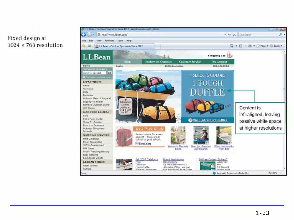
Fixed Design• As the screen resolution changes, the content
remains aligned to the left side of the page

1-32
1-33

1-34
Flexible Design• As the screen resolution changes, the content
expands to accommodate the varying screen width

1-35

1-36

1-37
Centered Design• As the screen resolution changes, the Web
page stays centered in the browser window, splitting the remaining space into equal amounts on the left and right side of the browser window

1-38

1-39

1-40
Operating System Issues• Monitors and displays software• Browser versions• Font choices

1-41
Summary
• Use Cascading Style Sheets • Decide whether to code to the XHTML
standard• Use good coding practices • Choose the type of editing tool you will use
to create your code• Choose the suite of browsers you will use to
test your site

1-42
Summary (continued)
• Decide how browser-specific your site will be • Resolve to continually test your work as you
build your site• Test with multiple browsers, at different
screen resolutions, and at different connection speeds
• If you can, try to view your site on multiple platforms such as PC and Macintosh as well