website analysis
TRANSCRIPT

Website

At the top of the website, there is the band logo. It is clearly distinguishable as it has been the band logo for a long time.It is the first thing you see, so it sticks in your mind and you remember the band.
Just underneath the logo there are various links to the bands’ news, tour dates, biography, videos, music, photos, store and contact. The website loads of the news page, which shows updates of the band, website and store. These links, the logo and the background are shown on every page of the website except the store. However, the store has the same colour scheme, this all helps in the construction of the band and whenever someone sees this they instantly think of the band.
Throughout the website, there is a ‘Follow’ button for twitter. This is a key feature as it allows the person to connect with them on social media and keep up to date a lot easier than having to constantly visit the website.
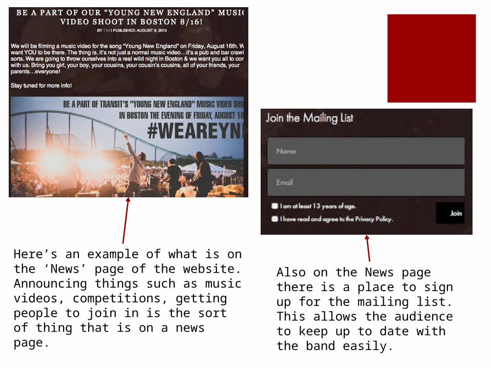
Here’s an example of what is on the ‘News’ page of the website. Announcing things such as music videos, competitions, getting people to join in is the sort of thing that is on a news page.
Also on the News page there is a place to sign up for the mailing list. This allows the audience to keep up to date with the band easily.

On the ‘Tour Dates’ tab it shows the dates that they are playing. An important feature is the ‘Local Dates’ tab, which shows any dates that they are playing that are nearby. This caters for the audience as it means that they don’t have to search through all the dates just to find ones near them.
On the ‘Bio’ page there is only a picture of a band. I think that there should also be a description of the history of the band, however, a picture is still a key feature for this page.

On the ‘Videos’ tab it has all the music videos on it. However, I think a way to improve this would be to add a ‘Making Of’ video.
The ‘Music’ page shows all the albums that the band has released and also gives links to where to buy them. This caters for the audience as it makes it easily accessible and easy to buy, especially as it gives links for different countries.
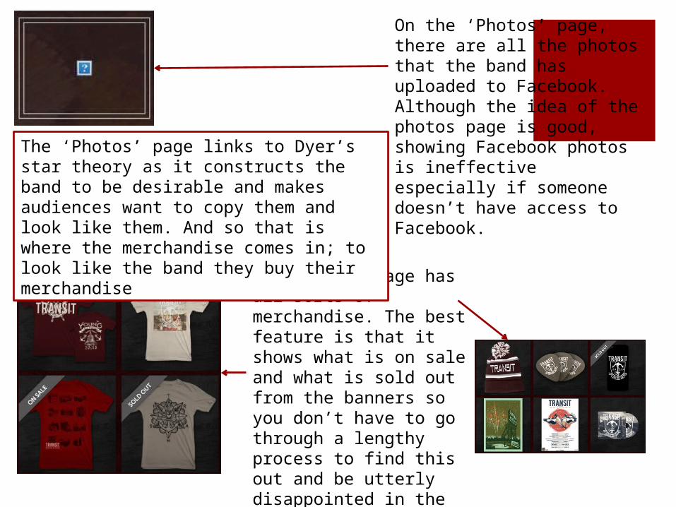
On the ‘Photos’ page, there are all the photos that the band has uploaded to Facebook. Although the idea of the photos page is good, showing Facebook photos is ineffective especially if someone doesn’t have access to Facebook.
The ‘Store’ page has all sorts of merchandise. The best feature is that it shows what is on sale and what is sold out from the banners so you don’t have to go through a lengthy process to find this out and be utterly disappointed in the end.
The ‘Photos’ page links to Dyer’s star theory as it constructs the band to be desirable and makes audiences want to copy them and look like them. And so that is where the merchandise comes in; to look like the band they buy their merchandise
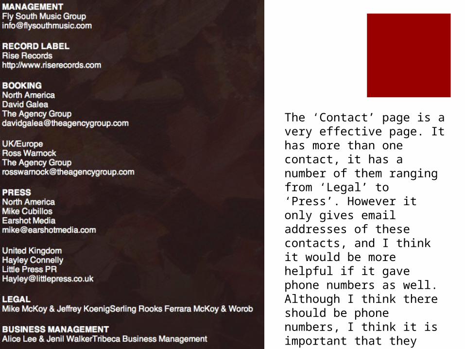
The ‘Contact’ page is a very effective page. It has more than one contact, it has a number of them ranging from ‘Legal’ to ‘Press’. However it only gives email addresses of these contacts, and I think it would be more helpful if it gave phone numbers as well. Although I think there should be phone numbers, I think it is important that they have included the names of these people.