· web viewthe future of food – module 11.2 summative assessment on food access and insecurity:...
TRANSCRIPT

The Future of Food – Module 11.2 Summative Assessment on food access and insecurity:
Names of Students in your group: _______________________________________________
Anatomy of a famine: multifactorial failures of adaptive capacity to climate and social shocks.
This worksheet relies heavily on the data resources presented by the Food Security and Nutrition Analysis Unit – Somalia (http://www.fsnau.org/) and the Famine Early Warning System (FEWS)
This summative assessment uses maps, tables, and graphs to guide you in analyzing a tragic famine in Somalia between 2010 and 2012 as a case of adaptive capacity and vulnerability (see Module11.2 for the definition of a famine). As many as 260,000 people died in this famine, half of them children under five years old (http://www.bbc.com/news/world-africa-22380352 , May 2, 2013). This is a difficult and sobering topic because we confront deaths by hunger on a massive scale, with a sense that much of the suffering could have been avoided. We hope, along with advocates such as those who work on famine response and analysis, that by providing this activity we are contributing to greater understanding that can help in avoiding these tragedies in the future.
Instructions:
You should read carefully through this case study and answer the question in each section, e.g. “Question A1” and the two summary questions at the end. Submit the filled in worksheet using the course management software at your institution.
First things first: Please put the names of students in your group on the blank at the top of this sheet.
A. Overall Context: Consider the rainfall map of Africa reproduced below.
Question A1 (fill in): What is approximately the rainfall in the circled region of Africa (central Somalia) where the famine occurred? Between _________ mm and ___________ mm per year.
Compared to other areas in Africa, is this low or high? ____________________
Is this a relatively wet or dry climate? __________________________________________
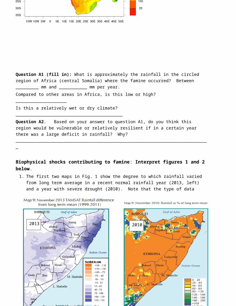
Question A2. Based on your answer to question A1, do you think this region would be vulnerable or relatively resilient if in a certain year there was a large deficit in rainfall? Why? ____________________________________________________________________________
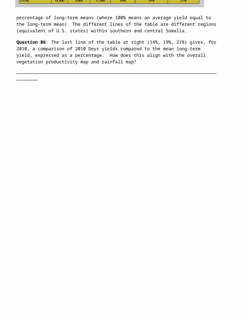
Biophysical shocks contributing to famine: Interpret figures 1 and 2 below. 1. The first two maps in Fig. 1 show the degree to which rainfall varied from long term average in a recent
normal rainfall year (2013, left) and a year with severe drought (2010). Note that the type of data presented is different between 2010 and 2013: the 2013 map at left shows an abolute difference with respect to the mean in mm , while the 2010 map at right shows the percent rainfall of normal.
Figure 1. Rainfall differences from the long-term mean in 2013 (relatively normal year, differences in mm, and 2010 (severe drought year, differences in percent of normal)
Let’s start making a ballpark estimate of the difference between the two years in rainfall terms. On the left, we note first that all the variation is mildly positive with respect to the long-term average shown on the map above: in functional terms, 2013 is an average rainfall year. By contrast, there is a drastic negative variation on the right in the famine year shown by the orange color with about only 10% of the yearly rainfall.
20102013

Section B: Vegetation and Crop ProductivityMeanwhile, figure 2 below shows the state of vegetation productivity, which includes crops and wild vegetation, during the normal year 2013 at left, and during 2010 at right. A measure called the normalized difference vegetation index (NDVI) is used with satellite imagery to measure productivity. NDVI is basically the greenness of the earth seen from space, calibrated to the amount of vegetation (crops, forest, etc.) that is growing there.
Figure 2. NDVI (greenness) differences from long-term means in late 2013 (left, typical year), and late 2010 (right, famine onset).
Question B1: How does plant productivity in figure 2 relate to the rainfall map above in figure 1, in a general way? _____________________________________________
_____________________________________________
_____________________________________________
_____________________________________________
_____________________________________________
_____________________________________________
Figure 3. Population density in Somalia
20102013

Question B2. Crop production is one thing that the NDVI measure of greenness can reveal. Besides crops, what other ways are farmers in the region likely using biomass produced by plants (leaves, stems, woody biomass). There are at least two please name one: ____________________________________________________________________________________
Question B3. Under this drought shock, how do you think plant productivity relates to the ability of farmers in the drought-stricken regions of to access food through crops and livestock, as well as townspeople and urban consumers living near to these farmers? ______________________________________________________________________________________.
Question B4: Note also above in Figure 3 the distribution of population within Somalia (the total population of Somalia is just over 10 million). Give a very rough estimate of the population living in the reduced productivity zone (red and orange in Fig. 2 for 2010) – i.e. is it 100,000 people, 1 million, all 10 million people in Somalia?
_____________________________________________________________
Question B5: Analyzing all the map data together (mean long-term rainfall, 2010 rainfall, population distribution in Somalia), what would be your response in 2010 if you were a person responsible for activating responses to humanitarian crises, such as the Famine Early Warning System (FEWS)?
_________________________________________________________________________________
_________________________________________________________________________________
_________________________________________________________________________________
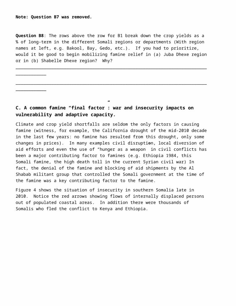
The response of crop yield: Table 1 below shows the production of major cereals (maize and sorghum) in Somalia in the Deyr season (one of two growing seasons through the year in Somalia), along with yield as a percentage of long-term means (where 100% means an average yield equal to the long-term mean). The different lines of the table are different regions (equivalent of U.S. states) within southern and central Somalia.
Question B6: The last line of the table at right (14%, 19%, 21%) gives, for 2010, a comparison of 2010 Deyr yields compared to the mean long-term yield, expressed as a percentage. How does this align with the overall vegetation productivity map and rainfall map?
___________________________________________________________________________________
Table 1. Production of staple grains in Somalia for 2010 Deyr season (late 2010)

Note: Question B7 was removed.
Question B8: The rows above the row for B1 break down the crop yields as a % of long-term in the different Somali regions or departments (With region names at left, e.g. Bakool, Bay, Gedo, etc.). If you had to prioritize, would it be good to begin mobilizing famine relief in (a) Juba Dhexe region or in (b) Shabelle Dhexe region? Why? _______________________________________________________________________________________
_______________________________________________________________________________________
C. A common famine “final factor”: war and insecurity impacts on vulnerability and adaptive capacity.
Climate and crop yield shortfalls are seldom the only factors in causing famine (witness, for example, the California drought of the mid-2010 decade in the last few years: no famine has resulted from this drought, only some changes in prices). In many examples civil disruption, local diversion of aid efforts and even the use of “hunger as a weapon” in civil conflicts has been a major contributing factor to famines (e.g. Ethiopia 1984, this Somali famine, the high death toll in the current Syrian civil war) In fact, the denial of the famine and blocking of aid shipments by the Al Shabab militant group that controlled the Somali government at the time of the famine was a key contributing factor to the famine.
Figure 4 shows the situation of insecurity in southern Somalia late in 2010. Notice the red arrows showing flows of internally displaced persons out of populated coastal areas. In addition there were thousands of Somalis who fled the conflict to Kenya and Ethiopia.

Question C1: The following question asks you to compare the adaptive capacity vs. vulnerability of different cases of displaced people versus those who are able to stay close to their stored grain that they may have from previous years:
Rank the following situations of families in terms of their level of adaptive capacity, by placing numbers from most (1) to least adaptive capacity (5) in the first space, and briefly explain your reasoning for each one in the longer space after the situation.
_____(first rank) Poor farm family that manages to stay in their home with small supplies of stored food and very little saved money, but some livestock
(now explain) _____________________________________________________________________________
_______ Poor rural family displaced by the war and traveling through the desert, with only a small amount of food, no saved money or livestock.
___________________________________________________________________________________________
________ Poorer farm family displaced by the war and living in a refugee camp in Kenya
___________________________________________________________________________________________
________ Wealthier farming family that manages to stay in their home with stored grain from previous years, and purchasing power to buy grain.
___________________________________________________________________________________________
________ Poor urban family displaced by the war and traveling through the desert, with a small amount of food and some saved money
___________________________________________________________________________________________
Figure 4. Insecurity and displacement of population in Somalia, December 2010
D. Food Prices and vulnerabilityAn important direct determinant of food security/insecurity in episodes of famines is the local price of food in the famine region. Subsistence production by smallholders is hugely important in smallholder food systems, but many poorer farmers, as well as most urban dwellers, purchase part or all of their food. Crop failure among smallholders like that which occurred in Somalia in 2010 (see above) only deepens the dependence of these vulnerable sectors on food purchases, so that their vulnerability to price increases (sometimes called price shocks in this context) goes up. Also, if global markets are unable to quickly fill the shortfall in local production due to conflict and government impediment during a war, then crop failure also can increase prices dramatically because the market lacks food supply. Consider the two graphs below (Figs. 5a and 5b) showing staple grain prices, and also the amount of grain purchasable with one day’s wage for staple grains, in kg grain per daily wage from 2004 to 2013. (images reproduced from FEWS publications)
Figure 5.
5a: Price trends of staple grains (most common grain in each region of Somalia) for 2004-2013, in Somali Shillings per kg.
5b: wage purchasing power or household terms of kg grain that can be bought with a daily wage. The two graphs have been roughly overlapped to show the same time axis. A sobering comparison: Even lower-income U.S. consumers with a ~US$10/h wage would be able to purchase well over 25 kg of grain (e.g. rice at a supermarket) at local U.S. prices.
Figure 5a. Local grain prices
Figure 5b. Purchasing power of one day’s wage (in kg of grain)
Question D1: Note the two time points noted by the vertical lines (A) and (B) on figure 5 (May 2011, July 2012). Which of these shows the impact of the drought and crop failure on food prices? _____________________________________________________
Does this date make sense in terms of the crop harvest data for 2010 that you analyzed above? _____________________________________________________________________________________
Question D2. Look at the purchasing power of one days wage at time point A, and then at the time point B and in the following months. Based on these data, if someone from an international aid organization asked you to define a rough threshold for purchasing power (kg of grain per daily wage) that is in line with more normal, food secure conditions, what approximate kg grain or range of kg would you give them purchasable with a single day’s wage?
_____________________________________________________________________________________
E. The end result: disastrous food insecurity and mortality: In spite of the efforts mobilized by FEWS and many other U.N. agencies and aid groups, the combination of crop failure, high food prices, and civil conflict caused a disastrous famine in Somalia from 2010 to2012. The maps on the next page (Fig. 6) show the indicators for the food security/famine situation and trends in August 2011 and the total estimated mortality from the famine.
Note that the loss of life in this famine is on the same magnitude as that encountered in a major war. In the case of this famine, deaths from hunger were not entirely separable from the war and other forms of civil conflict.
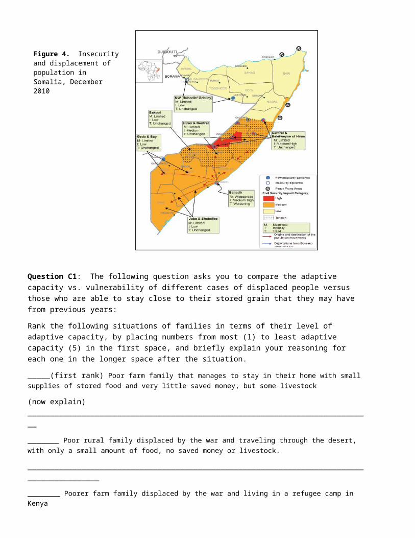
Figure 6. Food security assessment of Somalia in August 2011 (left) and total estimated death toll from the famine (above right). Arrows on the left diagram show the direction and magnitude of the food security trend.
Famine Mortality2011-2012
Food Insecurity,August 2011
Section F: final analysis. Now answer the summary questions below.
F1. Scales of adaptive capacity and vulnerability: By now we hope that you have seen that for famine to occur, many things have to go tragically wrong at the same time. Another way to say that “things go wrong” in the language of RACV from this module is that there is a failure of adaptive capacity, often due to the magnitude of a shock being so great, or a new vulnerability that is exposed by the shock. In the following three diagrams we illustrate three levels of adaptive capacity that were overwhelmed by the crisis that created the Somali famine. Match the factors of shock/new vulnerability given just below to the different scales of adaptive capacity in the three cases, and explain briefly what effect this had on food security.
a. The three situations (further shocks and perturbations) you should match are:i. Prices go up and/or food not even available in markets. Civil strife means that paid work is hard to
find.ii. Drought is extreme, and even well-adapted resilient varieties, grazing, and other land-uses affected.
Displacement of farmers means no access to land or livestock.iii. War and standoff between Somali government and international aid agencies slows or stops the
delivery of food aid.b. Here are the different scales of adaptive capacity you should match to these situations. For each
question below, choose which of the above shocks or perturbations i, ii, or iii best matches the scale of resilience below.
i. Local adaptive capacity on farms: local farming knowledge and grazing of livestock is a resilient system that can adapt to changing conditions in a dry climate. By using very drought-adapted crop varieties, and shifting to livestock, stored grain, and temporary migration for wage work in drought years, a moderate drought can be survived by farmers in this very challenging climate.
Match one of the situations from the 2010-2012 famine to this level of resilience, and explain in a sentence how it overwhelms this level of resilience: _________________________________________________________________________________________________________________________________________________
ii. Regional and country-scale adaptive capacity based on food purchase: even if drought strikes one region of the country, food production in other areas will remain strong, and savings and wage earnings by farmers and city dwellers will allow them to supplement grain stores by purchasing food. Life will be hard, but not impossible.
Match one of the situations from the 2010-2012 famine to this country-scale adaptive capacity, and explain in a sentence how it overwhelms this level of resilience: _________________________________________________________________________________________________________________________________________________
iii. Global-scale adaptive capacity: international relief agencies and global markets also provide resilience to local regions when other aspects of resilience fail. Food shipments under famine conditions, and camps for displaced people, allow survival under extreme conditions when other strategies of adaptive capacity fail.
Match one of the situations from the 2010-2012 famine to this global scale of resilience, and explain in a sentence how it overwhelms this level of resilience: _________________________________________________________________________________________________________________________________________________

F2. Concept map of the Famine: Draw a concept map below (or create a concept map in a powerpoint slide attached or copied into this document) explaining how the famine occurred, based on the exploration of the case in this worksheet. You should label instances of adaptive capacity or vulnerability. Below are some terms or concepts you may consider using, but feel free to add your own as well. As you draw you diagram, label at least three aspects that represent components of the human system with a capital H, and three elements that represent components of the natural system with a capital N. You may want to refer to the coupled human-natural systems diagrams in module 11 for ideas, though you are not required to reproduce one of these diagrams as your concept map:
Drought Civil conflict Food Prices Adapted crops and livestock
Stored grain International Aid Displacement Crop yields
Mortality Wages Dry Climate