web foundations thursday, october 24, 2013 lecture 18: the principles of design
TRANSCRIPT
Web FoundationsTHURSDAY, OCTOBER 24, 2013
LECTURE 18: THE PRINCIPLES OF DESIGN
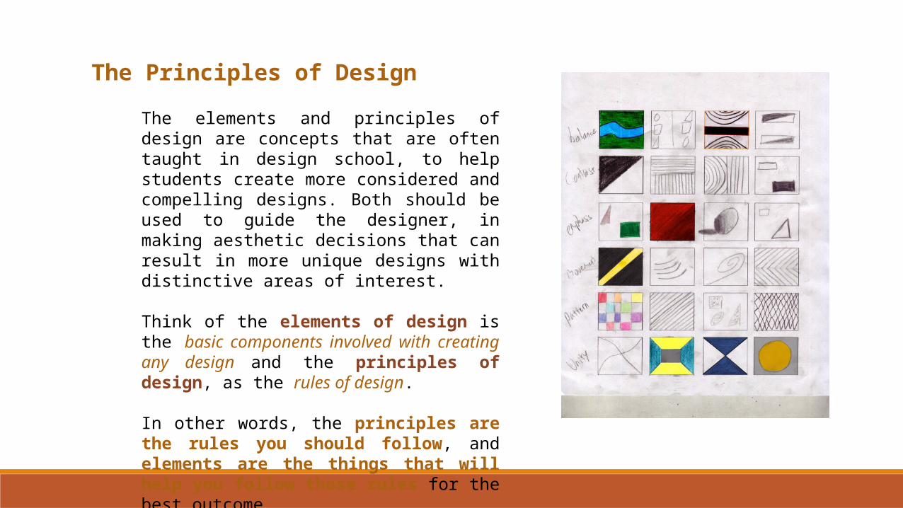
The Principles of Design
The elements and principles of design are concepts that are often taught in design school, to help students create more considered and compelling designs. Both should be used to guide the designer, in making aesthetic decisions that can result in more unique designs with distinctive areas of interest.
Think of the elements of design is the basic components involved with creating any design and the principles of design, as the rules of design.
In other words, the principles are the rules you should follow, and elements are the things that will help you follow those rules for the best outcome.
The Principles of Design
This means that, if the principles of design are like the laws or rules of design, then to have a good design, you should consider each of these principles carefully even if you end up ignoring them deliberately, or going against them completely. Like the elements of design, there is some debate over how many principles there actually are, depending on whom you talk to. For today's lecture, we will be examining ten principles of design. They are, in no particular order:
1. Contrast2. Emphasis3. Balance4. Unity5. Pattern6. Movement7. Rhythm and Repetition8. Proportion9. Simplicity10. Gradation
Contrast
If you think about what the word contrast means, comparing two or more things and noticing their differences, you get a rough idea of how it can be used in terms of design to create visual areas of interest.
In formal terms, contrast is the juxtaposition of opposing elements by way of using different colors, tones, directions, lines, shapes, et cetera to show emphasis.
Creating contrast is a skill that often develops over time. However, you can jump start your own use of it by paying attention to your site's content, and deciding in advance the relative importance of each element in your design.
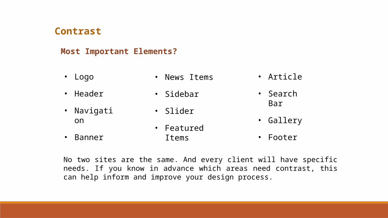
Contrast
Most Important Elements?
• Logo
• Header
• Navigation
• Banner
• News Items
• Sidebar
• Slider
• Featured Items
• Article
• Search Bar
• Gallery
• Footer
No two sites are the same. And every client will have specific needs. If you know in advance which areas need contrast, this can help inform and improve your design process.
Contrast
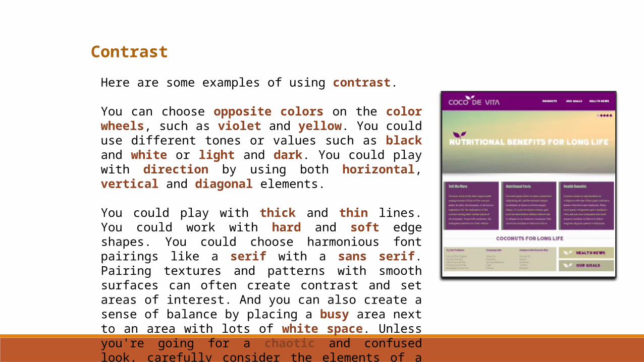
Here are some examples of using contrast.
You can choose opposite colors on the color wheels, such as violet and yellow. You could use different tones or values such as black and white or light and dark. You could play with direction by using both horizontal, vertical and diagonal elements.
You could play with thick and thin lines. You could work with hard and soft edge shapes. You could choose harmonious font pairings like a serif with a sans serif. Pairing textures and patterns with smooth surfaces can often create contrast and set areas of interest. And you can also create a sense of balance by placing a busy area next to an area with lots of white space. Unless you're going for a chaotic and confused look, carefully consider the elements of a design as you construct your web layout.
Emphasis
The second of the ten principles of design is emphasis. What exactly does emphasis mean?
Merriam-Webster defines emphasis as force or intensity of expression that gives impressiveness or importance to something.
In plain English and with regard to web design, emphasis occurs when attention is focused on a single area within a design, to assist the viewer in understanding visually that this particular area is more important than other areas.

Emphasis
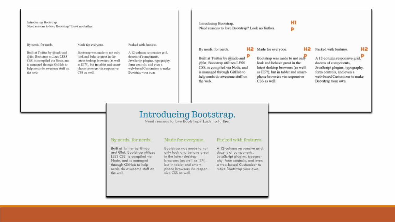
We need to find a way to show the viewer what's most important in our design. Certainly, we can easily accomplish this with size and placement of certain key elements like a set of large photos, or one big rotating banner. But what about text?
How do we teach web visitors what they should and should not focus on when they come to a new website? The answer is simple: using harmonious hierarchical font styles or what some designers call typographic hierarchy.
This term refers to the specific way of using fonts that creates a sense of flow and emphasis on a page. By deliberately varying the size, weight, color and spacing of your text, your text not only looks great, but it also aids visitors in understanding which elements on your site are more important than others. For instance, you can make certain text bold, italic, or all caps, and you can tier the size of your elements in pixels, percentages, or ems, or any other unit of measure using cascading style sheets.
Emphasis
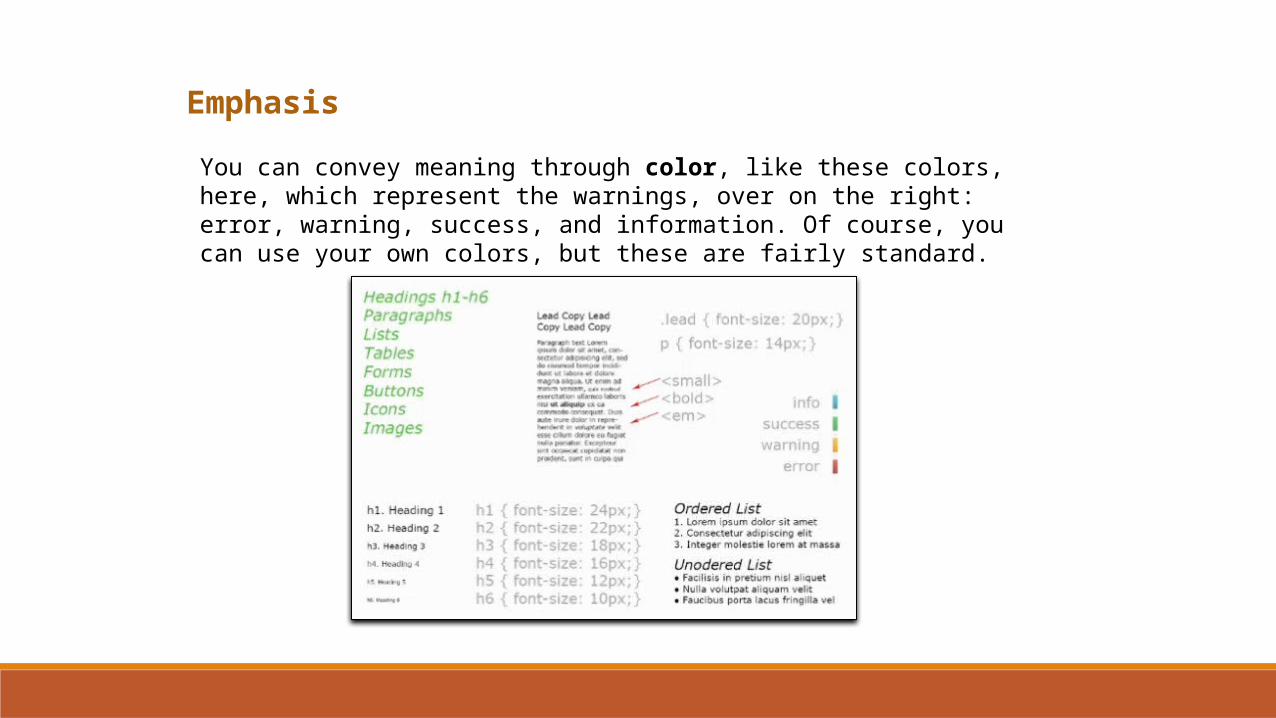
You can convey meaning through color, like these colors, here, which represent the warnings, over on the right: error, warning, success, and information. Of course, you can use your own colors, but these are fairly standard.
Emphasis
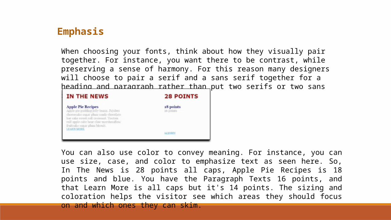
When choosing your fonts, think about how they visually pair together. For instance, you want there to be contrast, while preserving a sense of harmony. For this reason many designers will choose to pair a serif and a sans serif together for a heading and paragraph rather than put two serifs or two sans serifs next to each other.
You can also use color to convey meaning. For instance, you can use size, case, and color to emphasize text as seen here. So, In The News is 28 points all caps, Apple Pie Recipes is 18 points and blue. You have the Paragraph Texts 16 points, and that Learn More is all caps but it's 14 points. The sizing and coloration helps the visitor see which areas they should focus on and which ones they can skim.
Emphasis
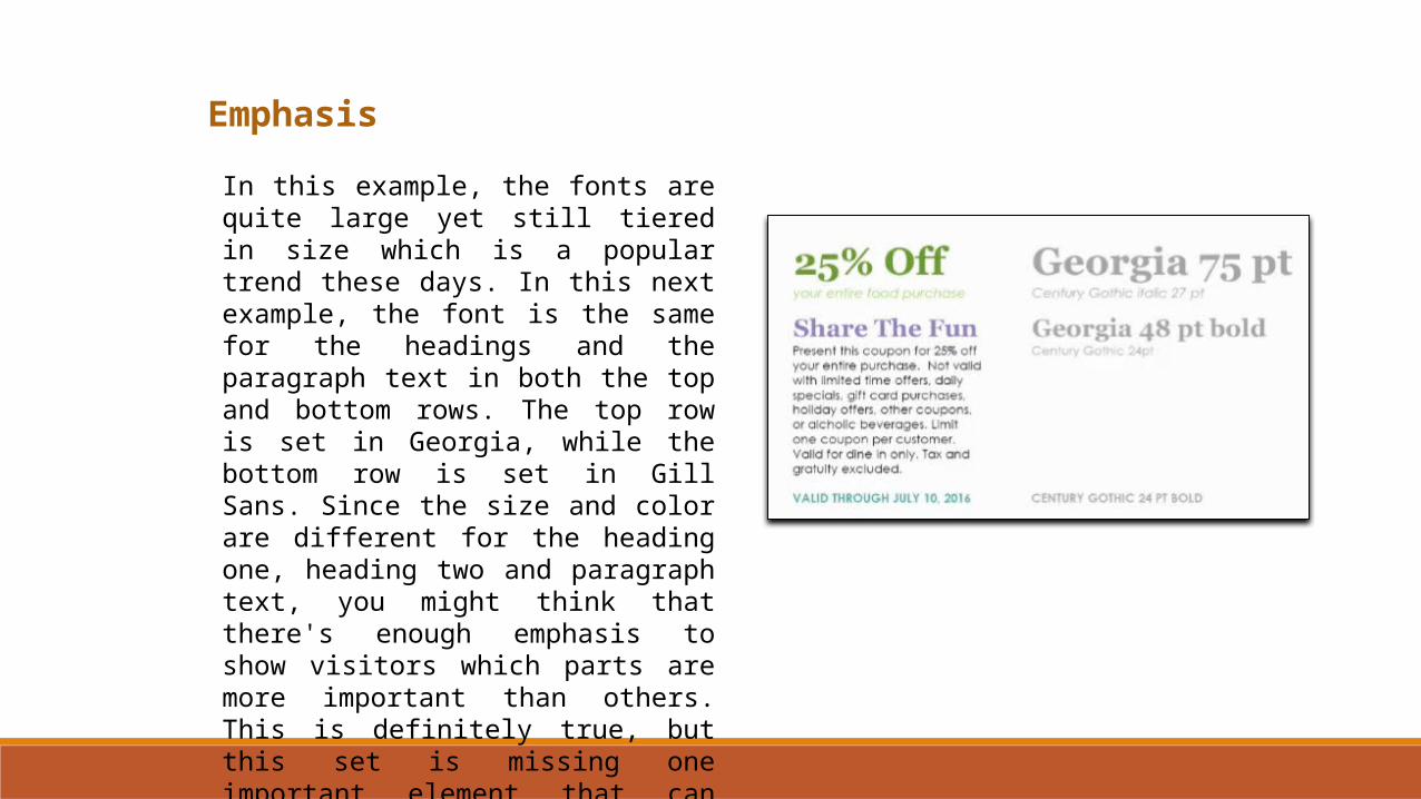
In this example, the fonts are quite large yet still tiered in size which is a popular trend these days. In this next example, the font is the same for the headings and the paragraph text in both the top and bottom rows. The top row is set in Georgia, while the bottom row is set in Gill Sans. Since the size and color are different for the heading one, heading two and paragraph text, you might think that there's enough emphasis to show visitors which parts are more important than others. This is definitely true, but this set is missing one important element that can really improve readability.
Emphasis
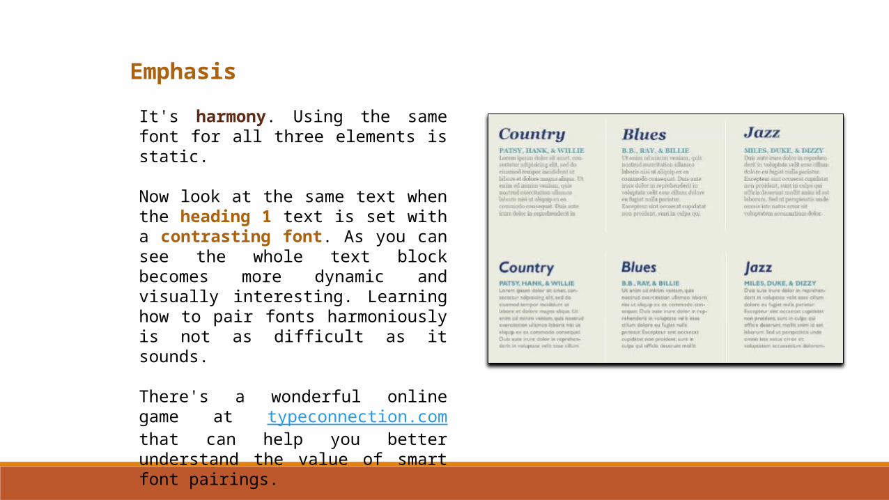
It's harmony. Using the same font for all three elements is static.
Now look at the same text when the heading 1 text is set with a contrasting font. As you can see the whole text block becomes more dynamic and visually interesting. Learning how to pair fonts harmoniously is not as difficult as it sounds.
There's a wonderful online game at typeconnection.com that can help you better understand the value of smart font pairings.
Balance
The next principle of design we'll explore is balance.
In design, balance can happen in several ways including paying special attention to the alignment, distribution, and placement of various shaped colored and sized objects in your layouts.
In fact, we can say that balance occurs in a design when the elements as a whole have a feeling of equality of weight, attention or attraction.
Balance
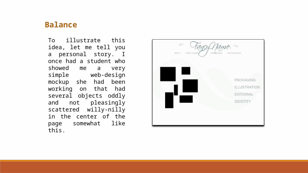
To illustrate this idea, let me tell you a personal story. I once had a student who showed me a very simple web-design mockup she had been working on that had several objects oddly and not pleasingly scattered willy-nilly in the center of the page somewhat like this.
Balance
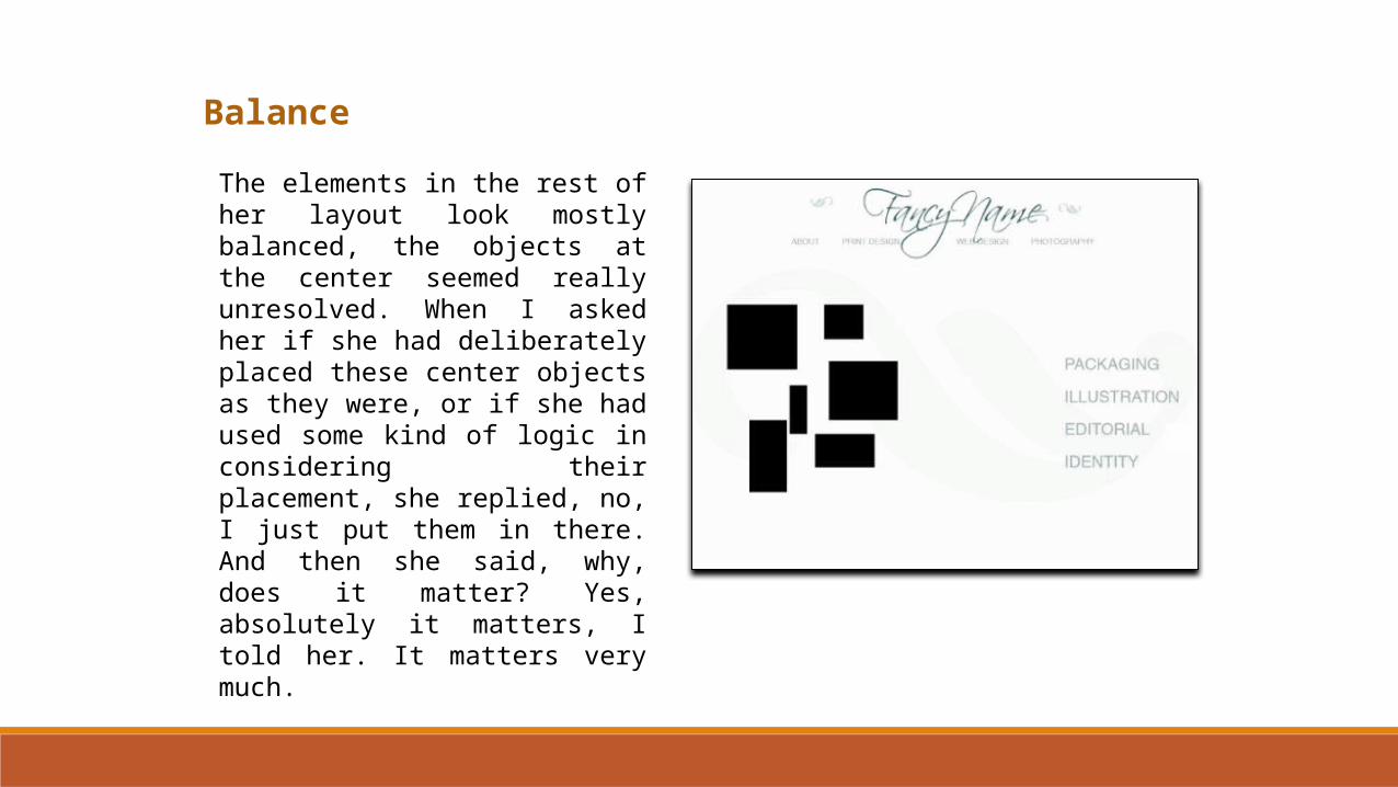
The elements in the rest of her layout look mostly balanced, the objects at the center seemed really unresolved. When I asked her if she had deliberately placed these center objects as they were, or if she had used some kind of logic in considering their placement, she replied, no, I just put them in there. And then she said, why, does it matter? Yes, absolutely it matters, I told her. It matters very much.
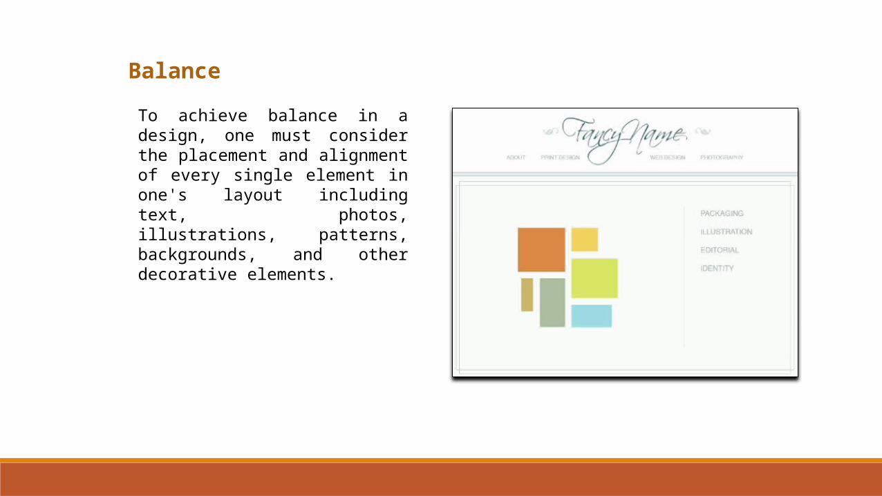
Balance
To achieve balance in a design, one must consider the placement and alignment of every single element in one's layout including text, photos, illustrations, patterns, backgrounds, and other decorative elements.
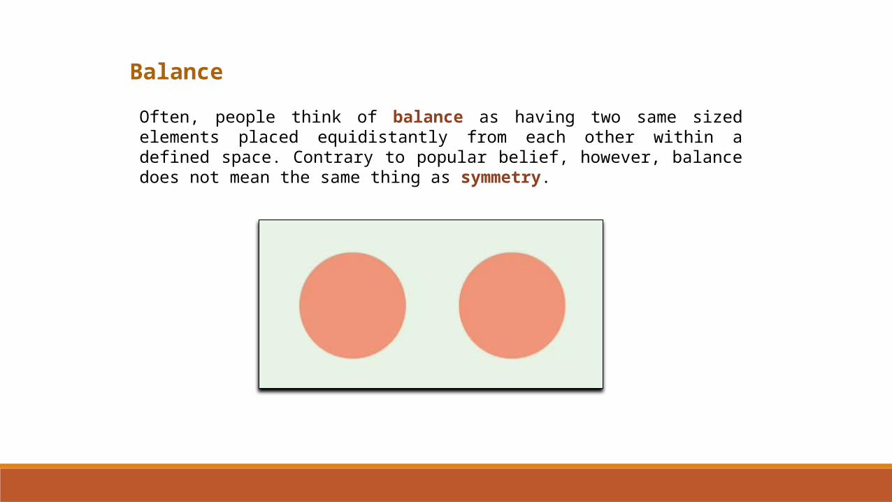
Balance
Often, people think of balance as having two same sized elements placed equidistantly from each other within a defined space. Contrary to popular belief, however, balance does not mean the same thing as symmetry.
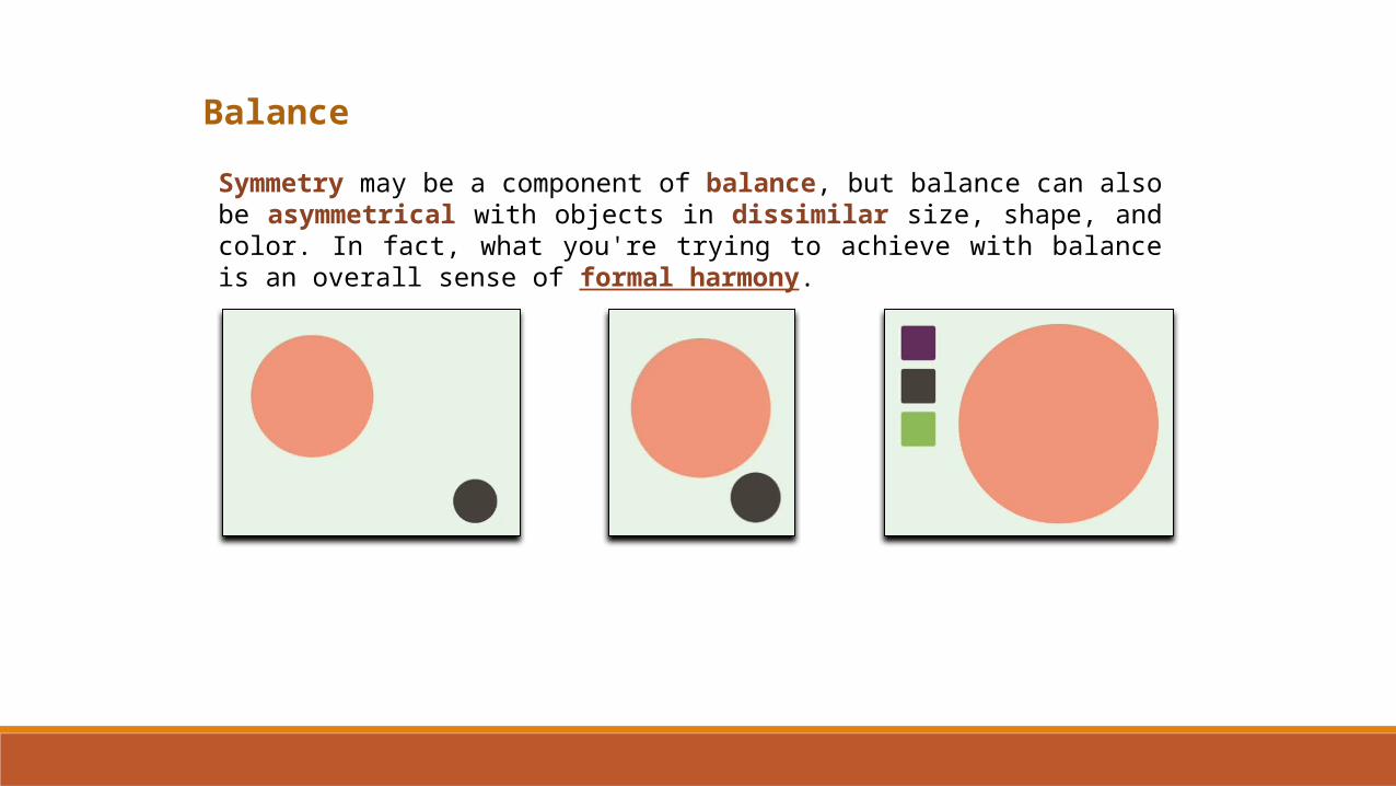
Balance
Symmetry may be a component of balance, but balance can also be asymmetrical with objects in dissimilar size, shape, and color. In fact, what you're trying to achieve with balance is an overall sense of formal harmony.

Balance
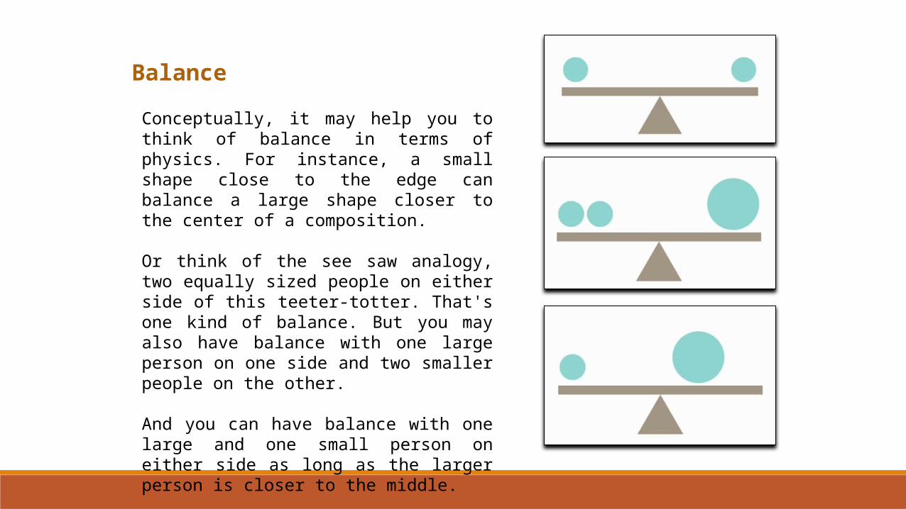
Conceptually, it may help you to think of balance in terms of physics. For instance, a small shape close to the edge can balance a large shape closer to the center of a composition.
Or think of the see saw analogy, two equally sized people on either side of this teeter-totter. That's one kind of balance. But you may also have balance with one large person on one side and two smaller people on the other.
And you can have balance with one large and one small person on either side as long as the larger person is closer to the middle.
Balance
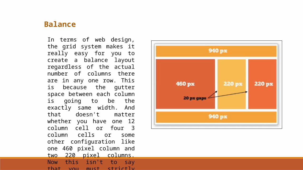
In terms of web design, the grid system makes it really easy for you to create a balance layout regardless of the actual number of columns there are in any one row. This is because the gutter space between each column is going to be the exactly same width. And that doesn't matter whether you have one 12 column cell or four 3 column cells or some other configuration like one 460 pixel column and two 220 pixel columns. Now this isn't to say that you must strictly follow the grid system to achieve balance in your web layouts.
Balance
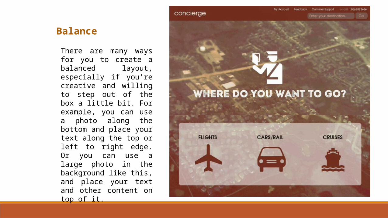
There are many ways for you to create a balanced layout, especially if you're creative and willing to step out of the box a little bit. For example, you can use a photo along the bottom and place your text along the top or left to right edge. Or you can use a large photo in the background like this, and place your text and other content on top of it.
Balance
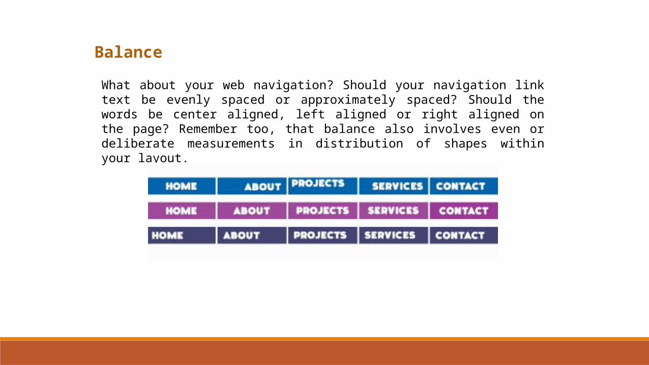
What about your web navigation? Should your navigation link text be evenly spaced or approximately spaced? Should the words be center aligned, left aligned or right aligned on the page? Remember too, that balance also involves even or deliberate measurements in distribution of shapes within your layout.
Balance
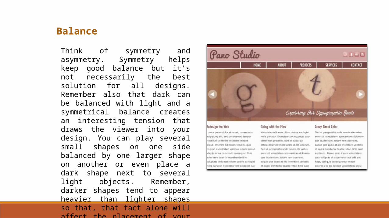
Think of symmetry and asymmetry. Symmetry helps keep good balance but it's not necessarily the best solution for all designs. Remember also that dark can be balanced with light and a symmetrical balance creates an interesting tension that draws the viewer into your design. You can play several small shapes on one side balanced by one larger shape on another or even place a dark shape next to several light objects. Remember, darker shapes tend to appear heavier than lighter shapes so that, that fact alone will affect the placement of your objects as you strive for balance in your design.
Unity
The next principle of a design we will examine is unity or what some people refer to as harmony.
In web design you can achieve unity through a pleasing balance of the elements of design like color, form, shape, and space. Another great way to keep the design cohesive and promote unity is to customize your hyperlink styles with cascading style sheets.
Simply put, unity refers to the pleasing arrangement of all the parts within a composition.
In design, we're often trying to communicate some kind of idea, promote a brand, or evoke a feeling.
Unity
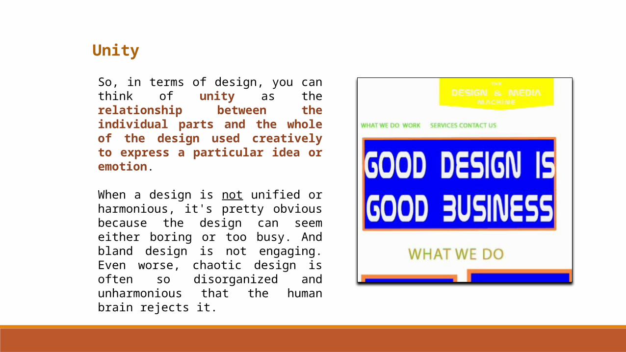
So, in terms of design, you can think of unity as the relationship between the individual parts and the whole of the design used creatively to express a particular idea or emotion.
When a design is not unified or harmonious, it's pretty obvious because the design can seem either boring or too busy. And bland design is not engaging. Even worse, chaotic design is often so disorganized and unharmonious that the human brain rejects it.
Unity
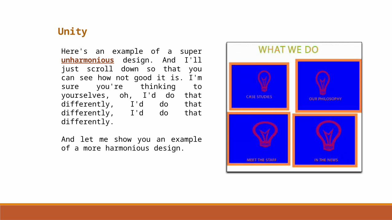
Here's an example of a super unharmonious design. And I'll just scroll down so that you can see how not good it is. I'm sure you're thinking to yourselves, oh, I'd do that differently, I'd do that differently, I'd do that differently.
And let me show you an example of a more harmonious design.
Unity
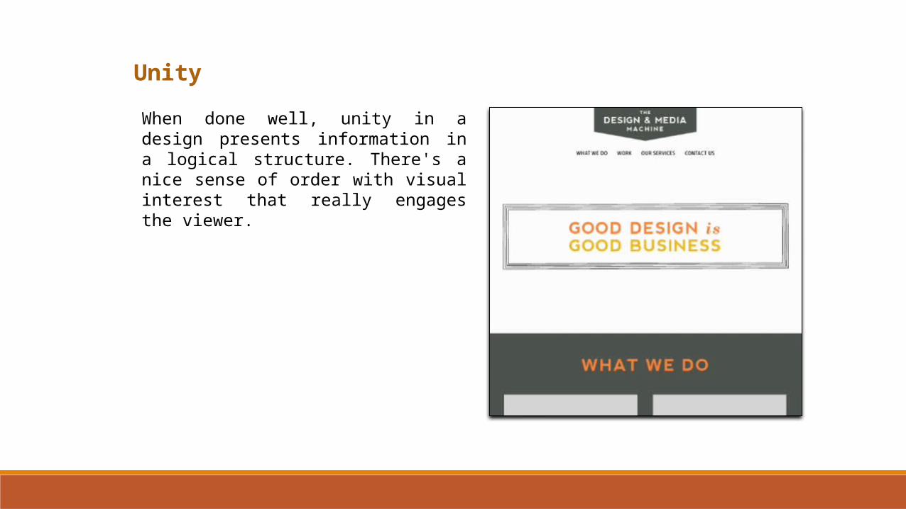
When done well, unity in a design presents information in a logical structure. There's a nice sense of order with visual interest that really engages the viewer.
Unity
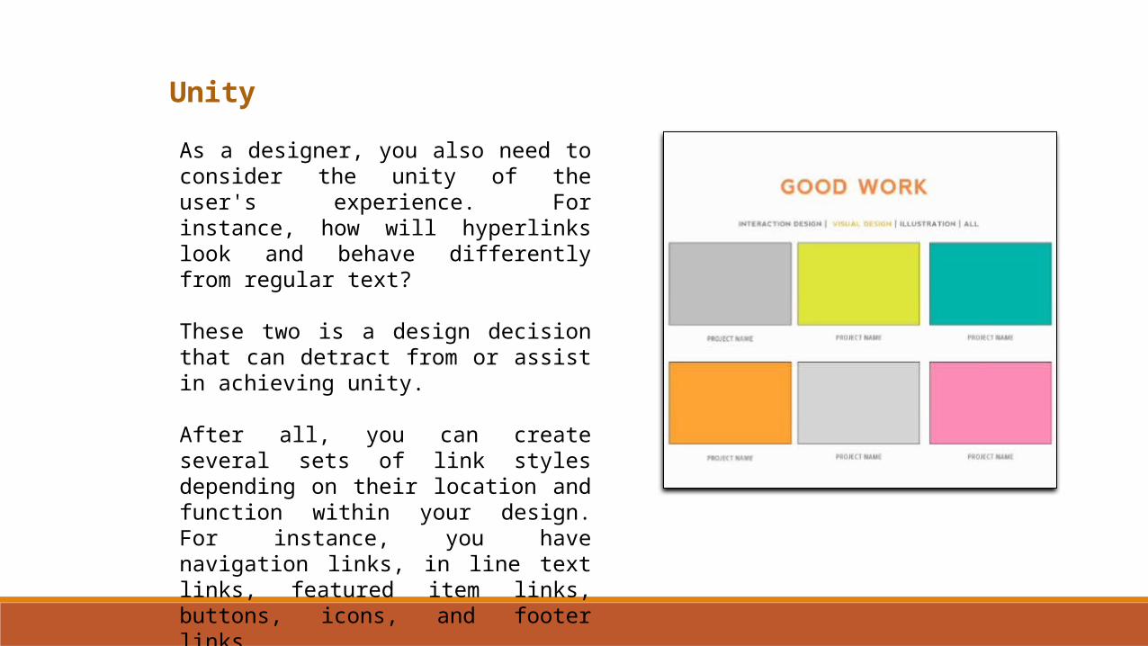
As a designer, you also need to consider the unity of the user's experience. For instance, how will hyperlinks look and behave differently from regular text?
These two is a design decision that can detract from or assist in achieving unity.
After all, you can create several sets of link styles depending on their location and function within your design. For instance, you have navigation links, in line text links, featured item links, buttons, icons, and footer links.
Unity
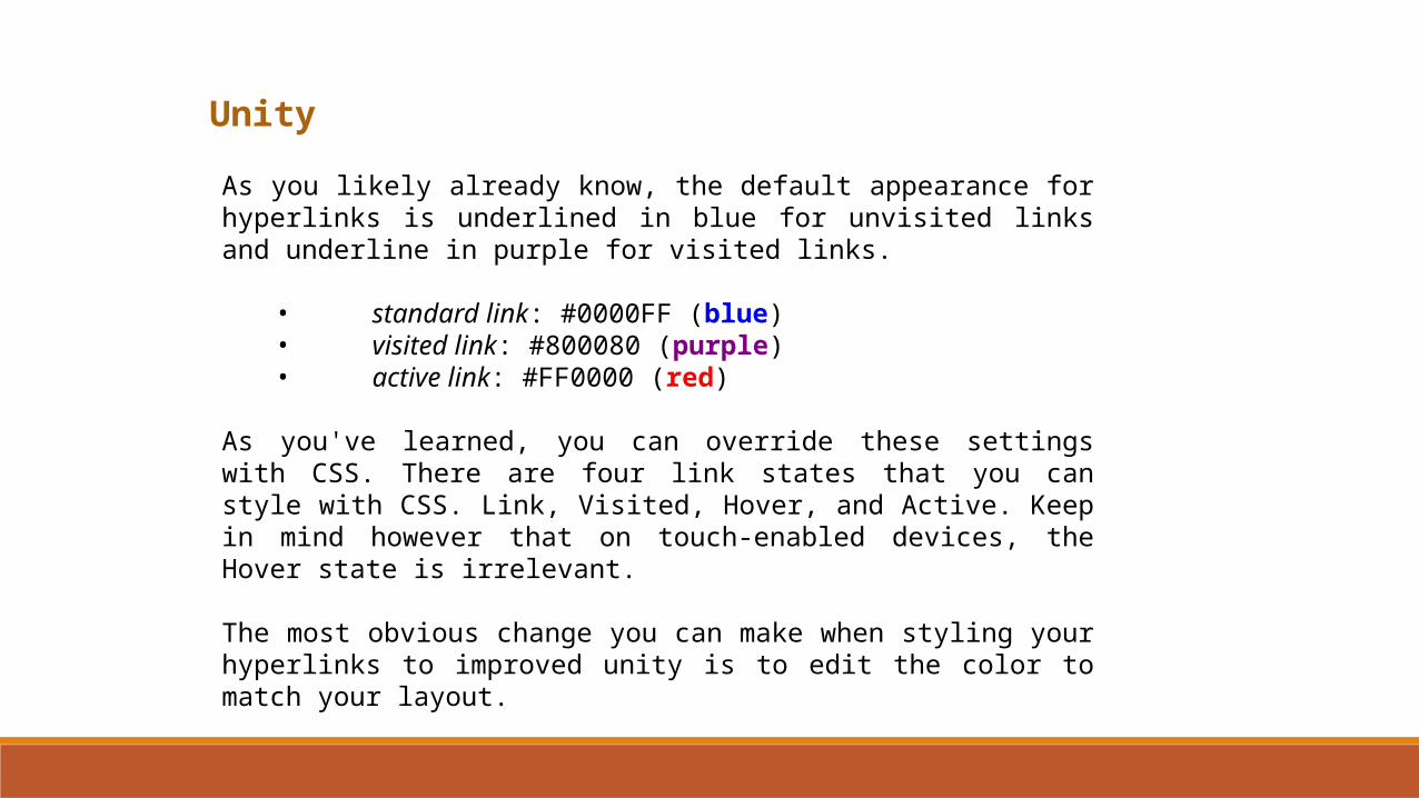
As you likely already know, the default appearance for hyperlinks is underlined in blue for unvisited links and underline in purple for visited links.
• standard link: #0000FF (blue)• visited link: #800080 (purple)• active link: #FF0000 (red)
As you've learned, you can override these settings with CSS. There are four link states that you can style with CSS. Link, Visited, Hover, and Active. Keep in mind however that on touch-enabled devices, the Hover state is irrelevant.
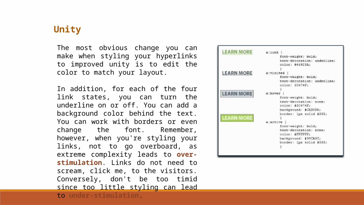
The most obvious change you can make when styling your hyperlinks to improved unity is to edit the color to match your layout.
Unity
The most obvious change you can make when styling your hyperlinks to improved unity is to edit the color to match your layout.
In addition, for each of the four link states, you can turn the underline on or off. You can add a background color behind the text. You can work with borders or even change the font. Remember, however, when you're styling your links, not to go overboard, as extreme complexity leads to over-stimulation. Links do not need to scream, click me, to the visitors. Conversely, don't be too timid since too little styling can lead to under-stimulation.
Pattern
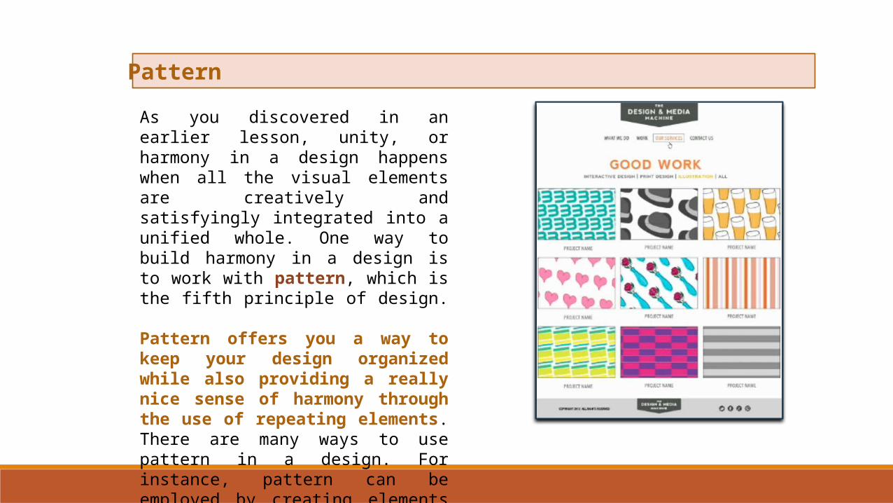
As you discovered in an earlier lesson, unity, or harmony in a design happens when all the visual elements are creatively and satisfyingly integrated into a unified whole. One way to build harmony in a design is to work with pattern, which is the fifth principle of design.
Pattern offers you a way to keep your design organized while also providing a really nice sense of harmony through the use of repeating elements. There are many ways to use pattern in a design. For instance, pattern can be employed by creating elements that are the same size, like thumbnail graphics on a gallery page.
Pattern
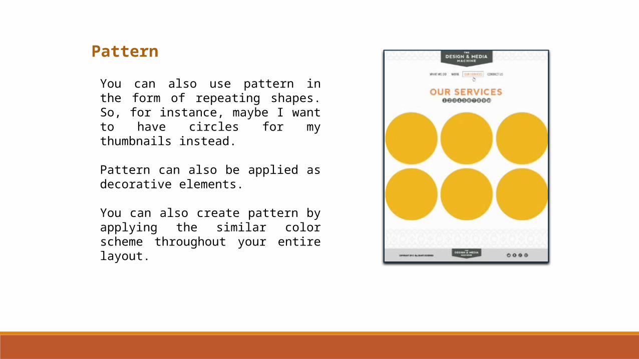
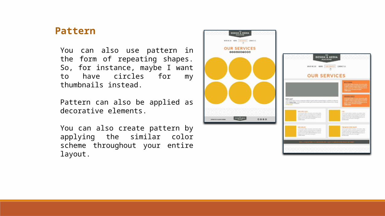
You can also use pattern in the form of repeating shapes. So, for instance, maybe I want to have circles for my thumbnails instead.
Pattern can also be applied as decorative elements.
You can also create pattern by applying the similar color scheme throughout your entire layout.
Pattern
You can also use pattern in the form of repeating shapes. So, for instance, maybe I want to have circles for my thumbnails instead.
Pattern can also be applied as decorative elements.
You can also create pattern by applying the similar color scheme throughout your entire layout.
Pattern
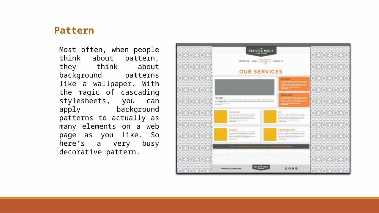
Most often, when people think about pattern, they think about background patterns like a wallpaper. With the magic of cascading stylesheets, you can apply background patterns to actually as many elements on a web page as you like. So here's a very busy decorative pattern.
Pattern
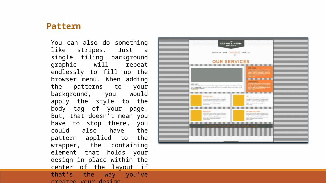
You can also do something like stripes. Just a single tiling background graphic will repeat endlessly to fill up the browser menu. When adding the patterns to your background, you would apply the style to the body tag of your page. But, that doesn't mean you have to stop there, you could also have the pattern applied to the wrapper, the containing element that holds your design in place within the center of the layout if that's the way you've created your design.
Pattern
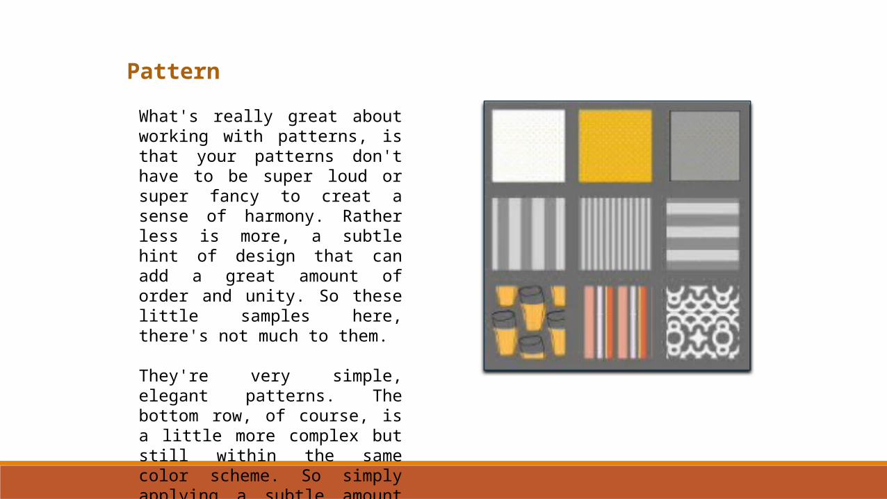
What's really great about working with patterns, is that your patterns don't have to be super loud or super fancy to creat a sense of harmony. Rather less is more, a subtle hint of design that can add a great amount of order and unity. So these little samples here, there's not much to them.
They're very simple, elegant patterns. The bottom row, of course, is a little more complex but still within the same color scheme. So simply applying a subtle amount of pattern here and there can help provide that unity.

Pattern
To get free background patterns for your web projects you can visit several sites online. Here's a short list of some sites you might want to check out.
You can also create your own patterns by scanning fabrics or other materials into your computer, or even by drawing your own designs in a programmer like Photoshop and then converting them into digital patterns to use in your web mockups.
• http://subtlepatterns.com/• http://dinpattern.com/• http://squidfingers.com/patterns • http://pattern8.com/ • http://backgroundlabs.com/• OneExtraPixel: Pattern Sites
Movement
The sixth principle of design will explore is movement. There are several ways to add a sense of movement to a web layout including working with line and shape. In this lesson, however we'll concentrate on adding movement with various scrolling and animation effects.
In graphic design, we can say that the principle of movement refers to the suggestion of action or direction, since nearly all graphic design is two-dimensional.
On the web, however, we can work with both implied and actual movement.
Movement
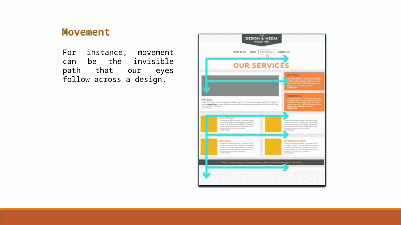
For instance, movement can be the invisible path that our eyes follow across a design.
Movement
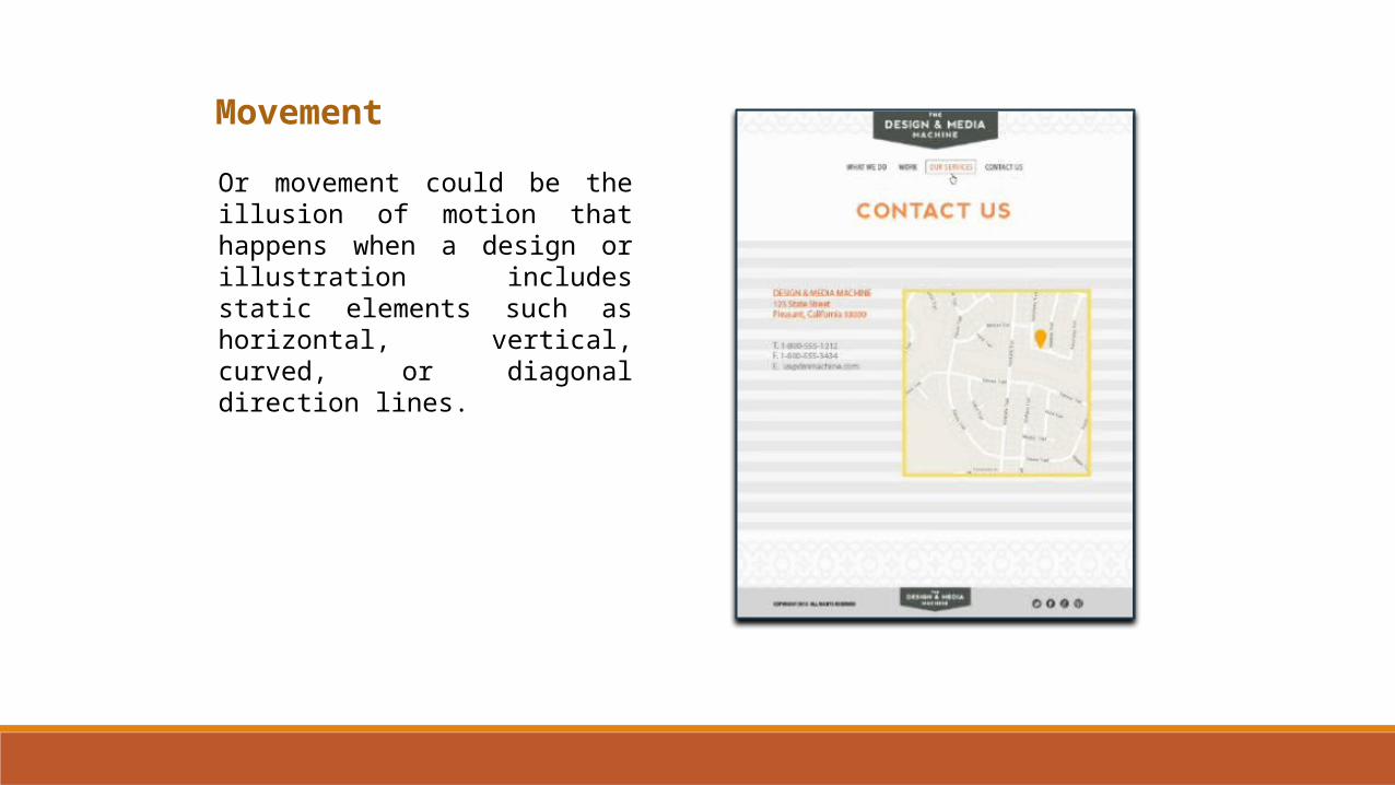
Or movement could be the illusion of motion that happens when a design or illustration includes static elements such as horizontal, vertical, curved, or diagonal direction lines.
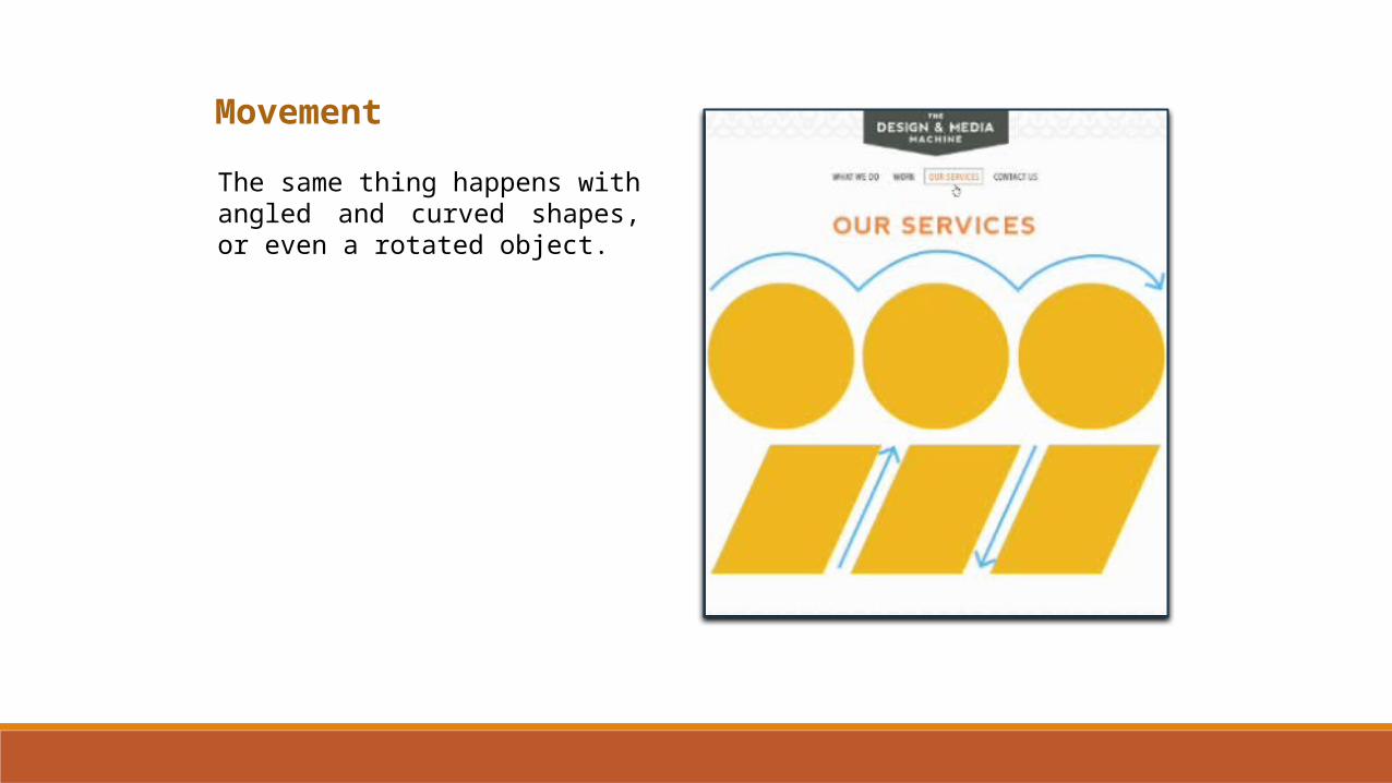
Movement
The same thing happens with angled and curved shapes, or even a rotated object.
Movement
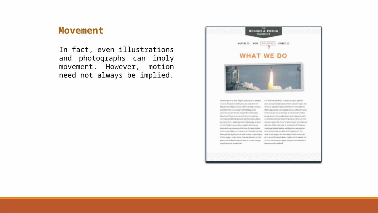
In fact, even illustrations and photographs can imply movement. However, motion need not always be implied.
Movement
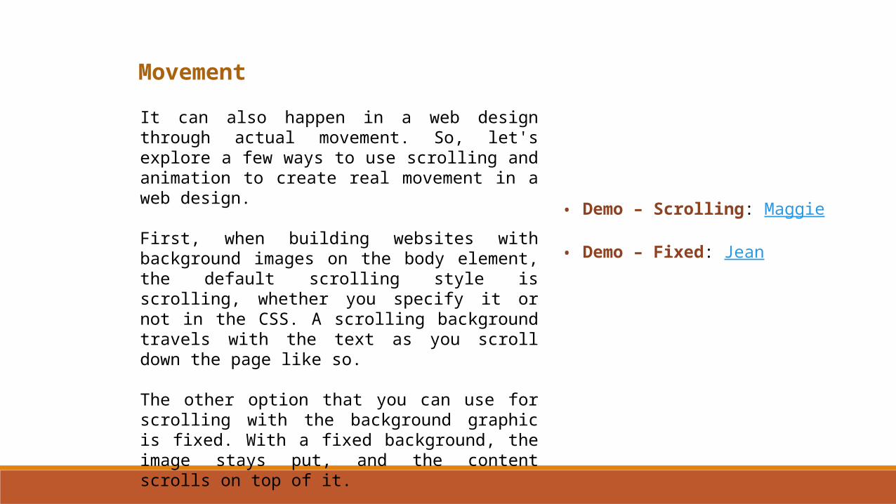
It can also happen in a web design through actual movement. So, let's explore a few ways to use scrolling and animation to create real movement in a web design.
First, when building websites with background images on the body element, the default scrolling style is scrolling, whether you specify it or not in the CSS. A scrolling background travels with the text as you scroll down the page like so.
The other option that you can use for scrolling with the background graphic is fixed. With a fixed background, the image stays put, and the content scrolls on top of it.
• Demo – Scrolling: Maggie
• Demo – Fixed: Jean
Movement
Another way to add movement is with parallax scrolling, which when done well can be really wonderful.
Essentially what happens with this type of scrolling is that the background images shift slower than the content in the foreground, creating this wonderful illusion of three dimensional depth.
• NetTuts• Boy-Coy• Lexus Asia• Hot Dot• Madwell NYC• Teapot Creation• Dangelico Guitars
Movement
Easing is one of several popular jQuery animation effects. It's another really cool way of adding movement to a webpage.
• Jquery Easing Effects
Movement
if you're a flash action script or java script coder looking to harness your skills in the jQuery world, check out the green sock animation platform at greensock.com. With
HTML5 and CSS3 as well as with jQuery and other code tools like greensock.com, designers are creating all kinds of great interactive, moving, and animated features to their sites. Without the use of flash. This is not to say that as a designer, you also need to be a coder or programmer.
• greensock.com
Rhythm & Repetition
The next principle of design we will explore is rhythm and repetition, which has to do with how objects are placed within a web layout and the overall flow of your design.
Rhythm and repetition occurs when one or more elements in a design are repeated often enough to create a visual rhythm.
When considering this principle, it might be helpful to think of it in terms of music. For instance, you might have a base line and a melody, each having its own distinct beat and flow.

Rhythm & Repetition
Similarly in design, there can be an underlying structure paired with free flowing design elements. At its core, rhythm and repetition helps to establish visual interest in a design. And it often happens naturally when you repeat similar elements, either regularly or irregularly within your layout.
Rhythm can be regular with even intervals flowing like a series of geometric or organic shapes. Or it can be progressive, where the elements grow or shrink in some way, such as size, position, or color.
Rhythm & Repetition
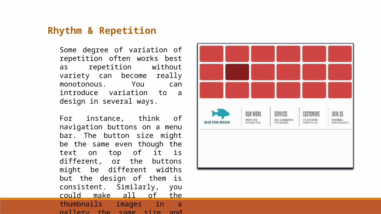
Some degree of variation of repetition often works best as repetition without variety can become really monotonous. You can introduce variation to a design in several ways.
For instance, think of navigation buttons on a menu bar. The button size might be the same even though the text on top of it is different, or the buttons might be different widths but the design of them is consistent. Similarly, you could make all of the thumbnails images in a gallery the same size and shape.

Rhythm & Repetition
With CSS3 you could vary the shapes a little to add variety.
Likewise, when working with your web layouts, you can build rhythm and repetition into the design by alternating the number of columns appearing in each row.
Rhythm & Repetition
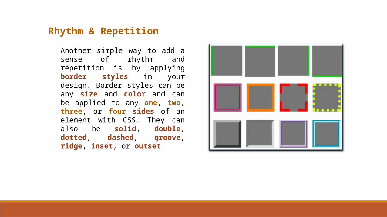
Another simple way to add a sense of rhythm and repetition is by applying border styles in your design. Border styles can be any size and color and can be applied to any one, two, three, or four sides of an element with CSS. They can also be solid, double, dotted, dashed, groove, ridge, inset, or outset.
Rhythm & Repetition
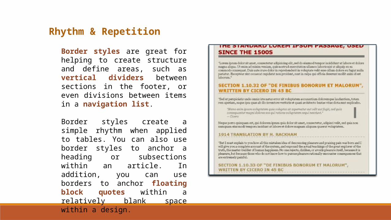
Border styles are great for helping to create structure and define areas, such as vertical dividers between sections in the footer, or even divisions between items in a navigation list.
Border styles create a simple rhythm when applied to tables. You can also use border styles to anchor a heading or subsections within an article. In addition, you can use borders to anchor floating block quotes within a relatively blank space within a design.
Proportion
Proportion is one of those principles of design that makes logical sense when you think about it. Proportional elements can bring a sense of balance, emphasis, and harmony to a design. As well as clue viewers into a design, so they know which items are more important than others are.
In web design, we can define proportion as the visual relationship between two or more things in terms of their size, number, or degree.

Proportion
Another way to think of proportion is as tiered dominance where elements relate to each other in a way that creates a sense of hierarchy and order. In fact, we can say that proportion really goes hand in hand with the principles of emphasis and unity.
For instance, to achieve proportion while adding emphasis, you can apply dominance to the shape, size, color, order, or direction of one or more elements in your design.
Proportion
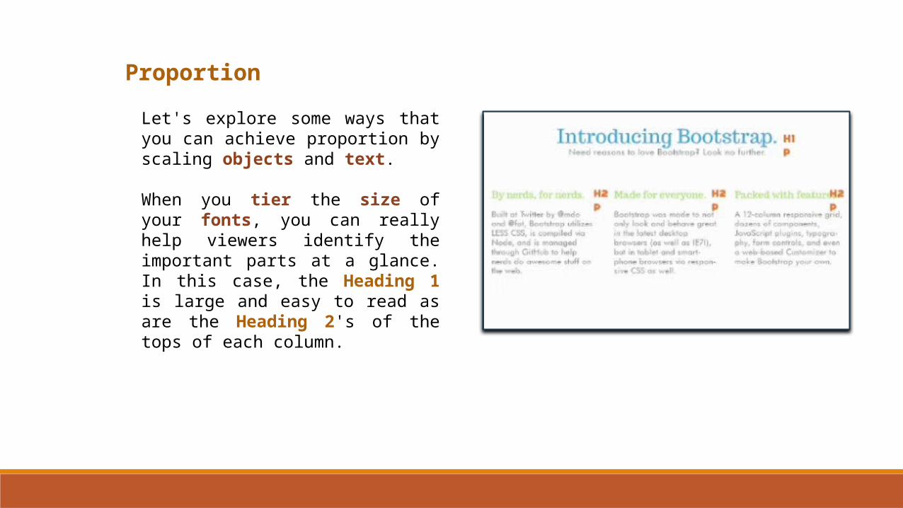
Let's explore some ways that you can achieve proportion by scaling objects and text.
When you tier the size of your fonts, you can really help viewers identify the important parts at a glance. In this case, the Heading 1 is large and easy to read as are the Heading 2's of the tops of each column.
Proportion
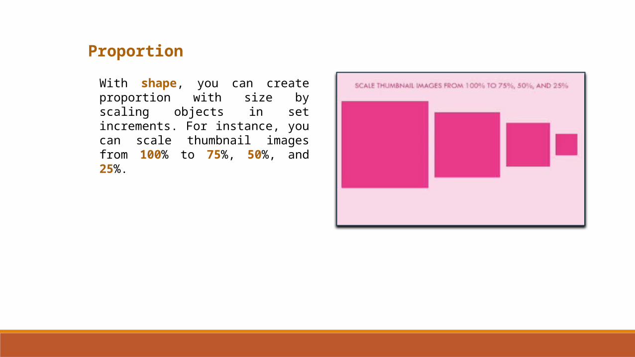
With shape, you can create proportion with size by scaling objects in set increments. For instance, you can scale thumbnail images from 100% to 75%, 50%, and 25%.
Proportion
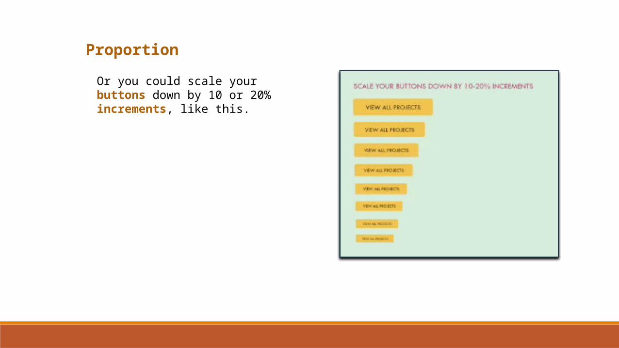
Or you could scale your buttons down by 10 or 20% increments, like this.
Proportion
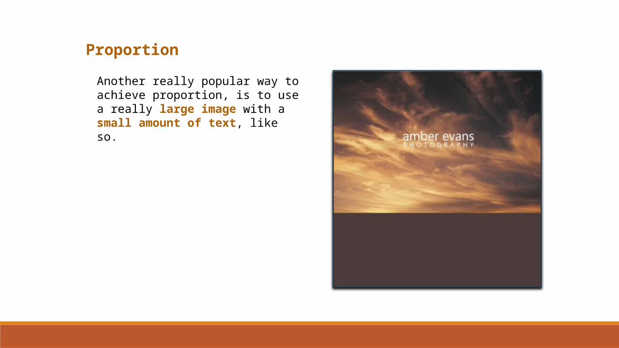
Another really popular way to achieve proportion, is to use a really large image with a small amount of text, like so.
Proportion
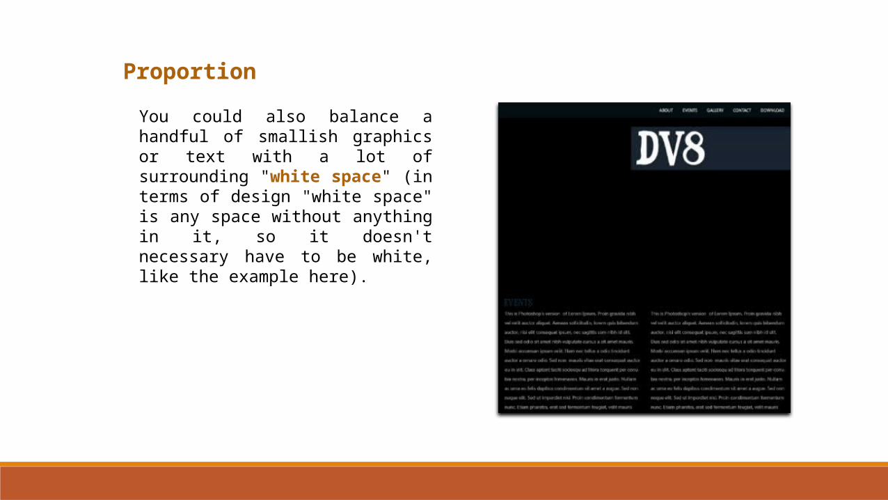
You could also balance a handful of smallish graphics or text with a lot of surrounding "white space" (in terms of design "white space" is any space without anything in it, so it doesn't necessary have to be white, like the example here).
Proportion
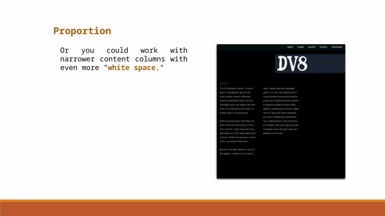
Or you could work with narrower content columns with even more "white space."
Proportion
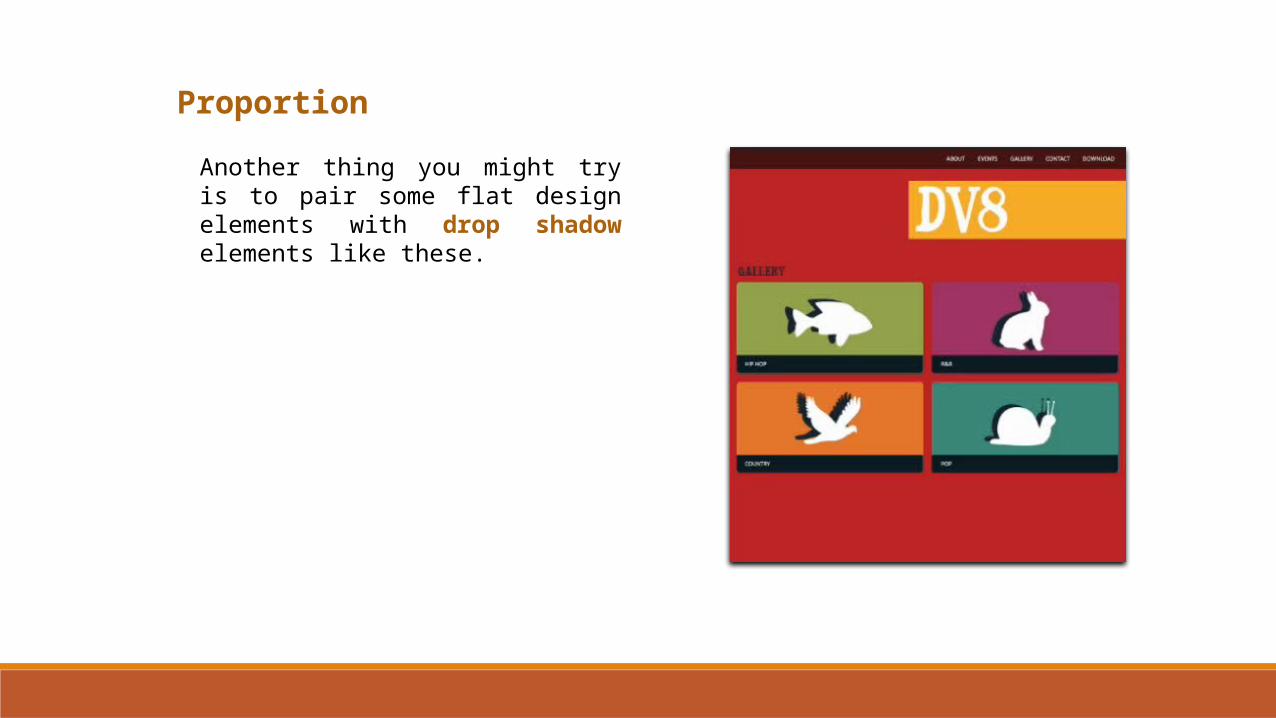
Another thing you might try is to pair some flat design elements with drop shadow elements like these.
Proportion
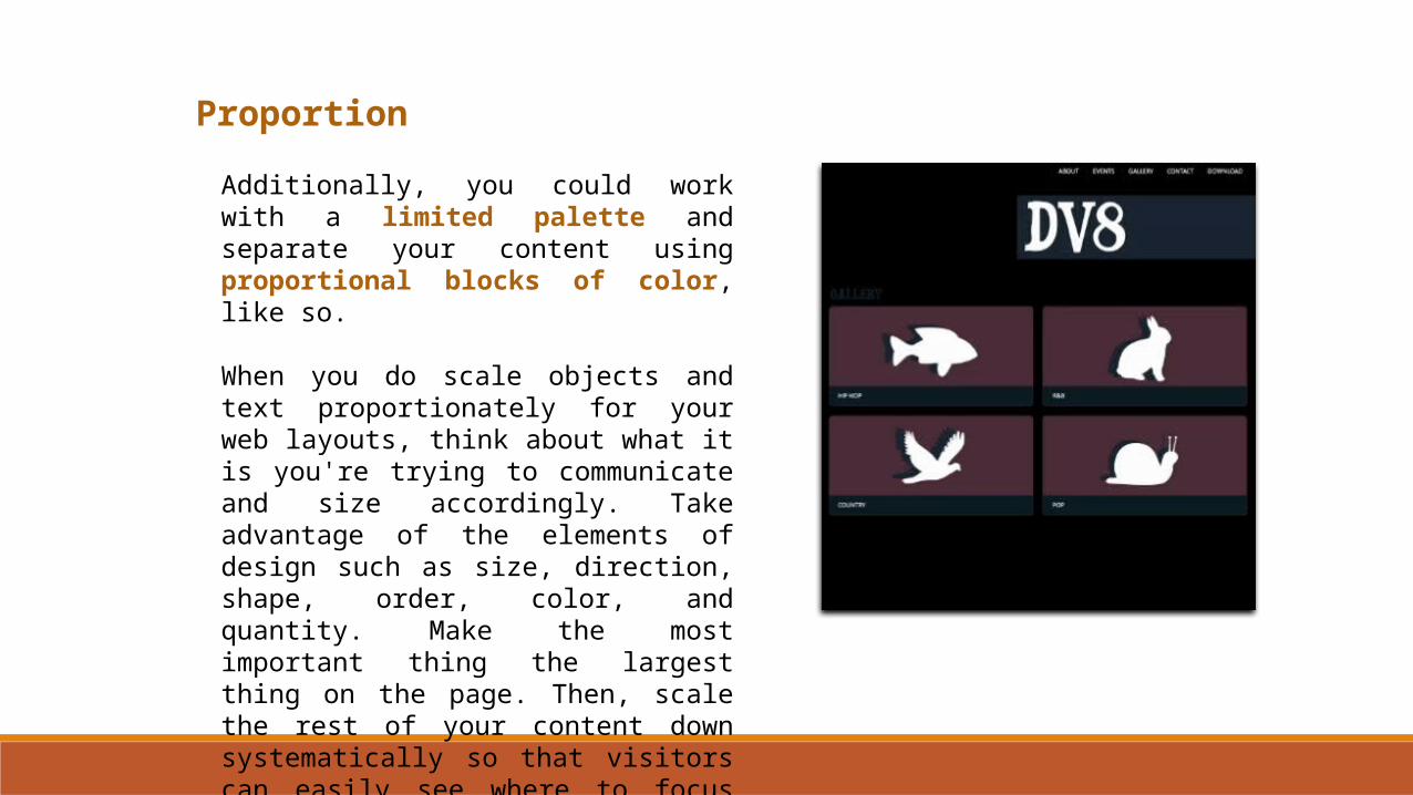
Additionally, you could work with a limited palette and separate your content using proportional blocks of color, like so.
When you do scale objects and text proportionately for your web layouts, think about what it is you're trying to communicate and size accordingly. Take advantage of the elements of design such as size, direction, shape, order, color, and quantity. Make the most important thing the largest thing on the page. Then, scale the rest of your content down systematically so that visitors can easily see where to focus their attention.
Simplicity
Strangely, one of the most misunderstood of the ten principles of design is simplicity. The reason for this difficulty is that the idea of simplicity is somewhat open to interpretation. Well, I'm sure you may have had the thought, beauty is in the eye of the beholder, a thought that glorifies the subjective. There is some truth to objective beauty, or objective value in both art and design. Let's begin our exploration of simplicity by looking at its definition.
Simplicity or visual economy means only showing what is essential in a design.
In other words, simplicity deals with the elimination of any non-essential elements or details to reveal the essence of a form.
How can you tell what is essential versus non-essential in a design? As much as you might want that answer to be simple and concrete, in most cases people have a hard time determining what should stay in a design and what can go.
Simplicity
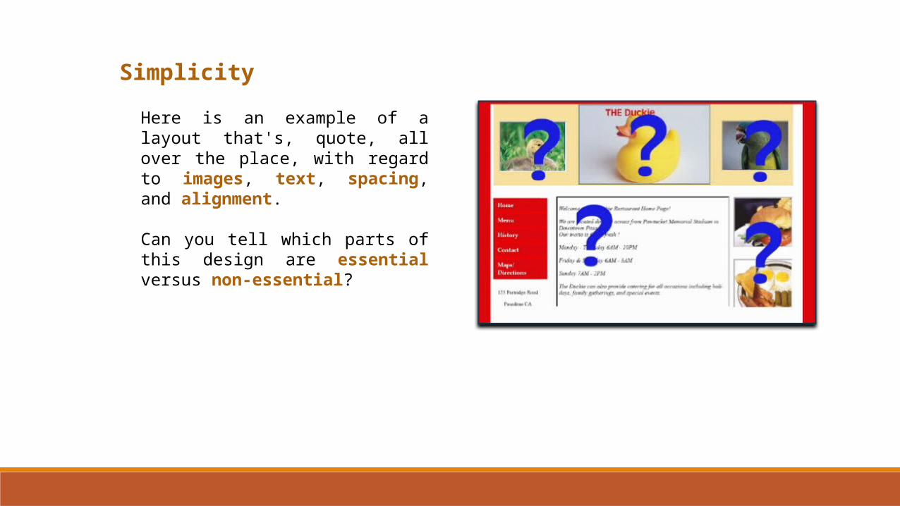
Here is an example of a layout that's, quote, all over the place, with regard to images, text, spacing, and alignment.
Can you tell which parts of this design are essential versus non-essential?

Simplicity
Surprisingly, however, if you were to ask a group of people to tell you which of two designs they find more attractive, invariably, they would choose the design with the greatest degree of simplicity. This is not to say that less is always more. On the contrary, a design with many elements can still have a high degree of simplicity.
Rather, what makes a design have a sense of simplicity is the fact that everything in the layout is needed, and there is nothing extra that shouldn't be there
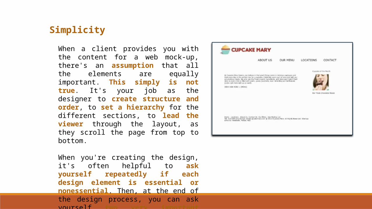
Simplicity
When a client provides you with the content for a web mock-up, there's an assumption that all the elements are equally important. This simply is not true. It's your job as the designer to create structure and order, to set a hierarchy for the different sections, to lead the viewer through the layout, as they scroll the page from top to bottom.
When you're creating the design, it's often helpful to ask yourself repeatedly if each design element is essential or nonessential. Then, at the end of the design process, you can ask yourself two very important questions.
Simplicity
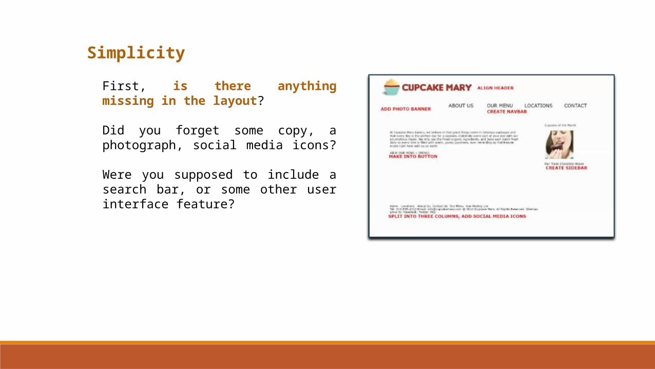
First, is there anything missing in the layout?
Did you forget some copy, a photograph, social media icons?
Were you supposed to include a search bar, or some other user interface feature?
Simplicity
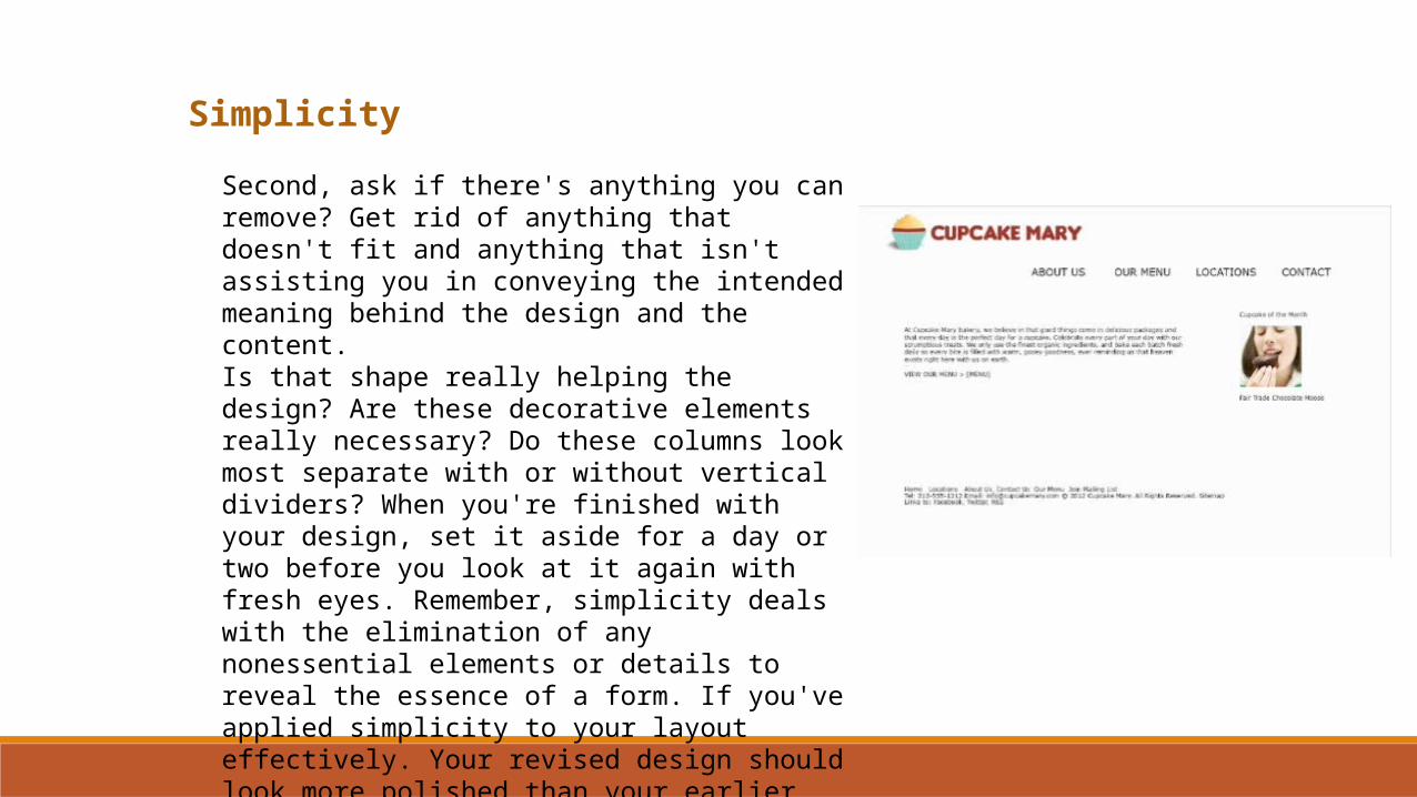
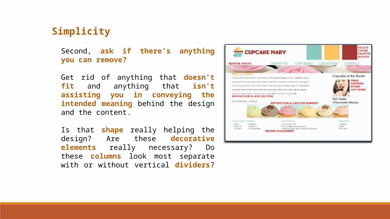
Second, ask if there's anything you can remove? Get rid of anything that doesn't fit and anything that isn't assisting you in conveying the intended meaning behind the design and the content. Is that shape really helping the design? Are these decorative elements really necessary? Do these columns look most separate with or without vertical dividers? When you're finished with your design, set it aside for a day or two before you look at it again with fresh eyes. Remember, simplicity deals with the elimination of any nonessential elements or details to reveal the essence of a form. If you've applied simplicity to your layout effectively. Your revised design should look more polished than your earlier version.
Simplicity
Second, ask if there's anything you can remove?
Get rid of anything that doesn't fit and anything that isn't assisting you in conveying the intended meaning behind the design and the content.
Is that shape really helping the design? Are these decorative elements really necessary? Do these columns look most separate with or without vertical dividers?
Simplicity
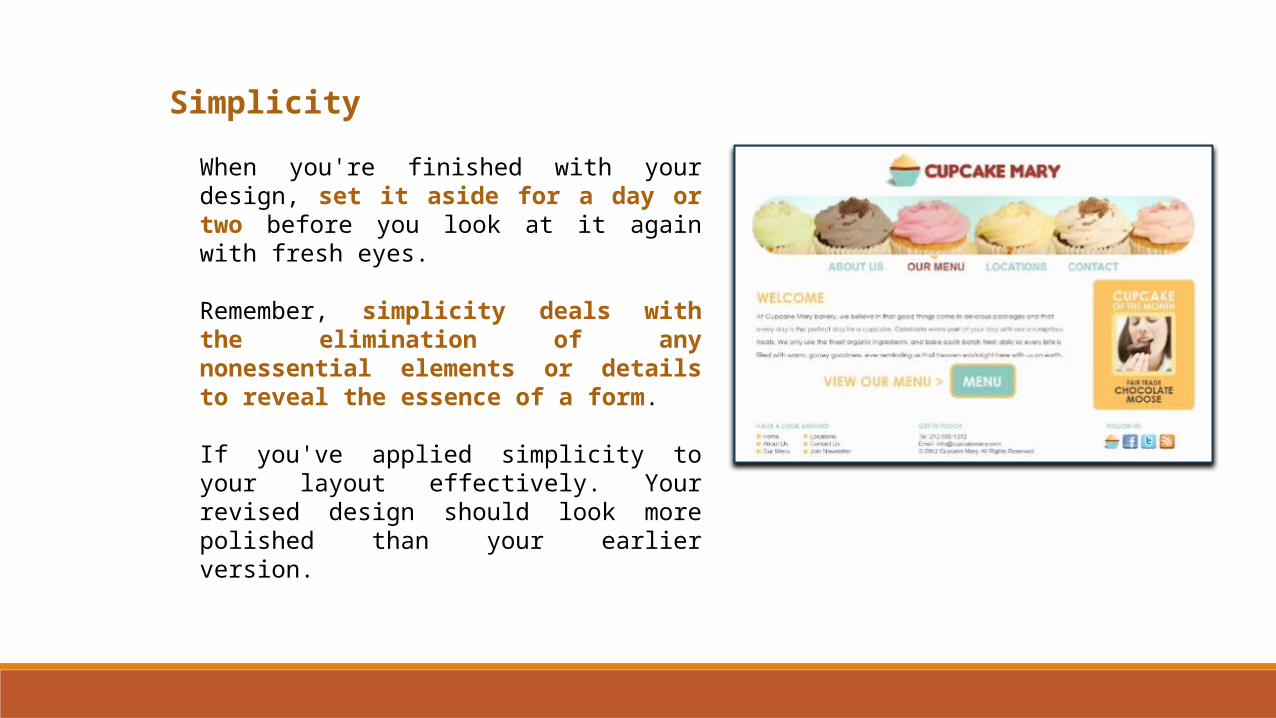
When you're finished with your design, set it aside for a day or two before you look at it again with fresh eyes.
Remember, simplicity deals with the elimination of any nonessential elements or details to reveal the essence of a form.
If you've applied simplicity to your layout effectively. Your revised design should look more polished than your earlier version.
Gradation
The tenth principal of design is called gradation which explores the concept of steps or stages in a design. When applied thoughtfully gradation can add a wonderful yet subtle sense of movement and interest to your designs.
To put it simply, gradation in design refers to any gradual change that occurs by a series of steps, degrees or stages, where there's an obvious visual shift from one state to another. Gradation is most apparent when you shift your design's elements in size and color. However, you can also add gradation to value, direction, line, shape, and even texture.
• Size• Color• Value• Direction
• Line• Shape• Texture
Gradation
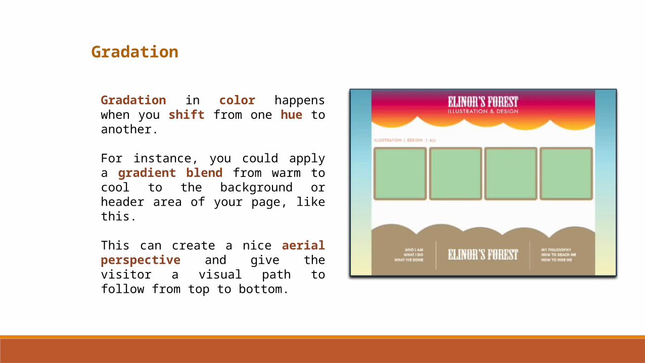
Gradation in color happens when you shift from one hue to another.
For instance, you could apply a gradient blend from warm to cool to the background or header area of your page, like this.
This can create a nice aerial perspective and give the visitor a visual path to follow from top to bottom.
Gradation
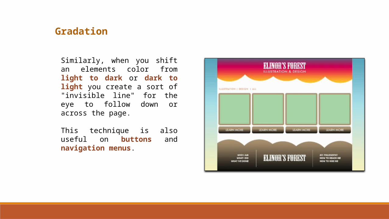
Similarly, when you shift an elements color from light to dark or dark to light you create a sort of "invisible line" for the eye to follow down or across the page.
This technique is also useful on buttons and navigation menus.
Gradation
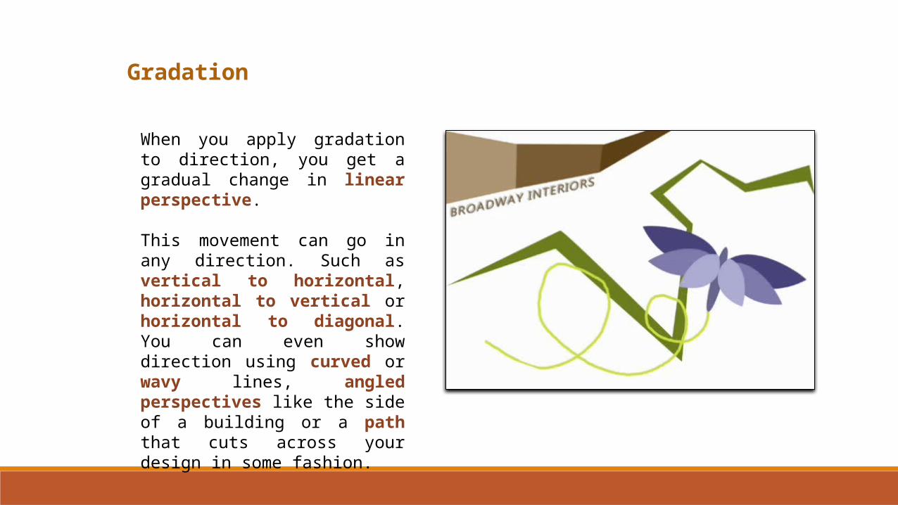
When you apply gradation to direction, you get a gradual change in linear perspective.
This movement can go in any direction. Such as vertical to horizontal, horizontal to vertical or horizontal to diagonal. You can even show direction using curved or wavy lines, angled perspectives like the side of a building or a path that cuts across your design in some fashion.
Gradation
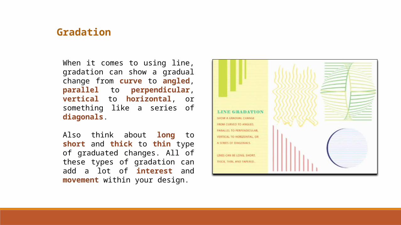
When it comes to using line, gradation can show a gradual change from curve to angled, parallel to perpendicular, vertical to horizontal, or something like a series of diagonals.
Also think about long to short and thick to thin type of graduated changes. All of these types of gradation can add a lot of interest and movement within your design.
Gradation
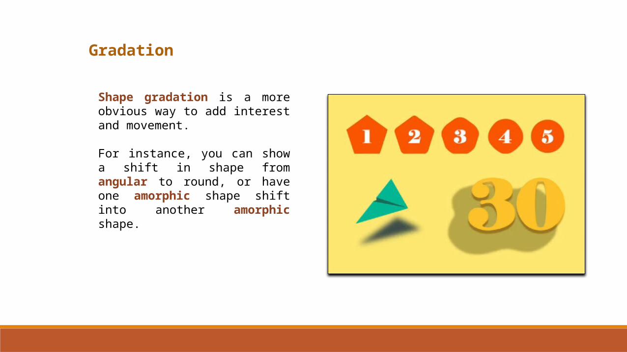
Shape gradation is a more obvious way to add interest and movement.
For instance, you can show a shift in shape from angular to round, or have one amorphic shape shift into another amorphic shape.
Gradation
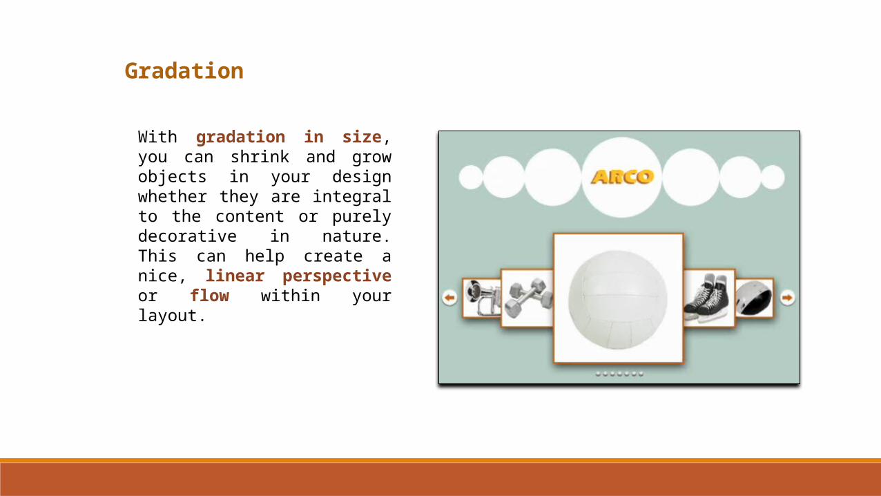
With gradation in size, you can shrink and grow objects in your design whether they are integral to the content or purely decorative in nature. This can help create a nice, linear perspective or flow within your layout.
Gradation
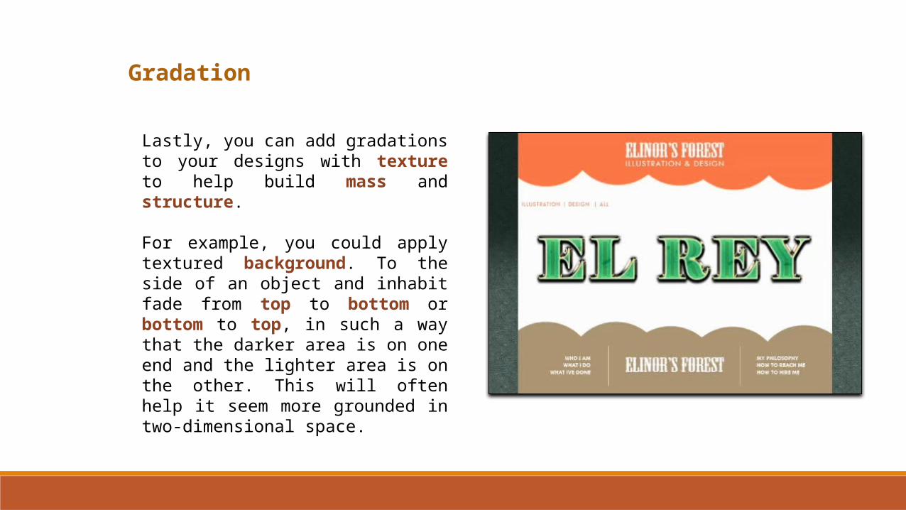
Lastly, you can add gradations to your designs with texture to help build mass and structure.
For example, you could apply textured background. To the side of an object and inhabit fade from top to bottom or bottom to top, in such a way that the darker area is on one end and the lighter area is on the other. This will often help it seem more grounded in two-dimensional space.
Gradation
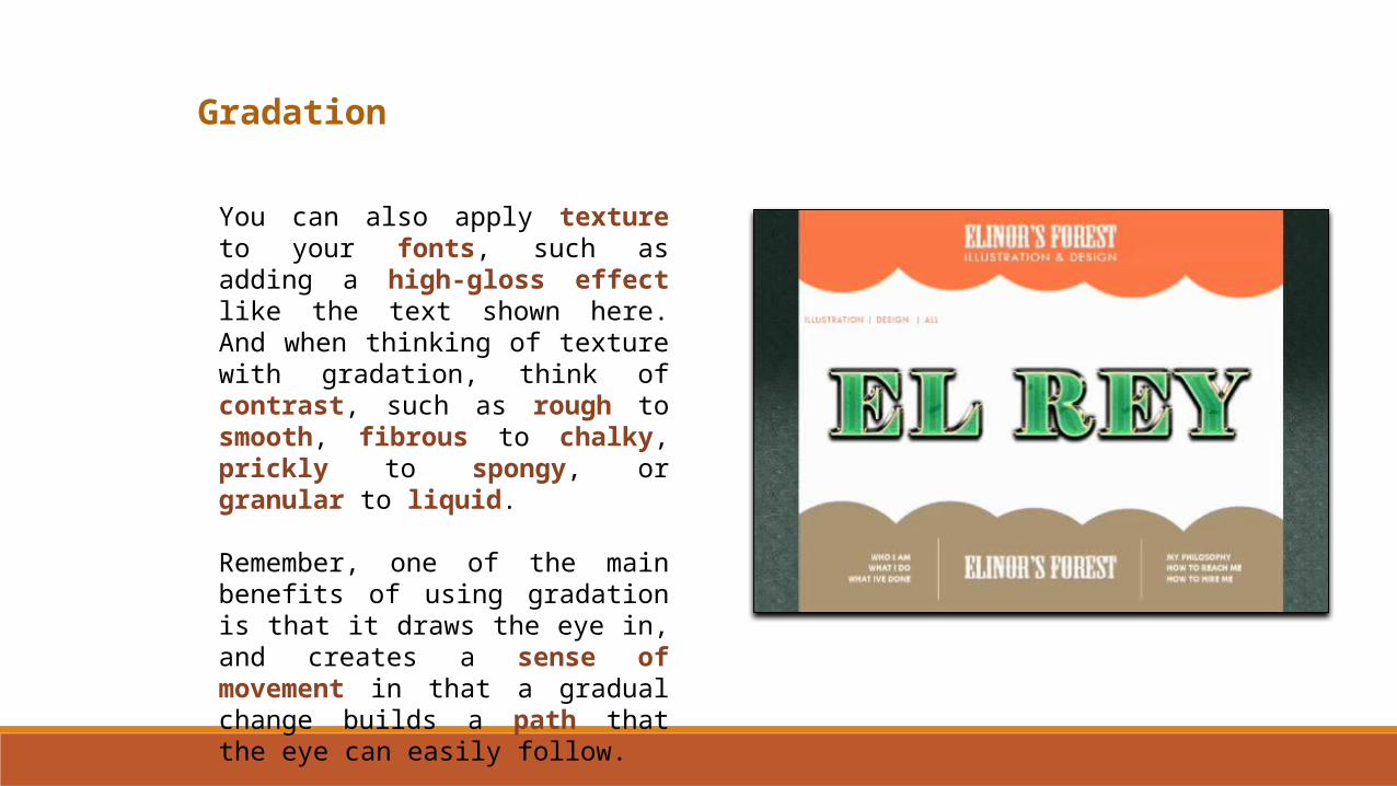
You can also apply texture to your fonts, such as adding a high-gloss effect like the text shown here. And when thinking of texture with gradation, think of contrast, such as rough to smooth, fibrous to chalky, prickly to spongy, or granular to liquid.
Remember, one of the main benefits of using gradation is that it draws the eye in, and creates a sense of movement in that a gradual change builds a path that the eye can easily follow.