web design with html5 & css3 - wayne state universityism7994.business.wayne.edu/week03/ppt/html...
TRANSCRIPT

Chapter 6
Responsive Design Part 2:
Designing for Tablet and Desktop Devices
Web Design with
HTML5 & CSS38th Edition

1. Understand and use media query expressions
2. Explain the design principles of a tablet website
3. Insert a media query to target tablet viewports
4. Create style rules for tablet viewports
5. Explain the design principles of a desktop website
6. Insert a media query to target desktop viewports
Chapter 6: Responsive Design Part 2: Designing for Tablet and Desktop Devices 2
Chapter Objectives

7. Create style rules for desktop viewports
8. Identify and modify breakpoints
9. Explain pseudo-classes
10.Apply pseudo-classes to a website
11.Explain linear and radial gradients
12.Apply a linear gradient to a webpage for a desktop viewport
Chapter 6: Responsive Design Part 2: Designing for Tablet and Desktop Devices 3
Chapter Objectives

1. Introduction
2. Project – Use Media Queries to Design for Tablet and Desktop Viewports
3. Using Media Queries
4. Designing for Desktop Viewports
5. Modifying Breakpoints
6. Using Pseudo-Classes
7. Using Gradients
8. Summary
Chapter 6: Responsive Design Part 2: Designing for Tablet and Desktop Devices 4
Topics
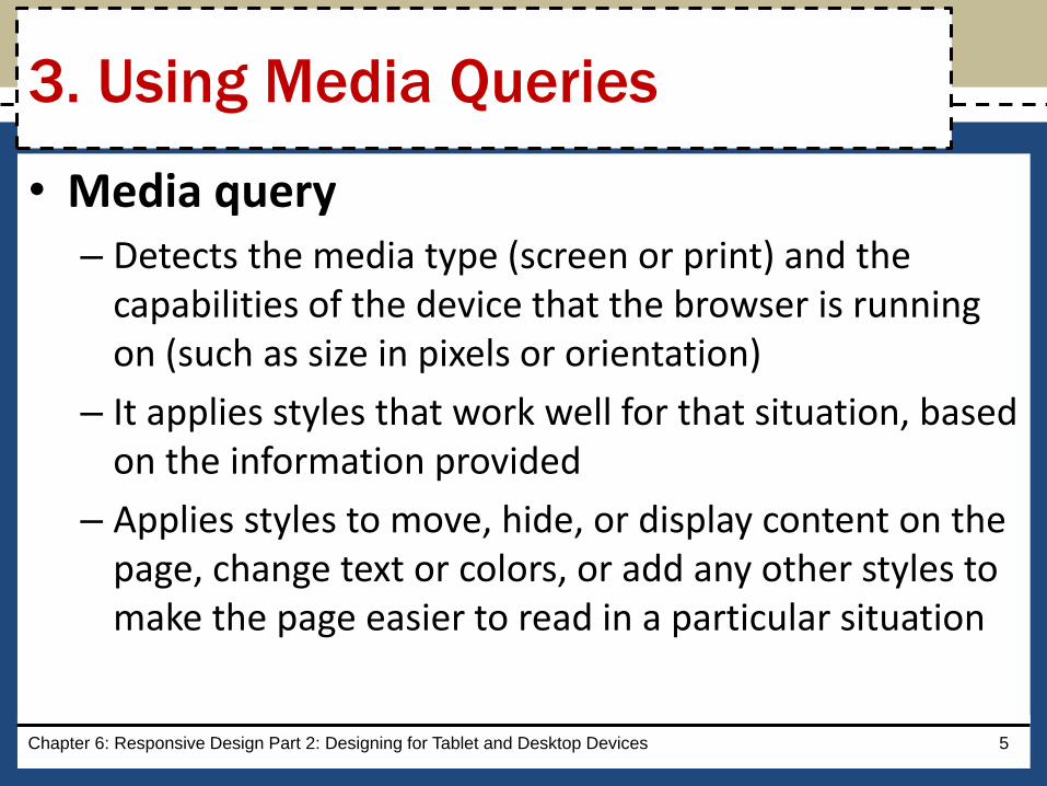
• Media query– Detects the media type (screen or print) and the
capabilities of the device that the browser is running on (such as size in pixels or orientation)
– It applies styles that work well for that situation, based on the information provided
– Applies styles to move, hide, or display content on the page, change text or colors, or add any other styles to make the page easier to read in a particular situation
Chapter 6: Responsive Design Part 2: Designing for Tablet and Desktop Devices 5
3. Using Media Queries

– The following code provides a basic example of a media query inserted into the link tag of an HTML page:
<link rel="stylesheet"
href="css/styles.css” media="screen">
<link rel=“stylesheet”
href="css/stylesprint.css” media="print">
Chapter 6: Responsive Design Part 2: Designing for Tablet and Desktop Devices 6
3. Using Media Queries

• Breakpoint
– It is set to understand the code and syntax of how a media query detects viewport size
– It is the point at which a webpage is required to change
– It is where different styles are applied to the webpage to cause it to change in a way that makes it easier to read and navigate for a particular situation
Chapter 6: Responsive Design Part 2: Designing for Tablet and Desktop Devices 7
3.1 Breakpoints

Chapter 6: Responsive Design Part 2: Designing for Tablet and Desktop Devices 8
3. Using Media Queries
• The Table 6–1 lists the three common viewport sizes

• A media query can use a logical expression to test whether a viewport has reached a particular breakpoint
• The logical expression includes the name of a media query feature, a characteristic of the environment, and a breakpoint value to be tested
• If the logical expression evaluates to “true,” the media query applies the styles that follow
Chapter 6: Responsive Design Part 2: Designing for Tablet and Desktop Devices 9
3.2 Media Query Expressions

• A media query can also test for both minimum and maximum breakpoints
– Example: <link rel="stylesheet"
href="css/styles-tablet.css”
media="screen and
(min-width: 481px) and
(max-width: 768px)">
Chapter 6: Responsive Design Part 2: Designing for Tablet and Desktop Devices 10
3.2 Media Query Expressions

– The code directs browsers to apply the styles-tablet.css stylesheet in the css folder when screens have a viewport width between 481px and 768px
– When testing for minimum and maximum widths, the word “and” separates each part of the media attribute value
Chapter 6: Responsive Design Part 2: Designing for Tablet and Desktop Devices 11
3.2 Media Query Expressions

• Another way to implement media queries is to code them directly into a single CSS file using the @media rule
• The three most common types of media are screen, print, and all
Chapter 6: Responsive Design Part 2: Designing for Tablet and Desktop Devices 12
3.2 Media Query Expressions

Chapter 6: Responsive Design Part 2: Designing for Tablet and Desktop Devices 13
3.2 Media Query Expressions
• Table 6–2 lists common media query features that can be used in a logical expression

• In a mobile-first strategy, the mobile styles are listed first as they are the default styles
• Next, media queries are used to add styles for larger viewports, progressing from tablet to desktop. Styles created for the smaller viewports apply to larger viewports by default
• To modify the appearance of an element for a larger viewport, a media query is created for the larger viewport, and then a new style is created
Chapter 6: Responsive Design Part 2: Designing for Tablet and Desktop Devices 14
3.3 Adding Media Queries to an
External Style Sheet

• With so many tablet sizes, it is difficult to design a “one size fits all” layout for a tablet device
• However, with the use of responsive web design and media queries, designing multiple tablet layouts is not required
• If a particular tablet device has a viewport smaller than the minimum size specified in the media query, then the layout will default to the mobile viewport layout
Chapter 6: Responsive Design Part 2: Designing for Tablet and Desktop Devices 15
4. Designing for Tablet Viewports

Figure 6–3 shows the code to create a media query for a tablet viewport
Chapter 6: Responsive Design Part 2: Designing for Tablet and Desktop Devices 16
4. Designing for Tablet Viewports

4.1 Page Design for a Tablet Viewport– When designing for a tablet viewport
oMaintain the same color scheme, typography, and general look of the website
o The appearance of the website should look the same from viewport to viewport
o The only thing that should change is layout and placement of content
o To determine the ideal layout for a website’s tablet viewport, review the mobile site to confirm where the content should be added and if any content should be hidden
Chapter 6: Responsive Design Part 2: Designing for Tablet and Desktop Devices 17
4. Designing for Tablet Viewports

4.2 Navigation Design for a Tablet Viewport
– It is not necessary to maintain a vertical list of navigation buttons as a tablet screen is larger than a smartphone screen
– Align the navigation buttons in a horizontal line
– This frees space for the main content below the navigation area, improving its visibility by displaying it in the middle of the screen
Chapter 6: Responsive Design Part 2: Designing for Tablet and Desktop Devices 18
4. Designing for Tablet Viewports

4.2 Navigation Design for a Tablet Viewport
– To accomplish this design, create a style rule to display the navigation list items as a single horizontal line when displayed in a tablet viewport
– Add other properties and values that override the defaults already set for the mobile viewport
Chapter 6: Responsive Design Part 2: Designing for Tablet and Desktop Devices 19
4. Designing for Tablet Viewports

• Figure 6–5 shows the code to style the navigation area for a tablet viewport
Chapter 6: Responsive Design Part 2: Designing for Tablet and Desktop Devices 20
4. Designing for Tablet Viewports

• Figure 6–8 shows the code to style the style the main element for a tablet viewport
Chapter 6: Responsive Design Part 2: Designing for Tablet and Desktop Devices 21
4. Designing for Tablet Viewports

• Figure 6–10 shows the code to show and hide content for a tablet viewport
Chapter 6: Responsive Design Part 2: Designing for Tablet and Desktop Devices 22
4. Designing for Tablet Viewports

Break
Chapter 6: Responsive Design Part 2: Designing for Tablet and Desktop Devices 23
BREAK

• When designing for desktop viewports
– Use simple, intuitive navigation, clear images, and typography and apply the same color scheme
– Maintain the same look and feel of the site, but change some formatting to best accommodate the desktop viewport
– It also provides an opportunity for a multiple-column layout
Chapter 6: Responsive Design Part 2: Designing for Tablet and Desktop Devices 24
5. Designing for Desktop Viewports
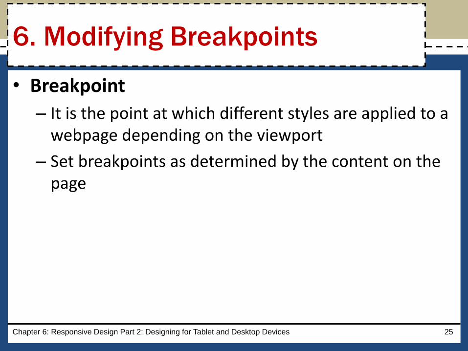
• Breakpoint
– It is the point at which different styles are applied to a webpage depending on the viewport
– Set breakpoints as determined by the content on the page
Chapter 6: Responsive Design Part 2: Designing for Tablet and Desktop Devices 25
6. Modifying Breakpoints

• Pseudo-classes
– They allow changes to the style of a link based on four link states: link, visited, hover, and active
– They must be used in the following order: link, visited, hover, active
– A pseudo-class is attached to a selector with a colon to specify a state or relation to the selector
Chapter 6: Responsive Design Part 2: Designing for Tablet and Desktop Devices 26
7. Using Pseudo-Classes

• The Table 6–3 describes each link state
Chapter 6: Responsive Design Part 2: Designing for Tablet and Desktop Devices 27
7. Using Pseudo-Classes

• A pseudo-class is attached to a selector with a colon to specify a state or relation to the selector to give the web developer more control over that selector
• A unique style for normal, visited, hover, and active links is defined by creating four separate style rules with a:link, a:visited, a:hover, and a:active as the selectors
Chapter 6: Responsive Design Part 2: Designing for Tablet and Desktop Devices 28
7. Using Pseudo-Classes
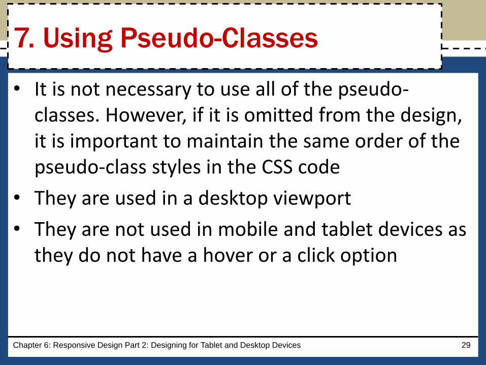
• It is not necessary to use all of the pseudo-classes. However, if it is omitted from the design, it is important to maintain the same order of the pseudo-class styles in the CSS code
• They are used in a desktop viewport
• They are not used in mobile and tablet devices as they do not have a hover or a click option
Chapter 6: Responsive Design Part 2: Designing for Tablet and Desktop Devices 29
7. Using Pseudo-Classes

• Figure 6–45 shows the code for link and visited pseudo-classes
Chapter 6: Responsive Design Part 2: Designing for Tablet and Desktop Devices 30
7. Using Pseudo-Classes

• Figure 6–46 shows the code for hover and active pseudo-classes
Chapter 6: Responsive Design Part 2: Designing for Tablet and Desktop Devices 31
7. Using Pseudo-Classes

• Gradient
– Is a gradual transition from one color to another
–CSS3 has two types of gradients: • linear and radial
Chapter 6: Responsive Design Part 2: Designing for Tablet and Desktop Devices 32
8. Using Gradients
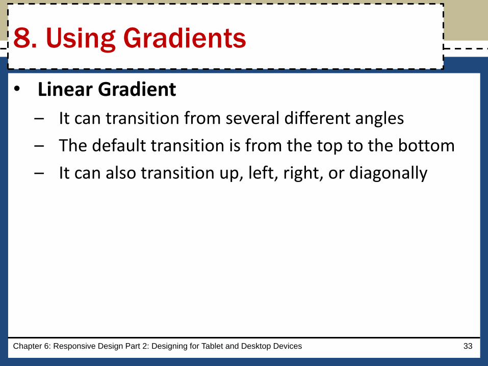
• Linear Gradient
– It can transition from several different angles
– The default transition is from the top to the bottom
– It can also transition up, left, right, or diagonally
Chapter 6: Responsive Design Part 2: Designing for Tablet and Desktop Devices 33
8. Using Gradients
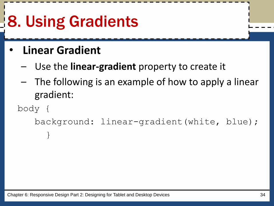
• Linear Gradient
– Use the linear-gradient property to create it
– The following is an example of how to apply a linear gradient:
body {
background: linear-gradient(white, blue);
}
Chapter 6: Responsive Design Part 2: Designing for Tablet and Desktop Devices 34
8. Using Gradients
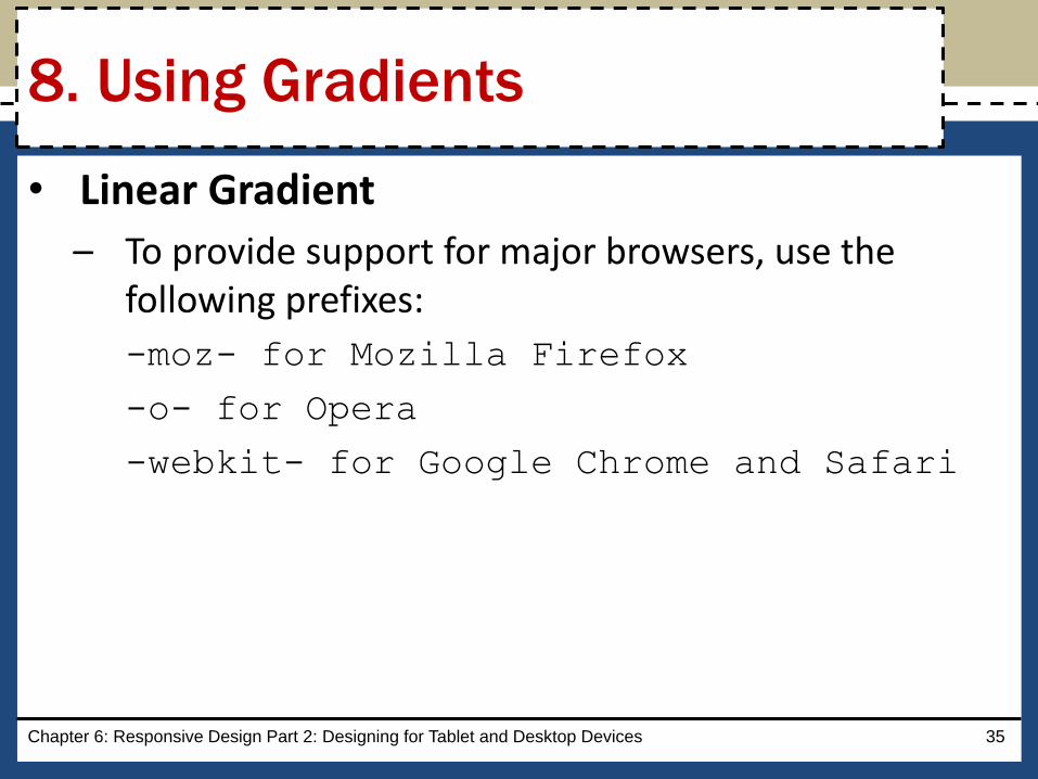
• Linear Gradient
– To provide support for major browsers, use the following prefixes:
-moz- for Mozilla Firefox
-o- for Opera
-webkit- for Google Chrome and Safari
Chapter 6: Responsive Design Part 2: Designing for Tablet and Desktop Devices 35
8. Using Gradients
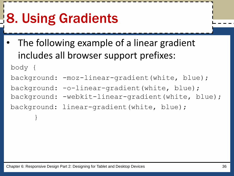
• The following example of a linear gradient includes all browser support prefixes:
body {
background: -moz-linear-gradient(white, blue);
background: -o-linear-gradient(white, blue);
background: -webkit-linear-gradient(white, blue);
background: linear-gradient(white, blue);
}
Chapter 6: Responsive Design Part 2: Designing for Tablet and Desktop Devices 36
8. Using Gradients

• The Table 6–4 provides an overview of linear gradients
Chapter 6: Responsive Design Part 2: Designing for Tablet and Desktop Devices 37
8. Using Gradients

• Radial gradients
– They are specified by their center
– The color begins in the center and transitions in a radial direction to another color or colors
– To create a radial gradient, at least two colors must be specified
Chapter 6: Responsive Design Part 2: Designing for Tablet and Desktop Devices 38
8. Using Gradients

• The following is an example of a radial gradient:body {
background: -moz-radial-gradient(red, white, blue);
background: -o-radial-gradient(red, white, blue);
background: -webkit-radial-gradient(red, white, blue);
background: radial-gradient(red, white, blue);
}
Chapter 6: Responsive Design Part 2: Designing for Tablet and Desktop Devices 39
8. Using Gradients

• Figure 6–51 shows the code for creating a new style rule to apply a linear gradient for a desktop viewport
Chapter 6: Responsive Design Part 2: Designing for Tablet and Desktop Devices 40
8. Using Gradients

Chapter 6
Responsive Design Part 2:
Designing for Tablet and Desktop Devices
HTML5 & CSS8th Edition