web design: using css to enhance your online profile..€¦ · · 2016-12-15web design: using css...
TRANSCRIPT
Web Design: Using CSS to enhance your online profile..


Prerequisites Time in the classroom is precious – it is an opportunity for you to interact with the workshop leader and other participants through questions and discussions and to share your experiences and concerns. To make the most of this time we sometimes ask you to carry out learning activities ahead of the workshop so that everyone comes into the class with the same basic knowledge. We keep this prior learning to a minimum and often make use of Lynda.com videos. Lynda.com videos can be accessed by University members anytime, anywhere, through a browser or app. The workshop description will tell you if any prior learning is required. If you don’t have an environment where you can do this learning, you can come along to one of our ‘Lynda Labs’. These are scheduled every week, and are a quiet space where you can work through Lynda.com videos or other workshop resources. If you turn up to a workshop without having done the prior learning, the workshop leader may suggest
that you come back on another session.
Copyright Traci Huggins makes this booklet and the accompanying slides available under a Creative Commons licence (BY-NC-SA: Attribution-NonCommercial-ShareAlike). The Oxford University crest and logo and IT Services logo are copyright of the University of Oxford and may only be used by members of the University in accordance with the University’s branding guidelines.
About the workshop designer Traci Huggins has over a decade’s experience in teaching, she has worked as a Computing Lecturer, Course Leader and Tutor in Further Education writing and delivering courses for Levels 1 to Level 5, she has also co-wrote a new Foundation Degree in Computing Science course in conjunction with Oxford Brookes University.
Traci’s teaching knowledge covers Excel, Business Computing, Information Systems, Web Design (HTML/CSS/WordPress) and SharePoint. She is a highly committed teacher who likes to ensure that everybody has the opportunity to learn to use technology in their study or workplace both effective and efficiently.
Revision history Version Date Author Comments 1.0 September 2016 Traci Huggins
About this workshop This workshop will give you an insight into how to create and work with a WordPress site. You will not be a fully pledged web designer by the end of the session however it will put you in a good position with the right tools and knowledge to enable you to be creative and create a fully working and adaptable Academic Profile. Bluefish is a free software advanced text editor with a variety of tools for programming in general and the development of dynamic websites. Bluefish supports development in (among others) HTML, XHTML, CSS, SML, PHP, C, C++, JavaScript, java, google Go, Vala, Ada, D, SQL, Perl, ColdFusion, JSP, Python, Ruby and shell. Cascading Style Sheets (CSS) is a style sheet language used for describing the presentation of a document written in a markup language
What you will learn This session covers the use of CSS in Web design. It concentrates on simple techniques of CSS, we will cover the following;
Using and specifying CSS documents in web design Creating simple effects using CSS3 Using gradients from other applications
What you need to know This session assumes that you are familiar with the basic features of website and a little knowledge of HTML would be helpful, for example you should be able to; Locate and open websites View and understand simple HTML files would be helpful Add and edit basic HTML would be helpful.
The resources you need Sample Images and text that you can use to experiment with will be available, but you might like to bring along your own. Unless you have been told otherwise, there will be a computer available for you to use with the following tools installed:
Internet Explorer
Firefox
BlueFish
The computer network in the ITLC may differ slightly from that which you are used to in your College or Department; if you are confused by the differences please ask for help from either the teacher or demonstrator.
Learning objectives This workshop covers the following learning objectives;
Learning Objective One – Understand basic styling in CSS Learning Objective Two – CSS for layouts Learning Objective Three – Create simple effects with CSS Learning Objective Four – Creating navigation
I will point you at a variety of resources that will help you in achieving these objectives. They can all be downloaded from the ITLC Portfolio at;
http://portfolio.it.ox.ac.uk/resource/course-pack/web-design-enhancing-academic-presence-using-css/2013
Starting from scratch or using templates
What are templates?
Templates allow you to build webpages that have certain things standardised before you start. General templates will deal with the common elements that make up a webpage – text, lists etc.
A layout template like Bootstrap will divide the page into easily manageable sections (like a table) that allows you to use as much or as little of it as you wish. They are generally grid like by design. You choose how much of the grid you want to reveal in your page. You may only need a few areas to put your information, or you might be planning something more complex – the grid will accommodate both designs.
Another important feature of a grid is that it is scalable. Many sites are now viewed on mobile devices and a good grid template will deal with how the page looks across a range of viewing devices.
Doing it yourself
Starting from scratch is a good idea for small sites and to develop skills but templates offer a lot of options that allow you to create bigger interactive sites with consistency. Using a template
Bootstrap
Using templates offer several distinct advantages and the most used template can be found at:
http://getbootstrap.com/
Bluefish: Your code editor
This class is using a code editor called Bluefish to create the files that generate the webpage. There are many choices available for editors, ranging from free, and cross-platform open-source editors like Bluefish, to commercially available options such as Dreamweaver. Dreamweaver is comprehensively supported in the ITLC curriculum and has many sophisticated features that are not necessary for an introduction to CSS. Bluefish represents a simple but effective editor that allows us to clearly see the workflow from entering information in a style sheet and seeing the result in a browser.
Features include the following:
Fast - Bluefish starts very quickly and loads many files within seconds. A What You
See Is What You Need interface Can open many documents at same time. Project support, enables you to work efficiently on multiple projects, and automatically
restores settings for each project.
Multi-threaded support for remote files using WebDAV Powerful
search and replace
In-line spell checker which is programing language aware Auto-recovery of
changes in modified documents after a crash. File synchronisation
Web publishing: An introduction to CSS
Full screen editing
Many tools such as tabs to spaces, join lines, lines to columns, strip whitespace, etc.
Customizable programming language support:
In-line reference information (move your mouse over a function name or tag name) for various programming languages
Highlighting matching block start and end markers (both brackets and tags) Auto-completion and auto-tag-closing for many programming languages, with reference
information, and even for nested languages (e.g. css and javascript inside html code that is inside a php document)
With included language definition files for:
ASP .NET and VBS C/C++ CSS HTML, XHTML and HTML5 Java and JSP JavaScript and jQuery Octave/MATLAB MediaWiki PHP Python Ruby SQL SVG WordPress XML Bookmarks functionality HTML toolbar and menu's Fully featured image insert dialog Thumbnail creation and automatically linking of the thumbnail with the original image Multi thumbnail generation for easy creation of photo albums or screenshot pages User-customizable toolbar for quick access to often used functions
The basic html site
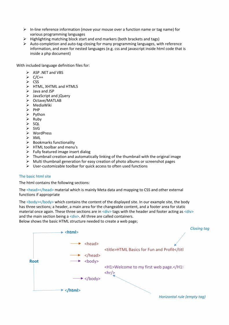
The html contains the following sections:
The <head></head> material which is mainly Meta data and mapping to CSS and other external functions if appropriate
The <body></body> which contains the content of the displayed site. In our example site, the body has three sections; a header, a main area for the changeable content, and a footer area for static material once again. These three sections are in <div> tags with the header and footer acting as <div> and the main section being a <div>. All three are called containers. Below shows the basic HTML structure needed to create a web page;
<html>
<head>
<title>HTML Basics for Fun and Profit</title>
</head>
Root <body>
<H1>Welcome to my first web page.</H1>
<hr/>
</body>
</html>
Horizontal rule (empty tag)
Closing tag
Simple HTML5 and CSS3
What is HTML5?
HTML is a simple tag language that controls the structure of a document by defining content with function – headers, paragraph content, lists and other elements. Its main purpose is to provide the foundation of websites and although it was subsequently used to control design aspects, this was not its original purpose.
Not surprisingly, HTML is not a very efficient tool for controlling the way webpages look, and whilst web designers became quite creative with this redeployment of HTML, there were always compromises and workarounds that used to result in pages loading slowly, especially when images were used to make the site's design look fresh.
Html 5 is a real attempt to move away from the compromises in previous versions and to lay out a clear content based tagging language that semantically interpreted content but did not try to style it. HTML5 also has the most comprehensive support thus far for video and audio so in future these elements can be incorporated straight into the core code.
What is CSS3?
Cascading style sheets (CSS) are designed to work with mark up languages (including html and xhtml) to separate the presentation of the document (the way it looks) and the content layout. CSS deals with the aspects like the colour, size, shape of text and headings, background colours or images, list display features and form presentation.
The way CSS does this is to refer to elements in the html and then define their look with attributes - colour, size etc. Every html element can be defined this way and if a particular instance of html needs to look different, CSS will accept an ID tag or a class of object that will be listed in the CSS explicitly and have unique styling if necessary. Every aspect of a web page can be controlled and the most flexible way to do so is by using CSS.
CSS3 has added to the functionality and effects that could only previously be achieved using graphics packages can now be done natively in CSS3 – drop shadows, gradients, curved border corners etc.
Advantages compared to styling in html include:
Controlling many pages with one style sheet Consistency in look across your site Quick editing of an entire site Greater flexibility in layout Improved content accessibility New effects such as drop shadows, gradients, and rounded corners

Browser compatibility and CSS3
Working with any web standards such as CSS3 can be frustrating as you see older browser versions struggling to display the pages as you intended. A full list of browser compatibility can be seen in the link below but CSS3 has good support across all the latest browsers from chrome, Firefox, Safari, Internet Explorer and Opera.
http://www.w3schools.com/cssref/css3_browsersupport.asp
The example website
We will use a fully functioning example website for the lessons today. You can explore the website in the Exercise 1 on page 1. The website is styled using CSS for layout and effects such gradient backgrounds to the menu and curved borders around the main content areas. The site relies on a grid template to set it up after which, it is relatively simple to create the other features. The CSS styling is designed to be appealing but easy to manage and the stylesheet should be easy to use as a template that you might wish to build upon.
To Do: ….
Make sure the computer is switched on and click on the Start button, choose All Programs and locate the software Bluefish – once located double click to open.
Learning objective One – Understand basic styling in CSS
The CSS and how it connects to HTML
HTML and CSS work together by the way HTML elements or specific instances of an html element are mapped to, and formatted in the CSS stylesheet. For instance, most html documents will have text headings - H1, H2 etc. These are then listed in the CSS stylesheet where they are defined in terms of the font, size, weight, and colour. Any further styling such as italicising is also defined as is any specific spacing using the padding property. So the html document points to the style sheet in which tags or identifiers for specific elements (see below) are explicitly mentioned. The style sheets then defines how that element or instance of the element is to be displayed. CSS can be entered in-line with the html, embedded at the top of a html page, or an external stylesheet can be referred to in the html file. This is the preferred way to style many webpages including today's example as it allows every element to be defined once in the stylesheet and for it to apply to every instance of the html.
If we define what a H1 heading should look line using in-line CSS, only that specific H1 tag will be affected. If we embed the CSS at the top of the html page, only H1 tags in that html page will be affected. But if we map all the html pages of a website to a single external stylesheet, then every H1 tag will be styled with the properties and values we have chosen.
If you want to define a specific instance of an element that is used many times in a html document, you have two choices. You can give the element a 'class' or to be even more specific you can give it an' identity'
The standard syntax for CSS is the following:
selector {
property: value }
The selector is the element that is in the html, either as a tag such as ‘p’ or as a class of object, such as ‘right box’, or as a specified instance of an object – an object with an ID such as ‘footer’ for a div that will sit at the bottom of the page and have material suitable for that location (date, copyright information).
The property is the aspect of the selector we wish to format – colour, placement, size etc.
The value is the specific measurement we are using to define the property: ‘red’ for a colour, ‘18px’ for a specific size, ‘left’ for placement.
Class versus Identity
Quite often this issue arises with generic elements such as a <div> tag. Giving this element a class means that you can say every time the element has this class, it can be defined in a certain way - it will look a certain way whenever it has a class. You could have a class of a <div> tag called 'left' and it would be styled to be on the left hand side of the page so whenever you wanted some content to appear on the left of your page you would put it into a <div> with the class 'left'. When you want to be more specific about an element you wish to style, using an ID for the element works well. This is a a way of tagging specific elements so they can be styled separately from any other element.
The key difference in operation between classes and identities is that an identity must only be used once in a style sheet - it enables a unique styling for a single element. Classes may well be specialised forms of elements but they still might appear more than once - the use of class actually indicates you are interested in having the element in your document more than once with the same styling.
Learning objective Two – CSS for layouts
Divs
The DIV element defines logical divisions on your web page. It acts a lot like a P element, by placing newlines or carriage returns before and after the division. A division can have multiple paragraphs in it.
Using the DIV Tag
To use the DIV element, surround the area of your page that you want as a separate division with the <div> and </div> tags:
<div> <p>contents of div</p> </div>
If the area is unique on the page, you can add an id, e.g. <div id="myDiv"> or if there are many similar areas on the page, you can add a class, e.g. <div class="bigDiv">. Both of these attributes can then be selected using CSS or modified using JavaScript.
The DIV element allows you to define the style of entire sections of the HTML. You can define a division of your page as a callout and give that area a different style from the surrounding text. That area may have images, paragraphs, and headlines, anything you wanted. The DIV element also gives you the ability to identify unique areas of your documents.
The DIV element is different from the HTML5 SECTION element because it does not give the enclosed content any semantic meaning. If you aren’t sure whether the block of content should be a DIV or a SECTION, think about what that content’s purpose is and why you need the DIV or SECTION element.
If you need the element simply to add styles to that area of the page, you should use the DIV element.
If that area of the page has a specific semantic meaning or the contents can stand on its own like an article or blog post, then you should use the SECTION element.
One thing to keep in mind when using the DIV element is that it breaks paragraphs. It acts as a paragraph end/beginning, and while you can have paragraphs within a DIV you can’t have a DIV inside a paragraph.
The most important attributes of the DIV element are:
style class id
Even if you don’t use style sheets or DHTML, you should get into the habit of using the DIV element. This will give you more flexibility and future proof your HTML.
Because the CENTER element has been deprecated in HTML 4.0 and is obsolete in HTML5, it is a good idea to start using <div style="text-align: center;"> to center the text inside your DIV elements instead.
Box model
To understand positioning in CSS you must first understand the box model. For display purposes, every element in a document is considered to be a rectangular box which has a content area surrounded by padding, a border and margins. The illustration below shows these various parts.
Margins are always transparent. Borders come in different styles. Background settings for an element apply to the area just inside the borders which includes both the padding and content areas.

The CSS box model
In CSS margins, borders and padding are all optional but for purposes of calculating positions and sizes they are given a default width of zero if not specified. Different widths can be set for each individual side (top, right, bottom and left) if desired. Margins can even have negative values.
The width and height of each box is equal to the width and height of the outer margin box. Note that this is not the necessarily the same as the width and height of the content area.
A box can contain any number of other boxes, creating a nesting of boxes that corresponds to the nesting of page elements. The browser window serves as the root element for this hierarchy.
Box Types
There are two basic types of boxes, block and inline. Block boxes are generated by elements such as P, DIV or TABLE. Inline boxes are generated by tags such as B, I or SPAN and actual content like text and images.
The box type may also be set using the display property. Setting a value of block on an inline element, for example, will cause it to be treated as a block element. Note that if you set the display to none, no box is created. The browser acts as if the element did not exist. Likewise, any nested elements are ignored as well, even if they specifically declare some other display value.
There are other types of boxes which apply to special elements like lists and tables. However, these are ultimately treated as block or inline boxes for positioning purposes. As such, these other box types not covered here.
Containing Blocks
Block boxes act as a containing block for any boxes within them. For example, in this code:
<div> This is the first sentence. <p>This is the second sentence.</p> </div> the DIV element establishes a containing block for both the first string of text and the P element. The P element in turn creates a containing block for the second text string.
It's interesting to note that while the text of the first sentence in the above example generates an inline box, there is considered to be block box surrounding it. These "anonymous" block boxes are used to simplify the positioning process. The result is that a block box will only contain either all inline boxes or all block boxes, even if some of those block boxes only act as a wrapper for an inline box.
This containing block is used in determining both the position of the boxes within it and in some cases, the dimensions of those boxes. For example, if an element has a style setting of width:

50%; its width will be set to half the width of its containing block.
For any element that is not absolutely positioned, the containing block is considered to be the content edge of its most recent, block-level ancestor. If none exists, the browser window serves as the containing block. Absolutely positioned elements are discussed separately.
Positioning Schemes
There are three positioning modes or schemes in CSS2: normal, float and absolute. Each has its own set of rules. Every box is positioned using one of these schemes but different boxes will use different schemes depending on their position and float style settings.
Normal Flow
Normal flow is the default scheme used for positioning. It applies to any element that does not specify position:absolute or fixed and is not floated.
In this scheme, block boxes flow vertically starting at the top of their containing block with each placed directly below the preceding one. Inline boxes flow horizontally from left to right.
You should note that vertical margins are collapsed in the normal flow. That is, instead of adding the bottom margin of a box to the top margin of the one immediately below it, only the larger of the two values is used, as illustrated here.
Horizontal margins, however, are never collapsed.
Float
Floating is achieved by setting the float property on an element's style to either left or right. Special rules apply to floated elements.
When specified, the box is positioned vertically as it would be within the normal flow, its top aligned with the top of the current line box. But horizontally, it is shifted as far to the right or left of its containing block as possible, within that block's padding (just like other content). Surrounding inline content is then allowed to flow around the opposite side.
To Do: ….
You now have a reasonably good understanding of Bluefish, including layouts in CSS.
You will now need to locate the Exercises Files on the “Home Drive” and complete the first exercise: Create a Basic CSS Layout
Learning objective Three – Create simple effects/styling with CSS
Text
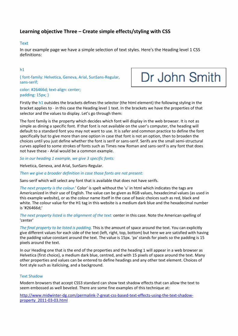
In our example page we have a simple selection of text styles. Here's the Heading level 1 CSS definitions:
h1
{ font-family: Helvetica, Geneva, Arial, SunSans-Regular, sans-serif;
color: #26466d; text-align: center; padding: 15px; }
Firstly the h1 outsides the brackets defines the selector (the html element) the following styling in the bracket applies to - in this case the Heading level 1 text. In the brackets we have the properties of that selector and the values to display. Let’s go through them:
The font family is the property which decides which font will display in the web browser. It is not as simple as dining a specific font. If that font is not available on the user’s computer, the heading will default to a standard font you may not want to use. It is safer and common practice to define the font specifically but to give more than one option in case that font is not an option, then to broaden the choices until you just define whether the font is serif or sans-serif. Serifs are the small semi-structural curves applied to some strokes of fonts such as Times new Roman and sans-serif is any font that does not have these - Arial would be a common example.
So in our heading 1 example, we give 3 specific fonts:
Helvetica, Geneva, and Arial, SunSans-Regular.
Then we give a broader definition in case those fonts are not present:
Sans-serif which will select any font that is available that does not have serifs.
The next property is the colour.' Color' is spelt without the 'u' in html which indicates the tags are Americanized in their use of English. The value can be given as RGB values, hexadecimal values (as used in this example website), or as the colour name itself in the case of basic choices such as red, black and white. The colour value for the H1 tag in this website is a medium dark blue and the hexadecimal number is '#26466d;'
The next property listed is the alignment of the text: center in this case. Note the American spelling of 'center'
The final property to be listed is padding. This is the amount of space around the text. You can explicitly give different values for each side of the text (left, right, top, bottom) but here we are satisfied with having the padding value constant around the text. The value is 15px. 'px' stands for pixels so the padding is 15 pixels around the text.
In our Heading one that is the end of the properties and the heading 1 will appear in a web browser as Helvetica (first choice), a medium dark blue, centred, and with 15 pixels of space around the text. Many other properties and values can be entered to define headings and any other text element. Choices of font style such as italicising, and a background.
Text Shadow
Modern browsers that accept CSS3 standard can show text shadow effects that can allow the text to seem embossed as well beveled. There are some fine examples of this technique at:
http://www.midwinter-dg.com/permalink-7-great-css-based-text-effects-using-the-text-shadow-property_2011-03-03.html
The general principle is to create either one or two lines of css that look like this: text-shadow: 0px 1px
1px #ffffff;
The px numbers are placing the effect horizontally, vertically and setting the amount of diffusion. All these settings will normally be small unless a wilder effect is desired. The final setting is the colour for the shadow and this can be displayed in any of the normal formats; hexadecimal, RGB values etc. Opacity is also supported. Repeating the line to create another ‘shadow’ on the same text allows for more 3 dimensional effects to be realised.
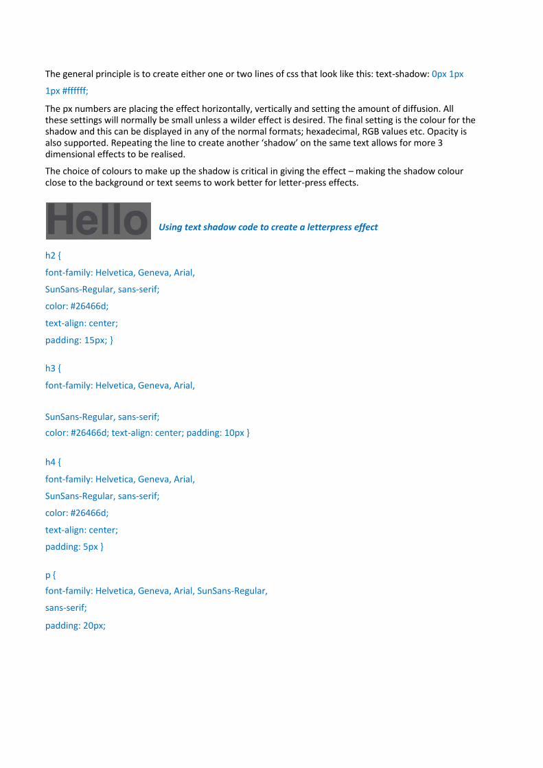
The choice of colours to make up the shadow is critical in giving the effect – making the shadow colour close to the background or text seems to work better for letter-press effects.
Using text shadow code to create a letterpress effect
h2 {
font-family: Helvetica, Geneva, Arial,
SunSans-Regular, sans-serif;
color: #26466d;
text-align: center;
padding: 15px; }
h3 {
font-family: Helvetica, Geneva, Arial,
SunSans-Regular, sans-serif;
color: #26466d; text-align: center; padding: 10px }
h4 {
font-family: Helvetica, Geneva, Arial,
SunSans-Regular, sans-serif;
color: #26466d;
text-align: center;
padding: 5px }
p {
font-family: Helvetica, Geneva, Arial, SunSans-Regular,
sans-serif;
padding: 20px;

Colours
Specifying colours in a style sheet is simple and colours can be specified in one of at least three ways; RGB values, hexadecimal numbers or, for standard colours, the name itself. The hardest aspect to giving a colour is knowing what numbers refer to what colours.
There are some good resources available on the web to give you visualisations for the numbering system you are using. A good place to start (in all things related to html and CSS generally) is the W3Schools site. Their section on CSS and colour starts at:
www.w3schools.com/cssref/css_colors.asp
Borders
A wide variety of border effects can be achieved with CSS - from simple choices such as solid or dotted lines through to curved edges and drop shadows. As a general design principle, it is probably best to choose one general 'look' and stick to it throughout a site. The table below shows some choices you can make:
Some examples of common border choices
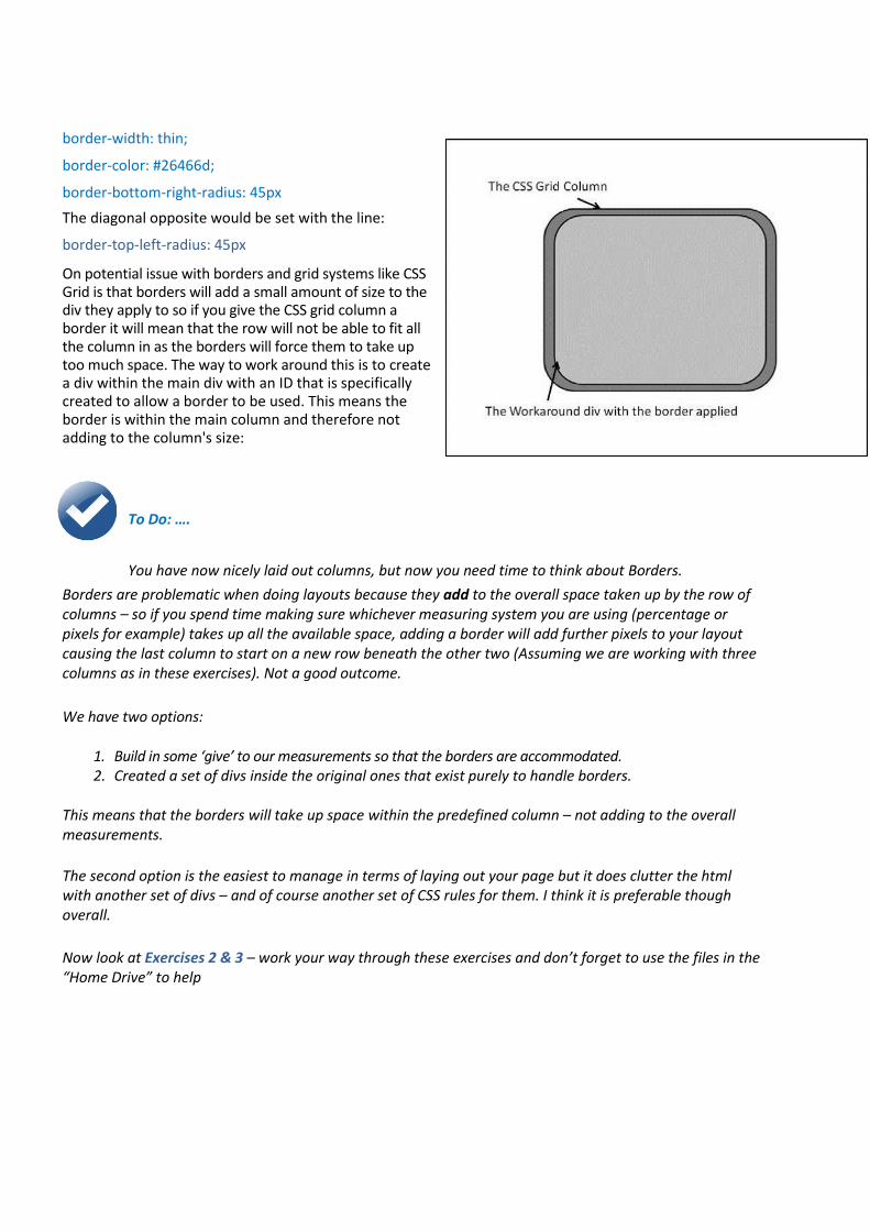
Border attributes tend to work together and one set of parameters may rely on another attribute being present; for instance, the border width property needs the border style property to be present for it to work. This is the CSS syntax for a thin solid border with rounded edges - used throughout the example site:
#MainNews6 {
border: solid;
border-width: thin; border-color:
#26466d; border-radius: 25px }
The #MainNews6 is the div ID for the Rounded Corners border in Figure 3. Each line of CSS defines a parameter. The border is defined as solid, then thin. The color is set using a Hexadecimal value (a shade of blue in this case) and the radius of the border curves is set by one line as each curve will be the same. If we look at the CSS for MainNews4 we can a specific border radius being set of a corner:
border: solid;
border-width: thin;
border-color: #26466d;
border-bottom-right-radius: 45px
The diagonal opposite would be set with the line:
border-top-left-radius: 45px
On potential issue with borders and grid systems like CSS Grid is that borders will add a small amount of size to the div they apply to so if you give the CSS grid column a border it will mean that the row will not be able to fit all the column in as the borders will force them to take up too much space. The way to work around this is to create a div within the main div with an ID that is specifically created to allow a border to be used. This means the border is within the main column and therefore not adding to the column's size:
To Do: ….
You have now nicely laid out columns, but now you need time to think about Borders.
Borders are problematic when doing layouts because they add to the overall space taken up by the row of columns – so if you spend time making sure whichever measuring system you are using (percentage or pixels for example) takes up all the available space, adding a border will add further pixels to your layout causing the last column to start on a new row beneath the other two (Assuming we are working with three columns as in these exercises). Not a good outcome.
We have two options:
1. Build in some ‘give’ to our measurements so that the borders are accommodated. 2. Created a set of divs inside the original ones that exist purely to handle borders.
This means that the borders will take up space within the predefined column – not adding to the overall measurements.
The second option is the easiest to manage in terms of laying out your page but it does clutter the html with another set of divs – and of course another set of CSS rules for them. I think it is preferable though overall.
Now look at Exercises 2 & 3 – work your way through these exercises and don’t forget to use the files in the “Home Drive” to help
Learning objective Four – Creating a Navigation Bar
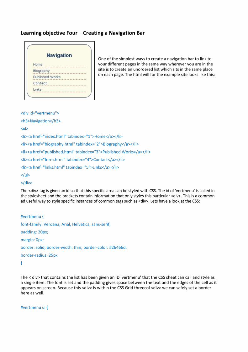
One of the simplest ways to create a navigation bar to link to your different pages in the same way wherever you are in the site is to create an unordered list which sits in the same place on each page. The html will for the example site looks like this:
<div id="vertmenu">
<h3>Navigation</h3>
<ul>
<li><a href="index.html" tabindex="1">Home</a></li>
<li><a href="biography.html" tabindex="2">Biography</a></li>
<li><a href="published.html" tabindex="3">Published Works</a></li>
<li><a href="form.html" tabindex="4">Contact</a></li>
<li><a href="links.html" tabindex="5">Links</a></li>
</ul>
</div>
The <div> tag is given an id so that this specific area can be styled with CSS. The id of 'vertmenu' is called in the stylesheet and the brackets contain information that only styles this particular <div>. This is a common ad useful way to style specific instances of common tags such as <div>. Lets have a look at the CSS:
#vertmenu {
font-family: Verdana, Arial, Helvetica, sans-serif;
padding: 20px;
margin: 0px;
border: solid; border-width: thin; border-color: #26466d;
border-radius: 25px
}
The < div> that contains the list has been given an ID 'vertmenu' that the CSS sheet can call and style as a single item. The font is set and the padding gives space between the text and the edges of the cell as it appears on screen. Because this <div> is within the CSS Grid threecol <div> we can safely set a border here as well.
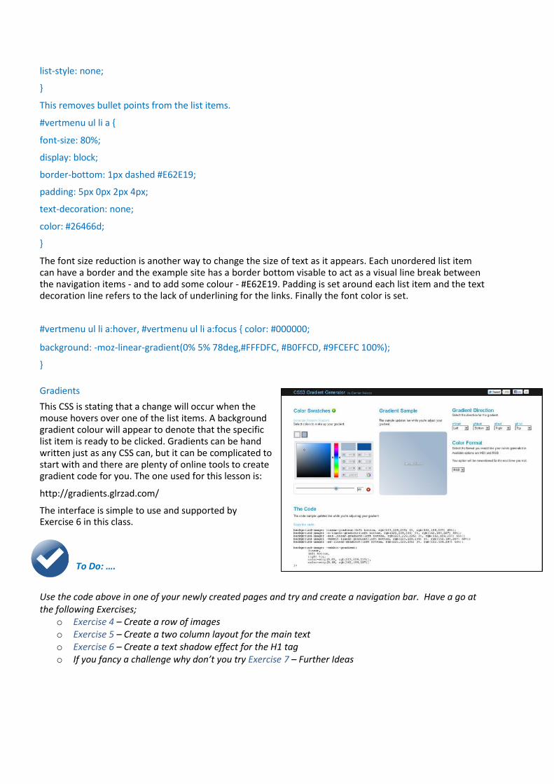
#vertmenu ul {
list-style: none;
}
This removes bullet points from the list items.
#vertmenu ul li a {
font-size: 80%;
display: block;
border-bottom: 1px dashed #E62E19;
padding: 5px 0px 2px 4px;
text-decoration: none;
color: #26466d;
}
The font size reduction is another way to change the size of text as it appears. Each unordered list item can have a border and the example site has a border bottom visable to act as a visual line break between the navigation items - and to add some colour - #E62E19. Padding is set around each list item and the text decoration line refers to the lack of underlining for the links. Finally the font color is set.
#vertmenu ul li a:hover, #vertmenu ul li a:focus { color: #000000;
background: -moz-linear-gradient(0% 5% 78deg,#FFFDFC, #B0FFCD, #9FCEFC 100%);
}
Gradients
This CSS is stating that a change will occur when the mouse hovers over one of the list items. A background gradient colour will appear to denote that the specific list item is ready to be clicked. Gradients can be hand written just as any CSS can, but it can be complicated to start with and there are plenty of online tools to create gradient code for you. The one used for this lesson is:
http://gradients.glrzad.com/
The interface is simple to use and supported by Exercise 6 in this class.
To Do: ….
Use the code above in one of your newly created pages and try and create a navigation bar. Have a go at the following Exercises;
o Exercise 4 – Create a row of images o Exercise 5 – Create a two column layout for the main text o Exercise 6 – Create a text shadow effect for the H1 tag o If you fancy a challenge why don’t you try Exercise 7 – Further Ideas
Further information - Getting extra help
Clinics
The IT Learning Centre offers bookable clinics where you can get pre- or post-course advice.
About Lynda.com
Lynda.com is free to all members of the University. Visit courses.it.ox.ac.uk/lynda and sign in with your Single Sign-On (SSO) credentials. Some courses recommend pre- and/or post-course playlists of Lynda.com videos to support your learning. You can watch these anywhere, anytime, and even download them on to a tablet or smartphone for off-line viewing. If you need a quiet place to work through playlists away from distractions, the IT Learning Centre offers frequent Lynda Labs that you can book on to.
About the ITLC Portfolio
Many of the resources used on the IT Learning Centre courses and workshops are made available as Open Educational Resources (OER) via our Portfolio website at portfolio.it.ox.ac.uk.
About the IT Learning Centre The IT Learning Centre delivers over 100 It-related classroom-based courses, and gives you access to thousands of on-line course through Lynda.com.
Our team of teachers have backgrounds in academia, research, business and education and are supported by other experts from around the University and beyond.
Our courses are open to all members of the University at a small charge. Where resources allow, we can deliver closed courses to departments and colleges, which can be more cost effective than signing up individually. We can also customize courses to suit your needs.
Our fully equipped suite of seven teaching and training rooms are available for hire for your own events and courses. For more information contact us at [email protected]
About Academic IT Services The IT Learning Centre is part of Academic IT Services (AcIT). AcIT engages with the University in all aspects of the use of IT for teaching, learning and outreach, including the development of the University’s Virtual Learning Environment (WebLearn), research data management advice, technology enhanced learning, and digital media services including the Replay lecture capture service. If you think AcIT can help you, contact us at [email protected]

1
Traci Huggins
Web Design: Using WordPressto create an online presence
Your comfort is important..
• The toilets are along the corridoroutside the lecture rooms
• The rest area is where you registered
• The swivel seats are adjustable
• You can adjust the monitors forheight, tilt and brightness
The Course Handbook ..
Contains notes on each topic + slides
Tasks for you to practice during today’s course
Work at your own pace
Follow up work
Continue with exercises after the session
Course Clinics and Lynda Labs
Course Outline …..
What is WordPress
Create a WordPressSite
Introducing theDashboard
Themes
Media Library
Pages
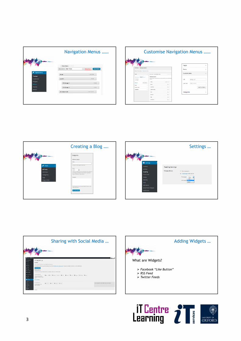
Navigation Menus
Creating a Blog
Settings
Sharing Social Media
Adding Widgets
What is a WordPress?
WordPress is a publishing platform that makes it easy for anyoneto publish online.
WordPress powers millions of websites
WordPress comes in two flavours;
• Fully hosted – wordpress.com
• Self hosted – wordpress.orghttps://premium.wpmudev.org/blog/wordpress-org-vs-wordpress-com-2015/
WordPress is free…
Use WordPress to…
Blogs
Web Pages
Image Galleries
Ecommerce Sites (for a fee)
2
Open your WordPress Account …
https://wordpress.com/
The Dashboard …
In the URL after the .com type/wp-admin/
This will bring up the dashboardwhere you make all the changesto your site
Themes …
Choose 2016
Media Library ……
Pages and Sub-Pages …… Adding Content ….
VideosImages
3
Navigation Menus …… Customise Navigation Menus ……
Creating a Blog …. Settings …
Sharing with Social Media … Adding Widgets …
What are Widgets?
Facebook “Like Button”
RSS Feed Twitter Feeds
4
This presentation is made available under a Creative Commonslicence: Attribution, Non-Commercial, Share Alike.Individual images are subject to their own licensing