web design for the small business owner
DESCRIPTION
This guide was created to help small business owners perform their own website audit and/or enable them to understand what to look for when working with a web designer.TRANSCRIPT

www.ludelljones.com [email protected]! 1
LUDELL JONESOnline Marketing
Web Design for the Small Business Owner

2
Table of ContentsIntroduction
Section1: Begin With Content
Essential Components of a Good Website
Website Necessities
Fantastic Homepages
Section 2: Calls to Action
Call to Action Types
Section 3: White Space
Good Design, Bad Design
Section 4: Consistency
Section 5: Architecture
Top 4 Mistakes in Architecture
Section 6: Keep it Fresh
Section 7: Testimonials
Page 3
Page 4
Page 5
Page 6
Page 7
Page 9
Page 10
Page 11
Page 12
Page 13
Page 14
Page 15
Page 16
Page 17
www.ludelljones.com [email protected]! 3
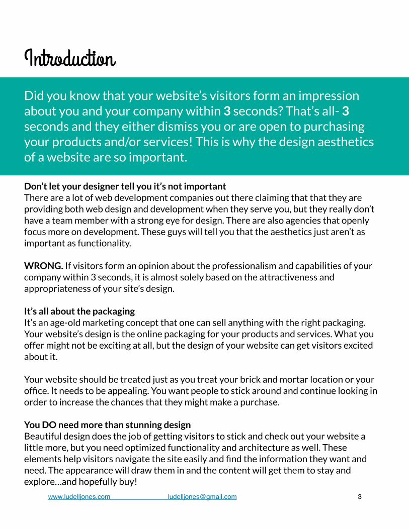
Introduction
Don’t let your designer tell you it’s not importantThere are a lot of web development companies out there claiming that that they are providing both web design and development when they serve you, but they really don’t have a team member with a strong eye for design. There are also agencies that openly focus more on development. These guys will tell you that the aesthetics just aren’t as important as functionality. WRONG. If visitors form an opinion about the professionalism and capabilities of your company within 3 seconds, it is almost solely based on the attractiveness and appropriateness of your site’s design. It’s all about the packagingIt’s an age-old marketing concept that one can sell anything with the right packaging. Your website’s design is the online packaging for your products and services. What you offer might not be exciting at all, but the design of your website can get visitors excited about it. Your website should be treated just as you treat your brick and mortar location or your office. It needs to be appealing. You want people to stick around and continue looking in order to increase the chances that they might make a purchase. You DO need more than stunning designBeautiful design does the job of getting visitors to stick and check out your website a little more, but you need optimized functionality and architecture as well. These elements help visitors navigate the site easily and find the information they want and need. The appearance will draw them in and the content will get them to stay and explore…and hopefully buy!
Did you know that your website’s visitors form an impression about you and your company within 3 seconds? That’s all- 3 seconds and they either dismiss you or are open to purchasing your products and/or services! This is why the design aesthetics of a website are so important.

4
1. Begin With Content
Don’t put the cart before the horse!Define content before thinking about how you want your site to look. This includes service/product descriptions, verbiage for the “About” page, a portfolio/featured clients if applicable, testimonials, blog posts, and homepage content.
Mind your word countDon’t clutter your website with unnecessary text or miss out on Google indexing. Follow best practices by creating between 250 and 300 words of content for each page.
No keyword stuffingSearch Engine Optimization (SEO) has changed. Creating quality content is far more important than obsessing over keyword usage. Use the right verbiage to represent what each page is about. Think about the information that your customers or clients need and provide it. (See Section 2)
What is Google indexing? Googlebot processes each of the pages it crawls in order to compile
a massive index of all the words it sees and their location on each page.
What is SEO? The process of affecting the visibility of a website or a web page in a search engine’s
“natural” or un-paid (“organic”) search results.


6
There are some basic guidelines regarding what pages and what information should be included on a website. As a best practice, make sure your site includes the items listed below to ensure that your site visitors are getting the information they need.
1. Optimized homepagea. Either a sliding gallery or videob. Call to Action (i.e. newsletter sign up or contact)- see Section 4c. Your phone number- somewhere at the topd. Social Media buttons
2. Service Pages a. General service description (i.e. What does your company do?) b. Full list of services c. Individual service descriptions
3. Testimonials a. Give your visitors quotes from past satisfied customers or clients b. Include names, employers, and positions-anything that will make the testimonial seem more credible
4. Contact Page a. Phone number b. Fax number (if applicable) c. Email d. Address e. Contact form
Website Necessities


www.boardsoffreedom.com
www.patisserie46.com
8

www.ludelljones.com [email protected]! 9
Without them, you might as well not have a siteCalls to action guide visitors to do what you want them to do. It should be featured on your homepage very prominently. It’s worth taking the time to think about what action would be most valuable to your company. You might even experiment featuring different calls to action to see what works best. Avoid multiple calls to action close together on one page- this will confuse your visitors and make you appear too sales oriented.
Call to Action (CTA) Rules1. Throwing a CTA button on the page isn’t enough. You need to support the CTA with
convincing copy that describes the benefit that will come with responding to it. For example, “Sign up for our newsletter to receive FREE tips and tricks on maintaining your home as a new home owner.”
2. The CTA should be a contrasting color that draws the eye as soon as the page is opened.
3. Prioritize your calls to action. Make sure they make sense. Sending someone to a page to buy a product isn’t always the best choice.
2. Calls to Action

Call to Action Types
10
A Call to Action...
1. Provides focus for your site2. Provides a way to measure the success and effectiveness of
your site3. Gives your visitors direction
Engagement- focuses on getting readers to take simple actions to help promote your content or share their thoughts
Drive to other content- simply drive the reader to other things you've created
Lead nurturing- consciously move your prospect along the sales funnel; architect an experience that drives them toward the sale
Sign up or lead capture- get more in-depth information about prospects such as email address or lead generation information including more detailed contact information
Sales- drive the reader toward making a purchase
Questions you should ask yourself...Does this content have a call to action and is it clear and concise?
Is the call to action appropriate to the audience reading it?
To what page am I driving them and is that page optimized?

www.ludelljones.com [email protected]! 11
3. White Space
Don’t be a pack ratYour site should not be cluttered with images and colors. A good web designer will use white space to make your site look professional and elegant. Ditch the excess and strip down to the necessities.
Give me room to breathe!!!Think of white space on your site as giving your visitors room to breathe. Give them what they need- don’t overwhelm or overstimulate them.
Check out the homepage of this beautiful site for Adhara. It mixes beautiful images and color with plenty of white space.

Good Design, Bad Design
12
Compare the two websites below. One completely ignores the value of white space and the other embraces it. Do you see the difference it makes?

www.ludelljones.com [email protected]! 13
4. Consistency
Support your brandingMake sure everything on your website is consistent and supportive of your message and branding. Don’t request use of colors or fonts that aren’t already being used in other collateral for your business, including your logo, business cards, and brochures.
Make sure you match!Each page should be based on the same general design. The same fonts, font size, colors, general layout, and image quality should be present on each and every page of your website. Visitors should not feel like they’re on a completely different website when they go from page to page.
Is the copy focused and relevant?Make sure your messages are not all over the place from page to page. Don’t contradict yourself and check that what your company does and the value you bring is clear all across the board.

14
5. Architecture
SimplifyDon’t try to reinvent the wheel. Stick with the standard structure and give your audience a homepage menu that they understand. Give pages names people will recognize and prioritize the order so the viewer knows which pages are most important.
NavigationDon’t make visitors work too hard to get where they need to go. Get them clicking 3 times or less before they arrive on the page where they want to be. Providing a Site Map, with a link in the footer menu, might help visitors navigate a site with a lot of pages.
Focusing on creating good site architecture helps to...
1. Assure visitors they are in the right place
2. Make it easy for visitors to find what they’re looking for
3. Lead visitors to respond to a call to action
4. Make your company look more credible with a logically organized site

Top 4 Mistakes in Architecture
www.ludelljones.com [email protected]! 15
Here are the top 4 site architecture mistakes you should avoid. Does your site integrate any of these bad practices?
Making up menu titles instead of going with the classics that everyone already recognizes
Featuring anything that rotates on its own without giving the visitor the option to control it themselves
Lack of organization in general; not grouping like categories and pages together
Invisible navigation options; not using buttons and text that makes links highly visible

16
6. Keep It Fresh
Regular Updates Are KeyOnce you’ve got your site up and you’ve made sure that it meets all of the guidelines in this guide, the work isn’t over! The content featured on your site needs to stay fresh and, in some cases, you’ll need to create new content to keep people coming back. From event listings to promotions and new blog posts to the date in footer way at the bottom of the page, you’re content must feel current or it will make your company look less credible. Do you really want your site visitors wondering if you’re still in business?
Ways to Keep Your Site Updated
1. Make sure you’re following an editorial calendar for your blog. Update at least once a week. If this isn’t possible, you shouldn’t have a blog on your site!
2. If you have a homepage slider, change the photos regularly.3. Feature current promotions or sales focuses on the homepage or within product pages.4. Each year, perform a self audit, going through each page of the site and checking that
there are no broken links and updating the year in your footer.5. Integrate video. Start by having a general video about your business created and put it
on the homepage.6. Link only to social media accounts on which you are active. If you haven’t posted
anything since February 2013, don’t send people there!

www.ludelljones.com [email protected]! 17
7. Testimonials
Prove itYour own claims about your services or products are made so much more powerful and validated when your customers back you up. Make asking customers or clients for their testimony a regular part of your service process. Use their name and even include a picture if possible. We’re built to trust human faces.
A good testimonial page will include the testimony giver’s name and photo and it might even integrate video testimonials.

18
At Ludell Jones, we work with you to create a stunning website that meets your company’s goals and vision while integrating best practices, which will help your company be more effective online. Contact us at (707)331-4167 or [email protected] today for a FREE 15 minute consultation.