web-based information visualization using javascript · 1 1. introduction information visualization...
TRANSCRIPT

Web-based Information Visualization Using JavaScript
Selin Guldamlasioglu
University of Tampere School of Information Sciences Interactive Technology M.Sc. thesis Supervisor: Harri Siirtola June 2015

i
University of Tampere School of Information Sciences Interactive Technology Selin Guldamlasioglu: Web-based Information Visualization Using JavaScript M.Sc. thesis, 57 pages June 2015
Since the available digital information grows rapidly, the utilization of the information
visualization becomes of utmost importance to perform complex data analysis tasks.
With the help of the visualizations, hidden facts about the data such as patterns, outliers
and tendencies can be revealed. Strategic decisions can be established with the insights
gained during the interactive data exploration.
The latest developments in browser technology have enabled developers to build
interactive web-based visualizations to target broader audience. This thesis is dedicated
to investigate usage of JavaScript in web applications. After describing the main
theories and frameworks in the information visualization literature, a number of
visualization tools are introduced. D3.js is selected as the visualization framework to
visualize Tampere Unit for Computer-Human Interaction Research Center’s publication
data.
According to design considerations and experiment gained from visualization of the
web-based publication data, it is possible to create powerful and reusable interactive
visualizations with JavaScript frameworks. Theories and frameworks mentioned in the
literature review worked as a guideline while visualizing the web-based data.
Key words: information visualization, web-based visualization, JavaScript and information visualization

ii
Contents 1. Introduction ............................................................................................................... 1 2. Information Visualization using JavaScript .............................................................. 4
2.1. Information Visualization ................................................................................ 4 2.1.1. Data Types and Information-Seeking Mantra ..................................... 5 2.1.2. Goals of the Information Visualization ............................................... 8 2.1.3. Gaining Insight .................................................................................. 10 2.1.4. Activity of Information Visualization ................................................ 12 2.1.5. Reference Model for Visualization .................................................... 13
2.2. Web-based Information Visualization ........................................................... 15 2.2.1. Visualization Tools ............................................................................ 16 2.2.2. Web-based Visualization Tools ......................................................... 18
2.2.2.1 SVG ........................................................................................... 18 2.2.2.2 HTML5 Canvas ......................................................................... 18 2.2.2.3 JavaScript ................................................................................... 19
2.3. JavaScript and a web browser as a visualization platform ............................ 20 2.3.1. Reference Model and JavaScript ....................................................... 20 2.3.2. Interaction and Animation ................................................................. 21 2.3.3. Compatibility and Accessibility ......................................................... 22 2.3.4. Client-side Frameworks ..................................................................... 22
3. D3.js: A Data-driven Visualization Framework ..................................................... 24 3.1. Major Goals ................................................................................................... 24 3.2. Creating a Design .......................................................................................... 25
3.2.1. Selection ............................................................................................. 26 3.2.2. Data Operations ................................................................................. 26 3.2.3. Interaction and Animation ................................................................. 26 3.2.4. Modules ............................................................................................. 27
3.3. Example Applications .................................................................................... 27 3.3.1. Example Study 1: Flight Analysis ..................................................... 27 3.3.2. Example Study 2: Real-time Analysis of Twitter .............................. 30 3.3.3. Example Study 3: Stock market visualization ................................... 32
4. Visualization of the Publication Data ..................................................................... 35 4.1. User Requirements ......................................................................................... 35 4.2. Related Work ................................................................................................. 36 4.3. Implementation .............................................................................................. 38
4.3.1. External JavaScript Libraries ............................................................. 38 4.3.2. DOM Manipulation ............................................................................ 40 4.3.3. Data Abstractions ............................................................................... 41 4.3.4. Interaction .......................................................................................... 42

iii
5. Implementation Results: Description, Analysis and Synthesis ............................... 44 5.1. Results ........................................................................................................... 44 5.2. Discussion ...................................................................................................... 49
6. Conclusions ............................................................................................................. 52
References ...................................................................................................................... 53
1
1. Introduction Information visualization is an emerging discipline that utilizes visual representations
of abstract data to help people to understand the underlying meanings of the
information. Visual data observation makes more sense on human beings than looking
at the raw information. In today’s big-data world, meta-information, i.e., information
about the information, has become more important. While dealing with the data,
information visualization not only appeals to the eyes, but also has a potential to reveal
the hidden information.
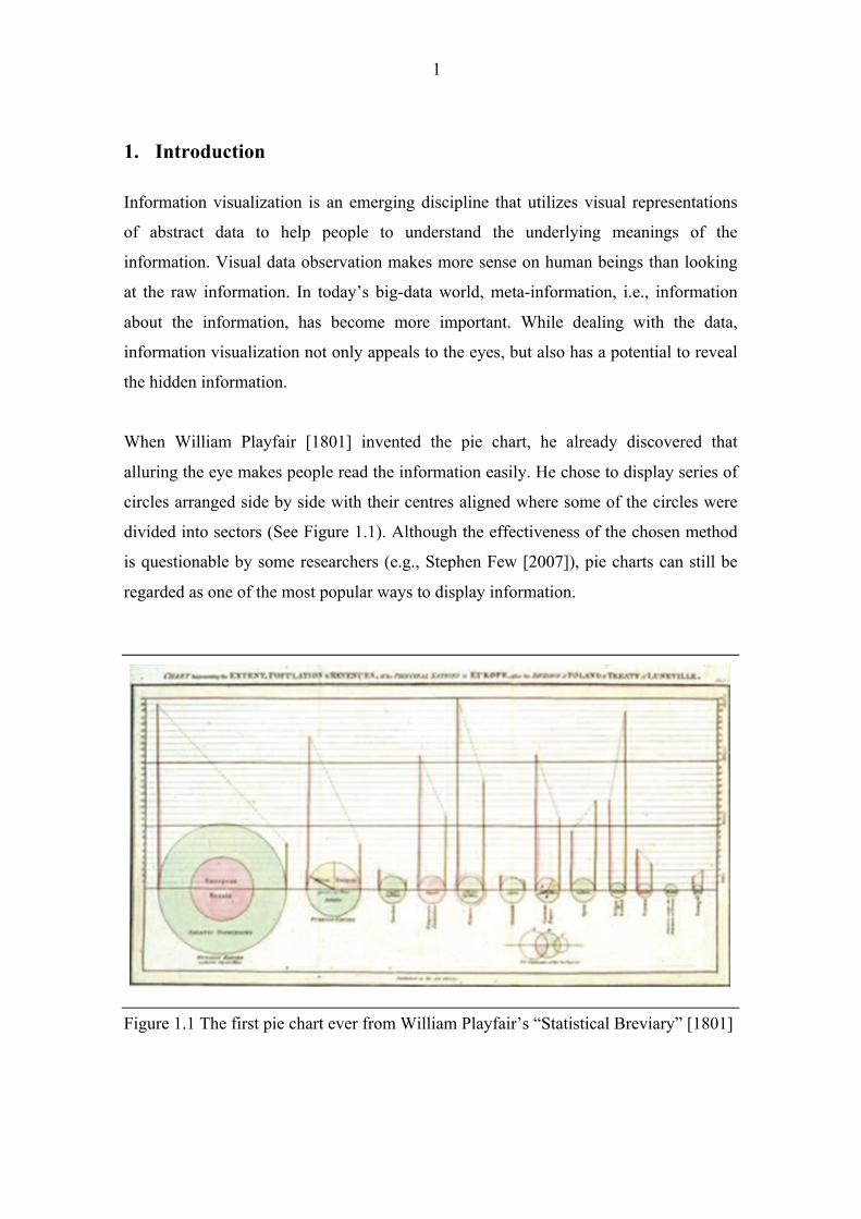
When William Playfair [1801] invented the pie chart, he already discovered that
alluring the eye makes people read the information easily. He chose to display series of
circles arranged side by side with their centres aligned where some of the circles were
divided into sectors (See Figure 1.1). Although the effectiveness of the chosen method
is questionable by some researchers (e.g., Stephen Few [2007]), pie charts can still be
regarded as one of the most popular ways to display information.
Figure 1.1 The first pie chart ever from William Playfair’s “Statistical Breviary” [1801]
2
After Playfair’s invention, historical examples vary with Napoleon’s Russian campaign
of 1812 [Tufte, 2001] and John Snow’s map that represents the cholera clusters of the
epidemic data [Johnson, 2006]. In addition to the historical examples demonstrating
the earlier usage of visualization tools, The Joy of Stats by Hans Rosling [2010]
revealed how information visualization can be applied creatively to demonstrate big
quantities of public data. Rosling visualized the development story of the world using
augmented reality animation. He illustrated how modern technology can be used to
visualize mass amounts of data.
Although Rosling’s visualization was a good example to demonstrate big amounts of
data, it was lacking to provide a platform where people could interact with the data. In
today’s Internet of Things world, devices are connected with each other within the
Internet infrastructure. Web browsers are widely being used to retrieve, present and
traverse information on the World Wide Web.
One of the most common applications of information visualization can be regarded as
visualizing web-based information due to the increasing power of web browsers.
Today’s interactive and mobile-friendly visualizations require responding to the user
actions such as clicking, hovering, scrolling and touch gestures. Users want to navigate
through data and filter the information according to their needs. Nowadays web
browsers are responsible for data processing instead of servers because of the increased
demand for real-time interactivity.
Since JavaScript is the language of web browser, it is commonly used while visualizing
the data. Client-side JavaScript, i.e., JavaScript interpreter embedded in a browser,
combines scripting capabilities of JavaScript together with the document object model
(DOM) presented by the browser.
Client-side JavaScript enables users to control document appearance and content,
interact with HTML forms and other users. This approach has both advantages and
disadvantages. Since JavaScript code is executed on the user’s computer, processing is
fast as there is no need to process data in server. JavaScript also provides an extended
functionality for web pages so that developers can customize the visualization and
behaviour of the websites. Although advantages of using JS in web browsers are varied,

3
there are some related drawbacks. JavaScript frameworks, which are being used to
extend functionality, might raise security issues since they execute on client side
immediately. Moreover, inconsistencies between different layout engines might lead to
functionality and interface variations. This disadvantage doesn’t afflict the web-based
visualization using JavaScript since most of the modern browsers support the latest
versions of JavaScript.
This thesis mainly focuses on the usage of JavaScript in web applications. The main
purpose of this work is to examine JavaScript visualization frameworks. After
examining the important theories and frameworks in the process of information
visualization, example web-based applications will be examined with regard to these
theories and frameworks. Lastly, Tampere Unit for Computer-Human Interaction’s
(TAUCHI) publication data will be visualized with selected JavaScript framework to
demonstrate the strength of JavaScript in web-based applications.
This thesis consists of six chapters. Chapter 2 introduces the main principles and
concepts of information visualization. This is followed by a detailed discussion on the
web-based information visualization and usage of visualization tools. Chapter 3 focuses
on the selected visualization framework, D3.js, and demonstrates the application of this
framework to the recent web based visualization examples. Chapter 4 explains the
implementation details of the TAUCHI’s publication data and implementation results
can be seen in Chapter 5. In the conclusion chapter, visualization of the TAUCHI’s
publication data will be discussed regarding the theories and frameworks mentioned
during the literature review.
4
2. Information Visualization using JavaScript This chapter discusses the main principles of information visualization and describes
web-based information visualization regarding the current visualization tools. Lastly,
usage of JavaScript in the field of information visualization is introduced in detail.
2.1. Information Visualization
Information visualization is a research area that aims to allow people to gain insight,
understand and analyse the data. According to a dictionary, ‘visualize’ means “to form
a mental image, to make something visible”. Vast quantities and different types of
information are being generated these days, emerging the need to extract information
from data overload.
Card et al. [1999] describes information visualization as the use of computer-supported,
interactive, visual representations of abstract data to amplify cognition. One of the main
goals of information visualization can be regarded as augmenting human cognition in a
way that viewers gain knowledge about the underlying meaning of the data.
Information visualization influences the lives of humankind directly. To exemplify,
people need to search through various information such as metro lines, e-mails and
schedules on a daily basis. Finding the valuable information hidden in large amounts of
data can be a difficult task. Therefore, adequate exploration of data enables people to
make use of the data.
As information visualization is an evolving discipline, historical examples indicate the
significance of the different visualization techniques. In 1931, Harry Beck, engineering
draftsman, altered and improved London Underground Tube map [Degani, 2013]. He
eliminated all of the surface details except the Thames River that brought simplicity to
his drawing. The result was so simple and comprehensible that society embraced his
map and it became an essential guide to London. Beck’s revolutionary design with
modifications and additions survives to the present day.
5
Although Harry Beck prepared striking Tube map to display available information, lack
of proper visualization techniques caused some disasters in the history. In 1986, Space
Shuttle Challenger exploded 73 seconds after its launch causing the death of seven US
astronauts. The reason for the explosion was the failure of an O-ring seal on a booster
rocket due to the cold weather. Edward Tufte, noted statistician in the field of data
visualization, indicates that inaccurate assessment of the facts lead to the explosions.
Although design engineers prepared 13 charts supporting the launch, they couldn`t
display the relationship between O-ring failure and temperature. Tufte even claims that
this tragic accident might have been avoided with a clear representation. [Robinson et
al., 2002]
Impact of information visualization in today`s world is increasing as generated digital
content is also expanding. One of the important aspects of information visualization can
be regarded as interactivity. Visual representation of the data allows viewers to gain
insight of the data and reach conclusions by directly interacting with the data. Viewers
can interact with the data intuitively without requiring understanding of the underlying
structures. It is crucial to understand the information visualization process while
creating interactive web-visualizations. User friendly, highly interactive and reusable
charts can be created if designers convey to the main principles of information
visualization.
2.1.1. Data Types and Information-Seeking Mantra
The terms data, information and knowledge are being extensively used in the field of
information visualization. It is important to differentiate these terms to be able to
understand data types better.
Russell Ackoff, organizational theorist, classifies the content of the human mind into
five categories: data, information, knowledge, understanding and wisdom [Ackoff,
1989]. He defines data as symbols. Data can exist in any form independent of its
usability. He describes information as the data that is processed to be useful.
Information provides answers to “who”, “what”, “where” and “when” questions. He
further characterizes knowledge by stating that knowledge provides answers to “how”
questions, as knowledge is the application of data and information. Ackoff [1989]

6
continues his definitions by stating that understanding is the appreciation of “why”
whereas wisdom is the evaluated understanding.
Ackoff [1989] makes distinction between data and information in perceptual and
cognitive space. It is also important to make the distinction in computational space
since data and information can be stored in a computer. Data is defined as computerized
representations, whereas information is the data that represents the results of a
computational process [Chen et al., 2009].
Although one can categorize data in many ways (e.g., nominal, ordinal, interval),
Shneiderman [1996] discusses about the data type taxonomy with seven data types
(one, two, three dimensional data, temporal data, multi-dimensional data, tree and
network data) and seven tasks (overview, zoom, filter, details on demand, relate, history
and extract). Shneiderman`s Visual Information-Seeking Mantra [Shneiderman, 1996]
provides a framework for designing information visualization applications.
According to Shneiderman [1996], data types can be described as follows:
• One-dimensional data: Consists of linear data types (e.g., textual documents
which are sequentially organized).
• Two-dimensional data: Includes planar or map data where each item in the
collection corresponds to some part of the area. Every item includes task-
domain attributes.
• Three-dimensional data: Includes real world objects. Understanding the position
and orientation of the object is one of the challenging tasks of the viewers.
• Temporal data: Consists of items which has a start and finish time where
timelines are needed (e.g., medical records, project management).
• Multi-dimensional data: Items with n-attributes relate with points in an n-
dimensional space. Common user tasks include, for instance, finding patterns,
correlations and outliers.
• Tree data: In a tree hierarchy, each item has a link to the parent item except
from the root. Finding the number of levels in a tree can be one of the major
user tasks.
7
• Network data: Includes items linked to an arbitrary number of other items where
these items cannot fit into a tree conveniently (e.g., visualizing the social
networks).
After defining different data types, Shneiderman [1996] states his mantra to achieve
powerful visualizations: overview first, zoom and filter, then details on demand. This
mantra provides designers a framework and explains the essential elements of
interacting with different types of data. Details about his mantra can be seen in below
[Shneiderman, 1996]:
• Overview: Provides a general context for understanding the whole dataset.
Patterns and themes can be observed from this viewpoint.
• Zoom and Filter: Once the data is presented to the user with overview, viewers
can focus on the particular area depending on their interest. Zooming allows
users to adjust the size and the position of the data on screen where filtering
removes the irrelevant information.
• Details on demand: Viewers should be able to observe the raw data if they
demand. Visualization application should not enforce the users to change the
view to be able to see the details.
• Relate: Users can observe the relationships between the items. For instance,
users of HomeFinder [Williamson and Shneiderman, 1992] could select an
attribute garage, to find the houses with a garage in a price range and area
relating the houses only with a garage.
• History: Viewers should be supported with undo and replay options to provide
historical information to the users.
• Extract: Once the user has found the related information by overviewing first,
zooming and filtering, and then details on demand, it would be useful to enable
users to save the relevant information by extraction.
Despite the fact that there are different data types, designers can cope with these
different types of data by applying the Visual Information-Seeking Mantra
[Shneiderman, 1996]. Shneiderman`s Mantra provides an efficient guideline to achieve
successful visualizations. Frequent use of the Mantra could be an indication that

8
overview first, zoom and filter, then details on demand approach provides strong
visualizations under different scenarios with different data types.
2.1.2. Goals of the Information Visualization
The main goals of information visualization mainly focus on making viewers gain
insight by forming a mental model. As information visualization includes human
interaction with the data, main aim of information visualization is to acquire the viewer
with the knowledge. It has been proven that information visualization works as a
learning tool to foster knowledge acquisition. Experiment that investigates the
understanding of the relations in a data set leads to the conclusion that cognitive
processes in knowledge acquisition can be enhanced by applying information
visualization techniques. [Keller et al., 2006]
The main goals of information visualization can be listed as discovery, decision-making
and explanation. Each of these goals, explained as follows, plays a significant role in
gaining insight:
• Discovery: Information visualization provides metadata, i.e., data about the
data. Therefore, it is possible to create hypotheses without investigating all
bits of the data. Exploratory data analysis is a data analysis approach which
utilizes mostly graphical techniques such as box plots, histograms and
scatter plots. Tukey [1977] defines exploratory data analysis in 1962 as:
“Procedures of analyzing data, techniques for interpreting the results of such
procedures, ways of planning the gathering of data to make its analysis
easier, more precise or more accurate …”. Viewers can make discoveries by
finding outliers, tendencies and trends with the help of the exploratory
analysis. Viewers can also formulate hypotheses and verify or refute the
hypotheses.
• Decision-making: After deriving hypotheses about the data, information
visualization aims to provide confirmative analysis. For example, Dr. John
Snow`s main hypothesis was that cholera spreads through water [Johnson,

9
2006]. In order to prove his hypothesis, he mapped the number of deaths,
which lead to the confirmation of his hypotheses (See Figure 2.1).
Figure 2.1 Original map by John Snow demonstrating the cholera clusters in London epidemic cases of 1854 [Johnson, 2006]
In contrast to the exploratory data analysis, confirmatory analysis begins by
stating a hypothesis. Examination of the hypothesis is achieved in a goal-
oriented manner. Visualization either confirms or rejects the hypothesis as a
result.
• Explanation: Another goal of information visualization is to present the fact
which results in high-quality visualization of the data. Presentation serves
the purpose of delivering the results of an analysis efficiently and
effectively. User selects the appropriate presentation technique, determining
the facts to be presented beforehand.
Observers gain insight by discovery, decision-making and explanation. Information
visualization aims to acquire the observers with knowledge. Viewers can make new
discoveries simply by finding outliers, detecting trends and tendencies. They can also
refute or accept hypothesizes by observing or interacting with the data. Large quantities
of data can be explained to the viewers so that they can understand the underlying
meanings of the data.
10
2.1.3. Gaining Insight
Human vision contains millions of neurons where each individual neuron works in
parallel to extract the features of visualization. This rapid parallel processing and
pattern recognition happen regardless of human attention [Ware, 2004]. Visualization
means the formation of a mental model or cognitive map of the data [Spence, 2014].
Visualization is perceived in mind and results in mental model or internal model, i.e.,
cognitive maps.
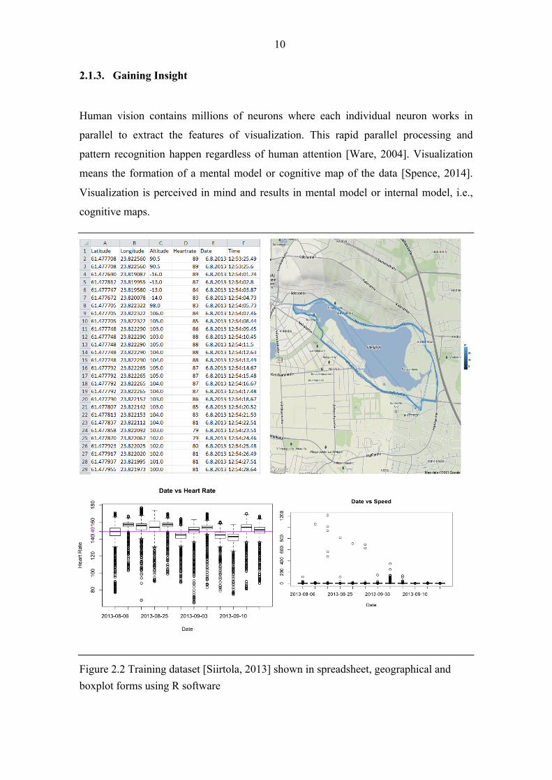
Figure 2.2 Training dataset [Siirtola, 2013] shown in spreadsheet, geographical and boxplot forms using R software

11
For instance, Figure 2.2 demonstrates the mapping of the training data which includes
latitude, longitude, altitude, date, and time information. The training terrain, altitude
differences, average heart rate and highest speed can be inferred from the visualizations.
It is not possible to gain these insights only by observing the raw dataset. Although
these insights aren`t explicitly stored in the data, they are gained through pattern
recognition. Therefore, visual representation plays an important role in gaining insight.
Visualizations can hide the meanings or mislead the viewers unless data is visualized
accurately.
Yi et al. [2008] claim that there are certain procedures leading to insight. These
procedures are as follows:
1. Provide overview: Viewers can discover the overall picture of the data with
this process. Further inquiries needs to be done on the dataset can be
determined during this step by grasping knowledge about the data
comprehensively.
2. Adjust: Observers can change the level of abstraction and selections in a
flexible manner. This way, large quantities of data can be explored using
filtering. Additionally, uninteresting parts of the data can be omitted.
3. Detect pattern: Specific distributions, outliers and relationships in the
dataset can be found by detecting patterns. New knowledge discoveries can
be made by recognizing patterns within the dataset.
4. Match mental model: Cognitive load in the process of knowledge acquisition
can be reduced by linking the data with the viewer`s mental model.
Metaphors can provide more effective mapping while matching the data
with the mental model.
Information visualization is a strong tool for the knowledge discovery. Additional to
simple insights such as minimum, maximum or average values, complex insights as
patterns, clusters, paths can be derived from information insight. Viewer`s internal
model can be refined, clarified and extended by gaining insight.

12
2.1.4. Activity of Information Visualization
Considering the fact that information visualization enhances the ability to comprehend
huge amounts of data, there are various differences in visualizations such as interaction
paradigms and different data types. Although there are divergences in different
visualizations, it is conceivable to analyse visualizations systematically.
Ware [2004] separates the process of data visualization into four: collection and storage
of data, pre-processing and transporting the data into human-readable format,
displaying the image on screen, and finally the perceiver (see Figure 2.3).
Figure 2.3 A schematic diagram of the visualization process [Ware, 2004]
Data is gathered from both physical and social environments. After data is collected, it
needs to be pre-processed and transformed into organized canonical data format. At this
stage, data entities need to be associated with attribute values. Graphics engine is
responsible for mapping the dataset into visual form. Once the visual forms are created,
views need to be provided to present transformations (e.g., navigation). Views are
interpreted by users through human visual system, visual and cognitive processes.
Although Ware [2004] explains the process of information visualization, it lacks the
ability of providing a platform to compare and contrast different information
visualization systems. Different reference models were developed to simplify the
discussion of different visualization systems by making correlations.

13
2.1.5. Reference Model for Visualization
Card et al. [1999] established a reference model by defining the milestones in the
process of information visualization (see Figure 2.4). Reference model aims to provide
a framework for developers who create new visualizations.
Figure 2.4 Reference model for visualization [Card et al., 1999]
According to the Card et al.`s model, raw data needs to be transformed into structured
data using data tables. Data tables contain the metadata. Further transformations can be
performed on metadata to derive additional characteristics of the data. Visual mappings
constitute to the core of the reference model by converting data tables into visual
structures. Visual structures are abstract, representing the derived characteristics of the
data, which undergoes to the visual mappings. At this stage human vision can process
the visual structures, whereas data tables were representing the mathematical relations.
Once the visual structures are created and graphical views are acquired by view
transformations, human interaction can alter the views (e.g., colour, size and
orientation).
According to the Card et al.`s model (Figure 2.4), human interaction can take part at
any stage of the visualization process. User selects the relative raw-data in the data
transformations stage. During the visual mappings, user determines the mapping
between the data variables and abstract structures (e.g., axes). User can interactively
control the presentation of data, for instance, by distorting at the view transformations
stage.

14
Although Card et al.`s [1999] reference model provides a step-by-step description on
how to visualize raw data and how to include human interaction during the visualization
process, this model lacks to provide detailed information for the developers. This lack
of information is being criticized by some researchers. Chi [2000] criticizes the
previous reference models by stating “Researchers have attempted to construct
taxonomies of information visualization techniques by examining the data domains that
are compatible with these techniques. However, these taxonomies do not help the
implementers understand how to apply and implement these techniques”. After this
criticism, Chi proposes a new way to taxonomize information visualization techniques
by providing an overview (See Figure 2.5) to his earlier Data State Model [Chi and
Riedl, 1998].
Figure 2.5 Information Visualization Data State Reference Model [Chi and Riedl, 1998]
There are four data stages in Chi`s Data State Model [Chi, 2000]: value, analytical
abstraction, visual abstraction and view. Value corresponds to the raw data whereas
analytical abstraction represents the metadata. Visualization abstraction means the
information that can be visualized on screen using visualization techniques. User
interacts with the view as it is the end-product. Data transformation, visualization
transformation and visual mapping transformation operators have similar tasks as in the
Card et al.`s Reference Model [Card et al., 1999].

15
Chi uses this Data State Reference Model to taxonomize different visualization
techniques. For instance, one of the visualization techniques called GraphViz [AT&T,
2014] can take a graph as a raw data and remodel the graph by extracting edges and
nodes during the data transformation stage. Complex graph layout algorithm places the
nodes on a 2D plane during the visual mapping transformation stage. Chi [2000] gives
many examples like GraphViz to provide sequential order of operations so that
developers can create modular visualizations.
Although both of the Card et al.`s and Chi`s reference model and taxonomies share
similar techniques to allow reuse, Chi puts more emphasize on the implementers so that
they can understand how to apply these techniques broadly. Both of the Reference
Model and Data State Model are important while analysing the information
visualization activities. These models can be utilized to present further categorization to
identify similarities between different visualization techniques.
The most important aspect of using reference models can be reuse. If designers can
understand how to apply and implement information visualization techniques, they can
reuse different parts of the system to construct new information visualizations. Reuse
leads to the rapid development that brings broad benefits. Implementers are more likely
to construct new visualizations if they understand the interactions between the data and
operations clearly. Therefore, usage of reference models leads to rapid development.
2.2. Web-based Information Visualization
Utilization of information visualization becomes crucial when dealing with complex
data sets. Data, information, users and applications work interactively in a distributed
environment with the latest developments in browser and internet technologies. Web-
based information visualization has a broad target group as there is no necessity for
installing software to operate on the data. Users can interact with the up-to-date data
without relying on the platform. Collaborative data analysis can be possible as most of
the modern web browsers support the implementation of visualizations without
requiring any other software installation.

16
There are different tools and technologies for developing interactive web-based
visualizations. Before the improvement of browser technologies, small applets were the
major visualization tools. These applets required third-party installations like Java
Applets or Adobe Flash. Although there are still some tools requiring software
installation, web-based visualizations tools tends to work in browser natively. Different
visualization tools are explained in detail in the following chapters.
2.2.1. Visualization Tools
Bostock and Heer [2009] divide data visualization tools into two to make better
comparison between the visualization tools as follows:
1. Graphical Systems: In this kind of systems, cognitive mapping between the
representation and results accomplished directly since designers manipulate the
graphical visualization using the selected software tool (e.g., vector-based
Adobe Illustrator). Although higher-level tools like Adobe Flash provides
illustration and animation, constructing even simple visualizations with these
systems requires advanced design and programming skills.
2. Visualization Systems: Bostock and Heer [2009] describe these systems as tools
that are designed for explicit data visualizations. These tools support data-
management, layout algorithms, interaction and animation.
a. Consumer Software: This category includes the most commonly used
visualization tools such as Microsoft Excel and Google Spreadsheets.
Some of the main tasks include the selection of relative data cells and
determining the desired type of the chart. Although this kind of software
is considered as successful in terms of ease of use and immediate
visualization, there are some short comes mentioned by Wilkinson
[2005]. He argues that chart metaphor is restrictive, disabling the user
from understanding what to do with the data after constructing the
visualization. He continues his arguments that charts give the impression
of data exploration rather than the experience.

17
b. Analytical and Exploratory Tools: These types of tools are designed for
providing flexible options for data explorations. Statistical programming
language R can be regarded as an example for such tools. R has specific
data visualization packages to replace base graphics with scales and
layers. Although analytical and exploratory tools utilize the metadata by
choosing appropriate visual encodings, it is not possible for designers to
customize all visual aspects. Additionally, graphical output is mostly
being used for research purposes rather than presentation since control
over graphical output is limited [Bostock and Heer, 2009].
c. Programming Toolkits: According to Bostock and Heer [2009],
programming toolkits are popular for presenting live data and allowing
user interaction. Some of the toolkits (e.g., Google Chart API) support
limited number of chart types, presenting similar characteristics with
consumer software. More expressive visualization toolkits (e.g., InfoViz
[Li, 2012]) allow extensions by modifying existing components or
creating new components from scratch. On the other hand, Prefuse and
Flare [Chi and Riedl, 1998] conveys the Chi`s Data State Model [2000],
i.e., designers can specify properties of configurable operators to
perform actions such as layout and color encoding. However, these kinds
of toolkits transform easy tasks into complex ones [Bostock and Heer,
2009].
According to Bostock and Heer [2009], there is no strict distinction between graphical
systems and visualization systems. Graphical systems use low-level graphical
components whereas visualization systems utilize high-level abstractions designed for
data visualization. Protovis, Bostock and Heer`s [2009] solution, adapts properties of
both graphical and visualization systems. Protovis runs natively in the browser, but also
allows declarative specification so that other rendering engines (e.g., Java2D, Flash)
can be integrated in the future. With this approach they aim to optimize the Data State
Model [Chi, 1998] through lazy evaluation of visual properties of large datasets.

18
2.2.2. Web-based Visualization Tools
In this section selected tools for web-based information visualization will be described
considering the recent developments in web tools.
2.2.2.1 SVG Scalable Vector Graphics (SVG) is an XML-based image format with support for
interactivity and animation. World Wide Web Consortium (W3C) explicitly
recommends the usage of SVG in web browsers [W3C, 2011]. It is possible to integrate
SVG with other W3C standards like Document Object Model (DOM).
SVG is being used to define vector-based 2D web graphics in XML format. Since it is
vector based, image size and scale can be changed without quality loss. As the images
are scalable, they can also be zoomed without deterioration. Since SVG objects are
available in DOM, JavaScript event handlers for the objects can be created, for instance,
when the user clicks on a certain circle.
Every drawn shape is considered as a SVG object. When the user changes the attributes
of an object, web browser re-enders the shape automatically. Therefore, usage of SVG
is suited for the applications for large rendering areas like Google Maps.
Although SVG brings benefits like scalability, it is not widely supported. Intensive
research needs to be carried out after creating a SVG image to ensure the image will
appear and function as intended through different kinds of browsers. Additionally, SVG
is not suitable for graphic-intensive applications as complex SVG images render slowly
in the browser.
2.2.2.2 HTML5 Canvas The Canvas Element is part of the HTML5 and enables dynamic rendering of 2D
shapes. Canvas element with height and width attributes creates a container for the
shapes. JavaScript code can access the specific canvas area while dynamically
generating the graphics.

19
Canvas API is a low level pixel-oriented model. Shapes cannot be changed without
overwriting the pixels. Unlike an SVG-object, once the shape is drawn, system forgets
the fact that shape was drawn. As there is no automatic rendering with the Canvas
element, entire shape would need to be redrawn if its shape or position is changed.
Additionally, unlike SVG, it is not possible to create event handlers for Canvas
elements, e.g., coordinates need to be matched manually to determine mouse click
events. Canvas is suited better for graphic-intensive applications as it is more memory-
efficient compared to SVG.
2.2.2.3 JavaScript JavaScript (JS) is considered as the programming language of the web as most of the
modern HTML pages are using JavaScript. Main usage of JS is the client-side
JavaScript where users control and alter the document content in a web browser.
JS program can manipulate the content through containing Document and Element
objects. Presentation of the content can be changed by scripting CSS styles.
Additionally, event handlers can change the behaviour of documents. Combination of
scriptable content, presentation, and behaviour is called Dynamic HTML (DHTML)
[Flanagan, 2011]. Scripts embedded in HTML pages interact with the Document Object
Model (DOM) directly to alter the page content dynamically.
JavaScript can be utilized to enhance the browsing experience, for example, by creating
animations, playing audio/video and validating input values. Additional to content,
presentation and behaviour manipulation, JavaScript APIs allow web applications to
work asynchronously, sending and retrieving data without interfering with the current
user actions. Quick and responsive applications can be built with JavaScript since JS
code runs on user`s browser locally.
20
2.3. JavaScript and a web browser as a visualization platform
JavaScript is a dynamic language, which is mainly used to modify the displayed
document content in web browsers. JavaScript can change HTML DOM (the Document
Object Model) elements, attributes and styles. JavaScript includes an eval function that
can execute statements at run-time [Richards et al., 2010].
JavaScript has a powerful object literal notation (JSON) since objects can be created
easily by listing their components. As JSON object is in text format, it can be easily
read. Additionally, it is language independent [Crockford, 2008], allowing data to be
read and used by different programming languages.
In addition to dynamic objects and expressive object literal notation, JavaScript
functions are objects with lexical scoping, i.e., scope of inner function contains the
scope of parent function. Lexical scoping enhances the functionality of the language
since all variable definitions are accessible [Gentleman and Ihaka, 2000].
As it can be complex to support all different web browser requirements, there are many
JavaScript libraries available for easier development. Although JavaScript frameworks
have common characteristics like DOM manipulation, every framework has different
main functionality. For instance, jQuery, one of the most commonly used libraries in
websites [SimilarTech, 2014], uses CSS selectors to manipulate HTML elements,
whereas D3 is a JavaScript library that manipulates documents based on data by
providing powerful visualization components.
2.3.1. Reference Model and JavaScript
Card et al.’s [1999] Data Reference Model is important for understanding and applying
JavaScript properties for visualizing the data. Figure 2.6 represents the modified version
of the Reference Model for information visualization with JavaScript.

21
Figure 2.6 Reference model adapted for JS web visualization [Card et al., 1999].
JSON corresponds to the data table as it lists the attributes of the metadata. Visual
structures, such as a pie chart, are the visualization means that are interpreted directly
by the human. Canvas element of HTML5 is being used to draw elements on webpage.
View transformations interactively modify visual structures to create interactive
visualizations (e.g., zooming and fish eye view). Views are created with HTML
elements that are formatted with CSS.
Reference model describes the approximate steps in the information visualization
process. Information visualization reference model can be applied easily to the
visualizations with JavaScript. JavaScript includes dedicated structures, such as JSON,
SVG, Canvas, and HTML, which fit into data tables, visual structures and views of the
model.
2.3.2. Interaction and Animation
Spence [2007] defines the interaction between human and computer as the heart of
modern information visualization. Usually core of the data is so large that one single
view is unlikely to lead to gaining insight. Interactive exploration is required so that the
view triggers an `a ha!´ moment.
JavaScript provides an excellent interaction support in web browsers. Client-side JS
frameworks can be utilized to enhance dynamic behaviours such as interaction and

22
animation. For instance, interactive SVG bar charts with smooth transitions and user
interaction can be generated with the various JavaScript frameworks (e.g., D3.js).
2.3.3. Compatibility and Accessibility
Web visualizations are being viewed in browsers from different ages and from different
vendors such as Google and Opera. It can be a challenging task to create JS
visualizations that behaves as intended in different kinds of browsers. Flanagan [2011]
suggests the usage of additional libraries to deal with the incompatibility problems.
In addition to compatibility issues, it is important to provide accessible visualizations to
users. Device-independent events should be supported rather than device-dependent
events (e.g., mouse over) to be able to include the users regardless of which device they
are using (e.g., keyboard, mouse).
2.3.4. Client-side Frameworks
Client-side frameworks build a higher-level API on top of the standard APIs offered by
web browsers. JavaScript code needs to be written to use the APIs defined by the
selected framework [Flanagan, 2011]. A well-written framework addresses the
compatibility and accessibility issues described in the previous section. One of the main
benefits of using a framework is extended functionality with less coding.
There are many JavaScript frameworks for information visualization. Some of the most
widely used open-source frameworks include:
• Processing.js: This framework is JS port of the Processing programming
language designed for visualizing the web. It converts the written Processing
code into JavaScript and executes. This module makes use of the HTML5
canvas element to render 2D and 3D visualizations. The Processing API
includes various methods such as canvas and color manipulation, shapes and
image drawing, and math functions. [Fry and Reas, 2014]
23
• Raphaël.js: This library provides an API for SVG manipulation. This is used
mostly for drawing vector graphics on web. Additionally, this API tries to
solve the compatibility issues with old-versions of Internet Explorer using
VML (Vector Markup Language). Websites like Washington Post and the
Times Online makes use of this framework because of the compatibility
advantages. [Dmitry, 2014]
• Protovis: Bostock and Heer [2009] created Protovis JS library to generate
SVG graphics. In Protovis, visualizations are designed as hierarchy of marks
such as bars and dots. Inheritance, scales and layouts are allowed in
Protovis. However, it has limitations to provide animation and transitions.
Therefore, Heer and Bostock developed a successor to Protovis, D3.js, to
provide an improved support for animation and interaction.
• D3.js: Data-driven Documents (D3) is a JS library for direct manipulation of
a native representation [Bostock et al., 2011]. Main purpose of D3 is to
create highly interactive and responsive data visualizations by allowing
animation. D3 JavaScript library makes use of the SVG, HTML5 and CSS
standards to create visualizations for modern web browsers.
There are different JavaScript libraries for making the development of JavaScript-based
applications easier. Every JavaScript framework has specified functionality such as
DOM manipulation, GUI development, graphics and visualization development and
web application related. JavaScript frameworks are beneficial in terms of dealing with
the inconsistencies between runtime environments. Devoted visualization frameworks
(e.g., Processing.js, D3.js) become advantageous while creating web-based applications
since developers can concentrate on the visualization components.

24
3. D3.js: A Data-driven Visualization Framework As described in the previous chapter, D3.js is designed to propose a novel visualization
approach for web. With D3.js, designers can generate and modify web content by direct
manipulation of the document object model. D3.js is a very powerful visualization
library since it makes use of JavaScript, SVG and CSS.
3.1. Major Goals
According to Bostock et al. [2011], interactive visualizations should combine various
web technologies such as HTML, CSS, JavaScript and SVG. They claim that
visualization toolkits, which lack the ability of direct manipulation of the existing
DOM, cannot make use of the different web technologies [Bostock et al., 2011].
Some of the earlier visualization tools, such as Protovis [Bostock and Heer, 2009],
present accessibility and expressiveness drawbacks. It is difficult to learn the
representation since the DOM is encapsulated in tool-specific formats. Additionally,
tools that provide structured solutions do not enhance the development of new graphic
solutions.
D3.js developers categorize their goals as follows, aiming to overcome the drawbacks
related with the earlier visualization toolkits [Bostock et al., 2011]:
• Compatibility: D3.js aims to provide reusable components to improve
accessibility and efficiency. Moreover, additional JS libraries can be utilized
to assure backwards compatibility with older browsers.
• Debugging: D3.js simplifies debugging due to the JS console in developer
tools. Developers can interactively debug by running JS in the browser.
• Performance: D3.js emphasizes transformation rather than representation.
Since there is no specific format for certain visualizations (e.g., drawing a
circle), developers can make use of this characteristic to improve
performance, for instance, by writing pure HTML code.

25
Additional to the developer’s goals, there are certain requirements for a web-based
visualization framework. Some of these applied requirements are mentioned below
[Aufreiter, 2011]:
• Declarative language design: D3.js adapts the properties of declarative
programming. This approach has potential to improve performance with the
help of higher-level abstractions. D3 selections allow this declarative
approach.
• Data Representation and Transformation: In D3 there are no predefined
vocabularies for graphical representations. Instead, alternative forms of
graphics are built on top of CSS3, HTML5 and SVG.
• Interaction: Arbitrary data can be bound to DOM with the data-driven
approach. Data is available to event handlers, enhancing the interaction.
• Animation: Instead of mapping the data into a static representation, D3
emphasizes manipulation. There is a transition operator devoted to animated
transitions. CSS transitions can be also utilized for animation purposes.
• Extensibility: There are various external modules to allow extensibility. For
instance, geo module can be used to transform geographic data into SVG
paths without disrupting the core library.
D3.js allows great control over the final visual result with compatibility, debugging and
performance benefits. Since D3.js fulfils the requirements of a web-based visualization
framework mentioned by Aufreiter [2011], it can be regarded as a powerful library
while creating dynamic and interactive web visualizations. It is common to encounter
various web visualizations developed with D3.js in different areas such as data analytics
and newspapers (e.g., The New York Times [Ashkenas et al., 2012]).
3.2. Creating a Design
Atomic function of D3.js can be regarded as the selection operation. Elements can be
retrieved from the current document using the selection method. After relevant elements
are selected, operators can be applied to modify content (e.g., attributes, styles,
HTML). Event handlers can be used to create interaction whereas attributes can be
26
changed smoothly over time to allow animation. Various modules (e.g., layouts) can be
used to achieve common visualization tasks. [Bostock, 2011]
3.2.1. Selection
D3 makes use of CSS3 to select elements. There are two selection functions: select and
selectAll where the former selects only the first matching element whereas the latter
selects all of the matching elements. Elements can be filtered and selected according to
their tags, class names, identifiers and attributes. The selector format, defined by the
W3C Selectors API, is compatible with modern browsers. [Bostock et al., 2011] After
selecting the elements, operators can be applied to manipulate attributes, styles,
properties, HTML and text content of the selected element.
3.2.2. Data Operations
In D3.js, data is bound to DOM elements. D3 allows reuse by enabling users to work
with different datasets without requiring additional work. D3 accepts various data types
such as arrays, strings and objects. Additionally, it can handle large datasets in JSON
formats or CSV files. The data operator is being used to bind the input data to the
selected DOM nodes. Additionally, there are dedicated enter and exit selections for data
binding to enable adding new nodes and removing unwanted nodes. [Bostock, 2011]
3.2.3. Interaction and Animation
D3.js focuses on manipulation rather than the static representation of the data.
Therefore, this framework includes support for smooth transitions. Event listeners can
be added to selected elements to recognize events supported by the browser (e.g., click,
mouseover, submit). Transition applies the operations smoothly over time to allow
animation. [Bostock, 2011]

27
3.2.4. Modules
D3.js is extensible with available optional modules. Selection and transition operations
are the main required operations for a module. These prototypes can be extended by
adding new methods. Additional modules can always be added to extend the
functionality. For instance, csv module supports reading and writing comma-separated
values whereas layout module provides various reusable visualization layouts such as
tree-maps.
3.3. Example Applications
In this section, three example applications, which include D3.js during the application development, will be examined.
3.3.1. Example Study 1: Flight Analysis
Example study NormSTAD Flight Analysis: Visualizing Air Traffic Patterns over the
United States [Ayhan et al., 2014] addresses the issue of the optimization of the air
traffic. Ayhan et al. claim that air carries would benefit if air traffic is visualized.
Flights can be scheduled more efficiently with the help of the interactive visualization
of the air traffic patterns. Not only fuel consumption, landings and takeoffs can be
optimized but also general picture of the air traffic can be monitored.
NormSTAD is an interactive web-based visualization application which empowers
users to analyze flight data and make observations on time, distance, altitude and speed
of the flights. This study intends to optimize air traffic by detecting trends and
anomalies and performing strategic planning. NormSTAD uses data provided by the
Aircraft Situation Display to Industry.
Normalized flight information is displayed on customizable line chart (see Figure 3.1).
Users can customize the line chart according to airline, date and flight number. Figure
3.1 depicts the example application of NormSTAD. Outlier in red can be spotted once
bottom graph is used to select the range. It can be observed from Figure 3.1 that,
although red flight is closer to the destination compared to the other flights, it doesn`t

28
arrive earlier [Ayhan et al., 2014]. Further analysis on the outlier flight can be
performed to find the causes of the problem and this flight could be optimized.
Figure 3.1 NormSTAD`s Line Chart displaying the “Distance vs. Actual flight time”. [Ayhan et al., 2014]
Researchers preferred to implement web-based interface of NormSTAD with D3.js.
First of all, data is imported and normalized values are stored locally using JavaScript.
After importing the data, D3.js is employed to bind the imported data with the selected
airlines and flights. This way visualization could be updated interactively when the
selections are changed. Line charts are created with D3.js. In addition to D3.js, Google
Maps API was used to provide map view of the flight routes.
Although researchers have not explicitly stated that they have conveyed the Information
Seeking Mantra [Shneiderman, 1996] and Reference Model [Card et al., 1999] during
the development of the visualization software, NormSTAD can be explored further
regarding these frameworks.
Figure 3.2 demonstrates the application of Reference Model for the NormSTAD. Raw
data is the data retrieved from the Aircraft Situation Display to Industry. After
retrieving the data, researchers transformed the data into a tabular form. Line chart and
map chart constitute to the major visual structures which are conceived with SVG. After
applying view transformations, views are created with HTML and formatted with CSS.

29
Figure 3.2 Reference model applied to the NormSTAD flight analysis tool.
Web-based information visualization tool NormSTAD can be examined further by
taking Shneiderman`s Mantra into account as follows:
• Overview: NormSTAD provides an overview with the possible airlines and
flights. General idea about the dataset can be derived from the overview.
• Zoom and Filter: Although zooming isn`t encouraged with NormSTAD,
filtering is being extensively used. Users can limit the results appearing on the
line chart by using the filters panel. Users can filter airlines, flight numbers and
flight dates.
• Details on demand: Researchers have created separate panel for supporting
details on demand. When user requires, additional information pertaining to
selected flight(s) is being displayed in a tabular form.
NormSTAD is a proposed solution for optimizing the flight landings and takeoffs. Air
traffic controllers can investigate flights interactively to discover flight patterns
(holding, slow down etc.). Researchers applied JavaScript and D3.js to the development
of the web-based visualization application. D3.js facilitated interactive line charts.
Researchers separated data models, visual models, views and interaction as in the
Reference Model. NormSTAD can be regarded as a successful visualization application
since it conveys the principles of the Information-Seeking Mantra and allows
interaction.
30
3.3.2. Example Study 2: Real-time Analysis of Twitter
A study called RApID: A System for Real-time Analysis of Information Diffusion in
Twitter [Taxidou and Fischer, 2014] examines how Twitter users influence each other
in real-time basis. Taxidou and Fischer developed a system called RApID to visualize
the information being propagated from user to user.
Twitter maintains a social graph of followers. Information diffusion from user to user is
available explicitly with the concept of retweeting. Tracing, understanding and
predicting how information spreads in social media can be a challenging task. User
roles like opinion leaders or spammers could be identified with the help of the
understanding of the information diffusion.
RApID includes a model of information cascades where nodes correspond to the users
and edges represent “who has influenced by whom”. Real-time analysis of the
information cascades is not a trivial task as visualization of the large and fast evolving
graph is required. Updates are needed to be integrated into cascades instantaneously
because of the dynamic nature of the cascading graphs. Therefore, researchers
developed their own web-based visualization techniques to overcome the presentation
of dynamic, large-scale cascade graphs. They have established new collapsing
techniques to deal with the complex structure of the information cascades.
Taxidou and Fischer [2014] chose to visualize large and fast-evolving graph data using
D3.js. User interface of RApID allows interactive visualizations of evolving cascades to
provide information about how users influence each other (See Figure 3.3).

31
Figure 3.3 Visualization of information cascade
As Figure 3.3 depicts, visualization of information cascade includes nodes and edges.
There are four complementary aspects of the illustrated visualization [Taxidou and
Fischer, 2014]:
1. Dynamic representation of the evolving information cascades
2. Real-time distributions (e.g., geographical spread)
3. Relevant user information when pointed with the mouse (e.g., number of
followers)
4. Information about the original tweet (e.g., number of retweets).
In order to fulfill the mentioned complementary aspects, Taxidou and Fischer [2014]
developed their own web-based visualization technique of combining/collapsing leaf
nodes with their parent nodes. D3.js is selected to visualize information cascades. With
the help of D3.js, researchers could achieve dynamic visualizations which evolve over
time with the dynamic collapsing algorithms.
Researchers kept visual Information-Seeking Mantra in mind during the design phase of
RApID as they developed a system with overview first, zoom and filter, then details on
demand principle. Details of how researchers complied with the mantra are described
below:

32
• Overview: Detailed overview of the dataset is provided. It is possible to see the
pins on the world map as tweets are being gathered. Information cascade can be
played to observe the influences of users on each other.
• Zoom and Filter: Zooming is made available as users can select collapse
threshold, link distance and sub-tree size. Additionally, users can filter the
information cascades according to the collapsing techniques (e.g., full cascade,
two level). With the help of these options, users can zoom and limit the
displayed information through filtering.
• Details on demand: When the user points the mouse over a certain node,
relevant user information is being displayed. User information includes, for
instance, name, tweet and original creator. Users can retrieve detailed
information with the interactive selection while still observing the overview.
RApID demonstrates how presentation problem of dynamic cascading graphs can be
solved. Valuable insights can be gained with RApID by interacting with the dynamic
and evolving cascades. RApID has proven that JavaScript and D3.js can visualize large,
fast and evolving data sets with the application of Information Seeking Mantra
[Shneiderman, 1996].
3.3.3. Example Study 3: Stock market visualization
Example study Stock Lamp: An Engagement-Versatile Visualization Design [Tanahashi
and Ma, 2015] investigates the way users interact with the real-time visualizations.
Although most of the design methodologies in the field of information visualization
assume that users will be fully engaged in the visual exploration of the information,
real-time applications do not always receive active interaction from the users.
Therefore, Tanahashi and Ma [2015] have introduced new design concept called
engagement-versatile design to serve the users with various engagement styles.
Tanahashi and Ma [2015] applied engagement-versatile design concept to the system
called Stock Lamp to help users keep track of the stock market in real-time. First of all,
they have identified different modes of engagement and derived design implications.
Later on, they have applied these modes to the Stock Lamp`s visualization design.
Tanahashi and Ma [2015] have defined three types of engagement modes as follows:
33
• Periphery - Passive mode: This mode suggests that visualization isn`t in the
user`s sight directly and the user doesn`t pay much attention as s/he doesn`t
actively interact with the system. This kind of user prefers to glance at the data
quickly to check the updates.
• Focus - Passive mode: Users do not engage in data interaction in this mode,
although visualization is in the user`s direct sight and user focuses on the
system. Users prefer gazing at the visualization and passively interact to gain
information.
• Focus - Active mode: In this type of engagement mode, users give full attention
to the visualization by interacting to explore the data. Users who prefer this type
of mode intends to explore data extensively for in-depth data analysis purposes.
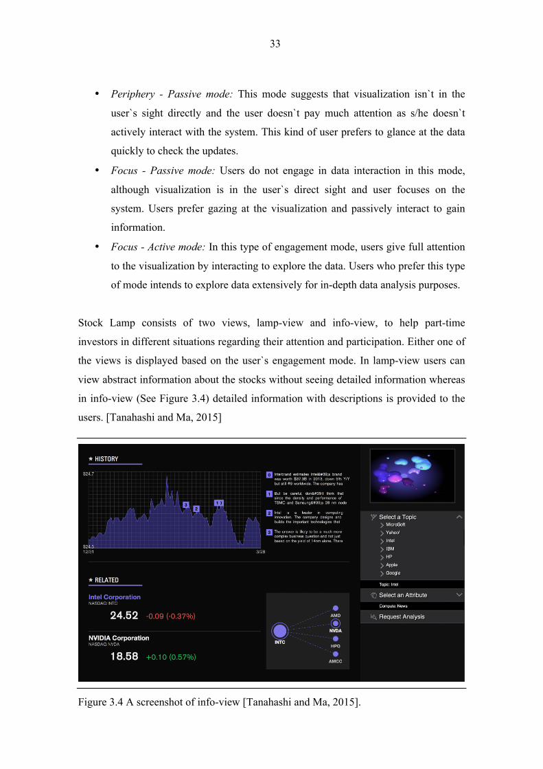
Stock Lamp consists of two views, lamp-view and info-view, to help part-time
investors in different situations regarding their attention and participation. Either one of
the views is displayed based on the user`s engagement mode. In lamp-view users can
view abstract information about the stocks without seeing detailed information whereas
in info-view (See Figure 3.4) detailed information with descriptions is provided to the
users. [Tanahashi and Ma, 2015]
Figure 3.4 A screenshot of info-view [Tanahashi and Ma, 2015].

34
Researchers have used D3.js to implement the visualizations of info-view (Figure 3.4).
They stated that simplicity of D3.js was the main reason for using it while developing
the visualizations. With the help of D3.js, user interactions could be included and pilot
users could test the interactions based on mouse and touchscreen.
Although developers of Stock Lamp mostly focused on providing different user
engagement modes, it is still possible to observe the principles of the visual
Information-Seeking Mantra [Shneiderman, 1996] in this manner:
• Overview: General information about the stocks is provided in the lamp-view.
Users can understand the general picture of the stocks with the lamp-view and
observe the updates on the stocks.
• Zoom and Filter: Users can zoom into the specific stock with the info-view.
Detailed information about the selected stock is given in the overview of the
info-view. It is possible to see history of the stock and related stocks. However,
filtering isn`t supported in Stock Lamp.
• Details on demand: After selecting the specific stock in info-view, users can
demand additional details such as news or Twitter feed about the stock.
Researchers of Stock Lamp present a new design concept, engagement-versatile design,
to target the users with different engagement styles. According to Tanahashi and Ma,
users do not always pay attention or actively interact with the visualizations in real life.
First, Tanahashi and Ma present taxonomy of user engagement with traditional
visualizations and determine the unique characteristics of each engagement style. Later,
they use this knowledge in Stock Lamp, where investors with different engagement
styles can keep track of the stock market in real time. D3.js is utilized for generating
info-view as D3.js has broad built-in library for managing user interactions with visual
elements. [Tanahashi and Ma, 2015] Visualizations comply with the visual
Information-Seeking Mantra [Shneiderman, 1996] while serving the users with
different attention and participation modes.

35
4. Visualization of the Publication Data Although there are various JavaScript toolkits available for information visualization, it
is still common to encounter traditional visualizations in web pages. In this thesis,
visualization of the web-based publication data is developed with D3.js library in order
to demonstrate the strength of JavaScript in web browsers.
4.1. User Requirements
Currently, publication data of the Tampere Unit for Computer-Human Interaction
(TAUCHI) is listed as shown in Figure 4.1. Users can select from the publication years
to overview the articles published during the selected year. Although users can reach to
the articles directly with the provided URL links, it is not possible to gain insight or
make comparisons about the overall publication information with this kind of
visualization approach.
Figure 4.1 Current way of visualizing the publication data of TAUCHI Research Center.

36
Major user requirements when observing the visualization of the TAUCHI’s
publication data can be listed as follows:
1. Users should be able to observe the number of publications made every year
and make comparisons between the publication years.
2. Users should be able to observe the list of the researchers who publish articles
in TAUCHI research center.
3. Users should be able to observe which researcher makes the most
publications.
4. Users should be able to make comparisons between the researchers.
5. Users should be able to observe the number of publications every researcher
published during the year span (e.g., 2011 to 2015).
6. Users should be able to observe which topics were the most popular in overall
publications.
7. Users should be able to observe which topics were the most popular during
the selected year.
8. Users should be able to observe which researcher is specialized in which area.
Once the mentioned requirements are fulfilled, users can gain insight about the
publication data and different aspects of the web-based publication data could be
unveiled.
4.2. Related Work
Keshif is a D3.js based visual data browser, which aims at data exploration with data
filtering and discovery [Yalcin, 2014]. Users of Keshif can easily filter and preview the
results with a mouse over interaction. Yalcin [2014] claims that Keshif provides
scalable visualizations even for big data collections. Keshif is able to load the data in a
flexible manner. Structured data can be easily loaded from Google spread sheets and
CSV files without requiring to hassle with coding and importing the data to JavaScript.
However, for JSON objects users need to write their own importers.
37
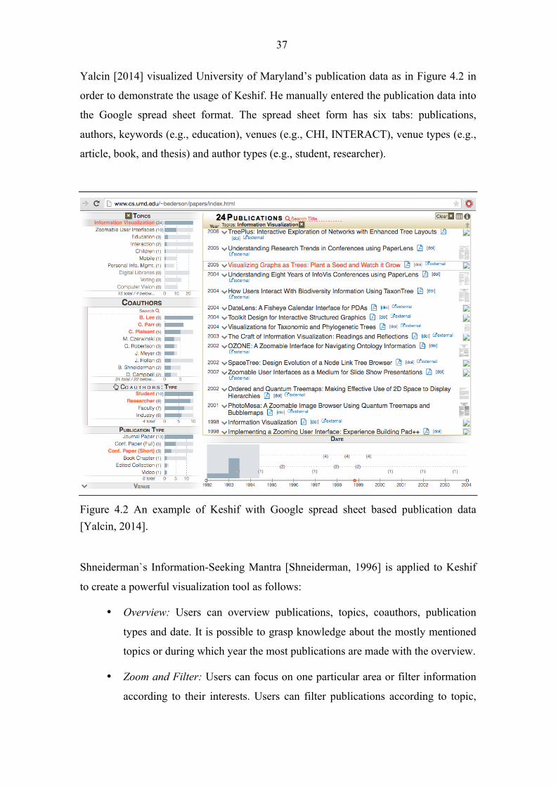
Yalcin [2014] visualized University of Maryland’s publication data as in Figure 4.2 in
order to demonstrate the usage of Keshif. He manually entered the publication data into
the Google spread sheet format. The spread sheet form has six tabs: publications,
authors, keywords (e.g., education), venues (e.g., CHI, INTERACT), venue types (e.g.,
article, book, and thesis) and author types (e.g., student, researcher).
Figure 4.2 An example of Keshif with Google spread sheet based publication data [Yalcin, 2014].
Shneiderman`s Information-Seeking Mantra [Shneiderman, 1996] is applied to Keshif
to create a powerful visualization tool as follows:
• Overview: Users can overview publications, topics, coauthors, publication
types and date. It is possible to grasp knowledge about the mostly mentioned
topics or during which year the most publications are made with the overview.
• Zoom and Filter: Users can focus on one particular area or filter information
according to their interests. Users can filter publications according to topic,

38
coauthor, publication type, venue and date. All of the charts in Keshif allow
filtering. Once a filter is selected, visualization animates smoothly.
• Details on demand: Users can retrieve detailed information about
publications. External links are provided to reach the full publication content.
• Relate: Users can relate publications with topics, coauthors, publication types
and date by selecting an attribute. For instance, when the user selects the topic
HCI, all of the related researchers can be discovered.
Keshif provides successful visualization techniques for visualizing the publication data
with the help of the application of Shneiderman`s Information-Seeking Mantra [1996].
Developers can enter data manually to Google Spread Sheets and create visualizations
with Keshif. Although Yalcin [2014] presents an effortless visualization platform for
the developers, this kind of visualization requires developers to structure data manually.
Keshif brings a powerful approach to create quick and easy visualizations. However,
additional coding is required for big data sets since it is not feasible to enter data to the
spreadsheet form manually.
4.3. Implementation
Implementation of the development of the interactive charts aims to satisfy the user
requirements mentioned in Section 4.1. Implementation part of this thesis consists of
three major segments: getting the data from web, parsing the data and creating the
visualizations. In this section, issues encountered during the achievement of the
mentioned segments will be explained.
4.3.1. External JavaScript Libraries
In order to visualize the TAUCHI`s publication data, different JavaScript frameworks
are used for different purposes. Pure JavaScript is used to parse the data. Additional to
the JavaScript, jQuery is exploited to retrieve the data from the previous years.
Visualizations such as bar chart and researchers list are derived with D3.js. In addition

39
to JavaScript and D3.js, an additional D3 layout cloud library enabled the creation of
word cloud visualization. This way, the principle of separation of concerns is enhanced.
Usage areas of jQuery, D3.js and D3 layout cloud in the implementation process are
explained in detail below:
• jQuery.js: jQuery is a cross-platform JavaScript library especially designed to
simplify client-side programming assignments. Implementation tasks such as
HTML/DOM manipulation and event handling can be easily accomplished with
jQuery. Many lines of JavaScript code are wrapped in a single line of code in
jQuery, empowering simplicity for the developers.
During the implementation part, jQuery is utilized to make Ajax, i.e.,
asynchronous JS and XML, calls. Web applications can send and retrieve data
from the server without interfering with the behaviour of the current page with
Ajax calls. With the help of the jQuery, publication data from the previous years
could be retrieved.
• D3.js: D3 is used to visualize the publication data. Bar chart and researcher list
are created with D3.js library. Bar chart represents the number of publications
published per year whereas researcher list demonstrates how many publications
every researcher has done during the year span. These visualizations are
explained in detail in Chapter 5.
• D3.layout.cloud.js: World cloud generator is an additional JavaScript library
built on top of D3 developed by Davies [2014]. This library allows words to be
replaced in a word cloud randomly. Original algorithm places all of the given
words into the word cloud with a random font size assignment.
The main intention for creating a word cloud is to give an overall idea about the
topics mentioned in the publications. Users should be able to observe which
keywords are the most frequently mentioned in overall publications.
Additionally, it would be beneficial to grasp an idea about the area of interest of
the researchers. Because of these reasons, original algorithm has been changed.
40
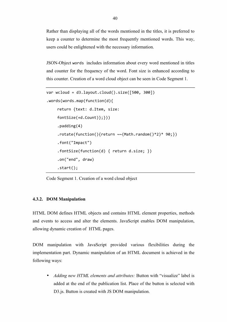
Rather than displaying all of the words mentioned in the titles, it is preferred to
keep a counter to determine the most frequently mentioned words. This way,
users could be enlightened with the necessary information.
JSON-Object words includes information about every word mentioned in titles
and counter for the frequency of the word. Font size is enhanced according to
this counter. Creation of a word cloud object can be seen in Code Segment 1.
var wcloud = d3.layout.cloud().size([500, 300])
.words(words.map(function(d){
return {text: d.Item, size:
fontSize(+d.Count)};}))
.padding(4)
.rotate(function(){return ~~(Math.random()*2)* 90;})
.font("Impact")
.fontSize(function(d) { return d.size; })
.on("end", draw)
.start();
Code Segment 1. Creation of a word cloud object
4.3.2. DOM Manipulation
HTML DOM defines HTML objects and contains HTML element properties, methods
and events to access and alter the elements. JavaScript enables DOM manipulation,
allowing dynamic creation of HTML pages.
DOM manipulation with JavaScript provided various flexibilities during the
implementation part. Dynamic manipulation of an HTML document is achieved in the
following ways:
• Adding new HTML elements and attributes: Button with “visualize” label is
added at the end of the publication list. Place of the button is selected with
D3.js. Button is created with JS DOM manipulation.

41
• Creating new HTML events: After clicking onto the visualize button, new
page with the charts needs to be created. Therefore, button on-click event is
created.
• Altering the CSS styles in the page: Once the new page is created, CSS
styles need to be determined for the visualization styles. Additional
ChartStyle.css file is created with the style details. This CSS file is added to
the newly created page with the JS’s document write function.
4.3.3. Data Abstractions
Data can be abstracted with JavaScript for data representation and manipulation.
JavaScript Object Notation (JSON) makes the data easy to read for humans. After
parsing the data received from server, it is saved into JSON objects in desired formats
for the visualizations. Bar chart, researcher list and word cloud make use of the
following JSON objects:
• Bar chart: Displays the total number of articles published every year to
facilitate comparisons (See Figure 5.3). Bar chart is created with D3.js.
JSON data linked to the chart is shown in Code Segment 2.
var barchartJSON =[{"Year":"2011","Total":42},
{"Year":"2012","Total":49}, {"Year":"2013","Total":60},
{"Year":"2014","Total":64}, {"Year":"2015","Total":5}]
Code Segment 2. Data used for creating a bar chart
• Researcher list: Displays all of the researcher names who published articles
in the TAUCHI Research Center and number of publications every
researcher published (See Figure 5.4 and 5.5). This list is created with D3.js.
JSON data used for conceiving this visualization can be seen in Code
Segment 3.

42
var listJSON = [{"Researcher":"Raisamo Roope", "Published":
[[2011,8], [2012,13], [2013,14], [2014,22], [2015,3]],
"Total":60}, {"Researcher": "Turunen Markku", "Published":
[[2011,5], [2012,12], [2013,17], [2014,10]], "Total":44},…]
Code Segment 3. Part of the dataset used for creating researcher list
• Word cloud: Displays the word cloud as in Figure 5.6 using the article titles.
Word cloud is created with D3.layout.cloud.js. JSON data attached to the
word cloud is structured as shown in Code Segment 4.
var wordcloudJSON = [{"Item":"pervasive","Count":2},
{"Item":"eye","Count":4}, {"Item":"tracking","Count":2},
{"Item":"mobile","Count":9}, {"Item":"eye-‐based","Count":1},
{"Item":"interaction","Count":9},…]
Code Segment 4. Part of the dataset used while creating word cloud
4.3.4. Interaction
The key feature of modern visualizations can be regarded as user interaction. Therefore,
implementation process has been aiming at creating interactive charts. D3.js’ capacity
of creating highly interactive visualizations simplified the development process of the
charts.
Bar chart and researcher list are made interactive as follows:
• Bar chart: When a user hovers, selection is highlighted as shown in Figure 5.3. Word cloud is updated with the selected year’s most frequently mentioned words.
• Researcher list: When a user points the mouse over a researcher name, number of articles published by the selected researcher is displayed as in Figure 5.5. Word cloud is updated according to the topics selected researcher wrote his/her articles on.

43
Event handling mechanism makes the interaction possible. Common HTML events
include, for instance, onchange, onclick, onmouseover and onmouseout events. Event
handling attributes can be linked to HTML elements with JavaScript. Event handlers for
the bar chart and researcher list include mouseover and mouseout events to enable
interaction patterns described above.

44
5. Implementation Results: Description, Analysis and Synthesis Implementation task was aiming to visualize TAUCHI Research Center`s publication
data so that users could gain insight about different aspects of the publications with
interactive data exploration. JavaScript, D3.js and external JS library were utilized to
create interactive visualizations in a web browser.
5.1. Results
In order to achieve the user requirements mentioned in Section 4.1, it was necessary to
place Visualize option button to the current publication web page of the TAUCHI. Once
the user selects the visualize option, new tab with the visualizations opens. This newly
created page can be seen in Figure 5.1. Implementation part results in three
visualizations: bar chart, researcher list and word cloud.
Figure 5.1 Newly created web page where bar chart, researcher list and word cloud are displayed.

45
Bar chart, illustrated in Figure 5.2, fulfills the first user requirement so that users can
see number of articles published every year and make comparisons between the years.
Exact number of publications made every year is printed on top of the every bar. Bar
chart is interactive in this way: when user points the mouse over one of the bars,
selected year is highlighted as depicted in Figure 5.2.
Figure 5.2 Bar chart representing the number of articles published every year.
Figure 5.3 demonstrates part of the researcher list. All the researchers who publish
articles in TAUCHI Research Center are listed in this chart. Therefore, height of this
chart is determined dynamically depending on the names of the researchers in the
publication data.
Researchers are listed according to the total number of publications, i.e., researcher with
the most publications is listed at the top. The year of the publication is marked with a
circle. Circle sizes allow comparisons so that it is possible to acquire knowledge about
when a researcher made most of his/her publications. Bigger circle size implies that
most of the publications are made during the relative year. Circle size doesn`t allow
comparisons between the researchers, instead it enables making yearly comparisons for
a selected researcher.

46
Figure 5.3 List of the researchers who publish articles in TAUCHI. (A part of the researchers is displayed in this figure).
Researcher list is also interactive. Users can observe the number of articles a researcher
has published by pointing the mouse over the name of the researcher. For instance,
when user points the mouse over “Raisamo Roope”, the number of articles he has
published for every year is displayed as in Figure 5.4.

47
Figure 5.4 Interactive researcher list depicting the mouse over action.
Word cloud (Figure 5.5) includes information about the frequency of the words
mentioned in all of the titles of the publications. External D3.layout.cloud.js library has
handled the representation of the words in a random order. In other words, word cloud
has different content or layout of the words every time it loads.
When the page loads, mostly mentioned words in the overall publications are displayed
as in Figure 5.5. Frequency of a word in overall publication tittles is counted. Font size
of the word in the word cloud is directly proportional with the frequency of the word.

48
Figure 5.5 Word cloud generated when the page loads. By default it represents the most mentioned words in overall years in a random order.
Although word cloud itself is not interactive, bar chart and researcher list can
dynamically modify the word cloud content. As it can be seen in Figure 5.6, users can
modify word cloud content by moving mouse over one of the years. In this case, word
cloud is filled with the most frequently mentioned words during the selected year.
When the user does not select a year, word cloud is updated with the most frequently
mentioned words in overall years (Figure 5.5).
Figure 5.6 Modifying word cloud content with bar chart.
Figure 5.7 is derived as an example to demonstrate how researcher list updates word
cloud. After pointing mouse over Harri Siirtola, the supervisor of this thesis, word
cloud is filled with his most frequently mentioned publication titles. The main aim for
this interaction is to let user get a glimpse about in which area the selected researcher is
specialized.

49
Figure 5.7 Updated word cloud content when the user points mouse over researcher Harri Siirtola.
With the help of the newly created visualizations, users can learn about different aspects
of the data. JavaScript and additional JavaScript libraries helped the creation of highly
interactive and modern visualizations. Instead of displaying the publication data as a
list, interactive charts are preferred to enhance users’ cognitive learning processes and
unveil the hidden aspects of the publication data.
5.2. Discussion
Visualization of the TAUCHI`s publication data provides an overview to the users so
that users can learn more about the data and view certain aspects of the data without
losing the overall context. Users can familiarize themselves with the dataset and gain
knowledge with the help of the exploratory data analysis.
Shneiderman`s Information Seeking Mantra [1996] makes exploratory data analysis
possible with overview, zoom and filter and details on demand functionalities.
Resulting visualizations conveys to the Shneiderman`s Mantra as explained in below:
• Overview: Overview serves as an entry point to allow further inquiries to take
place on the dataset. The resulting visualization in Figure 5.1, not only
displays the number of articles published every year, but also lists the
researchers who publish articles in the TAUCHI Research Center.

50
Additionally, it is also possible to learn about the most frequently mentioned
words in overall articles.
• Zoom and Filter: Users might request to focus on their area of interest. Some
portion of the dataset is displayed to the user with filtering. Zooming and
filtering enhances data exploration by revealing additional information about
the dataset. The resulting visualizations allow zooming and filtering since
availability of these options is crucial for interactive data visualizations. As in
Figures 5.4 and 5.6, users can zoom and filter with the help of the bar chart
and researcher list.
• Details on demand: Users can discover about the details of the selected
researcher. Although Shneiderman [1996] suggests providing details with a
pop-up window, modern visualisations don`t use pop-up menus as often.
Therefore, details about the selected researcher are provided with mouse over
action and word cloud is updated with the details of the researcher, as shown
in Figures 5.4 and 5.5.
Card et al.`s [1999] reference model for information visualization has worked as a
guideline during the implementation part. Figure 5.8 represents the application of
reference model to the implementation of the visualization process. Data models, visual
models and interactive controls are separated from each other for creating extensible
and reusable software architecture. Publication data which is available on the
TAUCHI`s publications web page corresponds to the raw data in Card et al.`s model.
Metadata is stored in data tables, which consist of JSON objects in this implementation
case. Visual structures are created and elements are drawn with SVG on the web page.
Additionally, views are created with HTML elements and styled with CSS.
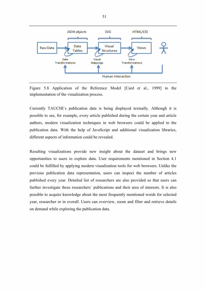
51
Figure 5.8 Application of the Reference Model [Card et al., 1999] to the implementation of the visualization process.
Currently TAUCHI`s publication data is being displayed textually. Although it is
possible to see, for example, every article published during the certain year and article
authors, modern visualization techniques in web browsers could be applied to the
publication data. With the help of JavaScript and additional visualization libraries,
different aspects of information could be revealed.
Resulting visualizations provide new insight about the dataset and brings new
opportunities to users to explore data. User requirements mentioned in Section 4.1
could be fulfilled by applying modern visualization tools for web browsers. Unlike the
previous publication data representation, users can inspect the number of articles
published every year. Detailed list of researchers are also provided so that users can
further investigate these researchers` publications and their area of interests. It is also
possible to acquire knowledge about the most frequently mentioned words for selected
year, researcher or in overall. Users can overview, zoom and filter and retrieve details
on demand while exploring the publication data.
52
6. Conclusions In the course of this thesis, issues for visualizing web-based applications using
JavaScript have been addressed. TAUCHI Research Center`s publication data has
visualized in order to demonstrate JavaScript`s strength for web-based visualizations.
Shneiderman [1996] proposed Information Visualization Mantra to achieve powerful
visualizations with overview first, zoom and filter, then details on demand principle.
His mantra has been frequently used and applied to the modern web-based visualization
examples. Therefore, Shneiderman`s Mantra has administered to the visualization of the
TAUCHI`s publication data.
As interaction between human and computer is the heart of modern visualizations
[Spence, 2007], interactivity was of utmost importance while visualizing the
publication data. Developed charts, namely bar chart and researcher list, enhance data
exploration by allowing user interaction. Unlike the current way of displaying the
publication data, users can observe different aspects of the data interactively. For
instance, users can select a researcher and grasp an idea about the selected researcher`s
area of interests interactively.
D3.js has been chosen as the framework while developing the interactive charts. Main
reasons for selecting D3.js as the visualization framework include direct DOM
manipulation, data abstractions and interaction. Visualization tasks were accomplished
by employing the DOM interface directly. Additionally, data abstractions with JSON
objects not only led to having reusable charts, but also enabled the application of the
Reference Model [Card et al., 1999].
After introducing the main principles and concepts of information visualization, this
thesis explains web-based tools for visualizing the data. Secondly, it introduces D3.js
framework for web-based applications and demonstrates the example cases where D3.js
is utilized for visualizing web-based datasets. Finally, it administers the mentioned
characteristics of D3.js to the application of web-based data visualization. These results
can be used as a guideline when selecting the appropriate tools and theories for
visualizing information on World Wide Web.

53
References
[Ackoff, 1989] Ackoff, Russell. "From Data to Wisdom." Journal of Applied Systems
Analysis 16 (1989): 3-9.
[Aufreiter, 2011] Aufreiter, Michael. “Web-based Information Visualization”. Thesis.
Linz University, 2011.
[Ashkenas et al., 2012] Ashkenas, Jeremy, Matthew Bloch, Shan Carter, and Amanda
Cox. "The Facebook Offering: How It Compares." The New York Times. 17 May
2012. <http://www.nytimes.com/interactive/2012/05/17/business/dealbook/how-the-
facebook-offering-compares.html>.
[AT&T, 2014] "Graphviz - Graph Visualization Software." AT&T Labs Research,
2014. <http://www.graphviz.org/>.
[Ayhan et al., 2014] Samet Ayhan, Brendan Fruin, Fan Yang, and Michael O. Ball.
“NormSTAD flight analysis: visualizing air traffic patterns over the United
States.” Proceedings of the 7th ACM SIGSPATIAL International Workshop on
Computational Transportation Science – IWCTS `14 (2014): 1-10. ACM.
[Bostock, 2011] Bostock, Mike. "Mbostock/d3." GitHub. 29 May 2011.
<https://github.com/mbostock/d3/wiki/Selections>.
[Bostock and Heer, 2009] Bostock Michael and Jeffrey Heer. “Protovis: A Graphical
Toolkit for Visualization.” IEEE Transactions on Visualization and Computer
Graphics 15, (2009): 1121-1128.
[Bostock et al., 2011] Bostock, Michael, Vadim Ogievetsky, and Jeffrey Heer. "D3:
Data-driven Documents." IEEE Transactions on Visualization and Computer Graphics
17 (2011): 2301-309.

54
[Card et al., 1999] Card, Stuart K., Jock D. Mackinlay, and Ben Shneiderman. Readings
in Information Visualization: Using Vision to Think. San Francisco, CA: Morgan
Kaufmann, 1999. 17-23.
[Chen et al., 2009] Chen, Min, David Ebert, Hans Hagen, Robert S. Laramee, Robert
Van Liere, Kwan-Liu Ma, William Ribarsky, Gerik Scheuermann, and Deborah Silver.
"Data, Information, and Knowledge in Visualization." IEEE Computer Graphics and
Applications 29.1 (2009): 12-19.
[Chi and Riedl, 1998] Chi, Ed H., and John T. Riedl. "An Operator Interaction
Framework for Visualization Systems." INFOVIS '98 Proceedings of the 1998 IEEE
Symposium on Information Visualization. Research Triangle Park, North Carolina.
1998. 63-70.
[Chi, 2000] Chi, Ed H. "A Taxonomy of Visualization Techniques Using the Data State
Reference Model." InfoVis 2000 Proceedings of the 2000 IEEE Symposium on
Information Visualization. Salt Lake City, UT. 2000. 69-75.
[Crockford, 2008] Crockford, Douglas. JavaScript: The Good Parts. Beijing: O'Reilly,
2008.
[Davies, 2014] Davies, Jason. "Jasondavies/d3-cloud." GitHub. 10 Jan. 2014. Web. 28
Apr. 2015. <https://github.com/jasondavies/d3-cloud>.
[Degani, 2013] Degani, Asaf. "A Tale of Two Maps: Analysis of the London
Underground "Diagram"" Ergonomics in Design: The Quarterly of Human Factors
Applications 21.3 (2013): 7-16.
[Dmitry, 2014] Baranovskiy, Dmitry. " Raphaël-JavaScript Library." Raphaël-
JavaScript Library. MIT, 2008. <http://www.raphaeljs.com/>.
[Few, 2007] Few, Stephen. "Save the Pies for Dessert." Perceptual Edge Visual
Business Intelligence Newsletter (Aug. 2007).

55
[Flanagan, 2011] Flanagan, David. JavaScript: The Definitive Guide. 6th ed.
Sebastopol, CA: O'Reilly, 2011.
[Fry and Reas, 2014] Fry, Ben, and Casey Reas. "Processing.js." Processing.js. 25 Mar.
2014. Web. 13 Nov. 2014. <http://processingjs.org/>.
[Gentleman and Ihaka, 2000] Gentleman, Robert, and Ross Ihaka. "Lexical Scope and
Statistical Computing." Journal of Computational and Graphical Statistics 9,3 (2000):
491-508.
[Johnson, 2006] Johnson, Steven. The Ghost Map: The Story of London's Most
Terrifying Epidemic--and How It Changed Science, Cities, and the Modern World. New
York: Riverhead, 2006.
[Keller et al., 2006] Keller, Tanja, Peter Gerjets, Katharina Scheiter, and Bärbel
Garsoffky. "Information Visualizations for Knowledge Acquisition: The Impact of
Dimensionality and Color Coding." Computers in Human Behavior 22.1 (2006): 43-65.
[Li, 2012] Li, Zheng. "InfoViz - Open Source JavaScript Information Visualization."
InfoViz. MIT, 2012. Web. 19 Dec. 2014. <http://infoviz.org/>.
[Playfair, 1801] William Playfair, The Statistical Breviary; Shewing the Resources of
Every State and Kingdom in Europe, 1801.
[Richards et al., 2010] Richards, Gregor, Sylvain Lebresne, Brian Burg, and Jan Vitek.
"An Analysis of the Dynamic Behavior of JavaScript Programs." Proceedings of the
2010 ACM SIGPLAN Conference on Programming Language Design and
Implementation. New York: ACM, 2010. 1-12.
[Robinson et al., 2002] Robison, Wade, Roger Boisjoly, David Hoeker, and Stefan
Young. "Representation and Misrepresentation: Tufte and the Morton Thiokol
Engineers on the Challenger." Science and Engineering Ethics 8 (2002): 59-81.
[Rosling, 2010] Rosling, Hans. "The Joy of Stats." BBC News. BBC, 2010.

56
[Shneiderman, 1996] Shneiderman, Ben. "The Eyes Have It: A Task by Data Type
Taxonomy for Information Visualizations." Proceedings of the IEEE Symposium on
Visual Languages. Washington. IEEE Computer Society, 1996. 336-43.
[Siirtola, 2013] Siirtola, Harri. "Information Visualization." Exercise 3. UTA, Tampere.
2013. Lecture.
[SimilarTech, 2014] JavaScript Technologies Market Share and Web Usage Statistics.
SimilarTech, Web. 06 Oct. 2014. <https://www.similartech.com/categories/javascript>.
[Spence, 2007] Spence, Robert. Information Visualization: Design for Interaction, 2nd
ed.: Prentice-Hall, 2007. 136.
[Spence, 2014] Spence, Robert. Information Visualization: An Introduction. 3rd ed.
London: Springer, 2014. 29.
[Tanahashi and Ma, 2015] Tanahashi, Yuzuru, and Kwan-Liu Ma. "Stock Lamp: An
Engagement-Versatile Visualization Design." CHI '15 Proceedings of the 33rd Annual
ACM Conference on Human Factors in Computing Systems. 595-604. ACM.
[Taxidou and Fischer, 2014] Taxidou, Io, and Peter M. Fischer. "RApID: A System for
Real-time Analysis of Information Diffusion in Twitter." CIKM '14 Proceedings of the
23rd ACM International Conference on Conference on Information and Knowledge
Management. New York: ACM, 2014. 2060-2062.
[Tufte, 2001] Tufte, Edward R. The Visual Display of Quantitative Information. 2nd ed.
Graphics, 2001.
[Tukey, 1962] Tukey, John W. "The Future of Data Analysis." The Annals of
Mathematical Statistics 33.1 (1962): 1-67.
[Tukey, 1977] Tukey, John W. Exploratory Data Analysis. Addison-Wesley, 1977.

57
[Yalcin, 2014] Yalcin, Adil. "Keshif." GitHub. University of Maryland, 28 Apr. 2014.
Web. 29 Apr. 2015. <https://github.com/adilyalcin/Keshif>.
[Yi et al., 2008] Yi, Ji Soo, Youn-ah Kang, John T. Stasko, and Julie A. Jacko.
"Understanding and Characterizing Insights: How Do People Gain Insights Using
Information Visualization?" BELIV '08 Proceedings of the 2008 Workshop on Beyond
Time and Errors: Novel Evaluation Methods for Information Visualization. New York:
ACM, 2008.
[W3C, 2011] "Scalable Vector Graphics (SVG) 1.1 (Second Edition)." W3C
Recommendation. W3C, 16 Aug. 2011. Web. 11 Nov. 2014.
<http://www.w3.org/TR/SVG/>.
[Ware, 2004] Ware, Colin. "A Model of Perceptual Processing." Information
Visualization: Perception for Design. 2nd ed. San Francisco: Morgan Kaufmann, 2004.
20-23.
[Wilkinson, 2005] Wilkinson, Leland. "Graphics Versus Charts." The Grammar of
Graphics. 2nd ed. New York: Springer, 2005. 2. Print.
[Williamson and Shneiderman, 1992] Williamson, Christopher, and Ben Shneiderman.
"The Dynamic HomeFinder: Evaluating Dynamic Queries in a Real-estate Information
Exploration System." SIGIR '92 Proceedings of the 15th Annual International ACM
SIGIR Conference on Research and Development in Information Retrieval. New York:
ACM, 1992. 338-46. Web.