wde08 visualizing web of data
TRANSCRIPT

Visualizing A Web Of Data
Approach this by starting underneath the surface.
Stamen DesignEric Rodenbeck
Michal Migurski (me)Shawn AllenTom Carden
Geraldine SarmientoDeborah Monaghan
Ben Cerveny
Approach this by starting underneath the surface.

Live, Vast, and DeepThe iron triangle of Stamen Design
The iron triangle of Stamen Design
“Live”: our favorite projects demonstrate data that is, ideally, being generated as you watch it.
“Vast”: data can cover an enormous surface area, think Google Maps
“Deep”: data is dense, interlinked

Live, Vast, and Deep

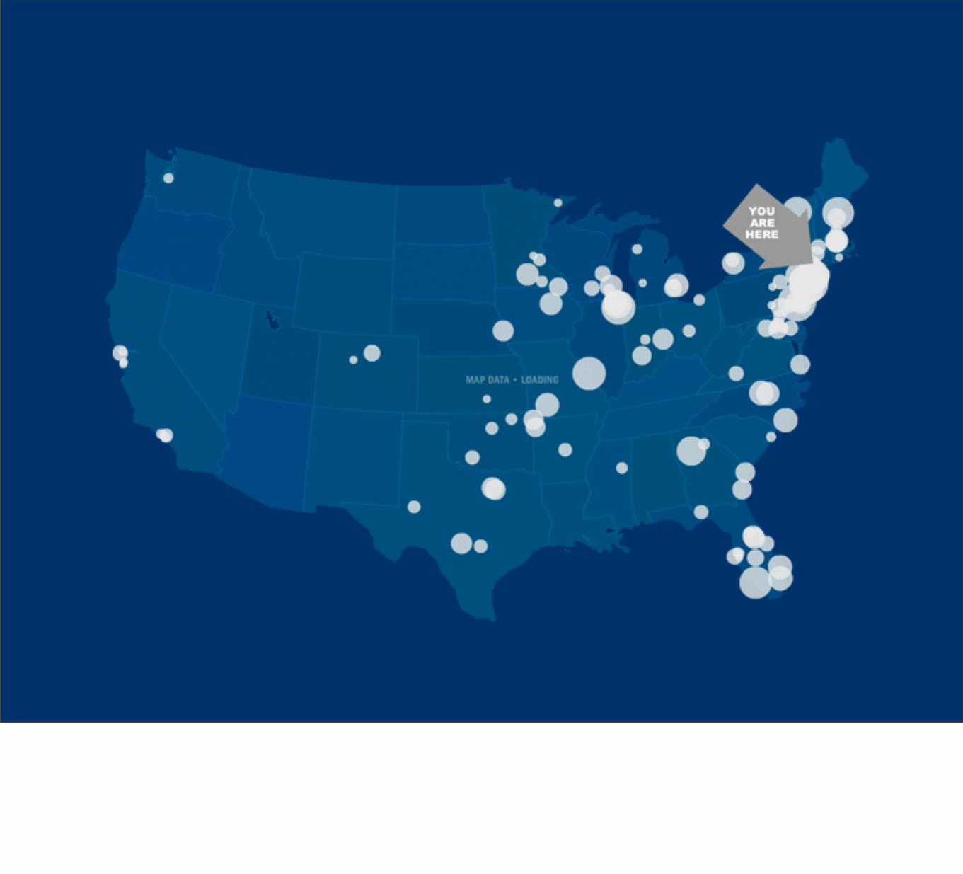
MoveOn.org Virtual Town Hall
Influencing the 2004 Presidential election
MoveOn’s Virtual Town Hall was an early project we did with US-based liberal political group, MoveOn.org. In 2004, they were (unsuccessfully) trying to prevent a second term for President Bush.
They wanted to improve on the conference calls they were doing via regular phone connections - these were both expensive and not-very-good.

The first difference the project introduced was a move to the web. That’s the Real Audio plugin up there on every page. The application was used as a radio call-in show, with music and conversation broadcast centrally.

The second big difference the project introduced was that users identified themselves with a post code and a headcount of people with them

The result: Virtual Town Hall knows where you are, and where everyone else is.


50K people joined us on for the first Town Hall!

Special guest, Director Michael Moore, could accept questions from the audience

The map displayed feedback from the audience.

You could zoom in and see who was around you - this is the San Francisco Bay Area, showing all the people attending nearby along with pie charts showing their answers to straw poll questions.

This ability to reach through the map, to see other people around you, imparted a feeling of presence and excitement to the application.

Digg Labs: SwarmIllustrating dense social activity
http://labs.digg.com/swarm
Our work with social news website Digg.com demonstrates a different sort of liveness.

What’s interesting here is that the Labs section visually demonstrates up-to-the-moment live activity on the website. This is Stack, which shows current popular stories on the site. User activity falls from the top of the screen and builds up columns of popularity.
It’s an animated pie chart, and is designed to evoke Tetris.

You can expand individual stories to see what historical activity looks like.
Here’s one from earlier today - the chart across the bottom shows that this popular post-election story hit the front page about 9 hours previously, and you can see a burst of voting and comment activity.

This is a video of Digg Swarm, which shows the same underlying data but in a different visual form.
Here user activity is shown using a biological clustering concept.

Users swarm around stories, and stories grow connections based on shared voting activity.

As before, you can investigate the visual interface - read more about something that looks interesting.

CabspottingMirroring the real worldhttp://cabspotting.org

First showed three years ago

Our first project to use tiled map, constantly-updating data

Live, Vast, and Deep

Trulia HindsightHistorical views of home construction
http://hindsight.trulia.com
Our work with San Fracisco-based Real Estate information aggregator Trulia demonstrates the potential vastness of data online.
Trulia collects data about residential properties for the entire country, from government and private sources. They wanted to demonstrate the massive scale of this information collection by creating something that could be relevant and interesting to people who weren’t necessarily in the market for a home.

Hindsight is initially presented in the form of a blog, with posts about a variety of communities nationwide.

This shows Plano, Texas - an example of suburban housing development.
The interface shows colored dots for each home. You can immediately see construction patterns resulting from tract home development, where whole swaths of similar homes are laid down at once.
At the bottom you can see a timeline of development - itʼs quite short, because these homes were all built around the same time, quite rapidly.
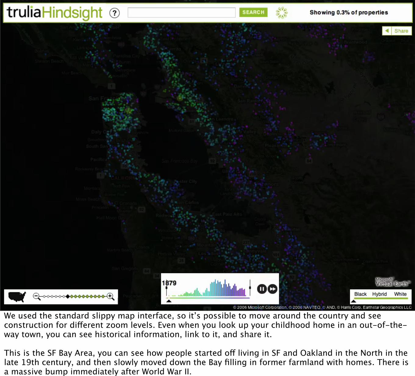
We used the standard slippy map interface, so it’s possible to move around the country and see construction for different zoom levels. Even when you look up your childhood home in an out-of-the-way town, you can see historical information, link to it, and share it.
This is the SF Bay Area, you can see how people started off living in SF and Oakland in the North in the late 19th century, and then slowly moved down the Bay filling in former farmland with homes. There is a massive bump immediately after World War II.

Exploration
I’ve shown three projects with a fairly high degree of polish.
It’s important to note that these don’t spring from our heads fully-formed, there’s a lot of exploratory work and dead-ends that contribute to the final piece.

This was an early sketch we did in Processing, showing data animated by house price, from cheapest to most expensive. It beautifully demonstrated animated sweeps, but home prices as a metric seemed insufficiently “real” for a final piece.

This is the same visualization style, also with just properties in San Francisco, now animated by construction date. This was a more satisfying visualization, the information presented is more directly relevant to people, because it’s possible to use it to tell a story about the city.

We added satellite imagery to the visualizations before, and quickly ran into a problem of accidental visual resonance. Prior to the last five or so years, the place most people encounter data visualization is through science, through the military, and through disaster response.

Accidental Visual Resonance (avoid!)
Hindsight looked too much like this NASA image of the fires in the Oakland Hills in 1991. You can pick out each home, and neighbourhood, clearly. “Accidental Visual Resonance.” In response, we removed red, orange, and yellow colors to keep it from looking like a fire.

Trulia SnapshotThe Real Estate magazine that moves
http://snapshot.trulia.com
Our second project with Trulia built on several features of Hindsight.
We kept the infinitely scrolling map concept, and the idea of including nationwide information visible for any community in the US.

This time, we focused on photography


Live, Vast, and Deep

SFMOMA ArtScopeImmersive modern art browsing
http://sfmoma.org/pages/artscope
The SFMOMA ArtScope is our most recent project.
It doesn’t look like a map, but we’ve been exploring the use of development and publishing ideas from online maps and satellite images for other purposes.
We’re also looking at communicating the idea of depth.

This is an image from Microsoft’s Terraserver, from 2004. Prior to the release of Google Maps in 2005, this and MapQuest were the only good ways to get geographical information online. Interactions were slow, form-based, and limited. Imagery and map content was limited and poorly-designed.

Google’s maps were a massive step forward, because they allowed you to move the map in the page, zooming freely from one place to another.

The infinite, continuous road maps and satellite imagery are available over a regular broadband connection because Google serves them to you as small square images

This idea can be applied to other kinds of deep navigation.


This is ArtScope

You can move the magnifying glass around to see what’s in the Museum of Modern Art’s extensive collection, or use tags and text searches to the right if you know what artist you’re looking for, or are interested in browsing artwork by medium or subject.

Really though, it’s a kind of Google Maps for Modern Art.
All the familiar interaction metaphors - panning, zooming, small overview map - are there. There are certain interaction ideas popular on the web that are ripe for application to new contexts.


Visualizing urban data
Oakland Crimespotting is another recent project that demonstrates depth of interpretation through a variety of views on information.

This is the state of the art in mapping crime information for cities in the US. Maps are designed by programmers and not fully resident on the web.
Generally speaking, it’s hard to link to things and hard to explore information laterally.

“Native To A Web Of Data”
Tom Coates, 2006http://www.plasticbag.org/files/native/
I’ve borrowed the title of this talk from Tom Coates’s Native to a Web of Data.
“A web of data sources, services for exploring and manipulating data, and ways users can connect them together”

“Designing Data For Reuse”
Matt Biddulph, 2005http://www.hackdiary.com/slides/xtech2005/
Another influential piece of writing in this space is from Dopplr CTO Matt Biddulph.
Matt describes a series of best practices around open data formats and permanent, guessable URL’s.

ViewsHow many ways are
there to look at data?
Oakland Crimespotting combines practices around usable data formats, web-friendly bookmarkable addresses, and visualization as a interpretation layer above data.

Aggravated Assault
6:14am
Wednesday, Mar 5, 2008
ATTEMPTED MURDER:FIRST
DEGREE (08-016924)
Murder
6:14am
Wednesday, Mar 5, 2008
MURDER (08-016924)
Murder
5:48am
Wednesday, Mar 5, 2008
MURDER (08-016924-002)
Aggravated Assault
5:48am
Wednesday, Mar 5, 2008
ATTEMPTED MURDER:FIRST
DEGREE (08-016924-003)
Burglary
12:20pm
Wednesday, Mar 5, 2008
(7 hours later)
BURGLARY-NO FORCE
(08-017167)
Narcotics
10:40am
Wednesday, Mar 5, 2008
(5 hours later)
POSSESS/PURCHASE COCAINE
BASE FOR SALE (08-017006)
Murder
Wednesday, Mar 5, 2008 5:48am
MURDER
Case Number 08-016924-003, Police Beat 06X.
3200 block of San Pablo Ave, Emeryville, CA 94608, USA
Scroll down to see related and nearby reports, or to leave a comment.
View an interactive map of this report.
Related Reports
These reports are directly related to the one above, and may be part of the same incident.
Comments
1. http://www.ktvu.com/news/15500985/detail.html
"Just hours after an Oakland City Council vote to add more officers to its police force, a
neighborhood bus stop was riddled with gunfire early Wednesday leaving one person
dead and another wounded.
The death was the city's 28th homicide of the year, far outpacing last where there were
15 homicides by this date.
The latest shooting took place at the corner of San Pablo and Brockhurst with officers
responding to a "shots fired" call at 5:50 a.m."
Posted by Michal Migurski on Tuesday, Mar 11, 2008 2:44pm
Leave a Comment
Leave a comment about report 08-016924-003, especially if you are familiar with the
incident, believe we have incorrect information about the crime report, or know of a
mention in the local news media such as the Oakland Tribune or San Francisco
Chronicle. We also welcome the posting of details obtained directly from Oakland Police
Department crime report requests—see “8. How do I get a copy of a Crime Report?” at
OPD Frequently Asked Questions.
Comments will be displayed on this page, including the name you provide.
What is the Link for?
We!re most interested in two kinds of links: those pointing to relevant news articles about
this report, and those pointing to other possibly-related reports on this website.
Your Name
Link (if any)
No HTML, please. URL!s will be made into links.
comment
Similar Reports
All Reports of Murder on Wednesday, Mar 5, 2008
All crimes on Wednesday, Mar 5, 2008
All Reports of Murder
Nearby Reports
Reports near the one above, from around the same time.
Home Map Crime Reports Police Beats Alerts About Feedback
Contact us at [email protected].
This project is not affiliated with the City of Oakland or the Oakland Police Department.
We use data obtained from CrimeWatch, Oakland's community mapping website.
Please read their disclaimer to understand limitations of the data.
All map content © Microsoft Corporation / Microsoft® Virtual Earth™
Report data last published by Oakland Police: 2 days ago
Home Map Crime Reports Police Beats Alerts About Feedback
First, there is a page for every individual crime report in the system.
This is the most basic building block of the site. Each one has a sensible URL that includes a map, connected reports, and nearby neighborhood information.

Second, there are listing pages that show collections of reports: by day, by type of crime, by police beat.

We're intentionally trying to stretch the definition of "API" here: the classic, Flickr-driven concept of an XML web service is definitely one Web 2.0 compliant way of looking at things, but Excel files and permanent URLs right there on the website is a broader concept that invites members of the non-geek public to join in. These have all been API-like "handles" that visitors can connect with.

Third, everything is presented on a map.

The map shows global context.

As well as the relative isolation of just one city of data.

LessonsWhat can be learned
from visual data?
The project also demonstrates additional layers of information that can be derived from raw data.


Here we see reports of just one particular type, isolated on the map.


These reports almost all happened on one day - prostitution in particular following this “sting” pattern.

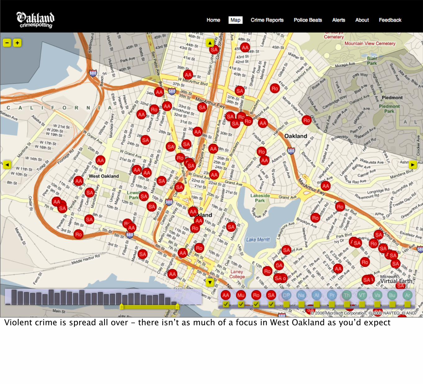
Violent crime is spread all over - there isn’t as much of a focus in West Oakland as you’d expect

Most of these narcotics reports are in beats 06X and 07X

Thank You
Approach this by starting underneath the surface.