wd guidelines
TRANSCRIPT


This Corporate Identity Standards guidelines document has been created to define the correct use of fundamental Western Digital branding elements that in many cases unite the corporation and its different business units. It is important to realize that the branding elements covered in this document provide the very foundation of our visual identity.
With our thousands of employees and award winning products, the WD brand represents who we are and what we stand for. The power of our brand in part relies on the consistent application of our core identity elements across all communications and geographies.
These elements work together to position WD as an innovative, professional, category leading company. It’s up to each person who creates communication materials on behalf of the WD brand to remain diligent about maintaining the integrity of the brand by following these guidelines.


The corporate logo shown at right isthe foundation of Western Digital’sgraphic identity system. This distinctive symbol consists of two elements and is designed to be easily recognized and remembered internationally.
The colors and proportions of the corporate signature and the monogram must not be altered. Consistent usage of the marks builds recognition.
The WD corporate signature (monogram plus logotype) or the WD monogram by itself are both acceptable uses of the logo.
When applying the corporate logo, always use the reproduction artwork supplied by Western Digital. Do not redraw or in any way alter the artwork. All applications of the corporate logo and monogram must be approved by WD’s Corporate Communications Department.
The Western Digital Monogram PMS 301C
The Western Digital Logotype C:60 | M:40 | Y:40 | K:100
refers to the four inks used in most color printing: yan, agenta, ellow, and blac . The numbers (0-100) assigned to
each are the percentages of ink necessary to make a specific color.
These two elements combine to form the WD corporate signature or logo.
Western Digital’s monogram represents Western Digital’s familiar name, WD, and symbolizes WD’s forward momentum and growth.
Western Digital’s interactive monogram is for use in computer based applications such as web graphics,software graphics, videos or flash. It is not to be used for print or for displays or trade show graphics.
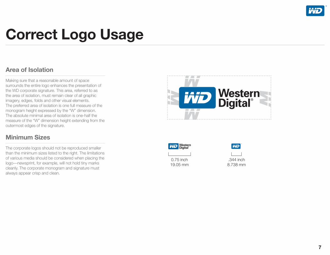
Making sure that a reasonable amount of space surrounds the entire logo enhances the presentation of the WD corporate signature. This area, referred to as the area of isolation, must remain clear of all graphic imagery, edges, folds and other visual elements. The preferred area of isolation is one full measure of the monogram height expressed by the “W” dimension. The absolute minimal area of isolation is one-half the measure of the “W” dimension height extending from the outermost edges of the signature.
The corporate logos should not be reproduced smaller than the minimum sizes listed to the right. The limitations of various media should be considered when placing the logo—newsprint, for example, will not hold tiny marks cleanly. The corporate monogram and signature must always appear crisp and clean.
0.75 inch19.05 mm
.344 inch8.738 mm

When the WD signature is on a colored background, certain standards also apply. Examples of different acceptable uses are shown to the right.
Black on white.
Logos print black over a color of sufficiently light contrasting color, leaving the letters white.
Logos reverse to white on a background color of sufficiently dark contrasting value. The letters knock out, so the background color shows through.

Any deviation from the acceptable signatureconfigurations — no matter how minor — can undermineour valued corporate identity and void legal protection ofour registered trademarks. Therefore, no other configuration or any variation on the signature is permitted under any circumstances.
Examples of such variations are demonstrated to the right. These examples are meant to be representative and do not encompass all possible cases. To ensure proper application of the corporate signature and monogram, use only the artwork supplied by WD. Artwork may be enlarged or reduced proportionately to satisfy design requirements; however, it may in no other way be altered.
The monogram cannot appear on the right of the logotype.
The monogram cannot appear above or below the logotype.
Black is the only text color that may be used with a blue monogram. If the background color requires that the logotype be white, then the monogram should be white as well.
The signature cannot be screened.

Additional examples of such variations are demonstrated to the right.
The proportion of the monogram to the logotype cannot be altered.
The aspect ratio cannot be altered.
The signature cannot be tilted or rotated.
The colors of the monogram or logotype must not be altered.

Additional examples of such variations are demonstrated to the right.
Additional art or marks must not be attached to the logo.
The type must not be altered.
The logo is not to be dropped into text as part of running copy.
The corporate logo is a signature. The corporate signature should not be used as a headline.
This is text. Text it is. This istext. Text it is.This is text. Textit is.This is text. Text it is.Thisis text. Text it is.This is text.Text it is.This is text. Text itis.This is text. Text it is. Thisis text. Text it is. This is text.Text it is.This is text. Text itis.This is text. Text it is.This istext. Tes.This is text. Text it is.
WD Caviar®

All previous Western Digital logos are discontinued. Under no circumstances can previous identities be combined with the new corporate monogram or logotype.


“Put Your Life On It” is WD’s corporate tagline. The line represents our commitment to unsurpassed quality and reliability that gives users the confidence to trust their life’s information to Western Digital products.
The WD monogram and Put Your Life On It may be used together in one of these three configurations. Colors for this lockup include all black, all white, or PMS 301C and black. Put Your LIfe On It is always black or reversed out to white; it is never blue.
When using the WD monogram and Put Your Life On It, the area of isolation must still be adhered to. The WD monogram size is 30% of the width of Put Your Life On It and can be centered, aligned to the left, or aligned to the right of the monogram.
These two elements combine to form the WD monogram and Put Your Life On It lockup.
WD Monogram and Put Your Life On It with WD monogram centered above Put Your Life On It.
WD Monogram and Put Your Life On It with WD monogram aligned to the left of Put Your Life On It.
WD Monogram and Put Your Life On It with WD monogram aligned to the right of Put Your Life On It.

Helvetica Neue Bold Helvetica Neue Light
Helvetica Neue Bold in the product titles for the product families like “My Book,” or “My Passport.” Helvetica Neue Light Helvetica Neue Light in the product titles when specifying model names like “Essential,” “Elite,” or “Studio.”
Helvetica Neue Roman when product titles such as “Essential,” “Elite,” or “Studio” are knocked out to white on a dark background.
® Essential™
®®
Essential™® for Mac®
™®
Desktop
™ Essential™®
™ Elite™
™ Studio™
RE4AVAV-GP
® Blue™
® Blue™
® Green™
® Black™
Helvetica Neue Bold Helvetica Neue Light

Standard tracking for all product branding is -10.
An exception to this is “Book” in My Book which is set at -40.
Trademark identification symbols should be superscript and aligned to the top of the tallest letter.
The last letter and the trademark kerning is set to -80 when letters are at x-height (examples: a, e, o ), allowing the registration mark to be tucked under the lowercase letter. When lowercase letters have an ascender (examples: d, k, l ), kerning is set to -50.
® Essential™
-40 -10-10
® for Mac®
-80 -80
® Blue™
-800 guidelines discussed above apply to Adobe InDesign page layout program only. Setting type in other page layout programs will achieve a different and undesirable effect.

1. WD Caviar® BlackTM
Desktop Hard Drives
2. My Book® EssentialTM
External Hard Drives
3. WD RE4 Enterprise SATA Hard Drives
4. My Passport® for Mac®
Portable Hard Drives
1. WD Caviar® BlackTM
Incorrect because it’s not tied to a descriptor such as “Desktop Hard Drives.”
2. My Book® EssentialTM Desktop Hard DrivesIncorrect because “Desktop” is not part of this product name descriptor.
3. WD RE-4Incorrect because no hyphen needed and Enterprise product descriptor is missing.
4. Passport for Mac®
Incorrect because “My” in product name is missing and descriptor “Portable Hard Drives” is missing.
An important, but often over looked aspect of marketing WD products is using complete product names. A critical element of proper product naming is including the category in which the product resides. WD Caviar Black may not make perfect sense to many customers, whereas WD Caviar Black Desktop Hard Drives fully describes the product, and is in alignment with correct WD branding. Proper naming helps avoid confusion both internally at WD, and more importantly helps avoid confusion with our customers. For more information or any questions regarding correct product naming contact .

From the WD website and online shopping sites to the hard drive aisle at your local retail shop, a consistent color system is essential for helping consumers easily navigate packaging and differentiate between products.

WD Blue, as shown, is designated as the official corporate color. This specific shade of blue is to be used as the preferred color treatment of the corporate signature.
WD Blue is equivalent to PMS 301C for coated stock applications or PMS 301U for uncoated stock applications.
The logos may also be blind embossed or debossed into wood, metal or glass.
The standards for color reproduction of the WD signature ensure quality and consistency in the presentation of our corporate identity, while allowing design flexibility for a wide range of applications.
To ensure consistency and quality in the presentation of our signature, there can be no variation on the approved colors. The acceptable color treatments of the corporate signature are demonstrated in this section. No other treatment is permitted.
Preferred: Monogram is WD Blue, PMS 301C;Logotype is 4 color process black, C:60 M:40 Y:40 K:100
Preferred: Monogram is WD Blue, PMS 301C.


The WD corporate typeface is Helvetica Neue. It is a sans-serif typeface originally released in 1896 and was the first to be widely used. It influenced later typefaces such as Univers and Folio. Light, Roman, and Bold are versions of the font used in varying circumstances in the WD corporate branding.

Typography adds an important element to the brand identity system. Use of consistent typefaces across communications adds another element that defines the WD look. The typefaces listed below are the only acceptable fonts that can be used in printed, digital, and web media.
A B C D E F G H I J K L M N O P Q R S T U V W X Y Za b c d e f g h i j k l m n o p q r s t u v w x y z1 2 3 4 5 6 7 8 9 0
A B C D E F G H I J K L M N O P Q R S T U V W X Y Z
a b c d e f g h i j k l m n o p q r s t u v w x y z
1 2 3 4 5 6 7 8 9 0

Backup just got a whole lot easier with a unified view of all your data. It’s simple to back up, restore, manage and secure your files.
Backup just got a whole lot easier with a unified view of all your data. It’s simple to back up, restore, manage and secure your files.
Backup just got a whole lot easier with a unified view of all your data. It’s simple to back up, restore, manage and secure your files. Backup just got a whole lot easier with a unified view of all your data. It’s simple to back up, restore, manage and secure your files.
Helvetica Neue Light for body copy when placed against a white background.
Helvetica Neue Roman for body copy when against a black or dark background.
All body text should be set to -10 tracking which will maximize word-per-line and also create a legible read. The same kerning would apply to oblique text.
Helvetica Neue Light, 24 pt
Helvetica Neue Romant, 24 pt
Helvetica Neue Light, 12 pt
Helvetica Neue Roman, 12 pt
Helvetica Neue Light, 8 pt
Helvetica Neue Roman, 8 pt
guidelines discussed above apply to Adobe InDesign page layout program only. Setting type in other page layout programs will achieve a different and undesirable effect.

– Turns on and off with your computer, enters idle mode when not in use,utilizes a WD drive with power-saving WD GreenPower Technology and an EnergyStar compliant power supply. Packaged in a minimized eco-friendly, recyclable package made from recycled materials.
All tracking should be set to -10. Titles and headlines should be set by hand to ensure that the characters are spaced appropriately. Titles can generally be tracked tighter than body copy, usually up to as much as -25.
guidelines discussed above apply to Adobe InDesign page layout program only. Setting type in other page layout programs will achieve a different and undesirable effect.


The ideal setting for a reflection.
The process for creating a reflection is very simple. The icon consists of a gradient and transparency settings. First, a gradient (1A) should be made of 40% black(2) and white and set an anchor point at a location of 85%(1B) and rotated at an angle of 90%(1C). Second, the drop shadow’s transparency settings should be set to “multiply.”
From a packaging point of view, these icons quickly identify in an objective way, the differences between products.
These icons are designed to provide greater attention to the icon itself and should be used for feature call-outs.
Icons that represent an idea, concept, or service that are without physical manifestation. Pure Performance and Planet Friendly are examples of metaphoric icons.
Icons that directly represent the object to which it is referring. Drive lock, Formatted for Mac, and Grab and Go USB dock are all examples of literal icons.

Password protection with 256-bit hardware encryption.
See at a glance how much space is left on your drive.
Can be used with Apple’s Time Machine.
Turns on and off with your computer, enters idle mode when not in use, utilizes a WD drive with power-saving WD GreenPower technology and an EnergyStar compliant power supply. Packaged in a minimized eco-friendly, recyclable package made from recycled materials.
Convenient connection to your computer.
WareA visual control center with a single-screen view of all your data. From it you can back up, retrieve, and secure your files.

Plug the cord into the interface port.
Follow the on-screen instructions.
Call for installation assistance.
Plug in the power source.
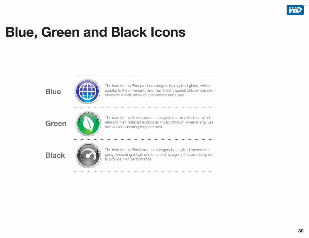
The icon for the Blue product category is a stylized globe, which speaks to the universality and mainstream appeal of Blue-branded drives for a wide range of applications and users.
The icon for the Green product category is a simplified leaf which refers to their reduced ecological impact through lower energy use and cooler operating temperatures.
The icon for the Black product category is a stylized tachometer gauge indicating a high rate of speed, to signify they are designed to provide high performance.

The icon for the Enterprise Storage business unit is a series of gears which suggest the 24/7 business critical environment in which WD Enterprise drives are designed to perform.
The icon for the AV business unit represents a “play” button which speaks to the different consumer electronic applications that WD AV drives are designed for.


Environmental sustainability is important to us at Western Digital. One of the best ways we can make a positive impact on the environment is to help our customers — PC, server, consumer electronics and external hard drive manufacturers — offer products that consume less electricity. To that end, WD has designed eco-friendly hard drives with WD GreenPower Technology for WD desktop, Enterprise, CE and external hard drive products.
These two logos show color variations of the WD GreenPower Technology logo mark.
GreenPower Technology Logo C60 M40 Y40 K100
GreenPower Technology Logo PMS 362C

The #1 icon is a visual representation of WD’s leadership position in the external storage market. It may be used in advertising, collateral or other graphics. The #1 icon must be clearly associated with My Book or My Passport external hard drives.

1. OEMs who purchase internal hard drives from WD for integration into non-WD storage products, computer systems, or application-specific hard drive based products;
2. Authorized distributors who purchase WD storage products from WD for distribution to system integrators, retailers, or authorized resellers in regions authorized by WD; and
3. Other third party vendors integrating or reselling WD storage products acquired from WD, their authorized distributors, or authorized resellers. OEMs, distributors, integrators, retailers, and resellers using WD storage products acquired from unauthorized sources are not permitted to use any WD trademarks or logos. Inquiries regarding authorized or unauthorized sources should be sent to .
Hard Drive by Western Digital chassis stickers.Dimensions .625x.75 HXWScreen print on .025 anodized aluminum or equivalent.Pressure sensitive adhesive backing required.Pantone solid color 661 (Blue)
2063-705948 WD SCORPIO BLUE BBG PC STICKER
Hard Drive by Western Digital chassis stickers.Dimensions .625x.75 HXWScreen print on .025 anodized aluminum or equivalent.Pressure sensitive adhesive backing required.Pantone solid colors 6 C
2063-705949-000 WD SCORPIO BLACK BBG PC STICKER
Hard Drive by Western Digital chassis stickers.Dimensions .625x.75 HXWScreen print on .025 anodized aluminum or equivalent.Pressure sensitive adhesive backing required.Pantone solid color 361 (Green)
2063-705946-000 WD CAVIAR GREEN BBG PC STICKER
Hard Drive by Western Digital chassis stickers.Dimensions .625x.75 HXWScreen print on .025 anodized aluminum or equivalent.Pressure sensitive adhesive backing required.Pantone solid colors 6C (Black)
2063-705947-000 WD CAVIAR BLACK BBG PC STICKER
Hard Drive by Western Digital chassis stickers.Dimensions .625x.75 HXWScreen print on .025 anodized aluminum or equivalent.Pressure sensitive adhesive backing required.Pantone solid color 661 (Blue)
2063-705945-000 WD CAVIAR BLUE BBG PC STICKER
WD produced a set of high quality stickers available for use on products and systems containing WD internal drives. Stickers may not be used on third party systems that directly compete with WD external products.

Storage products made by WD and contained in original WD packaging.
Storage products made by third parties that contain WD internal hard drives acquired from WD, authorized distributors, or authorized resellers.
Desktop computers, notebook computers, or servers containing WD internal hard drives acquired from WD, authorized distributors, or authorized resellers.
The WD stickers may not be used.
Prior written approval is required to use the WD stickers. Submit requests to
. After receiving written approval from WD, the WD sticker may be used on the Non-WD storage product itself to indicate that such product contains an internal hard drive made by WD.
The WD stickers may be used on the computer system itself to indicate that such products contain an internal hard drive made by WD.
1. Always use WD stickers in the manner intended by WD and not for any goods or services for which they were not originally intended. Do not alter them in any way.
2. Do not use WD stickers on or in connection with any product that does not include an authentic WD product. Inquiries regarding authentic WD products should be sent to [email protected].
3. Other than indicating that the component itself is a WD product, use of an identifying sticker does not imply an endorsement of, affiliation with, or liability for any goods or services offered by OEMs, authorized distributors or authorized resellers. Please send any inquiries regarding these Guidelines to
.

When working with an online retailer (e-tailer), it is helpful to supply the retailer with photography suitable for use online. Providing them with quality photography of current WD products will help sales, because presenting the product accurately helps ensure that the buyer is choosing the correct product for their needs.
The images on this page represent artwork that is available for placement with an online retailer. These approved images include the appropriate product category icon, carrying the Client Blue, Green and Black branding strategy down to the product level with our online retail partners. This is particularly effective in making the WD drive stand out when placed alongside its competitors in the online product listing style popular with many e-tailers.

Please direct any questions regarding these guidelines or other corporate standards to WD’s Corporate Communication Department at .
Please visit for guidelines direction covering Western Digital’s external products communications and on a separate document, WD’s internal components communications.
also contains additional photography, samples, and other downloadable assets.