water quality event detection system challenge ... · • pushing the wqm data analysis field ......
TRANSCRIPT

Water Quality Event Detection System Challenge: Methodology and Findings


Office of Water (MC-140) EPA 817-R-13-002
April 2013


i
Disclaimer The Water Security Division of the Office of Ground Water and Drinking Water has reviewed and approved this draft document for publication. This document does not impose legally binding requirements on any party. The findings in this report are intended solely to recommend or suggest and do not imply any requirements. Neither the U.S. Government nor any of its employees, contractors, or their employees make any warranty, expressed or implied, or assumes any legal liability or responsibility for any third party’s use of or the results of such use of any information, apparatus, product, or process discussed in this report, or represents that its use by such party would not infringe on privately owned rights. Mention of trade names or commercial products does not constitute endorsement or recommendation for use. Questions concerning this document should be addressed to: Katie Umberg EPA Water Security Division 26 West Martin Luther King Drive Mail Code 140 Cincinnati, OH 45268 (513) 569-7925 [email protected] or Steve Allgeier EPA Water Security Division 26 West Martin Luther King Drive Mail Code 140 Cincinnati, OH 45268 (513) 569-7131 [email protected]

ii
Acknowledgements The U.S. Environmental Protection Agency’s (EPA) Office of Ground Water and Drinking Water would like to recognize the Event Detection System Challenge participants. The level of effort and patience required was significant, and participants were not compensated in any way. Collaborators are listed by EDS. CANARY
• David Hart, Sandia National Laboratories • Sean McKenna, Sandia National Laboratories
ana::tool
• Florian Edthofer, s::can • Andreas Weingartner, s::can
OptiEDS
• Elad Salomons, Optiwater Event Monitor
• Katy Craig, the Hach Company • Karl King, the Hach Company • Dan Kroll, the Hach Company • Mike Kateley, Kateley Consulting
BlueBoxTM
• Eyal Brill, Whitewater Security, Holon Institute of Technology • Bar Amit, Whitewater Security • Shiri Haber, Whitewater Security
Special thanks to the following drinking water utilities that provided data for the Challenge.
• Greater Cincinnati Water Works • Newport News Waterworks • Northern Kentucky Water District • Pittsburgh Water and Sewer Authority • San Francisco Water
EPA’s Office of Ground Water and Drinking Water would also like to recognize the following individuals and organizations for their support in the implementation of the EDS Challenge and documentation of the results.
• Brandon Grissom, San Francisco Water • Mike Hotaling, Newport News Waterworks • Rita Kopansky, Philadelphia Water Department • Yeongho Lee, Greater Cincinnati Water Works • Simin Nadjm-Tehrani, Linköping University • Shannon Spence, Malcolm Pirnie/ARCADIS • Jeff Swertfeger, Greater Cincinnati Water Works • Tom Taggart, formerly of Philadelphia Water Department • John Vogtman, Philadelphia Water Department

iii
Foreword Through the U.S. Environmental Protection Agency’s (EPA) Water Security initiative program, the concept of a contamination warning system (CWS) for real-time monitoring of drinking water distribution systems (EPA, 2005) has been developed. A CWS is a proactive approach to distribution system monitoring through deployment of advanced technologies and enhanced surveillance activities to collect, integrate, analyze, and communicate information. A CWS seeks to minimize public health (illnesses, deaths) and infrastructure (pipe contamination) consequences of an incident of abnormal water quality through early detection and efficient response. Though originally designed to detect intentional contamination, a CWS can detect a variety of abnormal water quality issues including backflow, main breaks, and nitrification incidents. Four surveillance components are used to optimize real-time detection of a system anomaly.
• Online water quality monitoring comprises stations located throughout the distribution system that measure parameters such as chlorine, conductivity, pH, and turbidity. This data is analyzed and possible contamination is indicated if a significant, unexplained deviation in water quality occurs. This component can detect incidents that cause a change in a measured water quality parameter.
• Enhanced security monitoring includes equipment to detect security breaches at distribution system facilities such as video cameras, door alarms, and motion detectors. This equipment actively monitors the premises: the goal is to detect, not prevent, intrusion to allow for rapid and effective response. This component detects attempted contamination at monitored facilities.
• Customer complaint surveillance enhances the collection of and automates the analysis of complaints from customers for water quality problems indicative of possible contamination. This component can detect substances that impart an odor, taste, or visual change to the drinking water.
• Public health surveillance involves analysis of health-related data to identify disease events that may stem from contaminated drinking water. Public health data streams can include over-the--counter drug sales, hospital admission reports, infectious disease surveillance, 911 calls, and poison control center calls. This component can detect contaminants that have acute health effects – particularly with severe or unusual symptoms.
Just as critical as detection is efficient response. In general, an alert from a CWS detection component triggers the component’s operational strategy. These are procedures for assessing the validity of a single alert and determining if water contamination is possible. The final two CWS components focus on investigating, corroborating, and responding to possible contamination.
• Sampling and analysis is the analysis of distribution system samples for specific contaminants and analyte groups. Sampling is both routine to establish a baseline and triggered to respond to an indication of possible contamination.
• If there is no benign explanation for the alert, the utility transitions into Consequence Management where they follow pre-defined procedures and protocols for assessing credibility of a contamination incident and implementing response actions.
More details on the Water Security initiative can be found at: http://water.epa.gov/infrastructure/watersecurity/lawsregs/initiative.cfm.

iv
Executive Summary The U.S. Environmental Protection Agency’s (EPA) Event Detection System (EDS) Challenge research project was initiated to advance the state of knowledge in the field of water quality event detection. The objectives included:
• Identifying available EDSs and exploring their capabilities • Providing EDS developers a chance to train and test their software on a large quantity of data –
both raw utility data and simulated events • Pushing the WQM data analysis field forward by challenging developers to optimize their EDSs
and incorporate innovative approaches to WQM data analysis • Developing and demonstrating a rigorous procedure for the objective analysis of EDS
performance, considering both invalid alerts and detection rates • Evaluating available EDSs using an extensive dataset and this precise evaluation procedure
This was a research effort. An objective was not to identify a “winner.” Five EDSs were voluntarily submitted for this study:
• CANARY - Sandia National Laboratories, EPA • ana::tool - s::can • OptiEDS - OptiWater (Elad Salomons) • BlueBoxTM - Whitewater Security • Event Monitor - Hach Company
This report begins with an overview of the EDS Challenge, including the methodology and data used for testing. Section 4 analyzes EDS performance. Section 4.2 summarizes the detected events and invalid alerts produced by each EDS, considering both their raw binary output (Section 4.2.1) and alternate performance that could be achieved by modifying the alert threshold setting (Section 4.2.2). Section 4.3 investigates the impact of the simulated contamination characteristics (such as the contaminant used) on event detection across all EDSs.
Section 5 presents findings and conclusions from the EDS Challenge, including the following: • WQ event detection can provide valuable information to utility staff. • There is no “best” EDS. • The ability of an EDS to detect anomalous WQ strongly depends on the “background” WQ
variability of the monitoring location. The characteristics of the WQ change also impacts the ability of an EDS to detect it.
• Changing an EDS’s configuration settings can significantly impact alerting. In general, reconfiguration to reduce invalid alerts reduces the detection sensitivity as well.
This report concludes with ideas for future research in this area and a discussion of practical considerations for utilities when considering EDS implementation.

v
Table of Contents SECTION 1.0: INTRODUCTION ............................................................................................................................... 1
1.1 MOTIVATION FOR THE EDS CHALLENGE ...................................................................................................... 1 1.2 EDS CHALLENGE OBJECTIVES...................................................................................................................... 2
SECTION 2.0: EDS CHALLENGE PARTICIPANTS ................................................................................................ 3 2.1 EDS OVERVIEW ............................................................................................................................................ 3 2.2 CONDITIONS FOR PARTICIPATION IN THE EDS CHALLENGE .......................................................................... 3 2.3 PARTICIPANTS ............................................................................................................................................... 4
SECTION 3.0: EVALUATION METHODOLOGY.................................................................................................... 5
3.1 EDS INPUT (EDS CHALLENGE DATA) .......................................................................................................... 5 3.1.1 Baseline Events ........................................................................................................................................ 6 3.1.2 Simulated Contamination Events ............................................................................................................. 6
3.2 EDS OUTPUTS .............................................................................................................................................. 7
SECTION 4.0: ANALYSIS AND RESULTS .............................................................................................................. 9
4.1 CONSIDERATIONS FOR INTERPRETATION OF EDS CHALLENGE RESULTS ...................................................... 9 4.2 ANALYSIS OF PERFORMANCE BY EDS ........................................................................................................ 11
4.2.1 Analysis Considering Alert Status .............................................................................................................. 11 4.2.1.1 CANARY ..................................................................................................................................................... 12 4.2.1.2 OptiEDS ........................................................................................................................................................ 12 4.2.1.3 ana::tool ....................................................................................................................................................... 13 4.2.1.4 BlueBox™ .................................................................................................................................................... 14 4.2.1.5 Event Monitor ............................................................................................................................................... 15 4.2.1.6 Summary ....................................................................................................................................................... 16
4.2.2 Analysis Considering Variance of the Alert Threshold .......................................................................... 17 4.2.2.1 CANARY ..................................................................................................................................................... 17 4.2.2.2 OptiEDS ........................................................................................................................................................ 18 4.2.2.3 ana::tool ........................................................................................................................................................ 19 4.2.2.4 BlueBox™ .................................................................................................................................................... 19 4.2.2.5 Event Monitor ............................................................................................................................................... 20 4.2.2.6 Summary ....................................................................................................................................................... 21
4.3 ANALYSIS OF DETECTION BY CONTAMINATION EVENT CHARACTERISTIC ................................................. 22 4.3.1 Monitoring Location .............................................................................................................................. 22 4.3.2 Contaminant and Concentration ............................................................................................................ 23 4.3.3 Event Profile .......................................................................................................................................... 26 4.3.4 Event Start Time .................................................................................................................................... 27 4.3.5 Summary ................................................................................................................................................ 28
SECTION 5.0: SUMMARY AND CONCLUSIONS ................................................................................................ 30
5.1 CONCLUSIONS ............................................................................................................................................. 30 5.2 RESEARCH GAPS ......................................................................................................................................... 30 5.3 PRACTICAL CONSIDERATIONS FOR EDS IMPLEMENTATION ........................................................................ 31
SECTION 6.0: REFERENCES .................................................................................................................................. 33
APPENDIX A: EDDIES ............................................................................................................................................ 34
A.1 TESTING DATA GENERATION ...................................................................................................................... 34 A.2 EDS MANAGEMENT .................................................................................................................................... 35 A.3 EXPORT AND ANALYSIS .............................................................................................................................. 35
APPENDIX B: PARTICIPANTS ............................................................................................................................... 36
B.1 CANARY ................................................................................................................................................... 37 B.2 OPTIEDS .................................................................................................................................................... 39 B.3 ANA::TOOL .................................................................................................................................................. 41 B.4 BLUEBOXTM ................................................................................................................................................ 43
MAIN IMPROVEMENTS & NEW FEATURES ............................................................................................................. 43

vi
FUTURE ROADMAP .................................................................................................................................................... 44
B.5 EVENT MONITOR ........................................................................................................................................ 45
APPENDIX C: LOCATION DESCRIPTIONS ......................................................................................................... 47 C.1 LOCATION A ............................................................................................................................................... 47 C.2 LOCATION B ............................................................................................................................................... 48 C.3 LOCATION C ............................................................................................................................................... 50 C.4 LOCATION D ............................................................................................................................................... 50 C.5 LOCATION E ................................................................................................................................................ 52 C.6 LOCATION F ................................................................................................................................................ 54 C.7 LOCATION G ............................................................................................................................................... 56
APPENDIX D: BASELINE EVENTS ....................................................................................................................... 59
APPENDIX E: EVENT SIMULATION .................................................................................................................... 62
E.1 EVENT RUN CHARACTERISTICS .................................................................................................................. 62 E.1.1 Contaminant .......................................................................................................................................... 62 E.1.2 Peak Contaminant Concentration .......................................................................................................... 64 E.1.3 Event Profile .......................................................................................................................................... 65 E.1.4 Event Start Time .................................................................................................................................... 66
E.2 EXAMPLE .................................................................................................................................................... 68
APPENDIX F: ROC CURVES AND THE AREA UNDER THE CURVE .............................................................. 70
F.1 ROC OVERVIEW ......................................................................................................................................... 70 F.2 DIFFICULTIES FOR EDS EVALUATION ......................................................................................................... 71
F.2.1 Difficulties with ROC Curves for EDS evaluation ................................................................................. 71 F.2.2 Difficulties with Area under a ROC Curve for EDS evaluation ............................................................ 72
APPENDIX G: KEY TERMS AND ADDITIONAL RESULTS............................................................................... 73

vii
List of Tables TABLE 2-1. EDS CHALLENGE PARTICIPANTS ..................................................................................................... 4
TABLE 3-1. SUMMARY OF BASELINE DATA ....................................................................................................... 5
TABLE 3-2. SIMULATION EVENT VARIABLES .................................................................................................... 7
TABLE 4-1. CANARY INVALID ALERT METRICS .............................................................................................. 12 TABLE 4-2. CANARY VALID ALERTS AND SUMMARY METRICS................................................................. 12
TABLE 4-3. OPTIEDS INVALID ALERT METRICS .............................................................................................. 13
TABLE 4-4. OPTIEDS VALID ALERTS AND SUMMARY METRICS ................................................................. 13
TABLE 4-5. ANA::TOOL INVALID ALERT METRICS ......................................................................................... 14
TABLE 4-6. ANA::TOOL VALID ALERTS AND SUMMARY METRICS ............................................................ 14
TABLE 4-7. BLUEBOXTM INVALID ALERT METRICS ........................................................................................ 14 TABLE 4-8. BLUEBOXTM VALID ALERTS AND SUMMARY METRICS ........................................................... 15
TABLE 4-9. EVENT MONITOR INVALID ALERT METRICS .............................................................................. 15
TABLE 4-10. EVENT MONITOR VALID ALERTS AND SUMMARY METRICS ............................................... 15
TABLE 4-11. INVALID ALERT METRICS ACROSS ALL EDSS .......................................................................... 16
TABLE 4-12. VALID ALERTS AND SUMMARY METRICS FOR ALL EDSS .................................................... 17
TABLE 4-13. OPTIEDS PERCENTAGE OF EVENTS DETECTED VERSUS NUMBER OF INVALID WEEKLY ALERTS ...................................................................................................................................................................... 18
TABLE 4-14. PERCENTAGE OF EACH EDS’S DETECTIONS THAT CAME FROM EACH MONITORING LOCATION ................................................................................................................................................................. 22
TABLE 4-15. CONTAMINANT IMPACT ON WQ PARAMETERS ....................................................................... 23
TABLE 4-16. PERCENTAGE OF EVENTS DETECTED BY EDS AND EVENT PROFILE ................................. 26 TABLE 4-17. AVERAGE TIMESTEPS TO DETECT FOR SIMULATED EVENTS DETECTED BY EDS AND PROFILE ..................................................................................................................................................................... 26
TABLE 4-18. RANGE AND STANDARD DEVIATION OF DETECTIONS ACROSS EVENT CHARACTERISTIC CATEGORIES ......................................................................................................................... 28
TABLE B-1. EDS DEVELOPER CONTACT INFORMATION ............................................................................... 36
TABLE E-1. CONTAMINANT WQ PARAMETER REACTION EXPRESSIONS (X=CONTAMINANT CONCENTRATION) .................................................................................................................................................. 62
TABLE E-2. SIMULATED PEAK CONTAMINANT CONCENTRATIONS .......................................................... 64
TABLE E-3. EXAMPLE BASELINE DATA ............................................................................................................. 68
TABLE E-4. EXAMPLE PROFILE ............................................................................................................................ 68
TABLE E-5. EXAMPLE SIMULATED EVENT GENERATION ............................................................................ 69

viii
List of Figures FIGURE 3-1. EXAMPLE OF ANOMALOUS WQ IN BASELINE DATASET ......................................................... 6
FIGURE 3-2. EXAMPLE EDS OUTPUT DURING A SIMULATED EVENT .......................................................... 8
FIGURE 4-1. CANARY PERCENTAGE OF EVENTS DETECTED VERSUS NUMBER OF INVALID WEEKLY ALERTS ...................................................................................................................................................................... 18 FIGURE 4-2. ANA::TOOL PERCENTAGE OF EVENTS DETECTED VERSUS NUMBER OF INVALID WEEKLY ALERTS .................................................................................................................................................... 19
FIGURE 4-3. BLUEBOX™ PERCENTAGE OF EVENTS DETECTED VERSUS NUMBER OF INVALID WEEKLY ALERTS .................................................................................................................................................... 20
FIGURE 4-4. EVENT MONITOR PERCENTAGE OF EVENTS DETECTED VERSUS NUMBER OF INVALID WEEKLY ALERTS .................................................................................................................................................... 21 FIGURE 4-5. NUMBER OF DETECTED EVENTS VERSUS NUMBER OF INVALID ALERTS BY STATION AND EDS .................................................................................................................................................................... 23
FIGURE 4-6. OVERALL NUMBER OF DETECTED EVENTS BY CONTAMINANT AND CONCENTRATION ..................................................................................................................................................................................... 24
FIGURE 4-7. NUMBER OF DETECTED EVENTS BY EDS, CONTAMINANT, AND CONCENTRATION ...... 25
FIGURE 4-8. SIMULATED EVENT PROFILES ...................................................................................................... 26 FIGURE 4-9. PERCENTAGE OF EVENTS DETECTED BY EVENT START TIME ............................................ 27
FIGURE 4-10. PERCENTAGE OF EVENTS DETECTED BY EDS AND EVENT START TIME ........................ 28
FIGURE A-1. BATCH MANAGER TAB SCREENSHOT ...................................................................................... 34
FIGURE C-1. TYPICAL WEEK OF WQ AND OPERATIONS DATA FROM LOCATION A ............................. 47
FIGURE C-2. PERIOD OF CHLORAMINE SENSOR MALFUNCTION AT LOCATION A ............................... 48 FIGURE C-3. INVALID ALERT CAUSES FOR LOCATION A ACROSS ALL EDSS......................................... 48
FIGURE C-4. TYPICAL WEEK OF WQ DATA AT LOCATION B ........................................................................ 49
FIGURE C-5. EXAMPLE OF TOC SENSOR ISSUES.............................................................................................. 50
FIGURE C-6. INVALID ALERT CAUSES FOR LOCATION B ACROSS ALL EDSS .......................................... 50
FIGURE C-7. TYPICAL WEEK OF WQ AND OPERATIONS DATA AT LOCATION D .................................... 51
FIGURE C-8. INVALID ALERT CAUSES FOR LOCATION D ACROSS ALL EDSS.......................................... 52 FIGURE C-9. TYPICAL WEEK OF WQ DATA AT LOCATION E ........................................................................ 53
FIGURE C-10. EXAMPLE OF NOISY CHLORINE DATA DUE TO OPERATIONS CHANGE .......................... 53
FIGURE C-11. EXAMPLE OF TOC CALIBRATION .............................................................................................. 54
FIGURE C-12. INVALID ALERT CAUSES FOR LOCATION E ACROSS ALL EDSS ........................................ 54
FIGURE C-13. TYPICAL WEEK OF WQ AND OPERATIONS DATA AT LOCATION F ................................... 55
FIGURE C-14. NOISY CHLORINE DATA AT LOCATION F ................................................................................ 56 FIGURE C-15. INVALID ALERT CAUSES FOR LOCATION F ACROSS ALL EDSS ........................................ 56
FIGURE C-16. TYPICAL WEEK OF CHLORINE, CONDUCTIVITY, AND PUMPING DATA FROM LOCATION G ............................................................................................................................................................. 57
FIGURE C-17. TYPICAL WEEK OF CHLORINE, CONDUCTIVITY, AND PUMPING DATA FROM LOCATION G ............................................................................................................................................................. 57
FIGURE C-18. INVALID ALERT CAUSES FOR LOCATION G ACROSS ALL EDSS........................................ 58 FIGURE D-1. BASELINE EVENT FROM STATION A .......................................................................................... 60

ix
FIGURE D-2. BASELINE EVENT FROM STATION B .......................................................................................... 60
FIGURE D-3. EXAMPLE FROM STATION D OF A WQ CHANGE EXPLAINED BY SUPPLEMENTAL DATA AND THUS NOT CLASSIFIED AS A BASELINE EVENT ..................................................................................... 61 FIGURE E-1. C1 CONTAMINATION EVENT: C1_ HIGH_STEEP_D1 ............................................................... 63
FIGURE E-2. C4 CONTAMINATION EVENT: C4_ HIGH_STEEP_D1 ............................................................... 63
FIGURE E-3. C5 CONTAMINATION EVENT: C5_ HIGH_STEEP_D1 ............................................................... 63
FIGURE E-4. LOW PEAK CONTAMINANT CONCENTRATION EVENT: C2_ LOW_FLAT_A1 .................... 64
FIGURE E-5. HIGH PEAK CONTAMINANT CONCENTRATION EVENT: C2_ HIGH_FLAT_A1 .................. 65
FIGURE E-6. SIMULATED EVENT PROFILES ...................................................................................................... 65 FIGURE E-7. FLAT PROFILE CONTAMINATION EVENT: C6_LOW_FLAT_G4 ............................................. 66
FIGURE E-8. STEEP PROFILE CONTAMINATION EVENT: C6_LOW_STEEP_G4 ......................................... 66
FIGURE E-9. 11/5/2007 09:00 EVENT START TIME EVENT:C2_LOW_STEEP_A1 .......................................... 67
FIGURE E-10. 12/25/2007 12:00 EVENT START TIME EVENT:C2_LOW_STEEP_A2 ...................................... 67
FIGURE E-12. 05/20/2008 14:00 EVENT START TIME EVENT:C2_LOW_STEEP_A4 ...................................... 67
FIGURE E-13. PLOT OF EXAMPLE SIMULATED EVENT .................................................................................. 69 FIGURE F-1. SAMPLE CLASSIFICATIONS BASED ON ACTUAL AND ALGORITHM INDICATION .......... 70
FIGURE F-2. SAMPLE ROC CURVE ....................................................................................................................... 71
FIGURE F-3. TWO SAMPLE ROC CURVES WITH THE SAME AREA UNDER THE CURVE ......................... 72

x
List of Acronyms, Abbreviations CL2 Free chlorine CLM Chloramine COND Conductivity CSV Comma-Separated Values CWS Contamination Warning System EDDIES Event Detection, Deployment, Integration, and Evaluation System EDS Event Detection System EPA U. S. Environmental Protection Agency ORP Oxidation Reduction Potential ROC Receiver Operator Characteristic TOC Total Organic Carbon WQ Water Quality WQM Water Quality Monitoring WSi Water Security initiative

Water Quality Event Detection System Challenge: Methodology and Findings
1
Section 1.0: Introduction As described in the Foreword, water quality monitoring (WQM) is one component of a contamination warning system (CWS) in which online instrumentation continuously measures distribution system water quality (WQ). Generally, sensors measuring standard parameters such as chlorine, pH, and conductivity (specific conductance) are used. In addition to allowing utility staff to track real-time WQ in the system, these parameters have been shown to change in the presence of anomalous WQ – whether caused by intentional injection of a contaminant (EPA, 2009a; Hall, et al., 2007) or a distribution system upset such as a main break or caustic feed from the treatment plant. Additional sensor types such as biomonitors and spectral analyzers are available, but this study focuses on the most commonly monitored WQ parameters. WQM generates a lot of data, as each sensor produces data continuously, often at one or two minute intervals. It is generally not feasible to have staff continuously monitor this data. But without real-time analysis, the full benefit of these monitors is not realized. A common solution is to use automated data analysis. Event detection systems (EDSs) are designed to monitor WQ data in real time and produce an alert if WQ is deemed anomalous. Analysis of the data received is challenging. Distribution system WQ is complex, and dramatic changes in WQ parameter values can result from a variety of benign causes such as changes in water demands, system operations, and source water variability. In addition, EDSs often receive inaccurate data due to sensor or data communication issues. As a result, automated analysis of the data inevitably produces invalid alerts. Utilities certainly want to minimize the number of alerts they receive and must respond to. And while this is vital to the sustainability of the system, the goal of WQM cannot be forgotten: to provide early notification of WQ anomalies (intentional or not) so that effective response actions can be implemented. Adjusting an EDS’s configuration to reduce the number of alerts can also reduce the sensitivity of the system, causing real events to be missed. Thus, when choosing the EDS and configuration to deploy at a utility, both the invalid alert rate and the ability of the system to detect anomalies must be considered. The EDS Challenge explicitly investigates the tradeoff between these competing objectives. It also considers the impact of baseline WQ data on alerting and the nature of WQ anomalies on an EDS’s ability to detect. 1.1 Motivation for the EDS Challenge The EDS Challenge was implemented under the U.S. Environmental Protection Agency’s (EPA) Water Security initiative (WSi). When the project was initiated in summer 2008, WSi’s first pilot utility was approaching full deployment. Four additional pilot utilities had been awarded grants and were in the planning phase of their CWS projects. Also, non-WSi utilities were beginning to implement WQM independently and were reaching out to WSi staff for information and guidance. Of the WQM components, utilities had the most questions about event detection. Most utilities had experience with WQ sensor hardware, but few, if any, had implemented real-time analysis of the data generated (aside from simple parameter setpoints). WSi staff also received questions from EDS developers. Vendors and researchers had begun development of EDSs to analyze WQ data, but most products were largely untested and still in the development and refinement phases. There had been no independent or comprehensive evaluation of EDSs. The limited evaluations that had been done used either raw utility data with no anomalies to detect, or used data from laboratory experiments in which contaminants were injected into a pipe loop, lacking the WQ variability present in a distribution system. The EDS Challenge was initiated to provide insight into these questions.

Water Quality Event Detection System Challenge: Methodology and Findings
2
1.2 EDS Challenge Objectives Reliable, automated data analysis is necessary to realize the full potential of the voluminous data generated through online WQM. The EDS Challenge was intended to advance the state of knowledge in this area through the following objectives:
• Identifying available EDSs and exploring their capabilities • Providing EDS developers a chance to train and test their software on a large quantity of data – both raw
utility data and simulated events • Pushing the WQM data analysis field forward by challenging developers to optimize their EDSs and
incorporate innovative approaches to WQM data analysis • Developing and demonstrating a rigorous procedure for the objective analysis of EDS performance,
considering both invalid alerts and detection rates • Evaluating available EDSs using an extensive dataset and this precise evaluation procedure
This study focused primarily on WQ anomalies caused by intentional contaminant injection because the initial objective of the WSi program was the detection of intentional contamination of the distribution system. While utilities with WQM have realized significant cost savings and improved WQ by identifying chronic issues and gradual WQ degradation, these were not the focus of this study. All WQ anomalies considered here lasted less than a day, averaging 4.5 hours in duration. Data was provided to the EDSs for individual monitoring locations. Network models were not provided, and there was no opportunity for synthesis of data across evaluated locations. In some cases, data streams from outside the station were included such as the status of key pumps and valves. For the EDS Challenge, only data analysis was evaluated. Factors such as cost, ease of use, and support were not considered. It cannot be overstated that this was first and foremost a research effort and not intended to be a definitive assessment of EDSs. Thus, there was no attempt to identify an overall “winner” of the EDS Challenge, and this challenge does not result in EPA either endorsing or discrediting a particular EDS.

Water Quality Event Detection System Challenge: Methodology and Findings
3
Section 2.0: EDS Challenge Participants The EDS Challenge was open to anyone with automated software capable of analyzing time series data and producing a normal/abnormal indication for each timestep. Information about the EDS Challenge, including instructions for registering, was posted to the EPA website. In addition, the notice was forwarded to all EDS developers known to the project team. In this document, participant and EDS developer are used interchangeably and refer to an entity that chose to voluntarily submit an EDS for evaluation. 2.1 EDS Overview An EDS is an analytical tool for data analysis. EDSs analyze data in real time, generating an alert when WQ is deemed anomalous. The algorithms used by EDSs vary in complexity, with setpoint values defined in the control system being a simple example. All EDSs included in this study use sophisticated analysis techniques, leveraging a variety of the latest mathematical and computer science approaches to time series analysis. In general, EDSs have one or more configuration variables that impact the number and type of alerts produced. These are entirely EDS-specific. One example of an EDS configuration variable is the minimum number of consecutive anomalous timesteps the EDS must identify before alerting. Determining values for an EDS’s configuration variables is called training. Training is generally done for each monitoring location using historical WQ data from that location. Depending on the EDS, training requires different levels of effort and user expertise. Some EDSs “train themselves” once they are launched, whereas others require the user to do their own analyses to determine variable settings. Some EDSs are designed for local analysis, in which the EDS software is installed at the actual monitoring location. Others perform centralized analysis, in which data is transmitted to a single location where one instance of the EDS is installed. Many EDSs, including several included in the Challenge, are part of an integrated product containing capabilities such as sensor hardware, data management and validation, and a user interface. As noted in Section 1.2, these additional characteristics were not considered in the EDS Challenge. 2.2 Conditions for Participation in the EDS Challenge Participants were not compensated in any way. They were not paid for use of their EDS, nor were they compensated for the significant effort required for Challenge-specific interface development, testing, and training. All EDSs were required to be submitted to EPA for testing. To ensure objectivity, it was not acceptable for the EDS developers to process the data themselves and send results. Also, the submitted software had to be fully prepared and configured such that all the project team had to do was install the software and “hit go.” This necessitated the following two tasks. Creating an acceptable interface As part of the Challenge, each EDS had to analyze 582 data files (described in Section 3.1). It was clearly infeasible to manually launch the EDSs for each file. The original EDS Challenge requirements stated that EDSs must interface with the Event Detection Deployment, Integration, and Evaluation Software (EDDIES), described in Appendix A. This requirement was later relaxed to allow for any automated method that processed a series of files in sequence and produced an acceptably formatted output file for each. This required most participants to develop a special interface for the Challenge, which necessitated significant effort to develop and test. Extensive verification was done by the project team and participants to ensure that data

Water Quality Event Detection System Challenge: Methodology and Findings
4
was being read and processed correctly by each EDS, and that the correct results were being imported into EDDIES, as EDDIES was still used for data management and analysis. Training the EDS The EDSs were required to be fully configured before submittal. Participants were given three months of historical data from each monitoring location to train their software (described in Section 3.1), and with this data they used their best judgment to establish settings to maximize detections and minimize invalid alerts. No information was given about the type of events that would be used to evaluate the EDSs. This was the crux of the Challenge for the participants. They had to make assumptions about the types of events with which their EDS would be challenged, as well as how well the training data received would match the data for the testing period. Unlike a utility implementation where configurations can be adjusted based on performance once the EDS is installed, no changes could be made for the Challenge after the EDSs were submitted. 2.3 Participants Originally, 16 teams registered – a combination of established companies with commercial WQM EDSs, companies with data analysis experience in other fields considering adding a WQM EDS to their product line, and researchers who had developed data analysis software. However, eight teams quickly withdrew due to limited resources (the time commitment was too large) and/or unwillingness to adhere to requirements (they wanted to be paid or were unwilling to send their EDS for EPA testing). Additionally, three participants withdrew due to poor performance: they first trained their EDS for only one monitoring location and chose not to continue after seeing those results. Table 2-1 lists the five teams that participated in the Challenge, along with the name of their EDS. Only CANARY and OptiEDS participated fully and were submitted for all six monitoring locations. As noted below the table, ana::tool analyzed four stations, and BlueBoxTM and the Event Monitor analyzed only three stations each. Thus, unfortunately, there were no stations for which there were results from all five EDSs. Table 2-1. EDS Challenge Participants
EDS Participant Name CANARY Sandia National Laboratories, EPA OptiEDS OptiWater (Elad Salomons)
ana::tool 1 s::can BlueBoxTM 2 Whitewater Security
Event Monitor 3 Hach Company 1Due to issues with the event data files, ana::tool results are not included for Stations F and G. 2Due to issues with running BlueBoxTM on very long datasets in off-line mode, results were only available for the three stations with larger polling intervals (Stations A, B, and E). 3 Hach chose to only participate for the three sites with a two-minute polling interval (Stations D, F, and G). Appendix B gives more details about each EDS. Each participant had the chance to describe their product and discuss their participation in the Challenge including comments on their performance, assumptions, and improvements that have been made since the Challenge.

Water Quality Event Detection System Challenge: Methodology and Findings
5
Section 3.0: Evaluation Methodology As noted in Section 1.2, maximizing the comprehensiveness and integrity of the evaluation process was a critical objective of the EDS Challenge. Thus, significant effort went into developing the study methodology. Major tenets of this methodology included:
• Considering both invalid and valid alerts produced by each EDS. This is essentially a cost/benefit of each EDS: invalid alerts are undesirable and require time to investigate, while valid alerts provide benefit and motivate implementation of WQM.
• Using testing data that accurately represents what could be seen at a water utility. • Performing a variety of analyses and considering EDS output in different ways.
3.1 EDS Input (EDS Challenge Data) One year of continuous data was obtained from a total of six monitoring stations from four U.S. water utilities. The first three months of data from each station was provided to participants to train their EDS (as described in Section 2.2). The remaining data from each station was used for testing and is referred to as baseline data. Data from sites with variable, complex WQ was specifically requested from the utilities – ideally sites where supplementary data such as pressure and valving was available. Previous experience with EDSs indicated that a large percentage of EDS alerts were triggered by WQ changes caused by changes in system operations, and the hope was that this supplementary data could be leveraged by the EDSs to reduce the number of invalid alerts. In hindsight, the range of performance of the EDSs would have been more fully captured if there had been a variety of stations, some with fairly stable WQ. But the feeling during the study design was that these sites would be “boring” – that all EDSs would have similar performance with few invalid alerts and reliable detections. And again, this was intended to be an EDS Challenge. Table 3-1 summarizes the testing data, including the baseline datasets and the events used for evaluation (described in Section 3.1). The polling interval is the frequency at which data is reported and EDS results are produced. For the Challenge, this ranged from 2 to 20 minutes. The data with large intervals were from the utilities that had to query the data from their data historian, and not every value was stored there. Table 3-1. Summary of Baseline Data
Station Polling Interval
WQ Variability* Data Quality* Length of Baseline
Dataset (days) # of Events
Baseline Simulated Total
A 5 Medium Very good 237 4 96 100
B 20 Low Fair 264 4 96 100
D 2 Medium Good 254 3 96 99
E 10 Low Good 237 1 96 97
F 2 High Fair 322 1 96 97
G 2 High Fair 254 0 96 96
Overall: n/a n/a n/a 1568 13 576 589
* These subjective indications are meant only to give the reader a general sense of the WQ variability and data quality at the stations to facilitate interpretation of the results. Appendix C provides additional details about each of the six stations including the parameters reported, data quality, and WQ variability.

Water Quality Event Detection System Challenge: Methodology and Findings
6
3.1.1 Baseline Events While most utilities will not experience intentional contamination in their system, utilities with WQM have found that many of the alerts they receive are valid: the WQ or WQ changes are different than typically seen at the monitoring location. It is expected and desired that EDSs alert during these events, and utilities have cited numerous incidents where these alerts allowed them to respond quickly and limit the spread of water of substandard quality such as red water (Scott, 2008; Thompson, 2010; EPA, 2012). Each baseline dataset was methodically analyzed to identify periods where the WQ was anomalous. Figure 3-1 shows an example of a clear and unusual spike in TOC.
Figure 3-1. Example of Anomalous WQ in Baseline Dataset A total of 13 baseline events were identified in the testing data. Appendix D describes the methodology used to identify the baseline events and provides additional sample plots. The method provided a conservative, underestimate of the number of baseline events. If a utility was actively investigating alerts, they likely would have identified many more periods of anomalous WQ. Thus some alerts classified as invalid in this study would likely be considered valid by the utility. 3.1.2 Simulated Contamination Events The EDDIES software, described in Appendix A, was used to simulate 96 contamination events for each monitoring station. EDDIES was developed by EPA to facilitate implementation of WQM. Simulated contamination events are created by superimposing WQ changes on the baseline dataset, modifying WQ parameter values in a manner that simulates how a designated event would likely manifest in the system. Empirically measured reaction factors that relate the concentration of a specific contaminant are used to determine the change in WQ parameter values. Table 3-2 shows the variables in EDDIES that define a contamination event. A dataset was created for every combination of these variables: 4 start times x 6 contaminants x 2 concentrations x 2 contaminant profiles = 96 simulated contamination events per monitoring station. Multiplying this by six monitoring locations yields the 576 simulated contamination events used to evaluate the EDSs for this study. Appendix E further describes the event simulations, with details on the variable values used and plots of some simulated events used in the Challenge.
0
1
2
3
4
5
6
7
3/22 12:00 3/22 18:00 3/23 0:00 3/23 6:00 3/23 12:00
ppm
Station F TOC

Water Quality Event Detection System Challenge: Methodology and Findings
7
Table 3-2. Simulation Event Variables
Variable Description Number Used in EDS Challenge
Monitoring Location Baseline dataset on which water quality changes are superimposed 6
Start Time The first timestep in the baseline data where the WQ is modified 4 per monitoring location
Contaminant Contaminant to be simulated, which determines the WQ parameters that are impacted
6
Contaminant Peak Concentration Maximum concentration of the contaminant during the simulated event, which determines the magnitude of WQ changes
2 per contaminant
Event Profile Time series of contaminant concentrations, defining the wave of contaminant that passes through the monitoring location
2
3.2 EDS Outputs For the EDS Challenge, each EDS generated the following output values for each timestep, using the data available up to that timestep. The first two outputs described were required of each EDS.
• Level of abnormality: a real number reflecting how certain the EDS is that conditions are anomalous, with higher values indicating more certainty that a WQ anomaly is occurring. This measure was originally called event probability, as it was practically interpreted to be the EDS’s assessment of how likely it is that an event is occurring. This term was changed because EDSs in this study output values greater than 1. The level of abnormality forms the basis for the analyses in Section 4.2.2.
• Alert status: a binary normal/abnormal indication. This precisely identifies when the EDS is alerting. Section 4.2.1 uses this output in its analyses.
• Trigger parameter(s): the WQ parameter(s) whose values caused the increased level of abnormality. This
output was optional. A measure of the trigger accuracy is given in Appendix D for the three EDSs that generated trigger parameters: CANARY, OptiEDS, and BlueBoxTM.
For all participating EDSs, the level of abnormality and alert status are directly related: an alert is produced when the level of abnormality reaches an internal alert threshold. Participants set the alert threshold for each monitoring station during training. To illustrate this, Figure 3-2 shows EDS output for one of the Station A simulated events. In this example, a small drop in chlorine causes an increase in the level of abnormality at 3/16 1:20, though the increase is not large enough to trigger an alert. However, the chlorine and TOC changes associated with the simulated event beginning at 3/16 9:00 cause an increase in the level of abnormality large enough to trigger an alert (changing the alert status to “alerting”) at 9:55. The production of this single alert is based on an alert threshold of one. If the alert threshold were lowered (to 0.5 for example), an additional alert would have been triggered for the earlier level of abnormality increase as well, and thus two alerts would have been generated during the period shown.

Water Quality Event Detection System Challenge: Methodology and Findings
8
Figure 3-2. Example EDS Output during a Simulated Event
0
0.5
1
1.5
2
2.5
3/15 0:00 3/15 12:00 3/16 0:00 3/16 12:00 3/17 0:00
mg/
L, p
pm
ChlorineTOCLevel of AbnormalityAlert Status

Water Quality Event Detection System Challenge: Methodology and Findings
9
Section 4.0: Analysis and Results For all analyses in this document, the following terminology was used.
• Alerting timestep: A timestep for which the EDS is alerting. This is indicated by one of the following.
Alert status, level of abnormality, and alert threshold are defined in Section 3.2. o Alert status = 1 o Level of abnormality ≥ alert threshold
• Alert: A continuous sequence of alerting timesteps. For this study, alerts separated by less than 30 minutes
were considered to be a single alert, as it is assumed that alerts very close in time are in response to the same WQ change. Many utilities have the capability to, and do, set up their control system to suppress repeated alerts. The following general alert categories were used. Section 4.2.1 gives a further breakdown of alert causes. o Valid alert: An alert beginning during a baseline event or simulated contamination event. o Invalid alert: An alert that is not a valid alert, as it does not result from verified anomalous WQ.
Invalid alerts are captured only in the baseline datasets. As noted in Section 4.2, some alerts classified as invalid in this study might be acceptable and even desirable to utilities.
• Detection: A baseline or simulated event during which an alert occurs. Section 4.1 describes some artifacts of the study methodology that should be considered when reviewing this section. Section 4.2 presents results for each monitoring station by EDS, first using the binary alert status and then considering the impact of changing the alert threshold. Section 4.3 looks across the EDSs, examining the impact of contamination event characteristics on detection. Additional analyses, such as alert length and detection time metrics, are presented in Appendix G. 4.1 Considerations for Interpretation of EDS Challenge Results Based on the methodology described in Section 2, the following points should be considered when reviewing the data presented in this report:
• This truly was designed to be a Challenge. o As described in Section 3.1, stations with complex WQ were intentionally chosen. Thus, it is likely
that more invalid alerts were produced than would be seen in normal EDS implementation. o For each contaminant, the “low” concentration was specifically chosen so that the WQ changes
produced would be difficult to distinguish from normal WQ variability. o For each monitoring location, at least one of the start times was intentionally selected during a period
of high variability or near an operational change to make detection more challenging.
• This evaluation was done off line, whereas the EDSs are designed to run in real time. Drawbacks of this unnatural testing environment include the following. o Many participants had to significantly modify their EDS to run in off-line mode. For example,
ana::tool’s data pre-processing functionality was disabled. o ana::tool, BlueBox™, and the Event Monitor use real-time user feedback to determine future alerting.
Some alerts (invalid and valid) would likely have been eliminated if feedback was provided after each alert as to whether similar WQ should be considered normal in the future.
o Issues with execution of the off-line version of BlueBox™ kept it from analyzing all stations. These issues are not present in the normal product line.

Water Quality Event Detection System Challenge: Methodology and Findings
10
o As the Event Monitor algorithms were developed to analyze one-minute data, Hach chose not to analyze the stations with polling intervals longer than two minutes, feeling that it would not accurately represent their EDS’s performance. Note that all EDSs would likely have performed better with more frequent data.
• Many of the alerts classified as invalid alerts in this study might be considered valuable by utility staff.
o The number of baseline events was likely significantly underestimated due to the rigorous logic used by the researchers to identify events (described in Appendix D).
o Alerts due to sensor issues and communication failure are considered invalid in this report since they are not detections of WQ anomalies. However, the data is abnormal. Also, notification of sensor problems can be beneficial in alerting utility staff to maintenance needed.
• Only standard WQ parameter data was used. Additional real-time sensor hardware exists whose data could
potentially contribute to effective WQ monitoring. Examples include biomonitors, instruments using UV-Vis spectrometry, and gas chromatography–mass spectrometry instruments. Unfortunately, a year’s worth of data from these instrument types was not available from the participating utilities at the time of data collection for this study.
• Data quality was not ideal. o Most utilities with WQM poll data at least every five minutes. Umberg (2011) showed that the polling
interval significantly impacts EDS alerting. Particularly, the ability to detect anomalies decreases as the polling interval increases. The 10- and 20-minute polling intervals were not ideal, but some utilities could not provide data at a smaller interval.
o Only one utility was receiving EDS alerts in real time. Sensors were generally not as diligently maintained at the other utilities who were not receiving alerts triggered by bad data.
• The training datasets and guidance were not ideal.
o Implementation of an EDS is a gradual process. Three months of data is reasonable to determine initial settings, but it is common and suggested that a utility adjust those settings based on observed performance during real-time operations to establish acceptable performance. This tuning process was not possible during the Challenge.
o Participants were unable to account for the significant changes in WQ and system operations that can occur throughout the year, particularly as the seasons change. The yearlong utility dataset was divided into a training and a testing dataset, and thus the EDSs were trained on a different time of year than they were tested on.
o Participants were not given any guidance on the type of events that would be simulated or the type of WQ variations in the baseline data that would be considered baseline events. Thus, they had to make assumptions about what constituted a WQ anomaly and parameterize their algorithms accordingly. In real-world installations, the EDS developers would work with a utility to agree upon the types of WQ changes that should generate an alert.
Given these caveats, it is clear that the analyses presented in this report are not adequate for making decisive conclusions about individual EDSs or the performance potential of EDSs in general. However, they are valid EDS results and can be used to investigate characteristics of EDS output, such as the direct relationship between invalid alerts and detections described in Section 4.2.2. Also, these results likely represent a “worst case” in terms of performance, particularly for the EDSs that disabled functionality to satisfy the EDS Challenge requirements.

Water Quality Event Detection System Challenge: Methodology and Findings
11
4.2 Analysis of Performance by EDS This section considers performance by EDS and monitoring location. The analyses in Section 4.2.1 are based on the alert status and thus the precise settings established by the participants during training. Section 4.2.2 considers the level of abnormality and investigates how alerting would change if the alert threshold were adjusted. 4.2.1 Analysis Considering Alert Status This section includes two tables for each EDS which summarize the alerts – both invalid and valid - generated when the alert status is considered. Each metric is reported for the individual monitoring stations and for the EDS overall. Monitoring stations not analyzed by a particular EDS are grayed out in the tables. The first table for each EDS summarizes the invalid alerts generated. The WQ at the time of each invalid alert was considered by the project team to assign the alert one of the following alert causes. The percentages in this table show the percentage of total invalid alerts for the station with the given alert cause, and thus the percentages in each row add up to 100%.
• Normal variability: Changes in WQ parameter values within the range of typical WQ patterns are common – most often caused by normal system operations. Changes in pumping and valving can result in a WQM station receiving water from different sources (e.g., from a tank versus a transmission main) within a short span of time, often causing rapid but normal changes in the monitored WQ. If supplemental data was included in the dataset showing an operational change just before the WQ change, the alert was automatically considered invalid.
• Sensor problem: Sensor hardware malfunctions can result in data that does not accurately reflect the water in the distribution system. Sensor issues can result from a variety of conditions, such as component failure, depletion of reagents, flow blockage in the internal sensor plumbing, or a loss of water flow/pressure to the monitoring station.
• Data communication problem: Failure of the data communication system causes incomplete data – either
missing data or long “flatline” periods of a repeated value. EDSs often generate an alert when data communications are restored and the values begin varying once again.
• No clear cause: In some cases, there was no distinguishable cause for the alert. WQ values were within
normal ranges, and no significant WQ change had recently occurred. The second table for each EDS summarizes valid alerts. In this table, the percentages of events detected are based on the number of potential detections. The number of events is shown in Table 3-1, with 96 simulated events and 0 – 4 baseline events for each station. The average time to detect is the average number of event timesteps that occurred before a valid alert. This metric only includes detected events. The final column in this table is the only metric that combines valid and invalid alert numbers: the percentage of all alerts produced on the Challenge data that were valid alerts. It was requested that this value be included in the report, though this ratio cannot be extrapolated beyond these datasets. These percentages would change if more or less events were included or if the amount of baseline data were changed. For example, these numbers would become quite impressive if only a week of baseline data were used: there would still be dozens of detections but very few invalid alerts. As each participant trained their EDS for each station separately using their own judgment and assumptions, it is not valid to compare the number of alerts in Section 4.2.1 across EDSs or monitoring locations.

Water Quality Event Detection System Challenge: Methodology and Findings
12
4.2.1.1 CANARY Looking across the monitoring locations in Tables 4-1 and 4-2, CANARY’s performance is fairly consistent, with few values standing out as being particularly good or bad. One exception is Station B, which has a very low detection percentage. This is a station where reconfiguration to allow for more alerts could be useful, as the invalid alert rate is also fairly low. The other clear outlier is the number of invalid alerts for Station F. CANARY was not alone in generating by far the most invalid alerts for Station F. Appendix C describes the complexity of WQ at this station, as well as the numerous sensor issues reflected in the testing data. Along with this large number of invalid alerts, however, CANARY also produced the highest number of valid alerts for Station F. Table 4-1. CANARY Invalid Alert Metrics
Station Normal
Variability Sensor Problem Communication Problem No Clear Cause Total #
Invalid Alerts Invalid Alert
Rate (alerts/day) Total % Total % Total % Total %
A 22 58% 10 26% 4 11% 2 5% 38 0.16
B 10 19% 34 63% 1 2% 9 17% 54 0.20 D 64 67% 16 17% 6 6% 10 10% 96 0.38 E 5 22% 15 65% 2 9% 1 4% 23 0.10 F 972 85% 136 12% 38 3% 0 0% 1146 3.56 G 40 44% 34 38% 3 3% 13 14% 90 0.35
Overall: 1113 77% 245 17% 54 4% 35 2% 1447 0.92
Table 4-2. CANARY Valid Alerts and Summary Metrics
Station Simulated Event Baseline Event Total %
Events Detected
Average Time to Detect
(timesteps)
% Total Alerts that were
Valid Alerts Total % Total %
A 70 73% 2 50% 72% 13 65% B 37 39% 1 25% 38% 17 41% D 62 65% 0 0% 63% 16 39% E 71 74% 0 0% 73% 8 76%
F 83 86% 1 100% 87% 13 7% G 83 86% 0 n/a 86% 14 48%
Overall: 406 70% 4 31% 70% 13 22%
As 79% of all invalid alerts came from Station F and 85% of these alerts were attributed to normal variability, the overall invalid alert cause numbers for CANARY were skewed. If the Station F alerts were removed, the breakdown of overall invalid alert causes would be as follows: 46% due to normal variability, 36% sensor problems, 5% due to communication problems, and 12% with no clear cause. 4.2.1.2 OptiEDS Comparing Tables 4-3 and 4-4 to the values presented in Section 4.3.1.1, OptiEDS’s overall detection totals are almost identical to CANARY’s, with 70% of events detected and an average time to detect of 13 timesteps. However, the performance for individual monitoring locations is quite different. For example, CANARY, as configured for the Challenge, detected Station A events reliably (72%), whereas this was by far OptiEDS’s worst station for detecting events, with only 36% of events detected. The opposite is true for Station B: OptiEDS had the highest number of detections here (94%), whereas CANARY only detected 38% of this station’s events.

Water Quality Event Detection System Challenge: Methodology and Findings
13
Table 4-3. OptiEDS Invalid Alert Metrics
Station Normal
Variability Sensor Problem Communication Problem No Clear Cause Total #
Invalid Alerts Invalid Alert
Rate (alerts/day) Total % Total % Total % Total %
A 89 90% 7 7% 2 2% 1 1% 99 0.42
B 5 4% 107 82% 1 1% 17 13% 130 0.49 D 102 84% 14 12% 2 2% 3 2% 121 0.48 E 9 14% 28 42% 9 14% 20 30% 66 0.28 F 1023 87% 129 11% 21 2% 2 0% 1175 3.65 G 51 19% 215 79% 2 1% 3 1% 271 1.07
Overall: 1279 69% 500 27% 37 2% 46 2% 1862 1.19
Table 4-4. OptiEDS Valid Alerts and Summary Metrics
Station Simulated Event Baseline Event Total %
Events Detected
Average Time to Detect
(timesteps)
% Total Alerts that were
Valid Alerts Total % Total %
A 34 35% 2 50% 36% 6 27% B 90 94% 4 100% 94% 6 42% D 57 59% 0 0% 58% 19 32% E 84 88% 1 100% 88% 14 56%
F 72 75% 1 100% 75% 10 6% G 68 71% 0 n/a 71% 22 20%
Overall: 405 70% 8 62% 70% 13 18%
For OptiEDS, Stations A and F might benefit from reconfiguration, with Station A having a low detection rate and Station F having a high number of invalid alerts. The invalid alerts occurring at Station F accounted for 63% of OptiEDS’s invalid alerts, which skewed the invalid alert totals towards the normal variability cause. With the Station F alerts removed, the alert cause breakdown would become 37% normal variability, 54% sensor problems, 2% communication problems, and 6% with no clear cause. OptiEDS detected the most baseline events. It is the only EDS whose detection percentage for baseline events is similar to that of simulated events. The next best detection percentage for baseline events is CANARY, at 31%. 4.2.1.3 ana::tool Based on the low number of alerts shown in Tables 4-5 and 4-6, the ana::tool developers appear to have focused their training on minimizing the number of alerts, as ana::tool had by far the fewest alerts – both valid and invalid. This EDS could likely be reconfigured to achieve higher detection rates for all stations. ana::tool’s invalid alert rate is remarkably consistent across the stations. The overall alert causes are also similar, though they differ across the stations. For example, sensor issues are the primary cause of Station B alerts, whereas most Station A alerts are triggered by normal variability. The high percentage of alerts with “no clear cause” is noteworthy. The other invalid alert cause categories reflect a large, noticeable change in at least one data stream. However, alerts were classified as “no clear cause” if the alert trigger was not obvious from a cursory look at the data.

Water Quality Event Detection System Challenge: Methodology and Findings
14
Table 4-5. ana::tool Invalid Alert Metrics
Station Normal
Variability Sensor Problem Communication Problem No Clear Cause Total #
Invalid Alerts Invalid Alert
Rate (alerts/day) Total % Total % Total % Total %
A 16 52% 7 23% 8 26% 0 0% 31 0.13
B 2 7% 20 67% 2 7% 6 20% 30 0.11 D 5 15% 2 6% 3 9% 23 70% 33 0.13 E 5 20% 5 20% 7 28% 8 32% 25 0.11 F G
Overall: 28 24% 34 29% 20 17% 37 31% 119 0.12
Table 4-6. ana::tool Valid Alerts and Summary Metrics
Station Simulated Event Baseline Event Total %
Events Detected
Average Time to Detect
(timesteps)
% Total Alerts that were
Valid Alerts Total % Total %
A 30 31% 0 0% 30% 21 49% B 57 59% 0 0% 57% 15 66% D 42 44% 0 0% 42% 9 56% E 49 51% 1 100% 52% 18 67%
F G
Overall: 178 45% 1 8% 45% 16 60%
4.2.1.4 BlueBox™ BlueBox™’s performance in summarized in Tables 4-7 and 4-8. The invalid alert rates are low, though the three stations it analyzed did have the lowest invalid alert rates across all EDSs. Invalid alert causes were fairly consistent for the stations it analyzed – with sensor problems being a major cause of invalid alerts for all stations. Like ana::tool, a large percentage of BlueBox™’s alerts were associated with “no clear cause.” BlueBox™’s detection percentage was high overall, particularly for simulated events. Station A, for which BlueBox™ had the lowest percentage of events detected, had the fewest events detected across the EDSs. Table 4-7. BlueBoxTM Invalid Alert Metrics
Station Normal
Variability Sensor Problem Communication Problem No Clear Cause Total #
Invalid Alerts Invalid Alert
Rate (alerts/day) Total % Total % Total % Total %
A 33 22% 50 34% 9 6% 57 38% 149 0.63 B 2 6% 20 63% 0 0% 10 31% 32 0.12 D E 4 5% 41 53% 11 14% 21 27% 77 0.32
F G
Overall: 39 15% 111 43% 20 8% 88 34% 258 0.35

Water Quality Event Detection System Challenge: Methodology and Findings
15
Table 4-8. BlueBoxTM Valid Alerts and Summary Metrics
Station Simulated Event Baseline Event Total %
Events Detected
Average Time to Detect
(timesteps)
% Total Alerts that were
Valid Alerts Total % Total %
A 65 68% 0 0% 65% 17 30%
B 88 92% 2 50% 90% 13 74% D E 83 86% 0 0% 86% 10 52% F G
Overall: 236 82% 2 22% 80% 13 48%
4.2.1.5 Event Monitor Based on Tables 4-9 and 4-10, the Event Monitor appears to have been configured to maximize detection of events. While this did result in a high detection rate for simulated contamination events, it also resulted in a large number of invalid alerts, by far the most of the EDSs analyzed in the Challenge. Section 4.2.2.5 confirms that, for most stations, adjustment of the Event Monitor’s alert threshold could produce fewer invalid alerts while maintaining reasonable detection rates. Table 4-9. Event Monitor Invalid Alert Metrics
Station Normal
Variability Sensor Problem Communication Problem No Clear Cause Total #
Invalid Alerts Invalid Alert
Rate (alerts/day) Total % Total % Total % Total %
A B D 205 72% 63 22% 8 3% 7 2% 283 1.11 E F 1113 78% 238 17% 73 5% 1 0% 1425 4.43 G 229 78% 57 19% 3 1% 4 1% 293 1.15
Overall: 1547 77% 358 18% 84 4% 12 1% 2001 2.41 Table 4-10. Event Monitor Valid Alerts and Summary Metrics
Station Simulated Event Baseline Event Total %
Events Detected
Average Time to Detect
(timesteps)
% Total Alerts that were
Valid Alerts Total % Total %
A B D 83 86% 0 0% 84% 16 23% E F 81 84% 1 100% 85% 14 5% G 60 63% 0 n/a 63% 15 17%
Overall: 224 78% 1 25% 77% 15 10%
Once again, Station F yielded by far the most frequent invalid alerts. With the Station F alerts removed, the alert cause breakdown would become 75% normal variability, 21% sensor problems, 2% communication problems, and 2% with no clear cause. For the Event Monitor, the breakdown of invalid alert causes was almost identical across

Water Quality Event Detection System Challenge: Methodology and Findings
16
the monitoring locations, with background variability triggering the most alerts. The Event Monitor had the lowest percentage of alerts with no clear cause. 4.2.1.6 Summary As noted in the introduction to this section, analysis of the actual alert numbers is not meaningful, as each participant trained their EDS specifically for each station, using their own discretion and objectives. For example, it seems that ana::tool was configured to minimize alerts and thus the valid and invalid alert numbers were very small for this EDS. On the other hand, the Event Monitor was configured to maximize detection of events, and as a result generated the most valid and invalid alerts. Though this limitation persists, Tables 4-11 and 4-12 show alert totals for all five EDSs. These numbers are sums of the alert numbers from all EDSs: they are not weighted in any way. Table 4-11. Invalid Alert Metrics across All EDSs
Station Normal
Variability Sensor Problem Communication Problem No Clear Cause Total #
Invalid Alerts Invalid Alert
Rate (alerts/day) Total % Total % Total % Total %
A 160 50% 74 23% 23 7% 60 19% 317 0.33 B 19 8% 181 74% 4 2% 42 17% 246 0.23 D 376 71% 95 18% 19 4% 43 8% 533 0.52
E 23 12% 89 47% 29 15% 50 26% 191 0.20 F 3108 83% 503 13% 132 4% 3 0% 3746 3.88 G 320 49% 306 47% 8 1% 20 3% 654 0.86
Overall: 4006 70% 1248 22% 215 4% 218 4% 5687 0.91
Table 4-11 once again illustrates that the most invalid alerts were generated for Station F: 56% of the total alerts came from this station, though only three of the five EDSs analyzed the data from this station. To try to identify a cause for this disparity, the project team reviewed the data from this station to determine if the testing data was significantly different from the training data (for example, many utilities operate their pumps and reservoirs differently depending on the season, and thus WQ patterns from one period can be very different than another). No obvious differences were observed, though further analysis could prove that this did indeed have an impact on the alert numbers. This station clearly skewed the alert cause totals toward normal variability. Removing the Station F alerts, the alerts attributable to each cause becomes 46% due to normal variability, 38% due to sensor problems, 4% due to communication problems, and 11% with no clear cause. Alert causes are clearly station dependent. The totals for Station B, for example, are not surprising in light of the discussion of this station in Appendix C: Station B does not have the dramatic WQ shifts resulting from source water changes that many of the other stations do, though it has more sensor issues than other stations. Table 4-12 shows that detection rates were fairly consistent across the monitoring locations. The lower number of Station A events detected was seen across all EDSs except for CANARY. This table also reflects the fact that simulated events were detected more reliably than baseline events. The reason for this is not clear. It could be due to the fact that the baseline events were generally shorter – lasting an average of 17.7 timesteps versus the 24 and 57 timestep profiles of the simulated events. However, the sample size is much smaller, with 13 baseline events in the testing datasets versus 576 simulated events, and thus it is impossible to draw any definite conclusions.

Water Quality Event Detection System Challenge: Methodology and Findings
17
Table 4-12. Valid Alerts and Summary Metrics for All EDSs
Station Simulated Event Baseline Event Total %
Events Detected
% Total Alerts that were
Valid Alerts Total % Total %
A 199 52% 4 25% 51% 39%
B 272 71% 7 44% 70% 53% D 244 64% 0 0% 62% 31% E 287 75% 2 50% 74% 60% F 236 82% 3 100% 82% 6% G 211 73% 0 n/a 73% 24%
Overall: 1449 63% 16 31% 62% 20%
4.2.2 Analysis Considering Variance of the Alert Threshold Section 4.2.1 illustrates the substantial differences in alerting that resulted from the participants’ differing assumptions and goals during training. Thus, in order to do any reasonable comparison of the EDSs, it is important to consider the range of possible performance. This section considers alerting as the alert threshold is varied. Additional performance could undoubtedly be obtained by modifying each EDS’s other configuration variables. But the alert threshold is the only one that can be tested without re-running the EDSs, as it is directly related to the level of abnormality. The Analysis Export functionality in EDDIES-ET was used to generate the data in this section. The number of valid and invalid alerts produced at individual alert threshold values was captured, beginning at each EDS’s minimum level of abnormality and incrementally increasing to their maximum level. Each point on the scatterplots reflects the alerting for one threshold value. Optimal performance is at the top left of these plots, with few invalid alerts and high detection rates. The slope of the “curve” between two points indicates the ratio of benefit (increased detections) to cost (increased invalid alerts) that would be realized by changing the alert threshold to move from one point of performance to the next. Steeper slopes indicate that a significant increase in detections can be realized with a minor increase in invalid alerts, and thus it is likely worthwhile to change the threshold accordingly. The x-axes on the plots in this section show performance from 0 to 3.5 invalid alerts per week (an alert every other day). Points with more than 3.5 invalid alerts per week are not shown on these plots based on the assumption that they would not be of practical interest to a utility. For example, the point showing that the Event Monitor detected 100% of events for Station D at an invalid alert rate of 14 per week is not on this plot. Full results are included in Appendix G. The point highlighted in yellow on each curve represents the threshold setting chosen by the participant during training. This point corresponds to the alerts analyzed in Section 4.2.1 and will be referred to in the text as the configured point. 4.2.2.1 CANARY CANARY’s curves, shown in Figure 4-1, are quite unusual in that there is little difference in detection rates across the data points, particularly for Stations A, D, E, and G. For example, the lowest threshold setting shown for Station G yielded 200 invalid alerts and 85 events detected, while the highest threshold setting produced 84 invalid alerts and 83 events detected. This is a difference of 116 invalid alerts but only two detections! This can be explained by looking at CANARY’s output. In general, CANARY’s level of abnormality stays very close to zero – quickly jumping to one when WQ is deemed anomalous, and then dropping back down to zero. This

Water Quality Event Detection System Challenge: Methodology and Findings
18
lack of “middle ground” causes CANARY’s relative insensitivity to changes in the alert threshold. Appendix G shows that CANARY has the smallest standard deviation in level of abnormality of all EDSs. Therefore, a utility could (and should) raise the alert threshold to get the minimum number of alerts, as this causes little to no loss of sensitivity. The CANARY developers did implement these high thresholds during training. For most locations where the curve is relatively horizontal, the configured point is all the way to the left, at the point with the lowest number of invalid alerts.
0%
10%
20%
30%
40%
50%
60%
70%
80%
90%
100%
0.0 0.5 1.0 1.5 2.0 2.5 3.0 3.5
% o
f Eve
nts
Det
ecte
d
# of Invalid Alerts Per Week
Station A
Station B
Station D
Station E
Station F
Station G
Figure 4-1. CANARY Percentage of Events Detected Versus Number of Invalid Weekly Alerts For several stations, the maximum alert threshold still resulted in a significant number of alerts. For example, for Station D there is no alert threshold that yielded less than 2.5 alerts per week (unless the threshold was raised beyond CANARY’s maximum output value, in which case no alerts were produced). 4.2.2.2 OptiEDS For OptiEDS, the level of abnormality was the same as the alert status. Since it was binary, adjusting the alert threshold did not change the number of alerts or detections. The EDS would need to be reconfigured to get different performance. Thus, the plot would consist of just one point for each station. The coordinates for those points are shown in Table 4-13 (the same values shown in Section 4.2.1.2). Table 4-13. OptiEDS Percentage of Events Detected Versus Number of Invalid Weekly Alerts Station # Invalid Alerts/Week % of Events Detected
A 2.9 36%
B 3.4 94% D 3.3 58% E 1.9 79% F 25.5 75% G 7.5 71%

Water Quality Event Detection System Challenge: Methodology and Findings
19
Note that if these points were plotted, Stations F and G would not show up on the x-axis scale used for the plots in this section. OptiEDS would likely need to be reconfigured for these stations to be reasonable for a utility to deploy. The impact of the monitoring location’s WQ variability is clearly seen here: Stations B and D have almost identical invalid alert rates, but there is a 36% difference in the number of events detected. 4.2.2.3 ana::tool Figure 4-2 shows the more “textbook” curves produced by ana::tool – starting at (0, 0), rising sharply, and then leveling off as the detection percentage approaches 100%. Especially for the lower invalid alert rates, changing the alert threshold significantly impacts the detection percentage. These curves reinforce the results from Section 4.2.1.3: ana::tool has the most consistent performance across monitoring locations. Station D shows an example of a threshold change with a “steep slope” that could yield improved performance. By reducing the alert threshold to the performance indicated by the pink point, the percentage of events detected could be increased by 11%, with an extra alert occurring only once every 7.3 weeks.
0%
10%
20%
30%
40%
50%
60%
70%
80%
90%
100%
0.0 0.5 1.0 1.5 2.0 2.5 3.0 3.5
% o
f Eve
nts
Det
ecte
d
# of Invalid Alerts Per Week
Station A
Station B
Station D
Station E
Figure 4-2. ana::tool Percentage of Events Detected Versus Number of Invalid Weekly Alerts 4.2.2.4 BlueBox™ In Figure 4-3, Station E is an example where a utility would most certainly choose to change the threshold setting. Lowering the alert threshold to that of the pink point would reduce the number of invalid alerts by 0.7 per week with only a 4% reduction in detection. Depending on their objectives, a utility might choose to reduce the threshold further to reach the orange point, which would nearly cut the invalid alert rate in half. This would also reduce the detection percentage, though the resulting detection rate (70%) would still be fairly high when considering rates across the EDSs and monitoring locations.

Water Quality Event Detection System Challenge: Methodology and Findings
20
0%
10%
20%
30%
40%
50%
60%
70%
80%
90%
100%
0.0 0.5 1.0 1.5 2.0 2.5 3.0 3.5
% o
f Eve
nts
Det
ecte
d
# of Invalid Alerts Per Week
Station A
Station B
Station E
Figure 4-3. BlueBox™ Percentage of Events Detected Versus Number of Invalid Weekly Alerts The curves for Stations B and E both show cases where the invalid alert rate actually decreased as the number of events detected increased. For example, the number of detections for Station B increased from 72% to 83% at the same time the invalid alerts decreased from 0.64 to 0.58 per week. This can occur when two alerts are close together in time: lowering the threshold causes timesteps between the alerts to become alerting, and thus multiple alerts are merged into one longer alert period. This is not unusual: this occurs on CANARY’s and the Event Monitor’s plots as well. 4.2.2.5 Event Monitor Figure 4-4 shows curves for the three stations analyzed by the Event Monitor. None of the configured points set by the developers show up on this plot, as they did not fall within the invalid alert range shown on the x-axis. These curves have many points which are spread out across the x-axis, showing a wide range of possible performance. While this gives the utility more options when setting the alert threshold, the decision on a precise threshold setting is also more difficult. The general “rule of thumb” is to set the threshold at the point where the curve begins to level off – where the slope between points begins to decrease. After this point, the ratio of improved detections to increased invalid alerts is not as high as the threshold is reduced. For Station F, that point of decreasing returns is clear: the curve levels off at approximately (2.4, 35%). However, as this performance would likely not be acceptable to utilities, reconfiguration of more of the Event Monitor’s variables would be necessary. For Stations D and G, a utility would need to balance their objectives to decide on the final threshold setting. Identifying a minimum acceptable percentage of detections or a maximum invalid alert rate could help to make that decision.

Water Quality Event Detection System Challenge: Methodology and Findings
21
0%
10%
20%
30%
40%
50%
60%
70%
80%
90%
100%
0.0 0.5 1.0 1.5 2.0 2.5 3.0 3.5
% o
f Eve
nts
Det
ecte
d
# of Invalid Alerts Per Week
Station D
Station F
Station G
Figure 4-4. Event Monitor Percentage of Events Detected Versus Number of Invalid Weekly Alerts 4.2.2.6 Summary Plots like those shown in this section are extremely valuable when configuring and implementing an EDS. They allow a utility to see the tradeoff between valid and invalid alerts (the cost/benefit of configuration changes) so that they can make an informed decision on the overall performance they desire. However, these plots are likely not sufficient when selecting an EDS, as they only show the impact of changing the alert threshold. Other configuration variables in each EDS could be modified to realize an even wider range of performance. A utility would likely use a combination of the following approaches to set thresholds based on these plots.
• Identification of the “point of diminishing returns,” where the curve begins to level off and the slope between points begins to decrease. These decreasing slopes mean that, for the same increase in invalid alerts, the improvement in number of detections is not as great. It is common practice to set the threshold near this point.
• Identification of a non-negotiable performance requirement. This could be a maximum acceptable invalid alert rate, or a minimum detection percentage. Identification of the points on the curve where these values are surpassed can help select a threshold.
For example, consider a utility deciding where to set the threshold for ana::tool, Station D. Figure 4-2 shows that the point of diminishing returns occurs at the point, (1.1 invalid alerts/week, 53% events detected). The previous point on the curve was at (0.97, 42%) – and increasing the threshold from this point would result in an 11% increase in detection with only a 0.13 per week increase in invalid alerts (an extra alert every 54 days). Another increase in threshold would produce the point (1.65, 58%). This change would result in only a 5% increase in detections but a 0.55 per week increase in invalid alerts – less than half of the previous increase in detections, but over four times the increase in invalid alerts. Thus, use of the threshold corresponding to the point (1.1, 53%) is logical. However, if the utility had previously decided that they would not accept more than one invalid alert per week, they would need to decide if they were willing to accept the slightly higher alert rate to achieve more detections, or if they would adhere to their ceiling and choose to set the threshold to achieve the (0.97, 42%) performance. It is interesting to note that there is not one EDS that has the best performance universally. For example, when comparing BlueBox™ and CANARY, BlueBox™’s performance for Station B (as configured for the EDS

Water Quality Event Detection System Challenge: Methodology and Findings
22
Challenge) is better than CANARY’s. BlueBox™ detects 90% of events with 0.85 invalid alerts per week, whereas CANARY detects only 20% of events at the same invalid alert rate. On the other hand, CANARY performs better than BlueBox™ for Station A at low invalid alert rates. When considering invalid alert rates of less than one per week, CANARY detected 69% of events versus BlueBox™’s 35% for this station. While the curves in this section are similar to the receiver operating characteristic (ROC) curves used for cost/benefit analysis in signal processing, there are important differences. Appendix F discusses these differences and also challenges the use of the area under the ROC curve as a metric to compare EDSs. 4.3 Analysis of Detection by Contamination Event Characteristic Like Section 4.2.1, alerts in this section are identified using the alert status output. But instead of focusing on the causes of invalid alerts, this section examines valid alerts and if there are characteristics of simulated contamination events that make them more or less likely to be detected. All characteristics that define a simulated event are examined: the monitoring location where the event is simulated, the contaminant being injected and its concentration, the profile of the wave of contaminant as it passes the monitoring station, and the time that the contaminant reaches the station. Many tables and figures in this section are normalized based on the total number of detections by the EDS. This highlights the impact of event characteristics on detection and de-emphasizes the difference in total detection numbers caused by the training objectives of each participant. 4.3.1 Monitoring Location The results presented in Section 4.2 illustrate that, for all five EDSs, the monitoring location has a significant impact on the detection of contamination events. This section presents some additional results associated with the impact of monitoring location on detection. Table 4-14 shows the percentage of each EDS’s total detections that came from each monitoring location. For example, 57 of the 178 total simulated events detected by ana::tool (32%) were from Station B. Each column sums to 100%. For each EDS, the monitoring station with the lowest percentage of events detected is shaded in pink, and the station with the most events detected is shaded in green. Table 4-14. Percentage of each EDS’s Detections that came from each Monitoring Location
Station CANARY OptiEDS ana::tool BlueBoxTM Event Monitor Overall A 17% 8% 17% 28% - 14%
B 9% 22% 32% 37% - 19%
D 15% 14% 24% - 37% 17%
E 17% 21% 28% 35% - 20%
F 20% 18% - - 36% 16%
G 20% 17% - - 27% 15% While these numbers heavily depend on the configuration of each EDS for the individual station, it is interesting to note that no station has the highest or lowest percentage of events detected for all stations. In fact, Stations B and G had the highest rate of detection for one EDS, but the lowest for another. Also, though Station E does not rank highest in detections for any individual EDS, it has the most events detected when all EDSs are combined.

Water Quality Event Detection System Challenge: Methodology and Findings
23
Figure 4-5 is another way to visualize the difference in alerts across monitoring locations. Both detections and invalid alerts are shown, with each point representing one EDS’s performance for one monitoring location. Values are not normalized in this figure. Optimal performance occurs in the top left portion of the plot – with more valid alerts and fewer invalid alerts. This plot suggests that Station E is the “easiest” of the locations to analyze. It is the only station where all four EDSs analyzing it detected at least 50% of events (reinforcing Table 4-14’s indication of this station’s high detection rates). Invalid alert counts are low as well. Overall performance for Station B is also good. As described in Appendix C, Stations B and E do not have the source water changes and abrupt WQ changes seen in other stations. Conversely, the large number of both valid and invalid alerts from all EDSs for Station F can clearly be seen when plotted in this manner.
0
10
20
30
40
50
60
70
80
90
100
0 200 400 600 800 1000 1200 1400 1600
# of
Det
ecte
d Ev
ents
# of Invalid Alerts
Station AStation BStation DStation EStation FStation G
Figure 4-5. Number of Detected Events Versus Number of Invalid Alerts by Station and EDS 4.3.2 Contaminant and Concentration The contaminant simulated impacts which WQ parameters are modified and the relative difference in the changes. The contaminant concentration determines the magnitude of these changes. Table 4-15 summarizes the impact each contaminant had on WQ, with the arrows indicating if it triggered an increase or decrease in the WQ value. Table 4-15. Contaminant Impact on WQ Parameters
Contaminant Total Organic Carbon (TOC)
Chlorine (CL2)/Chloramine
(CLM) Oxygen Reduction
Potential (ORP)* Conductivity
(COND) pH
C1 ↑ ↓ ↓ ─ ─ C2 ─ ─ ↑ ↑ ↓ C3 ↑ ↓ ↓ ─ ↑ C4 ↑ ↓ ─ ─ ─ C5 ↑ ─ ─ ↑ ─ C6 ─ ↓ ↓ ─ ─
* Only Station G had ORP data

Water Quality Event Detection System Challenge: Methodology and Findings
24
Six contaminants were simulated at two concentrations each. Appendix E lists the values and describes how they were chosen. Figure 4-6 sums the number of simulated events detected in each category across all EDSs. The number of detected events with high concentration is stacked on the number of detected events with low concentration to yield the total number of events using the given contaminant that were detected. These values are simply sums across the EDSs and are not normalized in any way.
123 69
109 102 100 74
150
142
158 153 143
126
0
50
100
150
200
250
300
350
C1 C2 C3 C4 C5 C6
# of
Eve
nts
Det
ecte
d
Contaminant ID
Low Concentration
High Concentration
Figure 4-6. Overall Number of Detected Events by Contaminant and Concentration The contaminant used impacted detection, with the percentage of events detected ranging from 57% (C6) to 78% (C1). The concentration was also significant: the high contaminant concentrations yielded higher detection percentages than the low concentrations for all contaminants. And in general, the contaminants with higher detection rates at low concentrations also had more detections at high concentrations. The two contaminants with the fewest events detected (C2 and C6) were the two for which TOC was not impacted (shown in Table 4-15), though it is impossible to know if this was due to the lack of TOC data or to the concentrations at which these contaminants were simulated. Appendix E describes how the high and low concentrations were fairly subjectively selected. This figure also shows the value added by monitoring parameters beyond chlorine. C6, which had the lowest detection percentage, is the only contaminant which does not impact additional parameters (Station G excluded). Also, utilities monitoring only chlorine could not detect contaminant C2 or C5, as they do not impact chlorine. Figure 4-7 summarizes detection by contaminant for each EDS. The y-axis is scaled to the maximum number of detections by the EDS, as the purpose of these plots is to consider the impact of contaminants and concentrations, not raw detection numbers. For the most part, the individual EDSs’ detections were similar to the overall numbers presented in Figure 4-6, with C1 and C3 being easiest to detect and C2 and C6 being the most difficult. But as the differences are impacted by the concentrations used, these numbers cannot be used to make firm conclusions about the detection potential of the individual contaminants.

Water Quality Event Detection System Challenge: Methodology and Findings
25
The impact of contaminant and concentration clearly varied by EDS. The Event Monitor was most sensitive to contaminant type. The percentage of events detected by contaminant ranged from 40% (C2) to 98% (C3). ana::tool was impacted most strongly by concentration, detecting 74% of events with high concentrations (across all contaminants) versus 18% at low concentrations. Though not clear from Figure 4-7, BlueBoxTM detected 100% of events with high concentration. Detection of events with low concentration was fairly consistent except for C2, for which only 13% of events were detected. OptiEDS’s performance is the most consistent across contaminants and concentrations. Detection across contaminant (including both low and high concentrations) ranged from 61% (C6) to 76% (C1). The percentages of detections by concentrations (across all contaminants) were 63% (low) and 76% (high). CANARY’s performance is also quite consistent across contaminants and concentrations, with detections by contaminant ranging from 51% (C6) to 77% (C1 and C3), and 58% and 83% of events detected for the two concentrations.
0
74
C1 C2 C3 C4 C5 C6
# Ev
ents
Det
ecte
d
CANARY High Low
0
73
C1 C2 C3 C4 C5 C6
# Ev
ents
Det
ecte
d
OptiEDS High Low
0
34
C1 C2 C3 C4 C5 C6
# Ev
ents
Det
ecte
d
ana::tool High Low
0
45
C1 C2 C3 C4 C5 C6
# Ev
ents
Det
ecte
d
BlueBox High Low
0
47
C1 C2 C3 C4 C5 C6
# Ev
ents
Det
ecte
d
Event Monitor High Low
Figure 4-7. Number of Detected Events by EDS, Contaminant, and Concentration

Water Quality Event Detection System Challenge: Methodology and Findings
26
4.3.3 Event Profile This section examines the impact that the shape of the wave of contaminant as it passes through a monitoring station has on event detection. Figure 4-8 shows the two profiles used for this study – one with a shorter, quick spike in contaminant concentration and another with a longer, slower rise to the peak concentration.
Profile
0%
20%
40%
60%
80%
100%
0 10 20 30 40 50 60
% o
f Pea
k C
onta
min
ant
Con
cent
ratio
n
Timestep
Steep
FlatProfile
Figure 4-8. Simulated Event Profiles Table 4-16 summarizes the total events detected by EDS for the two event profile categories. Each column adds up to 100%. Detection percentages were surprisingly close for all EDSs. ana::tool was the EDS most impacted by event profile, but even that difference (40% versus 60%) is not dramatic. Table 4-16. Percentage of Events Detected by EDS and Event Profile
Profile CANARY OptiEDS ana::tool BlueBoxTM Event Monitor Overall FLAT 45% 55% 40% 51% 49% 49%
STEEP 55% 45% 60% 49% 51% 51% The profile with the higher detection rate varied across the EDSs. OptiEDS and BlueBox™ more effectively identified events generated using the FLAT profile, with its more gradual changes in WQ. ana::tool, CANARY, and the Event Monitor more reliably identified the shorter, more abrupt WQ changes of the STEEP profile. Though the reliability of detection is almost identical for the two profiles, the difference in time to detect is dramatic. Table 4-17 shows that events with the STEEP profile were detected more quickly on average by all five EDSs. The overall difference in time to detect between the FLAT and STEEP events was 16.8 timesteps. Table 4-17. Average Timesteps to Detect for Simulated Events Detected by EDS and Profile Profile CANARY OptiEDS ana::tool BlueBoxTM Event Monitor Overall FLAT 18.9 21.6 29.2 22.0 25.3 22.3
STEEP 8.6 2.0 6.2 4.2 5.4 5.5 ana::tool had the biggest difference in time to detect for the two profiles (as noted above, it also had the biggest difference in percentage detected). CANARY’s time to detect was least impacted by the event profile. OptiEDS’s two-timestep average time to detect for STEEP profile events is extremely short. OptiEDS’s quick decisions might have contributed to it having some of the highest invalid alert rates among the EDSs, as presented in Section 4.2.1.2.
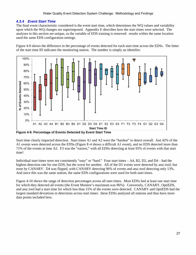
Water Quality Event Detection System Challenge: Methodology and Findings
27
4.3.4 Event Start Time The final event characteristic considered is the event start time, which determines the WQ values and variability upon which the WQ changes are superimposed. Appendix E describes how the start times were selected. The analyses in this section are unique, as the variable of EDS training is removed: results within the same location used the same EDS configuration settings. Figure 4-9 shows the difference in the percentage of events detected for each start time across the EDSs. The letter of the start time ID indicates the monitoring station. The number is simply an identifier.
Figure 4-9. Percentage of Events Detected by Event Start Time Start time clearly impacted detection. Start times A1 and A2 were the “hardest” to detect overall. Just 42% of the A1 events were detected across the EDSs (Figure E-4 shows a difficult A1 event), and no EDS detected more than 71% of the events at time A2. F3 was the “easiest,” with all EDSs detecting at least 95% of events with that start time! Individual start times were not consistently “easy” or “hard.” Four start times – A4, B2, D2, and D4 – had the highest detection rate for one EDS, but the worst for another. All of the D1 events were detected by ana::tool, but none by CANARY. D4 was flipped, with CANARY detecting 96% of events and ana::tool detecting only 13%. And since this was the same station, the same EDS configurations were used for both start times. Figure 4-10 shows the range of detection percentages across all start times. Most EDSs had at least one start time for which they detected all events (the Event Monitor’s maximum was 96%). Conversely, CANARY, OptiEDS, and ana::tool had a start time for which less than 15% of the events were detected. CANARY and OptiEDS had the largest standard deviations in detections across start times: these EDSs analyzed all stations and thus have more data points included here.
0%
10%
20%
30%
40%
50%
60%
70%
80%
90%
100%
A1 A2 A3 A4 B1 B2 B3 B4 D1 D2 D3 D4 E1 E2 E3 E4 F1 F2 F3 F4 G1 G2 G3 G4
% o
f Eve
nts
Det
ecte
d
Start Time ID

Water Quality Event Detection System Challenge: Methodology and Findings
28
Figure 4-10. Percentage of Events Detected by EDS and Event Start Time 4.3.5 Summary All of the event characteristics discussed in this section impacted the EDSs’ ability to detect the event. Table 4-18 shows the minimum and maximum percentage of events detected across the categories for each event characteristic, as well as the standard deviation of percentage detected. For example, CANARY detected between 51% (C6) and 77% (C1 and C3) of events for individual contaminants, and across the contaminants there was a 10% standard deviation in detection percentage. Monitoring location is not included in this table: those numbers are presented in Section 4.2.1 and are entirely dependent on how the EDS was trained. The cells are color-coded to show the impact of the event characteristic on ease of detection for the given EDS based on the standard deviation of detection percentages across all categories of the characteristic (for example, across all six contaminants). White cells indicate that the standard deviation was less than 10%, light shading reflects a 10-25% standard deviation, and dark coloring indicates that the EDS’s performance was highly impacted by the event characteristic, with a standard deviation higher than 25%. Table 4-18. Range and Standard Deviation of Detections across Event Characteristic Categories
CANARY OptiEDS ana::tool BlueBoxTM Event Monitor Min Max
St Dev
Min Max
St Dev
Min Max
St Dev
Min Max
St Dev
Min Max
St Dev
Contaminant 51% 77% 10% 61%
76% 5% 33% 53% 8% 56%
94% 13% 40% 98% 26%
Concentration 58% 83% 18% 63%
77% 10% 18% 74% 40% 64%
100% 26% 71% 85% 10%
Event Profile 64% 77% 9% 64%
77% 9% 38% 55% 13% 80%
84% 3% 76% 80% 3%
Start time 0% 100% 25% 8%
100% 28% 13% 100% 22% 54%
100% 15% 58% 96% 14%
Start time had the biggest influence on overall detection, with all EDSs being moderately or highly impacted. Contaminant concentration also had a significant impact. Event profile had the smallest impact on the EDSs’ ability to detect an event, though Section 4.3.3 shows that this characteristic dramatically impacts the time to detect. All characteristics except for event profile had a high impact on at least one EDS. And for each characteristic except for start time, there was at least one EDS not significantly impacted by the characteristic.
0%
10%
20%
30%
40%
50%
60%
70%
80%
90%
100%
CANARY OptiEDS ana::tool BlueBox Event Monitor
% o
f Eve
nts
Det
ecte
d

Water Quality Event Detection System Challenge: Methodology and Findings
29
Each EDS had at least one characteristic that highly impacted its ability to detect an event and a characteristic that did not significantly impact it, and these were different across EDSs. For example, the contaminant simulated had a high impact on the Event Monitor’s ability to detect the event but a low impact for ana::tool. Conversely, the concentration of that contaminant had a large impact on ana::tool’s ability to detect, but not on the Event Monitor’s. Each EDS had at least one category for which it detected at least 98% of events – and thus there is some quality that makes an event essentially certain to be detected by the EDS. This varied by EDS. For example, events using contaminant C1 were “slam dunks” for the Event Monitor. For BlueBox™, it was events with high contaminant concentrations that were easily detected. Though this section focused specifically on the detection of simulated contamination events, these findings could reasonably be extrapolated to detection of anomalous WQ in general. Contaminant and concentration simply determine the change in the various WQ parameters. The event profile reflects the length of time during which the monitoring location receives anomalous water, as well as the level of “unusualness” throughout that period. The start time identifies the water impacted by contamination. For example, a pipe break might most closely resemble the events with the STEEP profile and high concentrations of contaminant C1: a quick change, impacting TOC and chlorine significantly. A nitrification event would have a pattern closer to the FLAT profile and would be reflected in a low level chlorine change (perhaps like a low concentration of C6). It would also impact ammonia, though ammonia data was not provided for any of the Challenge locations.

Water Quality Event Detection System Challenge: Methodology and Findings
30
Section 5.0: Summary and Conclusions All of the study objectives stated in Section 1.2 were achieved.
• The major EDSs being used by utilities today were included in the Challenge, and the performance of each was certainly analyzed in a variety of ways. EPA is appreciative to these developers for their voluntary participation and the significant effort required.
• EDS developers were able to train and test their software on a large quantity of data (three months of training data, nine months of testing data, and 96 simulated contamination events for each of the six monitoring stations). Also, these datasets will be made publicly available so researchers and utilities can use them for their own evaluations.
• Most participants have updated their EDS based on the experience gained from the Challenge. EDS developers describe enhancements they have made in Appendix B.
• The evaluation procedure developed was robust and precise. The study design and findings have been used by WSi pilot utilities seeking to evaluate and select EDSs.
The introduction to Section 4.1 describes some of the limitations of this study and considerations for interpretation of the results. This study does not and was never intended to provide decisive conclusions about individual EDSs or the feasibility of event detection in general. 5.1 Conclusions Even with a perfect evaluation methodology, any evaluation of EDSs can only reflect the performance of a specific version and configuration of each EDS. As noted above, participating EDSs have been updated and enhanced since this analysis was performed. And even with the EDSs in their previous state, the results could have been very different if the participants had configured their EDS even slightly differently. Even with these study limitations in mind, the following conclusions regarding EDS performance can be made based on the results presented in this report.
• WQ event detection is possible. For all stations except Station F, there were detections over 50% with less than one invalid alert per week. While this might not seem particularly impressive, keep in mind that this likely represents a worst case of EDS performance. Going into this study, the project team feared that the issues presented in Section 4.1 would render the EDSs essentially useless – that at all reasonable invalid alert frequencies, detection rates would be negligible.
• Altering the alert threshold dramatically changes alerting – both invalid alerts and the ability to detect anomalous WQ. Reconfiguring an EDS to reduce invalid alerts generally reduces the detection sensitivity as well.
• There was no clear “best” EDS. Section 4.2.2 illustrates that EDS performance varies greatly based on variable configuration.
• The ability of an EDS to detect anomalous WQ strongly depends on baseline variability of the monitoring location (Sections 4.3.1 and 4.3.4) and the nature of the WQ change (Sections 4.3.2 and 4.3.3).
5.2 Research Gaps Table 4-11 shows that the most common cause of invalid alerts in the EDS Challenge was background variability. Variability also impacted detection: Section 4.3.4 shows that start time significantly impacted all EDSs’ ability to detect an event. To obtain maximum benefit, one idea is to consider event detection during selection of sites for new monitoring locations. Utilities with WQM have admitted becoming desensitized when frequent invalid alerts are received from a particular monitoring location. As this eliminates the benefit of that equipment, it has been suggested that

Water Quality Event Detection System Challenge: Methodology and Findings
31
monitoring stations not be placed at locations with high WQ variability or with large pressure fluctuations. This study certainly supports the premise that a site with more stable background WQ could allow for improved detection. And there are case studies of utilities considering the WQ variability of sites when selecting monitoring locations (EPA, 2009b). However, no research has been done to determine how an alternate site with less variable WQ could be identified that still monitors the area of interest. Supplemental data was included in the EDS Challenge datasets in the hope that the EDSs could use this information to reduce invalid alerts. However, the data provided represented only a small percentage of the factors that determine the WQ at a particular point in the distribution, such as source WQ, treatment plant operations, distribution system maintenance and upsets, system demands, temperature, and valving and pumping. Even if all of this data was available, effectively incorporating it into automated analysis seems infeasible due to its complexity and interdependency. A proposed solution is real-time modeling, in which real-time operations data is incorporated into the utility’s hydraulic and WQ model to predict real-time flow, pressure, and WQ throughout the system. Researchers are developing a real-time extension to EPANET (Hatchett, 2011; Janke, 2011), a free modeling software available at http://www.epa.gov/nrmrl/wswrd/dw/epanet.html. The vision is that event detection could be built into this platform, alerting if the difference between real-time WQ data and the values predicted by this model is significant. While this capability would be powerful, it seems unlikely that this will be feasible for the average utility in the foreseeable future. As an alternative, Koch and McKenna (2011) describe a study where data from multiple monitoring stations was integrated using knowledge of the network topology (e.g., how many pipes and junctions between any pair of monitoring stations). This work did not rely on a calibrated network model. It is unclear whether this approach would be reasonable or useful for the average utility. Finally, utilities with WQM often come up with their own innovations for reducing the number of invalid alerts. For example, some utilities have reported reducing their invalid alert numbers by modifying system operations to make WQ more predictable. Options for operational changes would vary by utility, but case studies such as this would certainly be valuable to share. 5.3 Practical Considerations for EDS Implementation The old adage “garbage in, garbage out” certainly applies to EDSs. Section 4.2.1 shows that sensor problems triggered a large percentage of invalid EDS alerts. Proper maintenance of sensor hardware is crucial to reduce invalid alerts and maximize the ability of an EDS to identify anomalous WQ. For best EDS performance, utilities should wait until sensors are operating reliably and accurately before training and installing their EDS. The following are suggestions for selection and implementation of an EDS. They are based on the EDS Challenge conclusions presented in Section 5.1 and lessons learned by utilities who have implemented an EDS.
• Do not make an EDS selection decision solely based on EDS performance. The whole package should be considered including cost, available support, ease of use and user interface, compatibility with existing data management systems, and the ability to modify or add parameters to analysis.
• Ideally, assess EDS performance on utility data prior to selection. Valid and invalid alerting can vary greatly across monitoring locations, and thus case studies included in a vendor presentation might not reflect performance that could be realized at other utilities. Ideally, a utility could provide data from one or two of their monitoring locations and see the alerts that would be generated. This is even more informative if that data contains “baseline events” so that response to anomalous WQ can be observed. Any data used for evaluation should be representative of the type and quality of data that would be used during real-time monitoring.

Water Quality Event Detection System Challenge: Methodology and Findings
32
• Consider both invalid alerts and anomaly detection when setting EDS configurations. To measure the ability to detect anomalous WQ, simulated events and/or historical WQ anomalies from the utility can be used. Most vendors assist with this configuration process.
• Develop procedures, roles, and responsibilities to support review of alerts in an effective and efficient manner. This should be aligned with normal utility activities to the extent possible. With this optimization of response, many utilities have reported that investigation of alerts averages less than 10 minutes.
• Implement event detection in stages. Do not just “turn it on” and immediately begin responding to alerts. Do off-line analysis of alerts produced (likely in cooperation with the EDS developer) and adjust configurations until acceptable performance is achieved.
• Regularly review EDS alerting and update configurations if necessary. This is particularly important if standard system operations have changed.
• Regularly review and update alert investigation procedures based on lessons learned.
With the current state of technology, there is a limit on what can be done to improve EDS performance. Invalid alerts will certainly persist, as WQ in the distribution system is complex and variable, and there is presently no reliable way to predict precisely what it will be. Thus, the benefit of early detection of anomalous WQ comes with the cost of invalid alerts. Hardware vendors will continue to develop and refine methods for measuring WQ. EDS developers will continue to refine and enhance their data analysis approaches. And researchers will continue to develop methods to more accurately model distribution system conditions. However, regardless of the advances in event detection, the need for utility expertise will never be eliminated. While an EDS can alert utility personnel to a potential anomaly, it is up to utility experts to investigate and determine if the water is indeed anomalous and if action is required.

Water Quality Event Detection System Challenge: Methodology and Findings
33
Section 6.0: References Hatchett, S., Uber, J., Boccelli, D., Haxton, T., Janke, R., Kramer, A., Matracia, A., and Panguluri, S. 2011. “Real-
time Distribution System Modeling: Development, Application, and Insights”, Proceedings of International Conference on Computing and Control for the Water Industry, Exeter, UK.
Hall, J., Zaffiro, A., Marx, R., Kefauver, P., Krishnan, E., Haught, R., Herrmann, J. 2007. “Online Water Quality
Parameters as Indicators of Distribution System Contamination.” Journal AWWA. Vol. 99, Issue 1: 66-77. Janke, R., Morley, K., Uber, J., and Haxton, T. 2011. “Real-Time Modeling for Water Distribution System
Operation: Integrating Security Developed Technologies with Normal Operations”, Proceedings of AWWA Distribution Systems Symposium and Water Security Conference, Nashville, TN.
Koch, M. and McKenna, S. 2011. “Distributed Sensor Fusion in Water Quality Event Detection”, ASCE Journal
of Water Resources Planning and Management. Vol. 137, Issue 1: 10-19. Scott, R., Thompson, K. 2008. “Case Study: Operational Enhancements Resulting From the Development and
Implementation of a Contamination Warning System for Glendale, Arizona”, Proceedings of AWWA Water Security Congress, Cincinnati, OH.
Thompson, K., Jacobson, G., Kadiyala, R. 2010. “Using Online Water Quality Monitoring to Understand
Distribution Systems and Improve Security”, Proceedings of Water Contamination Emergency Conference 4, Mulheim-an-der Rhur, Germany.
Umberg, K., Edthofer, F., van den Broeke, J., Zach Maor, A., McKenna, S., and Craig, K. 2011. “The Impact of
Polling Frequency on Water Quality Event Detection”, Proceedings of AWWA Water Quality Technology Conference, Seattle, WA.
U.S. Environmental Protection Agency. 2005. WaterSentinel System Architecture, EPA 817-D-05-003. U.S. Environmental Protection Agency. 2009a. Distribution System Water Quality Monitoring: Sensor
Technology Evaluation Methodology and Results. A Guide for Sensor Manufacturers and Water Utilities. EPA 600/R-09/076.
U.S. Environmental Protection Agency. 2009b. Sensor Network Design for Drinking Water Contamination
Warning Systems: A Compendium of Research Results and Case Studies using TEVA-SPOT. EPA/600/R-09/141.
U.S. Environmental Protection Agency. 2012. Water Security Initiative: Evaluation of the Water Quality
Monitoring Component of the Cincinnati Contamination Warning System Pilot. Under Development.

Water Quality Event Detection System Challenge: Methodology and Findings
34
Appendix A: EDDIES EDDIES was developed by the EPA to facilitate implementation of WQM. It was initiated for and has been enhanced based on the needs of the WSi pilot utilities as they implement EDSs. EDDIES-ET, used to implement the EDS Challenge, contains all functionality needed to manage and implement an evaluation of EDS(s). This appendix describes the major capabilities of EDDIES-ET. Contact Katie Umberg at [email protected] for more information. EDDIES-RT is a separate piece of software designed to support real-time deployment of EDSs at water utilities. It eliminates the need for EDSs to interface with multiple data sources: once an EDS is compatible with EDDIES, it can be used in any utility or evaluation setting where EDDIES is installed. Likewise, once a utility configures its connection to EDDIES-RT, it can instantly run any tool that is compatible with EDDIES. This software is not being actively supported, however, as few EDSs have chosen to develop an EDDIES interface. A.1 Testing Data Generation EDDIES-ET simulates contamination events by superimposing WQ changes on utility data uploaded by the user. Appendix E describes this methodology. Figure A-1 shows the EDDIES-ET screen where the user specifies the test datasets and EDS to be evaluated. The desired baseline data to use for testing is selected on the top portion of the screen, as well as the EDS and configuration to test. The data polling interval is also designated here.
Figure A-1. Batch Manager Tab Screenshot

Water Quality Event Detection System Challenge: Methodology and Findings
35
On the bottom half of the screen, the user enters characteristics of the desired simulated contamination events. An event is simulated for every combination of the values entered, so large test ensembles can be generated quickly and easily. A.2 EDS Management Batch execution can be done within or outside of EDDIES-ET. If the EDS to be evaluated is compatible with EDDIES, the user simply clicks a button to implement the evaluation. EDDIES launches and communicates with the EDS, provides data to the EDS for all scenarios in the batch, and collects and stores the EDS results. If the EDS is not compatible with EDDIES-ET, the user exports the test data files (including the simulated contamination events), runs them through their EDS externally, and uploads the results files into EDDIES in order to use the export and analysis capabilities described below. The EDDIES-ET software comes with a simple EDS already installed: the setpoint algorithm. This EDS will generate an alert if the WQ data deviates outside of the parameter limit values identified by the user. The setpoint algorithm can be used as a standard against which to evaluate another EDS. Also, EDDIES-ET can be used to evaluate the ability of current setpoints to detect anomalous WQ, or can be used to identify new setpoint values to maximize the ability to detect WQ anomalies while minimizing invalid alert rates. A.3 Export and Analysis The user can export data files containing raw data, test datasets, and EDS output. EDDIES-ET also includes a variety of analysis capabilities which the user can implement on any subset of completed run(s). The Alerts Export lists all EDS alerts produced in the selected runs, designating them as valid or invalid. This export was used for the analyses in Section 4.2.1. The Analysis Export calculates performance metrics for multiple alert threshold settings. This export was used for Section 4.2.2 and Appendix G.

Water Quality Event Detection System Challenge: Methodology and Findings
36
Appendix B: Participants As described in Section 2.2, participants in the EDS Challenge trained their EDS for each monitoring station and sent the software to EPA for testing. After that, they had no control of (or even knowledge of) the project implementation. EPA ran the EDS on the test datasets, collected and analyzed the EDS output, and prepared this report. The participants did not even see a summary of their performance until the work was largely complete. This appendix was added to give the participants a voice. The content of this appendix was provided entirely by the participants. Contact information for each EDS is given in Table B-1. Table B-1. EDS Developer Contact Information
EDS Contact Website
CANARY Sean McKenna 505-844-2450 [email protected]
http://www.epa.gov/NHSRC/aboutwater.html
OptiEDS Elad Salomons +972-54-2002050 [email protected]
http://www.optiwater.com
ana::tool Florian Edthofer +43 1 219 73 93 35 [email protected]
http://www.s-can.us
BlueBoxTM Asaf Yaari +001-786-2829066, +972-3-609-9013 [email protected]
http://w-water.com
Event Monitor Katy Craig 970-663-1377 x 2395 [email protected]
http://www.hach.com

Water Quality Event Detection System Challenge: Methodology and Findings
37
B.1 CANARY We appreciate being able to take part in this study. We found this analysis to be well thought out and well executed given the constraints of simulation-based testing. We were surprised to see the variation in results across EDS tools for a given station and look forward to examining the event data used in the evaluation so that we can better understand some of the results produced by CANARY. CANARY was not updated based on the experiences gained in this study. The base algorithms in CANARY have been in place since 2008, prior to the start of this study, and in our analysis of the baseline (training) data we simply adjusted the algorithm parameters based on the training data. Simultaneous, or prior, to the start of this study, we were adding the Composite Signals capability and the Trajectory Clustering Pattern Matching algorithms to CANARY and we did use these on some of the stations. The composite signals capability was used at Stations A, D, and G to make CANARY less sensitive to water quality changes after any of the pumps changed status (Stations A and D) or there was a significant change in the flow rate from a pump (Station G). Pressure data were also available at Station A, but incorporating these data into the event detection did not significantly improve results. Subsequent to the end of the study, we learned that during the evaluation (testing) phase, EDDIES was not able to correctly read some of the composite signals we had defined. This feature of EDDIES impacts our results at monitoring stations D and G where there was a calibration signal for the entire station, as provided in the data set, and we also created a second calibration signal using the composite signals capability within CANARY. EDDIES was only able to read one of these calibration signals and we are not clear which one. The pattern matching was used at Station F to recognize multivariate changes (chlorine, pH and conductivity) in the training data and then compare any potential water quality event against a previously recognized pattern prior to calculating the “level of abnormality.” Both of these newer algorithms tend to use other information usually gained through discussions with the network operator, and since there really was no communication here, we did not use these tools as extensively as we would in an actual setting. In the version of CANARY used in this study, estimation of the water quality signal value at the next time step is done independently of any other signal (e.g., no cross correlation between signals is exploited). Fusion from the M signals down to one “level of abnormality” value is done using the residuals between each estimated value and the measured value as it becomes available. All signals are weighted equally in the fusion: No consideration of the ability of a signal to be better or worse in defining an event or to react more or less strongly to a certain contaminant was employed in this study. We typically used all five water quality signals: chlorine, pH, turbidity, conductivity, and TOC in the analyses for each site. We examined the ability of temperature to contribute to event detection and decided not to use it in analysis at any of the stations. CANARY employs an algorithm called the binomial event discriminator (BED) to aggregate event detection measures across multiple consecutive time steps and calculate the probability of an event (here the “level of abnormality”). This algorithm has proven robust at keeping the probability of an event at 0.0 in the face of noisy data and then rapidly increasing that probability to 1.0 when an event is identified. The result is that there are relatively few time steps where the “level of abnormality” has values between 0.0 and 1.0. This nearly binary assignment of probability creates the very flat curves (curves showing the proportion of events detected as a function of the number of invalid alerts per week). It is possible to change the parameters within the BED algorithm to get different shapes in the resulting curves. A challenging part of this study was trying to understand what the “utility” would consider to be a significant change in the baseline water quality in order to better set the event detection parameters. The training datasets contained significant changes in water quality that would certainly be of interest to a utility, but we were uncertain in how small of a change the utility would be interested in finding. We adjusted the parameters in CANARY such that we picked up the majority of the large “baseline events” but our definition of “large” for each station remained an ad hoc estimate. Again, discussions with the utility would refine this understanding and allow for improved event detection.

Water Quality Event Detection System Challenge: Methodology and Findings
38
It is our feeling that if a utility is sampling their water quality data at intervals greater than 5 minutes, then they are not that concerned about water security. Therefore, we did not place as much attention on Stations B and E for setting parameters relative to the other stations. The CANARY algorithms used here are designed to detect relatively abrupt changes in water quality and the two contaminant patterns used by EPA were both abrupt enough to be well-detected by these algorithms. Other algorithms within CANARY allow for the addition of user-defined set points (low and high) and these can be used to pick up the end result of a slow decline/increase in a water quality value. These set-point algorithms work well for detection of a sensor that is slowly going out of calibration or cases where a water quality level (e.g., chlorine) decays to an unacceptably low value. These algorithms can be added to the abrupt change algorithms employed here.

Water Quality Event Detection System Challenge: Methodology and Findings
39
B.2 OptiEDS The optimal Event Detection System (optiEDS) is a software-based Event Detection System (EDS) which helps detect anomalous water quality conditions in real time. optiEDS will monitor a set of water quality and operational data, measured and computed. Once an abnormal combination of the monitored data set is detected the system will alert and report the "suspicious" parameters. The basic algorithm of optiEDS uses trend analysis to monitor deviations from a steady parameters baseline. On top of the statistical analysis of parameters, the unique water network operation logic may be embedded into optiEDS, empowering the water utility's engineers and operators with specific knowledge of the system. The EPA EDS challenge was the trigger for the development of optiEDS as a standalone application. The version submitted to the EPA was compiled in short period of two weeks.
The main capabilities of optiEDS are:
• Monitoring a large set of water quality and operational parameters • Real-time alarming for abnormal changes in the water quality • Definition of a normal dynamic baseline of parameters • Custom adjustments to a water network using the utility's knowledge
The EPA EDS challenge The EPA EDS challenge was a great opportunity for EDS developers to objectively test their algorithms and products. This exercise was truly challenging and was managed in a professional way as described in this report. For understandable reasons, there were a few issues making the exercise even more challenging.
• Due to lack of direct communication with the utility's personal, queries regarding operational issues could not be addressed.
• The provided monitoring stations descriptions were not always supported by the data provided. In some stations the quality of the data was poor. For example, some parameters dropped to zero for long periods of time.
• As stated in the report, data time step in three stations was above 5 minutes. These polling intervals are not idea for water quality event detection.

Water Quality Event Detection System Challenge: Methodology and Findings
40
One of the most promising results of optiEDS is the high detection of “baseline” events. These events are much more likely to happen within the water distribution system and their detection would be of great value to the water utility. About Elad Salomons Elad Salomons is an independent Water Resources Engineer with over 15 years of consulting experience. Elad’s focus is on water distribution systems management, modeling, optimization, water security, software development and research. Elad is a consultant to water companies, water utilities, engineering firms, startup companies and research institutes. In recent years, most research has been devoted to water security issues, such as software development for sensor placement, online contamination monitoring, event detection systems, and identification of possible contamination sources. Elad is the author of the water simulation blog at http://www.water-simulation.com. Professional information may be found at http://www.eladsalomons.com. As a personal note, I would like to mention that this challenge shows that the differences between the tested tools are not vast. Water utilities considering implementing event detection systems should seek consultancy on related issues such as sensors locations, sensors types, EDS, contamination source detection and procedures for handling events.

Water Quality Event Detection System Challenge: Methodology and Findings
41
B.3 ana::tool

Water Quality Event Detection System Challenge: Methodology and Findings
42

Water Quality Event Detection System Challenge: Methodology and Findings
43
B.4 BlueBoxTM
The EPA Challenge contributed dramatically to the product’s development. During the process of training the EDS and analyzing the EPA Challenge data sets, a lot of insights were discovered, both regarding the product’s configuration methodology and the product’s working procedures. Since submitting the results, the product was deployed in many utilities, where we were able to continuously improve the product based on customer inputs. In each deployment we added new features to the product and acquired new insights regarding the product’s configuration methodology. The next two chapters describe the new features and improvements which were added to the product since the EPA Challenge and the developments which are currently in process and will be released in the near future.
Main Improvements & New Features
1. Incorporation of Operational Inputs
Extending the BlueBox™ the ability to define and incorporate operational variables, such as discrete variables (e.g. indication of pumps and valves on/off), or substantial changes in the measurements of operational parameters, such as flow, pressure and water direction. This capability allows the system to cross reference and correlate between suspected quality events and the operational environment in which the event occurred, therefor providing additional insight into the event characteristics resulting in higher certainty and accuracy of alarming.
2. Differentiation Between Quality Events and Malfunctions
Extending the BlueBox™ the ability to distinguish between water quality events and sensors malfunctions, by analyzing water quality data. Figure No. 1-1 and 1-2, below, demonstrate the BlueBox’s™ ability to identify changes in water quality patterns, specifically being able to distinguish the cause of the alert, whether it is a result of a water quality event or an equipment mailfunction.
Extending the system the ability to integrate with any sensor, regardless of manufacturer, make or model. The BlueBox™ has an Open Process Control (OPC) interface which allows the system to exchange data with any standard industrial automation system. As a result, the integration of the BlueBox™ into most environments, controllers and SCADA systems is simple, quick and straightforward resulting in a short installation and integration time.
Providing the BlueBox™ with a self-learning mechanisim based on event classifications. The BlueBox™ enables the user to classify the on-going events as “true” or “false”. Over time, this growing library of event
Figure 1-1 Water Quality Event Figure 1-2 Sensor Malfunction
3. Sensor Agnostic
4. Ability to Learn from Past Experiences

Water Quality Event Detection System Challenge: Methodology and Findings
44
classifications is used to “teach” the BlueBox™ which scenario to alert in the future as a true event, resulting in improvement of the detection rate and minimizing false positive alerts.
5. Incorporation of Time Parameters
Extending The BlueBox™ the ability to incoporate time parameters as part of the system inputs and parameters monitored. Using that ability The BlueBox™ can detect abnormalities based on seasonal parameters (time of the day/month of the year) - an advantage which greatly improves event detection analysis in real time and reduces the level of false alarms resulting from seasonality effects.
6. Reports Module
Providing the BlueBox™ a reporting module enabling the system operator and the managers to excute various data analysis reports including alarming statistics, events history and more.
Future Roadmap
1. Auto Calibration
A new feature which will shorten the system configuration time and reduce dependency on manual inputs from the user. The auto calibration feature will enable the user to configure automatically the EDS system for each monitoring station.
2. Optimal Location Planner of Sensors
A new feature which will enable calculation of the optimal location of sensors in the water distribution network based on sensor type, cost and their efficiency in detecting water quality events. The module will be available both for existing Water Distribution Systems (WDS) as well as WDS under design process.
3. Spatial Detection Module
A new module which will enable detecting abnormalities in spatial sub regions of a WDS by analyzing online water quality data.

Water Quality Event Detection System Challenge: Methodology and Findings
45
B.5 Event Monitor The Hach Event Monitor
The Hach Event Monitor is specifically designed to detect incidents of abnormal water quality. In real world operation, incidents of variable water quality that are routine or normal in nature will far outnumber incidents that are true threats. With this in mind, the Hach system has been designed with both a heuristic ability to learn events and an automatic self-tuning capability that modifies the definition of what constitutes an abnormality according to the variability encountered for a given time frame at a specific site. The self-tuning minimizes time and expertise needed for users to adjust and train the system. Self-tuning features allow for the optimization of sensitivity while eliminating many unknown alarms due to noise.
Event Monitor Analyzes Water Quality Data from Online Sensors Monitoring Source or Finished Water
The patented Event Monitor from Hach Company integrates multiple sensor outputs and calculates a single Trigger signal. It then identifies deviations in water quality due to operational fluctuations and calculates a “fingerprint” of each system event which is then catalogued in the monitor’s “Plant Event Library.” This intelligent software streamlines analyzing the data from the instruments, interpreting the significance of water quality deviations from the established baseline, and alerting operations personnel to “events” in their water system. The trigger threshold and other simple settings can be adjusted to increase or decrease system sensitivity. The Plant Library then stores information that employees have dealt with in the past. Operators adjust the sensitivity of the system to water quality events and they can label event fingerprints for simplified identification should the event recur. With its demonstrated ability to “learn” and be “taught” specific system dynamics, the Event Monitor can become an invaluable tool for water utilities looking to lower system maintenance costs and streamline plant operations, all while improving water quality and customer satisfaction.
Leverage the Power
Hach Company has developed an Agent Library to augment and enhance the capabilities of the Event Monitor when used as part of the GuardianBlue® Early Warning System. The Agent Library is capable of classifying threat contaminants so they are easily differentiated from water quality events. The Agent Library was not utilized in this study due to the nature of the study and unknown sensors. Capabilities of the Agent Library have been confirmed in earlier EPA studies. The GuardianBlue Early Warning System has received Safety Act Certification and Designation from the US Department of Homeland Security based on review of performance and testing data.
EDS Study
The data sets provided for this study contained not only noise but actual true events that were likely of a normal or operational nature. In the training part of the exercise, Hach had no knowledge of the operational characteristics of the site data used and chose to address the noise part of the equation but did not remove or categorize operational type events. This route was chosen because without operator input as to what is normal and the probable cause, removing the ability to alarm on true water quality events such as an increase in TOC or a decrease in chlorine is never a good idea as it could compromise the event detection system’s ability to respond to true events. The goal of the training was to maximize the detection of contamination events without causing alerts with no clear cause. During the course of the study, the Event Monitor recorded a number of the normal variability changes as unknown alarms. Additionally, the number of alerts due to ‘No Clear Cause’ was successfully minimized. Real world deployments at many locations over a number of years have shown that when operators take the time to categorize and name events, the number of such alarms decreases dramatically and rapidly with most being eliminated after just a few days of deployment. If such interaction was available during this study, the number of these alarms would be expected to decrease dramatically.

Water Quality Event Detection System Challenge: Methodology and Findings
46
Detect Source Water Quality Events
In addition to consistently detecting changes in drinking water quality, the Event Monitor has proven in field use (since 2006) to be a powerful tool used to detect changes in source water quality used in conjunction with appropriate sensors.

Water Quality Event Detection System Challenge: Methodology and Findings
47
Appendix C: Location Descriptions This appendix provides details about the WQ, hydraulics, and data quality at each monitoring location. It is intended to support the user in better understanding the EDS Challenge results. Some utilities provided their data in change-based format, where data was only reported when a significant change in value occurred. This data was transformed to report the most recent value for each timestep. The data was analyzed to find the smallest frequency for which new values were generally available for all WQ parameters. However, this still resulted in instances of repeated values in the testing datasets until new values were reported. C.1 Location A Monitoring Location A is located at the point of entry into Utility 1’s distribution system. There are three pumps located at this station that greatly influence the WQ: the station receives water from different sources depending on pump operations. This station’s data was provided in change-based format, which was converted to a five minute polling interval. The following data streams were provided for this station:
• Chloramine, conductivity, pH, temperature, TOC, and turbidity at the monitoring station • Pressure at the monitoring station • Status of the three key pumps
In general, WQ changes at Location A were significant and abrupt, impacting multiple parameters. They corresponded well to the pumping data provided: in general, the status of one or more of the pumps changed within 10 timesteps before the WQ change. Figure C-1 shows the chloramines and conductivity data from a typical week. The WQ impact of pump changes, shown by the green squares, is clear.
0
60
120
180
240
300
0
0.5
1
1.5
2
2.5
6/23 0:00 6/24 0:00 6/25 0:00 6/26 0:00 6/27 0:00 6/28 0:00 6/29 0:00 6/30 0:00 7/1 0:00
Con
duct
ivity
(mS/
cm)
Chl
oram
ine
(mg/
L)
Pump ChangeChloramineConductivity
Figure C-1. Typical Week of WQ and Operations Data from Location A

Water Quality Event Detection System Challenge: Methodology and Findings
48
In general, the data quality for this location was very good with the exception of a few sensor issues: • Three periods when the chloramine sensor produced noisy data. Two of these were resolved within a few
days, but the data remained poor for over two weeks in the third case. Figure C-2 shows an example. • Approximately one week where the TOC data stream flatlined. The instrument was likely taken off line for
maintenance.
0
0.5
1
1.5
2
2.5
3
10/16 10/17 10/18 10/19 10/21 10/22
mg/
L
Figure C-2. Period of Chloramine Sensor Malfunction at Location A Figure C-3 shows the breakdown of invalid alerts for Location A, summing the invalid alerts for all EDSs. Considering the frequent and significant WQ changes shown in Figure C-1, it is not surprising that the majority of the alerts were triggered by WQ variability.
160, 51%
74, 23%
23, 7%
60, 19%
Normal Variability
Sensor Problem
Communication Problem
No Clear Cause
Figure C-3. Invalid Alert Causes for Location A across All EDSs C.2 Location B Monitoring Location B is located in the distribution system of Utility 2, downstream of the main treatment plant. Travel time to the site from the plant ranges from 6 to 12 hours depending on system conditions. The water does not pass through any distribution system tanks on the way to this monitoring location.

Water Quality Event Detection System Challenge: Methodology and Findings
49
This monitoring location is at the connection to one of the utility’s large customers. Water is taken from the system to fill the customer’s ground storage tank, so flow through this station is intermittent. The data from Utility 2 was unusual. It was provided at a 20 minute polling interval (the data was not transformed to this interval), and the values represented twenty minute averages taken from the utility’s data historian. The following data streams were provided for this location:
• Total chlorine, conductivity, pH, temperature, TOC, and turbidity at the monitoring location • Pressure at the monitoring location • Total chlorine, pH, and turbidity of finished water from the treatment plant • Total flow and water pressure from the treatment plant
Unlike Location A, WQ changes at Location B were more gradual and less clearly defined. Also, there was no supplemental data that strongly corresponded to WQ changes. Figure C-4 shows the chlorine, conductivity, and turbidity data from a typical week, in addition to chlorine from the upstream treatment plant. A correlation can be seen between the chlorine residual at the monitoring location and plant effluent, but the relationship is imprecise and thus hard for EDSs to use.
200
212
224
236
248
260
272
284
296
308
320
0
0.5
1
1.5
2
2.5
3
3.5
4
4.5
5
6/23 0:00 6/24 0:00 6/25 0:00 6/26 0:00 6/27 0:00 6/28 0:00 6/29 0:00 6/30 0:00 7/1 0:00 7/2 0:00C
ondu
ctiv
ity (m
S/cm
)
Chl
orin
e (m
g/L)
, Tur
bidi
ty (N
TU)
Station ChlorinePlant ChlorineTurbidityConductivity
Figure C-4. Typical Week of WQ Data at Location B The dataset provided by Utility B was during a pilot period for the sensor hardware, and real-time alerts were not received. Thus, sensors were not attentively maintained, and in general the data quality was not as good as other stations. There was significant variability and periods of “flatlined” data caused by sensors malfunctioning or being taken off line for servicing. The most significant instance of this in the testing data occurred when all sensors were not producing data for almost six days. There were issues with the TOC sensor for much of the testing dataset. An example is given in Figure C-5 where there are many periods of flatlined data. There are also large changes in TOC, including a drop to zero. These sensor issues are reflected in Figure C-6, where over two-thirds of the invalid alerts produced for Location B are triggered by poor data quality due to sensor problems.

Water Quality Event Detection System Challenge: Methodology and Findings
50
0
2
4
6
8
10
12
9/22 9/25 9/28 10/2 10/5 10/8 10/12
ppb
Figure C-5. Example of TOC Sensor Issues
19, 8%
181, 73%
4, 2%
42, 17%
Normal Variability
Sensor Problem
Communication Problem
No Clear Cause
Figure C-6. Invalid Alert Causes for Location B across All EDSs C.3 Location C Utility 3 provided training data for Location C but was unable to produce sufficient data for testing. Thus, Location C is not included in these analyses. C.4 Location D Monitoring Location D is located at an 81 million gallon reservoir in the distribution system of Utility 3. Water passing through this location can come from one of two transmission lines fed by different upstream pumping locations, or from the co-located reservoir. This station’s data was provided on a two minute polling interval. The following data streams were provided:
• Total chlorine, conductivity, pH, temperature, TOC, and turbidity at the monitoring station • Instrument fault data for the station’s chlorine sensor • A tag indicating when the station was being serviced and thus data should be ignored • Flow through a bidirectional pipe at the station

Water Quality Event Detection System Challenge: Methodology and Findings
51
• Flow through each of the two pumping stations that supply water to this station • Chlorine and pH at each of these upstream pumping stations • Chlorine at the co-located reservoir • Position of a key nearby valve
WQ changes at Location D are generally significant, abrupt, and impact multiple parameters. And while many supplemental parameters were provided, there was no clear way to use them. Utility 3 provided a full page of complex guidelines for interpreting the supplementary data (e.g., “if Valve_B is closed and Flow_B>Flow_C…”). However, these guidelines were inexact and it is unlikely that any of the EDSs were able to successfully leverage this information. Figure C-7 shows the chlorine and conductivity from a typical week. These two parameters generally changed at the same time, though sometimes the values change in the same direction (both increased or both decreased) and sometimes they move in opposite directions (one increased and the other decreased). Also included in this plot are indications of when the flow through the three key pumps changed. Unlike Location A, there is no clear connection between the WQ and the supplementary data provided: there are many pumping changes that do not impact the WQ.
250
265
280
295
310
325
0
0.4
0.8
1.2
1.6
2
4/1 0:00 4/2 0:00 4/3 0:00 4/4 0:00 4/5 0:00 4/6 0:00 4/7 0:00 4/8 0:00
Con
duct
ivity
(mS/
cm)
Chl
orin
e (m
g/L)
Pump 1 Change Pump 2 ChangePump 3 Change ChlorineConductivity
Figure C-7. Typical Week of WQ and Operations Data at Location D The data quality was reliable at Location D with the following exceptions:
- Two 3-4 hour periods where it looked like the station was being calibrated (all sensors were being adjusted) though the calibration tag did not reflect this.
- Several instances of flatlined conductivity data. The longest of these periods was 4.4 days. - Many periods of flatlined TOC data.
Figure C-8 shows the invalid alert causes for Station D. The large percentage of alerts due to normal variability is not surprising given the frequent, significant changes in WQ with no corresponding operational data.
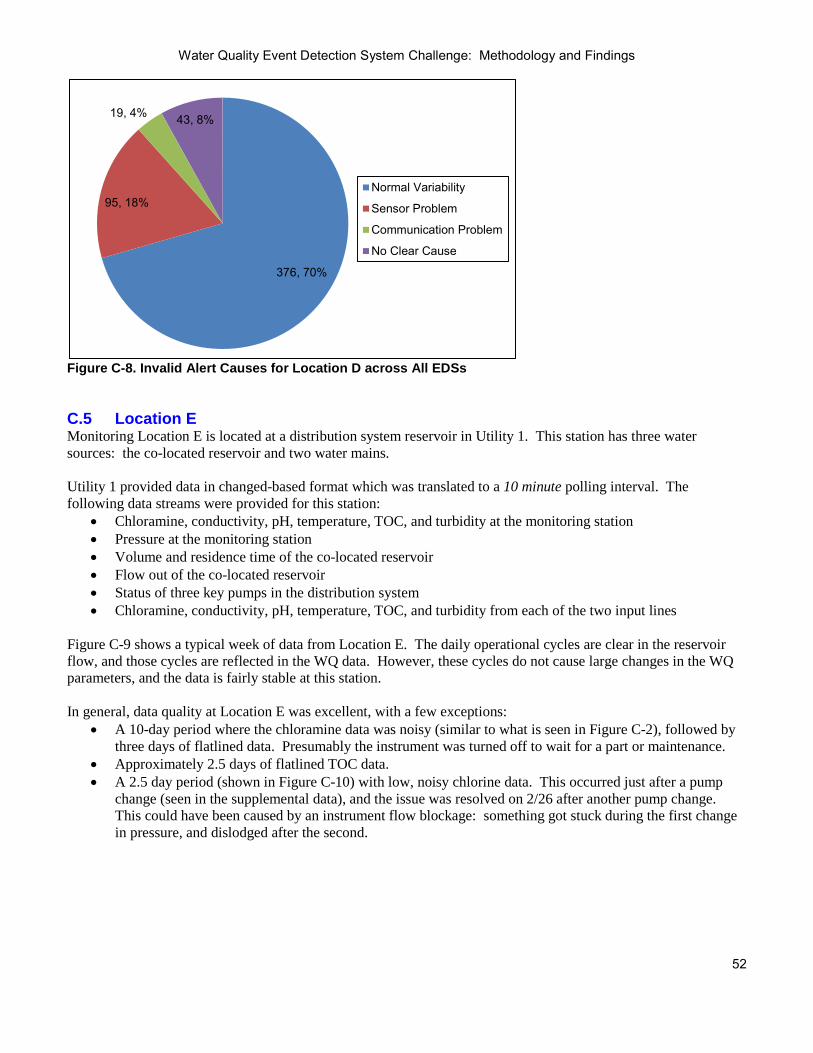
Water Quality Event Detection System Challenge: Methodology and Findings
52
376, 70%
95, 18%
19, 4% 43, 8%
Normal Variability
Sensor Problem
Communication Problem
No Clear Cause
Figure C-8. Invalid Alert Causes for Location D across All EDSs C.5 Location E Monitoring Location E is located at a distribution system reservoir in Utility 1. This station has three water sources: the co-located reservoir and two water mains. Utility 1 provided data in changed-based format which was translated to a 10 minute polling interval. The following data streams were provided for this station:
• Chloramine, conductivity, pH, temperature, TOC, and turbidity at the monitoring station • Pressure at the monitoring station • Volume and residence time of the co-located reservoir • Flow out of the co-located reservoir • Status of three key pumps in the distribution system • Chloramine, conductivity, pH, temperature, TOC, and turbidity from each of the two input lines
Figure C-9 shows a typical week of data from Location E. The daily operational cycles are clear in the reservoir flow, and those cycles are reflected in the WQ data. However, these cycles do not cause large changes in the WQ parameters, and the data is fairly stable at this station. In general, data quality at Location E was excellent, with a few exceptions:
• A 10-day period where the chloramine data was noisy (similar to what is seen in Figure C-2), followed by three days of flatlined data. Presumably the instrument was turned off to wait for a part or maintenance.
• Approximately 2.5 days of flatlined TOC data. • A 2.5 day period (shown in Figure C-10) with low, noisy chlorine data. This occurred just after a pump
change (seen in the supplemental data), and the issue was resolved on 2/26 after another pump change. This could have been caused by an instrument flow blockage: something got stuck during the first change in pressure, and dislodged after the second.

Water Quality Event Detection System Challenge: Methodology and Findings
53
Figure C-9. Typical Week of WQ Data at Location E
Figure C-10. Example of Noisy Chlorine Data due to Operations Change Figure C-11 is an example from Location E that shows the benefit of a signal indicating when a station is in calibration (this station does not have one). From looking at the data in hindsight, it is clear that maintenance of the TOC sensor was done on 1/29. But not knowing calibration was in progress, it is likely that an EDS would alert at least once in this period due to the TOC spikes, dips, and value increase. Figure C-12 shows the invalid alert breakdown for Station E. This station had the fewest number of total alerts and the most even distribution across alert causes.
0
25
50
75
100
125
150
175
200
225
250
0
2
4
6
8
10
12
10/17 0:00 10/18 0:00 10/19 0:00 10/20 0:00 10/21 0:00 10/22 0:00 10/23 0:00 10/24 0:00 10/25 0:00
Con
duct
ivity
(mS/
cm)
Chl
oram
ine
(mg/
L), p
H. F
low
(gpm
) TOC pHReservoir Flow Conductivity
0
0.5
1
1.5
2
2.5
3
2/22 0:00 2/24 0:00 2/26 0:00 2/28 0:00 3/1 0:00
Chl
oram
ine
(mg/
L)

Water Quality Event Detection System Challenge: Methodology and Findings
54
0
0.5
1
1.5
2
2.5
3
1/27 0:00 1/28 0:00 1/29 0:00 1/30 0:00 1/31 0:00
TOC
(ppb
)
Figure C-11. Example of TOC Calibration
23, 12%
89, 47% 29, 15%
50, 26% Normal Variability
Sensor Problem
Communication Problem
No Clear Cause
Figure C-12. Invalid Alert Causes for Location E across All EDSs C.6 Location F Monitoring Location F is located beneath a large elevated tank in the distribution system of Utility 4. The WQ at this station is very much influenced by this tank. This station’s data was provided on a two minute polling interval. The following data streams were provided:
• Free chlorine, conductivity, pH, temperature, TOC, and turbidity at the monitoring station • Instrument fault data for the station’s chlorine sensor • Pressure at the monitoring station • Tank level of the co-located tank • Status of two co-located pumps
Figure C-13 shows the chlorine and conductivity from a typical week, as well as indications of when a pumping change occurred. Of all locations included in the Challenge, this one has the most frequent operational changes. Unfortunately, there is no clear connection between the station WQ and the supplemental data provided. Some WQ changes occur just

Water Quality Event Detection System Challenge: Methodology and Findings
55
after a pumping change - others do not. Some pumping changes clearly trigger a source water change - others do not. And oddly, significant changes in WQ often occur 30 to 60 minutes before a change in pumping. It is unclear why this happens (perhaps pumping changes are made based on a change in pressure or flow?).
350
360
370
380
390
400
410
420
430
440
450
0
0.5
1
1.5
2
2.5
3
3.5
4
4.5
5
6/30 0:00 7/1 0:00 7/2 0:00 7/3 0:00 7/4 0:00 7/5 0:00 7/6 0:00 7/7 0:00
Con
duct
ivity
(mS/
cm)
Chl
orin
e (m
g/L)
Chlorine Pumping changesConductivity
Figure C-13. Typical Week of WQ and Operations Data at Location F Data quality at Location F was good aside from some isolated periods when individual sensors needed calibration. Some issues included:
• Six periods that lasted over six hours where data was missing or flatlined for all parameters. Four of those periods lasted longer than two days, with the longest flatlined period lasting 53.3 days.
• Twenty-five 15 to 30 minute periods of missing WQ data. While these were short periods, they were preceded by negative values for conductivity, temperature, TOC, and turbidity and thus might have triggered alerts.
• “Fuzzy” chlorine data for much of the testing dataset. Figure C-14 shows an example. On 10/29 and 10/30, it looks like the sensor was off-line – seemingly due to sensor maintenance as it came back online on 10/30 with accurate data.
Station F had by far the highest number of invalid alerts for all EDSs that analyzed the station’s data. Figure C-15 shows that the vast majority of these were caused by normal WQ variability. Also, the 132 alerts caused by communication problems were the most of any station, though this accounts for only a small percentage of this station’s alerts.

Water Quality Event Detection System Challenge: Methodology and Findings
56
0
0.5
1
1.5
2
2.5
10/28 10/29 10/30 10/31
mg/
L
Station F…
Figure C-14. Noisy Chlorine Data at Location F
3108, 83%
503, 13%
132, 4% 3, 0%
Normal Variability
Sensor Problem
Communication Problem
No Clear Cause
Figure C-15. Invalid Alert Causes for Location F across All EDSs C.7 Location G Monitoring Location G is located at a major pumping station in the distribution system of Utility 3 which pumps water into and out of the co-located reservoir. The monitoring station here is connected to a bi-directional line that runs between the reservoir and pump station. This pipe has constant flow, though flow can go either into or out of the reservoir. WQ at this location is greatly impacted by the direction in which the water is flowing, which is determined by pump operations. “Blips” in the data that seem, at first glance, to be sensor errors are closely tied to operational changes. For example, there are often dramatic drops in chlorine as the reservoir begins to drain. This station’s data was provided on a two minute polling interval. The following data streams were provided:
• Free chlorine, conductivity, ORP, pH, temperature, TOC, and turbidity at the monitoring station • Instrument fault data for the station’s chlorine and TOC sensors • Tank level of the co-located reservoir • Status of three co-located pumps • Flow into and out of the co-located reservoir

Water Quality Event Detection System Challenge: Methodology and Findings
57
Figures C-16 and C-17 show chlorine and conductivity data and pumping changes for two, one-week periods. These plots illustrate how operations can vary significantly for a single monitoring location throughout the year. In addition to very different variability patterns, there is also a big difference in conductivity values. The training data more closely resembled Figure C-17 and thus the shorter chlorine changes shown in Figure C-16 likely triggered invalid alerts. For Station G, the changes in WQ correlate well with the pumping changes included in the supplemental data. And because the station is located at the pumping station, the WQ reaction to changes in operation (like a pump turning on) is almost instantaneous.
250
370
490
610
0
0.5
1
1.5
4/2 0:00 4/3 0:00 4/4 0:00 4/5 0:00 4/6 0:00 4/7 0:00 4/8 0:00 4/9 0:00
Con
duct
ivity
(mS/
cm)
Chl
orin
e (m
g/L)
ChlorinePumping ChangeConductivity
Figure C-16. Typical Week of Chlorine, Conductivity, and Pumping Data from Location G
250
370
490
610
0
0.5
1
1.5
11/18 0:00 11/19 0:00 11/20 0:00 11/21 0:00 11/22 0:00 11/23 0:00 11/24 0:00 11/25 0:00
Con
duct
ivity
(mS/
cm)
Chl
orin
e (m
g/L)
ChlorinePumping ChangeConductivity
Figure C-17. Typical Week of Chlorine, Conductivity, and Pumping Data from Location G

Water Quality Event Detection System Challenge: Methodology and Findings
58
In general, the data quality at Station G was good. The following describe extended periods of missing or inaccurate data.
• Three extended periods with flatlined data for all parameters. The longest of these periods was 4.4 days. • The chlorine sensor was not producing data for over two days. Once it was turned back on, there were six
days of inaccurate data before it was correctly calibrated. • Several instances of the TOC sensor malfunctioning. Most notable was a seven-day period when the
instrument was taken off line, followed by eight days of poor data quality. Station G had frequent and significant WQ changes – second only to Station F. It also had the second highest number of alerts across the stations. As shown in Figure C-18, these are fairly evenly split between sensor issues and normal variability.
320, 49% 306, 47%
8, 1% 20, 3%
Normal Variability
Sensor Problem
Communication Problem
No Clear Cause
Figure C-18. Invalid Alert Causes for Location G across All EDSs

Water Quality Event Detection System Challenge: Methodology and Findings
59
Appendix D: Baseline Events Periods of anomalous WQ are fairly common at water utilities. Causes of these non-contamination events include changes in system operations, changes in the treatment process, and distribution system upsets such as main breaks or pipe flushing. As the WQ and variability in these cases are not consistent with what is typically observed, it is anticipated and even desired that an EDS alert would be generated, notifying utility staff of the anomalous conditions. As such, alerts occurring during baseline events were considered valid, and each baseline event was classified as either detected or a missed detection. Ideally, records would have been available from each utility listing instances of anomalous WQ and system upsets within the data period provided. Since this was not available, the baseline WQ data from all stations was methodically post-processed as described below in order to identify baseline events.
• The data was first “cleaned” to remove any obviously invalid values. This included negative numbers and values for individual sensors known to indicate instrument malfunction (for one TOC sensor, for example, a value of 25 signifies unit failure).
• Potential WQ anomalies were identified using the following processes and flagged for further evaluation: o The average value and standard deviation of each data stream was calculated. Any values outside of
the normal range were flagged. o Each value was compared to the value from the previous timestep. Any values deviating more than
15% from the previous value were flagged. This analysis caught dramatic parameter value changes that fell within the lower and upper thresholds of the previous analysis.
o Each data stream was plotted and manually viewed to identify anomalies including dramatic spikes and dips in data, gradual changes beyond normal operations, and brief periods of highly variable data.
• For these periods flagged for the individual parameters, the full suite of parameters for the monitoring
station, including the supplementary information, was considered as a whole to more fully investigate the nature of the anomaly. Domain knowledge and utility input were leveraged to decide if the WQ change should be classified as a baseline event. Requirements to be considered a baseline event included: o The change was not commonly seen at that station with respect to the parameter values or pattern. o The change could not be explained by supplemental data included in the dataset. For example, it did
not occur just after a valve was opened. o The change lasted at least three timesteps, to distinguish it from a sensor or data communication issue.
Thirteen baseline events were identified in the Challenge testing data. Two of the baseline events are shown below, as well as one that looked like a baseline event but did not meet one of the above criteria. Note that only undeniably anomalous WQ periods were classified as baseline events: there were likely many more periods that a utility would consider anomalous (and thus any alert during them valid) if investigated at the time of occurrence. Figure D-1 shows an example of a baseline event from Station A, beginning at 11/15 08:50. This was considered a baseline event because it meets the criteria described above:
• The WQ change is certainly anomalous. The change is much larger than the other source WQ changes shown, and the TOC and conductivity in particular are out of the ranges normally observed.
• This unusually large spike could not be explained by the supplemental data provided. In contrast, valving changes were present in the data just before all other WQ changes during this period (the smaller ones), including the odd “blip” late on 11/12. It is likely that an unusual operational change did occur in a valve or pump not included in the dataset, but this cannot be verified and thus it is considered a baseline event.
• It was long enough, lasting for three hours.

Water Quality Event Detection System Challenge: Methodology and Findings
60
0
50
100
150
200
250
0
1
2
3
4
5
6
7
8
9
10
11/10 0:00 11/11 0:00 11/12 0:00 11/13 0:00 11/14 0:00 11/15 0:00 11/16 0:00 11/17 0:00
Con
duct
ivity
(mS/
cm)
pH, T
OC
(ppm
)
pHTOCConductivity
Figure D-1. Baseline Event from Station A Figure D-2 shows a very different baseline event from Station B. Here, the WQ change is primarily seen in TOC. Again considering the criteria for classification as a baseline event:
• The TOC values are much higher than that typically seen at Station B. Its peak is more than double standard TOC values during this period.
• Supplemental data does not explain this increase. • It is sufficiently long: 5.6 hours.
0
1
2
3
4
5
6
7
8
12/12 0:00 12/13 0:00 12/14 0:00 12/15 0:00
ppm
TOC
Figure D-2. Baseline Event from Station B The second criterion – the absence of corroborating supplemental data – eliminated many unusual WQ changes that would otherwise have been classified as baseline events. Figure D-3 shows such an example from Station D in which chlorine, conductivity, TOC (not shown), and turbidity change dramatically and uncharacteristically for

Water Quality Event Detection System Challenge: Methodology and Findings
61
approximately 30 minutes. However, the supplemental data showed a valve change just before this WQ change, and thus this was not classified as a baseline event.
440
450
460
470
480
490
500
510
520
530
540
0
0.2
0.4
0.6
0.8
1
1.2
1.4
8/14 0:00 8/14 12:00 8/15 0:00 8/15 12:00 8/16 0:00
Con
duct
ivity
(mS/
cm)
Chl
orin
e (m
g/L)
, TO
C (p
pm)
Chlorine
Turbidity
Valve Position
Conductivity
Figure D-3. Example from Station D of a WQ Change Explained by Supplemental Data and thus not Classified as a Baseline Event For EDSs that did not leverage the supplemental data, these significant WQ changes due to operations often triggered invalid alerts.

Water Quality Event Detection System Challenge: Methodology and Findings
62
Appendix E: Event Simulation Ninety-six event datasets were developed for each monitoring station, each containing one simulated contamination event. The event datasets contained the same parameters as the training and baseline datasets. Section E-1 describes the event run characteristics used in the EDS Challenge: the contaminants and concentrations, the event profiles, and the event start times. Also, plots of event datasets from the Challenge are shown. The figure descriptions include the run characteristics of each simulated event using the following naming convention: ContaminantID_ContaminantConcentration_EventProfile_StartTimeID. Section E-2 describes in detail how the WQ data was modified to simulate contamination. E.1 Event Run Characteristics This section describes each of the event run characteristics that define the simulated contamination events used in the EDS Challenge. On the plots, the start and end of the simulated events are indicated by black bars. E.1.1 Contaminant The contaminant defines the type of WQ responses to be simulated. For example, one contaminant might affect TOC, chlorine, and ORP whereas another might only impact TOC. Six contaminants were used to simulate contamination events. They are referred to by the generic indicators C1, C2, C3, C4, C5, and C6. These were selected using the following criteria.
• In 2005, EPA identified 33 “contaminants of concern” as potential threats to public health or utility infrastructure (EPA, 2005). All contaminants used in the Challenge were on this list.
• At that time, the contaminants were grouped into 12 classes based on the CWS components that could potentially detect them (EPA, 2005). The six contaminants chosen for the Challenge represent the six contaminant classes for which WQM has a high detection potential.
• Laboratory data was available for each of the contaminants chosen. This was necessary to develop the models, or reaction expressions, for the change in WQ parameter values as a function of contaminant concentration. Table E-1 shows the WQ changes caused by each of the six Challenge contaminants.
• This set of contaminants captures a wide variety of WQ parameter responses, also reflected in Table E-1. Table E-1. Contaminant WQ Parameter Reaction Expressions (X=Contaminant Concentration)
Contaminant TOC CL2 ORP COND pH C1 0.34 * X -0.25 * X -4.3 * X C2 3.7 * X 0.19 * X -0.04 * X
C3 0.57 * X -0.06 * X -3.3 * X 0.01 * X C4 0.41 * X -0.03 * X C5 0.19 * X 0.76 * X C6 -0.18 * X -52.5 * X
Figures E-1 through E-3 illustrate how the contaminant used impacts the simulated event. Chlorine, conductivity, and TOC are shown for Challenge events using three different contaminants. All other event characteristics were held constant: the same station (D), event start time (8/29/2008 9:00am), and profile (STEEP) were used for all three events, and the high concentration was used for each contaminant. Note that there are significant drops in chlorine and conductivity, likely due to an operational change, in the baseline data at the end of the event period.

Water Quality Event Detection System Challenge: Methodology and Findings
63
470
480
490
500
510
520
530
0
1
2
3
4
5
6
8/23 21:00 8/24 1:00 8/24 5:00 8/24 9:00 8/24 13:00 8/24 17:00 8/24 21:00
Con
duct
ivity
(mS/
cm)
Cl2
, TO
C (m
g/L)
Cl2TOCCONDSimulated Event Period
Figure E-1. C1 Contamination Event: C1_ High_Steep_D1
470
480
490
500
510
520
530
0
1
2
3
4
5
6
8/23 21:00 8/24 1:00 8/24 5:00 8/24 9:00 8/24 13:00 8/24 17:00 8/24 21:00
Con
duct
ivity
(mS/
cm)
Cl2
, TO
C (m
g/L)
Cl2TOCCONDSimulated Event Period
Figure E-2. C4 Contamination Event: C4_ High_Steep_D1
470
480
490
500
510
520
530
0
1
2
3
4
5
6
8/23 21:00 8/24 1:00 8/24 5:00 8/24 9:00 8/24 13:00 8/24 17:00 8/24 21:00
Con
duct
ivity
(mS/
cm)
Cl2
, TO
C (m
g/L)
Cl2TOCCONDSimulated Event Period
Figure E-3. C5 Contamination Event: C5_ High_Steep_D1

Water Quality Event Detection System Challenge: Methodology and Findings
64
E.1.2 Peak Contaminant Concentration The concentration at which a contaminant is simulated determines the magnitude of the WQ response. As described further in Section E.2, the reaction expression and the contaminant concentration combine to yield the WQ change for a given timestep. This WQ change is then added to the corresponding value in the utility’s baseline data. Each of the six contaminants was simulated at a high and low peak concentration. The peak concentrations for each contaminant were determined in a somewhat subjective manner. The goal was to select concentrations for each contaminant such that the high concentration yielded obvious WQ changes when visually inspecting the data and the WQ changes resulting from the low concentrations were less noticeable. As a starting point, the LD10 and LD90 of each contaminant (the concentration that would be lethal for 10% and 90% of the exposed population) were identified. Simulated events using these concentrations were plotted for a variety of start times and event profiles across all monitoring locations. Values were adjusted until concentrations were found that caused the desired WQ changes (one subtle, one significant) across the majority of WQ periods. Table E-2 provides the concentrations selected for each contaminant. The maximum change in each WQ parameter simulated for each contaminant can be calculated by combining these values with those shown in Table E-1. For a given timestep, the same percentage of peak concentration was used for all parameters. Table E-2. Simulated Peak Contaminant Concentrations
Contaminant Low Concentration High Concentration C1 2 4.2 C2 11 49 C3 1.5 6.9 C4 2 10.85 C5 4 14 C6 2.5 10
Figures E-4 and E-5 show two contamination events from Station A. The plots show the impact that the peak contaminant concentration, low versus high, had on pH and conductivity when all other characteristics are held constant. This low concentration event caused very subtle WQ changes; it is likely that the EDSs missed this event. There is a source water change causing a conductivity drop within this event period.
0
20
40
60
80
100
120
0
2
4
6
8
10
12
12/25 0:00 12/25 6:00 12/25 12:00 12/25 18:00 12/26 0:00
Con
duct
ivity
(mS/
cm)
pH
pHSimulated Event PeriodConductivity
Figure E-4. Low Peak Contaminant Concentration Event: C2_ Low_Flat_A1

Water Quality Event Detection System Challenge: Methodology and Findings
65
0
20
40
60
80
100
120
0
2
4
6
8
10
12
12/25 0:00 12/25 6:00 12/25 12:00 12/25 18:00 12/26 0:00
Con
duct
ivity
(mS/
cm)
pH
pHSimulated Event PeriodConductivity
Figure E-5. High Peak Contaminant Concentration Event: C2_ High_Flat_A1 E.1.3 Event Profile The contaminant and concentration define how the event WQ is calculated at the timestep of peak contaminant concentration. However, real contamination events would likely last for multiple timesteps, with the contaminant concentration varying over those timesteps. For the Challenge, the rise and fall of the wave of contaminant is defined by the event profile. It is a time series of values representing the percentage of the peak contaminant concentration as a function of time. The two event profiles used for the Challenge were taken from a tracer study done by one of the participating utilities. The STEEP profile was 24 timesteps. It had a sharp increase in concentration and reached its peak quickly (at the 4th timestep). The FLAT profile was 57 timesteps. The contaminant concentration gradually increased and the peak was not reached until the 41st timestep. Figure E-6 shows these profiles.
0%
20%
40%
60%
80%
100%
0 10 20 30 40 50 60% o
f Pea
k C
onta
min
ant
Con
cent
ratio
n
Timestep
SteepProfileFlatProfile
Figure E-6. Simulated Event Profiles Figures E-7 and E-8 show two contamination events used for the EDS Challenge. The plots show the impact of the event profile when all other event characteristics are held constant. The event length is different for these events, as the FLAT profile is longer than the STEEP one. Note that Station G is the only location that monitors ORP. For the other stations, only chlorine is impacted for contaminant C6.

Water Quality Event Detection System Challenge: Methodology and Findings
66
0
200
400
600
800
0
0.5
1
1.5
2
11/4 0:00 11/4 6:00 11/4 12:00 11/4 18:00 11/5 0:00
OR
P (m
V)
Chl
orin
e (m
g/L)
ChlorineORPSimulated Event Period
Figure E-7. Flat Profile Contamination Event: C6_Low_Flat_G4
0
200
400
600
800
0
0.5
1
1.5
2
11/4 0:00 11/4 6:00 11/4 12:00 11/4 18:00 11/5 0:00
OR
P (m
V)
Chl
orin
e (m
g/L)
ChlorineORPSimulated Event Period
Figure E-8. Steep Profile Contamination Event: C6_Low_Steep_G4 E.1.4 Event Start Time The event start time establishes when WQ modifications begin. The simulated event ends x timesteps later, where x is the number of timesteps in the event profile. The event start time can dramatically change the way a simulated event appears, depending on the variability of the baseline WQ at the time the event is superimposed. Four start dates and times were chosen for each monitoring location to superimpose the contamination events on a variety of hydraulic and WQ conditions. The start times were chosen with the following criteria:
• Spread out across the test data period. • At different days and times (weekdays and weekends, high and low demand) • During periods of different WQ variability, including periods of very stable WQ (Figure E-9) and periods
of frequent operational changes (Figure E-10). Events were also simulated amidst or just after substantial baseline WQ changes, such as the event shown in Figure E-4.
• Not during periods of significant sensor problems, including not during periods of flatlined data.

Water Quality Event Detection System Challenge: Methodology and Findings
67
Figures E-9 through E-12 show four contamination events used for the EDS Challenge. The plots show the impact the start time has on conductivity and pH when all other characteristics are held constant. The baseline WQ and variability around each start time is very different, and this impacts how easy it is to identify the anomalous WQ.
406080100120140160180
8.38.58.78.99.19.39.59.7
11/4 19:30 11/5 1:30 11/5 7:30 11/5 13:30 11/5 19:30
CO
ND
(mS/
cm)
pH
pHConductivitySimulated Event Period
Figure E-9. 11/5/2007 09:00 Event Start Time Event:C2_Low_Steep_A1
406080100120140160180
8.38.58.78.99.19.39.59.7
12/25 0:00 12/25 6:00 12/25 12:00 12/25 18:00 12/26 0:00
CO
ND
(mS/
cm)
pH
pHConductivitySimulated Event Period
Figure E-10. 12/25/2007 12:00 Event Start Time Event:C2_Low_Steep_A2
406080100120140160180
8.38.58.78.99.19.39.59.7
3/15 21:00 3/16 3:00 3/16 9:00 3/16 15:00 3/16 21:00
CO
ND
(mS/
cm)
pH
pHConductivitySimulated Event Period
Figure E-11. 03/15/2008 09:00 Event Start Time Event:C2_Low_Steep_A3
Figure E-12. 05/20/2008 14:00 Event Start Time Event:C2_Low_Steep_A4
406080100120140160180
8.38.58.78.99.19.39.59.7
5/20 2:00 5/20 8:00 5/20 14:00 5/20 20:00 5/21 2:00
CO
ND
(mS/
cm)
pH
pHConductivitySimulated Event Period

Water Quality Event Detection System Challenge: Methodology and Findings
68
For the EDS Challenge, event simulation did not account for the analysis time of the instruments. For example, a spectral-based TOC sensor gives a nearly instantaneous measurement, while a reagent-based TOC instrument could take up to eight minutes to produce a value. E.2 Example This section describes generation of a sample contamination event. This is not an event from the Challenge. The dataset and event profile in this example are much shorter. Also, for simplicity only chlorine will be considered. Table E-3 shows the baseline data upon which the event will be simulated. Table E-3. Example Baseline Data
Timestep Chlorine 1/12/2012 00:00 0.9 1/12/2012 00:02 0.93 1/12/2012 00:04 0.93 1/12/2012 00:06 0.92 1/12/2012 00:08 0.91 1/12/2012 00:10 0.89 1/12/2012 00:12 0.89 1/12/2012 00:14 0.91 1/12/2012 00:16 0.93 1/12/2012 00:18 0.94 1/12/2012 00:20 0.93 1/12/2012 00:22 0.92 1/12/2012 00:24 0.92 1/12/2012 00:26 0.91 1/12/2012 00:28 0.91 1/12/2012 00:30 0.9
The event characteristics will be as follows:
• Contaminant: Reaction expression for chlorine = -0.3*X, where X is the contaminant concentration • Peak Concentration: 3 mg/L • Event Profile: Table E-4 shows the event profile to be used, which is six timesteps long • Start Time: 1/12/2012 00:10
Table E-4. Example Profile
Timestep % of Peak Concentration
1 0.1 2 0.25 3 0.5 4 1.0 5 0.75 6 0.5
Table E-5 shows the calculations used to generate the event.
• The first two columns repeat the timestep and baseline WQ, shown in Table E-3. • Next, the percentage of peak concentration for each timestep is specified by applying the event profile
shown in Table E-4 beginning at the event start time. • This is then translated to the contaminant concentration for the timestep by multiplying the percentages by
the peak concentration of 3 mg/L. • These concentrations are plugged into the reaction expression of -0.3*X to calculate the change in chlorine
that would be produced.
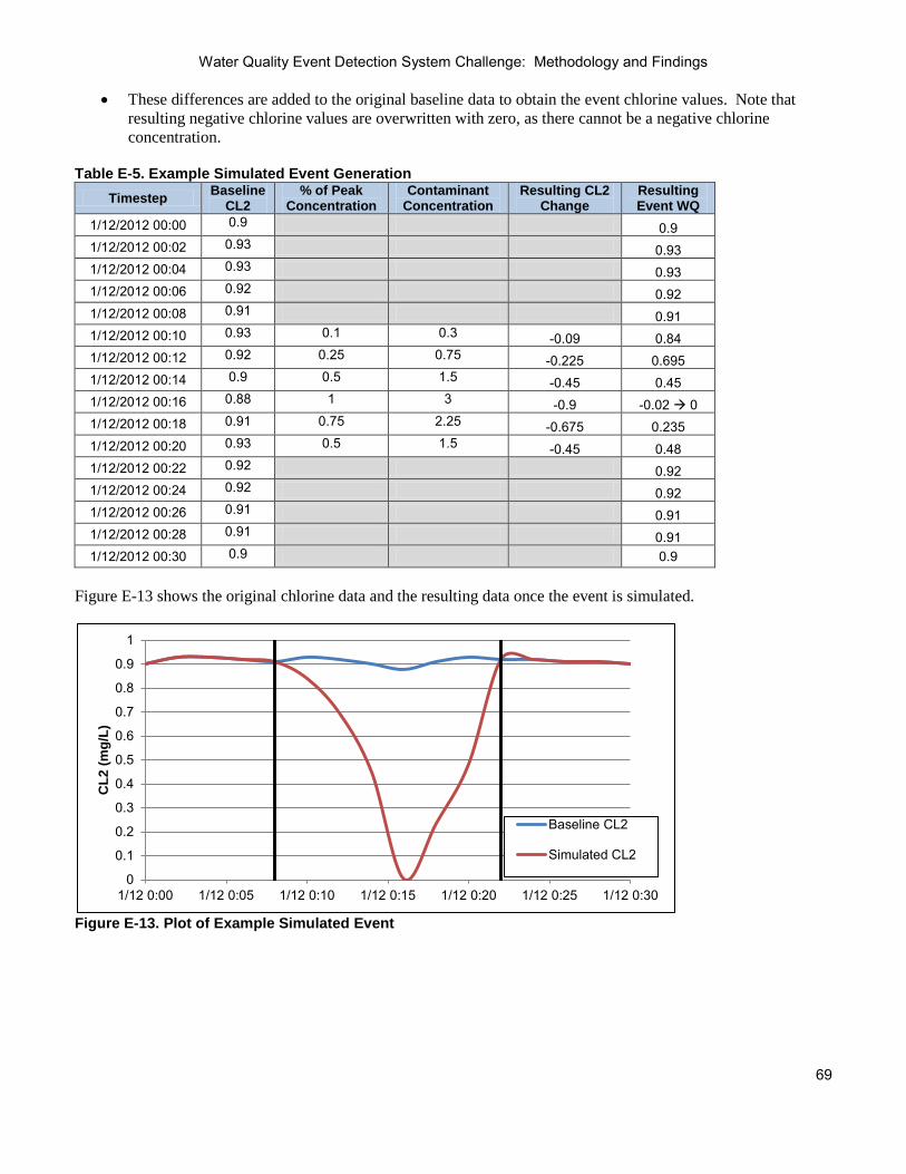
Water Quality Event Detection System Challenge: Methodology and Findings
69
• These differences are added to the original baseline data to obtain the event chlorine values. Note that resulting negative chlorine values are overwritten with zero, as there cannot be a negative chlorine concentration.
Table E-5. Example Simulated Event Generation
Timestep Baseline CL2
% of Peak Concentration
Contaminant Concentration
Resulting CL2 Change
Resulting Event WQ
1/12/2012 00:00 0.9 0.9 1/12/2012 00:02 0.93 0.93 1/12/2012 00:04 0.93 0.93 1/12/2012 00:06 0.92 0.92 1/12/2012 00:08 0.91 0.91 1/12/2012 00:10 0.93 0.1 0.3 -0.09 0.84 1/12/2012 00:12 0.92 0.25 0.75 -0.225 0.695 1/12/2012 00:14 0.9 0.5 1.5 -0.45 0.45 1/12/2012 00:16 0.88 1 3 -0.9 -0.02 0 1/12/2012 00:18 0.91 0.75 2.25 -0.675 0.235 1/12/2012 00:20 0.93 0.5 1.5 -0.45 0.48 1/12/2012 00:22 0.92 0.92 1/12/2012 00:24 0.92 0.92 1/12/2012 00:26 0.91 0.91 1/12/2012 00:28 0.91 0.91 1/12/2012 00:30 0.9 0.9
Figure E-13 shows the original chlorine data and the resulting data once the event is simulated.
0
0.1
0.2
0.3
0.4
0.5
0.6
0.7
0.8
0.9
1
1/12 0:00 1/12 0:05 1/12 0:10 1/12 0:15 1/12 0:20 1/12 0:25 1/12 0:30
CL2
(mg/
L)
Baseline CL2
Simulated CL2
Figure E-13. Plot of Example Simulated Event

Water Quality Event Detection System Challenge: Methodology and Findings
70
Appendix F: ROC Curves and the Area under the Curve This appendix is primarily intended for readers experienced with algorithm evaluation. ROC curves have been used regularly to compare EDSs. The area under these curves has also been used to evaluate performance. However, neither is included in this report. The curves in Section 4.2.2 are similar to ROC curves in that performance is shown for a variety of alert threshold settings. But the data presented on the plots is different. The authors of this document question use of the pure ROC curve or the area underneath for EDS evaluation, as described below. F.1 ROC Overview ROC curves are used in a variety of decision making applications including medicine and data mining. They illustrate the ability of an algorithm to accurately discriminate between normal and abnormal samples at a variety of discrimination thresholds. When constructing a ROC curve, the test or algorithm being evaluated analyzes “samples” and produces what in this document is referred to as a level of abnormality for each. Using a variety of threshold settings, each sample is classified as a true negative, false negative, false positive, or true positive, as shown in Figure F-1. For example, in a test to detect strep throat, the “samples” would be the patients, their actual characterization would be whether or not they have strep throat, and the algorithm indicator would be the test results. So if a patient did not have strep throat (they were actually normal) but at the current threshold setting the test indicated that they did (the algorithm indicated abnormal), the patient would represent a false positive.
Figure F-1. Sample Classifications Based on Actual and Algorithm Indication The ROC curve is then constructed by making a point for each threshold, showing the test’s false positive rate for that threshold (the percentage of normal samples incorrectly identified as abnormal) versus the true positive rate (the percentage of abnormal samples that were correctly identified as such). Figure F-2 shows a sample ROC curve in which five threshold settings were tested. For example, for the threshold that produced the large point on this curve, the test incorrectly indicated that 3% of the healthy patients had strep throat, and correctly identified strep throat in 70% of patients that were sick (leaving the other 30% of patients with strep throat being told they did not have it). Optimal performance occurs at the top left of this plot, with low false positives and high true positives. Thus, the closer the curve is to the y-axis, the greater the area under the curve. This area is often used to determine which test or algorithm is better as a whole – looking at a range of performance that could be achieved instead of a specific configuration that might or might not be reproducible in another setting.

Water Quality Event Detection System Challenge: Methodology and Findings
71
0%
20%
40%
60%
80%
100%
0% 20% 40% 60% 80% 100%
True
Pos
itive
Rat
e
False Positive Rate Figure F-2. Sample ROC Curve F.2 Difficulties for EDS Evaluation This section describes why ROC curves were not used in the EDS Challenge. F.2.1 Difficulties with ROC Curves for EDS evaluation The difficulty with creating a ROC curve for EDS evaluation is in identifying the “samples.” EDS researchers using ROC curves have generally considered each timestep to be a sample, and thus each baseline timestep is classified as a true negative or false positive, and each timestep during an event is classified as a true positive or false negative. However, utilities are generally only notified of the first timestep of an alert. During a three hour abnormal WQ event, a utility would be pleased to get an alert early in the event. They would not care (or probably even notice) if the EDS remained in alerting mode for the duration of the event. Likewise, it would be just the first timestep of an invalid alert for which a utility would be notified. The utility response would be the same regardless of alert length. Considering each timestep separately gives EDSs with longer alerts a major disadvantage when calculating the false positive rate. Using this method, an EDS that produced a two hour alert once a month would appear equivalent to an EDS that produced a two minute alert twice a day! Thus, it is the author’s opinion that this type of ROC curve is not valid for EDS evaluation or comparison. However, for those that are interested, this type of curve can be generated using the data in Appendix G: the percentage of baseline timesteps that are false positives (x-axis) and the average percentage of event timesteps the EDS alerts on (y-axis) are provided. It seems clear that for events, the ideal definition is to consider each as a whole and classify each event as a true positive (detected) or false negative (missed), as was done in the curves in Section 4.2.2. But there is no obvious equivalent method for capturing invalid alerts. One proposed solution is to select “sample” periods in the baseline data and classify them based on if an alert occurred during that period. For example, each day of the dataset could be considered as a sample, and any day where an invalid alert occurred could be considered a false positive and each day without an alert would be a true negative.

Water Quality Event Detection System Challenge: Methodology and Findings
72
However, the percentage of these periods for which an invalid alert occurs would depend heavily on the length of the data periods selected. For example, it would be much more likely that an alert would occur during a random day-long period than an hour-long period. Also, this method would not account for repeated alerts: an EDS that produced 20 invalid alerts during the defined sample period would be assigned one false positive – the same as an EDS that alerted only once. Thus, instead of trying to define false positives, Section 4.2.2 uses invalid alert frequency for the x-axis. F.2.2 Difficulties with Area under a ROC Curve for EDS evaluation Even assuming that a valid ROC curve could be produced, the authors of this document do not believe that the area under the curve is a valid measure of performance. As discussed in Section 4.2.2, only a small portion of the x-axis is of practical interest to utilities. For example, there is little value in comparing detection rates when an EDS is alarming 80% of the time, as no utility would tolerate such performance. A solution to this would be to identify an acceptable range (perhaps 0% to 5%) and only calculate the area under this portion of the curve. In addition, the area under the curve can be misleading. Figure F-3 shows an example of two curves with an identical area under the curve (50%). The performance of the two EDSs is very different, however. Though neither EDS has great performance, a utility would certainly not select the one shown in green: the EDS does not detect any events unless it is alerting over 50% of the time!
0%
20%
40%
60%
80%
100%
0% 20% 40% 60% 80% 100%
True
Pos
itive
Rat
e
False Positive Rate Figure F-3. Two Sample ROC Curves with the Same Area Under the Curve The area under the ROC curve strongly depends on the number of configured points selected. In Figure F-2, the black and gray lines show what the curve would look like if the point (3%, 70%) were included or not included, respectively. The area in the triangle formed by that point being included or not included is very significant. As each EDS’s standard variability is unique, there is no clear way to determine the number of points necessary for a fair comparison (aside from just using a very large number of points). Also, use of the points (0,0) and (1,1) for all EDSs seems inconsequential, though the triangle formed as these are connected to the next closest points certainly impacts the area under the curve.

Water Quality Event Detection System Challenge: Methodology and Findings
73
Appendix G: Key Terms and Additional Results This appendix is included primarily for individuals familiar with EDS evaluation who want to do a more detailed investigation of the EDS output. Many more analyses could be completed using the EDS output from the Challenge than are presented in this report. This appendix includes some detailed metrics generated using EDDIES-ET (described in Appendix A). For each EDS and location, two tables of information are included in this appendix. The first table includes three metrics that do not depend on the alert threshold or alert status.
• The median and standard deviation of the level of abnormality are intended to give users a sense of the EDSs’ typical output, both on baseline and event data. The actual values are somewhat meaningless, but comparison across event and non-event periods, locations, and EDSs can provide interesting insight into each EDS’s output. For example, the impact of EDS configuration can be seen by comparing ana::tool’s output across monitoring locations. The median level of abnormality for Station B was 0.108 with a standard deviation of 0.27, whereas Station D had a median level of 0.01 and standard deviation of 0.15. Thus Station B’s median level of abnormality was 67 times that for Station D, though Station D’s output was more variable.
• Net response is a measure of the EDS’s reaction to simulated events. It is a nuanced metric and thus is not
described in this document. Its value is included for those familiar with the metric, and a description can be found in the EDDIES-ET User’s Guide.
• Trigger accuracy is the ratio of trigger parameters correctly identified during a detected simulated
contamination event to the total number of parameters manipulated in that event. For example, contaminant C5 impacts TOC and conductivity. If the EDS outputted TOC for any detected event timestep using C5 but never identified conductivity, the trigger accuracy would be 50% (one out of two of the impacted parameters were identified).
EDS developers had the option of outputting trigger parameters to indicate the WQ parameter(s) causing an increase in level of abnormality. CANARY, OptiEDS, and BlueBoxTM outputted trigger parameters, while ana::tool and Event Monitor did not.
The second table expands on the results presented in Section 4.2.2, and metrics are presented for various alert thresholds. The metrics are grouped into overall summary metrics, those related to and calculated for baseline data, and those calculated for simulated events. The following key terms are used in this table. Testing Data
• Baseline Data: Raw data from each monitoring station used for testing. An EDS should not alert on baseline data.
• Baseline Timestep: A timestep of baseline data. EDSs should not alert on baseline timesteps. Timesteps during baseline events are not considered baseline timesteps.
• Baseline Event: As described in Appendix D, a period of anomalous WQ in the raw utility data. An event that was not artificially simulated.
• Event Timestep: A timestep during an event period. This term is used for both baseline events and simulated contamination events. EDSs should alert on event timesteps.

Water Quality Event Detection System Challenge: Methodology and Findings
74
Alerts • Alerting Timestep: A timestep for which the EDS is alerting, or a timestep for which the level of
abnormality is greater than or equal to the specified alert threshold. See Section 3.2 for a detailed discussion of level of abnormality and alert threshold.
• Alert: A continuous sequence of alerting timesteps, and thus one notification to utility staff of a potential WQ anomaly. For this study, alerts separated by less than 30 minutes were considered to be a single alert.
• Invalid alert: An alert that begins on a baseline timestep. • Alert Length: The duration over which an invalid alert occurs, represented in number of timesteps.
Detections
• Detected Event: An event during which at least one alerting timestep occurs. For this study, alerting timesteps within one hour of the last timestep of non-zero concentration for simulated events were considered detected timesteps. This ensured that alerts triggered by WQ changes as the water returned to the baseline (the tail of the event) were counted as detections.
• Time to Detect: The number of event timesteps occurring chronologically before the first alerting timestep. • Percent of Event Timesteps that are Alerting: The average percentage of timesteps in an event that were
alerting timesteps. Thus if an EDS alerted for six of the 24 event timesteps in an event using the steep profile, the percentage of event timesteps alerting would be 25%.
Two non-numeric values show up in this table. NA indicates that values were not calculated for the field. This appears for EDSs that did not output trigger parameters and for baseline event metrics for locations with no identified baseline events. ND stands for “not detected” and is entered if the EDS did not detect any events (e.g., a minimum time to detect cannot be calculated if no events were detected).
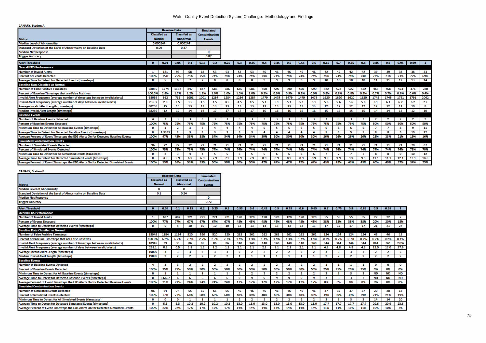
Water Quality Event Detection System Challenge: Methodology and Findings
75

Water Quality Event Detection System Challenge: Methodology and Findings
76
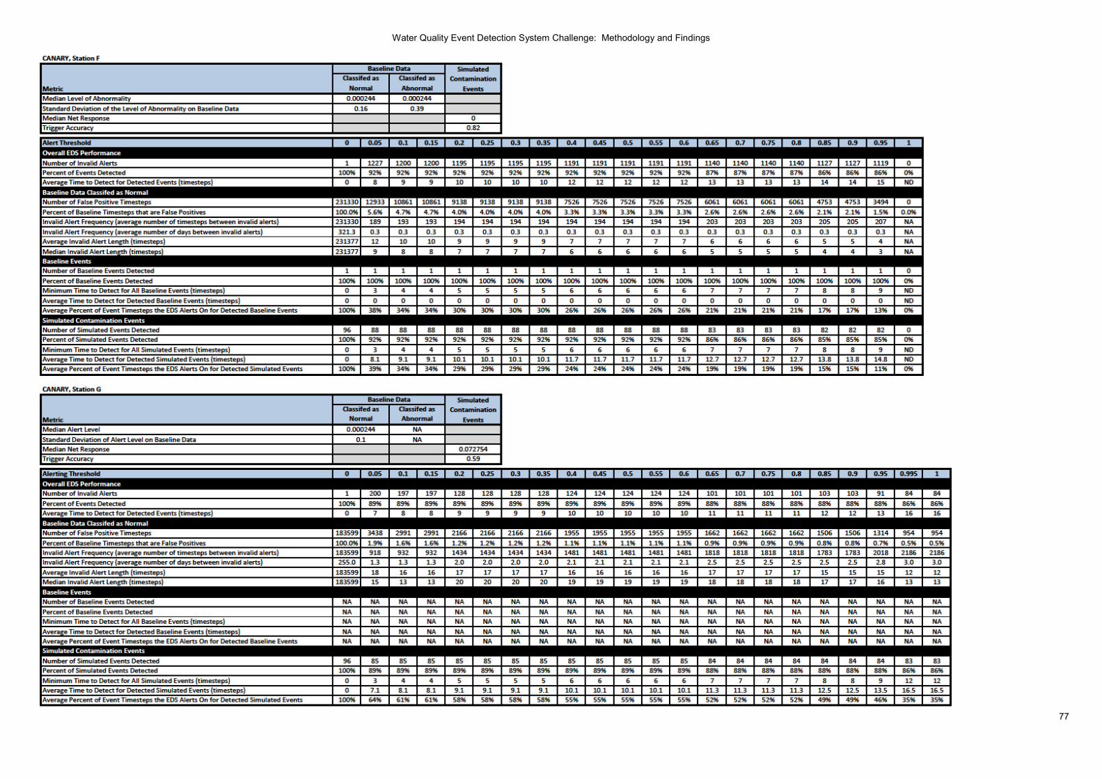
Water Quality Event Detection System Challenge: Methodology and Findings
77

Water Quality Event Detection System Challenge: Methodology and Findings
78

Water Quality Event Detection System Challenge: Methodology and Findings
79

Water Quality Event Detection System Challenge: Methodology and Findings
80

Water Quality Event Detection System Challenge: Methodology and Findings
81

Water Quality Event Detection System Challenge: Methodology and Findings
82

Water Quality Event Detection System Challenge: Methodology and Findings
83

Water Quality Event Detection System Challenge: Methodology and Findings
84