walmart brand guidelines
TRANSCRIPT
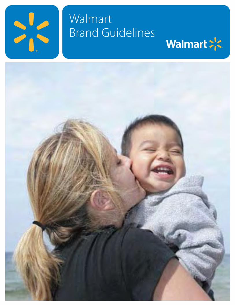
WalmartBrand GuidelinesWalmartBrand Guidelines
Table of Contents
Our BrandWho is Our Customer 1.0
Price-Value Shoppers 1.1
Brand-Aspirational Shoppers 1.2
Price-Sensitive Affluent Shoppers 1.3
What is Our Brand Identity 1.4
Our Company's Purpose 1.5
Our Positioning, Brand Character, and Commitment 1.6
Our Brand Personality Traits 1.7
Our Look and Feel Our Look and Feel 2.0
Logo Specifications 2.2
Logo with Retail Tagline Specifications 2.4
Using the Purpose Statement 2.6
Incorrect Use of the Purpose Statement 2.7
Using the Retail Tagline without the Logo 2.8
Using the Retail Tagline with the Half-Spark 2.10
Incorrect Use of the Retail Tagline 2.11
Using the Logo with Internal Department Names 2.12
Examples of Department Type Treatments 2.13
Using the Logo with Multi-line Department Names 2.14
Examples of Multi-line Department Names 2.15
Examples of Department Type Treatment Applications 2.16
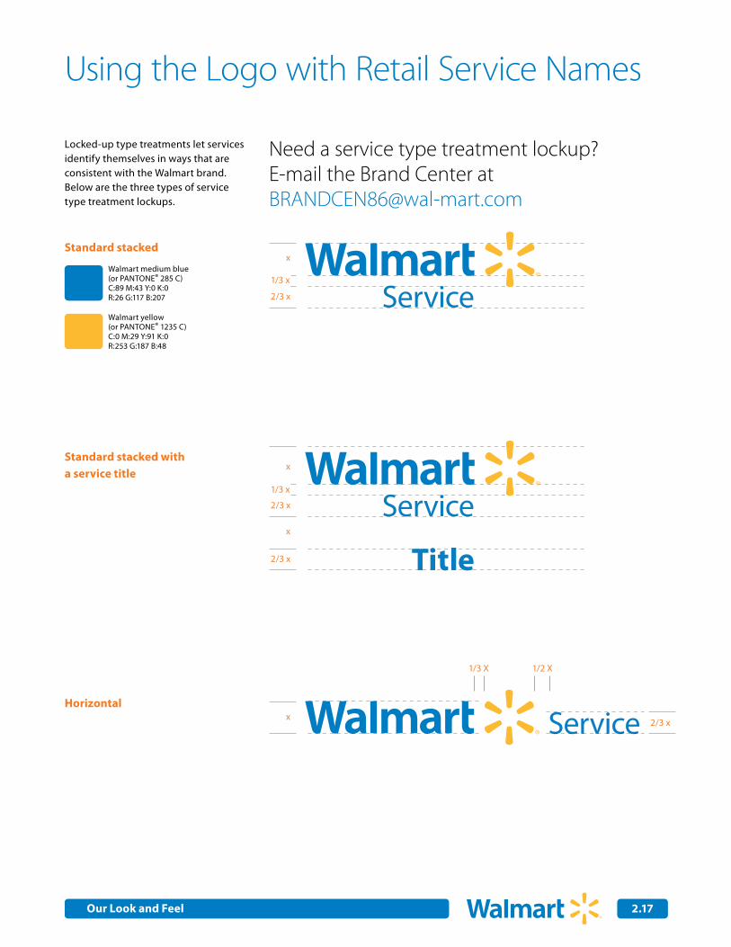
Using the Logo with Retail Service Names 2.17
Examples of Walmart Retail Service Type Treatments 2.18
Examples of Walmart Service Type Treatments in Applications 2.19
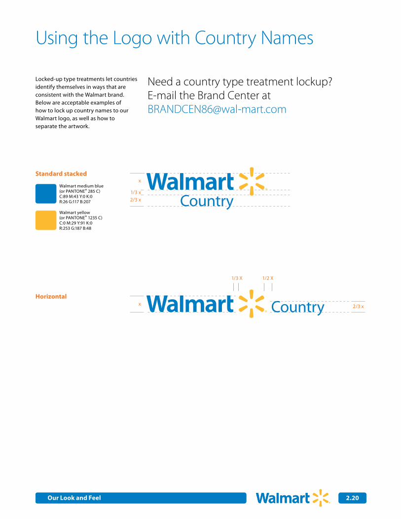
Using the Logo with Country Names 2.20
Example of Country Type Treatments 2.21
Example of Country Type Treatment Applications 2.22Using the Logo Country Names & Multi-line Department Names 2.23
Discontinued Logo/ Tagline Treatments 2.24
Incorrect use of the Logo 2.25
Our Primary Color Pallete
Our Core Colors 3.0
Color Ratio 3.1
Our Typeface
Myriad Pro 4.0
Typographic Style 4.1
Using Type Effectively 4.2
Applying the Full Spark Graphic
Spark in Color 5.0
The Full Spark in Action 5.1
Applying the Half-Spark Graphic
Half-Spark in Color/
Applying the Half-Spark Graphic: Products 6.0
Applying the Half-Spark Graphic: Inspiring Ideas 6.1
Applying the Half-Spark Graphic: Inspired People 6.2
Applying Talkboxes
Talkbox Attributes 7.0
Applying Talkboxes 7.1
Examples of Talkbox Usage 7.3
Photographic CreativeDirectionPhotographic Creative Direction 8.0
Lifestyle 8.1
Incorrect Lifestyle Imagery 8.6
Product 8.7
Incorrect Product Imagery 8.10
Copyright 2009 Wal-Mart Stores, Inc. All rights reserved. Unauthorized duplication is a violation of all applicable laws.
Food 8.11
Incorrect Food Imagery 8.14
Tone and VoiceOur Tone and Voice 9.0
Communicating in the Walmart Voice: the Role of Our Brand Personality Traits 9.1
Trait #1: Caring 9.2
Trait #2: Real 9.3
Trait #3: Innovative 9.4
Trait #4: Straightforward 9.5
Trait #5: Positive 9.6
The 16 Ingredients for Cooking up Copy Walmart Style 9.7
Internal CommunicationResourcesPowerPoint Templates with Logo 10.0
PowerPoint Templates Logo and Retail Tagline 10.1
PowerPoint Templates Logo and Country Lockup 10.2
Stationery with Logo 10.3
Stationery with Logo and Retail Tagline 10.4
Stationery with Logo and Country Lockup 10.5
E-mail Signature with Purpose Statement 10.6
E-mail Signature with Retail Tagline 10.7
For general questions about
our guidelines, please contact:
Brand Center Help
vm: (479) 277-7859
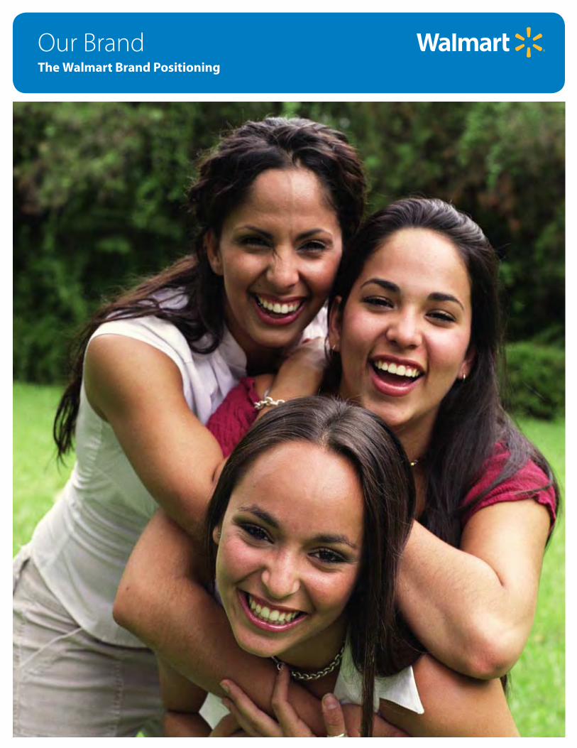
Our BrandThe Walmart Brand Positioning
Our Brand 1.0
Effective communications? They’re just not possible unless you know who you’re talking to.
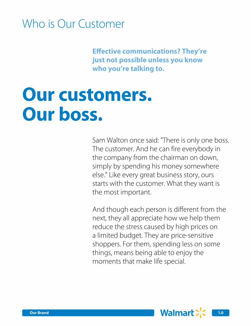
Who is Our Customer
Sam Walton once said: "There is only one boss. The customer. And he can fire everybody in the company from the chairman on down, simply by spending his money somewhere else." Like every great business story, ours starts with the customer. What they want is the most important.
And though each person is different from the next, they all appreciate how we help them reduce the stress caused by high prices on a limited budget. They are price-sensitive shoppers. For them, spending less on some things, means being able to enjoy the moments that make life special.
Our customers. Our boss.
Our Brand 1.1
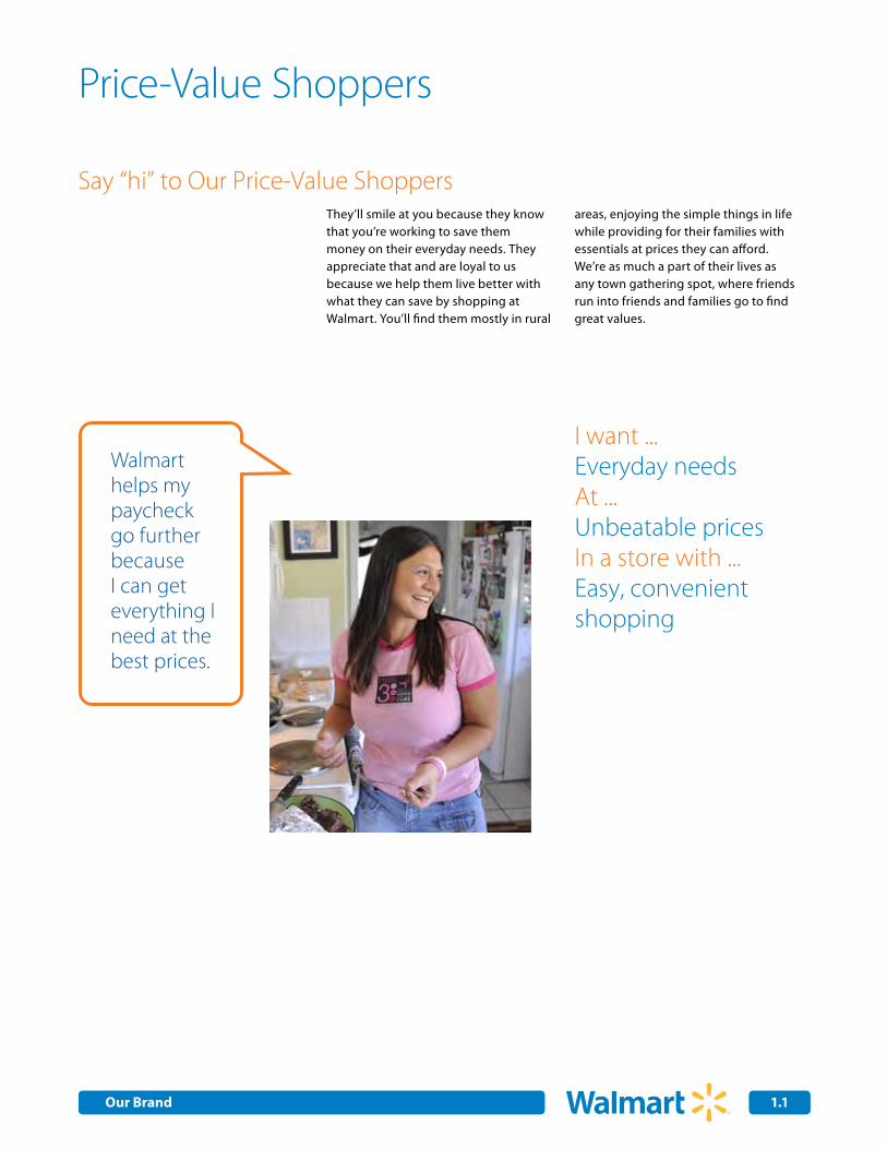
Price-Value Shoppers
Say “hi” to Our Price-Value ShoppersThey’ll smile at you because they know that you’re working to save them money on their everyday needs. They appreciate that and are loyal to us because we help them live better with what they can save by shopping at Walmart. You’ll find them mostly in rural
areas, enjoying the simple things in life while providing for their families with essentials at prices they can afford. We’re as much a part of their lives as any town gathering spot, where friends run into friends and families go to find great values.
Walmart helps my paycheck go further because I can get everything I need at the best prices.
I want ...Everyday needsAt ...Unbeatable pricesIn a store with ...Easy, convenient shopping
Walmart helps me save money on the basics so I have to spend on the brands that are important to me.
Our Brand 1.2
Brand-Aspirational Shoppers
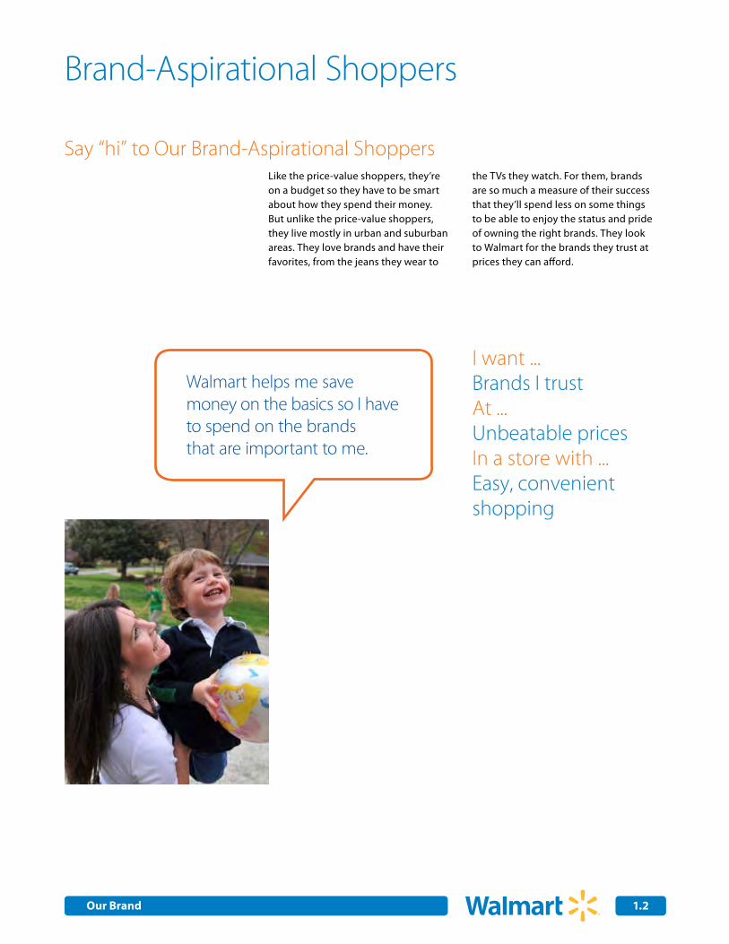
Say “hi” to Our Brand-Aspirational ShoppersLike the price-value shoppers, they’re on a budget so they have to be smart about how they spend their money. But unlike the price-value shoppers, they live mostly in urban and suburban areas. They love brands and have their favorites, from the jeans they wear to
the TVs they watch. For them, brands are so much a measure of their success that they’ll spend less on some things to be able to enjoy the status and pride of owning the right brands. They look to Walmart for the brands they trust at prices they can afford.
I want ...Brands I trustAt ...Unbeatable pricesIn a store with ...Easy, convenient shopping
Our Brand 1.3
Price-Sensitive Affluent Shoppers
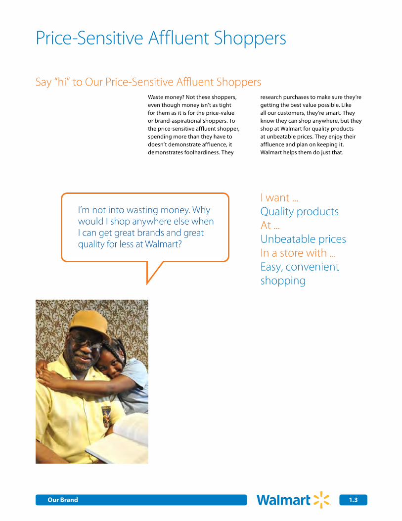
Say “hi” to Our Price-Sensitive Affluent ShoppersWaste money? Not these shoppers, even though money isn’t as tight for them as it is for the price-value or brand-aspirational shoppers. To the price-sensitive affluent shopper, spending more than they have to doesn’t demonstrate affluence, it demonstrates foolhardiness. They
research purchases to make sure they’re getting the best value possible. Like all our customers, they’re smart. They know they can shop anywhere, but they shop at Walmart for quality products at unbeatable prices. They enjoy their affluence and plan on keeping it. Walmart helps them do just that.
I’m not into wasting money. Why would I shop anywhere else when I can get great brands and great quality for less at Walmart?
I want ...Quality productsAt ...Unbeatable pricesIn a store with ...Easy, convenient shopping
Our Brand 1.4
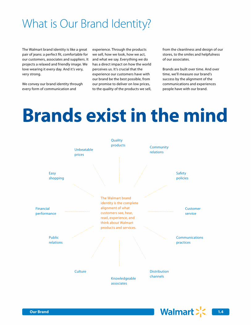
Brands exist in the mind
The Walmart brand identity is the complete alignment of what customers see, hear, read, experience, and think about Walmart products and services.
Qualityproducts Community
relations
Easy shopping
Customerservice
Distributionchannels
Communications practices
Culture
Public relations
Financialperformance
Safetypolicies
Unbeatable prices
What is Our Brand Identity?
The Walmart brand identity is like a great pair of jeans: a perfect fit, comfortable for our customers, associates and suppliers. It projects a relaxed and friendly image. We love wearing it every day. And it’s very, very strong.
We convey our brand identity through every form of communication and
experience. Through the products we sell, how we look, how we act, and what we say. Everything we do has a direct impact on how the world perceives us. It’s crucial that the experience our customers have with our brand be the best possible, from our promise to deliver on low prices, to the quality of the products we sell,
from the cleanliness and design of our stores, to the smiles and helpfulness of our associates.
Brands are built over time. And over time, we’ll measure our brand’s success by the alignment of the communications and experiences people have with our brand.
Knowledgeable associates
Our Brand 1.5
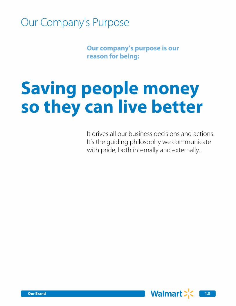
Our company’s purpose is our reason for being:
It drives all our business decisions and actions. It’s the guiding philosophy we communicate with pride, both internally and externally.
Our Company's Purpose
Saving people moneyso they can live better
Our Brand 1.6
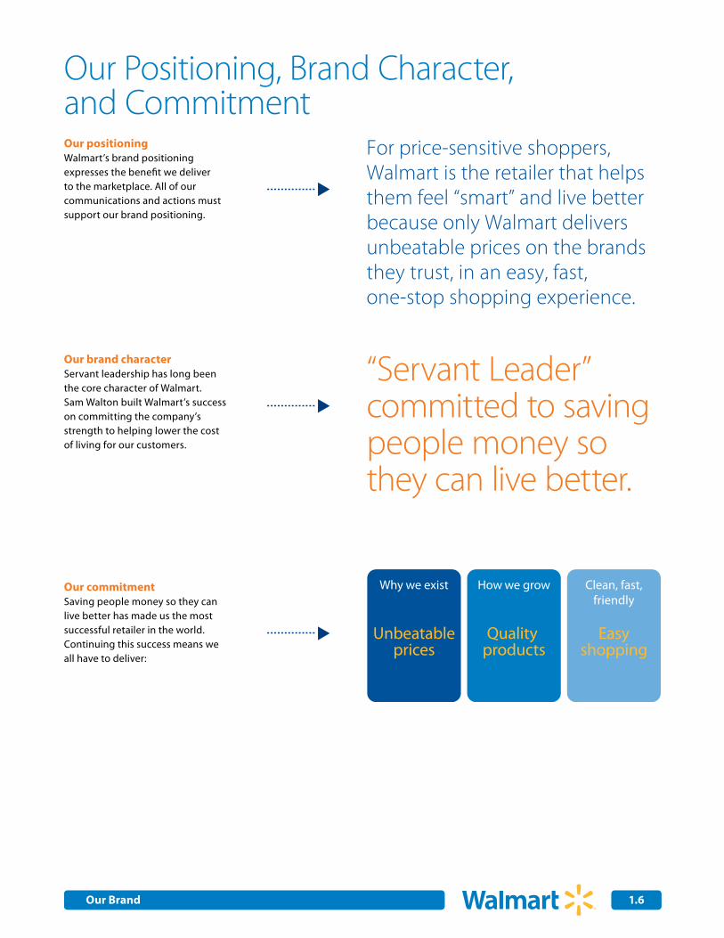
Our positioningWalmart’s brand positioning expresses the benefit we deliver to the marketplace. All of our communications and actions must support our brand positioning.
For price-sensitive shoppers, Walmart is the retailer that helps them feel “smart” and live better because only Walmart delivers unbeatable prices on the brands they trust, in an easy, fast, one-stop shopping experience.
Our brand characterServant leadership has long been the core character of Walmart. Sam Walton built Walmart’s success on committing the company’s strength to helping lower the cost of living for our customers.
Our commitmentSaving people money so they can live better has made us the most successful retailer in the world. Continuing this success means we all have to deliver:
“Servant Leader”committed to saving people money so they can live better.
Our Positioning, Brand Character, and Commitment
Easyshopping
Clean, fast, friendly
Quality products
How we grow
Unbeatableprices
Why we exist
Our Brand 1.7
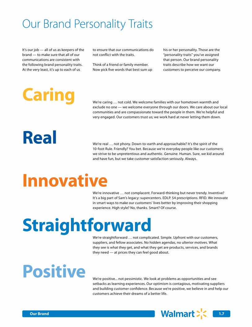
Caring
Real
Innovative
Straightforward
Positive
We’re caring … not cold. We welcome families with our hometown warmth and exclude no one — we welcome everyone through our doors. We care about our local communities and are compassionate toward the people in them. We’re helpful and very engaged. Our customers trust us; we work hard at never letting them down.
We’re real … not phony. Down-to-earth and approachable? It’s the spirit of the 10-foot Rule. Friendly? You bet. Because we’re everyday people like our customers; we strive to be unpretentious and authentic. Genuine. Human. Sure, we kid around and have fun, but we take customer satisfaction seriously. Always.
Our Brand Personality Traits
It's our job — all of us as keepers of the brand — to make sure that all of our communications are consistent with the following brand personality traits. At the very least, it's up to each of us
to ensure that our communications do not conflict with the traits.
Think of a friend or family member. Now pick five words that best sum up
his or her personality. Those are the “personality traits” you’ve assigned that person. Our brand personality traits describe how we want our customers to perceive our company.
We’re innovative … not complacent. Forward-thinking but never trendy. Inventive? It’s a big part of Sam’s legacy: supercenters. EDLP. $4 prescriptions. RFID. We innovate in smart ways to make our customers’ lives better by improving their shopping experience. High style? No, thanks. Smart? Of course.
We’re straightforward … not complicated. Simple. Upfront with our customers, suppliers, and fellow associates. No hidden agendas, no ulterior motives. What they see is what they get, and what they get are products, services, and brands they need — at prices they can feel good about.
We're positive... not pessimistic. We look at problems as opportunities and see setbacks as learning experiences. Our optimism is contagious, motivating suppliers and building customer confidence. Because we're positive, we believe in and help our customers achieve their dreams of a better life.
2.0Internal Corporate Communications
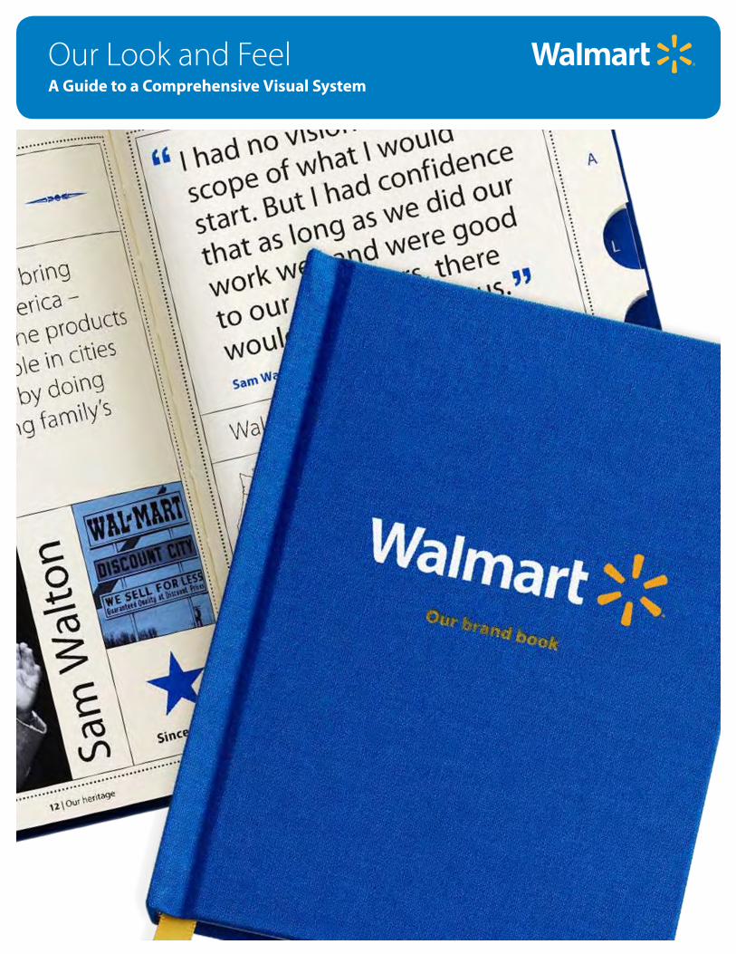
Our Look and FeelA Guide to a Comprehensive Visual System
2.0Our Look and Feel
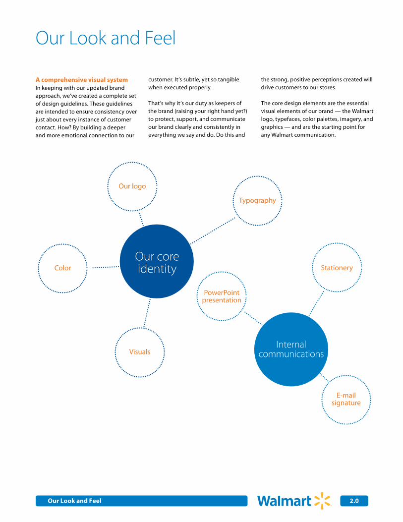
Our Look and Feel
A comprehensive visual systemIn keeping with our updated brand approach, we’ve created a complete set of design guidelines. These guidelines are intended to ensure consistency over just about every instance of customer contact. How? By building a deeper and more emotional connection to our
customer. It’s subtle, yet so tangible when executed properly.
That’s why it’s our duty as keepers of the brand (raising your right hand yet?) to protect, support, and communicate our brand clearly and consistently in everything we say and do. Do this and
the strong, positive perceptions created will drive customers to our stores.
The core design elements are the essential visual elements of our brand — the Walmart logo, typefaces, color palettes, imagery, and graphics — and are the starting point for any Walmart communication.
E-mailsignature
Our coreidentity
InternalcommunicationsVisuals
PowerPointpresentation
Stationery
Our logo
Color
Typography

2.0Internal Corporate Communications 2.0Our Core IdentityOur Look and Feel
Walmart or Wal-Mart?
Consistency. It’s a powerful idea and one that can’t be overstated. Especially when it comes to our logo and the way we express our name in written copy. So please take a few moments to review the following brief yet very important style direction:
We hear it all the time: “How am I supposed to write our company’s name?” The answer is simple: unless you're in the legal departmentor investor relations, you write our company name just as it’s writtenin our logo: Walmart.
The right way: When writing, just keep it simple: Walmart
Previous identity and logo New identity and logo
Corporate or International
U.S. Retail Stores
2.1
2.2
Logo Specifications
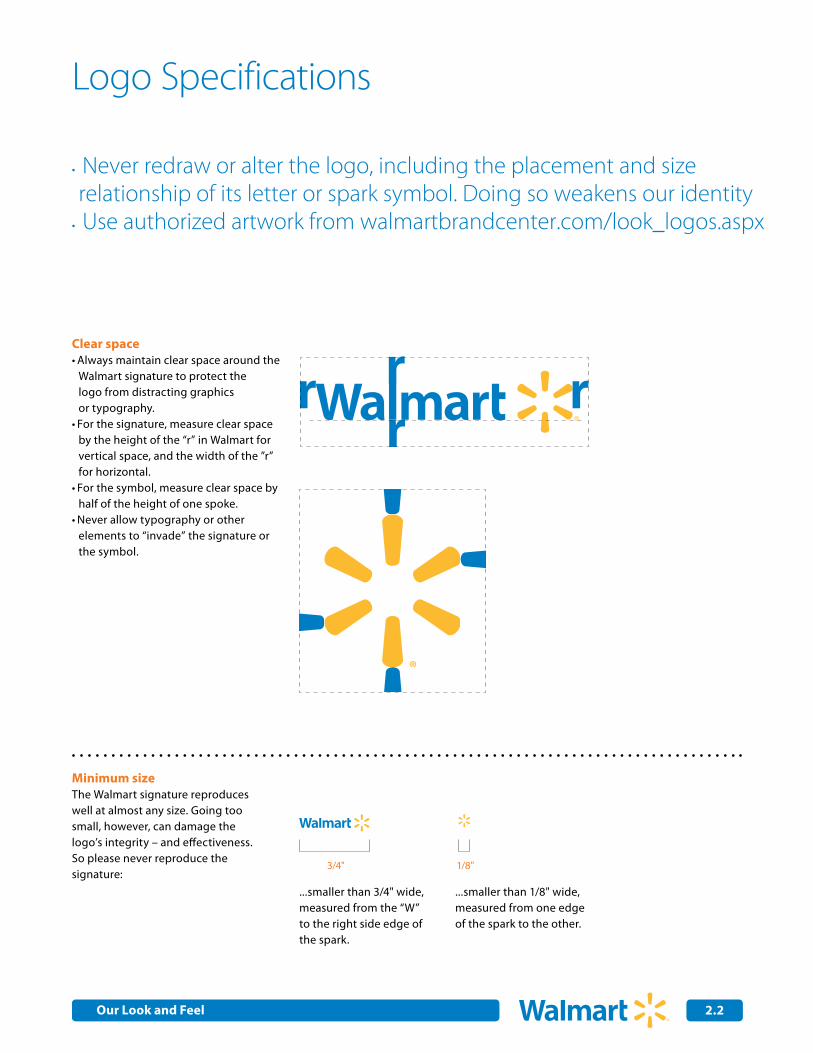
Never redraw or alter the logo, including the placement and size •
relationship of its letter or spark symbol. Doing so weakens our identity Use authorized artwork from walmartbrandcenter.com/look_logos.aspx•
3/4"
Clear spaceAlways maintain clear space around the •Walmart signature to protect the logo from distracting graphics or typography.For the signature, measure clear space •by the height of the “r” in Walmart for vertical space, and the width of the ”r” for horizontal.For the symbol, measure clear space by •half of the height of one spoke.Never allow typography or other •elements to “invade” the signature or the symbol.
Minimum sizeThe Walmart signature reproduces well at almost any size. Going too small, however, can damage the logo’s integrity – and effectiveness. So please never reproduce the signature:
...smaller than 3/4" wide, measured from the “W” to the right side edge of the spark.
...smaller than 1/8" wide, measured from one edge of the spark to the other.
1/8"
Our Look and Feel
2.3
Logo Specifications (cont.)
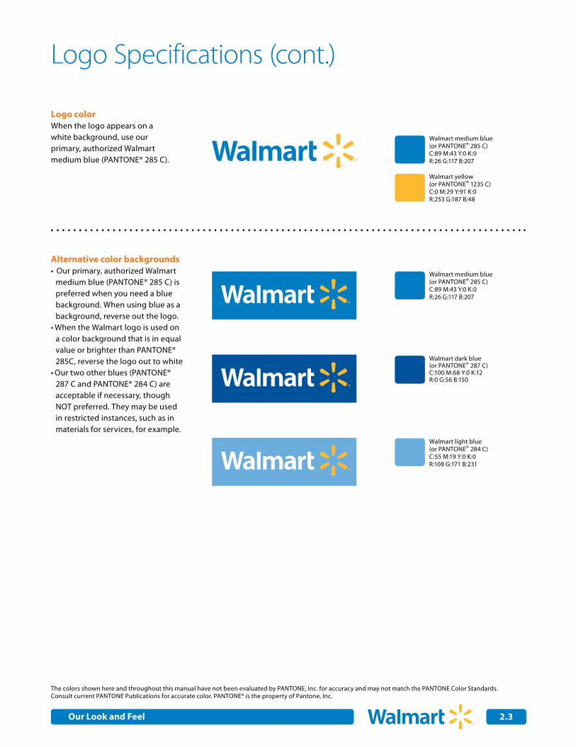
Logo colorWhen the logo appears on a white background, use our primary, authorized Walmart medium blue (PANTONE® 285 C).
Alternative color backgrounds Our primary, authorized Walmart •medium blue (PANTONE® 285 C) is preferred when you need a blue background. When using blue as a background, reverse out the logo.When the Walmart logo is used on •a color background that is in equal value or brighter than PANTONE® 285C, reverse the logo out to whiteOur two other blues (PANTONE® •287 C and PANTONE® 284 C) are acceptable if necessary, though NOT preferred. They may be used in restricted instances, such as in materials for services, for example.
The colors shown here and throughout this manual have not been evaluated by PANTONE, Inc. for accuracy and may not match the PANTONE Color Standards. Consult current PANTONE Publications for accurate color. PANTONE® is the property of Pantone, Inc.
Walmart medium blue (or PANTONE® 285 C)C:89 M:43 Y:0 K:0R:26 G:117 B:207
Walmart dark blue (or PANTONE® 287 C)C:100 M:68 Y:0 K:12R:0 G:56 B:150
Walmart medium blue (or PANTONE® 285 C)C:89 M:43 Y:0 K:0R:26 G:117 B:207
Walmart light blue (or PANTONE® 284 C)C:55 M:19 Y:0 K:0 R:108 G:171 B:231
Walmart yellow(or PANTONE® 1235 C)C:0 M:29 Y:91 K:0R:253 G:187 B:48
Our Look and Feel
2.0Internal Corporate Communications 2.4
Logo with Retail Tagline Specifications
Taglines are an integral part of conveying a brand image. To maximize its impact and to preserve its unique status, please: Never use it alone or linked to a product or service. Don't change the lockup (how it’s positioned with our logo). And, maybe less obvious but just as important: never recreate the combined
logo and tagline art; use only authorized, original art.
The different rules on how our tagline should be used appear below. Please, never ever create taglines and, of course, don't use any tagline other than our
authorized tagline in any advertising or marketing materials.
For authorized, original artwork for the approved logo and tagline lockup, go to: walmartbrandcenter.com/look_logos.aspx
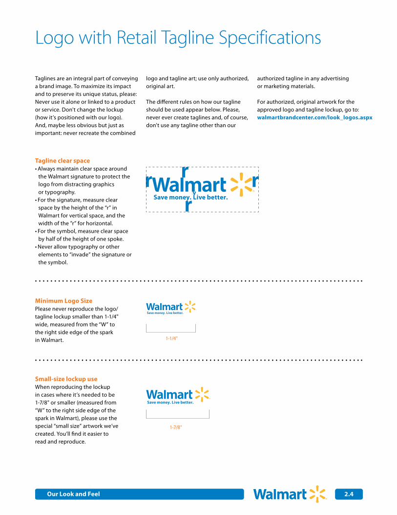
Tagline clear spaceAlways maintain clear space around •the Walmart signature to protect the logo from distracting graphics or typography.For the signature, measure clear •space by the height of the “r” in Walmart for vertical space, and the width of the ”r” for horizontal.For the symbol, measure clear space •by half of the height of one spoke.Never allow typography or other •elements to “invade” the signature or the symbol.
Minimum Logo SizePlease never reproduce the logo/tagline lockup smaller than 1-1/4" wide, measured from the “W” to the right side edge of the spark in Walmart.
Small-size lockup useWhen reproducing the lockup in cases where it’s needed to be 1-7/8" or smaller (measured from “W” to the right side edge of the spark in Walmart), please use the special “small size” artwork we’ve created. You’ll find it easier to read and reproduce.
1-1/4"
1-7/8"
Our Look and Feel
2.0Internal Corporate Communications 2.5
Logo with Retail Tagline Specifications (cont.)
Using the logo and tagline on a color background
Logo with tagline color
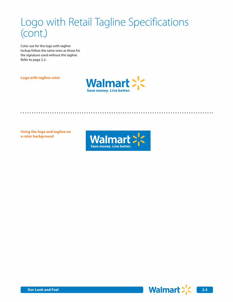
Color use for the logo with tagline lockup follow the same ones as those for the signature used without the tagline. Refer to page 2.2.
Our Look and Feel
2.0Internal Corporate Communications 2.6
Using the Purpose Statement
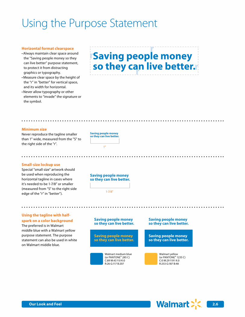
Horizontal format clearspaceAlways maintain clear space around •the "Saving people money so they can live better" purpose statement, to protect it from distracting graphics or typography.Measure clear space by the height of •the “r” in "better" for vertical space, and its width for horizontal.Never allow typography or other •elements to “invade” the signature or the symbol.
Minimum sizeNever reproduce the tagline smaller than 1" wide, measured from the "S" to the right side of the "r".
Small-size lockup useSpecial "small size" artwork should be used when reproducing the horizontal tagline in cases where it’s needed to be 1-7/8" or smaller (measured from “S” to the right side edge of the "r" in "better"). 1-7/8"
1"
Using the tagline with half-spark on a color backgroundThe preferred is in Walmart middle blue with a Walmart yellow purpose statement. The purpose statement can also be used in white on Walmart middle blue.
Walmart medium blue (or PANTONE® 285 C)C:89 M:43 Y:0 K:0R:26 G:117 B:207
Walmart yellow(or PANTONE® 1235 C)C:0 M:29 Y:91 K:0R:253 G:187 B:48
Saving people moneyso they can live better.
Saving people moneyso they can live better.
Saving people moneyso they can live better.
Saving people moneyso they can live better.
Saving people moneyso they can live better.
Saving people moneyso they can live better.
Saving people moneyso they can live better.r r
rr
Our Look and Feel
2.0Internal Corporate Communications 2.7
Incorrect uses of the Purpose Statement
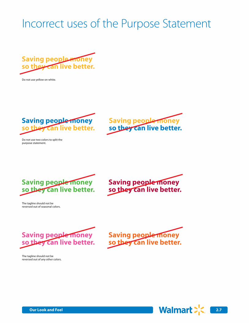
Do not use yellow on white.
Do not use two colors to split thepurpose statement.
The tagline should not be reversed out of seasonal colors.
The tagline should not be reversed out of any other colors.
Saving people moneyso they can live better.
Saving people moneyso they can live better.
Saving people moneyso they can live better.
Saving people moneyso they can live better.
Saving people moneyso they can live better.
Saving people moneyso they can live better.
Saving people moneyso they can live better.
Our Look and Feel
2.8
Using the Retail Tagline without the Logo
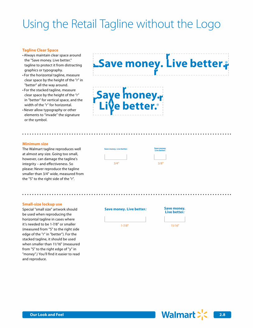
Tagline Clear SpaceAlways maintain clear space around •the "Save money. Live better." tagline to protect it from distracting graphics or typography.For the horizontal tagline, measure •clear space by the height of the "r" in "better" all the way around.For the stacked tagline, measure •clear space by the height of the “r” in "better" for vertical space, and the width of the ”r” for horizontal.Never allow typography or other •elements to “invade” the signature or the symbol.
Minimum sizeThe Walmart tagline reproduces well at almost any size. Going too small, however, can damage the tagline's integrity – and effectiveness. So please: Never reproduce the tagline smaller than 3/4" wide, measured from the "S" to the right side of the "r".
3/4" 3/8"
Small-size lockup useSpecial "small size" artwork should be used when reproducing the horizontal tagline in cases where it’s needed to be 1-7/8" or smaller (measured from “S” to the right side edge of the "r" in "better"). For the stacked tagline, it should be used when smaller than 11/16" (measured from "S" to the right edge of "y" in "money".) You’ll find it easier to read and reproduce.
1-7/8" 11/16"
Our Look and Feel

2.9
Walmart medium blue (or PANTONE® 285 C)C:89 M:43 Y:0 K:0R:26 G:117 B:207
Using the tagline on color backgroundThe preferred version of our tagline used solo is in Walmart yellow, on a Walmart medium blue background.
Walmart yellow(or PANTONE® 1235 C)C:0 M:29 Y:91 K:0R:253 G:187 B:48
Using the tagline in one colorWhen our solo tagline is used on a white background and/or in a one- color application, it should only appear in Walmart medium blue. It can also be reversed out in white.
Walmart medium blue (or PANTONE® 285 C)C:89 M:43 Y:0 K:0R:26 G:117 B:207
Using the tagline in black and whiteWhen use of color is not available:
Produce our tagline in black •When the background is black, •please reverse out
Using the Retail Tagline without the Logo(continued)
Our Look and Feel

2.10
Using the Retail Tagline with the Half-spark
Horizontal format clearspaceAlways maintain clear space around •the "Save money. Live better." tagline with the half-spark, to protect it from distracting graphics or typography.Measure clear space by the height of •the “L” in "Live" for vertical space, and its width for horizontal.Never allow typography or other •elements to “invade” the signature or the symbol.
Minimum sizeNever reproduce the tagline smaller than 3/4" wide, measured from the "S" to the right side of the "r".
Small-size lockup useSpecial "small size" artwork should be used when reproducing the horizontal tagline in cases where it’s needed to be 1-7/8" or smaller (measured from “S” to the right side edge of the "r" in "better"). For the stacked tagline, it should be used when smaller than 11/16" (measured from "S" to the right edge of "y" in "money".) You’ll find it easier to read and reproduce.
1-7/8" 11/16"
3/4" 3/8"
Using the tagline with half-spark on a color backgroundThe preferred is in Walmart middle blue with a Walmart yellow half-spark. When reversed out of a color, the tagline portion should be reversed out in white.
Walmart medium blue (or PANTONE® 285 C)C:89 M:43 Y:0 K:0R:26 G:117 B:207
Walmart yellow(or PANTONE® 1235 C)C:0 M:29 Y:91 K:0R:253 G:187 B:48
Our Look and Feel
2.11
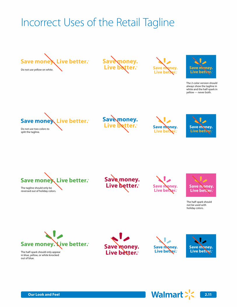
Incorrect Uses of the Retail Tagline
Do not use yellow on white.
Do not use two colors to split the tagline.
The tagline should only be reversed out of holiday colors.
The half-spark should only appear in blue, yellow, or white knocked out of blue.
The 2-color version should always show the tagline in white and the half-spark in yellow — never both.
The half-spark should not be used with holiday colors.
Our Look and Feel

2.0Internal Corporate Communications 2.12
Standard stacked
Horizontal
x
1/3 x2/3 x
Service
Departmentx 2/3 x
1/3 X 1/2 X
Using the Logo with Internal Department NamesLocked-up type treatments let departments identify themselves in ways that are consistent with the Walmart brand. Below are acceptable examples of how to lock up department names to our Walmart logo, as well as how to separate the artwork.
Need a department type treatment lockup? E-mail the Brand Center at [email protected]
Walmart medium blue (or PANTONE® 285 C)C:89 M:43 Y:0 K:0R:26 G:117 B:207
Walmart yellow(or PANTONE® 1235 C)C:0 M:29 Y:91 K:0R:253 G:187 B:48
Department
Title
Smart Network
Our Look and Feel
2.0Internal Corporate Communications 2.13
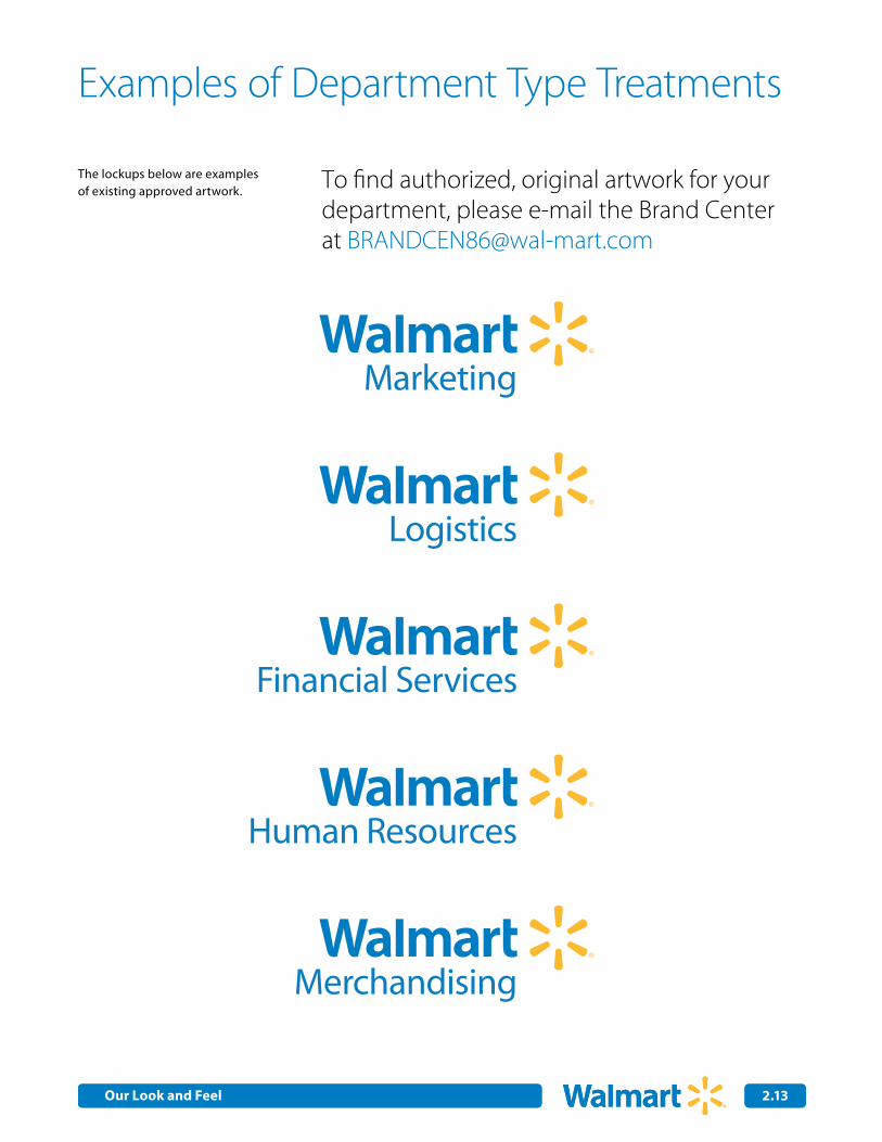
Examples of Department Type Treatments
The lockups below are examples of existing approved artwork. To find authorized, original artwork for your
department, please e-mail the Brand Center at [email protected]
Marketing
Logistics
Financial Services
Human Resources
Merchandising
Our Look and Feel
2.0Internal Corporate Communications 2.14
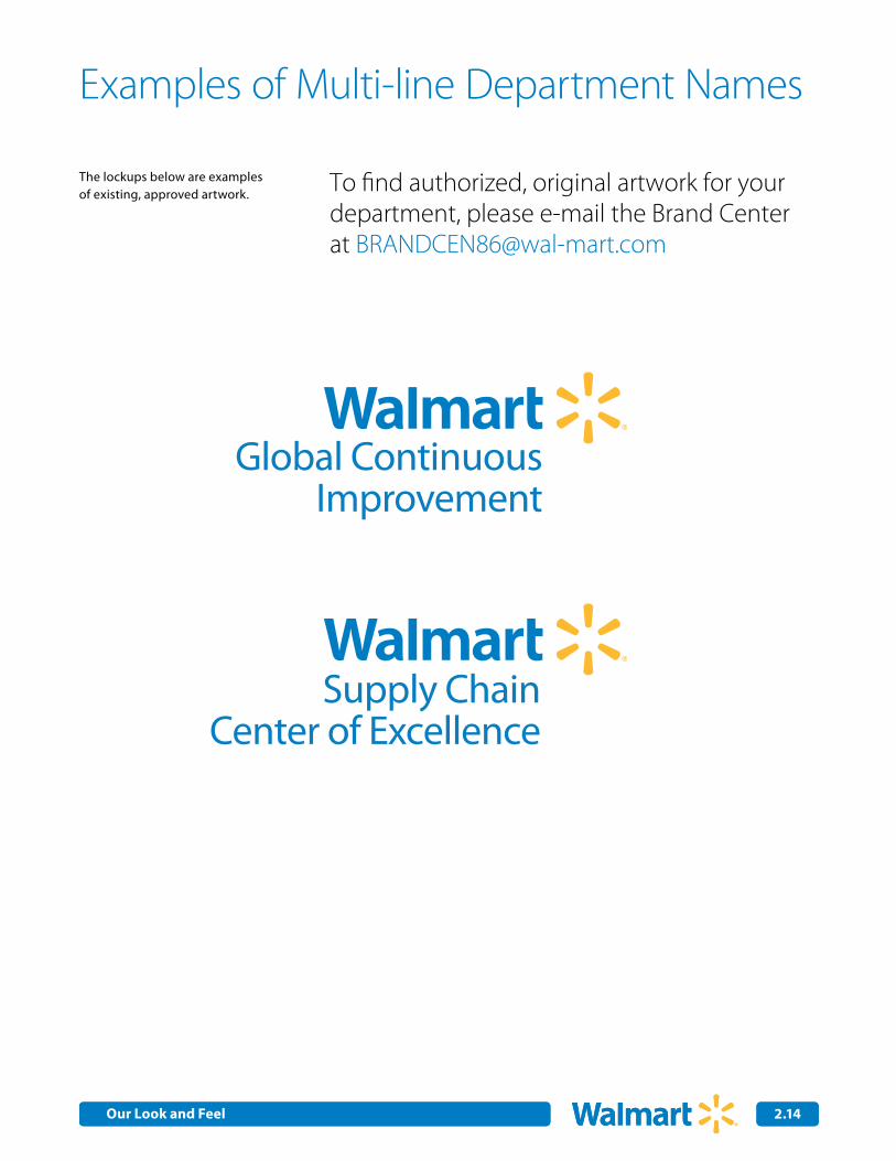
Examples of Multi-line Department Names
The lockups below are examples of existing, approved artwork. To find authorized, original artwork for your
department, please e-mail the Brand Center at [email protected]
Global ContinuousImprovement
Supply ChainCenter of Excellence
Our Look and Feel
2.0Internal Corporate Communications 2.15
Horizontal2-line stack
Horizontal3-line stack
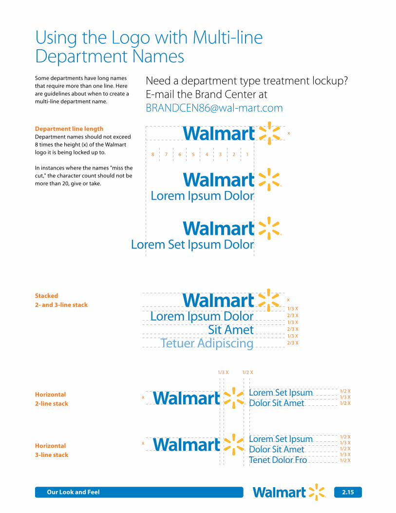
Using the Logo with Multi-lineDepartment NamesSome departments have long names that require more than one line. Here are guidelines about when to create a multi-line department name.
Need a department type treatment lockup? E-mail the Brand Center at [email protected]
Department line lengthDepartment names should not exceed 8 times the height (x) of the Walmart logo it is being locked up to.
In instances where the names "miss the cut," the character count should not be more than 20, give or take.
Stacked2- and 3-line stack
12345678
x
x
1/3 X
1/3 X
1/3 X
2/3 X
2/3 X
2/3 X
Lorem Ipsum DolorSit Amet
Tetuer Adipiscing
Lorem Set Ipsum DolorSit Amet
Tetuer Adipiscing
Lorem Set Ipsum Dolor Sit Amet
Lorem Set Ipsum Dolor Sit AmetTenet Dolor Fro
1/2 X1/3 X1/2 X
x
Lorem Set Ipsum Dolor Sit Amet
Lorem Set Ipsum Dolor Sit AmetTenet Dolor Fro
1/2 X1/3 Xx1/2 X1/3 X1/2 X
1/2 X1/3 X
Lorem Ipsum DolorSit Amet
Tetuer Adipiscing
Our Look and Feel

2.0Internal Corporate Communications 2.16
Examples of DepartmentType Treatment Applications
Office signs
First Last Name One Team. One Dream.
Department
Department
Title
DepartmentDepartment
Below are acceptable examples of how to use type treatment lockups to identify individual departments.
T-shirts
First Last Name One Team. One Dream.
Department
Department
Title
DepartmentDepartment
Front and back of hats
First Last Name One Team. One Dream.
Department
Department
Title
DepartmentDepartment
Our Look and Feel
2.17
Using the Logo with Retail Service Names
Locked-up type treatments let services identify themselves in ways that are consistent with the Walmart brand. Below are the three types of service type treatment lockups.
Need a service type treatment lockup? E-mail the Brand Center at [email protected]
x
1/3 x
2/3 x
x
1/3 x
2/3 x
2/3 x
x
Service
Department
x2/3 x
Standard stacked
Standard stacked witha service title
Horizontal
1/3 X 1/2 X
Walmart medium blue (or PANTONE® 285 C)C:89 M:43 Y:0 K:0R:26 G:117 B:207
Walmart yellow(or PANTONE® 1235 C)C:0 M:29 Y:91 K:0R:253 G:187 B:48
Service
Title
Smart Network
Service
Title
Smart Network
Our Look and Feel
2.18
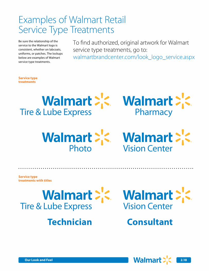
Examples of Walmart RetailService Type TreatmentsBe sure the relationship of the service to the Walmart logo is consistent, whether on labcoats, uniforms, or patches. The lockups below are examples of Walmart service type treatments.
To find authorized, original artwork for Walmart service type treatments, go to: walmartbrandcenter.com/look_logo_service.aspx
Service type treatments
Service type treatments with titles
Pharmacy Tire & Lube Express
Photo Vision Center
Tire & Lube Express
Technician
Vision Center
Consultant
Pharmacy Tire & Lube Express
Photo Vision Center
Tire & Lube Express
Technician
Vision Center
Consultant
Pharmacy Tire & Lube Express
Photo Vision Center
Tire & Lube Express
Technician
Vision Center
Consultant
Pharmacy Tire & Lube Express
Photo Vision Center
Tire & Lube Express
Technician
Vision Center
Consultant
Pharmacy Tire & Lube Express
Photo Vision Center
Tire & Lube Express
Technician
Vision Center
Consultant
Pharmacy Tire & Lube Express
Photo Vision Center
Tire & Lube Express
Technician
Vision Center
Consultant
Our Look and Feel
2.19
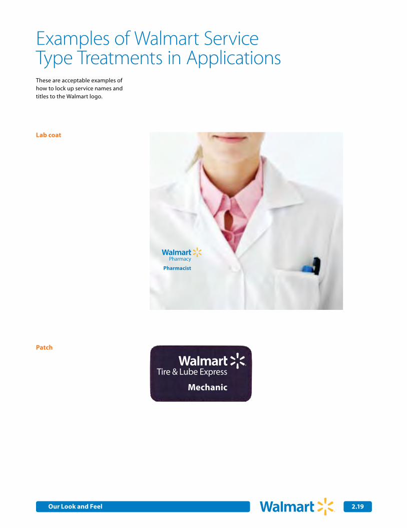
Examples of Walmart ServiceType Treatments in Applications
Pharmacy
Pharmacist
Tire & Lube Express
Mechanic
Tire & Lube Express
Pharmacy
Pharmacist
Tire & Lube Express
Mechanic
Tire & Lube Express
Lab coat
Patch
These are acceptable examples of how to lock up service names and titles to the Walmart logo.
Our Look and Feel
2.0Internal Corporate Communications 2.20
Standard stacked
Horizontal
x
1/3 x2/3 x
Countryx 2/3 x
1/3 X 1/2 X
Using the Logo with Country Names
Locked-up type treatments let countries identify themselves in ways that are consistent with the Walmart brand. Below are acceptable examples ofhow to lock up country names to our Walmart logo, as well as how toseparate the artwork.
Need a country type treatment lockup? E-mail the Brand Center at [email protected]
Walmart medium blue (or PANTONE® 285 C)C:89 M:43 Y:0 K:0R:26 G:117 B:207
Walmart yellow(or PANTONE® 1235 C)C:0 M:29 Y:91 K:0R:253 G:187 B:48
Country
Our Look and Feel
2.0Internal Corporate Communications 2.21
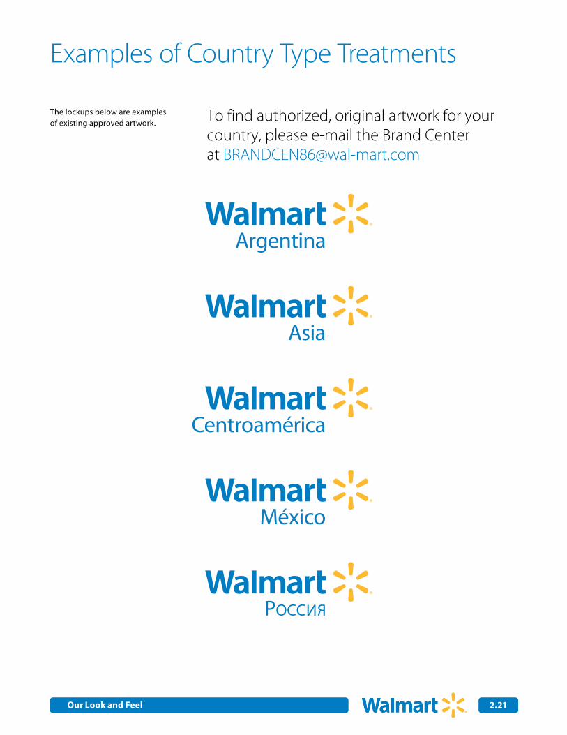
Examples of Country Type Treatments
The lockups below are examples of existing approved artwork. To find authorized, original artwork for your
country, please e-mail the Brand Center at [email protected]
Argentina
Asia
Centroamérica
México
POCC
Our Look and Feel
2.22
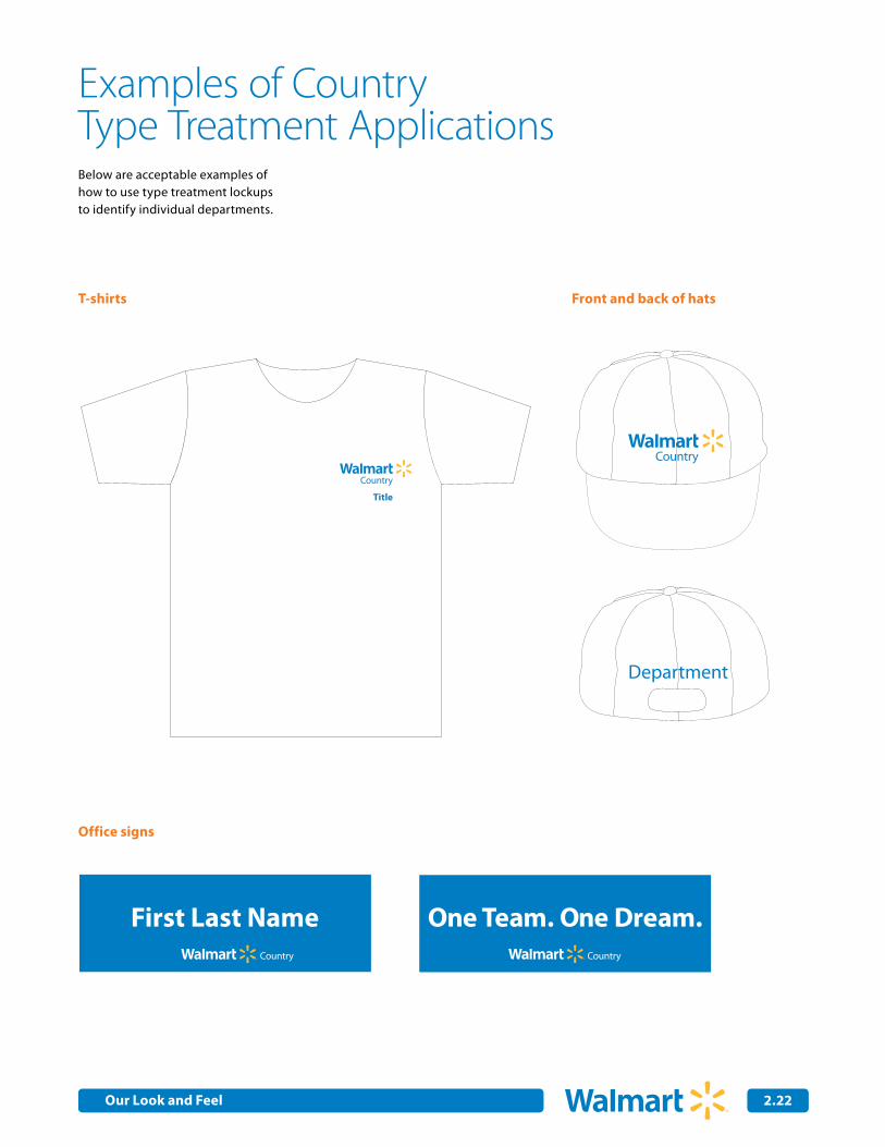
Examples of CountryType Treatment Applications
Office signs
First Last Name One Team. One Dream.
Department
Country
CountryCountry
Country
Below are acceptable examples of how to use type treatment lockups to identify individual departments.
T-shirts
First Last Name One Team. One Dream.
Department
Country
Title
Country
Country
Country
Front and back of hats
First Last Name One Team. One Dream.
Department
Country
Title
Country
Country
Country
Our Look and Feel
CentroaméricaSupply Chain
Center of Excellence
ArgentinaGlobal Continuous
Improvement
2.23
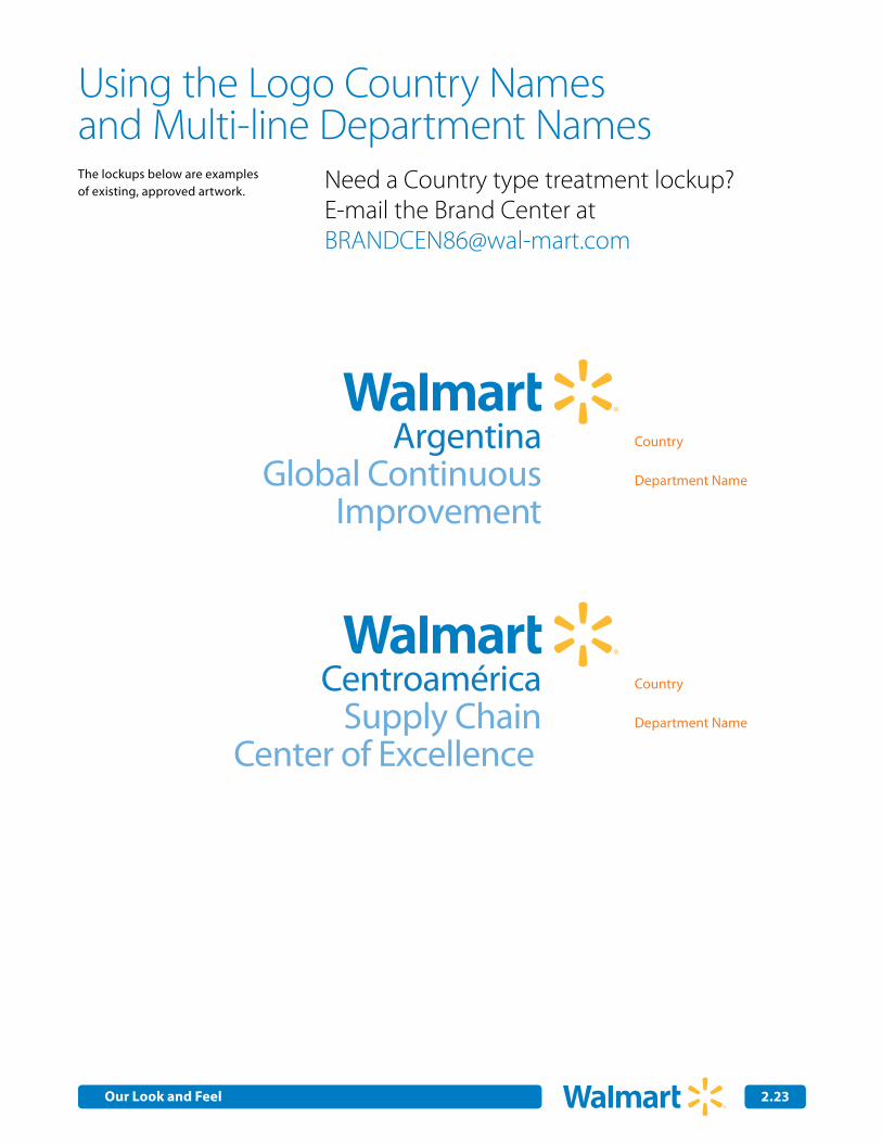
Using the Logo Country Namesand Multi-line Department Names
Need a Country type treatment lockup? E-mail the Brand Center at [email protected]
The lockups below are examples of existing, approved artwork.
Country
Country
Department Name
Department Name
Our Look and Feel
2.24
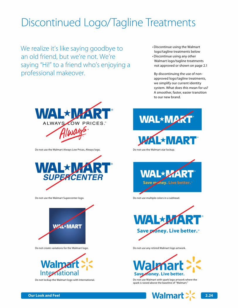
Discontinue using the Walmart •logo/tagline treatments belowDiscontinue using any other •Walmart logo/tagline treatments not approved or shown on page 2.1
We realize it’s like saying goodbye to an old friend, but we’re not. We’re saying “Hi!” to a friend who’s enjoying a professional makeover.
Discontinued Logo/Tagline Treatments
Do not use the Walmart Always Low Prices, Always logo.
Do not use the Walmart Supercenter logo.
Do not create variations for the Walmart logo.
Do not lockup the Walmart logo with International.
By discontinuing the use of non-approved logo/tagline treatments, we simplify our current identity system. What does this mean for us? A smoother, faster, easier transition to our new brand.
SMSave money. Live better.SMSave money. Live better.
SMSave money. Live better.SMSave money. Live better.
SMSave money. Live better.
SMSave money. Live better.
SMSave money. Live better.
SMSave money. Live better.
SMSave money. Live better.
Do not use the Walmart star lockup.
Do not use multiple colors in a subhead.
Do not use any retired Walmart logo artwork.
Do not use Walmart with spark logo artwork where the spark is raised above the baseline of "Walmart."
X
X
X
Global ContinuousImprovement
Xxxxxxxx
Global ContinuousImprovementXxxxxxxx
X
3/4 X
1/2 X
1/3 X
3/4 X
1/3 X
3/4 X
3/4 X
1/3 X
3/4 X
1/3 X
3/4 X
Supply ChainCenter of Excellence
3/4 X
1/3 X
3/4 X
Supply ChainCenter of Excellence
X
3/4 X
1/2 X
1/3 X
3/4 X
Supply ChainCenter of Excellence
InternationalCorporate A�airs
Global ContinuousImprovement
Lorem Ipsum Dolor Sit
X
3/4 X
1/2 X
1/3 X
X
10X
21 Characters
Lorem Ipsum Dolor Sit 21 Characters
Ut Rutrum Nunc Vitaen 21 Characters
3/4 X
International Corporate A�airs
X
3/4 X
1/2 X
1/3 X
3/4 X
X
X
X
Global ContinuousImprovement
Xxxxxxxx
Global ContinuousImprovementXxxxxxxx
X
3/4 X
1/2 X
1/3 X
3/4 X
1/3 X
3/4 X
3/4 X
1/3 X
3/4 X
1/3 X
3/4 X
Supply ChainCenter of Excellence
X
3/4 X
1/2 X
1/3 X
3/4 X
International Corporate A�airs
X
3/4 X
1/2 X
1/3 X
3/4 X
Tire & Lube ExpressX
3/4 X
1/2 X
Diversity Relations
X Diversity Relations
InternationalCorporate A�airs
3/4 X
1/3 X
3/4 X
Global ContinuousImprovement
25%
Spot Color Pantone 285C
4-color Process C89/M43(Walmart Medium Blue)
SMSave money. Live better.
International
Our Look and Feel
Internal Corporate Communications
WalmartSave money. Live better.
2.25
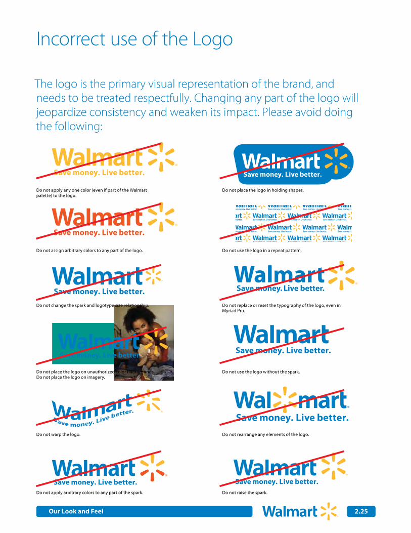
Incorrect use of the Logo
Do not apply any one color (even if part of the Walmart palette) to the logo.
Do not place the logo in holding shapes.
Do not use the logo in a repeat pattern.
Do not replace or reset the typography of the logo, even in Myriad Pro.
Do not use the logo without the spark.
Do not rearrange any elements of the logo.
Do not raise the spark.
Do not assign arbitrary colors to any part of the logo.
Do not change the spark and logotype size relationship.
Do not place the logo on unauthorized color backgrounds. Do not place the logo on imagery.
Do not warp the logo.
Do not apply arbitrary colors to any part of the spark.
The logo is the primary visual representation of the brand, and needs to be treated respectfully. Changing any part of the logo will jeopardize consistency and weaken its impact. Please avoid doing the following:
Our Look and Feel
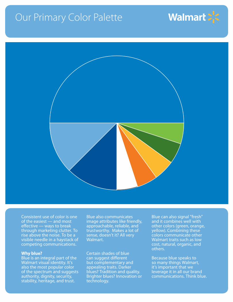
Our Primary Color Palette
Consistent use of color is one of the easiest — and most effective — ways to break through marketing clutter. To rise above the noise. To be a visible needle in a haystack of competing communications.
Why blue?Blue is an integral part of the Walmart visual identity. It’s also the most popular color of the spectrum and suggests authority, dignity, security, stability, heritage, and trust.
Blue also communicates image attributes like friendly, approachable, reliable, and trustworthy. Makes a lot of sense, doesn’t it? All very Walmart.
Certain shades of blue can suggest different but complementary and appealing traits. Darker blues? Tradition and quality. Brighter blues? Innovation or technology.
Blue can also signal "fresh” and it combines well with other colors (green, orange, yellow). Combining these colors communicate other Walmart traits such as low cost, natural, organic, and others.
Because blue speaks to so many things Walmart, it’s important that we leverage it in all our brand communications. Think blue.
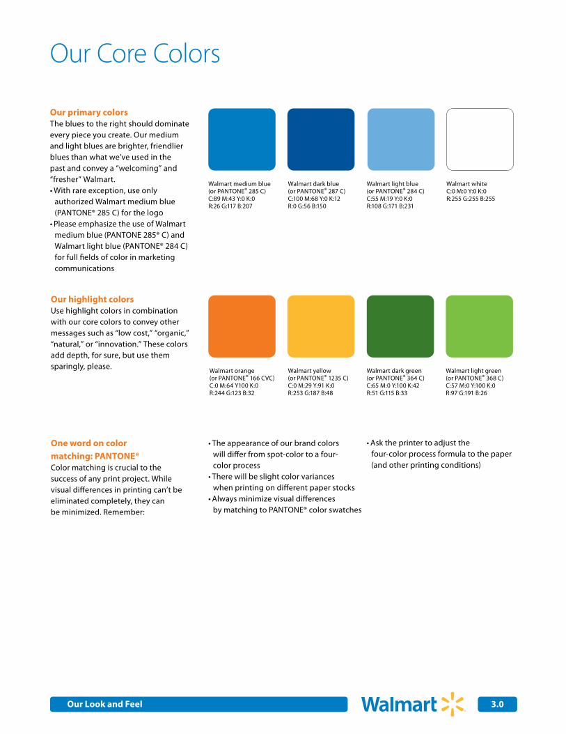
3.0
Our primary colorsThe blues to the right should dominate every piece you create. Our medium and light blues are brighter, friendlier blues than what we’ve used in the past and convey a “welcoming” and “fresher” Walmart.
With rare exception, use only •authorized Walmart medium blue (PANTONE® 285 C) for the logoPlease emphasize the use of Walmart •medium blue (PANTONE 285® C) and Walmart light blue (PANTONE® 284 C) for full fields of color in marketing communications
Our highlight colorsUse highlight colors in combination with our core colors to convey other messages such as “low cost,” “organic,” “natural,” or “innovation.” These colors add depth, for sure, but use them sparingly, please.
One word on color matching: PANTONE®Color matching is crucial to the success of any print project. While visual differences in printing can’t be eliminated completely, they can be minimized. Remember:
Walmart dark blue (or PANTONE® 287 C)C:100 M:68 Y:0 K:12R:0 G:56 B:150
Walmart medium blue (or PANTONE® 285 C)C:89 M:43 Y:0 K:0R:26 G:117 B:207
Walmart light blue (or PANTONE® 284 C)C:55 M:19 Y:0 K:0R:108 G:171 B:231
Walmart whiteC:0 M:0 Y:0 K:0R:255 G:255 B:255
Walmart orange(or PANTONE® 166 CVC)C:0 M:64 Y100 K:0R:244 G:123 B:32
Walmart yellow(or PANTONE® 1235 C)C:0 M:29 Y:91 K:0R:253 G:187 B:48
The appearance of our brand colors •will differ from spot-color to a four- color processThere will be slight color variances •when printing on different paper stocksAlways minimize visual differences •by matching to PANTONE® color swatches
Our Core Colors
Ask the printer to adjust the •four-color process formula to the paper (and other printing conditions)
Walmart light green(or PANTONE® 368 C)C:57 M:0 Y:100 K:0R:97 G:191 B:26
Walmart dark green (or PANTONE® 364 C)C:65 M:0 Y:100 K:42R:51 G:115 B:33
Our Look and Feel
3.1
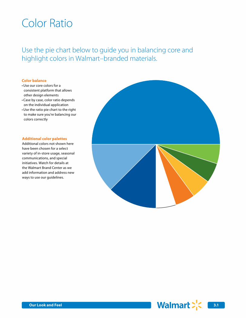
Use the pie chart below to guide you in balancing core and highlight colors in Walmart–branded materials.
Color balanceUse our core colors for a •consistent platform that allows other design elements Case by case, color ratio depends •on the individual applicationUse the ratio pie chart to the right •to make sure you’re balancing our colors correctly
Additional color palettesAdditional colors not shown here have been chosen for a select variety of in-store usage, seasonal communications, and special initiatives. Watch for details at the Walmart Brand Center as we add information and address new ways to use our guidelines.
Color Ratio
Our Look and Feel
Our Typeface
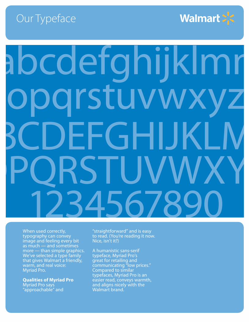
When used correctly, typography can convey image and feeling every bit as much — and sometimes more — than simple graphics. We’ve selected a type family that gives Walmart a friendly, warm, and real voice:Myriad Pro.
Qualities of Myriad ProMyriad Pro says “approachable” and
“straightforward” and is easy to read. (You’re reading it now. Nice, isn’t it?)
A humanistic sans-serif typeface, Myriad Pro’s great for retailing and communicating “low prices.” Compared to similar typefaces, Myriad Pro is an easier read, conveys warmth, and aligns nicely with the Walmart brand.
abcdefghijklmnopqrstuvwxyz
ABCDEFGHIJKLMNOPQRSTUVWXYZ
1234567890
4.0
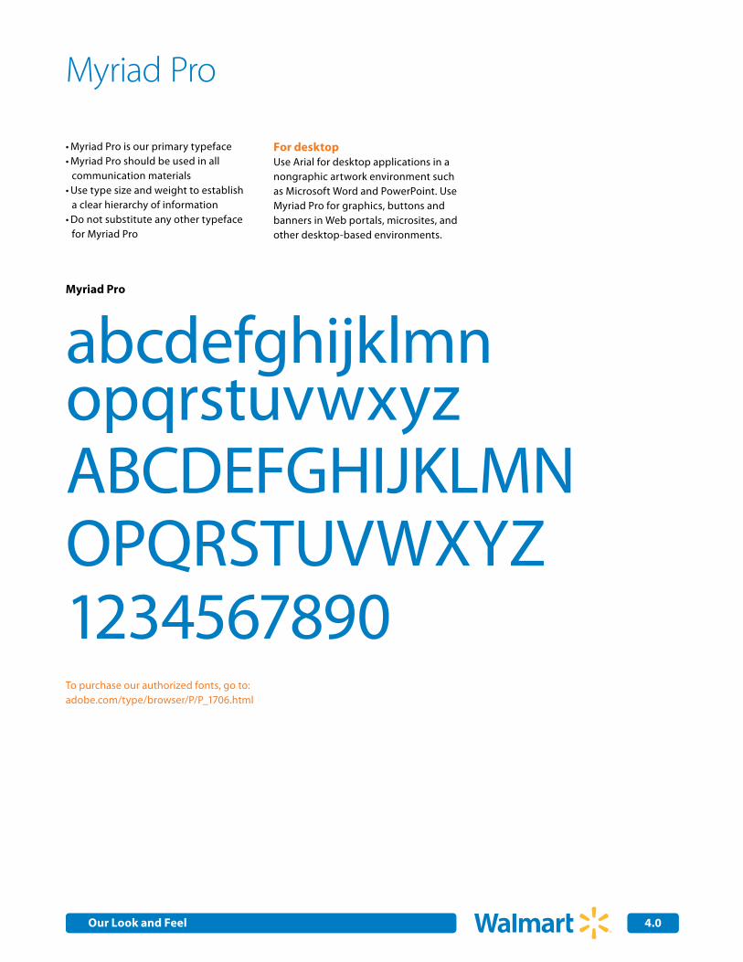
Myriad Pro
abcdefghijklmnopqrstuvwxyzABCDEFGHIJKLMNOPQRSTUVWXYZ1234567890
Myriad Pro
Myriad Pro is our primary typeface •Myriad Pro should be used in all •communication materials Use type size and weight to establish •a clear hierarchy of information Do not substitute any other typeface •for Myriad Pro
For desktopUse Arial for desktop applications in a nongraphic artwork environment such as Microsoft Word and PowerPoint. Use Myriad Pro for graphics, buttons and banners in Web portals, microsites, and other desktop-based environments.
To purchase our authorized fonts, go to:adobe.com/type/browser/P/P_1706.html
Our Look and Feel
4.1
Typographic Style
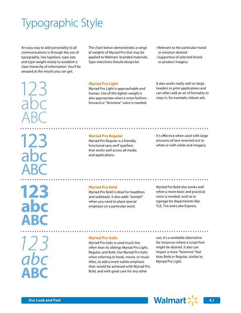
An easy way to add personality to all communications is through the use of typography. Use typeface, type size, and type weight wisely to establish a clear hierarchy of information. You’ll be amazed at the results you can get.
The chart below demonstrates a range of weights of Myriad Pro that may be applied to Walmart–branded materials. Type selections should always be:
Relevant to the particular mood •or emotion desired Supportive of selected brand •or product imagery
123 abc ABC
123 abc ABC 123 abc ABC
123 abc ABC
Myriad Pro LightMyriad Pro Light is approachable and human. Use of this lighter weight is also appropriate when a more fashion-forward or “feminine” voice is needed.
It also works really well on large headers in print applications and can often add an air of formality to copy in, for example, tribute ads.
Myriad Pro RegularMyriad Pro Regular is a friendly, functional sans serif typeface that works well across all media and applications.
It’s effective when used with large amounts of text reversed out to white or with solids and imagery.
Myriad Pro BoldMyriad Pro Bold is ideal for headlines and subheads. It also adds “oomph” when you need to place special emphasis on a particular word.
Myriad Pro Bold also works well when a more basic and practical voice is needed, such as in signage for departments like TLE, Tire and Lube Express.
Myriad Pro ItalicMyriad Pro Italic is used much less often than its siblings Myriad Pro Light, Regular, and Bold. Use Myriad Pro Italic when referring to book, movie, or music titles, to add a more subtle emphasis than would be achieved with Myriad Pro Bold, and with great care for any other
use. It’s a workable alternative for instances where a script font might be desired. It also can impart a more “feminine” feel than Bold or Regular, similar to Myriad Pro Light.
Our Look and Feel
•Do always set type in a combination of uppercase and lowercase •Do use only approved colors, or colors that are easily read in type•Do use only the approved Walmart typefaces•Do avoid using all uppercase; we don't want to shout
Dos and Don’ts of typeface usage:
Using Type Effectively
Think of the most powerful brands you know. Now think of how identifiable their typography and branding elements are. On a billboard? Glimpsed through the corner of your eye on someone’s desk? Seen on a sign as you walk past a display at your local Walmart? We see the brands even before we read the message.
Sticking to the approved families of Myriad Pro exclusively gives us, over time, ownership of the look and feel the typeface contributes to our branding efforts.
Developing creative for Walmart? Whether you’re a graphic designer or working with one, using Myriad Pro
is the hallmark of a true brand champion. Download the approved Walmart core typeface at: http://www.adobe.com/type/browser/P/P_1706.html
Not working on a graphic (e.g., buttons and banners)? Please use Arial for non-graphic desktop applications.
•Don’t use special effects, such as drop shadow, that compromise legibility •Don’t change kerning (space between letters) when setting headlines or body copy•Don’t distort the typefaces (e.g., expand, condense, or modify the letterforms)•Don’t substitute other typefaces
Please adhere closely to these guidelines when using the Myriad Pro typeface.Note: Some natural distortion of type is inevitable when used in a photo or illustration. All the same, please maintain the overall integrity of the typeface – always.
Our Core Identity
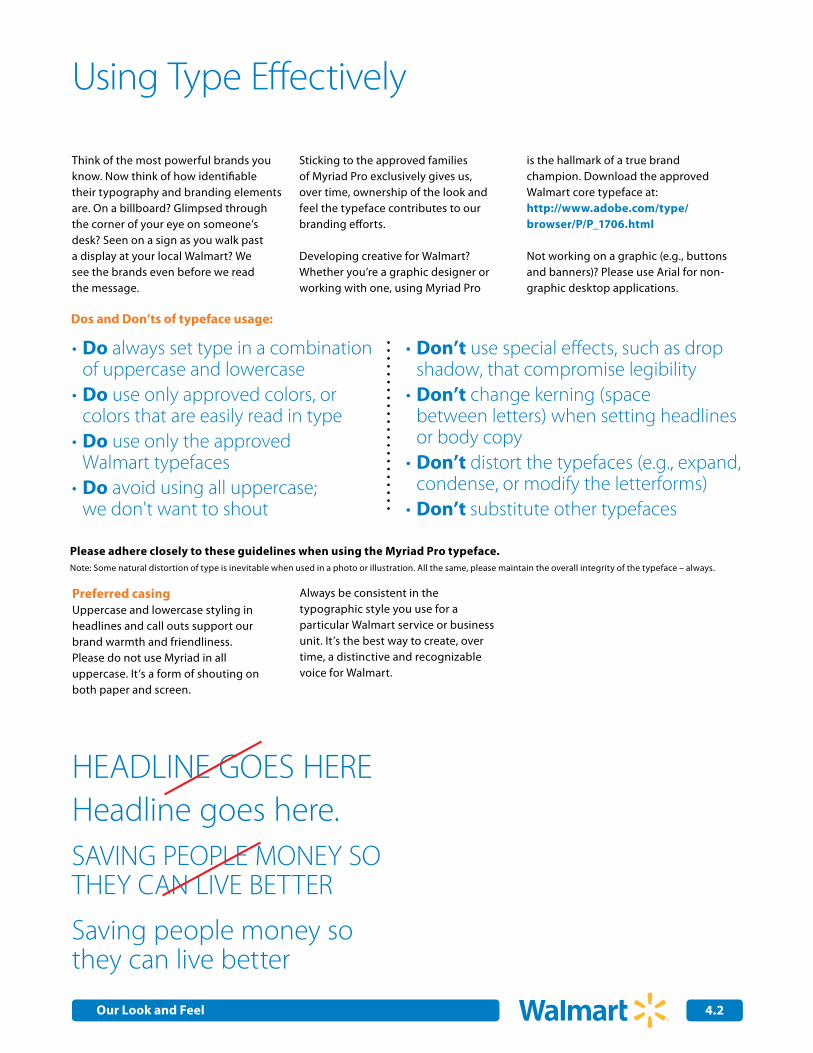
HEADLINE GOES HEREHeadline goes here.
Saving people money so they can live better
SAVING PEOPLE MONEY SO THEY CAN LIVE BETTER
Preferred casingUppercase and lowercase styling in headlines and call outs support our brand warmth and friendliness.Please do not use Myriad in all uppercase. It’s a form of shouting on both paper and screen.
Always be consistent in the typographic style you use for a particular Walmart service or business unit. It’s the best way to create, over time, a distinctive and recognizable voice for Walmart.
4.2Our Look and Feel
Applying the FullSpark Graphic
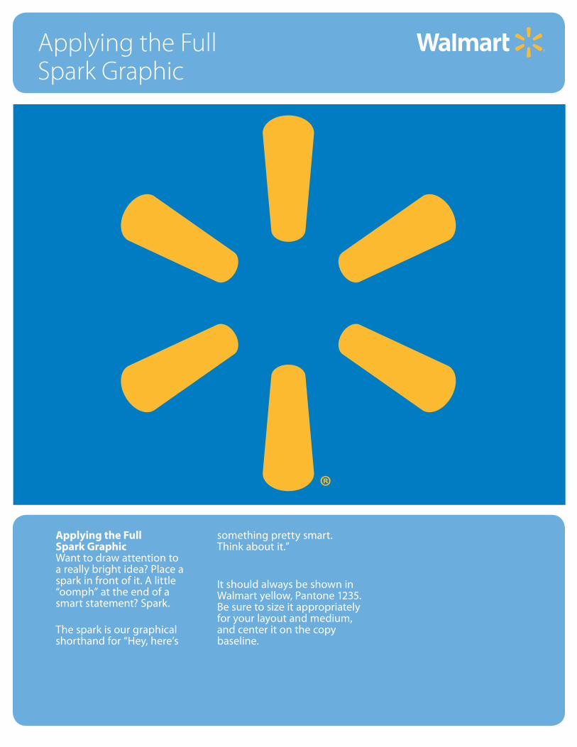
Applying the FullSpark GraphicWant to draw attention to a really bright idea? Place a spark in front of it. A little “oomph” at the end of asmart statement? Spark.
The spark is our graphical shorthand for “Hey, here’s
something pretty smart.Think about it.”
It should always be shown in Walmart yellow, Pantone 1235. Be sure to size it appropriately for your layout and medium, and center it on the copy baseline.
5.0
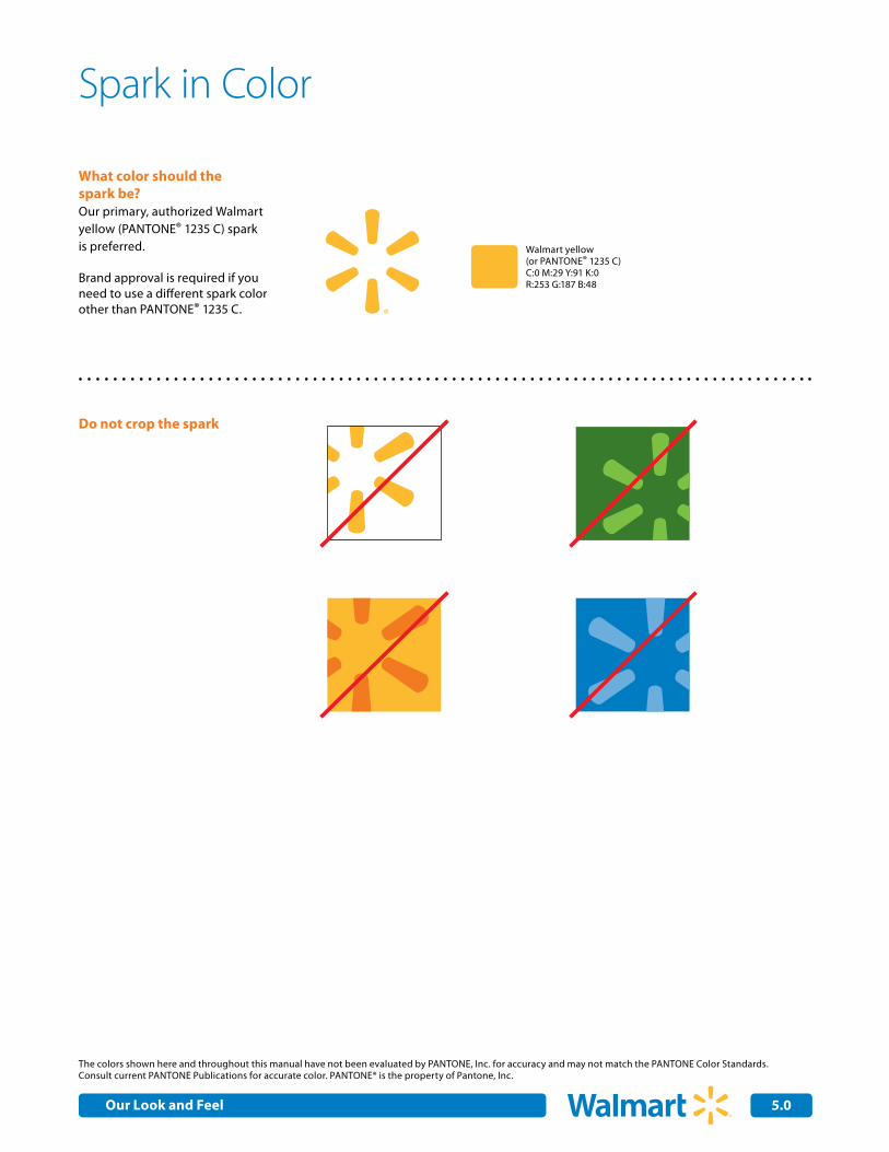
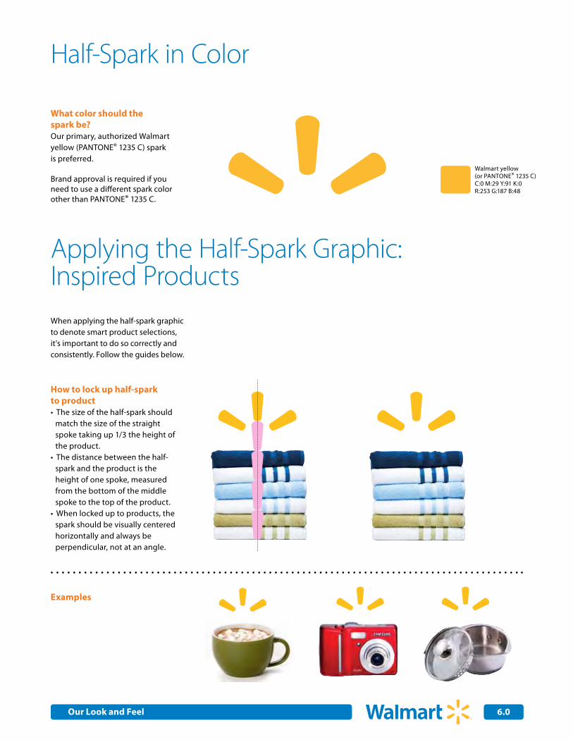
What color should the spark be?Our primary, authorized Walmart yellow (PANTONE® 1235 C) spark is preferred.
Brand approval is required if you need to use a different spark color other than PANTONE® 1235 C.
Walmart yellow(or PANTONE® 1235 C)C:0 M:29 Y:91 K:0R:253 G:187 B:48
Do not crop the spark
The colors shown here and throughout this manual have not been evaluated by PANTONE, Inc. for accuracy and may not match the PANTONE Color Standards. Consult current PANTONE Publications for accurate color. PANTONE® is the property of Pantone, Inc.
Spark in Color
Our Look and Feel
2.0Internal Corporate Communications 5.1
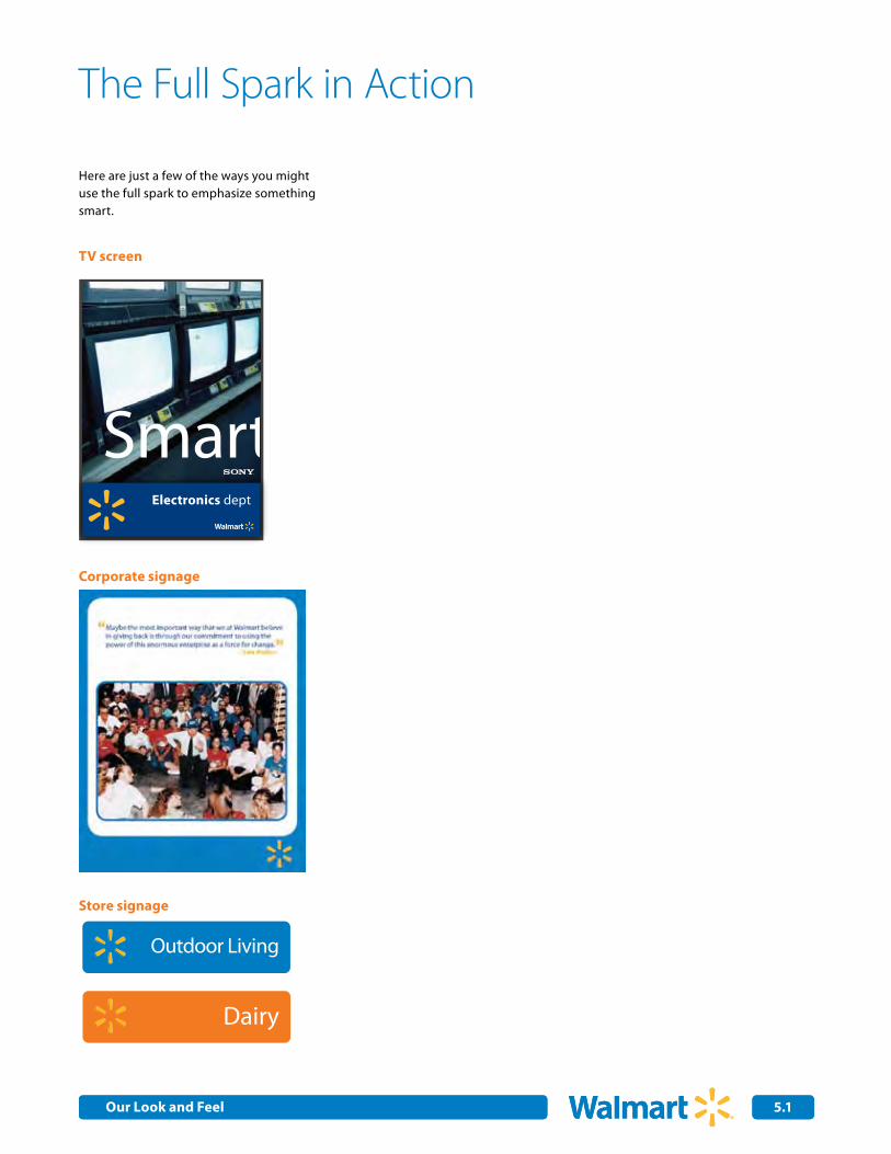
SmartElectronics dept
Fresh
In theProduce dept
Corporate signage
The Full Spark in Action
TV screen
Store signage
Primary ID
Primary ID
Meat & Poultry
Milk Eggs
Meals to Go Quick Meals
Breakfast Meats
Packaged Deli
Dairy
Toys Auto Care
Pet Care
Tire & Lube
Photo Center
Do It Yourself
Outdoor Living
Paper & Cleaning
Celebrate!
Garden Center
Sports & Leisure
Fresh Produce
Here are just a few of the ways you might use the full spark to emphasize something smart.
Our Look and Feel
Internal Corporate Communications
Applying theHalf-Spark Graphic
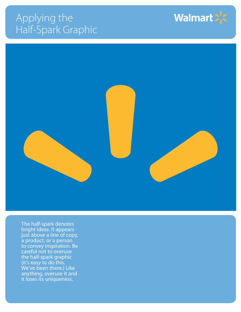
The half-spark denotes bright ideas. It appears just above a line of copy, a product, or a person to convey inspiration. Be careful not to overuse the half-spark graphic (it’s easy to do this. We’ve been there.) Like anything, overuse it andit loses its uniqueness.
Internal Corporate Communications 6.0
How to lock up half-sparkto product
The size of the half-spark should •match the size of the straight spoke taking up 1/3 the height of the product. The distance between the half-•spark and the product is the height of one spoke, measured from the bottom of the middle spoke to the top of the product. When locked up to products, the •spark should be visually centered horizontally and always be perpendicular, not at an angle.
Examples
Applying the Half-Spark Graphic: Inspired ProductsWhen applying the half-spark graphic to denote smart product selections, it's important to do so correctly and consistently. Follow the guides below.
Walmart yellow(or PANTONE® 1235 C)C:0 M:29 Y:91 K:0R:253 G:187 B:48
...saving money so they can live better
Our customersshop smart ...
Lorem ipsum dolor sit amet, consetetur sadipscing elitr, sed diam nonumy eirmod tempor invidunt ut labore et dolore magna aliquyam
erat, sed diam voluptua.
What color should the spark be?Our primary, authorized Walmart yellow (PANTONE® 1235 C) spark is preferred.
Brand approval is required if you need to use a different spark color other than PANTONE® 1235 C.
Half-Spark in Color
Our Look and Feel
Internal Corporate Communications 6.1
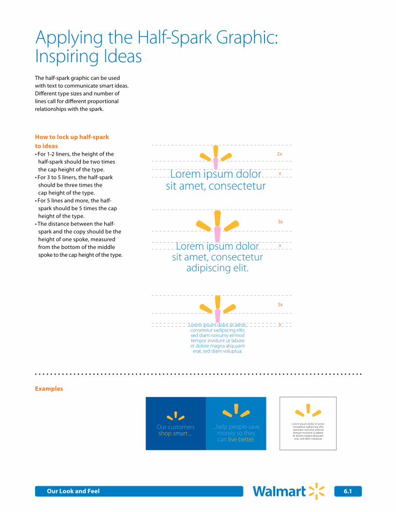
How to lock up half-spark to ideas
For 1-2 liners, the height of the •half-spark should be two times the cap height of the type. For 3 to 5 liners, the half-spark •should be three times the cap height of the type. For 5 lines and more, the half-•spark should be 5 times the cap height of the type.The distance between the half-•spark and the copy should be the height of one spoke, measured from the bottom of the middle spoke to the cap height of the type.
Examples
Applying the Half-Spark Graphic:Inspiring Ideas
x
x
x
3x
5x
2x
Lorem ipsum dolor sit amet, consectetur
Lorem ipsum dolor sit amet, consectetur
adipiscing elit.
Lorem ipsum dolor sit amet, consectetur adipiscing elit. Integer
laoreet lobortis felis. In aliquam consectetur augue. Aenean nisl magna,
accumsan vestibulum, porttitor in, dictum ac, elit. Morbi gravida nisi sed
diam. Fusce egestas tristique velit. Curabitur lobortis massa sed augue.
Aenean a quam ac velit lacinia vulputate. Nullam dignissim leo in eros.
Lorem ipsum dolor sit amet, consetetur sadipscing elitr, sed diam nonumy eirmod tempor invidunt ut labore et dolore magna aliquyam
erat, sed diam voluptua.
Lorem ipsum dolor sit amet, consectetur
Lorem ipsum dolor sit amet, consectetur
adipiscing elit.
Lorem ipsum dolor sit amet, consectetur adipiscing elit. Integer
laoreet lobortis felis. In aliquam consectetur augue. Aenean nisl magna,
accumsan vestibulum, porttitor in, dictum ac, elit. Morbi gravida nisi sed
diam. Fusce egestas tristique velit. Curabitur lobortis massa sed augue.
Aenean a quam ac velit lacinia vulputate. Nullam dignissim leo in eros.
Lorem ipsum dolor sit amet, consetetur sadipscing elitr, sed diam nonumy eirmod tempor invidunt ut labore et dolore magna aliquyam
erat, sed diam voluptua.
...help people savemoney so theycan live better.
Our customersshop smart ...
Lorem ipsum dolor sit amet, consetetur sadipscing elitr, sed diam nonumy eirmod tempor invidunt ut labore et dolore magna aliquyam
erat, sed diam voluptua.
Lorem ipsum dolor sit amet, consectetur
Lorem ipsum dolor sit amet, consectetur
adipiscing elit.
Lorem ipsum dolor sit amet, consectetur adipiscing elit. Integer
laoreet lobortis felis. In aliquam consectetur augue. Aenean nisl magna,
accumsan vestibulum, porttitor in, dictum ac, elit. Morbi gravida nisi sed
diam. Fusce egestas tristique velit. Curabitur lobortis massa sed augue.
Aenean a quam ac velit lacinia vulputate. Nullam dignissim leo in eros.
Lorem ipsum dolor sit amet, consetetur sadipscing elitr, sed diam nonumy eirmod tempor invidunt ut labore et dolore magna aliquyam
erat, sed diam voluptua.
The half-spark graphic can be used with text to communicate smart ideas. Different type sizes and number of lines call for different proportional relationships with the spark.
Our Look and Feel
Internal Corporate Communications 6.2
Applying the Half-Spark Graphic:Inspired People
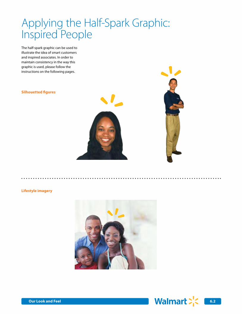
Silhouetted figures
Lifestyle imagery
The half-spark graphic can be used to illustrate the idea of smart customers and inspired associates. In order to maintain consistency in the way this graphic is used, please follow the instructions on the following pages.
Our Look and Feel
Internal Corporate Communications 6.3
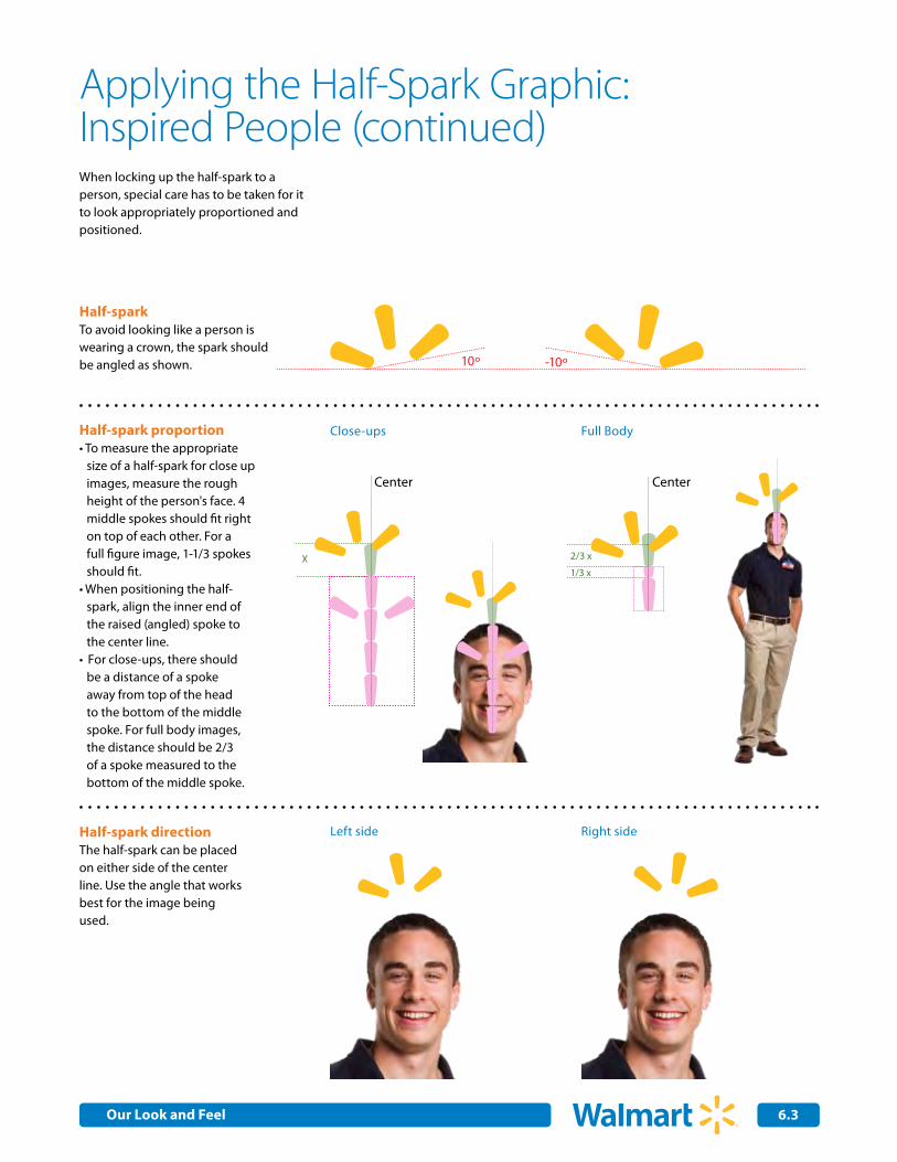
Applying the Half-Spark Graphic: Inspired People (continued)When locking up the half-spark to a person, special care has to be taken for it to look appropriately proportioned and positioned.
-10º10º
Half-sparkTo avoid looking like a person is wearing a crown, the spark should be angled as shown.
Center Center
X
Half-spark proportionTo measure the appropriate •size of a half-spark for close up images, measure the rough height of the person's face. 4 middle spokes should fit right on top of each other. For a full figure image, 1-1/3 spokes should fit.When positioning the half-•spark, align the inner end of the raised (angled) spoke to the center line. For close-ups, there should •be a distance of a spoke away from top of the head to the bottom of the middle spoke. For full body images, the distance should be 2/3 of a spoke measured to the bottom of the middle spoke.
Half-spark directionThe half-spark can be placed on either side of the center line. Use the angle that works best for the image being used.
Left side
Close-ups
Right side
Full Body
2/3 x
1/3 x
Our Look and Feel
Internal Corporate Communications 6.4
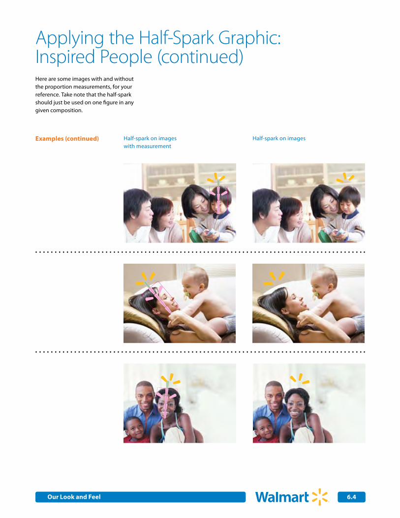
Applying the Half-Spark Graphic: Inspired People (continued)
Half-spark on images with measurement
Examples (continued) Half-spark on images
Here are some images with and without the proportion measurements, for your reference. Take note that the half-spark should just be used on one figure in any given composition.
Our Look and Feel