visualizing - reed college
TRANSCRIPT

Visualizing Evolutionary Activity of Genotypes
Mark A. Bedauy and C. Titus Brownz
Reed College, 3203 SE Woodstock Blvd., Portland, OR 97202, USA
Voice: (503) 771-1112, ext. 7337
Fax: (503) 777-7769
Email: fmab, [email protected]
yTo whom correspondence should be addressed.
zPresent address: MC 106-38, Computation and Neural Systems
California Institute of Technology, Pasadena CA 91125
A revised version of this paper will appear in Arti�cial Life 5 (1999): 17{35.
1

Abstract
We introduce a method for visualizing evolutionary activity of genotypes. Following a
proposal of Bedau and Packard [13], we de�ne a genotype's evolutionary activity in terms
of the history of its concentration in the evolving population. To visualize this evolutionary
activity we graph the distribution of evolutionary activity in the population of genotypes as
a function of time. Adaptively signi�cant genotypes trace a salient line or \wave" in these
graphs. The quality of these waves indicates a variety of evolutionary phenomena, such as
competitive exclusion, neutral variation, and random genetic drift. We apply this method in
an evolutionary model of self-replicating assembly language programs competing for room in
a two-dimensional space. Comparison with �tness graphs and with a non-adaptive analogue
of this model shows how this method highlights adaptively signi�cant events.
Keywords: adaptation, evolutionary activity, visualization, neutral variation, random
genetic drift, genotypes.
Running head: Visualizing Evolutionary Activity
2

1 How to Visualize Evolutionary Activity
Although it is commonly accepted that the process of adaptation produces much of the order and
functionality evident in complex systems [26, 21, 18, 19, 22], it is often di�cult to distinguish
adaptive change in a system from other evolutionary phenomena such as random genetic drift
[20, 27, 15, 38]. The problem is not a shortage of data but the inability to highlight the relevant
data. Those studying arti�cial models have the luxury of being able to collect virtually complete
data; aside from storage space, only imagination limits what kinds of data are gathered. But this
compounds rather than alleviates the problem of �ltering this data to �nd a picture that reveals
a system's signi�cant adaptive phenomena. The study of evolutionary dynamics in natural and
arti�cial systems dearly needs an e�ective method for visualizing adaptive phenomena.
We here introduce a method for visualizing adaptive phenomena involving genotypes, and we
illustrate this method by applying it to the evolutionary dynamics generated by a simple model
of evolving machine language programs. Our visualization method is a generalization of the
way Bedau and Packard visualized and quanti�ed what they called \evolutionary activity" [13].
Bedau and Packard focused on activity at the level of individual alleles, and they illustrated their
visualization method only brie y. The primary novelties of the present paper are to apply the
approach at a new level of analysis|whole genotypes|and then to give detailed analyses of the
adaptive phenomena revealed in a series of speci�c cases of evolution. These analyses disclose the
characteristic signatures of a variety of evolutionary phenomena involving genotypes, including
competitive interactions among genotypes, clouds of neutral variant genotypes acting in concert,
and random genetic drift among neutral variant genotypes.
The fundamental idea behind evolutionary activity of genotypes is to identify those genotypes
that make a di�erence in the evolutionary process. Generally we consider a genotype to \make
a di�erence" if it continues to be active in the evolving system. Here we measure evolutionary
activity of genotypes in the context of the Evita model, a simple arti�cial system which consists
of evolving assembly language programs competing for space, akin to Tierra [30]. In this model
the relative adaptive signi�cance of a genotype is re ected by its concentration in the population.
Relatively well adapted genotypes will have a relatively high concentration in the population,
and relatively poorly adapted genotypes will be correspondingly scarce. Thus, we here de�ne the
evolutionary activity ai(t) of the ith genotype at time t as its concentration integrated over the
time period from its origin up to t, provided it exists:
ai(t) =
8<:Rt
0ci(t)dt if genotype i exists at t
0 otherwise; (1)
where ci(t) is the concentration of the ith genotype at t, i.e., the fraction of the population that
has the ith genotype. A genotype's evolutionary activity (or \activity", for short) re ects the
3

changes in its adaptedness (relative to the other genotypes in the population) throughout its
history in the system.
Concentration might be an inappropriate measure of a genotype's adaptive signi�cance in
some contexts; in this case, the de�nition of evolutionary activity would need to operationalize
adaptive signi�cance in some other way. Furthermore, when concentration is impractical to
measure the de�nition of evolutionary activity must be appropriately modi�ed. For example, since
concentration data is generally unavailable for taxonomic families in the fossil record, evolutionary
activity for fossil families could be de�ned by integrating a family's presence in the fossil record
[11]. The key in each case is to increment a genotype's activity counter ai over time by some
method that re ects the genotype's relative adaptive signi�cance. Then the integration in Eq. 1
makes the activity counter ai re ect the history of the genotype's adaptive signi�cance.
To summarize the evolutionary activity of all the genotypes throughout the history of evolution
in a system, we de�ne an activity distribution function, M(t; a), as follows:
M(t; a) =
8<:
1 if there exists i s.t. ai(t) = a
0 otherwise: (2)
The activity distribution function combines information about how the activity ai(t) of every
genotype i in the population changes over time.1 Our visualization method is simply to graph
these activity distribution functions.
Evolutionarily signi�cant genotypes trace a salient line or \wave" in activity distribution
graphs. Comparing evolutionary activity waves within or between systems can show how these
evolutionary phenomena vary as a function of time, space, mutation rate, mode of selection, or
other factors. In addition, the data displayed in this visualization method can be quanti�ed
with various statistics [13, 7, 11, 12], thus enabling evolutionary activity in various arti�cial and
natural systems to be directly compared [11, 12]. And since one can argue that the nature of life
is intrinsically connected with adaptive evolutionary activity [8, 9], this visualization method can
put discussions of the nature of life on a vivid, empirical footing.
In the rest of this paper, after describing the evolutionary model used here, we explain how to
interpret activity distribution functions, examine the adaptive phenomena evident in the activity
distribution functions from a handful of individual runs of the model, and �nally indicate the
generality of this method. Although we illustrate the visualization method in the Evita model
here, the method applies directly to any other system with an evolving distribution of genotypes.
1This M(t; a) distribution function omits some of the information re ected in the original de�nition [13]. The
strict analogue of the original de�nition would re ect the number of genotypes that have a given activity value at
a given time, as follows:
N(t; a) = #fi : ai(t) = ag; (3)
where #f�g denotes set cardinality. For present purposes the simpler de�nition in the text su�ces.
4

Comparing our detailed visualization of evolutionary activity of genotypes with the original ap-
plication of this method to individual alleles [13] should help to convey how easily this method
can be adapted to display and quantify evolutionary activity at a variety of di�erent levels in a
variety of di�erent kinds of evolving systems.
2 The Evita Model and a Non-Adaptive Analogue
The Evita model consists of a population of self-replicating strings of code competing for space,
akin to Tierra [30] and Avida [3]. As in Tierra and Avida, programs in a customized assembly
language carry out their own replication while subject to mutation. Unlike Tierra but like Avida,
these programs interact only with their nearest neighbors on a two dimensional grid, so the
spread of information through the population depends the size of the system. But Evita is much
simpler than Tierra and Avida because it disallows code parasitism and thus blocks parasitism
and more complicated interactions (e.g., hyperparasitism and code pirating), so Evita's dynamics
are especially easy to understand. We use such a simple system here in order to provide an
especially simple and clear illustration of our visualization method. In addition, understanding
Evita should help illuminate more complicated analogues like Tierra and Avida. Indeed, the
visualization method we introduce here would be an especially useful tool to use for studying
these more complicated systems.
Evita is initialized with a single human-written program placed randomly on an N �M grid.
This program then executes and thereby reproduces. Each o�spring is placed within a small
radius of the parent program on the grid, and they then also start executing. When a parent
program can �nd no unoccupied grid locations nearby, the system chooses randomly from the
oldest of its neighbors, \kills" that neighbor, and places the o�spring there. No other interaction
between programs is permitted.
A time step of the model is a unit of time in which the program at each occupied grid spot
receives a �xed amount of the processor time. This time is allocated in a way that is unbiased
by position; hence, no organism can gain an advantage in its placement. In fact, the only real
advantage position can give is the relative �tness of the surrounding population: it may be that
the nearby creatures are less �t, e.g., reproduce more slowly, than the creature placed onto their
edge.
Mutations in this model are all point mutations, and they can fall on any existing program at
any time, as if caused by \cosmic-rays". The mutation rate is speci�ed in terms of the probability
per time step that each given \codon" or assembly language instruction in a genotype is mutated
to another instruction (chosen at random with equal probability from the entire instruction set).
Thus, the probability that a given program su�ers a mutation somewhere is proportional to its
5

length. While the probability that a given program is mutated is independent of the size of the
population of programs, the probability that a mutation occurs somewhere in the population is
clearly proportional to the population size. Typically, mutation rates are speci�ed in terms of
10�5 mutations per time step: that is, a mutation rate of m would mean that a given codon
would mutate on average once every 105
mtime steps. This means, for example, that in a run with
1600 creatures with an average length of 30 instructions, a mutation rate of 1 would cause one
mutation somewhere in the population approximately every other time step. By increasing the
mutation rate to 200, the population generally dies out almost immediately because no successfully
reproducing creature can survive long enough.
The model has a clear biological analogy. The system represents a biological \soup", full of
self-replicating strands of code (similar to RNA). Survival is governed primarily by reproductive
speed, and evolution towards faster programs is the behavior usually exhibited. This kind of
system, while extremely simple, shows interesting behavior in certain regimes of mutation rate.
Many people have used Tierra, Avida, and similar systems to examine a variety of issues in
evolutionary dynamics [30, 31, 32, 33, 3, 25, 37, 16, 34, 4, 1, 2, 35, 17].
There is a clear distinction between genotype and phenotype in Evita. A given genotype is
de�ned simply as a string of assembly language code. If two programs di�er in even one instruc-
tion they have di�erent genotypes. On the other hand, two programs might have exactly the
same behavior|the same phenotype|even though they have di�erent genotypes. The funda-
mental reason for this is that the only behavior of these programs, the only thing they \do", is
reproduce, so the only di�erence between the behavior of programs is the speed with which they
reproduce. Thus, any two genotypes which reproduce at the same rate, no matter how di�erent
their genotype, will have exactly the same phenotype.
The distinction between genotype and phenotype becomes important whenever there is a
piece of unused or unimportant code in the programs. For example, programs sometimes include
instructions that are never executed. This code can then be mutated freely without a�ecting
the operation of the program; multiple genotypes|without phenotype distinction and so with
exactly the same �tness|may then arise and appear as di�erent waves in the activity distribution
pictures.
Evita is explicitly designed so that the only way the programs interact is by competing for
space. On average, programs that reproduce faster will supplant their more slowly reproducing
neighbors. A program's rate of reproduction depends only on its genotype. Here, we measure the
rate at which a genotype reproduces, or its \fecundity", as we will call it, as the reciprocal of the
number of instructions that must be executed for an instance of that genotype to reproduce, on
average.2 So, a genotype that uses half as many instructions to reproduce as a second genotype
2In biology, fecundity is the number of o�spring that an individual produces. Note that our use of the term,
though related, is di�erent.
6
will have twice the fecundity of the second. A genotype's fecundity is the sole determinant of
the expected rate at which programs with that genotype will produce o�spring. Most signi�cant
adaptive events in Evita are changes in fecundity, so for present purposes we simply equate a
genotype's �tness with its fecundity.3 To keep �tness values from being inconveniently small,
we de�ne �tness as 30 times fecundity. So, for example, a genotype that reproduces in 100
instructions has a fecundity of 0.01 and a �tness of 0.3.
Two types of genetic changes can a�ect a genotype's �tness: change in length and change in
algorithm. A change in length usually leads to a change in fecundity, that is, the time in which a
program produces one copy (on average). Since adaptation is driven mainly by fecundity, shorter
programs have a higher �tness, everything else being equal. In fact, a program typically gains a
four-time-step decrease in reproduction time for each codon that is \lost" from its length. But
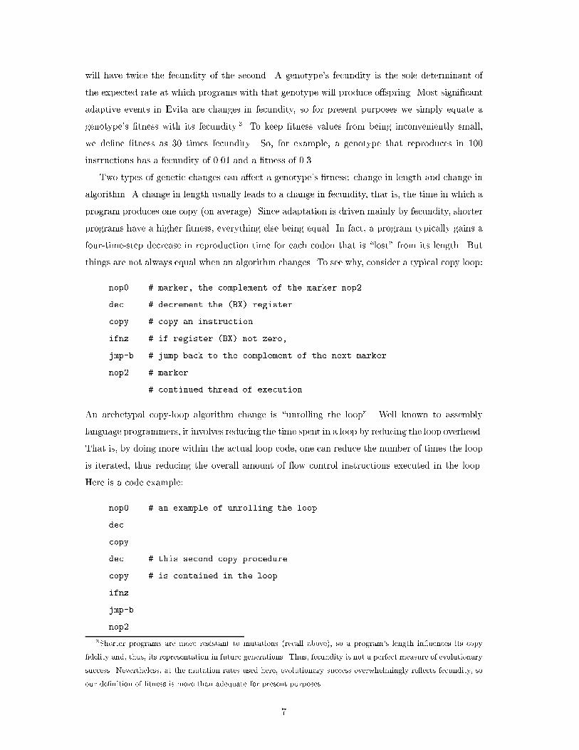
things are not always equal when an algorithm changes. To see why, consider a typical copy loop:
nop0 # marker, the complement of the marker nop2
dec # decrement the (BX) register
copy # copy an instruction
ifnz # if register (BX) not zero,
jmp-b # jump back to the complement of the next marker
nop2 # marker
... # continued thread of execution
An archetypal copy-loop algorithm change is \unrolling the loop". Well known to assembly
language programmers, it involves reducing the time spent in a loop by reducing the loop overhead.
That is, by doing more within the actual loop code, one can reduce the number of times the loop
is iterated, thus reducing the overall amount of ow control instructions executed in the loop.
Here is a code example:
nop0 # an example of unrolling the loop
dec
copy
dec # this second copy procedure
copy # is contained in the loop
ifnz
jmp-b
nop2
3Shorter programs are more resistant to mutations (recall above), so a program's length in uences its copy
�delity and, thus, its representation in future generations. Thus, fecundity is not a perfect measure of evolutionary
success. Nevertheless, at the mutation rates used here, evolutionary success overwhelmingly re ects fecundity, so
our de�nition of �tness is more than adequate for present purposes.
7

This can lead to a signi�cant increase in the speed of execution. Comparing the two examples,
above, in the �rst loop one copy is performed every four instructions, while in the second loop
two copies are performed in the space of six instructions, resulting in a 50% increase in speed
even though the second algorithm uses 30% more code.
We also de�ne a non-adaptive analogue of Evita, which di�ers from Evita only in that there
is no chance that a genotype's presence or concentration in the population is due to its adaptive
signi�cance. Nominal \programs" exist at locations at grid locations, reproduce and die. The
non-adaptive or \neutral" model has two parameters: the number of mutations in the population
per time step and the number of \programs" that reproduce per time step; each of these param-
eters can be either a single average value or a varying sequence of particular values. When the
neutral system is due to have a reproduction event, the self-reproducing \program" is chosen at
random from the population (with equal probability). When a \program" reproduces, its oldest
neighboring \program" dies and the new child occupies the newly emptied grid location. Each
\program" has a nominal \genotype" which its children inherit. Whenever a mutation strikes a
\program" it is assigned a new \genotype". The evolutionary dynamics in this neutral analogue is
reduced to a simple positive random walk in genotype space [4]. Genotypes arise and go extinct,
and their concentrations change over time, but the genotype dynamics is only weakly linked to
adaptation through the reproduction rate parameter determined by the normal model. None of
the dynamic of a genotype in the neutral analogue is due to that genotype's adaptive signi�cance,
for a genotype has no adaptive signi�cance whatsoever.
By recording mutation rates and reproduction rates from an actual Evita run, the non-adaptive
analogue can then be run with these parameters. The behavior of this neutral analogue allows
us to determine which aspects of the behavior of our original Evita run were due to adaptation
and which can be attributed to non-adaptive factors such as chance (e.g., random genetic drift)
or necessity (e.g., the system's underlying architecture). A series of related studies has similarly
exploited non-adaptive or \neutral" models [7, 11, 12].
3 Interpreting Activity Wave Diagrams
Graphs of activity distribution functions depict how evolutionary activity of the genotypes (on
the y-axis) varies as a function of time (on the x-axis). The most evident feature of such graphs is
the presence of myriad lines or waves (as we will call them), clearly evident in the �gures below.
Each wave corresponds to a single genotype and shows the variation over time of that genotype's
evolutionary activity.
It follows directly from the de�nition of evolutionary activity that the slope of a given geno-
type's activity wave at a given time is the same as the genotype's concentration in the population
8

at that time. This explains why the waves invariably arise from the x-axis and thence move up-
wards and rightwards, as illustrated by the two isolated waves in Figure 1. When a new genotype
enters the population, a new wave will arise from the x-axis. As the genotype's concentration in
the population grows (or shrinks) over time, the slope of the wave increases (or decreases). When
the genotype �nally goes extinct, the slope of its wave falls to zero and the wave ends. In this
way, a genotype's activity wave re ects its changing concentration throughout its history in the
population.
�gure 1 about here
Thus, an activity distribution function graph depicts the adaptive history of every genotype
in the population. The ancestral genotype always corresponds to the wave that arises out of the
origin. (See any of the activity distributions below.) When the ancestral genotype is driven to
extinction by another genotype, the ancestral wave ends as one or more new signi�cant waves
arise. Whenever one genotype drives another to extinction, a new wave arises as an earlier one
dies out. Multiple waves coexist in the activity diagram when multiple genotypes coexist in the
population, and genotypic interactions that a�ect genotype concentrations are visible as changes
in the slopes of waves. In general, the dominating genotype(s) during a given epoch of evolution
appear as dominating wave(s) during that period of the activity diagram.
Mutation rate has a direct and obvious impact on the evolutionary dynamics of genotypes,
and this e�ect is clearly evident in the genotype's activity wave diagrams. Comparing the activ-
ity waves in a series of runs in which all parameters are held constant except for mutation rate
shows how evolutionary activity phenomenology depends on mutation rate (Fig. 2). When the
mutation rate is set to zero, there is just one genotype|the ancestral one|so there is just one
wave with constant maximal slope (slope = 1). As soon as the mutation rate becomes positive,
new waves start to appear throughout the course of the runs, and their changing concentration
in the population causes the waves' slopes to vary. The rate at which new waves are generated is
proportional to the mutation rate, and the length of waves is inversely proportional to the muta-
tion rate, just as one would expect. (The choice of scale for x- or y-axes on graph of an activity
density function can obscure the density or length of activity waves, so these proportionalities
are not always evident.)
�gure 2 about here
When we compare activity wave diagrams from the normal Evita model and its neutral ana-
logue, we see a dramatic indication of how activity distribution functions highlight signi�cant
9

adaptive events. To produce a neutral analogue that is directly comparable with a normal Evita
run, we recorded the reproduction rate per time step and the mutation rate per program per time
step from the normal Evita run and then ran the neutral model with these sequences of values as
input. Fig. 3 compares the activity distribution functions from these normal (top) and neutral
(bottom) runs, with the activity scale (y-axis) in these two plots set to be roughly comparable.
�gure 3 about here
There is a striking di�erence between these two graphs; leaving aside the ancestral wave, the
highest waves in the normal Evita model are three orders of magnitude higher than those in the
neutral analogue.4 This is clear evidence of how the size of a genotype's activity waves in the
normal Evita data re ects the genotype's adaptive signi�cance. In the normal model, at each
time one or a few genotypes enjoy a special adaptive advantage over their peers, and this is
re ected by their correspondingly huge waves. In the neutral analogue, by contrast, a genotype's
concentration re ects only dumb luck, so no genotype activity waves rise signi�cantly above their
peers. This di�erence between the normal and neutral activity data can be used to quantify the
adaptive evolutionary activity in evolving systems [13, 7, 12].
4 Details in Individual Activity Wave Diagrams
In this section we discuss the speci�c evolutionary phenomena visible in a handful of Evita runs
driven by di�erent mutation rates and lasting for di�erent durations. This detailed analysis of
a variety of individuals runs is the best way to convey how activity wave diagrams can depict a
variety of evolutionary phenomena, such as competitive exclusion and random genetic drift. To
help interpret the adaptive signi�cance of the activity waves, we compare the activity diagrams
with �tness plots of the same runs and we con�rm our interpretations by examining the speci�c
assembly language instructions in the relevant genotypes.
In all the runs shown below we held constant all model parameters except mutation rate and
elapsed time. The grid size was 40� 40, so when the grid �lled up the population consisted of
about 1600 self-reproducing programs. To prune out irrelevant data about transitory genotypes
all the activity distribution functions shown here depict only those genotypes that at one time
have more than a certain minimum representation (�ve copies) in the population.
4The other salient di�erence between the normal and neutral runs|that the ancestral genotype persists about
four times longer in the neutral run|is due to the fact that, since the neutral ancestral genotype need never
compete with better adapted genotypes, its initial numerical advantage as ancestor carries more weight.
10

Each genotype in a given run is given a unique name of the form AB, where A is a number
indicating the genotype's length and B is a three-character string (in e�ect, a base 52 number)
indicating the genotype's order of origination among genotypes of that length. Thus, 32aac is
the third length 32 genotype to arise in the course of a given run.
4.1 Mutation rate = 1; 5000 time steps
The activity graph (Fig. 4) of this run is dominated by �ve waves corresponding to the �ve most
populous genotypes over the course of the run. Miscellaneous low-activity genotypes that never
claim a substantial following in the population are barely visible along the bottom of the activity
plot.
�gure 4 about here
Comparison with the �tness plot shows that each of the signi�cant new waves corresponds to
a genotype that has a signi�cant �tness advantage over its predecessors, and closer examination
of those genotypes discloses those adaptive advantages. The �rst signi�cant new wave is caused
by genotype 33aad, which reproduces much faster than the ancestral genotype 37aaa due to its
shorter length. The next signi�cant activity wave, the largest one in the graph, is caused by
genotype 33aak; this genotype is the same length as 33aad but it can reproduce faster because
it has a shorter copy loop. Notice the kink in 33aak's wave at about time step 2000. Magnifying
the low-activity waves at that time shows that this kink is simultaneous with the start of another
wave|the fourth main wave in this plot, due to genotype 31aab which is still shorter in length.
The post-kink slope in 33aak's wave is slightly less than that of 31aab's wave, and in fact genotype
31aab's shorter length gives it only a slight �tness advantage (about 1%) over genotype 33aak.
Finally, the �fth signi�cant wave is caused by a genotype, 30aab, which reproduces faster than
genotype 31aab due to its slightly shorter length.
Thus, we see that the activity distribution plot clearly highlights those genotypes with a
signi�cant adaptive advantage over their peers. In addition to births and deaths of genotypes, we
clearly see the dynamics of competitive exclusion between the major genotypes in the evolving
system.
4.2 Mutation rate = 2; 5000 and 20,000 time steps
The data from this run (Fig. 5) shows a nice correspondence between the main activity waves in
the activity distribution plots and the main �tness jumps, as in the previous run. Closer analysis
reveals the same general pattern as before: The major activity waves correspond to the major
11

adaptive events, and these consist of shortening a genotype's length or copy loop. But there are
two interesting exceptions to this general pattern. Each exception involves a distinctive kind of
evolutionary phenomenon, and each leaves a characteristic signature in activity wave diagrams.
�gure 5 about here
�gure 6 about here
One exception is that the second �tness jump corresponds to a cluster of seven similar
genotypes (33aap, 33aaq, 33aar, 33aas, 33aat, 33aau, 33aav) which all arise at about the
same time and which together contribute to a dense cloud of activity waves; see Fig. 6. These
genotypes di�er from each other only by mutations at an unexpressed locus, so they all use
exactly the same algorithm and are neutral variants of one another|di�erent genotypes with
exactly the same phenotype. The unexpressed locus was created by a mutation which produced
a non-template instruction inside the template surrounding the copy loop, saving one executed
instruction per loop traversal and thus signi�cantly increasing fecundity. Once this mutation has
occurred, almost any other mutation at the same locus creates another non-template instruction
with an identical �tness bene�t, so a cloud of neutral variants quickly grows. Since these neutral
variants have exactly the same �tness advantage over their predecessors, and since they all are
just one mutation away from each other, they engage in adaptive interactions with competing
genotypes e�ectively as a single higher-level unit. If the activity data from these neutral variant
genotypes were pooled and graphed as a single phenotype, they would constitute a single salient
wave on a par with the other salient waves in the activity distribution function.
Second, notice that the fourth salient wave (due to genotype 32abl) does not correspond
to a signi�cant �tness jump. The fact that the waves from 32aaV and 32abl coexist for a
long time (about 1000 time steps), rather than one quickly driving the other to extinction by
competitive exclusion, indicates that they are nearly neutral variants. In fact, the �tness of the
second wave (32abl) exceeds that of the �rst wave (32aaV) by about only 0.5%, for 32abl has
a mutation which causes a single instruction to be skipped, for a net savings of one instruction
per reproduction event. The interactions among the three salient waves between time steps 4000
and 5000 have a similar explanation. They are a signi�cant improvement (5% �tness advantage)
over the genotypes that they drive extinct, but they di�er from one another by much less (under
2% �tness di�erence).
12

When this run is extended signi�cantly further (Fig. 7), we continue to see competitive exclu-
sion between genotypes when the origination of one genotype wave causes the end of another, and
we also continue to see neutral variants when signi�cant genotype waves persist simultaneously
for a signi�cant duration.
�gure 7 about here
4.3 Mutation rate = 10; 20,000 time steps
This run (Fig. 8) shows some classic competitive exclusion during the �rst 2000 time steps, in
which signi�cant �tness boosts correspond to the origination of signi�cant new genotype waves.
But evolution reaches an equilibrium early in the run and the bulk of the evolutionary change
in the run consists of random drift among selectively-neutral genotypes|the sort of neutral
evolution emphasized by Motoo Kimura [23]. The di�erence between these kinds of evolutionary
phenomena is clearly indicated in the di�erent quality of the activity waves. A genotype winning
at competitive exclusion typically causes a relatively smooth and sigmoidal-shaped wave (although
the bottom of the wave will be truncated if it's concentration rises extremely fast). By contrast,
random drift causes waves that are much more wiggly because the wave's slope randomly rises
and falls as the genotype's concentration wanders up and down. This di�erence can be clearly
seen in Fig. 1. The sigmoidal wave in Fig. 1 is that due to genotype 32abl in Fig. 5 which arose
through competitive exclusion, and the wiggly wave in Fig. 1 is taken from the random genetic
drift in the middle of Fig. 8.
�gure 8 about here
4.4 Mutation rate = 40; 30,000 time steps
This run (Fig. 9) shows a variety of evolutionary phenomena. First, standard competitive exclu-
sion between genotypes dominates the �rst 3000 time steps of the run; some of this is evident
in the familiar sigmoidal wave shapes, but some is hidden in low-lying clouds of neutral variants
acting as a single phenotype. Next, as the rather wiggly waves signal, over half of the run consists
of random genetic drift among more or less neutral variants with minute di�erences in �tness. It
is interesting to note that genotype 24aNR, which creates the last and longest wiggly wave in the
middle of the run, takes two more instructions to reproduce, and so is slightly less �t, than the
13

genotype (24avp) which it supplants. This illustrates how marginal �tness improvements do not
always win the day during random drift.
�gure 9 about here
At about two-thirds the way through the run we see the emergence of a new genotype (24bxI)
which totally dominates the rest of the run. Genotype 24bxI has a huge �tness advantage (about
20%) over its competitors because it has acquired the ability to \unroll the loop". (Shortly before
this the genotype 24bqf acquired a slight �tness advantage by partially unrolling the loop.) The
run ends in a period of evolutionary equilibrium, with a variety of new genotypes coexisting with
the original loop-unroller and undergoing random genetic drift. These new genotypes are all
neutral variants of the original loop-unrolling genotype, di�ering only by unexpressed mutations.
4.5 Mutation rate = 30; 178,000 time steps
This run (Fig. 10) is an order of magnitude longer than any other shown here. We see that
signi�cant adaptations can continue to happen in the Evita model after quite long periods of
stasis. The �tness jump at about time step 10,000 occurred when a genotype (of length 24) �rst
acquired the ability to unroll the loop. The two subsequent signi�cant �tness jumps correspond
to shorter loop unrolling programs, of length 22 and 20 respectively. The long periods between
these adaptive innovations consist of random drift among neutral variants of these loop unrollers.
�gure 10 about here
Of particular interest is the period (roughly spanning time steps 40,000 { 80,000) that has
no salient waves at all|a unique occurrence in the runs shown here. This period starts with
the innovation of a length 22 loop-unrolling genotype, but this genotype is quickly supplanted
by a sequence of selectively-neutral variants, each of which quickly supplants its selectively-
neutral predecessor. All of these neutral variant genotypes di�er only in silent mutations at two
unexpressed sites, and so all have exactly the same �tness. Magnifying the waves corresponding
to these neutral variants would reveal the wiggly signature of random genetic drift.
The striking lack of salient waves during time steps 40,000 { 80,000 implies that the random
drift during this period involves an unusually high density of neutral variant genotypes. The
explanation for this high density is due to the two loci undergoing random drift in these genotypes.
Compared to genotypes of the same length with just one drifting locus, there is an order of
magnitude more possible neutral variants and mutations produce them at twice the rate.
14

5 Generalizations and Conclusions
Activity wave diagrams vividly show the evolving adaptive history of genotypes in the Evita
model. Comparing activity waves from the normal Evita model with �tness graphs and with
activity waves in a non-adaptive analogue shows how the signi�cant activity waves have readily
interpretable adaptive signi�cance. Activity distribution diagrams show the number, timing, and
character of a variety of adaptive phenomena, including competitive exclusion between genotypes,
collateral evolution of selectively-neutral variants, and random genetic drift. Somewhat akin to
the interpretation of tracks in a cloud chamber, one can identify and read the history of di�erent
kinds of adaptive events in the waves in an activity distribution function.
Any system with an evolving distribution of genotypes can generate activity distribution
functions, and such distributions make it easy to compare adaptive phenomena across a variety
of arti�cial and natural evolutionary systems. We have made preliminary studies of activity
distribution functions for genotypes in many di�erent systems, including Holland's Echo model
[21, 22], Packard's Bugs model [28, 13], Lindgren's model of evolving strategies in the iterated
prisoner's dilemma [24], Ray's Tierra model [30], the Avida model of Adami and Brown [3],
Arthur's El Farol model [5], and the Santa Fe arti�cial stock market of Arthur, Holland, LeBaron,
Palmer, and Taylor [29, 6]. We have also made analogous studies of activity distribution functions
for taxonomic families in the fossil record [14, 36].
In general, activity distributions from other systems have the same kind of interpretation
as those given here for the distributions from Evita, but there are certain obvious di�erences in
some cases. Some details of the interpretation depend on the de�nition of evolutionary activity, so
modifying the de�nition can change the interpretation. One simple example of this arises in those
contexts in which it is appropriate to de�ne a genotype's evolutionary activity by integrating its
persistence rather than its concentration [11, 12]; in this case the activity waves are all straight
parallel lines with slope equal to one. Some other details of interpretation depend on the nature
of the evolutionary process that generated the data. One important example of this is our inter-
pretation of wiggly activity waves. In the Evita model wiggly waves indicate random drift among
selectively-neutral variants. In other models, though, wiggly waves|especially certain kinds of
coordinated wiggling|can signal various other kinds of interactions (such as host/parasite and
cooperative interactions) which Evita disallows. We have focused in this paper on visualizing
evolutionary phenomena in the relatively simple Evita model in order to make the interpretation
of the activity distributions especially simple and clear.
Evolutionary activity can be de�ned at levels other than the genotype, so activity distribution
functions can depict evolutionary phenomena at other levels. For example, evolutionary activity
has been observed at the level of individual genes [13], classes of genes [10], and taxonomic families
in the fossil record [11, 12]. Analogous distribution functions could also be de�ned at the level of
15
the phenotype, e.g., by putting genotypes with e�ectively the same phenotype into equivalence
classes. Furthermore, collecting activity statistics for genetic schemata would reveal the di�erent
schemata's relative adaptive signi�cance, and this would allow one to judge the relative timing
and magnitude of the evolutionary activity of di�erent size schemata, for example.
Activity distribution functions do not just provide a qualitative visualization of evolution-
ary activity; they also enable us to de�ne various quantitative aspects of evolutionary activity,
including both what we might intuitively call an evolving system's \accumulated adaptive activ-
ity" [7, 11, 12] and what we might intuitively call its \adaptive evolutionary innovation" [13, 12].
Quantitative comparison of adaptive evolutionary activity across many di�erent evolutionary sys-
tems, both arti�cial and natural, would open the door to a general study of the essential features
of complex adaptive systems.
No single method can unambiguously show all aspects of all kinds of adaptation in evolving
systems; activity wave diagrams are no exception. Still, these diagrams do exibly apply to vir-
tually all evolutionary systems. They are remarkably e�ective for visualizing a system's adaptive
evolutionary activity, and they provide the foundation for a general quantitative study of adaptive
evolutionary dynamics.
16

Acknowledgments
Special thanks to Norman Packard|longtime collaborator on methods for visualizing and quanti-
fying adaptive evolutionary activity. Thanks to the Santa Fe Institute for support and hospitality
while some of this work was completed. For helpful discussion on these issues, thanks to the au-
dience at the Santa Fe Institute where some of this work was presented in the summer of 1996.
For helpful comments on the manuscript, thanks to Tim Taylor, to the anonymous reviewers for
ECAL97, where this work was presented in the summer of 1997, and to the anonymous reviewers
for this journal.
17
References
[1] Adami, C. 1995. Learning and complexity in genetic auto-adaptive systems. Physica D 80:
154{170.
[2] Adami, C. 1995. Self-organized criticality in living systems. Physics Letters A 203: 23{32.
[3] Adami, C., Brown, C. T. 1994. Evolutionary learning in the 2D arti�cial life system \avi-
da". In R. Brooks and P. Maes, (Eds.), Arti�cial Life IV (pp. 377{381). Cambridge, MA:
Bradford/MIT Press.
[4] Adami, C., Brown, C.T., Haggerty, M.R. 1995. Abundance-distributions in arti�cial life and
stochastic models: \age and area" revisited. In F. Mor�an, A. Moreno, J.J. Merelo, P. Chac�on,
(Eds.), Advances in Arti�cial Life (pp. 503{514). Berlin: Springer.
[5] Arthur, W. B. 1994. Inductive reasoning and bounded rationality. American Economic Re-
view 84: 406{411.
[6] Arthur, W. B., Holland, J. H., LeBaron, B., Palmer, R., Taylor, P. 1997. Asses pricing
under endogenous expectations in an arti�cial stock market. In W. B. Arthur, D. Lane,
and S. N. Durlauf, (Eds.), The Economy as an Evolving, Complex System II. Menlo Park:
Addison-Wesley.
[7] Bedau, M. A. 1995. Three illustrations of arti�cial life's working hypothesis. In W. Banzhaf
and F. Eeckman, (Eds.), Evolution and Biocomputation|Computational Models of Evolu-
tion (pp. 53{68). Berlin: Springer.
[8] Bedau, M. A. 1996. The nature of life. In M. Boden, (Ed.), The Philosophy of Arti�cial Life
(pp. 332{357). New York: Oxford University Press.
[9] Bedau, M. A. 1998. Four puzzles about life. Arti�cial Life 4: XXX-XXX.
[10] Bedau, M. A., Jones, T. 1994. Unpublished results produced at the Santa Fe Institute.
[11] Bedau, M. A., Snyder, E., Brown, C. T., Packard, N. H. 1997. A comparison of evolutionary
activity in arti�cial systems and in the biosphere. In P. Husbands and I. Harvey, (Eds.),
Fourth European Conference on Arti�cial Life (pp. 125{134). Cambridge: Bradford/MIT
Press.
[12] Bedau, M. A., Snyder, E., Packard, N. H. 1998. A classi�cation of long-term evolutionary
dynamics. In C. Adami, R. K. Belew, H. Kitano, and C. Taylor, (Eds.), Arti�cial Life VI
(pp. 228{237). Cambridge: Bradford/MIT Press.
18
[13] Bedau, M. A., Packard, N. H. 1992. Measurement of evolutionary activity, teleology, and life.
In C.G. Langton, C. Taylor, D. Farmer, S. Rasmussen, (Eds.), Arti�cial Life II, Santa Fe
Institute Studies in the Sciences of Complexity (pp. 431{461). Redwood City, CA: Addison-
Wesley.
[14] Benton, M. J., (Ed.). 1993. The Fossil Record 2. London: Chapman and Hall.
[15] Burian, R. M. 1992. Adaptation: historical perspectives. In E. F. Keller and E. A. Lloyd,
(Eds.), Keywords in Evolutionary Biology (pp. 7{12). Cambridge: Harvard University Press.
[16] Cho, S.-B., Ray, T. S. 1995. An evolutionary approach to program transformation and syn-
thesis. International Journal of Software Engineering and Knowledge Engineering 5: 179{192.
[17] Chu, J., Adami, C. 1997. Propagation of information in populations of self-replicating code.
In C.G. Langton and T. Shimohara, (Eds.), Proceedings of \Arti�cial Life V", Nara (Japan),
May 16-18, 1996 (pp. 462{469). Cambridge: Bradford/MIT Press.
[18] Dawkins, R. 1979. The Sel�sh Gene, new edition in 1989. New York: Oxford University
Press.
[19] Dawkins, R. 1987. The Blind Watchmaker: Why the evidence of evolution reveals a universe
without design. New York: Norton.
[20] Gould, S. J., Lewontin, R. C. 1979. The spandrals of San Marco and the Panglossian
paradigm: a critique of the adaptationist programme. Proceedings of the Royal Society
B 205: 581{598.
[21] Holland, J.H. 1992. Adaptation in Natural and Arti�cial Systems: An introductory analysis
with applications to biology, control, and arti�cial intelligence, 2nd edition. Cambridge: MIT
Press/Bradford Books.
[22] Holland, J. H. 1995. Hidden Order: How Adaptation Builds Complexity. Reading, MA:
Addison-Wesley/Helix Books.
[23] Kimura, M. 1983. The Neutral Theory of Molecular Evolution. Cambridge: Cambridge Uni-
versity Press.
[24] Lindgren, K. 1992. Evolutionary phenomena in simple dynamics. In C.G. Langton, C. Taylor,
D. Farmer, S. Rasmussen, (Eds.), Arti�cial Life II, Santa Fe Institute Studies in the Sciences
of Complexity (pp. 295{312). Redwood City, CA: Addison-Wesley.
[25] Maley, C. C. 1994. The computational completeness of Ray's Tierran assembly language.
In C. G. Langton, (Ed.), Arti�cial Life III, Santa Fe Institute Studies in the Sciences of
Complexity (pp. 503{514). Redwood City, CA: Addison-Wesley.
19
[26] Maynard Smith, J. 1975. The Theory of Evolution, 3rd edition. New York: Penguin.
[27] Mayr, E. 1988. Towards a New Philosophy of Biology. Cambridge, MA: Harvard University
Press.
[28] Packard, N. H. 1989. Intrinsic adaptation in a simple model for evolution. In C. G. Langton,
(Ed.), Arti�cial Life, Sante Fe Institute Studies in the Sciences of Complexity (pp. 141{155).
Redwood City, CA: Addison-Wesley.
[29] Palmer, R. G., Arthur, W. B., Holland, J. H., LeBaron, B., Taylor, P. 1994. Arti�cial
economic life: a simple model of a stock market. Physica D 75: 264{274.
[30] Ray, T. S. 1992. An approach to the synthesis of life. In C. G. Langton, C. Taylor, D.
Farmer, S. Rasmussen, (Eds.), Arti�cial Life II, Santa Fe Institute Studies in the Sciences
of Complexity (pp. 371{408). Redwood City, CA: Addison-Wesley.
[31] Ray, T. S. 1993/1994. An evolutionary approach to synthetic biology: Zen and the art of
creating life. Arti�cial Life 1: 179{209.
[32] Ray, T. S. 1994. Evolution, complexity, entropy, and arti�cial reality. Physica D 75: 239{263.
[33] Ray, T. S. 1994. Evolution and complexity. In G. A. Cowan, D. Pines and D. Metzger, (Eds.),
Complexity: Metaphors, Models, and Reality (pp. 161{173) Redwood Cite, CA: Addison-
Wesley.
[34] Ray, T. S. 1995. Arti�cial life and the evolution of distributed processes. Journal of Japanese
Society for Arti�cial Intelligence 10: 213{221.
[35] Ray, T. S. 1996. Software evolution. Systems, Control and Information 40: 337{343.
[36] Sepkoski, Jr., J.J. 1992. A Compendium of Fossil Marine Animal Families, 2nd ed. Milwaukee
Public Museum Contributions in Biology and Geology, Vol. 61.
[37] Thearling, K., Ray, T. 1994. Evolving multi-cellular arti�cial life. In R. Brooks and P. Maes,
(Eds.), Arti�cial Life IV (pp. 283{288). Cambridge: Bradford/MIT Press.
[38] West-Eberhard, M. J. 1992. Adaptation: current uses. In E. F. Keller and E. A. Lloyd, (Eds.),
Keywords in Evolutionary Biology (pp. 13{18). Cambridge: Harvard University Press.
20

time
activ
ity
time
activ
ity
0 2000 4000 6000 8000 10000 12000 14000
010
020
030
040
050
0
origination of
origination of genotype #2
extinction of genotype #1
extinction of
genotype #2genotype #1
Figure 1: An illustration of two isolated genotype activity waves, taken from two activity distri-
bution functions. The origination and extinction of each genotype is clearly visible. A genotype's
concentration at a given time is proportional to the slope of its activity wave at that time. Thus,
the wave's slope increases (or decreases) when the genotype's concentration in the population
rises (or falls), and the genotype becomes extinct when the wave's slope falls to zero. A point in
the graph of an activity distribution function M(t; a) represents a binary characteristic; M(t; a)
is either 0 or 1 at the point (t; a), depending on whether any genotype in the system has activity
a at time t (recall Eq. 2).
21

time
activity
0 1000 2000 3000 4000 5000
50
10
0
time
activity
0 1000 2000 3000 4000 5000
50
10
0
time
activity
0 1000 2000 3000 4000 5000
50
10
0
time
activity
0 1000 2000 3000 4000 5000
50
10
0
mutation rate = 0
mutation rate = 1
mutation rate = 10
mutation rate = 180
Figure 2: Activity distribution functions, M(t; a), showing genotype activity waves at di�erent
mutation rates. Note that the time and activity scales on all graphs are the same, so the activity
wave phenomenology is directly comparable. The activity scale causes some activity waves to be
cropped. The activity distribution function at mutation rate = 0 shows only one wave (cropped
very early in the run) because the system can contain only one genotype|the ancestral genotype.
This wave is a straight line with slope one persisting for the duration of the run. In general the
number of waves (new genotypes) is proportional to the mutation rate and the length of waves
(duration of genotypes) is inversely proportional to the mutation rate.
22

time
activity
0 5000 10000 15000 20000
15
00
30
00
time
activity
0 5000 10000 15000 20000
50
01
00
0
normal model
neutral analogue
Figure 3: Genotype activity waves in activity distributions M(t; a) from a normal Evita run
(top) and from a run of the neutral analogue (bottom). The parameters used to drive the neutral
analogue were taken directly from the normal run. Note that the activity scale on the normal
model data is three times that of the neutral analogue; comparable activity scales would make
the waves in the normal model three times higher than those shown here.
23

activ
ity
200
400
600
800
time
fitne
ss
1000 2000 3000 4000 5000
0.10
0.12
0.14
0.16
0.18
37aaa: the ancestor
33aad: shorter length
33aak: shorter copy loop
31aab: shorter length
30aab: shorter length
Figure 4: Genotype activity distribution function M(t; u) from a typical run with mutation
rate = 1. Above: graph of M(t; a) showing genotype activity waves. Below: average genotype
�tness. The genotype causing each salient wave is indicated, and its adaptive advantage over its
predecessors is noted. Note that the start of a signi�cant new wave corresponds to an increase in
�tness.
24

activ
ity
225
450
675
900
time
fitne
ss
1000 2000 3000 4000 5000
0.10
0.12
0.14
0.16
0.18
37aaa: the ancestor
33aaf: shorter length
33aa[p,q,r,s,t,u,v]:neutral variants
32aaV: shorter length and copy loop
32abl: minuscule fitness advantage
30aab: shorter length
Figure 5: Genotype activity distribution function M(t; u) from a typical run with mutation
rate = 2, 5000 time steps. Above: graph of M(t; a) showing genotype activity waves. Below:
average genotype �tness. The adaptive advantage of the genotypes causing the salient waves is
indicated. The start of a signi�cant wave generally corresponds to an increase in �tness. Note
the cloud of neutral variants that cause one of the �tness jumps and act in the population like a
single phenotype. These neutral variants are more �t than 33aaf because they require one fewer
instruction per execution of the copy loop. Note also that the signi�cant wave due to genotype
32abl does not cause a signi�cant �tness increase. Genotypes 32abl and 32aaV are nearly neutral
variants which coexist without signi�cant adaptive competition, for 32abl executes only one fewer
instruction per reproduction event than 32aaV.
25

time
activ
ity
0 1000 2000 3000 4000 5000
2550
7510
0
33aap
33aaq
33aar
33aas
33aat
33aau
33aav
Figure 6: Blow up of the activity distribution function M(t; u) from the run with mutation rate
= 2, 5000 time steps, magnifying low activity. The neutral variants shown here cause the �tness
increase that occurs just after time step 1000 (see Fig. 5).
26

activ
ity
1000
2000
3000
time
fitne
ss
5000 10000 15000 20000
0.10
0.15
0.20
neutral variants
32aaV30aab
26aaa
25aaa
25aac
24aaa
23aaa
Figure 7: Genotype activity distribution function M(t; u) from a typical run with mutation rate
= 2, 20,000 time steps; a continuation of the run shown in Fig. 5. Above: plot ofM(t; a) showing
genotype activity waves. Below: average genotype �tness. Genotypes corresponding to some of
the salient waves are marked. Note that the evident adaptive advantage of the salient waves is
being shorter in length than their competition. The signi�cant coexistence of waves is a sign
of selectively-neutral variants. For example, the two simultaneous waves in the middle of the
run are due to the neutral variant genotypes 25aaa and 25aac. Other neutral variants are also
evident during this run. With the exception of the origination of neutral variants, the start of
each signi�cant wave corresponds to an increase in �tness.
27

activ
ity
100
200
300
400
500
time
fitne
ss
5000 10000 15000 20000
0.10
0.15
0.20
24aaa
24aks
24aeh 24acn
24aEp
24aJN
24aNw
24aLI
24aXo
24aSV
Figure 8: Genotype activity distribution function M(t; u) from a typical run with mutation
rate = 10. Above: plot of M(t; a) showing genotype activity waves. Below: average genotype
�tness. Evolution reaches an equilibrium early in this run. The last genotype clearly arising
through competitive exclusion is 24aaa. The rest of the evolution seen here is dominated by
random genetic drift among selectively neutral genotypes. Some of the neutral variants of 24aaa
undergoing random genetic drift are indicated. Note the quite di�erent quality of the sigmoidal
activity waves due to competitive exclusion and the wiggly waves due to random genetic drift.
The wiggly wave from genotype 24aks was shown out of context in Fig. 1.
28

activ
ity
1000
2000
3000
4000
5000
time
fitne
ss
5000 10000 15000 20000 25000 30000
0.10
0.15
0.20
0.25
24anb24avp
24aNR
24bqf
24bxI: unrolled loop
Figure 9: Genotype activity distribution function M(t; u) from a typical run with mutation rate
= 40. Above: plot of M(t; a) showing genotype activity waves. Below: average genotype �tness.
Competitive exclusion is evident in the �rst 3000 time steps of the run and at time step 20,000
when genotype 24bxI discovers the loop unrolling algorithm. Most of the other salient genotype
activity wave phenomena is random drift of nearly neutral variants; note the substantial periods of
at �tness. The quality of the activity waves signals the di�erence between adaptively signi�cant
evolution (sigmoidal waves) and the genetic change during periods of adaptive stasis (the wiggly
waves of neutral variants). Nearly neutral variants are not always exactly neutral. For example,
the three signi�cant waves in the middle of the run (prior to the discovery of unrolling the loop)
are due to genotypes 24anb, 24avp, and 24aNR, which have �tnesses of 0.222, 0.224, and 0.220,
respectively. These �tnesses, though close, are not identical. Nevertheless, note that genotype
24aNR is still able to supplant genotype 24avp even though its �tness is slightly lower (0.220 vs.
0.224). Random genetic drift among nearly neutral variants can swamp slight �tness advantages.
29

activ
ity
2000
4000
6000
8000
time
fitne
ss
0 50000 100000 150000
0.10
0.15
0.20
0.25
0.30
first length 24 unrolled loop
first length 22 unrolled loop
24akF
24ask20aaa
20alI
20bFV
Figure 10: Genotype activity distribution function M(t; u) from a typical run with mutation
rate = 30. Above: plot of M(t; a) showing genotype activity waves. Below: average genotype
�tness. Three genotypes with successively shorter loop unrolling algorithms cause the three
largest �tness jumps. Between these adaptive innovations there is random genetic drift among
selectively neutral versions of these algorithms. The genotypes of the largest activity waves in
these periods of random drift are indicated.
30