visualizing multivariate data€¦ · ## no answer (general) 0.4444444444 0.1111111111 ##...
TRANSCRIPT

Visualizing Multivariate Data
Aditya Guntuboyina & Elizabeth Purdom
This document has last been compiled on Jan 20, 2020.
Contents
1 Relationships between Continous Variables 3
2 Categorical Variable 7
2.1 Relationships between two (or more) categorical variables . . . . . . . 9
2.2 Alluvial Plots . . . . . . . . . . . . . . . . . . . . . . . . . . . . . . . 15
2.3 Mosaic Plots . . . . . . . . . . . . . . . . . . . . . . . . . . . . . . . . 19
2.4 Pairs plots including categorical data . . . . . . . . . . . . . . . . . . 22
3 Heatmaps 23
3.1 Heatmaps for Data Matrices . . . . . . . . . . . . . . . . . . . . . . . 25
3.2 Clustering . . . . . . . . . . . . . . . . . . . . . . . . . . . . . . . . . 29
3.2.1 How Hierarchical Clustering Works . . . . . . . . . . . . . . . 33
4 Principal Components Analysis 35
4.1 Linear combinations of existing variables . . . . . . . . . . . . . . . . 37
4.2 Geometric Interpretation . . . . . . . . . . . . . . . . . . . . . . . . . 39
1
4.3 More than 2 variables . . . . . . . . . . . . . . . . . . . . . . . . . . . 48
4.4 Adding another principal component . . . . . . . . . . . . . . . . . . 49
4.4.1 The geometric idea . . . . . . . . . . . . . . . . . . . . . . . . 51
4.4.2 Finding the Best Plane . . . . . . . . . . . . . . . . . . . . . . 52
4.4.3 Projecting onto Two Principal Components . . . . . . . . . . 54
4.4.4 z as variables . . . . . . . . . . . . . . . . . . . . . . . . . . . 56
4.5 Return to real data (2 PCs) . . . . . . . . . . . . . . . . . . . . . . . 57
4.5.1 Loadings . . . . . . . . . . . . . . . . . . . . . . . . . . . . . . 59
4.5.2 Biplot . . . . . . . . . . . . . . . . . . . . . . . . . . . . . . . 60
4.6 More than 2 PC coordinates . . . . . . . . . . . . . . . . . . . . . . . 64
4.7 How many dimensions? . . . . . . . . . . . . . . . . . . . . . . . . . . 68
Instructor: Fithian #4, Spring 2020, STAT 131A 2
We’ve spent a lot of time so far looking at analysis of the relationship of twovariables. When we compared groups, we had 1 continuous variable and 1 categoricalvariable. In our curve fitting section, we looked at the relationship between twocontinuous variables. The rest of the class is going to be focused on looking at manyvariables.
This chapter will focus on visualization of the relationship between many variablesand using these tools to explore your data. This is often called exploratory dataanalysis (EDA)
1 Relationships between Continous Variables
In the previous chapter we looked at college data, and just pulled out two variables.What about expanding to the rest of the variables?
A useful plot is called a pairs plot. This is a plot that shows the scatter plot ofall pairs of variables in a matrix of plots.
Instructor: Fithian #4, Spring 2020, STAT 131A 3

What kind of patterns can you see? What is difficult about this plot?
How could we improve this plot?
We’ll skip the issue of the categorical Control variable, for now. But we can addin some of these features.
Instructor: Fithian #4, Spring 2020, STAT 131A 4
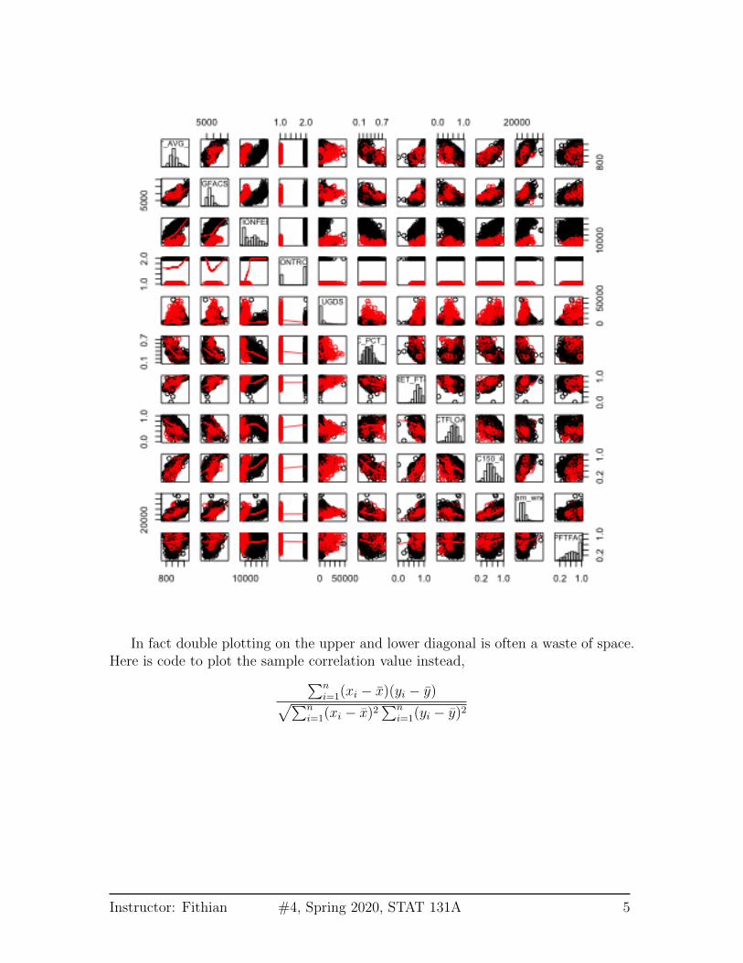
In fact double plotting on the upper and lower diagonal is often a waste of space.Here is code to plot the sample correlation value instead,∑n
i=1(xi − x)(yi − y)√∑ni=1(xi − x)2
∑ni=1(yi − y)2
Instructor: Fithian #4, Spring 2020, STAT 131A 5

For many variables, we can look at the correlations using colors and a summaryof the data via loess smoothing curves. This is implemented in the gpairs functionthat offers a lot of the above features we programmed in a easy format.
Instructor: Fithian #4, Spring 2020, STAT 131A 6
The lower panels gives only the loess smoothing curve and the upper panels indi-cate the correlation of the variables, with dark colors representing higher correlation.
What do you see in this plot?
2 Categorical Variable
Let’s consider now how we would visualize categorical variables, starting with thesimplest, a single categorical variable.
Single Categorical Variable For a single categorical variable, how have you learnhow you might visualize the data?
Let’s demonstrate this with the following data that is pulled from the GeneralSocial Survey (GSS) (http://gss.norc.org/). The GSS gathers data on contem-porary American society via personal in-person interviews in order to monitor andexplain trends and constants in attitudes, behaviors, and attributes over time. Hun-dreds of trends have been tracked since 1972. Each survey from 1972 to 2004 wasan independently drawn sample of English-speaking persons 18 years of age or over,within the United States. Starting in 2006 Spanish-speakers were added to the target
Instructor: Fithian #4, Spring 2020, STAT 131A 7
population. The GSS is the single best source for sociological and attitudinal trenddata covering the United States.
Here we look at a dataset where we have pulled out variables related to reportedmeasures of well-being (based on a report about trends in psychological well-beinghttps://gssdataexplorer.norc.org/documents/903/display). Like many sur-veys, the variables of interest are categorical.
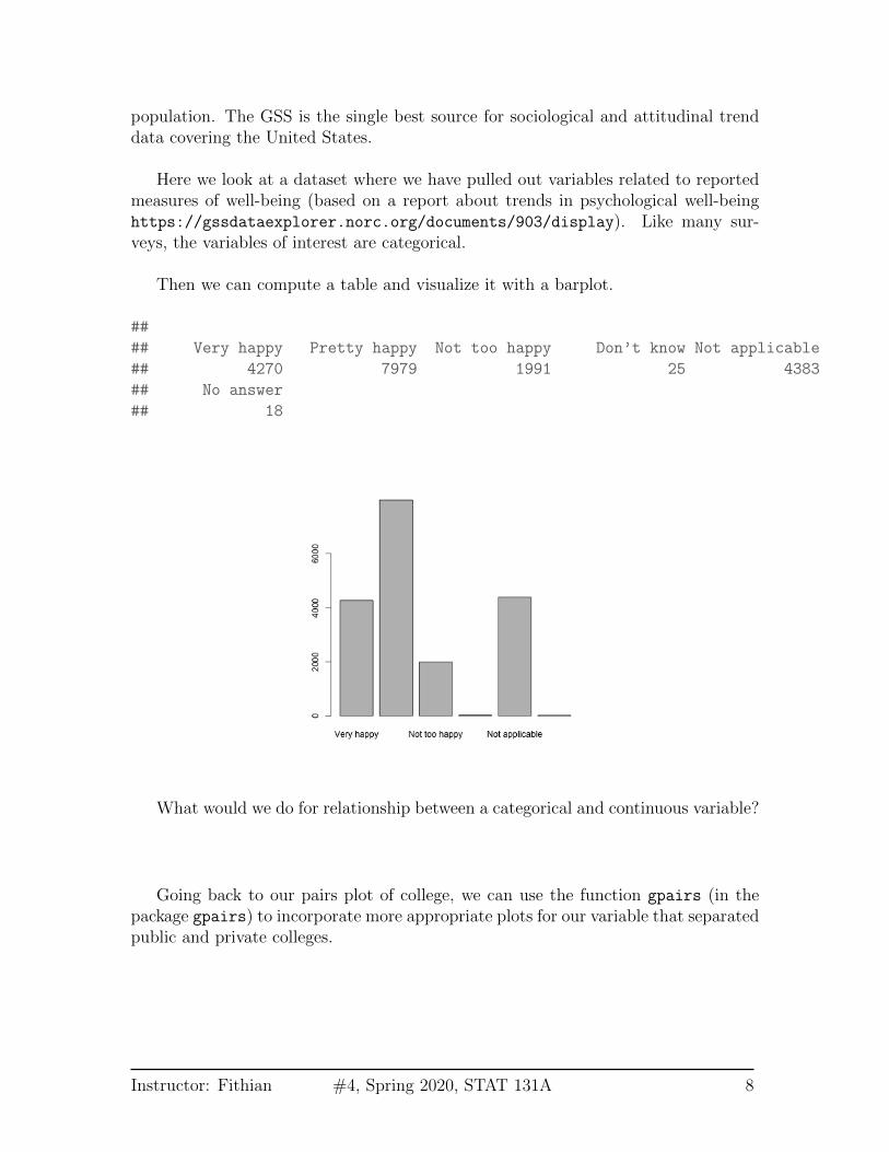
Then we can compute a table and visualize it with a barplot.
##
## Very happy Pretty happy Not too happy Don’t know Not applicable
## 4270 7979 1991 25 4383
## No answer
## 18
What would we do for relationship between a categorical and continuous variable?
Going back to our pairs plot of college, we can use the function gpairs (in thepackage gpairs) to incorporate more appropriate plots for our variable that separatedpublic and private colleges.
Instructor: Fithian #4, Spring 2020, STAT 131A 8

2.1 Relationships between two (or more) categorical vari-ables
When we get to two categorical variables, then the natural way to summarize theirrelationship is to cross-tabulate the values of the levels.
Cross-tabulations You have seen that contingency tables are a table that givethe cross-tabulation of two categorical variables.
Instructor: Fithian #4, Spring 2020, STAT 131A 9
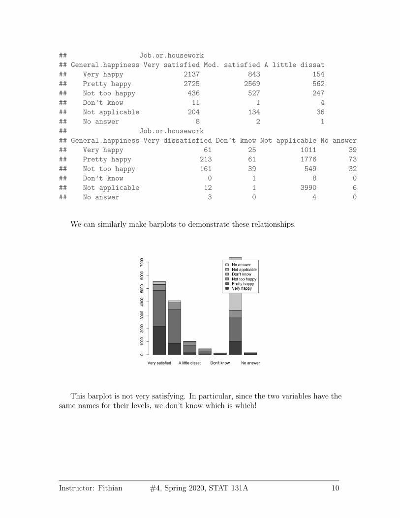
## Job.or.housework
## General.happiness Very satisfied Mod. satisfied A little dissat
## Very happy 2137 843 154
## Pretty happy 2725 2569 562
## Not too happy 436 527 247
## Don’t know 11 1 4
## Not applicable 204 134 36
## No answer 8 2 1
## Job.or.housework
## General.happiness Very dissatisfied Don’t know Not applicable No answer
## Very happy 61 25 1011 39
## Pretty happy 213 61 1776 73
## Not too happy 161 39 549 32
## Don’t know 0 1 8 0
## Not applicable 12 1 3990 6
## No answer 3 0 4 0
We can similarly make barplots to demonstrate these relationships.
This barplot is not very satisfying. In particular, since the two variables have thesame names for their levels, we don’t know which is which!
Instructor: Fithian #4, Spring 2020, STAT 131A 10

It can also be helpful to separate out the other variables, rather than stackingthem, and to change the colors.
Instructor: Fithian #4, Spring 2020, STAT 131A 11

Conditional Distributions from Contingency Tables When we look at thecontingency table, a natural question we ask is whether the distribution of the datachanges across the different categories. For example, for people answering ‘VerySatisfied’ for their job, there is a distribution of answers for the ‘General Happiness’question. And similarly for ‘Moderately Satisfied’. We can get these by making thecounts into proportions within each category.
## Job.or.housework
## General.happiness Very satisfied (Job) Mod. satisfied (Job)
## Very happy (General) 0.3870675602 0.2068204122
## Pretty happy (General) 0.4935700054 0.6302747792
## Not too happy (General) 0.0789712009 0.1292934249
## Don’t know (General) 0.0019923927 0.0002453386
## Not applicable (General) 0.0369498279 0.0328753680
## No answer (General) 0.0014490129 0.0004906771
## Job.or.housework
## General.happiness A little dissat (Job) Very dissatisfied (Job)
## Very happy (General) 0.1533864542 0.1355555556
## Pretty happy (General) 0.5597609562 0.4733333333
## Not too happy (General) 0.2460159363 0.3577777778
## Don’t know (General) 0.0039840637 0.0000000000
## Not applicable (General) 0.0358565737 0.0266666667
## No answer (General) 0.0009960159 0.0066666667
## Job.or.housework
## General.happiness Don’t know (Job) Not applicable (Job)
## Very happy (General) 0.1968503937 0.1377759608
## Pretty happy (General) 0.4803149606 0.2420278005
Instructor: Fithian #4, Spring 2020, STAT 131A 12

## Not too happy (General) 0.3070866142 0.0748160262
## Don’t know (General) 0.0078740157 0.0010902153
## Not applicable (General) 0.0078740157 0.5437448896
## No answer (General) 0.0000000000 0.0005451077
## Job.or.housework
## General.happiness No answer (Job)
## Very happy (General) 0.2600000000
## Pretty happy (General) 0.4866666667
## Not too happy (General) 0.2133333333
## Don’t know (General) 0.0000000000
## Not applicable (General) 0.0400000000
## No answer (General) 0.0000000000
We could ask if these proportions are the same in each column (i.e. each levelof ‘Job Satisfaction’). If so, then the value for ‘Job Satisfaction’ is not affecting theanswer for ‘General Happiness’, and so we would say the variables are unrelated.
Looking at the barplot, what would you say? Are the variables related?
We can, of course, flip the variables around.
## Job.or.housework
## General.happiness Very satisfied (Job) Mod. satisfied (Job)
## Very happy (General) 0.5004683841 0.1974238876
## Pretty happy (General) 0.3415214939 0.3219701717
Instructor: Fithian #4, Spring 2020, STAT 131A 13
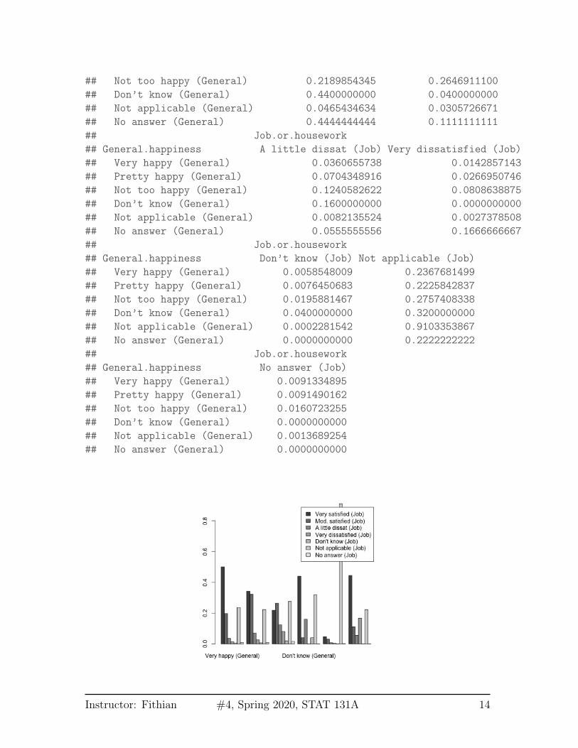
## Not too happy (General) 0.2189854345 0.2646911100
## Don’t know (General) 0.4400000000 0.0400000000
## Not applicable (General) 0.0465434634 0.0305726671
## No answer (General) 0.4444444444 0.1111111111
## Job.or.housework
## General.happiness A little dissat (Job) Very dissatisfied (Job)
## Very happy (General) 0.0360655738 0.0142857143
## Pretty happy (General) 0.0704348916 0.0266950746
## Not too happy (General) 0.1240582622 0.0808638875
## Don’t know (General) 0.1600000000 0.0000000000
## Not applicable (General) 0.0082135524 0.0027378508
## No answer (General) 0.0555555556 0.1666666667
## Job.or.housework
## General.happiness Don’t know (Job) Not applicable (Job)
## Very happy (General) 0.0058548009 0.2367681499
## Pretty happy (General) 0.0076450683 0.2225842837
## Not too happy (General) 0.0195881467 0.2757408338
## Don’t know (General) 0.0400000000 0.3200000000
## Not applicable (General) 0.0002281542 0.9103353867
## No answer (General) 0.0000000000 0.2222222222
## Job.or.housework
## General.happiness No answer (Job)
## Very happy (General) 0.0091334895
## Pretty happy (General) 0.0091490162
## Not too happy (General) 0.0160723255
## Don’t know (General) 0.0000000000
## Not applicable (General) 0.0013689254
## No answer (General) 0.0000000000
Instructor: Fithian #4, Spring 2020, STAT 131A 14
Notice that flipping this question gives me different proportions. This is becausewe are asking different question of the data. These are what we would call Condi-tional Distributions, and they depend on the order in which you condition yourvariables. The first plots show: conditional on being in a group in Job Satisfaction,what is your probability of being in a particular group in General Happiness? Thatis different than what is shown in the second plot: conditional on being in a groupin General Happiness, what is your probability of being in a particular group in JobSatisfaction?
2.2 Alluvial Plots
It can be complicated to look beyond two categorical variables. But we can createcross-tabulations for an arbitrary number of variables.
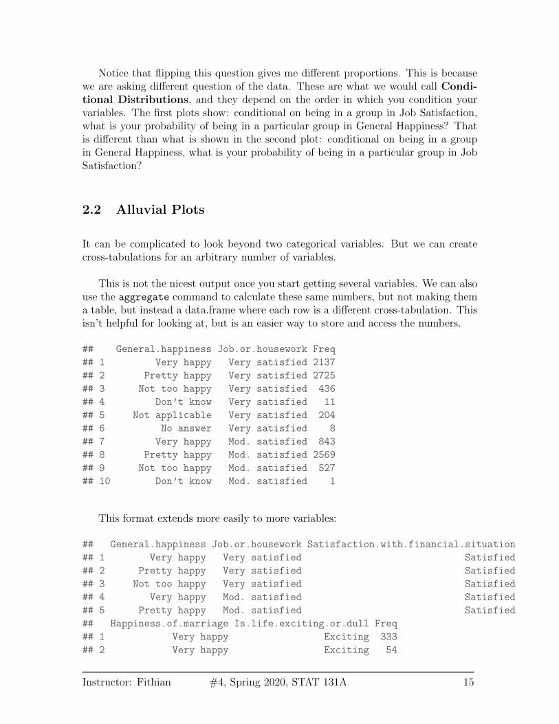
This is not the nicest output once you start getting several variables. We can alsouse the aggregate command to calculate these same numbers, but not making thema table, but instead a data.frame where each row is a different cross-tabulation. Thisisn’t helpful for looking at, but is an easier way to store and access the numbers.
## General.happiness Job.or.housework Freq
## 1 Very happy Very satisfied 2137
## 2 Pretty happy Very satisfied 2725
## 3 Not too happy Very satisfied 436
## 4 Don’t know Very satisfied 11
## 5 Not applicable Very satisfied 204
## 6 No answer Very satisfied 8
## 7 Very happy Mod. satisfied 843
## 8 Pretty happy Mod. satisfied 2569
## 9 Not too happy Mod. satisfied 527
## 10 Don’t know Mod. satisfied 1
This format extends more easily to more variables:
## General.happiness Job.or.housework Satisfaction.with.financial.situation
## 1 Very happy Very satisfied Satisfied
## 2 Pretty happy Very satisfied Satisfied
## 3 Not too happy Very satisfied Satisfied
## 4 Very happy Mod. satisfied Satisfied
## 5 Pretty happy Mod. satisfied Satisfied
## Happiness.of.marriage Is.life.exciting.or.dull Freq
## 1 Very happy Exciting 333
## 2 Very happy Exciting 54
Instructor: Fithian #4, Spring 2020, STAT 131A 15
## 3 Very happy Exciting 3
## 4 Very happy Exciting 83
## 5 Very happy Exciting 38
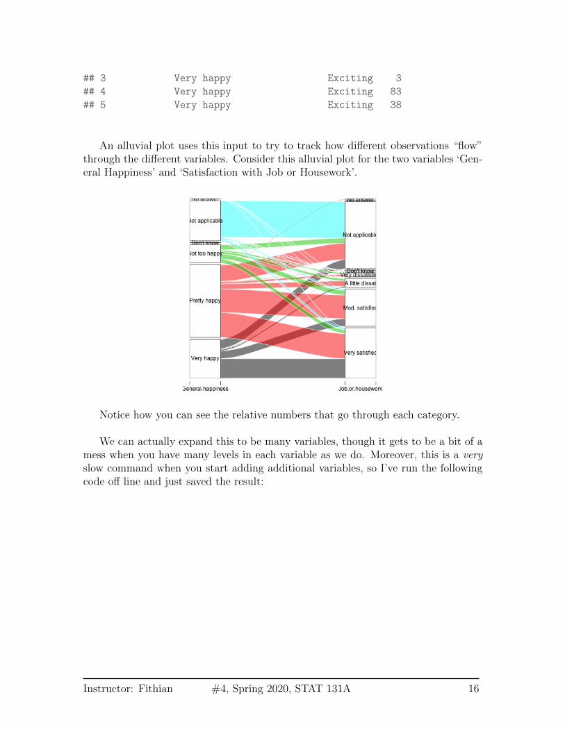
An alluvial plot uses this input to try to track how different observations “flow”through the different variables. Consider this alluvial plot for the two variables ‘Gen-eral Happiness’ and ‘Satisfaction with Job or Housework’.
Notice how you can see the relative numbers that go through each category.
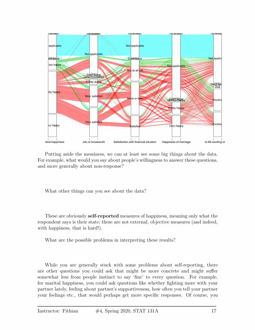
We can actually expand this to be many variables, though it gets to be a bit of amess when you have many levels in each variable as we do. Moreover, this is a veryslow command when you start adding additional variables, so I’ve run the followingcode off line and just saved the result:
Instructor: Fithian #4, Spring 2020, STAT 131A 16
Very happy
Pretty happy
Not too happy
Don't know
Not applicable
No answer
Very satisfied
Mod. satisfied
A little dissat
Very dissatisfiedDon't know
Not applicable
No answer
Satisfied
More or less
Not at all sat
Don't know
Not applicable
No answer
Very happy
Pretty happy
Not too happyDon't know
Not applicable
No answer
Exciting
Routine
DullDon't know
Not applicable
No answer
General.happiness Job.or.housework Satisfaction.with.financial.situation Happiness.of.marriage Is.life.exciting.or.dull
Putting aside the messiness, we can at least see some big things about the data.For example, what would you say about people’s willingness to answer these questions,and more generally about non-response?
What other things can you see about the data?
These are obviously self-reported measures of happiness, meaning only what therespondent says is their state; these are not external, objective measures (and indeed,with happiness, that is hard!).
What are the possible problems in interpreting these results?
While you are generally stuck with some problems about self-reporting, thereare other questions you could ask that might be more concrete and might suffersomewhat less from people instinct to say ‘fine’ to every question. For example,for marital happiness, you could ask questions like whether fighting more with yourpartner lately, feeling about partner’s supportiveness, how often you tell your partneryour feelings etc., that would perhaps get more specific responses. Of course, you
Instructor: Fithian #4, Spring 2020, STAT 131A 17
would then be in a position of interpreting whether that adds up to a happy marriagewhen in fact a happy marriage is quite different for different couples!
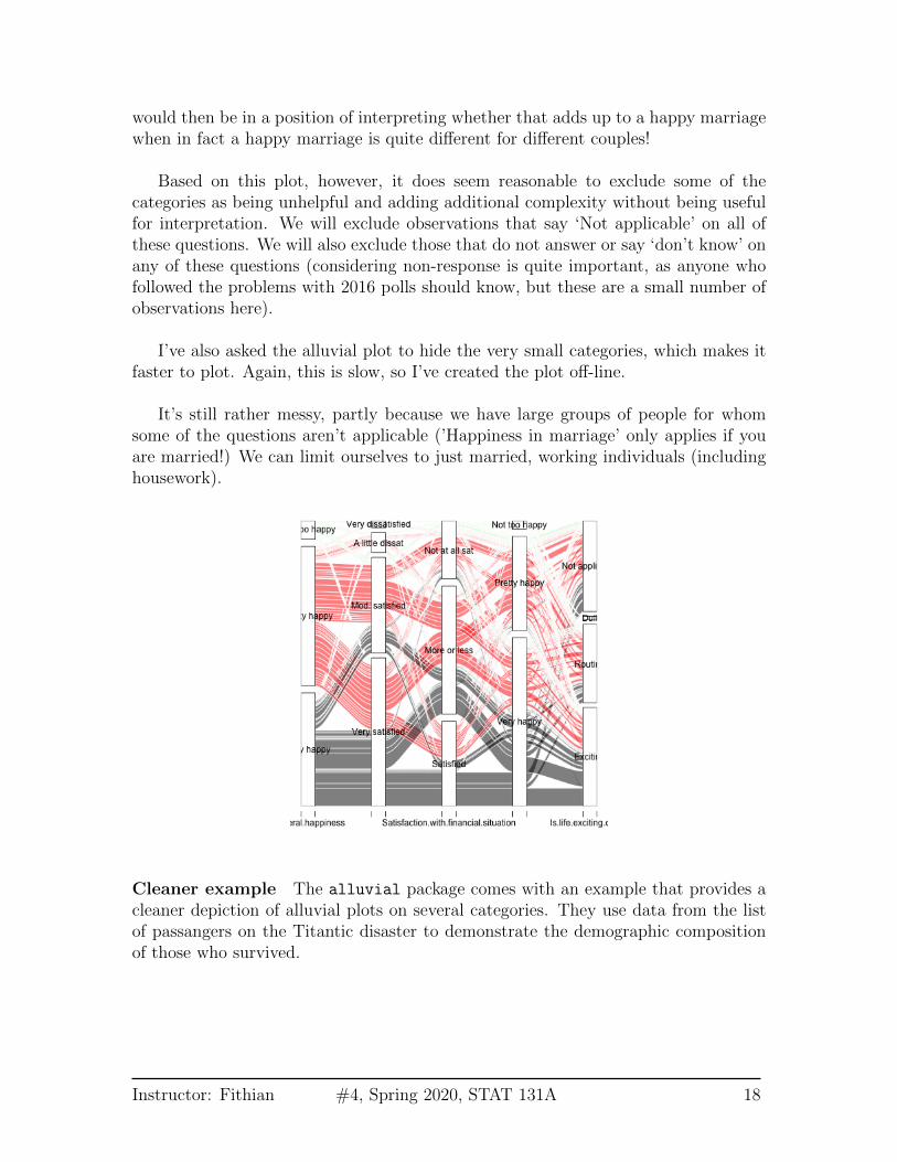
Based on this plot, however, it does seem reasonable to exclude some of thecategories as being unhelpful and adding additional complexity without being usefulfor interpretation. We will exclude observations that say ‘Not applicable’ on all ofthese questions. We will also exclude those that do not answer or say ‘don’t know’ onany of these questions (considering non-response is quite important, as anyone whofollowed the problems with 2016 polls should know, but these are a small number ofobservations here).
I’ve also asked the alluvial plot to hide the very small categories, which makes itfaster to plot. Again, this is slow, so I’ve created the plot off-line.
It’s still rather messy, partly because we have large groups of people for whomsome of the questions aren’t applicable (’Happiness in marriage’ only applies if youare married!) We can limit ourselves to just married, working individuals (includinghousework).
Cleaner example The alluvial package comes with an example that provides acleaner depiction of alluvial plots on several categories. They use data from the listof passangers on the Titantic disaster to demonstrate the demographic compositionof those who survived.
Instructor: Fithian #4, Spring 2020, STAT 131A 18

Like so many visualization tools, the effectiveness of a particular plot depends onthe dataset.
2.3 Mosaic Plots
In looking at alluvial plots, we often turn to the question of asking whether thepercentage, say happy in their jobs, is very different depending on whether theyreport that they are generally happy. . Visualizing these percentages is often donebetter by a mosaic plot.
Let’s first look at just 2 variables again.
Instructor: Fithian #4, Spring 2020, STAT 131A 19
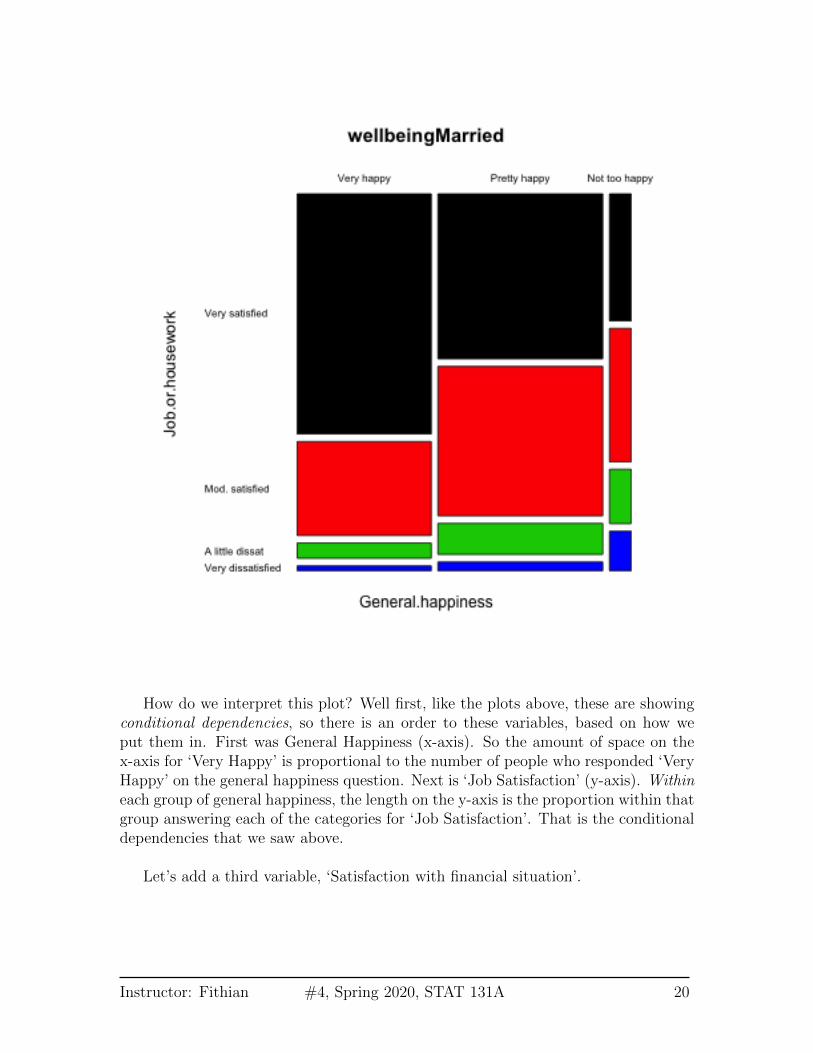
How do we interpret this plot? Well first, like the plots above, these are showingconditional dependencies, so there is an order to these variables, based on how weput them in. First was General Happiness (x-axis). So the amount of space on thex-axis for ‘Very Happy’ is proportional to the number of people who responded ‘VeryHappy’ on the general happiness question. Next is ‘Job Satisfaction’ (y-axis). Withineach group of general happiness, the length on the y-axis is the proportion within thatgroup answering each of the categories for ‘Job Satisfaction’. That is the conditionaldependencies that we saw above.
Let’s add a third variable, ‘Satisfaction with financial situation’.
Instructor: Fithian #4, Spring 2020, STAT 131A 20
This makes another subdivision on the x-axis. This is now subsetting down to thepeople, for example, that are very satisfied with both Job and their General life, andlooking at the distribution of ‘Satisfaction with financial situation’ for just those setof people.
Using this information, how do you interpret this plot? What does this tell youabout people who are ‘Very Happy’ in general happiness?
Instructor: Fithian #4, Spring 2020, STAT 131A 21
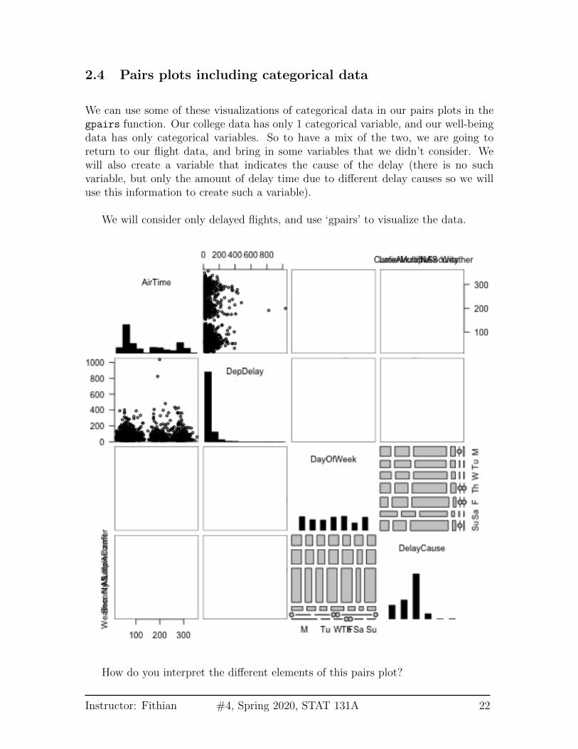
2.4 Pairs plots including categorical data
We can use some of these visualizations of categorical data in our pairs plots in thegpairs function. Our college data has only 1 categorical variable, and our well-beingdata has only categorical variables. So to have a mix of the two, we are going toreturn to our flight data, and bring in some variables that we didn’t consider. Wewill also create a variable that indicates the cause of the delay (there is no suchvariable, but only the amount of delay time due to different delay causes so we willuse this information to create such a variable).
We will consider only delayed flights, and use ‘gpairs’ to visualize the data.
How do you interpret the different elements of this pairs plot?
Instructor: Fithian #4, Spring 2020, STAT 131A 22
3 Heatmaps
Let’s consider another dataset. This will consist of “gene expression” measurementson breast cancer tumors from the Cancer Genome Project. This data measures forall human genes the amount of each gene that is being used in the tumor beingmeasured. There are measurements for 19,000 genes but we limited ourselves toaround 275 genes.
One common goal of this kind of data is to be able to identify different types ofbreast cancers. The idea is that by looking at the genes in the tumor, we can discoversimilarities between the tumors, which might lead to discovering that some patientswould respond better to certain kinds of treatment, for example.
We have so many variables, that we might consider simplifying our analysis andjust considering the pairwise correlations of each variable (gene) – like the upper halfof the pairs plot we drew before. Rather than put in numbers, which we couldn’t easilyread, we will put in colors to indicate the strength of the correlation. Representinga large matrix of data using a color scale is called a heatmap. Basically for anymatrix, we visualize the entire matrix by putting a color for the value of the matrix.
In this case, our matrix is the matrix of correlations.
Instructor: Fithian #4, Spring 2020, STAT 131A 23

Why is the diagonal all dark red?
This is not an informative picture, however – there are so many variables (genes)that we can’t discover anything here.
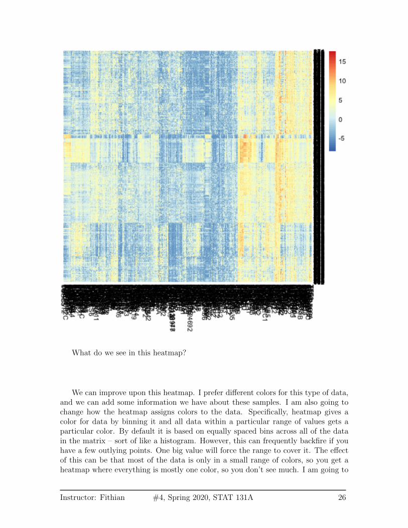
However, if we could reorder the genes so that those that are highly correlated arenear each other, we might see blocks of similar genes like we did before. In fact thisis exactly what heatmaps usually do by default. They reorder the variables so thatsimilar patterns are close to each other.
Here is the same plot of the correlation matrix, only now the rows and columns
Instructor: Fithian #4, Spring 2020, STAT 131A 24

have been reordered.
What do we see in this heatmap?
3.1 Heatmaps for Data Matrices
Before we get into how that ordering was determined, lets consider heatmaps more.Heatmaps are general, and in fact can be used for the actual data matrix, not justthe correlation matrix.
Instructor: Fithian #4, Spring 2020, STAT 131A 25
What do we see in this heatmap?
We can improve upon this heatmap. I prefer different colors for this type of data,and we can add some information we have about these samples. I am also going tochange how the heatmap assigns colors to the data. Specifically, heatmap gives acolor for data by binning it and all data within a particular range of values gets aparticular color. By default it is based on equally spaced bins across all of the datain the matrix – sort of like a histogram. However, this can frequently backfire if youhave a few outlying points. One big value will force the range to cover it. The effectof this can be that most of the data is only in a small range of colors, so you get aheatmap where everything is mostly one color, so you don’t see much. I am going to
Instructor: Fithian #4, Spring 2020, STAT 131A 26
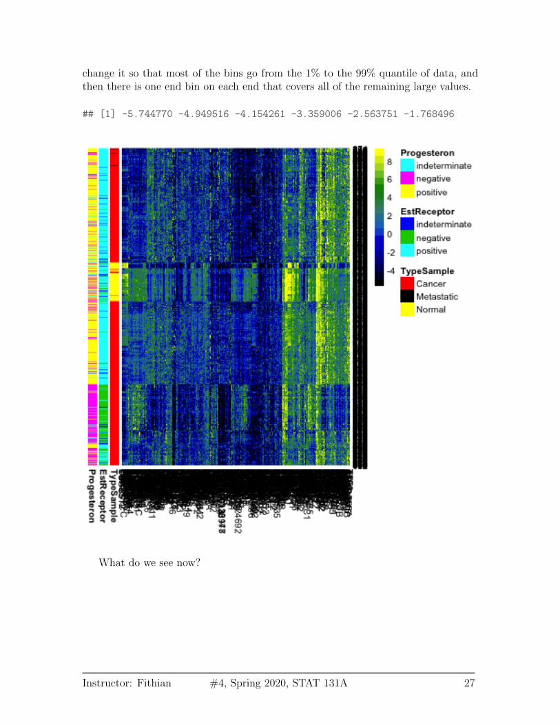
change it so that most of the bins go from the 1% to the 99% quantile of data, andthen there is one end bin on each end that covers all of the remaining large values.
## [1] -5.744770 -4.949516 -4.154261 -3.359006 -2.563751 -1.768496
What do we see now?
Instructor: Fithian #4, Spring 2020, STAT 131A 27
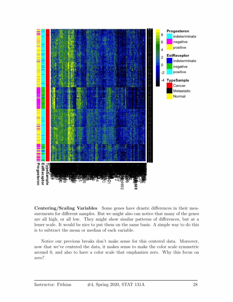
Centering/Scaling Variables Some genes have drastic differences in their mea-surements for different samples. But we might also can notice that many of the genesare all high, or all low. They might show similar patterns of differences, but at alesser scale. It would be nice to put them on the same basis. A simple way to do thisis to subtract the mean or median of each variable.
Notice our previous breaks don’t make sense for this centered data. Moreover,now that we’ve centered the data, it makes sense to make the color scale symmetricaround 0, and also to have a color scale that emphasizes zero. Why this focus onzero?
Instructor: Fithian #4, Spring 2020, STAT 131A 28

We could also make their range similar by scaling them to have a similar variance.This is helpful when your variables are really on different scales, for example weights inkg and heights in meters. This helps put them on a comparable scale for visualizingthe patterns with the heatmap. For this gene expression data, the scale is moreroughly similar, though it is common in practice that people will scale them as wellfor heatmaps.
3.2 Clustering
How do heatmaps find the ordering of the samples and genes? It performs a form ofclustering on the samples. Let’s get an idea of how clustering works generally, andthen we’ll return to heatmaps.
Instructor: Fithian #4, Spring 2020, STAT 131A 29

The idea behind clustering is that there is an unknown variable that would tellyou the ‘true’ groups of the samples, and you want to find it. This may not actuallybe true in practice, but it’s a useful abstraction. The basic idea of clustering relies onexamining the distances between samples and putting into the same cluster samplesthat are close together. There are countless number of clustering algorithms, butheatmaps rely on what is called hierarchical clustering. It is called hiearchicalclustering because it not only puts observations into groups/clusters, but does so byfirst creating a hierarchical tree or dendrogram that relates the samples.
Here we show this on a small subset of the samples and genes. We see on the leftthe dendrogram that relates the samples (rows).1
1I have also clustered the variables (columns) in this figure because otherwise it is hard to seeanything, but have suppressed the drawing of the dendrogram to focus on the samples – see the nextfigure where we draw both.
Instructor: Fithian #4, Spring 2020, STAT 131A 30
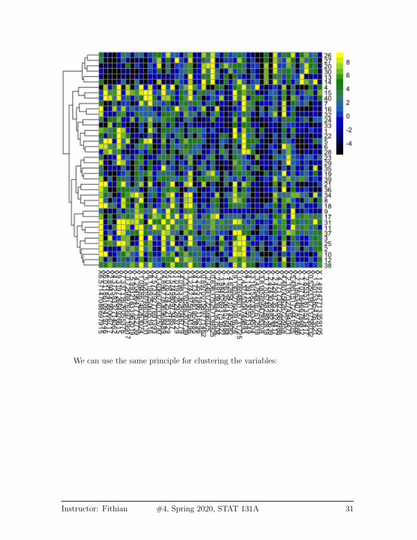
We can use the same principle for clustering the variables:
Instructor: Fithian #4, Spring 2020, STAT 131A 31
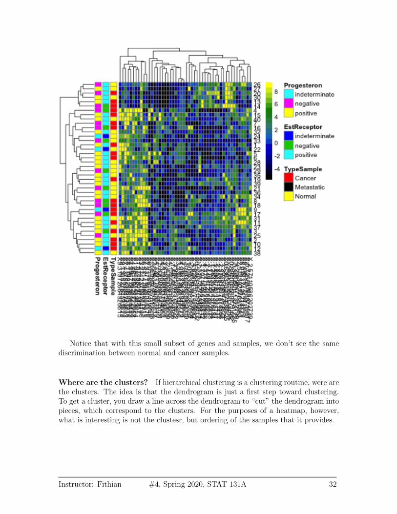
Notice that with this small subset of genes and samples, we don’t see the samediscrimination between normal and cancer samples.
Where are the clusters? If hierarchical clustering is a clustering routine, were arethe clusters. The idea is that the dendrogram is just a first step toward clustering.To get a cluster, you draw a line across the dendrogram to “cut” the dendrogram intopieces, which correspond to the clusters. For the purposes of a heatmap, however,what is interesting is not the clustesr, but ordering of the samples that it provides.
Instructor: Fithian #4, Spring 2020, STAT 131A 32
3.2.1 How Hierarchical Clustering Works
Hierarchical clustering is an iterative process, that builds the dendrogram by itera-tively creating new groups of samples by either
1. joining pairs of individual samples into a group
2. add an individual samples to an existing group
3. combine two groups into a larger group2
Step 1: Pairwise distance matrix between groups We consider each sample tobe a separate group (i.e. n groups), and we calculate the pairwise distances betweenall of the n groups.
For simplicity, let’s assume we have only one variable, so our data is y1, . . . , yn.Then the standard distance between samples i and j could be
dij = |yi − yj|
or alternatively squared distance,
dij = (yi − yj)2.
So we can get all of the pairwise distances between all of the samples (a distancematrix of all the n× n pairs)
Step 2: Make group by joining together two closest “groups” Your availablechoices from the list above are to join together two samples to make a group. So wechoose to join together the two samples that are closest together, and forming ourfirst real group of samples.
Step 3: Update distance matrix between groups Specifically, say you havealready joined together samples i and j to make the first true group. To join updateour groups, our options from the list above are:
1. Combine two samples k and ` to make next group (i.e. do nothing with thegroup previously formed by i and j.
2This is called an agglomerative method, where you start at the bottom of the tree and build up.There are also divisive method for creating a hiearchical tree that starts at the “top” by continuallydividing the samples into two group.
Instructor: Fithian #4, Spring 2020, STAT 131A 33

2. Combine some sample k with your new group
Clearly, if we join together two samples k and ` it’s the same as above (pick twoclosest). But how do you decide to do that versus add sample k to my group ofsamples i and j? We need to decide whether a sample k is closer to the groupconsisting of i and j than it is to any other sample `.
We do this by recalculating the pairwise distances we had before, replacing thesetwo samples i and j by the pairwise distance of the new group to the other samples.
Of course this is easier said than done, because how do we define how close agroup is to other samples or groups? There’s no single way to do that, and in factthere are a lot of competing methods. The default method in R is to say that if wehave a group G consisting of i and j, then the distance of that group to a sample kis the maximum distance of i and j to k3 ,
d(G, k) = max(dik, djk).
Now we have a updated n− 1×n− 1 matrix of distances between all our current listof “groups” (remember the single samples form their own group).
Step 4: Join closest groups Now we find the closest two groups and join thesamples in the group together to form a new group.
Step 5+: Continue to update distance matrix and join groups Then yourepeat this process of joining together to build up the tree. Once you get more thantwo groups, you will consider all of the three different kinds of joins described above– i.e. you will also consider joining together two existing groups G1 and G2 that bothconsist of multiple samples. Again, you generalize the definition above to define thedistance between the two groups of samples to be the maximum distance of all thepoints in G1 to all the points in G2,
d(G1,G2) = maxi∈G1,j∈G2
dij.
Higher Dimension Distances The same process works if instead of having asingle number, your yi are now vectors – i.e. multiple variables. You just need adefinition for the distance between the yi, and then follow the same algorithm.
What is the equivalent distance when you have more variables? For each variable`, we observe y
(`)1 , . . . , y
(`)n . And an observation is now the vector that is the collection
3This is called complete linkage.
Instructor: Fithian #4, Spring 2020, STAT 131A 34
of all the variables for the sample:
yi = (y(1)i , . . . , y
(p)i )
We want to find the distance between observations i and j which have vectors of data
(y(1)i , . . . , y
(p)i )
and(y
(1)j , . . . , y
(p)j )
The standard distance (called Euclidean distance) is
dij = d(yi, yj) =
√√√√ p∑`=1
(y(`)i − y
(`)j )2
So its the cummulative (i.e. sum) amount of the individual (squared) distance of eachvariable. You don’t have to use this distance – there are other choices that can bebetter depending on the data – but it is the default.
We generally work with squared distances, which would be
d2ij =
p∑`=1
(y(`)i − y
(`)j )2
4 Principal Components Analysis
In looking at both the college data and the gene expression data, it is clear that thereis a lot of redundancy in our variables, meaning that several variables are often givingus the same information about the patterns in our observations. We could see thisby looking at their correlations, or by seeing their values in a heatmap.
For the purposes of illustration, let’s consider a hypothetical situation. Say thatyou are teaching a course, and there are two exams:
Instructor: Fithian #4, Spring 2020, STAT 131A 35
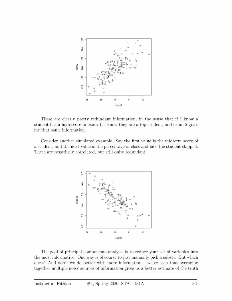
These are clearly pretty redundant information, in the sense that if I know astudent has a high score in exam 1, I know they are a top student, and exam 2 givesme that same information.
Consider another simulated example. Say the first value is the midterm score ofa student, and the next value is the percentage of class and labs the student skipped.These are negatively correlated, but still quite redundant.
The goal of principal components analysis is to reduce your set of variables intothe most informative. One way is of course to just manually pick a subset. But whichones? And don’t we do better with more information – we’ve seen that averagingtogether multiple noisy sources of information gives us a better estimate of the truth
Instructor: Fithian #4, Spring 2020, STAT 131A 36
than a single one. The same principle should hold for our variables; if the variablesare measuring the same underlying principle, then we should do better to use all ofthe variables.
Therefore, rather than picking a subset of the variables, principal componentsanalysis creates new variables from the existing variables.
There are two equivalent ways to think about how principal components analysisdoes this.
4.1 Linear combinations of existing variables
You want to find a single score to give a final grade.
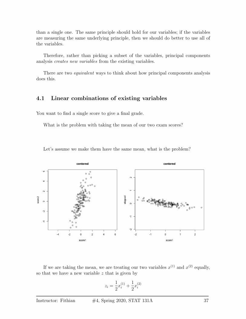
What is the problem with taking the mean of our two exam scores?
Let’s assume we make them have the same mean, what is the problem?
If we are taking the mean, we are treating our two variables x(1) and x(2) equally,so that we have a new variable z that is given by
zi =1
2x(1)i +
1
2x(2)i
Instructor: Fithian #4, Spring 2020, STAT 131A 37
The idea with principal components, then, is that we want to weight them differentlyto take into account the scale and whether they are negatively or positively correlated.
zi = a1x(1)i + a2x
(2)i
So the idea of principal components is to find the “best” constants (or coefficients),a1 and a2. This is a little bit like regression, only in regression I had a response yi, andso my best coefficients were the best predictors of yi. Here I don’t have a response. Ionly have the variables, and I want to get the best summary of them, so we will needa new definition of “best”.
So how do we pick the best set of coefficients? Similar to regression, we needa criteria for what is the best set of coefficients. Once we choose the criteria, thecomputer can run an optimization technique to find the coefficients. So what is areasonable criteria?
If I consider the question of exam scores, what is my goal? Well, I would like afinal score that separates out the students so that the students that do much betterthan the other students are further apart, etc.
The criteria in principal components is to find the line so that the new variablevalues have the most variance – so we can spread out the observations the most. Sothe criteria we choose is to maximize the sample variance of the resulting z.
In other words, for every set of coefficients a1, a2, we will get a set of n new valuesfor my observations, z1, . . . , zn. We can think of this new z as a new variable.
Then for any set of cofficients, I can calculate the sample variance of my resultingz as
ˆvar(z) =1
n− 1
n∑i=1
(zi − z)2
Of course, zi = a1x(1)i + a2x
(2)i , this is actually
ˆvar(z) =1
n− 1
n∑i=1
(a1x(1)i + a2x
(2)i − z)2
(I haven’t written out z in terms of the coefficients, but you get the idea.) Now thatI have this criteria, I can use optimization routines implemented in the computer tofind the coefficients that maximize this quantity.
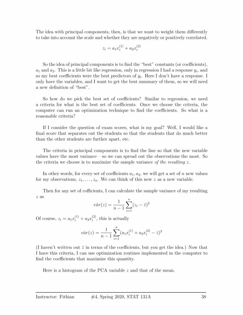
Here is a histogram of the PCA variable z and that of the mean.
Instructor: Fithian #4, Spring 2020, STAT 131A 38

We’ll return to considering this criteria more but first let’s look at the otherinterpretation of summarizing the data.
4.2 Geometric Interpretation
Another way to consider our redundancy is geometrically. If this was a regressionproblem we would “summarize” the relationship betweeen our variables by the re-gression line:
Instructor: Fithian #4, Spring 2020, STAT 131A 39

This is a summary of how the x-axis variable predicts the y-axis variable. Butnote that if we had flipped which was the response and which was the predictor, wewould give a different line.
The problem here is that our definition of what is the best line summarizing thisrelationship is not symmetric in regression. Our best line minimizes error in the ydirection. Specifically, for every observation i, we project our data onto the line sothat the error in the y direction is minimized.
Instructor: Fithian #4, Spring 2020, STAT 131A 40

However, if we want to summarize both variables symmetrically, we could insteadconsider picking a line to minimize the distance from each point to the line.
By distance of a point to a line, we mean the minimimum distance of any pointto the line. This is found by drawing another line that goes through the point andis orthogonal to the line. Then the length of that line segment from the point to theline is the distance of a point to the line.
Just like for regression, we can consider all lines, and for each line, calculate theaverage distance of the points to the line.
So to pick a line, we now find the line that minimizes the average distance to the
Instructor: Fithian #4, Spring 2020, STAT 131A 41
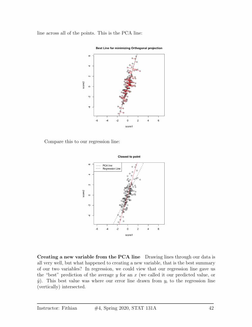
line across all of the points. This is the PCA line:
Compare this to our regression line:
Creating a new variable from the PCA line Drawing lines through our data isall very well, but what happened to creating a new variable, that is the best summaryof our two variables? In regression, we could view that our regression line gave usthe “best” prediction of the average y for an x (we called it our predicted value, ory). This best value was where our error line drawn from yi to the regression line(vertically) intersected.
Instructor: Fithian #4, Spring 2020, STAT 131A 42
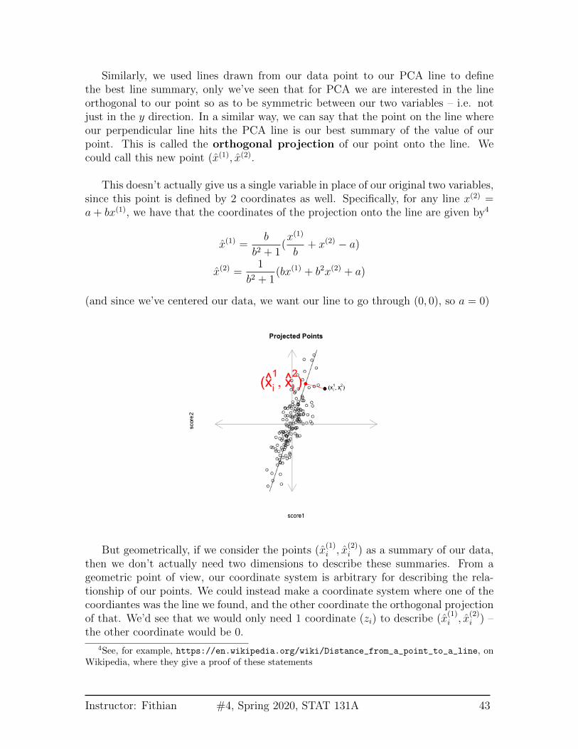
Similarly, we used lines drawn from our data point to our PCA line to definethe best line summary, only we’ve seen that for PCA we are interested in the lineorthogonal to our point so as to be symmetric between our two variables – i.e. notjust in the y direction. In a similar way, we can say that the point on the line whereour perpendicular line hits the PCA line is our best summary of the value of ourpoint. This is called the orthogonal projection of our point onto the line. Wecould call this new point (x(1), x(2).
This doesn’t actually give us a single variable in place of our original two variables,since this point is defined by 2 coordinates as well. Specifically, for any line x(2) =a + bx(1), we have that the coordinates of the projection onto the line are given by4
x(1) =b
b2 + 1(x(1)
b+ x(2) − a)
x(2) =1
b2 + 1(bx(1) + b2x(2) + a)
(and since we’ve centered our data, we want our line to go through (0, 0), so a = 0)
But geometrically, if we consider the points (x(1)i , x
(2)i ) as a summary of our data,
then we don’t actually need two dimensions to describe these summaries. From ageometric point of view, our coordinate system is arbitrary for describing the rela-tionship of our points. We could instead make a coordinate system where one of thecoordiantes was the line we found, and the other coordinate the orthogonal projectionof that. We’d see that we would only need 1 coordinate (zi) to describe (x
(1)i , x
(2)i ) –
the other coordinate would be 0.
4See, for example, https://en.wikipedia.org/wiki/Distance_from_a_point_to_a_line, onWikipedia, where they give a proof of these statements
Instructor: Fithian #4, Spring 2020, STAT 131A 43
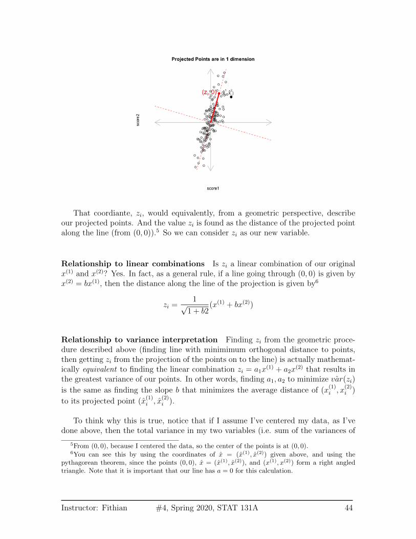
That coordiante, zi, would equivalently, from a geometric perspective, describeour projected points. And the value zi is found as the distance of the projected pointalong the line (from (0, 0)).5 So we can consider zi as our new variable.
Relationship to linear combinations Is zi a linear combination of our originalx(1) and x(2)? Yes. In fact, as a general rule, if a line going through (0, 0) is given byx(2) = bx(1), then the distance along the line of the projection is given by6
zi =1√
1 + b2(x(1) + bx(2))
Relationship to variance interpretation Finding zi from the geometric proce-dure described above (finding line with minimimum orthogonal distance to points,then getting zi from the projection of the points on to the line) is actually mathemat-ically equivalent to finding the linear combination zi = a1x
(1) + a2x(2) that results in
the greatest variance of our points. In other words, finding a1, a2 to minimize ˆvar(zi)
is the same as finding the slope b that minimizes the average distance of (x(1)i , x
(2)i )
to its projected point (x(1)i , x
(2)i ).
To think why this is true, notice that if I assume I’ve centered my data, as I’vedone above, then the total variance in my two variables (i.e. sum of the variances of
5From (0, 0), because I centered the data, so the center of the points is at (0, 0).6You can see this by using the coordinates of x = (x(1), x(2)) given above, and using the
pythagorean theorem, since the points (0, 0), x = (x(1), x(2)), and (x(1), x(2)) form a right angledtriangle. Note that it is important that our line has a = 0 for this calculation.
Instructor: Fithian #4, Spring 2020, STAT 131A 44
each variable) is given by
1
n− 1
∑i
(x(1)i )2 +
1
n− 1
∑i
(x(2)i )2
1
n− 1
∑i
[(x
(1)i )2 + (x
(2)i )2
]So that variance is a geometrical idea once you’ve centered the variables – the sumof the squared length of the vector ((x
(1)i , x
(2)i ). Under the geometric interpretation
your new point (x(1)i , x
(2)i ), or equivalently zi, has mean zero too, so the total variance
of the new points is given by1
n− 1
∑i
z2i
Since we know that we have an orthogonal projection then we know that the distancedi from the point (x
(1)i , x
(2)i ) to (x
(1)i , x
(2)i ) satisfies the Pythagorean theorem,
zi(b)2 + di(b)
2 = [x(1)i ]2 + [x
(2)i ]2.
That means that finding b that minimizes∑
i di(b)2 will also maximize
∑i zi(b)
2
because ∑i
di(b)2 = constant−
∑i
zi(b)2
so minimizing the left hand size will maximize the right hand side.
Therefore since every zi(b) found by projecting the data to a line through the origin
is a linear combination of x(1)i , x
(2)i AND minimizing the squared distance results in
the zi(b) having maximum variance across all such z2i (b), then it MUST be the samezi we get under the variance-maximizing procedure.
The above explanation is to help give understanding of the mathematical under-pinnings of why they are equivalent. But the important take-home fact is that bothof these procedures are the same: if we minimize the distance to the line, we also findthe linear combination so that the projected points have the most variance (i.e. wecan spread out the points the most).
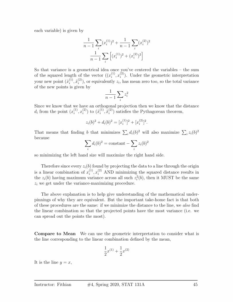
Compare to Mean We can use the geometric interpretation to consider what isthe line corresponding to the linear combination defined by the mean,
1
2x(1) +
1
2x(2)
It is the line y = x,
Instructor: Fithian #4, Spring 2020, STAT 131A 45
We could see geometrically how the mean is not a good summary of our cloud ofdata points.
Note on Standardizing the Variables You might say, “Why not standardizeyour scores by the standard deviation so they are on the same scale?” For the caseof combining 2 scores, if I normalized my variables, I would get essentially the samez from the PCA linear combination and the mean.7 However, as we will see, we canextend PCA summarization to an arbitrary number of variables, and then the scalingof the variables does not have this equivalency with the mean. This is just a freakthing about combining 2 variables.
Why maximize variance – isn’t that wrong? This geometric interpretationallows us to understand something that is often confusing to students. Usually wethink we want low variability because we think of variability as noise, so it seemswrong to maximize the variance. But variability amongst samples should only beconsidered noise among homogeneous samples, i.e. after we have remove the inter-esting patterns. Otherwise we can have variability in our variables due to patterns inthe data. Consider this simple simulated example where there are two groups thatdistinguish our observations. Then the difference in the groups is creating a largespread in our observations. Capturing the variance is capturing these differences.
7If the data is scaled so the two variances have the same st.deviation, then they are exactly thesame up to a constant; PCA uses 1√
2rather than 1
2 for the constant. But they both give equal
weight to the two variables.
Instructor: Fithian #4, Spring 2020, STAT 131A 46

Example on real data We will look at data on scores of students taking APstatistics. First we will draw a heatmap of the pair-wise correlation of the variables.
Not surprisingly, many of these measures are highly correlated.
Let’s look at 2 scores, the midterm score (MT) and the pre-class evaluation (Lo-cus.Aug) and consider how to summarize them using PCA.
Instructor: Fithian #4, Spring 2020, STAT 131A 47

4.3 More than 2 variables
We could similarly combine three measurements. Here is some simulated test scoresin 3 dimensions.
Now a good summary of our data would be a line that goes through the cloud ofpoints. Just as in 2 dimensions, this line corresponds to a linear combination of thethree variables. A line in 3 dimensions is written in it’s standard form as:
c = b1x(1)i + b2x
(2)i + b3x
(3)i
Instructor: Fithian #4, Spring 2020, STAT 131A 48

Since again, we will center our data first, the line will be with c = 0.8
The exact same principles hold. Namely, that we look for the line with the smallestaverage distance to the line from the points. Once we find that line (drawn in thepicture above), our zi is again the distance from 0 of our point projected onto theline. The only difference is that now distance is in 3 dimensions, rather than 2. Thisis given by the Euclidean distance, that we discussed earlier.
Just like before, this is exactly equivalent to setting zi = a1x(1)i + a2x
(2)i + a3x
(3)i
and searching for the ai that maximize ˆvar(zi).
Many variables We can of course expand this to as many variables as we want,but it gets hard to visualize the geometric version of it. But the variance-maximizingversion is easy to write out.
Specifically, any observation i is a vector of values, (x(1)i , . . . , x
(p)i ) where p is the
number of variables. With PCA, I am looking for a linear combination of these pvariables. This means some set of adding and subtracting of these variables to get anew variable z,
zi = a1x(1)i + . . . + apx
(p)i
So a linear combination is just a set of p constants that I will multiply my variablesby.
Q: If I take the mean of my p variables, what are my choices of ak for each of myvariables?
I can similarly find the coefficients ak so that my resulting zi have maximumvariance. As before, this is equivalent the geometric interpretation of finding a linein higher dimensions, though it’s harder to visualize in higher dimensions than 3.
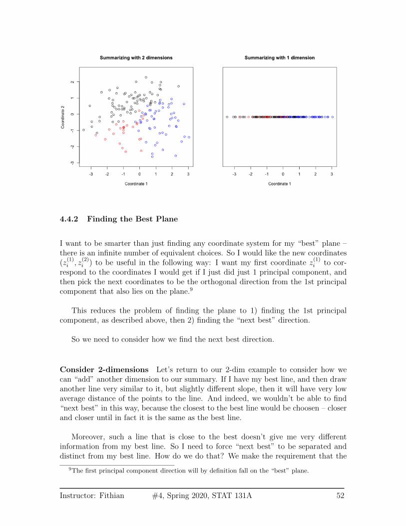
4.4 Adding another principal component
What if instead my three scores look like this (i.e. line closer to a plane than a line)?
8This is the standard way to write the equation for a line in higher dimensions and is symmetricin the treatment of the variables. Note the standard way you were probably taught to write a linein 2-dimensions, y = a + bx can also be written in this form with c = b, b1 = b, and b2 = −1.
Instructor: Fithian #4, Spring 2020, STAT 131A 49
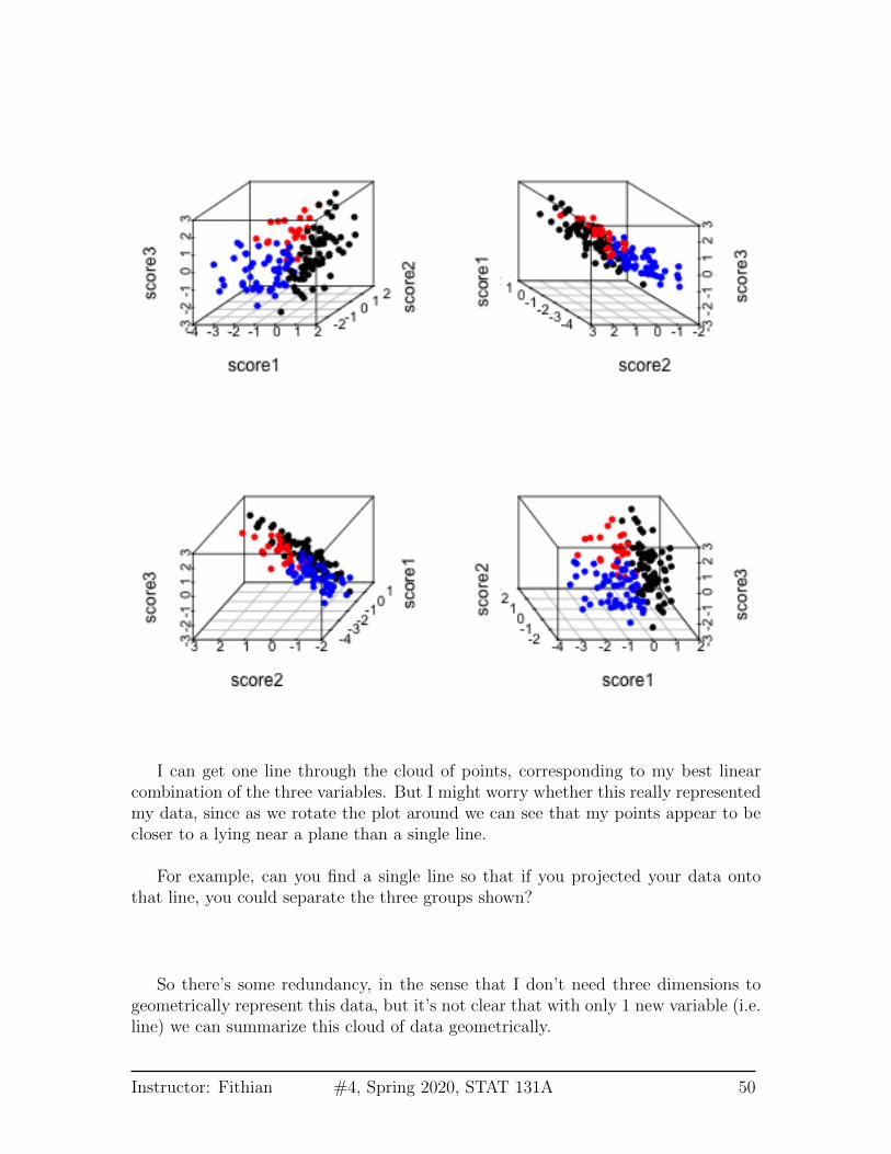
I can get one line through the cloud of points, corresponding to my best linearcombination of the three variables. But I might worry whether this really representedmy data, since as we rotate the plot around we can see that my points appear to becloser to a lying near a plane than a single line.
For example, can you find a single line so that if you projected your data ontothat line, you could separate the three groups shown?
So there’s some redundancy, in the sense that I don’t need three dimensions togeometrically represent this data, but it’s not clear that with only 1 new variable (i.e.line) we can summarize this cloud of data geometrically.
Instructor: Fithian #4, Spring 2020, STAT 131A 50
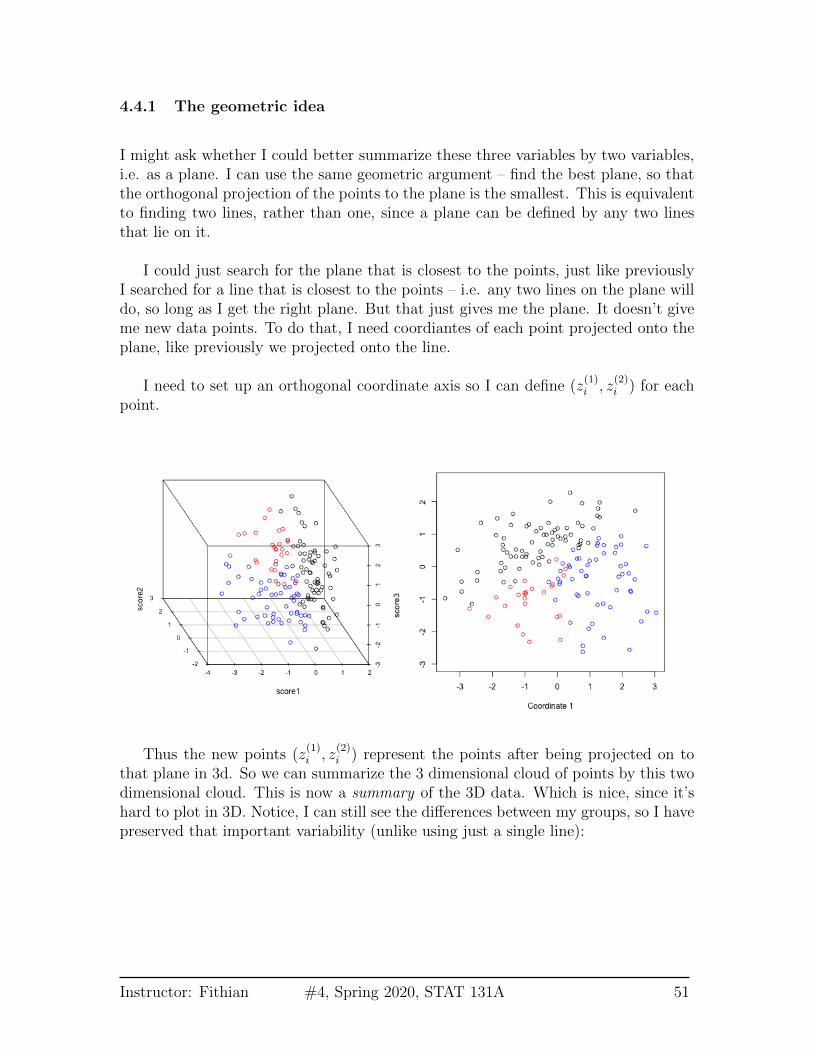
4.4.1 The geometric idea
I might ask whether I could better summarize these three variables by two variables,i.e. as a plane. I can use the same geometric argument – find the best plane, so thatthe orthogonal projection of the points to the plane is the smallest. This is equivalentto finding two lines, rather than one, since a plane can be defined by any two linesthat lie on it.
I could just search for the plane that is closest to the points, just like previouslyI searched for a line that is closest to the points – i.e. any two lines on the plane willdo, so long as I get the right plane. But that just gives me the plane. It doesn’t giveme new data points. To do that, I need coordiantes of each point projected onto theplane, like previously we projected onto the line.
I need to set up an orthogonal coordinate axis so I can define (z(1)i , z
(2)i ) for each
point.
Thus the new points (z(1)i , z
(2)i ) represent the points after being projected on to
that plane in 3d. So we can summarize the 3 dimensional cloud of points by this twodimensional cloud. This is now a summary of the 3D data. Which is nice, since it’shard to plot in 3D. Notice, I can still see the differences between my groups, so I havepreserved that important variability (unlike using just a single line):
Instructor: Fithian #4, Spring 2020, STAT 131A 51
4.4.2 Finding the Best Plane
I want to be smarter than just finding any coordinate system for my “best” plane –there is an infinite number of equivalent choices. So I would like the new coordinates(z
(1)i , z
(2)i ) to be useful in the following way: I want my first coordinate z
(1)i to cor-
respond to the coordinates I would get if I just did just 1 principal component, andthen pick the next coordinates to be the orthogonal direction from the 1st principalcomponent that also lies on the plane.9
This reduces the problem of finding the plane to 1) finding the 1st principalcomponent, as described above, then 2) finding the “next best” direction.
So we need to consider how we find the next best direction.
Consider 2-dimensions Let’s return to our 2-dim example to consider how wecan “add” another dimension to our summary. If I have my best line, and then drawanother line very similar to it, but slightly different slope, then it will have very lowaverage distance of the points to the line. And indeed, we wouldn’t be able to find“next best” in this way, because the closest to the best line would be choosen – closerand closer until in fact it is the same as the best line.
Moreover, such a line that is close to the best doesn’t give me very differentinformation from my best line. So I need to force “next best” to be separated anddistinct from my best line. How do we do that? We make the requirement that the
9The first principal component direction will by definition fall on the “best” plane.
Instructor: Fithian #4, Spring 2020, STAT 131A 52
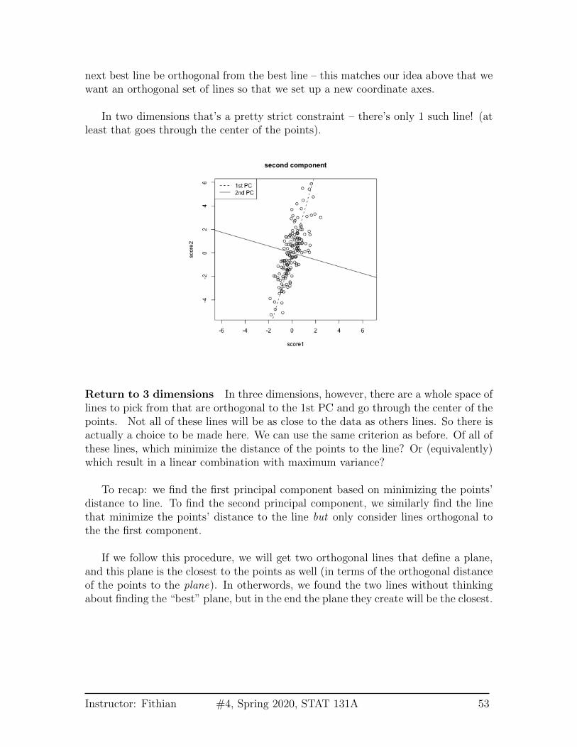
next best line be orthogonal from the best line – this matches our idea above that wewant an orthogonal set of lines so that we set up a new coordinate axes.
In two dimensions that’s a pretty strict constraint – there’s only 1 such line! (atleast that goes through the center of the points).
Return to 3 dimensions In three dimensions, however, there are a whole space oflines to pick from that are orthogonal to the 1st PC and go through the center of thepoints. Not all of these lines will be as close to the data as others lines. So there isactually a choice to be made here. We can use the same criterion as before. Of all ofthese lines, which minimize the distance of the points to the line? Or (equivalently)which result in a linear combination with maximum variance?
To recap: we find the first principal component based on minimizing the points’distance to line. To find the second principal component, we similarly find the linethat minimize the points’ distance to the line but only consider lines orthogonal tothe the first component.
If we follow this procedure, we will get two orthogonal lines that define a plane,and this plane is the closest to the points as well (in terms of the orthogonal distanceof the points to the plane). In otherwords, we found the two lines without thinkingabout finding the “best” plane, but in the end the plane they create will be the closest.
Instructor: Fithian #4, Spring 2020, STAT 131A 53
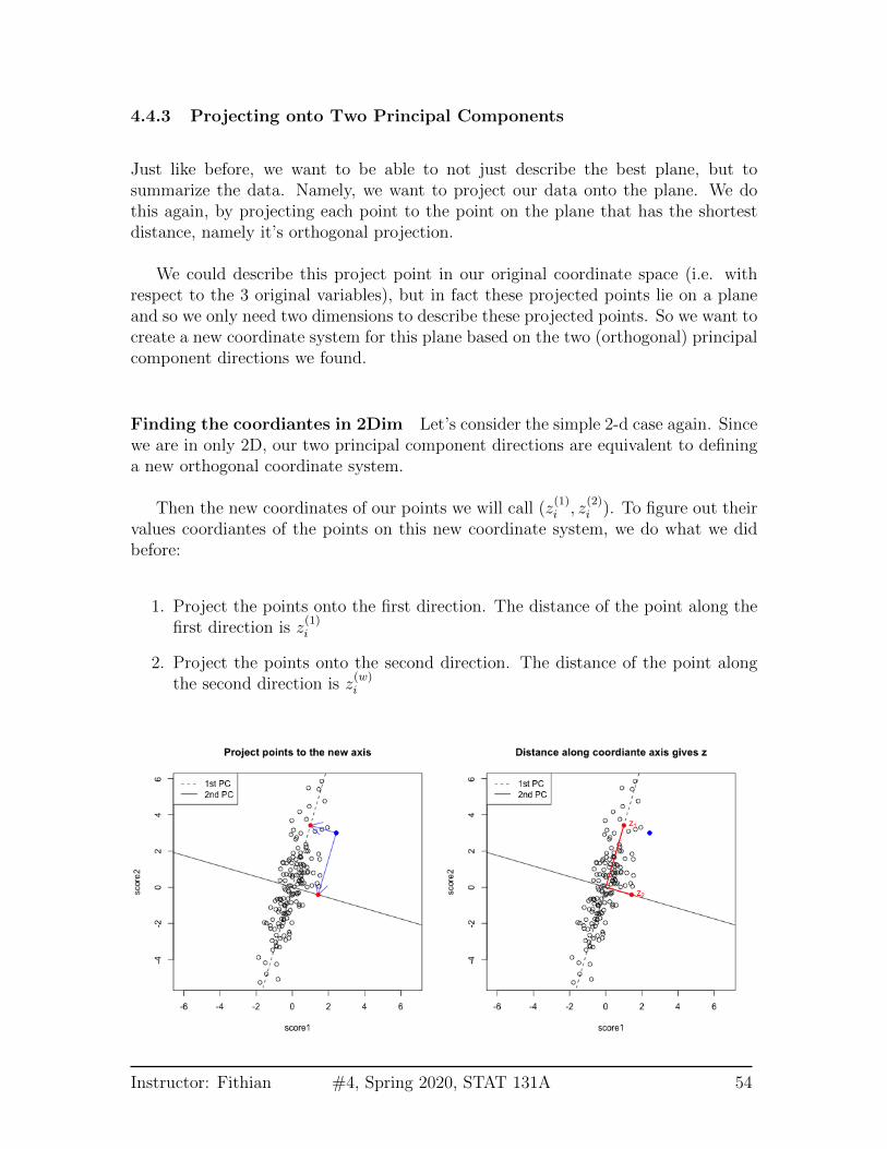
4.4.3 Projecting onto Two Principal Components
Just like before, we want to be able to not just describe the best plane, but tosummarize the data. Namely, we want to project our data onto the plane. We dothis again, by projecting each point to the point on the plane that has the shortestdistance, namely it’s orthogonal projection.
We could describe this project point in our original coordinate space (i.e. withrespect to the 3 original variables), but in fact these projected points lie on a planeand so we only need two dimensions to describe these projected points. So we want tocreate a new coordinate system for this plane based on the two (orthogonal) principalcomponent directions we found.
Finding the coordiantes in 2Dim Let’s consider the simple 2-d case again. Sincewe are in only 2D, our two principal component directions are equivalent to defininga new orthogonal coordinate system.
Then the new coordinates of our points we will call (z(1)i , z
(2)i ). To figure out their
values coordiantes of the points on this new coordinate system, we do what we didbefore:
1. Project the points onto the first direction. The distance of the point along thefirst direction is z
(1)i
2. Project the points onto the second direction. The distance of the point alongthe second direction is z
(w)i
Instructor: Fithian #4, Spring 2020, STAT 131A 54
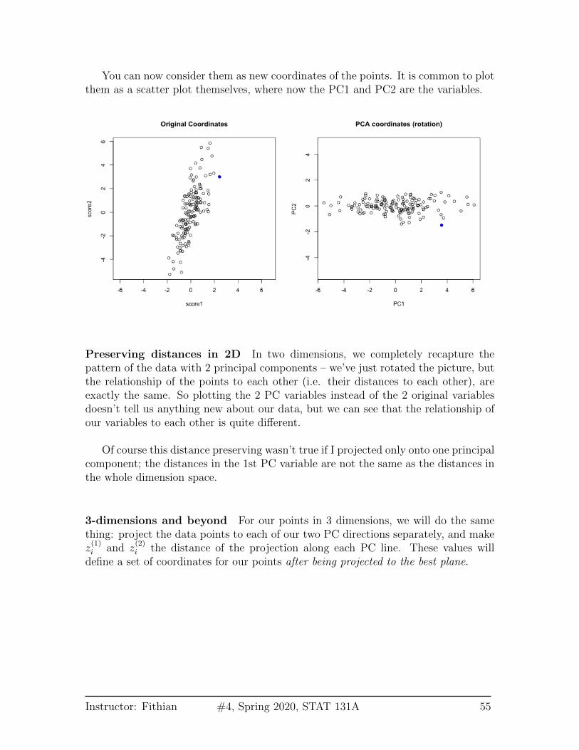
You can now consider them as new coordinates of the points. It is common to plotthem as a scatter plot themselves, where now the PC1 and PC2 are the variables.
Preserving distances in 2D In two dimensions, we completely recapture thepattern of the data with 2 principal components – we’ve just rotated the picture, butthe relationship of the points to each other (i.e. their distances to each other), areexactly the same. So plotting the 2 PC variables instead of the 2 original variablesdoesn’t tell us anything new about our data, but we can see that the relationship ofour variables to each other is quite different.
Of course this distance preserving wasn’t true if I projected only onto one principalcomponent; the distances in the 1st PC variable are not the same as the distances inthe whole dimension space.
3-dimensions and beyond For our points in 3 dimensions, we will do the samething: project the data points to each of our two PC directions separately, and makez(1)i and z
(2)i the distance of the projection along each PC line. These values will
define a set of coordinates for our points after being projected to the best plane.
Instructor: Fithian #4, Spring 2020, STAT 131A 55
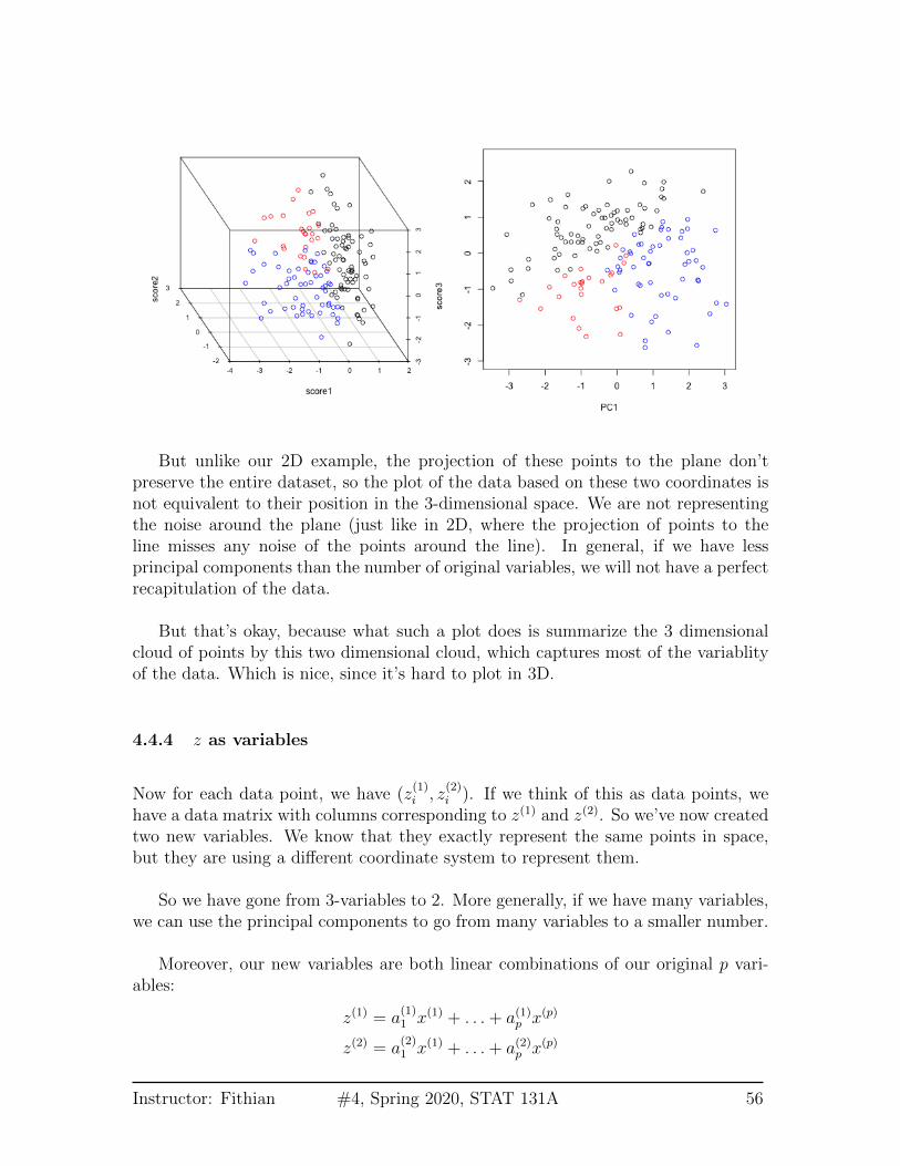
But unlike our 2D example, the projection of these points to the plane don’tpreserve the entire dataset, so the plot of the data based on these two coordinates isnot equivalent to their position in the 3-dimensional space. We are not representingthe noise around the plane (just like in 2D, where the projection of points to theline misses any noise of the points around the line). In general, if we have lessprincipal components than the number of original variables, we will not have a perfectrecapitulation of the data.
But that’s okay, because what such a plot does is summarize the 3 dimensionalcloud of points by this two dimensional cloud, which captures most of the variablityof the data. Which is nice, since it’s hard to plot in 3D.
4.4.4 z as variables
Now for each data point, we have (z(1)i , z
(2)i ). If we think of this as data points, we
have a data matrix with columns corresponding to z(1) and z(2). So we’ve now createdtwo new variables. We know that they exactly represent the same points in space,but they are using a different coordinate system to represent them.
So we have gone from 3-variables to 2. More generally, if we have many variables,we can use the principal components to go from many variables to a smaller number.
Moreover, our new variables are both linear combinations of our original p vari-ables:
z(1) = a(1)1 x(1) + . . . + a(1)p x(p)
z(2) = a(2)1 x(1) + . . . + a(2)p x(p)
Instructor: Fithian #4, Spring 2020, STAT 131A 56

What can we say statistically regarding our z(1) and z(2) variables? Just like beforewe have both a geometric and statistical interpretation. If we find z(1) as we describedabove, we have also found the set of coefficients a
(1)1 . . . a
(1)p so that z(1) has the max-
imum variance. That makes sense, because we already said that we would choose itas if we did just PC for 1 component.
If we find z(2) as we described above, we know that we have found the set ofcoefficients a
(2)1 . . . a
(2)p that have the maximum variance out of all those that are
uncorrelated with z(1). This makes sense in our 2D example – we saw that we havethe same relationship between the points using the coordinates z(1), z(2), but that thez(1) and z(2) no longer showed any relationship, unlike our original variables.
4.5 Return to real data (2 PCs)
We will turn now to illustrating finding the first 2 PCS on some real data examples.We can find the top 2 PCs for our real data examples and plot the scatter plot ofthese points.
Consider the college dataset, which we only considered the pairwise differences.Now we show the scatter plot of the first two PCS. Notice that PCA only makes sensefor continuous variables, so we will remove variables (like the private/public split) thatare not continuous. PCA also doesn’t handle NA values, so I have removed samplesthat have NA values in any of the observations.
This certainly shows us patterns among the data – what?
Instructor: Fithian #4, Spring 2020, STAT 131A 57
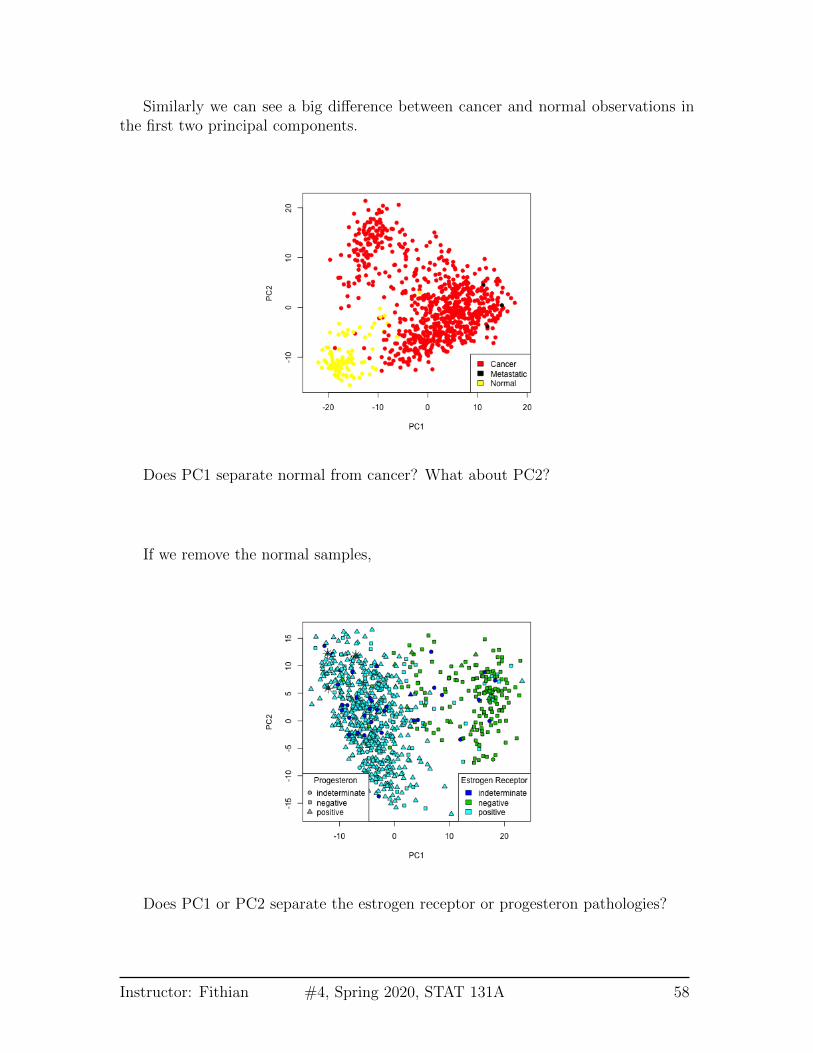
Similarly we can see a big difference between cancer and normal observations inthe first two principal components.
Does PC1 separate normal from cancer? What about PC2?
If we remove the normal samples,
Does PC1 or PC2 separate the estrogen receptor or progesteron pathologies?
Instructor: Fithian #4, Spring 2020, STAT 131A 58
What about metastastic samples?
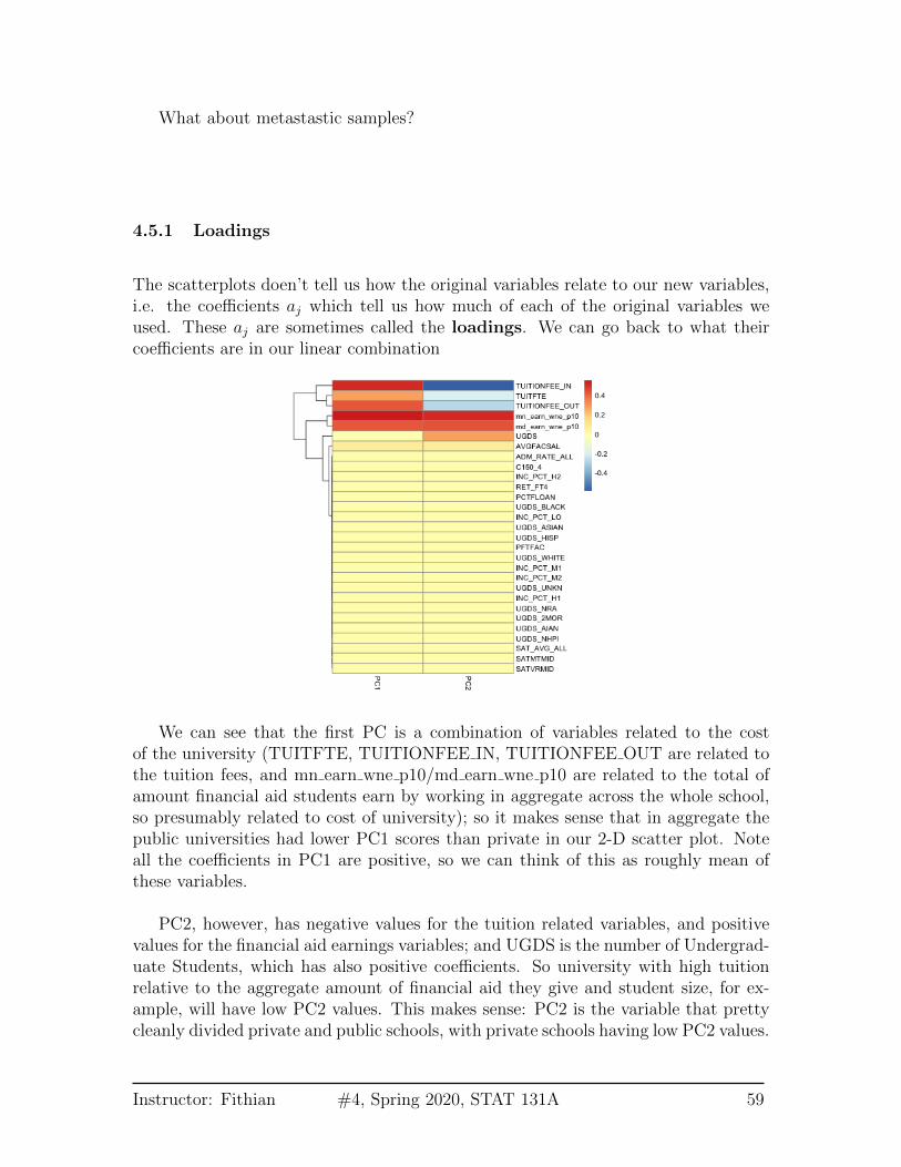
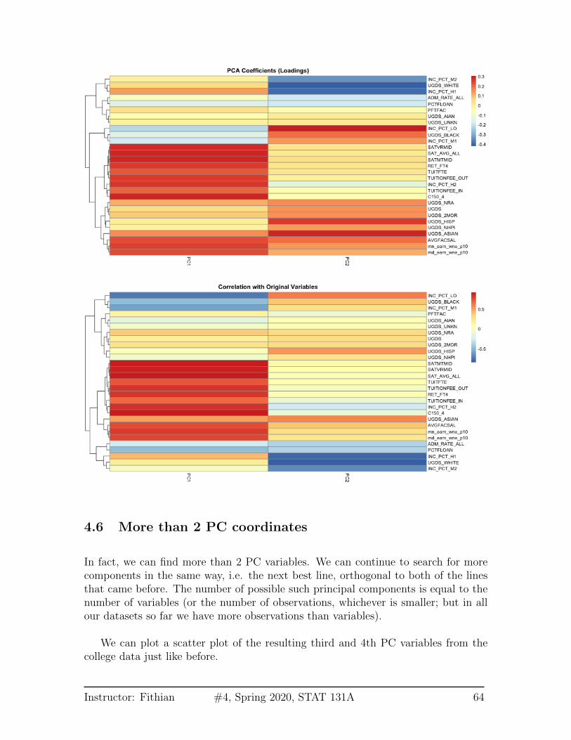
4.5.1 Loadings
The scatterplots doen’t tell us how the original variables relate to our new variables,i.e. the coefficients aj which tell us how much of each of the original variables weused. These aj are sometimes called the loadings. We can go back to what theircoefficients are in our linear combination
We can see that the first PC is a combination of variables related to the costof the university (TUITFTE, TUITIONFEE IN, TUITIONFEE OUT are related tothe tuition fees, and mn earn wne p10/md earn wne p10 are related to the total ofamount financial aid students earn by working in aggregate across the whole school,so presumably related to cost of university); so it makes sense that in aggregate thepublic universities had lower PC1 scores than private in our 2-D scatter plot. Noteall the coefficients in PC1 are positive, so we can think of this as roughly mean ofthese variables.
PC2, however, has negative values for the tuition related variables, and positivevalues for the financial aid earnings variables; and UGDS is the number of Undergrad-uate Students, which has also positive coefficients. So university with high tuitionrelative to the aggregate amount of financial aid they give and student size, for ex-ample, will have low PC2 values. This makes sense: PC2 is the variable that prettycleanly divided private and public schools, with private schools having low PC2 values.
Instructor: Fithian #4, Spring 2020, STAT 131A 59

Correlations It’s often interesting to look at the correlation between the new vari-ables and the old variables. Below, I plot the heatmap of the correlation matrixconsisting of all the pair-wise correlations of the original variables with the new PCs
Notice this is not the same thing as which variables contributed to PC1/PC2. Forexample, suppose a variable was highly correlated with tuition, but wasn’t used inPC1. It would still be likely to be highly correlated with PC1. This is the case, forexample, for variables like SAT scores.
4.5.2 Biplot
We can put information regarding the variables together in what is called a biplot.We plot the observations as points based on their value of the 2 principal components.Then we plot the original variables as vectors (i.e. arrows).
Instructor: Fithian #4, Spring 2020, STAT 131A 60
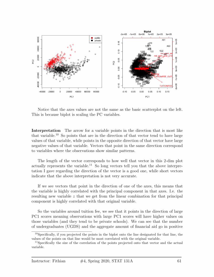
Notice that the axes values are not the same as the basic scatterplot on the left.This is because biplot is scaling the PC variables.
Interpretation The arrow for a variable points in the direction that is most likethat variable.10 So points that are in the direction of that vector tend to have largevalues of that variable, while points in the opposite direction of that vector have largenegative values of that variable. Vectors that point in the same direction correspondto variables where the observations show similar patterns.
The length of the vector corresponds to how well that vector in this 2-dim plotactually represents the variable.11 So long vectors tell you that the above interpre-tation I gave regarding the direction of the vector is a good one, while short vectorsindicate that the above interpretation is not very accurate.
If we see vectors that point in the direction of one of the axes, this means thatthe variable is highly correlated with the principal component in that axes. I.e. theresulting new variable z that we get from the linear combination for that principalcomponent is highly correlated with that original variable.
So the variables around tuition fee, we see that it points in the direction of largePC1 scores meaning observations with large PC1 scores will have higher values onthose variables (and they tend to be private schools). We can see that the numberof undergraduates (UGDS) and the aggregate amount of financial aid go in positive
10Specifically, if you projected the points in the biplot onto the line designated for that line, thevalues of the points on that line would be most correlated with the original variable.
11Specifically the size of the correlation of the points projected onto that vector and the actualvariable.
Instructor: Fithian #4, Spring 2020, STAT 131A 61

directions on PC2, and tuition are on negative directions on PC2. So we can see thatsome of the same conclusions we got in looking at the loadings show up here.
AP Scores We can perform PCA on the full set of AP scores variables and makethe same plots for the AP scores. There are many NA values if I look at all thevariables, so I am going to remove ‘Locus.Aug’ (the score on the diagnostic taken atbeginning of year) and ‘AP.Ave’ (average on other AP tests) which are two variablesthat have many NAs, as well as removing categorical variables.
Not surprisingly, this PCA used all the variables in this first 2 PCs and there’s noclear dominating set of variables in either the biplot or the heatmap of the loadings
Instructor: Fithian #4, Spring 2020, STAT 131A 62
for the first two components. This matches the nature of the data, where all of thescores are measuring similar qualities of a student, and many are on similar scales.
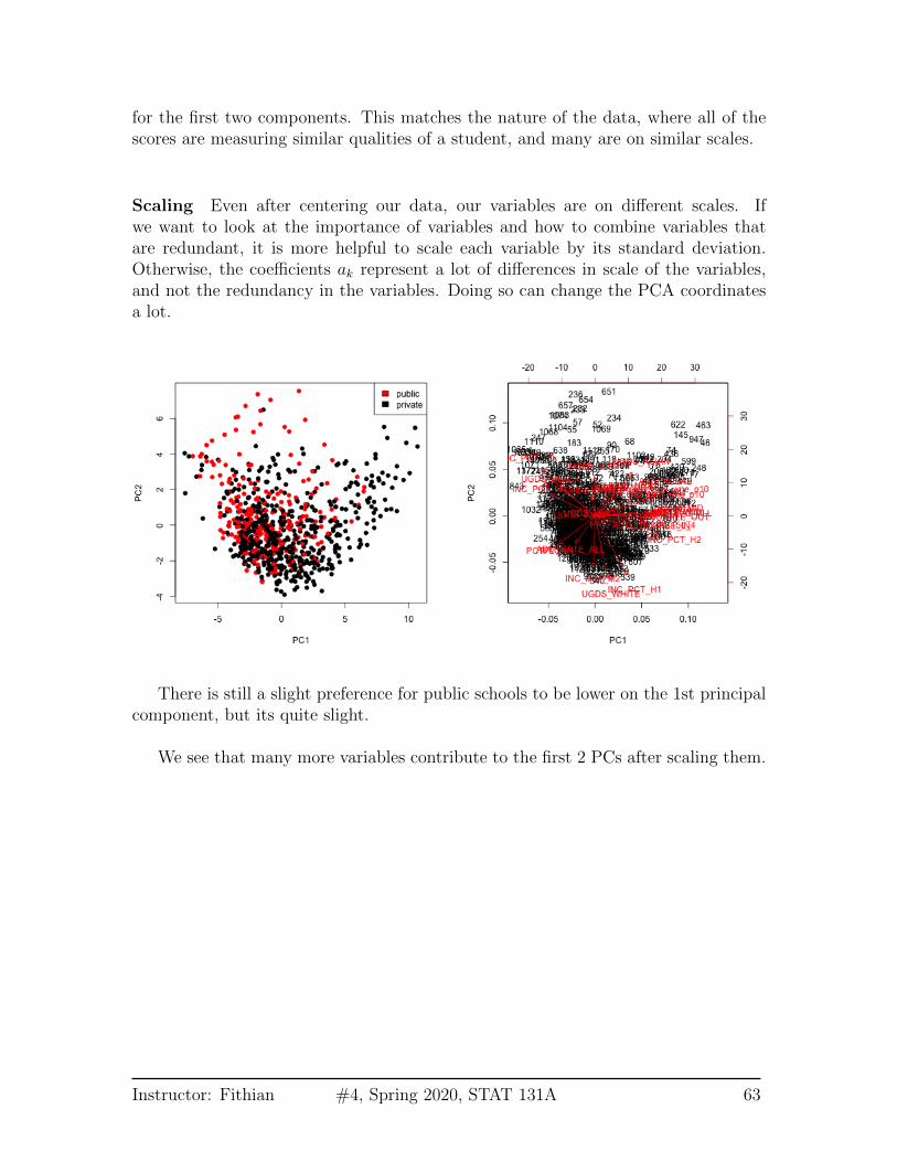
Scaling Even after centering our data, our variables are on different scales. Ifwe want to look at the importance of variables and how to combine variables thatare redundant, it is more helpful to scale each variable by its standard deviation.Otherwise, the coefficients ak represent a lot of differences in scale of the variables,and not the redundancy in the variables. Doing so can change the PCA coordinatesa lot.
There is still a slight preference for public schools to be lower on the 1st principalcomponent, but its quite slight.
We see that many more variables contribute to the first 2 PCs after scaling them.
Instructor: Fithian #4, Spring 2020, STAT 131A 63
4.6 More than 2 PC coordinates
In fact, we can find more than 2 PC variables. We can continue to search for morecomponents in the same way, i.e. the next best line, orthogonal to both of the linesthat came before. The number of possible such principal components is equal to thenumber of variables (or the number of observations, whichever is smaller; but in allour datasets so far we have more observations than variables).
We can plot a scatter plot of the resulting third and 4th PC variables from thecollege data just like before.
Instructor: Fithian #4, Spring 2020, STAT 131A 64
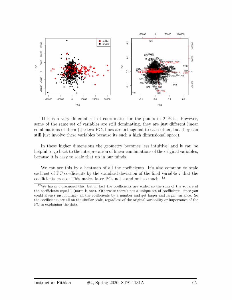
This is a very different set of coordinates for the points in 2 PCs. However,some of the same set of variables are still dominating, they are just different linearcombinations of them (the two PCs lines are orthogonal to each other, but they canstill just involve these variables because its such a high dimensional space).
In these higher dimensions the geometry becomes less intuitive, and it can behelpful to go back to the interpretation of linear combinations of the original variables,because it is easy to scale that up in our minds.
We can see this by a heatmap of all the coefficients. It’s also common to scaleeach set of PC coefficients by the standard deviation of the final variable z that thecoefficients create. This makes later PCs not stand out so much. 12
12We haven’t discussed this, but in fact the coefficients are scaled so the sum of the square ofthe coefficients equal 1 (norm is one). Otherwise there’s not a unique set of coefficients, since youcould always just multiply all the coefficients by a number and get larger and larger variance. Sothe coefficients are all on the similar scale, regardless of the original variability or importance of thePC in explaining the data.
Instructor: Fithian #4, Spring 2020, STAT 131A 65

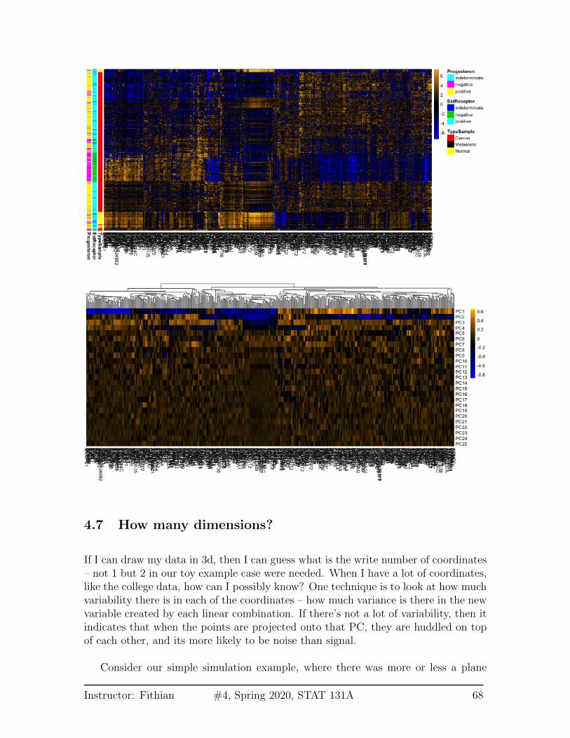
Breast data We can also look at the higher PCs from the breast data (with thenormal samples). If there are 500 genes and 878 observations, how many PCs arethere?
We can see that there are distinct patterns in what genes/variables contribute tothe final PCs (we plot only the top 25 PCs). However, it’s rather hard to see, becausethere are large values in later PCs that mask the pattern.
Instructor: Fithian #4, Spring 2020, STAT 131A 66
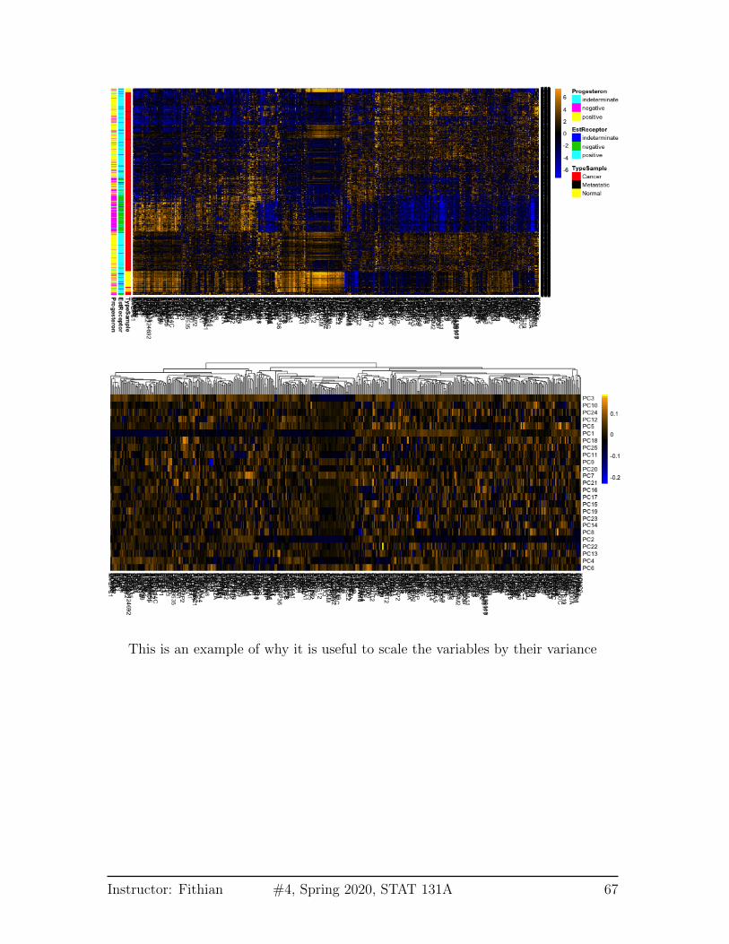
This is an example of why it is useful to scale the variables by their variance
Instructor: Fithian #4, Spring 2020, STAT 131A 67
4.7 How many dimensions?
If I can draw my data in 3d, then I can guess what is the write number of coordinates– not 1 but 2 in our toy example case were needed. When I have a lot of coordinates,like the college data, how can I possibly know? One technique is to look at how muchvariability there is in each of the coordinates – how much variance is there in the newvariable created by each linear combination. If there’s not a lot of variability, then itindicates that when the points are projected onto that PC, they are huddled on topof each other, and its more likely to be noise than signal.
Consider our simple simulation example, where there was more or less a plane
Instructor: Fithian #4, Spring 2020, STAT 131A 68
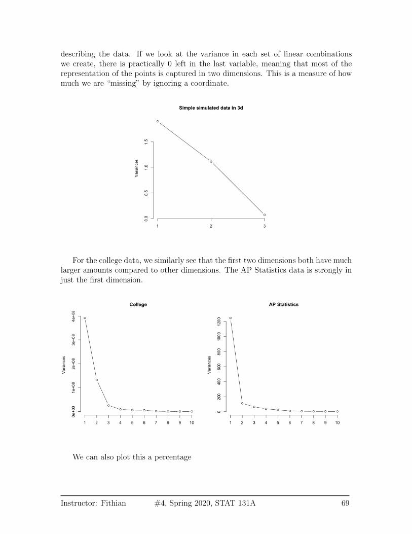
describing the data. If we look at the variance in each set of linear combinationswe create, there is practically 0 left in the last variable, meaning that most of therepresentation of the points is captured in two dimensions. This is a measure of howmuch we are “missing” by ignoring a coordinate.
For the college data, we similarly see that the first two dimensions both have muchlarger amounts compared to other dimensions. The AP Statistics data is strongly injust the first dimension.
We can also plot this a percentage
Instructor: Fithian #4, Spring 2020, STAT 131A 69
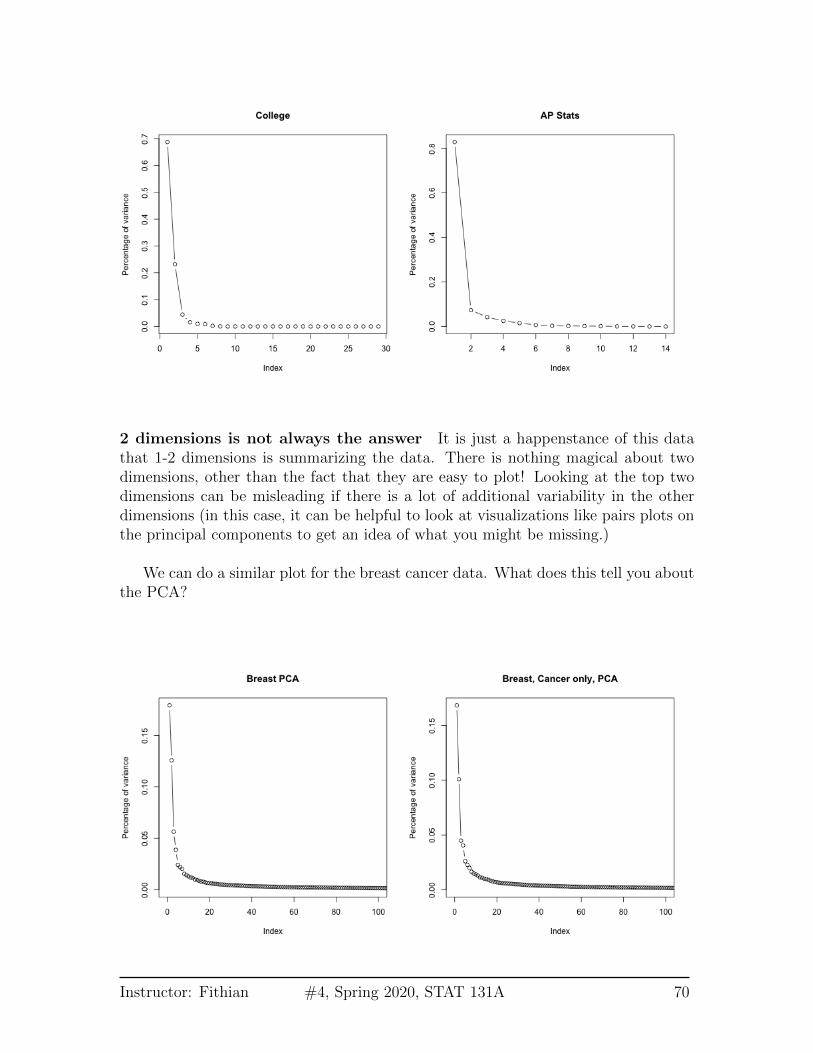
2 dimensions is not always the answer It is just a happenstance of this datathat 1-2 dimensions is summarizing the data. There is nothing magical about twodimensions, other than the fact that they are easy to plot! Looking at the top twodimensions can be misleading if there is a lot of additional variability in the otherdimensions (in this case, it can be helpful to look at visualizations like pairs plots onthe principal components to get an idea of what you might be missing.)
We can do a similar plot for the breast cancer data. What does this tell you aboutthe PCA?
Instructor: Fithian #4, Spring 2020, STAT 131A 70