visualizing energy flows in urban microclimates
TRANSCRIPT

Visualizing energy flows in urban microclimates
Ties BlaauwMaster thesis
Landscape Architecture and Spatial PlanningWageningen University & Research

C

All rights reserved. No part of this publication may be reproduced, stored in a retrieval system, or transmitted, in any form or any means, elec-tronic, mechanical, photocopying, recording or otherwise, without the prior written permission of either the author, or Wageningen University LAR chairgroup.
Landscape architecture chairgroupPhone: +31 317 484 056Fax: +31 317 482 166E-mail: [email protected]
Postal addressPostbus 476700 AA, WageningenThe Netherlands
Ties Blaauw
Master Thesis Landscape Architecture
Wageningen University
Period:01.04.16 - 28.11.16
Supervisor:Dr.ing S.LenzholzerLandscape architecture chairgroup
1st examiner:Prof.dr.ir. A. van den BrinkLandscape architecture chairgroup
2nd examiner:Dr.ing. S.StremkeLandscape architecture chairgroup
Colophon

1st examiner:Prof.dr.ir. A. van den BrinkLandscape architecture chairgroup
2nd examiner:Dr.ing. S.StremkeLandscape architecture chairgroup
Supervisor:Dr.ing S.LenzholzerLandscape architecture chairgroup

PrefaceDuring my study in landscape architecture I developed an interest in sustainable landscape architecture, in particular climate-responsive design. I was happy to hear that a new course was announced in the Masters pro-gramme about climate responsive design and planning. During this course I was able to get acquainted with the basics of (urban) climatology in combination with design. Furthermore I have always been intrigued by visual communication within the discipline of landscape architecture.
Sanda Lenzholzer offered me to study the visualization of energy flows in urban microclimates, which I gladly accepted. With this opportunity I was able to combine my two favourite subjects, climate-responsive design and visual communication. In this research I studied what kind of visualization type could make (urban) energy flows intelligible for urban planners and designers.
During my research numerous persons contributed to the end result. First of all I would like to thank Sanda Lenzholzer for her supervision. You always gave sharp comments and motivated me to keep on going. I would also like to thank the expert group: Gert-Jan Steenenveld, Joao Cortesao, David Huijben, Katarzyna Starzyc-ka, Antonia Cangosz and Gao Zhonglin. We had some interesting feedback sessions and you helped me a lot shaping my research and design. Furthermore I would like to thank all the participants of the survey. You were essential in evaluating the visualizations and came up with helpful improvements. Last but not least, I would like to thank Adri van den Brink and Sven Stremke for their useful comments and feedback upon my green-light presentation.

6

AbstractIn the next decades (urban) designers and planners will face major challenges concerning urban climate and energy supply. There will be an increase in urban heat caused by human activities and the demand for energy will be ever growing. Climate-responsive planning and design can have beneficial effects on the urban climate by contributing to a reduction of urban heat and helping to reduce the energy demand of buildings and public space. In order to achieve these beneficial effects, an understanding of the characteristics in urban (micro)cli-mates, their thermodynamic system and potentials to generate renewable energy is crucial. Currently urban planners and designers are not able to comprehend the urban environment in terms of energy flows. They tend to value urban environments as fixed three-dimensional objects and do not consider the mani-fold dynamic flows present in this environment. The goal of this research was to make urban (renewable) energy flows intelligible for planners and designers, which was achieved by the development of a new visualization method. A thorough literature study on urban climatology, urban renewable energy potentials and visuali-zation, informed the new visualization method. The visualization method was mainly developed by research through designing, which included the planning, data collection, creation and review of the new visualizations.
Animated 3D visualizations, with the use of particle systems, appeared to be the most adequate technique in representing dynamic urban energy flows. A student survey revealed that by using animated 3D visualizations, (urban) planners and designers were able to comprehend the urban environment in terms of (renewable) energy flows. With the new method, (urban) planners and designers will be able to understand the complex interac-tions of energy in urban environments and how these interactions could benefit the environmental performance of the urban landscape.


Contents
Chapter 1: Research context & framework
Chapter 2: Methods
Chapter 3: Results
Chapter 4: Discussion
Literature
List of figures
Appendix
1.1 Introduction 1
3361017
17
19
21
27
29
3536
37
41
44
48
50
2.1 Research for- and through designing
3.1 Version 1.0
3.2 Version 2.0
4.1 Discussion
2.2 Research design
2.1 Discussion of methods
1.2 Theoretical background
1.3 Towards a new visualization method
1.2.1 Energy flows in urban microclimates
1.2.3 Visualization
1.3.1 Research questions
3.1.1 Review of results
3.1.2 Improvements
1.2.2 Renewable energy flows in urban microclimates

10
Chapter 1
RESEARCH CONTEXTAND FRAMEWORK

1
In the next decades designers and planners will have to face major challenges concerning urban climate and energy supply (Figure 1). Urban microclimates are important thermo-regulators in urban environ-ments. Urban microclimates are small scale climates, which have their own climatological characteristics, such as temperature, humidity and solar irradiation (Vallati et al, 2015). Due to the building density and use of materials, urban microclimates retain more heat from solar radiation than their rural surround-ing climate, commonly known as the ‘urban heat-is-land’ (Oke, 1982). Effective planning and design can have beneficial effects on the urban climate by contributing to a reduction of the urban heat-island, improving the living environment, and helping to reduce cooling, heating and electricity demand of buildings (Rasheed, 2009). In order to achieve these beneficial effects, an understanding of the character-istics of urban microclimates, their thermodynamic system and potentials to generate renewable energy is essential.
The use of visualization may contribute in under-standing the complex interactions of energy flows in urban environments. Humans perceive their envi-ronment through their senses. It is estimated that ap-proximately eighty percent of the impression of our surroundings comes from sight (Bruce et al. 1996). Visualizations are able to increase engagement, en-hance learning and strengthen people’s understand-ing of complex environmental issues (Sheppard,
2012). Bishop & Lange (2005) identified three major reasons why we use visualization: (1) We visualize to see, experience and understand environmental changes before they occur, (2) through the ability to share this experience and potential for exploration, visualization will help communities to build consen-sus and make better decisions about their future, and (3) the relationship of people to their environment is a key contributor to environmental decisions, and visualization can help us learn more about that re-lationship (Bishop & Lange, 2005). So ultimately the use of landscape visualization can contribute to bet-ter decisions in urban planning and design. The aim of this research is to make the energy flows in urban microclimates, and the potentials to generate renew-able energy, intelligible for planners and designers. This will be achieved through the development of a new visualization method.
Designers and planners are currently not able to comprehend urban environments in terms of flows (Inam, 2013). They tend to value urban environments as fixed three-dimensional objects and do not con-sider the manifold dynamic flows present in this en-vironment. While this approach leads to visionary thinking and stunning visualizations, it includes an end-point for a phenomenon (e.g. the city), which is actually constantly changing (Inam, 2013). Change involves the fourth dimension, which in urban envi-ronments can be conceptualized as flows. Flows rep-resent the process side of the urban landscape.
1.1 Introduction
Figure 1: Current and future challenges concerning heat and energy in urban environments
Chapter 1: Context and framework

2
By designing cities with flows in mind, the envi-ronmental performance of the urban landscape can improve (Brugmans & Strien, 2014). To achieve this, Kennedy et al. (2010) argue that the design commu-nity should become much more familiar with ener-gy- and material flows.To understand energy flows, many energy account-ing methods and numerical models are developed by meteorologists, climatologists and other environ-mental specialists (Allegrini, 2015). Currently there is an abundance of urban energy models to analyse flows on a wide and temporal scale (Keirstead et al. 2012). However, the current models seem to be inef-fective for use in planning and design, because plan-ners and designers are not able to comprehend the urban thermodynamic system. Although many researchers advocate the value of urban climatic knowledge in urban planning and de-sign, they acknowledge that transferring this knowl-edge into mainstream practice remains a major chal-lenge (Grimmond et al, 2010; Mills et al, 2010; Mills, 2014; Erell et al, 2011; Hebbert & Mackillop, 2013). Part of this problem is the perceived importance of urban climate in (urban) planning and design. When placed alongside other planning issues, urban heat islands have been seen of marginal interest. Another part of the problem is the failure of urban climatol-ogy in general to communicate its scientific knowl-edge into practice in an accessible and applicable manner (Mills, 2014). Urban climatologists have attempted to transfer theoretical knowledge into real-world planning. However, Oke (1984) found a number of shortcomings such as a lack of standardi-zation, generality, transferability, and the absence of clear guidelines which can be adapted by planners and designers (Erell et al, 2011). To make energy flows intelligible for planners and designers, urban climatic knowledge should be com-municated in a clear and structured manner. Over-coming the barriers to knowledge-practice transfer will require accessible knowledge and appropriate communication tools (Mills, 2014). A new visuali-zation method to make energy flows intelligible for planners and designers, could be one of these com-munication tools.

3
A literature study has been conducted to inform the new visualization method. The literature study elab-orates on theories grounded in a variety of research disciplines. An assessment on urban climatology, identified the climatological energy flows, and an as-sessment on renewable energy, identified the renew-able energy flows. Finally, this chapter elaborates on theories within the discipline of visualization, to identify the characteristics of visualization and ap-propriate visualization techniques to visualize urban energy flows.
Human settlements and landscapes are part of the physical environment, which is governed by the Laws of Thermodynamics. Thermodynamics is the study of the relationship between heat and work in a system. Energy flows, which consist of radiative- and heat transfer, are thus governed by the laws of thermodynamics. Any attempt to understand how energy exchange takes place at the surface, must start with an analysis of the energy balance (Erell et al, 2011). How the energy flows enter and leave the urban environment greatly depends on local (micro)climate and built-up characteristics. Understanding
1.2 Theoretical background these interactions can lead to a more efficient and sustainable use of energy flows, for example by gen-erating renewable energy. The concept of the energy balance is derived from the First Law of Thermody-namics. When applied to a simple system, this means that the energy input must equal the sum of the ener-gy output and the difference in energy stored within the system (Erell et al, 2011):
However, in more complex and open systems, like cities, the energy in- and outputs are most likely to be unequal. Furthermore, the energy in- and outputs appear in several forms simulta-neously and are constantly in imbalance, which will determine if the system is heating up or cooling down (Erell et al, 2011). The urban energy balance (UEB) influences the microscale effects that control the urban canopy layer (Arnfield, 2003). Microclimates refer to the smallest realm (Figure 2C), where individual structures and trees cast shadows and building materials reflect sunlight (Erell et al, 2011). Mi-croclimates have their own climatological char-acteristics, such as temperature, humidity and solar irradiation (Vallati et al, 2015).
Figure 2: Scales of the urban climate (Mills, 2014)
1.2.1 Energy flows in urban microclimates
Energy input = Energy output + change in stored energy
Chapter 1: Context and framework

4
Generally, the UEB is seen as a local- or mesoscale phenomenon, with the built-up area represented as a textured surface that can be characterized by its properties (such as albedo or aerodynamic rough-ness). Urban energy flows are generally measured above the urban canopy layer to ensure that the measurements represent the overall urban terrain. The UEB equation can be given in watts per square meters:
Q* + QF = QH + QE + QS + QA
where Q* is net all-wave radiation, QF is anthropo-genic heat, QH and QE are the respective turbulent flows of sensible and latent heat, and QS is the net change in heat storage within the buildings, air, and ground down to a level where heat exchanges be-come negligible (Pearlmutter & Berliner, 2004). Commonly advection (QA) plays a role within the energy balance, but the size of advective flows be-tween neighbourhoods has not been well-document-ed (Grimmond et al, 2010). Therefore, the energy flows in Figure 3, will be used in this research. In the following sections the individual energy flows will be explained in more detail.
Figure 3: Energy flows of the urban energy balance
sity, building height, building uniformity and road orientation) and material properties (reflection and conductivity) of urban areas (Pearlmutter & Berliner, 2004). Storage heat flow (QS)The storage heat flow is the net uptake or release of energy by sensible heat changes in the UCL, build-ings (materials), vegetation and the ground. The size of the storage heat flow is determined by the surface materials, urban structure and the result-ing thermal mass (heat conductivity and capacity) (Grimmond et al, 2010). Values of QS can be two to three times higher in a city centre than their rural surroundings (Christen & Vogt, 2004).
Turbulent sensible heat flow (QH)When an object or air is heated, its temperature rises because energy is added. Similarly, when energy is removed from an object and its temperature falls, the removed heat is called sensible heat. Thus, an energy flow that causes a change in temperature is called sensible heat. The turbulent sensible heat flow is driven by several phenomena, such as the net avail-able energy, the ability of the air to transport the en-ergy away from warmer locations (towards or away from the surface), and the gradient in air tempera-ture between the surface and the air above it. The typical diurnal course of the turbulent sensible heat flow is related to the nature of the building fabric (a key control on the storage heat flow) and the avail-able moisture including the fraction of green space (Grimmond et al, 2010). The amount of sensible heat varies greatly between rural and urban areas (Gold-bach & Kuttler, 2013).
Latent heat flow (QE)All pure substances in nature are able to change their state. Solids can become liquids and liquids can be-come gases, but changes like these require the ad-dition or removal of energy. The energy flow that causes these changes is called latent heat. The tur-bulent latent heat flow depends on the availability of moisture at the surface (water-bodies, vegetation and wet soils), the sign and size of the surface–air humidity gradient and the ability of the atmosphere to transport moisture. The latent heat flow (QE) may be substantial in vegetated areas, but in areas dom-inated by dry surfaces, such as cities, this flow can
Net all-wave radiation (Q*)The net all-wave radiation is a direct function of the absorption and reflection of short-wave radiation from the sun, during daytime, and the absorption and emission of long-wave radiation from the earth through radiative transfer, mainly during night-time. Both are modified by the geometric (plan den-

5
Temporal variations of surface energy exchangeUrban energy flows are extremely dynamic. The en-ergy flows within urban environments do not only vary diurnally, but also seasonally and annually. The dynamics of the urban energy flows in central Lon-don are displayed in Figure 5. The monthly diurnal patterns (coloured lines) and accumulated energy flows (for day- and night-time) are presented in bars.
be marginalized (Masson et al, 2002). The latent heat flow densities in mid-latitude cities show less evapo-transpiration than their rural surroundings, because QE is mainly determined by vegetation, which is only a small fraction in urban areas. Additionally, faster run-off in the built environment lowers the availability of water.
Anthropogenic heat flow (QF) The anthropogenic heat flow is a function of the number of vehicles driven within the area, the en-ergy used within buildings, and the energy released as a part of the urban metabolism (Grimmond et al, 2004). This energy flow is often omitted in the urban energy balance, because of its small magnitude in residential settings, it is assumed to be embedded in other flows and the required data is often not avail-able (Grimmond et al, 2004; Pearlmutter & Berlin-er, 2004). However, the anthropogenic heat flow in dense urban areas can play a major role in the sur-face energy balance.
Figure 4 gives an indication of the amounts of energy flows in dense urban environments (Grimmond et al, 2004).
Figure 4: UEB Marseille (Grimmond et al, 2004)
Figure 5: Energy flow dynamics (Kotthaus & Grimmond, 2013). Q* is net all-wave radiation, Qh is sensible heat, Qe is latent heat, β is the Bowen-ratio (Qh/Qe).
Chapter 1: Context and framework
6
Wind Although wind does not play a major role in energy partitioning in the urban environment, it is shaped by the urban climatic conditions. The air movement in urban spaces have great consequences for pedes-trian comfort, building ventilation, air quality, en-ergy use (Erell et al, 2011) and energy generation (Turkbeyler et al, 2011). Unfortunately, the irregular-ity of the urban terrain makes air-flow patterns in the built up areas extremely complex (Erell et al, 2011). Wind is caused by differences in temperature. Pres-sure differences are created through ascending warm air, which subsequently attracts cold air (Lenzholzer, 2013). Wind can be observed at three different scale levels: (1) Macro-scale, which is influenced by the ro-tation of the earth and the main wind directions; (2) the local-scale, which is influenced by the difference in temperature between water and land, hills and valleys and urban heat-islands and their surround-ings, and (3) the micro-scale where the wind flows are dominantly influenced by the geometry of the urban environment. On average the wind on ground-level flows in a hori-zontal direction and is predominantly powered by the macro- and local wind patterns. Changes in the ground-level, due to topography, vegetation or built structures in urban areas, obstruct the wind flow and modify its pattern (Erell et al, 2011). Within the ur-ban canopy layer the wind speed and direction are extremely variable. In general, observations show a drop in average wind speed below the roof level, but micro-scale changes in geometry may result in local-ized high wind speeds. These winds may be used for energy generation.
Urban microclimates influence the potentials to generate renewable energy (Shahrestani et al, 2015; Turkbeyler et al, 2011). The microclimate parameters and potentials for renewable energy technologies are significantly influenced by urban textures and neighbouring buildings. This underlines the need for a radical change towards considering microclimates for planning and design (Shahrestani et al, 2015).
Within urban environments, there will generally be a range of renewable energy options available; wind, solar, biomass and geothermal energy. It is essential to select a mix of renewable energy sources, along with some energy storage mechanism to best uti-lize the resources and ensure a continuity of energy supply. The best combination will typically depend on the local climate, geology and terrain (Macleod, 2008). Urban environments are best suited for small scale energy generation. Small scale energy gener-ation, or microgeneration, is the process of energy generation on a small scale to supply the energy de-mands of low-consumption buildings, such as do-mestic dwellings, or small communities. The objec-tive may be in-dependency from the electrical grid, but typically to reduce the direct consumption of fos-sil fuels (Macleod, 2008).Knowledge of the microclimatic variables, especial-ly urban wind patterns and solar radiation can be effective for developing better design options for renewable energy technologies within the urban environment (Turkbeyler, 2011). However, achiev-ing these solutions in dense urban environments is challenging. This is mainly due to the complex na-ture of the heat transfer mechanisms within urban areas, which are significantly different from those recorded by official weather stations located in sub-urban environments. The knowledge of microcli-matic parameters, especially direct and diffuse solar radiation, air temperature, wind direction and speed are of great importance in developing better design options for building design and the implementation of renewable energy within the urban environment (Shahrestani et al, 2015). The implementation of re-newable energy devices preferably takes place at the building design stage when the building location, orientation and structural elements can be optimized according to the available wind and sunlight (Macle-od, 2008). In the next section a range of energy microgenera-tion techniques will be discussed, including their po-tentials in the urban environment and their relation with urban microclimates.
1.2.2 Renewable energy flows in urban microclimates
7
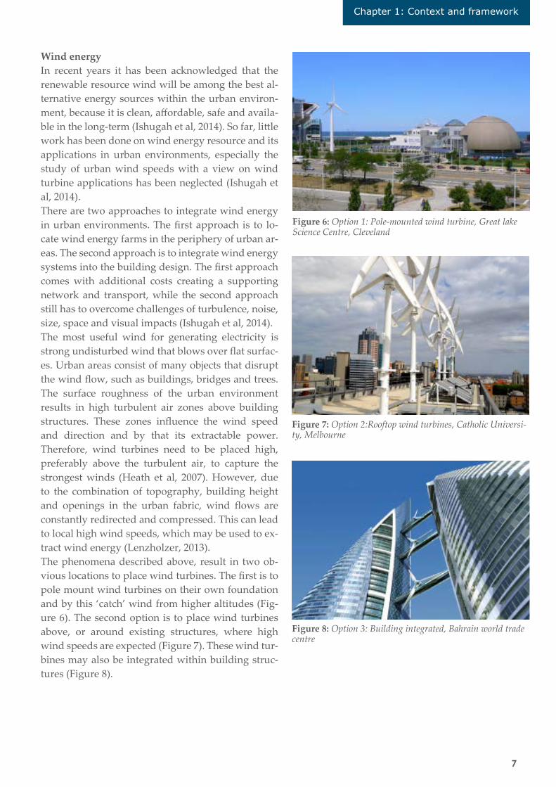
Wind energyIn recent years it has been acknowledged that the renewable resource wind will be among the best al-ternative energy sources within the urban environ-ment, because it is clean, affordable, safe and availa-ble in the long-term (Ishugah et al, 2014). So far, little work has been done on wind energy resource and its applications in urban environments, especially the study of urban wind speeds with a view on wind turbine applications has been neglected (Ishugah et al, 2014). There are two approaches to integrate wind energy in urban environments. The first approach is to lo-cate wind energy farms in the periphery of urban ar-eas. The second approach is to integrate wind energy systems into the building design. The first approach comes with additional costs creating a supporting network and transport, while the second approach still has to overcome challenges of turbulence, noise, size, space and visual impacts (Ishugah et al, 2014).The most useful wind for generating electricity is strong undisturbed wind that blows over flat surfac-es. Urban areas consist of many objects that disrupt the wind flow, such as buildings, bridges and trees. The surface roughness of the urban environment results in high turbulent air zones above building structures. These zones influence the wind speed and direction and by that its extractable power. Therefore, wind turbines need to be placed high, preferably above the turbulent air, to capture the strongest winds (Heath et al, 2007). However, due to the combination of topography, building height and openings in the urban fabric, wind flows are constantly redirected and compressed. This can lead to local high wind speeds, which may be used to ex-tract wind energy (Lenzholzer, 2013). The phenomena described above, result in two ob-vious locations to place wind turbines. The first is to pole mount wind turbines on their own foundation and by this ‘catch’ wind from higher altitudes (Fig-ure 6). The second option is to place wind turbines above, or around existing structures, where high wind speeds are expected (Figure 7). These wind tur-bines may also be integrated within building struc-tures (Figure 8).
Figure 6: Option 1: Pole-mounted wind turbine, Great lake Science Centre, Cleveland
Figure 7: Option 2:Rooftop wind turbines, Catholic Universi-ty, Melbourne
Figure 8: Option 3: Building integrated, Bahrain world trade centre
Chapter 1: Context and framework

8
Solar energySolar energy has a considerable role to play in urban areas (Keirstead & Shah, 2013). An extensive appli-cation of solar radiation in urban areas seems to be essential and a practicable strategy, but has a great influence on the formation of cities to be totally effec-tive. Solar systems include electronic or mechanical devices that modulate the sun’s effect on a building, or collect, channels and transform sunlight in some form of energy. Photovoltaic panels (Figure 9), mov-able shading and solar thermal panels (Figure 10) are all active solar systems (Zeman, 2012). Roofs and façades are the most logical places to in-tegrate solar energy on the building level, but place-ment needs to be carefully considered as it signifi-cantly affects the architecture. When the integration of solar energy is taken into account in the early de-sign phases, it is more likely to lead to more attrac-tive solutions (Figure 11). The integration might be made easier when planners and designers are aware of the locations where most of the energy can be har-vested (Kanters & Horvat, 2012). The potential of solar energy on stand-alone build-ings has been well studied (Li et al, 2015). Buildings within urban areas are not able to capture as much solar radiation as stand-alone buildings, due to the effects of mutual shading of surrounding buildings. Compactness is obviously a major parameter for ur-ban form that affects the accessibility of solar energy in urban environments (Mohajeri, 2016). Other im-portant criteria to take into account are the sun’s an-gle and roof and façade characteristics.
Figure 9: Option 1: Photovoltaic panels
Figure 10: Option 2: Thermal collectors
Figure 11: Option 3: Integrated, Solar city

9
Biomass energyBiomass includes all existing terrestrial organic mat-ter and is the most important source for food, fodder and fibre production (Offerman et al, 2011). Current-ly the conversion of biomass contributes to approx-imately 10% of the world’s annual primary energy supply (IEA, 2015). The largest part of bioenergy is currently used in developing countries for the pur-pose of heating and cooking. These applications are often characterized by low efficiencies and strong emissions (Offerman et al, 2011). One unique feature of bioenergy is its diversity (Keirstead & Sha, 2013). There are multiple options to produce heat and power from biomass depend-ing on the biomass type, technology type and size, and the degree of decoupling between the biomass treatment and conversion processes (Keirstead et al, 2012). Some examples of directly available biomass within urban environments are; biodegradable mu-nicipal wastes (e.g. household wastes and paper), urban wood waste (e.g. household waste, industri-al wood wastes and construction wood) and waste vegetable oils (e.g. cooking oil wastes). Most of the biomass applications in urban environ-ments such as biodegradable wastes, do not directly influence the urban microclimate, except for bioen-ergy crops and plants (in public and private space). Bioenergy crops are plants which can be processed into energy such as willow and Miscanthus (Figure 12). Bio-energy crops can be cultivated and processed within the city boundaries. Organic wastes from the city can be used to fertilize the energy crops and by this create a closed loop. However, due to the low energy density (aprx. 0.5W/m2), bioenergy crops are more appropriate for peri-urban environments where more space is available. Besides bioenergy crops, building roofs and façades, make up a great amount of unused space within the city’s bounda-ries. This unused space can be used to grow plants (Figure 13) or algae, which can be transformed into bioenergy as well. Besides the benefit of energy generation from bi-omass, green areas in cities can improve the urban landscape (Robitu et al, 2006). Green areas can reg-ulate the urban climate by increasing the moisture content of the air and by this reduce the air temper-ature and provide better comfort (Honjo & Takaku-ra, 1990). Numerous studies show that the cooling effects of parks, due to the combined effect of evap-
otranspiration and shading, can result in a temper-ature reduction by 5 degrees Celsius (Robitu et al, 2006). Furthermore, shadows cast by vegetation can modify the cooling and heating loads of buildings by reducing the solar radiation and surface temper-ature (Simpson, 2002). However, vegetation reduces the wind speed and has a negative effect on natural ventilation, and convective cooling of building sur-faces (Akbari, 2002). Biomass can be used for a variety of commercially available technologies and it can be converted into fuel, electricity and heat. Due to these reasons, bioen-ergy is expected to play an important role in achiev-ing a sustainable energy system. However, there are some specific concerns when integrating bioenergy into urban areas such as the availability of space to store biomass, the emission levels of bioenergy con-version processes and transport issues regarding logistics and costs of biomass supply (Keirstead et al, 2012).
Figure 12: Option 1: Energy crops (e.g. Miscanthus sinensis), Houtan Park, Shanghai
Figure 13: Option 2: Vertical green wall, University del Claustro de Sor Juana, Mexico
Chapter 1: Context and framework

10
1.2.3 Visualization
To be able to comprehend the (renewable) energy flows in urban environments, clear and accessible communication tools are necessary. Communication is the main activity to increase an understanding of certain phenomena. While it is estimated that ap-proximately eighty percent of the impression of our surrounding comes from sight (Bruce et al, 1996), the use of visualizations may contribute in making (renewable) energy flows understandable. Commu-nication is the fundamental purpose of producing visualizations throughout the planning and design phases of any landscape, urban design or architec-tural project (Downes & Lange, 2015).The link between seeing and understanding was the basis for the adoption of the term visualization by McCormick et al (1987). It was a new word, because in earlier dictionary definitions, visualization was re-stricted to the process of forming a mental image of, or envisioning, something (Bishop and Lange, 2005). The more recent usage of the word involved the pro-cess of interpreting something in the visual terms or, more particularly, putting something in visible form. McCormick et al. (1987) defined visualization in this way: Visualization is a method of computing. It transforms the symbolic into the geometric, enabling researchers to ob-serve their simulations and computations. Visualization offers a method for seeing the unseen. It enriches the pro-cess of scientific discovery and fosters profound and unex-pected insights. In many fields it is already revolutioniz-ing the way scientists do science. So, visualizations can help people to envision. That is, to better understand the relationship between data or some condition of the environment (Bishop & Lange, 2005). Due to modern technical develop-ments, urban systems generate complex and large data sets. Visualizations can make these large data sets understandable and accessible. Fortunately, for landscape architects and urban planners, the envi-ronment can be represented via a palette of analogue and digital media as an essential mean for communi-cating to experts and the public. 3D visualizations are currently used in a variety of fields from brain surgery to tv advertisements (Fig-ure 14).
Visualizations inform, demonstrate, persuade and facilitate communication (Offenhuber, 2010). Moreo-ver, 3D visualizations increase engagement, enhance learning and strengthen people’s understanding of complex environmental issues (Sheppard, 2012). Creating a picture is one of the easiest ways of get-ting people to imagine something. 3D visualizations are able to make the invisible visible: Not physical in the actual landscape, or with abstract graphics, such as diagrams, but in virtual landscapes, placing what cannot be seen with the naked eye into contexts to which people can relate to (Sheppard, 2012). Ultimately visualization will contribute to more in-formed decisions in (urban) planning and design. In order to achieve more informed decisions through visualization, Sheppard (1989) suggested that (land-scape) visualizations should fulfill three funda-mental objectives: (1) Convey understanding of the proposed project, (2) demonstrate credibility of the visualization itself, and (3) avoid bias in response to the proposed project. Credibility can be demonstrat-ed by the use of evaluation. Evaluation is a crucial part in developing visualizations in order to build up defensibility and reliability. Sheppard (2001) proposed an interim code of ethics (Appendix 1), which support the goal of response equivalence and acceptability to the audience. Six principles provide guidance on the quality of the visualization:1 Accuracy2 Representativeness3 Visual clarity4 Interest5 Legitimacy6 Access to visual information.
Figure 14: 3D visualization in an advertisement

11
(https://www.youtube.com/watch?v=-JV3FfmAnNnI).
Criteria 1-3 relate directly to issues of content valid-ity. Criterion 4 addresses utility to ensure the view-er’s engagement. Criterion 5 relates directly to valid-ity and reliability. Criterion 6 addresses the concept of equity (equal access for stakeholders and public). Several of these principles were used during this re-search, to safeguard the quality of the new visualiza-tions. The selected principles will be elaborated on in chapter 2 (Methods).
Variables in visualizationOne of the first identifications of the major variables within the realm of (cartographic) visualization was proposed by MacEachren et al (1994). Along with other important distinctions, as proposed by Bishop & Lange (2005), these included:
1. Communication vs the discovery of knowledge2. The level of interaction 3. Abstract vs realistic presentation4. Dynamic vs static displays5. Single vs multiple representations6. Dimensions
The focus of this research is to communicate urban energy flows and less on the discovery of knowledge (identification 1). When a visualization is focused on communication, the level of interaction plays a less significant role (identification 2). Urban energy flows are highly dynamic, which means that multiple rep-resentations are crucial in representing dynamics (identification 5). Therefore, variables three, four, and six, will be elaborated on.
Abstract versus realistic presentationEvery visualization or simulation is a simplified rep-resentation of reality and therefore, it is important to decide what exactly to show. Abstract visualizations (Figure 15) generally require substantial degrees of familiarity of both the subject matter and display technique. Therefore, abstract visualizations are generally understood by domain experts (Bishop & Lange, 2005). On the other hand, visualizations with more detail (Figure 16) or realism are generally ad-vantageous due to the sense of familiarity to the ob-server, assisting with engagement, orientation and credibility (Lovett et al, 2015). However, this needs to be balanced against the resource implications and the purpose of the visualization.
Figure 15: Abstract data visualization
Figure 16: Realistic visualization
Chapter 1: Context and framework
Dynamic vs static viewsDynamic visualizations are continuously changing, either with or without intervention of the user (Slo-cum et al, 2001). One example is an animated map in which the display is constantly changing (earth wind flows: https://earth.nullschool.net). Another form is direct manipulation, in which the user can explore the data by interacting with it (Interactive maps of the municipality of Amsterdam: http://maps.amster-dam.nl/energie_gaselektra/?LANG=nl) (Bishop & Lange, 2005)Dynamic displays may represent many different changes. In cartographic visualization, temporal phenomena are most commonly displayed dynam-ically, such as spatial distribution of data on sea sur-face temperature, pollution, population and mortal-ity rates. In realistic visualization, the dynamics are generally more spatial (e.g. changing viewpoints) and would commonly be in the form of a walk- or fly-through

12
Dimension Maps are recognized as two-dimensional graphics and rendered buildings often as three-dimension-al. However, there are many ways of representing two- and three-dimensional graphics and more dis-tinctions can be made in terms of dimensionality (Bishop & Lange, 2005). Especially in (landscape) architecture, some representations are referred to as two and a half dimension (2.5D). 2.5D graphics try to simulate the appearance to be 3D, but in fact they are not. A famous technique used in architecture is parallel projection (also called orthographic projec-tion). In these projections lines are parallel to each other, both in reality and in the projection plane. Or-thographic projections can be sub-divided in axono-, iso-, di- and trimetric projections (Figure 17).
While 2D and 3D images are relatively easy to grasp as human beings, the fourth dimension (4D) is gener-ally more complicated (Figure 18). The main compo-nent of the fourth dimension is the inclusion of time. For the natural sciences it is a dimension of the uni-verse as a fundamental measurable value (Mertens, 2010). Time has a specific meaning in landscape ar-chitecture and planning. The way designs are used and perceived do not only depend on location and content alone, but to a large extent on time as well. The use of the fourth dimension is crucial in repre-senting dynamic systems (Figure 19).
Figure 17: Orthographic projections
Figure 18: Dimensions visualized
Figure 19: Development of the ‘fiber optic marsh’, Rhode island, USA

13
Chapter 1: Context and framework
Figure 20: Landscape visualization methods (Lovett et al, 2015)
Visualization techniques The goal of this research is to make energy flows in-telligible for (urban) planners and designers. There-fore, it is important to find out which visualization techniques are able to visualize dynamic urban en-ergy flows. There are many visualisation techniques available, but only the most relevant techniques for the representation of energy flows in urban microcli-mates will be discussed. Four disciplines were fur-ther examined: Landscape visualization, flow visu-alization, climatic (flow) visualization and energy flow visualization.
Landscape visualization To appropriately visualize (parts of) landscapes, visualizers will have to make trade-offs in areas of detail, interactivity, resources available and the de-mands and aims of the intended end-users (Appleton et al, 2002). The three main Computer-Aided-Design (CAD) and Geographical Information System (GIS) methods regarding visualization purpose, audience, available resources and communications strengths or weaknesses are shown in Figure 20 (Lovett et al,
2015). The three main methods are categorized in still images (or scrolling panorama’s) from defined viewpoints, animated sequences (fly-through’s along specified paths or changes over time) and real-time models (or virtual worlds), where the user is able to navigate freely through the landscape.
Visualizing flows Understanding and representing the complexities of flow structures has been a subject of interest for many centuries. Understanding and predicting flow behaviour affects our daily life and safety by appli-cations ranging from cardiology of aircraft design to global climate and weather predictions (Svakhine et al, 2005). In the last century, many experimental vis-ualization techniques have been applied to capture and depict flow characteristics. These techniques range from photography to dye injection (Figure 21). Many of the applied techniques involve a reduction of detail and use lower-dimensional (1D/2D) struc-tural information to depict flow characteristics. These techniques created some stunning and scientifically meaningful imagery, but showed to be time-con-

14
suming, expensive and not applicable to large scale problems (Svakhine et al, 2005).
According to the different needs of the users, there are different approaches to flow visualization. A distinc-tion is made between; 1. Direct flow visualization, 2. Texture-based flow visualization, 3. Geometric flow visualization, and 4. Feature-based flow visualiza-tion. This research merely focuses on the direct flow visualization (Figure 22: left). Direct flow visualiza-tion techniques are the most primitive methods of flow visualization. In direct visualization the data is directly mapped to a visual representation, without complex conversions or extraction steps (Post et al, 2002). Direct flow visualization techniques are com-putationally inexpensive and simple to implement. Direct visualization allow for immediate investiga-tion of the flow field. However, they may suffer from visual complexity and the lack of visual coherency. Furthermore they also suffer from serious occlusion problems when applied to 3D data sets (McLoughlin et al, 2010)
Figure 21: Dye injection
Figure 22: Flow visualization techniques. Direct- (left), texture based- (middle) and geometric (right) visualization (Hauser et al, 2003)
Visualizing climatic flowsClimatic phenomena are predominantly visual-ized by atmospheric researchers (Nocke et al, 2007; Häb, 2015). Atmospheric researchers are frequently restricted to the standard visualization techniques, such as 2D diagrams (Figure 23), scatterplots and
coloured 2D maps (Figure 24). These (static) visu-alizations are commonly created by using statistical tool-kits, including MS excel, R and ArcGIS. While the currently used visualization techniques are eas-ily understandable, they are frequently restricted to summarizing time series or scatterplots without in-cluding the spatial context (Nocke et al, 2007). Thus, interesting features or patterns in the data might remain undetected, especially for spatial oriented disciplines like (landscape) architecture and urban design. On the other hand, in recent years many in-teractive visualization techniques for atmospheric data sets have been developed, especially for global and regional scale datasets varying from observa-tions, simulations and remote sensing (Häb, 2015). While there has been an increase in visualizations of large scale weather and climate data, examples for the visualization and analysis of urban (micro)cli-mate datasets are still limited (Häb, 2015).
Figure 23: UEB in a 2D diagram (Oke, 1988)
Figure 24: Ocean currents in a 2D map (Nocke et al, 2007)

15
Figure 25: Sankey diagram depicting the energy flowing through industrial heating processes in the UK
Figure 26: Urban metabolism of Brussels (Kennedy et al, 2011)
Visualizing energy flowsOver the past 100 years the most well-known tech-nique for visualizing energy- and material flows are Sankey diagrams (Figure 25). Sankey diagrams are abstract, or diagrammatic visualizations and consist of arrows varying in width, where the width indi-cates the relative magnitude of the flow and the di-rection indicates the connection between sources and sinks for each flow (Abdelalim et al. 2015; Schmidt 2008).
Although, recent attempts have been made to include the third dimension, interactivity and spatiality (e.g. EnergyViz) in Sankey diagrams (Alemasoom, 2016). Sankey diagrams can be developed easily, because energy- and material flows are commonly stable. Cli-matic energy flows on the other hand, have a much more dynamic character.
Energy flow visualizations involving the (urban) spatial context were developed during the 1970’s (Figure 26). These visualizations were part of the concept called ‘urban metabolism’. The concept of the urban metabolism, conceived by Wolman (1965), is fundamental in developing sustainable cities and communities. The study of urban metabolism in-volves the ‘big picture’ quantification of the inputs, outputs and storage of energy, nutrients, water, ma-terials and wastes for an urban region. The concept of urban metabolism has been researched over the past 45 years and research accelerated in the last dec-ade (Kennedy et al. 2011).The concept of urban metabolism can be defined as ‘the sum total of the technical and socio-economic processes that occur in cities, resulting in growth, production of energy, and elimination of waste’ (Kennedy et al, 2007).
Sankey diagrams are important in showing the ener-gy flows from source to sink, but are often static in character and without a (urban) spatial component.
Chapter 1: Context and framework

16
Figure 27: Representation of a sustainable metabolism for the Toronto Port Lands, designed by graduate students at the Univer-sity of Toronto (Kennedy et al, 2011)
The potential of urban metabolism in an urban de-sign context is a relatively new development. One of the first attempts to move beyond analysis to design is described in Netzstadt by Oswald and Baccini, 2003 (Kennedy et al, 2011). Urban metabolism has also been used as a tool to guide sustainable designs by civil engineering students at the university of To-ronto. The students were challenged by design at the neighbourhood scale, involving the integration of various infrastructure using the concept of neigh-bourhood metabolism (Figure 27). They traced flows of water, nutrients, energy and materials through the urban system. Closed loops were created, which re-duced the input of resources and output of wastes (Kennedy et al, 2011). New types of visualizations were experimented with (Figure 27). In this visual-ization the students used (static) parallel projection techniques and arrow symbols to indicate flows. Un-fortunately, too many components were displayed, which led to severe occlusion. Some climatic flows were included (e.g. solar energy and evaporation), but were not represented in a comprehensible man-ner. Kennedy et al (2011) are calling for a mainstream practice of identifying resource flows for urban de-
velopments. However this requires the design com-munity to be much more acquainted with the mate-rial and energy flows (Kennedy et al, 2011).
Recently a new approach has been developed to represent energy flows (not climatic energy flows). This new approach involved the use of particle sys-tems. Particle systems are well-known in comput-er graphics. These systems are primarily designed to represent natural ‘fuzzy’ objects such as, water, rain, smoke and fire (see: https://www.youtube.com/watch?v=NuDHD-dpWlA). In the past these objects have been a huge challenge for computer rendering, because of their complex and irregular behaviour (Dudarev et al, 2013). However, in recent years’ com-puter power has increased and researchers started to render fountains (Liang & Zhou, 2009) and fire (Zhou et al, 2006) using particle systems. One of the most important task of these simulations was to understand how the system works and how to influence it (Dudarev et al, 2013). Energy flows can be rendered by using complex objects consisting of many small particles. Particle system simulation can clearly show the source and the consumer of en-

17
This research will focus on energy flows within the urban canopy- and roughness sub-layer, because these layers are affected by interventions made by urban planners and designers. The energy flows of the urban energy balance will be included in the new visualization method, except for the advection flow. Wind flows will be included in the research, partly because of its effect on renewable energy generation. Besides energy flows, the most promising renewable energy flows (solar-, wind- and biomass energy) will be included. Geothermal energy will be excluded, because its effect on the urban microclimate and vice versa, has been understudied. Due to the great variability and dynamics of the en-ergy flows, this research will primarily focus on the day- and night variations and will exclude season-al and annual variations. This is mainly due to the fact that the summertime climatological conditions are most valuable to investigate, regarding the ther-moregulation of cities.
The aim of this research is to make the energy flows in urban microclimates and potentials to generate re-newable energy, intelligible for planners and design-ers. This will be achieved through the use of a new visualization method.The research criteria for this research are partly adopted by the interim code of ethics (Sheppard, 2001) and include: Legibility (the ability to ‘read’ the visualizations), comprehensibility (the ability to understand the visualizations), attractiveness (the ability of the visualizations to hold the interest of the viewer), and usability (the ability of the visualization to be useful in urban planning and design).
Research question: What type of visualization can make energy flows (microclimatic and renewable) intelligible for urban planners and designers?
Sub-questions:1. Are the new visualizations legible? 2. Are the new visualizations comprehensible? 3. Are the new visualizations attractive? 4. Are the new visualizations useful for (urban) planners and designers?
ergy. This and other characteristics of the system can be effectively used to increase an understanding of energy flows (Dudarev et al, 2013). The particle system consists of three stages (Fig-ure 28): generation, dynamic changes and death. A lifespan begins with the generation of particles (any shape) through an emitter. This emitter can be a sin-gle point or different types of surfaces (square, plane, circle etc.). The emitter controls the settings of the particles such as, number, speed and direction. The generated particles will die if lifetime reaches zero.
Particle systems consist of a variety of characteristics. Each characteristic can be adjusted to fit the desired outcome. By adjusting the parameter of the particles, it is possible to change the simulation. The following characteristics of particle systems can be identified:
• Particle opacity (transparency and intensity);• Particle size;• Particle colour;• Particle velocity (speed and direction);• Particle initial position;• Particle lifetime.
The literature clearly shows that there is a lack of visualization methods to communicate (climatic)energy flows into mainstream urban planning and design. This is partly due to the fact that current stat-ic and numerical models are unable to communicate energy flows in a concise and understandable man-ner and the failure of urban climatology in general to communicate its scientific knowledge in an accessi-ble and applicable way (Mills, 2014).
Figure 28: Particle system
1.3 Towards a new visualization method
1.3.1 Research questions
Chapter 1: Context and framework

18
Chapter 2
METHODS

19
Several research methods were used to develop a new visualization method (Table 1, page 20). The literature study that formed the theoretical back-ground of this research, can be seen as ‘research for design’ (RFD). This study informed the design to im-prove its quality and to increase its reliability (Len-zholzer et al, 2013). The second part of the research focused on the devel-opment of a new visualization method by ‘research through designing’ (RTD) (Lenzholzer et al, 2013). In this case RTD included the translation of specialist knowledge (urban climatology, renewable energy and (flow) visualization) into new visualizations. Subsequently, the new visualizations were constant-ly reviewed and adapted, which resulted in a cyclic process (Table 1). To develop the new visualization method, the five main steps for visualization creation by Sheppard (2012) were applied, which will be elaborated on in paragraph 2.2:
1. Collecting data2. Planning3. Creation4. Review5. Presenting
The variables of visualization (see page 11) were im-portant for the development of the new visualiza-tions. In table 2, the relevant visualization variables are shown on the left and the assessed disciplines on the top. Because the purpose of the new method is to
2.1 Research for- and through designing
Chapter 2: Methods
educate professionals in the field of urban planning and design, the method should be seen as a tool for communication. The fourth dimension (4D) of time was included, to represent the dynamics of the ener-gy flows. Animations were selected as a main visu-alization technique to visualize the dynamics of the energy flows. Animations are useful when landscape dynamics are involved, because they can convey a sense of movement (Lovett et al, 2015). Animations are advantageous over still images, because of their static character and over real-time models, because of their time and cost implications. It was impossi-ble to represent energy flows in a realistic manner, because (most of) the energy flows are invisible to the human eye. Therefore the use of abstractions were essential in developing new visualizations. The most useful techniques of the four disciplines are displayed at the bottom of the visualization matrix. Several of these techniques were experimented with, including (4D) animations and particle systems.
Table 2: Visualization matrix

20
Methodological fram
ework
Experience
Education
Literature
Problem
statement
Know
ledgegap
RQ
+SQ
Literaturestudy
RFD
RTD
2.Planning
1.Collecting data
3.Creation
RQ
RQ
RFD
= R
esearch For D
esign
RTD
= R
esearch Th
roug
h D
esing
ing
RQ
= R
esearch q
uestion
SQ
= S
ub
-qu
estions
SQ
5.PresentingReporting
4.ReviewTheoretical lens
Table 1: Methods

21
2.2 Research design
Chapter 2: Methods
1. Collecting dataVisualizations may use data to increase their valid-ity and reliability. For the new visualization meth-od, data was needed to be able to communicate the energy flow characteristics (e.g. amounts of energy). Therefore, data of energy flow observations was es-sential. The results of a variety of measurement stud-ies were the main input for the new visualizations, ranging from city centres to urban parks (London: Kotthaus & Grimmond, 2014; Basel: Christen & Vogt, 2004; Marseille: Grimmond et al, 2004; Stockholm: Bäckström, 2006). If there was no measured data of certain energy flows available, educated guesses were made. Furthermore, it should be taken into ac-count that the visualizations focus on the aspect of communication and do not represent real life situa-tions. The used measurement studies merely gave an indication of the amounts of energy flows.
To make a distinction between urban microclimates, the local climate zone (LCZ) classification of Stewart and Oke (2012) was applied in this research. LCZ’s are formally defined as regions of uniform surface cover, material, structure and human activity that span hundreds of meters to multiple kilometres in horizontal scale. Each LCZ is individually named and ordered by one (or more) distinguishing surface property, which is often the height of objects (e.g. buildings) or the dominant land cover (Stewart and Oke, 2012). The LCZ map of Amsterdam (Appendix 2) was used to identify the most present LCZ’s. This map revealed that compact mid-rise and open mid-rise were most present in the city of Amsterdam. Com-pact mid-rise, consists of a mix of mid-rise buildings (3-9 stories) with few or no trees and mostly paved land cover. Open mid-rise consists of an open ar-rangement of mid-rise buildings with an abundance of pervious land cover (low plants, scattered trees) (Stewart & Oke, 2012). A third LCZ was selected to represent the differences between the energy flows in built (e.g. city centre and residential) and non-built (e.g. park) environments. This LCZ exhibits a lightly wooded landscape of deciduous and/or ever-green trees. The land-cover is mostly pervious (low plants) and the zone function is urban park (Stew-
art & Oke, 2012). The three LCZ’s formed the basis of the new visualizations. To understand the LCZ’s more easily, they were renamed for communication purposes (compact mid-rise = city centre, open mid-rise = neighbourhood, scattered trees = park).
2. PlanningIn this research the target audience consists of (semi-)professionals in the field of urban planning and de-sign, although other disciplines may benefit from the visualizations as well. The main purpose of the visualization is to educate professionals in the field of urban planning and design about urban energy flows, but eventually it may also be used as a tool for analysis, design and representation. Visualization media options and software programs are numerous and evolve rapidly. Applying the ap-propriate software to develop the visualizations was essential. Software known by urban planners and designers would make the visualization more ac-cessible. Unfortunately, known software programs such as, Google Sketchup and Autodesk AutoCAD, are limited in the use of animations and are not able to visualize particle systems. Therefore, a more ad-vanced 3D program was required. A wide variety of specialized 3D programs is available, but most of these programs are expensive (e.g. Cinema4D, Rhi-no and Maya). To make the visualization widely ac-cessible, a more affordable program was required. Therefore, the software program Blender (3D) was selected. Blender has many advantages over oth-er 3D programs, because it is free and open source. Moreover, Blender is quite extensive and there are many tutorials available. Furthermore, there is a large community, which can be helpful if problems occur. Finally, Blender is compatible with many oth-er well known software programs, such as Google Sketchup and Autodesk AutoCad.Because meteorological measurements were not con-ducted during this research, the resources required to develop the visualizations were relatively low, al-though a graphically powerful computer saves ren-dering time.

22
3. CreationThe new visualizations were created by research through designing. The developed visualizations in-cluded the urban (renewable) energy flows in three different LZC's 1. City centre, 2. Neighbourhood, 3. Park. The visualization variables (level of realism, dimen-sion etc.) and the particle characteristics (speed, size, etc.) were important in developing a new visualiza-tion method. The visualization- and particle charac-teristics were experimented with, to develop a range of visualizations (designs). The most relevant visu-alization variables for this research are explained in detail below.
Level of realismAn appropriate level of realism is essential in under-standing and communicating urban energy flows. Non-visual phenomena (most of the energy flows) are impossible to visualize in a realistic manner. Therefore the flows had to be abstracted. This was achieved by the use of particle systems. The parti-cle characteristics (parameters) were adjusted to visualize the variety of energy flows. The differenc-es between each flow were visualized by their par-ticle colour, initial position and lifetime. Each flow had their own particle colour; short-wave radiation (yellow), long-wave radiation (red), anthropogen-ic heat (purple), sensible heat (orange), latent heat (blue) and storage heat (yellow = cold, red = warm). By assigning colours to each flow individually, they were more easily understood and separated. Differ-ent particle parameters were experimented with, to make the energy flows intelligible (Figures 29-31). The focus of the visualizations had to be on the ener-gy flows, therefore the built up environment (micro-climate) was displayed as simple as possible. In this way the viewer did not get distracted or dazzled by the visualization.
Figure 29: Incoming short-wave radiation: Random particles (lines)
Figure 32: Scale 2000x2000m
Figure 30: Incoming short-wave radiation: Random particles (dots)
Figure 31: Incoming short-wave radiation: continuous parti-cles (dots)
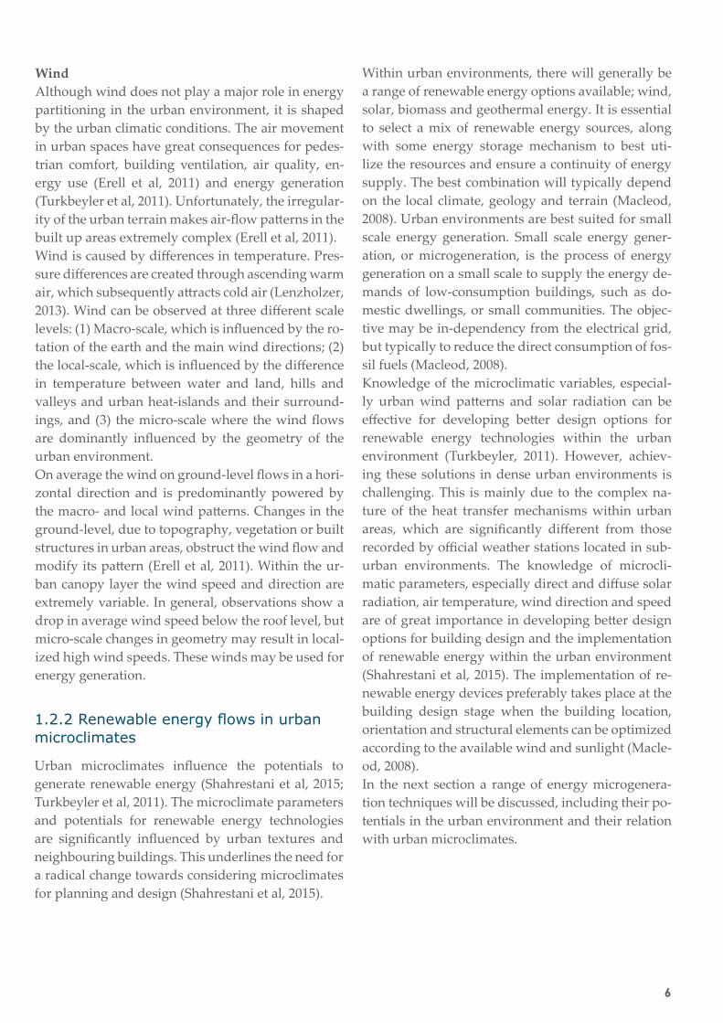
Dimension and scaleFrom the literature it became clear that including the fourth dimension would fit the visualization pur-pose. This was achieved by the use of an animated 3D model, which will be discussed in the animation section below. A variety of scales were experimented with, from 2000x2000m (Figure 32) to 25x150m (Fig-ure 33).
23
Chapter 2: Methods
Figure 33: Scale 25x150m
AnimationAnimation in Blender is achieved through frame-by-frame animation. This type of animation is accomplished by subsequently showing still images at 24 frames per second. At this frame-rate (24 frames/second) one can recognize the idea of movement. By using animation, the speed of the particles can be adjusted. Furthermore, by animating the camera, viewers would have multi-ple viewpoints at the 3D model, which creates a better 3D experience. In this research different experiments were conducted regarding particle speed (fast: https://www.youtube.com/watch?v=rGpBBfenO0Q, and slow: https://www.youtube.com/watch?v=5iUFGnLhIZU) and viewing points.

24
Visualization workflow
Draw or import a 2D map
Make faces (s4u Make face plugin)
Extrude faces
Export 3D model (using BlendUP plugin)
Import mp4 files
Sequence animations (speed, duration, etc.)
Add text/titles
Add original data as 2D image
3D model opens automatically with BlendUP plugin
Go to cycles render view
Add light (sun)
Add particle systems to your own preferences (object shape, color, 2D or 3D etc.)
Add textures/materials to 3D model
Add collisions to 3D model elements (permeability, sticki-ness etc.)
Add camera
Animate camera along a path (by adding keyframes)
Render animations (mp4)
Google Sketchup
Blender
Adobe Premiere Pro
1
2
3
Simple 3d modelling in Sketchup
Visualization elements in Blender
Rendering in Blender
Video-editing in Premiere ProTable 3: Work flow

25
Chapter 2: Methods
Work flowA variety of software programs were applied to develop the new visualizations (Table 3). Google Sketchup was used to develop a simple 3D model of the relevant local climate zone. More advanced users of Blender can develop this simple 3D model in Blender, instead of Google Sketchup. Once the 3D model was imported in Blender, several steps need-ed to be taken to add colours or textures to the 3D objects and to add particle systems and collisions to the model. When all the desired particle character-istics were entered, the model could be rendered in an animation. Once the animation was rendered, it was imported in a video editing program Adobe Pre-miere Pro. In Premiere Pro the animation properties (speed, duration etc.) were adjusted and titles added.
4. ReviewAn important aspect to build defensibility and qual-ity of a visualization, is to involve community input. The community can help to derive the right deci-sions, and the community is able to objectively see things that the visualization preparer cannot. The visualizations can be revised afterwards and will lead to a final visualization, which can be more con-fidently explained to the audience (Sheppard, 2012). Two methods of community input were applied dur-ing this research.
The first involved community input by (semi-)pro-fessionals, during group meetings. These (semi-)pro-fessionals were either (landscape)architects, meteor-ologists or MSc students involved in microclimatic research. Every three weeks the (semi-)professionals gave feedback on the developed visualizations in group meetings.
The second method involved community input by 13 students in landscape architecture and spatial planning (3rd year BSc or higher) of the Wageningen University. A survey was conducted to review the quality of the new developed visualizations (version 1.0). After a short introduction of the research, the questionnaire (Figure 34) was distributed via per-sonal computers. A distinction was made between specific questions (for each visualization) and gen-eral questions (for all visualizations together). The four research criteria were included in the question-naire (left column, Figure 34).The results of the survey were processed in SPSS and Microsoft Excel. Subsequently, the results were used to improve the visualizations.
Figure 34: Questionnaire

26
5. PresentationWhen animation is involved, specific presentation techniques are required. There is commonly a va-riety of presentation techniques available, ranging from Powerpoint presentations to web-based for-mats. It is important to communicate the visualiza-tions effectively to the target audience, without ig-noring the context of the visualizations. The context, or pre-knowledge, is essential to take into account, because the visualizations cannot be comprehend-ed in isolation. To be able to display the context and increase accessibility, multiple presentation modes were used (Sheppard, 2001). Furthermore it was im-portant to show non-visual information during the visual presentation, using a neutral delivery (Shep-pard, 2001). Three different presentation modes were used to represent the urban energy flows. These in-cluded a survey, (Powerpoint) presentations and web-based formats (online).
SurveyDuring the survey the animations (visualizations) were displayed using Microsoft Powerpoint. Within Powerpoint the viewers had the freedom to start and stop the animations at any given time. Non-visual information was given verbally at the start of the sur-vey and by the use of recorded explanations during the animations in Powerpoint.
PresentationThe visualizations were presented multiple times by the use of a Powerpoint presentation (expert meet-ings, green-light, colloquium). The visualizations were displayed by using a beamer, tv or computer. Non-visual information was given verbally, to ex-plain the context.
Web-based (online)This research report functions as a context medium for the visualizations. The visualizations were made accessible, via website links (on Youtube.com). These links were unlisted, which meant that people could only access the visualizations if they possessed the specific website link. This prevented that the visuali-zations would be taken out of context.
27
Chapter 2: Methods
2.3 Discussion of methodsData and softwareThe availability of microclimatic datasets is limited, especially in dense urban environments. This lim-itation obstructed the assessment of the amounts of energy. On the other hand, completely accurate data was not a necessity in order to communicate the ur-ban energy flows. The visualizations were able to show differences in energy flow amounts and the re-lationships between several energy flows within a va-riety of local climate zones. Furthermore we have to take into account that, for communication purposes, the visualizations contain a high level of abstraction. This means that many detailed, but important (clima-tological) aspects, were omitted (e.g. shadows, sky view factor and advection).
Blender showed to be an appropriate software me-dium for the visualization purpose. Advantages of using Blender include; ease of use (accessibility), versatility and visualization capabilities. However, I would like to discuss some disadvantages of the soft-ware as well. The first disadvantage of the software is the learning curve, which is steep. Fortunately, many urban planners and designers are acquainted with designer software, which makes the learning curve more shallow. However, the learning curve decreases the accessibility of the visualizations. The second dis-advantage is the rendering time of the visualizations. Producing ten second animations can take up to one hour of rendering time, dependent on the graphical power of the computer. Fortunately, due to techno-logical advancements the rendering time will be re-duced in the future.
Methods The majority of the research methods appeared to be adequate in relation to the research question(s). The literature study formed a strong scientific basis to develop the design (visualizations). Subsequently the five steps in developing new visualizations (Shep-pard, 2012), appeared to be effective in developing new visualizations. This step-by-step guide was easy to follow and included the complete process of de-veloping new visualizations. The survey appeared to be one of the most essential methods during this re-search. The survey was an important method to build defensibility and quality of the visualizations.
Furthermore it was helpful in improving the visuali-zations. The code of ethics (Sheppard, 2001), provid-ed a solid base in developing assessment criteria for the questionnaire, but should always be considered carefully.
The code of ethics is helpful in increasing valid-ity and reliability of visualizations, but is far from complete. Beyond the choice of medium or software, many factors influence the quality of visualizations such as, content choices, audiences, viewpoints and presentation modes. Therefore, it has to allow for uncertainty and flexibility in rapidly changing tech-nologies and diverse (landscape) products (Bishop & Lange, 2005). The main obstacle during the evalua-tion, using the code of ethics, was the lack of quan-tification. The code attempts to provide reasonable and feasible safeguards for reliability, validity and other aspects involving the quality of visualizations, but does not define the definitions of ‘reasonable’ and ‘appropriate’ methods (Bishop & Lange, 2005). The code appeared to be useful in creating aware-ness of visualization validity and reliability, but the lack of quantification made it difficult to draw spe-cific conclusions.Cavens (2002) suggests two different approaches to safeguard or limit threats to visualization quali-ty: 1. More prescriptive approaches (more detailed and quantified code of ethics), which guide or drive the presentation of visualization material according to established principles or standards; and 2. More flexible and interactive approaches which give much greater control over visualization information to the user/viewer. The prescriptive approach includes a standard format or template to create ‘high quality’ visualizations and forces visualization preparers to think about validity and reliability issues. This pre-scriptive approach would work with any visualiza-tion tool or software and should be applied when interactive visualizations are unachievable (e.g. due to resource requirements). A flexible and interactive approach will give the viewer much more interac-tive control over what they see, and freedom to roam within the visualization data set.

28
Chapter 3
RESULTS

29
Chapter 3: Results
The following sections will present the developed new visualizations. First the results of version 1.0 will be presented, which was subsequently reviewed by the participants of the survey and expert meet-ings. The results of the review were then used to im-prove the visualizations, which resulted in version 2.0.
After experimenting with the visualization varia-bles, particle characteristics and approximately five expert meetings, version 1.0 of the visualizations was completed. Still frames of the results of version 1.0 are shown in Figure 35. Animations are accessi-ble (with internet connection) by clicking on the play button:
GeneralIn all visualizations, particles of incoming (short-wave radiation) flows are displayed as dots in a line, evenly distributed. Outgoing particles are dis-played as dots, randomly distributed. The built-up environment is displayed on the smallest scale pos-sible (25x150m), in which characteristic elements of the LCZ are visible. This scale increased legibility and saved rendering time. Animations show the 3D model in 360 degrees rotation (day-night) and 180 degrees rotation (day). Comparison animations be-tween the local climate zones are accessible in Figure 36 (page 33).
Net all-wave radiation and storage heatIncoming short-wave radiation, from the sun, is dis-played by yellow dots, which are evenly distributed. Short-wave radiation is partly absorbed by the urban materials and transformed into thermal energy (Fig-ure 35, 1.1-1.3).Long-wave radiation is displayed by red dots, ran-domly distributed (Figure 35, 2.1-2.3). Long-wave ra-diation is mainly released during night-time. For ex-ample, city centres release more long-wave radiation during the night, because more radiation is stored in this climate zone during the day (Figure 36, 1).The storage heat is displayed by the coloured rib-bon at the bottom of the 3D model (Figure 35, 1.1-2.3). This ribbon corresponds to the temperature of the material. For example, the animation shows that dark materials, such as asphalt, have higher temper-
3.1 Version 1.0 atures (red colour) than grass (yellow colour). The temperature difference is also caused by the albedo, emissivity and conductivity of the materials (Len-zholzer, 2013). Furthermore, the city centre stores more heat during the day and releases more heat during the night, compared to the park (Figure 35, 1.1-2.3).
Sensible heatSensible heat is displayed by orange dots, which are randomly distributed (Figure 35, 3.1-3.3). Sensible heat is mainly released during daytime. Darker, and thus warmer, materials emit more sensible heat than lighter and thus colder materials. Again, this differ-ence is also caused by the albedo, emissivity and conductivity of the materials. The city centre releases more sensible heat than the park , because city cen-tres contain more hardscape (Figure 36, 2).
Latent heatLatent heat is displayed by blue dots, randomly dis-tributed (Figure 35, 4.1/4.3). Latent heat is mainly re-leased during daytime, by vegetation and water. The park releases large amounts of latent heat, while the city centre does not release any latent heat, or just small amounts, depending on the vegetation cover. The latent heat visualization of the city centre was omitted in version 1.0, but included in version 2.0 (Figure 43, 12.3).
Anthropogenic heatAnthropogenic heat is displayed (Figure 35, 5.1/5.2) by purple dots, randomly distributed. Anthropo-genic heat is mainly released at daytime, when most human activities take place. At night there is less an-thropogenic heat, because human activities will be less. In the visualization, anthropogenic heat is re-leased by buildings and cars. When the LCZ’s are compared, it is apparent that the city centre releases the most anthropogenic heat, because most human activities take place in this local climate zone (Figure 36, 4). The park visualization is omitted in version 1.0, but included in version 2.0 (Figure 43, 12.4).

30
Mixed energy flowsIn reality all energy flows occur at the same point in time. This results in a chaotic, but more realistic visualization (Figure 35, 6.1-6.3). When the LCZ’s are compared, it does not show more or less particles be-tween the LCZ’s, but just a different distribution of energy flows. For example, the park contains high amounts of latent heat, while the city centre contains high amounts of anthropogenic heat (Figure 36, 5).
Wind profile Due to the building height and width ratio, a variety of wind flows occur around buildings. These wind flows are visualized by arrows (Figure 35, 7.1-7.3). The colour of the arrow indicates the wind veloci-ty. High wind speeds generally occur on the edge of building roofs and façades.
Wind energyThe high wind speeds around roof edges can be used to generate renewable energy (Figure 35, 8.1-8.3). Small wind turbines can be placed here, to extract electricity of wind flows. This extraction is visual-ized by white dots (electricity). Another option to generate wind energy are pole mounted wind tur-bines. These wind turbines are especially suited for areas without high buildings (Figure 35, 8.1/8.3).
Solar energyIncoming solar radiation is displayed by yellow dots (Figure 35, 9.1-9.3). These yellow dots are trans-formed by photovoltaic cells into electricity (white dots), or to thermal heat by other forms of thermal collectors. Solar collectors can be placed on build-ing roofs (city centre and neighbourhood) or on the ground (park). The generated electricity can be used for buildings, street furniture or can be transported to the electricity grid.
Biomass energyBiomass energy can be generated from vegetation grown in urban environments. Vegetated areas in urban environments can be parks, but also roofs and façades (Figure 35, 10.1/10.2). In the visualizations vegetation is growing by sunlight (yellow dots), and subsequently harvested and transported to conver-sion facilities (Figure 35, 10.1-10.3).
Figure 35: Results of the visualizations version 1.0 (page 31 and 32)

31
Chapter 3: Results
Neighbourhood City centre
Short-wave radiation
Sensible heat
See shortwave radiation See shortwave radiation See shortwave radiation
Latent heat
Anthropogenic heat
Long-wave radiation
Park
1.1
2.1
3.1
5.1
4.1
1.2
2.2
3.2
5.2
1.3
2.3
3.3
4.3

32
Neighbourhood City centre Park
Flows mixed
Wind profile
Wind energy
Solar energy
Biomass energy
6.1
7.1
8.1
9.1
10.1
6.2
7.2
8.2
9.2
10.2
6.3
7.3
8.3
9.3
10.3
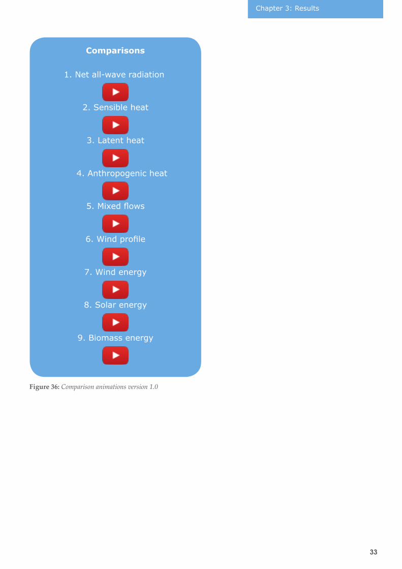
33
Chapter 3: Results
Figure 36: Comparison animations version 1.0
Comparisons
1. Net all-wave radiation
4. Anthropogenic heat
7. Wind energy
2. Sensible heat
5. Mixed flows
8. Solar energy
3. Latent heat
6. Wind profile
9. Biomass energy

34
Figure 37: Mean values of legibility per visualization
Figure 38: Mean values of comprehensibility per visualization
Figure 39: Mean values of attractiveness per visualization
Figure 40: General mean values of all assessment criteria

35
Chapter 3: Results
Version 1.0 of the visualizations was reviewed by the use of a questionnaire. The results of the question-naire are shown in Figure 41.
The average score of all the visualizations was ≥3.11. This meant that every questions was agreed upon. Question 3 (Q3), scored the highest (4.46) and ques-tion 8 (Q8) scored the lowest (3.11).
Figures 36-38 show the results of the assessment cri-teria in bar charts for each visualization. Usability was omitted, because the questions about usability only concerned general questions. Figures 36-38 re-late to research sub-questions 1-3.
The results of legibility (Figure 37) and attractive-ness (Figure 39) showed that the visualizations about climatic energy flows scored higher than the visu-alizations about renewable energy flows. Compre-hensibility (Figure 38) generally scored lower than legibility and attractiveness, especially the visualiza-tions of the net all-wave radiation, latent heat and the mixed flow visualization.
Figure 41: Results of the questionnaire version 1.0. From left to right: assessment criterion (column 1), assessment metrics (col-umn 2), questions (column 3), mean result (column 4), standard deviation (column 5, only applicable to specific questions).
On the three assessment criteria (legibility, compre-hensibility, attractiveness), the wind profile visuali-zation scored the highest (total of 12.65, figures 36-38) and the visualization of the mixed energy flows the lowest (total of 10.19, figures 36-38).
Figure 40 shows the results for the assessment cri-teria of all visualizations together (see Figure 41 for corresponding questions). Comprehensibility clearly showed the lowest value of the assessment criteria.
3.1.1 Review of results

36
3.1.2 Improvements
SurveyEvery participant of the survey could propose im-provements to the visualizations. The proposed im-provements were considered at a threshold of three similar answers from different participants. Subse-quently the proposed improvements of the survey, expert meetings and researcher’s observations were incorporated in version 2.0.
Improvement 1: Amount of particlesThe first improvement concerned the amount of particles in the visualizations. Multiple participants proposed to show less particles, especially in the re-newable energy visualizations, to increase legibility.
In version 2.0 all visualizations contain less and larg-er particles. The renewable energy visualizations contain less incoming short-wave radiation particles to avoid occlusion.
Improvement 2: Day/night differenceThe second improvement concerned the difference between day and night. It was proposed to represent day and night differences more clearly.
In version 2.0 all visualizations contain a clearer dis-tinction between day and night. This was achieved by modifying the colours of the visualizations. Fur-thermore, all version 2.0 visualizations contain a 24 hour cycle (day/night). This makes it easier to com-pare the local climate zones.
Improvement 3: Local climate zone differenceThe third improvement concerned the differences in particle amounts between the local climate zones. Participants noted that the differences in particle amounts between the local climate zones were not clear.
The differences were made more clear by increased or decreased particle amounts in version 2.0. For ex-ample, the difference between long-wave radiation in the city centre was reinforced with more particles and the long-wave radiation in the park with less particles (12.1). This measure increased legibility, but decreased reliability of the visualizations.
Improvement 4: Rotation speed and pausesThe fourth improvement concerned the rotation speed of the animation. Participants noticed that the rotation was distracting in some cases. Furthermore they mentioned that more pauses were preferred.
This improvement was not incorporated in version 2.0, because of: 1. Slowing down the rotation speed would cause more rendering time, because more frames would have to be added to the animation and 2. More pauses are not necessary when the viewer is able to pause the animation at any given time.
‘Expert’ meetingsAt the expert meetings several smaller improve-ments were proposed to increase the quality of the visualizations. The first improvement concerned the shadows within the 3D model, which were thought to be too light. In version 2.0 all visualizations con-tain darker shadows, which was achieved by increas-ing the light emission from the 'sun'. The second improvement concerned the viewing angle of the camera, which was thought to be to high. In version 2.0 of the visualizations the camera viewpoint was lowered five degrees. The third improvement con-cerned the addition of a time-clock, to indicate the diurnal differences of the energy flows. In version 2.0, this time-clock was added in the top right corner. The fourth and final improvement concerned the ad-dition of raw data as a 2D image. This improvement was added to the city centre visualizations (Figure 42). This data indicates the diurnal amounts of each energy flow. An animated black bar (top left corner) indicates the daytime to the according amount of en-ergy.
Researcher’s observationsFinally I implemented more improvements to the visualizations. The first improvement included an equal camera speed throughout the animation, which would increase legibility. The camera speed in version 1.0 started and ended slow, while the cam-era speed in version 2.0 contained an equal speed throughout the animation. The second improvement included the use of 2D particles, instead of 3D parti-cles, which reduced rendering times by 30%.

37
Chapter 3: Results
The improved visualizations are shown in Figure 42 and Figure 43 below. The raw data is attached on the top left corner (Grimmond et al, 2004). This meas-ured data is from the city centre of Marseille, France, and gives an indication of the amounts of energy flows within dense urban environment and should therefore not be mistaken with the real-life situation. Figure 43, shows the comparisons of the LCZ’s of version 2.0.
Net all-wave radiation
Sensible heat
Anthropogenic heat
Flows mixed
11.1
11.3
11.2
11.4
Figure 42: Version 2.0 city centre
3.2 Version 2.0

38
Anthropogenic heat Mixed flows
Short-wave radiation Long-wave radiation
Wind profile Wind energy
Sensible heat Latent heat
Solar energy Biomass energy
12.0
12.2
12.4
12.6
12.8
12.1
12.3
12.5
12.7
12.9
Figure 43: Comparisons LCZ’s version 2.0

39

40
Chapter 4
DISCUSSION

41
In this chapter the research questions will be an-swered and discussed. Furthermore, the scientific and societal impact and future directions will be dis-cussed.
Research question [RQ.1]: What type of visuali-zation can make energy flows (microclimatic and renewable) intelligible for urban planners and de-signers?
In this study, energy flows in urban microclimates were made intelligible by the use of a new visual-ization method. This new method was developed by combining visualization techniques, grounded in several research disciplines. Animated 3D visu-alizations, with the use of particle systems, are the most adequate in representing dynamic urban ener-gy flows. The survey revealed that by using animat-ed 3D visualizations, urban planners and designers were able to comprehend the urban environment in terms of (renewable) energy flows. Comprehension of the energy flows was achieved by the right levels of abstraction, dimensionality and (semi-)interactiv-ity.
Version 1.0 of the visualizations was reviewed quan-titatively, which resulted in reliable and valid con-clusions. Although the sample size of the survey was relatively small, the results are promising. This is supported by the fact that every question of the questionnaire was agreed upon (≥3.11). The results of the questionnaire indicated that the visualizations involving energy flows, were generally rated higher than the visualizations involving renewable energy flows. This may have been caused due to occlusion and cluttering issues. These issues were probably caused by the amount of particles, which resulted in dazzling the viewer. This corresponds to the litera-ture about (energy) flow visualization, where occlu-sion and cluttering have always been major challeng-es (Brambilla et al, 2012), especially with direct flow visualization (McLoughlin et al, 2010). Participants of the survey suggested to display less particles in the visualizations to avoid occlusion. This sugges-tion was incorporated in version 2.0 of the visuali-zations.
Sub-question [SQ.1] Are the new visualizations legible?
In the general assessment of the survey, legibility was rated the highest (4.13) of all four assessment criteria. From this score, we can conclude that the visualizations were legible. The most important fac-tors of legibility, were the use of 3D components, colours and by showing enough viewpoints in the visualizations. In the specific assessment criteria of the survey, the results of legibility show a duality be-tween the energy flow visualizations and the renew-able energy flow visualizations. This duality may have been caused by occlusion and cluttering issues, because too much particles occluded the view in the renewable energy visualizations.
Sub-question [SQ.2] Are the new visualizations comprehensible?
In the general assessment, comprehensibility was rat-ed the lowest (3.56). This may have been caused by the necessity of pre-knowledge. This is strengthened by the fact that the question regarding pre-knowledge was rated the lowest of all questions, with a score of 3.11. This finding is supported by earlier studies that implicated that visualizations where pre-knowledge was not required were rated higher than visualiza-tions where pre-knowledge was required (Shamim, 2015). The results of the specific assessment criteri-on comprehensibility, show a wide distribution. The specific cause of this distribution remains unclear, but may have been caused by unclear explanations during the survey (written and/or verbally).
Sub-question [SQ.3] Are the new visualizations at-tractive?
In the general assessment, attractiveness was rated generally high (4.04). This means that the visualiza-tions are generally attractive and hold the interest of the viewer. The results of the specific assessment, more or less correspond to the results of legibility, and low scores are therefore probably caused by oc-clusion and cluttering issues as well.
4.1 Discussion
Chapter 4: Discussion

42
Sub-question [SQ.4] Are the new visualizations useful for (urban) planners and designers?
In the general assessment, usability was rated high (4.12). This result was mainly caused by the high scores of question 14, which involved the amount of information the visualizations were able to transfer to the viewer. This means that the visualizations in general were informative. Question 15, regarding the usability of the visualizations in future plans and design, was rated relatively high as well. Un-fortunately, the question does not state if the visu-alizations are useful as a communication tool or as a design tool. This unclarity may have caused un-reliable results. This means that the usability of the visualizations, specifically as a communication tool has not been proven. Finally, the used visualization technique was thought to be appropriate in repre-senting urban energy flows. Accessibility plays an important role in the use of these visualizations. Due to the complex work flow in creating the visualiza-tions, accessibility decreases and the visualizations can be generally considered to fall within the expert domain. And even for domain experts, extensive tu-torials may have to be provided to replicate the vis-ualizations.
Transferring urban climate knowledge to routine planning and design practice seems to be a major challenge (Mills, 2014). This research bridges the gap between knowledge (urban climatology) and prac-tice (urban planning and design), by using a new visual communication method. By using this new method, urban planners and designers will be able to comprehend the complex interactions of energy in urban environments and how these interactions can be used to improve the environmental performance of the urban landscape in an accessible and appli-cable manner. Furthermore, these visualizations will help them to improve the overall sustainability of ur-ban environments, by reducing urban heat, improv-ing the living environment, and exploring the poten-tial implementation of renewable energy generation. This will directly benefit the society as a whole.
The development of this new visualization method is one of the first steps in communicating urban ener-gy systems to mainstream planning and design.The next step will be to develop the visualizations
as a tool for design. However, to make the visuali-zations widely accessible as a design tool, I suggest to make the visualizations more interactive. This re-quires close collaboration between (urban) design-ers, (urban) climatologists and computer scientists. Urban designers could focus on the visual aspects, while urban climatologists can focus on the data, and computer scientists on the technical aspects of the model. Providing more choice and freedom would reduce the risk of systematic bias from the presenter or preparer, and allows more direct and individu-alized estimates of validity and reliability (Bishop & Lange, 2005). In a more interactive environment viewers would be able to import their own plan or design and decide which energy flow(s) they want to examine. Further improvements in interactivity would involve the option to add or remove certain elements of the design. For example by adding trees, latent heat will be increased and urban temperatures may decrease. In an ideal situation the planner or designer would be able to add more trees until the environment would be comfortable to live in. This would create a more simulated environment, similar to ENVI-met (climatological simulation software), but would be much more accessible and comprehen-sible.
Another option would be to involve virtual- or augmented reality techniques in combination with measuring instruments, for example to examine real-life energy flows. These types of realities may increase immersion, but like interactive models, re-quire many resources. In the end trade-offs will al-ways have to be made between utility, feasibility and cost implications. Moreover, there is nothing to say that self-choice would automatically lead to the appropriate information being found or seen, and could even lead to more biased and confusing arrays of visualization. Some combination of prescriptive and interactive approaches might lead to the great-est validity, while preserving freedom to explore the visualization process and design options (Bishop & Lange, 2005).
This research provides a basis for widely accessi-ble and applicable tools for communicating energy systems to (urban) planning and design. The visu-alization method of this research will help (urban) planners and designers to improve the overall sus-

43
tainability of urban environments, by reducing ur-ban heat, improving the living environment, and ex-ploring the potential implementation of renewable energy generation.

44
Abdelalim, A., et al. (2015) Visualization of energyW and water consumption and GHG emissions: A case study of a Canadian University Campus. Energy and Buildings, 109, 334-352.
Akbari, H. (2002) Shade trees reduce building ener-gy use and CO2 emissions from power plants. Envi-ronmental pollution, 116, S119-S126.
Alemasoom, H., et al. (2016) EnergyViz: an interac-tive system for visualization of energy systems. The Visual Computer, 32.3, 403-413.
Allegrini, J., et al. (2015) A review of modelling ap-proaches and tools for the simulation of district-scale energy systems. Renewable and sustainable energy reviews, volume 52, 1391-1404.
Appleton, K., et al. (2002) Rural landscape visualiza-tion from GIS databases: A comparison of approach-es, options and problems. Computers, Environment and Urban Systems, 26, 141–162.
Arnfield, A. J. (2003). Two decades of urban climate research: a review of turbulence exchanges of energy and water, and the urban heat island. International Journal of Climatology, 23, 1–26.
Bäckström, E. (2006) The surface energy balance and climate in an urban park and its surroundings. The-sis, Uppsala, Sweden.
Bishop, I.D., Lange, E. (2005) Visualization in land-scape and environmental Planning: Technology and Applications. Taylor & Francis, London.
Brambilla, A., et al. (2012) Illustrative flow visuali-zation: State of the art, trends and challenges. Vis-ibility-oriented Visualization Design for Flow Illus-tration.
Bruce, V., Green, P.R. and Georgeson, M.A. (1996) Visual perception, physiology, psychology and & ecology. Psychology Press, 2003.
Brugmans, G., Strien, J. (2014) ‘Urban by nature’. IABR, Rotterdam.
LiteratureCavens, D. (2002) A design-based decision support system for forest design. Unpublished MSc. thesis, University of British Columbia, Vancouver, BC.
Christen, A., Vogt, R. (2004) Energy and radiation balance of a Central European City. International Journal of Climatology, 24, 1395–1421.
Downes, M., Lange E. (2015) What you see is not always what you get: A qualitative, comparative analysis of ex ante visualizations with ex post pho-tography of landscape and architectural projects. Landscape and Urban Planning, 142, 136-146.
Dudarev, I., et al. (2013) Visualization of Energy Flows Using a Particle System. Mechatronics 2013, Springer International Publishing, 185-192.
Erell, E., Pearlmutter, D., Williamson, T. (2011) Ur-ban microclimate: Designing the spaces between buildings’. Routledge, Abingdon.
Grimmond, C.S.B., et al. (2004) Flux and turbulence measurements at a dense urban site in Marseille: heat, mass (water, carbon dioxide) and momentum. Journal of Geophysical Research: Atmosphere, 109, 19.
Grimmond, C.S.B., et al. (2010) Climate and more sustainable cities: climate information for improved planning and management of cities. Environmental Sciences: Processes, 1, 247–274.
Häb, K. (2015) Visualization and analysis techniques for urban microclimate data sets. Dissertation, Tech-nical University Kaiserslautern, Kaiserslauterns.
Hauser, H. et al. (2003) The State of the Art in Flow visualization, part 1: Direct, Texture-based and Ge-ometric Techniques.” Proceedings IEEE Visualiza-tion.
Heath, M.A., et al. (2007) Estimating the Potential Yield of Small Building-mounted Wind Turbines. Wind Energy, 10, 271–287.

45
Hebbert, M. and Mackillop, F. (2013) Urban clima-tology applied to urban planning: a post-war knowl-edge circulation failure. International Journal Urban Regeneration, 37, 1542–1558.
Honjo, T, Takakura, T. (1990) Simulation of thermal effects of urban green areas on their surrounding ar-eas. Energy and Buildings, 15.3-4, 443-446.
Inam, A. (2013) Designing urban transformation. Routledge, New York.
Ishugah, T.F., et al. (2014) Advances in wind energy resource exploitation in urban environment: A re-view. Renewable and Sustainable Energy Reviews, 37, 613–626.
Kanters, J., Horvat, M. (2012) Solar energy as a de-sign parameter in urban planning. Energy Procedia 30, 1143 – 1152.
Keirstead, J., Jennings, M., Sivakumar, A. (2012) A review of urban energy system models: Approaches challenges and opportunities’. Renewable and sus-tainable energy reviews, 16, 3847-3866.
Keirstead, J., Shah, N. (2013) Urban energy systems: An integrated approach. Routledge, Abingdon.
Kennedy, C. (2010) The study of urban metabolism and its applications to urban planning and design. Environmental pollution, 159, 1965-1973.
Kennedy, C., Cuddihy, J., and Engel-Yan, J. (2007) The changing metabolism of cities. Journal of indus-trial ecology, 11.2, 43-59.
Kotthaus, S., Grimmond, C.S.B (2014) Energy ex-change in a dense urban environment – Part I: Tem-poral variability of long-term observations in central London. Urban Climate, 10, 261–280.
Lenzholzer, S. (2013) Het weer in de stad. Hoe ont-werp het stadsklimaat bepaalt, Rotterdam, Nai010 uitgevers.
Lenzholzer, S., Duchhart, I., and Koh, J. (2013) Re-search through designing in landscape architecture. Landscape and Urban Planning, 113, 120-127.
Li, D. Liu, G., Liao, S. (2015) Solar potential in urban residential buildings. Solar Energy 111, 225–235.
Liang, Z., Zhou, H. (2009) Three-dimension Foun-tain Simulation Based on GPU and Particle system. International Forum on Information Technology and Applications, 37–39.
Lovett, A., et al. (2015) Using 3D visualization meth-ods in landscape planning: An evaluation of options and practical issues. Landscape and Urban Planning, 142, 85-94.
MacEachren, A.M., et al. (1999) Virtual environments for geographic visualisation: potential and challeng-es. ACM Workshop on New Paradigms for Informa-tion Visualization and manipulation, Kansas City, 35-40.
Macleod, A. (2008) Using the microclimate to opti-mise renewable energy installations. Renewable En-ergy, 33, 1804–1813.
Masson, V., Grimmond, C. S. B., and Oke, T. R. (2002). Evaluation of the town energy balance (TEB) scheme with direct measurements from dry districts in two cities. Journal of Applied Meteorology, 41(10), 1011–1026.
McCormick, B. H., T. A. DeFanti, and M. D. Brown (1987) Visualization in scientific computing. Com-puter Graphics, 21, (entire issue).
McLoughlin, T., et al. (2010) Over two decades of in-tegration-based, geometric flow visualization. Com-puter Graphics Forum 29, 6, 1807–1829.
Mertens, E. (2010) Visualizing landscape architec-ture. part of Springer Science + Business media, Ba-sel.

46
Mills, G. (2014) Urban climatology: History, status and prospects. Urban Climate, 10, 479-489.
Mills, G., et al (2010) Climate information for im-proved planning and management of mega cities. Procedia Environmental Sciences, 1, 228–246.
Mohajeri, N., et al. (2016) Effects of urban compact-ness on solar energy potential. Renewable Energy, 93 , 469-482.
Nocke, T., et al. (2007) Visual exploration and evalu-ation of climate-related simulation data. Winter Sim-ulation Conference, IEEE.
OECD, IEA (2015) Key world energy statistics. Chi-rat, France.
Offenhuber, D. (2010) Visual anecdote. Leonardo 43.4, 367-374.
Offermann, R., et al. (2011) Assessment of global bio-energy potentials. Mitigation and Adaptation Strate-gies for Global Change, 16.1, 103-115.
Oke, T. R. (1982) The energetic basis of the urban heat island. Quarterly Journal of the Royal Meteoro-logical Society, 108, 1–24.
Oke, T.R. (1984) Towards a prescription for the great-er use of climatic principles in settlement planning. Energy and Buildings, 7, 1-10.
Pearlmutter, D., Berliner, P (2004) Evaluation of Ur-ban Surface Energy Fluxes Using an Open-Air Scale Model. Journal of applied meteorology, 44, 532-545.
Post, F.H., et al. (2002) Feature extraction and visu-alization of flow fields. Eurographics 2002 State-of-the-Art Reports 1, 69-100.Rasheed, A. (2009) Multiscale modelling of urban climate. Ph.D Thesis, 4531, EPFL, Lausanne, Switzer-land.
Robitu, M., et al. (2006) Modeling the influence of vegetation and water pond on urban microclimate. Solar Energy, 80.4, 435-447.
Schmidt, M. (2008) The Sankey Diagram in Energy and Material Flow Management Part I: History, Jour-nal of industrial ecology, 12, 82-94.
Shahrestani, M., et al. (2015) A field study of urban microclimates in London. Renewable Energy, 73, 3-9.
Sheppard, S.R.J. (1989) Visual simulation: A user’s guide for architects, engineers, and planners. Van Nostrand Reinhold, New York.
Sheppard, S.R.J. (2001) Guidance for crystal ball gaz-ers: developing a code of ethics for landscape visual-ization. Landscape and Urban Planning, 54:183–199.
Sheppard, S.R.J. (2012) Visualizing climate change: a guide to visual communication of climate change and developing local solutions, Routledge, Abing-don.
Simpson, J. R. (2002) Improved estimates of tree-shade effects on residential energy use. Energy and Buildings, 34.10, 1067-1076.
Slocum, T.A., et al. (2001) Cognitive and usability issues in geo-visualization. Cartography and Geo-graphic Information Science, Volume 28, 61–75.
Stewart, I.D., and Oke, T.R. (2012) Local climate zones for urban temperature studies. Bulletin of the American Meteorological Society, 93.12, 1879-1900.
Svakhine, N.A., et al. (2005) Illustration and pho-tography inspired visualization of flows and vol-umes. VIS 05, IEEE Visualization.
Turkbeyler, E., et al. (2011) Urban microclimates and renewable energy use in cities. World renewable en-ergy congress 2011, Sweden.
Vallati, A., et al. (2015) On the Impact of Urban Micro Climate on the Energy Consumption of Buildings. Energy Procedia, 82, 506-511.
Wolman, A. (1965) The metabolism of cities. Scientif-ic American, 213 (3), 179-190.

47
Yau, N. (2013) Data points: Visualization that means something. John Wiley & Sons, Inc., Indianapolis, In-diana.
Zeman, F. (2012) Metropolitan sustainability: Un-derstanding and improving the urban environment. Woodhead Publishing Limited, UK.
Zhou, S. et al. (2006) Fire model based on Particle sys-tem and its application in Virtual Reality. Processing of the 16th International Conference on Artificial Re-ality and Telexestence-Workshop, ICAT.

48
Figure 2: Mills, G. (2014) Urban climatology: Histo-ry, status and prospects. Urban Climate, 10, 479-489.
Figure 4: Grimmond, C.S.B., et al. (2004) Flux and turbulence measurements at a dense urban site in Marseille: heat, mass (water, carbon dioxide) and momentum. Journal of Geophysical Research: At-mosphere, 109, 19.
Figure 5: Kotthaus, S., Grimmond, C.S.B (2014) En-ergy exchange in a dense urban environment – Part I: Temporal variability of long-term observations in central London. Urban Climate, 10, 261–280.
Figure 6: Kennedy, D., (2007) Cleveland is a More Beautiful City than You Remember [Image on-line], available: https://danakennedy.wordpress.com/2009/10/01/cleveland-is-a-more-beautiful-city-than-you-remember/cleveland-june-30-2007-052/ [accessed 10 Nov 2016]
Figure 7: Mahan, S., (2014) 40 Religious Groups Practicing Creation Care with Wind Turbines [Im-age online], available: http://blog.cleanenergy.org/2014/02/23/creationcare/ [accessed 10 Nov 2016]
Figure 8: AMA REINFORCEMENT (2015) Bahrain world trade centre [Image online], available: http://steel.amabuildingmaterials.com/completed-pro-jects.html [accessed 10 Nov 2016]
Figure 9: ZME Science (2016) No title [Image online], available: http://www.zmescience.com/ecology/renewable-energy-ecology/solar-panels-pros-and-cons-056654/ [accessed 10 Nov 2016]
Figure 10: HowStuffWorks (2016) No title [Image on-line], available: http://science.howstuffworks.com/environmental/green-science-pictures.htm [accessed 10 Nov 2016]
Figure 11: Pedd, J., (2016) No title [Image online], available: https://www.techzine.nl/nieuws/99343/tesla-en-solarcity-lanceren-speciaal-zonnedak.html [accessed 10 Nov 2016]
List of figuresFigure 12: Landezine (2015) No title [Image on-line], available: http://www.landezine.com/index.php/2011/02/shanghai-houtan-park-by-turen-scape/43-turenscape-landscape-architecture-hout-an-park/ [accessed 10 Nov 2016]
Figure 13: ViralPosme (2014) Universidad del Claus-tro de Sor Juana en México [Image online], available: http://viralposme.com/algunos-de-los-jardines-sin-horizonte-tienes-nada-mas-que-verlos/ [accessed 10 Nov 2016]
Figure 14: Hayward, A., (2016) Pop-up shops will have the OnePlus 3 for sale on 15 June [Image online], available: http://www.stuff.tv/news/pop-shops-will-have-oneplus-3-sale-15-june [accessed 10 Nov 2016]
Figure 15: Thorpe, J., (2009) No title [Image on-line], available: http://quod.lib.umich.edu/j/jep/3336451.0014.212?view=text;rgn=main [accessed 10 Nov 2016]
Figure 16: Archenhancer, V., (2014) Duplex_Villa [Image online], available: http://www.cgarchitect.com/2014/02/duplexvilla [accessed 10 Nov 2016]
Figure 17: Shark, D., (2009) Graphical projection comparison [Image online], available:https://commons.wikimedia.org/w/index.php?cu-rid=8497328 [accessed 10 Nov 2016]
Figure 18: Baez, J.C., (2013) Symmetry and the Fourth Dimension [Image online], available:https://johncarlosbaez.wordpress.com/2013/06/04/symmetry-and-the-fourth-dimension-part-10/ [ac-cessed 10 Nov 2016]
Figure 19: Mertens, E. (2010) Visualizing landscape architecture. part of Springer Science + Business me-dia, Basel.
Figure 20: Lovett, A., et al. (2015) Using 3D visualiza-tion methods in landscape planning: An evaluation of options and practical issues. Landscape and Ur-ban Planning, 142, 85-94.

49
Figure 21: Unknown author [Image online], availa-ble: https://i.ytimg.com/vi/Fc87s7lA3jM/maxresde-fault.jpg [accessed 10 Nov 2016]
Figure 22: Hauser, H. et al. (2003) The State of the Art in Flow visualization, part 1: Direct, Texture-based and Geometric Techniques.” Proceedings IEEE Vis-ualization.
Figure 23: Oke, T. R. (1988) Street design and urban canopy layer climate. Energy and buildings 11.1 , 103-113.
Figure 24: Nocke, T., et al. (2007) Visual exploration and evaluation of climate-related simulation data. Winter Simulation Conference, IEEE.
Figure 25: Soundararajan, K, et al. (2014) Sankey di-agram framework for energy and exergy flows. Ap-plied energy, 136, 1035-1042.
Figure 26: Kennedy, C. (2010) The study of urban me-tabolism and its applications to urban planning and design. Environmental pollution, 159, 1965-1973.
Figure 27: Kennedy, C. (2010) The study of urban me-tabolism and its applications to urban planning and design. Environmental pollution, 159, 1965-1973.
Figure 28: Krüger, J., et al (2005) A Particle System for Interactive Visualization of 3D Flows, IEEE TRANS-ACTIONS ON VISUALIZATION AND COMPUTER GRAPHICS, VOL. 11, NO. 6, 11.
Unmentioned figures are made by the author of this Thesis report

50
Appendix
Appendix 1: Interim code of ethics for (landscape) visualization (Sheppard, 2001)

51
Appendix 2: Local Climate Zone (LCZ) map of Amsterdam (