visualizing data to tell your story excel google charts piktochart r sas spss tableau timeline js...
TRANSCRIPT
Visualizing Data to Tell Your Story
November 16, 20162

Slide 1
2 Go to slide master view and add unique titles to all slides. They will not be visible, but will be used by screen readers.tOSU uCOM, 12/28/2015

2
UNIVERSITY LIBRARIES
Data visualization is not new
1

Slide 2
1 add alt text to all graphics including photos, charts, and shapes. Right click the object, choose format shape, then edit the alt text title and description. tOSU uCOM, 12/28/2015

3
UNIVERSITY LIBRARIES
https://en.wikipedia.org/wiki/Nautical_chart#/media/File:Fern%C3%A3o_Vaz_Dourado_1571-1.jpg
4
UNIVERSITY LIBRARIES
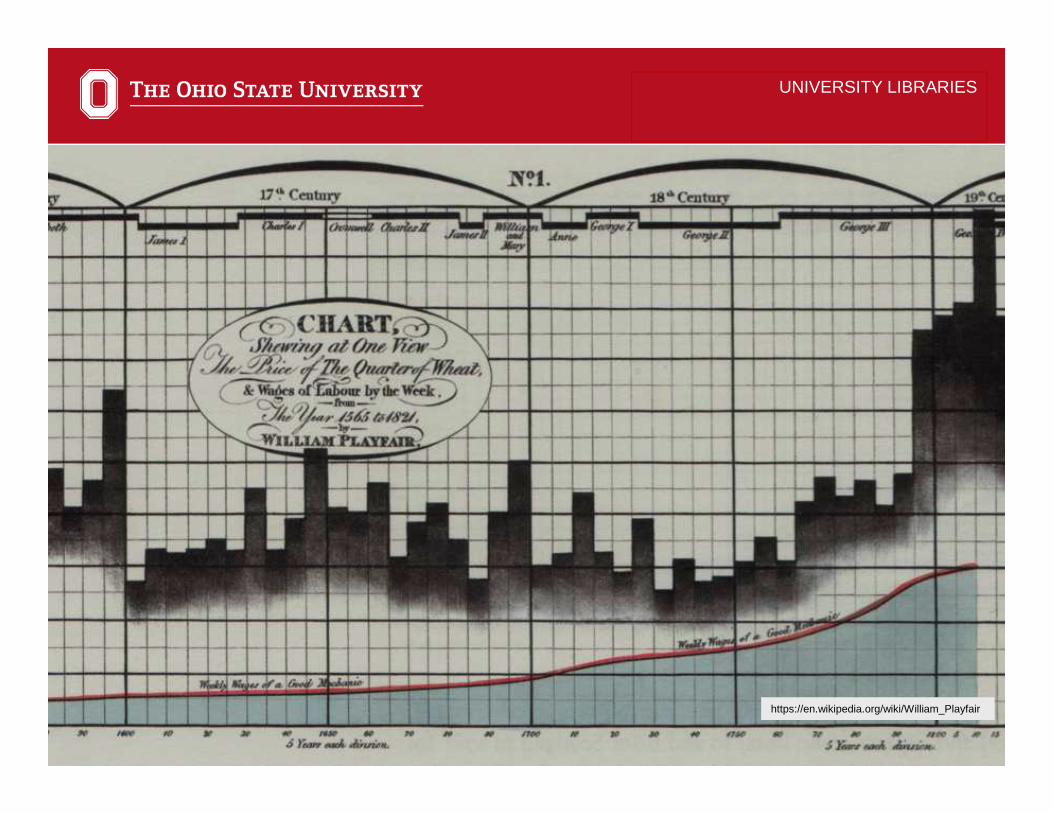
https://en.wikipedia.org/wiki/William_Playfair

5
UNIVERSITY LIBRARIES
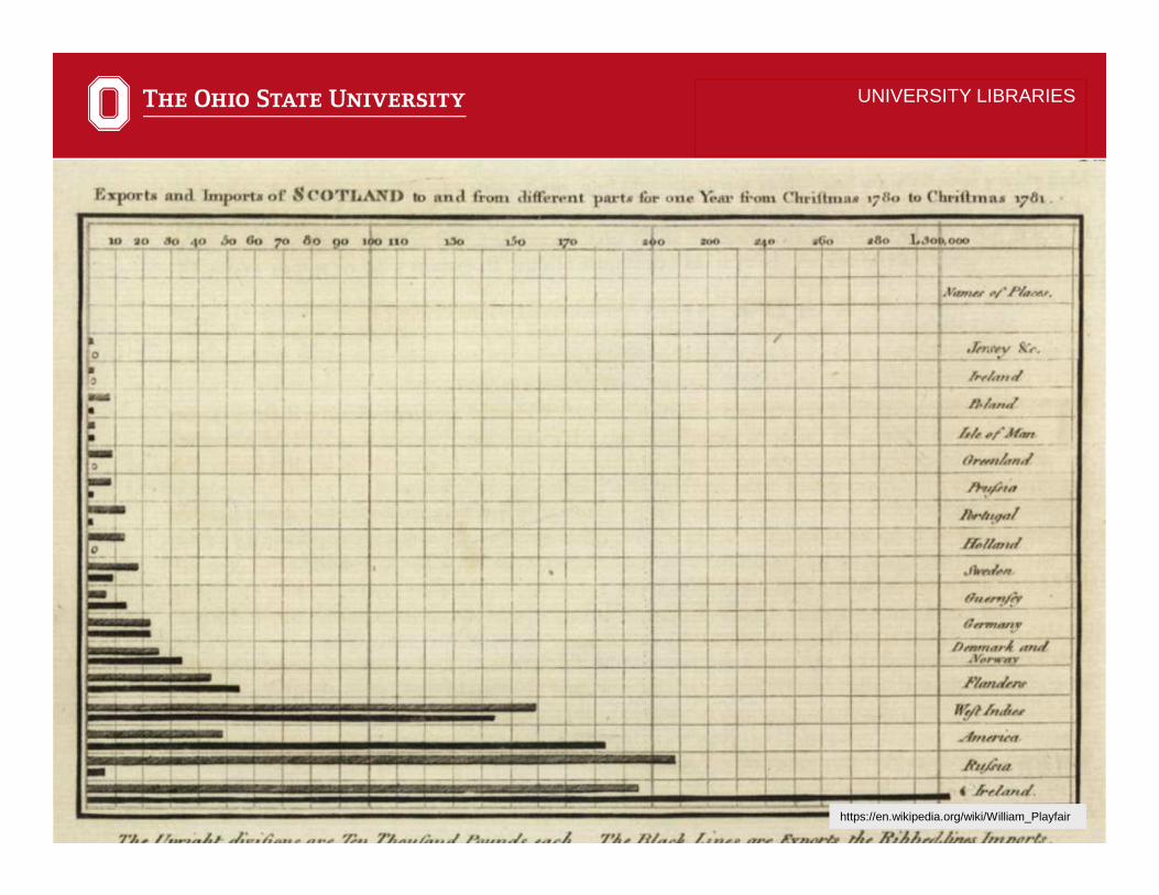
https://en.wikipedia.org/wiki/William_Playfair

6
UNIVERSITY LIBRARIES
https://en.wikipedia.org/wiki/William_Playfair

7
UNIVERSITY LIBRARIES
https://en.wikipedia.org/wiki/William_Playfair

8
UNIVERSITY LIBRARIES
http://www.bl.uk/learning/histcitizen/21cc/publichealth/sources/source5/mapofleeds.html
9
UNIVERSITY LIBRARIES
https://en.wikipedia.org/wiki/William_Playfair

10
UNIVERSITY LIBRARIES

11
UNIVERSITY LIBRARIES
http://www.bl.uk/learning/histcitizen/21cc/publichealth/sources/source5/mapofleeds.html

12
UNIVERSITY LIBRARIES

13
UNIVERSITY LIBRARIES
“… all types of visual representations that support the exploration,
examination, and communication of data.”
Data visualization
-Stephen FewNow You See It: Simple Visualization Techniques for Quantitative Analysis

14
UNIVERSITY LIBRARIES
“When we represent quantitative information in visual form, our ability to think about it is dramatically enhanced.
Visual representation not only make the patterns, trends, and exceptions in numbers visible and understandable, they also extend the capacity of our
memory.” -Stephen FewNow You See It: Simple Visualization Techniques for Quantitative Analysis

15
1. Great visualizations are efficient;2. Visualizations can help groups achieve
more insight into the nature of a problem and discover new understanding; and
3. Great visualizations create a shared view of a situation and align folks on needed actions.
UNIVERSITY LIBRARIES
General Benefits of Data Visualization
-John Sviolkla“Swimming in Data?”

16
UNIVERSITY LIBRARIES
Graphic displays are often very effective at communicating information

17
UNIVERSITY LIBRARIES
Graphic displays are also often not effective at communicating information

18
Survey softwareQualtrics, SurveyMonkey
Free toolsGoogle Forms, Google Analytics
Proprietary toolsPeople counters, LibAnalytics/LibAnswers, ProQuest 360 Core
UNIVERSITY LIBRARIES
Tools for collecting library data

19
AccessExcelRSASSPSSTableau
UNIVERSITY LIBRARIES
Tools for analyzing library data

20
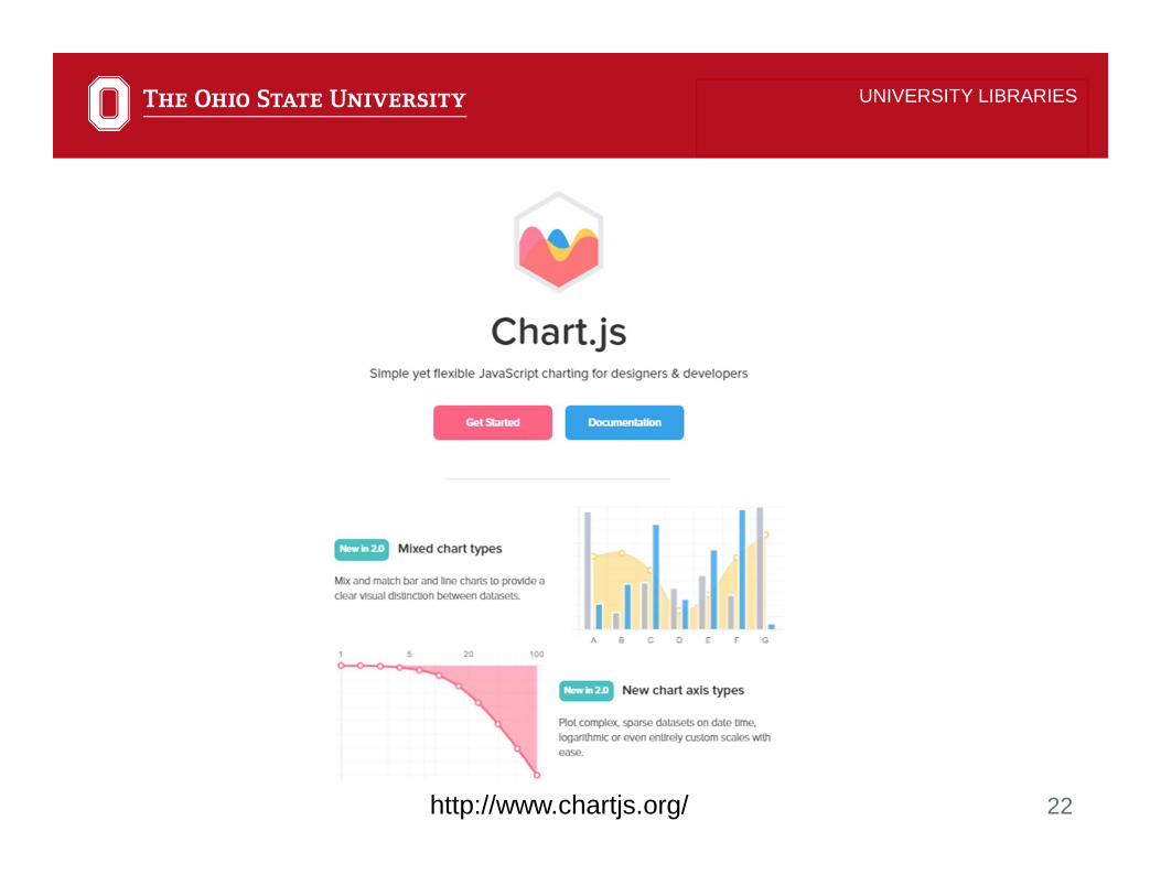
Adobe IllustratorChart.jsDatawrapperD3.jsExcelGoogle ChartsPiktochart
RSASSPSSTableauTimeline JS
UNIVERSITY LIBRARIES
Tools for visualizing library data

21
UNIVERSITY LIBRARIES
Tools for visualizing library data
https://helpx.adobe.com/illustrator/using/graphs.html
Adobe Illustrator
22
UNIVERSITY LIBRARIES
http://www.chartjs.org/

23
UNIVERSITY LIBRARIES
https://www.datawrapper.de/gallery/
24
UNIVERSITY LIBRARIES
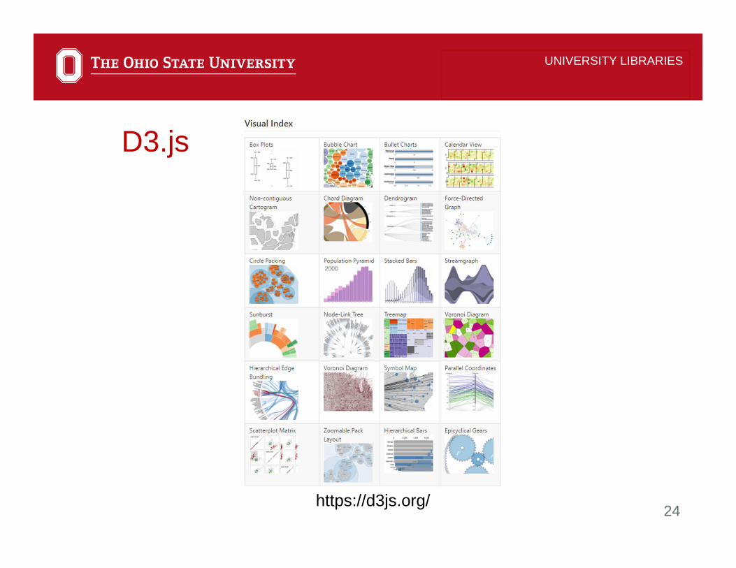
https://d3js.org/
D3.js

25
UNIVERSITY LIBRARIES
https://products.office.com/en-us/excel
Excel

26
UNIVERSITY LIBRARIES
https://developers.google.com/chart/interactive/docs/gallery
Google Charts

27
UNIVERSITY LIBRARIES
https://piktochart.com/
Piktochart

28
UNIVERSITY LIBRARIES
https://www.r-project.org/
R

29
UNIVERSITY LIBRARIES
https://support.sas.com/sassamples/graphgallery/
SAS
30
UNIVERSITY LIBRARIES
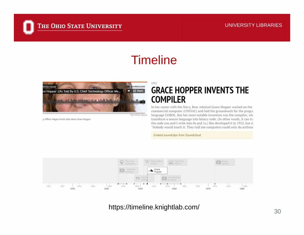
https://timeline.knightlab.com/
Timeline

31
UNIVERSITY LIBRARIES
https://public.tableau.com/en-us/s/gallery/scripps-national-spelling-bee-difficulty/
Tableau

32
UNIVERSITY LIBRARIES
Stephen FewNow you see it:Simple visualization techniques for quantitative analysis.
33
UNIVERSITY LIBRARIES
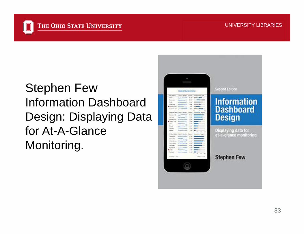
Stephen FewInformation Dashboard Design: Displaying Data for At-A-Glance Monitoring.

34
UNIVERSITY LIBRARIES
Dona M. WongThe Wall Street Journal Guide to Information Graphics

35
UNIVERSITY LIBRARIES
Cole NussbaumerKnaflicStorytelling With Data: A Data Visualization Guide for Business Professionals.

36
• Know your audience• Provide context and incorporate
instructions• Add interactivity• Apply visual best practices
UNIVERSITY LIBRARIES
Best Practices for Designing Effective Visualizations

37
UNIVERSITY LIBRARIES
Know your audience

38
UNIVERSITY LIBRARIES
https://public.tableau.com/en-us/s/gallery/endangered-safari

39
UNIVERSITY LIBRARIES
http://go.osu.edu/GateCount

40
UNIVERSITY LIBRARIES
Provide context and incorporate instructions
41
UNIVERSITY LIBRARIES
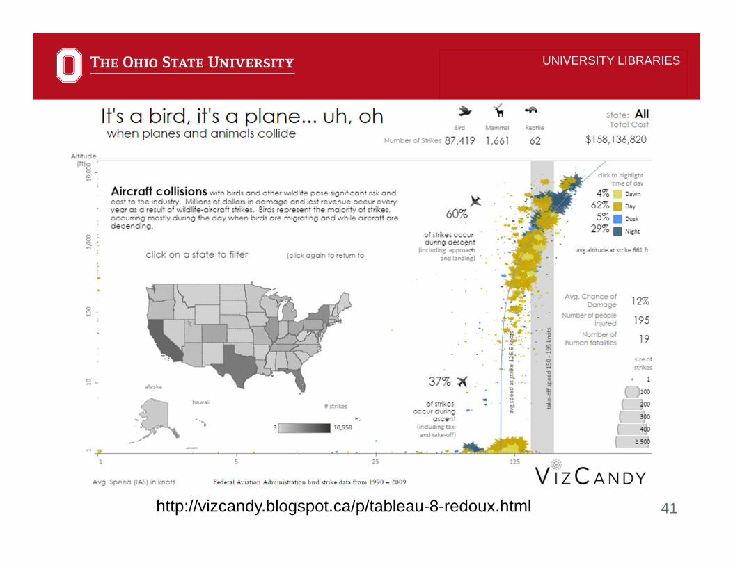
http://vizcandy.blogspot.ca/p/tableau-8-redoux.html

42
UNIVERSITY LIBRARIES
https://public.tableau.com/en-us/s/gallery/weekly-news-iron-viz-2015-champion

43
UNIVERSITY LIBRARIES
Add interactivity
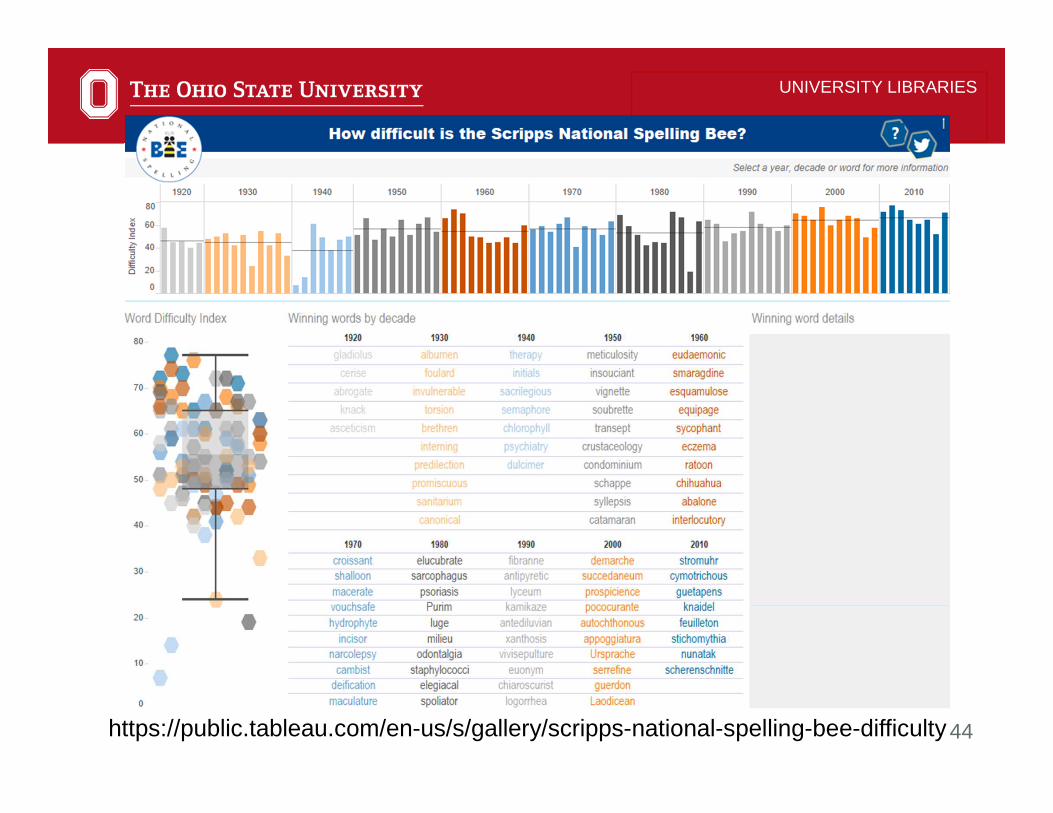
44
UNIVERSITY LIBRARIES
https://public.tableau.com/en-us/s/gallery/scripps-national-spelling-bee-difficulty

45
UNIVERSITY LIBRARIES
Apply visual best practices

46
• Choose the right chart type for the data and the purpose of the visualization
• Emphasize the most important data• Less is usually better• Limit colors and use color and fonts
consistently• Use space efficiently
UNIVERSITY LIBRARIES
What are visual best practices?

47
UNIVERSITY LIBRARIES
Select an appropriate view for your data
http://blog.darkhorseanalytics.com/salvaging-the-pie

48
UNIVERSITY LIBRARIES
Pie Chart

49
UNIVERSITY LIBRARIES
Horizontal vs. Vertical Bar Chart
Example from: http://www.storytellingwithdata.com/blog/2012/10/my-penchant-for-horizontal-bar-graphs

50
UNIVERSITY LIBRARIES
Horizontal vs. Vertical Bar Chart
Example from: http://www.storytellingwithdata.com/blog/2012/10/my-penchant-for-horizontal-bar-graphs

51
UNIVERSITY LIBRARIES

52
UNIVERSITY LIBRARIES
Discrete vs. Continuous Dates

53
UNIVERSITY LIBRARIES
Discrete vs. Continuous Dates
http://go.osu.edu/GateCount

54
UNIVERSITY LIBRARIES
Discrete vs. Continuous Dates

55
UNIVERSITY LIBRARIES
Discrete vs. Continuous Dates

56
UNIVERSITY LIBRARIES
Small Multiples
57
UNIVERSITY LIBRARIES
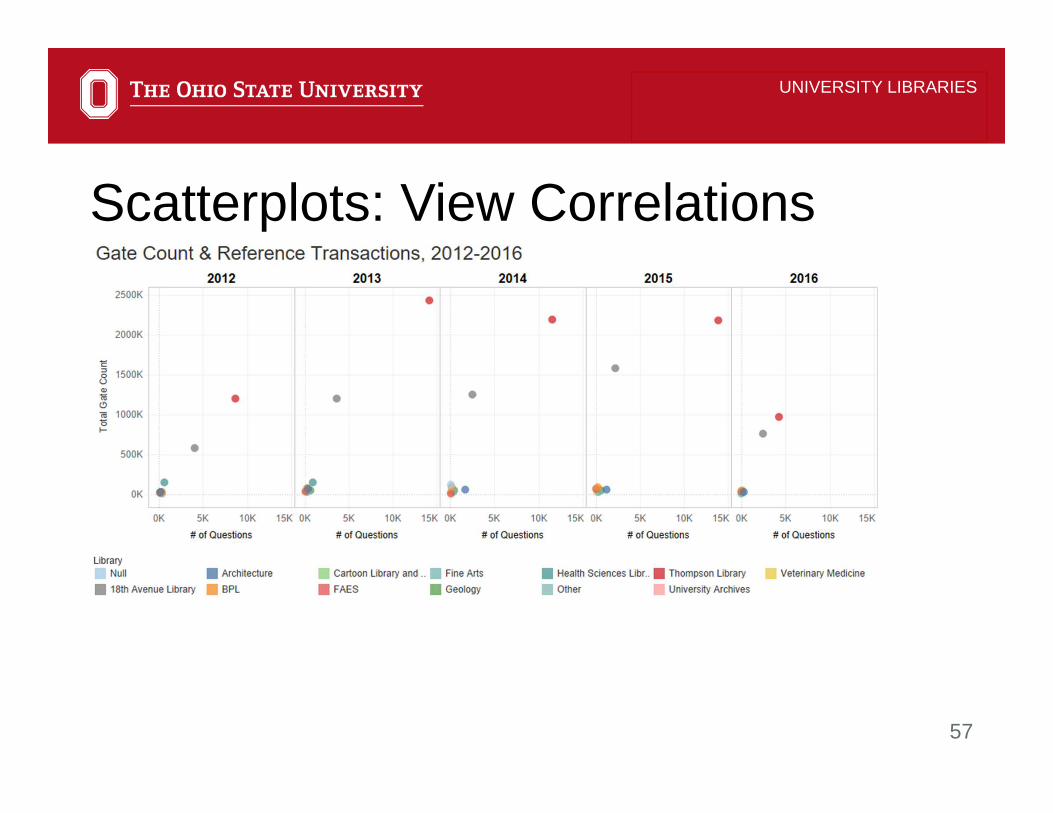
Scatterplots: View Correlations
58
UNIVERSITY LIBRARIES
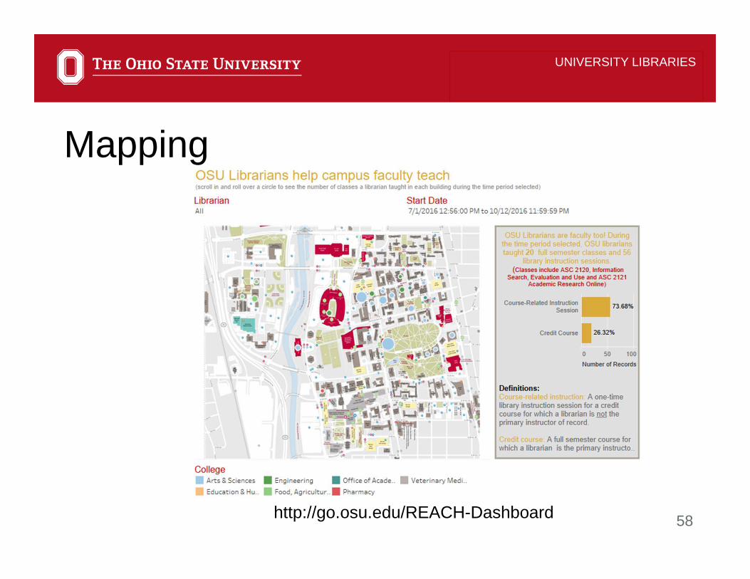
Mapping
http://go.osu.edu/REACH-Dashboard
59
UNIVERSITY LIBRARIES
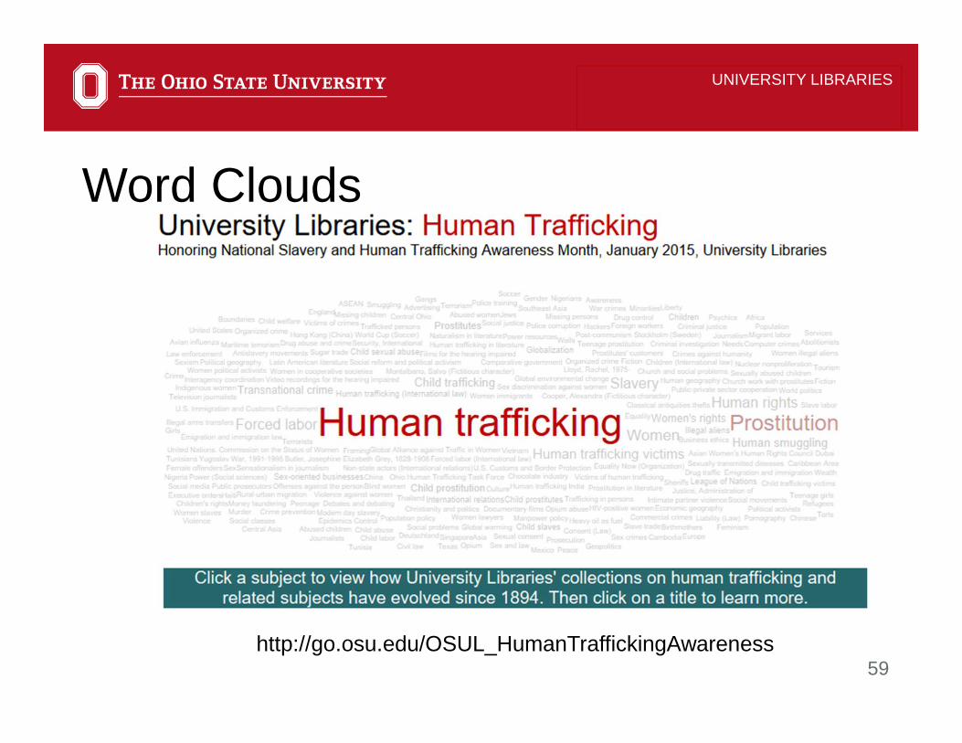
Word Clouds
http://go.osu.edu/OSUL_HumanTraffickingAwareness

60
UNIVERSITY LIBRARIES
Tree Maps

61
UNIVERSITY LIBRARIES
Tree Maps
https://en.wikipedia.org/wiki/Small_multiple

62
UNIVERSITY LIBRARIES
Histograms & Box & Whisker Plots

63
UNIVERSITY LIBRARIES
Histograms & Box & Whisker Plots

64
UNIVERSITY LIBRARIES
Join & Blend Data

65
UNIVERSITY LIBRARIES
Data visualization ≠ data narrative

66
ContextClarityEmotional connectionEngagement
UNIVERSITY LIBRARIES
The data narrative
67
UNIVERSITY LIBRARIES
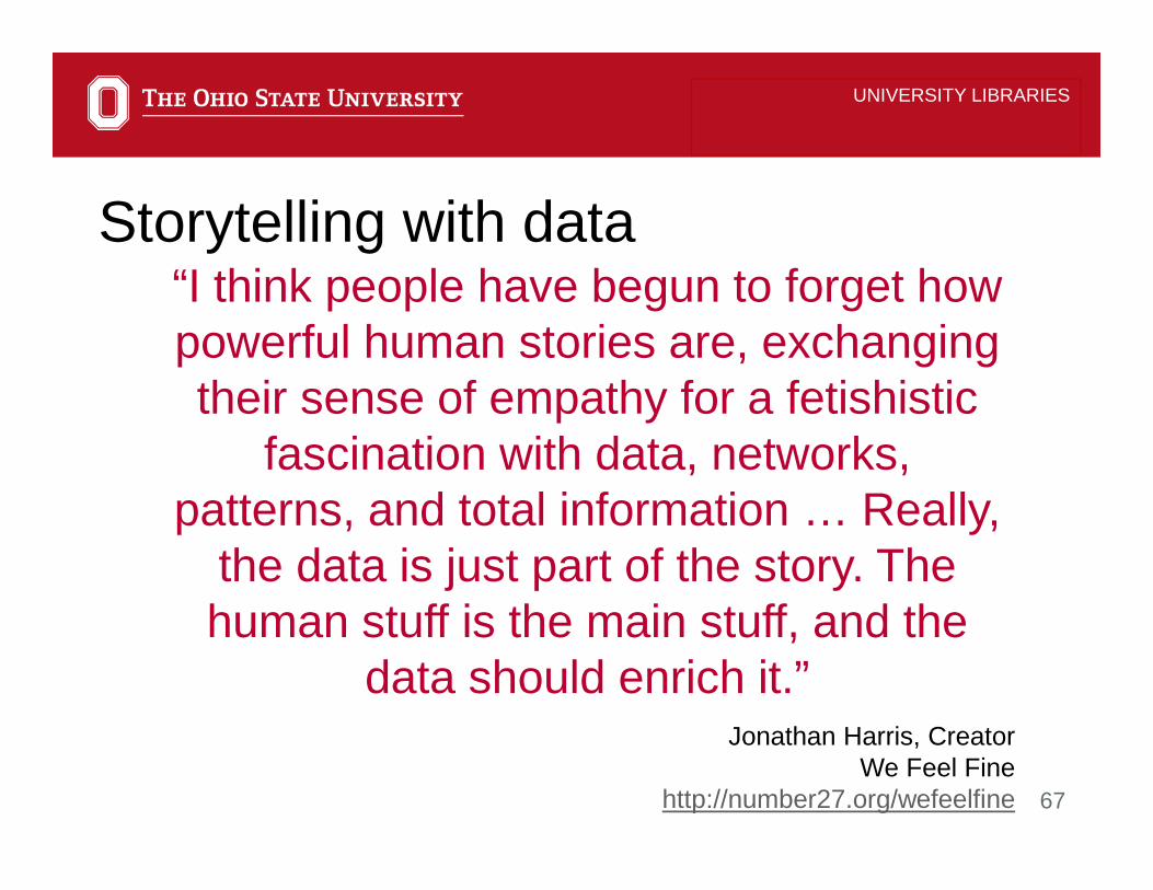
“I think people have begun to forget how powerful human stories are, exchanging their sense of empathy for a fetishistic
fascination with data, networks, patterns, and total information … Really,
the data is just part of the story. The human stuff is the main stuff, and the
data should enrich it.”
Storytelling with data
Jonathan Harris, CreatorWe Feel Fine
http://number27.org/wefeelfine

68
UNIVERSITY LIBRARIES
“An account of a series of events, facts, etc., given in order and with the establishing of connections between
them; a narration, a story, and account.”
Narrative
Oxford English Dictionary

69
UNIVERSITY LIBRARIES
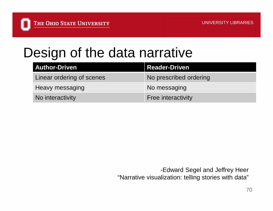
Design of the data narrative
-Edward Segel and Jeffrey Heer“Narrative visualization: telling stories with data”
70
Author-Driven Reader-Driven
Linear ordering of scenes No prescribed ordering
Heavy messaging No messaging
No interactivity Free interactivity
UNIVERSITY LIBRARIES
Design of the data narrative
-Edward Segel and Jeffrey Heer“Narrative visualization: telling stories with data”

71
UNIVERSITY LIBRARIES
Visual narrative tactics1. Visual structuring2. Highlighting3. Transition guidance
-Edward Segel and Jeffrey Heer“Narrative visualization: telling stories with data”

72
UNIVERSITY LIBRARIES
Narrative structure tactics1. Ordering2. Interactivity3. Messaging
-Edward Segel and Jeffrey Heer“Narrative visualization: telling stories with data”

73
Chronicle of Higher Education Where Does Your Freshman Class Come From? http://www.chronicle.com/interactives/where-does-your-freshman-class-come-from#id=inst_204796
Bread for the World InstituteUnmasking Hidden Hungerhttps://public.tableau.com/profile/derek4529#!/vizhome/UnmaskingHiddenHunger_0/TheNewFaceofHunger
UNIVERSITY LIBRARIES
Examples

74
ProPublicaWorkers Comp Benefits: How Much is a Limb Worth?https://projects.propublica.org/graphics/workers-compensation-benefits-by-limb
Faces of FrackingCalifornia’s Getting Frackedhttp://www.facesoffracking.org/data-visualization/
UNIVERSITY LIBRARIES
Examples
75
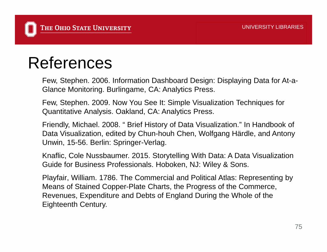
Few, Stephen. 2006. Information Dashboard Design: Displaying Data for At-a-Glance Monitoring. Burlingame, CA: Analytics Press.
Few, Stephen. 2009. Now You See It: Simple Visualization Techniques for Quantitative Analysis. Oakland, CA: Analytics Press.
Friendly, Michael. 2008. “ Brief History of Data Visualization.” In Handbook of Data Visualization, edited by Chun-houh Chen, Wolfgang Härdle, and Antony Unwin, 15-56. Berlin: Springer-Verlag.
Knaflic, Cole Nussbaumer. 2015. Storytelling With Data: A Data Visualization Guide for Business Professionals. Hoboken, NJ: Wiley & Sons.
Playfair, William. 1786. The Commercial and Political Atlas: Representing by Means of Stained Copper-Plate Charts, the Progress of the Commerce, Revenues, Expenditure and Debts of England During the Whole of the Eighteenth Century.
UNIVERSITY LIBRARIES
References

76
Segel, Edward and Jeffrey Heer. “Narrative Visualization: Telling Stories with Data.” IEEE Transactions on Visualization and Computer Graphics 16, no. 6 (2010):1139-1148.
Simon, Phil. 2014. The Visual Organization: Data, Visualization, Big Data, and the Quest for Better Decisions. Hoboken, New Jersey: Wiley.
Sviolkla, John. 2009. “Swimming in Data? Three Benefits of Visualization.” Harvard Business Review https://hbr.org/2009/12/swimming-in-data-three-benefit
Wong, Dona M. The Wall Street Journal. Guide to Information Graphics: The Dos and Don’ts of Presenting Data, Facts, and Figures. (New York: W.W. Norton & Co., c2010).
UNIVERSITY LIBRARIES
References

77
UNIVERSITY LIBRARIES
QUESTIONS?
Sarah Anne Murphy, MLS, MBA
Coordinator of Assessment & Professor
University Libraries
221C Thompson Library,
1858 Neil Avenue Mall, Columbus, OH 43210
614-247-7236 Office
[email protected] u.osu.edu/murphy.465/