visualization of time-varying power system information · human factor testing caution • there is...
TRANSCRIPT

Visualization of Time-Varying Power System Information
Tom OverbyeFox Family Professor
University of Illinois at [email protected]
PSERC WebinarMarch 17, 2015

2
Acknowledgements
• Work presented here has been supported by a variety of sources including PSERC, DOE, NSF, EPRI and Illinois Center for a Smarter Electric Grid (ICSEG). Their support is gratefully acknowledged!
• Slides also include contributions from UIUC graduate students Sudipta Dutta (now with GE), Saurav Mohapatra ([email protected]), Trevor Hutchins ([email protected]),and Iyke Idehen ([email protected]); also ICSEG staff engineer Richard Macwan ([email protected])
• Thanks for human factor aspects from Esa Rantanen, Rochester Institute of Technology

3
Overview
• Power system operations are generating more data than ever– In operations thousands of PMUs are now deployed– In planning many thousand of studies are now
routinely run, with a single transient stability run creating millions of data values
• How data is transformed into actionable information is a crucial, yet often unemphasized, part of the software design process
• Presentation addresses some issues associated with dealing with this data

4
Visualization Software Design
• Key question: what are the desired tasks that need to be accomplished?–Needs for real-time operations might be quite different
than what is needed in planning• Understanding the entire processes in which the
visualizations are embedded is key• Software should help humans make the more
complex decisions, i.e., those requiring information and knowledge –Enhance human capabilities–Alleviate their limitations (like adding up the flows into a
bus)

5
The InformationVisualization Process
Image source: Colin Ware, Information Visualization, Third Edition, 2013

6
Power System Visualization History: Time Varying Information
Utility Control Room, 1960’sLeft Source: W. Stagg, M. Adibi, M. Laughton, J.E. Van Ness, A.J. Wood, “Thirty Years of Power Industry Computer Applications,” IEEE Computer Applications in Power, April 1994, pp. 43-49
PSE&G Control Center in 1988
Right Source: J.N. Wrubel, R. Hoffman, “The New Energy Management System at PSE&G,” IEEE Computer Applications in Power, July 1988, pp. 12-15.

7
2010's: PJM Control Center: Electronic Strip-Charts
Image Source: http://tdworld.com/site-files/tdworld.com/files/imagecache/large_img/uploads/2013/07/pjmcontrolroom117.jpg

8
Power System Operating States
• Effective visualization for operations requires considering the different operating states
• Effective visualization is most needed for the more rare situations
Image Derived From L.H. Fink and K. Carlsen, Operating under stress and strain, IEEE Spectrum, March 1978, pp. 48-53

9
Blackouts and Operator Intervention
• Many large-scale blackouts have time scales of several minutes to a few dozen minutes– this time scale allows for operator intervention, but it
must occur quickly to be effective (extreme emergency control)
• Operators can’t respond effectively if they do not know what is going on– they need “situational awareness”

10
Extreme Emergency Control
• How the control room environment might be different during such an event–advanced network analysis applications could be
unavailable or overwhelmed–system state could be quite different, with unfamiliar
flows and voltages– lots of alarms and phone calls–high level of stress for control room participants with
many tasks requiring their attention– large number of decision makers might be present
• Designing software for extreme conditions is challenging since conditions seldom encountered

11
A Visualization Caution!
• Just because information can be shown graphically, doesn’t mean it should be shown
• Three useful design criteria from 1994 EPRI visualization report: 1. natural encoding of information2. task specific graphics3. no gratuitous graphics
Source: E. Tufte, The Visual Display of Quantitative Information, Graphics Press, Cheshire, CT, 1983.

12
Human Factor Testing Caution
• There is actually very little in the human factors literature with regard to power system visualizations.
• Doing formal human factors assessments and experiments is quite time consuming, and ultimately of somewhat limited value in determining the usefulness of visualizations in a control center setting
• We need to develop a community of power system engineers and human factor experts!

13
Access to Cases and Data:Need for Synthetic Models
• Working with actual cases and data preferred• However, getting access to power system cases
and data has been getting more difficult– I'm personally thankful for the many cases we've
received under NDAs; recently the issue of FISMA compliance has been raised
• Even when cases/data is available, publishing results can be an issue
• Need for synthetic cases, particularly for dynamics• University of Illinois is developing public domain
cases

14
Illini 42 Bus Case
• It is a 345/138 kV fictitious case with dynamics• This case will be used here to demonstrate some
of the techniques presented here• The case, which contains
an interactive transient stability level blackout scenario, and a movie, can be downloaded at
http://publish.illinois.edu/smartergrid/Power-Dynamics-Scenarios/

15
Visualization Background: Preattentive Processing
• Good reference book: Colin Ware, Information Visualization: Perception for Design, Third Edition, 2013
• When displaying large amounts of data, take advantage of preattentive cognitive processing–With preattentive processing the time spent to find a
“target” is independent of the number of distractors• Graphical features that are preattentively
processed include the general categories of form, color, motion, spatial position

16
All are Preattentively Processed Except Juncture and Parallelism
Source: Information Visualization by Colin Ware, Fig 5.5

17
Preattentive Processing with Color and Size
Illini 42 Bus Case
Unserved Load: 0.00 MW
417 MW
515 MW
2378 MW
1750 MW
234 MW 55 Mvar
234 MW 45 Mvar
92 MW 29 Mvar
265 MW -48 Mvar
265 MW -48 Mvar
265 MW -48 Mvar
267 MW 127 Mvar
267 MW 127 Mvar
236 MW 108 Mvar
199 MW 82 Mvar
149 MW 30 Mvar
205 MW 54 Mvar
203 MW 64 Mvar
198 MW 45 Mvar 198 MW
45 Mvar
155 MW 42 Mvar
155 MW 42 Mvar
240 MW 0 Mvar
240 MW 0 Mvar
157 MW 32 Mvar
157 MW 27 Mvar
183 MW 55 Mvar
199 MW 32 Mvar
187 MW 41 Mvar
199 MW 51 Mvar
199 MW 61 Mvar
173 MW 32 Mvar 154 MW
23 Mvar 174 MW 15 Mvar
208 MW 29 Mvar 137 MW
32 Mvar 208 MW 29 Mvar
130 MW 15 Mvar
93 MW 35 Mvar
265 MW 1 Mvar
265 MW 1 Mvar
265 MW 1 Mvar
207 MW 45 Mvar
182 MW 33 Mvar
110 MW 39 Mvar
296 MW 59 Mvar
94 MW 23 Mvar 74 MW
15 Mvar 196 MW 35 Mvar
190 MW 30 Mvar
159 MW 21 Mvar
134 MW 20 Mvar
140 MW 20 Mvar
87 MW -47 Mvar
129 MW 45 Mvar
127 MW 27 Mvar
67%
59%
29%
45%
85%
37%
61%
20%
60%
21%
25%
33%
38%
59% 65%
27%
70%
66%
45%
57%
39%
75%
49%
47%
59%
75%
35%
62%
21%
80%
54%
45%
87%
49%
1162 MW
184 MW 168 MW 183 MW
91 MW
60%
1570 MW
246 MW 49 Mvar
Hickory138
Elm138 Lark138
Monarch138
Willow138
Savoy138Homer138
Owl138
Walnut138
Parkway138 Spruce138
Ash138Peach138
Rose138
Steel138 130 Mvar
70 Mvar
100 Mvar
130 Mvar
Metric: Unserved MWh: 0.00 120 Mvar
120 Mvar
88%
31%
70%
57% 78%
64%
47%
65%
Badger
DolphinViking
Bear
SidneyValley
Hawk
46%
Illini
Prairie
Tiger
Lake
Ram
Apple
Grafton
Oak
Lion
55%
85%
1570 MW
52%
197 MW 39 Mvar
198 MW 45 Mvar
34%
75%
189 MW 63 Mvar
200 MW
515 MW
82%
60 Mvar
63%
Eagle
26%
75%
0 MW
96%
90%
105%
121%
103%
114%

18
Use of Color
• Some use of color can be quite helpful –10% of male population has some degree of color
blindness (1% for females)• Do not use more than about ten colors for coding
if reliable identification is required• Color sequences can be used effectively for data
maps (like contours)–Grayscale is useful for showing forms–Multi-color scales (like a spectrum) have advantages
(more steps) but also disadvantages (effectively comparing values) compared to bi-color sequences

19
Color Sequence Example: Blue/Red, Discrete
Illini 42 Bus Case
Unserved Load: 0.00 MW
417 MW
515 MW
2378 MW
1750 MW
234 MW 55 Mvar
234 MW 45 Mvar
92 MW 29 Mvar
265 MW -48 Mvar
265 MW -48 Mvar
265 MW -48 Mvar
267 MW 127 Mvar
267 MW 127 Mvar
236 MW 108 Mvar
199 MW 82 Mvar
149 MW 30 Mvar
205 MW 54 Mvar
203 MW 64 Mvar
198 MW 45 Mvar 198 MW
45 Mvar
155 MW 42 Mvar
155 MW 42 Mvar
240 MW 0 Mvar
240 MW 0 Mvar
157 MW 32 Mvar
157 MW 27 Mvar
183 MW 55 Mvar
199 MW 32 Mvar
187 MW 41 Mvar
199 MW 51 Mvar
199 MW 61 Mvar
173 MW 32 Mvar 154 MW
23 Mvar 174 MW 15 Mvar
208 MW 29 Mvar 137 MW
32 Mvar 208 MW 29 Mvar
130 MW 15 Mvar
93 MW 35 Mvar
265 MW 1 Mvar
265 MW 1 Mvar
265 MW 1 Mvar
207 MW 45 Mvar
182 MW 33 Mvar
110 MW 39 Mvar
296 MW 59 Mvar
94 MW 23 Mvar 74 MW
15 Mvar 196 MW 35 Mvar
190 MW 30 Mvar
159 MW 21 Mvar
134 MW 20 Mvar
140 MW 20 Mvar
87 MW -47 Mvar
129 MW 45 Mvar
127 MW 27 Mvar
67%
59%
29%
45%
85%
37%
61%
20%
60%
21%
25%
33%
38%
59% 65%
27%
70%
66%
45%
57%
39%
75%
49%
47%
59%
75%
35%
62%
21%
80%
54%
45%
87%
49%
1162 MW
184 MW 168 MW 183 MW
91 MW
60%
1570 MW
246 MW 49 Mvar
Hickory138
Elm138 Lark138
Monarch138
Willow138
Savoy138Homer138
Owl138
Walnut138
Parkway138 Spruce138
Ash138Peach138
Rose138
Steel138 130 Mvar
70 Mvar
100 Mvar
130 Mvar
Metric: Unserved MWh: 0.00 120 Mvar
120 Mvar
88%
31%
70%
57% 78%
64%
90%
47%
65%
Badger
DolphinViking
Bear
SidneyValley
Hawk
46%
Illini
Prairie
Tiger
Lake
Ram
Apple
Grafton
Oak
Lion
55%
85%
1570 MW
52%
197 MW 39 Mvar
198 MW 45 Mvar
34%
75%
189 MW 63 Mvar
200 MW
515 MW
82%
60 Mvar
63%
Eagle
26%
75%
0 MW
96%
105%
121%
103%
114%

20
Color Sequence Example: Spectrum, Continuous
Illini 42 Bus Case
Unserved Load: 0.00 MW
417 MW
515 MW
2378 MW
1750 MW
234 MW 55 Mvar
234 MW 45 Mvar
92 MW 29 Mvar
265 MW -48 Mvar
265 MW -48 Mvar
265 MW -48 Mvar
267 MW 127 Mvar
267 MW 127 Mvar
236 MW 108 Mvar
199 MW 82 Mvar
149 MW 30 Mvar
205 MW 54 Mvar
203 MW 64 Mvar
198 MW 45 Mvar 198 MW
45 Mvar
155 MW 42 Mvar
155 MW 42 Mvar
240 MW 0 Mvar
240 MW 0 Mvar
157 MW 32 Mvar
157 MW 27 Mvar
183 MW 55 Mvar
199 MW 32 Mvar
187 MW 41 Mvar
199 MW 51 Mvar
199 MW 61 Mvar
173 MW 32 Mvar 154 MW
23 Mvar 174 MW 15 Mvar
208 MW 29 Mvar 137 MW
32 Mvar 208 MW 29 Mvar
130 MW 15 Mvar
93 MW 35 Mvar
265 MW 1 Mvar
265 MW 1 Mvar
265 MW 1 Mvar
207 MW 45 Mvar
182 MW 33 Mvar
110 MW 39 Mvar
296 MW 59 Mvar
94 MW 23 Mvar 74 MW
15 Mvar 196 MW 35 Mvar
190 MW 30 Mvar
159 MW 21 Mvar
134 MW 20 Mvar
140 MW 20 Mvar
87 MW -47 Mvar
129 MW 45 Mvar
127 MW 27 Mvar
67%
59%
29%
45%
85%
37%
61%
20%
60%
21%
25%
33%
38%
59% 65%
27%
70%
66%
45%
57%
39%
75%
49%
47%
59%
75%
35%
62%
21%
80%
54%
45%
87%
49%
1162 MW
184 MW 168 MW 183 MW
91 MW
60%
1570 MW
246 MW 49 Mvar
Hickory138
Elm138 Lark138
Monarch138
Willow138
Savoy138Homer138
Owl138
Walnut138
Parkway138 Spruce138
Ash138Peach138
Rose138
Steel138 130 Mvar
70 Mvar
100 Mvar
130 Mvar
Metric: Unserved MWh: 0.00 120 Mvar
120 Mvar
88%
31%
70%
57% 78%
64%
90%
47%
65%
Badger
DolphinViking
Bear
SidneyValley
Hawk
46%
Illini
Prairie
Tiger
Lake
Ram
Apple
Grafton
Oak
Lion
55%
85%
1570 MW
52%
197 MW 39 Mvar
198 MW 45 Mvar
34%
75%
189 MW 63 Mvar
200 MW
515 MW
82%
60 Mvar
63%
Eagle
26%
75%
0 MW
96%
105%
121%
103%
114%

21
Visual Working Memory and Change Blindness
• The visual working memory (what we retain about images) is limited to a small number of simple objects or patterns, perhaps 3 to 5.
• Because we remember so little, it is possible to make large changes to displays and people will generally not notice unless they are fixated upon it.
• Fast animation (without flicker) can help reduce this.

22
Change Blindness Example: With Flicker Hard to Detect
Source: http://nivea.psycho.univ-paris5.fr/ECS/ECS-CB.html

23
Large Changes can be Hard to Detect with Local Disruptions
Source: http://nivea.psycho.univ-paris5.fr/ECS/ECS-CB.html

24
Change Blindness Comments
• Change blindness is most likely under high task load conditions with improbable events
• Less likely to occur when change is more salient (turning on a light is better than turning it off; changing “on” to “off” is not very salient).
• Changes in main field of vision easiest to detect• Experts in domain are less likely to experience
change blindness
Reference: Wickens, Hollands, Banbury, Parasuraman, Engineering Psychology and Human Performance, 4th Edition, 2013
25
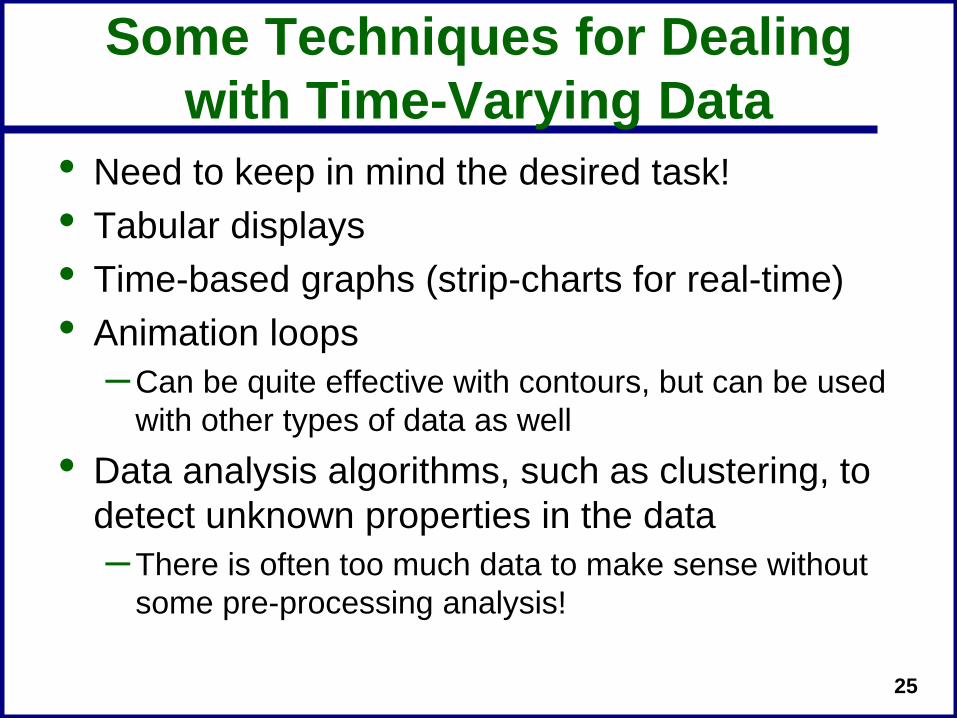
Some Techniques for Dealing with Time-Varying Data
• Need to keep in mind the desired task!• Tabular displays• Time-based graphs (strip-charts for real-time)• Animation loops
–Can be quite effective with contours, but can be used with other types of data as well
• Data analysis algorithms, such as clustering, to detect unknown properties in the data–There is often too much data to make sense without
some pre-processing analysis!
26
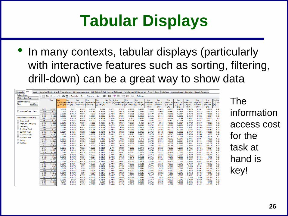
Tabular Displays
• In many contexts, tabular displays (particularly with interactive features such as sorting, filtering, drill-down) can be a great way to show data
The informationaccess costfor the task at hand is key!

27
Time-based graphs
• Graphs can be quite helpful for showing exact values if no more than about ten individual signals are shown– In larger sets outliers may
be missed• Showing more values can
be helpful in identifyingresponse envelope–Graph at left shows 2400
signals

28
Animation loops
• Animation loops trade-off the advantages of snapshot visualizations with the time needed to play the animation loop–A common use is in weather forecasting
• In power systems applications the length/speed of the animation loops would depend on application– In real-time displays could update at either SCADA or
PMU rates–Could be played substantially faster than real-time to
show historical or perhaps anticipated future conditions

29
Animation Loops: SCADA vs. PMUs
• A potential visualization change is how much future displays are visualized at PMU rates (30 times per second) versus SCADA rates (every 4-12 seconds)
Image Source: Jay Giri (Alstom Grid), "Control Center EMS Solutions for the Grid of the Future," EPCC, June 2013

30
Animation Loop Example
• Below link provides an interactive 42 bus, 345/138 kV, transient stability level fictitious case in which you can try to prevent a tornado from blacking-out the system–Two examples compare a simulation in which the
display is refreshed at 5 times per second versus once every 6 seconds
–Without intervention the case has a system-wide blackout in about 90 seconds
Case (Illini 42 Bus Tornado) and movie available at http://publish.illinois.edu/smartergrid/Power-Dynamics-Scenarios

31
42 Bus Illini Tornado Case: Fast Refresh Rate

32
42 Bus Illini Tornado Case: SCADA Refresh Rate

33
Black Sky Animation Loop: High Altitude Electromagnetic Pulse (HEMP)
Case and movie available at http://publish.illinois.edu/smartergrid/Power-Dynamics-Scenarios
EMP E3is similar to GMD,except witha rise time of seconds,and hencecan be studiedwith transientstability

34
Data Analysis Algorithms
• Usually there is too much data to make sense of without some type of analysis
• Several terms are used to denote the idea of discovering insight from data:–Statistics, data mining,
knowledge discovery, data analytics, machine learningbig data
• Large field, so will just presenta few examples
Image source: Colin Ware, Information Visualization, Third Edition, 2013
35
Clustering Example: Transient Stability, PMU, or SCADA Analysis • A single transient stability solution can generate
large amounts of output data• In real-time a similar situation occurs with PMU
data, or on a longer time frame with SCADA• How much this data needs to be considered is
application dependent– In operations the concern may just be OK or Not OK– In planning more detailed analysis may be required.
Issue is how to determine if the results are “correct”?• Clustering is an example of unsupervised machine
learning to make the data more manageable
36
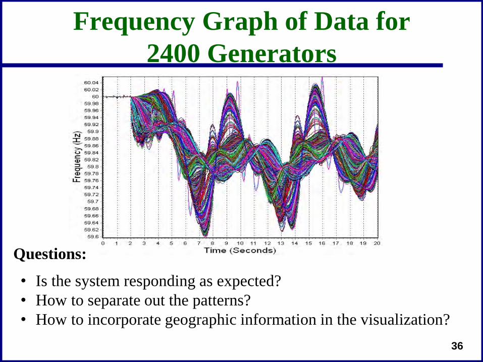
Frequency Graph of Data for 2400 Generators
• Is the system responding as expected?• How to separate out the patterns?• How to incorporate geographic information in the visualization?
Questions:

37
Solution: Apply Data Mining Clustering Techniques
• Clustering is the process of grouping a set of objects so similar objects are together, and dissimilar objects are not together
• There is no perfect clustering method or even a single definition for what constitutes a cluster
Two Clusters?

38
Clustering Algorithms
• There are a variety of clustering algorithms. Two common algorithms are–K-Means
• The number of clusters must be specified• Very fast and simple in practice• Different initial clusters may lead to different results
–QT: Quality Threshold• Form an unknown number of potentially large clusters that
meet a “quality standard” which is a specified threshold cluster diameter
• Requires more computation

39
Clustering Applied to Transient Stability Results
• Idea is to cluster the signal (e.g. generator frequency responses) using a Euclidean distance similarity measure, summing the values over time
• K-means clustering is used to pre-group the signals responses to a more reasonable number (say from 2400 to 300 signals)
• QT clustering is then used to determine signal sets that have similar frequency responses
xp and xq are τ-dimensional sampled time vectors

40
Clustering Applied to Results, Ten Distinct Responses Identified

41
Results Combined with Visualization with Spark-Lines
• Spark-lines (from E. Tufte, Beautiful Evidence, 2006) are “intense, word-sized graphics”

42
2400 Generator Results Visualized in a Geographic Context
C10
C7
Outliers are detectedautomatically

43
Application to Voltage Magnitude Alarming
• Clustering can also be used with SCADA data to dynamically cluster areas of abnormal voltage
• Alarms could then just be issued on the cluster, with drill down ability to get details
• As the system evolves cluster membership may change
• This avoids missing outliers, since every bus is in a cluster, yet also can reduce the number of alarms

44
42 Bus Example Case: Near Collapse
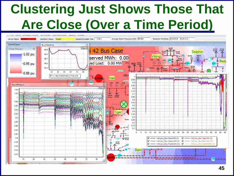
45
Clustering Just Shows Those That Are Close (Over a Time Period)

46
Frequency Domain
• Frequency domain techniques, such as Fast Fourier Transforms (FFTs) can be used to detect unusual behavior–Can be used with PMU values to detect unusual
frequencies–Can be used with transient stability to locate outliers
Bus 40687 (CAMPCOL_230_201) Frequency
Time2423222120191817161514131211109876543210
Bus
4068
7 (C
AMPC
OL_
230_
201)
Fre
quen
cy
60.02
60
59.98
59.96
59.94
59.92
59.9
59.88
59.86
59.84
59.82
59.8
59.78
59.76
59.74
59.72
59.7
59.68
59.66
Max Value
Freq (Hz)109876543210
Max
Val
ue
0.040.0380.0360.0340.032
0.030.0280.0260.0240.022
0.020.0180.0160.0140.012
0.010.0080.0060.0040.002
Thousandsof signalscan beconsideredquickly

47
Signal Based RingdownModal Decomposition
• Idea is to determine thefrequency and dampingof power system signalsafter an event–Reproduce a signal, such
as bus frequency, usingexponential functions
• A number of differenttechniques have beenproposed to do this forpower systems, starting with Prony analysis in the late 1980's

48
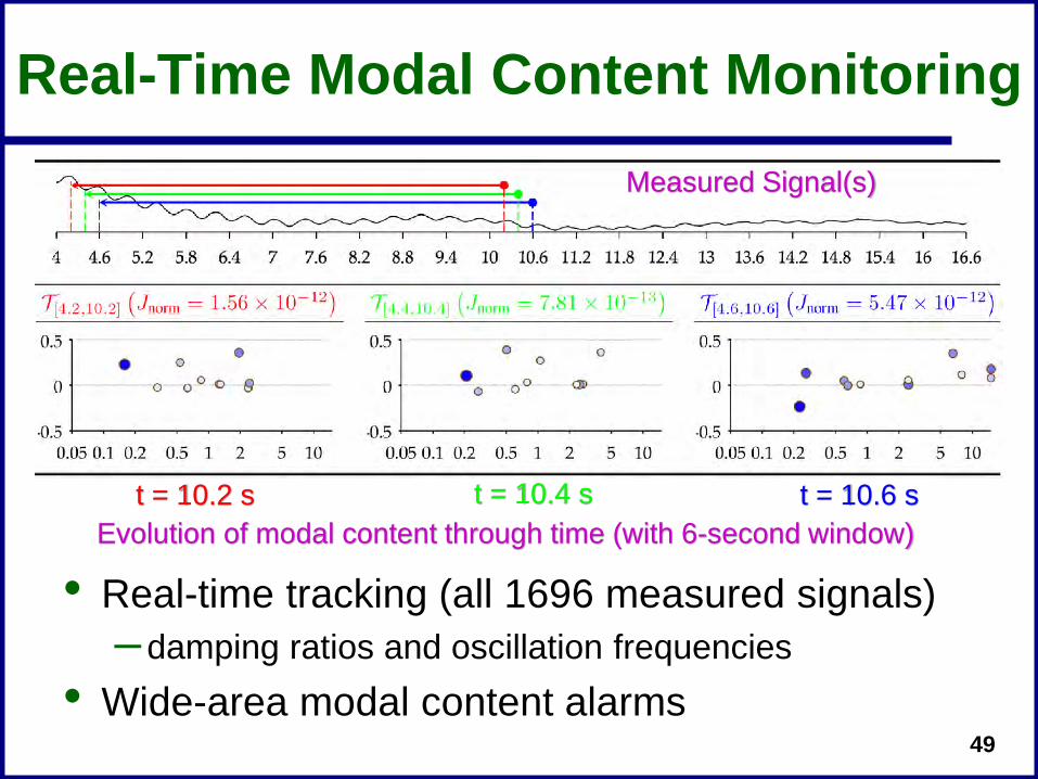
Oscillation/Stability Analysis(Dynamic Mode Decomposition)• s
6-second window at t = 10 s
Modal composition
VISUAL: Plot of damping ratios vs. oscillation frequencies 1696 signals
INPUT DATA
MODAL ANALYSIS OUTPUT
REAL-TIME
NEGATIVE DAMPING
49
Real-Time Modal Content Monitoring
• Real-time tracking (all 1696 measured signals)–damping ratios and oscillation frequencies
• Wide-area modal content alarms
Measured Signal(s)
Evolution of modal content through time (with 6-second window)t = 10.2 s t = 10.4 s t = 10.6 s

50
Spatio-Temporal Visualization of Modal Participation
• Mode 4–Oscillation frequency
• 0.62376 Hz
–Damping ratio• 0.00099628 (very low)
• 6-second window • At t = 10 s
51
Conclusion
• We've reached the point in which there is too much data to handle most of it directly–Certainly the case with much time-varying data
• How data is transformed into actionable information is a crucial, yet often unemphasized, part of the software design process
• There is a need for continued research and development in this area –Synthetic dynamics cases are needed to help provide
input for such research

52
Questions?