visualization lecture notes - 7com1079 team research and
TRANSCRIPT

Visualization – Lecture notes7COM1079 – Team Research and Development Project
Dr. John NollUniversity of Hertfordshire

Part 1: Types of Visualization

Visualization – Lecture notes 7COM1079 | Dr. John Noll
Learning Objectives
The aim of this lecture is to understand when various kinds of datavisualizations are useful.
3 of 38

Visualization – Lecture notes 7COM1079 | Dr. John Noll
Scatterplots–Relations Between VariablesA scatterplot plots points (x, y) to show the relationship betweentwo variables:
● ●
●
●
●●
●
●
●
●
●
●
●
●
● ●
●
●
●
●
●
●●
●
●
●
●
●
●
●
●
●
2 3 4 5
1015
2025
30
MPG vs Weight
Weight
MP
G
4 of 38

Visualization – Lecture notes 7COM1079 | Dr. John Noll
Example: Runs vs Innings
● ●
●
●
●
●
●
●●
● ●
●●● ●●●
●●
●●●● ●
●● ●
● ●●● ●
●●● ●●●
● ●● ● ●●● ●●●
● ●
4 5 6 7 8 9 10 11
200
300
400
500
600
Runs vs Innings
Innings
Run
s
5 of 38

Visualization – Lecture notes 7COM1079 | Dr. John Noll
Boxplots–Variability
●
●
●
1015
2025
3035
40
x
y
A B C D
I The rectangle (“box”) isbounded by the first andthird quartiles.
I The line across the box isat the median (secondquartile).
I “Whiskers” represent themaximum or minimumvalues within 1.5 times the“Interquartile Range” (theheight of the box) beyondthe top or bottom edges.
I Points are extreme valuesoutside the InterquartileRange. 6 of 38
Visualization – Lecture notes 7COM1079 | Dr. John Noll
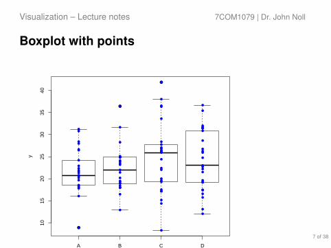
Boxplot with points
●
●
●
1015
2025
3035
40
x
y
A B C D
●●
●●
●
●
●
●
●●
●
●
●
●
●
●
●
●
●
●
●
●
●
●
●
●
●
●
●●
●
●
●
●●
●
●
●
●
●
●
●
●
●
●
●
●
●
●
●
●
●
●
●
●
●
●
●
●
●
●
●
●
●
●
●
●
●
●
●
●
●
●
●
●
●
●
●
●
●
●
●
●
●
●
●
●
●
●
●
●
●
●
●
●
●
●
●
●
●
Shows where your data fall in relation to the quartiles.
7 of 38

Visualization – Lecture notes 7COM1079 | Dr. John Noll
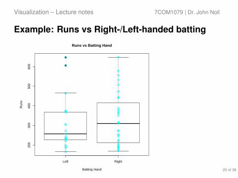
Example: Runs vs Batting Hand
●
●
Left Right
200
300
400
500
600
Runs vs Batting Hand
Batting Hand
Run
s
●●
●
●
●
●
●
●●
●●
●●●● ●●●●
●●●●●
●● ●
● ●●●●
●●● ●● ●
●●●● ●●● ●●●●●
8 of 38

Visualization – Lecture notes 7COM1079 | Dr. John Noll
Barplots–Frequency of categories
Left Right
LeftRight
Number of left and right handed batters
Batting Hand
Cou
nt
05
1015
2025
30
9 of 38
Visualization – Lecture notes 7COM1079 | Dr. John Noll
Barplots–ProportionsA
fgha
nist
an
Aus
tral
ia
Ban
glad
esh
Eng
land
Indi
a
New
Zea
land
Pak
ista
n
Sou
th A
fric
a
Sri
Lank
a
Win
dies
RightLeft
Fraction of left and right handed batters
Fra
ctio
n of
pla
yers
0%50
%10
0%
Team10 of 38

Visualization – Lecture notes 7COM1079 | Dr. John Noll
Histogram–Distribution
Runs Frequency
Runs
Fre
quen
cy
100 200 300 400 500 600 700
05
1015
11 of 38

Summary

Visualization – Lecture notes 7COM1079 | Dr. John Noll
Summary
1. Use scatterplots to visualize possible correlation of interval orordinal data.
2. Use boxplots to visualize variability, of interval or ordinal datawithin categories.
3. Use barplots to visualize frequencies of nominal data.4. Use histograms to visualize distribution, of interval data.
13 of 38

End Part 1

Part 2: Visualization in R

Visualization – Lecture notes 7COM1079 | Dr. John Noll
Learning Objectives
The aim of this part is to understand how to create various usefulvisualizations:
I Scatterplots (with linear model).I Boxplots.I Barplots.I Histograms.
16 of 38

Visualization – Lecture notes 7COM1079 | Dr. John Noll
Scatterplot
Basic scatterplot (using the ‘mtcars’ dataset)
1 x <- mtcars$wt2 y <- mtcars$mpg3 # Plot with main and axis titles4 # Change point shape (pch = 19) and include frame.5 plot(x # independent variable (weight)6 , y # dependent variable (miles per gallon)7 , main = "MPG vs Weight" # chart title8 , xlab = "Weight" # x-axis label9 , ylab = "MPG" # y-axis label
10 , pch = 19 # point shape (filled circle)11 , frame = T # surround chart with a frame12 )13 model <- lm(y ~ x, data = mtcars) # compute the linear model14 abline(model, col = "blue") # draw the model as a blue line
17 of 38

Visualization – Lecture notes 7COM1079 | Dr. John Noll
Scatterplot
● ●
●
●
●●
●
●
●
●
●
●
●
●
● ●
●
●
●
●
●
●●
●
●
●
●
●
●
●
●
●
2 3 4 5
1015
2025
30
MPG vs Weight
Weight
MP
G
18 of 38

Visualization – Lecture notes 7COM1079 | Dr. John Noll
Boxplots (with points)
1 d <- read.csv("icc_world_cup_2019_batting_stats.csv")2 x <- d$Batting.Hand # independent, nominal variable3 y <- d$Runs # dependent, interval variable4
5 plot(y ~ x # plot Runs vs Batting.Hand6 , main = "Runs vs Batting Hand" # main chart title7 , xlab = "Batting Hand" # x-axis label8 , ylab = "Runs" # y-axis label9 , pch = 19 # point type (filled circle)
10 , frame = T # frame around chart11 )12 points(y ~ x, col="cyan"); # overlay blue points
19 of 38
Visualization – Lecture notes 7COM1079 | Dr. John Noll
Example: Runs vs Right-/Left-handed batting
●
●
Left Right
200
300
400
500
600
Runs vs Batting Hand
Batting Hand
Run
s
●●
●
●
●
●
●
●●
●●
●●●● ●●●●
●●●●●
●● ●
● ●●●●
●●● ●● ●
●●●● ●●● ●●●●●
20 of 38

Visualization – Lecture notes 7COM1079 | Dr. John Noll
Barplots–Frequency of categories
1 d <- read.csv("icc_world_cup_2019_batting_stats.csv")2
3 # This bit of magic counts right- and left-handed batters, using4 # the length of lists of players that are either "Left" or "Right" handed5 a <- aggregate(d$Player, list(d$Batting.Hand), FUN=length)6
7 barplot(a$x, # aggregate() puts the counts in column 'x'8 , names.arg=a$Group.1 # names under the bars9 , main = "Number of left and right handed batters" # main chart title
10 , xlab="Batting Hand" # x-axis label11 , ylab="Count" # y-axis label12 , col = c("lightblue", "mistyrose") # colors of bars13 , args.legend = list(x = "topleft") # where to put the legend14 , legend.text=a$Group.1) # what to put in the legend15 )
21 of 38

Visualization – Lecture notes 7COM1079 | Dr. John Noll
Example: Left vs Right Handed batters
Left Right
LeftRight
Number of left and right handed batters
Batting Hand
Cou
nt
05
1015
2025
30
22 of 38

Visualization – Lecture notes 7COM1079 | Dr. John Noll
Histogram–Distribution
1 d <- read.csv("icc_world_cup_2019_batting_stats.dsv", sep="|")23 y <- d$Runs # variable to visualize45 h <- hist(y # variable to count6 , 6 # number of 'bins' (or bars)7 , main = "Runs Frequency" # main chart title8 , xlab = "Runs" # x-axis label9 , ylab = "Frequency" # y-axis label
10 , col="azure" # fill color for the bars11 )12 # Overlay a normal curve1314 mn <- mean(y) # mean of the data (runs)15 stdD <- sd(y) # standard deviation of the data16 x <- seq(100, 700, 1) # x-axis points: 100 to 70017 y1 <- dnorm(x, mean=mn, sd=stdD) # an idealized normal curve,18 # (frequencies are fraction of 1.0)19 y1 <- y1 * diff(h$mids[1:2]) * length(y); # calibrate the curve against actual2021 lines(x, y1, col="blue") # plot calibrated line in blue
23 of 38

Visualization – Lecture notes 7COM1079 | Dr. John Noll
Example: Runs
Runs Frequency
Runs
Fre
quen
cy
100 200 300 400 500 600 700
05
1015
24 of 38

Visualization – Lecture notes 7COM1079 | Dr. John Noll
Summary
1. Always add a main chart title.2. Always label the x-axis.3. Always label the y-axis.4. Always label the boxplot and barplot categories.5. Use colors to make charts clear (but don’t overdo it).6. Add a legend to explain colors or point styles if they are
meaningful.7. Make sure text does not overlap or go outside the margins (see
next part).
25 of 38

End Part 2

Part 3: More Advanced Examples

Visualization – Lecture notes 7COM1079 | Dr. John Noll
Stacked Barplots–ProportionsA
fgha
nist
an
Aus
tral
ia
Ban
glad
esh
Eng
land
Indi
a
New
Zea
land
Pak
ista
n
Sou
th A
fric
a
Sri
Lank
a
Win
dies
RightLeft
Fraction of left and right handed batters
Fra
ctio
n of
pla
yers
0%50
%10
0%
Team
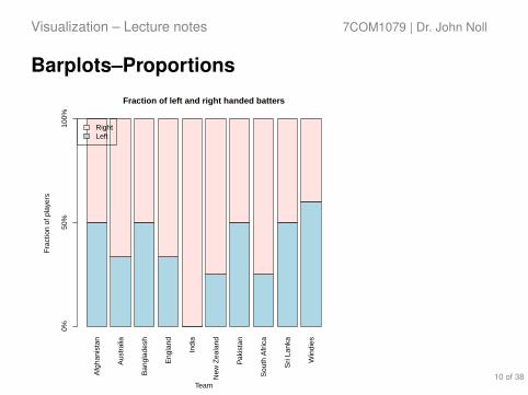
I Stacked barplots are goodfor showing proportions,especially if the height of thebars is normalized to be thesame for all categories of the(nominal) independentvariable.
I This is the right way tovisualize a comparison ofproportions problem
28 of 38

Visualization – Lecture notes 7COM1079 | Dr. John Noll
Stacked Barplots–Step 1
Transform (“wrangle”) the data: we need a tabulation of theproportions (fractions) of Left- and Right-handed batters on eachteam:
1 d <- read.csv("icc_world_cup_2019_batting_stats.csv")2 # Aggregate by Team and Batting.Hand to get number of Left and Right-handers3 a.Team.Batting.Hand <-aggregate(Player ~ Team + Batting.Hand, d, FUN=length)4 # Aggregate by Team to get number of Players5 a.Team.Size <-aggregate(Player ~ Team, d, FUN=length)6 # Merge the two aggregations, to enable proportion calculation7 a <- merge(a.Team.Batting.Hand, a.Team.Size, by = "Team") # 'join' on Team8 # Rename columns to make meaning more clear9 colnames(a) <- c("Team", "Batting.Hand", "Batting.Hand.Count", "Total.Count")
10 # Create a cross-tabulation of *fraction* of Left/Right-hand batters11 xtab <- xtabs(Batting.Hand.Count / Total.Count ~ Team + Batting.Hand, a)
29 of 38

Visualization – Lecture notes 7COM1079 | Dr. John Noll
Why xtabs()?Our aggregation looks like this:> a
Team Batting.Hand Batting.Hand.Count Total.Count1 Afghanistan Left 2 42 Afghanistan Right 2 43 Australia Right 4 64 Australia Left 2 65 Bangladesh Right 3 66 Bangladesh Left 3 67 England Right 4 68 England Left 2 69 India Right 5 510 New Zealand Left 1 411 New Zealand Right 3 412 Pakistan Left 3 613 Pakistan Right 3 614 South Africa Right 3 415 South Africa Left 1 416 Sri Lanka Right 2 417 Sri Lanka Left 2 418 Windies Left 3 519 Windies Right 2 5
We need the hand fraction perteam, which is thecross-tabulation of theBatting.Hand.Count divided bythe Total.Count per Team andBatting.Hand:> xtabs(Batting.Hand.Count / Total.Count ~
Team + Batting.Hand, a)
Batting.HandTeam Left Right
Afghanistan 0.5000000 0.5000000Australia 0.3333333 0.6666667Bangladesh 0.5000000 0.5000000England 0.3333333 0.6666667India 0.0000000 1.0000000New Zealand 0.2500000 0.7500000Pakistan 0.5000000 0.5000000South Africa 0.2500000 0.7500000Sri Lanka 0.5000000 0.5000000Windies 0.6000000 0.4000000
The cross-tabulation shows the fraction of Left- and Right-handedbatters per team.
When we plot this, it becomes clear how different teams compare interms of Left- vs Right-handed batters.
30 of 38

Visualization – Lecture notes 7COM1079 | Dr. John Noll
Stacked Barplots–Step 2Plot the cross-tabulation:
1 # Create a cross-tabulation of *fraction* of Left/Right-hand batters2 xtab <- xtabs(Batting.Hand.Count / Total.Count ~ Team + Batting.Hand, a)3
4 # Extend bottom margin so team names are not cropped.5 par(mar=c(7, 4.1, 4.1, 2.1)) # First element is bottom margin (default: c(5.1, 4.1, 4.1, 2.1)).6
7 # Plot transposed xtab as stacked barplot.8 barplot(t(xtab) # transpose so Teams appear as columns9 , main = "Fraction of left and right handed batters" # chart title, as usual
10 , ylab = "Fraction of players" # y-axis label (x-axis labelled below)11 , col = c("lightblue", "mistyrose") # colors of left and right-handed segmetnt12 , las = 2 # rotate x-axis labels 90 degrees13 , legend.text=c("Left", "Right") # color key14 , args.legend = list(x = "topleft") # legend location15 , axes = F # no (vertical) axis (added below)16 )17 axis(side = 2, at = c(0,.5,1), labels = c("0%", "50%", "80%"))18 mtext("Team", side=1, line = 6) # Put xlab below labels
31 of 38

Visualization – Lecture notes 7COM1079 | Dr. John Noll
Stacked Barplots–World Cup Batting HandA
fgha
nist
an
Aus
tral
ia
Ban
glad
esh
Eng
land
Indi
a
New
Zea
land
Pak
ista
n
Sou
th A
fric
a
Sri
Lank
a
Win
dies
RightLeft
Fraction of left and right handed batters
Fra
ctio
n of
pla
yers
0%50
%10
0%
Team32 of 38

Visualization – Lecture notes 7COM1079 | Dr. John Noll
Histograms with Normal Curve
Runs Frequency
Runs
Fre
quen
cy
100 200 300 400 500 600 700
05
1015
I Plotting a normalcurve over ahistogram helpsvisualize variationand potentialnon-normality.
33 of 38

Visualization – Lecture notes 7COM1079 | Dr. John Noll
Histograms with Normal Curve1 d <- read.csv("icc_world_cup_2019_batting_stats.csv")2 y <- d$Runs3
4 h <- hist(y5 , 66 , main = "Runs Frequency"7 , xlab = "Runs"8 , ylab = "Frequency"9 , col = "azure"
10 )11
12 x <- seq(100, 700, 1)13 mn <- mean(y)14 stdDev <- sd(y)15 yn <- dnorm(x, mean=mn, sd=stdDev)16 box.size <- diff(h$mids[1:2]) * length(y)17 yn <- yn * box.size18
19 lines(x, yn, col="blue") 34 of 38

Visualization – Lecture notes 7COM1079 | Dr. John Noll
Histograms with Normal Curve
Runs Frequency
Runs
Fre
quen
cy
100 200 300 400 500 600 700
05
1015
35 of 38

Visualization – Lecture notes 7COM1079 | Dr. John Noll
Histograms with Normal CurveWhy scale yn?
1 h <- hist(y, 6, main = "Runs Frequency", xlab = "Runs", ylab = "Frequency", col="azure")23 x <- seq(100, 700, 1)4 mn <- mean(y)5 print(mn)6 yn <- dnorm(x, mean=mn, sd=sd(y))7 bin.size <- diff(h$mids[1:2]) * length(y)8 yn <- yn * bin.size
1. dnorm() yields a probability density curve for the normaldistribution.
2. hist() produces a distribution of frequencies.3. To convert the density curve to a frequency curve we have to
scale the density by the size of the bins:1 bin.size <- diff(h$mids[1:2]) * length(y)
I diff(h$mids[1:2]) is the width of the binI length(y) is the number of points in the sample, and hence
the height of the bin if all the points fell into it. 36 of 38

Notes:Points on the curve are the probability that a single sample chosen at random from thepopulation will have the x-axis value. This is why the mean of a normal population is alsocalled the expected value: it is the most likely.
Visualization – Lecture notes 7COM1079 | Dr. John Noll
Histograms with Normal Curve
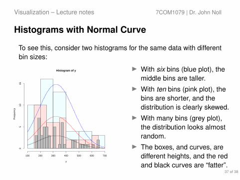
To see this, consider two histograms for the same data with differentbin sizes:
Histogram of y
y
Fre
quen
cy
100 200 300 400 500 600 700
05
1015
I With six bins (blue plot), themiddle bins are taller.
I With ten bins (pink plot), thebins are shorter, and thedistribution is clearly skewed.
I With many bins (grey plot),the distribution looks almostrandom.
I The boxes, and curves, aredifferent heights, and the redand black curves are “fatter”.
37 of 38

End Part 3