viewon 2 - graphical components - support | ewonsupport.ewon.biz/download/aug/aug-007-0-en-(viewon...
TRANSCRIPT

eWON Application User Guide
AUG 007/ Rev 1.1
You
Sel
ect,
We
Con
nec
t
viewON 2 - Graphical Components
How To
Con
ten
t This guide will explain in a few steps how to use the graphical components proposed byviewON 2.

Table of Contents
1. Hardware and software requirements..................................................................................................3 Hardware requirements....................................................................................................................3 Software requirements.....................................................................................................................3 eWON Firmware Version.................................................................................................................3
2. Graphical Component..........................................................................................................................4 Button...............................................................................................................................................6 Check Box......................................................................................................................................11 Toggle Button.................................................................................................................................13 Combo Box....................................................................................................................................16
Combo box using the Send Command action..........................................................................17Combo box using the Send Measure action.............................................................................18Combo box using the Load View action .................................................................................19
List.................................................................................................................................................20List using the Send Command action.......................................................................................21List using the Send Measure action.........................................................................................22List using the Load View action................................................................................................23 ................................................................................................................................................23
Number Editor................................................................................................................................25 Slider..............................................................................................................................................28 Alarm Summary.............................................................................................................................30 Alarm History.................................................................................................................................33 Menu Bar.......................................................................................................................................36 Trends ...........................................................................................................................................40
Real time trend.........................................................................................................................40Historical trend.........................................................................................................................45
Revisions...............................................................................................................................................47

1. Hardware and software requirements
Hardware requirementsIn order to follow this guide you will need:
1 eWON with viewON capabilities (for example : eWON 4001, eWON 4101, eWON 4005, etc.)
Software requirementseWON configuration software:The eWON is configured through its web server. So all you need is a standard Web Browser software like Internet Exploreri or Firefoxii.
Additionally we suggest you to download the eBuddy software on our website : http://support.ewon.biz.This utility shows you the list of all the eWONs on your network and allows to change the default IP address of an eWON to match your LAN IP address range. With eBuddy you can also easily upgrade the firmware of your eWON (if required).
Other programming software:viewON 2 Software.
eWON Firmware VersionTo be able to follow this guide your eWON needs a firmware version 5.4 or higher.A simple way to upgrade the eWON firmware, is to use eBuddy, the eWON software companion.
viewON 2 - Graphical Components (How To) Page 3/47

2. Graphical Component
In the viewON interface, you can create a Graphical Component instead of drawing an object yourself.
There are 11 graphical components :
In opposition to the objects that you create yourself, the Graphical Components cannot be completely customized. You will not be able to customize a graphical component like any other object. As a result, the Graph properties are used to modify only a few aspects of your object. As you can see in the following picture only the Geometry (the position of the object), the ID and the Display (the opacity of the object) tabs are available for a graphical component. The Graph resources are useless as no gradient can be added to a graphical component.
We will see later that some aspects are configurable in the Graphical Component properties section.
viewON 2 - Graphical Components (How To) Page 4/47

2. Graphical Component
viewON 2 - Graphical Components (How To) Page 5/47

2. Graphical Component
ButtonThe Button allows you to send a value to your Tag. Select Button, the context box will close.
With the mouse, click on your View and do a click and drag movement to make the Button appear.
Of course you can magnify the Button afterwards or decrease it in size either with the mouse or in the Graph properties.
viewON 2 - Graphical Components (How To) Page 6/47

2. Graphical Component
In the Graphical Component properties section (in the third part of the screen), in Button data/Label field you will be able to add a text on your object. For example “Hello”. It is possible to change the font color, the font size, etc.
Instead of a fixed text, you can use a Text on State. In the Animations context, select Text on State.
viewON 2 - Graphical Components (How To) Page 7/47

2. Graphical Component
In the Properties section, choose the Tag that you want to link to the object (Boolean Tags). In the Tag values field, choose a text that you want to see each time the value of the Tag is 1 and a text you want to see when the value of the Tag is 0. ex: value 1 text : on value 0 text : off
In this case each time the value of the tag is 1, “on” will appear on your object and when the value is 0, then “off” replaces the other text.If you want to be able to click on your Button, you will have to add an action on your graphical component. Let us choose a Send Command action.
viewON 2 - Graphical Components (How To) Page 8/47

2. Graphical Component
Choose a Tag to write (Boolean Tags), then a value when the Button is selected. Finally type a confirmation message, if needed (this message will appear each time you click on the Button, asking a confirmation). When you click on your Button, the value 1 will be sent to the Tag linked to the Send Command action. Be aware that the Return to initial value is not handled by the eWON and must remain disabled.
Hereunder an example of a confirmation message:
If you do not want a confirmation message to pop up, do not write anything in the Confirmation Message field.
viewON 2 - Graphical Components (How To) Page 9/47

2. Graphical Component
For further information on how to use an Animation or an Action, please refer to the AUG-006-0-EN (http://support.ewon.biz/viewon.html )
viewON 2 - Graphical Components (How To) Page 10/47

2. Graphical Component
Check BoxWith the Check box, you will be able to draw a check box in the easiest way. The process is the same as the Button one. Select Check Box, the context box will close.
With the mouse, click on your View to make the Check Box appear.
In the Graphical Component properties section (in the third part of the screen), in the Text/Label field, you will be able to add a text next to your object.
For example “Heating ON”. It is possible to change the font color, the size, etc.
For the Check Box to work, you will have to add an action to your object: an Action command (only the Send Command action is possible).
viewON 2 - Graphical Components (How To) Page 11/47

2. Graphical Component
Let us see how to add an action on your Check box. Be aware that only the Send Command action is available.
Choose a Tag to write, then a value when the Check box is selected and a value when it is not selected. In our example, when selected, the value 1 is sent to the Tag. On the other hand, when the Check box is not selected, the value 0 is sent to the same Tag. Finally type a confirmation message, if needed (this message will appear each time you click on the Check Box, asking a confirmation).Hereunder an example of a confirmation message:
If you do not want a confirmation message to pop up, do not write anything in the Confirmation Message field.For further information on how to use an Animation or an Action, please refer to the AUG-006-0-EN pdf file (http://support.ewon.biz/viewon.html )
viewON 2 - Graphical Components (How To) Page 12/47

2. Graphical Component
Toggle ButtonThe Toggle button allows you to send a value to your Tag. Select Toggle button, the context box will close.
With the mouse, click on your View to make the Toggle Button appear. Just like the Button, you will be able to add a text on this object. Be aware that for the graphical components, the Graph resources do not work as you cannot change the color of the object. In the Graphical Component properties section (in the third part of the screen), in the Text/Label field, you can add a text on your object.
For example “Heating”. It is possible to change the font color, the size, etc.
viewON 2 - Graphical Components (How To) Page 13/47

2. Graphical Component
As for most of the graphical components, you can only apply a Send Command action and a Text on State animation.In the Animations context, select Text on State and choose the Tag (only a Boolean one)you want to link to the object in the Properties section.
In this case, you click on the Toggle Button, “set on” will appear instead of “Heating” and “set off” will appear when you click again.
Let us see how to add an action on your Toggle Button. Be aware that only the Send Command action is available.
viewON 2 - Graphical Components (How To) Page 14/47

2. Graphical Component
As you can see in the following picture, the procedure is the same as for a Check Box.
Choose a Tag to write, then a value when the Toggle button is selected and a value when it is not selected. Finally type a confirmation message, if needed (this message will appear each time you click on the Toggle button, asking a confirmation).
Hereunder an example of a confirmation message:
If you do not want a confirmation message to pop up, do not write anything in the Confirmation Message field.
For further information on how to use an Animation or an Action, please refer to the AUG-006-0-EN pdf file(http://support.ewon.biz/viewon.html )
viewON 2 - Graphical Components (How To) Page 15/47

2. Graphical Component
Combo BoxThe Combo box gives you the opportunity to create a kind of menu. By using this Combo box, you will be able to see the different Views that you have created or send a predefined values to a Tag.
Select Combo box, the context box will close.
With the mouse, click on your View to make the Combo box appear. For this graphical component, you do not have the possibility to add any animation. Only actions are available (Load view, Send Command and Send Measure). Unlike the other graphical components, you will not be able to write a text directly on your Combo box. The text will be added through the action that you will link to the object.
viewON 2 - Graphical Components (How To) Page 16/47

2. Graphical Component
You can change the font color, the size etc. of the default text “Items” in the Graphical Component properties section.
Combo box using the Send Command action
viewON 2 - Graphical Components (How To) Page 17/47

2. Graphical Component
In this case, the Combo box will look like this:
This action allows to set a state of a Tag. So if you select “on”, the value 1 will be sent to the Tag linked to the Combo box. If you click on “off”, the value 0 will be sent to the Tag. If your write a Confirmation message in the provided field, then, a pop-up window will open to ask a confirmation before changing the status. Be aware that the Return to initial value field must remain disabled.
Combo box using the Send Measure action
This action will allow to set a value of a Tag. Only analog Tags are taken into account for the Send Measure action. The Return to initial value is not used by the eWON, so it must remain disabled. As for the other actions for graphical components, you can insert a Confirmation message. Finally, define the values to send to the linked Tag. To do so, click on the button on the right bottom corner of the screen.
Your Combo box will look like this:
viewON 2 - Graphical Components (How To) Page 18/47

2. Graphical Component
So if you click on “start”, the value 10 will be sent to the linked Tag, when you click on “slow”, the value 20 will be sent to the Tag and so on.
Combo box using the Load View action Thanks to this action,you will be able to link your Views to your Combo box. Under the Properties section (in Actions/Load View) you will see all the Views of your project. All you have to do is check the Views you would like to add to the combo box. In the Text section, you can name your Views.
Thanks to the Load View action, you will be able to see your Views by clicking on each of them:
So, if you click on “focusing” for example, the View (exercice1) linked to it will open. Be aware that when you choose a View, your current view will be replaced by the new one.
viewON 2 - Graphical Components (How To) Page 19/47

2. Graphical Component
ListThe List is very similar to the Combo box. It gives you the opportunity to create a kind of menu that will allow you to see by a click the different views you have created or send predefined values to the Tag.
Select List, the context box will close.
With the mouse, click on your View to make the List appear. For this graphical component, you do not have the possibility to add any animation. Only actions are available (Load view, Send Command and Send Measure)In the Graphical Component properties section, you will be able to customize your List : choose the background color, the opacity, the font, the color of the text, etc.
viewON 2 - Graphical Components (How To) Page 20/47

2. Graphical Component
List using the Send Command action
According to the above example, if you select “on”, the value 1 will be sent to the Tag linked to the List. If you click on “off”, the value 0 will be sent to the Tag. If your write a Confirmation message in the provided field, then, a pop-up window will open to ask a confirmation before changing the status. Be aware that the Return to initial value field must remain disabled.
viewON 2 - Graphical Components (How To) Page 21/47

2. Graphical Component
Your List will look like this:
So, when “on” is selected the value 1 is sent to the Tag and when “off” is selected, the value 0 is sent to the Tag.
List using the Send Measure action
Only analog Tags are taken into account for the Send Measure action. The Return to initial value is not used by the eWON, so it must remain disabled. As for the other actions for graphical components, you can insert a confirmation message. Finally, define the values to send to the Tag. To do so, click on the button on the right bottom corner of the screen.
So if you click on “start”, the value 10 will be sent to the linked Tag, when you click on “slow”, the value 20 will be sent to the Tag and so on.
viewON 2 - Graphical Components (How To) Page 22/47

2. Graphical Component
List using the Load View action
Thanks to this action,you will be able to link your Views to your List. Under the Properties section (in Actions/Load View) you will see all the Views of your project. All you have to do is check the Views you would like to add to the combo box. In the Text section, you can name your Views.
Thanks to the Load View action, you will be able to see your Views by clicking on them.
viewON 2 - Graphical Components (How To) Page 23/47

2. Graphical Component
Your List will look like this:
So, if you click on “focusing”, the View (exercice1) linked to it will open and so on. Be aware that when you choose a View, your current view will be replaced by the new one.
viewON 2 - Graphical Components (How To) Page 24/47

2. Graphical Component
Number EditorThe Number editor allows you to send a value to a Tag, only by clicking on the little darts. Select Number editor, the context box will close.
With the mouse, click on your View to make the Number editor appear. For this graphical component, you do not have the possibility to add any animation.
In the Graphical Component properties section, you will have to choose a minimum value, a maximum value, an initial value and a step size (you will be able to choose the maths table you want to use (1,2,3,4,5,6,... /2,4,6,8,10,.../3,6,9,12,18,...)
Once again, you can choose the background color, the text color, etc.
viewON 2 - Graphical Components (How To) Page 25/47
2. Graphical Component
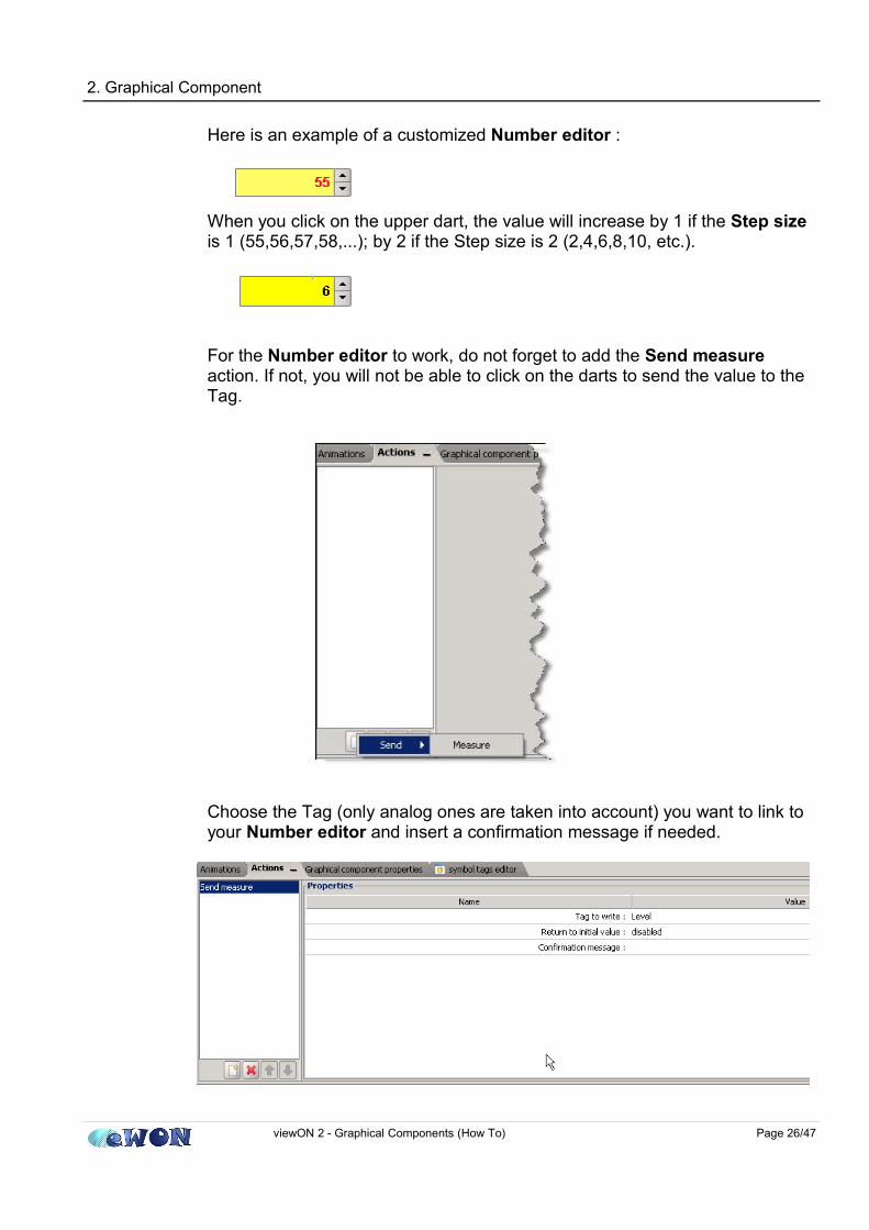
Here is an example of a customized Number editor :
When you click on the upper dart, the value will increase by 1 if the Step size is 1 (55,56,57,58,...); by 2 if the Step size is 2 (2,4,6,8,10, etc.).
For the Number editor to work, do not forget to add the Send measure action. If not, you will not be able to click on the darts to send the value to the Tag.
Choose the Tag (only analog ones are taken into account) you want to link to your Number editor and insert a confirmation message if needed.
viewON 2 - Graphical Components (How To) Page 26/47

2. Graphical Component
Hereunder an example of a confirmation message:
If you do not want a confirmation message to pop up, do not write anything in the Confirmation Message field. The Return to initial value is not used by the eWON, so it must remain disabled.
viewON 2 - Graphical Components (How To) Page 27/47

2. Graphical Component
SliderThe Slider allows you to send a value to a Tag only by moving the cursor. Select the Slider, the combo box will close. With the mouse, click on your View to make the Slider appear. For this graphical component, you do not have the possibility to add any animation.
In the Graphical Component properties section (Numeric data), you will have to choose a minimum value and a maximum value. In the Ticks section, you will have to choose if you want to insert ticks (check the Display ticks), if so, select a major tick spacing and a minor one and finally, choose a direction (horizontal or vertical) in the Display section and if you want the labels to be displayed or not.
The only available action is the Send measure one. In this case, just link a Tag (only analog one are taken into account) to your Slider. The Slider will move according to the value of the Tag. Besides, you can send a value to the linked Tag by moving the slider.
viewON 2 - Graphical Components (How To) Page 28/47

2. Graphical Component
The Return to initial value is not used by the eWON, so it must remain disabled. Finally, insert a confirmation message if needed.
Hereunder an example of a confirmation message:
If you do not want a confirmation message to pop up, do not write anything in the Confirmation Message field.
viewON 2 - Graphical Components (How To) Page 29/47

2. Graphical Component
Alarm SummaryThe Alarm Summary will give you the opportunity to have an overview of the alarm states of your Tags in real time. Select the Alarm Summary, the combo box will close. With the mouse, click on your View to make the Alarm Summary appear.
In the Graphical Component properties section, you can configure your Alarm Summary table. Just like the other graphical components, you can choose the font color, the font size etc. But you will be also able to choose the size of the columns.
viewON 2 - Graphical Components (How To) Page 30/47

2. Graphical Component
Be aware that for the Alarm Summary, there is no animation and no action. This graphical component is autonomous, no need to link Tags to it. Once the project has been exported in the eWON, the Alarm Summary is displayed on the eWON web page.
Here is the kind of table you will see:
The first column (ACK) of the table can be used to acknowledge an alarm simply by checking the check box
viewON 2 - Graphical Components (How To) Page 31/47
NOTE To display the Alarm Summary list, the user must have special access rights in your eWON (FTP server access and eWON Files access). Be also aware that the Alarm Summary cannot be tested through the Animation Test as it works in real time, linked to the alarm states of the Tags.

2. Graphical Component
viewON 2 - Graphical Components (How To) Page 32/47

2. Graphical Component
Alarm HistoryThe Alarm History will give you the opportunity to have an overview of the alarm states of your Tags for a certain period of time that you can define.Select the Alarm History, the combo box will close. With the mouse, click on your View to make the Alarm History appear.
In the Graphical Component properties section, you can configure your Alarm History table. Just like the other graphical components, you can choose the font color, its size etc. But you will be able to choose the size of the columns as well. Do not forget to select the time range you want to see on your table.
viewON 2 - Graphical Components (How To) Page 33/47

2. Graphical Component
Be aware that for the Alarm History, there is no animation and no action. This graphical component is autonomous, no need to link Tags to it. Once the project has been exported in the eWON, the Alarm History is displayed on the eWON web page.
Here is the kind of table you will see:
viewON 2 - Graphical Components (How To) Page 34/47
IMPORTANT Be aware that if you select a long range of time (7 days, for instance), the page may take a lot of time to download (depending on the frequency of alarm changes).
2. Graphical Component
viewON 2 - Graphical Components (How To) Page 35/47
NOTE If, while configuring your Alarm History, you asked to display the last 24 hours and later you would like to see the last hour only, then this last hour will be simply added to the 24 hours already displayed. The already displayed alarms will not be deleted from the screen.
NOTE To display the Alarm History list, the user must have special access rights in your eWON (FTP server access and eWON Files access). Be also aware that the Alarm History cannot be tested through the Animation Test as it works in real time, linked to the alarm states of the Tags.

2. Graphical Component
Menu Bar
With this graphical component, you will be able to create a menu bar by yourself. Select the Menu Bar, the combo box will close. With the mouse, click on your View to make the Menu Bar appear.
In the Graphical Component properties section, you can add menus and item menus only by clicking on the + on the right bottom of the screen. It works like a tree. Select the main menu called “Menu Bar” by default and then, click on +, you are able to add a menu.
Then, if you click on this menu, you will be able to add an item menu. Of course, you can name all the menus and item menus as you please. All you have to do is select a menu and double-click, now you can write in the small field and press the ENTER key.
viewON 2 - Graphical Components (How To) Page 36/47

2. Graphical Component
Here is an example of the result:
For this graphical component, only actions are available. Actions can be applied to the item menus (not to the main Menu). Choose an item and ask to Load view, for instance. You can choose a pop-up dialog. In the View section, click on ... to select which View you want to display. Finally, insert a confirmation message if needed.
viewON 2 - Graphical Components (How To) Page 37/47

2. Graphical Component
Do the same with the other Views you want to add in the menu bar.
The other action you can use is the Send Command action.
Here, choose a Tag and a value (0/1) to send to the Tag. This action is available for Boolean Tags only. In the following example, the value 0 will be sent to the Tag “buton” when you click on a menu item.
viewON 2 - Graphical Components (How To) Page 38/47

2. Graphical Component
You can also specify a Tag in the Authorization Level field. This will allow to enable or disable the Menu item depending on the value of the authorization Tag. The authorization level is not taken into account.
viewON 2 - Graphical Components (How To) Page 39/47

2. Graphical Component
Trends The Trends give you the opportunity to see the evolution of your Tags in the form of a graph.
Real time trendThe Real time trend the values of the linked Tags in real time. Those values will not be recorded. They only stay in your Browser memory. So, if you close your web page, the real time graph will start from the beginning again.
To configure the Real time trend, you will need to fill the General and the Display settings. In the Start section of the General part, choose Real time. Check the Interpolation if you want each points to be linked. And insert a Data Refresh period (the period when a new point is taken), a Buffer points number (the number of the displayed points) and a Maximum displayable time.
In the Display section, you can choose a time axis, the cursors, etc.
viewON 2 - Graphical Components (How To) Page 40/47

2. Graphical Component
Choose a Displayed time zone (the duration of visible part of the graph), the Display time graduation needs to be checked.The Horodates define the time display (ex: 12:30:45 or 12:30). The Cursor section needs to be checked so that you can see the horodates when you click on a point of the graph.
If you check the Curves, then the properties of your curve will be displayed when you open your web page. In the Grid section, you can configure the aspect of your grid. The Values give you the opportunity to format the display of the cursor.
viewON 2 - Graphical Components (How To) Page 41/47

2. Graphical Component
To define the Tags that you want to display on the trend must use the Animations. Be aware that the States animation is of no use.
In the Animations section(Trend curves/ Measures), select a Tag that you want to link to the Trends, choose a Label (for instance, °C, this label will not appear on the graph, but in the properties of the graph), choose a Minimum and a Maximum, the color, the dashes, the interpolation, the color for the invalid state, etc. Pay attention, if you do not choose an interpolation, you may not see your graph.
viewON 2 - Graphical Components (How To) Page 42/47

2. Graphical Component
If needed, you can display another curve in your Trend graph. Just click on add animations and proceed as explained above.
Once you have done this, export the project to the eWON and your Trends will be displayed in your web page.
Once you are on this page, you will see the curves corresponding to the tags you chose before. Thanks to the tool bar, you will be able (from the left to the right) to shift from the Real time log to the Historical log, play, pause, select a new time zone, display a cursor, zoom in, zoom out, display a new duration, zoom only a period of time and display the properties of the curves. To open those properties, just click on the last icon of the menu bar.
viewON 2 - Graphical Components (How To) Page 43/47

2. Graphical Component
The Properties allow you to customize your graph. In Style tab, you can change the color, the dashes, the thickness, the interpolation of the curves. The blue dart helps you switch from one curve to another and the yellow dart sets the previous settings back.
To close the information, just click on the same icon again (on the menu bar).
Please bear in mind that each time the tool bar is used, the graph stops. You have to click on play for it to go on.
viewON 2 - Graphical Components (How To) Page 44/47

2. Graphical Component
Historical trendThe Historical trend displays the curves of the Tag linked to the Trends. It will display for a period of time defined by the user the values of the linked Tags in the form of a graph. The historical data are retrieved from the eWON. So, it is very important to activate the Historical Logging in the eWON for those Tags.
The configuration of the Historical trend is similar to the Real Time trend. The only difference is that you will have to choose History in the Graphical component properties:
viewON 2 - Graphical Components (How To) Page 45/47
NOTE For all this to work, the Tag has to be able to read the Historical Logging. So, make sure the Historical logging is checked in your Tag setup (in the eWON).
2. Graphical Component
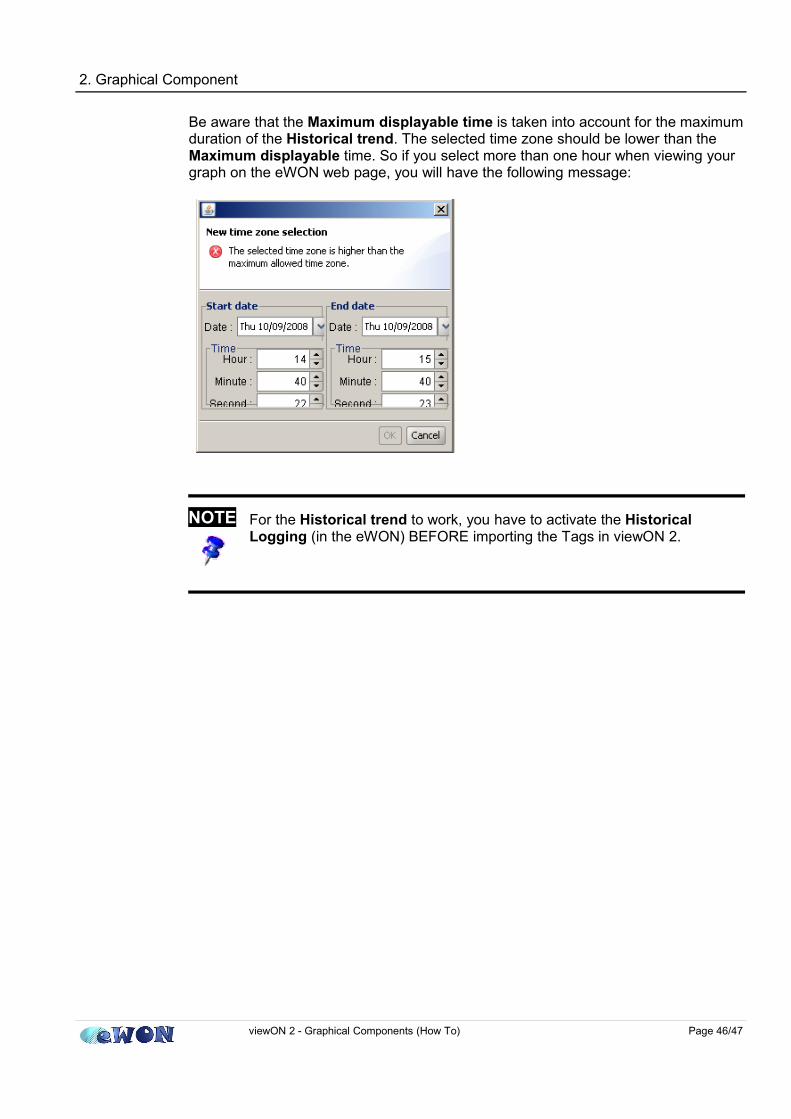
Be aware that the Maximum displayable time is taken into account for the maximum duration of the Historical trend. The selected time zone should be lower than the Maximum displayable time. So if you select more than one hour when viewing your graph on the eWON web page, you will have the following message:
viewON 2 - Graphical Components (How To) Page 46/47
NOTE For the Historical trend to work, you have to activate the Historical Logging (in the eWON) BEFORE importing the Tags in viewON 2.

RevisionsRevision Level Date Description
1.0 2008-10-10 First release.1.1 2008-11-17 User rights for Alarm History
i Microsoft, Internet Explorer, Windows and Windows XP are either registered trademarks or trademarks of Microsoft Corporation
ii Firefox is a trademark of the Mozilla Foundation
Document build number: 175
Note concerning the warranty and the rights of ownership:
The information contained in this document is subject to modification without notice. The vendor and the authors of this manual are not liable for the errors it may contain, nor for their eventual consequences.
No liability or warranty, explicit or implicit, is made concerning quality, the accuracy and the correctness of the information contained in this document. In no case the manufacturer's responsibility could be called for direct, indirect, accidental or other damage occurring from any defect of the product or errors coming from this document.
The product names are mentioned in this manual for information purposes only. The trade marks and the product names or marks contained in this document are the property of their respective owners.
This document contains materials protected by the International Copyright Laws. All reproduction rights are reserved. No part of this handbook can be reproduced, transmitted or copied in any way without written consent from the manufacturer and/or the authors of this handbook
eWON sa, Member of ACT'L Group. Subject to change without notice.viewON 2 - Graphical Components (How To) Page 47/47