using statistics to explore environmental justice issues
TRANSCRIPT

1
Using Statistics to Explore Environmental Justice Issues
Lesson plan for grades: Algebra 2
Length of lesson: 1 class period
Authored by: Various sources
Adapted by: William Oakley
SOURCES AND RESOURCES:
Hot Science Cool Talks, Environmental Justice: Progress towards Sustainability lecture by Dr. Robert
Bullard
http://www.esi.utexas.edu/k-12-a-the-community/hot-science-cool-talks/gulf-hurricanes-our-history-
and-future
EPA Environmental Justice website
http://www.epa.gov/environmentaljustice/
Data for worksheet
http://www.scielosp.org/pdf/csp/v23s4/04.pdf
POTENTIAL CONCEPTS TEKS ADDRESSED THROUGH THIS LESSON:
§111.40.b:1AB, 2ABCDE, 8ABC
PERFORMANCE OBJECTIVES (in order of increasing difficulty to permit tailoring to various age groups):
Students will be able to:
Explain why environmental justice is an important and relevant topic
Perform a correlation analysis to see if there is an association between two issues relevant to
environmental justice
Identify the correlation coefficient and explain its importance in statistics
MATERIALS (per group of four): (Numbers may be adjusted based on class size and budget)
Laptops (Preferably one per student if available)
Excel 2010 (Older versions are fine, but this lesson will assume 2010 is used)
Pencils
Worksheet (PROVIDED AT THE END OF THIS FILE)
Graph output example (PROVIDED AT THE END OF THIS FILE)
2
BACKGROUND:
Robert Bullard’s Hot Science – Cool Talks lecture focuses on Environmental Justice, which is defined as the fair
treatment and meaningful involvement of all people regardless of race, color, national origin, or income with
respect to the development, implementation, and enforcement of environmental laws, regulations, and
policies (source: U.S. Environmental Protection Agency (EPA)). Bullard is a principle figure within the
environmental justice movement and explains the origins of it, how it’s grown, and how far it still needs to go
to reach it’s ultimate goal.
Statistics are used by scientists, activists, and policymakers addressing Environmental Justice issues to locate
problem areas. Some statistical procedures and analyses are too complicated for a typical high school lesson
such as linear regression analysis. Correlation analysis, however, is a powerful statistics tool that allows
students to see if there is a potential association between two observable and measurable things that are of
interest to them.
NOTE:
It is very important that students understand that at this point, NO assumption is made as to whether one
thing depends on (or is caused by) the other. It merely measures the degree of association between
measurements of two things. If two things are associated, changes in one may be associated with changes
in the other even if the two have absolutely no causal connection whatsoever.
This distinction is critical to understanding issues in environmental justice. Environmental pollution and
health hazards may be strongly associated with poverty or racial minorities (a big problem), however it
would be totally inaccurate to say that environmental pollution and health hazards CAUSE poverty or racial
minorities, or vice-versa!!!
It would be, however, reasonable to test the prediction that environmental pollution causes health hazards.
For that, a related (but distinctly different) statistical test called linear regression in connection with the
scientific method of hypothesis testing.
This lesson introduces students to a common data management and analysis program, Microsoft Excel, in
terms of inputting data, graphing it and running a linear regression using data that pertains to environmental
justice, thereby putting a real life application to mathematics.
PREPARATION:
The teacher should watch Robert Bullard’s Hot Science – Cool Talks lecture linked in the resource section to be
familiar with what will be shown in the lesson. The teacher should also be familiar with Excel, particularly the
version that their classroom has. This lesson plan will explain things assuming that Excel 2010 is being used.
3
ENGAGE: (10 minutes)
Show the class the Bullard Lecture that talks about what Environmental Justice is, why it’s important and what
it means to achieve it (see minute marks 0:00 to 6:12 of Robert Bullard’s Hot Science Cool Talks lecture; linked
in Sources and Resources section).
Then ask the following questions:
What does Environmental Justice mean?
Why is this issue important?
EXPLORE: (50 minutes)
The students will be working with excel and the Worksheet (see Materials section) for this lesson, so students
should be split into small groups to allow the teacher to facilitate the lesson and give hints as needed.
This lesson examines the relationship between measures of poverty and environmentally-related health levels.
Ultimately, the students will input study data into Microsoft Excel, create a scatter plot and examine the
correlation coefficient statistic to see if there is any correlation between the two sets of data. Although an
analysis using correlation statistic is typically not associated with testing a predictive hypothesis, teachers are
encouraged to have their students make a prediction about the strength of relationship between poverty level
and exposure to environmental health hazards. As mentioned in the Background section and Worksheet, care
must be taken when making inferences or formally testing predictions about the relationship between two
variables. Since we are not performing a linear regression analysis in this lesson, teachers must be clear to
instruct students to be careful about how they state their hypothesis:
They should make a prediction as to whether they think there is a relationship between poverty level and
health risks from environmental hazards. They should not make a prediction that addresses whether
poverty causes health problems from environmental hazards, or vice-versa.
The teacher is encouraged to add data for the students to analyze that goes along with the lesson and can be
found in the Elaborate section if there is time available to help reinforce the methodology and to provide a
more broad spectrum of what Environmental Justice covers. This particular lesson includes an analysis on
several cities in a “Middle Parabella Region” of Brazil, and has a lot of data that can be plugged into Excel to
determine the correlation coefficient to see if there’s any correlation involved. For purposes of the worksheet
only the Poverty Rate and the Proportional Mortality Rate of Acute Respiratory Infections.
EXPLAIN: (10 minutes)
After the students have finished the worksheet, have each group present to the class about what they
discovered with the data. Probing questions for this section should include:
4
Which ethnicity had the largest percentage?
Were there some ethnicities that increased in poverty over time? Decrease over time?
What was the largest R value you computed? The smallest?
In your own words, what does the R-value tell you about the relationship between two measured
things you are analyzing in a regression?
Are there any trends or is the data too scattered?
ELABORATE: (20 minutes) Show the students the EPA’s Environmental Justice website and show them some of the real statistics on there
to show them how complicated some of the calculations can be, or to explore more about the Environmental
Justice Movement.
http://www.epa.gov/environmentaljustice/
EVALUATE:
Teachers should administer the Exit Quiz in this lesson plan as a centerpiece to their student evaluations for
the lesson.
5
Statistics Worksheet
Name:
Date:
Statistics is one of the most widely used math fields in across science and policymaking. Anytime you
hear a percentage value or a comparison of any large populations, statistics is involved. However,
statistics are often misrepresented to the public and as such the field sometimes has a negative
reputation because it is misused.
A correlation analysis measures the strength of association between two things that have been
measured, and are of interest. Environmental Justice is a universal concept, not just limited to the
USA. For purposes of this worksheet we will be investigating the Middle Paraíba Region of Brazil,
where Rio De Jenario is located.
First go to this link to see a report from the US Census Bureau about Poverty:
http://www.scielosp.org/pdf/csp/v23s4/04.pdf
This region of Brazil has undergone rapid Ubranization, a trend of people living in a rural area to living
in an urban one. Read over the paper and makes notes of general trends that have occurred over the
past 50 years until you finally get to Table 5 on page S524 (or page 12 of the pdf). This is where we
will be analyzing some data.
That’s a lot of data right? If you read the paper carefully it defined what each of the columns mean,
but since we’re only concerned about two data columns for now, we’ll go over those explicitly here.
Poverty at first glance seems to be a simple subject to define: Someone who lives in poverty does not
make enough money per year to provide the basic needs to live. However, in the world of statistics, it
is extremely important to define everything that is used when one says something like “poverty”. For
example, in 2010 the UN created the Multi-Dimensional Poverty Index, which uses the following
categories to generate the number:
6
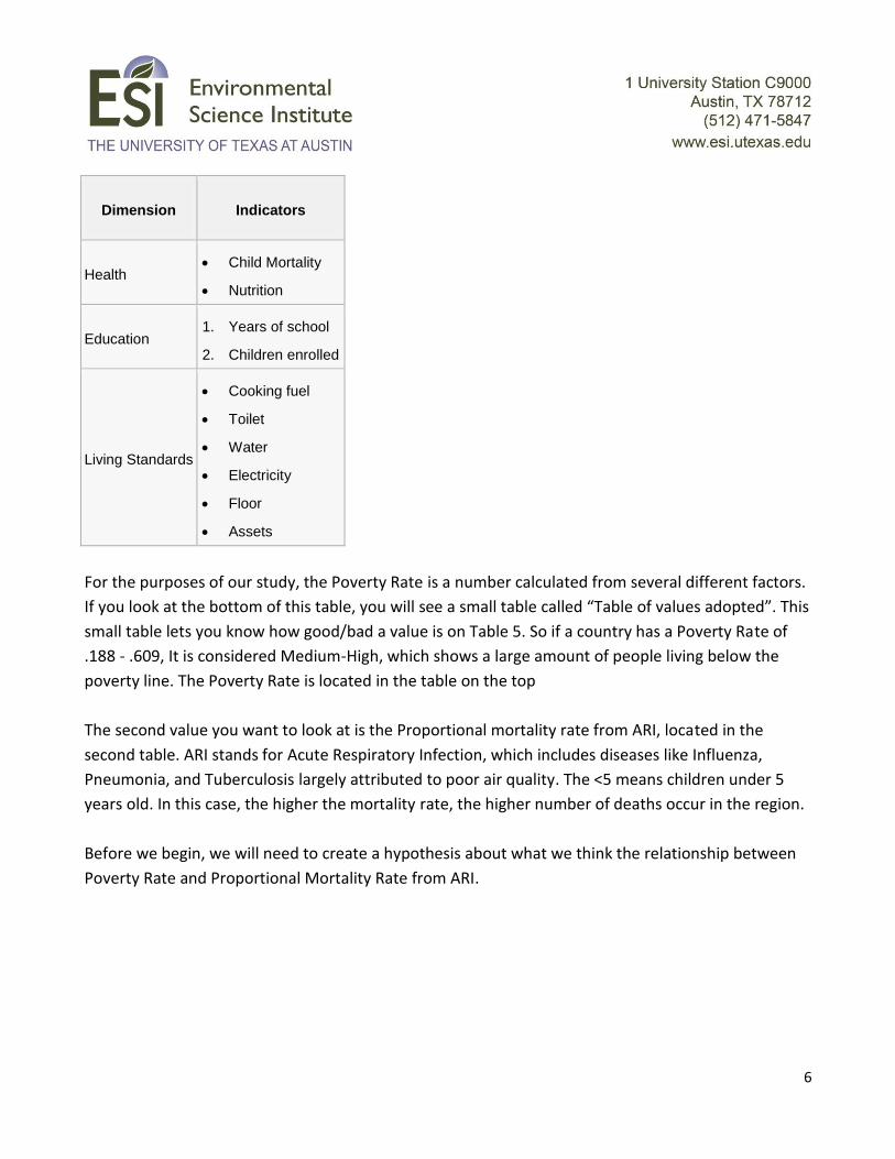
Dimension Indicators
Health Child Mortality
Nutrition
Education 1. Years of school
2. Children enrolled
Living Standards
Cooking fuel
Toilet
Water
Electricity
Floor
Assets
For the purposes of our study, the Poverty Rate is a number calculated from several different factors.
If you look at the bottom of this table, you will see a small table called “Table of values adopted”. This
small table lets you know how good/bad a value is on Table 5. So if a country has a Poverty Rate of
.188 - .609, It is considered Medium-High, which shows a large amount of people living below the
poverty line. The Poverty Rate is located in the table on the top
The second value you want to look at is the Proportional mortality rate from ARI, located in the
second table. ARI stands for Acute Respiratory Infection, which includes diseases like Influenza,
Pneumonia, and Tuberculosis largely attributed to poor air quality. The <5 means children under 5
years old. In this case, the higher the mortality rate, the higher number of deaths occur in the region.
Before we begin, we will need to create a hypothesis about what we think the relationship between
Poverty Rate and Proportional Mortality Rate from ARI.
7
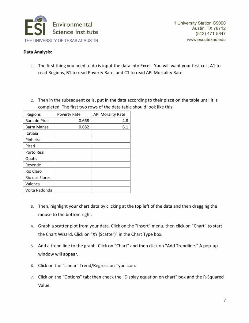
Data Analysis:
1. The first thing you need to do is input the data into Excel. You will want your first cell, A1 to
read Regions, B1 to read Poverty Rate, and C1 to read API Mortality Rate.
2. Then in the subsequent cells, put in the data according to their place on the table until it is
completed. The first two rows of the data table should look like this:
Regions Poverty Rate API Morality Rate
Bara do Pirai 0.668 4.8
Barra Mansa 0.682 6.1
Itatiaia
Pinheiral
Pirari
Porto Real
Quatis
Resende
Rio Claro
Rio das Flores
Valenca
Volta Redonda
3. Then, highlight your chart data by clicking at the top left of the data and then dragging the
mouse to the bottom right.
4. Graph a scatter plot from your data. Click on the "Insert" menu, then click on "Chart" to start
the Chart Wizard. Click on "XY (Scatter)" in the Chart Type box.
5. Add a trend line to the graph. Click on "Chart" and then click on "Add Trendline." A pop-up
window will appear.
6. Click on the "Linear" Trend/Regression Type icon.
7. Click on the "Options" tab; then check the "Display equation on chart" box and the R-Squared
Value.

8
8. Click on "OK" to display the regression line on your chart.
9. The R-Squared value is known as the Coefficient of Determination, it is used to determine how
well the linear regression line fits the data. However, the value we want is R, the Correlation
Coefficient. This value is found by simply taking the square root for R-Squared which is done in
Excel by typing in an empty cell =sqrt(Value), where Value is whatever your R-Squared number
is.
10. The R value is known as the Correlation Coefficient, and it lets you know how “linear” a group
of data is when values from two variables (or “things of interest”) are plotted against each
other on a graph with X & Y axes. If the calculated R-Squared value is equal to 1, then there is
a 100% correlation between the two data groups (they are highly related). In other words, 1
unit change in one thing is associated with 1 unit change in the other thing, thereby forming a
perfect line when plotted on the graph. If R = 0 then there is no discernible linear pattern in
the data set so there isn’t any correlation (there is no relationship between the two variables).
Basically, the closer to 1 the R value is, the higher confidence you can have when saying there
is a correlation between the two data groups.
Data Interpretation:
1. Record your R-Squared value and describe what it means in using the above definition and the
data you are using. Is it near the desired target of 1? Plot the graph of the data and draw a
rough approximation of the regression line made from Excel.
9
2. Based upon your previous R-Squared value, you probably noticed that it’s fairly far from our
desired value of 1, which means we can’t really say the API and Poverty rate are correlated.
However, there is a way where we can raise the R-Squared value. Copy and Paste your table you
made in Excel to a second worksheet, but delete the data for Barra Mansa and Pirari. Then graph the
data, run the regression line and record your R-squared value. Also include a copy of the graph and
regression line (like you did previously) in the space below.
3. What do you notice about the new R-squared value computed without data from Barra Mansa and
Pirari? It should be higher than the last time. Ideally, we want a high R-Squared value (well above .5)
before we say that there is a correlation, but it is important to note that there are not a large number
of cases in in the dataset. Based on your calculated R-squared value, what type of relationship (strong,
weak, no relationship whatsoever) do you think the two variables in this data has?
10
4. How were we able to increase the R-Squared value calculated in Step 2 to the value in Step 3? Provide
an answer in your own words below.
Barra Mansa and Pirari were cases called “outliers”, and they were removed in Step 3. In statistics, an
outlier is a piece of data that is numerically distant from the others. Outliers tend to skew the results
of an analysis, so they are sometimes removed in order to get a more accurate analysis of a particular
sample. NOTE TO STUDENTS: In statistics, there is an established method for determining whether a
data point is an outlier or not, and most software programs have this method readily available; you
cannot delete points of data in order to make the analysis fit your prediction. Otherwise your analysis
will be biased and invalid!
11
Exit Quiz Name:
1) What is Environmental Justice and why is it important?
2) What is poverty, and what factors affect how it is calculated?
3) In your own words, what is the difference between R and R^2 values in a linear regression analysis?
4) How are R and R^2 values useful for statistical analyses?
12
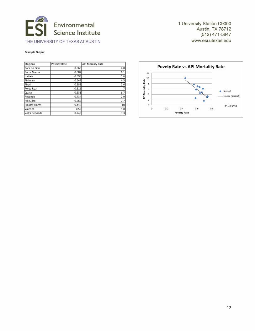
Example Output
Regions Poverty Rate API Morality Rate
Bara do Pirai 0.668 4.8
Barra Mansa 0.682 6.1
Itatiaia 0.695 1.6
Pinheiral 0.642 4.5
Pirari 0.583 2.6
Porto Real 0.611 7
Quatis 0.638 6.7
Resende 0.734 2.9
Rio Claro 0.562 7.7
Rio das Flores 0.446 10
Valenca 0.59 5.8
Volta Redonda 0.745 3.3
R² = 0.55390
2
4
6
8
10
12
0 0.2 0.4 0.6 0.8
AP
I Mo
rtal
ity
Rat
e
Poverty Rate
Povety Rate vs API Mortality Rate
Series1
Linear (Series1)