user manual - home - victoria forms
TRANSCRIPT

Page 1 of 28
VF Creator for Word
User ManualVersion: 1.0.24
Welcome
This User Manual aims to cover all aspects of installing and using Victoria FormsCreator for Word.
If you still can't find an answer, we are very happy to help: please contact us [email protected].
Installing and registering VF Creator
Follow these easy steps to start using VF Creator on your computer:
1. You can download the setup program directly from here. Run the program andfollow the installation process. Please note: during this process, the setupprogram may install some other pieces of software provided by Microsoft,which are required for VF Creator to run. If your Anti-Virus software reports the VF Creator setup program as a potentialvirus, this is just because we are a new piece of software: please report it as asafe application!

Page 2 of 28
2. Start Microsoft Word and click on the VF Creator tab in the Ribbon. If theSoftware Registration window doesn't pop up, click "Register", and enter yourCustomer Account Name and licence key. (your account name is not your emailaddress).
Registration:
Please note: you will require one licence per version of Word that VF Creator isinstalled on. This means that if you have two versions of Word running on thesame machine, you will need two licences.
Office Versions:
Please note: Office 2016 or later is recommended, but VF Creator should workin all versions from Office 2007. Office 2007 users must have Service Pack 1installed.
The Basics

Page 3 of 28
Standard or Advanced
You can use the Start Form button in any document: either an existing one or abrand new one. When you start a form you are presented with the option tostart a Standard Form or an Advanced Form.
Standard Mode:
Create simple forms with different types of fields, which can be mademandatory and have additional help dialogues.
Standard Form Examples: Contact Form, Registration Form, Order Form,Feedback, Online Booking, Short Customer Survey, Competition Entry
Advanced Mode:
Create more complex forms with different types of fields which can be mademandatory, read only or hidden; as well as set to display based on answers toprevious questions. The Advanced option also facilitates calculations andvalidation to be applied to fields using simple JavaScript.
Advanced Form Examples: Application Form, Contracts, Customer Survey basedon Type of Purchase, Qualification Form, Quote Generator, Medical Information,License Form, Risk Assessment, Holiday Request
We recommend using Standard Mode for smaller forms that will not requirefields to display dynamically, and that will not require the form data to be runthrough any validation scripts.
Please note: there is an option in the Form Properties Panel to change fromAdvanced Mode to Standard Mode, or vice versa, after you have starteddesigning a form.
Adding Fields to your Form
In order to place a field on the page, simply select the type of field you needfrom the ribbon, and it will appear at the current location of your cursor. Fieldsdisplay in line with text—so placing text before a field will push the field along.
Field Placement:
Currently fields placed within Headers, Footers, Footnotes or Text Boxes withshadows will not function correctly when the form is published.
Number of fields:
Page 4 of 28
Whilst there is no fixed limit on the number of fields in a form, for performancereasons we recommend no more than 600 fields.
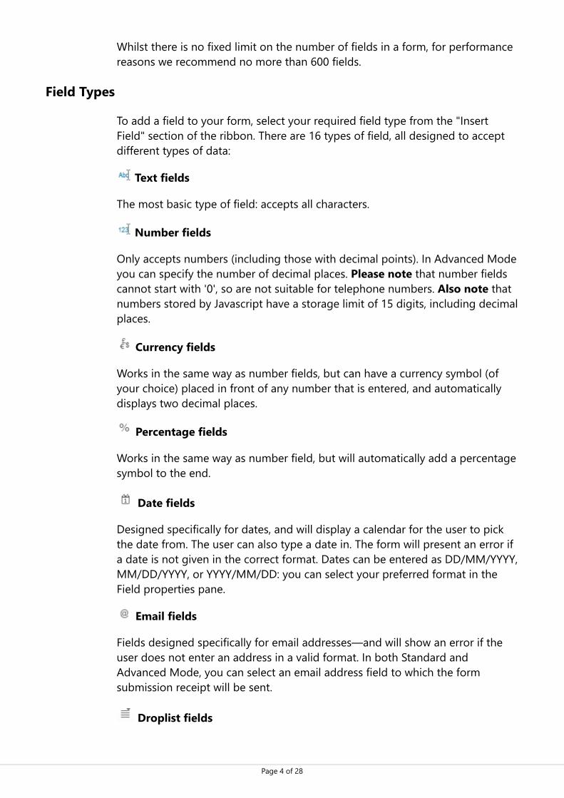
Field Types
To add a field to your form, select your required field type from the "InsertField" section of the ribbon. There are 16 types of field, all designed to acceptdifferent types of data:
Text fields
The most basic type of field: accepts all characters.
Number fields
Only accepts numbers (including those with decimal points). In Advanced Modeyou can specify the number of decimal places. Please note that number fieldscannot start with '0', so are not suitable for telephone numbers. Also note thatnumbers stored by Javascript have a storage limit of 15 digits, including decimalplaces.
Currency fields
Works in the same way as number fields, but can have a currency symbol (ofyour choice) placed in front of any number that is entered, and automaticallydisplays two decimal places.
Percentage fields
Works in the same way as number field, but will automatically add a percentagesymbol to the end.
Date fields
Designed specifically for dates, and will display a calendar for the user to pickthe date from. The user can also type a date in. The form will present an error ifa date is not given in the correct format. Dates can be entered as DD/MM/YYYY,MM/DD/YYYY, or YYYY/MM/DD: you can select your preferred format in theField properties pane.
Email fields
Fields designed specifically for email addresses—and will show an error if theuser does not enter an address in a valid format. In both Standard andAdvanced Mode, you can select an email address field to which the formsubmission receipt will be sent.
Droplist fields

Page 5 of 28
These fields allow you to specify a number of list options from which the userhas to pick. You can specify the list items in the Field properties pane.
ComboBox fields
A ComboBox works in a similar way to a droplist field, but this field type givesthe user the option to type custom text into the field. Any list options that youspecify in the Field properties pane will work as selectable suggestions.
Checkbox / Tickbox fields
These fields only have two states—true or false, the user can only tick or untickthese fields. Checkbox fields display a cross when true, whereas tickbox fieldsdisplay a tick.
Checkbox group / Tickbox group fields
These fields function in the same way as checkbox and tickbox fields, but ifadded to the same group, only one field can be checked at a time. The samegroup name must be specified, in the sidebar, for all fields that you want to begrouped together.
E-sign fields
Specialist fields designed to allow users to input a signature on the form. Whenthe user clicks in this field, a new window will open asking them to draw theirsignature. Once they are happy with their signature, pressing Enter ↵ on theirkeyboard adds their signature directly to the form.
Advanced Signature fields
This field allows the user to sign the form on a different device to the one theform is completed on. Remote Sign provides the option to send a text messageor email so the form can be signed on a smart phone. It can also populate adate automatically after the field is signed.
Image fields
Specialist fields designed to allow users to attach images directly to your forms.
Button fields
Field that displays a clickable button which can direct to external links, forexample to a separate contract or terms and conditions. Validation can be set tomake sure the button has been clicked before the form can be submitted.Please contact [email protected] if you wish to use this feature.
Field Properties Pane

Page 6 of 28
You can customise fields individually or multiple fields at once. To customisemore than one field at a time, hold down Ctrl on your keyboard and clickeach field you would like to select.
Selected fields will be highlighted in the "Active Field Colour".
Field Label (advanced mode)
Every field has a unique identifier in the form of a field label. Field labels are setautomatically as you add new fields to your form. Fields with the same label willhave the same contents, which can be useful if you want to re-use the sameinformation more than once in a form without making the user enter theinformation again.
You can change a field label by typing a number into the box. Labels alwaysstart with the letter "D" (which will automatically be added) and can be anynumber between 1 and 99999.
Data Type
You can change the field type using this dropdown list. The field types are thesame as the "Insert Field" menu above. The Field properties pane will adjust toinclude different formatting options depending on the Data Type selected.
This option is useful if you need to reword a question which changes the type ofanswer you will receive—e.g. changing "What is your age?" to "What is yourdate of birth?" would require changing the data type from a number to a date.
Other properties of the field will stay the same if you change the data typeusing the dropdown list.
Font Customisation
Customise your fields by choosing different fonts and styles. The default settingis Arial, 12pt.
Choose your preferred font from the dropdown list. You can resize field text byselecting your preferred font size from the dropdown list. Text can also be Boldor Italic for emphasis, and you can choose any colour you like. Align your fieldcontents left, centre, or right using the Alignment buttons. Your choice of fontmay not be available to every user filling in your forms, so it may not alwaysdisplay the same way across all devices.
Text Fields can be formatted to display UPPERCASE or lowercase text—thisoption is useful for Postcodes (uppercase) for example. The field automaticallychanges whatever has been typed in into uppercase or lowercase text,depending on your selection. If neither toggle is enabled, fields will displaywhatever has been typed in by the user.
Field Border

Page 7 of 28
Toggle the field border on or off using the Border button. The default bordercolour is black, but you can customise this by choosing your preferred colour
from the Border Colour pop up window as pictured: .
Field Size
You can type in field dimensions into the Height and Width boxes in theProperties Pane. By default, field height is 14px, and field width is 25px.
Alternatively, use Ctrl + ← ↑ → ↓ ; this will resize the field in 10 pixelincrements. ← and → control the field width, ↑ and ↓ control the fieldheight. Using the arrow keys without holding down Ctrl allows you to resizefields in 1 pixel increments.
Field Intelligence
Read only (advanced mode)
"Read Only" is an option for fields that you want people to see, but not be ableto edit, such as calculation totals or a dynamic message. This allows you to pre-fill a field with data that cannot be changed by the user.
Read-Only can either be enabled all the time or can be enabled dynamically(using Simple JavaScript). This will allow users to change the field contents, onlyif certain criteria are met.
For example, the following expression would allow the user to view a field, onlyif they enter "hello world" in field D100:
D100 �� "hello world"
For additional help with JavaScript expressions, see "Help with JavaScript"below.
Hidden (advanced mode)
This option allows you to hide a field, or choose when it should be displayed.Fields will be displayed automatically unless the Hidden option is selected.
You can hide a field all the time, or only hide a field depending on how previousquestions have been answered. For example, fields relating to questions aboutthe user's partner could be hidden unless the user answers "Yes" to having apartner.
To hide/display a field based on answers in the rest of the form, you can use aJavaScript expression.

Page 8 of 28
For example, the following expression would only allow the user to edit a field ifthe field "D100" is a checkbox for the answer "Yes" to having a partner:
D100 �� true
For additional help with JavaScript expressions, see "Help with JavaScript"below.
Calculation (advanced mode)
This option allows you to pre-fill a field with data—or dynamically display data—dependent on the answers given by the user. Calculations can either bewritten using JavaScript Expressions or JavaScript Commands .
JavaScript Expressions are best used for displaying text that will notchange, or for displaying a number that will be calculated on the form. Forexample, if we wanted to display the words "Hello world" in a text field, all wewould need to do is set the calculation as a JavaScript Expression and input theexpression below in the calculation box in the Field properties pane:
"Hello world"
You can incorporate answers the user has given on the form, for example:
"Hello " + D100
would output "Hello " followed by any data from the field D100. You mustinclude spaces with the text as any data in field D100, for example, will beadded immediately after your specified text without spaces.
Expressions can also be used for simple maths calculations, for example:
D1 + D2
In a number field, this would show the sum of fields D1 and D2. ImportantNote: When running mathematical calculations, you must ensure that the targetfields are set as number fields.
In a text field, this would display the data from either field one after another, forexample if D1=John and D2=Smith then you could add these together into afull name field as below:
D1 + " " + D2
This would display as John Smith in the field specified field. Important Note: " "is added in as a space and will not be added in automatically. Without thisspace, the field would display JohnSmith.
JavaScript Commands are best used for when different data will have to bedisplayed dependent on an answer the user gives on the form. A Javascriptcommand will always include at least one "result=" which outputs the data to

Page 9 of 28
be displayed based on the calculation. For example, the code below outputs adifferent message dependent on the user's answer to D1000:
if (D1000 �� "I wish to renew") { result = "You are unable to renew using this form, please contact Customer Services"; } else if (D1000 �� "I wish to make a new application") { result = "Please fill out your details below"; } else { result = "Please choose an answer to the above question"; }
It is advised to set a field with a calculation to be Read-Only.
For additional help with JavaScript Expressions and Commands, see "Help withJavaScript" below.
Validation Rule (advanced mode)
Validation Rules allow you to ensure that the user enters the correct data into afield. You can create Validation Rules using JavaScript Expressions andJavaScript Commands.
Expressions are best used for simple rules that will only be dependent onone or two conditions, such as, "the number must be larger than 0". Commands
are best used for longer rules that will rely on multiple conditions, such as,"the answer must be over 12 characters long, and cannot contain any numbers".These will always contain at least one "result=".
A JavaScript Expression sets the conditions that have to be satisfied for thefield not to display an error. For example, the code below will cause a field todisplay an error unless the user enters "hello world" in field D1000:
D1000 �� "hello world"
A JavaScript Command works in the same way as an expression, except youmust declare a result. For example, the code below will cause a field to displayan error unless the user enters "hello world" in field D1000:
if (D1000 �� "hello world") { result = true; } else { result = false; }
For a validation rule, the result must always equal true or false.
You can type a custom message into the "Validation Message" box—if leftblank, the default message is "Error: Not Valid". The message will be displayed ifthe contents of the field are not valid and prompts the user to enter the correctinformation.

Page 10 of 28
For additional help with JavaScript Expressions and Commands, see "Help withJavaScript" below.
Mandatory
This allows you to set whether or not a field must be filled out by the userbefore they can submit their form.
In Standard Mode, enabling this option means the field is always mandatory
In Advanced Mode, you can set a field to be always mandatory, or make a fieldmandatory only if certain criteria have been met within the form, using aJavaScript Expression.
For example the code below would make the field mandatory if "hello world" isentered in D1000:
D1000 �� "hello world"
For additional help with JavaScript expressions, see "Help with JavaScript"below.
Help
You can enter optional question-specific help text using this feature.
When a user clicks in the field, a small question mark icon will appear next tothe field, which displays your custom help text when the user clicks on it.
Field-Specific Intelligence Options
Limit Size (Advanced Mode)
Available for: Text, Number, Currency, Percentage
Enable this option to limit how much can be typed into a field by entering anyvalue for the maximum number of characters.
For example, you may wish to set a standard length for an account number, orprevent a user from entering more information into a field than can be seen ona printed page.
Decimal Places (Advanced Mode)
Available for: Number, Percentage
Enter the maximum number of decimal places you want to allow for numberand percentage values. By default the decimal places configuration is set tozero.

Page 11 of 28
Blank if Zero (Advanced Mode)
Available for: Number, Currency, Percentage
When a form is first opened, all empty numeric fields will be blank. If a zero (0)is entered into the field, then by default the field will display the zero character.
Turning on the option of "Blank if Zero" means that the field will have nocontents, even if a zero has been typed in. This helps keep forms tidy and easyto read.
Currency Symbol (Standard Mode & Advanced Mode)
Available for: Currency
Currency field contents will automatically be displayed as a number with twodecimal places. To add a currency symbol, you must type your preferredcurrency symbol into the box in the Properties Pane.
The symbol will automatically be placed ahead of any number entered into thecurrency field.
Date Formatting (Standard Mode & Advanced Mode)
Available for: Date
Select the preferred format for dates to be entered into the form from thedroplist.
The three options are DD/MM/YYYY, MM/DD/YYYY, or YYYY/MM/DD.
If the date is selected from the calendar, the field will format the dateautomatically. If the user types in the date, the field will validate the dateentered and will show an error if the user types the wrong kind of date into thefield.
Submission receipt
Available for: Email
Enabling the "Send Submission Receipt" option uses the email address enteredinto the email field to send the user an email receipt after they submit theirform. Only one email field can be set to Send Submission Receipt.
The default submission receipt confirms the date and time of their submission.
The subject and contents of this submission receipt email can be customised inthe "Form Properties" menu.
Group Name (Standard Mode & Advanced Mode)

Page 12 of 28
Available for: Checkbox Group, Tickbox Group
Use Checkbox / Tickbox Groups for when you need a single checkbox to beselected from a number of options.
The Group Name must be specified, as this identifies which fields are in whichgroup. You cannot use the same group name for different groups. The groupname can be anything you choose, but you must be careful when typing inGroup Names separately as lowercase and uppercase characters will berecognised as different: "ExampleGroupName" is not the same as"examplegroupname".
You can select all the checkbox group / tickbox group fields you wish to add tothe same group by holding down Ctrl on your keyboard and clicking on thecorrect fields. You can then type in the Group Name once for all the fields, toensure that all the fields are part of the same group.
List Items (Standard Mode & Advanced Mode)
Available for: Droplist, ComboBox
For Droplist and ComboBox fields, you must enter at least one list item into thebox.
Enter each separate list item on a new line by typing an item and pressingEnter ↵ on your keyboard.
List items entered for a Droplist field will be the only options available to thefinal form user, whereas list items entered into a ComboBox field are optional,and the form user can also type in their own answer if none of the list optionssuit.
Droplist is useful for situations where there are a predefined set of optionsavailable. For example, "List of Products" or "Sizes Available"
ComboBox is useful for situations where a list of options will help the user, butdoes not cover every possible outcome. For example, "Relationship toEmergency Contact" or "Where did you hear about us?"
Help with Javascript
For full tutorials on using JavaScript, please see these resources:
W3 Schools JavaScript Tutorials
CodeAcademy Javascript Tutorials
Mozilla JavaScript Tutorials
JavaScript can be entered in two different ways:

Page 13 of 28
JavaScript Expressions JavaScript Commands
JavaScript Expressions allow you to make simple statements and carry outbasic mathematical calculations.
JavaScript Commands allow you to use the full power of JavaScript and createlong and complicated calculations and validations.
JavaScript Expressions
Expressions are useful for making simple statements that will determine fieldsettings on the form. Expressions are constructed using JavaScript operators.
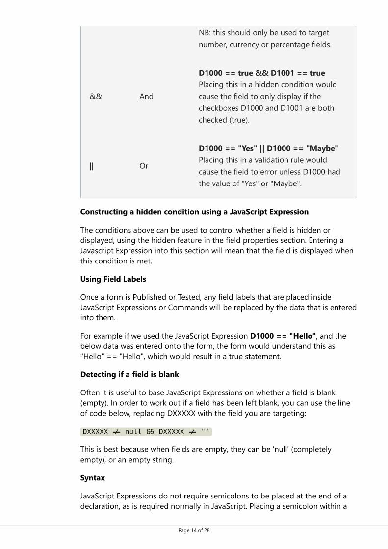
JavaScript Operators
Operator Description Example
== Equal to
D1000 == true Placing this in a hidden condition wouldonly display the field if the checkboxD1000 was checked (true).
!=Not equalto
D1000 != "Yes" Placing this into a validation rule wouldcause the field to error if "Yes" was enteredin D1000
>Greaterthan
D1000 > 8 Placing this in a hidden condition wouldcause the field to only display when D1000was given a value above 8. Use >= to indicate greater than or equalto. NB: this should only be used to targetnumber, currency or percentage fields.
< Less than D1000 < 1 Placing this inside a validation rule wouldcause the field to error if D1000 was givena value of 1 or greater. Use <= to indicate less than or equal to.
Page 14 of 28
NB: this should only be used to targetnumber, currency or percentage fields.
&& And
D1000 == true && D1001 == true Placing this in a hidden condition wouldcause the field to only display if thecheckboxes D1000 and D1001 are bothchecked (true).
|| Or
D1000 == "Yes" || D1000 == "Maybe" Placing this in a validation rule wouldcause the field to error unless D1000 hadthe value of "Yes" or "Maybe".
Constructing a hidden condition using a JavaScript Expression
The conditions above can be used to control whether a field is hidden ordisplayed, using the hidden feature in the field properties section. Entering aJavascript Expression into this section will mean that the field is displayed whenthis condition is met.
Using Field Labels
Once a form is Published or Tested, any field labels that are placed insideJavaScript Expressions or Commands will be replaced by the data that is enteredinto them.
For example if we used the JavaScript Expression D1000 == "Hello", and thebelow data was entered onto the form, the form would understand this as"Hello" == "Hello", which would result in a true statement.
Detecting if a field is blank
Often it is useful to base JavaScript Expressions on whether a field is blank(empty). In order to work out if a field has been left blank, you can use the lineof code below, replacing DXXXXX with the field you are targeting:
DXXXXX �� null �� DXXXXX �� ""
This is best because when fields are empty, they can be 'null' (completelyempty), or an empty string.
Syntax
JavaScript Expressions do not require semicolons to be placed at the end of adeclaration, as is required normally in JavaScript. Placing a semicolon within a

Page 15 of 28
JavaScript Expression may cause your form to error in test or when published.
JavaScript Commands
JavaScript Commands use the same operators and logic as JavaScriptExpressions, but you can take advantage of the full power of JavaScript. If youare not familiar with JavaScript, we recommend using Expressions on yourforms.
Using JavaScript Commands within VF Creator
Using fields
You should treat all fields as variables, Field Labels work as predefined variables.For example, you can use Field Labels to create conditions in if else statements,as below:
if (D1000 < 5) { result="The number entered in D1000 is less than 5"; } else { result="The number entered in D1000 is equal to or greater than 5"; }
You can also define new variables using Field Labels, as below:
var myString = String(D1000);
In calculation fields you can also use Field Labels to update the result of otherfields, as below:
result = "This will update the field that it is placed within"; D1001 = "This will update field D1001"; D1002 = "This will update field D1002";
Declaring a result
All JavaScript Commands should include a result declaration. This is apredefined variable which will output into the current field:
For calculations, "result =" will output directly to the field.
For Validation Rules, you must declare result as a Boolean. If you declare "result= true", the field will not show an error on the form, if you declare "result =false", the field will show an error on the form.
Ribbon Controls

Page 16 of 28
Tools
Re-Number
Use "Re-Number" to update the field labels of your selected fields (or all fields ifnone are selected), starting with a number of your choosing. This feature isuseful if you have copied a lot of fields and some of them have the same fieldlabel, instead of amending each field individually, you can use "Re-Number" toupdate them all at once.
Using re-number with JavaScript Expressions or Commands
Please be aware that re-numbering fields only updates the Field Label, it doesnot automatically update the use of any field labels in any JavaScriptExpressions or Commands. Therefore JavaScript Expression and Commands thatrely on certain field numbers may not function as expected after re-number hastaken place.
Show/Hide
Show or Hide the Field properties pane.
Apply Order
You can customise the tab order of the fields (when the user presses the Tabkey between fields when filling the form in). Select a group of fields whilstholding Ctrl in the order you'd like them to be. Then click on the "ApplyOrder" button.
Cut / Copy / Paste
Cut / Copy / Paste individual fields, or you can select multiple fields by holdingCtrl and clicking on the fields you wish to select.
Delete
To remove a field or multiple selected fields, you can use the Delete button inthe VF Creator ribbon, or the Delete on your keyboard. A warning messagewill appear asking you to confirm you wish to delete before the field(s) is/areremoved from your form.
Navigator
Find fields by field number with a list sorted either in numerical order or bypage. Duplicates of fields on the form are also listed, allowing you to locate andre-number repeated fields as required.
Properties
Field Colour

Page 17 of 28
Select your preferred colour for all fields on your form. This will display as thebackground colour for all fields which can be clicked in by the user. The defaultField Colour is light yellow. Note: Hidden and Read Only fields will always havea white background.
Active Field Colour
Select your preferred colour for an Active Field. When a field is active, the cursoris blinking and ready to accept text input. The default Active Field Colour is lightblue.
PDF Field Colour
When a user submits the form, a PDF copy of the completed form is generated.You can select your preferred colour for all the fields on your PDF form. This isuseful if you wish to print your completed forms, as you can choose a printfriendly colour. The default PDF Field Colour is white.
Page Properties
Page Properties is only available in Advanced Mode.
Page Title
You can add an individual Page Title for each form page. The page titles willshow in the "Select Page" menu on your published form to help users navigatethrough the form. Page titles are optional, but are useful for keeping track oflonger forms.
Forced Error Checking
This option can be enabled on a page by page basis. If enabled for a page, theuser must complete all mandatory questions on that page before they canproceed with the rest of the form.
Forced Error Checking is a useful feature if you have included questions later inthe form which are dependent on questions on the current page.
Conditional Display
Sometimes not all pages are relevant to all form users. For example, a formpage asking for information about medical conditions is only relevant if the useranswers "Yes" to an earlier question: "Do you have any medical conditions weneed to know about?"
You can choose to display this page only when it is needed, by checking the"Conditional Display" box for the correct page, and adding a ConditionalExpression. This option is not available for the first or last page of any form.
Conditional Expression

Page 18 of 28
If you have ticked the Conditional Display box, you must specify a ConditionalExpression.
For example, if the "Yes" answer to the medical conditions question is field labelD100, then the page must only display if field D100 is checked (true). TheConditional Expression for this would be:
D100 �� true
Form Properties
Form Configuration
Enterprise Forms Server vs Enterprise Forms Server Core
The form configuration below only applies to EFS Core. EFS Core is the defaultsystem provided with VF Creator. If you are going to publish the form to EFSinstead, you only need to fill in the Form Name.
Form Name
This specifies the official name of the form. Your form name can be anycombination of letters and numbers, but cannot include special characters(;/?:@&=+$,.%\|-).
The form name will appear as the title of the form in your online Forms Systemand will also appear as part of the URL of the form once it has been published.
Advanced Mode
Enable or disable Advanced Mode once the form has been started.
Advanced Mode allows you to create more complex forms with different typesof fields which can be made mandatory, read only or hidden; as well as set todisplay based on answers to previous questions. Advanced Mode also facilitatescalculations and validation to be applied to fields using JavaScript commands.
If you started your form in Standard Mode, enabling Advanced Mode will giveyou more customisable options for your form fields.
If you started your form in Advanced Mode, disabling Advanced Mode willremove all JavaScript code and customisable options.
Description
Page 19 of 28
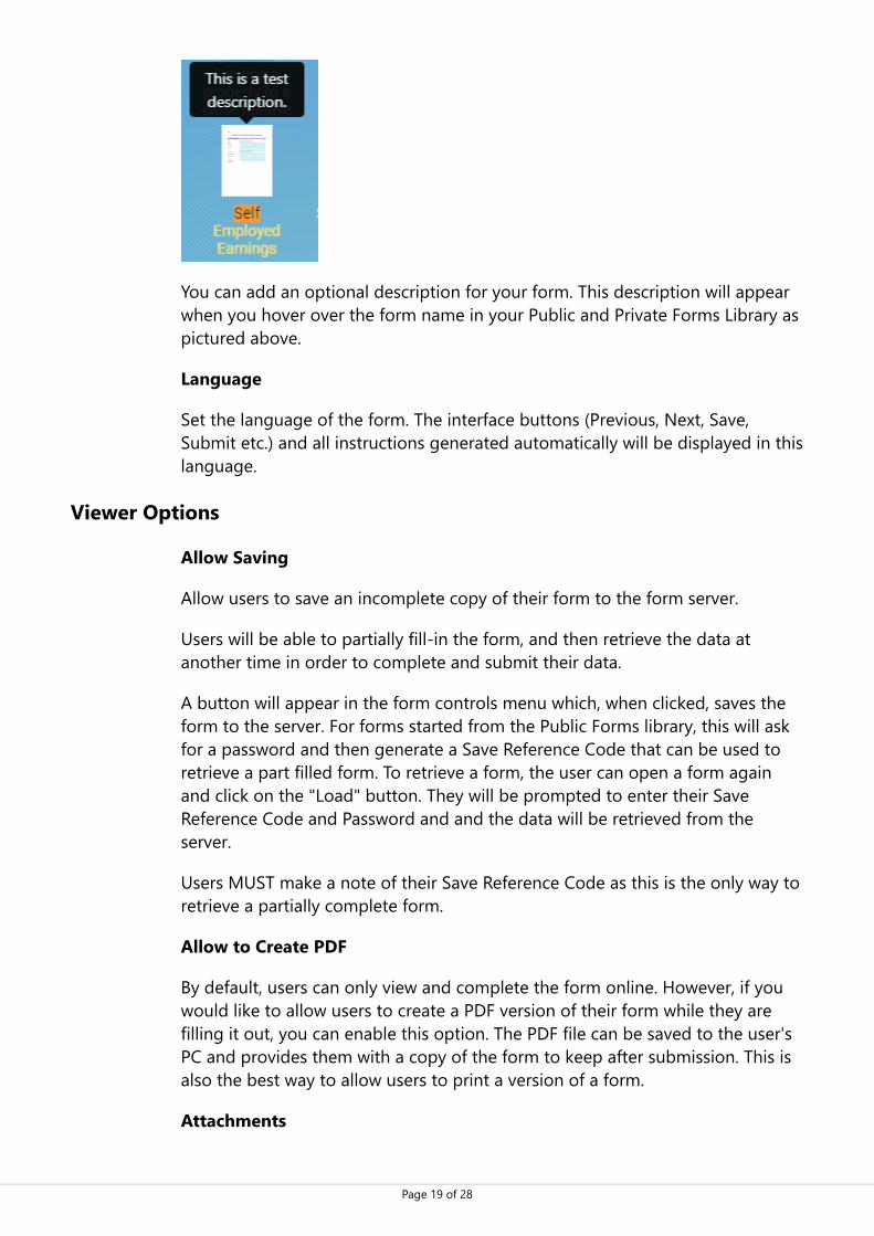
You can add an optional description for your form. This description will appearwhen you hover over the form name in your Public and Private Forms Library aspictured above.
Language
Set the language of the form. The interface buttons (Previous, Next, Save,Submit etc.) and all instructions generated automatically will be displayed in thislanguage.
Viewer Options
Allow Saving
Allow users to save an incomplete copy of their form to the form server.
Users will be able to partially fill-in the form, and then retrieve the data atanother time in order to complete and submit their data.
A button will appear in the form controls menu which, when clicked, saves theform to the server. For forms started from the Public Forms library, this will askfor a password and then generate a Save Reference Code that can be used toretrieve a part filled form. To retrieve a form, the user can open a form againand click on the "Load" button. They will be prompted to enter their SaveReference Code and Password and and the data will be retrieved from theserver.
Users MUST make a note of their Save Reference Code as this is the only way toretrieve a partially complete form.
Allow to Create PDF
By default, users can only view and complete the form online. However, if youwould like to allow users to create a PDF version of their form while they arefilling it out, you can enable this option. The PDF file can be saved to the user'sPC and provides them with a copy of the form to keep after submission. This isalso the best way to allow users to print a version of a form.
Attachments

Page 20 of 28
This enables users to attach files (for example supporting evidence for anapplication) to your form. These files will be available in the Forms System and(if possible) embedded into the PDF created.
Submission Configuration
Submit Form with Errors
This option allows the user to submit the form with errors still on the form. Thismeans that any mandatory field can be left blank, and any validation you haveadded to fields can be bypassed.
This is useful in situations where you ask for information which may take a longtime for the user to provide. Making the fields mandatory shows the user whatinformation you would really like them to include in their completed form, butallowing submission with errors gives users the facility to provide as muchinformation as possible, without being barred from submitting the form ifcertain information is much more complicated to provide.
Receipt Email
If you select "Send Submission Receipt" for an Email field in the form, theseoptions become available to fill in. The email address that the user specifies inthis box will receive a Receipt Email using the Subject and Body you specifyhere.
The subject and body of the email must be entered in plain text. You caninclude information from the form to personalise the email. This uses fieldlabels contained within square brackets: i.e. [D___].
For example, if you had asked for the user's name in field D100, you wouldenter [D100] to include the user's name in the body of the receipt email.
Send PDF Copy in Receipt Email
Provide users with a PDF copy of their completed form for their records. ThePDF version of the form will be attached to the Email Receipt.
Submission Confirmation Message
A message can be displayed when the form is submitted by a user, to confirmtheir form has been sent. If enabled, the default message reads:
"Thank you, your form has been received", followed by the date and time ofsubmission
You can fully customise this message by using plain text in the Form Propertieswindow. The message can be personalised by including information from theform, by entering field labels in the following format: [D____].

Page 21 of 28
For example, if you had asked for the user's name in field D100, you wouldenter [D100] to include the user's name in the body of the submissionconfirmation message.
Notification Email
Automatically send an email to a member (or members) of your team wheneverthis form is submitted. This is separate to the Email Receipt that is sent to theuser.
The Notification Email will be sent to the email addresses specified in theNotification Email box. You can put multiple addresses on separate lines.
You can also choose if a PDF of the form is attached to the Notification Email.
Form Submission Reference
You have the option of including any field on the form to use as a "FormSubmission Reference". This reference will be used in the "Filled Forms" sectionsof the Forms System to help identify each submission.
By default, the Form Submission will be blank. However, you can choose anyfield from within your form to use as a submission reference.
For example, if you ask for the user's surname in field D100, then enter D100into the Submission Reference in the Form Properties window (Form Propertiestab), for the user's surname to show in the "Filled Forms" section. If you want touse multiple fields here, you could create a Hidden field in the form with acalculation to combine the fields you want, then use that Hidden field as theForm Submission Reference.
Form Information
Author
If you have more than one person designing forms, you can use the Author fieldto input who has made each form. This is optional and is not displayed to thepublic.
Notes
You can include any notes about the form in the Form Information window. Thisis useful if you have more than one person working on the same form. This isoptional and is not displayed to the public.
Date Started / Last Modified
The system logs when the form was first created and when the last changeswere made. You can use these dates to track form design and version history.The dates cannot be altered.

Page 22 of 28
Web Form Options
See Web Form Pane for more information on Web Forms.
Enable Web Form Version
Select Yes if you have created an Web Form version of the form (using the WebForm Pane) and would like it to be available.
Web Version Display Options
Automatic will choose whether to show the Web or Desktop/Word version ofthe form based on the user's device width. The user will also have the option toswitch between versions.Always will always show the Web version. The Word version will be used onlywhen creating a PDF of the form.User Choice (Desktop start) will default to the Desktop/Word version, but givethe user the option to switch between versions.User Choice (Web Form start) will default to the Web version, but give theuser the option to switch between versions.Accessible Link Only is the same as "User Choice (Desktop start)" except thatthe link to switch between options will say "Accessible Version" rather than"Smartphone Version".
Web Form Page Stylesheet
In the future, you will be able to choose the style of the Web Form, or evencustomise the styles for your forms. For now, the only option is "Default".
Testing
Validate
This checks your form for errors before you Test or Publish. Validate searcheseach field looking for items that may cause issues, such as: no list items addedto a droplist field, errors in JavaScript code or no Group Name defined for acheckbox or tickbox group.
Fields with errors will be highlighted red, and the Field properties pane willdisplay a red box around the specific field property that is causing the error.Clicking on Validate opens an "Errors" window which lists each error found onthe form including the field label, the property affected and a description of theissue.
Forms cannot be Tested or Published until all errors have been corrected.
Test
Page 23 of 28
Before the form is Published and uploaded to the online Forms System, you canuse the Test service to perform as many test runs of your form as you need.
This service quickly converts your form to the online format and opens in a newwindow. It allows you to preview the whole form, fields and any JavaScriptExpressions or Commands you have added. If you need to make any changes,you can close the Test window and return to your Word Document to makechanges as required.
All form controls (Save, Submit, Create PDF etc.) are disabled in Test mode, butyou can check the Submission Configuration.
Publish
Once you are happy with your form design, and have configured your desiredForm Properties; you are ready to Publish your form. You can use the Testservice to preview everything is working as expected. You may be asked to saveyour form before the system converts your form to the online format. Pleasenote that if you have a field selected, you cannot save a document; so deselectall fields and then save the document before publishing.
Publish to Server
If you have EFS Core, you can publish directly to the server. When you click on"Publish to Server", it will offer you the choice of EFS Core systems that youhave access to, and whether to make the form Live or Pending.
Making the form Live displays it in both the Private Forms Library and in thePublic Forms Library in your EFS Core System. Forms in the Private Forms Librarycan be completed by a logged in user. Forms in the Public Forms Library can becompleted by anybody who has a link to the form.
Keeping the form Pending means that the form is uploaded to your EFS CoreSystem, but is not included in either Forms Library yet. You can Publish apending form from the Configure Forms section of EFS Core.
Live Link
If you choose to Publish your form and make it Live, you will be given a link foryour form in a pop up window. This link can be used by anybody to access yourform—no login required.
Once you have taken a note of the Live link, you can close the popup window toreturn to your Word Document.
Publish to Package File
If you want to publish to an Enterprise Forms Server system, you can usePublish to Package File. This will generate a .wdfpz file and ask you where to

Page 24 of 28
save it. You can then upload this file to EFS.
Publishing large forms
Please be aware that it is not possible to publish forms over 20 MB in size. Trycompressing any images you have in order to reduce the size of your form.
Web Form Pane
Web Form Pane availability
The Web Form Pane isn't available to all customers, as it is an optional extra.Please contact us if you would like to add this extra.
Overview
The published version of your form can be in Desktop mode, where it looks justlike your Word document, or Web Form mode, where it looks more like aconventional Web form.
Desktop mode
Web Form mode

Page 25 of 28
The benefits of Desktop mode are that you have complete control of the lookof the form, and the PDF of the form matches the form that was filled in. Thebenefits of Web Form mode are that the form works well on all devices(Smartphones, Tablets etc.). When in Web Form mode, the PDFs still look likethe Word document.
You can create a Web Form version of your form using the Web Form Pane, andthen control which version is used using the Web Form Options
Getting Started
You should normally complete designing your form in Word before moving intothe Web Form Pane. Once you have finished making your form, click on the"Web Form Pane" button to open the Pane on the right-hand side of thewindow.
In the Web Form, all fields on each page will be presented to the userunderneath each other. When you first open the Pane, you will see all the fieldson the current page, with no text. You need to add text to each field, by free-typing it, or by linking to the Word document.
You can place text in 7 different positions relative to the field, as shown by thisgraphic. When you click on a field in the Pane, these positions will all appear.
You can also add text between fields that are not directly linked to that field.This is useful for headings or explanation paragraphs. You can add a Text Blockby hovering in the space between two fields, hovering over the icon, thenclicking on the icon.

Page 26 of 28
In most cases, the text you want in the Web form already exists in the Worddocument, so you can "link" Caption positions, or Text Blocks to text within thedocument. To do this, expand the field by clicking on it in the Pane, then selectthe text you want to link in the main document, and then clicking on the Link icon to link the text. The text you selected will then appear in the correct placein the HTML form. If you update the text in the Word document, it willautomatically update in the Web Form Pane.
If you want to free-type text into a Caption Position instead of linking text tothe document, you can click on the Edit icon. If you have already linked text,you can use the Edit icon to customise the text and unlink it from thedocument. If you want to unlink text from the document, you can use the Cross
icon.
Editing Text
When editing text, you can either type HTML (or plain text) directly in the box,or use the rich text mode: click on the Rich Text icon to activate that mode.
You can click on the relevant buttons to make text Bold, Italic, Underlined, 5levels of heading, or bullets and numbering.
Click on the tick icon to save your changed text, or the cross to undo yourchanges.
Option Buttons

Page 27 of 28
Refresh
If you add a field to the document after you have opened the Web Form Pane, itwill not automatically appear in the Pane. To get it to appear you should click onthe refresh button.
Move
You can re-order fields by setting the tab order using the Ribbon icon. You canalso re-order them in the Web Form pane by clicking on the Move icon, and
then dragging items around using the handle icon.
Expand All
When you are linking text from the document to specific fields, you may preferto expand every field's caption positions, rather than have to click into eachfield. You can do this with the Expand icon.
Highlight Mode
Once you have linked text in the document to the Web Form pane, you can seewhich text is linked by enabling Highlight mode and then clicking on fields.
Advanced Options
Disable bookmark updates: Normally, once you have linked text in thedocument to the web form, this will update every few seconds. For largedocuments this can become very sluggish, so you can use this option totemporarily disable the automatic updates.Remove all captions from this page: Complete removes all captions and textblocks from the current page.
Moving between pages
Only one page is shown in the Web Form pane at any one time. To movebetween pages, simply scroll in the Word document and click into a page youwant to load. You can also use the arrows at the top of the Web Form Pane.
Advanced Options
To access advanced options for each field, hover over the field, and then clickon the blue cog that appears on the right-hand side.
Hiding Fields from the Web Form version
If you have a field in the Word version of the form that you do not want toappear in the Web Form version, click on the cog, and then turn on "Do not

Page 28 of 28
display on Web form".
Display Conditions for Text Blocks
Text blocks can be displayed conditionally: dependent on another field's displaycondition, or alternatively you can type your own JavaScript condition (see"Help with JavaScript" for more information).
The web version of this document is available at https://victoriaforms.com/vfcreatorhelp/.
Contact us on [email protected].