user experience (ux) design for infographics - … to social media and data visualization tools,...
TRANSCRIPT
1 | P a g e
User Experience (UX) Design for Infographics
Background Information: This text is written for the ‘Software Engineering Workshop 2B’ at the School of Computer Science and Software Engineering (CSE), University of New South Wales (UNSW).
1. Introduction This chapter introduces infographics, the recent trends in their increasing use, and discusses challenges in the design of interactive infographics. It then offers a three-step process for designing infographics with a particular focus on user experience (UX) design. Some popular websites that allow designing infographics are introduced. As a case study, the innovative use of infographics to analyze 2012 US election is discussed. Finally, a case to practice skills in designing infographics is provided.
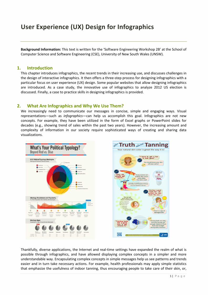
2. What Are Infographics and Why We Use Them? We increasingly need to communicate our messages in concise, simple and engaging ways. Visual representations—such as infographics—can help us accomplish this goal. Infographics are not new concepts. For example, they have been utilized in the form of Excel graphs or PowerPoint slides for decades (e.g., showing trend of sales within the past two years). However, the increasing amount and complexity of information in our society require sophisticated ways of creating and sharing data visualizations.
Thankfully, diverse applications, the Internet and real-time settings have expanded the realm of what is possible through infographics, and have allowed displaying complex concepts in a simpler and more understandable way. Encapsulating complex concepts in simple messages help us see patterns and trends easier and in turn take necessary actions. For example, health professionals may apply simple statistics that emphasize the usefulness of indoor tanning, thus encouraging people to take care of their skin, or,

2 | P a g e
infographics can help politicians understand the presence and popularity of diverse political views across different age groups.
In addition to these, infographics help businesses by building Internet traffic and links and by raising brand awareness. For example, people can see an interesting infographic, click on the link, and be directed to the main business website. The following link lists and analyzes 83 informative and inspiring infographics. Each infographic takes a clever combination of words and pictures to tell a story quickly, concisely, and in an entertaining fashion, see the link: http://www.creativebloq.com/graphic-design-tips/information-graphics-1232836.
3. Infographics’ Trends Thanks to social media and data visualization tools, infographics can pull out disperse and complex information from the web, analyze them, give them meaning, and make them available and sharable for viewers. For example, companies can use infographics in real-time settings to monitor, track, and measure their social presences and brand sentiment on the web. For instance, during London Olympics, Unruly's Brand Tracker infographic pitted the official sponsors against each other in a race for which online video ads from the sponsors generated the most social media buzz. Using the Unruly’s Viral Video Chart, it tracked the total number of shares across Facebook, Twitter and the blogosphere for each brand (See Figure below).
In addition, the need for interactive infographics is on rise. For example, stale financial information can become dynamic to improve users’ understanding of financial trends through interacting with the infographic, see the link: http://www.avelo.com/blog/bid/308977/Four-Trends-for-the-Future-of-Financial-Advice-INFOGRAPHIC.
Interactive infographics are often Flash-based need designers and developers to utilize analytics and data visualization tools to feed infographics and visualize multiple layers of data in a single interface, while providing a dynamic user experience for the viewer (e.g., http://vimeo.com/channels/staffpicks/22655744). They are often narrative-based and use a combination of illustration, data visualization and text to inform the viewer about a particular topic. Unlike static infographics that are easy to build, host, share and view (e.g., examples in the previous figures), interactive infographics bring the heart of the site’s content to the forefront and allow users to be hands-on. While this can be a rewarding experience for users and has profound social and business implications, designing and implementing a good user-interface adds additional challenges that need careful attention and management. The following section provides a three-step process for designing infographics, which is based on the fundamental steps of web design. See also: http://www.fastcodesign.com/1665029/3-trends-that-will-define-the-future-of-infographics.
3 | P a g e
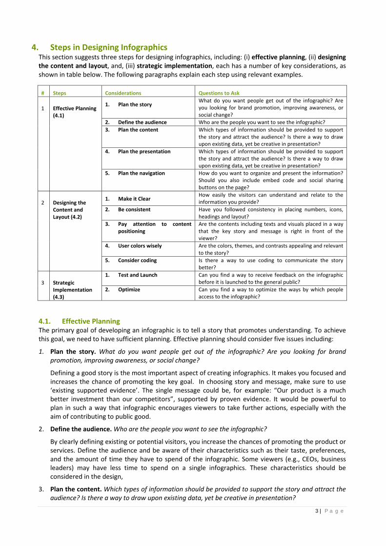
4. Steps in Designing Infographics This section suggests three steps for designing infographics, including: (i) effective planning, (ii) designing the content and layout, and, (iii) strategic implementation, each has a number of key considerations, as shown in table below. The following paragraphs explain each step using relevant examples.
# Steps Considerations Questions to Ask
1 Effective Planning (4.1)
1. Plan the story What do you want people get out of the infographic? Are you looking for brand promotion, improving awareness, or social change?
2. Define the audience Who are the people you want to see the infographic? 3. Plan the content Which types of information should be provided to support
the story and attract the audience? Is there a way to draw upon existing data, yet be creative in presentation?
4. Plan the presentation Which types of information should be provided to support the story and attract the audience? Is there a way to draw upon existing data, yet be creative in presentation?
5. Plan the navigation How do you want to organize and present the information? Should you also include embed code and social sharing buttons on the page?
2 Designing the Content and Layout (4.2)
1. Make it Clear How easily the visitors can understand and relate to the information you provide?
2. Be consistent Have you followed consistency in placing numbers, icons, headings and layout?
3. Pay attention to content positioning
Are the contents including texts and visuals placed in a way that the key story and message is right in front of the viewer?
4. User colors wisely Are the colors, themes, and contrasts appealing and relevant to the story?
5. Consider coding Is there a way to use coding to communicate the story better?
3 Strategic Implementation (4.3)
1. Test and Launch Can you find a way to receive feedback on the infographic before it is launched to the general public?
2. Optimize Can you find a way to optimize the ways by which people access to the infographic?
4.1. Effective Planning The primary goal of developing an infographic is to tell a story that promotes understanding. To achieve this goal, we need to have sufficient planning. Effective planning should consider five issues including:
1. Plan the story. What do you want people get out of the infographic? Are you looking for brand promotion, improving awareness, or social change?
Defining a good story is the most important aspect of creating infographics. It makes you focused and increases the chance of promoting the key goal. In choosing story and message, make sure to use ‘existing supported evidence’. The single message could be, for example: “Our product is a much better investment than our competitors”, supported by proven evidence. It would be powerful to plan in such a way that infographic encourages viewers to take further actions, especially with the aim of contributing to public good.
2. Define the audience. Who are the people you want to see the infographic?
By clearly defining existing or potential visitors, you increase the chances of promoting the product or services. Define the audience and be aware of their characteristics such as their taste, preferences, and the amount of time they have to spend of the infographic. Some viewers (e.g., CEOs, business leaders) may have less time to spend on a single infographics. These characteristics should be considered in the design,
3. Plan the content. Which types of information should be provided to support the story and attract the audience? Is there a way to draw upon existing data, yet be creative in presentation?

4 | P a g e
Content communicates the message of infographic. It may include time frames (timelines, calendars, clocks, etc.), statistics (numbers, data), visuals such as charts and graphs, and, facts (our realization from the data offered to support the story and the message). For example, an infographic may contain various graphs and facts to tell the viewer about results of a survey on people’s thoughts about climate change.
4. Plan the presentation. How do you want to organize and present the information? Should you also include embed code and social sharing buttons on the page?
Topography (text), graphics, video, audio and animation are different types of media that can be used for presenting the content. Smart graphics combine different types of media to enhance user experience, reduce users’ memory load, and let the key message to be heard.
5. Plan the navigation. How do you want people to navigate and interact with the infographic? How quickly can visitors understand the key message? Navigation guides the viewer through the content. Good navigation allows the viewer to understand the message faster and easier, rather than being overwhelmed with graphs, numbers and words. There are many styles of navigation such as horizontal, vertical, tabbed, and grid. You may consider studying material on website navigation (e.g., https://blog.kissmetrics.com/common-website-navigation-mistakes/)
4.2. Designing the Content and Layout In Design, you have the opportunity to manifest what you planned to do in the planning. You choose the design elements for conveying the message. Easy navigation, clean lines and a simple layout make it easy for visitors to understand and interact with infographic. Some design considerations include:
1. Make it clear. How easily the visitors can understand and relate to the information you provide?
o Try to describe the infographic with few words. The text and writing style should be easy to understand, browser friendly, and appropriate for the target audience. It may allow visitors to print or share it easily. The infographic below visualizes a century of motoring in America in an easy and understandable manner.
o Ensure to make the infographic and its components ‘purposeful’, ‘brief’, and ‘simple’. o Graphics and charts are powerful ways for structuring data and communicating the message. Yet,
use them only when they enhance understanding of data. Each graphic should communicate the message (as planned in the Plan the story). You may check this by removing each visual to see if the message is still told.
o Graphs and charts can be beautiful, but never choose style over story in this case. o Consider the audience and their taste in choosing the type of visuals. For example, pie charts may be
more appealing to people in industry, whereas researchers may prefer seeing bar charts. o In using chart, be responsible and make sure to choose the right chart (e.g., pie chart, line chart, bar
chart, etc.) Experiment with different possibilities and see which one would be simpler and more intuitive for viewers to grasp the message.
o Make sure that the conclusions are drawn from data, and not the other way around.

5 | P a g e
2. Be consistent (within the infographic and also with common trends). Consistency makes it easier to understand and learn from infographic. This can include consistency in placing numbers, icons, headings and layout. For example, the following infographic about the evolution of apple starts from 1976 in the left bottom of the page goes up till 1991, and then goes down to 2009 in the right bottom of the page. This is not consistent with the common form of timelines that start in the bottom left corner of a page and then go up. However, the infographic that compares mobile phones, tablets and computers, is a good example of having consistency in presenting information and graphics.

6 | P a g e
3. Pay attention to content positioning. Contents, including texts and visuals, should be placed in a way
that the key story and message is right in front of the viewer. Think about the message & audience, and position the content accordingly. Below is a powerful and bold example of content positioning.
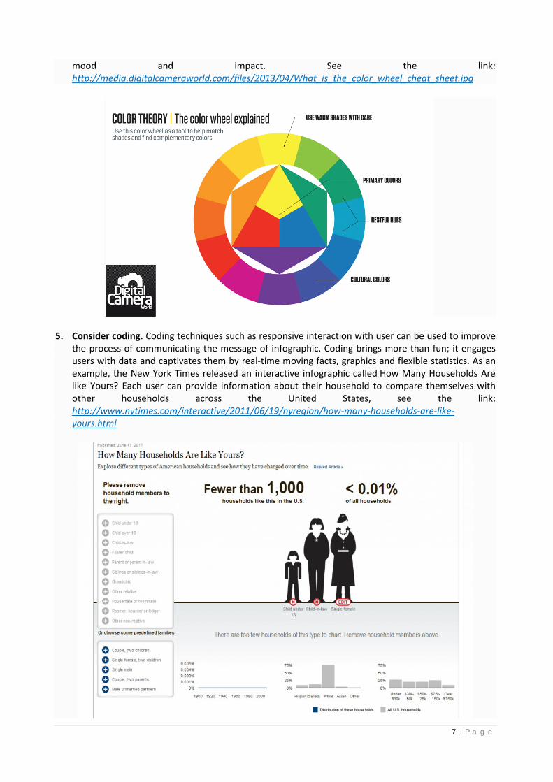
4. Use colors wisely. Choosing a color pallet, which is appealing to visitors, is important. For example, some designers use colors opposite each other on the colour wheel to improve awareness and influence. In short, be mindful in choosing colors, fonts, contrasts and themes as they influence the
7 | P a g e
mood and impact. See the link: http://media.digitalcameraworld.com/files/2013/04/What_is_the_color_wheel_cheat_sheet.jpg
5. Consider coding. Coding techniques such as responsive interaction with user can be used to improve the process of communicating the message of infographic. Coding brings more than fun; it engages users with data and captivates them by real-time moving facts, graphics and flexible statistics. As an example, the New York Times released an interactive infographic called How Many Households Are like Yours? Each user can provide information about their household to compare themselves with other households across the United States, see the link: http://www.nytimes.com/interactive/2011/06/19/nyregion/how-many-households-are-like-yours.html

8 | P a g e
4.3. Strategic Implementation Implementation is the final step in which you will see, test, and optimize the previous efforts in planning for and designing the infographic. It includes testing and launching and optimization, as described below.
1. Test and launch. You should find a chance receive feedback on the infographic before it is launched to the general public. Testing provides an opportunity to check user interface functions as intended, and allows making possible changes to enhance the final product. It is good to start testing early and do it often. You can learn from watching others interacting with the infographics. Even sitting and watching others’ experiences is a valuable practice.
2. Optimize. Infographics are made to inspire some type of change. It is important to make sure that the infographic is listed correctly with search engines and optimized. You can consider including a copy-and-paste embed code, adding buttons for social media sharing (e.g. Facebook, Google+, Twitter), and submitting it to article-sharing sites (e.g. Digg, Stumbleupon, Reddit), see more at: http://www.dbswebsite.com/blog/2011/09/07/how-to-market-an-infographic/
5. Some Useful Websites for Infographic Design Steps A number of websites allow user to create infographics. Some of the most popular existing services are: Infogr.am, InfoActive, Piktochart, Easel.ly, and Many Eyes. These websites are designed to help non-designers create their own Infographics easily. Most of their services are free unless the users upgrade their account for better customization. Read more at: http://readwrite.com/2013/06/10/5-tools-for-creating-your-own-infographics#awesm=~og3nLuiAahQIzC
o http://piktochart.com o http://infogr.am o http://infoactive.co o http://www.easel.ly o http://www-958.ibm.com/software/analytics/labs/manyeyes/#home
6. 202 US Election: A Case In November 2012, despite a relatively close popular vote, Obama became the president of the United States. TV news showed that states went from white to red (Obama) or blue (Romney). An interesting infographics analyzed data from social networks, in particular Twitter, to analyze the impact of social media on election results, see the link: http://orionadvert.com/2012/12/03/2012-election-infographic/
Morteza Karimi, the designer, created a spreadsheet of keywords that each candidate used in their Twitter and then graphed them all on a timeline from Oct 23 to Nov 8. The infographic shows that right around the election night, Obama sites inundated Twitter with messages to “vote” and reminders of the “polls. On the other side, Romney’ side pushed topics like Sandy and FEMA. One conclusion out of this infographic was that: actionable words are a lot more effective on Twitter than name drops. See more at: http://orionadvert.com/2012/12/03/2012-election-infographic/

9 | P a g e
7. Practice
Statistics on mobile usage and adoption can inform the mobile marketing strategy of companies. The infographic shows the global popularity of different digital devices. It is based on data from Global Web Index in 2015, see the link: http://www.smartinsights.com/mobile-marketing/mobile-marketing-analytics/mobile-marketing-statistics/.
This infographic shows the popularity of smartphone ownership and emerging mobile devices like Smart watches. The data suggests that majority of consumers are "multiscreening" and thus they access retail sites from different platforms such as mobile or desktop. Therefore, consistent experiences across devices must be deployed. Consider the previous discussions in planning, design and implementation, and suggest improvements to this infographic.