usage of nasta’liq in the modern · pdf fileusage of nasta’liq in the modern...
TRANSCRIPT

Typography in Publication Design
Usage of Nasta’liq in the Modern Publications
Farzan Kermaninejad, Indian Institute of Technology Bombay, India, [email protected]
Abstract: Nasta’liq is a beautiful calligraphic and most widely used style of writing Farsi
(Persian)/Urdu using an adapted Arabic script that has 36 and in Urdu 39 characters as against 28 in
Arabic. In Nasta’liq, many character shapes have multiple instances. The shapes are context-
sensitive too – character shapes changing with changes in the preceding character or the succeeding
one. At times even the 3rd, 4th or 5th character may cause a similar change.
Farsi/Urdu typography has been a great challenge for the printing and publishing industry. Because
it is composed of complex and shifting letters, typesetting technology, based on separate letter.
In addition of illustrating the history of Nasta’liq printing, this paper discusses the complexity of
Nasta’liq and experiments the usage of Nasta’liq in modern publishing requirements. And it tries to
portrait the different efforts made in different countries.
Key words: Nasta’liq Font, cursiveness , ligature, Farsi typography, Urdu typography, Farsi
DTP, Urdu DTP.
1. Introduction
Creating coexistence between traditional elements and modern technology is one of the
major challenges of the graphic designers today. Nasta’liq is the core script of the
traditional Persian writing and equally important in the areas under its cultural influence.
A single script with its basic character shapes is adapted for writing in multiple languages
e.g. Roman script for English and French while Arabic for Persian, Urdu etc.
In Iran Nasta’liq is used as a national writing system for most of the nonreligious
manuscripts and documents for at least the past five centuries. In Pakistan and
Bangladesh, almost everything in Urdu is written in Nasta’liq, concentrating the greater
part of Nasta’liq usage in the world. In Hyderabad, Lucknow, and other cities in India with
large Urdu-speaking populations, Nasta’liq is very popular too.

Although there are many styles for writing Perso-Arabic script, there are two common
styles: Naskh (the linear style used typically) and Nasta’liq (has characters within a word
placed at multiple levels). While in Arabic/Farsi most of the typefaces designed on Naskh
base, Nasta’liq is widely used for writing Urdu and in Iran it’s the favorite style of writing
as its one of the national identities. Nasta’liq is one of the most beautiful and aesthetic
styles of Islamic Calligraphy.
Table 1. List of languages using the Perso-Arabic script
Lots of languages rely on Nasta’liq. The main ones are: Farsi, Azeri, Kurdish and Turkmen
in Iran; Dari, Baluchi and Uzbek in Afghanistan; Punjabi, Urdu and Saraiki in Pakistan;

Urdu, Rekhta, Kashmiri and Sindhi in India, and the Turkic Uyghur language of the Chinese
province of Xinjiang. Beside the above list, nastaliq has also been beloved by Ottoman and
Arab calligraphers. In general, all Perso-Arabic languages partly use Nastaliq as one style
of writing. There is a list of languages using the Perso-Arabic script in table 1.
2. Nasta’liq properties
Farsi and Urdu use an extended Arabic adapted script; Farsi has 36 and Urdu has 39
characters while Arabic has 28 only. Each character then has 2-4 different shapes
depending upon its position in the word; initial, medial or final. When a character shape is
written alone, it is called an isolated character shape. Each of these initial, medial and
final character shapes can have multiple instances, the character shape changing
depending upon the preceding or the succeeding character. This characteristic of having
multiple instances of these character shapes is called context sensitivity. A complete
language script comprises an alphabet and style of writing.
Figure.1 Farsi Alphabet with Nasta’liq
Figure.2 Farsi Numerals with Nasta’liq
2.1 Properties of Nasta’liq Fonts
The complexity of Nasta’liq makes it one of the world's most challenging writing styles.
Nasta’liq has a strong contextual dependency. Nasta’liq is a cursive script, featuring
elongated horizontal strokes and exaggerated rounded forms. The diacritical marks were

casually placed, and the lines were flowing rather than straight. The overlapping shapes
make the Noqtah (rhombic dots) and kerning problem even harder.
Nasta’liq script has the following characteristics:
• Text is written from right to left while Numbers are written from left to right
• Nasta’liq script is inherently cursive in nature
• The shapes of individual letters change forms depending on whether the letter is
alone, at the beginning of a word, the middle of a word or at the end.
• A ligature is formed by joining two or more characters cursively in a free flow form
• A ligature is not necessarily a complete word, rather in most of the cases a part of a
word, sometimes referred to as a sub-word
• A word in Nasta’liq is composed of ligatures and isolated characters
• Word forming in Nasta’liq is context sensitive i.e. characters in a ligature change shape
depending upon their position and preceding or succeeding characters
• Kerning in Nastaliq text are designed in a way to remove extra interword space which
will give a calligraphic style
• Ability of Kashida Insertion for extended letter forms
2.2 Problems of Nasta’liq Font
Nastaliq, with its inherent cursive nature, makes a complex script. A single word in the
script can comprise several ligatures formed in turn by combining several characters
cursively joined together, along with isolated characters.
Ligatures in Nasta’liq are unique combinations or units of characters that change their
shape according to their position within the unit. An initial “BA”, for example, which is
the second character in the alphabet, is quite different from medial, final or an isolated
one. Added to this is the dependence of each character on the preceding or succeeding
characters it joins with. A character might take more than 20 different shapes according
to the character it is joining with. Sometimes even the 3rd, 4th or 5th preceding or
succeeding character may initiate a change in shapes.

Figure.3 Four forms of “Ba”- 1) beginning 2) middle 3) end 4) isolated
Figure.4 Some of the different shapes of beginning of “Ba”, each shape has change according to the
next character.
Several Nasta’liq characters (17 out of 36 in Farsi and 39 in Urdu) are differentiated by the
presence of dots placed over, below or within them. Therefore, position/number of
rhombic dots are very important. Positions of dots and diacritical mark have a great role in
aesthetic aspect of Nasta’liq too.
Figure.5 Similar letters with different position of dots and diacritical mark

Figure.6 Some of different shape of "Ha" (34th letters of Farsi Alphabet)
Figure.7 Some joining of letters in Nasta’liq

2.3 Tradition of Nasta’liq
Nasta’liq style was developed in Iran in the 14th century. Soon it got spread to large
territories of Islamic world from Ottoman Empire and North Africa in east to India and the
West of China in west and central Asia in North. The Mughal Empire used Persian as their
courtlanguage. During that time, Nasta’liq came into a widespread use in South Asia. The
influence remained to this day. Nasta’liq is a common style of several scripts of Indian
Muslims. In Pakistan, almost everything is written in nastaliq script.
Figure.8 The richly illuminated double frontispiece of the Shahnameh in the Baysonqori manuscript,
copied by Ja'far Baysonqori in a Nasta'liq script.
3. Nasta’liq in Publications
Farsi/Urdu typography has been a great challenge for the printing and publishing industry.
The Perso-Arabic publishing and computing world has long been looking for a new font
especially in the case of Nasta’liq. A font that is not only aesthetically fine but technically
supportive.
Today many Nastaliq typefaces are available in the market. But they have a lot of
shortcomings. Example of such fonts and software could be Dehalvi-type Nastaliq, Lahori
Nastaliq and Faiz Nastaliq fonts as well as Inpage software from India, Irannastaliq font as
well as chlipa, kelk and Mir Emad software from Iran.
3.1 Typesetting
Nasta’liq Typography first started with the attempts to develop a metallic type for the
script, but all such efforts failed. Fort William College developed a Nasta’liq Type, which

was not close enough to Nasta’liq and hence never used other than by the college library
to publish its own books. The creation of introducing the first printing press in India also
goes to John Borthwick Gilchrist (1759-1841) a Scottish surgeon and Indologist. He was
head of the Fort William College, and professor of Persian and Hindi in early 19 century.
All Urdu works of the Fort William College were printed in Nasta’liq script for the first
time. State of Hyderabad in India also attempted to develop a Nasta’liq Typewriter but
this attempt miserably failed and the file was closed with the phrase “Preparation of
Nasta’liq on commercial basis is impossible”. Basically, in order to develop such a metal
type, thousands of pieces would be required.
Figure.9 Inshā_yi_Harkaran on of the first book printed by Nasta’liq typesetting in Kolkata1781
Similar efforts were made in Egypt too. The metallic types were not close enough to
Nasta’liq and hence never used other than the creators who use to publish their own books
or newspapers; therefore all of those were left immature.
The earliest books printed in Urdu type were either in Persian or partly in Urdu. Some
English newspapers in Kolkata were using Nasta’liq types in the eighth and ninth decades
of the 18th century. The popularity of Urdu type soon spread to England also, where
Haileybury College.
Today, according to the mentioned Nasta’liq features, all of the Farsi metallic types were
designed on the base of Naskh style because of its simple structure.
3.2 Lithography
In the case of Persian/Urdu printing, lithography method or planographic printmaking
technic was a good alternative for typesetting. This method invented at the end of the

18th century. Nasta'liq type did not acquire popularity and was replaced by the litho system
of printing in which calligraphed matter is transferred on to a flat stone from which it is
printed off. While Nasta'liq typing was difficult and costly, calligraphists were easily
available. In addition to the superior aesthetic appeal of the Nasta'liq style of calligraphy
over the Naskh style, it was also more convenient and practical to adopt in litho printing.
The overriding consideration in switching over to calligraphy was, however, the high cost
of books printed in Nasta’liq type. Consequently, there have been very few champions of
Nasta’liq type since the establishment of the first litho press in Delhi around 1835.
For the aim of keeping the rich tradition of Persian bookmaking and employ the elegance
Nasta’liq, publishers used the lithography technic in most of the Farsi published materials
such as books and newspapers in Iran and India during the 19th century. In the process of
lithography which its impressions were taken from a stone that has been treated with an
oily substance and then coated with ink, calligraphers were a part of these printings
technic. This method use to take a lot of time and was useful for a few number of copies.
Figure.10 An old sample lithography printing of Persian book in Iran by Nasta’liq in 19 C
In Iran, although Iranian Armenians began printing with movable types in 1638 and it was
the first long lasting printing enterprise in the Middle East but lithographic printing press
was brought from Russia (Tiflis in Georgia,) to Iran in 1821 and the first Persian books were
printed in the early decades of the 19th century.
The first printing press of Persian language in Iran with the necessary printing machinery,
equipment and materials was established by Mirza Mohammad Saleh Shirazi. He was

graduated from university in England. Lithography, introduced to Persia in the early
decades of the 19th century. The first book published by lito was Holy Qur’an in 1834 and
the first book by Nasta’liq style was printed in 1843 too. He returned to Iran in 1855 and
brought Lithography technic which made printing prevalence in Iran and various
newspapers and books were published by this method.
3.3 DTP Software
Calligraphy is traditionally a pen-to-paper craft but even the fluidity of the pen can be
replicated on a computer. Using a computer to create calligraphy can prove to be more
efficient for calligraphers and graphic designers of all levels. Moreover, they keep the
possibility to edit and modify it.
The computer facilitates the shape variations per letter to open up new creative
possibilities for advertisements, front pages, greeting and business cards. It brings the
possibility to create sophisticated Arabic literary and academic books as well as shape
prose and poetry. Nasta’liq font is a ligature based typeface. The first step of preparing
Nasta’liq typeface is to find unique ligatures in Farsi (Persian) language as well as in Urdu
and Arabic.
We can find 12,000 unique ligatures in the first survey but with a rigorous search this
number increase to approximately 30,000, with repetitions. There are more than 3500
unique Qur’anic ligatures included in it too. While a normal Farsi font has 220 glyphs only.
Though the number of unique ligatures looks amazingly huge, it is not easy, first to find it
and then to sort out the unique ones. Typing these unique ligatures is equally tough. Many
books, magazines, newspapers and Holy Qur’an have to be typed.
After collecting unique ligatures, the second phase is to get the basic structure of the
ligatures written. This task must be done by a professional calligraphers. After that
technicians must transfer the handwriting works to digital characters. Then it passed on to
the font developing team for its final conclusion.
Modern Nasta’liq typography began in 1981 by The Monotype Corporation. Although this
was a ground-breaking solution employing over 20,000 ligatures (individually designed
character combinations) which provided the beautiful results, and allowed newspapers to
use digital typesetting instead of an army of calligraphers, it suffered from a variety of
problems. With the advent of desktop publishing, different solutions have been proposed
and implemented.
Presently there are couples of software and fonts capable of authentically handling Farsi
or Urdu Nasta’liq typesetting work. There are verities of typeface and DTP software which
are specifically developed for Farsi/Urdu publishing world. They have been used for a wide
variety of publishing requirements ranging from heavy duty page layouts for Newspapers,
Magazines, and Books etc. to some rather simple designs for brochures and greeting cards
in Iran, Afghanistan Pakistan, Bangladesh and India without a good relationship between
publishers, designers, software programmers, etc.
The new Nasta’liq writing software give the designers and publishers the most
indispensable high quality typesetting for printing works. They provide ligatures to shape
writing of different genre, poetry, prose, blank verse, etc. It is a delight of designers. It
will help them enhance the designs of the magazines, hoardings, posters, advertisement
and newspapers. The new Nasta’liq typeface and DTP lets the users to fully express the
enormous calligraphic variability in modern typography. Using those publishers can returns
to the sources of the Nasta’liq script traditions, providing today’s generation of high-tech
designers with greater freedom and offering them a real Farsi/Urdu-friendly design
environment.
Unfortunately, there is incomplete implementation of creating correct way of typing the
complicated joining and curves of word and combinations of them in a line or a page in all
of the software packages yet.
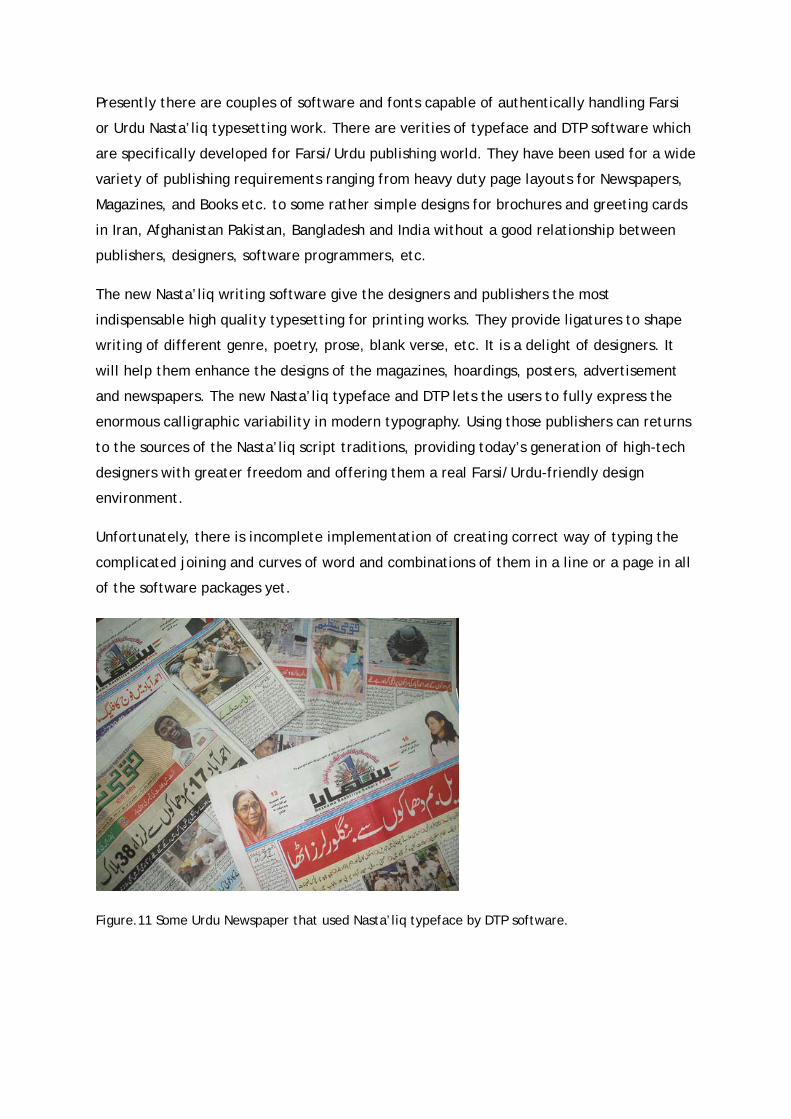
Figure.11 Some Urdu Newspaper that used Nasta’liq typeface by DTP software.

Figure.12 A part of a book by Modern Nasta’liq typeface with Farsi and Arabic text
Figure.13 Noori Nastaliq with Kashish
Figure.14 Alvi nastaleeq

Figure.15 Pak Urdu
Figure.16 Nafees Nastaleeq
Figure.17 Gedit interface

Tasmeem
Tasmeem is a set of Arabic enhancements for Adobe InDesign Middle eastern edition
developed by an international software company called WinSoft International which was
found initially in France. Tasmeem allows users to create typographically advanced text in
Arabic in the Middle Eastern and North African versions of InDesign, turning it into a
typesetting and design tool for Arabic. Tasmeem integrates Arabic and Perso Arabic
traditional calligraphy with modern typefaces.
Tasmeem 4 proposes a new collection of high-quality fonts such as Naskh, Emiri, Hasan
Hiba. Tasmeem fonts may only be used with Tasmeem. The Word Shaping presents all the
possible calligraphic alternatives for the selected letters of a word. Text Shaping of
Tasmeem also deals with the same calligraphic parameters as the Word Shaping, but
automates it for large amounts of text.
Distribution of shape alternates, dissimilation of the same letter through a variation,
Kashida distribution and frequency can be precisely controlled and applied on a long text,
just like a regular paragraph style. The Position Tuner feature allows dragging and
positioning a segment of a word with the mouse in normal, searchable text.
It intuitively adjust spacing, kerning and create calligraphic arrangements.
Moreover it lets select and colour vowels independently. Arabic Spacing also allows
adjusting space between words and space between word segments.
Figure.18 Tasmeem 4 interface, The Selection helper and word shaping

Figure.19 A handful of sample panes showing the Tasmeem Word Shaper at work
Figure.20 Sample of Nasta’liq typesetting by Tasmeem

InPage
InPage (commonly known as InPage Urdu) is an industry standard Page Making software for Urdu
and related languages, Since its introduction in 1994, InPage has been used for a wide variety of
publishing requirements ranging from heavy duty page layouts for Newspapers, Magazines, and
Books etc. to some rather simple designs for brochures and greeting cards. Some of the features
that made InPage popular with its users are Calligraphic style handling of Nasta’liq script using
Noori Nasta’liq font, Handling of all Perso-Arabic scripts correctly, Easy to use and Standardized MS
Windows interface with support for all MS Windows platforms.
To cater to different economic and user segments, InPage provides two versions; InPage Basic for
the end user and InPage Professional for the advance user. InPage Professional has all the features
of InPage basic plus some meant for the professional user. While Automatic Kerning for Nastaliq
script allows you to layout very compact and sually appealing Urdu text, other features like
rotation of text and objects indexing and table of contents, four color separation gives you more
power while designing and outputting pages of published text.
Figure.21 "Noori Nastaliq" designed by Kamal Mansour
Chalipa
Figure.22 Chalipa interface

Chalipa is a simple calligraphy software designed by an Iranian company called
Chalipasoftware. Chalipa version 1.1 was released in back 1997 and Chalipa version 2 was
released in year 2005. This programme is well known among the publishers for its accurate
fonts. Its friendly user interface and exports for both bitmap and vector files made it
special too.
With Chalipa you can edit a title, type a piece of text, poem or verse and watch its
information into callgraphaic font of Nasta’liq. Chalipa’s calligrapher is Amir Ahmad
Falsafi and provided by Chalipasoftware team. In this program those who are not very
familiar with calligraphy may not worry about their work being wrong as such thing is not
possible in Chalipa.
Figure.23 One page of Persian magazine with modern composition of Nasta’liq in title of article
Some of the main features of chalipa could be the ability to export your work in various
formats like .bmp, wmf, eps and ai; characters can be enlarged, and multiple works can
be done at the same time and there are guide lines available for users to edit their works
better.

Kelk
Figure.24 Kelk interface
Kelk is an application used to design Arabic, Persian and Urdu calligraphy. It is developed
by a famous Iranian software company called Sinasoft.
Kelk has a typical WYSIWYG interface, similar to most graphical applications. It has a
TextToolbox encapsulating the different tools that the functionality provides. Horizontal,
vertical, diagonal, circle and bezier guidelines are available. The various tools available to
manipulate text include the width, height, "other shape", kashida, join, separate and
rotate tool. Kelk also provides direct export to PostScript, PDF, and .ai
With Kelk, you can type a piece of text, poem or verse and watch its information into
Calligraphic fonts such as Nasta’liq and other calligraphic fonts. Kelk can type setting
different sorts of media like magazines, newspapers and books etc. and can be used for
special titles and artistic works. Another noticeable features of kelk could be manual
Kashidah Insertion.
With the power of Kelk, you can type your favorite piece of text, poem or verse and watch
its information into beautiful Callgraphaic fonts such as Nasta’liq, Naskh (Osman Taha),
Thuluth, Shekasteh, Tahriri, Naskh (Baghdadi), Divani Jali, Divani Khafi. It is also possible
to use normal windows fonts in combination with calligraphic fonts in artworks.

Figure.25 Kelk interface
Irannastaliq
Figure.26 Irannastaliq Font in Notepad
Irannastaliq is an advance font designed by Hussein Zahedi in an Iranian software company
called hamoonsoft with the official of support of the supreme council of information and
communication technology of Iran. The main advantage of this font is that once its added
to operating system’s fonts the user will be able to type Nasta’liq in any DTP software like
MS Office Word, Adobe InDesign, Adobe Photoshop and CorelDraw etc.
This is because the font completly supports the Unicode standards. Being Unicode means it
will act just like most of the famous fonts available like Arial or Times New Roman.

Iran Nasta’liq is 1048 Kb where as a normal Persian font is approximately 60 Kb and it
contains 4200 glyphs which again a normal Persian font would contain around 220 glyphs
only.
With irannastaliq and advance graphics software you can completely adjust the leading
between lines and kerning of the characters. Using this one can make a work quite similar
to the original hand written calligraphic works
Irannastaliq is very simple to use as its light and you don’t need any knowledge of any
particular program and you just have to simply type but at the same time one of its few
disadvantages is that unlike calligraphy software you cannot displace or extend the words
as it’s just a font. Another noticeable feature of Irannastaliq is that it’s completely free
and there is no need of purchasing anything.
4. Conclusions
Over the years typesetting of Nasta’liq was a difficult task. Initially there were attempts
on typesetting by movable letters but it was extremely difficult and there weren’t any
proper outcome. With lithography’s technic, there were better outcomes and closer to the
actual calligraphy works but because of the limited copies and development of technology
this system was put to a halt. In the past two decades as the DTPs improved, publisher got
attracted to Nasta’liq typesetting again.
Several software and typeface appeared in the case of electronic Publishing and DTP
during the last two decades in Iran, Pakistan and India. They separately offer some
solution that uses electronic Publishing as the typesetting engine for rendering Nasta’liq.
However they are not perfect yet but using them we are able to combine the rich tradition
and modern concepts today. All this efforts which were separately made in various places
was gathered together, it could have result in better outcome and more developments. All
available software still have lots of weaknesses and none had yet achieved the quality of
hand work of calligraphers but looking at the procedure of the improvement of this
industry there are hopes on them getting closer in future.
References
S. A. Sattar, S. Haque, M. K. Pathan and Q. Gee (2008) Implementation Challenges for Nastaliq
Character Recognition [Online DOC]. Available at eprints.ecs.soton.ac.uk/16510/1/ASattar_85.doc
Khorsheed, M.S., Clocksin, W.F. (1999) Structural Features of Cursive Arabic Script. In: 10th British
Machine Vision Conference, Nottingham, UK. pp. 422-431.

Sayyed Ḥasan Taqizāda, (1917) Kave, dowra-ye dovvom , No. 5 “Chapkhane wa ruzname dar Iran,”
pp. 11-41
Richard Steadman-Jones, Colonialism and grammatical representation: John Gilchrist and the
analysis of the Hindustani language in the late eighteenth and early nineteenth centuries
Publications of the Philological Society; 41, 2007 9781405161329
Datta, Amaresh. The Encyclopaedia Of Indian Literature (Volume Two) (Devraj To Jyoti). Volume 2,
Gilchrist, John Borthwick,
Iranica Encyclopedia, lithography-I in persia, Available at
http://www.iranicaonline.org/articles/lithography-i-in-persia