us 116943: using a graphical user interface (gui)-based
TRANSCRIPT

End User Computing NQF 3: SAQA ID 61591 - Handbook
Page 1 of 31
End User Computing NQF 3 - US 116943 Issue 3: 01-01-2020
US 116943: USING A GRAPHICAL USER INTERFACE (GUI)-BASED SPREADSHEET APPLICATION, ENHANCE THE FUNCTIONALITY AND APPLY GRAPH /CHARTS TO A
SPREADSHEET
Module 1: Create and edit a graph After completing this module, the learner will be able to create and edit a graph, by successfully completing the following:
Define the major graph types in terms of their purpose
Create a graph from a given data source
Resize a graph
Change the graph type
Edit a graph
Copy and move a graph based on given specifications
Delete a graph from a spreadsheet Create and edit a graph A picture is worth a thousand words." This is certainly true when you're presenting and explaining data. You can provide tables setting out the figures, and you can talk about numbers, percentages, and relationships forever. However, the chances are that your point will be lost if you rely on these alone. Put up a graph or a chart, and suddenly everything you're saying makes sense! Graphs or charts help people understand data quickly. Whether you want to make a comparison, show a relationship, or highlight a trend, they help your audience "see" what you are talking about. 1 What is a graph? A graph2 is a visual representation of a relationship between, but not restricted to, two variables. A graph generally takes the form of a one- or two-dimensional figure such as a scatterplot. Although, there are three-dimensional graphs available, they are usually considered too complex to understand easily. Knowing how to convey information graphically is important in presenting statistics. The following is a list of general rules to keep in mind when preparing graphs. A good graph:
accurately shows the facts grabs the reader's attention complements or demonstrates arguments presented in the text has a title and labels is simple and uncluttered shows data without altering the message of the data clearly shows any trends or differences in the data is visually accurate (i.e., if one chart value is 15 and another 30, then 30 should appear to be twice
the size of 15).
Why use graphs to present data? Graphs are quick and direct Graphs highlight the most important facts Graphs facilitate understanding of the data Graphs can convince readers Graphs can be easily remembered
1.1 Define the major graph types in terms of their purpose There are many different types of graphs that can be used to convey information. The major graph types in terms of their purpose includes:
bar graphs
1 Information from: http://en.wikipedia.org/wiki/Spreadsheet 2Information from: http://www.statcan.gc.ca/

End User Computing NQF 3: SAQA ID 61591 - Handbook
Page 2 of 31
End User Computing NQF 3 - US 116943 Issue 3: 01-01-2020
pie charts line graphs scatterplots histograms
Knowing what type of graph to use with what type of information is crucial. Depending on the nature of the data some graphs are more appropriate than others. Let’s look at some of these graphs in more detail. Bar Graph A bar graph may be either horizontal or vertical. The important point to note about bar graphs is their bar length or height—the greater their length or height, the greater their value. Bar graphs are one of the many techniques used to present data in a visual form so that the reader may readily recognize patterns or trends. Bar graphs usually present categorical and numeric variables grouped in class intervals. They consist of an axis and a series or labeled horizontal or vertical bars. The bars depict frequencies of different values of a variable or simply the different values themselves. The numbers on the x-axis of a bar graph or the y-axis of a column graph are called the scale. When developing bar graphs, draw a vertical or horizontal bar for each category or value. The height or length of the bar will represent the number of units or observations in that category (frequency) or simply the value of the variable. Select an arbitrary but consistent width for each bar as well. There are three types of graphs used to display time series data:
horizontal bar graphs, vertical bar graphs and line graphs.
All three of these types of graphs work well when you need to compare values. However, in general, data comparisons are best represented vertically. Example 1 – Vertical bar graphs Bar graphs should be used when you are showing segments of information. From the information given in the section on graph types, you will know that vertical bar graphs are particularly useful for time series data. The space for labels on the x-axis is small, but ideal for years, minutes, hours or months. At a glance you can see from the graph that the scales for both the x- and y-axis increase as they get farther away from the origin. The Figure below shows the number of police officers in Crimeville from 2004 to 2012.
In the figure you can see that the number of police officers decreased from 2004 to 2007, but started increasing again in 2008. The graph also makes it easy to compare or contrast the number of police officers for any combination of years. For example, in 2004 there were sixteen more police officers than in 2007. Pie charts A pie chart is a way of summarizing a set of categorical data or displaying the different values of a given variable (e.g., percentage distribution). This type of chart is a circle divided into a series of segments. Each segment represents a particular category. The area of each segment is the same proportion of a circle as the category is of the total data set. Pie charts usually show the component parts of a whole. Often you will see a segment of the drawing separated from the rest of the pie in order to emphasize an important piece of information.
The circle graph/pie chart above clearly shows that 90% of all students and faculty members at Park High School do want to have a uniform dress code and that only 10% of the school

End User Computing NQF 3: SAQA ID 61591 - Handbook
Page 3 of 31
End User Computing NQF 3 - US 116943 Issue 3: 01-01-2020
population would like to stop wearing uniforms to school. This point is clearly emphasized by its visual separation from the rest of the pie. The use of the pie chart is quite popular, as the circle provides a visual concept of the whole (100%). Circle graphs/pie charts are also one of the most commonly used charts because they are simple to use. Despite its popularity, circle graphs/pie charts should be used sparingly for two reasons. First, they are best used for displaying statistical information when there are no more than six components only—otherwise, the resulting picture will be too complex to understand. Second, pie charts are not useful when the values of each component are similar because it is difficult to see the differences between slice sizes. A pie chart uses percentages to compare information. Percentages are used because they are the easiest way to represent a whole. The whole is equal to 100%. Line Graphs Line graphs, especially useful in the fields of statistics and science, are more popular than all other graphs combined because their visual characteristics reveal data trends clearly and these graphs are easy to create. A line graph is a visual comparison of how two variables—shown on the x- and y-axes—are related or vary with each other. It shows related information by drawing a continuous line between all the points on a grid. Line graphs compare two variables: one is plotted along the x-axis (horizontal) and the other along the y-axis (vertical). The y-axis in a line graph usually indicates quantity (e.g., rand, litres) or percentage, while the horizontal x-axis often measures units of time. As a result, the line graph is often viewed as a time series graph. For example, if you wanted to graph the height of a baseball pitch over time, you could measure the time variable along the x-axis, and the height along the y-axis. Although they do not present specific data as well as tables do, line graphs are able to show relationships more clearly than tables do. Line graphs can also depict multiple series and hence are usually the best candidate for time series data and frequency distribution. Bar and column graphs and line graphs share a similar purpose. The column graph, however, reveals a change in magnitude, whereas the line graph is used to show a change in direction. In summary, line graphs
show specific values of data well reveal trends and relationships between data compare trends in different groups of a variable
Graphs can give a distorted image of the data. If inconsistent scales on the axes of a line graph force data to appear in a certain way, then a graph can even reveal a trend that is entirely different from the one intended. This means that the intervals between adjacent points along the axis may be dissimilar, or that the same data charted in two graphs using different scales will appear different. Example – Plotting a trend over time The next figure shows one obvious trend, the fluctuation in the labour force from January to July. The number of workers at Park high school who are members of the labour force is scaled using intervals on the y-axis, while the time variable is plotted on the x-axis. The number of workers participating in the labour force was 252 in January, 252 in February, 255 in March, 256 in April, 282 in May, 290 in June and 319 in July. When examined further, the graph indicates that the labour force participation of these students was at a plateau for the first four months covered by the graph (January to April), and for the next three months (May to July) the number increased steadily.

End User Computing NQF 3: SAQA ID 61591 - Handbook
Page 4 of 31
End User Computing NQF 3 - US 116943 Issue 3: 01-01-2020
1.2 Create a graph from a given data source Before you create tour graph, you will need to collect the data that you want to represent in this graph. Your given data source will help you make a decision on what type of chart you will need to create. In this next section we will provide you with the steps you need to be able to create graphs yourself. 1.2.1 Learn about charts Charts are used to display series of numeric data in a graphical format to make it easier to understand large quantities of data and the relationship between different series of data. To create a chart in Excel, you start by entering the numeric data for the chart on a worksheet. Then you can plot that data into a chart by selecting the chart type that you want to use on the Insert tab, in the Charts group.
1. Worksheet data 2. Chart created from worksheet data
Excel supports many types of charts to help you display data in ways that are meaningful to your audience. When you create a chart or change an existing chart, you can select from a variety of chart types (such as a column chart or a pie chart) and their subtypes (such as a stacked column chart or a pie in 3-D chart). You can also create a combination chart by using more than one chart type in your chart.
Example of a combination chart that uses a column and line chart type. We will now demonstrate how to create a Pie graph/chart and a Column graph/chart in detail. 1.2.2 Create a Pie graph / chart Pie charts, or circle graphs as they are sometimes called, are used to show percentages. The circle of pie charts represents 100%. The circle is subdivided into slices representing data values. The size of each slice shows what part of the 100% it represents.
Entering the Chart Data
Enter the Chart Data
The first step in creating a pie chart is to enter the data into the worksheet. When entering the data, keep these rules in mind:
1. Don't leave blank rows or columns when entering your data. 2. Enter your data in columns.
Angel Cups 15 500.00R
Triple Chocolate 27 589.00R
Creamy Dreams 24 980.00R
Vanilla Blast 14 768.00R
Cup Cake Heaven Sales 2012

End User Computing NQF 3: SAQA ID 61591 - Handbook
Page 5 of 31
End User Computing NQF 3 - US 116943 Issue 3: 01-01-2020
When laying out your spreadsheet, list the names describing the data in one column and, to the right of that, the data itself.
3. A pie chart is a percentage chart, so only one series of data will be used in the chart. If there is more than one column of data, try to list the data to be used in the chart next to the column containing the list of names in order to simplify creating the chart.
Select the Pie Chart Data
Two Options for Selecting the Chart Data Using the mouse
1. Drag select with the mouse button to highlight the cells containing the data to be included in the pie chart.
Using the keyboard 1. Click on the top left of the pie charts’ data. 2. Hold down the SHIFT key on the keyboard. 3. Use the arrow keys on the keyboard to select the data to be included in the pie chart.
Selecting a Pie Chart Type
1. Click on the Insert ribbon tab. 2. Click on a chart category to open the drop down list of
available chart types. (Hovering your mouse pointer over a chart type will bring up a description of the chart type).
3. Click on a chart type to select it. fiance
The basic Pie Chart
Formatting options for the pie chart When you click on a chart, three tabs - the Design, Layout, and Format tabs are added to the ribbon under the title of Chart Tools.
Choosing a style for the Pie chart
1. Click on the pie chart. 2. Click on the Design tab. 3. Choose any of the Chart Styles

End User Computing NQF 3: SAQA ID 61591 - Handbook
Page 6 of 31
End User Computing NQF 3 - US 116943 Issue 3: 01-01-2020
Exploding a piece of the pie chart Exploding a piece of pie out from the rest of the chart is done to emphasize that section.
1. Click once on the pie chart to highlight it. 2. Click once on the slice of the pie chart that you want to explode to select just that piece of the chart. 3. Click and drag the slice out from the pie chart to explode it.
Adding a title to the chart 1. Click on the Layout tab. 2. Click on Chart Title under the Labels section. 3. Select the third option - Above Chart. 4. Type in the title
Remove the legend 1. Choose Layout > Legend > None.
Adding data labels to the chart
1. Choose Layout > Data Labels > Best Fit to add data labels. 2. Choose Layout > Data Labels > More Data Label Options to bring up the
Format Data Labels dialog box. 3. Remove the check marks from Value and Show Leader Lines under Label
Options in the right hand window. 4. Check off Category Name and Percentage under Label Options in the right
hand window.
Colouring the chart background
1. Click on the chart background. 2. Click on the Format ribbon tab. 3. Choose Shape Fill. Apply the formatting you like
1.2.3 Create a Column graph / chart Column graphs are most often used to show amounts or the number of times a value occurs. The amounts are displayed using a vertical bar or rectangle. The taller the column, the greater number of times the value occurs. Column charts make it easy to see the differences in the data being compared.
Enter the Chart Data The first step in creating a column chart is to enter the data into the worksheet. When entering the data, keep these rules in mind:
1. Don't leave blank rows or columns when entering your data. 2. Enter your data in columns.
When laying out your spreadsheet, list the names describing the data in one column and, to the right of that, the data itself. If there is more than one data series, list them one after the other in columns with the title for each data series at the top. Selecting a Column Chart Type
1. Click on the Insert ribbon tab. 2. Click on a chart category to open the drop down list of available chart
types. (Hovering your mouse pointer over a chart type will bring up a description of the chart type).
3. Click on a chart type to select it.

End User Computing NQF 3: SAQA ID 61591 - Handbook
Page 7 of 31
End User Computing NQF 3 - US 116943 Issue 3: 01-01-2020
Formatting the Column Chart
Chart Tools Ribbon When you click on a chart, three tabs - the Design, Layout, and Format tabs are added to the ribbon under the title of Chart Tools. Choosing a style for the column chart
1. Click on the column chart. 2. Click on the Design tab. 3. Choose the Style you want from the Chart Styles
Adding a title to the chart
1. Click on the Layout tab. 2. Click on Chart Title under the Labels section. 3. Select where you want the title 4. Type in the title
Colouring the chart background
1. Click on the chart background. 2. Click on the Shape Fill > Gradient > Linear Diagonal option. 3. Choose Shape Fill > Gradient > More Gradients to bring up
the Format Chart Area dialog box. 4. Choose Colour > Dark Blue, Text 2. 5. Click Close.
Changing the gridline colour
1. Click on the Layout tab. 2. Choose Gridlines > Primary Horizontal Gridlines > More Primary Horizontal Gridlines
Options to bring up the Format Major Gridlines dialog box. 3. Choose the options you prefer 4. Click Close.
Colouring the chart floor
1. Click on the chart background to select it. 2. Click on the Layout ribbon tab. 3. Choose Chart Elements > Floor to select the floor area of the chart. 4. Click on Format Selection to bring up the Format Floor dialog box. 5. Choose Fill > Solid Fill. Here you can add any colour to the . 6. Click Close.
Hiding the vertical axis
1. Choose Chart Elements > Vertical (Value) Axis to select the chart's vertical axis. 2. Click on Format Selection to bring up the Format Axis dialog box.

End User Computing NQF 3: SAQA ID 61591 - Handbook
Page 8 of 31
End User Computing NQF 3 - US 116943 Issue 3: 01-01-2020
3. Choose Line Colour > No Line. 4. Click Close.
Applying 3-d rotation to the chart
1. Choose Chart Elements > Chart Area to select the chart. 2. Click on Format Selection to bring up the Format Chart Area dialog box. 3. Choose 3-D Rotation in the left hand window. 4. In the right hand window, set the rotation to:
o X - 50 o Y - 20
1.2.4 Understand the elements of a chart A chart has many elements. Some of these elements are displayed by default, others can be added as needed. You can change the display of the chart elements by moving them to other locations in the chart, resizing them, or by changing the format. You can also remove chart elements that you do not want to display.
1. The chart area of the chart. 2. The plot area of the chart. 3. The data points of the data series that are plotted in the chart. 4. The horizontal (category) and vertical (value) axis along which the
data is plotted in the chart. 5. The legend of the chart. 6. A chart and axis title that you can use in the chart. 7. A data label that you can use to identify the details of a data point in a data series.
1.2.5 Modifying a basic chart to meet your needs After you create a chart, you can modify any one of its elements. For example, you might want to change the way that axes are displayed, add a chart title, move or hide the legend, or display additional chart elements. To modify a chart, you can do one or more of the following:
Change the display of chart axes You can specify the scale of axes and adjust the interval between the values or categories that are displayed. To make your chart easier to read, you can also add tick marks to an axis, and specify the interval at which they will appear.
Add titles and data labels to a chart To help clarify the information that appears in your chart, you can add a chart title, axis titles, and data labels.
Add a legend or data table You can show or hide a legend, change its location, or modify the legend entries. In some charts, you can also show a data table that displays the legend keys and the values that are presented in the chart.
Apply special options for each chart type Special lines (such as high-low lines and trendlines, bars (such as up-down bars and error bars), data markers, and other options are available for different chart types.
1.2.6 Applying a predefined chart layout and chart style for a professional look Instead of manually adding or changing chart elements or formatting the chart, you can quickly apply a predefined chart layout and chart style to your chart. Excel provides a variety of useful predefined layouts and styles. However, you can fine-tune a layout or style as needed by making manual changes to the layout and format of individual chart elements, such as the chart area, plot area, data series, or legend of the chart. When you apply a predefined chart layout, a specific set of chart elements (such as titles, a legend, a data table, or data labels) are displayed in a specific arrangement in your chart. You can select from a variety of layouts that are provided for each chart type. When you apply a predefined chart style, the chart is formatted based on the document theme that you have applied, so that your chart matches your organisations or your own theme coloursand theme effects. You cannot create your own chart layouts or styles, but you can create chart templates that include the chart layout and formatting that you want.

End User Computing NQF 3: SAQA ID 61591 - Handbook
Page 9 of 31
End User Computing NQF 3 - US 116943 Issue 3: 01-01-2020
1.2.7 Adding eye-catching formatting to a chart In addition to applying a predefined chart style, you can easily apply formatting to individual chart elements such as data markers, the chart area, the plot area, and the numbers and text in titles and labels to give your chart a custom, eye-catching look. You can apply specific shape styles and WordArt styles, and you can also format the shapes and text of chart elements manually. To add formatting, you can use one or more of the following:
Fill chart elements You can use colours, textures, pictures, and gradient fills to help draw attention to specific chart elements.
Change the outline of chart elements You can use colours, line styles, and line weights to emphasize chart elements.
Add special effects to chart elements You can apply special effects, such as shadow, reflection, glow, soft edges, bevel, and 3-D rotation to chart element shapes, which gives your chart a finished look.
Format text and numbers You can format text and numbers in titles, labels, and text boxes on a chart as you would text and numbers on a worksheet. To make text and numbers stand out, you can even apply WordArt styles.
1.3 Resize a graph To resize a chart, do one of the following:
Click the chart, and then drag the sizing handles to the size that you want. On the Format tab, in the Size group, enter the size in the Shape Height
and Shape Width box.
For more sizing options, on the Format tab, in the Size group, click to launch the Format Chart Area dialog box. On the Size tab, you can select options to size, rotate, or scale the chart. On the Properties tab, you can specify how you want the chart to move or size with the cells on the worksheet. 1.4 Change the graph type For most 2-D charts, you can change the chart type of the whole chart to give the chart a different look, or you can select a different chart type for any single data series, which turns the chart into a combination chart.
For bubble charts and all 3-D charts, you can only change the chart type of the whole chart. To complete this procedure, you must have an existing chart.
1. Do one of the following: To change the chart type of the whole chart, click the
chart area or plot area of the chart to display the chart tools.
You can also right-click the chart area or plot area, click Change Chart Type, and then continue with step 3.
To change the chart type of a data series, click that data series. You can change the chart type of only one data series at a time. To change the chart type of more than one data series in the chart, repeat the steps of this procedure for each data series that you want to change.
2. This displays the Chart Tools, adding the Design, Layout, and Format tabs. 4. On the Design tab, in the Type group, click Change Chart Type. 5. In the Change Chart Type dialog box, click a chart type that you want to use.
The first box shows a list of chart type categories, and the second box shows the available chart types for each chart type category. 1.5 Edit a graph You can add titles to an Excel 2013 chart to help describe its purpose. By default, titles are not added when you create a basic chart, but you can add them later manually. In addition to a main chart title that is generally displayed above a chart, you can add descriptive titles to the x-axis (category axis) and the y-axis (value axis).

End User Computing NQF 3: SAQA ID 61591 - Handbook
Page 10 of 31
End User Computing NQF 3 - US 116943 Issue 3: 01-01-2020
1. In a graph, click the chart element that you want to change, or do the following to select the chart element from a list of chart elements:
1. Click anywhere in the chart. This displays the Chart Tools, adding the Design, Layout, and Format tabs.
2. On the Format tab, in the Current Selection group, click the arrow next to the Chart Elements box, and then select the chart element that you want to format.
Instead of using the ribbon commands, you can also right-click a chart element, click Format <Chart Element> on the shortcut menu, and then continue with step 3.
2. On the Format tab, in the Current Selection group, click Format Selection. 3. In the Format <Chart Element> dialog box, click a category, and then select the formatting options
that you want. Depending on the selected chart element, different formatting options are available in this dialog box.
When you select different options in this dialog box, the changes are immediately applied to the selected chart element, making it easy to see the effects of the changes in you chart without closing the dialog box. However, because the changes are instantly applied, it is not possible to click Cancel in this dialog box. To remove changes, you must click Undo on the Quick Access Toolbar.
You can undo multiple changes that you made to one dialog box option as long as you did not make changes to another dialog box option in between.
You may want to move the dialog box so that you can see both the chart and the dialog box at the same time.
1.5.1 Edit the graph title If you have created a graph without a title, you can always add it afterwards Add an and edit chart title
1. Click anywhere in the chart to which you want to add a title. This displays the Chart Tools, adding the Design, Layout, and Format tabs.
2. On the Layout tab, in the Labels group, click Chart Title.
3. Click Centered Overlay Title or Above Chart. 4. In the Chart Title text box that appears in the chart, type the text that you want.
To insert a line break, click to place the pointer where you want to break the line, and then press ENTER. 5. To format the text, select it, and then click the formatting options that you want on the Mini toolbar.
You can also use the formatting buttons on the ribbon (Home tab, Font group). To format the whole title, you can right-click it, click Format Chart Title, and then select the formatting options that you want. 1.5.2 Add and Edit the axis titles
1. Click anywhere in the chart to which you want to add axis titles. This displays the Chart Tools, adding the Design, Layout, and Format tabs.
2. On the Layout tab, in the Labels group, click Axis Titles.
3. Do one or more of the following:
To add a title to a primary horizontal (category) axis, click Primary Horizontal Axis Title, and then click the option that you want.
If the chart has a secondary horizontal axis, you can also click Secondary Horizontal Axis Title. To add a title to primary vertical (value) axis, click Primary Vertical Axis Title, and then
click the option that you want. If the chart has a secondary vertical axis, you can also click Secondary Vertical Axis Title.

End User Computing NQF 3: SAQA ID 61591 - Handbook
Page 11 of 31
End User Computing NQF 3 - US 116943 Issue 3: 01-01-2020
To add a title to a depth (series) axis, click Depth Axis Title, and then click the option that you want.
This option is only available when the selected chart is a true 3-D chart, such as a 3-D column chart. 4. In the Axis Title text box that appears in the chart, type the text that you want.
To insert a line break, click to place the pointer where you want to break the line, and then press ENTER. 5. To format the text, select it, and then click the formatting options that you want on the Mini toolbar.
You can also use the formatting buttons on the ribbon (Home tab, Font group). To format the whole title, you can right-click it, click Format Axis Title, and then select the formatting options that you want.
If you switch to another chart type that does not support axis titles (such as a pie chart), the axis titles will no longer be displayed. The titles will be displayed again when you switch back to a chart type that does support axis titles.
Axis titles that are displayed for secondary axes will be lost when you switch to a chart type that does not display secondary axes.
1.5.3 Edit the data labels A data label provides additional information about a data marker, which represents a single data point or value that originates from a worksheet cell.
1. On a chart, do one of the following:
To add a data label to all data points of all data series, click the chart area.
To add a data label to all data points of a data series, click anywhere in the data series that you want to label. To add a data label to a single data point in a data series, click the data series that contains
the data point that you want to label, and then click the data point that you want to label. This displays the Chart Tools, adding the Design, Layout, and Format tabs.
2. On the Layout tab, in the Labels group, click Data Labels, and then click the display option that you want.
Depending on the chart type that you used, different data label options will be available. 1.5.4 Edit the background colour The chart area includes the entire chart and all its elements.
1. On a chart sheet or in an embedded chart, double-click the chart element that you want to change. 2. On the Patterns tab, do any of the following:
To specify a fill effect, click Fill Effects, and then select the options that you want on the Gradient, Texture, or Pattern tabs.
You can also fill a chart element with a picture. On the Picture tab, click Select Picture, double-click the picture that you want, and then click Insert. To clear a fill effect or picture and return the chart element to the default formatting, click Automatic under Area.
To change border and line styles, select the options that you want under Border. To clear all border formatting, click None.
Different chart elements have different options available under Border. For the chart area, for example, there are Shadow and Round corners check boxes that you can select.
To change colours, select the colour that you want under Area. To clear all colour formatting, click None.
1.5.5 Edit the line or bar colour You can fill a selected shape with a solid colour, gradient, picture, or texture. You cannot use shape fill to format lines in a chart (such as gridlines, axes, trendlines, or error bars).
1. On a chart, click the on the bar or line that you want to change, or do the following to select it from a list of chart elements:
2. On the Format tab, in the Shape Styles group, click Shape Fill.

End User Computing NQF 3: SAQA ID 61591 - Handbook
Page 12 of 31
End User Computing NQF 3 - US 116943 Issue 3: 01-01-2020
3. Do one of the following: To use a different fill colour, under Theme Colours or Standard Colours, click the colour that you
want to use. Before you apply a different colour, you can quickly preview how that colour affects the chart. When you point to colours that you may want to use, the selected chart element will be displayed in that colour on the chart.
To remove the colour from the selected chart element, click No Fill. To use a fill colour that is not available under Theme Colours or Standard Colours, click More
Fill Colours. In the Colours dialog box, specify the colour that you want to use on the Standard or Custom tab, and then click OK.
Custom fill colours that you create are added under Recent Colours so that you can use them again. To fill the shape with a picture, click Picture. In the Insert Picture dialog box, click the picture that
you want to use, and then click Insert. To use a gradient effect for the selected fill colour, click Gradient, and then under Variations, click the
gradient style that you want to use. For additional gradient styles, click More Gradients, and then in the Fill category, click the gradient options that you want to use.
To use a texture fill, click Texture, and then click the texture that you want to use. If you don't like the change that you made, you can undo it immediately. On the Quick Access Toolbar,
click Undo , or press CTRL+Z.
Apply a different shape outline You can change the colour, width, and line style of lines in a chart (such as gridlines, axes, trendlines, or error bars), or you can create custom borders for selected shapes (such as data markers, titles, data labels, or a legend).
1. On a chart, click the bar or line that you want to change, or do the following to select it from a list of chart elements:
2. On the Format tab, in the Shape Styles group, click Shape Outline.
3. Do one of the following: To use a different outline colour, under Theme Colours or Standard Colours, click the colour that
you want to use. To remove the outline colour from the selected chart element, click No Outline.
If the selected element is a line, the line will no longer be visible on the chart. To use an outline colour that is not available under Theme Colours or Standard Colours, click
More Outline Colours. In the Colours dialog box, specify the colour that you want to use on the Standard or Custom tab, and then click OK.
Custom outline colours that you create are added under Recent Colours so that you can use them again. To change the weight of a line or border, click Weight, and then click the line weight that you want
to use. For additional line style or border style options, click More Lines, and then click the line style or border style options that you want to use.
To use a dashed line or border, click Dashes, and then click the dash type that you want to use. For additional dash-type options, click More Lines, and then click the dash type that you want to use.
To add arrows to lines, click Arrows, and then click the arrow style that you want to use. You cannot use arrow styles for borders.

End User Computing NQF 3: SAQA ID 61591 - Handbook
Page 13 of 31
End User Computing NQF 3 - US 116943 Issue 3: 01-01-2020
For additional arrow style or border style options, click More Arrows, and then click the arrow setting that you want to use.
1.6 Copy and move a graph In Microsoft Office Excel, you can copy an existing chart to another worksheet or chart sheet, a different
workbook, or to another location on the same worksheet. To copy a chart in the same worksheet, you can drag the chart by using the mouse.
1.6.1 Copy and move a graph within a worksheet Copy a chart by using the mouse 1. Right-click the chart that you want to copy, and then drag it to the location that you want. 2. After you release the mouse, click Copy Here. 1.6.2 Copy and move a graph to a different worksheet 1. In Excel, select the chart that you want to copy.
2. On the Home tab, in the Clipboard group, click Copy .
Keyboard shortcut You can also press CTRL+C. 3. Click the worksheet where you want to paste the copied chart. To paste the copied chart in another workbook, open that workbook, and then click the
worksheet or chart sheet where you want to paste the copied chart. 4. On the Home tab, in the Clipboard group, click Paste. Keyboard shortcut You can also press CTRL+V.
5. If you paste a chart on a worksheet, click Paste Options next to the chart, and then do one of the following:
To paste the chart in its original format, click Keep Source Formatting. To paste the chart and format it by using the document theme that is applied to the presentation, click
Use Destination Theme. If you copied a chart from another program, different paste options will be available on the worksheet,
depending on the program that you copied from. 1.6.3 Copy and move a graph to a different spreadsheet file 1. In Excel, select the chart that you want to copy as a picture. 2. On the Home tab, in the Clipboard group, click Copy if you want to leave the original in
place or click Cut if you want to remove the original graph.
3. On a worksheet or chart sheet, click where you want to paste the picture. To paste the picture in a document of another program, open that document, and then use the
Paste commands that are available in that program.
4. On the Home tab, in the Clipboard group, click Paste . Keyboard shortcut You can also press CTRL+V. 1.7 Delete a graph from a spreadsheet Select the chart that you want to delete, and then press DELETE.
Class Activity 1: Create and edit a graph Please follow the instructions from the facilitator to complete the formative activity in your Learner Workbook
Module 2: Load data from an external data source After completing this module, the learner will be able to load data from an external data source to produce a given spreadsheet result, by successfully completing the following:
Check the external data file to ensure that the input into a spreadsheet will achieve the required results
Determine the format of the input file to ensure correct input into a spreadsheet
Copy the data into the spreadsheet
Ensure that the resulting spreadsheet is in accordance with the given spreadsheet result

End User Computing NQF 3: SAQA ID 61591 - Handbook
Page 14 of 31
End User Computing NQF 3 - US 116943 Issue 3: 01-01-2020
Load data from an external data source to produce a given spreadsheet result Data in an Excel workbook can come from two different locations. The data may be stored directly in the workbook, or it may be stored in an external data source, such as a text file or a database Microsoft Office Access and Microsoft Office Excel possess many similarities, which can make it difficult to decide which program you should use. For example, both programs can store large amounts of data, run powerful queries and analysis tools to slice and dice that data, and perform sophisticated calculations that return the data that you need. 2.1 Check the external data file to ensure that the input into a spreadsheet will achieve the required results At first glance, you may expect Word and Excel to work seamlessly together; however, you must consider that you are taking a document with text laid out in paragraphs and turning it into a field of cells. When users work in a word table they do not necessarily adhere to correct accounting formats. Your currency format is created when your regional settings for your operating system is configured. This means that if it is correctly set to South African settings, the system will recognise a space as a thousand separator and a full stop as the decimal symbol. It will also convert the R as a currency symbol. This rule applies to any countries currency settings. If these settings are incorrect, Excel will simply copy the information as text and you will be unable to manipulate the figures to do calculations. There is other ways to ensure that the input into a spreadsheet will achieve the required results. The same rule applies to dates and times. Verify the Regional Settings is correct. This is done by going to the Control Panel and choosing the Region settings
The following dialog box will appear.
End User Computing NQF 3: SAQA ID 61591 - Handbook
Page 15 of 31
End User Computing NQF 3 - US 116943 Issue 3: 01-01-2020
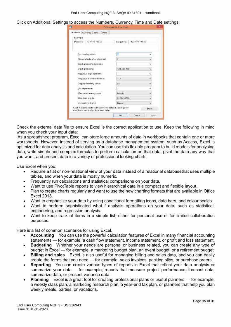
Click on Additional Settings to access the Numbers, Currency, Time and Date settings.
Check the external data file to ensure Excel is the correct application to use. Keep the following in mind when you check your input data: As a spreadsheet program, Excel can store large amounts of data in workbooks that contain one or more worksheets. However, instead of serving as a database management system, such as Access, Excel is optimized for data analysis and calculation. You can use this flexible program to build models for analysing data, write simple and complex formulas to perform calculation on that data, pivot the data any way that you want, and present data in a variety of professional looking charts. Use Excel when you:
Require a flat or non-relational view of your data instead of a relational databasethat uses multiple tables, and when your data is mostly numeric.
Frequently run calculations and statistical comparisons on your data. Want to use PivotTable reports to view hierarchical data in a compact and flexible layout. Plan to create charts regularly and want to use the new charting formats that are available in Office
Excel 2013. Want to emphasize your data by using conditional formatting icons, data bars, and colour scales. Want to perform sophisticated what-if analysis operations on your data, such as statistical,
engineering, and regression analysis. Want to keep track of items in a simple list, either for personal use or for limited collaboration
purposes. Here is a list of common scenarios for using Excel.
Accounting You can use the powerful calculation features of Excel in many financial accounting statements — for example, a cash flow statement, income statement, or profit and loss statement.
Budgeting Whether your needs are personal or business related, you can create any type of budget in Excel — for example, a marketing budget plan, an event budget, or a retirement budget.
Billing and sales Excel is also useful for managing billing and sales data, and you can easily create the forms that you need — for example, sales invoices, packing slips, or purchase orders.
Reporting You can create various types of reports in Excel that reflect your data analysis or summarize your data — for example, reports that measure project performance, forecast data, summarize data, or present variance data.
Planning Excel is a great tool for creating professional plans or useful planners — for example, a weekly class plan, a marketing research plan, a year-end tax plan, or planners that help you plan weekly meals, parties, or vacations.

End User Computing NQF 3: SAQA ID 61591 - Handbook
Page 16 of 31
End User Computing NQF 3 - US 116943 Issue 3: 01-01-2020
Tracking You can use Excel to keep track of data in a time sheet or list — for example, a time sheet for tracking work, or an inventory list that keeps track of equipment.
Using calendars Because of its grid-like nature, Excel lends itself well to creating any type of calendar — for example, an academic calendar to keep track of activities during the school year, or a fiscal year calendar to track business events and milestones.
2.2 Determine the format of the input file to ensure correct input into a spreadsheet The main benefit of connecting to external data is that you can periodically analyse this data without repeatedly copying the data to your workbook, which is an operation that can be time consuming and prone to error. After connecting to external data, you can also automatically refresh (or update) your Excel workbooks from the original data source whenever the data source is updated with new information. To bring external data into Excel, you need access to the data. If the external data source that you want to access is not on your local computer, you may need to contact the administrator of the database for a password, user permissions, or other connection information. If the data source is a database, make sure that the database is not opened in exclusive mode. If the data source is a text file or a spreadsheet, make sure that another user does not have it open for exclusive access. You can open a file that was created in another file format (in an earlier version of Microsoft Office Excel or in another program) by clicking the File Tab, and then clicking Open. You will be prompted to save it to an Office Excel 2013 format, unless you open a workbook that is shared. For files that were created in an earlier version of Excel, you have the option to keep the original format. The following tables will help you identify the tables from another source that Excel will be able to read and import. Excel formats
Format Extension Description
Excel Workbook .xlsx The default Office Excel 2007 XML-based file format. Cannot store Microsoft Visual Basic for Applications (VBA) macro code or Microsoft Office Excel 4.0 macro sheets (.xlm).
Excel Workbook (code)
.xlsm The Office Excel 2007 XML-based and macro-enabled file format. Stores VBA macro code or Excel 4.0 macro sheets (.xlm).
Excel Binary Workbook
.xlsb The Office Excel 2007 Binary file format (BIFF12).
Template .xltx The default Office Excel 2007 file format for an Excel template. Cannot store VBA macro code or Excel 4.0 macro sheets (.xlm).
Template (code) .xltm The Office Excel 2007 macro-enabled file format for an Excel template. Stores VBA macro code or Excel 4.0 macro sheets (.xlm).
Excel 97- Excel 2003 Workbook
.xls The Excel 97 - Excel 2003 Binary file format (BIFF8).
Excel 97- Excel 2003 Template
.xlt The Excel 97 - Excel 2003 Binary file format (BIFF8) for an Excel template.
Microsoft Excel 5.0/95 Workbook
.xls The Excel 5.0/95 Binary file format (BIFF5).
XML Spreadsheet 2003
.xml XML Spreadsheet 2003 file format (XMLSS).
XML Data .xml XML Data format.
Excel Add-In .xlam The Office Excel 2007 XML-based and macro-enabled Add-In, a supplemental program that is designed to run additional code. Supports the use of VBA projects and Excel 4.0 macro sheets (.xlm).
Excel 97-2003 Add-In
.xla The Excel 97-2003 Add-In, a supplemental program that is designed to run additional code. Supports the use of VBA projects.
Excel 4.0 Workbook .xlw An Excel 4.0 file format that saves only worksheets, chart sheets, and macro sheets. You can open a workbook in this file format in Office Excel 2007, but you cannot save an Excel file to this file format.
Text formats Format Extension Description
Formatted Text (Space-delimited)
.prn Lotus space-delimited format. Saves only the active sheet.
Text (Tab-delimited) .txt Saves a workbook as a tab-delimited text file for use on another Microsoft Windows operating system, and ensures that tab characters, line breaks, and other characters are interpreted correctly. Saves only the active sheet.

End User Computing NQF 3: SAQA ID 61591 - Handbook
Page 17 of 31
End User Computing NQF 3 - US 116943 Issue 3: 01-01-2020
Text (Macintosh) .txt Saves a workbook as a tab-delimited text file for use on the Macintosh operating system, and ensures that tab characters, line breaks, and other characters are interpreted correctly. Saves only the active sheet.
Text (MS-DOS) .txt Saves a workbook as a tab-delimited text file for use on the MS-DOS operating system, and ensures that tab characters, line breaks, and other characters are interpreted correctly. Saves only the active sheet.
Unicode Text .txt Saves a workbook as Unicode text, a character encoding standard that was developed by the Unicode Consortium.
CSV (comma delimited) .csv Saves a workbook as a comma-delimited text file for use on another Windows operating system, and ensures that tab characters, line breaks, and other characters are interpreted correctly. Saves only the active sheet.
CSV (Macintosh) .csv Saves a workbook as a comma-delimited text file for use on the Macintosh operating system, and ensures that tab characters, line breaks, and other characters are interpreted correctly. Saves only the active sheet.
CSV (MS-DOS) .csv Saves a workbook as a comma-delimited text file for use on the MS-DOS operating system, and ensures that tab characters, line breaks, and other characters are interpreted correctly. Saves only the active sheet.
DIF .dif Data Interchange Format. Saves only the active sheet.
SYLK .slk Symbolic Link Format. Saves only the active sheet.
Other formats
Format Extension Description
DBF 3, DBF 4 .dbf dBase III and IV. You can open these files formats in Excel, but you cannot save an Excel file to dBase format.
OpenDocument Spreadsheet
.ods OpenDocument Spreadsheet. You can save Excel 2007 files so they can be opened in spreadsheet applications that use the OpenDocument Spreadsheet format, such as Google Docs and OpenOffice.org Calc. You can also open spreadsheets in the .ods format in Excel 2007. Formatting might be lost when saving and opening .ods files.
Clipboard formats You can paste data from the Microsoft Office Clipboard into Excel by using the Paste or Paste Special command (Home tab, Clipboard group, Paste button) if the Office Clipboard data is in one of the following formats.
Format Extension Clipboard type identifiers
Picture .wmf or .emf Pictures in Windows Metafile Format (WMF) or Windows Enhanced Metafile Format (EMF). Note If you copy a Windows metafile picture from another program, Excel pastes the picture as an enhanced metafile.
Bitmap .bmp Pictures stored in Bitmap format (BMP).
Microsoft Excel file formats
.xls Binary file formats for Excel versions 5.0/95 (BIFF5), Excel 97-2003 (BIFF8), and Office Excel 2007 (BIFF12).
SYLK .slk Symbolic Link Format.
DIF .dif Data Interchange Format.
Text (tab-delimited) .txt Tab-separated text format.
CSV (Comma-delimited)
.csv Comma-separated values format.
Formatted text (Space-delimited)
.rtf Rich Text Format (RTF). Only from Excel.
Embedded object .gif, .jpg, .doc, .xls, or .bmp
Microsoft Excel objects, objects from properly registered programs that support OLE, and Picture or another presentation format.
Linked object .gif, .jpg, .doc, .xls, or .bmp
OwnerLink, ObjectLink, Link, Picture, or other format.
Office drawing object .emf Office drawing object format or Picture (Windows enhanced metafile format, EMF).
Text .txt Display Text, OEM Text.
HTML .htm Hypertext Markup Language. Note When you copy text from another program, Excel pastes the text in HTML format, regardless of the format of the original text.
2.3 Copy the data into the spreadsheet When you want to move data from a Microsoft Office Word table to Microsoft Office Excel, you can avoid having to retype that data by copying it from Word directly into Excel. When you copy data from a Word table into an Excel worksheet, the data in each Word table cell is pasted in an individual cell on the worksheet. Important After pasting the data, you may have to clean it up so that you can take advantage

End User Computing NQF 3: SAQA ID 61591 - Handbook
Page 18 of 31
End User Computing NQF 3 - US 116943 Issue 3: 01-01-2020
of the calculation features in Excel. For example, there may be unwanted extra spacing in cells, numbers may have been pasted as text rather than as numeric values that you can calculate, or dates are not displayed correctly.
1. In a Word document, select the rows and columns of the table that you want to copy to an Excel worksheet.
2. To copy the selection, press CTRL+C. 3. In the Excel worksheet, select the upper-left corner of the worksheet area where you want to paste
the Word table. Make sure that the paste area is empty before you paste the data. Data in Word table cells will replace any existing data in worksheet cells in the paste area. If necessary, review the table first in Word to verify its dimensions.
4. On the Home tab, in the Clipboard group, click Paste .
Keyboard shortcut You can also press CTRL+V.
5. To adjust the formatting, click Paste Options next to the data that you pasted, and then do the following:
To use the formatting that is applied to the worksheet cells, click Match Destination Formatting.
To use the formatting of the Word table, click Keep Source Formatting. Excel pastes the contents of each Word table cell into a single cell. After you paste the data, you can distribute the data across additional cells in a column (for example, to divide first and last names so that they appear in separate cells) by using the Text to Columns command (Data tab, Data Tools group). 2.4 Ensure that the resulting spreadsheet is in accordance with the given spreadsheet result To ensure that the resulting spreadsheet is in accordance with the given spreadsheet result, you might need to clean your data. You don't always have control over the format and type of data that you import from an external data source, such as a database, text file, or a Web page. Before you can analyse the data, you often need to clean it up. Fortunately, Excel has many features to help you get data in the precise format that you want. Sometimes, the task is straightforward and there is a specific feature that does the job for you. For example, you can easily use Spell Checker to clean up misspelled words in columns that contain comments or descriptions. Or, if you want to remove duplicate rows, you can quickly do this by using the Remove Duplicates dialog box. At other times, you may need to manipulate one or more columns by using a formula to convert the imported values into new values. For example, if you want to remove trailing spaces, you can create a new column to clean the data by using a formula, filling down the new column, converting that new column's formulas to values, and then removing the original column. The basic steps for cleaning data are as follows:
1. Import the data from an external data source. 2. Create a backup copy of the original data in a separate workbook. 3. Ensure that the data is in a tabular format of rows and columns with: similar data in each column,
all columns and rows visible, and no blank rows within the range. 4. Do tasks that don't require column manipulation first, such as spell-checking or using the Find and
Replace dialog box. 5. Next, do tasks that do require column manipulation. The general steps for manipulating a column
are: 1. Insert a new column (B) next to the original column (A) that needs cleaning. 2. Add a formula that will transform the data at the top of the new column (B). 3. Fill down the formula in the new column (B). In an Excel table, a calculated column is
automatically created with values filled down. 4. Select the new column (B), copy it, and then paste as values into the new column (B). 5. Remove the original column (A), which converts the new column from B to A.
2.5 Work with MS Excel according to organisation standards and procedures Organisational standards and procedures establish the rules of conduct within an organisation, outlining the responsibilities of both employees and employers. Performance of all elements is to be carried out in

End User Computing NQF 3: SAQA ID 61591 - Handbook
Page 19 of 31
End User Computing NQF 3 - US 116943 Issue 3: 01-01-2020
accordance with organisation standards and procedures, unless otherwise stated. Company policies and procedures are in place to protect the rights of workers as well as the business interests of employers. Depending on the needs of the organisation, various policies and procedures establish rules regarding employee conduct, attendance, dress code, privacy and other areas related to the terms and conditions of employment. Organisation standards and procedures also cover:
a. quality assurance b. documentation c. security d. communication e. health and safety f. personal behaviour
The need for effective workplace policies3 and procedures has never been more important in today’s changing workplace. This is driven by changes to legislation, regulation and codes of practice. Workplace policies are statements of principles and practices dealing with the on-going management and administration of the organisation. Policies act as a guiding frame of reference for how the organisation deals with everything from its day- to-day operational problems or how to respond to requirements to comply with legislation, regulation and codes of practice. It is important that policies are reasonable, that employees are aware and clearly understand what the policy is trying to achieve. Policies are a statement of purpose, which highlight broad guidelines on action to be taken to achieve that purpose. The statement of purpose should not be more than one page in length, but this will vary depending on the policy. Procedures explain how to perform tasks and duties. A procedure may specify who in the organisation is responsible for particular tasks and activities, or how they should carry out their duties. Well-written workplace policies:
1. are consistent with the values of the organisation and employment legislation 2. demonstrate that the organisation is being operated in an efficient and business-like manner 3. ensure uniformity and consistency in decision- making and operational procedures 4. save time when a new problem can be handled quickly and effectively through an existing policy 5. foster stability and continuity 6. maintain the direction of the organisation even during periods of change 7. provide the framework for business planning 8. assist in assessing performance and establishing accountability 9. clarify functions and responsibilities.
2.5.1 Complying with the ethical codes of relevant professional bodies Ethical codes are adopted by organisations to assist members in understanding the difference between 'right' and 'wrong' and in applying that understanding to their decisions. All professional bodies activities must comply with any policies, procedures and requirements of the organisations involved, the ethical codes of relevant professional bodies and any relevant legislative and/or regulatory requirements An ethical code generally implies documents at three levels: codes of business ethics, codes of conduct for employees, and codes of professional practice. A code of practice is adopted by a profession or by a governmental or non-governmental organisation to regulate that profession. A code of practice may be styled as a code of professional responsibility, which will discuss difficult issues, difficult decisions that will often need to be made, and provide a clear account of what behaviour is considered "ethical" or "correct" or "right" in the circumstances. In a membership context, failure to comply with a code of practice can result in expulsion from the professional organization. In its 2007 International Good Practice Guidance, Defining and Developing an Effective Code of Conduct for Organizations, the International Federation of Accountants provided the following working definition: "Principles, values, standards, or rules of behaviour that guide the decisions, procedures and systems of
3Taken from: www.industrialrelations.nsw.gov.au

End User Computing NQF 3: SAQA ID 61591 - Handbook
Page 20 of 31
End User Computing NQF 3 - US 116943 Issue 3: 01-01-2020
an organization in a way that (a) contributes to the welfare of its key stakeholders, and (b) respects the rights of all constituents affected by its operations." Professional ethics encompass the personal, organisational and corporate standards of behaviour expected of professionals. Professionals and those working in acknowledged professions, exercise specialist knowledge and skill. How the use of this knowledge should be governed when providing a service to the public can be considered a moral issue and is termed professional ethics. Professionals are capable of making judgements, applying their skills and reaching informed decisions in situations that the general public cannot, because they have not received the relevant training. One of the earliest examples of professional ethics is probably the Hippocratic Oath to which medical doctors still adhere to this day. Professional bodies are organisations whose members are individual professionals. In some professions it is compulsory to be a member of the professional body, in others it is not. This usually depends on whether or not the profession requires the professional to have a ‘license to practice’, or to be on a professional register, in order to do their job. This is related to how the profession is regulated i.e. who is responsible for making sure that professionals are doing their jobs properly. The professional body may have a number of functions. They may:
Set and assess professional examinations Provide support for Continuing Professional Development through learning opportunities and tools
for recording and planning Publish professional journals or magazines Provide networks for professionals to meet and discuss their field of expertise Issue a Code of Conduct to guide professional behaviour Deal with complaints against professionals and implement disciplinary procedures
Not all professional bodies have regulatory functions. In some professions it is necessary to be registered with the regulator but not the professional body, who may provide a set of services to their professional members without regulating them. Ethical behaviour, such as honesty and integrity, will lead to the success of a business, as it will lead to trust amongst workers and trust from the public. Businesses that exhibit and promote strong corporate codes of ethics are more prosperous in the long run because they show a commitment to an expectation of sound moral behaviour from their employees. This demonstrates a dedication to society, customers, employees and the business itself. It also enhances a company's reputation if it becomes commonly known as an ethical company. This adds value to the organisation as customers actively seek out the products and services of a company they trust. The highly competitive environment in today's global economy puts pressure on company leaders to remain profitable and to produce a good return for shareholders. Often this pressure can result in unethical decisions being made in order to deliver positive results. When this occurs, it usually results in a pattern that gets passed down through the organisation. Business ethics are the principles and norms that serve as a guide for good and bad conduct in business. Although many people equate obeying the law with being ethical, they are not the same thing. Situations will arise in which laws might not be broken, but ethical standards will be violated. Laws serve as a minimum requirement for ethicality. In other words, obeying the law is necessary but not sufficient in behaving ethically in the corporate world, and in particular, in the debt recovery profession. 2.5.2 Complying with the laws of the country When we work with and create electronic documents for the organisation it is important that all the all elements complies with the laws of the country, especially with regard to copyright, privacy, health and safety, and consumer rights. Copyright

End User Computing NQF 3: SAQA ID 61591 - Handbook
Page 21 of 31
End User Computing NQF 3 - US 116943 Issue 3: 01-01-2020
The copyright law of South Africa4 governs copyright, the right to control the use and distribution of artistic and creative works, in the Republic of South Africa. It is embodied in the Copyright Act, 1978 and its various amendment acts, and administered by the Companies and Intellectual Property Commission in the Department of Trade and Industry. The Copyright Act defines nine classes of work that are eligible for copyright: Literary works - including novels, poems, plays, film scripts, textbooks, articles, encyclopaedias, reports,
speeches, etc. Musical works - excluding words sung with the music Artistic works - including paintings, sculptures, drawings, photographs, architectural works, works of
craftsmanship, etc. Cinematograph films - in any medium, including film, tape or digital data Sound recordings - in any medium, but excluding film soundtracks Broadcasts - signals transmitted by radio waves and intended for public reception Programme-carrying signals - signals representing audio and/or video and transmitted via satellite Published editions - particular typographical arrangements of literary or musical works Computer programs - instructions, in any medium, that direct the operation of a computer For a work to be eligible for copyright, it must be original, and it must have been written down or recorded in some way (except for broadcasts and programme-carrying signals, which must have been broadcast or transmitted, respectively). "Originality" requires the work to have been produced by the exercise of skill and effort by the author(s). As in all Berne Convention countries, copyright is automatic and does not require registration. The Copyright Act automatically protects works created by South Africans or in South Africa. It also permits the Minister of Trade and Industry to extend the same protection to works created in, or by residents of, other countries; such protection has been extended to all Berne Convention countries. Privacy The Protection Of Personal Information Bill5 was developed to promote the protection of personal information processed by public and private bodies; to introduce information protection principles so as to establish minimum requirements for the processing of personal information; to provide for the establishment of an Information Protection Regulator; to provide for the issuing of codes of conduct; to provide for the rights of persons regarding unsolicited electronic communications and automated decision making; to regulate the flow of personal information across the borders of the Republic; and to provide for matters connected therewith. (1) The purpose of this Act is to— (a) give effect to the constitutional right to privacy, by safeguarding personal information when processed by a responsible party, subject to justifiable limitations that are aimed at— (i) balancing the right to privacy against other rights, particularly the right of access to information; (ii) protecting important interests, including the free flow of information within the Republic and across international borders; (b) regulate the manner in which personal information may be processed, by establishing principles, in harmony with international standards, that pre- scribe the minimum threshold requirements for lawful processing of personal information; (c) provide persons with rights and remedies to protect their personal information from processing that is not in accordance with this Act; and (d) establish voluntary and compulsory measures, including an Information Protection Regulator, to ensure respect for and to promote, enforce and fulfil the rights protected by this Act. (2) This Act must be interpreted in a manner that— (a) gives effect to the purposes of the Act set out in subsection (1); and (b) does not prevent any public or private body from exercising or performing its powers, duties and functions in terms of the law as far as such functions, powers and duties relate to the processing of personal information and such processing is in accordance with this Act or any other legislation that regulates the processing of personal information.
4 Information from: http://en.wikipedia.org/wiki/Copyright_law_of_South_Africa 5 Information taken from: Protection Of Personal Information Bill

End User Computing NQF 3: SAQA ID 61591 - Handbook
Page 22 of 31
End User Computing NQF 3 - US 116943 Issue 3: 01-01-2020

End User Computing NQF 3: SAQA ID 61591 - Handbook
Page 23 of 31
End User Computing NQF 3 - US 116943 Issue 3: 01-01-2020
Health and safety The Occupational Health and Safety Act6 (OHSA) were instituted in 1994 in South Africa. The OHSA gives workers some rights in health and safety in the workplace. It tells management to set up safety representatives and safety committees in the workplace. The regulations in the Act give guidelines on things such as toilets, change rooms, first aid, and drinking water, washing facilities, protective clothing, machinery, stacking and packing, ladders, fire, ventilation, lighting, temperature, noise and asbestos. Inspectors have wide powers in terms of the Act to make sure that employers and workers follow the Act. The Act excludes workers in mines and on ships, where other laws apply. The OHSA covers all other workers, including farm workers, domestic workers and state workers. Workers must take reasonable precautions over their own health and safety at work. They must follow any precautions and rules about safety and health. They must report any unsafe circumstances or accidents as soon as possible, to the safety representative. Anyone who acts in a reckless way or damages any safety measures can be charged. Also, if the worker does this damage on purpose, then the employer can claim damages from him/her. The employer must make sure that the workplace is safe and healthy, and must not allow any worker to do work that is potentially dangerous. The worker must know what the dangers of the work are. But it is always the employer who decides what a threat to workers’ safety is. The general duties of the employer are to: Choose safety representatives Consult with the workers' organisation about the safety representatives Inform workers of the dangers in the workplace Reduce any dangers to a minimum before issuing protective clothing Issue protective clothing where necessary Give necessary training to workers who use dangerous machines and materials, to make sure they
know the safety precautions Prevent workers from using or working with dangerous materials or machines, unless all safety rules
have been followed Ensure that dangerous machines are in good working order and are safe to work with Make sure that dangerous machinery carries warnings and notices Make sure that somebody who knows the work is supervising the operations to ensure the safety of
workers Keep the workplace open so that workers can escape from danger if necessary Not move any evidence of an accident before an inspector has given permission, unless someone
has been badly injured and needs treatment. Consumer rights South African consumers7 are protected by law, which means they can demand redress. There are various pieces of powerful legislation in place to protect consumers, the most important being the Consumer Protection Act (Act 68 of 2008) and the National Credit Act (Act 34 of 2005). Consumers also have the right to information and education. The Consumer Protection Act outlines key consumer rights, including the right to: Be heard: consumers have the right to be heard on issues, policies, plans, programmes and decisions
which affect them. Safety: consumers must be protected against flaws or hidden dangers in products or services. Redress: When you are sold an inferior product or service, you have the right to demand a replacement
or a refund. Be informed: Consumers have the right to be given all the information they need about a product or
service. Choice: Consumers have the right to a variety of products and goods that are competitively priced. Consumer education: Consumers have the right to education that will empower them to make informed
choices.
6 Information from: http://www.mywage.co.za/main/decent-work/health-and-safety-at-work 7 Read more: http://www.southafrica.info/services/consumer

End User Computing NQF 3: SAQA ID 61591 - Handbook
Page 24 of 31
End User Computing NQF 3 - US 116943 Issue 3: 01-01-2020
Satisfaction of basic needs: Consumers have the right to basic goods and services for survival, such as food, water, education and sanitation.
A healthy environment: Consumers have the right to a physical environment that will enhance the quality of life.
2.5.3 Completing all MS Excel work within the normal range of time and cost To perform work within the normal range of time and cost that would be expected in a professional environment is more commonly referred to as performance standards. Adhering to these standards will see organisations in compliance. Compliance is either a state of being in accordance with established guidelines, specifications, or legislation or the process of becoming so. Software, for example, may be developed in compliance with specifications created by some standards body, such as the Institute of Electrical and Electronics Engineers (IEEE), and may be distributed in compliance with the vendor's licensing agreement. In the legal system, compliance usually refers to behaviour in accordance with legislation. Compliance in a regulatory context is a common business concern because of an increasing number of regulations and a lack of understanding about what is required for a company to be in compliance with new legislation. As compliance has become a concern of corporate management, corporations are turning to specialised software and consultancies to assist. When employees are requested to do presentations, you must ensure that they have the necessary knowledge, skill, capability and ability to carry out the given instructions. Companies developed performance standards that each employee is expected to practice while on duty. These behaviours and standards are should be incorporated as a measure of overall work performance but will also be used to measure task effectiveness. Companies must make it clear that all employees are expected to adhere to and practice the Standards of Performance. Here are some examples of performance standards Make a Positive Impression
Be clean and professional looking. Follow dress code at all times. Greet customers and co-workers with a smile. Offer to assist customers.
Respect and Caring Make sure that information is kept confidential. Listen to customers with empathy; be courteous and do not use jargon. Treat other employees as professionals deserving courtesy, honesty and respect. Welcome new employees.
Innovation Apologise for poor service, and fix what is in your control. Identify ways to solve problems. Offer suggestions. Follow up and follow through to get problems resolved. Take a personal interest in meeting the needs of the customers.
Dedication Take pride in the organisation as if you own it. Accept the responsibilities of your job. Support your co-workers. Do no chastise or embarrass fellow employees. Participate in staff meetings and company events. Be an ambassador for the Company. Adhere to policies and procedures. Arrive to work on time. Do the right thing. Pick up litter and dispose of it properly.
Exceptional Service Our job is to serve our customers and provide high quality service with care and courtesy.

End User Computing NQF 3: SAQA ID 61591 - Handbook
Page 25 of 31
End User Computing NQF 3 - US 116943 Issue 3: 01-01-2020
Anticipate and exceed all customer expectations - "Go The Extra Mile." Demonstrate enthusiasm and a high degree of professionalism while performing your job. Make a difference. Consider the safety and well-being of others in all actions.
Invest in compliance. Auditing your reports, maintaining accurate and complete records, following a sound policy and training your staff is costly. But it may be less expensive than the alternative.
Class Activity 2: Load data from an external data source to produce a given spreadsheet result
Please follow the instructions from the facilitator to complete the formative activity in your Learner Workbook
Module 3: Insert and edit objects into a spreadsheet
After completing this module, the learner will be able to insert and edit objects into a spreadsheet, by successfully completing the following:
Insert an object into a spreadsheet
Manipulate a selected object in a spreadsheet
Use a drawing tool to draw an object in the spreadsheet Insert and edit objects into a spreadsheet Drawings and graphical objects can help liven up a dull spreadsheet. Embedding images in your spreadsheets will add interest in your data and may help explain the results of your analyses to other users. You can add pictures, clip art and SmartArt to your Excel workbooks along with graphs that are created from charts. Objects can be:
Pictures Images Charts Autoshapes
3.1 Insert an object into a spreadsheet You can insert or copy pictures and clip art, also known as objects, into an Excel worksheet from many different sources, including downloading from a clip art Web site provider, copying from a Web page, or inserting from a folder where you save pictures. 3.1.1 Insert a picture
1. Click where you want to insert the picture. 2. On the Insert tab, in the Illustrations group, click Picture.
3. Locate the picture that you want to insert, and then double-click it. For example, you might have a
picture file located in My Documents.

End User Computing NQF 3: SAQA ID 61591 - Handbook
Page 26 of 31
End User Computing NQF 3 - US 116943 Issue 3: 01-01-2020
To add multiple pictures, press and hold CTRL while you click the pictures that you want to insert, and then click Insert.
4. To resize a picture, select the picture you have inserted in the spreadsheet. To increase or decrease the size in one or more directions, drag a sizing handle away from or toward the centre, while you do one of the following:
To keep the centre of an object in the same location, press and hold CTRL while you drag the sizing handle.
To maintain the object's proportions, press and hold SHIFT while you drag the sizing handle. To both maintain the object's proportions and keep its centre in the same location, press
and hold both CTRL and SHIFT while you drag the sizing handle. Adding pictures can significantly increase the file size of your workbook. You can control this file
size by making choices about the resolution of a picture and the quality or compression of a picture. If you insert a picture using the Link to File or Insert and Link options, make changes such as
adding artistic effects, select the Discard editing data under Image Size and Quality options (under Options, Advanced tab) and then save the file, when you reopen the file, you will see the original picture. This occurs because the picture editing data has been deleted. To keep both the link and the edits, do not select the Discard editing data check box.
Link to File adds a link to the picture and that is the only source for the picture. If you open the workbook without access to the file location, you will see a red X instead of your picture. Insert and Link links to the picture, but also adds a copy to the file. If you open the workbook without access to the file location, you see the embedded picture. 3.1.2 Insert an image
1. Open the spreadsheet that you want to add clip art to. 2. On the Insert tab, in the Illustrations group, click Clip Art.
3. In the Clip Art task pane, in the Search for text box, type a word or phrase that describes the clip
art that you want, or type all or some of the file name of the clip art.
To narrow your search, in the Results should be list, select the check boxes next to Illustrations, Photographs, Videos, and Audio to search those media types.
4. Click Go. 5. In the list of results, click the clip art to insert it.
3.1.3 Insert an autoshape You can insert graphic shapes such as lines, rectangles, block arrows, stars, and other basic shapes in your Excel 2013 charts and worksheets. All you need to do is select a thumbnail on the Shapes drop-down gallery on the Insert tab of the Ribbon and draw the shape in the worksheet.

End User Computing NQF 3: SAQA ID 61591 - Handbook
Page 27 of 31
End User Computing NQF 3 - US 116943 Issue 3: 01-01-2020
1. On the Insert tab, click the Shapes button in the Illustrations group. 2. The Shapes gallery appears, revealing nine categories of shapes, including Recently Used Shapes
at the top. 3. Click a shape thumbnail to select it. 4. The Shapes gallery disappears and the mouse pointer changes to a crosshair. 5. Click and drag the mouse in the worksheet to create the shape in the desired size. 6. Drag the object until it's approximately the size you want (you can fine-tune the size later). 7. Release the mouse button. The shape appears in the worksheet. After you release the mouse button, the shape you've drawn in the worksheet
is still selected. This is indicated by the selection handles around its perimeter and the rotation handle at the top, which you can use to reposition and resize the shape, as needed. In addition, Excel displays the Drawing Tools Format tab, and you can use the Shape Styles gallery or other command buttons to further format the shape until it's exactly the way you want it. Click anywhere outside the shape to deselect it. 3.2 Manipulate a selected object in a spreadsheet 116943.3.2 Manipulate a selected object in a spreadsheet Let’s explore how to manipulate (resize, move, copy) an object: 3.2.1 Resize an object To change the dimensions of a graphic object, click it to select it and then drag one of the uncoloured, round sizing handles that appear around the object, as shown.
To maintain the object's original proportions as you change its size, press SHIFT while dragging one of the corner sizing handles. To resize the object symmetrically about its centre (that is, to change the object's size without moving the position of its centre), hold down CTRL while dragging a sizing handle. 3.2.2 Move an object
1. Click the object that you want to position or move. If you click a WordArt or other object to select it and another object is selected instead, it may be because the other object is in the layer above the WordArt that you’re aiming for.
2. Do one of the following: Drag the object to its new location. To constrain an object so that it moves only horizontally or vertically, press and hold SHIFT
while you drag the object. To move in small increments, press and hold CTRL while you press an arrow key.
If you’re trying to move a WordArt or text box in small increments, make sure that you’ve selected the object itself by clicking on its border, and not the text inside the object. When the WordArt or text box itself is selected, it is surrounded by a solid border line. When the text inside the WordArt or text box is selected, the border line is dashed.
The incremental, or nudge, distance is a 1 pixel increment. What 1 screen pixel represents relative to the document area depends on the zoom percentage. When your document is zoomed in to 400%, 1 screen pixel is a relatively small nudge distance on the document. When your document is zoomed out to 25%, 1 screen pixel is a relatively large nudge distance on the document.
When you draw, resize, or move a WordArt, shape, or other object, it will align or "snap to" the nearest intersection of lines in the grid, even if the grid is not visible, or snap to other shapes or objects. If your WordArt, shape or object does not move where you want, you can temporarily turn this option off, by pressing and holding ALT while you drag the WordArt or other object.
US 116943

End User Computing NQF 3: SAQA ID 61591 - Handbook
Page 28 of 31
End User Computing NQF 3 - US 116943 Issue 3: 01-01-2020
3.2.3 Copy an object You can use standard cut, copy, and paste commands to cut or copy and paste individual drawn objects or an entire sketch. To copy and paste objects, do the following:
1. Select the drawn object(s) you would like to cut or copy by clicking on it.
2. On the Home Tab, choose Copy from the Clipboard Group
3. Move to the position you want to copy the object to. From the Home Tab, in the Clipboard Group
click Paste to paste the drawn objects. 3.3 Use a drawing tool to draw an object in the spreadsheet In Excel, you can easily draw shapes in a worksheet and connect them together using connectors. You can insert shapes into a worksheet. In this example, insert an oval shape into a worksheet.
1. Click the Insert tab. 2. Click Shapes in Illustrations.
3. Click (Oval) in Basic Shapes.
4. Drag on the worksheet to draw an oval shape.
The oval shape is inserted.

End User Computing NQF 3: SAQA ID 61591 - Handbook
Page 29 of 31
End User Computing NQF 3 - US 116943 Issue 3: 01-01-2020
You can move the inserted shape in the worksheet.
1. Click the inserted shape.
The shape is selected.
2. Drag the selected shape to the position where you want to move it.
The shape is moved.
You can select multiple shapes and other kind of objects at the same time.
1. Click one of the objects that you want to select, and then hold down the SHIFT key or CTRL key while you click the other objects that you want to select.
The objects are selected at the same time.
If you want to edit a shape, use Drawing Tools. 1. Click a shape that has been inserted into the document.
The shape becomes selected and Drawing Tools is displayed.

End User Computing NQF 3: SAQA ID 61591 - Handbook
Page 30 of 31
End User Computing NQF 3 - US 116943 Issue 3: 01-01-2020
2. Click the Format tab in Drawing Tools. The items in Drawing Tools are displayed and you can edit the selected shape.
3. When you want to finish using Drawing Tools, click somewhere in the document that is not a shape.
Drawing Tools disappears and the shape is no longer selected. Summative Assessment You are required to complete a number of summative assessment activities in your Learner Portfolio of Evidence Guide. The Learner Portfolio of Evidence Guide will guide you as to what you are required to do:
Complete all the required administration documents and submit all the required documentation, such as a certified copy of your ID, a copy of your CV and relevant certificates of achievement:
Learner personal information form
Pre-assessment preparation sheet
Assessment plan document
Declaration of authenticity form
Appeals procedure declaration form
Place your complete Learner Workbook (with the completed Class Activities) in the specified place in the Learner Portfolio of Evidence Guide.
Complete the summative assessment activities in your workplace:
Knowledge Questions Individually, complete this summative activity in your Learner Portfolio of Evidence Guide
Practical Activities
Individually, complete this summative activity in your Learner Portfolio of Evidence Guide
Witness Testimony Individually, complete this summative activity in your Learner Portfolio of Evidence Guide
Logbook Individually, complete this summative activity in your Learner Portfolio of Evidence Guide
Once you have completed all the summative activities in your Learner Portfolio of Evidence Guide, complete the Assessment Activities Checklist to ensure that you have submitted all the required evidence for your portfolio, before submitting your portfolio for assessment. References and Further Reading
www.microsoft.com
http://www.gcflearnfree.org/excel2013/
http://www.dummies.com/
http://www.guidesandtutorials.com/editing-an-excel-worksheet.html
http://www.homeandlearn.co.uk/
http://office.microsoft.com/
http://spreadsheets.about.com/
Class Activity 3: Insert and edit objects into a spreadsheet
Please follow the instructions from the facilitator to complete the formative activity in your Learner Workbook
Reflection Individually, complete the formative activity in your Learner Workbook
Facilitator Observation Checklist The facilitator will provide you with feedback about your participation during the class activities in your Learner Workbook

End User Computing NQF 3: SAQA ID 61591 - Handbook
Page 31 of 31
End User Computing NQF 3 - US 116943 Issue 3: 01-01-2020