unit one notes: graphing how do we graph data?. name the different types of graphs (charts)
TRANSCRIPT

Unit One Notes: Graphing
How do we graph data?
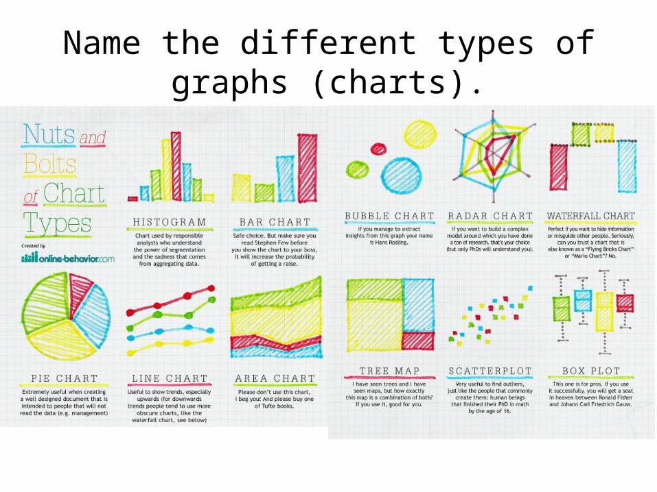
Name the different types of graphs (charts).

Why do we use graphs?


Creating a line graph

1. Draw the Axes: Put the manipulated (independent) variable on the horizontal (x) axis and the (responding) dependent variable on the vertical (y) axis.
X Axis – Independent Variable
Y Axis – Dependent
Variable
Remember: Dry Mix
What you are collecting data on
Changed on purpose
M--- Manipulated VariableI--- Independent VariableX--- X- Axis
D—Dependent Variable R—Responding Variable Y—Y Axis

In class Graphing Practice
A B
1 Temperature Hours of heating
2 Stopping distance Speed of a car Speed
3Number of people in a family
Cost per week for groceries
4 Amount of rainfall Stream flow rate
5 Tree age Average tree height
6Test score Number of hours studying
for a test7 Number of schools needed Population of a city
Part I: Circle the independent variable in each pair:

2. Label each axis: Label the name of the variable and the measurement units (cm, days, etc.)
Ice Cream Sales vs Temperature
Temperature °C Ice Cream Sales
14.2° $215
16.4° $325
11.9° $185
15.2° $332
18.5° $406
22.1° $522
19.4° $412
25.1° $614
23.4° $544
18.1° $421
22.6° $445
17.2° $408
Temperature (°C)
Ice C
ream
Sale
s ($
)

Use this Table to guide you in scaling your graph
Range (Highest # - Lowest #) Range ÷ number of boxes Adjusted scale (round # above) Adjusted scale x # boxes Starting value (lowest # or slightly below)- does not have to be zero
Ending Value = (Adjusted scale x # boxes)+ starting value
DO ONE VARIABLE AT
A TIME!

RangeTemperature:
3. Determine the range: for each variable, take the largest number in the data set and subtract the lowest number. This is the range.
Ice Cream Sales vs Temperature
Temperature °C Ice Cream Sales
14.2° $215
16.4° $325
11.9° $185
15.2° $332
18.5° $406
22.1° $522
19.4° $412
25.1° $614
23.4° $544
18.1° $421
22.6° $445
17.2° $408
25.1 – 11.9 = 13.2

Use this Table to guide you in scaling your graph
Range (Highest # - Lowest #) Range ÷ number of boxes Adjusted scale (round # above) Adjusted scale x # boxes Starting value (lowest # or slightly below)- does not have to be zero
Ending Value = (Adjusted scale x # boxes)+ starting value
13.2

4. Determine the scale: Count the number of squares you have available for each axis. For each axis, take the range and divide by the number of squares. Use even increments. Round up.
Temperature (°C)
Ice C
ream
Sale
s ($
)
ScaleTemperature:
13.2 ÷15
15
= 0.88

Use this Table to guide you in scaling your graph
Range (Highest # - Lowest #) Range ÷ number of boxes Adjusted scale (round # above –always up) Adjusted scale x # boxes Starting value (lowest # or slightly below)- does not have to be zero
Ending Value = (Adjusted scale x # boxes)+ starting value
13.2 0.88
1 1 x 15 =15

3. Determine the range: for each variable, take the largest number in the data set and subtract the lowest number. This is the range.
Ice Cream Sales vs Temperature
Temperature °C Ice Cream Sales
14.2° $215
16.4° $325
11.9° $185
15.2° $332
18.5° $406
22.1° $522
19.4° $412
25.1° $614
23.4° $544
18.1° $421
22.6° $445
17.2° $408

Use this Table to guide you in scaling your graph
Range (Highest # - Lowest #) Range ÷ number of boxes Adjusted scale (round # above –always up) Adjusted scale x # boxes Starting value (lowest # or slightly below)- does not have to be zero
Ending Value = (Adjusted scale x # boxes)+ starting value
13.2 0.88
1 1 x 15 =15
11
11 + 15= 26

3. Determine the range: for each variable, take the largest number in the data set and subtract the lowest number. This is the range.
Ice Cream Sales vs Temperature
Temperature °C Ice Cream Sales
14.2° $215
16.4° $325
11.9° $185
15.2° $332
18.5° $406
22.1° $522
19.4° $412
25.1° $614
23.4° $544
18.1° $421
22.6° $445
17.2° $408
If done correctly the ending value should be greater than the highest number in the table

Use this Table to guide you in scaling your graph
Range (Highest # - Lowest #) Range ÷ number of boxes Adjusted scale (round # above –always up) Adjusted scale x # boxes Starting value (lowest # or slightly below)- does not have to be zero
Ending Value = (Adjusted scale x # boxes)+ starting value
13.2 0.88
1 1 x 15 =15
11
11 + 15= 26
NOTICE THE
STARTING VALUE IS
NOT ZERO

Temperature (°C)
Ice C
ream
Sale
s ($
)
Add adjusted scale each time
11
12
13
14
15
16
17
18
19
20
21
22
23
24
25
26

Part II: Determine the Scale for the following sets of data:
ValuesRang
e
# of boxe
s
Range ÷
boxes
Adjusted Scale
Adjusted scale x #
boxes
Starting Value
Ending Value = (Adjusted scale x #
boxes)+ starting value
4, 1, 0, 5, 7, 22
15
1.1, 0.95, 1.01, 1.09, 0.98
15
225, 331, 115, 45, 279
20
0.20, 0.04, 0.09, 0.15, 0.10
10
550, 970 2450, 1830
20
22 1.47
1.5 22.5
0 22.5
Can’t I just round it to 2?

Temperature (°C)
Ice C
ream
Sale
s ($
) 0
Add adjusted scale each time
1.5
3
.0
4.5
6
.0
7.5
9
.0
10.5
1
2.0
1
3.5
1
5.0
16.5
1
8.0

Part II: Determine the Scale for the following sets of data:
ValuesRang
e
# of boxe
s
Range ÷
boxes
Adjusted Scale
Adjusted scale x #
boxes
Starting Value
Ending Value = (Adjusted scale x #
boxes)+ starting value
4, 1, 0, 5, 7, 22
15
1.1, 0.95, 1.01, 1.09, 0.98
15
225, 331, 115, 45, 279
20
0.20, 0.04, 0.09, 0.15, 0.10
10
550, 970 2450, 1830
20
22 1.47
2 30 0 30
This will not spread out the data as much but …

Part II: Determine the Scale for the following sets of data:
ValuesRang
e
# of boxe
s
Range ÷
boxes
Adjusted Scale
Adjusted scale x #
boxes
Starting Value
Ending Value = (Adjusted scale x #
boxes)+ starting value
4, 1, 0, 5, 7, 22
15
1.1, 0.95, 1.01, 1.09, 0.98
15
225, 331, 115, 45, 279
20
0.20, 0.04, 0.09, 0.15, 0.10
10
550, 970 2450, 1830
20

Values Range # of boxes
Range ÷ boxes
Adjusted Scale
Adjusted scale x # boxes
Starting Value
Ending Value = (Adjusted scale x #
boxes)+ starting value
4, 1, 0, 5, 7, 22 22 15 1.47 1.5 22.5 0 22.52 30 0 30
1.1, 0.95, 1.01, 1.09, 0.98 0.15 15 0.01 0.01 0.15 0.95 1.1225, 331, 115, 45, 279 286 20 14.3 15 300 45 3450.20, 0.04, 0.09, 0.15, 0.10
0.16 10 0.016 0.02 0.2 0 0.200.04 0.22
550, 970 2450, 1830 1900 20 95 100 2000 500 2500

5. Title the graph: Remember the title can be a clue as to what is shown by the slope of the line. The titles are usually written as “y vs x” (dependent variable vs independent variable).
• For example a graph of distance on the y is and time on the x axis can be titled “Graph of Distance vs. Time”. In this case, it would also be called “Graph of Speed”, since the slope of a distance vs. time graph represents speed.

Ice C
ream
Sale
s ($
)
Temperature (°C)
Ice Cream Sales Vs.Temperature

6. Plot: Put a dot at the location of each pair of variable values

Ice Cream Sales Vs.Temperature
Ice C
ream
Sale
s ($
)
Temperature (°C)
Ice Cream Sales vs Temperature
Temperature °C
Ice Cream Sales
14.2° $215
16.4° $325
11.9° $185
15.2° $332
18.5° $406
22.1° $522
19.4° $412
25.1° $614
23.4° $544
18.1° $421
22.6° $445
17.2° $408

7. Draw the line or curve of best fit: We often want to find the “best fit line” straight line.
• To do this by hand, line up a ruler with the data points as best as you can, and draw a straight line. Roughly half of the points should be above the line, and half below it, in a random fashion.
• Do not force the line to go through the first and last data points. In fact, the line may not necessarily pass exactly through any of the data points. The line should reflect the general trend of the data as a whole, averaging out any random variations.
• Sometimes the data will show a curved relationship. Draw a smooth curve through the data points.

Ice Cream Sales Vs.Temperature
Ice C
ream
Sale
s ($
)
Temperature (°C)

Draw a best fit curve or line

Draw a best fit curve or line

Draw a best fit curve or line

8. If necessary determine the slope: Choose two points on the line, with coordinates (x1,y1) and (x2,y2), and calculate the slope m as:

8. If necessary determine the slope: Choose two points on the line, with coordinates (x1,y1) and (x2,y2), and calculate the slope m as:The two points used in this calculation should not, in general, be actual data points. Also, they should be as far apart as possible, for maximum precision in calculating the slope. Do not restrict yourself to points where the best-fit line passes through an intersection of two gridlines.

Communicating what the graph reveals
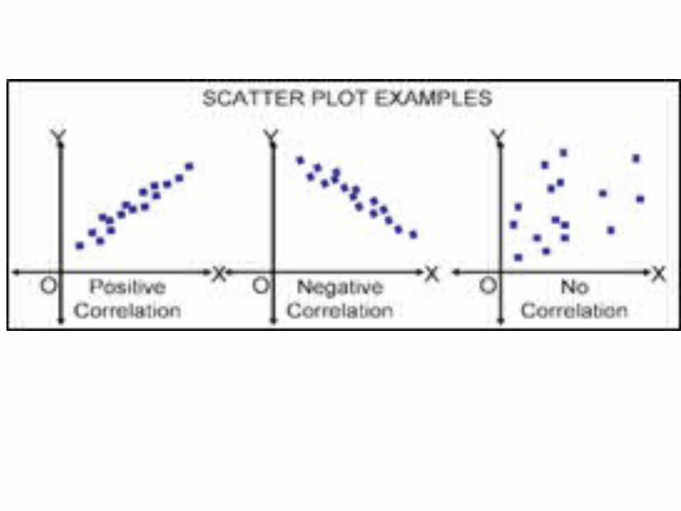
• Interpreting Graphs: Explain in words what the graph shows. Types of relationships include:
• ____________________ relationship: Both factors (variables) increase or both factors (decrease) at a constant rate. Represented by a linear line.
• ___________________relationship: The factors change in opposite directions. One factor (variable) may increase while the other decreases. Both factors do not have to change at the same rate.
Direct (linear)
Inverse

Communicating what the graph reveals
• ____________________relationship: Factors increase sharply in both directions. Both factors do not have to change at the same rate.
• _________relationship: One (factor) variable will increase and the other (factor) variable does nothing at all. No increase or decrease.
Exponential
No

Which graph? ExponentialDirectNo relationship
Inverse

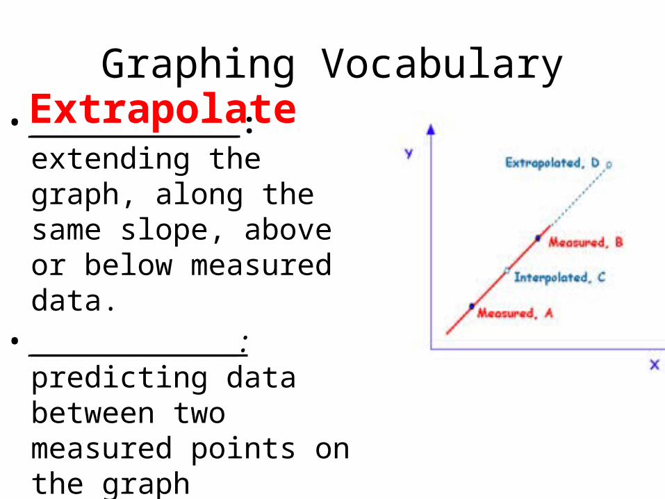
Graphing Vocabulary• __________________:
extending the graph, along the same slope, above or below measured data.
• __________________: predicting data between two measured points on the graph

X Axis
Y Axis
Density
Graphing Vocabulary• __________________:
extending the graph, along the same slope, above or below measured data.
• __________________: predicting data between two measured points on the graph
Extrapolate

X Axis
Y Axis
Temperature
Density
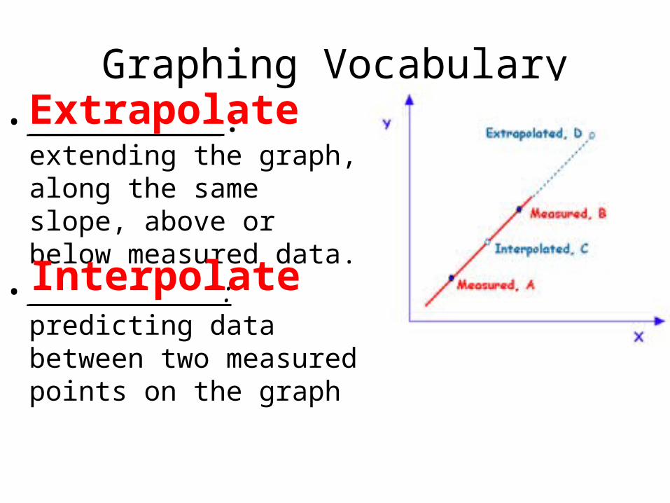
Graphing Vocabulary• __________________:
extending the graph, along the same slope, above or below measured data.
• __________________: predicting data between two measured points on the graph
Extrapolate
Interpolate