understanding users. objectives gestalt principles of perception design principles development...
TRANSCRIPT

Understanding users

Objectives
Gestalt Principles of Perception Design principles Development activity

Core cognitive aspects Attention
Perception and recognition
Memory
Reading, speaking and listening
Problem-solving, planning, reasoning and decision-making, learning
Most relevant to interaction design are attention, perception and recognition, and memory

Gestalt Principles of Perception
A premise of Gestalt psychology is the idea that humans strive to find the simplest solutions to incomplete visual information.

Principles
Humans organize things into meaningful units using: Proximity: we group by distance or location Similarity: we group by type Symmetry: we group by meaning Continuity: we group by flow of lines (alignment) Closure: we perceive shapes that are not (completely) there
Also Common fate Surroundedness Principle Proportion Area Principle

Five principles
User interface design and evaluation By Deborah L. Stone, Debbie Stone

Design Principles
Design Principles Fitts’ law 80/20 Rule Alignment Aesthetic-Usability Effect Flexibility-Usability Tradeoff Elegance and simplicity
• Universal Principles of Design, Lidwell, W., Holden, K., Butler, J., 2010. Rockport Publishers: Massachusetts.• Designing Visual Interfaces, Mullet, K. Sano, D. 1995. Prentice Hall: Upper Saddle, New Jersey.

Fitts’ law
Time required to move to a target is a function of the target size and the distance to the target.
Smaller and more distant a target, longer it takes to move to the resting position over the target.
Faster movement and smaller targets, greater error rate due to the speed-accuracy tradeoff.

Tapping Experiment
Longest time, most errors?

Fitts’ law
Fitt’s law only applies to rapid pointing movement
Not for more continuous movements, such as writing or drawing.

Fitts’ law
Pointing movement typically consists of: Ballistic movement - one large quick
movement toward a target, Homing movement - followed by the
adjustment movements to a resting position over (Acquiring) the target.
Fitts’ law Implications
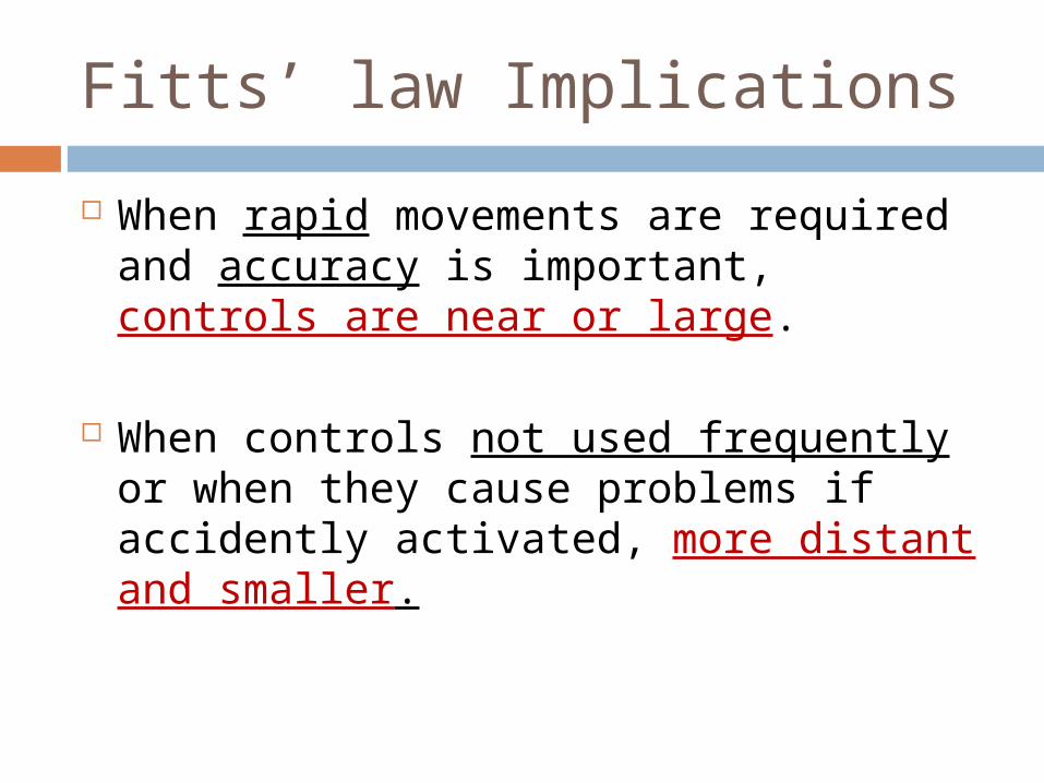
When rapid movements are required and accuracy is important, controls are near or large.
When controls not used frequently or when they cause problems if accidently activated, more distant and smaller.

Tapping Experiment
When rapid movements are required and accuracy is important.
When controls not used frequently or when they cause problems if accidently activated.

Fitts’ law Implications
Use large objects for important functions (Big buttons are faster).
Use pinning actions of the sides, bottom, top, and corners of your display.

Fitts’ law Implications
Use pinning actions of the sides, bottom, top, and corners of your display.

Faster
Single-row toolbar with tool icons that "bleed" into the edges of the display is faster than a double row of icons.
Fitts’ law Implications
Slower
Fitts’ law Implications
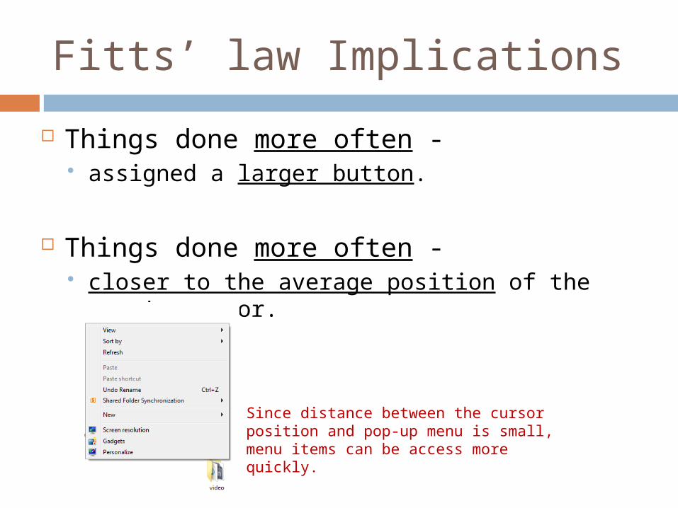
Things done more often - assigned a larger button.
Things done more often - closer to the average position of the user's
cursor.
Since distance between the cursor position and pop-up menu is small, menu items can be access more quickly.
Fitts’ law Implications
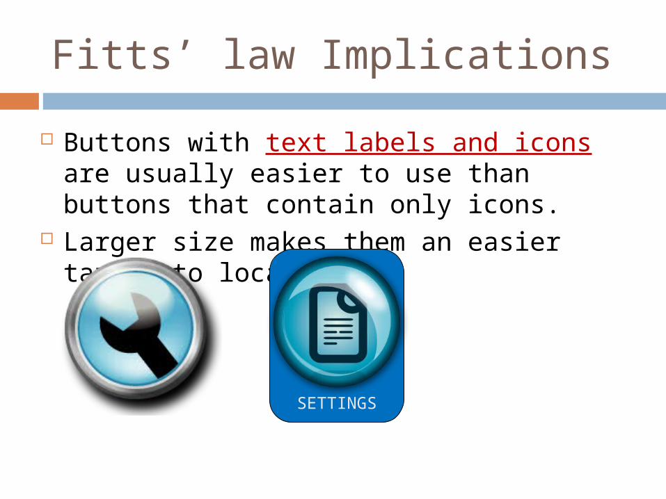
Buttons with text labels and icons are usually easier to use than buttons that contain only icons.
Larger size makes them an easier target to locate.
SETTINGS

Fitts’ law Implications
Target position relative to the current cursor position is important:
1. Users can most easily move the mouse cursor horizontally from the current position.
2. Moving to the right is more efficient than moving to the left.
3. Next in efficiency is moving straight downwards.
4. Upward moves are slower than downward ones.
5. Diagonal moves are generally slower than horizontal or vertical ones.


Fitts’ law (example)
Technique to reduce acquisition time - Center child menu, so no item is more than total items/2 away from mouse.
Source: http://www.asktog.com/columns/022DesignedToGiveFitts.html

80/20 Rule
Approximately 80% of effects generated by any large system are caused by 20% of the variables in that system.
80 percent of a product's usage involves 20 percent of its features.
80 percent of a town's traffic is on 20 percent of its roads. 80 percent of a company's revenue comes from 20 percent of
its products. 80 percent of innovation comes from 20 percent of the people. 80 percent of progress comes from 20 percent of the effort. 80 percent of errors are caused by 20 percent of the
components.The first recognition of the 80/20 rule is attributed to Vilfredo Pareto, an Italian economist who observed that 20 percent of the Italian people possessed 80 percent of the wealth. The seminal work on the 80/20 rule is Quality Control Handbook by Joseph M. Juran (Ed.), McGraw-Hill, 1951.

80/20 Rule
Design and testing should focus on 20% of features used 80% of the time.
Noncritical functions part of the less-important 80% should be minimized or removed from the design.

80/20 Rule
Identify the critical 20% of the functions that are used 80% of the time and…
make them readily available to users.

Alignment
It is easier to perceive a structured layout.
Place elements so edges line up along common rows or columns.
Nothing should be placed arbitrarily.

Alignment
Every item should have a visual connection with something else on screen (Williams, R. p. 27)
Creates a sense of unity and cohesion Contributes to the design's overall aesthetic
and stability.
Alignment can help lead person through a design.

Alignment
In textLeft-aligned and right-aligned text blocks
better than center-aligned text.
Left-aligned and right-aligned text blocks presents clear, visual cue against which other elements
of the design can be aligned.
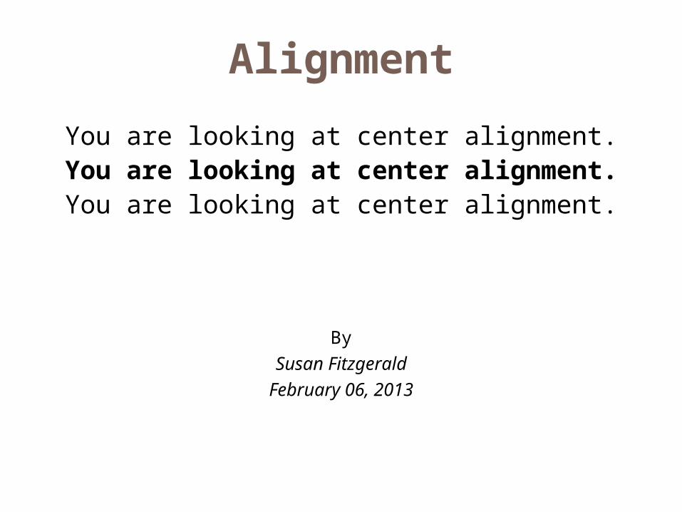
Center-aligned text has more visually ambiguous alignment cues, and can be
difficult to connect with other elements.
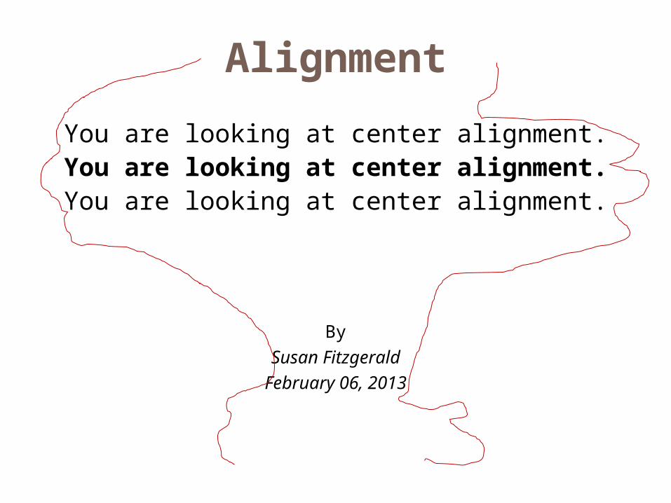
Alignment
You are looking at center alignment.You are looking at center alignment.
You are looking at center alignment.
BySusan Fitzgerald
February 06, 2013
Alignment
You are looking at center alignment.You are looking at center alignment.
You are looking at center alignment.
BySusan Fitzgerald
February 06, 2013

Alignment
You are looking at left alignment.You are looking at left alignment.You are looking at left alignment.
BySusan FitzgeraldFebruary 06, 2013

Alignment
You are looking at left alignment.You are looking at left alignment.You are looking at left alignment.
BySusan FitzgeraldFebruary 06, 2013

Hello World

Hello world
Navigation
Section Headings
Navigation
SEARCH

Hello world
Navigation
Section Headings
Navigation
SEARCH

Hello world
Navigation
Section Headings
Navigation
SEARCH
It is easier to perceive a structured layout.

Remember : Screen layout
Use grids for layout Grid 960 (http://960.gs/) The Grid System (www.thegridsystem.org/)

1. Divide screen into rows and columns
2. Identify elements that are common throughout
3. Essential and common elements are made to fit within the grid
4. Group related elements together
5. Create sample and get feedback.
• Gives a coherent visual structure.
• Reduces clutter and provides users visual cues to follow.

50 px 50 px
50 px
50 px50 px
50 px 50 px
50 px
100X100 px
100X100 px 100X100 px
100X100 px

Help users understand
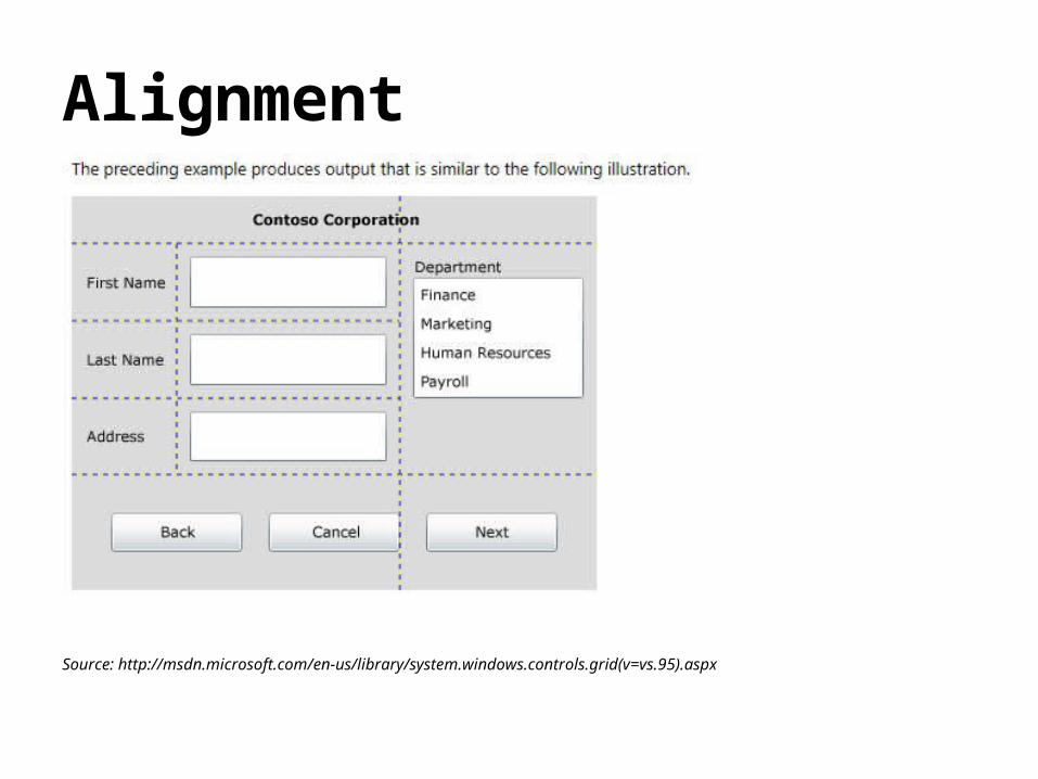
Alignment
Source: http://msdn.microsoft.com/en-us/library/system.windows.controls.grid(v=vs.95).aspx
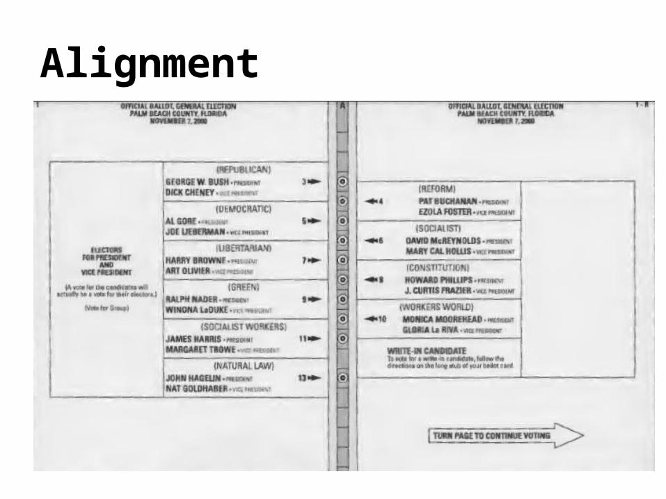
Alignment

Alignment
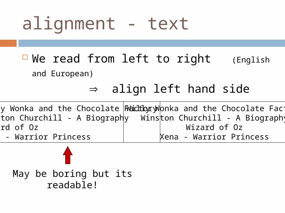
alignment - text
We read from left to right (English and
European) align left hand side
Willy Wonka and the Chocolate FactoryWinston Churchill - A BiographyWizard of OzXena - Warrior Princess
May be boring but its readable!
Willy Wonka and the Chocolate FactoryWinston Churchill - A Biography
Wizard of OzXena - Warrior Princess

Alignment - names
Scanning for surnames make it easy!
Alan DixJanet FinlayGregory AbowdRussell Beale
Dix , AlanFinlay, JanetAbowd, GregoryBeale, Russell
Alan DixJanet FinlayGregory AbowdRussell Beale

Alignment - numbers
Think purpose!
Which is biggest?
532.56179.3
256.31715
73.9481035
3.142497.6256
532.56179.3256.317
1573.948
10353.142
497.6256