understanding technology diffusion and spatial
TRANSCRIPT

University of Arkansas, Fayetteville University of Arkansas, Fayetteville
ScholarWorks@UARK ScholarWorks@UARK
Graduate Theses and Dissertations
7-2015
Understanding Technology Diffusion and Spatial Accessibility in Understanding Technology Diffusion and Spatial Accessibility in
the Home Healthcare Industry the Home Healthcare Industry
Mehmet Serdar Kilinç University of Arkansas, Fayetteville
Follow this and additional works at: https://scholarworks.uark.edu/etd
Part of the Industrial Engineering Commons, and the Telemedicine Commons
Citation Citation Kilinç, M. S. (2015). Understanding Technology Diffusion and Spatial Accessibility in the Home Healthcare Industry. Graduate Theses and Dissertations Retrieved from https://scholarworks.uark.edu/etd/1282
This Dissertation is brought to you for free and open access by ScholarWorks@UARK. It has been accepted for inclusion in Graduate Theses and Dissertations by an authorized administrator of ScholarWorks@UARK. For more information, please contact [email protected].

Understanding Technology Diffusion and Spatial Accessibility in the Home Healthcare Industry
A dissertation submitted in partial fulfillment of the requirements for the degree of
Doctor of Philosophy in Industrial Engineering
by
Mehmet Serdar Kılınç Istanbul Technical University
Bachelor of Science in Industrial Engineering, 2005 Istanbul Technical University
Master of Science in Industrial Engineering, 2008
July 2015 University of Arkansas
This dissertation is approved for recommendation to the Graduate Council.
______________________________ Dr. Ashlea Bennett Milburn Dissertation Director ______________________________ Dr. Ed Pohl Committee Member
______________________________ Dr. Justin R. Chimka Committee Member
______________________________ Dr. Jessica L. Heier Stamm Committee Member

Abstract
Home healthcare is becoming an important alternative to institutionalized care. It not only reduces costs
but also increases health outcomes and patient satisfaction. However, the availability and efficiency of
home healthcare services need to be improved as the aging population increases in the US. Hence,
understanding home healthcare utilization and access are the essential steps to develop strategies
ensuring effective and sustainable services to patients.
This research aims to study two main issues in the US home healthcare system: diffusion and long-term
impacts of home telehealth and potential spatial accessibility of home healthcare services. Home
telehealth is a promising technology that can increase efficiency and health outcomes. However, the
diffusion of this technology has been slow basically due to lack of reimbursement and lack of evidence
on its impacts. In the first part of this dissertation, we study the innovation characteristics affecting
home telehealth diffusion among agencies and develop a system dynamics model to demonstrate the
impacts of home telehealth on healthcare utilization and overall healthcare cost. Next, we study the
potential spatial access to home healthcare services. Potential spatial accessibility refers to the
availability of a service in a given area based on geographical factors, such as distance and location. In
this part of the dissertation, a new measure that simultaneously considers both staffing levels and
eligible populations is developed and used in a case study to highlight the spatial disparities in access in
Arkansas. To the best of our knowledge, no previous measure has been proposed to quantify the
potential spatial accessibility of home healthcare services within a geographic region. Then, we examine
the factors that are associated with accessibility across the study region by space-varying coefficient
models. The results of this part of the dissertation can inform policies that positively impact access to
home healthcare services.

Acknowledgements
I would like to express my sincere gratitude to my advisor Dr. Ashlea Bennett Milburn for her continuous
support, encouragement, and guidance in the development of this dissertation research. I also want to
thank Dr. Jessica L. Heier Stamm. I greatly appreciate her involvement with my research, especially in
the part of spatial accessibility. I express my sincere gratitude to my other committee members, Dr.
Justin R. Chimka and Dr. Ed Pohl, for their valuable comments and kindly advice related to my
dissertation. Thanks also go to Dr. Ronald Rardin and Dr. Nebil Buyurgan for providing research
opportunities during my time at the University of Arkansas and coaching me during my job search.
Finally, and most importantly, I would like to thank my family back home in Turkey for their love and
support.

Dedication
This dissertation is dedicated to my parents, Gülcan and Ali Kılınç.

Table of Contents
1. Introduction .......................................................................................................................................... 1
References ................................................................................................................................................ 5
2. A Study of Home Telehealth Diffusion among US Home Healthcare Agencies Using System
Dynamics ....................................................................................................................................................... 7
2.1. Introduction .................................................................................................................................. 7
2.2. Literature Review ........................................................................................................................ 10
2.3. Model Formulation/Development .............................................................................................. 12
2.3.1. System Dynamics Modeling ................................................................................................ 12
2.3.2. Model Overview .................................................................................................................. 12
2.3.3. Telehealth Diffusion Module .............................................................................................. 13
2.3.4. Patient Population Module ................................................................................................. 15
2.3.5. Telehealth Use Module ....................................................................................................... 16
2.3.6. Healthcare Utilization Module ............................................................................................ 18
2.3.7. Costs and Savings Module .................................................................................................. 20
2.4. Model Parameters ...................................................................................................................... 22
2.4.1. Telehealth Diffusion Module .............................................................................................. 22
2.4.2. Patient Population Module ................................................................................................. 30
2.4.3. Telehealth Use Module ....................................................................................................... 31
2.4.4. Healthcare Utilization Module ............................................................................................ 32
2.4.5. Cost and Savings Module .................................................................................................... 34
2.5. Experiments ................................................................................................................................ 34
2.6. Model Validation ......................................................................................................................... 35
2.6.1. Structure Validation ............................................................................................................ 36
2.6.2. Behavior Validation ............................................................................................................. 37
2.7. Results ......................................................................................................................................... 37
2.7.1. Uncapacitated Models ........................................................................................................ 37
2.7.2. Capacitated Models ............................................................................................................ 38
2.8. Conclusion ................................................................................................................................... 44
References .............................................................................................................................................. 46
Appendix A: Bass Model Parameter Estimation ..................................................................................... 54
Appendix B: Impact of Home Telehealth ................................................................................................ 56

Appendix C: Extreme Conditions Tests ................................................................................................... 58
Appendix D: Sensitivity Analysis ............................................................................................................. 62
Appendix E: Breakdown Analysis ............................................................................................................ 67
3. Measuring the Potential Spatial Accessibility of Home Healthcare Services ..................................... 72
3.1. Introduction ................................................................................................................................ 72
3.2. Measures of Potential Spatial Accessibility ................................................................................ 75
3.3. Methodology ............................................................................................................................... 81
3.4. Case Study Development ............................................................................................................ 84
3.5. Results ......................................................................................................................................... 91
3.6. Conclusion ................................................................................................................................... 99
References ............................................................................................................................................ 102
Appendix F: Cartograms ........................................................................................................................ 106
4. Assessing Socioeconomic Disparities in Potential Spatial Accessibility of Home Healthcare ........... 110
4.1. Introduction .............................................................................................................................. 110
4.2. Literature Review ...................................................................................................................... 111
4.3. Choice of Independent Variables .............................................................................................. 115
4.4. Methods .................................................................................................................................... 117
4.4.1. Examining Spatial Auto-correlation of Variables .............................................................. 118
4.4.2. Space-varying Coefficient Models ..................................................................................... 119
The Model ................................................................................................................. 120 4.4.2.1.
Coefficient Estimation ............................................................................................... 120 4.4.2.2.
Inference on Shape of Coefficients ........................................................................... 121 4.4.2.3.
Implementation Stages ............................................................................................. 121 4.4.2.4.
4.5. Results ....................................................................................................................................... 127
4.5.1. Examining Spatial Auto-correlation of Variables .............................................................. 127
4.5.2. Space-varying coefficient models ..................................................................................... 129
Skilled Nursing ........................................................................................................... 130 4.5.2.1.
Physical Therapy........................................................................................................ 132 4.5.2.2.
Occupational Therapy ............................................................................................... 135 4.5.2.3.
Medical Social ........................................................................................................... 138 4.5.2.4.
Speech Pathology ...................................................................................................... 140 4.5.2.5.
Home Health Aide ..................................................................................................... 144 4.5.2.6.

4.6. Conclusion ................................................................................................................................. 147
References ............................................................................................................................................ 149
Appendix G: Alternative Models ........................................................................................................... 154
Appendix H: Pareto Frontiers ............................................................................................................... 164
Appendix I: Analyzing the Border Impact ............................................................................................. 165
5. Conclusion ......................................................................................................................................... 167

List of Figures
Figure 1. Total and share of population 65 and over: 2015 to 2050 (U.S. Census Bureau, 2014) ................ 1
Figure 2. An example of system dynamics blocks ....................................................................................... 12
Figure 3. Modules in the home telehealth diffusion model ....................................................................... 13
Figure 4. Technology Diffusion Module ...................................................................................................... 14
Figure 5. Patient Population Module .......................................................................................................... 16
Figure 6. Telehealth Use Module ................................................................................................................ 18
Figure 7. Healthcare Utilization Module ..................................................................................................... 19
Figure 8. Costs and Savings Module ........................................................................................................... 21
Figure 9. Relationships between IT characteristics and diffusion patterns (Teng et al., 2002) .................. 25
Figure 10. Home telehealth diffusion between 1995 and 2015 ................................................................. 28
Figure 11. Projection of home telehealth diffusion ................................................................................... .30
Figure 12. Telehealth capacity and patient demand .................................................................................. 39
Figure 13. Patients receiving telehealth ..................................................................................................... 40
Figure 14. Hospitalization and ED visits ...................................................................................................... 41
Figure 15. Physician office and skilled nursing visits .................................................................................. 42
Figure 16. Annual net benefits and average net benefit per telehealth patient ........................................ 43
Figure 17. Classification of healthcare accessibility (Guagliardo, 2004; Khan, 1992) ................................. 73
Figure 18. Kernel density estimation (Schuurman et al., 2010).................................................................. 77
Figure 19. An illustrative example .............................................................................................................. 83
Figure 20. Number of agencies serving in each ZCTA ................................................................................. 89
Figure 21. Number of agencies with NO missing FTE data in each ZCTA ................................................... 89
Figure 22. Results for skilled nursing .......................................................................................................... 93
Figure 23. Results for physical therapy ....................................................................................................... 94
Figure 24. Results for occupational therapy ............................................................................................... 94
Figure 25. Results for speech pathology ..................................................................................................... 95
Figure 26. Results for medical social ........................................................................................................... 95
Figure 27. Results for home health aide ..................................................................................................... 96
Figure 28. Boxplot of ZCTA level access scores ........................................................................................... 97
Figure 29. Distribution of over 65 population by access level .................................................................... 98
Figure 30. Implementation stages ............................................................................................................ 122

Figure 31. Moran’s I scatter plots ............................................................................................................. 128
Figure 32. Association between percent Hispanic population and skilled nursing accessibility .............. 131
Figure 33. Association between percent Hispanic population and physical therapy accessibility ........... 133
Figure 34. Association between poverty rate and physical therapy accessibility .................................... 134
Figure 35. Association between poverty rate and occupational therapy accessibility ............................ 136
Figure 36. Association between percent rural population and occupational therapy accessibility ......... 137
Figure 37. Association between percent rural population and medical social accessibility .................... 139
Figure 38. Association between percent rural population and speech pathology accessibility ............... 141
Figure 39. Association between percent Hispanic population and speech pathology accessibility ......... 142
Figure 40. Association between poverty rate and speech pathology accessibility .................................. 143
Figure 41. Association between percent Hispanic population and home health aide accessibility ......... 145

List of Tables
Table 1. Changes in home healthcare utilization .......................................................................................... 2
Table 2. Current assessment for home telehealth ..................................................................................... 27
Table 3. Future assessment for home telehealth ....................................................................................... 30
Table 4. Parameter values used in Patient Population Module ................................................................. 31
Table 5. Patient acceptance rates ............................................................................................................... 32
Table 6. Visit Rates (visits per patient per year) for each patient group .................................................... 32
Table 7. Selected Telehealth Impact values ................................................................................................ 33
Table 8. Parameter values used in Cost and Savings Module..................................................................... 34
Table 9. Net benefits ($) ............................................................................................................................. 38
Table 10. Example access score calculation ................................................................................................ 83
Table 11. Population structure of Arkansas ................................................................................................ 84
Table 12. Demand and capacity values ....................................................................................................... 91
Table 13. Relative accessibility groups........................................................................................................ 91
Table 14. Access scores for 72701 ZCTA ..................................................................................................... 98
Table 15. Summary statistics of potential predictor variables for case study region ............................... 118
Table 16. Spatial correlations between independent variables ............................................................... 123
Table 17. Initial models with included independent variables ................................................................. 124
Table 18. An example of reduced models ................................................................................................ 125
Table 19. Moran’s I test results................................................................................................................. 127
Table 20. Shapes and coefficient values of predictors ............................................................................. 129

1
1. Introduction
By 2050, the population over the age of 65 is projected to surpass 85 million in 2050 (a growth of nearly
87 percent) and one in five people will be 65 and older (Figure 1). The main driver of this trend is that
10,000 baby boomers will reach age 65 per day for the next 20 years. Due to the growth of the aging
population, the demand for long-term care services is expected to increase dramatically. Aging comes
with increased risk of health issues. Approximately 85 percent of those over 65 years of age have at least
one chronic condition such as heart failure, cardiovascular disease, and diabetes (AARP, 2009). In
addition, over two-thirds of Medicare beneficiaries over 65 years old have multiple (2 or more) chronic
conditions (CMS, 2012). Chronic illnesses are the primary reason for rising healthcare utilization and
they account for 75 percent of all healthcare expenditures (IOM, 2012). Hence, it is essential to ensure
the national availability of affordable quality long-term care services (Hutchison, Hawes, & Williams,
2010).
Figure 1. Total and share of population 65 and over: 2015 to 2050 (U.S. Census Bureau, 2014)
Home healthcare, which refers to patients being treated in their home environments, is an important
long-term care delivery option for the US health system. It is a cost-effective alternative to
institutionalized care. The average cost of a home healthcare visit is $154 per day whereas the same
0%
5%
10%
15%
20%
25%
0
20
40
60
80
100
2015 2020 2025 2030 2035 2040 2045 2050
% o
f Tot
al P
opul
atio
n ov
er 6
5
Popu
latio
n (M
illio
ns)
Years Population 65+ % of Total Population

2
care in a hospital costs $1,889/day and in a nursing home $220/day (AHRQ, 2007; CMS, 2013;
Genworth, 2015). In addition to lowering healthcare costs, home healthcare can improve patient
satisfaction by promoting independence and avoiding discomfort of hospitalization (Hutchison et al.,
2010; Nelson & Gingerich, 2010; The Joint Commission, 2011).
A wide range of medical services can be provided in a person’s home. Medicare, the primary payer of
home healthcare services, covers six different types of services: skilled nursing, physical therapy,
occupational therapy, speech pathology, medical social, and home health aide. These services are
provided by licensed professionals to homebound patients according to a plan of care certified by a
physician. A home healthcare agency must be approved by Medicare to be able provide service to
Medicare beneficiaries and receive reimbursement (Goldberg Dey, Johnson, Pajerowski, Tanamor, &
Ward, 2011). Under the prospective payment system, Medicare provides payments to agencies for each
60-day episode of care for each beneficiary. Beneficiaries can receive an unlimited number of episodes
as long as they are eligible for care.
The utilization of home healthcare services has increased dramatically in recent years. To illustrate,
between 2000 and 2012 the number of users increased from 2.5 million to 3.4 million. During this period
the number Medicare-certificated agencies increased by 64 percent (since 2002) to reach 12,311 in
2012. In addition, the average number of care episodes per user increased from 1.6 to 2.0 between 2002
and 2012. (MedPAC, 2013, 2014). Medicare home healthcare expenditures are projected to reach
almost $66.9 billion in 2022 (CMS, 2011).
Table 1. Changes in home healthcare utilization 2000 2012 % Change
Agencies 7,528 12,311 64 Total spending (in billions) $8.5 $34.0 298 Home healthcare users 2.5 3.4 38 Number of visits (in millions) 90.6 113.7 25

3
In spite of the growth in the industry, home healthcare agencies struggle with several challenges such as
decreasing reimbursement rates, providing care to patients in rural areas, legal requirements that
demand higher quality and clinical outcomes, and a shortage of skilled nursing professionals (Demiris,
2010; Fazzi & Harlow, 2007; Hebert & Korabek, 2004; McCloskey & McCharthy, 2007; Milburn, 2012).
Hence, the home healthcare industry is looking for opportunities to improve operational efficiencies and
reduce costs while continuing to improve quality of care. Over the next couple of decades, the current
practice of providing home healthcare services needs to transform to more productive and cost-
effective methods.
Analyzing the US home healthcare industry from a systems point of view and understanding home
healthcare utilization and access are the essential steps to develop strategies ensuring effective and
sustainable services to patients. The objective of this research is to propose appropriate methodologies
addressing major challenges in the home healthcare industry and to provide evidence for policy making.
This research aims to study the US home health sector from three perspectives: demonstrating the long-
term nationwide impacts of home telehealth technology diffusion, measuring potential spatial
accessibility of home healthcare services, and examining the factors that are associated with
accessibility across geographic regions.
In chapter 2, we examine the long-term systematic impacts of home telehealth diffusion in the US
homecare industry. Home telehealth technology allows remote care delivery between a home health
agency and a patient with a chronic illness. The purpose of this study is to understand the diffusion of
home telehealth and evaluate its long-term impacts to the US home healthcare system. This is realized
by employing a system dynamics model that simulates the diffusion of home telehealth among agencies
over time. This model generates a diffusion curve for home telehealth adoption and measures the
associated long-term savings in healthcare expenditures.

4
Secondly, in chapter 3, we study the potential spatial access to home healthcare services. Potential
spatial accessibility refers to the availability of a service in a given area based on geographical factors,
such as distance and location. The objectives of this research are to create a new measure of patient
access to home healthcare services and understand variations across a region. We have developed a
new measure to quantify potential spatial access to home healthcare services and illustrated the
measure using a case study of Arkansas.
Chapter 4 employs spatial statistical models to explain the associations between accessibility and
population characteristics, including racial/ethnic minority groups, income, and rural/urban status.
These associations can vary across a study area. Hence, space-varying coefficient models, which allow
local estimates of regression parameters, are used. In fact, the results indicate inhomogeneous spatial
patterns of associations in the case study area. The findings of this study can help us better understand
how the aforementioned socio-economic factors impact access to different home healthcare services.
The research methodology and the findings in this chapter can also serve as useful inputs for policy
makers and public health planners.

5
References
AARP. (2009). Chronic Care: A Call to Action for Health Reform. Washington, DC: AARP’s Public Policy Institute.
AHRQ. (2007). National and regional estimates on hospital use for all patients from the HCUP nation-wide inpatient sample: 2007 outcomes by patient and hospital characteristics for all discharges. Rockville, MD: Agency for Healthcare Research and Quality.
CMS. (2011). National Health Expenditure Data. Baltimore, MD: Centers for Medicare & Medicaid Services.
CMS. (2012). Chronic Conditions among Medicare Beneficiaries (Chart Book). Baltimore, MD: Centers for Medicare & Medicaid Services.
CMS. (2013). Medicare and Medicaid Statistical Supplement Report. Centers for Medicare & Medicaid Services.
Demiris, G. (2010). Information Technology and Systems in Home Health Care. In The Role of Human Factors in Home Health Care: Workshop Summary (pp. 173–199). The National Academies Press.
Fazzi, R., & Harlow, L. (2007). The incredible future of home care and hospice. Caring : National Association for Home Care Magazine, 26(3), 36–8, 40–5.
Genworth. (2015). Genworth 2015 Cost of Care Survey. Richmond, VA.
Goldberg Dey, J., Johnson, M., Pajerowski, W., Tanamor, M., & Ward, A. (2011). Home Health Study Report. Washington, DC: L&M Policy Research.
Hebert, M. A., & Korabek, B. (2004). Stakeholder readiness for telehomecare: implications for implementation. Telemedicine Journal and E-Health: The Official Journal of the American Telemedicine Association, 10(1), 85–92.
Hutchison, L., Hawes, C., & Williams, L. (2010). Access to Quality Health Services In Rural Areas - Long-Term Care: A Literature Review. In L. Gamm & L. Hutchison, Rural Healthy People 2010: A companion document to Healthy People 2010 (Vol. 3). College Station, Texas: The Texas A&M University System Health Science Center.
IOM. (2012). Living Well with Chronic Illness: A Call for Public Health Action. Washington D.C: Institute of Medicine.
McCloskey, W. W., & McCharthy, R. L. (2007). Home Care. In R. L. McCarthy & K. W. Schafermeyer, Introduction to Health Care Delivery: A Primer for Pharmacists. Jones & Bartlett Learning.
MedPAC. (2013). Report to the Congress: Medicare Payment Policy. The Medicare Payment Advisory Commission.
MedPAC. (2014). Report to the Congress: Medicare Payment Policy. The Medicare Payment Advisory Commission.

6
Milburn, A. B. (2012). Operations Research Applications in Home Healthcare. In R. Hall (Ed.), Handbook of Healthcare System Scheduling (pp. 281–302). Springer US.
Nelson, J. A., & Gingerich, B. S. (2010). Rural Health: Access to Care and Services. Home Health Care Management & Practice, 22(5), 339–343.
The Joint Commission. (2011). Home – The Best Place for Health Care (Position paper). Oakbrook Terrace, IL: The Joint Commission.
U.S. Census Bureau. (2014). 2014 National Population Projections.

7
2. A Study of Home Telehealth Diffusion among US Home Healthcare Agencies Using System Dynamics
2.1. Introduction
Home telehealth (HT) is a type of telemedicine technology that “encompasses remote care delivery or
monitoring between a healthcare provider and a patient outside of a clinical facility, in their place of
residence” (ATA, 2003). While home telehealth systems on the market vary considerably, they can be
grouped broadly into two classes - telemonitoring and interactive home telehealth. Telemonitoring
includes the collection and remote transmission of health data from the patient to a healthcare
provider, whereas interactive home telehealth includes the utilization of two-way interactive
audio/video communication between the patient and healthcare professional. Physiologic monitoring
tools (e.g. blood glucose monitor, weight scale, glucometer, thermometer) are the typical equipment
included in both classes of home telehealth systems (Alwan, Wilet, & Nobel, 2007; CAST, 2009). By the
help of physiologic monitoring tools, patients can collect their own vital signs and report health status
data to a provider location. Hence, a healthcare professional can remotely monitor the health progress
of patients, especially those with chronic illnesses, on a daily basis.
Home telehealth can offer great benefits to the chronic care management programs of American home
healthcare agencies. Regular remote monitoring allows home healthcare nurses to detect deteriorations
in health and perform early intervention to avoid unnecessary emergency department, hospital, and
physician visits and associated costs. Moreover, patient involvement can be enhanced by sustained self-
care and frequent contact between nurse and patient. Last but not least, home healthcare agencies
using home telehealth can increase their efficiency by decreasing staff travel time, automating patient
data collection, and enabling easier to access information and improved communication between
caregivers (CAST, 2013; Coye, Haselkorn, & DeMello, 2009; CTEC, 2009).

8
By utilizing home telehealth, home healthcare agencies can provide better chronic care while reducing
costs (see for example, Alston (2009) and Myers et al. (2006)). Hence, a widespread adoption of HT
technologies holds great potential for the current US healthcare system. At present, several HT systems
are available on the market: Health Buddy by Bosch, Genesis DM by Honeywell HomMed, TeleStation by
Philips, LifeView by American Telecare, IDEAL LIFE Pod by Ideal Life, Inc., etc. To date, however, the US
home healthcare system has been slow to adopt HT technologies. A comprehensive survey conducted
by Fazzi Associates provides valuable insights into the adoption and utilization of HT systems by US
home healthcare agencies (Fazzi Associates, 2014). Approximately 29% of the agencies responding to
the survey reported using some type of home telehealth application in 2013.
The barriers against widespread adoption and utilization of HT by US home healthcare agencies are
addressed in various reports and articles. Commonly cited barriers include Medicare reimbursement
coverage restrictions, lack of studies demonstrating positive economic outcomes, technology
acceptance by patients and providers, organizational issues, and legal/licensure issues (CAST, 2009; Coye
et al., 2009; FAST, 2009; Finkelstein, Speedie, & Potthoff, 2006; Helitzer, Heath, Maltrud, Sullivan, &
Alverson, 2003). In order for HT adoption to become widespread, policy initiatives addressing the
number one barrier, inadequate Medicare reimbursement policy, are required (Litan, 2008). In fact,
several bills aiming to expand the Medicare coverage of home telehealth were introduced in the U.S.
House of Representatives in recent years (H.R. 3306, 2013; H.R. 5380, 2014; H.R. 6719, 2012). Experts
agree that, if passed, the legislation would boost home healthcare agencies’ utilization of HT by
eliminating coverage restrictions (Comstock, 2013; McCann, 2013; Wels-Maug, 2013). Moreover,
according to a recent survey, nine in ten agencies report they will consider providing home telehealth
service if a bill that allows them to be reimbursed passes (Rowan, 2013).

9
The term “diffusion” refers to “the process by which an innovation is communicated through certain
channels over time among the members of a social system” (Rogers, 2003). The primary research
questions addressed in this study are (i) how will home telehealth diffuse among home healthcare
agencies in the US over time, and (ii) what will be the associated long-term impacts to the overall
healthcare system? Both questions are addressed via a system dynamics model. A technology diffusion
model is embedded in the model to address the first question. The diffusion model is developed by
integrating concepts from the innovation diffusion literature with an assessment of the innovation
characteristics affecting home telehealth diffusion. Then to demonstrate the impacts of HT diffusion, we
consider the overall healthcare service utilization by Medicare beneficiaries who are 65 years or older
and receive home healthcare services. We examine the reduction in use of overall healthcare services
when home healthcare agencies employ HT in the care of this patient group.
The contributions of this paper are three-fold. First, to the best of our knowledge, this is the first
diffusion model to describe the adoption of HT by home healthcare agencies. Second, this is the first SD
model to describe the behavior of healthcare utilization over time when HT is used in the care of our
target patient populations. Finally, a comprehensive literature review was conducted to gather the data
needed for this study. This data could be useful for other health researchers who are interested in
modeling healthcare utilization for the elderly population based on age and number of chronic
conditions.
The organization of the remainder of this paper is as follows. Section 2.2 provides a summary of relevant
literature. The systems dynamic model is presented in Section 2.3, with parameter values for model
elements described in Section 2.4. Section 2.5 describes the set of experiments used in the
computational study. The model validation is explained in 2.6 and results are provided in Section 2.7.
Finally, conclusions and directions for future work are highlighted in Section 2.8.

10
2.2. Literature Review
Numerous studies have presented the impacts and outcomes of home telehealth pilot programs for
patients with different chronic illnesses including, but not limited to, diabetes, hypertension, heart
failure (HF), chronic obstructive pulmonary disease (COPD), asthma, and depression. Many of these
illnesses are among the most common primary diagnoses for home healthcare admission (Caffrey,
Sengupta, Moss, Harris-Kojetin, & Valverde, 2011). Some of these studies investigate the effects of
home telehealth on health outcomes for patients with chronic illness whereas others report the
economic analysis of the adoption. The vast majority of these studies report positive clinical and
financial outcomes. For example, Woods and Snow (2013) examined the impact of home telehealth on
the outcomes of home healthcare patients with chronic conditions such as HF and COPD. Their results
showed home telehealth reduced the probability of hospitalization and emergency department visits.
Chen et al. (2011) also found that remote monitoring of home healthcare patients who are 65 years or
older can reduce hospitalization rates and lead to cost savings. In addition, according to two different
studies, home telehealth significantly reduced the number of in-person nurse visits needed during an
episode of home healthcare while maintaining high patient satisfaction (Alston, 2009; Myers, Grant,
Lugn, Holbert, & Kvedar, 2006). Comprehensive reviews of home telehealth application studies can be
found in Bowles and Baugh (2007), Brettle et al. (2013), Center for Connected Health Policy (2014),
Ekeland et al. (2010), Hersh et al. (2006), Louis et al. (2003), Nangalia et al. (2010), Pare et al. (2007),
Polisena et al. (2009), Seto (2008), Stachura and Khasanshina (2007), and VATAP (2010).
Although previous research provides valuable insights via small home telehealth case studies, those
studies were conducted with small sample sizes and for limited periods of time. Thus, a macro scale
demonstration of the impacts of a widespread adoption is needed. Only a few studies and reports
attempt to evaluate the potential long-term systemic impacts of different telemedicine applications.
Litan (2008) assessed the savings from the remote monitoring of diabetic, HF, COPD and chronic skin

11
ulcer patients in the US over a 25 year period. The New England Healthcare Institute (2004) projected
the value of remote monitoring for heart failure patients in New England region using a cost-
effectiveness model. Cusack et al. (2007) demonstrated the national costs and economic benefits of
provider-to-provider telehealth technologies in the US. Similar cost benefit analyses were conducted for
different telemonitoring interventions in Canada and Australia (Access Economics, 2010; Praxia
Information Intelligence, 2007). Nevertheless, these studies do not specifically consider HT in the
context of the US home healthcare system nor the industry diffusion curve of the technology over time.
System Dynamics (SD) is a simulation based methodology that can allow modeling systems at an
aggregate level for long-term policy decision making analysis (Sterman, 2000). SD methodology has been
applied to examine policy interventions and study innovation diffusion in different systems including
healthcare. Many researchers utilized SD for policy analysis in various healthcare settings such as
chronic care management (Homer, Hirsch, Minniti, & Pierson, 2004), mental health treatment
(Schwaninger, Pérez Rios, Wolstenholme, Monk, & Todd, 2010), cardiac catheterization services (Taylor
& Dangerfield, 2004), ambulatory healthcare services (Diaz, Behr, & Tulpule, 2012), long-term care
services (Ansah et al., 2014), primary and acute care services (Lyons & Duggan, 2014), and the entire
national healthcare system (Wolstenholme, 1999). Others performed simulation analysis on patient flow
to examine the impacts of Information Technology (IT) diffusion in healthcare (Bayer, Barlow, & Curry,
2007; Osipenko, 2005). Moreover, SD has been used to understand the diffusion behavior of IT and
innovations such as electronic health records (Erdil, 2009; Otto & Nevo, 2013) and identification
standards (Burbano, 2012). Therefore, SD is an appropriate methodology for modeling the diffusion of
HT over time through the home healthcare system.

12
2.3. Model Formulation/Development
This section presents a system dynamics model that was created to simulate both the diffusion of home
telehealth in the US home healthcare industry and its impacts on the utilization of services in the overall
healthcare system. The quantitative model generates a diffusion curve for home telehealth adoption
and measures the associated long-term savings in healthcare expenditures. Here, we briefly explain the
basic system dynamics modelling concepts and follow with the model description.
2.3.1. System Dynamics Modeling
In system dynamics models, stocks are the accumulations in the system and they are filled or drained by
flows. Converters are used to model auxiliary variables. Converters can have constant values or convert
inputs into outputs using algebraic or graphical relationships. Lastly, connectors (arrows) connect model
entities to each other and show causality. Each of these model elements are illustrated in Figure 2.
Figure 2. An example of system dynamics blocks
2.3.2. Model Overview
The SD model consists of five main modules: (i) Telehealth Diffusion, (ii) Patient Population, (iii)
Telehealth Use, (iv) Healthcare Utilization, (v) Costs and Savings. Figure 3 provides an overview of the
relationships between the modules. As illustrated, the Patient Population and Telehealth Diffusion
modules influence Telehealth Use. Subsequently, the Telehealth Use module influences to what extent
other types of healthcare services are needed (via Healthcare Utilization). Finally, the Costs and Savings

13
module describes how the final outcomes of the model depend on utilization of telehealth and other
types of healthcare services. Each of these modules is described in detail in the following subsections.
Figure 3. Modules in the home telehealth diffusion model
2.3.3. Telehealth Diffusion Module
This module is designed to simulate the diffusion progress of home telehealth through the US home
healthcare agency population. The primary purpose of this module is to produce a future industry
diffusion curve for home telehealth based on its historical diffusion and innovation characteristics such
as relative advantage and complexity. In the literature, S-shaped curves have been fitted to model the
diffusion progress of a number of health technologies in the United States, including electronic health
records (Bower, 2005) and personal digital assistants (Garritty & El Emam, 2006). The S-shaped curves
have also been used to model the diffusion of healthcare service innovations such as the postoperative
recovery room, intensive care unit, respiratory therapy department and diagnostic radioisotope facilities
(Russell, 1976). Hence, we assume that home telehealth diffusion can be explained by an S-shaped curve
like many other innovations and technologies in healthcare. To generate an S-shaped curve for home
telehealth, we propose to embed a Bass diffusion model in the Telehealth Diffusion Module (Bass,
1969). Bass diffusion models have proven to generate diffusion curves that fit the historical diffusions of
many innovations accurately (Sultan, Farley, & Lehmann, 1990; Teng, Grover, & Guttler, 2002).

14
The Telehealth Diffusion Module is depicted in Figure 4. The stocks in this module represent home
healthcare agencies that have been separated according to whether they have adopted telehealth at a
particular point in time (Adopted Agencies have, Potential Agencies have not). The sum of both stocks of
agencies is denoted Total Agencies, and the proportion of Adopted Agencies to Total Agencies is
denoted Proportion of Adopters. The rate of flow between these two stocks is denoted Telehealth
Diffusion and is modeled based on a generic Bass diffusion model (Bass, 1969). The model elements
connecting into the Telehealth Diffusion flow variable (i.e., Diffusion Speed and Saturation Level) are the
inputs required by the Bass diffusion model.
Figure 4. Technology Diffusion Module
In a Bass diffusion model, the adoption rate at a given time 𝑡 is formulated as:
( ))()()(
ttt NmaxM
maxMbN
adt
dN−
+= , (1)
where )(tN is the Adopted Agencies at time t , M is the Total Agencies, max is the maximum expected
proportion of total adopters, and a and b are the coefficients of external and internal influences,
respectively. External influences include phenomena such as advertising impact, vendor investment and
government publicity, for example. Internal influence refers to the impact of current adopters on

15
potential users which is analogous to epidemic spread (Bower, 2005; Radas, 2006). Parameters a and
b in Equation (1) determine the module element named Diffusion Speed, whereas parameter 𝑚𝑚𝑚
determines the module element named Saturation Level. A primary challenge in using Bass diffusion
models to generate appropriate diffusion curves is estimating the parameter values (i.e. a , b , and max )
when sufficient historical adoption rate data is not available. Later, Section 2.4 will describe the efforts
to estimate these parameters for this study by considering the unique characteristics of home telehealth
technology and the US home healthcare system.
2.3.4. Patient Population Module
Figure 5 depicts the Patient Population Module. The primary purpose of this module is to quantify the
number of home healthcare users at various points in time, and separate them into groups that
determine their levels of healthcare utilization. In our study we consider only those home healthcare
agencies with Medicare certification, as Medicare is the largest payer for home healthcare services in
the US (CMS, 2011). While the Medicare home healthcare user population is comprised of people of all
ages, including children and non-senior adults, the analysis here is restricted to consider only Medicare
beneficiaries who are 65 years or older. This decision is made because Medicare beneficiaries who are
younger than 65 years of age have qualified for Medicare coverage because they are either disabled or
have end stage renal disease. Therefore, they will have health needs that are different from the majority
of home healthcare users (Chen et al., 2011). Also, instead of modeling the healthcare utilization
associated with specific conditions explicitly, we instead focus on distinguishing home healthcare
patients by age and severity groups. Severity groups are determined based on the number of chronic
illnesses a person has. This classification system enables us to take advantage of available data that
describes differences in healthcare service utilization rates for patient groups that are constructed based
on age and number of chronic conditions. These parameter estimates will be presented in Section 2.4.

16
Based on this discussion, together the USA Elderly Population (a stock) and the Medicare Fee For Service
(FFS) Enrollment Rates (for various age groups) determine the number of FFS Enrollees. The stock of the
USA Elderly Population is controlled by the Change In Population bi-directional flow variable, which can
increase or decrease the population stock based on the Population Change Rate of that year (whether
the rate of death or rate of aging into the elderly population is greater). The Chronic Condition Rates
(the fraction of FFS enrollees with different numbers of chronic conditions) and the Home Healthcare
Admission Rates (the fraction of the FFS enrollees with chronic conditions who use home healthcare
services) are used to calculate the number of Home Healthcare Patients in each age-severity patient
group.
Figure 5. Patient Population Module
2.3.5. Telehealth Use Module
The Telehealth Use Module, depicted in Figure 6, interacts with the Telehealth Diffusion and Patient
Population Modules to model the provision of telehealth to home healthcare patients. At an aggregate
level, the primary inputs include measures of telehealth capacity and the potential demand for
telehealth services among the patient populations considered in this case study. We inherently assume
that there are a sufficient number of telehealth devices available and the workforce is the limiting factor

17
with respect to home telehealth capacity. Hence, the determinants of telehealth capacity include the
number of nurses allocated to telehealth monitoring and the number of agencies that have adopted
home health. Specifically, Telehealth Capacity represents the total capacity of telehealth units in terms
of number of patients that can be monitored and is a function of the Number of Telehealth Nurses,
Average Telehealth Nurse Capacity (measured in the number of patients a telehealth nurse can manage
annually) and Proportion of Adopters (the proportion of Adopted Agencies to Total Agencies, as in the
Telehealth Diffusion Module). The Number of Telehealth Nurses is a function of the Telehealth Nurse
Dedication Ratio, which represents the percentage of nurses allocated to telehealth monitoring, and the
Nurse Workforce in Home Healthcare. The latter is a stock variable representing registered and licensed
practical nurses employed in US home healthcare agencies. A bi-directional flow variable, Change in
Nurse Workforce, is used to model either the increase or decrease in the total nurse workforce each
year.
On the demand side of the equation, the number of Available Patients is a function of Home Healthcare
Patients and Patient Acceptance. Although home telehealth can provide remarkable clinical outcomes,
some patients may refuse to use this technology due to privacy issues and functional limitations. Hence,
the number of Available Patients is calculated by multiplying Home Healthcare Patients (the number of
Medicare FFS home healthcare patients with chronic conditions, from the Patient Population Module)
with Patient Acceptance rates, the proportion of home healthcare patients willing to use the technology.
Telehealth Coverage, which denotes whether certain patient groups are covered for telehealth service
or not, affects the number of available patients who demand telehealth service (i.e. Telehealth
Demanding Patients). This is a lever we use in our computational study to represent various allocation
policies for telehealth. The value of the Telehealth Coverage variable can be set as 0 or 1 for each
severity based patient group (0 means not covered and 1 means covered). Telehealth Patients, which
represents the actual telehealth users of each severity level, cannot exceed the capacity allocated for

18
monitoring patients of that severity level, nor the total number of patients of that severity level who
require (and accept) telehealth services. Lastly, the patients not receiving telehealth service are denoted
as Traditional Patients in the model. Note that these patients still receive home healthcare as Medicare
FFS enrollees.
Figure 6. Telehealth Use module
2.3.6. Healthcare Utilization Module
In the Healthcare Utilization Module, depicted in Figure 7, the long-term impacts of home telehealth
diffusion on overall healthcare service utilization are demonstrated in terms of number of visits. In our
model, among many cited impacts of home telehealth, we examine the most tangible and easy to
measure impacts in the following areas: hospitalizations, emergency department (ED) visits, physician

19
office (PO) visits, and skilled nursing (SN) home healthcare visits. We refer to this group of impact areas
as “service types”. The module quantifies two outputs for each healthcare service type: Number of Visits
and Number of Reductions. Number of Visits is the number of total visit encounters (of each type) for
Telehealth Patients and Traditional Patients (from the Telehealth Use Module) that can be expected if
telehealth is not used. Number of Reductions is used to track the decrease in numbers of visits for each
service type if telehealth is used.
Figure 7. Healthcare Utilization Module
To calculate the two outputs, Number of Visits and Number of Reductions, the numbers of Traditional
Patients and Telehealth Patients are included as external inputs from the Telehealth Use Module. Two
multipliers are used to compute healthcare utilization for these populations. First, Visit Rates is a
multiplier that represents the annual number of visits per patient for each service type required in a
traditional care model (traditional in that telehealth is not used). Second, the Telehealth Impact
multiplier takes on a value between 0 and 1 for each service type to represent the percent reduction in

20
visits for that service type that can be expected when telehealth is used. More formally, for each age-
severity group i , the Number of Visits ( ijV ) for each service type j is calculated using Equation (2):
( )iiijij HTRV += , (2)
where ijR is the visit rate of age-severity group i for visit type j and iH and iT are the number of
telehealth and traditional patients in age-severity group i , respectively. Then, Equation (3) is used to
calculate the Number of Reductions ( ijK ) for each visit type and age-severity group pair for the patients
using telehealth:
ijiijij ITRK = , (3)
where ijI is the telehealth impact multiplier for age-severity group i and visit type j . Finally, Overall
Healthcare Utilization ( jU ) for each visit type j is then calculated using Equation (4):
∑∑∀∀
−=i
iji
ijj KVU . (4)
The savings associated with these reductions are computed in the Costs and Savings Module, which is
described in detail in the next section.
2.3.7. Costs and Savings Module
The final module computes the costs associated with telehealth use and also the savings associated with
the reduction in healthcare utilization that is enabled when telehealth is used. Costs refer to those
associated with the provision of telehealth services, and savings are those associated with the
reductions in visits for the service types described in the previous section. Three major cost items are
considered: Telehealth Device Cost, Annual Operating Costs, and Nurse Monitoring Cost (Figure 8). The
Telehealth Device Cost represents the one-time purchase and installation cost of a telehealth unit,
amortized over the technology’s useful life. Annual Operating Costs include yearly data transmission and

21
maintenance costs. The Nurse Monitoring Cost represents salaries and benefits paid to telehealth nurses
who have the responsibility of monitoring data transmitted via telehealth devices and following up with
patients when necessary. With respect to savings, total visit reductions, obtained from the Healthcare
Utilization Module, are converted into dollar amounts. Specifically, Number of Reductions (measured in
number of visits) is multiplied by Average Visit Charges (measured in dollars per visit) for each service
type. Their product comprises the Total Savings of Telehealth for each visit type. Then, the Annual Net
Benefit is computed as the difference between the Total Savings of Telehealth (across all service types)
and Total Cost of Telehealth.
Figure 8. Costs and Savings module

22
2.4. Model Parameters
This section describes how the system dynamics model is populated with data for the purposes of the
computational study. Data collection and modeling efforts for each module are explained below.
2.4.1. Telehealth Diffusion Module
Because historical data is not available for estimating the parameters needed in the Bass diffusion
model described in Section 2.3, a technique from the innovation characteristics research is employed.
Specifically, various innovation characteristics as they pertain to home telehealth are examined, and
then the classification scheme from Teng et al. (2002) is used to map those characteristics to meaningful
values for diffusion model parameters.
Teng et al. (2002) provides evidence of the relationship between an information technology’s (IT)
diffusion pattern and its innovation characteristics. In the paper, nonlinear regression is used to fit Bass
models representing the diffusions of 19 different information technologies in the US. The regression
models are then used to estimate the parameters a , b and max (as described in Equation (1)) for each
IT diffusion. Their results show that for all 19 technologies, the coefficient of external influence ( a ) is
extremely small compared to the coefficient of internal influence ( b ), suggesting that b is the dominant
parameter in the diffusion. Therefore, they exclude any further analysis of how a might depend on
various innovation characteristics. Next, the remaining two parameters of the Bass model, the
coefficient of internal influence ( b ) and saturation level ( max ), are considered in a cluster analysis to
find groups of ITs having similar characteristics and diffusion curves. As a result, the innovation
characteristics having the largest effects on these Bass model parameters b and max are identified:
relative advantage, compatibility, complexity, network externality, and adoption effort (each
discussed in detail below).
Relative advantage, the degree to which an innovation is perceived as being better than the innovation
it supersedes, can include profitability, higher market share, efficiency, social prestige, or other benefits

23
(Bower, 2005; Menachemi, Burke, & Ayers, 2004; Rogers, 2003). So, if an innovation promises high
relative advantages to the potential users, the ultimate proportion of adopters will be larger.
Compatibility is defined as the degree to which an innovation is perceived as being consistent with the
existing environment and values, practices, and past experiences of the potential adopters (Cain &
Mittman, 2002; England, Stewart, & Walker, 2000; Rogers, 2003). High compatibility of a new
technology increases the eventual saturation level of the diffusion.
The degree to which an innovation is perceived as relatively difficult to understand and use is referred to
as complexity (Rogers, 2003). Research indicates that complex innovations may have lower ultimate
diffusion due to lower acceptance by the users (Teng et al., 2002; Tornatzky & Klein, 1982).
Network externality exists if a user’s benefit from the product increases with the number of other users
(Peres, Muller, & Mahajan, 2010). Benefit can be seen directly in terms of number of possible
communication partners especially in telecommunication products such as fax, e-mail, phone and
teleconference. Benefit can also be indirect due to wider availability of other compatible products and
services (Hanseth & Aanestad, 2003; Peres et al., 2010). High externality needs hinder the diffusion of
the innovation.
Teng et al. (2002) states that system technologies which require an extensive and time consuming
implementation phase diffuse more slowly than technologies which can be directly utilized. We refer to
this concept as adoption effort.
The identified clusters of IT diffusion patterns and their associations with innovation characteristics can
provide a practical guide for estimating the parameters of the Bass diffusion model for an information
technology. In summary, the results in Teng et al. (2002) suggest that the number of adopters in the
market will be higher if an IT innovation has high relative advantage, high compatibility, and low
complexity. Additionally, the diffusion will be rapid if adoption efforts and externality needs are low and

24
it is a device, not a system. Figure 9 summarizes the results of their cluster analysis. For each cluster, a
descriptor for each innovation characteristic is provided (i.e., high versus low), as are acceptable
diffusion parameter values. For example, if an information technology has high relative advantage, low
complexity, high compatibility, high adoption efforts, high externality needs, and is a system, not a
device, then it belongs in Cluster 1. Therefore, acceptable ranges for the coefficient of internal influence
( b ) and maximum eventual percentage of adopters ( max ) are [0,0.5] and [0.90,1], respectively.
We use this framework to select parameter values for the Bass diffusion model in our Telehealth
Diffusion Module described in Section 2.3.3. The following discusses our assessment of home telehealth
with respect to the framework above. Specifically, an evaluation of home telehealth along each
innovation dimension is provided.
Relative advantage: In various case studies, remarkable financial and clinical outcomes of HT
implementation are reported (Finkelstein et al., 2006; Myers et al., 2006; NEHI, 2004; Polisena et al.,
2009). Under current circumstances, financial benefits are limited and unclear to home healthcare
agencies because of two reasons. First, HT may require high initial investment costs as well as ongoing
monitoring costs which are not covered by the current home healthcare reimbursement system (CAST,
2013; FAST, 2009). Second, while patients may benefit, the home healthcare agencies do not directly
gain any financial benefits from home telehealth outcomes such as reduced hospitalizations and
emergency department visits (Coye et al., 2009; CTEC, 2009; FAST, 2009). Therefore, there is no clear
return on investment (ROI) from the perspective of the home healthcare organization until the
payment/reimbursement model changes. Thus, our assessment is that the relative advantage of home
telehealth is limited in the current environment.

25
Diffusion Speed
Low (𝑏 < 0.5) High (𝑏 > 0.5)
High R. Advantage Low Complexity High Compatibility Low R. Advantage High Complexity Low Compatibility
Cluster 1 Cluster 4 Maximal (90% < 𝑚𝑚𝑚)
Saturation Percent Cluster 2 N/A Large
(70% < 𝑚𝑚𝑚 < 90%)
Cluster 3 Cluster 5 Moderate (30% < 𝑚𝑚𝑚 < 70%)
High Adoption Effort
High Externality Needs System
Low Adoption Effort Low Externality Needs Device
Figure 9. Relationships between IT characteristics and diffusion patterns (Teng et al., 2002)
Compatibility: Compatibility of home telehealth can be investigated over several dimensions.
Interoperability is defined as the ability of multiple systems to communicate with each other and
electronically exchange data. Without integrating home telehealth systems with other healthcare
technologies (e.g. electronic health records, back office solutions, etc.), providers cannot realize the
technology’s full capabilities for improving efficiency and reducing cost. Adoption of industry-wide
standards will not only contribute to resolve interoperability problems but also lower technology
implementation cost and efforts. Progress in the development of standards is still continuing (Brantley,
Laney-Cummings, & Spivack, 2004; Wang, Redington, Steinmetz, & Lindeman, 2011). Policy issues
compose another dimension of compatibility. There is a need for updated regulations related to
provider licensing, security, privacy and reimbursement (Brantley et al., 2004; CTEC, 2009; Wang et al.,
2011). In addition to the problems associated with interoperability and regulations, compatibility can
address the fit between the technology and the user/organization. Telehealth will necessitate a change
in care delivery methods and work patterns (CAST, 2013; CTEC, 2009). Taken together, these issues
suggest the compatibility of home telehealth with the current home healthcare environment is low.

26
Complexity: Patient and nurse acceptance of and compliance with HT are reported as very high in
various case studies (Agrell, Dahlberg, & Jerant, 2000; Bowles & Baugh, 2007; Darkins et al., 2008;
Dimmick, Mustaleski, Burgiss, & Welsh, 2000; Louis et al., 2003). Therefore the current assessment is
that the complexity of HT is low.
Network externality: Considering that a “user” in this case refers to a home healthcare agency it must
be evaluated whether the relative benefit of HT to a single home healthcare agency increases as the
number of other adopting agencies increases. Our assessment is that it does. As the number of adopting
agencies increases, it is more likely that telehealth systems become integrated and the sharing of
patient information is enabled. Furthermore, an individual agency benefits more as the experience of
other adopters and technology providers increase. For example, providers can share lessons learned and
best practices with each other. Also, if the demand for HT in a region is high, there will likely be a supply
of technical support services for installing HT in patient homes. Finally, as the demand for HT increases,
so does the demand for high-speed connectivity in broader geographic areas (including rural). A home
healthcare agency that is adopting HT benefits from faster, more reliable and cheaper high-speed
connectivity. For example, the Arkansas e-Link Project “extended the Arkansas Telehealth network to
communities where medical expertise did not exist” by installing new fiber optic cable and
telecommunications infrastructure throughout the state (ARE-ON, 2015). Hence, because HT diffusion
can be influenced by network externalities, our assessment is that externality needs are high.
Adoption effort: Home telehealth is a remote clinical technology which integrates in-home devices with
a central monitoring system through a communications network. Implementation of home telehealth
requires adoption efforts which are related to staff and patient training, device set-up, testing,
reorganization of work processes, and documentation. However, many agencies do not have sufficient
experience with telemedicine technologies (Coye et al., 2009). We conclude that this situation is a
hurdle against diffusion and therefore adoption effort is high.

27
Our current assessment of home telehealth according to these innovation characteristics is summarized
in Table 2. This assessment places home telehealth in Cluster 3 of the Teng et al. (2002) model in Figure
9. This implies home telehealth will achieve a moderate adopter population by a slow rate of diffusion.
Appropriate values for Bass diffusion model parameters are b∈ [0,0.5] and max∈ [0.30,0.70]. The
parameter a is smaller than 0.01 for all clusters in the Teng et al. (2002) model.
Table 2. Current assessment for home telehealth Innovation Characteristics Assessment
Relative advantage Low Compatibility Low Complexity Low Network externality High Adoption effort High System or device System Selected cluster Cluster 3
We select a specific set of parameter values from the prescribed ranges for a , b , and max using a non-
linear optimization model. The model minimizes a measure of aggregate error while keeping each
parameter’s value in the ranges described in the previous paragraph (see Appendix A for details). Three
different measures of aggregate error are considered – Root Mean Squared Error, Mean Squared Error,
and Mean Absolute Error – and the model is solved once per measure. Error is computed as the
deviation between predicted diffusion levels (adopted proportions) and actual diffusion levels according
to historical data at discrete points in time. Historical diffusion data is available for eight years in the
range 1997-2013. Specifically, the proportion of agencies having adopted HT in years 1997, 2004, 2006-
2009 and 2013 is documented in a number of reports and surveys (Fazzi Associates, 2008, 2009, 2014;
MedPAC, 2005; NAHC, 2007; Resnick & Alwan, 2010). The starting year of the diffusion is set as 1994
with no initial adopters (note that the first home telehealth nursing projects started in 1995). The
optimization returns the following parameter values: a = 0.00337, b = 0.45183, and max = 0.30. To
be more precise, each of the three optimization models, based on different measures of aggregate
error, return very similar parameter values for a , b , and max , so an average of the three optimization

28
model results is taken for each parameter. Figure 10 depicts the S-shaped diffusion curve that results
from this set of diffusion parameter values, shown using a solid red line. It is generated from the
simulated proportion of adopters for each year. The curve is overlaid with the data series representing
the historical proportion of adopters, depicted using blue diamonds for each year for which data is
available.
Figure 10. Home telehealth diffusion between 1995 and 2015. For the simulated diffusion curve in red, 𝑚 = 0.00337, 𝑏 = 0.45183, and 𝑚𝑚𝑚 = 0.30. The data series depicted using blue diamonds are the
actual historical proportion of adopters.
Having calibrated the base model against the available data, the Telehealth Diffusion Module of the SD
model can be populated with the selected diffusion parameters for the years 1994-2015. This enables
the SD model to determine the impacts of telehealth during that time period. However, to model HT
diffusion and its associated impacts in the years beyond 2015, we must consider whether the diffusion
will continue to follow the same curve. To do so, we re-assess home telehealth along each innovation
dimension for the years 2015-2025. The purpose is to project an industry diffusion curve with respect to
possible policy improvements.
Home telehealth devices and services are currently not covered by the Medicare homecare
reimbursement program and agencies are not allowed to substitute telehealth for services ordered by a
0%
5%
10%
15%
20%
25%
30%
35%
1995 1997 1999 2001 2003 2005 2007 2009 2011 2013 2015
Prop
ortio
n of
Ado
pter
s
Years Actual Simulated

29
physician (ATA, 2013). However, as described in Section 2.1, several bills aiming to expand the Medicare
coverage of home telehealth have been introduced in the U.S. House of Representatives in recent years
(H.R. 3306, 2013; H.R. 5380, 2014; H.R. 6719, 2012). It is reasonable to anticipate that a policy
improvement for home telehealth technology and services will be passed soon. If it is, the relative
advantage of HT will improve as the return on investment from the perspective of the home healthcare
organization improves. Increasing the relative advantage of HT moves the innovation up the y-axis of the
taxonomy presented in Figure 9, from Cluster 3 into Cluster 2 or Cluster 1. Moving along the y-axis of
this taxonomy impacts the saturation level parameter in the diffusion model (i.e., max ) but does not
impact the other parameters ( a and b ). Therefore, instead of the range for 𝑚𝑚𝑚 being [0.30,0.70] as in
Cluster 3, it will instead be [0.70,90] as in Cluster 2 or [0.90,1] as in Cluster 1. The other innovation
dimension along which the assessment of HT may change if reimbursement policies improve is
compatibility. Compatibility of HT may increase if improved reimbursement policies increase
interoperability of HT systems and aid in industry-wide adoption of data standards. This change again
impacts the y-axis in Figure 9 but not the x-axis, resulting in an increase of the parameter max but not
a and b in the diffusion model. The diffusion speed will still be slow.
The future assessment of innovation characteristics for home telehealth is summarized in Table 3. To
address uncertainty in how far along the y-axis of Figure 9 HT will move and also uncertainty in when the
reimbursement environment will change, six alternative future diffusion curves for the time period
2015-2025 are generated. For all six curves, the diffusion speed parameters are not changed from their
values in the historical diffusion curve that was validated ( a = 0.00337, b = 0.45183). However, three
levels for saturation percent are considered ( max = 0.70, 0.85, 1.00), as are two different years for the
reimbursement environment change to take place (2015 and 2020). The generated industry diffusion
curves are presented in Figure 11. The results show that in the most conservative of the six scenarios
( max = 0.70, year = 2020), 66% of home healthcare agencies will adopt HT by 2025, with the proportion

30
of adopters reaching 98.8% by 2025 in the most optimistic scenario ( max = 1.00, year = 2015). The latter
is the diffusion curve that will serve as input to the overall system dynamics model in the set of
experiments presented in this chapter.
Table 3. Future assessment for home telehealth Innovation Characteristics Assessment Relative advantage Medium or High Compatibility Medium or High Complexity Low Network externality High Adoption effort High System or device System Selected cluster Cluster 1 or 2
Figure 11. Projection of home telehealth diffusion
2.4.2. Patient Population Module
Based on the explanation in Section 2.3, the patient population in the system dynamics model is
disaggregated by both age cohort and severity level. Three age sets are defined: 65 to 74, 75 to 85, and
>85 years of age. According to (CMS, 2012), both per capita spending for Medicare FFS beneficiaries and
utilization of healthcare services increase with the number of chronic conditions an individual has. Thus,
the number of chronic conditions can provide a useful proxy for patient severity. We use four severity
0%
20%
40%
60%
80%
100%
1995 1998 2001 2004 2007 2010 2013 2016 2019 2022 2025
Prop
ortio
n of
Ado
pter
s
Years Actual Simulated 2015, 70% 2015, 85%2015, 100% 2020, 70% 2020, 85% 2020, 100%

31
levels, determined according to the number of chronic conditions an individual has: very low (0 to 1
chronic conditions), low (2 to 3 chronic conditions), medium (4 to 5 chronic conditions), and high (6+
chronic conditions).
Table 4 provides parameter values for FFS enrollment rates by age group (percentage of the population
in each age group that has enrolled in Medicare FFS). It also provides the percentage of persons in each
age group of each severity level (based on numbers of chronic conditions) and the home healthcare
admission rates for each age-severity group. It is assumed these rates will not change during the horizon
of the computational study (through 2025). Population data between years 2015 and 2025 for each age
group was taken from the (U.S. Census Bureau, 2014) and was used to model Population Change Rate
and the initial stock of USA Elderly Population.
Table 4. Parameter values used in Patient Population Module Variables Sources Values
FFS Enrollment Rates (CMS, 2013) 65-74 0.6875-84 0.8085+ 0.82
Chronic Condition Rates (CMS, 2012)
Very low Low Medium High65-74 0.37 0.34 0.20 0.0975-84 0.23 0.33 0.27 0.1885+ 0.17 0.29 0.29 0.25
Home Healthcare Admission Rates
(CMS, 2012; Cubanski, Huang, Damico, Jacobson, & Neuman, 2010)
Very low Low Medium High65-74 0.005 0.02 0.08 0.3075-84 0.02 0.04 0.16 0.3585+ 0.02 0.21 0.27 0.47
2.4.3. Telehealth Use Module
The number of nurses employed in home healthcare is determined from Bureau of Labor Statistics data
(2014). Average telehealth nurse capacity is assumed to be 100 patients per nurse (Broderick &
Steinmetz, 2013; Darkins et al., 2008; Milburn, Hewitt, Griffin, & Savelsbergh, 2014). A number of pilot
studies and surveys have evaluated the patient acceptance of home telehealth systems and all reported
very high acceptance rates (85%-95%). These pilot studies and surveys do not provide details of patient

32
acceptance rates based on age or severity level however, in the literature it is stated that patient
acceptance of technology decreases as a patient’s age and severity increase (Mattke et al., 2010; Wang
et al., 2011). We use this information to estimate patient acceptance rates for each age-severity group.
Our estimates are given in Table 5.
Table 5. Patient acceptance rates Variable Sources Values
Patient Acceptance
(Darkins et al., 2008; Dimmick et al., 2000; FAST, 2009; Fazzi Associates, 2008; Lindeman, 2011; Louis et al., 2003; Mattke et al., 2010; Wang et al., 2011)
Very low Low Medium High65-74 0.95 0.95 0.95 0.9075-84 0.95 0.95 0.90 0.8585+ 0.90 0.90 0.85 0.80
2.4.4. Healthcare Utilization Module
In this module, we include four healthcare visit types: hospital, emergency department, physician office,
and skilled nursing. The latter refers to in-home visits by home healthcare nurses. The number of annual
visits of each type per patient in each severity cohort (the Visit Rates), were estimated from Centers for
Medicare & Medicaid Services reports and other related studies and are summarized in Table 6. Note
that the visit rates do not vary based on age. Data to support variation along the age dimension is not
available in the literature.
Table 6. Visit rates (visits per patient per year) for each patient group Variables (Visit Rates) Sources Values
Hospital (CMS, 2012) Very low Low Medium High0.06 0.17 0.44 1.2
Emergency department (CMS, 2012; Lochner, Goodman, Posner, & Parekh, 2013; Machlin & Soni, 2013)
Very low Low Medium High0.2 0.5 0.8 2
Physician office (CMS, 2012) Very low Low Medium High3.3 6.7 8.5 9.6
Skilled nursing (CMS, 2012, 2013) Very low Low Medium High14 15.5 16 17.5
To estimate Telehealth Impact for each visit type, we have reviewed the results of a wide range of
studies measuring the effect of home telehealth on hospitalization, ED visits, physician office visits, and

33
skilled nursing visits. This research is typically associated with pilot studies of different home telehealth
types for small groups of patients with different chronic conditions. Although the outcomes of these
studies provide a wide range of impact estimates, they are consistent in reporting reduction in
hospitalization, emergency department visit, and skilled nursing visits. The impact of home telehealth on
physician office visits is ambiguous compared to the other visit types. Although home telehealth may
avoid some unnecessary physician office visits, additional physician office visits may be expected due to
early detection and avoided hospital or ED visits (Access Economics, 2010; Litan, 2008; Praxia
Information Intelligence, 2007). The list of studies we examined regarding the effect of home telehealth
is provided in the Appendix B.
According to our review, higher reductions were mostly seen in hospitalization and emergency
department visits whereas generally lower reductions were seen in skilled nursing visits. For physician
visits both negative and positive impacts are reported. Due to the challenge to estimate exact impact
values from uncertain data in the home telehealth studies, we define three impact scenarios: optimistic
(opt.), moderate (mod.), and pessimistic (pes.). These impact scenarios indicate home telehealth’s
success in reducing healthcare utilization. We assign different Telehealth Impact values for each visit
type, based on estimates taken from the literature. That is, we used the estimates corresponding to the
first quartile, second quartile (median value), and third quartile for each visit types. Then, we rounded
these values to the nearest 5% value. Telehealth Impact values for each scenario are summarized in
Table 7.
Table 7. Selected telehealth impact values Visit Type Pessimistic Scenario Moderate Scenario Optimistic Scenario Hospitalization 30% decrease 50% decrease 60% decrease Emergency department visit 30% decrease 45% decrease 60% decrease Physician office visits 10% increase 0% change 10% decrease Skilled nursing visits 25% decrease 30% decrease 40% decrease

34
2.4.5. Cost and Savings Module
Costs related to home telehealth provision can change according to the selected technology and the size
of the home healthcare agency, among other things. For the purpose of this study, we conservatively
estimate average Telehealth Device Cost and Annual Operating Costs based on the limited data provided
in market research and pilot studies. The telehealth device is assumed to be replaced every five years so
one-time costs are distributed over five years. To find the Nurse Monitoring Cost, the average nurse
salary is divided by Average Telehealth Nurse Capacity (this was described in the Telehealth Use
module). We rely on publicly available sources and studies for costs associated with visits. This data is
summarized in Table 8.
Table 8. Parameter values used in Cost and Savings Module Variable Sources Values
Telehealth Device Cost (FAST, 2009; Milburn et al., 2014; The Greenlining Institute, 2009) $1,500/5
Annual Operating Costs (FAST, 2009; Milburn et al., 2014; The Greenlining Institute, 2009) $200
Nurse Monitoring Cost (per year) (Bureau of Labor Statistics, 2014) $55,000/100 Average Visit Charge (Hospital) (Pfuntner, Wier, & Steiner, 2013) $11,600 Average Visit Charge (ED) (AHRQ, 2009) $1,306 Average Visit Charge (PO) (Milburn et al., 2014; NEHI, 2009) $160 Average Visit Charge (SN) (CMS, 2013) $159
2.5. Experiments
In the computational study presented in this paper, the quantitative system dynamics model described
above is implemented using the STELLA 10.0.6 simulation tool.
Uncapacitated models
We first run uncapacited models in which there are no limits on telehealth capacity that patients can
use. The purpose of uncapacitated models is to determine whether home telehealth is cost-effective for
each patient cohort. In this case, we set Telehealth Patients equal to Telehealth Demanding Patients in
the Telehealth Use Module. In each run, we set Telehealth Coverage as 1 for different patient cohorts.

35
Capacitated models
For capacitated experiments, we limit the Telehealth Nurse Dedication Ratio as 10%. With capacity
limited in this way, it is not possible to allocate telehealth units to all patient groups who present
demand for them. The application of capacitated models is illustrated using two telehealth allocation
strategies, namely Proportional Allocation (PA) and Severity-based Allocation (SA). In the Proportional
Allocation strategy, telehealth units are allocated to patient groups based on their proportion in the
overall patient population whereas in the Severity-based Allocation patient groups with higher severity
have priority to use telehealth units. That is, a patient from a lower severity group cannot receive a
telehealth unit until all patients from all higher severity groups have received them. Let S represent the
set of severity groups, and let iD and iT represent the demand and telehealth users in patient group i
in S , respectively. Let C be the telehealth capacity. The parameters iD , iT , and C are measured in
number of patients. Then, the Proportional Allocation strategy is formulated as follows:
=∑∈
i
Sii
ii D
DDCT ,min . (5)
Alternatively, the formulation for the Severity-based Allocation strategy is:
−= ∑
∈i
Piii DDCT
i
,0,maxmin , (6)
where iP is the set of severity groups having higher priority than group i .
2.6. Model Validation
Validation of system dynamics models is seen a continuous process that can take place in every step of
modelling (Barlas, 1996; Forrester & Senge, 1980). Several tests can be performed to validate system
dynamics models (Sterman, 2000).

36
2.6.1. Structure Validation
The purpose of structure tests is to establish confidence in the structure of the model by checking the
consistency between the model and the real world. The model was tested under the following structure
validation tests:
Structure and Parameter Confirmation Tests
Parameter values and mathematical equations in each module are explained in detail in Section 2.3 and
2.4. To populate Bass diffusion model parameters in the Telehealth Diffusion Module, we derive data
from historical diffusion and assessment of innovation characteristics for home telehealth. Values of all
other factors in the model are derived from home telehealth case studies, official reports and national
statistics.
Dimensional Consistency Test
This test assesses whether units of all variables are specified and both sides of all equations are
balanced dimensionally. The model was tested for dimensional consistency by using the “Check Units”
feature in Stella.
Extreme Conditions Test
The model should respond logically when it is simulated with extreme values. This test is conducted by
assigning extreme values to selected variables and comparing the simulated output to the observed (or
anticipated) behavior in real life. In this study, extreme conditions tests were performed with specific
parameters and the model generated expected behaviors. The details of the extreme condition tests
are given in Appendix C.

37
2.6.2. Behavior Validation
Behavior validation tests examine whether the model can accurately reproduce the historical behavior
patterns (e.g. periods, frequencies, trends, etc.) of the real system. Two tests were carried to assess the
behavior validation of the model.
Behavior Reproduction Tests
Behavior reproduction tests analyze the pattern match between simulated and historical data. The
model’s main behavioral output is the S-shaped diffusion curve of home telehealth. Due to the S-shaped
pattern, the model has a non-stationary behavior and thereby graphical/visual comparison of behavior-
pattern characteristics can be more suitable (Barlas, 1996). As explained in Section 2.4.1, the model is
able to generate a diffusion pattern similar to the historical trend.
Behavior Prediction Tests
Unlike behavior reproduction tests, behavior prediction tests focus on the future behavior. In Section
2.4.1, we explicitly examine the impact of a policy improvement for home telehealth technology and
services on the diffusion pattern. The model is responsive to the policy improvement and the simulated
output pattern is within a reasonable range.
2.7. Results
In this section, results are presented for both uncapacitated and capacitated experiments. For each
allocation strategy, all impact scenarios are tested.
2.7.1. Uncapacitated Models
The annual net benefit per patient receiving a telehealth unit is reported in Table 9 for each patient
severity group for pessimistic, moderate, and optimistic telehealth impact scenarios. Providing home
telehealth to the patients in low, medium, and high severity groups is cost effective in all impact
scenarios. Providing telehealth to very low severity patients is cost effective in the moderate and

38
optimistic scenarios. Thus, patients with very low severity level are excluded from consideration in the
capacitated models by setting their Telehealth Coverage as 0 in those experiments.
Table 9. Net benefits ($) Patient Cohorts
Pessimistic Scenario
Moderate Scenario
Optimistic Scenario
Very low severity -370 83 467 Low severity 123 969 1,618 Medium severity 1,167 2,735 3,792 High severity 4,312 7,920 10,135
2.7.2. Capacitated Models
Figure 12 presents the simulated demand for and supply of home telehealth through 2025, according to
the SD model. The contribution of different patient cohorts to overall home telehealth demand are
depicted as stacked bars. Note that throughout the simulation horizon, almost half of the total demand
results from high severity patients while medium and low severity patients constitute approximately 34
percent and 17 percent of the total demand each year, respectively. The total demand for telehealth is
projected to rise from 3,139,693 persons in 2015 to 4,228,404 persons in 2025; a 25.7% growth. This
expected increase is primarily due to the increase in the elderly population during the simulation
horizon. The supply of home telehealth (home telehealth capacity) rises from one-half million in 2015 to
2.8 million in 2025; a 79% increase. The supply increase is due to increases in numbers of adopted
agencies and in the telehealth nurse workforce. Despite a more than fourfold increase, telehealth
capacity is lower than the demand for it throughout the entire simulation horizon.

39
Figure 12. Telehealth capacity and patient demand
Figure 13 depicts the distribution of telehealth throughout the simulation horizon that results when the
two different allocation strategies are used. The y-axis describes the number of patients in each severity
group who receive telehealth. Figure 13a corresponds to the Severity-based Allocation strategy. Note
that for years 2015-2020, the high-severity group is the only patient group receiving telehealth. This is
because the demand of this group exceeds the capacity of telehealth until year 2021. For example, in
year 2019, approximately 1.6 million high-severity patients receive telehealth; this is the capacity of
telehealth in 2019, while the demand of the high-severity group is 1.7 million patients. In year 2021,
patients with medium severity begin to receive telehealth in addition to those with high severity. By
year 2025, there is capacity for approximately 2 million high severity and one-half million medium
severity patients to receive home telehealth. Low severity patients never receive telehealth according to
this strategy. Figure 13b presents the results of the Proportional Allocation strategy. Compared with the
Severity-based strategy, it generates a more equitable distribution of telehealth among patient severity
groups. The patient groups receive home telehealth proportionally to their share of the whole patient
population. For example, the distribution of low-medium-high severity groups in the overall patient
population is 17%-34%-49%. In 2015 the numbers of patients in low, medium and high severity groups
receiving telehealth are 97,235, 189,700, and, 274,687, respectively. Thus, the low severity group is
0.00.51.01.52.02.53.03.54.04.5
2015 2016 2017 2018 2019 2020 2021 2022 2023 2024 2025
Patie
nts
(Mill
ions
)
Years High Severity Medium Severity Low Severity Telehealth Capacity

40
allocated 17% of telehealth capacity, while medium and high severity groups are allocated 34% and
49%. By year 2025, the total number of patients receiving telehealth increases to over 2.6 million.
However, the percent distribution across the severity groups remains the same.
Figure 13. Patients receiving telehealth
The system dynamics model provides further insights by projecting overall healthcare utilization
numbers for each service type. Utilization of these services depends not only on the allocation strategy
used but also the impact scenario. Hence, the results of six simulation runs are presented: Severity-
based Allocation with three impact scenarios (SA- opt, SA-mod, and SA-pes) and Proportional Allocation
with three impact scenarios (PA-opt, PA-mod, and PA-pes). Figure 14 presents hospitalization and ED
visit projections for each simulation run, while Figure 15 presents the physician office and skilled nursing
visits. These outputs are separated into the two figures due to the difference in their scales (millions of
hospitalizations/ED visits compared with tens of millions of physician office and skilled nursing visits).
Observations that can be deduced from the two figures are as follows. First, for all service types, the SA
strategy results in lower service utilizations than the PA strategy, regardless of impact scenario. For
example, it can be seen in Figure 14a and 14b that ED utilization in year 2025 is under 4 million using the
SA strategy and over 4.4 million using the PA strategy. This occurs because the higher severity groups,
with the highest baseline service utilizations, benefit the most from the telehealth impact. The SA
allocates more telehealth devices to the higher severity groups than the PA strategy does. A second
0.0
0.5
1.0
1.5
2.0
2.5
3.0
2015 2017 2019 2021 2023 2025
Patie
nts
(Mill
ions
)
Years
a) Severity-based allocation (SA)
0.0
0.5
1.0
1.5
2.0
2.5
3.0
2015 2017 2019 2021 2023 2025
Patie
nts (
Mill
ions
)
Years
b) Proportional allocation (PA)
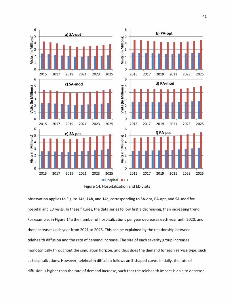
41
Figure 14. Hospitalization and ED visits
observation applies to Figure 14a, 14b, and 14c, corresponding to SA-opt, PA-opt, and SA-mod for
hospital and ED visits. In these figures, the data series follow first a decreasing, then increasing trend.
For example, in Figure 14a the number of hospitalizations per year decreases each year until 2020, and
then increases each year from 2021 to 2025. This can be explained by the relationship between
telehealth diffusion and the rate of demand increase. The size of each severity group increases
monotonically throughout the simulation horizon, and thus does the demand for each service type, such
as hospitalizations. However, telehealth diffusion follows an S-shaped curve. Initially, the rate of
diffusion is higher than the rate of demand increase, such that the telehealth impact is able to decrease
0
1
2
3
4
5
6
2015 2017 2019 2021 2023 2025
Visi
ts (I
n M
illio
ns) a) SA-opt
0
1
2
3
4
5
6
2015 2017 2019 2021 2023 2025
Visi
ts (I
n M
illio
ns) b) PA-opt
0
1
2
3
4
5
6
2015 2017 2019 2021 2023 2025
Visi
ts (I
n M
illio
ns) c) SA-mod
0
1
2
3
4
5
6
2015 2017 2019 2021 2023 2025Vi
sits
(In
Mill
ions
) d) PA-mod
0
1
2
3
4
5
6
2015 2017 2019 2021 2023 2025
Visi
ts (I
n M
illio
ns) e) SA-pes
0
1
2
3
4
5
6
2015 2017 2019 2021 2023 2025
Visi
ts (I
n M
illio
ns) f) PA-pes

42
the number of hospitalizations required overall. Eventually (by year 2021) the rate of demand growth is
faster than the rate of diffusion. This trend is most apparent in the figures corresponding to the SA
strategy because telehealth offers the most benefit for the high severity patient group, which is favored
under the SA strategy. It is also most apparent in the figures corresponding to hospital and ED visits
because their telehealth impacts are much larger than for PO and SN visits (see Table 7).
Figure 15. Physician office and skilled nursing visits
The annual net benefits and average net benefits per telehealth patient, both measured in dollars, are
provided in Figure 16 for each experiment. As expected, experiments using the SA strategy result in
greater net benefits than those using the PA strategy. Once the vast majority of home healthcare
0
20
40
60
80
2015 2017 2019 2021 2023 2025
Visi
ts (I
n M
illio
ns)
Years
a) SA-opt
0
20
40
60
80
2015 2017 2019 2021 2023 2025Vi
sits
(In
Mill
ions
) Years
a) PA-opt
0
20
40
60
80
2015 2017 2019 2021 2023 2025
Visi
ts (I
n M
illio
ns)
Years
c) SA-mod
0
20
40
60
80
2015 2017 2019 2021 2023 2025
Visi
ts (I
n M
illio
ns)
Years
d) PA-mod
0
20
40
60
80
2015 2017 2019 2021 2023 2025
Visi
ts (I
n M
illio
ns)
Years
e) SA-pes
0
20
40
60
80
2015 2017 2019 2021 2023 2025
Visi
ts (I
n M
illio
ns)
Years
f) PA-pes

43
agencies have adopted home telehealth technology (98% of all agencies by 2025), annual net benefits
peak at 23.3 billion dollars in the SA-opt experiment and 17.5 billion dollars in the PA-opt experiment.
Estimated annual net benefits are much more conservative in the SA-pes and PA-pes experiments,
reaching maximum values of 10.4 and 7.5 billion dollars, respectively. Note that in all experiments,
annual net benefits increase at a faster rate until year 2020 before slowing down in 2021. This marks
when the annual rate of HT diffusion begins to slow according to its S-shaped curve. This difference is
most pronounced in those experiments where the telehealth impact is also most pronounced (i.e., SA-
opt). When considering the net benefit per telehealth patient in Figure 16b, the three experiments
corresponding to the SA strategy yield a different trend than the PA strategy. In the SA strategy, net
benefit per telehealth patient decreases markedly after year 2020. This is because patients from both
the high and medium severity groups receive telehealth after that point in time, while only high severity
patients were receiving them previously. The net benefit per patient is greatest for the high severity
group. As expected under the PA strategy, the net benefit per patient does not change from year to
year, because the relative distribution of telehealth among severity groups does not change.
Sensitivity analysis on uncertain parameters and breakdown analysis on Total Savings of Telehealth are
provided in Appendix D and Appendix E, respectively.
Figure 16. Annual net benefits and average net benefit per telehealth patient
0
5
10
15
20
25
2015 2017 2019 2021 2023 2025
$(Bi
llion
s)
Years
a) Annual net benefits
02468
1012
2015 2017 2019 2021 2023 2025
$ (T
hous
ands
)
Years
b) Net benefit per telehealth patient

44
2.8. Conclusion
This study aims to utilize SD to examine the long-term macro-level impacts of home telehealth diffusion
in the US homecare industry. The methodology presented includes a Bass diffusion model to examine
the home telehealth diffusion pattern over time. Generating the diffusion model required an
examination of home healthcare technology with respect to a number of innovation characteristic
dimensions. Then, the diffusion model was embedded within a larger SD model to capture the impacts
of the HT diffusion at a macro level in terms of healthcare service utilization and healthcare spending.
Specifically, the telehealth benefits explicitly considered in the model were visit reductions for four
healthcare service types: number of hospitalizations, number of emergency department (ED) visits,
number of physician office (PO) visits, and number of skilled nursing (SN) visits. The patient population
in the simulation study was comprised of a group representing the majority of home healthcare users:
Medicare Fee-for-Service (FFS) enrollees with multiple chronic conditions.
We classified patients in terms of their severity level by using the number of chronic conditions a patient
has as a proxy for their severity. Then, we studied two different allocation strategies for telehealth,
namely, Proportional Allocation (PA) and Severity-based Allocation (SA). The first strategy considers an
equitable distribution of limited telehealth capacity across patient groups while the latter prioritizes
allocation towards those with the most potential to benefit from telehealth (high severity patients). Due
to the uncertainty in the estimation of telehealth’s impact on the reduction of service types, we define
optimistic, moderate, and pessimistic impact scenarios and use them to compare the allocation
strategies. In the computational study, the SA strategy results in lower healthcare service utilization and
greater net benefit than the PA strategy.
The model requires high quality data in order to demonstrate accurate results. The data used in our
model was extracted from home telehealth case studies, official reports and national statistics. The
literature provides results for home telehealth pilot studies with small numbers of patients across

45
limited time periods. The results of these pilot studies are highly variable, providing a wide range of
telehealth impact observations. Due to this, estimating population level telehealth impacts is
challenging. Thus, the results presented in this paper should be interpreted with caution. The model can
be used to obtain more reliable results as higher quality data becomes available. Specifically, it would be
helpful to have a validated estimate for telehealth impact, if results across various demonstration
studies begin to converge. It would be especially helpful if the impact could be determined separately
for each age and severity group. Finally, FFS enrollment rates, home healthcare admission rates and
chronic condition rates are assumed to be constant during our simulation horizon. If these rates are
expected to change significantly by the year 2025, updated parameter estimates may lead to different
results. However, we expect that overall benefits of telehealth would only increase in that situation, not
decrease, as the population ages and chronic disease diagnoses continue to rise. Our results represent a
conservative lower bound on the potential impact of telehealth in that regard.

46
References
Access Economics. (2010). Telehealth for aged care. Canberra, ACT: Access Economics.
Agrell, H., Dahlberg, S., & Jerant, A. F. (2000). Patients’ perceptions regarding home telecare. Telemedicine Journal and E-Health: The Official Journal of the American Telemedicine Association, 6(4), 409–415.
AHRQ. (2009). Medical Expenditure Panel Survey. Agency for Healthcare Research and Quality.
Alston, K. (2009). Telehealth-supported innovation in home care. Caring: National Association for Home Care Magazine, 28(7), 18–21.
Alwan, M., Wilet, D., & Nobel, J. (2007). State of Technology in Aging Services. Center for Aging Services Technologies.
Ansah, J. P., Eberlein, R. L., Love, S. R., Bautista, M. A., Thompson, J. P., Malhotra, R., & Matchar, D. B. (2014). Implications of long-term care capacity response policies for an aging population: a simulation analysis. Health Policy (Amsterdam, Netherlands), 116(1), 105–113.
ARE-ON. (2015). Arkansas e-Link Project. Retrieved from https://www.areon.net/about/arkansas-e-link- project/
ATA. (2003). Home Telehealth Clinical Guidelines. American Telemedicine Association.
ATA. (2013). Telemedicine and Telehealth Services. American Telemedicine Association.
Barlas, Y. (1996). Formal aspects of model validity and validation in system dynamics. System Dynamics Review, 12(3), 183–210.
Barnett, T. E., Chumbler, N. R., Vogel, W. B., Beyth, R. J., Qin, H., & Kobb, R. (2006). The effectiveness of a care coordination home telehealth program for veterans with diabetes mellitus: a 2-year follow-up. The American Journal of Managed Care, 12(8), 467–474.
Bass, F. M. (1969). A new product growth for model consumer durables. Management Science, 15(5).
Bayer, S., Barlow, J., & Curry, R. (2007). Assessing the impact of a care innovation: telecare. System Dynamics Review, 23(1), 61–80.
Benatar, D., Bondmass, M., Ghitelman, J., & Avitall, B. (2003). Outcomes of chronic heart failure. Archives of Internal Medicine, 163(3), 347–352.
Bolch, E. B., Rosengart, C. L., & Piette, K. F. (2009). An evolutionary home care model for chronic disease management. Caring: National Association for Home Care Magazine, 28(7), 28–30, 32–33.
Bower, A. G. (2005). The Diffusion and Value of Healthcare Information Technology. Santa Monica, CA: The RAND Corporation.
Bowles, K. H., & Baugh, A. C. (2007). Applying research evidence to optimize telehomecare. The Journal of Cardiovascular Nursing, 22(1), 5–15.

47
Brantley, D., Laney-Cummings, K., & Spivack, R. (2004). Innovation, Demand and Investment in Telehealth. The Technology Administration.
Brettle, A. J., Brown, T. M., Hardiker, N. R., Radcliffe, J. N., & Smith, C. L. (2013). Telehealth: The effects on clinical outcomes, cost effectiveness and the patient experience: a systematic overview of the literature. Salford, UK: University of Salford.
Britton, B. (2010). Aging in Place: Remote Monitoring and Chronic Care Management. Presented at the NC Governor’s Conference on Aging, Durham.
Broderick, A., & Lindeman, D. (2013). Scaling Telehealth Programs: Lessons from Early Adopters. The Commonwealth Fund, 1.
Broderick, A., & Steinmetz, V. (2013). Centura Health at Home: Home Telehealth as the Standard of Care. The Commonwealth Fund, 2.
Brookes, L. (2005). SPAN-CHF II: Specialized Primary and Networked Care in Heart Failure II. Medscape.
Burbano, A. C. (2012). Modeling the adoption of identification standards within the healthcare supply chain. University of Arkansas.
Bureau of Labor Statistics. (2014). Occupational outlook handbook. U.S. Department of Labor. Retrieved from http://www.bls.gov/ooh/healthcare/registered-nurses.htm
Caffrey, C., Sengupta, M., Moss, A., Harris-Kojetin, L., & Valverde, R. (2011). Home Health Care and Discharged Hospice Care Patients: United States, 2000 and 2007. National Health Statistics Reports, 38.
Cain, M., & Mittman, R. (2002). Diffusion of Innovation in Health Care. California HealthCare Foundation.
CAST. (2009). Technologies to Help Older Adults Maintain Independence: Advancing Technology Adoption. Oakland, CA: Center for Technology and Aging.
CAST. (2013). Telehealth and Remote Patient Monitoring for Long-Term and Post-Acute Care. Washington, DC: The LeadingAge Center for Aging Services Technologies.
Center for Connected Health Policy. (2014). Cost Efficiency Studies. Center for Connected Health Policy.
Chen, H. F., Kalish, M. C., & Pagan, J. A. (2011). Telehealth and hospitalizations for Medicare home healthcare patients. The American Journal of Managed Care, 17(6), e224–230.
Chumbler, N. R., Neugaard, B., Ryan, P., Qin, H., & Joo, Y. (2005). An observational study of veterans with diabetes receiving weekly or daily home telehealth monitoring. Journal of Telemedicine and Telecare, 11(3), 150–156.
Cleland, J. G. F., Louis, A. A., Rigby, A. S., Janssens, U., Balk, A. H. M. M., & TEN-HMS Investigators. (2005). Noninvasive home telemonitoring for patients with heart failure at high risk of recurrent admission and death: the Trans-European Network-Home-Care Management System (TEN-HMS) study. Journal of the American College of Cardiology, 45(10), 1654–1664.

48
CMS. (2011). National Health Expenditure Data. Baltimore, MD: Centers for Medicare & Medicaid Services.
CMS. (2012). Chronic Conditions among Medicare Beneficiaries (Chart Book). Baltimore, MD: Centers for Medicare & Medicaid Services.
CMS. (2013). Medicare and Medicaid Statistical Supplement Report. Centers for Medicare & Medicaid Services.
Comstock, J. (2013). Bill tackles telehealth reimbursement, licensure. Retrieved from http://mobihealthnews.com/19723/bill-tackles-telehealth-reimbursement-licensure/
Coye, M. J., Haselkorn, A., & DeMello, S. (2009). Remote Patient Management: Technology-Enabled Innovation and Evolving Business Models For Chronic Disease Care. Health Affairs, 28(1), 126–135.
CTEC. (2009). Optimizing Telehealth in California: An Agenda for Today and Tomorrow. Sacramento, CA: The California Telemedicine and eHealth Center.
Cubanski, J., Huang, J., Damico, A., Jacobson, G., & Neuman, T. (2010). Medicare Chart Book. The Henry J. Kaiser Family Foundation.
Cusack, C. M., Pan, E., Hook, J. M., Vincent, A., Kaelber, D. C., Bates, D. C., & Middleton, B. (2007). The Value of Provider-to-Provider Telehealth Technologies. Charlestown, MA: Center for Information Technology Leadership.
Darkins, A., Ryan, P., Kobb, R., Foster, L., Edmonson, E., Wakefield, B., & Lancaster, A. E. (2008). Care Coordination/Home Telehealth: the systematic implementation of health informatics, home telehealth, and disease management to support the care of veteran patients with chronic conditions. Telemedicine Journal and E-Health: The Official Journal of the American Telemedicine Association, 14(10), 1118–1126.
Diaz, R., Behr, J. G., & Tulpule, M. (2012). A system dynamics model for simulating ambulatory health care demands. Simulation in Healthcare: Journal of the Society for Simulation in Healthcare, 7(4), 243–250.
Dimmick, S. L., Mustaleski, C., Burgiss, S. G., & Welsh, T. (2000). A case study of benefits & potential savings in rural home telemedicine. Home Healthcare Nurse, 18(2), 124–135.
Ekeland, A. G., Bowes, A., & Flottorp, S. (2010). Effectiveness of telemedicine: a systematic review of reviews. International Journal of Medical Informatics, 79(11), 736–771.
England, I., Stewart, D., & Walker, S. (2000). Information technology adoption in health care: when organisations and technology collide. Australian Health Review, 23(3), 176–185.
Erdil, N. Ö. (2009). Systems Analysis of Electronic Health Record Adoption in the U.S. Healthcare System. State University of New York at Binghamton.

49
FAST. (2009). Detailed Technology Analysis Home Telehealth. The Fast Adoption of Significant Technologies Initiative.
Fazzi Associates. (2008). Philips National Study on the Future of Technology and Telehealth in Home Care. Fazzi Associates.
Fazzi Associates. (2009). The BlackBerry® Report: The National State of the Home Care Industry. Fazzi Associates.
Fazzi Associates. (2014). National State of the Industry Report for Home Health and Hospice. Fazzi Associates.
Finkelstein, S. M., Speedie, S. M., & Potthoff, S. (2006). Home telehealth improves clinical outcomes at lower cost for home healthcare. Telemedicine Journal and E-Health: The Official Journal of the American Telemedicine Association, 12(2), 128–136.
Ford, A., & Flynn, H. (2005). Statistical screening of system dynamics models. System Dynamics Review, 21(4), 273–303.
Forrester, J. W., & Senge, P. M. (1980). Tests for Building Confidence in System Dynamics Models. TIMS Studies in the Management Sciences, 14.
Garritty, C., & El Emam, K. (2006). Who’s Using PDAs? Estimates of PDA Use by Health Care Providers: A Systematic Review of Surveys. Journal of Medical Internet Research, 8(2), e7.
Hanseth, O., & Aanestad, M. (2003). Bootstrapping networks, communities and infrastructures. On the evolution of ICT solutions in health care. Oslo, Norway: University of Oslo.
Helitzer, D., Heath, D., Maltrud, K., Sullivan, E., & Alverson, D. (2003). Assessing or Predicting Adoption of Telehealth Using the Diffusion of Innovations Theory: A Practical Example from a Rural Program in New Mexico. Telemedicine Journal and E-Health, 9(2), 179–187.
Hersh, W. R., Hickam, D. H., Severance, S. M., Dana, T. L., Krages, K. P., & Helfand, M. (2006). Telemedicine for the medicare population: update (No. 131) (pp. 1–41). Rockville, MD: Agency for Healthcare Research and Quality.
Homer, J., Hirsch, G., Minniti, M., & Pierson, M. (2004). Models for collaboration: how system dynamics helped a community organize cost-effective care for chronic illness. System Dynamics Review, 20(3), 199–222.
H.R. 3306. (2013). Telehealth Enhancement Act of 2014. 113th Congress. Retrieved from https://www.congress.gov/bill/113th-congress/house-bill/3306/text
H.R. 5380. (2014). Medicare Telehealth Parity Act of 2014. 113th Congres. Retrieved from https://www.congress.gov/bill/113th-congress/house-bill/5380/text
H.R. 6719. (2012). The Telehealth Promotion Act of 2012. 112th Congress. Retrieved from http://www.gpo.gov/fdsys/pkg/BILLS-112hr6719ih/html/BILLS-112hr6719ih.htm

50
Hsiao, J. P.-H., Jaw, C., & Huan, T.-C. (2009). Information diffusion and new product consumption: A bass model application to tourism facility management. Journal of Business Research, 62(7), 690–697.
Huddleston, M., & Kobb, R. (2004). Emerging technology for at-risk chronically ill veterans. Journal for Healthcare Quality: Official Publication of the National Association for Healthcare Quality, 26(6), 12–15, 24.
Jerant, A. F., Azari, R., & Nesbitt, T. S. (2001). Reducing the cost of frequent hospital admissions for congestive heart failure: a randomized trial of a home telecare intervention. Medical Care, 39(11), 1234–1245.
Johnston, B., Wheeler, L., Deuser, J., & Sousa, K. H. (2000). Outcomes of the Kaiser Permanente Tele-Home Health Research Project. Archives of Family Medicine, 9(1), 40–45.
Kobb, R., Hoffman, N., Lodge, R., & Kline, S. (2003). Enhancing elder chronic care through technology and care coordination: report from a pilot. Telemedicine Journal and E-Health: The Official Journal of the American Telemedicine Association, 9(2), 189–195.
Lee, H., Kim, S. G., Park, H., & Kang, P. (2014). Pre-launch new product demand forecasting using the Bass model: A statistical and machine learning-based approach. Technological Forecasting and Social Change, 86, 49–64. http://doi.org/10.1016/j.techfore.2013.08.020
Lehmann, P. C. A., Mintz, N., & Giacini, J. M. (2006). Impact of Telehealth on Healthcare Utilization by Congestive Heart Failure Patients. Disease Management & Health Outcomes, 14(3), 163–169.
Lindeman, D. (2011). Interview: Lessons from a Leader in Telehealth Diffusion: A Conversation with Adam Darkins of the Veterans Health Administration. Ageing International, 36(1), 146–154.
Litan, R. (2008). Vital Signs via Broadband: Remote Health Monitoring Transmits Savings, Enhances Lives. Better Health Care Together.
Lochner, K., Goodman, R., Posner, S., & Parekh, A. (2013). Multiple Chronic Conditions Among Medicare Beneficiaries: State-level Variations in Prevalence, Utilization, and Cost, 2011. Medicare & Medicaid Research Review, 3(3), E1–E19.
Louis, A. A., Turner, T., Gretton, M., Baksh, A., & Cleland, J. G. F. (2003). A systematic review of telemonitoring for the management of heart failure. European Journal of Heart Failure, 5(5), 583–590.
Lyons, G. J., & Duggan, J. (2014). System dynamics modelling to support policy analysis for sustainable health care. Journal of Simulation.
Machlin, S. R., & Soni, A. (2013). Health Care Expenditures for Adults With Multiple Treated Chronic Conditions: Estimates From the Medical Expenditure Panel Survey, 2009. Preventing Chronic Disease, 10.
Maeng, D. D., Starr, A. E., Tomcavage, J. F., Sciandra, J., Salek, D., & Griffith, D. (2014). Can Telemonitoring Reduce Hospitalization and Cost of Care? A Health Plan’s Experience in Managing Patients with Heart Failure. Population Health Management, 17(6), 340–344.

51
Marshall, M. (2009). Monitoring long term conditions with Telehealth. British Journal of Community Nursing, 14(6), 246–248.
Mattke, S., Klautzer, L., Mengistu, T., Garnett, J., Hu, J., & Wu, H. (2010). Health and Well-Being in the Home: A Global Analysis of Needs, Expectations, and Priorities for Home Health Care Technology. Santa Monica, CA: The RAND Corporation.
McCann, E. (2013). Proposed bill would expand telehealth services, bolster federal payouts. Retrieved from http://www.healthcareitnews.com/news/proposed-bill-would-expand-telehealth
MedPAC. (2005). Report to the Congress: Medicare Payment Policy. The Medicare Payment Advisory Commission.
Menachemi, N., Burke, D. E., & Ayers, D. J. (2004). Factors affecting the adoption of telemedicine - A multiple adopter perspective. Journal of Medical Systems, 28(6), 617–632.
Meyer, M., Kobb, R., & Ryan, P. (2002). Virtually Healthy: Chronic Disease Management in the Home. Disease Management, 5(2), 87–94.
Milburn, A. B., Hewitt, M., Griffin, P., & Savelsbergh, M. (2014). The value of remote monitoring systems for treatment of chronic disease. IIE Transactions on Healthcare Systems Engineering, 4(2), 65–79.
Myers, S., Grant, R. W., Lugn, N. E., Holbert, B., & Kvedar, J. C. (2006). Impact of Home-Based Monitoring on the Care of Patients with Congestive Heart Failure. Home Health Care Management & Practice, 18(6), 444–451.
NAHC. (2007). Recognize Home Telehealth Interactions as Bona Fide Medicare Services. National Association for Home Care & Hospice.
Nangalia, V., Prytherch, D. R., & Smith, G. B. (2010). Health technology assessment review: remote monitoring of vital signs--current status and future challenges. Critical Care (London, England), 14(5), 233.
NEHI. (2004). Remote Physiological Monitoring: Innovation in the Management of Heart Failure. Cambridge, MA: New England Healthcare Institute.
NEHI. (2009). Thinking Outside the Pillbox: A System-wide Approach to Improving Patient Medication Adherence for Chronic Disease. New England Healthcare Institute.
Noel, H. C., Vogel, D. C., Erdos, J. J., Cornwall, D., & Levin, F. (2004). Home telehealth reduces healthcare costs. Telemedicine Journal and E-Health: The Official Journal of the American Telemedicine Association, 10(2), 170–183.
Osipenko, L. (2005). System Dynamics in Early Health Technology Assessment (eHTA): Prenatal Screening Technology (ELI-P Complex). Stevens Institute of Technology.
Otto, P., & Nevo, D. (2013). Electronic health records: A simulation model to measure the adoption rate from policy interventions. Journal of Enterprise Information Management, 26(1/2), 165–182.

52
Pare, G., Jaana, M., & Sicotte, C. (2007). Systematic Review of Home Telemonitoring for Chronic Diseases: The Evidence Base. Journal of the American Medical Informatics Association : JAMIA, 14(3), 269–277.
Peres, R., Muller, E., & Mahajan, V. (2010). Innovation diffusion and new product growth models: A critical review and research directions. International Journal of Research in Marketing, 27(2), 91–106.
Pfuntner, A., Wier, L. M., & Steiner, C. (2013). Costs for Hospital Stays in the United States, 2011 (No. HCUP Statistical Brief #168). Rockville, MD: Agency for Healthcare Research and Quality.
Polisena, J., Coyle, D., Coyle, K., & McGill, S. (2009). Home telehealth for chronic disease management: a systematic review and an analysis of economic evaluations. International Journal of Technology Assessment in Health Care, 25(3), 339–349.
Praxia Information Intelligence. (2007). Canada Health Infoway Home Telehealth Business Case Report. Praxia Information Intelligence.
Radas, S. (2006). Diffusion Models in Marketing: How to Incorporate the Effect of External Influence? Economic Trends and Economic Policy, 15(105), 30, 30–51, 51.
Resnick, H. E., & Alwan, M. (2010). Use of health information technology in home health and hospice agencies: United States, 2007. Journal of the American Medical Informatics Association : JAMIA, 17(4), 389–395.
Rogers, E. M. (2003). Diffusion of innovations. New York: Free Press.
Rowan, T. (2013). Home Care Technology Report (No. 5). Rowan Consulting Associates.
Russell, L. B. (1976). The diffusion of new hospital technologies in the United States. International Journal of Health Services: Planning, Administration, Evaluation, 6(4), 557–580.
Schneider, N. M. (2004). Managing congestive heart failure using home telehealth. Home Healthcare Nurse, 22(10), 719–722.
Schwaninger, M., Pérez Rios, J., Wolstenholme, E., Monk, D., & Todd, D. (2010). Dynamic cost benefit analysis for mental health reform. Kybernetes, 39(9/10), 1645–1658.
Seto, E. (2008). Cost comparison between telemonitoring and usual care of heart failure: a systematic review. Telemedicine Journal and E-Health: The Official Journal of the American Telemedicine Association, 14(7), 679–686.
Stachura, M. E., & Khasanshina, E. V. (2007). Telehomecare and Remote Monitoring: An Outcomes Overview. Washington, DC: The Advanced Medical Technology Association.
Sterman, J. (2000). Business Dynamics: Systems Thinking and Modeling for a Complex World. Irwin/McGraw-Hill c2000. .

53
Sultan, F., Farley, J. U., & Lehmann, D. R. (1990). A Meta-Analysis of Applications of Diffusion Models. Journal of Marketing Research, 27(1), 70–77.
Takahashi, P. Y., Hanson, G. J., Pecina, J. L., Stroebel, R. J., Chaudhry, R., Shah, N. D., & Naessens, J. M. (2010). A randomized controlled trial of telemonitoring in older adults with multiple chronic conditions: the Tele-ERA study. BMC Health Services Research, 10, 255.
Taylor, K., & Dangerfield, B. (2004). Modelling the feedback effects of reconfiguring health services. Journal of the Operational Research Society, 56(6), 659–675.
Teng, J. T. C., Grover, V., & Guttler, W. (2002). Information technology innovations: general diffusion patterns and its relationships to innovation characteristics. IEEE Transactions on Engineering Management, 49(1), 13–27.
The Greenlining Institute. (2009). Telemedicine for the New Majority in California. Berkeley, CA: The Greenlining Institute.
Tornatzky, L. G., & Klein, K. J. (1982). Innovation characteristics and innovation adoption-implementation: A meta-analysis of findings. IEEE Transactions on Engineering Management, EM-29(1), 28–45.
Trappenburg, J. C. A., Niesink, A., de Weert-van Oene, G. H., van der Zeijden, H., van Snippenburg, R., Peters, A., … Schrijvers, A. J. P. (2008). Effects of telemonitoring in patients with chronic obstructive pulmonary disease. Telemedicine Journal and E-Health: The Official Journal of the American Telemedicine Association, 14(2), 138–146.
UK Department of Health. (2011). Whole System Demonstrator Programme. UK Department of Health.
U.S. Census Bureau. (2014). 2014 National Population Projections.
VATAP. (2010). Bibliography: Home Telehealth. Boston, MA: Veterans Affairs Technology Assessment Program.
Venkatesan, R., Krishnan, T. V., & Kumar, V. (2004). Evolutionary Estimation of Macro-Level Diffusion Models Using Genetic Algorithms: An Alternative to Nonlinear Least Squares. Marketing Science, 23(3), 451–464.
Wang, A., Redington, L., Steinmetz, V., & Lindeman, D. (2011). The ADOPT Model: Accelerating Diffusion of Proven Technologies for Older Adults. Ageing International, 36(1), 29–45.
Wels-Maug, C. (2013). US legislation paves the way for a telehealth breakthrough. Retrieved from http://www.ovum.com/us-legislation-paves-the-way-for-a-telehealth-breakthrough/
Wolstenholme, E. (1999). A patient flow perspective of U.K. health services: exploring the case for new “intermediate care” initiatives. System Dynamics Review, 15(3), 253–271.
Woods, L. W., & Snow, S. W. (2013). The impact of telehealth monitoring on acute care hospitalization rates and emergency department visit rates for patients using home health skilled nursing care. Home Healthcare Nurse, 31(1), 39–45.

54
Appendix A: Bass Model Parameter Estimation
We use the below non-linear model to select Bass model parameters.
Data elements:
Α : Aggregate error value.
a : The coefficient of external influences.
b : The coefficient of internal influences.
m : The maximum expected proportion of total adopters.
Objective function:
Minimize Α
Subject to:
1.00 ≤< a ,
5.00 ≤≤ b ,
7.03.0 ≤≤ m ,
∈mba ,, ℝ+.
To calculate the aggregate error value (Α ), we consider different measures that have been used to
estimate the accuracy of Bass models (Hsiao, Jaw, & Huan, 2009; Lee, Kim, Park, & Kang, 2014;
Venkatesan, Krishnan, & Kumar, 2004). The lower the performance measures, the better the prediction
model. These measures are formulated below:
Root mean squared error (RMSE): ( )∑=
−=n
iii yy
nRMSE
1
2ˆ1 ,

55
Mean squared error (MSE): ( )∑=
−=n
iii yy
nMSE
1
2ˆ1,
Mean absolute error (MAE): ∑=
−=n
iii yy
nMAE
1
ˆ1,
where iy is the actual (historical) value and iy is the predicted value by the model in time period i .
Based on the Bass diffusion model, the predicted proportion of adopters, iy , is calculated by;
( ) )1()1()1( ˆˆ
ˆˆ −−
− +−
+= ii
ii yym
myb
ay .
The non-linear model is solved for each measure in Microsoft Excel Solver. This software uses the
Generalized Reduce Gradient Algorithm for optimizing non-linear models. Note the software cannot
guarantee whether a local or global optimum has been found. The results are provided in Table A.1. The
values are close to each other so we decided to use the average values of each parameter in the system
dynamics model.
Table A.1. Parameter estimations Bass Model Parameters RMSE MSE MAE
a 0.00339 0.00339 0.00333 b 0.45213 0.45214 0.45122 m 0.30000 0.30000 0.30000

56
Appendix B: Impact of Home Telehealth
Table B.1. Studies reporting the impact of home telehealth Authors Interventions Patients Outcomes (Meyer, Kobb, & Ryan, 2002)
TM, IHT, messaging
Multiple chronic conditions
ED visits reduced by 29% Hospitalization reduced by 55% PO visits reduced by 20%
(Noel, Vogel, Erdos, Cornwall, & Levin, 2004)
TM Elderly with chronic conditions
ED visits reduced by 19% Hospitalization reduced by 19% PO visits increased by 10%
(Finkelstein et al., 2006) TM, IHH Elderly with chronic conditions
Hospitalization reduced by 58%
(Bolch, Rosengart, & Piette, 2009)
TM Multiple chronic conditions
Hospitalization reduced by 54%
(Woods & Snow, 2013) TM Multiple chronic conditions
ED visits reduced by 64% Hospitalization reduced by 66%
(Darkins et al., 2008) TM, IHT, messaging
Multiple chronic conditions
Hospitalization reduced by 19%
(Brookes, 2005) TM Elderly with HF Hospitalization reduced by 72% (Kobb, Hoffman, Lodge, & Kline, 2003)
TM, IHT Elderly with chronic conditions
Hospitalization reduced by 60% ED visits reduced by 66%
(Broderick & Lindeman, 2013)
TM HF Hospitalization reduced by 51%
(Broderick & Steinmetz, 2013)
TM Multiple chronic conditions
Hospitalization reduced by 62%
(Myers et al., 2006) TM HF SN visits reduced by 29% (Britton, 2010) TM Mostly elderly with
chronic conditions ED visits reduced by 81% Hospitalization reduced by 71%
(Barnett et al., 2006) TM, IHT Elderly with diabetes Hospitalization reduced by 25% (Alston, 2009) TM HF, COPD SN visits reduced by 25%
Hospitalization reduced by 44% (UK Department of Health, 2011)
TM, IHT Diabetes, heart failure, COPD
ED visits reduced by 20% Hospitalization reduced by 14%
(Marshall, 2009) TM Elderly with COPD Hospitalization reduced by 50% (Lehmann, Mintz, & Giacini, 2006)
TM Elderly with HF ED visits reduced by 33% Hospitalization reduced by 29%
(Benatar, Bondmass, Ghitelman, & Avitall, 2003)
TM Mostly elderly with HF
Hospitalization reduced by 45%
(Chumbler, Neugaard, Ryan, Qin, & Joo, 2005)
TM Veterans with diabetes
Hospitalization reduced by 52%
(Jerant, Azari, & Nesbitt, 2001)
IHT HF ED visits reduced by 61% Hospitalization reduced by 41%
(Schneider, 2004) TM HF Hospitalization reduced by 84% SN visits reduced by 55%
(NEHI, 2004) TM HF Hospitalization reduced by 32%

57
Table B.1. Studies reporting the impact of home telehealth (Cont.) Authors Interventions Patients Outcomes (Trappenburg et al., 2008) TM Lung disease PO visits reduced by 17% (Cleland et al., 2005) TM HF PO visits increased by 71% (Takahashi et al., 2010) TM Elderly with chronic
conditions ED visits reduced by 36% Hospitalization reduced by 43%
(Maeng et al., 2014) TM Elderly with chronic conditions
Hospitalization reduced by 23%
(Johnston, Wheeler, Deuser, & Sousa, 2000)
IHT Elderly with chronic conditions
PO visits increased by 12%
(Huddleston & Kobb, 2004) TM Mostly elderly with chronic conditions
PO visits reduced by 4% Hospitalization reduced by 43% ED visits reduced by 54%
TM: Telemonitoring, IHT: Interactive home telehealth

58
Appendix C: Extreme Conditions Tests
Extreme conditions tests were performed by setting extreme values to certain selected parameters and
observing the generated outputs of the model. The results of the extreme conditions tests are described
below.
Extreme Condition Test 1: Changing Proportion of Adopters
In this test, we excluded the Telehealth Diffusion module and set the Proportion of Adopters to 30% and
100% beginning with 2015. The simulation shows that telehealth capacity in a 100% Proportion of
Adopters case is higher than the capacity with a 30% Proportion of Adopters and telehealth capacity in
the S-shaped diffusion is in between them through years.
Figure C.1. Telehealth capacity under extreme conditions of Proportion of Adopters
Extreme Condition Test 2: Changing Patient Acceptance
In our model, we define Patient Acceptance for each age-severity group. If Patient Acceptance is lower,
then the demand for telehealth should decline. To test this, we decrease Patient Acceptance rates by
50%. It is apparent that the simulation properly responds to this extreme condition.
0.0
0.5
1.0
1.5
2.0
2.5
3.0
2015 2016 2017 2018 2019 2020 2021 2022 2023 2024 2025
Patie
nts
(Mill
ions
)
Years S-Shape 100% 30%

59
Table C.1. Extreme values for Patient Acceptance Extreme Condition Values
Patient Acceptance
Very low Low Medium High65-74 0.475 0.475 0.475 0.45075-84 0.475 0.475 0.450 0.42585+ 0.450 0.450 0.425 0.400
Figure C.2. Telehealth demand under extreme conditions of Patient Acceptance
Extreme Condition Test 3: Changing Average Telehealth Nurse Capacity
We tested two extreme values of Average Telehealth Nurse Capacity (i.e. 20 and 200 patients per year).
As seen in Figure C.3., Telehealth Capacity increases as Average Telehealth Nurse Capacity increases.
Figure C.3. Telehealth capacity under extreme conditions of Average Telehealth Nurse Capacity
0.00.51.01.52.02.53.03.54.04.5
2015 2016 2017 2018 2019 2020 2021 2022 2023 2024 2025
Patie
nts
(Mill
ions
)
Years Lower Patient Acceptance Normal Patient Acceptance
0.00.51.01.52.02.53.03.54.04.55.05.5
2015 2016 2017 2018 2019 2020 2021 2022 2023 2024 2025
Patie
nts
(Mill
ions
)
Years Normal Nurse Cap. Higher Nurse Cap. Lower Nurse Cap.

60
Extreme Condition Test 4: Changing Telehealth Coverage
Telehealth Coverage parameter denotes whether certain patient groups are covered for telehealth
service or not. According to the Severity-based Allocation strategy, patient groups with higher severity
have priority to use telehealth units. In this test, we change this strategy to the opposite, in that patient
groups with lower severity have higher priority to use telehealth units. The simulation responded
properly to this extreme allocation strategy (see Figure C.4)
Figure C.4. Patients receiving telehealth
Extreme Condition Test 5: Changing Telehealth Impact
The telehealth Impact parameter takes on a value between 0 and 1 for each service type to represent
the percent reduction in visits for that service type that can be expected when telehealth is used. If
Telehealth Impact is zero, then we wouldn’t expect to see any reduction in healthcare utilization. As it
can be seen in Figure C.5, the simulation produces higher healthcare utilization numbers for each service
type.
0.0
0.5
1.0
1.5
2.0
2.5
3.0
2015 2017 2019 2021 2023 2025
Patie
nts
(Mill
ions
)
Years
a) Normal Case
0.0
0.5
1.0
1.5
2.0
2.5
3.0
2015 2017 2019 2021 2023 2025
Patie
nts
(Mill
ions
)
Years
b) Extreme Case

61
Figure C.5. Healthcare utilization with zero Telehealth Impact
0102030405060708090
01234567
2015 2016 2017 2018 2019 2020 2021 2022 2023 2024 2025
Mill
ions
Mill
ions
Hospital ED Physician Skilled nursing

62
Appendix D: Sensitivity Analysis
Sensitivity analysis identifies the impact of uncertain factors on simulation results. First, we applied
statistical screening method (Ford & Flynn, 2005) for sensitivity analysis. Statistical screening method
identifies the importance of model parameters by observing the correlation coefficients between the
main output variable and model parameters at different time periods in the simulation. The correlation
coefficient at time period 𝑡 ( tr ) is calculated by the formula below:
( )( )( ) ( )22∑
∑−−
−−=
YYXX
YYXXr
ii
iit , (D.1)
Where iX is the selected model parameter at run i and iY is the model’s main output at run i . The
correlation coefficient ranges from -1 to +1.
Annual Net Benefit is determined as the model’s main output and the selected model parameters and
the corresponding distributions are provided in Table D.1. The number of runs is selected as 50 and a
period of 11 years (2015-2025) is defined as the horizon to run the sensitivity analysis test.
Table D.1. Sensitivity analysis parameters Parameter Ranges of Uncertainty Units Diffusion Speed (𝑏) Uniform (0.3, 0.5) Dimensionless Saturation Level Uniform (0.7, 1.0) Percentage Average Telehealth Nurse Capacity Uniform (80, 120) Number of patients per nurse/year Dedication Ratio Uniform (0.08, 0.12) Percentage Telehealth Impact on Hospitalization Uniform (0.3, 0.6) Percentage Telehealth Impact on ED Visits Uniform (0.3, 0.6) Percentage Telehealth Impact on PO Visits Uniform (-0.1, 0.1) Percentage Telehealth Impact on SN Visits Uniform (0.25, 0.4) Percentage
Figure D.1 shows the time series of the correlation coefficients in each allocation strategies. The
parameters with an 4.0>r can be considered to have an impact in the main output. All the high
influence parameters have positive correlations with Annual Net Benefit. Telehealth Impact on
hospitalization, Average Telehealth Nurse Capacity, and Dedication Ratio emerge as the most important

63
parameters through the whole simulation period, implying sensitivity analysis may be most important
for these three parameters. Saturation Level has an increasing correlation and after 2018 it becomes the
fourth dominant parameter. Diffusion Speed has a nonlinear correlation over time. The correlation
coefficient for Diffusion Speed increases till 2018 and then constantly falls down during the rest of the
simulation. The results of the statistical screening method provide insights on the model structure and
identify the relevant model parameters. Future data collection effort should prioritize the most relevant
model parameters. This would able us obtain more accurate simulation outputs.
Figure D.1. Correlation coefficient plots
To see the individual impacts of the high influence parameters (e.g. the parameters with an 4.0>r ),
we employ one-at-a-time sensitivity analysis. The parameters of interest are Telehealth Impact on
Hospitalization, Average Telehealth Nurse Capacity, and Dedication Ratio.
-0.2
0.0
0.2
0.4
0.6
0.8
1.0
2015 2016 2017 2018 2019 2020 2021 2022 2023 2024 2025
Corr
elat
ion
Coef
ficie
nts
Years
a) Severity-based allocation (SA)
-0.2
0.0
0.2
0.4
0.6
0.8
1.0
2015 2016 2017 2018 2019 2020 2021 2022 2023 2024 2025
Corr
elat
ion
Coef
ficie
nts
Years
b) Proportional allocation (PA)

64
Telehealth Impact on Hospitalization
The system dynamics model assumes a 30% decrease, 50% decrease, and 60% decrease in
hospitalization for pessimistic, moderate, and optimistic scenarios, respectively. To apply one-at-a-time
sensitivity analysis on this parameter, we change its values ±20% in each scenario and observe Annual
Net Benefit. For all cases, the Annual Net Benefit increases as home telehealth’s success in reducing
hospitalization increases.
Figure D.2. Sensitivity analysis - Telehealth Impact on Hospitalization
05
1015202530
2015 2017 2019 2021 2023 2025
$(Bi
llion
s)
Years
a) SA-opt
0
5
10
15
20
25
2015 2017 2019 2021 2023 2025
$(Bi
llion
s)
Years
b) PA-opt
0
5
10
15
20
25
2015 2017 2019 2021 2023 2025
$(Bi
llion
s)
Years
c) SA-mod
0
5
10
15
20
2015 2017 2019 2021 2023 2025
$(Bi
llion
s)
Years
d) PA-mod
0
5
10
15
2015 2017 2019 2021 2023 2025
$(Bi
llion
s)
Years
e) SA-pes
0
2
4
6
8
10
2015 2017 2019 2021 2023 2025
$(Bi
llion
s)
Years
f) PA-pes

65
Average Telehealth Nurse Capacity
The system dynamics model assumes that a telehealth nurse can provide service to 100 patients
annually on average. We change this parameter’s values ±20% in each scenario and observe Annual Net
Benefit. Annual Net Benefit is more sensitive to the changes in average telehealth nurse capacity in
proportional allocation strategy cases.
Figure D.3. Sensitivity analysis - Average Telehealth Nurse Capacity
05
1015202530
2015 2017 2019 2021 2023 2025
$(Bi
llion
s)
Years
a) SA-opt
0
5
10
15
20
25
2015 2017 2019 2021 2023 2025$(
Billi
ons)
Years
b) PA-opt
0
5
10
15
20
25
2015 2017 2019 2021 2023 2025
$(Bi
llion
s)
Years
c) SA-mod
0
5
10
15
20
2015 2017 2019 2021 2023 2025
$(Bi
llion
s)
Years
d) PA-mod
02468
1012
2015 2017 2019 2021 2023 2025
$(Bi
llion
s)
Years
e) SA-pes
0
2
4
6
8
10
2015 2017 2019 2021 2023 2025
$(Bi
llion
s)
Years
f) PA-pes

66
Dedication Ratio
This parameter represents the represents the percentage of nurses allocated to home telehealth
monitoring and it is assumed to be 10% in the model. The model outputs reflecting ±20% of change in
the value of the parameter is presented. Proportional allocation cases are more sensitive to dedication
ratio than severity-based allocations cases.
Figure D.5. Sensitivity analysis - Dedication Ratio
05
1015202530
2015 2017 2019 2021 2023 2025
$(Bi
llion
s)
Years
a) SA-opt
0
5
10
15
20
25
2015 2017 2019 2021 2023 2025$(
Billi
ons)
Years
b) PA-con
0
5
10
15
20
25
2015 2017 2019 2021 2023 2025
$(Bi
llion
s)
Years
c) SA-mod
0
5
10
15
20
2015 2017 2019 2021 2023 2025
$(Bi
llion
s)
Years
d) PA-mod
02468
1012
2015 2017 2019 2021 2023 2025
$(Bi
llion
s)
Years
e) SA-pes
0
2
4
6
8
10
2015 2017 2019 2021 2023 2025
$(Bi
llion
s)
Years
f) PA-pes

67
Appendix E: Breakdown Analysis
The total cost of telehealth in each year is provided in Table E.1. These costs are the same regardless of
which allocation strategy and telehealth impact scenarios are considered, as those factors do not impact
telehealth system cost.
Table E.1. Total cost of telehealth Years Total Cost 2015 $ 589,703,740 2016 $ 801,696,091 2017 $ 1,049,747,340 2018 $ 1,320,356,033 2019 $ 1,594,950,899 2020 $ 1,855,660,571 2021 $ 2,090,701,082 2022 $ 2,296,250,916 2023 $ 2,474,739,451 2024 $ 2,631,749,060 2025 $ 2,773,480,404
The results of the six different experiments (two types of allocation strategies, three levels of telehealth
impact) are broken down into individual savings for each healthcare service type. Tables from E.2 to E.7
provide the savings from each visit type in each year. The tables provide individual savings from
healthcare visits that comprise the total savings due to home telehealth diffusion.
Table E.2. Savings for each visit type in SA-opt experiment Years Hospital ED PO SN Total Savings 2015 $ 4,690,672,031 $ 880,174,953 $ 86,265,233 $ 625,085,964 $ 6,282,198,180 2016 $ 6,446,413,961 $ 1,209,628,827 $ 118,554,740 $ 859,058,757 $ 8,633,656,284 2017 $ 8,549,637,698 $ 1,604,285,465 $ 157,234,716 $ 1,139,337,495 $ 11,450,495,374 2018 $ 10,883,270,870 $ 2,042,176,976 $ 200,152,108 $ 1,450,320,938 $ 14,575,920,892 2019 $ 13,255,709,845 $ 2,487,350,152 $ 243,783,170 $ 1,766,475,701 $ 17,753,318,868 2020 $ 14,999,512,797 $ 2,819,140,231 $ 282,833,466 $ 2,052,252,667 $ 20,153,739,161 2021 $ 16,003,306,023 $ 3,016,410,666 $ 314,891,768 $ 2,290,033,467 $ 21,624,641,925 2022 $ 16,898,360,660 $ 3,191,104,504 $ 341,636,653 $ 2,487,976,509 $ 22,919,078,325 2023 $ 17,704,998,671 $ 3,347,367,817 $ 363,949,443 $ 2,652,672,638 $ 24,068,988,568 2024 $ 18,454,462,438 $ 3,491,581,463 $ 383,195,444 $ 2,794,333,842 $ 25,123,573,187 2025 $ 19,175,277,814 $ 3,629,569,537 $ 400,618,281 $ 2,922,261,493 $ 26,127,727,125

68
Table E.3. Savings for each visit type in SA-mod experiment Years Hospital ED PO SN Total Savings 2015 $ 3,908,893,359 $ 660,131,215 $ - $ 468,814,473 $ 5,037,839,047 2016 $ 5,372,011,634 $ 907,221,620 $ - $ 644,294,068 $ 6,923,527,322 2017 $ 7,124,698,082 $ 1,203,214,098 $ - $ 854,503,121 $ 9,182,415,302 2018 $ 9,069,392,391 $ 1,531,632,732 $ - $ 1,087,740,704 $ 11,688,765,828 2019 $ 11,046,424,871 $ 1,865,512,614 $ - $ 1,324,856,776 $ 14,236,794,261 2020 $ 12,499,593,997 $ 2,114,355,173 $ - $ 1,539,189,500 $ 16,153,138,671 2021 $ 13,336,088,353 $ 2,262,308,000 $ - $ 1,717,525,100 $ 17,315,921,453 2022 $ 14,081,967,216 $ 2,393,328,378 $ - $ 1,865,982,382 $ 18,341,277,976 2023 $ 14,754,165,559 $ 2,510,525,863 $ - $ 1,989,504,478 $ 19,254,195,900 2024 $ 15,378,718,698 $ 2,618,686,097 $ - $ 2,095,750,382 $ 20,093,155,177 2025 $ 15,979,398,178 $ 2,722,177,153 $ - $ 2,191,696,120 $ 20,893,271,451
Table E.4. Savings for each visit type in SA-pes experiment
Years Hospital ED PO SN Total 2015 $ 2,345,336,015 $ 440,087,476 $ (86,265,233) $ 312,542,982 $ 3,011,701,241 2016 $ 3,223,206,980 $ 604,814,413 $ (118,554,740) $ 429,529,379 $ 4,138,996,033 2017 $ 4,274,818,849 $ 802,142,732 $ (157,234,716) $ 569,668,748 $ 5,489,395,613 2018 $ 5,441,635,435 $ 1,021,088,488 $ (200,152,108) $ 725,160,469 $ 6,987,732,284 2019 $ 6,627,854,922 $ 1,243,675,076 $ (243,783,170) $ 883,237,851 $ 8,510,984,679 2020 $ 7,499,756,398 $ 1,409,570,116 $ (282,833,466) $ 1,026,126,334 $ 9,652,619,381 2021 $ 8,001,653,012 $ 1,508,205,333 $ (314,891,768) $ 1,145,016,733 $ 10,339,983,310 2022 $ 8,449,180,330 $ 1,595,552,252 $ (341,636,653) $ 1,243,988,255 $ 10,947,084,184 2023 $ 8,852,499,335 $ 1,673,683,908 $ (363,949,443) $ 1,326,336,319 $ 11,488,570,120 2024 $ 9,227,231,219 $ 1,745,790,731 $ (383,195,444) $ 1,397,166,921 $ 11,986,993,428 2025 $ 9,587,638,907 $ 1,814,784,769 $ (400,618,281) $ 1,461,130,746 $ 12,462,936,141
Table E.5. Savings for each visit type in PA-opt experiment
Years Hospital ED PO SN Total 2015 $ 2,990,176,454 $ 587,506,205 $ 78,414,806 $ 594,620,289 $ 4,250,717,754 2016 $ 4,112,091,085 $ 807,839,002 $ 107,786,048 $ 817,236,856 $ 5,844,952,991 2017 $ 5,457,238,721 $ 1,071,968,247 $ 142,979,197 $ 1,083,932,888 $ 7,756,119,052 2018 $ 6,951,255,551 $ 1,365,273,115 $ 182,039,141 $ 1,379,872,231 $ 9,878,440,037 2019 $ 8,471,946,539 $ 1,663,746,857 $ 221,762,406 $ 1,680,765,020 $ 12,038,220,822 2020 $ 9,888,844,765 $ 1,941,770,106 $ 258,734,940 $ 1,960,737,996 $ 14,050,087,807 2021 $ 11,112,946,007 $ 2,181,924,152 $ 290,678,882 $ 2,202,570,763 $ 15,788,119,804 2022 $ 12,127,726,642 $ 2,380,937,094 $ 317,130,614 $ 2,402,737,274 $ 17,228,531,624 2023 $ 12,967,503,227 $ 2,545,557,193 $ 338,991,965 $ 2,568,083,189 $ 18,420,135,574 2024 $ 13,685,689,448 $ 2,686,278,635 $ 357,662,832 $ 2,709,223,999 $ 19,438,854,914 2025 $ 14,330,999,524 $ 2,812,669,255 $ 374,418,728 $ 2,835,828,455 $ 20,353,915,962

69
Table E.6. Savings for each visit type in PA-mod experiment Years Hospital ED PO SN Total 2015 $ 2,491,813,712 $ 440,629,654 $ - $ 445,965,217 $ 3,378,408,582 2016 $ 3,426,742,571 $ 605,879,252 $ - $ 612,927,642 $ 4,645,549,465 2017 $ 4,547,698,934 $ 803,976,185 $ - $ 812,949,666 $ 6,164,624,785 2018 $ 5,792,712,959 $ 1,023,954,836 $ - $ 1,034,904,173 $ 7,851,571,969 2019 $ 7,059,955,449 $ 1,247,810,143 $ - $ 1,260,573,765 $ 9,568,339,357 2020 $ 8,240,703,970 $ 1,456,327,580 $ - $ 1,470,553,497 $ 11,167,585,047 2021 $ 9,260,788,339 $ 1,636,443,114 $ - $ 1,651,928,072 $ 12,549,159,526 2022 $ 10,106,438,869 $ 1,785,702,820 $ - $ 1,802,052,956 $ 13,694,194,645 2023 $ 10,806,252,689 $ 1,909,167,894 $ - $ 1,926,062,391 $ 14,641,482,975 2024 $ 11,404,741,206 $ 2,014,708,976 $ - $ 2,031,917,999 $ 15,451,368,182 2025 $ 11,942,499,603 $ 2,109,501,941 $ - $ 2,126,871,341 $ 16,178,872,886
Table E.7. Savings for each visit type in PA-pes experiment
Years Hospital ED PO SN Total 2015 $ 1,495,088,227 $ 293,753,103 $ (78,414,806) $ 297,310,144 $ 2,007,736,668 2016 $ 2,056,045,543 $ 403,919,501 $ (107,786,048) $ 408,618,428 $ 2,760,797,424 2017 $ 2,728,619,360 $ 535,984,123 $ (142,979,197) $ 541,966,444 $ 3,663,590,731 2018 $ 3,475,627,776 $ 682,636,558 $ (182,039,141) $ 689,936,115 $ 4,666,161,308 2019 $ 4,235,973,269 $ 831,873,428 $ (221,762,406) $ 840,382,510 $ 5,686,466,802 2020 $ 4,944,422,382 $ 970,885,053 $ (258,734,940) $ 980,368,998 $ 6,636,941,493 2021 $ 5,556,473,003 $ 1,090,962,076 $ (290,678,882) $ 1,101,285,382 $ 7,458,041,579 2022 $ 6,063,863,321 $ 1,190,468,547 $ (317,130,614) $ 1,201,368,637 $ 8,138,569,891 2023 $ 6,483,751,614 $ 1,272,778,596 $ (338,991,965) $ 1,284,041,594 $ 8,701,579,839 2024 $ 6,842,844,724 $ 1,343,139,318 $ (357,662,832) $ 1,354,611,999 $ 9,182,933,209 2025 $ 7,165,499,762 $ 1,406,334,628 $ (374,418,728) $ 1,417,914,228 $ 9,615,329,889
When we consider individual benefits of visit types, only the cost savings from hospitalization is more
than the total cost of telehealth in each experiment. Individual savings from ED and SN are more than
the cost of telehealth in the corresponding year (except for 2015 for ED in the PA-opt) only in the
optimistic cases (SA-opt and PA-opt). When considering optimistic and moderate cases, telehealth is not
cost-effective compared with the visit reductions for PO (note that the number of PO visits is expected
to increase in the pessimistic cases). Home telehealth is cost-effective with those visit reductions taken
together. The percent distributions of individual savings are provided in Tables E.8 to E.13.

70
Table E.8. Percent distributions of savings in SA-opt Years Hospital ED PO SN 2015 74.67 14.01 1.37 9.95 2016 74.67 14.01 1.37 9.95 2017 74.67 14.01 1.37 9.95 2018 74.67 14.01 1.37 9.95 2019 74.67 14.01 1.37 9.95 2020 74.43 13.99 1.40 10.18 2021 74.00 13.95 1.46 10.59 2022 73.73 13.92 1.49 10.86 2023 73.56 13.91 1.51 11.02 2024 73.45 13.90 1.53 11.12 2025 73.39 13.89 1.53 11.18
Table E.9. Percent distributions of savings in SA-mod Years Hospital ED PO SN 2015 77.59 13.10 0.00 9.31 2016 77.59 13.10 0.00 9.31 2017 77.59 13.10 0.00 9.31 2018 77.59 13.10 0.00 9.31 2019 77.59 13.10 0.00 9.31 2020 77.38 13.09 0.00 9.53 2021 77.02 13.06 0.00 9.92 2022 76.78 13.05 0.00 10.17 2023 76.63 13.04 0.00 10.33 2024 76.54 13.03 0.00 10.43 2025 76.48 13.03 0.00 10.49
Table E.10. Percent distributions of savings in SA-pes Years Hospital ED PO SN 2015 75.71 14.21 n/a 10.09 2016 75.71 14.21 n/a 10.09 2017 75.71 14.21 n/a 10.09 2018 75.71 14.21 n/a 10.09 2019 75.23 14.17 n/a 10.61 2020 74.64 14.12 n/a 11.24 2021 74.25 14.08 n/a 11.66 2022 74.00 14.06 n/a 11.94 2023 73.84 14.05 n/a 12.11 2024 73.75 14.04 n/a 12.21 2025 73.69 14.04 n/a 12.27

71
Table E.11. Percent distributions of savings in PA-opt Years Hospital ED PO SN 2015 70.35 13.82 1.84 13.99 2016 70.35 13.82 1.84 13.98 2017 70.36 13.82 1.84 13.98 2018 70.37 13.82 1.84 13.97 2019 70.38 13.82 1.84 13.96 2020 70.38 13.82 1.84 13.96 2021 70.39 13.82 1.84 13.95 2022 70.39 13.82 1.84 13.95 2023 70.40 13.82 1.84 13.94 2024 70.40 13.82 1.84 13.94 2025 70.41 13.82 1.84 13.93
Table E.12. Percent distributions of savings in PA-mod
Years Hospital ED PO SN 2015 73.76 13.04 0.00 13.20 2016 73.76 13.04 0.00 13.19 2017 73.77 13.04 0.00 13.19 2018 73.78 13.04 0.00 13.18 2019 73.78 13.04 0.00 13.17 2020 73.79 13.04 0.00 13.17 2021 73.80 13.04 0.00 13.16 2022 73.80 13.04 0.00 13.16 2023 73.81 13.04 0.00 13.15 2024 73.81 13.04 0.00 13.15 2025 73.82 13.04 0.00 13.15
Table E.13. Percent distributions of savings in PA-pes
Years Hospital ED PO SN 2015 71.67 14.08 n/a 14.25 2016 71.67 14.08 n/a 14.24 2017 71.68 14.08 n/a 14.24 2018 71.69 14.08 n/a 14.23 2019 71.70 14.08 n/a 14.22 2020 71.70 14.08 n/a 14.22 2021 71.71 14.08 n/a 14.21 2022 71.71 14.08 n/a 14.21 2023 71.72 14.08 n/a 14.20 2024 71.72 14.08 n/a 14.20 2025 71.73 14.08 n/a 14.19

72
3. Measuring the Potential Spatial Accessibility of Home Healthcare Services
3.1. Introduction
Home healthcare encompasses a range of services that are provided in the patient’s home, including
skilled nursing, physical therapy, and occupational therapy. The sector constitutes an important and
growing component of the US healthcare continuum, serving over 12 million homebound patients in
2010 alone (NAHC, 2010). Home healthcare can be a cost-effective therapy option when used as step-
down care from an inpatient hospitalization or from a nursing home stay. In spite of the less intensive
level of care, home healthcare has been shown to improve health outcomes and quality of care while
reducing total cost of a treatment episode (The Joint Commission, 2011).
The benefits of home healthcare can only be realized if patients have access to these services. Home
healthcare is provided to patients according to a physician’s prescription, which specifies three
attributes of an episode of care: (1) the type(s) of service needed, such as nursing, physical therapy and
occupational therapy; (2) the frequency of visits needed from each service provider type; and (3) the
duration of the care episode, usually given in weeks. In addition to a physician’s prescription, access to
home healthcare is dependent on whether there is a home healthcare agency that serves the patient’s
neighborhood. Agencies’ service regions are typically defined by the ZIP codes in which they are
authorized to operate. Finally, if one or more agencies serve the patient’s ZIP code, access also depends
on the number of staff of a particular service provider type relative to the number of patients requiring
that type of service in the agency’s service region. Thus, the supply of and demand for home healthcare
services in a region directly impact a prospective patient’s ability to access care.
In the literature, access to healthcare is considered as a multidimensional concept. Khan (1992) and
Guagliardo (2004) provided a valuable taxonomy of healthcare access where access is divided into four
types: realized spatial, realized non-spatial, potential spatial, and potential non-spatial (Figure 17).

73
Dimensions Spatial Non-spatial
Stages
Realized Utilization studies that consider
distance, location and other geographic factors
Utilization studies that consider affordability, culture and other non-
geographic factors
Potential Studying the availability of a service in a given area based on geographic
factors
Studying the availability of a service in a given area based on non-geographic
factors
Figure 17. Classification of healthcare accessibility (Guagliardo, 2004; Khan, 1992)
Potential accessibility refers to the availability of healthcare resources whereas realized accessibility
explains the actual utilization of those resources (Luo & Qi, 2009). For example, the number of primary
care visits per patient is one measure of realized accessibility of primary care. In contrast, potential
accessibility emphasizes the availability of a primary care provider in a location. The ratio of the number
of primary care providers to the population living in an area is an example measure of potential
accessibility.
Each of these two categories can be further divided into spatial accessibility based on factors such as
geographic location and distance, and non-spatial accessibility based on demographic and
socioeconomic variables including but not limited to income, age, race and sex (F. Wang, 2012). We
choose to measure potential spatial accessibility of home healthcare services in the proposed work
because it allows one to assess whether the distribution of services across a region is equitable
(Bissonnette, Wilson, Bell, & Shah, 2012). Geographical inequities in the provision of home healthcare
services can lead to insufficient access to these services and poorer health outcomes as a result.
Evaluating the geographical disparities in healthcare access is an essential step in designing an equitable
healthcare system and improving overall population health status (Bowerman, 1997). Quantitative
models are required to reveal the populations or areas with low access to healthcare services and
identify the geographic barriers that people experience in accessing healthcare services.

74
Past attempts to measure accessibility of home healthcare services may not have adequately captured
the distribution of services across a region. For example, one study measured only realized spatial
accessibility (not potential spatial accessibility) by considering the utilization of home healthcare
services (Freedman et al., 2004). Studies that measure potential spatial accessibility do exist in the
literature. For example, Hawes et al. (2005) measured the number of home healthcare agencies per
square mile and Kenney and Dubay (1992) measured the proportion of home healthcare agencies
offering ancillary services. However, these studies accounted for the supply of services in a region but
not the demand. Both the supply of health services and population demand have been identified as
critical factors influencing access to health services (Luo & Qi, 2009). Therefore, by failing to account for
supply and demand within a region simultaneously, access estimates may have been flawed.
In this chapter, we develop a new measure to quantify the potential spatial accessibility of home
healthcare services within a geographic region. The access measure is determined at the local level and
simultaneously considers both the staffing levels of agencies serving the locality and demand from
persons within the locality. It is created by adapting the two-step floating catchment area (2SFCA)
method (Luo & Wang, 2003; Radke & Mu, 2000). The measure is demonstrated via a case study using
the state of Arkansas. For simplicity of exposition we may use the terms accessibility and potential
spatial accessibility interchangeably throughout the remainder of this dissertation.
The organization of this chapter is as follows. Section 3.2 provides a review of the potential spatial
accessibility measurement literature. Section 3.3 presents the new method for measuring the potential
spatial accessibility of home healthcare services. The measure is demonstrated via a case study using the
state of Arkansas in Sections 3.4 and 3.5. Finally, conclusions are provided in Section 3.6.

75
3.2. Measures of Potential Spatial Accessibility
Numerous measures of potential spatial accessibility to healthcare services have been proposed in the
literature. Below, we review potential spatial access measures across five categories of measures we
frequently observed in the literature.
Distance and travel time measures
Distance and travel time measures capture traveling time or distance between demand and provider
locations. Commonly used measures are the average distance (or time) to the nearest provider, the
average distance (or time) to a set of providers and the number of providers within a certain distance.
Travelling time or distance can be measured in units of Euclidean distance (straight line) or actual travel
distance along a road network via a geographic information system (GIS) (Bagheri, Benwell, & Holt,
2006; Guagliardo, 2004). These measures may be used in rural areas where provider choices are very
limited (Guagliardo, 2004). The major limitation of these measures is that they ignore at least one
dimension of availability: either the capacity of the service provider, the size of the population, or both
(McGrail & Humphreys, 2009b).
Provider-to-population ratios
Provider-to-population ratios refer to the ratio of healthcare supply and population demand within an
area such as a state, a county, a census tract, or a primary care service area (Luo & Whippo, 2012; Wan,
Zou, & Sternberg, 2012). They are the most popular type of spatial accessibility measure because they
are highly intuitive and readily understood. For example, the U.S. Department of Health and Human
Services designates primary care shortage areas based on a physician-to-population ratio of 1:3,500
(U.S. Department of Health & Human Services, n.d.). The data for both the demand side (e.g. population
size, number of Medicare beneficiaries, senior citizens, etc.) and supply side (e.g. number of physicians,
clinics, hospital beds, etc.) of the ratio are commonly available. Calculating provider-to-population ratios

76
does not necessarily require GIS tools and expertise (Guagliardo, 2004; McGrail & Humphreys, 2009b).
However, these ratios have two criticized assumptions. First, they assume that people are restricted to
one area and cannot travel beyond that area to seek healthcare. Second, they assume that all individuals
within the same area have equal access to services. They do not consider internal variations in access
within an area or travel impedance, which represents a patient's willingness to travel due to cost or time
(Guagliardo, 2004; McGrail & Humphreys, 2009b; F. Wang, 2012). The first assumption can be realistic
when the areas for which the ratios are computed are large, but the second assumption requires areas
be small (Luo & Qi, 2009; Luo & Wang, 2003). Therefore, choosing an appropriate level of aggregation
for the spatial data is a challenge.
Kernel density models
Kernel density models use a kernel density function (e.g. Gaussian function) to represent supply and
demand catchment areas in a smooth density surface (Figure 18). As seen in Figure 18, there is a kernel
function and a bandwidth for each location in the study area. The kernel function models the distance
decay effect and the bandwidth indicates threshold distance. The influence of the location is biggest in
the center of the kernel function and decreases with distance. The value of the bandwidth has a great
impact on the density surface whereas the choice of kernel function has limited impact on results
(Schuurman, Bérubé, & Crooks, 2010; Wan, 2012).
Generally, there are two steps in this model. The first step is to generate two kernel density surfaces:
one for the provider sites and one for the population centroids. This provides an estimate of service
provider density and a separate estimate of population density for each discretized cell in the two
surfaces. In the second step, the provider surface is overlaid on the demand surface to obtain the
combined surface. The provider-to-population ratios on the combined surface are calculated by dividing
the estimates of provider density by population density for each location.

77
Figure 18. Kernel density estimation (Schuurman et al., 2010)
One drawback of kernel density models is the use of straight-line distances to determine the kernel
bandwidth. This does not correspond to transportation networks. This problem can be solved by
introducing a road network kernel density (Schuurman et al., 2010). However, other problems
associated with the placement of provider and population locations on the surface exist. For example,
portions of the provider circles may end up in non-populated areas such as lakes, airports, or forests. In
addition, this model assumes that most of the population lives near the centroid of the population
surface and that population density decreases along the radius. The population, however, could be
distributed homogeneously, or may peak at a different point than the centroid (Schuurman et al., 2010;
Wan, 2012; Wan, Zhan, Zou, & Chow, 2012).
Gravity models
Gravity models, which are based on Newton’s Law of Gravitation, can assess the potential spatial
interaction between a population location and all provider locations within reasonable distance from it
(Joseph & Bantock, 1982). In the gravity model, iA represents the spatial accessibility of provider
services for population location i and is formulated as:

78
∑∑ −
−
=j
kkjk
ijji dP
dSA β
β
, (7)
where jS is the supply at provider location j , kP is the demand magnitude at population location k ,
ijd is the distance between population location i and provider location j , and β is a distance decay
coefficient. The gravity model captures both supply and demand and assumes that access to services
decreases as the travel distance between a population location and provider location increases. A
primary drawback of this formulation is that the distance decay coefficient, β , is often unknown and
empirical investigation is required to estimate it (Guagliardo, 2004).
Two-step floating catchment area (2SFCA) method
The two-step floating catchment area method (2SFCA, Radke and Mu 2000; Luo and Wang 2003)
integrates provider-to-population ratio and gravity model concepts (Delamater, 2013; Luo & Qi, 2009;
Luo & Whippo, 2012). The 2SFCA method generates catchment areas around both demand and service
locations based on travel time or travel distance buffers (Delamater, 2013). The method is implemented
in two steps (Delamater, 2013; Luo & Whippo, 2012), described below.
Step 1: For each service location j , calculate the provider-to-population ratio ( jR ) by searching all
population locations i within the catchment area defined by a threshold travel time 0d :
∑∈
=
jLii
jj P
SR , (8)
where iP is the population of demand unit i , jS is the supply capacity of j , ijd is the travel time
between i and j , and jL is the set of population locations in the catchment of j )( 0ddij ≤ .

79
Step 2: For each demand location i , sum up the provider-to-population ratios jR (derived in step 1), by
searching all service locations j within the catchment area defined by a threshold travel time 0d :
∑∈
=iLj
ji RA , (9)
where iL is the set of all service locations in the catchment of i )( 0ddij ≤ and iA represents the
accessibility of healthcare services for the population at location i .
The 2SFCA method has been used extensively to estimate potential spatial accessibility of various
healthcare services such as primary care (Guagliardo, 2004; Mitchel Langford & Higgs, 2006; F. Wang,
McLafferty, Escamilla, & Luo, 2008; L. Wang, 2011), mental health facilities (Ngui & Vanasse, 2012),
cancer care (Russell et al. 2011; Shi et al. 2012) and dialysis services (Yang, Goerge, & Mullner, 2006).
Since 2SFCA was first proposed, several modified versions of this method have been developed. These
include accounting for traveling distance decay within a catchment area (Dai, 2010; Dai & Wang, 2011;
M. Langford, Fry, & Higgs, 2012; Luo & Qi, 2009; McGrail & Humphreys, 2009c), using variable
catchment sizes instead of fixed catchment sizes (Luo & Whippo, 2012; McGrail & Humphreys, 2009c;
Paez, Mercado, Farber, Morency, & Roorda, 2010), using relative accessibility ratios (Paez et al., 2010;
Wan, Zhan, et al., 2012; Wan, Zou, et al., 2012), considering competition of providers (Delamater, 2013;
Wan, Zou, et al., 2012), and incorporating non-spatial factors (McGrail & Humphreys, 2009a; Ngui &
Apparicio, 2011; Paez et al., 2010).
Measure for home healthcare accessibility
Home healthcare accessibility differs from other healthcare services in that individuals do not choose a
provider location to visit. Rather, home healthcare agencies choose the regions (ZCTAs) in which they
will offer services (subject to approval of state health authorities, in some cases), and then providers

80
travel to patients’ homes. Thus, a new measure for home healthcare accessibility is needed to account
for the unique features of this system.
Four of the five categories of potential spatial accessibility measures have characteristics that limit their
applicability for measuring access to home healthcare services. Distance and travel time measures are
easy to calculate but they do not incorporate the capacities of individual home healthcare agencies or
demands of population locations. Provider-to-population ratios do consider capacity and demand
information, but they ignore that a home healthcare agency may provide service in multiple population
locations and allocate its staff among these locations. Thereby, it is not reasonable to assume that the
numerator of the provider-to-population ratio is always equal to the total capacity of an agency. Kernel
density models are not appropriate for home healthcare because a home healthcare agency’s
catchment area cannot be represented by a kernel density function. Instead, an agency’s catchment
area typically consists of a list of population locations (e.g., ZIP codes) that the agency has been licensed
to serve. Gravity models are not appropriate for home healthcare because they require travel times
between provider and demand location pairs and coefficients describing willingness of the population to
travel. However, the office location of a home healthcare agency does not describe the service region of
the agency or the locations of its home-based service providers. Furthermore, individuals do not travel
to the home healthcare agency to receive services; instead, nurses from the home healthcare agency
travel to the patients.
In contrast, the 2SCFA method offers a way to compute a provider-to-population ratio by specifying a
catchment area for each provider. The original 2SFCA method defines the catchment area of a provider
as all population locations within a threshold travel time of the provider. This can be readily adapted for
the home health setting, in which agencies explicitly define their catchment areas by determining which
population locations (e.g., ZIP codes) to serve. Hence, in this work, we propose an adaptation of 2SFCA
that is uniquely designed for the home healthcare setting, where catchment areas are determined

81
explicitly by providers. The access measure proposed in this study quantifies potential spatial
accessibility of home healthcare services by capturing supply and demand simultaneously.
3.3. Methodology
Medicare home healthcare covers six different types of skilled professional services: skilled nursing,
physical therapy, occupational therapy, speech therapy, medical social work, and home health aide
(MedPAC, 2013). Under the Prospective Payment System (PPS), home healthcare agencies receive
payments for 60-day care episodes. If a patient needs additional home healthcare services at the end of
the episode, another episode may be permitted. The average number of care episodes per home
healthcare user was 2.0 in 2010 (MedPAC, 2013). During an episode, each home healthcare service is
provided by the appropriate type of skilled professional allocated by the agency. The demand for each
service and the supply of each provider type may vary. Hence, an access score for each provider type is
needed individually. The service area of a home healthcare agency consists of postal ZIP codes where
the agency provides services. Each agency can decide its service area but these decisions may be limited
by state licensing procedures. In some cases, agencies may provide services in multiple states. Over
time, home healthcare agencies can discontinue service to some ZIP codes and/or expand service to
other ZIP codes (Porell, Liu, & Brungo, 2006). Therefore, service region size varies among agencies.
We propose an adapted version of the 2SFCA method for measuring potential spatial accessibility of
home healthcare services. The following two steps are applied to calculate an access score for each
population location in the study region for each service provider type (e.g., nursing, physical therapy,
etc.).
Step 1: For each home healthcare agency j , calculate the provider-to-population ratio ( jkR ) for each
service provider type k by searching all eligible populations within the catchment area of agency j :

82
∑∈
=
jZiki
kjkjk dP
cSR , (10)
where jkS is the number of full-time-equivalent (FTE) service providers of type k employed by agency
j , kc is the average number of annual visits per FTE by service provider type k , jZ is the set of
population locations in the catchment of agency j , iP is the eligible population in population location
,i and kd is the average number of annual visits needed per person for service type k .
This is different from Step 1 of the 2SFCA methodology in the following ways. In home healthcare,
providers travel to visit patients instead of patients traveling to visit providers. Hence, the catchment
area of a provider is not associated with the travel impedance of patients. Here, the catchment area of
an agency is defined by all the service locations of an agency instead of a threshold travel time for
patients. Secondly, this formulation allows for adjustment among different service types by considering
their relative demands and supplies.
Step 2: For each population location i in the area of interest, sum up the provider-to-population ratios
jkR (derived in Step 1) for each service provider type k by searching all agencies j that serve i :
∑∈
=iHj
jkik RA , (11)
where iH is the set of all home healthcare agencies that serve i and ikA represents the accessibility of
provider type k in population location i .
Example: To illustrate this calculation, consider an instance consisting of three population locations, two
agencies, and one type of service provider (service type 1), with instance parameters summarized in
Table 10. Assume that the average number of annual visits per FTE is 1000 and the average number of
visits needed per person is 10. This example is depicted in Figure 19. The two “plus” symbols labeled 1

83
and 2 represent the two agencies and their surrounding circles represent their service areas (note home
healthcare agency service areas will most likely not be circular in practice due to the irregularity in shape
of ZIP codes). The three home symbols represent the population locations. Observe that population
location 3 is in the service region of both agencies, while population locations 1 and 2 are only in the
service regions of agencies 1 and 2, respectively.
Figure 19. An illustrative example
Table 10. Example access score calculation
Location Population In Agency 1’s
Service Region (50 FTEs)
In Agency 2’s Service Region
(75 FTEs)
Accessibility Scores
1 900 yes 3.57 2 1700 yes 3.41 3 500 yes yes 6.98
In the first step, provider-to-population ratios are calculated for each agency. Considering agency 1, for
example, the set of population locations in its catchment area are locations 1 and 3 (hence 𝑍1 =
{Location 1, Location 3}). Then, the provider-to-population ratio for agency 1, 11R , is computed as:
.57.310)500900(
100050
1
1
11111 =
×+×
==∑∈Zi
idPcSR

84
Similarly, the provider-to-population ratio of agency 2 is computed as:
.41.310)5001700(
100075
2
1
12121 =
×+×
==∑∈Zi
idPcSR
In the next step, accessibility scores for the population locations are calculated. Considering location 3,
agencies 1 and 2 are both in the set of home healthcare agencies serving this location and the
associated access score is:
∑∈
=+==3
.98.641.357.3131Hj
jRA
The access scores of the other ZCTAs are simply 3.57 for location 1 (served only by agency 1) and 3.41
for location 2 (served only by agency 2), as indicated in Table 10.
3.4. Case Study Development
We demonstrate the proposed 2SFCA adaptation to measure accessibility of home healthcare services in
a case study of Arkansas. Arkansas is a southern state with an area of 53,104 square miles. Its
population is almost 3 million people. Population demographics are summarized in Table 11 across the
dimensions of ethnicity, age and rural vs. urban location. Arkansas has one of the highest poverty rates
(19.6 percent) in the country (University of Arkansas, 2015).
Table 11. Population structure of Arkansas (University of Arkansas, 2015) Population Group 2013 estimates White alone, not Hispanic 73.7% Black alone, not Hispanic 15.4% Other races, not Hispanic 4.1% Hispanic, all races 6.9% Rural population* 42.4% 65 years old and over 15.4% 75 years old and over 6.5% Median Age 39.8 *Number of people living in nonmetropolitan counties

85
We illustrate the implementation at the ZIP Code Tabulation Area (ZCTA) aggregation level. ZCTAs are
approximate area representations of five-digit ZIP Codes and were created by the US Census Bureau to
present statistical data from censuses. The ZCTA is chosen because it is the lowest level of aggregation
at which both supply and demand side data are available, and small levels of aggregation are necessary
to capture any local effects that may be present. Therefore the catchment area of home healthcare
agencies is defined here as all ZCTAs in the service region of that agency. There are approximately six
hundred ZCTAs in the study area. We excluded seven ZCTAs that represent either university campuses
or army bases from consideration.
Only secondary-source data are required for the study. The following data inputs are required for the
study region: (1) list of home healthcare agencies serving the case study region; (2) list of ZCTAs served
by each home healthcare agency; (3) population of persons over age 65 in each ZCTA; and (4) number of
full time equivalent (FTE) nurses, therapists, and aides employed by each home healthcare agency.
Home healthcare agency data
A list of home healthcare agencies providing service to in Arkansas is obtained from the Medicare Home
Health Compare database (Centers for Medicare & Medicaid Services, 2010b). This data was collected in
2010 and included 227 agencies.
Service region data
The list of ZIP codes served by each home healthcare agency is obtained from the Medicare Home
Health Compare database (Centers for Medicare & Medicaid Services, 2010b) in 2010. Home healthcare
agencies report their geographic service areas to this database by ZIP code. Because population data is
reported by ZCTA instead of ZIP codes, a crosswalk developed by Robert Graham Center (2013) is used
to map each ZIP code to its corresponding ZCTA. Note that some ZCTAs located outside of Arkansas may
be included in the service regions of some agencies. This occurs when the catchment area of a

86
particular agency spreads beyond Arkansas borders. A total of 2579 ZCTAs receive service from the
agencies included in this case study. Of these ZCTAs, 589 are located within Arkansas.
Population data
The population of persons over age 65 in each ZCTA in Arkansas is extracted from the TIGER/Line
Shapefiles which contain ZCTA level 2010 US Census data (U.S. Census Bureau, 2012). The over-65
population is used as a proxy for home healthcare demand because this group accounts for a significant
majority of individuals receiving home healthcare (NAHC, 2010). Obviously, using the population of
people 65 years old and older overestimates the demand for home healthcare services. However, this
does not impact the quality of the output of the model because the goal is to measure the potential
access, and access scores of ZCTAs will only be interpreted relative to each other. That is, the access
scores measure how likely someone in a particular ZCTA is to be able to obtain home healthcare service
relative to someone in another ZCTA. An inherent assumption of our model is that per capita demand
for home healthcare services among the over-65 population does not vary throughout the state. This
assumption is discussed in more detail in Section 3.6.
Even though our study area is Arkansas, we obtained the population data for the ZCTAs that are not
located within Arkansas but do fall within a catchment area of at least one agency providing service in
Arkansas. This way, we can calculate provider-to-population ratios accurately because some portion of
supply (i.e., FTEs) may be allocated for ZCTAs outside of Arkansas. Disregarding the population of a ZCTA
outside of Arkansas, even though it is in the service region of an agency, would bias our results by
causing overestimation of provider-to-population ratios for that particular agency.
Staffing data
The FTE staffing data for each home healthcare agency are derived from two different sources. The FTE
data for the majority of the agencies (144 out of a total of 227 agencies) were derived from the

87
Healthcare Cost Report Information System (HCRIS) provided by the Centers for Medicare & Medicaid
Services (CMS) (Centers for Medicare & Medicaid Services, 2010a). CMS HCRIS databases contain self-
reported cost report files that provide annual employment data for each service provider type in terms
of FTEs. The HCRIS database consists of Hospital, Skilled Nursing Facility, Home Health Agency, Renal
Facility, Health Clinic and Hospice subsystems. Information related to home healthcare services can be
found in Hospital, Skilled Nursing Facility and Home Health Agency subsystems. For each home
healthcare agency in the study, we recorded the FTE data for 2010 if it was available. Some agencies did
not provide FTE data for all required service types in fiscal year 2010, so cost reports from adjacent
years were inspected to find the missing data. Specifically, if FTE data were missing for a particular
agency in their 2010 HCRIS report, we searched for it first in their 2009 cost report and then in 2011 and
2012 cost reports, in that order. The aim of this data collection method was to obtain supply data
(staffing levels) from a commensurate time period as the demand data (population numbers from 2010
census). Approximately three-fourths of the collected staffing data originated from the 2010 cost report
files, with the remaining one-fourth originating from the cost reports of 2009, 2011 and 2012.
The second source for FTE staffing data was Arkansas Department of Health In-Home Services Service
Reports from calendar year 2015 (S. Heffington, personal communication, April 29, 2015). The FTE data
of non-profit agencies affiliated with the Arkansas State Board of Health were obtained from these
reports because it was not available in the HCRIS database. The data for 74 agencies was obtained in this
way.
During the data collection process, FTE data could not be obtained for the remaining nine of the 227
agencies providing service in Arkansas. We proceeded in the analysis using only the 218 agencies for
which FTE data were available (96 percent of the total agencies). The provider-to-population ratio,
calculated by Equation (10), is zero for those nine agencies that did not provide cost reports in HCRIS.
These agencies with missing FTE data provide service to 136 different ZCTAs across state. Missing FTE

88
data potentially result in lower access scores for those 136 ZCTAs. We believe this impact is limited for
two reasons. First, all of these ZCTAs get service from at least one agency that has FTE data available.
Also, we observe that many of the ZCTAs for which data of associated agencies is missing also tend to be
served by many agencies. Figure 20 and 21 exhibit the total number of agencies serving each ZCTA and
the number of agencies serving each ZCTA with no missing data, respectively. We do not observe
dramatic differences between these two maps.
The proposed 2SFCA method requires two additional parameters describing the annual per capita
demand for each service ( kd ) and the annual productivity of service providers ( kc ). The demand
parameter kd is measured using the average number of visits needed per person for service type k .
This was obtained from the data provided in the Medicare Payment Advisory Commission (MedPAC)
report outlining the average number of visits of each service type that occurred during a patient episode
of care (MedPAC, 2011). According to the report, the average number of care episodes per home
healthcare user was 2.0 and the average number of total visits per episode was 21.4. The breakdown of
total visits per episode by service type is provided in Table 12. Multiplying these values by 2.0, the
number of care episodes per patient per year, yields the needed demand parameter kd for each service
type k .

89
Figure 20. Number of agencies serving in each ZCTA
Figure 21. Number of agencies with NO missing FTE data in each ZCTA

90
The second parameter kc , representing the annual productivity of service provider type k , is computed
as:
k
kkk a
wtc = , (12)
where kt is the amount of time per day a service provider of type k has available for direct patient
care, kw is the total working days per year, and ka is the average visit duration for service type k .
To estimate the time per day a service provider has available for direct patient care, we first assume
they work a standard eight-hour shift. Next, we conservatively assume they spend half of their working
hours on nonclinical tasks including traveling, documentation, and other duties (Hedtcke, MacQueen, &
Carr, 1992). Therefore, the direct care time per day, kt , is assumed to be four hours. After excluding
federal holidays, weekends, and a two-week vacation we assume kw , the total working days in a year, to
be 230 days. This yields a numerator for Equation (12) equal to 920 hours per year for all service types.
To populate the denominator, the average visit duration for each service provider type k is obtained
from data provided by Cheh and Schurrer (2010). In the study, the authors calculated the average visit
duration of each service provider by analyzing the 2005 CMS Datalink files, which contain 100 percent of
all the fee-for-service Medicare claims. The average visit durations for service type k )( ka are given in
Table 12. The annual productivity of service provider type k ( kc ) in Table 12 is found by using Equation
(12).

91
Table 12. Demand and capacity values
Service Provider Type Number of visits in an episode
kd (visits/year)
ka (min)
kc (visits/year)
Skilled Nursing (SN) 11.8 23.6 49.9 1106 Physical Therapy (PT) 4.8 9.6 46.9 1177 Occupational Therapy (OT) 1.0 2.0 48.1 1148 Speech Pathology (SP) 0.2 0.4 50.6 1091 Medical Social (MS) 0.1 0.2 59.1 934 Home Health Aide (HA) 3.5 7.0 66.9 825
3.5. Results
Accessibility scores for all ZCTAs in Arkansas are calculated using the proposed 2SFCA adaptation
method described in Section 3.3. Choropleth maps are created in ArcGIS 10.2 to display the variability in
access across the state. A quantile classification scheme with five classes (each class with 20% of the
ZCTAs) is used for map classification (Table 13). The 1st quantile has lowest relative access and the 5th
quantile has highest relative access. Darker shading represents higher relative accessibility while lighter
shading represents lower relative accessibility. Access to the six types of service providers is displayed in
Figures 22-27. Note that we only interpret values relative to one another and that there is not an
absolute threshold between “bad” access and “good” access.
Table 13. Relative accessibility groups Access Score Ranges Quantiles
1st (Lower access) 2nd 3rd 4th 5th (Higher access)
Skilled nursing (SN)
Many ZCTAs in the higher access quantiles can be identified across state. Primary concentrations are in
the West Central and East Central portions of the state. ZCTAs classified in the lower access quantiles for
skilled nursing services tend to fall in Central and Northwest Arkansas. It is interesting to note that the

92
Arkansas Department of Health In-Home Services Division does not operate agencies in many Northwest
Arkansas counties.
Physical therapy (PT)
The geographical pattern of physical therapy accessibility across the study area is different than skilled
nursing accessibility. Large portions of Southeastern Arkansas are primarily in the 1st and 2nd quantiles,
exhibiting relatively lower access. In contrast, the number of ZCTAs in the 5th quantile for PT access (with
relatively higher access) is very limited. Interestingly, ZCTAs located in close proximity to the major cities
of the state (such as Little Rock, Fayetteville, Fort Smith, and Jonesboro) tend to have better PT access
than the rest of the state.
Occupational therapy (OT)
Similar to physical therapy accessibility, the Southeastern corner of the state has relatively lower
occupational therapy accessibility. ZCTAs near Jonesboro and other parts of the Northeastern region of
the state also tend to have relatively lower access. ZCTAs in the highest quantile for occupational
therapy accessibility are clustered in the urban portions of the Northwest and Southwest corners.
Speech pathology (SP)
The concentration of ZCTAs in the higher access quantiles and lower access quantiles are distinctive
across the state. The ZCTAs in the lowest quantile for SP accessibility tend to fall along the Eastern
border and some parts of the inner West and North Central regions of the state. In contrast, the ZCTAs
in the highest access quantile are concentrated in the Northwest, Southwest, Central (around Little
Rock), and some of the Northeastern portions of the state. Please recall that dark blue in Figure 25
corresponds to the same magnitude of access score as for other service types. So, the variability in
access scores for speech pathology may be contributing to the behavior that is observed in this map.

93
Medical social (MS)
The higher access ZCTAs for medical social services are primarily located along the Northwest and
Northeast parts of the state, while ZCTAs with relatively lower accessibility are in Southeast Arkansas.
This is similar to what was observed for physical and occupational therapy services. ZCTAs around Little
Rock have better accessibility than their neighbors in the north and south but have lower accessibility
than their neighbors in the west and east.
Home health aide (HA)
As for home health aide services, ZCTAs in the 4th and 5th quantiles are clustered in Central and
Southwest Arkansas, with some also in the East Central region. Important metropolitan areas in the
state (e.g., ZCTAs surrounding Little Rock, Conway, Fayetteville and Rogers) tend to have relatively poor
access to home health aide services.
Figure 22. Results for skilled nursing

94
Figure 23. Results for physical therapy
Figure 24. Results for occupational therapy

95
Figure 25. Results for speech pathology
Figure 26. Results for medical social

96
Figure 27. Results for home health aide
Observe that spatial variability in access exists for all six types of services across the state. In general,
relatively higher access areas are concentrated along the western border of the state for occupational
therapy, speech pathology, and medical social services. Home health aide accessibility is also relatively
higher in large portions of west Arkansas, with the exception of the northwest. On the other hand,
access to physical therapy, occupational therapy, speech pathology, and medical social services are
relatively limited in large portions of eastern and southeastern Arkansas.
Figure 28 provides boxplots to depict the distributions of accessibility scores computed for the case
study region for each service type. Higher scores indicate relatively better accessibility. Note the
maximum and mean access scores for home health aide are greater than their counterpart access scores
for any other services throughout the case study region. Also, medical social has the largest median
value among all service types. This is due to some agencies having very high provider-to-population
ratios for home health aide and medical social services. These agencies may be considered as outliers
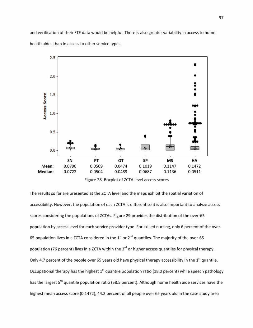
97
and verification of their FTE data would be helpful. There is also greater variability in access to home
health aides than in access to other service types.
SN PT OT SP MS HA
Mean: 0.0790 0.0509 0.0474 0.1019 0.1147 0.1472 Median: 0.0722 0.0504 0.0489 0.0687 0.1136 0.0511
Figure 28. Boxplot of ZCTA level access scores
The results so far are presented at the ZCTA level and the maps exhibit the spatial variation of
accessibility. However, the population of each ZCTA is different so it is also important to analyze access
scores considering the populations of ZCTAs. Figure 29 provides the distribution of the over-65
population by access level for each service provider type. For skilled nursing, only 6 percent of the over-
65 population lives in a ZCTA considered in the 1st or 2nd quantiles. The majority of the over-65
population (76 percent) lives in a ZCTA within the 3rd or higher access quantiles for physical therapy.
Only 4.7 percent of the people over 65 years old have physical therapy accessibility in the 1st quantile.
Occupational therapy has the highest 1st quantile population ratio (18.0 percent) while speech pathology
has the largest 5th quantile population ratio (58.5 percent). Although home health aide services have the
highest mean access score (0.1472), 44.2 percent of all people over 65 years old in the case study area

98
live in a ZCTA within the 1st or 2nd access quantile. This indicates that ZCTAs with better home health
aide accessibility tend to have lower over-65 population. We provide circular cartograms in Appendix F
to further visualize access scores and over-65 populations of ZCTAs.
Figure 29. Distribution of over 65 population by access level
The results of the proposed 2SCFA adaptation allow a comparison among access to different service
type providers in a single ZCTA. Table 14 below, for example, provides access scores of a single ZCTA.
According to the table, people living in this location have better access to medical social services than
any other service types. Access to home health aide services is the lowest.
Table 14. Access scores for 72701 ZCTA Skilled
Nursing Physical Therapy
Occupational Therapy
Speech Pathology
Medical Social
Home Health Aide
0.0772 0.0881 0.1329 0.2296 0.3662 0.0432
12.6% 1.6% 6.9%
58.5% 52.7%
22.9%
52.8%
32.0% 34.5%
8.8% 20.2%
12.8%
28.6%
42.4% 30.0%
10.9% 5.2%
20.1%
5.6%
19.2%
10.7% 9.5% 9.9%
42.2%
0.4% 4.7% 18.0% 12.2% 12.1%
2.0%
0%
10%
20%
30%
40%
50%
60%
70%
80%
90%
100%
SN PT OT SP MS HA5th Q – max access 4th Q 3rd Q 2nd Q 1st Q – min access

99
3.6. Conclusion
In this paper, we introduce a new measure to quantify the potential spatial accessibility of home
healthcare services and use the measure in a case study to highlight the spatial disparities in access in
Arkansas. The proposed measure can be used to quantify spatial accessibility of home healthcare
services within a geographic region while simultaneously considering both staffing levels and eligible
populations. Additionally, the proposed method incorporates demand for different service types and
their supply by introducing weights based on visit duration per service type and average number of visits
of each type per episode of care. Hence, it provides more refined estimates of accessibility. The
advantage of the proposed access measure for home healthcare services is that it allows for making
comparisons between ZCTAs (for a particular service provider type) as well as between access scores
(for a particular ZCTA). Unlike many other spatial potential accessibility studies, our method mitigates
potential border effects by including the demand of locations out of the case study region if those
locations are in an included home healthcare agency’s service region. Similarly, the capacity of agencies
located outside of the study region are included if they provide service to at least one ZCTA within the
study region.
Results from the case study indicate spatial variability for all six types of home healthcare service across
the state. On average, 24.4 percent of the population lives in ZCTAs classified in the first and second
access quantiles. In general, ZCTAs with relatively higher access to occupational therapy, speech
pathology, and medical social services are mainly located along the west border of Arkansas while ZCTAs
with relatively lower access are situated mostly in the eastern and southeastern parts of the state. By
using the outputs of the proposed 2SFCA, geographical variations for different service provider types
can be easily revealed and disparities among areas can be explicitly identified. Health system planners
can benefit from the results and design proper policies addressing the inequities in access. For example,

100
instead of defining a single add-on payment rate for all rural locations, add-on rates can be determined
based on the access score of a location.
A number of limitations exist in our study. First, some ZCTAs and ZIP codes may not completely overlap
after matching them using a crosswalk. ZCTAs are not an exact geographic match to ZIP codes and
therefore the relationships that exist between ZCTAs and ZIP codes can become quite complicated. A
ZCTA may be comprised of one or more ZIP Codes; likewise, within the boundaries of a single ZIP code,
there may exist more than one ZCTA. The US Census Bureau does not release an official crosswalk
between ZIP Codes and ZCTAs. Hence, we attempted to match ZCTAs and ZIP codes using a publicly
available crosswalk with our best effort. Second, for the demand side of the formulation, we use the
over-65 population as a proxy for home healthcare demand and assume that per capita demand for
home healthcare services among the over-65 population does not vary throughout the state. This
situation obviously overestimates the demand, however, this does not impact the quality of the output
of the model since the goal is to measure the potential access. To obtain more accurate outputs, we can
include elderly people’s home healthcare needs for each population location. For example, ZCTA level
chronic condition prevalence data may be a suitable proxy measure for elderly people’s home
healthcare needs. Third, this study did not consider home health users under 65 years old which
constitute around 13 percent of all Medicare home healthcare users (CMS, 2013). Fourth, FTE data for
some home healthcare agencies are not available in the Healthcare Cost Report Information System
(HCRIS). This could potentially impact the supply side of equation and thereby result in lower access
scores for ZCTAs that are in the catchment areas of agencies with missing FTE data. Fifth, one should be
aware that the Healthcare Cost Report Information System (HCRIS) is self-reported, which may lead to
misinterpretation, misunderstanding, and incorrect data entry (Johnson, Pope, & Tone, 2013). In other
words, measurement error may exist in responses. The model proposed to measure the access to home
healthcare services in this study is employed with the best available data. The problems of missing data

101
and measurement error need to be noted as a limitation when applying and making inferences based on
this study. For more accurate estimation of access scores, complete and verified data are required.
Lastly, the size of ZCTAs may vary and therefore the traveling distances of service providers can change
among ZCTAs. Longer traveling requirements in a large ZCTA may decrease the available direct care time
of service providers.
Future work can improve our knowledge in accessibility of home healthcare services: (i) the proposed
method can be applied across all states; (ii) the proposed method can be improved by accounting for
quality of services and service providers’ traveling requirement due to ZCTA size; and (iii) spatial
regression models can be used to examine factors that may be associated with spatial variations in
access.

102
References
Anselin, L. (2004). GeoDaTM 0.9.5-i Release Notes. Urbana, IL: Spatial Analysis Laboratory, University of Illinois, Urbana-Champaign.
Bagheri, N., Benwell, G. L., & Holt, A. (2006). Primary health care accessibility for rural Otago: “a spatial analysis.” Healthcare Review Online, 10(3).
Bissonnette, L., Wilson, K., Bell, S., & Shah, T. I. (2012). Neighbourhoods and potential access to health care: The role of spatial and aspatial factors. Health & Place, 18(4), 841–853.
Bowerman, R. L. (1997). Evaluating and improving the accessibility of primary health care services (Ph.D.). University of Waterloo (Canada), Canada.
Centers for Medicare & Medicaid Services. (2010a). Healthcare Cost Report Information System. Retrieved May 4, 2014, from https://www.cms.gov/Research-Statistics-Data-and-Systems/Downloadable-Public-Use-Files/Cost-Reports/index.html
Centers for Medicare & Medicaid Services. (2010b). Official Home Health Compare Data. Retrieved May 4, 2014, from https://data.medicare.gov/data/home-health-compare
Cheh, V., & Schurrer, J. (2010). Home Health Independence Patients: High Use, but Not Financial Outliers. Mathematica Policy Research.
CMS. (2013). Medicare and Medicaid Statistical Supplement Report. Centers for Medicare & Medicaid Services.
Dai, D. (2010). Black residential segregation, disparities in spatial access to health care facilities, and late-stage breast cancer diagnosis in metropolitan Detroit. Health & Place, 16(5), 1038–1052.
Dai, D., & Wang, F. (2011). Geographic disparities in accessibility to food stores in southwest Mississippi. Environment and Planning B: Planning and Design, 38(4), 659–677.
Delamater, P. L. (2013). Spatial accessibility in suboptimally configured health care systems: A modified two-step floating catchment area (M2SFCA) metric. Health & Place, 24, 30–43.
Freedman, V. A., Rogowski, J., Wickstrom, S. L., Adams, J., Marainen, J., & Escarce, J. J. (2004). Socioeconomic disparities in the use of home health services in a medicare managed care population. Health Services Research, 39(5), 1277–1297.
Guagliardo, M. F. (2004). Spatial accessibility of primary care: concepts, methods and challenges. International Journal of Health Geographics, 3(1), 3.
Hawes, C., Phillips, C. D., Holan, S., Sherman, M., & Hutchison, L. L. (2005). Assisted living in rural America: results from a national survey. The Journal of Rural Health: Official Journal of the American Rural Health Association and the National Rural Health Care Association, 21(2), 131–139.

103
Hedtcke, C. S., MacQueen, L., & Carr, A. (1992). How do home health nurses spend their time? The Journal of Nursing Administration, 22(1), 18–22.
Henry, K. A., Sherman, R., Farber, S., Cockburn, M., Goldberg, D. W., & Stroup, A. M. (2013). The joint effects of census tract poverty and geographic access on late-stage breast cancer diagnosis in 10 US States. Health & Place, 21, 110–121.
Johnson, A. L., Pope, B., & Tone, K. (2013). US hospital performance: A dynamic network analysis. In Workshop 2013 on Dynamic and Network DEA. Japan.
Joseph, A. E., & Bantock, P. R. (1982). Measuring potential physical accessibility to general practitioners in rural areas: A method and case study. Social Science & Medicine, 16(1), 85–90.
Kenney, G. M., & Dubay, L. C. (1992). Explaining area variation in the use of Medicare home health services. Medical Care, 30(1), 43–57.
Khan, A. A. (1992). An integrated approach to measuring potential spatial access to health care services. Socio-Economic Planning Sciences, 26(4), 275–287.
Langford, M., Fry, R., & Higgs, G. (2012). Measuring transit system accessibility using a modified two-step floating catchment technique. International Journal of Geographical Information Science, 26(2), 193–214.
Langford, M., & Higgs, G. (2006). Measuring Potential Access to Primary Healthcare Services: The Influence of Alternative Spatial Representations of Population. The Professional Geographer, 58(3), 294–306.
Luo, W., & Qi, Y. (2009). An enhanced two-step floating catchment area (E2SFCA) method for measuring spatial accessibility to primary care physicians. Health & Place, 15(4), 1100–1107.
Luo, W., & Wang, F. (2003). Measures of spatial accessibility to health care in a GIS environment: synthesis and a case study in the Chicago region. Environment and Planning B: Planning and Design, 30(6), 865 – 884.
Luo, W., & Whippo, T. (2012). Variable catchment sizes for the two-step floating catchment area (2SFCA) method. Health & Place, 18(4), 789–795.
McGrail, M. R., & Humphreys, J. S. (2009a). A new index of access to primary care services in rural areas. Australian and New Zealand Journal of Public Health, 33(5), 418–423.
McGrail, M. R., & Humphreys, J. S. (2009b). Measuring spatial accessibility to primary care in rural areas: Improving the effectiveness of the two-step floating catchment area method. Applied Geography, 29(4), 533–541.
McGrail, M. R., & Humphreys, J. S. (2009c). The index of rural access: an innovative integrated approach for measuring primary care access. BMC Health Services Research, 9(1), 124.
MedPAC. (2011). Report to the Congress: Medicare Payment Policy. The Medicare Payment Advisory Commission.

104
MedPAC. (2013). Report to the Congress: Medicare Payment Policy. The Medicare Payment Advisory Commission.
NAHC. (2010). Basic Statistics about Home Care (Technical Report). Washington, D.C.: National Association for Home Care and Hospice.
Ngui, A. N., & Apparicio, P. (2011). Optimizing the two-step floating catchment area method for measuring spatial accessibility to medical clinics in Montreal. BMC Health Services Research, 11(1), 166.
Ngui, A. N., & Vanasse, A. (2012). Assessing spatial accessibility to mental health facilities in an urban environment. Spatial and Spatio-Temporal Epidemiology, 3(3), 195–203.
Paez, A., Mercado, R. G., Farber, S., Morency, C., & Roorda, M. (2010). Accessibility to health care facilities in Montreal Island: an application of relative accessibility indicators from the perspective of senior and non-senior residents. International Journal of Health Geographics, 9(1), 52.
Porell, F. W., Liu, K., & Brungo, D. P. (2006). Agency and Market Area Factors Affecting Home Health Agency Supply Changes. Health Services Research, 41(5), 1847–1875.
Radke, J., & Mu, L. (2000). Spatial Decompositions, Modeling and Mapping Service Regions to Predict Access to Social Programs. Geographic Information Sciences, 6(2), 105–112.
Robert Graham Center. (2013). ZIP Code to ZCTA Crosswalk. Retrieved from http://udsmapper.org/zcta-crosswalk.cfm
Russell, E., Kramer, M. R., Cooper, H. L. F., Thompson, W. W., & Arriola, K. R. J. (2011). Residential Racial Composition, Spatial Access to Care, and Breast Cancer Mortality among Women in Georgia. Journal of Urban Health, 88(6), 1117–1129.
Schuurman, N., Bérubé, M., & Crooks, V. A. (2010). Measuring potential spatial access to primary health care physicians using a modified gravity model. Canadian Geographer / Le Géographe Canadien, 54(1), 29–45.
Shi, X., Alford-Teaster, J., Onega, T., & Wang, D. (2012). Spatial Access and Local Demand for Major Cancer Care Facilities in the United States. Annals of the Association of American Geographers, 102(5), 1125–1134.
The Joint Commission. (2011). Home – The Best Place for Health Care (Position paper). Oakbrook Terrace, IL: The Joint Commission.
University of Arkansas. (2015). Rural Profile of Arkansas 2015 (No. MP531). Little Rock, AR: University of Arkansas.
U.S. Census Bureau. (2012). 2010 TIGER/Line Shapefiles. U.S. Census Bureau.

105
U.S. Department of Health & Human Services. (n.d.). Shortage Designation: Health Professional Shortage Areas & Medically Underserved Areas/Populations. Retrieved from http://www.hrsa.gov/shortage/
Wang, F. (2012). Measurement, Optimization, and Impact of Health Care Accessibility: A Methodological Review. Annals of the Association of American Geographers, 102(5), 1104–1112.
Wang, F., McLafferty, S., Escamilla, V., & Luo, L. (2008). Late-Stage Breast Cancer Diagnosis and Health Care Access in Illinois. The Professional Geographer : The Journal of the Association of American Geographers, 60(1), 54–69.
Wang, L. (2011). Analysing spatial accessibility to health care: a case study of access by different immigrant groups to primary care physicians in Toronto. Annals of GIS, 17(4), 237–251.
Wan, N. (2012, August 15). Disparities of Colorectal Cancer Survival in Texas (Thesis). Texas State University-San Marcos.
Wan, N., Zhan, F. B., Zou, B., & Chow, E. (2012). A relative spatial access assessment approach for analyzing potential spatial access to colorectal cancer services in Texas. Applied Geography, 32(2), 291–299.
Wan, N., Zou, B., & Sternberg, T. (2012). A three-step floating catchment area method for analyzing spatial access to health services. International Journal of Geographical Information Science, 26(6), 1073–1089.
Yang, D.-H., Goerge, R., & Mullner, R. (2006). Comparing GIS-Based Methods of Measuring Spatial Accessibility to Health Services. Journal of Medical Systems, 30(1), 23–32.

106
Appendix F: Cartograms
A circular cartogram is a type of map where the original territory polygons are replaced by circles and
the size of each circle is proportional to the value of a given variable (Anselin, 2004). In the figures
below, each circle represents a ZCTA and the size of the circle is proportional to the over-65 population
in that ZCTA. Larger circles represent higher over-65 population while smaller circles represent lower
over-65 population. Colors of circles represent the access scores and are based on the quantile
classification scheme with five classes (each class with 20% of the ZCTAs). As in Section 3.6, darker
shading represents higher accessibility while lighter shading represents lower access scores.
Cartograms display access scores in relation to over-65 population and provide a convenient way to
make inference on this relationship. For example, recall that home health aide services have the highest
mean ZCTA level access score among all service types. Nevertheless, we observe that almost half of the
over-65 population (44.2 percent) lives in ZCTAs within the 1st or 2nd access quantile. The reason for this
situation is that the majority of the ZCTAs with better home health aide accessibility scores tend to have
lower over-65 population as seen in Figure F.6.

107
Figure F.1. Circular cartogram for skilled nursing
Figure F.2. Circular cartogram for physical therapy

108
Figure F.3. Circular cartogram for occupational therapy
Figure F.4. Circular cartogram for speech pathology

109
Figure F.5. Circular cartogram for medical social
Figure F.6. Circular cartogram for home health aide

110
4. Assessing Socioeconomic Disparities in Potential Spatial Accessibility of Home Healthcare
4.1. Introduction
Realizing the full individual and societal benefits of home healthcare requires that the supply of services
in a geographic region be sufficient to meet potential demand in that area. This concept is known as
potential spatial accessibility (Andersen, McCutcheon, Aday, Chiu, & Bell, 1983; Khan, 1992), or the
availability of a service as a function of geographic factors like location or distance. Quantifying potential
spatial accessibility makes it possible to study factors that may influence or be associated with
disparities in access, which in turn makes it possible to explicitly address these factors through policy
changes, if desired.
In chapter 3, a potential spatial accessibility measure is determined at the local level (in our case, for
each ZIP code tabulation area, or ZCTA) using an adapted version of the two-step floating catchment
area (2SFCA) method (Luo & Wang, 2003; Radke & Mu, 2000). Rather than specifying catchments in
terms of distance, as in traditional applications of 2SFCA, we take the catchment of each home health
agency to be those ZCTAs served by the agency. Similarly, the catchment of each ZCTA consists of those
agencies that provide service to the ZCTA. Then, we use the measure in a case study to investigate
spatial disparities in home healthcare accessibility.
The purpose of this chapter is to demonstrate how space-varying coefficient models can be used explain
spatial variability in accessibility across a study area. A case study region of Arkansas is used and
statistically significant associations between accessibility and population characteristics are identified.
Factors of interest include rural/urban status, income, racial/ethnic composition and primary care
accessibility of an area. If associations between independent factors and access to home healthcare are
identified, it could influence reimbursement or other types of public policies, perhaps incentivizing
agencies to operate in regions that meet specific demographic criteria.

111
The values of both the response (accessibility) and the predictor variables (population characteristics)
are spatially varying, making traditional regression inappropriate in this context. We propose to use
space-varying coefficient models to estimate statistically significant associations between response and
predictor variables. A large number of alternative space-varying coefficient models comprised of various
combinations of predictor variables are analyzed and a set of best-fitting models is chosen through a
model selection procedure that identifies statistically significant associations.
The remainder of this chapter is organized as follows. Section 4.2 provides a summary of relevant
literature. The data and the methods used in the analysis are described in Section 4.3 and 4.4,
respectively. Section 4.5 presents the results. Finally, conclusions and directions for future work are
highlighted in Section 4.6.
4.2. Literature Review
We review the health services research literature to identify population characteristics that may be of
interest in explaining access to home healthcare services. Separately, we review the literature on spatial
regression modeling.
Associations between demographic characteristics and healthcare access
Researchers in multiple disciplines have shown that access to health care and other critical services can
be associated with factors such as income, race, and ethnicity (Burton et al., 2010; Dai, 2010; Krieger,
Chen, Waterman, Rehkopf, & Subramanian, 2005; Wang & Luo, 2005; Ye & Kim, 2015). Disparities in
potential spatial accessibility of home healthcare services associated with geographic or socioeconomic
characteristics, such as population density, race or ethnicity, or income, would be concerning if
confirmed. However, limited research has explored these relationships to date, and methods that aim to
do so must explicitly account for the spatial elements of the problem.

112
Past research on factors associated with home healthcare access has largely focused on differences
between rural and urban areas and on utilization-based measures of access. Researchers have found
that people in rural areas have less access to home healthcare services than do urban residents (Cheh &
Phillips, 1993; Franco & Leon, 2000; Goldberg Dey, Johnson, Pajerowski, Tanamor, & Ward, 2011;
Hawes, Phillips, Holan, Sherman, & Hutchison, 2005; Kenney & Holahan, 1990; Probst, Towne, Mitchell,
Bennett, & Chen, 2014). Even in rural areas where home healthcare agencies do operate, the agencies
tend to be smaller, are more likely to use lower skilled staff, and are more likely to offer a narrower mix
of services (Calkins, 1999; Franco & Leon, 2000; Hutchison, Hawes, & Williams, 2010).
Other demographic characteristics that may be associated with differences in access to home healthcare
services include race and income. Past research has found that racial/ethnic minority elders are less
likely to receive formal home healthcare services, relying more heavily on care from family and friends,
compared with non-Hispanic whites (Dilworth-Anderson, Williams, & Gibson, 2002; Mitchell, Mathews,
& Hack, 2000; Mui & Burnette, 1994). Some researchers have attributed these racial differences in the
use of home healthcare to economic factors. Yet the association between income and access remains
opaque. While one study did identify a correlation between low income and access to home healthcare
services, this relationship was explained largely by differences in health mix by income group (Nelson,
Brown, Gold, Ciemnecki, & Docteur, 1997). Another recent study failed to identify diminished home
healthcare access for persons of lower income (Freedman et al., 2004). However, this study used
utilization as a proxy for access, meaning that the authors found no correlation between income and
utilization – not income and access.
Spatial regression models
Statistical models to quantify significant associations between accessibility and independent variables,
such as geographic and socioeconomic characteristics, must account for the spatial variation inherent in

113
both the predictor and response variables. Two main types of spatial effects can be considered: (i)
spatial dependence (spatial auto-correlation) and (ii) spatial heterogeneity (Anselin, 1988). The former
one implies observations in different locations are dependent on each other and neighboring
observations are more related than distant ones. If the association is positive, then similar values tend
to cluster in space whereas if the association is negative, then dissimilar values tend to cluster in space.
The second type of spatial effect, spatial heterogeneity, arises due to the instability in observational
units across space. This means that the relationship structure (e.g. regression coefficients) varies by
location and a single or “global” parameter estimated for the entire area cannot adequately capture the
“local” association. Existence of spatial dependency and heterogeneity in a dataset violates the basic
assumptions of ordinary least squares (OLS) regression and may cause unstable parameter estimation
and statistically misleading results (Anselin, 2003; Feng, 2008; Little, 2013; Martens, 2006; Yin, 2008).
The field of spatial regression modeling addresses these challenges.
Several spatial regression methods have been proposed in the literature. The spatial lag model and the
spatial error model (Anselin, 1988) are two well-known spatial regression models. Both of them can
address spatial auto-correlation (Little, 2013). In the spatial lag model, spatial auto-correlation is
introduced by including a spatially lagged dependent variable whereas in the spatial error model the
spatial auto-correlation is limited to the error term. Recall the standard linear regression model in
matrix notation:
,εβ += Xy (13)
where y is a vector of dependent variables, X is a matrix of explanatory variables, β is the vector of
regression coefficients, and ε is the vector of model errors. In the spatial lag model, a spatially lagged
dependent variable (Wy ) is added, as in Equation (14):
.εβρ ++= XWyy (14)

114
In the above equation, Wy is the spatial lag of the dependent variable for spatial weights matrix W , ρ
is a spatial autoregressive parameter and ε is the vector of model errors. Spatial weights determine the
effects of the neighbors. In the spatial error model, however, spatial auto-correlation is included by a
spatial weight matrix in the error component, as in Equation (15):
,ξελβ ++= WXy (15)
where λ is a spatial autoregressive parameter, ξ is the independent model error and W is the spatial
weights matrix, as before (Cellmer, 2013; Chrostek & Kopczewska, 2013; Little, 2013).
Both spatial lag and spatial error models have similar structures and account for the impact of proximal
locations on observations (Chrostek & Kopczewska, 2013). To explain a specific phenomenon, they
estimate a single (global) value for the whole system. Their assumption is that the associations between
the dependent variable and the explanatory variables are homogeneous (stationary) across all locations.
In many real life practices, however, the association may be dynamic and there is a possibility of
variation (heterogeneity) of model parameters throughout geographical space (Chen, Deng, Yang, &
Matthews, 2012; Fan & Zhang, 2008; Finley, 2011). Formally, in the case of heterogeneity, the regression
formula is expressed as below:
( ) ,εβ += Xfy (16)
where f is the vector of functional forms that can define different sets of regression coefficients β
associated with each observation (Little, 2013).
Geographically weighted regression models (Fotheringham, Brunsdon, & Charlton, 2002) and space-
varying coefficients models (Assunção, 2003; Gelfand, Kim, Sirmans, & Banerjee, 2003; Serban, 2011)
are the two main approaches available in the literature for incorporating spatial heterogeneity (Finley,
2011; Waller, Zhu, Gotway, Gorman, & Gruenewald, 2007). A geographically weighted regression (GWR)

115
model estimates regression coefficients for each location based on nearby observations by applying
local regression and kernel estimation methods (Chen et al., 2012; Little, 2013). This allows investigating
the spatial variations of regression relationships. In space-varying coefficients (SVC) models, the
variability of parameters is specified in a distribution form which can utilize a stochastic structure
(Finley, 2011; Little, 2013; Waller et al., 2007). Regression coefficients can vary as smooth functions of
other variables (Assunção, 2003). GWR and SVC models have been compared in the literature. The
results suggest that SVC models produce more robust results than GWR models when collinearity exists.
Also, SVC models provide a more complete basis that offers opportunity for model-based estimation
and inference (Finley, 2011; Waller et al., 2007; D. C. Wheeler & Calder, 2007; D. C. Wheeler & Waller,
2008). Hence, a space-varying coefficient model is used in this research to identify statistically significant
associations, if they exist, between home healthcare accessibility and geographic or socioeconomic
factors.
Spatial statistical models have been applied to understand spatial effects in other health-related
contexts, including H1N1 vaccine accessibility (Heier Stamm, 2010; Heier Stamm, Serban, Swann, &
Wortley, 2015), physical activity levels in pregnant women (Reich, Fuentes, Herring, & Evenson, 2010),
incidence of limiting long-term illness (Brunsdon, Fotheringham, & Charlton, 1998), incidence of
zoonotic disease (Assunção, 2003), prevalence of late-stage breast cancer (Dai, 2010) and access to
primary care physicians (Ye & Kim, 2015).
4.3. Choice of Independent Variables
In this study, we consider three important socio-economic characteristics of population locations:
income, rural/urban status, and racial/ethnic structure. We define a series of variables related to each
characteristic by considering the availability and completeness of data at the ZCTA level of aggregation
(recall access scores were computed at the ZCTA level as described in Chapter 3). The 2009-2013 5-Year
American Community Survey and 2010 Census Summary File 1 contain data related to these

116
characteristics at the ZCTA level (U.S. Census Bureau, 2011, 2014). Throughout the remainder of this
chapter, these datasets are referred to as ACS and SF1 respectively. Each characteristic and related
variables are summarized below.
Income
Variables related to income available in ACS at the ZCTA level include per capita income, median
household income and poverty rate, defined as the percent of the population living below the federal
poverty level.
Rural/urban status
Two variables selected to reflect the rural/urban status of population locations are population density
and the percent rural population. A ZCTA can be classified as urban, rural, or can contain both urban and
rural areas. Hence, the percent rural population variable is the percentage of residents in a ZCTA living in
a rural portion of that ZCTA. To understand what is meant by rural, the US Census identifies urban areas
as “urbanized areas of 50,000 or more population and urban clusters of at least 2,500 and less than
50,000 population” (Bureau of the Census, 2011). Territories outside urban areas are classified as rural.
Both population density and percent rural population data were extracted from SF1.
Racial/ethnic structure
The variables selected to reflect Racial/ethnic structure are percent black population, percent Hispanic
population and percent minority population. These are defined as the percentage of residents of a ZCTA
that are black, Hispanic, and other than non-Hispanic white, respectively. This data is obtained from SF1.
While data for other minority populations are available in SF1, we separately consider only African
American and Hispanic groups as they are identified as the primary minority populations in Arkansas
(Hamilton, 2011). The percent minority variable is additionally considered to discover any potential
effects related to the minority population as a whole instead of individual ethnic/race groups.

117
Primary care access
In addition to socio-economic characteristics, we include physician-to-population ratio to examine
association between primary care access and home healthcare access. Physician-to-population ratio is
used as a criterion to assess whether or not a location is a primary care health professional shortage
area (U.S. Department of Health & Human Services, n.d.). Arkansas ranks 48th among 50 states with
respect to this ratio (Association of American Medical Colleges, 2011). Physician-to-population ratio data
were acquired from the 2010 Primary Care Service Area Data version 3.1 (HRSA, 2010). The 2010 Census
Tract to PCSAv3.1 Crosswalk file provided by Health Resources and Services Administration (HRSA) Data
Warehouse is used to map primary care service areas to ZCTAs.
Summary statistics for the above nine variables are provided in Table 15. These summary statistics are
computed across the set of ZCTAs in the case study. It is interesting to note the median percent rural
population across all ZCTAs in the state is 100% (the entire population of the ZCTA is in a rural area). It
can also be observed that some ZCTAs have zero percent minority population while some have 100
percent.
4.4. Methods
This section describes the methods applied to understand disparities in home healthcare accessibility
associated with independent variables such as socio-economic characteristics and primary care
accessibility. We begin by introducing a test to examine the spatial auto-correlation of access scores and
then explain the space-varying coefficient models to identify factors associated with access scores.

118
Table 15. Summary statistics of potential predictor variables for case study region Variable Mean Median Std. Dev. Minimum Maximum
Black population (%) 12.61 1.02 19.99 0.00 100.00 Hispanic population (%) 3.47 2.00 4.96 0.00 40.99 Minority population (%) 18.77 8.76 20.12 0.00 100.00 Population density 5.36 1.01 15.28 0.02 130.75 Rural population (%) 84.09 100.00 30.35 0.00 100.00 Poverty rate (%) 20.22 18.00 12.21 0.00 83.00 Per capita income ($) 19,667 18,866 5,853 461 58,872 Median household income ($) 37,292 36,034 11,883 6,250 92,546 Physician-to-population ratio 0.00050 0.00046 0.00027 0.00000 0.00141
4.4.1. Examining Spatial Auto-correlation of Variables
According to Tobler's first law of geography, “everything is related to everything else, but near things
are more related than distant things” (Tobler, 1970). Spatial auto-correlation exists if nearby
observations in space have related values. In this case, independence of observations, one of the
ordinary least square (OLS) model assumptions, is violated and may result in inaccurate coefficient
estimations. Hence, the initial assessment in our methodology is to examine the spatial auto-correlation
of access scores by Univariate Moran’s I test (Moran, 1950). In the case of spatial auto-correlation, it is
necessary to employ methods that account for this dependency.
Univariate Moran’s I Test
Univariate Moran’s I test is the most commonly applied test to measure spatial auto-correlation. In
contrast to linear correlation, Univariate Moran’s I test measures the degree of the relationship
between a variable and the spatial lag of the same variable (the spatial lag of a variable is the weighted
average of neighboring values). The formula for Univariate Moran’s I Index is:
( )( )
( ),
1
2
1 1
1 1∑
∑∑
∑∑=
= =
= =
−
−−
= n
ii
n
i
n
jjiij
n
i
n
jij
xx
xxxxw
w
nI (17)

119
where n is the total number of observations (spatial units), ix and jx are the values of observations
(e.g. access scores) at locations i and j , respectively, x is the mean of the observations and ijw is the
spatial weight between locations i and j . The spatial weight ( ijw ) reflects the “nearness” of two
locations and can be specified based on contiguity or distance. For the purposes of this study, we chose
to compute spatial weights based on the straight-line Euclidean distance which is commonly used in
accessibility research (Smoyer-Tomic, Hewko, & Hodgson, 2004).
Similar to the linear correlation coefficient, Univariate Moran’s I correlation coefficient varies from -1 to
+1. A correlation coefficient close to 1 implies a clustered pattern (e.g. high values are surrounded
geographically by high values) and a correlation coefficient close to -1 implies a dispersed pattern (e.g.
high values are surrounded by low values). A value of 0 indicates complete spatial randomness.
The null hypothesis for the Univariate Moran's I test is that observations are spatially independent;
there is no spatial clustering. The significance of the Univariate Moran’s I statistic against the null
hypothesis can be tested by converting Moran’s I values to z-scores. If the p-value of the test is
statistically significant (p-value is smaller than the significance level α) then, the null hypothesis can be
rejected. We applied the Univariate Moran’s I test to examine the spatial auto-correlation of access
scores for each service type in the case study region. In each case, the null hypothesis was rejected,
indicating that spatial auto-correlation exists and models that account for spatial dependency are
needed in order to explain variation in access. A detailed discussion of these results is given in Section
4.5.1.
4.4.2. Space-varying Coefficient Models
Varying coefficient models allow estimating the associations between response (access scores) and
covariates (socio-demographic factors and primary care access) by accounting for the variation over
time or across space or both time and space (Serban, 2011). Hence, unlike the traditional linear

120
regression models, the regression coefficients are not required to be constant values and they can vary
smoothly across a geographic area or a time period (Heier Stamm, 2010; Park, Mammen, Lee, & Lee,
2015). To account for the spatially-varying associations between home healthcare accessibility and the
socio-demographic factors, we implement a space-varying coefficient model.
The Model 4.4.2.1.
A space-varying coefficient model for a set of observed data { }( )RrXY rjj ,...,1,, = can be described using
Equation (18):
𝔼 [ ] ( ) ( ) ( ) ,...110 RjjRjjjj XlXllXY βββ +++= (18)
where ( )jj lYY = is the dependent variable (accessibility score) and ( )jrrj lXX = is a set of independent
variables observed at location ( ),2,1 jjj lll = , Lj ...,,1= (Heier Stamm, 2010; Serban, 2011). In the model,
R is the number of independent variables and L is the number of geographical locations where data
are observed. The smooth coefficient functions that may vary in space are represented by ( )jr lβ for
Rr ...,,1= . Also, 1jl and 2jl denote the latitude and longitude of the locations (ZCTAs in our case).
Coefficient Estimation 4.4.2.2.
In the literature, Bayesian methods (Assunção, 2003; Gelfand et al., 2003; Waller et al., 2007) and non-
parametric methods (e.g. penalized splines (Ruppert, Wand, & Carroll, 2003)) have been proposed to
estimate the unknown coefficient functions ( )jr lβ for Rr ...,,1= . We chose to use penalized splines
because Bayesian approaches are computationally more expensive than non-parametric methods for
large geographic regions (big data sets) (Heier Stamm et al., 2015; Hoeting, Davis, Merton, & Thompson,
2006). Penalized splines method is implemented using functions in the R statistical software library mgcv
(Wood, 2006) to estimate the space-varying coefficients in our model. In the model, the space-varying
coefficients are drawn from the Normal distribution.

121
Inference on Shape of Coefficients 4.4.2.3.
Regression coefficients in a space-varying coefficient model can take various shapes. A non-constant
(i.e., linear or non-linear) coefficient represents that the association between the dependent variable
and the predictor varies over space. Hence, a non-constant coefficient indicates a varying association
pattern and suggests that the corresponding predictor is significant. On the other hand, the predictors
with a constant coefficient may not be statistically significant. Simultaneous confidence bands (Serban,
2011) are used to make inference on the shape and the statistical significance of coefficients. The
inference is based on a 1- α confidence band for a two-sided hypothesis test with a significance level of
α (Heier Stamm et al., 2015). For a non-constant predictor, if the lower bound of the confidence
interval at a ZCTA is positive, then the coefficient at that ZCTA is identified as statistically significantly
positive at a significance level of α . Similarly, if the upper bound of the confidence interval is negative,
then the coefficient is identified as statistically significantly negative.
Implementation Stages 4.4.2.4.
We implemented space-varying coefficient models by following the stages explained below. The
implementation methodology is summarized in Figure 30.
Define a set of initial models. In Section 4.3, we have identified the following nine predictors:
• Income: poverty rate (Poverty), per capita income (PerCapInc), and median household income
(MHInc)
• Racial/ethnic structure: percent black population (BlackP), percent Hispanic population (HispanicP),
and percent minority population (MinorP)
• Rural/urban status: percent rural population (RuralP) and population density (PopDens)
• Primary care accessibility: physician-to-population ratio (P-to-P).
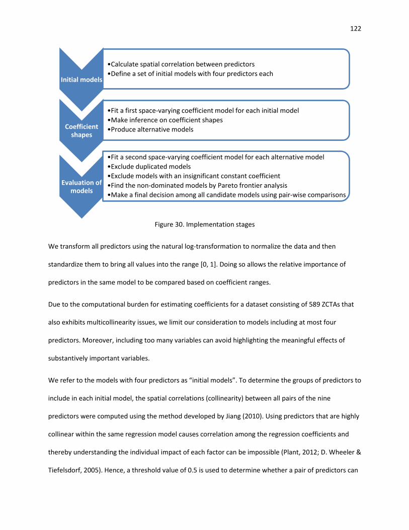
122
Figure 30. Implementation stages
We transform all predictors using the natural log-transformation to normalize the data and then
standardize them to bring all values into the range [0, 1]. Doing so allows the relative importance of
predictors in the same model to be compared based on coefficient ranges.
Due to the computational burden for estimating coefficients for a dataset consisting of 589 ZCTAs that
also exhibits multicollinearity issues, we limit our consideration to models including at most four
predictors. Moreover, including too many variables can avoid highlighting the meaningful effects of
substantively important variables.
We refer to the models with four predictors as “initial models”. To determine the groups of predictors to
include in each initial model, the spatial correlations (collinearity) between all pairs of the nine
predictors were computed using the method developed by Jiang (2010). Using predictors that are highly
collinear within the same regression model causes correlation among the regression coefficients and
thereby understanding the individual impact of each factor can be impossible (Plant, 2012; D. Wheeler &
Tiefelsdorf, 2005). Hence, a threshold value of 0.5 is used to determine whether a pair of predictors can
Initial models
•Calculate spatial correlation between predictors •Define a set of initial models with four predictors each
Coefficient shapes
•Fit a first space-varying coefficient model for each initial model •Make inference on coefficient shapes •Produce alternative models
Evaluation of models
•Fit a second space-varying coefficient model for each alternative model •Exclude duplicated models •Exclude models with an insignificant constant coefficient •Find the non-dominated models by Pareto frontier analysis •Make a final decision among all candidate models using pair-wise comparisons

123
be included in the same initial model. That is, we avoid using two variables in the same model if they
have a spatial correlation of more than 0.5. The computed spatial correlations are given in Table 16. The
spatial correlations above the allowable threshold are indicated in bold. Thus, pairs of variables
associated with the bold indications do not appear together in the same initial models.
Table 16. Spatial correlations between independent variables (above threshold in bold) BlackP HispanicP MinorP PopDens RuralP Poverty PerCapInc MHInc P-to-P
BlackP 1 HispanicP 0.379 1 MinorP 0.915 0.403 1 PopDens 0.177 0.559 0.087 1 RuralP -0.269 -0.342 -0.246 -0.736 1 Poverty 0.375 0.407 0.347 0.083 -0.091 1 PerCapInc 0.091 0.384 -0.006 0.554 -0.511 0.050 1 MHInc 0.077 0.600 0.004 0.685 -0.453 -0.006 0.831 1 P-to-P 0.238 0.148 0.155 0.244 -0.206 0.055 0.145 0.146 1
We also avoid including multiple variables that measure the same characteristic of a population location
in the same model. For example, percent rural population and population density variables would not be
allowed to appear together in an initial model because they both measure urban/rural status. One
exception to this rule is with the variables for racial/ethnic structure. Variables for percent black
population and percent Hispanic population are allowed to appear together in initial models. However,
neither of these variables can appear together in a model with percent minority population, which
accounts for all minorities including black and Hispanic. Table 17 provides a complete list of the initial
models that were considered.

124
Table 17. Initial models with included independent variables Initial Model Predictors
1 BlackP HispanicP Poverty P-to-P 2 BlackP HispanicP PerCapInc P-to-P 3 BlackP HispanicP Poverty RuralP 4 BlackP HispanicP P-to-P RuralP 5 BlackP Poverty P-to-P PopDens 6 BlackP Poverty P-to-P RuralP 7 BlackP MHInc P-to-P RuralP 8 HispanicP Poverty P-to-P RuralP 9 MinorP Poverty P-to-P PopDens
10 MinorP Poverty P-to-P RuralP 11 MinorP MHInc P-to-P RuralP
Determine coefficient shapes of predictors. We fit a space-varying coefficient model for each initial
model with four predictors. The output of this space-varying coefficient model is the confidence bands
of smooth coefficient functions ( )( )lrβ . We determine the shape of the coefficients (constant, linear or
non-linear) using confidence bands by applying the inference procedure proposed by (Serban, 2011).
For each model that includes one or more non-linear predictors and other predictors whose shape is
constant or linear, we generate reduced models where each constant or linear predictor is either
included as a constant or completely excluded. In other words, we produce reduced models by creating
combinations of predictors whose shape is other than non-linear. Predictors with non-linear coefficients
in the original model are included with non-linear coefficients in each of the corresponding reduced
models. Hence, for an initial model with 𝑛 constant and/or linear predictors we obtain 2𝑛 different
reduced models (these reduced models always contain the predictors with a non-linear coefficient). For
example, suppose that in initial model 1, the variables BlackP and HispanicP are found to have non-
linear coefficients, whereas Poverty has a linear coefficient and P-to-P has a constant coefficient. Then,
the reduced models derived from initial model one would be as shown in Table 18. Note that BlackP and
HispanicP appear in all four of the reduced models, because they have non-linear coefficients. In models
1.1 and 1.2, Poverty appears as a constant and does not appear at all in 1.3 and 1.4. Similarly, in models
1.1 and 1.3, P-to-P appears as a constant and does not appear at all in 1.2 and 1.4.

125
Table 18. An example of reduced models Reduced Model ID BlackP HispanicP Poverty P-to-P
1.1 non-linear non-linear constant constant 1.2 non-linear non-linear constant N/A 1.3 non-linear non-linear N/A constant 1.4 non-linear non-linear N/A N/A
For each initial model, reduced models are produced in this fashion. The complete list of all reduced
models constitutes what we refer to as “alternative models”. All alternative models are listed in
Appendix G.
Evaluate the alternative models. Model selection among alternative models is done through several
evaluation steps based on different criteria. We fit space-varying coefficient models for each alternative
model and calculate two measures to use during model evaluation; Akaike Information Criteria (AIC)
(Akaike, 1974) and spatial correlation between the response variable and the residuals (Jiang, 2010).
AIC is used because it is a common measure of the trade-off between goodness of fit and model
complexity (Johnson & Omland, 2004; Schunn & Wallach, 2005). The spatial correlation between the
response variable and the residuals is used because it is “a measure of how much spatial dependence in
the response variable is not explained by the model” (Heier Stamm et al., 2015). For both measures
smaller values indicate a better model. Also, we provide p-values to test the significance of those
predictors in the alternative models that are identified as having a constant coefficient. Recall it is not
necessary to use p-values to test the significance of predictors having non-linear coefficients, because a
non-linear coefficient indicates a varying association pattern and suggests that the corresponding
predictor is significant. Below, we explain the model evaluation steps in our methodology.
1. In the first step of the model evaluation phase, we find and exclude the duplicated models from
among all alternative models.
2. Next, we exclude all remaining alternative models that include at least one variable whose
coefficient is constant but insignificant (p-value > 0.10).

126
3. In the following step, we compare all of the remaining alternative models having the same number
of predictors based on Akaike Information Criteria (AIC) and absolute value of the correlation
between the response and residuals. For both criteria, lower values indicate better models. This
situation can be considered as a multi-objective decision process and hence a single model that
simultaneously minimizes the AIC and absolute correlation may not exist. In multi-objective decision
making, the Pareto optimal set is defined as the set of all trade-off solutions that are non-dominated
(Abraham, Jain, & Goldberg, 2005). By using Pareto frontier analysis for the models with same
number of predictors (for each possible number of predictors) we formally find the non-dominated
model(s) and eliminate all dominated models for each number of predictors. In Appendix H Pareto
frontiers are provided.
4. All non-dominated models are considered as “candidate models”. If there is only one candidate
model for a particular service type, it is selected as the final model for that service type. If there is
more than one candidate model, then we apply pair-wise comparisons, when possible. We compare
the candidate models that have at least one predictor in common and check whether or not the
additional predictor(s) included in the model with a larger number of predictors improve both AIC
and correlation values. For example, suppose that there are two candidate models as shown below;
AIC Correlation 1st Predictor 2nd Predictor Candidate Model 1: 2568.6 0.371 Poverty (non-linear) N/A Candidate Model 2: 2535.6 0.298 Poverty (non-linear) HispanicP (constant)
Candidate Models 1 and 2 share the same predictor with a non-linear coefficient (e.g. Poverty).
Because an additional predictor with a constant coefficient in Candidate Model 2 (e.g. HispanicP)
improves both AIC and correlation, Candidate Model 2 is preferred over Candidate Model 1.
5. If multiple candidate models exist after pair-wise comparisons, we chose the model with greatest
significance and/or magnitude of constant coefficients. All else being comparable, simpler models
(those with fewer predictors) were preferred.

127
4.5. Results
In this section, we present the results of our implementation study.
4.5.1. Examining Spatial Auto-correlation of Variables
As described in Section 4.4.1, we applied Univariate Moran’s I test to examining the spatial auto-
correlation of access scores. Straight-line Euclidean distances were used to calculate the distances
between two ZCTAs ( ijd ). The spatial weights ( ijW ) are then proportional to inverse distance
)/1( ijij wd = . Given that the values for all z-test statistics are greater than the critical value of 1.96 at a
level of significance of 0.05, we reject the null hypothesis in favor of the alternative hypothesis that
spatial auto-correlation exists in each set of access scores.
Table 19. Moran’s I test results Service Types Moran’s I Index z-score p-value Skilled Nursing (SN) 0.365340 15.51 0.002 Physical Therapy (PT) 0.493931 22.00 0.005 Occupational Therapy (OT) 0.644209 29.39 0.002 Speech Pathology (SP) 0.635165 29.54 0.002 Medical Social (MS) 0.482794 20.48 0.005 Home Health Aide (HA) 0.691155 32.16 0.002
The Moran Scatterplots (Figure 31) illustrate the relationship between access values (x-axis) and
spatially lagged access values (y-axis) using the variables in standardized form. The slope of the linear
regression line through a scatterplot equals the associated Univariate Moran’s I Index. Access scores of
all service types have a positive spatial auto-correlation (these can be observed by the trendlines with
positive slope in Figure 31). That means high values are surrounded geographically by high values and
low values are surrounded geographically by low values. OT, SP, and HA display higher positive spatial
auto-correlation than other service types. Significant spatial auto-correlations in the access scores of all
service types indicate spatial dependency among observations and thereby inaccurate estimates may be
obtained using linear regression models. Therefore, spatial regression models (e.g. space-varying

128
coefficient models) are necessary to account for the spatial dependency in the data. SVC models can
provide information on spatial relationships between variables.
Figure 31. Moran’s I scatter plots

129
4.5.2. Space-varying coefficient models
We employ space-varying coefficient regression methods described in Section 5.4.2 to examine the
association of predictors with accessibility of different home healthcare service types. None of the
models selected as a result of the methodology include percent black population, percent minority
population, population density, per capita income, median household income, or physician-to-
population ratio as predictors. However, percent Hispanic population is associated with access scores
for all service types and poverty rate and percent rural population are significant predictors for three
service types.
Table 20 summarizes the selected explanatory models for each service type. NL denotes non-linear
shape and C denotes constant shape. The numbers indicate the range of coefficient values.
Table 20. Shapes and coefficient values of predictors Service
Type Hispanic
population Poverty
rate Rural
population
Skilled Nursing (SN) NL [-1.23, 3.62]
Physical Therapy (PT) NL [-4.04, 3.50]
NL [-0.88, 7.30]
Occupational Therapy (OT) C* 2.25
NL [-5.55, 8.28]
NL [-15.78, 9.39]
Speech Pathology (SP) NL [-5.10, 8.65]
NL [-0.34, 7.90]
NL [-19.94, 9.03]
Medical Social (MS) C* 3.70 NL
[-13.53, 2.32]
Home Health Aide (HA) NL [-1.17, 4.44]
NC: Non-linear shape, C: Constant shape *corresponds to significance with p-value less than 0.01
We mapped fitted coefficients for the predictors that have non-linear shape (association) across space in
Figures 32 through 41 below. In the maps, the color red indicates positive regression coefficients
whereas blue indicates negative regression coefficients. The color white indicates a zero regression
coefficient. Please note that a common shading scale based on a range of [-20, 10] is used across all

130
maps. The maximum positive coefficient (10) is always the darkest red whereas the minimum negative
coefficient (-20) is always the darkest blue in the color scale. The common shading scale allows the
comparison of maps separately and crosswise. In addition to coefficient maps, significance maps
indicating statistically significant associations (either positive or negative) between access scores and
the corresponding non-linear predictor are also provided. In these maps, a red dot indicates a ZCTA with
a significant positive association whereas a blue dot indicates a ZCTA with a significant negative
association. In the next section, those maps are presented along with a discussion of the associations
between access values and the predictors in the final model for each service type.
Skilled Nursing 4.5.2.1.
Percent Hispanic population is the only significant predictor for the skilled nursing model, and its
association with access is spatially varying. Coefficient values across the case study region are presented
in Figure 32a. In the Southeast and Central parts of the state, skilled nursing access increases in areas
where percent Hispanic population increases (positive association). This seems to be largely tied to
some areas with higher skilled nursing access relative to neighboring ZCTAS specifically along the
Southeast border and also North and West of Little Rock. In the Northwest corner and inner Southwest,
skilled nursing access decreases in areas where percent Hispanic population increases (negative
association). This seems to be largely tied to some higher concentrations of Hispanic people in areas
that have relatively very low access. The far Northeast of the state also exhibits a negative association.
However, the Hispanic population in this area is low and access is relatively high.

131
(a) Coefficient values of log(HispanicP)
Positive Negative
(b) Significance map indicating statistically significant associations
(c) Access to skilled nursing (d) Percent Hispanic population
Figure 32. Association between percent Hispanic population and skilled nursing accessibility

132
Physical Therapy 4.5.2.2.
The percent Hispanic population has a non-linear relationship with physical therapy accessibility (Figure
33). Negative association is observed only in the Northeast corner where access to physical therapy
decreases as percent Hispanic population increases. In this particular area, locations with relatively
higher Hispanic population, at the border with Missouri and Tennessee, have relatively limited access.
The relationship is moderately positive in the Southwest, where access and percent Hispanic population
both increase. The relationship is more strongly positive in the rest of the state. In some areas (like
Southeast), this appears linked to decreases in physical therapy access in locations with lower Hispanic
populations. In others (like Northwest, Central and Central West), this occurs in areas of both high
access and high Hispanic population.
Poverty rate also has non-linear relationship with physical therapy accessibility, but this appears to be
driven by strong positive association in Northeast corner and little association elsewhere (Figure 34).
The coefficients vary in the range of values [-0.88, 7.30]. In the Northeast corner, many ZCTAs with
lower poverty relative to proximal locations also have lower access, and those with higher poverty
relative to neighbors have higher access.

133
(a) Coefficient values of log(HispanicP), controlling for log(Poverty)
Positive Negative
(b) Significance map indicating statistically significant associations
(c) Access to physical therapy (d) Percent Hispanic population
Figure 33. Association between percent Hispanic population and physical therapy accessibility

134
(a) Coefficient values of log(Poverty), controlling for log(HispanicP)
Positive Negative
(b) Significance map indicating statistically significant associations
(c) Access to physical therapy (d) Poverty rate
Figure 34. Association between poverty rate and physical therapy accessibility

135
Occupational Therapy 4.5.2.3.
Percent Hispanic population has a significant positive association on occupational therapy accessibility
across the state and its constant regression coefficient is estimated as 2.25 (p-value< 0.001). This means
that as percent Hispanic population increases, occupational therapy accessibility is expected to increase.
We observe that access tends to get better in western parts of the state, where Hispanic population
concentrations are highest.
Poverty rate is shown to have a non-linear coefficient, meaning that the association is spatially varying
across the study area. In the blue areas shown in Figure 35a, poverty rate is negatively associated with
occupational therapy accessibility, while in the red areas the opposite is true. Access in Central East is
slightly higher than in neighboring places and there is also a relatively higher poverty level in the Central
East. However, in the Northeast and Southeast, access to occupational therapy decreases where the
percentage of people living below the poverty level increases.
Percent rural population is another spatially varying factor for occupational therapy accessibility, and
the coefficients have larger magnitude compared to the other two predictors. The relationship tends to
be more positive in ZCTAs lying along the Northern border, and more negative in the South and East
portions of the state. The association is very weak in major metropolitan areas such as Little Rock,
Conway, and Fort Smith.

136
(a) Coefficient values of log(Poverty), controlling for log(HispanicP) and log(RuralP)
Positive Negative
(b) Significance map indicating statistically significant associations
(c) Access to occupational therapy (d) Poverty rate
Figure 35. Association between poverty rate and occupational therapy accessibility

137
(a) Coefficient values of log(RuralP), controlling for log(HispanicP) and log(Poverty)
Positive Negative
(b) Significance map indicating statistically significant associations
(c) Access to occupational therapy (d) Percent rural population
Figure 36. Association between percent rural population and occupational therapy accessibility

138
Medical Social 4.5.2.4.
In the medical social model, percent Hispanic population is found to have a significant positive
association with medical social accessibility across the state and the constant regression coefficient is
3.70 (p-value < 0.01).
Percent rural population exhibits a non-linear pattern, with coefficients ranging from -13.53 to 2.32.
There is a positive association between percent of rural population and medical social accessibility in
ZCTAs located in Northwest areas of the state, meaning that access increases as rurality increases.
Negative coefficients are found in the rest of the state and generally decrease as one moves south.
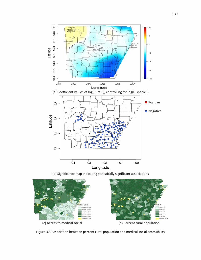
139
(a) Coefficient values of log(RuralP), controlling for log(HispanicP)
Positive Negative
(b) Significance map indicating statistically significant associations
(c) Access to medical social (d) Percent rural population
Figure 37. Association between percent rural population and medical social accessibility

140
Speech Pathology 4.5.2.5.
We find that three predictors, namely, percent rural population, percent Hispanic population, and
percent of the population living below the federal poverty level, have spatially varying associations with
speech pathology accessibility.
The coefficients corresponding to percent rural population exhibit both the largest magnitude and the
largest range among the three factors in the model. The corresponding factor coefficients, varying
between -19.94 and 9.03, are mapped in Figure 38a. There is a strong negative association between
percent rural population and speech pathology accessibility in some ZCTAs (in blue), meaning that the
access decreases as rurality increases. Other locations (in red), which are clustered in Northern part of
the state, exhibit a positive association. This seems to be largely tied to some areas with higher access
relative to neighboring ZCTAS specifically situated in Northern Arkansas.
The second factor shown to be significantly related to speech pathology accessibility is the percent
Hispanic population and its coefficient function takes on values in the range [-5.10, 8.65]. Figure 39a
illustrates that the magnitude of this factor is strongly positive in northwest Arkansas and moderately
positive in Central and Southwest. In these areas, accessibility is better where Hispanic concentration is
higher. On the other hand, negative association ZCTAs are present in Northeast and Southeast corners
of the state. Negative association areas in Northeast and Southeast occur in places with higher percent
Hispanic population and lower access.
Poverty rate also has a non-linear relationship with speech pathology accessibility and the
corresponding coefficients range from -0.34 to 7.90. The coefficient values of the poverty rate are
illustrated in Figure 40a. The association between poverty rate and speech pathology accessibility is
predominantly positive across the state.

141
(a) Coefficient values of log(RuralP), controlling for log(HispanicP) and log(Poverty)
Positive Negative
(b) Significance map indicating statistically significant associations
(c) Access to speech pathology (d) Percent rural population
Figure 38. Association between percent rural population and speech pathology accessibility
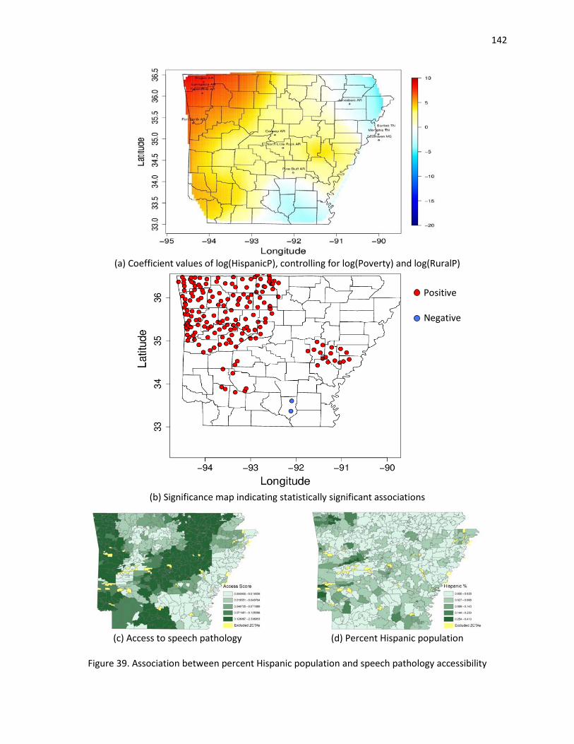
142
(a) Coefficient values of log(HispanicP), controlling for log(Poverty) and log(RuralP)
Positive Negative
(b) Significance map indicating statistically significant associations
(c) Access to speech pathology (d) Percent Hispanic population
Figure 39. Association between percent Hispanic population and speech pathology accessibility

143
(a) Coefficient values of log(Poverty), controlling for log(HispanicP) and log(RuralP)
Positive Negative
(b) Significance map indicating statistically significant associations
(c) Access to speech pathology (d) Poverty rate
Figure 40. Association between poverty rate and speech pathology accessibility

144
Home Health Aide 4.5.2.6.
The percent population that is Hispanic is the only significant factor in home health aide model. Its
association is spatially varying across the state and the coefficients take values between -1.17 and 4.44.
Negative associations are clustered in inner Southwest, Northeast and Northwest corners of the state. In
areas of negative association access to home health aide is lower where percent Hispanic population is
higher. The relationship is strongly positive in the Southeast and moderately positive in the rest of the
state.
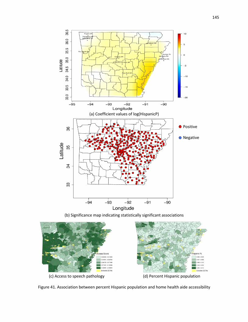
145
(a) Coefficient values of log(HispanicP)
Positive Negative
(b) Significance map indicating statistically significant associations
(c) Access to speech pathology (d) Percent Hispanic population
Figure 41. Association between percent Hispanic population and home health aide accessibility

146
The best-fitting space-varying coefficient models for all service types include percent Hispanic
population. Percent Hispanic population has constant positive associations with occupational therapy
and medical social accessibility. While the magnitude of this association is smaller than that of other
predictors in the corresponding models, percent Hispanic population is still a significant factor for
occupational therapy and medical social accessibility. Percent Hispanic population has spatially varying
associations with other service types and the association is predominantly positive across state except
the far northeast corner. We observe that percent Hispanic population is highly correlated with
population density and median household income (see Table 16). In other words, ZCTAs with a higher
Hispanic population rate tend to be metropolitan locations with higher income.
The percent of the population living below the poverty level is a statistically significant predictor of
access to physical therapy, occupational therapy, and speech pathology services and the association
varies spatially in each model. ZCTAs with strong positive associations are mainly clustered in the north
and central west. Poverty rate is found to have positive correlations with all the variables reflecting
minority population (see Table 16). ZCTAs with a higher poverty rate also tend to be areas with larger
minority populations.
Percent rural population is significantly associated with access to occupational therapy, medical social,
and speech pathology services. In each case, its association with access is spatially varying with strong
negative associations in south. This indicates high portions of rural areas in southern portions of the
state have relatively limited access to specific home healthcare services.
In our models, we do not control for a possible boundary impact (e.g. biased estimations on the state
borders). However, we investigated whether or not a border effect exists in the models and concluded
that associations between dependent variables (access scores) and predictors do not change when a
potential border impact is controlled for. Please see Appendix I for details.

147
4.6. Conclusion
This chapter aimed to explore the associations between socio-economic factors and potential spatial
access to six different home healthcare services in Arkansas. Access scores are calculated at the local
level (in our case, for each ZIP code tabulation area, or ZCTA) using an adapted version of the two-step
floating catchment area (2SFCA) method in Chapter 3. Univariate Moran’s I test is applied to assess the
similarity of accessibility among neighboring ZCTAs. The results of the test reveal strong positive spatial
auto-correlation for access scores of each service type. In addition, covariate effects vary with location
due spatial heterogeneity. That is, an estimate for the whole study area fails to explain associations at
local level and thereby local estimates of associations are required. These suggest there is a need for
spatial statistical method that incorporates spatial effects in the data and provides information on
spatial relationships between variables.
To account for the spatially-varying relationships between home healthcare accessibility and the socio-
demographic factors, we implement a space-varying coefficient model. We included several factors
related to race/ethnicity, income, rurality, and primary care access. The model is then implemented in
three main stages. First, we identify initial models by combining covariates that are not highly spatially
correlated. Next, we make inference on the shape of coefficients and significance of explanatory factors.
Finally, we select a best-fitting model for each service type using model selection criteria. According to
the results, access to home healthcare services tends to be affected by proportion of Hispanic
population, the percentage of people living below the federal poverty level, and the percentage of
people living in rural areas in a ZCTA.
Space-varying coefficient models can quantify associations between home healthcare accessibility and
the explanatory variables in each ZCTA. We visualize the spatial disparities of access to different home
healthcare services and reveal the population characteristics that are significantly associated with
access. The results indicate inhomogeneous spatial patterns of associations in the case study area. For

148
spatially varying coefficients, an important output of this analysis includes positive (respectively,
negative) significance maps that illustrate ZCTAs that have a statistically significant positive (negative)
association between accessibility and the predictor variable. The presence of a large number of such
points indicates potential inequities.
This study has a number of limitations. First, the quality and the completeness of the input data can
improve the reliability of the model outputs. The results of this study still could be influenced by the
missing FTE data problem in Chapter 3. Also, we consider only limited types of population characteristics
as explanatory variables in our models. Other important variables that can be associated with home
healthcare accessibility can be home ownership, houses without basic amenities, population without a
high-school diploma, etc (Wang & Luo, 2005). However, the possible impacts of these variables were not
examined due to the lack of ZCTA level data for these variables. Lastly, we examine potential
accessibility of home healthcare services, not realized.
Despite the limitations just discussed, the findings can serve as a complementary guideline for public
healthcare policy. The home healthcare market has demonstrated responsiveness to past policy
interventions. However, collecting and verifying comprehensive data at the local level are required
before basing policy on these results. Accurate results with better data have the potential to inform
policies that will positively impact individuals’ access to care. The following actions can be considered by
public policy designers aiming to ensure equitable home healthcare access for all patients: (i) examine
the accessibility of each home healthcare service independently since supply of and demand for these
services in a region may vary, (ii) coordinate and promote data collection efforts at local level across
state by collaborating with providers and professional associations, and (ii) design government
interventions that address significant disparities in home healthcare accessibility from the aspects of
race/ethnicity structure, income, and rural/urban status at the local level.

149
References
Abraham, A., Jain, L., & Goldberg, R. (Eds.). (2005). Evolutionary Multiobjective Optimization. London: Springer-Verlag.
Akaike, H. (1974). A new look at the statistical model identification. IEEE Transactions on Automatic Control, 19(6), 716–723. http://doi.org/10.1109/TAC.1974.1100705
Andersen, R. M., McCutcheon, A., Aday, L. A., Chiu, G. Y., & Bell, R. (1983). Exploring dimensions of access to medical care. Health Services Research, 18(1), 49–74.
Anselin, L. (1988). Spatial Econometrics: Methods and Models (Vol. 4). Dordrecht: Springer Netherlands.
Anselin, L. (2003). Spatial Econometrics. In B. H. Baltagi (Ed.), A Companion to Theoretical Econometrics. Malden, Mass.: Wiley-Blackwell.
Association of American Medical Colleges. (2011). 2011 State Physician Workforce Data Release. Washington, DC.
Assunção, R. M. (2003). Space varying coefficient models for small area data. Environmetrics, 14(5), 453–473.
Brunsdon, C., Fotheringham, S., & Charlton, M. (1998). Geographically Weighted Regression-Modelling Spatial Non-Stationarity. Journal of the Royal Statistical Society. Series D (The Statistician), 47(3), 431–443.
Bureau of the Census. (2011). Federal Register: Urban Area Criteria for the 2010 Census (No. 76(164)). Washington, DC.
Burton, D. C., Flannery, B., Bennett, N. M., Farley, M. M., Gershman, K., Harrison, L. H., … Active Bacterial Core Surveillance/Emerging Infections Program Network. (2010). Socioeconomic and racial/ethnic disparities in the incidence of bacteremic pneumonia among US adults. American Journal of Public Health, 100(10), 1904–1911.
Calkins, E. (1999). New Ways to Care for Older People: Building Systems Based on Evidence. New York, NY: Springer Publishing Company.
Cellmer, R. (2013). Use of spatial autocorrelation to build regression models of transaction prices. Real Estate Management and Valuation, 21(4), 65–74.
Cheh, V., & Phillips, B. (1993). Adequate access to posthospital home health services: differences between urban and rural areas. The Journal of Rural Health: Official Journal of the American Rural Health Association and the National Rural Health Care Association, 9(4), 262–269.
Chen, V. Y.-J., Deng, W.-S., Yang, T.-C., & Matthews, S. A. (2012). Geographically Weighted Quantile Regression (GWQR): An Application to U.S. Mortality Data. Geographical Analysis, 44(2), 134–150.

150
Chrostek, K., & Kopczewska, K. (2013). Spatial Prediction Models for Real Estate Market Analysis. Ekonomia, 35(0).
Dai, D. (2010). Black residential segregation, disparities in spatial access to health care facilities, and late-stage breast cancer diagnosis in metropolitan Detroit. Health & Place, 16(5), 1038–1052.
Dilworth-Anderson, P., Williams, I. C., & Gibson, B. E. (2002). Issues of race, ethnicity, and culture in caregiving research: a 20-year review (1980-2000). The Gerontologist, 42(2), 237–272.
Fan, J., & Zhang, W. (2008). Statistical Methods with Varying Coefficient Models. Statistics and Its Interface, 1(1), 179–195.
Feng, X. (2008). Spatial Econometric Analysis of Property Values---the Impact of Sports Facilities on Local Residential Property Values. ProQuest.
Finley, A. O. (2011). Comparing spatially-varying coefficients models for analysis of ecological data with non-stationary and anisotropic residual dependence. Methods in Ecology and Evolution, 2(2), 143–154.
Fotheringham, A. S., Brunsdon, C., & Charlton, M. (2002). Geographically Weighted Regression: The Analysis of Spatially Varying Relationships. Wiley.
Franco, S. J., & Leon, J. (2000). Rural Home Health Agencies: The Impact of the Balanced Budget Act. Bethesda, MD: The Project HOPE Walsh Center for Rural Health Analysis.
Freedman, V. A., Rogowski, J., Wickstrom, S. L., Adams, J., Marainen, J., & Escarce, J. J. (2004). Socioeconomic disparities in the use of home health services in a medicare managed care population. Health Services Research, 39(5), 1277–1297.
Gelfand, A. E., Kim, H.-J., Sirmans, C. F., & Banerjee, S. (2003). Spatial Modeling With Spatially Varying Coefficient Processes. Journal of the American Statistical Association, 98(462), 387–396.
Goldberg Dey, J., Johnson, M., Pajerowski, W., Tanamor, M., & Ward, A. (2011). Home Health Study Report. Washington, DC: L&M Policy Research.
Hamilton, G. L. (2011). The Majority Status of Arkansas Minority Populations: Transitioning to a Hispanic Major Minority. Little Rock, AR: Institute for Economic Advancement University of Arkansas.
Hawes, C., Phillips, C. D., Holan, S., Sherman, M., & Hutchison, L. L. (2005). Assisted living in rural America: results from a national survey. The Journal of Rural Health: Official Journal of the American Rural Health Association and the National Rural Health Care Association, 21(2), 131–139.
Heier Stamm, J. L. (2010). Design and analysis of humanitarian and public health logistics systems (Ph.D.). Georgia Institute of Technology, Atlanta, GA.
Heier Stamm, J. L., Serban, N., Swann, J., & Wortley, P. (2015). Quantifying and Explaining Accessibility with Application to the 2009 H1N1 Vaccination Campaign. under review.

151
Hoeting, J. A., Davis, R. A., Merton, A. A., & Thompson, S. E. (2006). Model selection for geostatistical models. Ecological Applications: A Publication of the Ecological Society of America, 16(1), 87–98.
HRSA. (2010). Primary Care Service Area Data 3.1. Retrieved May 4, 2014, from http://datawarehouse.hrsa.gov/data/datadownload/pcsa2010download.aspx
Hutchison, L., Hawes, C., & Williams, L. (2010). Access to Quality Health Services In Rural Areas - Long-Term Care: A Literature Review. In L. Gamm & L. Hutchison, Rural Healthy People 2010: A companion document to Healthy People 2010 (Vol. 3). College Station, Texas: The Texas A&M University System Health Science Center.
Jiang, H. (2010). Statistical computation and inference for functional data analysis (Ph.D.). Georgia Institute of Technology, Atlanta, GA.
Johnson, J. B., & Omland, K. S. (2004). Model selection in ecology and evolution. Trends in Ecology & Evolution, 19(2), 101–108.
Kenney, G., & Holahan, J. (1990). The Nursing Home Market and Hospital Discharge Delays. Inquiry, 27(1), 73–85.
Khan, A. A. (1992). An integrated approach to measuring potential spatial access to health care services. Socio-Economic Planning Sciences, 26(4), 275–287.
Krieger, N., Chen, J. T., Waterman, P. D., Rehkopf, D. H., & Subramanian, S. V. (2005). Painting a truer picture of US socioeconomic and racial/ethnic health inequalities: the Public Health Disparities Geocoding Project. American Journal of Public Health, 95(2), 312–323.
Little, T. D. (2013). The Oxford Handbook of Quantitative Methods, Vol. 2: Statistical Analysis. Oxford University Press, USA.
Luo, W., & Wang, F. (2003). Measures of spatial accessibility to health care in a GIS environment: synthesis and a case study in the Chicago region. Environment and Planning B: Planning and Design, 30(6), 865 – 884.
Martens, B. J. (2006). An analysis of the retail grocery industry: The spatial effects of supercenters. Purdue University.
Mitchell, J., Mathews, H. F., & Hack, K. A. (2000). Difference by Race in Long-Term Care Plans. Journal of Applied Gerontology, 19(4), 424–440.
Moran, P. A. P. (1950). Notes on Continuous Stochastic Phenomena. Biometrika, 37(1/2), 17–23.
Mui, A. C., & Burnette, D. (1994). Long-term care service use by frail elders: is ethnicity a factor? The Gerontologist, 34(2), 190–198.
Nelson, L., Brown, R., Gold, M., Ciemnecki, A., & Docteur, E. (1997). Access to care in Medicare HMOs, 1996. Health Affairs, 16(2), 148–156.

152
Park, B. U., Mammen, E., Lee, Y. K., & Lee, E. R. (2015). Varying Coefficient Regression Models: A Review and New Developments. International Statistical Review, 83(1), 36–64.
Plant, R. E. (2012). Spatial Data Analysis in Ecology and Agriculture Using R. CRC Press.
Probst, J. C., Towne, S., Mitchell, J., Bennett, K. J., & Chen, R. (2014). Home Health Care Agency Availability In Rural Counties. South Carolina Rural Health Research Center.
Radke, J., & Mu, L. (2000). Spatial Decompositions, Modeling and Mapping Service Regions to Predict Access to Social Programs. Geographic Information Sciences, 6(2), 105–112.
Reich, B. J., Fuentes, M., Herring, A. H., & Evenson, K. R. (2010). Bayesian variable selection for multivariate spatially varying coefficient regression. Biometrics, 66(3), 772–782.
Ruppert, D., Wand, M. P., & Carroll, R. J. (2003). Semiparametric Regression. Cambridge University Press.
Schunn, C. D., & Wallach, D. (2005). Evaluating Goodness-of-Fit in Comparison of Models to Data. Pittsburgh, PA: Learning Research and Development Center at the University of Pittsburgh.
Serban, N. (2011). A space-time varying coefficient model: The equity of service accessibility. The Annals of Applied Statistics, 5(3), 2024–2051.
Smoyer-Tomic, K. E., Hewko, J. N., & Hodgson, M. J. (2004). Spatial accessibility and equity of playgrounds in Edmonton, Canada. Canadian Geographer / Le Géographe Canadien, 48(3), 287–302.
Tobler, W. R. (1970). A Computer Movie Simulating Urban Growth in the Detroit Region. Economic Geography, 46, 234–240. http://doi.org/10.2307/143141
U.S. Census Bureau. (2011). 2010 Census Summary File 1 - USA. U.S. Census Bureau. Retrieved from http://factfinder.census.gov/
U.S. Census Bureau. (2014). 2009-2013 5-Year American Community Survey. U.S. Census Bureau. Retrieved from http://factfinder.census.gov/
U.S. Department of Health & Human Services. (n.d.). Shortage Designation: Health Professional Shortage Areas & Medically Underserved Areas/Populations. Retrieved from http://www.hrsa.gov/shortage/
Waller, L. A., Zhu, L., Gotway, C. A., Gorman, D. M., & Gruenewald, P. J. (2007). Quantifying geographic variations in associations between alcohol distribution and violence: a comparison of geographically weighted regression and spatially varying coefficient models. Stochastic Environmental Research and Risk Assessment, 21(5), 573–588.
Wang, F., & Luo, W. (2005). Assessing spatial and nonspatial factors for healthcare access: towards an integrated approach to defining health professional shortage areas. Health & Place, 11(2), 131–146.

153
Wheeler, D. C., & Calder, C. A. (2007). An assessment of coefficient accuracy in linear regression models with spatially varying coefficients. Journal of Geographical Systems, 9(2), 145–166.
Wheeler, D. C., & Waller, L. A. (2008). Comparing spatially varying coefficient models: a case study examining violent crime rates and their relationships to alcohol outlets and illegal drug arrests. Journal of Geographical Systems, 11(1), 1–22.
Wheeler, D., & Tiefelsdorf, M. (2005). Multicollinearity and correlation among local regression coefficients in geographically weighted regression. Journal of Geographical Systems, 7(2), 161–187.
Wood, S. (2006). Generalized Additive Models: An Introduction with R (1 edition). Boca Raton, FL: Chapman and Hall/CRC.
Ye, H., & Kim, H. (2015). Analyzing the Effect of Neighborhood Characteristics on the Spatial Pattern of Primary Care Physician Locations in Hillsborough County, Florida. Papers in Applied Geography, 1(1), 79–85.
Yin, M. (2008). Costs and Benefits of State Growth Management Programs: Evaluating Their Impacts on Sprawl and Housing Markets in the U.S., 1990--2000. ProQuest.

154
Appendix G: Alternative Models
Table G.1. Alternative models for skilled nursing ID BlackP HispanicP Poverty P-to-P 1.1 p = 0.42 NL p = 0 p = 0.69 1.2 N/A NL p = 0 p = 0.73 1.3 p = 0.15 NL N/A p = 0.69 1.4 p = 0.44 NL p = 0 N/A 1.5 N/A NL N/A p = 0.77 1.6 N/A NL p = 0 N/A 1.7 p = 0.16 NL N/A N/A 1.8 N/A NL N/A N/A ID BlackP HispanicP PerCapInc P-to-P 2.1 p = 0.15 NL p = 0.17 p = 0.77 2.2 N/A NL p = 0.18 p = 0.85 2.3 p = 0.15 NL N/A p = 0.69 2.4 p = 0.15 NL p = 0.16 N/A 2.5 N/A NL N/A p = 0.77 2.6 N/A NL p = 0.17 N/A 2.7 p = 0.16 NL N/A N/A 2.8 N/A NL N/A N/A ID BlackP HispanicP Poverty RuralP 3.1 p = 0.47 NL p = 0 p = 0.66 3.2 N/A NL p = 0 p = 0.6 3.3 p = 0.18 NL N/A p = 0.63 3.4 p = 0.44 NL p = 0 N/A 3.5 N/A NL N/A p = 0.52 3.6 N/A NL p = 0 N/A 3.7 p = 0.16 NL N/A N/A 3.8 N/A NL N/A N/A ID BlackP HispanicP P-to-P RuralP 4.1 p = 0.17 NL p = 0.67 p = 0.61 4.2 N/A NL p = 0.73 p = 0.51 4.3 p = 0.18 NL N/A p = 0.63 4.4 p = 0.15 NL p = 0.69 N/A 4.5 N/A NL N/A p = 0.52 4.6 N/A NL p = 0.77 N/A 4.7 p = 0.16 NL N/A N/A 4.8 N/A NL N/A N/A ID BlackP Poverty P-to-P PopDens 5.1 p = 0.35 p = 0 p = 0.45 p = 0.09 ID BlackP Poverty P-to-P RuralP 6.1 p = 0.19 p = 0 p = 0.55 p = 0.61 ID BlackP MHInc P-to-P RuralP 7.1 p = 0.02 p = 0.63 p = 0.52 p = 0.57

155
Table G.1. Alternative models for skilled nursing (Cont.) ID HispanicP Poverty P-to-P RuralP 8.1 p = 0 p = 0 p = 0.63 p = 0.64 ID MinorP Poverty P-to-P PopDens 9.1 p = 0.55 p = 0 p = 0.47 p = 0.04 ID MinorP Poverty P-to-P RuralP
10.1 p = 0.74 p = 0 p = 0.61 p = 0.47 ID MinorP MHInc P-to-P RuralP
11.1 p = 0.35 p = 0.52 p = 0.61 p = 0.47
Table G.2. Alternative models for physical therapy ID BlackP HispanicP Poverty P-to-P 1.1 p = 0.38 NL NL p = 0.47 1.2 N/A NL NL p = 0.5 1.3 p = 0.4 NL NL N/A 1.4 N/A NL NL N/A ID BlackP HispanicP PerCapInc P-to-P 2.1 p = 0.14 p = 0 p = 0.03 p = 0.52 ID BlackP HispanicP Poverty RuralP 3.1 p = 0.43 NL NL p = 0.62 3.2 N/A NL NL p = 0.57 3.3 p = 0.4 NL NL N/A 3.4 N/A NL NL N/A ID BlackP HispanicP P-to-P RuralP 4.1 p = 0.19 p = 0 p = 0.39 p = 0.46 ID BlackP Poverty P-to-P PopDens 5.1 p = 0.41 p = 0 p = 0.2 p = 0 ID BlackP Poverty P-to-P RuralP 6.1 p = 0.12 p = 0 p = 0.35 p = 0.41 ID BlackP MHInc P-to-P RuralP 7.1 p = 0 p = 0.54 p = 0.32 p = 0.39 ID HispanicP Poverty P-to-P RuralP 8.1 NL NL p = 0.47 p = 0.54 8.2 NL NL N/A p = 0.57 8.3 NL NL p = 0.5 N/A 8.4 NL NL N/A N/A ID MinorP Poverty P-to-P PopDens 9.1 p = 0.15 p = 0 p = 0.21 p = 0 ID MinorP Poverty P-to-P RuralP
10.1 p = 0.38 p = 0 p = 0.41 p = 0.26 ID MinorP MHInc P-to-P RuralP
11.1 p = 0.57 p = 0.45 p = 0.41 p = 0.27

156
Table G.3. Alternative models for occupational therapy ID BlackP HispanicP Poverty P-to-P 1.1 p = 0.6 p = 0 NL p = 0.83 1.2 N/A p = 0 NL p = 0.82 1.3 p = 0.15 N/A NL p = 0.9 1.4 p = 0.6 p = 0 NL N/A 1.5 N/A N/A NL p = 0.93 1.6 N/A p = 0 NL N/A 1.7 p = 0.15 N/A NL N/A 1.8 N/A N/A NL N/A ID BlackP HispanicP PerCapInc P-to-P 2.1 p = 0.19 p = 0 p = 0.63 p = 0.76 ID BlackP HispanicP Poverty RuralP 3.1 p = 0.53 p = 0 NL NL 3.2 N/A p = 0 NL NL 3.3 p = 0.14 N/A NL NL 3.4 N/A N/A NL NL ID BlackP HispanicP P-to-P RuralP 4.1 p = 0.29 p = 0 p = 0.91 NL 4.2 N/A p = 0 p = 0.87 NL 4.3 p = 0.02 N/A p = 0.79 NL 4.4 p = 0.28 p = 0 N/A NL 4.5 N/A N/A p = 0.85 NL 4.6 N/A p = 0 N/A NL 4.7 p = 0.02 N/A N/A NL 4.8 N/A N/A N/A NL ID BlackP Poverty P-to-P PopDens 5.1 p = 0.3 NL p = 0.76 p = 0.03 5.2 N/A NL p = 0.77 p = 0.02 5.3 p = 0.3 NL N/A p = 0.03 5.4 p = 0.15 NL p = 0.9 N/A 5.5 N/A NL N/A p = 0.02 5.6 N/A NL p = 0.93 N/A 5.7 p = 0.15 NL N/A N/A 5.8 N/A NL N/A N/A ID BlackP Poverty P-to-P RuralP 6.1 p = 0.14 NL p = 0.94 NL 6.2 N/A NL p = 0.96 NL 6.3 p = 0.14 NL N/A NL 6.4 N/A NL N/A NL

157
Table G.3. Alternative models for occupational therapy (Cont.) ID BlackP MHInc P-to-P RuralP 7.1 p = 0.02 p = 0.88 p = 0.78 NL 7.2 N/A p = 0.88 p = 0.84 NL 7.3 p = 0.02 N/A p = 0.79 NL 7.4 p = 0.02 p = 0.89 N/A NL 7.5 N/A N/A p = 0.85 NL 7.6 N/A p = 0.88 N/A NL 7.7 p = 0.02 N/A N/A NL 7.8 N/A N/A N/A NL ID HispanicP Poverty P-to-P RuralP 8.1 p = 0 NL p = 0.78 NL 8.2 N/A NL p = 0.96 NL 8.3 p = 0 NL N/A NL 8.4 N/A NL N/A NL ID MinorP Poverty P-to-P PopDens 9.1 p = 0.67 NL p = 0.78 p = 0.02 9.2 N/A NL p = 0.77 p = 0.02 9.3 p = 0.66 NL N/A p = 0.02 9.4 p = 0.42 NL p = 0.95 N/A 9.5 N/A NL N/A p = 0.02 9.6 N/A NL p = 0.93 N/A 9.7 p = 0.42 NL N/A N/A 9.8 N/A NL N/A N/A ID MinorP Poverty P-to-P RuralP
10.1 p = 0.41 NL p = 0.98 NL 10.2 N/A NL p = 0.96 NL 10.3 p = 0.41 NL N/A NL 10.4 N/A NL N/A NL ID MinorP MHInc P-to-P RuralP
11.1 p = 0.01 p = 0.71 p = 0.87 NL 11.2 N/A p = 0.88 p = 0.84 NL 11.3 p = 0.01 N/A p = 0.88 NL 11.4 p = 0.01 p = 0.71 N/A NL 11.5 N/A N/A p = 0.85 NL 11.6 N/A p = 0.88 N/A NL 11.7 p = 0.01 N/A N/A NL 11.8 N/A N/A N/A NL

158
Table G.4. Alternative models for medical social ID BlackP HispanicP Poverty P-to-P 1.1 p = 0.04 p = 0 NL p = 0.83 1.2 N/A p = 0 NL p = 0.77 1.3 p = 0 N/A NL p = 0.96 1.4 p = 0.04 p = 0 NL N/A 1.5 N/A N/A NL p = 0.95 1.6 N/A p = 0 NL N/A 1.7 p = 0 N/A NL N/A 1.8 N/A N/A NL N/A ID BlackP HispanicP PerCapInc P-to-P 2.1 p = 0 p = 0 p = 0.62 p = 0.88 ID BlackP HispanicP Poverty RuralP 3.1 p = 0.08 p = 0 p = 0 NL 3.2 N/A p = 0 p = 0 NL 3.3 p = 0.01 N/A p = 0 NL 3.4 p = 0.01 p = 0 N/A NL 3.5 N/A N/A p = 0 NL 3.6 N/A p = 0 N/A NL 3.7 p = 0 N/A N/A NL 3.8 N/A N/A N/A NL ID BlackP HispanicP P-to-P RuralP 4.1 p = 0.01 p = 0 p = 0.99 NL 4.2 N/A p = 0 p = 0.9 NL 4.3 p = 0 N/A p = 0.74 NL 4.4 p = 0.01 p = 0 N/A NL 4.5 N/A N/A p = 0.84 NL 4.6 N/A p = 0 N/A NL 4.7 p = 0 N/A N/A NL 4.8 N/A N/A N/A NL ID BlackP Poverty P-to-P PopDens 5.1 p = 0.02 NL p = 0.73 p = 0 5.2 N/A NL p = 0.75 p = 0 5.3 p = 0.02 NL N/A p = 0 5.4 p = 0 NL p = 0.96 N/A 5.5 N/A NL N/A p = 0 5.6 N/A NL p = 0.95 N/A 5.7 p = 0 NL N/A N/A 5.8 N/A NL N/A N/A

159
Table G.4. Alternative models for medical social (Cont.) ID BlackP Poverty P-to-P RuralP 6.1 p = 0.01 p = 0 p = 0.73 NL 6.2 N/A p = 0 p = 0.8 NL 6.3 p = 0 N/A p = 0.74 NL 6.4 p = 0.01 p = 0 N/A NL 6.5 N/A N/A p = 0.84 NL 6.6 N/A p = 0 N/A NL 6.7 p = 0 N/A N/A NL 6.8 N/A N/A N/A NL ID BlackP MHInc P-to-P RuralP 7.1 p = 0 p = 0.97 p = 0.74 NL 7.2 N/A p = 0.99 p = 0.84 NL 7.3 p = 0 N/A p = 0.74 NL 7.4 p = 0 p = 0.97 N/A NL 7.5 N/A N/A p = 0.84 NL 7.6 N/A p = 0.98 N/A NL 7.7 p = 0 N/A N/A NL 7.8 N/A N/A N/A NL ID HispanicP Poverty P-to-P RuralP 8.1 p = 0 p = 0 p = 0.97 NL 8.2 N/A p = 0 p = 0.8 NL 8.3 p = 0 N/A p = 0.9 NL 8.4 p = 0 p = 0 N/A NL 8.5 N/A N/A p = 0.84 NL 8.6 N/A p = 0 N/A NL 8.7 p = 0 N/A N/A NL 8.8 N/A N/A N/A NL ID MinorP Poverty P-to-P PopDens 9.1 p = 0.05 NL p = 0.79 p = 0 9.2 N/A NL p = 0.75 p = 0 9.3 p = 0.05 NL N/A p = 0 9.4 p = 0.01 NL p = 0.93 N/A 9.5 N/A NL N/A p = 0 9.6 N/A NL p = 0.95 N/A 9.7 p = 0.01 NL N/A N/A 9.8 N/A NL N/A N/A ID MinorP Poverty P-to-P RuralP
10.1 p = 0.01 p = 0 p = 0.84 NL 10.2 N/A p = 0 p = 0.8 NL 10.3 p = 0 N/A p = 0.89 NL 10.4 p = 0.01 p = 0 N/A NL 10.5 N/A N/A p = 0.84 NL 10.6 N/A p = 0 N/A NL 10.7 p = 0 N/A N/A NL 10.8 N/A N/A N/A NL

160
Table G.4. Alternative models for medical social (Cont.) ID MinorP MHInc P-to-P RuralP
11.1 p = 0 p = 0.72 p = 0.88 NL 11.2 N/A p = 0.99 p = 0.84 NL 11.3 p = 0 N/A p = 0.89 NL 11.4 p = 0 p = 0.72 N/A NL 11.5 N/A N/A p = 0.84 NL 11.6 N/A p = 0.98 N/A NL 11.7 p = 0 N/A N/A NL 11.8 N/A N/A N/A NL
Table G.5. Alternative models for speech pathology
ID BlackP HispanicP Poverty P-to-P 1.1 p = 0.76 NL NL p = 0.4 1.2 N/A NL NL p = 0.39 1.3 p = 0.73 NL NL N/A 1.4 N/A NL NL N/A ID BlackP HispanicP PerCapInc P-to-P 2.1 p = 0.31 NL NL p = 0.31 2.2 N/A NL NL p = 0.28 2.3 p = 0.28 NL NL N/A 2.4 N/A NL NL N/A ID BlackP HispanicP Poverty P-to-P 3.1 N/A NL NL NL 3.2 p = 0.74 NL NL NL ID BlackP HispanicP Poverty P-to-P 4.1 p = 0.36 NL p = 0.41 NL 4.2 N/A NL p = 0.39 NL 4.3 p = 0.34 NL N/A NL 4.4 N/A NL N/A NL ID BlackP HispanicP Poverty P-to-P 5.1 p = 0.53 NL p = 0.9 p = 0 5.2 N/A NL p = 0.89 p = 0 5.3 p = 0.53 NL N/A p = 0 5.4 p = 0.17 NL p = 0.66 N/A 5.5 N/A NL N/A p = 0 5.6 N/A NL p = 0.62 N/A 5.7 p = 0.17 NL N/A N/A 5.8 N/A NL N/A N/A

161
Table G.5. Alternative models for speech pathology (Cont.) ID BlackP HispanicP Poverty P-to-P 6.1 p = 0.33 p = 0 p = 0.71 NL 6.2 N/A p = 0 p = 0.68 NL 6.3 p = 0.03 N/A p = 0.73 NL 6.4 p = 0.32 p = 0 N/A NL 6.5 N/A N/A p = 0.67 NL 6.6 N/A p = 0 N/A NL 6.7 p = 0.03 N/A N/A NL 6.8 N/A N/A N/A NL ID BlackP HispanicP Poverty P-to-P 7.1 p = 0.03 p = 0.32 p = 0.74 NL 7.2 N/A p = 0.32 p = 0.69 NL 7.3 p = 0.03 N/A p = 0.73 NL 7.4 p = 0.03 p = 0.32 N/A NL 7.5 N/A N/A p = 0.67 NL 7.6 N/A p = 0.32 N/A NL 7.7 p = 0.03 N/A N/A NL 7.8 N/A N/A N/A NL ID BlackP HispanicP Poverty P-to-P 8.1 NL NL N/A NL 8.2 NL NL p = 0 NL ID BlackP HispanicP Poverty P-to-P 9.4 p = 0.32 NL p = 0.86 p = 0 9.5 N/A NL p = 0.89 p = 0 9.6 p = 0.32 NL N/A p = 0 9.7 p = 0.1 NL p = 0.6 N/A 9.8 N/A NL N/A p = 0 9.9 N/A NL p = 0.62 N/A
9.10 p = 0.1 NL N/A N/A 9.11 N/A NL N/A N/A ID BlackP HispanicP Poverty P-to-P
10.1 p = 0.13 p = 0 p = 0.66 NL 10.2 N/A p = 0 p = 0.68 NL 10.3 p = 0 N/A p = 0.63 NL 10.4 p = 0.13 p = 0 N/A NL 10.5 N/A N/A p = 0.67 NL 10.6 N/A p = 0 N/A NL 10.7 p = 0 N/A N/A NL 10.8 N/A N/A N/A NL

162
Table G.5. Alternative models for speech pathology (Cont.) ID BlackP HispanicP Poverty P-to-P
11.1 p = 0 p = 0.2 p = 0.65 NL 11.2 N/A p = 0.32 p = 0.69 NL 11.3 p = 0 N/A p = 0.63 NL 11.4 p = 0 p = 0.2 N/A NL 11.5 N/A N/A p = 0.67 NL 11.6 N/A p = 0.32 N/A NL 11.7 p = 0 N/A N/A NL 11.8 N/A N/A N/A NL
Table G.6. Alternative models for home health aide
ID BlackP HispanicP Poverty P-to-P 1.1 p = 0.18 NL p = 0 p = 0.33 1.2 N/A NL p = 0 p = 0.37 1.3 p = 0.05 NL N/A p = 0.35 1.4 p = 0.2 NL p = 0 N/A 1.5 N/A NL N/A p = 0.41 1.6 N/A NL p = 0 N/A 1.7 p = 0.05 NL N/A N/A 1.8 N/A NL N/A N/A ID BlackP HispanicP Poverty P-to-P 2.1 p = 0.05 NL p = 0.14 p = 0.41 2.2 N/A NL p = 0.14 p = 0.48 2.3 p = 0.05 NL N/A p = 0.35 2.4 p = 0.05 NL p = 0.12 N/A 2.5 N/A NL N/A p = 0.41 2.6 N/A NL p = 0.12 N/A 2.7 p = 0.05 NL N/A N/A 2.8 N/A NL N/A N/A ID BlackP HispanicP Poverty P-to-P 3.1 p = 0.2 NL p = 0 p = 0.97 3.2 N/A NL p = 0 p = 0.92 3.3 p = 0.06 NL N/A p = 0.96 3.4 p = 0.2 NL p = 0 N/A 3.5 N/A NL N/A p = 0.82 3.6 N/A NL p = 0 N/A 3.7 p = 0.05 NL N/A N/A 3.8 N/A NL N/A N/A ID BlackP HispanicP Poverty P-to-P 4.1 p = 0.1 p = 0 p = 0.28 p = 0.95

163
Table G.6. Alternative models for home health aide (Cont.) ID BlackP HispanicP Poverty P-to-P 5.1 p = 0.12 p = 0 p = 0.17 p = 0.2 ID BlackP HispanicP Poverty P-to-P 6.1 p = 0.06 p = 0 p = 0.22 p = 0.91 ID BlackP HispanicP Poverty P-to-P 7.1 p = 0 p = 0.99 p = 0.21 p = 0.85 ID BlackP HispanicP Poverty P-to-P 8.1 NL p = 0 p = 0.36 p = 0.87 8.2 NL N/A p = 0.4 p = 0.77 8.3 NL p = 0 N/A p = 0.92 8.4 NL p = 0 p = 0.37 N/A 8.5 NL N/A N/A p = 0.82 8.6 NL N/A p = 0.41 N/A 8.7 NL p = 0 N/A N/A 8.8 NL N/A N/A N/A ID BlackP HispanicP Poverty P-to-P 9.1 p = 0.97 p = 0 p = 0.19 p = 0.1 ID BlackP HispanicP Poverty P-to-P
10.1 p = 0.79 p = 0 p = 0.25 p = 0.78 ID BlackP HispanicP Poverty P-to-P
11.1 p = 0.14 p = 0.85 p = 0.27 p = 0.74

164
Appendix H: Pareto Frontiers
Figure H.1. Non-dominated and dominated models
0.00
0.10
0.20
0.30
0.40
2560 2580 2600 2620 2640 2660
ABS(
Corr
elat
ion)
AIC
Models with 1 predictor for OT
0.00
0.10
0.20
0.30
0.40
2500 2550 2600 2650 2700
ABS(
Corr
elat
ion)
AIC
Models with 2 predictors for OT
0.00
0.20
0.40
0.60
0.80
1.00
2940 2950 2960 2970 2980
ABS(
Corr
elat
ion)
AIC
Models with 1 predictors for MS
0.00
0.20
0.40
0.60
0.80
1.00
2900 2920 2940 2960 2980
ABS(
Corr
elat
ion)
AIC
Models with 2 predictors for MS
0.00
0.20
0.40
0.60
0.80
2910 2920 2930 2940
ABS(
Corr
elat
ion)
AIC
Models with 3 predictors for MS
0.00
0.20
0.40
0.60
0.80
2720 2730 2740 2750 2760 2770
ABS(
Corr
elat
ion)
AIC
Models with 1 predictor for SP
0.000.100.200.300.400.500.600.70
2660 2680 2700 2720 2740 2760 2780
ABS(
Corr
elat
ion)
AIC
Models with 2 predictors for SP
0.572
0.576
0.580
0.584
0.588
0.592
0 500 1000 1500 2000 2500
ABS(
Corr
elat
ion)
AIC
Models with 2 predictors for HA

165
Appendix I: Analyzing the Border Impact
A new binary variable, which takes the value of 1 if the ZCTA is located in the border and 0 otherwise, is
used to examine the possible border impact. This variable (border variable, bX ) is included to the
original best-fitting models with either constant and non-linear shape, separately. The results are
provided in Table I.1. If bX is introduced as a constant predictor, the p-values indicate that this variable
is not statistically significant in any of the models. If bX is introduced as a non-linear predictor, the
ranges of the corresponding coefficients are very small. Also, when we examine the coefficient ranges
and association patterns of other predictors in the model, we do not see dramatic differences compared
to original model results. Hence, we conclude that associations between dependent variables (access
scores) and predictors do not change when a potential border impact is controlled.

166
Table I.1. Models with a border variable Provider Type Models AIC Correlation HispanicP Poverty RuralP bX
Skilled nursing
Original model 2210.0 0.284 [-1.23, 3.62] Original model with a NL bX 2216.1 0.271 [-0.98, 3.50] [-0.36, 0.55] Original model with a C bX 2211.7 0.285 [-1.24, 3.61] 0.026 (p = 0.904)
Physical therapy
Original model 2287.0 0.153 [-4.04, 3.50] [-0.88, 7.30] Original model with a NL bX 2291.3 0.167 [-4.15, 3.48] [-0.82, 7.15] [-0.37, 0.91] Original model with a C bX 2286.5 0.151 [-4.16, 3.51] [-0.92, 7.28] 0.185 (p = 0.458 )
Occupational therapy
Original model 2540.7 0.079 2.25 (p<0.01) [-5.55, 8.28] [-15.78, 9.39] Original model with a NL bX 2546.6 0.082 2.23 (p<0.01) [-5.50, 8.22] [-15.77, 9.42] [-0.12, 0.18] Original model with a C bX 2542.6 0.079 2.24 (p<0.01) [-5.55, 8.27] [-15.77, 9.40] 0.016 (p = 0.962 )
Speech pathology
Original model 2677.5 0.109 [-5.10, 8.65] [-0.34, 7.90] [-19.94, 9.03] Original model with a NL bX 2681.1 0.106 [-5.14, 8.90] [-0.26, 7.85] [-20.21, 9.34] [-0.42, 0.51] Original model with a C bX 2679.2 0.109 [-5.16, 8.76] [-0.39, 7.84] [-19.89, 9.11] 0.143 (p = 0.69)
Medical social Original model 2934.6 -0.055 3.70 (p<0.01) [-13.53, 2.32] Original model with a NL bX 2939.7 -0.056 3.67 (p<0.01) [-13.31, 2.25] [-0.03, 0.43] Original model with a C bX 2936.1 -0.056 3.68 (p<0.01) [-13.39, 2.27] 0.151 (p = 0.734)
Home health aide
Original model 2218.3 0.572 [-1.17, 4.44] Original model with a NL bX 2222.7 0.561 [-1.17, 4.40] [-0.175, 0.355] Original model with a C bX 2220.0 0.572 [-1.18, 4.42] 0.03 (p = 0.895)

167
5. Conclusion
The availability, quality and efficiency of home healthcare services will likely have important roles in
meeting the increasing demand for long-term care in this century. A key factor for a better home
healthcare industry is utilizing strategic approaches supported by quantitative tools. This dissertation
examines two main issues in the US home healthcare system: telehealth diffusion and spatial
accessibility. The main objective of the research is to analyze these topics through developing and
employing intuitive solution methods from a comprehensive systems perspective.
Home telehealth is an emerging technology that has the potential to increase efficiency and health
outcomes. However, the utilization of this technology has been limited primarily due to lack of
reimbursement and lack of evidence on its impacts. In this dissertation, we study the factors impacting
home telehealth diffusion among agencies and develop a system dynamics model to demonstrate the
impacts of home telehealth on healthcare utilization and overall healthcare cost. Next, we study
potential spatial accessibility of home healthcare services. A new measure that simultaneously considers
both staffing levels and eligible populations is developed and demonstrated via a case study using the
state of Arkansas. To the best of our knowledge, no previous measure has proposed to quantify the
potential spatial accessibility of home healthcare services within a geographic region. The results of the
case study reveal disparities across the study area for each home healthcare service type. Finally, to
better understand the spatial accessibility of home healthcare services, we investigate associations
between population characteristics and access using space-varying coefficient models. The findings
indicate statistically significant associations between access and predictor variables across the state.
The primary limitation in all chapters is collecting the required data for the models. We rely on
secondary data sources to populate our models. In chapter 2, there is uncertainty in the system
dynamics model inputs of diffusion rates, telehealth’s impact on healthcare visits and telehealth nurse
capacity. We overcome these challenges by conducting comprehensive literature reviews and sensitivity

168
analyses. In chapters 3 and 4, unavailable cost reports from some agencies and questions around the
accuracy of self-reported data in the cost reports of other agencies may influence model outputs on
certain parts of the state.
As future work, independent from the ideas proposed after each chapter, the impact of home telehealth
utilization on access to home healthcare services can be examined. Distance and location are considered
as barriers against accessing healthcare services. However, telehealth technology provides opportunities
to the lower the impact of the distribution of healthcare resources and traveling barriers on patient’s
access to care. Hence, the concept of accessibility evaluation can be broadened to consider telehealth
utilization.