understanding boston - the boston foundation - tbf/media/tbforg/files/reports/2016 housing... ·...
TRANSCRIPT

The Greater Boston Housing Report Card 2016
The Trouble with GrowthHow Unbalanced Economic Expansion Affects Housing
U N D E R S T A N D I N G B O S T O N
November 2016

Design: Canfield Design Production: Mayerchak & Company
Cover Photo: Richard Howard, Richard Howard Photography
© 2016 by the Boston Foundation. All rights reserved.
The Boston Foundation, Greater Boston’s community foundation, is one of the largest community foundations in the
nation, with net assets of some $1 billion. In 2015, the Foundation and its donors paid more than $127 million in grants
to nonprofit organizations and received gifts of close to $123 million. In celebration of its Centennial in 2015, the Boston
Foundation launched the Campaign for Boston to strengthen the Permanent Fund for Boston, its endowment fund focused
on addressing the most pressing needs of Greater Boston. The Foundation is proud to be a partner in philanthropy, with
more than 1,000 separate charitable funds established by donors either for the general benefit of the community or for
special purposes. The Boston Foundation also serves as a major civic leader, think tank and advocacy organization,
commissioning research into the most critical issues of our time and helping to shape public policy designed to advance
opportunity for everyone in Greater Boston. The Philanthropic Initiative (TPI), an operating unit of the Foundation,
designs and implements customized philanthropic strategies for families, foundations and corporations both here and
around the globe. For more information about the Boston Foundation or TPI, visit tbf.org or call 617-338-1700.
The Kitty and Michael Dukakis Center for Urban and Regional Policy at Northeastern University conducts interdisciplinary
research, in collaboration with civic leaders and scholars both within and beyond Northeastern University, to identify
and implement real solutions to the critical challenges facing urban areas throughout Greater Boston, the Common-
wealth of Massachusetts, and the nation. Founded in 1999 as a “think and do” tank, the Dukakis Center’s collaborative
research and problem-solving model applies powerful data analysis, a bevy of multidisciplinary research and evaluation
techniques, and a policy-driven perspective to address a wide range of issues facing cities and towns. These include
affordable housing, local economic development, workforce development, transportation, public finance and environ-
mental sustainability. The staff of the Dukakis Center works to catalyze broad-based efforts to solve urban problems,
acting as both a convener and a trusted and committed partner to local, state, and national agencies and organizations.
The Center is housed within Northeastern University’s School of Public Policy and Urban Affairs.
The Warren Group collects public record data on real estate sales and ownership throughout New England and offers a
range of real estate products, information services, and printed publications, including the weekly newspapers Banker &
Tradesman and The Commercial Record. The company also produces and organizes trade shows and events for a variety
of industries, including bankers, mortgage brokers, credit unions and lawyers. Based in Boston, the company was estab-
lished in 1872 and is now in its fourth generation of family ownership and management.
UNDERSTANDING BOSTON is a series of forums, educational events and research sponsored by the Boston Foundation to provide
information and insight into issues affecting Boston, its neighborhoods and the region. By working in collaboration with a
wide range of partners, the Boston Foundation provides opportunities for people to come together to explore challenges
facing our constantly changing community and to develop an informed civic agenda. Visit www.tbf.org to learn more
about Understanding Boston and the Boston Foundation.

U N D E R S T A N D I N G B O S T O N
The Greater Boston Housing Report Card 2016
The Trouble with GrowthHow Unbalanced Economic Expansion Affects Housing
AUTHORS
Barry Bluestone
Catherine Tumber
James Huessy
Tim Davis
EDITOR
Sandra Kendall, The Boston Foundation
Prepared by
The Kitty and Michael Dukakis Centerfor Urban and Regional Policy
Northeastern University
forThe Boston Foundation


T h e G r e a t e r B o s t o n H o u s i n g R e p o r t C a r d 2 0 1 6 | 1
Contents
Acknowledgments . . . . . . . . . . . . . . . . . . . . . . . . . . . . . . . . . . . . . . . . . . . . . . . . . . . . . . . . . . . . . . . . . . . . . . . . . . . . . . . . . . . . . . . . . . . . . . 4
Letter from Paul Grogan . . . . . . . . . . . . . . . . . . . . . . . . . . . . . . . . . . . . . . . . . . . . . . . . . . . . . . . . . . . . . . . . . . . . . . . . . . . . . . . . . . . . . . . . 5
Executive Summary . . . . . . . . . . . . . . . . . . . . . . . . . . . . . . . . . . . . . . . . . . . . . . . . . . . . . . . . . . . . . . . . . . . . . . . . . . . . . . . . . . . . . . . . . . . . 7
CHAPTER ONE Introduction . . . . . . . . . . . . . . . . . . . . . . . . . . . . . . . . . . . . . . . . . . . . . . . . . . . . . . . . . . . . . . . . . . . . . . . . . . . . . . . . . .13
CHAPTER TWO Home Sales, Housing Production and Foreclosures in Greater Boston . . . . . . . . . . . . . . . . . . . . . . . . . .23
CHAPTER THREE Home Prices and Rents in Greater Boston . . . . . . . . . . . . . . . . . . . . . . . . . . . . . . . . . . . . . . . . . . . . . . . . . . . . .40
CHAPTER FOUR Family Homelessness, Housing Insecurity and Children’s Need for Social Stability . . . . . . . . . . . . . .52
CHAPTER FIVE Public Policy and Public Spending on Housing in the Commonwealth . . . . . . . . . . . . . . . . . . . . . . . . . . .62
CHAPTER SIX Summary and Conclusions . . . . . . . . . . . . . . . . . . . . . . . . . . . . . . . . . . . . . . . . . . . . . . . . . . . . . . . . . . . . . . . . . . . .74
Endnotes . . . . . . . . . . . . . . . . . . . . . . . . . . . . . . . . . . . . . . . . . . . . . . . . . . . . . . . . . . . . . . . . . . . . . . . . . . . . . . . . . . . . . . . . . . . . . . . . . . . . .80
Appendix . . . . . . . . . . . . . . . . . . . . . . . . . . . . . . . . . . . . . . . . . . . . . . . . . . . . . . . . . . . . . . . . . . . . . . . . . . . . . . . . . . . . . . . . . . . . . . . . . . . . . 86
LIST OF FIGURES AND TABLES
FIGURE 1 .1 Growth in Real Output, Massachusetts vs . U .S ., 2009–2016 Q2 . . . . . . . . . . . . . . . . . . . . . . . . . . . . . . . . . . . . . . . . . . . . . . . .13
FIGURE 1 .2 Total Non-Farm Employment Seasonally Adjusted, Massachusetts, 2008–2016 (June) . . . . . . . . . . . . . . . . . . . . . . . . . . . . . .14
FIGURE 1 .3 Massachusetts Civilian Unemployment Rate, 2009–2016 (June) . . . . . . . . . . . . . . . . . . . . . . . . . . . . . . . . . . . . . . . . . . . . . . .14
FIGURE 1 .4 Real Average Weekly Wage, Private Industry, Massachusetts, 2001–2015 Q3 (Real 2015 $) . . . . . . . . . . . . . . . . . . . . . . . . . . .15
TABLE 1 .1 Inflation-Adjusted Hourly Wage Distribution, Massachusetts, 2009–2015 . . . . . . . . . . . . . . . . . . . . . . . . . . . . . . . . . . . . . . . .15
FIGURE 1 .5 Five-County Greater Boston Total Non-Farm Employment, 2008–2015 (December) . . . . . . . . . . . . . . . . . . . . . . . . . . . . . . . .16
TABLE 1 .2 Population Statistics . . . . . . . . . . . . . . . . . . . . . . . . . . . . . . . . . . . . . . . . . . . . . . . . . . . . . . . . . . . . . . . . . . . . . . . . . . . . . . . . .16
TABLE 1 .3 Demographic Profile of the Five-County Greater Boston Region . . . . . . . . . . . . . . . . . . . . . . . . . . . . . . . . . . . . . . . . . . . . . . .17
TABLE 1 .4 Housing-Cost Burden, Greater Boston . . . . . . . . . . . . . . . . . . . . . . . . . . . . . . . . . . . . . . . . . . . . . . . . . . . . . . . . . . . . . . . . . . .18
FIGURE 1 .6 Greater Boston Population, 1970–2010, 2010–2030 Projected . . . . . . . . . . . . . . . . . . . . . . . . . . . . . . . . . . . . . . . . . . . . . . . . . .18
TABLE 1 .5 Projected Growth in the Population and Labor Force, Greater Boston, 2010–2030 . . . . . . . . . . . . . . . . . . . . . . . . . . . . . . . . . .19
TABLE 1 .6 Projected Number of Households in Greater Boston . . . . . . . . . . . . . . . . . . . . . . . . . . . . . . . . . . . . . . . . . . . . . . . . . . . . . . . .19
FIGURE 1 .7 Greater Boston Projected Population Growth by Age Cohort, 2010–2030 . . . . . . . . . . . . . . . . . . . . . . . . . . . . . . . . . . . . . . . .19
TABLE 1 .7A Poverty and Adjusted Poverty Rates for Greater Boston, 2014 (Families) . . . . . . . . . . . . . . . . . . . . . . . . . . . . . . . . . . . . . . . .20
TABLE 1 .7B Poverty and Adjusted Poverty Rates for Greater Boston, 2014 (Married Couple Families) . . . . . . . . . . . . . . . . . . . . . . . . . . .20

2 | T h e B o s t o n F o u n d a t i o n : A n U n d e r s t a n d i n g B o s t o n R e p o r t
TABLE 1 .7C Poverty and Adjusted Poverty Rates for Greater Boston, 2014 (Non-Family Households) . . . . . . . . . . . . . . . . . . . . . . . . . . .21
TABLE 1 .7D Poverty and Adjusted Poverty Rates for Greater Boston, 2014 (All Families + Non-Family Households) . . . . . . . . . . . . . . .21
TABLE 1 .8 Greater Boston : Rich and Poor Families . . . . . . . . . . . . . . . . . . . . . . . . . . . . . . . . . . . . . . . . . . . . . . . . . . . . . . . . . . . . . . . . . .22
FIGURE 2 .1 Annual Number of Sales of Single-Family Homes in Five-County Greater Boston Region, 2000 – 2016 (Est .) . . . . . . . . . . . . .23
FIGURE 2 .2 Annual Number of Sales of Condominiums in Five-County Greater Boston Region, 2000 – 2016 (Est .) . . . . . . . . . . . . . . . . . .24
FIGURE 2 .3 Annual Number of Sales of Homes in Two-Unit and Three-Unit Structures in Five-County
Greater Boston Region, 2000 – 2016 (Est .) . . . . . . . . . . . . . . . . . . . . . . . . . . . . . . . . . . . . . . . . . . . . . . . . . . . . . . . . . . . . . . . . . .24
TABLE 2 .1A Municipal Leaders in Single-Home Sales in Greater Boston, 2010– 2015 (Estimate) . . . . . . . . . . . . . . . . . . . . . . . . . . . . . . . .25
TABLE 2 .1B Municipal Leaders in Sales of Condominiums in Greater Boston, 2010–2015 (Estimate) . . . . . . . . . . . . . . . . . . . . . . . . . . . . .25
FIGURE 2 .4 Homeownership Rate Boston Metro Area, 2005 – 2016 (Q1 & Q2) . . . . . . . . . . . . . . . . . . . . . . . . . . . . . . . . . . . . . . . . . . . . . .26
TABLE 2 .2 Homeownership Rate for Prime Age Households, 2000–2015 . . . . . . . . . . . . . . . . . . . . . . . . . . . . . . . . . . . . . . . . . . . . . . . . .26
FIGURE 2 .5 Total Housing Permits Issued in Five-County Greater Boston Region, 2000–2016 (Est .) . . . . . . . . . . . . . . . . . . . . . . . . . . . . .27
FIGURE 2 .6 Number of Housing Unit Permits in Five-County Greater Boston Region, by Structure Type, 2000–2016 (Est .) . . . . . . . . . . .28
FIGURE 2 .7 5+ Unit Housing Unit Permits as a Percent of All Housing Permits Greater Boston, 2000–2016 (Est .) . . . . . . . . . . . . . . . . . .28
TABLE 2 .3 Single-Family and Multi-Family Building Permits in Greater Boston, 2000–2016 (Est .) . . . . . . . . . . . . . . . . . . . . . . . . . . . . . .29
FIGURE 2 .8 New Completed Apartment Units, Boston Metro Area, 2000–2016 (Est .) . . . . . . . . . . . . . . . . . . . . . . . . . . . . . . . . . . . . . . . . .30
TABLE 2 .4A Municipalities Permitting the Most New Housing Units, 2011–2016 . . . . . . . . . . . . . . . . . . . . . . . . . . . . . . . . . . . . . . . . . . . .31
TABLE 2 .4B Municipalities Permitting the Most New Single-Family Units, 2011–2016 . . . . . . . . . . . . . . . . . . . . . . . . . . . . . . . . . . . . . . . .31
TABLE 2 .4C Municipalities Permitting the Most New Units in 5+ Structures, 2011–2016 . . . . . . . . . . . . . . . . . . . . . . . . . . . . . . . . . . . . . .32
TABLE 2 .5 Permits : Boston vs . Greater Boston . . . . . . . . . . . . . . . . . . . . . . . . . . . . . . . . . . . . . . . . . . . . . . . . . . . . . . . . . . . . . . . . . . . . . .33
TABLE 2 .6 Average Application to Permit Wait Time (in Days) by Housing Type, Boston, 2014–2016 (September) . . . . . . . . . . . . . . . . .33
FIGURE 2 .9 Housing Unit Permit Applications, Housing Units Permitted and
Housing Units Completed, City of Boston, 2014–2016 (Est .) . . . . . . . . . . . . . . . . . . . . . . . . . . . . . . . . . . . . . . . . . . . . . . . . . .33
FIGURE 2 .10 Affordable New Unit Permits as a Percentage of All New Permits, City of Boston 1996–2016 (Est .) . . . . . . . . . . . . . . . . . . .34
TABLE 2 .7 Students Living On-Campus vs . Off-Campus in Greater Boston . . . . . . . . . . . . . . . . . . . . . . . . . . . . . . . . . . . . . . . . . . . . . . .35
TABLE 2 .8 Housing Units Constructed in Chapter 40R Smart-Growth Districts in Massachusetts . . . . . . . . . . . . . . . . . . . . . . . . . . . . . .36
FIGURE 2 .11 Annual Number of Foreclosure Petitions in Single-Family Homes in Five-County
Greater Boston Region, 2000–2016 (Est .) . . . . . . . . . . . . . . . . . . . . . . . . . . . . . . . . . . . . . . . . . . . . . . . . . . . . . . . . . . . . . . . . . .38
FIGURE 2 .12 Annual Number of Foreclosure Deeds in Single-Family Homes in Five-County Greater Boston
Region, 2000–2016 (Est .) . . . . . . . . . . . . . . . . . . . . . . . . . . . . . . . . . . . . . . . . . . . . . . . . . . . . . . . . . . . . . . . . . . . . . . . . . . . . . .39
TABLE 3 .1 Factors Affecting Home Prices and Rents . . . . . . . . . . . . . . . . . . . . . . . . . . . . . . . . . . . . . . . . . . . . . . . . . . . . . . . . . . . . . . . . .40
FIGURE 3 .1 Annual Percent Change in Case-Shiller Single-Family House Price Index, Greater Boston
Metropolitan Area, 1987–2016 . . . . . . . . . . . . . . . . . . . . . . . . . . . . . . . . . . . . . . . . . . . . . . . . . . . . . . . . . . . . . . . . . . . . . . . . . .41
FIGURE 3 .2 Greater Boston Housing Cycles, 1989–1999 vs . 2005–2016,
Case-Shiller Single-Family Home Price Index (Seasonally-Adjusted) . . . . . . . . . . . . . . . . . . . . . . . . . . . . . . . . . . . . . . . . . . .42

T h e G r e a t e r B o s t o n H o u s i n g R e p o r t C a r d 2 0 1 6 | 3
FIGURE 3 .3 Homeowner Vacancy Rates, Greater Boston vs . U .S . Metro Areas, 1990–2016 . . . . . . . . . . . . . . . . . . . . . . . . . . . . . . . . . . . . .42
FIGURE 3 .4 Annual Median Price of Single-Family Homes in Five-County Greater Boston Region, 2000–2016 . . . . . . . . . . . . . . . . . . . .43
FIGURE 3 .5 Annual Median Price of Condominiums in Five-County Greater Boston Region, 2000–2016 . . . . . . . . . . . . . . . . . . . . . . . . .43
FIGURE 3 .6 Ratio of Condominiums to Single-Family Home Prices in Five-County Greater Boston Region, 2000–2016 . . . . . . . . . . . . . .44
TABLE 3 .2 Ratio of Single-Family Home Prices 2016: Q2 vs . 2005 . . . . . . . . . . . . . . . . . . . . . . . . . . . . . . . . . . . . . . . . . . . . . . . . . . . . . . .45
MAP 3 .1 Ratio of Single-Family Home Prices 2016: Q2 vs . 2005 . . . . . . . . . . . . . . . . . . . . . . . . . . . . . . . . . . . . . . . . . . . . . . . . . . . . . . .46
MAP 3 .2 Ratio of Condo Home Prices 2016: Q2 vs . 2005 . . . . . . . . . . . . . . . . . . . . . . . . . . . . . . . . . . . . . . . . . . . . . . . . . . . . . . . . . . . . .46
TABLE 3 .3 Ratio of Condo Prices 2016: Q2 vs . 2005 . . . . . . . . . . . . . . . . . . . . . . . . . . . . . . . . . . . . . . . . . . . . . . . . . . . . . . . . . . . . . . . . . .47
FIGURE 3 .7 Annual Median Price of Two-Unit in Five-County Greater Boston Region, 2000–2016 (Through June) . . . . . . . . . . . . . . . . .48
FIGURE 3 .8 Greater Metro Boston Rental Vacancy Rate, 2000–2016:II . . . . . . . . . . . . . . . . . . . . . . . . . . . . . . . . . . . . . . . . . . . . . . . . . . . . .49
FIGURE 3 .9 Average Monthly Asking Rents and Effective Rent Boston Metro Area, 2000–2016 (Est .) . . . . . . . . . . . . . . . . . . . . . . . . . . . .49
FIGURE 3 .10 Average Market Rent, Inner Boston Core, 2009–2016:I . . . . . . . . . . . . . . . . . . . . . . . . . . . . . . . . . . . . . . . . . . . . . . . . . . . . . . .50
FIGURE 3 .11 Average Monthly Effective Rents in Selected U .S . Metro Areas (Indexed to Boston), 2016: Q2 . . . . . . . . . . . . . . . . . . . . . . . .50
FIGURE 3 .12 Percentage Change in Housing Prices Single Family Price vs . Condo Price vs . Apartment Rent,
Greater Boston, 2000–2016 . . . . . . . . . . . . . . . . . . . . . . . . . . . . . . . . . . . . . . . . . . . . . . . . . . . . . . . . . . . . . . . . . . . . . . . . . . . .51
FIGURE 4 .1 Majority Income Sources for HUD Housing Program Participants by County, 2015 . . . . . . . . . . . . . . . . . . . . . . . . . . . . . . . .53
FIGURE 4 .2 Percentage of Heads of Household in Subsidized Housing by Age Group, 2015 . . . . . . . . . . . . . . . . . . . . . . . . . . . . . . . . . .53
FIGURE 4 .3 Distribution of Households with Children in HUD Subsidized Households by County, 2015 . . . . . . . . . . . . . . . . . . . . . . . .53
FIGURE 4 .4 Percentage of Households Served by HUD Subsidies by Program in Greater Boston, 2015 . . . . . . . . . . . . . . . . . . . . . . . . . .54
FIGURE 4 .5 Percentage of Total Housing Units in HUD Housing Programs by County, 2015 . . . . . . . . . . . . . . . . . . . . . . . . . . . . . . . . . .54
FIGURE 4 .6 Percentage of Persons Living in Poverty That Are NOT Served by HUD Housing Programs, 2015 . . . . . . . . . . . . . . . . . . . .55
FIGURE 4 .7 Average Number of Months on a HUD Housing Program Waiting List by County, 2010–2015 . . . . . . . . . . . . . . . . . . . . . . .55
TABLE 4 .1A Boston Point-In-Time Homeless Locations, 2010–2015, Number of Families . . . . . . . . . . . . . . . . . . . . . . . . . . . . . . . . . . . . . .56
TABLE 4 .1B Boston Point-In-Time Homeless Locations, 2010–2015, Number of Individuals in Families . . . . . . . . . . . . . . . . . . . . . . . . . .56
TABLE 4 .1C Boston Point-In-Time Homeless Locations, 2010–2015, Number of Individual Adults . . . . . . . . . . . . . . . . . . . . . . . . . . . . . .56
FIGURE 4 .8 Average Length of Family Stay in EA Shelters or Motels/Hotels Statewide, FY 2014–2016 (Days) . . . . . . . . . . . . . . . . . . . . .58
TABLE 4 .2 Top Ten Destinations by Zip Code for MBHP Family Voucher Choice Placement, 2000–2016 . . . . . . . . . . . . . . . . . . . . . . . . .58
TABLE 4 .3 Top Ten Originations by Zip Code for Each Destination . . . . . . . . . . . . . . . . . . . . . . . . . . . . . . . . . . . . . . . . . . . . . . . . . . . . .59
TABLE 4 .4 Top Ten Destinations by Top Five Race/Ethnic Groups for MBHP Family Voucher Choice Placement, 2000–2016 . . . . . . . .61
TABLE 5 .1 Inclusionary Zoning Development in the City of Boston through May 2016 . . . . . . . . . . . . . . . . . . . . . . . . . . . . . . . . . . . . . .63
FIGURE 5 .1 Real Operating Funds For Housing and Homelessness (Inflation Adjusted), FY2001–FY2017 . . . . . . . . . . . . . . . . . . . . . . . .66
FIGURE 5 .2 Total Real Federal Spending (FY2016 $), F2001–FY2017 . . . . . . . . . . . . . . . . . . . . . . . . . . . . . . . . . . . . . . . . . . . . . . . . . . . . . .67
FIGURE 5 .3 Total Real DHCD Spending (FY2016 $), Including Federal Share and ARRA, FY2001–FY2017
(excluding homeless program funds) . . . . . . . . . . . . . . . . . . . . . . . . . . . . . . . . . . . . . . . . . . . . . . . . . . . . . . . . . . . . . . . . . . . .67
APPENDIX A Municipal Scorecard . . . . . . . . . . . . . . . . . . . . . . . . . . . . . . . . . . . . . . . . . . . . . . . . . . . . . . . . . . . . . . . . . . . . . . . . . . . . . . . . .86

4 | T h e B o s t o n F o u n d a t i o n : A n U n d e r s t a n d i n g B o s t o n R e p o r t
Acknowledgments
Any report of this magnitude relies for its accuracy and comprehensiveness on a large number of people
and organizations . We wish to thank all of you for the contributions you made to this 14th edition of the
Greater Boston Housing Report Card .
Eleanor White (Housing Partners, Inc .)
Ted Carman (Concord Square Development)
Alan Clayton-Matthews (Northeastern University)
Timothy Reardon (Metropolitan Area Planning Council)
William Reyelt (Office of Sustainable Communities, Massachusetts Department of Housing & Community Development)
Sheila Dillon (Department of Neighborhood Development, City of Boston)
Kevin McColl (Department of Neighborhood Development, City of Boston)
Tim Warren (The Warren Group)
Eric Gedstad (MassHousing)
In addition, we are most grateful to the following organizations, which provided assistance and data for
sections of this report:
Metropolitan Boston Housing Partnership
Horizons for Homeless Children
City of Boston Department of Neighborhood Development
FamilyAid Boston
Mass Coalition for the Homeless
We dedicate this Greater Boston Housing Report Card
in memoriam
to our dear friend and colleague
Karl “Chip” Case

T h e G r e a t e r B o s t o n H o u s i n g R e p o r t C a r d 2 0 1 6 | 5
Letter
Dear Friends,
Every year, the Greater Boston Housing Report Card provides a wealth of information that is pored over by those working in the housing and community development field . This 14th edition, prepared by Barry Bluestone and his team at Northeastern University’s Dukakis Center, is no exception . It presents a tremendous amount of research and analysis, not only about housing, but about shifting demographics and the ripple effects of other trends that reach the realm of housing .
The good news in this report is that our city is booming and we seem to be successful in attracting and retaining a talented young workforce for our area’s burgeoning innovation economy . When the Boston Foundation first began publishing the Report Card and other research 15 years ago, a major concern was the brain drain that was taking place, with young, talented workers choosing to leave Boston for cities where there was more opportunity . That is no longer our central problem . In fact, this report projects continued population growth through at least 2030 .
As early as seven years ago, the Report Card predicted that unless there was a concerted effort to increase housing production, more and more households would be priced out of the Greater Boston housing market, or would end up paying an exorbitant share of their incomes to cover rent or mortgage costs . This new report shows that prediction to have been right on the mark—and it should be taken very seriously by all of us who are concerned about our city’s future . Even though a number of nonprofit and for-profit developers have been addressing the need for more housing, we simply are not keeping up with the demand—and housing is becoming less and less affordable .
The bad news in this report is that those who are most profoundly affected by this phenomenon are families living in poverty . The report includes a special section that draws attention to the growing rates of family poverty in Greater Boston . The alarm that was sounded in a Boston Indicators Project report published five years ago, The Measure of Poverty, should ring louder than ever . Income inequality in Boston is the highest or among the highest of all metropolitan areas in America . And more than 160,000 Greater Boston families are living in poverty . In addition, foreclosure petitions are climbing again and threaten to continue to rise for the foreseeable future .
We at the Boston Foundation believe that information has the power first to open eyes and then to energize a response . Poverty cannot be allowed to continue to diminish the economic prospects of the most vulnera-ble people in our community . Affordable housing is as critical to opening the doors of opportunity as other important areas of community life .
This report is sobering, but it provides a solid foundation for future action . I invite you to read it, absorb it and then take action in whatever way you can .
Paul S . GroganPresident and CEOThe Boston Foundation

6 | T h e B o s t o n F o u n d a t i o n : A n U n d e r s t a n d i n g B o s t o n R e p o r t

T h e G r e a t e r B o s t o n H o u s i n g R e p o r t C a r d 2 0 1 6 | 7
Nearly every year that the Dukakis Center has published its annual Housing Report Card, we have concluded that Greater Boston needs more — and more appropriate — housing to keep the market even marginally affordable for low-income residents, work-ing families and a growing segment of the middle class . The unifying theme of this, our 14th edition, is that in spite of a strong commitment to making hous-ing more affordable in the region and despite a variety of imaginative efforts put forward by the Common-wealth and the City of Boston, housing supply is not keeping up with the housing demand of a growing population and, as a result, housing is less affordable than ever .
Moreover, with our projection of continued population growth through at least 2030, led by large increases in the number of Millennials and seniors, an enormous expansion in housing construction will be necessary to come anywhere close to meeting housing demand . Thus, with all due respect to the impressive endeav-ors put forward to date, the Commonwealth and the Greater Boston region will need to implement large-scale innovative approaches to building the housing we need .
As usual, we have refreshed our data on the state of the Massachusetts economy and Greater Boston’s housing volume, sales, prices, rents and permitting and updated our review of state and local housing policy . In addition, we have introduced two meth-odological innovations that shed clearer light on our economic and housing challenges: We have added to the mix a more accurate cost of living adjustment that, when taken into account, indicates that our regional poverty rate is much higher than official thresholds suggest (some 57,000 families higher), and we have included population growth projections through 2030 that, because they are expected to escalate, will bring even greater pressure to bear on the housing market in the years to come . One of our key findings, however, concerns the more immediate future . Throughout the region, permitting is down, particularly in the inner core communities of Boston, Cambridge and Somer-ville, and it is notably weak for the type of housing
most needed by our young adults and aging Baby Boomers: multi-family units . Ironically, permitting is slightly elevated for the one form of housing that will likely have less future demand: single-family homes .
Each year, we also include a special chapter that high-lights a particular dynamic or trend, and this report covers the alarming growth of housing insecurity and homelessness among families with children . The numbers collected by the state Department of Housing and Community Development, which show a slight drop in families requiring Emergency Assistance, tell only part of the story . Waiting lists for family hous-ing vouchers are growing, families are spending longer periods of time in shelters, and those who have vouchers remain in the same or similar demo-graphic communities, reducing access to employment networks and educational opportunities that are more likely to lead to economic mobility . All of our find-ings — combined with the real cost of living in Greater Boston — bear out the conclusion that the number of families marginalized by the housing market will only climb unless we find more appropriate and effec-tive policies and fund these interventions at all levels of government .
The Greater Boston Economy and Demographic Trends
The demand for housing in the region is intimately tied to the robust growth of its economy and an antici-pated rise in population . On both scores, we expect the five counties of Greater Boston to see continued expansion in the future . Since at least 2009, the annual rate of growth in the Massachusetts economy has been faster than that of the nation as a whole, with expected growth in 2016 exceeding 2 .5 percent . As such, since 2009 the number of jobs in the Common-wealth has increased by nearly 338,000, driving the current unemployment rate to just 3 .9 percent — close to what economists believe is “full employment .” The Commonwealth’s job growth is mainly due to the strength of the economy in the five counties of Greater
Executive Summary

8 | T h e B o s t o n F o u n d a t i o n : A n U n d e r s t a n d i n g B o s t o n R e p o r t
Boston, where between 2009 and December 2015, the number of jobs increased by 261,000 or 12 .2 percent .
The news on statewide wage levels is more mixed . For the third year in a row, real average wages have increased and by the end of 2015 were 5 .4 percent higher than in 2009 . Unfortunately, however, wage growth has been highly unequal, with the bottom 20 percent of jobholders experiencing nearly a 5 percent decline in their hourly wage since 2009 while those in the 80th percentile of the wage distribution received nearly all of the gains .
Greater Boston’s strong economy is attracting new residents, and this in-migration is taking place at an accelerating rate . Between 2010 and 2015, the popula-tion of Suffolk County increased by nearly 8 percent, more than double the rate of the Commonwealth as a whole . The population of Norfolk County increased by 5 .5 percent, while Essex and Middlesex increased by 4 .4 percent and 3 .8 percent, respectively . Due in part to this in-migration, Greater Boston’s population is becoming steadily more diverse racially and ethnically . Back in 1990, 88 percent of the population was white; today that number is closer to 75 percent . Greater Boston’s population is also aging . In 1990, half the region’s population was 33 .4 years or older . By 2014, the median age was 38 .5, and this upward skewing of age (shared throughout New England) is beginning to affect housing preferences .
Meanwhile, the student population continues to grow, placing ever more pressure on the region’s housing market . Of the nearly 158,000 undergraduate and grad-uate students enrolled on campuses in Boston alone, more than 83,000 live off-campus in private homes somewhere in Greater Boston . Most of the growth is among graduate students, young adults who are living with roommates in single-family homes, duplexes, and triple-deckers . More than 90 percent of the 60,000 graduate students in Boston live off-campus, exerting acute pressure on rents .
Of great concern is the rate of poverty in the region . Adjusting for the nearly 38 percent higher cost of living in Greater Boston compared with all other metro areas, the proportion of families in poverty is now more than 16 .2 percent (compared with an official poverty rate of 10 .6 percent) . Instead of 106,000 families in poverty, the adjusted threshold suggests something closer to 163,000 .
The adjusted data also confirms that income inequal-ity in the metro Boston region is the highest or at least among the highest of all metro areas in the United States . While compared to the overall U .S . popula-tion, a higher proportion of the region’s population falls below our adjusted poverty threshold, Greater Boston also has a much higher proportion of families with incomes above $150,000: 26 .3 percent in the region vs . only 13 .1 percent in the nation . The inner core of the region is becoming more and more a community of “haves” and “have-nots” with those in the middle finding it ever more difficult to remain there due to high and rising housing costs .
Home Sales in Greater BostonWe project that by the end of 2016, Greater Boston will see new records in single-family home and condomin-ium sales, despite a continued drop in homeownership rates — a trend shared with the rest of the country . Single-family home sales in the region should exceed 34,100 this year, the third year in a row of increased sales and more than 50 percent higher than in 2011 . Such record sales nearly equal the highest annual sales level since the beginning of this century . Moreover, single-family home sales were highest in both some of the least expensive communities and some of the wealthiest . Brockton, with a median sales price of $243,000, had more single-family home sales than any other community in Greater Boston . Newton ranked fourth in sales, despite having a median selling price in excess of $1 .1 million . Similarly, condo sales should reach more than 19,000 this year, the fifth year in a row of increased sales and 55 percent higher than in 2009 .
Somewhat paradoxically, homeownership rates in Greater Boston are declining while single-family and condo sales are rising in the region . Averaging more than 64 percent from 2005 through 2013, Greater Boston’s homeownership rate is down to 58 .5 percent today reflecting a nationwide trend . The regional drop in homeownership likely reflects a number of factors, including a delay in home purchases among cash-strapped, indebted Millennials and possibly a decline in homeownership among seniors who may be selling their large homes and renting smaller apart-ments . Among 20–34 year olds, the homeownership rate is down from 40 .7 percent in 2000 to 30 .2 percent in 2014 . Even for 35–44 year olds, the rate has declined

T h e G r e a t e r B o s t o n H o u s i n g R e p o r t C a r d 2 0 1 6 | 9
over this period, from 67 .2 to 58 .9 percent . This decline in homeownership, if it continues, could have an adverse impact on the assets of Millennials as they age and possibly on the stability of communities where high proportions of homeownership tend to promote civic engagement .
Housing Production in Greater Boston
In light of the growing economy and rising popula-tion, demand for housing will remain exceptionally strong . The question is whether there is any chance that housing supply will catch up with demand in the near future . While there is some good news in the data, most of the numbers are not encouraging .
Across the entire region, the number of permits for new housing units rose sharply from a little more than 4,700 in 2009 to nearly 14,000 in 2015 . Unfortunately, our best estimate for all of 2016 reveals a sharp fall in permitting — down to no more than 11,400, a drop of 18 percent . What might explain this is that just as the market for luxury housing is now nearly saturated, developers have not found a way to build affordable housing for working families . As a result, they are pull-ing fewer permits . The most discouraging sign is that virtually all of the decline in permitting is for multi-family housing with five or more units — the very housing type that, if expanded, would take pressure off duplex and triple-decker structures suited to work-ing families . In the five-plus multi-family category, permits are down from 9,042 in 2015 to 6,140 in 2016, a one-year drop of 32 percent .
Data on completed apartment units in Greater Boston show a similar decline from nearly 7,000 units constructed in 2015 to only about 4,600 in 2016 . What has increased are permits for single-family housing, which are actually up to more than 4,550 — the highest number since 2006 . The one good piece of news is that the number of Massachusetts communities permit-ting no multi-family housing has dropped from 308 cities and towns in 2012 to only 114 municipalities in 2016 . The 2004 Smart Growth Zoning Overlay District law (Chapter 40R), which got off to a rocky start due to the Great Recession, is helping to produce new hous-ing in Greater Boston . As of this year, more than 3,350 units of housing have been constructed, with another
1,445 units awaiting site plan approval . A total of 424 units were completed in 2016 alone . Of the total units completed, 92 percent are rental and nearly half (48%) are affordable .
It turns out that the general drop in permits is almost exclusively due to sharp reductions in the cities of Boston, Cambridge, Chelsea and Watertown . In Boston, new permits are down 29 percent, from 4,813 in 2015 to 3,408 in 2016 . In Cambridge, they are down by a whopping 69 percent, while in Watertown and Chelsea they are down by 74 and 35 percent, respec-tively . As for multi-family housing with five or more units, Boston will issue no more than 2,800 permits for such housing in 2016 vs . nearly 4,600 in 2015 — a near 40 percent reduction . The losses in Cambridge and Chelsea also reflect sharp declines in multi-family apartment and condo housing permits .
Although most of the decline in the issuance of permits has occurred in Boston, Cambridge and a few other inner core communities, there is some good news on permit applications in the City of Boston where devel-opers have one year to actually pull permits from the date of permit approval . While the number of permits issued by the city for new housing units plummeted in 2016, the number of applications for permits has risen sharply since 2014 . For the current year, we project total permit applications for over 5,800 units of hous-ing compared with less than 2,900 two years ago .
That permit applications are up is partly due to the fact that the city administration is committed to radi-cally reducing the time it takes to obtain a housing permit . As late as 2014, it took on average more than 15 months to obtain a single-family home permit . Today the wait time is down to just 2 .5 months . For a more complex multi-unit development, the wait time is down from 14 months to 4 months . The increase in applications and the decrease in wait times portend more permits being issued in the near future and therefore more construction . But we will have to see whether these applications actually materialize into permits and then into construction .
What is actually being produced, however, raises a red flag . Between 1996 and 2003, the number of permits issued by Boston for affordable new units represented nearly 40 percent of all permits . By 2004 through 2010, the percentage was down to less than 26 percent . For the latest period — 2011–2016 — the percentage is
10 | T h e B o s t o n F o u n d a t i o n : A n U n d e r s t a n d i n g B o s t o n R e p o r t
down to only 18 percent . Once again, this points to the extreme difficulty of constructing housing units that can be profitably built and sold or rented at affordable prices .
ForeclosuresDespite a strong economy, foreclosure petitions are up for the fourth straight year . By the end of this year, we expect nearly 4,500 petitions will have been extended . This is nearly three times the number in 2013 and suggests that despite the overall health of the econ-omy, there are still many families struggling to pay their mortgages .
Along with the rise in petitions, the number of homes lost to foreclosure deed has also increased for the fourth year, rising above 1,540, compared with fewer than 740 in 2013 .
Home Prices and Rents in Greater Boston
As in previous report cards, we have collected data on home prices and rents to measure their direction and magnitude . This year we found that on average across Greater Boston, home prices rose again in 2016 at a rate of nearly 5 percent, according to the Case-Shiller single-family home price index . The median price of a single-family home in Greater Boston, according to the Warren Group, is up to more than $425,600, surpassing the previous 2005 peak of $405,000 .
Nonetheless, while the recovery in home prices is now complete, we have not seen the kind of price accelera-tion we witnessed during the 1988–1999 housing cycle . Back then, by this time in the cycle, single-family home prices were 20 percent higher than the previous peak . In this cycle, they are only 2 percent higher . This is true despite the fact that the single-family home vacancy rate is still only about 1 percent in the region, half the rate needed to stabilize prices . Such relatively slug-gish price acceleration, even with low vacancy rates, may reflect the fact that, with Millennials delaying marriage and children, and student debt undermining savings and the ability to obtain mortgages, there is less demand in the single-family market than during the last housing cycle . For all these reasons, we expect
that single-family prices will continue to rise, but quite moderately . Unlike a decade ago, we do not foresee another housing crisis with single-family home prices skyrocketing and then imploding .
Condo prices may resume rising more rapidly in the next few years, but not as much as the extraordinary 145 percent increase between 2009 and 2015 . The median price for a condo unit appears to have actually softened in 2016, fallingfrom $406,000 to $391,000 . This decrease may reflect an overbuilding of luxury units and the need to discount their price a bit .
Meanwhile, duplex and triple-decker prices continue to explode in the region . By June of 2016, the median triple-decker price exceeded $500,000 — more than double the price in 2009 . In just three years, the typical triple-decker has appreciated 27 percent . There is virtu-ally no doubt that this is due to the extraordinarily high demand for these units by graduate students and other young professionals who can afford high rents by doubling up their living arrangements, making this type of property extremely valuable as an invest-ment asset .
Like the regional distribution of income, single-family home prices are diverging rapidly across Greater Boston . In some of the toniest communities, such as Brookline, Newton, Arlington, Lexington, Milton and Belmont, prices are up a minimum of 29 percent since 2005 . Cambridge leads all others with a median price 2 .4 times higher than the median back then . In contrast, a large number of communities in distant suburbs still have a long way to go before median prices return to their 2005 levels . In communities including North Andover, Avon and Townsend, single-family home prices are still no more than 85 percent of their previous highs .
Rents in Greater Boston have continued to soar, and will continue to do so as long as the population increases and the supply of new rental units remains weak . Asking rents reached an all-time high in 2016 at $2,169 per month — 28 percent higher than in 2009 and 48 percent higher than in 2000 . Not surprisingly, in the inner core cities in and around Boston, average market rent is even higher and rising faster . By early 2016, the average monthly rent was $2,957, a whopping 59 percent higher than in 2009 . This price rise is not likely to diminish anytime soon because vacancy rates for rental units as a whole have remained lower than at

T h e G r e a t e r B o s t o n H o u s i n g R e p o r t C a r d 2 0 1 6 | 11
any time since 2001 . At 3 .4 percent in the second quar-ter of 2016, the vacancy rate was well below the 5 .5 percent rate needed to stabilize rents . Nationwide, only two metro areas — San Francisco and New York — have rents higher than Greater Boston, a dubious honor that is wreaking havoc among those who live in or on the edge of poverty .
Family Homelessness and Housing Insecurity
In this edition of the housing report card, we paid special attention to homeless families with children and those facing an insecure housing future in Greater Boston . We found that most of those who are in HUD housing programs have limited income supplied by Social Security, disability programs, unemployment insurance and family contributions . Very few are on traditional family welfare programs while 26 percent are wage earners but earn so little they qualify for subsidized housing . Those households living in subsi-dized housing tend to be older . Nearly 42 percent are headed by someone 62 or older; another 22 percent are headed by someone between the ages of 51 and 61, and 72 percent are women . About a third of those in HUD subsidized housing are families with children and most heads of these households are single women .
Of all those served by HUD housing programs, 44 percent benefit from housing choice Section 8 vouch-ers; 31 percent live in housing paid for by Section 8 project based vouchers; and 18 percent live in public housing projects . Suffolk County has the highest proportion of HUD subsidized housing units — 17 percent . The four other Greater Boston counties range from 4 percent (Norfolk) to 7 percent (Essex) . Yet a majority of persons living in poverty — as defined by official thresholds that do not include our local cost-of-living adjustment — are not served by HUD housing programs, with the exception of Suffolk County where the percentage of the poor not benefiting from HUD programs is “only” 31 percent .
That housing subsidies are not meeting the extent of need is further borne out by waiting list data . Formal waiting lists to get into HUD subsidized housing are very long and in Essex, Middlesex and Plymouth Counties getting longer . Today, a family averages more than four years on a HUD housing program waiting
list in Essex County and 43 months in Middlesex County . Even in Suffolk County, it takes an average of more than two full years to move from application for housing to placement .
Although Emergency Assistance data gathered by the state Department of Housing and Community Development show that the number of families receiv-ing such assistance has dropped, family homeless-ness appears to be growing . In Boston alone, where a point-in-time census is conducted each year, family homelessness rose by 25 percent between 2010 and 2014, dropping only slightly since, even as individual homelessness has declined . Despite attempts to move more poor families to permanent housing, the aver-age length of a family stay in an Emergency Assistance shelter or motel in Massachusetts is up to 324 days in 2016 from 195 in 2014 . It is also important to bear in mind that capturing data on the homeless is notori-ously difficult, and that the picture provided by the state is therefore incomplete .
Finally, a majority of those who do receive housing vouchers end up in the same communities where they were homeless, or in communities demographically similar . In other words, they are usually placed in neighborhoods with concentrated poverty and thus little access to employment pathways or improved exposure to educational and “social capital” opportu-nities for their children .
Housing Policy in the Commonwealth and in Boston
The Commonwealth and the City of Boston have long targeted affordable housing as both a critical ethical matter and as a necessity for retaining a well-trained, educated workforce to sustain economic growth . From the passage of Chapter 40B in 1969 requiring new affordable housing in all communities across the state to the Chapter 40R incentives for smart growth zoning, the Commonwealth has used its legislative power to encourage housing development . The City of Boston and several other communities have used inclusionary zoning to set aside affordable units or payment-in-lieu fees in order to do the same .
Now we have an additional set of policies intended to increase housing supply in order to moderate

12 | T h e B o s t o n F o u n d a t i o n : A n U n d e r s t a n d i n g B o s t o n R e p o r t
home price appreciation and reduce the housing-cost burdens that afflict at least half the renter households in Greater Boston and a quarter of homeowners . The Baker-Polito administration has used more than $31 million in state and federal low-income housing tax credits to leverage $218 million in equity to create or preserve more than 1,400 units of affordable housing . In addition, the administration is awarding more than $59 million in federal HOME funds and state capital funds for these projects . In 2016, the administration also unveiled a five-year capital budget plan that includes a $1 .1 billion commitment to increasing hous-ing production . All in all, federal and state funding for housing programs has risen from $608 million in 2013 to $717 million in 2016, an 18 percent increase .
In another commendable move taken this summer, the Massachusetts Senate passed far-reaching housing legislation that would provide cities and towns with new tools for planning, zoning and permitting with the explicit goal of encouraging re-zoning for more hous-ing in general and more affordable housing in particu-lar . The Massachusetts House will need to take up this legislation with all due speed in its next session .
In the City of Boston, the Walsh administration has redoubled efforts to meet its housing production goal of 53,000 new units by 2030 . City land is being made available to developers of middle-class housing . A new Office of Housing Stability has been created to help prevent displacement of residents from their homes . A new workforce housing tax credit has been proposed for the city and the Governor has been asked to allow local control for such a measure .
In addition, a number of nonprofit institutions have increased their housing activity, including the Massa-chusetts Housing Partnership, which offers planning assistance to communities, a new mortgage product for first-time homebuyers, and rental housing financing to provide long-term, fixed-rate financing for multi-family housing .
What Is to Be Done?A new analysis of the barriers to housing develop-ment conducted at the Terner Center at the University of California, Berkeley has provided further evidence to pinpoint the most important factors that discour-age the production of housing . These include high target rates of return demanded by developers given the difficulty of producing housing that is affordable to working families, long and arduous permitting requirements, and demands for substantially higher inclusionary zoning housing requirements .
Meeting Greater Boston’s housing needs today and into the future will require radical new thinking — across public, private and nonprofit sectors — about zoning policy and opportunities to reduce the cost of housing construction so that reasonable target rates of return can be realized on market-rate and affordable workforce housing .
What will also be necessary is imaginative rethinking of the kinds of housing we need to produce consistent with the rapidly changing demography of the region . This should include placing priority on housing for young working adults and seniors, and possibly the adoption of new construction techniques such as panelized and modular units .
Fortunately, in addition to state and local government, a number of developers, architects and institutions in Greater Boston are committed to finding answers to our housing challenge . Now is indeed the time to speed up the process of housing innovation so that the region can move from concept to construction and finally meet our housing needs .

T h e G r e a t e r B o s t o n H o u s i n g R e p o r t C a r d 2 0 1 6 | 13
CHAPTER ONE
Introduction
glimpse at the evolving demographics of the five coun-ties of the region . We then follow the trends in home sales, housing production and foreclosures; consider the latest data on home prices and rents; focus new attention on the problems of family homelessness; and finally comment on new housing policy and review the latest data on public spending on housing in the Commonwealth .
The Massachusetts EconomySince 2009, Massachusetts has enjoyed annual percentage increases in real output that equal or outpace the rest of the United States . Last year, the Commonwealth’s growth rate of 2 .6 percent was nearly a third higher (30%) than the nation’s . This year, Massachusetts is on pace to grow its economy even faster and at a rate nearly three times that of the United States . By the second quarter of 2016, the economy was expanding at 3 percent annually (see Figure 1.1) .2
Last year’s Greater Boston Housing Report Card began with some very good news about the Massachusetts economy . Growth in real output for the sixth year in a row outpaced U .S . GDP growth . For the seventh straight year, total non-farm employment increased, and statewide unemployment had fallen to 4 .7 percent, the lowest rate since 2007 . The five counties of Greater Boston — Essex, Middlesex, Norfolk, Plymouth and Suffolk — were at the very heart of this economic boom with more than 48,000 new jobs generated in 2014 alone .1
There was also good news about housing production in Greater Boston . For existing homeowners in the region, single-family home prices finally returned to their 2005 level . The number of permits issued for new housing in 2015 was higher than at any time during the past decade and permits for buildings with five or more apartment or condo units reached a new peak not seen since at least 2000 . Indeed, permits for units in these larger housing complexes now comprised more than two-thirds of all permits issued, continuing a shift away from single-family home construction to units that could meet the needs of young Millennials and aging Baby Boomers .
In this, the 14th edition of the report card, we have more good news about the economy, but discourag-ing trends to report about vacancy rates, rents and the future of housing production in the region . Accord-ing to the latest data available, rents continued to rise sharply while the number of permits for new produc-tion now appears to be plummeting — suggesting less new housing construction in the near future in sharp contrast to recent years . What is likewise discourag-ing has been an apparent radical shift back toward the production of single-family homes and a disconcerting reduction in the number of permits issued for multi-family housing . All of this comes despite concerted attempts by the City of Boston and the Commonwealth to boost housing production to meet the needs of an ever-expanding workforce .
In this year’s report, we begin by tracking the economy of Massachusetts and Greater Boston and taking a
FIGURE 1 .1
Growth in Real Output Massachusetts vs. U.S.
2009–2016 Q2
Source: Mass Benchmarks; World Bank
-0.5%
0.0%
0.5%
1.0%
1.5%
2.0%
2.5%
3.0%
3.5%
4.0%
2016:II2016:I2015201420132012201120102009(Projected)
-0.2
0.4
2.7
3.0
1.7
3.8
1.2
0.5
1.71.6
3.1 3.1 3.1
2.52.3
3.0
2.0
2.6
U.S.Massachusetts

14 | T h e B o s t o n F o u n d a t i o n : A n U n d e r s t a n d i n g B o s t o n R e p o r t
With such rapid growth, employment has continued to expand in the Commonwealth as Figure 1.2 demon-strates .3 By June of this year, seasonally-adjusted total non-farm employment had reached 3,541,000, an increase of more than 48,000 jobs in a span of just 12 months . With the number of jobs in the state increas-ing every year since 2009, the Commonwealth today
boasts an employed workforce that has expanded by nearly 340,000 in just seven years .
With such strong employment growth, the state’s unemployment rate has continued to decline, and as of August 2016 it stood at only 3 .9 percent, less than half the rate in 2010 (see Figure 1.3) and the lowest rate in more than 15 years (July 2001) .4 Such a rate is considered by most economists to be close to real full employment .
With such a record of achievement, Governing maga-zine ranked Massachusetts #1 among all 50 states in overall economic performance in 2016 .5 Our traditional competitors were far behind . California was ranked #5, North Carolina #7, New York #29 and Connecti-cut #42 . The ranking was based on six variables from the Bureau of Labor Statistics . These included (1) the current state unemployment rate, (2) the improvement in the state unemployment rate over the past year, (3) per capita state GDP in 2015, (4) the percent change in real state GDP between 2014 and 2015, (5) the percent change in state personal income per capita from the third quarter of 2015 to the first quarter of 2016, and (6) the percent growth in job creation in 2016 . By virtually all of these measures, Massachusetts turned in a stellar performance . Perhaps not surpris-ingly, despite a small retreat from earlier this year, the business confidence index prepared by Associated
FIGURE 1 .3
Massachusetts Civilian Unemployment Rate 2009–2016 (June)
Source: U .S . Bureau of Labor Statistics
8.3% 8.3%
7.2%
6.6%
5.7%
6.6%
3%
4%
5%
6%
7%
8%
9%
2016 (June)2015201420132012201120102009
4.9%
3.9%
FIGURE 1 .2
Total Non-Farm Employment Seasonally Adjusted Massachusetts, 2008–2016 (June)
3,000,000
3,100,000
3,200,000
3,300,000
3,400,000
3,500,000
3,600,000
201620152014201320122011201020092008
3,250,250
3,214,0173,203,342
3,311,492 3,301,917
3,359,092
3,433,408
3,493,158
3,541,183
Source: Mass Benchmarks; World Bank

T h e G r e a t e r B o s t o n H o u s i n g R e p o r t C a r d 2 0 1 6 | 15
Industries of Massachusetts (AIM) revealed continued optimism about the state’s economy for the near term .6 The AIM survey of the state’s employers in September of this year found that nearly 39 percent of responding firms reported adding staff during the past six months while only 19 percent reduced employment . Over the coming six months, 37 percent of business respon-dents expect to be hiring additional staff while only 10 percent expect to downsize .7
With such a strong economy and low unemployment, there has been upward pressure on wages as many employers are now competing for workers and are forced to offer higher wages to attract and retain them . As such, real average weekly earnings (AWE) in the private sector continued to rise, although at a modest pace .8 By the third quarter of 2015, real AWE stood at $1,267, which is 1 .9 percent higher than in the previous year (see Figure 1.4) .9
While this growth in average (mean) weekly earnings is encouraging, the average hides a more discourag-ing picture when it comes to the distribution of wage gains . New data from the Economic Policy Insti-tute and updated by the Massachusetts Budget and Policy Center show that the inflation-adjusted median hourly wage in the Commonwealth actually declined by 3 .8 percent from $22 .03 to $21 .19 between 2009 and 2015 .10 Lower-wage workers, those at the 20th
percentile, experienced even a larger decline in real wages (–4 .7%) (See Table 1.1) . What accounted for the increase in the average real wage in Massachusetts was a small 30 cent increase for those workers in the 80th percentile of the earning distribution . Hence, inequal-ity in earnings continues to increase, making the cost of living plight for low-wage workers and working fami-lies that much worse .
The Greater Boston EconomyEmployment growth across the state has also been highly unequal . Virtually all of the increase in employ-ment since 2008 occurred in the five counties of Greater Boston. Between December 2014 and December 2015, employment in Essex, Middlesex, Norfolk, Plymouth
1,080
1,100
1,120
1,140
1,160
1,180
1,200
1,220
1,240
1,260
1,280
2015: I-III20142013201220112010200920082007200620052004200320022001
$1,191$1,186$1,188
$1,159$1,152
$1,171
$1,225
$1,202 $1,202
$1,221 $1,220 $1,225 $1,221
$1,243
$1,267
Source: Mass Benchmarks; World Bank Source: Massachusetts Department of Labor and Workforce Development, ES202 Data
FIGURE 1 .4
Real Average Weekly Wage, Private Industry Massachusetts, 2001–2015 Q3
(Real 2015 $)
TABLE 1 .1
Inflation-Adjusted Hourly Wage Distribution Massachusetts, 2009–2015
2009 2015 % Change
20th Percentile $12 .56 $11 .97 –4.70%
Median Wage $22 .03 $21 .19 –3.80%
80th Percentile $38 .24 $38 .54 +0.78%
Source: Massachusetts Budget and Policy Center

16 | T h e B o s t o n F o u n d a t i o n : A n U n d e r s t a n d i n g B o s t o n R e p o r t
and Suffolk counties increased by 48,000, equal to the increase in statewide employment (see Figure 1.5) . Indeed, this is now an old pattern . Between 2008 and 2015, Greater Boston experienced an increase of 187,700 jobs while the balance of the state lost more than 6,000 jobs . The continuing pressure on the housing market in Greater Boston versus the rest of the state reflects the geographic diversity of the state’s economy .
Greater Boston Demographic and Economic Profile
Not surprisingly, a strong economy attracts new resi-dents — and apparently at an accelerating rate . In the decade between 2000 and 2010, the population of Massachusetts increased by nearly 200,000, as Table 1.2 reveals .11 In just the half decade since then, the popu-lation has grown by even more — nearly 250,000 . An increasing share of the population growth is occur-ring in Greater Boston where the job growth has been situated . Between 2000 and 2010, two-thirds (66 .6%) of the state’s population growth took place in Greater Boston; over the past five years this share jumped to nearly 86 percent . During this latest five-year period, the population in Suffolk County — dominated by Boston — increased by nearly 8 percent, more than double the population growth rate in the Common-wealth as a whole and five times the rate for the region outside of Greater Boston . People usually prefer to live near where they work, if they can afford it . Such rapid population growth in Greater Boston — based on its strong economy — accounts for the strong hous-ing demand side of the home price and rent equation . Without housing supply to match, home prices and rents have been rising rapidly in the region and are likely to continue to do so as long as the region’s econ-omy remains strong .
More detail on Greater Boston’s population is found in Table 1.3 .
2,215,341 2,221,2775.7%
2,262,857
2,000,000
2,050,000
2,100,000
2,150,000
2,200,000
2,250,000
2,300,000
2,350,000
2,400,000
2,450,000
2015(Dec)
2014(Dec)
2013(Dec.)
2012(Dec.)
2011(Dec.)
2010(Dec.)
20092008
2,301,837
2,354,988
2,403,019
2,141,957
2,187,518
FIGURE 1 .5
Five-County Greater Boston Total Non-Farm Employment, 2008–2015 (December)
Source: U .S . Bureau of Labor Statistics
TABLE 1 .2
Population Statistics
Massachusetts Essex Norfolk Middlesex Plymouth SuffolkBalance of State
5-County/ State 5-County
2000 6,349,097 723,419 1,465,396 650,308 472,822 689,807 2,347,345 63 .0% 4,001,752
2010 6,547,629 743,159 1,503,085 670,850 494,919 722,023 2,413,593 63 .1% 4,134,036
2015 6,794,422 776,043 1,585,139 696,023 510,393 778,121 2,448,703 64 .0% 4,345,719
2000 –2010 198,532 19,740 37,689 20,542 22,097 32,216 66,248 66 .6%
2010 –2015 246,793 32,884 82,054 25,173 15,474 56,098 35,110 85 .8%
% Chg 2000 –2010 3 .1% 2 .7% 2 .6% 3 .2% 4 .7% 4 .7% 2 .8%
% Chg 2010 –2015 3 .8% 4 .4% 5 .5% 3 .8% 3 .1% 7 .8% 1 .5%
Source: U .S . Census, American Factfinder
T h e G r e a t e r B o s t o n H o u s i n g R e p o r t C a r d 2 0 1 6 | 17
Aging: As the table suggests, since 1990 the region’s population has been aging . Back then, half the region’s population was 33 .4 years old or older . By 2014, half the population was at least 38 .5 years old . Back in 1990, 31 .5 percent of the population was 45 years old or older; today nearly 41 percent of the population falls in this age range . Nonetheless, despite an aging popu-lation with many empty-nesters, the average size of Greater Boston households in 2014 was back up to 2 .62 members, somewhat higher than in 2000 or 2010 . This
may reflect an increase in multi-generational house-holds among the older generation and an increase in the number of unrelated individuals living with room-mates among younger cohorts .
Racial/Ethnic Diversity: Greater Boston’s population is increasingly diverse in terms of race and ethnicity . Back in 1990, more than 88 percent of the region’s resi-dents were white; today the percentage is closer to 75 percent with the Asian and Hispanic populations more than doubling .
TABLE 1 .3
Demographic Profile of the Five-County Greater Boston Region
1990 2000 2010 2014% Change 1990–2000
% Change 2000–2010
% Change 2010–2014
Total Population 3,783,817 4,001,752 4,134,036 4,228,787 5 .8% 3 .3% 2 .3%
Age
Percent 0–24 33 .7% 32 .5% 32 .0% 31 .4% -1 .3% -1 .4% -2 .0%
Percent 25–44 34 .7% 32 .6% 27 .7% 27 .7% -2 .1% -14 .9% -0 .1%
Percent 45–64 18 .7% 22 .1% 27 .1% 27 .2% 3 .4% 22 .4% 0 .5%
Percent 65 and Older 12 .8% 12 .8% 13 .2% 13 .7% 0 .0% 2 .9% 3 .8%
Median Agea 33 .4 36 .1 38 .3 38 .5 8 .2% 6 .1% 0 .4%
Household Size
Number of Households 1,412,190 1,532,549 1,598,451 1,611,938 8 .5% 4 .3% 0 .8%
Average Household Size 2 .68 2 .61 2 .59 2 .62 -2 .5% -1 .0% 1 .4%
Average Household Size, Owner-Occupied Units 2 .86 2 .75 2 .70 2 .73 -3 .9% -0 .7% 1 .1%
Average Household Size, Renter-Occupied Units 2 .22 2 .16 2 .18 2 .23 -2 .5% 2 .9% 2 .2%
Percent of Households with One Person 26 .4% 28 .2% 28 .9% 28 .8% 1 .9% 2 .2% -0 .2%
Race/Ethnicity
Percent White 88 .1% 82 .0% 77 .2% 75 .6% -6 .1% -7 .8% -2 .1%
Percent Black 6 .2% 6 .6% 7 .9% 8 .4% 0 .4% 27 .1% 6 .0%
Percent Asian 3 .1% 4 .9% 6 .9% 7 .4% 1 .9% 51 .2% 7 .8%
Percent Hispanic (Any Race) 4 .9% 6 .9% 9 .7% 10 .4% 2 .0% 50 .5% 7 .5%
Household Income
Median Household Income (Nominal)a $40,160 $55,108 $68,802 $75,144 37 .2% 36 .4% 9 .2%
Median Household Income (2010 $)a $67,002 $69,782 $68,802 $69,214 4 .2% -0 .8% 0 .6%
Median Homeowner Income (Nominal)a $51,682 $71,437 $93,484 $101,925 38 .2% 42 .7% 9 .0%
Median Homeowner Income (2010 $)a $86,225 $90,460 $93,484 $93,883 4 .9% 3 .8% 0 .4%
Median Renter Income (Nominal)a $26,245 $34,207 $39,208 $42,831 30 .3% 25 .2% 9 .2%
Median Renter Income (2010 $)a $43,787 $43,316 $39,208 $39,451 -1 .1% -8 .9% 0 .6%
Sources: U .S . Census Bureau, 1990 Census of Housing, General Housing Characteristics, Massachusetts; U .S . Census Bureau, 1990 Census of Population, General Population Characteristics, Massachusetts; U .S . Census Bureau, 1990 Census of Population and Housing, Summary Social, Economic, and Housing Characteristics, Massachusetts; U .S . Census Bureau, 1990 Census of Housing, Detailed Housing Characteristics; U .S . Census Bureau, 2000 Profile of General Demographic Characteristics; U .S . Census Bureau, 2010 Profile of General Population and Housing Characteristics; U .S . Census Bureau, 2009-2014 American Community Survey . All data are collected at the county level for Essex, Middlesex, Norfolk, Plymouth and Suffolk counties .
Note (a) These are averages (weighted according to the proper unit of analysis) of the median statistics in Essex, Middlesex, Norfolk, Plymouth and Suffolk counties .

18 | T h e B o s t o n F o u n d a t i o n : A n U n d e r s t a n d i n g B o s t o n R e p o r t
FIGURE 1 .6
Greater Boston Population 1970–2010, 2010–2030 Projected
Source:U .S . Census 1970–2014; MAPC 2020–2030 Stronger Region Projection (Adjusted)13
3,714,753 5.7%
3,000,000
3,200,000
3,400,000
3,600,000
3,800,000
4,000,000
4,200,000
4,400,000
4,600,000
4,800,000
20302020201420102000199019801970
4,286,610 4,319,340
4,476,305
3,662,854 3,739,105
3,953,402
4,134,036
Household Income: Despite the strong economy and some increase in average weekly earnings, household incomes in real terms are stagnating . Between 1990 and 2000, median homeowner income increased by 4 .9 percent followed by a 3 .8 percent increase in the following decade . But between 2010 and 2014, it has increased by a mere 0 .4 percent . Median renter income declined by 1 .1 percent during the 1990s, followed by a near 9 percent drop during the following decade . For the first time in years, real median renter income is up, but only by 0 .6 percent between 2010 and 2014 .
Rising Housing-Cost Burdens: Essentially, as home prices recover and rents continue to spiral upward, a large proportion of Greater Boston households remains cost burdened despite some increase in household incomes . This is shown clearly in Table 1.4 .
Based on Decennial Census data for 1990 and 2000, the proportion of renters who were paying more than 30 percent of their gross income on rent declined from roughly 42 percent to 39 percent . Since 2000, the proportion has increased to half of all Greater Boston renter households . Among owner-occupied house-holds with mortgages, the proportion paying more than 30 percent of their income on principle, interest and taxes increased from less than 27 percent in 2000 to 35 percent, according to the latest Census estimates from the U .S . Census’s American Community Survey .
Greater Boston Projected Population Growth, 2010–2030
As previous Greater Boston Housing Report Cards have shown, the region has been facing a serious housing shortage for a decade or more . This is directly respon-sible for the steady increases in home prices and rents that have made so many families and households housing-cost burdened .
Projected population growth suggests the problem will only get much worse, unless a great deal of new housing is developed . Figure 1.6 provides Census data for the Five-County Greater Boston Region for 1970 through 2010 with Five-County Adjusted Stronger Region (SR) projections through 2030 from the Metro-politan Area Planning Council (MAPC), along with the latest Census data for 2014 .12 As the figure shows, the population of Greater Boston is projected to increase to more than 4,475,000 by 2030, an addition of 340,000 people since the 2010 Census .
Within the region, the 2030 projection suggests that 203,000 or nearly 60 percent of the increase in popula-tion will occur within inner core cities and towns (see Table 1.5) . This includes the communities of Arling-ton, Belmont, Boston, Brookline, Cambridge, Chelsea, Everett, Malden, Medford, Melrose, Newton, Revere, Somerville, Waltham, Watertown and Winthrop . The population in the outer suburbs is expected to increase by only 35,000 .
TABLE 1 .4
Housing-Cost Burden, Greater Boston
1990 2000 2009–2014
Renter- Occupied Households Paying More than 30% of Income on Rent
41 .7% 39 .2% 50 .0%
Owner- Occupied Households with Mortgages Paying More than 30% of Income on Housing
28 .3% 26 .7% 35 .0%
Source: U .S . Census Bureau

T h e G r e a t e r B o s t o n H o u s i n g R e p o r t C a r d 2 0 1 6 | 19
That Greater Boston’s population increase is expected to be concentrated in the inner core communities is largely the result of the demographic composition of that growth . As Figure 1.7 confirms, projected addi-tions to the Greater Boston’s population between 2010 and 2030 are dominated by two age cohorts — those aged 25 to 44 and those 65 plus . These are the groups most likely to choose to live in urban areas with many local amenities and services . As such, it will be particu-larly important to expand housing production in these inner core communities .
Household GrowthHousing demand, of course, is based not on popula-tion growth per se, but on the growth in the number of households . Based on the population growth projection shown in Figure 1 .6, we have estimated the number of households that will likely be living in Greater Boston by 2030, with the expectation that the average number of persons per household will continue to decline slightly — in line with data from the recent past — from 2 .64 in 2010 to 2 .59 .
Table 1.6 provides these household growth estimates . Accordingly, the number of households in Greater Boston will increase between 2010 and 2030 by nearly 164,000 . Essentially, this means that if housing supply is to meet housing demand, the region is going to have to find a way to produce 164,000 more housing units or an average of nearly 8,200 per year .
Nearly 29 percent of these new housing units (47,200) will be needed in Suffolk County, a number close to the 53,000 that Mayor Walsh has targeted for Boston . But in addition, Essex County will need an additional 26,300 units; Middlesex an additional 55,900, Norfolk an additional 23,400, and Plymouth an additional 12,500 . Overall, this will mean increasing the housing stock in Greater Boston by more than 10 percent .
-100,000
-50,000
0
50,000
100,000
150,000
200,000
250,000
300,000
75+65–7445–6425–4416–240–15
-38,153
-66,044 -62,280
129,608
238,110
141,028
FIGURE 1 .7
Greater Boston Projected Population Growth by Age Cohort, 2010–2030
Source: U .S . Census 1970–2014; MAPC 2020–2030 Stronger Region population projections
TABLE 1 .5
Projected Growth in the Population and Labor Force, Greater Boston, 2010–2030
Greater Boston Geographic Area Population Growth
Percentage Population Growth
Inner Core 203,000 + 14 .9%
Regional Urban Centers
104,000 + 9 .7%
Suburbs 35,000 + 2 .1%
5-County Greater Boston Region
342,000 + 8.4%
Source: U .S . Census Bureau (2010); MAPC Projection (2010–2030)
TABLE 1 .6
Projected Number of Households in Greater Boston
Essex Middlesex Norfolk Plymouth Suffolk Greater Boston
2010 282,768 569,917 255,039 163,992 289,503 1,561,219
2030 309,065 625,769 278,502 176,455 336,692 1,725,146
2010–2030 26,297 55,852 23,463 12,463 47,189 163,927
% Increase 9 .3% 9 .8% 9 .2% 7 .6% 16 .3% 10 .5%
Source: Dukakis Center estimates based on MAPC Stronger Region Population Projections

20 | T h e B o s t o n F o u n d a t i o n : A n U n d e r s t a n d i n g B o s t o n R e p o r t
A New Look at Poverty and Income Inequality
in Greater BostonThat such a large number of households are housing- cost burdened is a consequence of a large proportion of the region’s population living in poverty . According to U .S . Census Bureau American Community Survey (ACS) data for 2010–2014, approximately 10 .6 percent of the families in Greater Boston — or more than 106,000 families — had incomes that left them below the 2014 official U .S . poverty threshold of $23,850 for a family of four . The official family poverty rate ranged from 6 .4 percent in Norfolk County to nearly 22 percent in Suffolk County (see Table 1.7a) .
But even these large numbers underestimate the real poverty status of Greater Boston because the official federal government poverty statistics going back to 1964 have never accounted for differences in the cost of living across metro areas . To remedy this problem, we have adjusted the official national poverty thresholds for three-person and four-person families and house-holds using a cost of living calculator that measures differences in the prices of standard goods and services across all U .S . metro areas .14 According to the calcula-tor, in 2014 the composite cost of living for the Boston metro area had an index value of 137 .7 relative to an index of 100 .0 for all metro areas .
Based on this index, we increased the poverty thresh-olds by 37 .7 percent and calculated the percentage of families and households with incomes under these
TABLE 1 .7A
Poverty and Adjusted Poverty Rates for Greater Boston, 2014
Families (4-Person Family)
Total Families
Percent Under Official Poverty Threshold ($23,850)
Percent Under Adjusted Poverty Threshold ($32,841)
Number Percent Number Percent Number
Essex 191,407 12 .0% 23,015 18 .5% 35,397
Middlesex 373,715 8 .2% 30,671 13 .1% 48,926
Norfolk 170,211 6 .4% 10,976 10 .5% 17,942
Plymouth 128,955 8 .2% 10,571 14 .0% 18,092
Suffolk 143,588 21 .7% 31,113 30 .1% 43,185
Greater Boston Total 1,007,876 10.6% 106,346 16.2% 163,542
Source: U .S . Census Bureau, Info USA Cost of Living Calculator
TABLE 1 .7B
Poverty and Adjusted Poverty Rates for Greater Boston, 2014
Married Couple Families (4-Person Families)
Total Married Couple Families
Percent Under Official Poverty Threshold ($23,850)
Percent Under Adjusted Poverty Threshold ($32,841)
Number Percent Number Percent Number
Essex 138,192 5 .4% 7,397 9 .4% 13,047
Middlesex 297,070 4 .1% 12,149 7 .5% 22,233
Norfolk 136,142 3 .2% 4,368 6 .3% 8,581
Plymouth 98,261 3 .4% 3,335 7 .1% 6,943
Suffolk 81,020 9 .2% 7,492 15 .1% 12,258
Greater Boston Total 750,685 4.6% 34,741 8.4% 63,062
Source: U .S . Census Bureau, Info USA Cost of Living Calculator
T h e G r e a t e r B o s t o n H o u s i n g R e p o r t C a r d 2 0 1 6 | 21
new thresholds, yielding the adjusted poverty statistics shown in the last two columns of Tables 1 .7a-d .
Table 1.7a shows that among all four-person families in Greater Boston, roughly one-sixth (16 .2%) fall below our adjusted poverty threshold — compared with the 10 .6 percent under the official poverty line . Instead of 106,000 families in poverty, the adjusted value is more than 163,000 . Both the official poverty rate and the adjusted rate vary substantially across the five counties of the region . According to the adjusted threshold, 10 .5 percent of Norfolk County families are impoverished . The proportion in Suffolk County is nearly three times greater (30 .1%) .
Restricting our sample to married couple families, the proportion in poverty is much lower . But Table 1.7b reveals that the proportion and the number under the adjusted poverty threshold is nearly double that in
the official statistics . For non-family households (and using a three-person threshold), the poverty rates are much higher . The official rate is 30 percent; the adjusted rate is 40 percent . Altogether, the number of non-family households in poverty across the region is nearly 237,000 using the cost-of-living adjustment (see Table 1.7c) .
Finally, if we combine all families and all non-family households, we arrive at poverty statistics for all households in the region (see Table 1.7d) . According to the official poverty line, the percentage of impover-ished households is 17 .7 percent . The adjusted number is 25 percent — fully one-quarter of all households . In this case, more than 400,000 of the 1 .6 million house-holds in Greater Boston have incomes that fall below the adjusted poverty threshold . No wonder the propor-tion of cost-burdened households is so great .
TABLE 1 .7C
Poverty and Adjusted Poverty Rates for Greater Boston, 2014
Non-Family Households (3-Person Households)
Total Non-Family Households
Percent Under Official Poverty Threshold ($19,790)
Percent Under Adjusted Poverty Threshold ($27,251)
Number Percent Number Percent Number
Essex 95,489 33 .3% 31,758 45 .5% 43,436
Middlesex 210,094 26 .4% 55,420 36 .3% 76,258
Norfolk 88,464 27 .4% 24,250 37 .9% 33,516
Plymouth 51,704 31 .1% 16,062 43 .1% 22,295
Suffolk 147,043 34 .1% 50,104 41 .8% 61,473
Greater Boston Total 592,794 30.0% 177,594 40.0% 236,977
Source: U .S . Census Bureau, Info USA Cost of Living Calculator
TABLE 1 .7D
Poverty and Adjusted Poverty Rates for Greater Boston, 2014
All Families + All Non-Family Households
Total Households
Percent Under Official Poverty Threshold
Percent Under Adjusted Poverty Threshold
Number Percent Number Percent Number
Essex 286,896 19 .1% 54,773 27 .5% 78,833
Middlesex 583,809 14 .7% 86,091 21 .4% 125,183
Norfolk 258,675 13 .6% 35,226 19 .9% 51,458
Plymouth 180,659 14 .7% 26,634 22 .4% 40,388
Suffolk 290,631 27 .9% 81,217 36 .0% 104,658
Greater Boston Total 1,600,670 17.7% 283,940 25.0% 400,520
Source: U .S . Census Bureau, Info USA Cost of Living Calculator

22 | T h e B o s t o n F o u n d a t i o n : A n U n d e r s t a n d i n g B o s t o n R e p o r t
These adjusted poverty statistics also provide further demonstration of how unequal family incomes are in Greater Boston . In Table 1.8 we compare the percent-age of Greater Boston families below the adjusted poverty threshold and those with incomes of $150,000 or more . The proportion of Greater Boston families under the cost-of-living adjusted poverty rate is actu-ally higher than the rate for the United States as a whole — 16 .2 percent vs . 11 .5 percent . At the other end of the income spectrum, the proportion of families with annual incomes of $150,000 or more is double the U .S . percentage . Accordingly, we have fewer families with incomes between these extremes . Nationally, about 75 percent of all families have incomes above the poverty level but below $150,000; in Greater Boston that figure is less than 58 percent . This disparity helps account for the fact that more families can afford the high prices of housing in the region even as more fami-lies are extremely cost burdened .
Summing UpGreater Boston is benefiting from both a rapidly improving economy and a rapidly increasing popula-tion drawn here by our strong labor market . In contrast to regions where the economy is weak and the popula-tion is declining, the region is doing quite well . But as we have stressed in one Greater Boston Housing Report Card after another, this is only a double blessing if housing supply keeps up with housing demand and household incomes keep up with the rising cost of housing . Because they have not, and incomes are more unequal in the region than almost anywhere else in the country, housing-cost burdens for many families have risen sharply and remain elevated — despite what otherwise appears to be a buoyant regional economy .
Finding ways to accommodate population growth with adequate housing has become a major objec-tive of state and local government . Even with the improvements noted last year in issued permits and construction, however, housing supply lags behind demand . A combination of restrictive zoning practices, high land acquisition costs and high construction costs makes it difficult for developers to construct the housing needed by working families and low income households . And as the next chapter shows, Greater Boston may be entering a new era of even less housing production — which can only exacerbate the region’s housing crunch .
TABLE 1 .8
Greater Boston : Rich and Poor Families
Greater Boston United States
Families below adjusted poverty threshold
16 .2% 11 .5%
Families with income greater than $150,000
26 .3% 13 .1%
Families between adjusted poverty threshold and $150,000
57 .5% 75 .4%
Source: U .S . Census; Dukakis Center Adjusted Poverty Threshold Statistics

T h e G r e a t e r B o s t o n H o u s i n g R e p o r t C a r d 2 0 1 6 | 23
CHAPTER TWO
Home Sales, Housing Production and Foreclosures in Greater Boston
With Greater Boston’s strong economy and grow-ing population, it would be fair to assume that home sales are increasing in Greater Boston and that devel-opers are planning to construct more housing . One might also expect to see fewer foreclosures as a result of higher employment levels and rising household incomes . As this chapter will demonstrate, home and condo sales indeed increased in the region in 2016, but there is new — and quite discouraging — evidence that the number of permits issued for future construction has plummeted and that the number of foreclosures has continued to increase . In this chapter we take a close look at the region’s latest statistics on each of these measures of housing activity .
Home Sales VolumeWith the bursting of the region’s housing bubble in 2007 followed by the Great Recession through the summer of 2009, single-family home sales plunged in Greater Boston as they did throughout the nation .1 By 2011, sales were down 36 percent from their 2004 peak (see Figure 2.1) . Since then, single-family home sales
have generally risen year-over-year and this was the case again in 2016 with a projected 7 percent increase in sales . If our projection — based on data for January through June of this year — is correct, 2016 will see the largest number of single-family home sales in Greater Boston since 2004, making it the second highest sales year in this century .
Condominium sales in 2016 are projected to increase as well, marking the fifth straight year of improved sales, as Figure 2.2 demonstrates . With 19,000 projected condo sales in 2016, total sales will be nearly 7 percent higher than in 2015 . This is the highest total since 2007 .
Sales of homes in two-unit and three-unit structures have been relatively constant since 2008, and we expect that by the end of this year this will prove to be the case again . We project about 3,500 sales in duplexes and about 1,400 triple-decker unit sales (see Figure 2.3) .
Based on data for all of 2015 and the first half of 2016 from the region’s premier real estate research and publishing firm, The Warren Group, we have esti-mated what the full-year 2016 sales of single-family
FIGURE 2 .1
Annual Number of Sales of Single-Family Homes in Five-County Greater Boston Region, 2000 – 2016 (Est.)
0
5,000
10,000
15,000
20,000
25,000
30,000
35,000
40,000
2016(est.)
2015201420132012201120102009200820072006200520042003200220012000
33,310
31,00031,935 32,485
35,44433,317
27,92725,886
22,787 23,482 23,534 22,635
27,372
29,79232,064
34,144
28,884
Source: The Warren Group

24 | T h e B o s t o n F o u n d a t i o n : A n U n d e r s t a n d i n g B o s t o n R e p o r t
Plymouth ranks second with expected sales of 890 . The median single-family home price in that commu-nity is $344,000 . The city of Lynn just north of Boston with a median sales price of $290,000 ranks third, up from 11th place in 2012 . Reflecting the underly-ing unequal distribution of income in the region, the city of Newton is expected to rank 4th in 2016 despite its median single-family home price of more than $1 .1 million . As recently as 2014, this wealthy Boston suburb ranked #1 in annual sales as a result of high
homes and condominiums might be in cities and towns throughout Greater Boston .2 Table 2.1a provides the results for the ten communities in the region with the highest projected single-family home sales for 2016 . The city of Brockton maintains its first-place status with anticipated single-family home sales of more than 1,160 . This city south of Boston has ranked in the top three for single-family sales since at least 2010 . With a median sales price of $243,000 in July 2016, it is one of most affordable communities in Greater Boston .
FIGURE 2 .2
Annual Number of Sales of Condominiums in Five-County Greater Boston Region, 2000 – 2016 (Est.)
0
5,000
10,000
15,000
20,000
25,000
30,000
2016(est.)
2015201420132012201120102009200820072006200520042003200220012000
17,79816,844
18,10819,093
23,194
26,127
22,33520,615
16,02714,980 14,471
12,269
15,43716,752
19,00817,698
16,875
Source: The Warren Group
FIGURE 2 .3
Annual Number of Sales of Homes in Two-Unit and Three-Unit Structures in Five-County Greater Boston Region, 2000 – 2016 (Est.)
0
1,000
2,000
3,000
4,000
5,000
6,000
2016(est.)
2015201420132012201120102009200820072006200520042003
4,468
2,101
5,5395,209
3,791
2,575
3,075 3,216 3,1102,886
3,374 3,431 3,300
2,441 2,430
1,622
933
1,352 1,396 1,3881,142 1,268 1,331 1,282
3,651
1,512
3,488
1,392
Two-Unit Three-Unit
Source: The Warren Group

T h e G r e a t e r B o s t o n H o u s i n g R e p o r t C a r d 2 0 1 6 | 25
demand by the growing ranks of well-paid profes-sional workers in the region .
As Figure 2.1b shows, condominium sales, not surpris-ingly, have been concentrated in the cities of Boston, Cambridge and Somerville, where multi-unit housing is more common . If our estimation method is correct, Boston will set a new seven-year record for condo sales with nearly 2,000 trading on the market . Within Boston, condo sales are now highest in South Boston,
Dorchester and Jamaica Plain . Cambridge and Somer-ville are also expected to have record years with more than 770 and 584 condo sales, respectively, followed by Quincy, Brookline, Salem and Lowell .
These are all promising statistics, but as we are about to see, other data suggest some menacing storm clouds on the horizon .
TABLE 2 .1B
Municipal Leaders in Sales of Condominiums in Greater Boston, 2010–2015 (Estimate)
Number of Sales (Ranking in Parentheses)
2016 (Est.) 2015 2014 2013 2012 2011 2010
Boston 1,996 (1) 1,785 (1) 1,632 (1) 1,827 (1) 1,864 (1) 1,575 (1) 1,622 (1)
South Boston 779 (2) 709 (3) 708 (3) 721 (3) 692 (3) 527 (3) 568 (3)
Cambridge 772 (3) 710 (2) 751 (2) 937 (2) 918 (2) 790 (2) 817 (2)
Somerville 584 (4) 400 (8) 471 (5) 430 (5) 450 (5) 340 (5) 413 (6)
Dorchester 557 (5) 415 (7) 447 (6) 374 (10) 352 (7) 340 (5) 515 (5)
Quincy 553 (6) 421 (6) 327 (9) 328 (11) 340 (8) 198 (14) 300 (9)
Brookline 548 (7) 557 (4) 483 (4) 540 (4) 635 (4) 476 (4) 561 (4)
Salem 535 (8) 381 (9) 314 (11) 315 (13) 269 (13) 202 (13) 254 (12)
Jamaica Plain 534 (9) 453 (5) 401 (7) 411 (6) 368 (6) 302 (6) 364 (7)
Lowell 424 (10) 353 (11) 311 (12) 263 (15) 234 (15) 221 (11) 276 (11)
Source: The Warren Group
TABLE 2 .1A
Municipal Leaders in Single-Home Sales in Greater Boston, 2010– 2015 (Estimate)
Number of Sales (Ranking in Parentheses)
2016 (Est.) 2015 2014 2013 2012 2011 2010
Brockton 1,162 (1) 772 (1) 619 (3) 660 (2) 659 (2) 552 (2) 624 (1)
Plymouth 893 (2) 713 (2) 624 (2) 617 (4) 582 (3) 512 (3) 501 (3)
Lynn 781 (3) 602 (5) 473 (6) 418 (9) 394 (11) 356 (9) 434 (5)
Newton 686 (4) 670 (3) 634 (1) 691 (1) 671 (1) 582 (1) 578 (2)
Framingham 647 (5) 657 (4) 604 (4) 627 (3) 498 (5) 408 (6) 452 (4)
Weymouth 686 (6) 579 (7) 461 (7) 500 (6) 450 (7) 340 (10) 368 (10)
Haverhill 627 (7) 470 (10) 352 (16) 357 (16) 346 (16) 325 (11) 150 (71)
Lowell 612 (8) 490 (9) 473 (6) 425(8) 419 (8) 411 (4) 412 (6)
Quincy 577 (9) 592 (6) 547 (5) 576 (5) 507 (4) 394 (7) 388 (8)
Methuen 557 (10) 506 (8) 388 (11) 352 (22) 370 (14) 304 (17) 310 (21)
Source: The Warren Group

26 | T h e B o s t o n F o u n d a t i o n : A n U n d e r s t a n d i n g B o s t o n R e p o r t
HomeownershipIn last year’s report, we noted that the homeowner-ship rate in the Boston metropolitan area was falling sharply . From 2008 through 2013, the rate held nearly steady at 65 .5 to 66 .5 percent . But in 2014, it dropped to 62 .9 percent and then 59 .2 percent in 2015 (see Figure 2.4) . According to the U .S . Census Bureau the homeownership rate in the Boston metro region fell further to 58 .5 percent during the first two quarters of 2016 . Will this trend continue? And what does it signify?
Greater Boston is hardly alone in terms of lower rates of owner-occupied housing . According to The State of the Nation’s Housing 2016, released by Harvard Univer-sity’s Joint Center for Housing Studies, “The U .S . homeownership rate has tumbled to its lowest level in nearly a half-century .”3 Nationwide, this is true across most age groups except for households headed by those 70 or older and the decline is particularly severe among 30–44 year-olds, traditionally those in the prime first-time home buying years .
What might be responsible for this trend? One factor, according to the Joint Center, has been the loss of homes by those who have faced foreclosure . Since 2006, more than 19,000 households have lost their homes to foreclosure in the five counties of Greater Boston, leading to a transition from owning to renting .4
A second factor is the increased scrutiny of potential homeowner finances by mortgage companies follow-ing the housing debacle a decade ago . Again, accord-ing to the Joint Center, no longer is mortgage credit available to applicants with subprime credit scores (below 620) and there has been a sharp retreat in mort-gage lending to applicants with scores of 620–660 . As such, homeownership rates are falling back to levels that prevailed before the era of easy credit and “no-doc” mortgages in the early part of last decade that contributed to the high rate of foreclosures in the first place .
A third factor has to do with the falling incomes of younger workers who, in the past, have led the ranks of first-time home buyers . Nationwide, the real incomes of 25–34 year-olds have dropped by 18 percent since the early 2000s and by 9 percent for 35–44 year-olds . This loss of income, combined with the expense of massive college loan and credit card debt, has forced many younger families to rent rather than to buy their own homes .5 Later marriages and post-poned childbearing may also be contributing to the slide in homeownership . As Table 2.2 demonstrates, the homeownership rate for 25–34 year-olds in Greater Boston has declined from nearly 41 percent in 2000 to 36 percent in 2010 to only a little more than 30 percent, as reported in the 2011–2014 American Community Survey . Among 35-44 year-olds, the decline has also
FIGURE 2 .4
Homeownership Rate Boston Metro Area 2005 – 2016 (Q1 & Q2)
56%
58%
60%
62%
64%
66%
68%
63.0
64.8
66.3 66.1 66.366.0
59.2
58.5
2015 2016:I&II
2012 2013
62.9
20142010
66.5
20112008
65.5
200920072005
64.7
2006
Source: U .S . Census Bureau, “Quarterly Vacancy and Homeownership Rates by State and Region”
TABLE 2 .2
Homeownership Rate for Prime Age Households 2000–2014
Age 25–34 Age 35–44
2000 40 .7% 67 .2%
2010 36 .2% 65 .0%
2011–2014 30 .2% 58 .9%
Source: U .S . Census Bureau (2000, 2010); American Community Survey (2011–2014)

T h e G r e a t e r B o s t o n H o u s i n g R e p o r t C a r d 2 0 1 6 | 27
accelerated, falling from just over 67 percent in 2000 to 65 percent in 2010 to less than 59 percent according to the latest data .6
New research suggests where Millennials — aged 18 to 34 — are living . According to Census data for 2015, 37 percent of Massachusetts Millennials now live with their parents, the ninth highest rate in the United States . Nationwide, in 2014 more than a third lived with their parents, and another 13 percent lived with relatives other than their parents . The total, 48 percent, was virtually double the 24 percent living with a spouse in a home they either rented or owned .7
Whether these young households will ever catch up to their elders in terms of homeownership is a major question . Given that older generations have generally benefited from an increase in home values and there-fore their net assets, younger generations may find that the lack of homeownership affects their long-term asset accumulation for older age .8 If they are fortunate in having homeowner parents who bequeath their homes to them or pass on their value, these younger house-holds may still benefit from legacy homeownership in the long run .
There is also the question of whether declining home-ownership rates, if sustained, will have a detrimental impact on neighborhoods and communities . Circum-stantial evidence suggests that communities with low
homeownership rates tend to have lower levels of social cohesion and political and civic engagement .9 Thus, while lower homeownership may lead to lower foreclosure rates in the future — a beneficial outcome — the economic and social consequences of rapidly falling homeownership rates may contribute to more troubled prospects for younger generations and for the communities where they live .
Housing PermitsFor the past four annual Greater Boston Housing Report Cards, we have been encouraged by the increase in housing permits issued in the region . From a low of just 4,714 in 2009, the pace of permitting has picked up nearly every year so that by 2015, city and town hous-ing authorities had approved permits for more than 13,800 new units (see Figure 2.5) . Not surprisingly, with so much permitting new housing construction got under way in many communities . Moreover, as Figure 2.6 reveals, the surge in permitting was dominated by plans for larger housing complexes with five or more units in contrast to past years when most permits were for single-family homes .
New data for the first six months of 2016 and extrapolated for the full year suggest a significant retreat in new permit-ting, reversing what has been nearly a six-year trend. Our best estimate is that only about 11,400 permits for new
FIGURE 2 .5
Total Housing Permits Issued in Five-County Greater Boston Region, 2000–2016 (Est.)
0
2,000
4,000
6,000
8,000
10,000
12,000
14,000
16,000
2016(est.)
2015201420132012201120102009200820072006200520042003200220012000
9,5638,929 8,558
11,120
12,713
15,107
12,332
9,772
6,529
4,714
5,8235,275
7,966
10,938
13,824
11,386 11,885
Source: U .S . Census Bureau, Building Permits Survey for Essex, Middlesex, Norfolk, Plymouth and Suffolk counties

28 | T h e B o s t o n F o u n d a t i o n : A n U n d e r s t a n d i n g B o s t o n R e p o r t
housing units will be issued in Greater Boston by the end of this year, down nearly 18 percent from 2015 . This is fewer than the number of permits in 2006, a year in which the economy was still experiencing the effects of a collapsing housing market .
If this forecast proves accurate, then we will likely see a sharp reduction in new housing starts over the next few years — making it more difficult to meet the ambitious housing goals that have been set for Boston and the rest of the region . Moreover, if 2016 marks the beginning of a longer term downward trend in housing permits, as we saw in the last housing cycle
(2000–2009), then it is virtually assured that all bets on meeting the region’s housing goals are off .
What is of equal or greater concern is the sharp reduction in permits for multi-unit apartments and condominiums — despite the fact that many more Massachusetts communities now have zoning regula-tions that allow the production of multi-family hous-ing . Back in 2014, 301 of the 351 municipalities in the Commonwealth did not permit even a single unit of multi-unit housing; in 2016 the number was down to 114 .10 Nevertheless, if the estimates prove accurate, the total number of permits for single-family homes
FIGURE 2 .7
5+ Unit Housing Unit Permits as a Percent of All Housing Permits Greater Boston, 2000–2016 (Est.)
0%
10%
20%
30%
40%
50%
60%
70%
2016(est.)
2015201420132012201120102009200820072006200520042003200220012000
26.4% 30.0%27.1%
42.8% 43.3%
50.1% 50.6% 51.1%53.2%
40.9% 41.7% 43.1%
51.9%58.1%
65.4%
53.9%
60.4%
Source: U .S . Census Building Permit Survey for Essex, Middlesex, Norfolk, Plymouth and Suffolk counties
FIGURE 2 .6
Number of Housing Unit Permits in Five-County Greater Boston Region, by Structure Type, 2000–2016 (Est.)
0
2,000
4,000
6,000
8,000
10,000
1,000
3,000
5,000
7,000
9,000
2015 2016(est.)
201420132012201120102009200820072006200520042003200220012000
6,376
7,564
2,682
4,131
1,929
692
4,133
6,140
9,042
1,180
2,527
660
Single-Family Two- to Four-Unit 5 or More Unit
Source: U .S . Census Bureau, Building Permits Survey for Essex, Middlesex, Norfolk, Plymouth and Suffolk counties

T h e G r e a t e r B o s t o n H o u s i n g R e p o r t C a r d 2 0 1 6 | 29
will actually be slightly higher in 2016 than 2015 while the total number of permits for 5+ unit buildings will be down by nearly a third (32 .2%) — from more than 9,000 permits to only 6,140 (see Table 2.3) . So despite the continuing shift in demographics toward younger and older households — many of whom are opting for multi-unit housing — future production of such hous-ing looks to be in jeopardy . In 2016, we project that only 54 percent of all new housing permits will be for units in 5+ unit buildings, lower than the average rate between 2003 and 2015 and significantly lower than the 65 percent of last year (see Figure 2.7) .
Housing ConstructionPermits are only the second stage in the housing development process . Developers first have to apply for a permit and only after receiving one can they move ahead to construction . There can be a long delay between a permit application, the issuing of a permit, and finally the construction of housing—some applica-tions are dropped . Data on the number of new apart-ments completed each year in the Boston metro region are collected by Reis, Inc ., a national real estate market research and analysis firm .11 Figure 2.8 provides the number of new units going back to 2000 .
TABLE 2 .3
Single-Family and Multi-Family Building Permits in Greater Boston 2000–2016 (est.)
YearTotal Units
% Change from Prior
Year
Units in Single-Family
Structures
% Change from Prior
Year
Units in 2–4 Unit
Structures
% Change from Prior
Year
Units in 5+ Unit
Structures
% Change from Prior
Year
2000 9,563 6,376 660 2,527
2001 8,929 –6 .6% 5,604 –12 .1% 642 –2 .7% 2,683 6 .2%
2002 8,558 –4 .2% 5,531 –1 .3% 709 10 .4% 2,318 –13 .6%
2003 11,120 29 .9% 5,290 –4 .4% 1,067 50 .5% 4,763 105 .5%
2004 12,713 14 .3% 6,222 17 .6% 985 –7 .7% 5,506 15 .6%
2005 15,107 18 .8% 6,552 5 .3% 991 0 .6% 7,564 37 .4%
2006 12,332 –18 .4% 4,910 –25 .1% 1,180 19 .1% 6,242 –17 .5%
2007 9,772 –20 .8% 4,139 –15 .7% 636 –46 .1% 4,997 –19 .9%
2008 6,529 –33 .2% 2,682 –35 .2% 376 –40 .9% 3,471 –30 .5%
2009 4,714 –27 .8% 2,507 –6 .5% 278 –26 .1% 1,929 –44 .4%
2010 5,823 23 .5% 3,057 21 .9% 340 22 .3% 2,426 25 .8%
2011 5,275 –9 .4% 2,773 –9 .3% 226 –33 .5% 2,276 –6 .2%
2012 7,966 51 .0% 3,461 24 .8% 374 65 .5% 4,131 81 .5%
2013 10,938 37 .3% 4,107 18 .7% 472 26 .2% 6,359 53 .9%
2014 11,885 8 .7% 4,204 2 .4% 500 5 .9% 7,181 12 .9%
2015 13,824 16 .3% 4,133 –1 .7% 649 29 .8% 9,042 25 .9%
2016 (est .) 11,386 –17 .6% 4,554 10 .2% 692 6 .6% 6,140 –32 .1%
Percentage Change
2000–2005 58 .0% 2 .8% 50 .2% 199 .3%
2005–2009 –68 .8% –61 .7% –71 .9% –74 .5%
2009–2010 23 .5% 21 .9% 22 .3% 25 .8%
2010–2014 104 .1% 37 .5% 47 .1% 196 .0%
2014–2016 (est .)* –4 .2% 8 .3% 38 .4% –14 .5%
Source: U .S . Census Building Permit Survey for Essex, Middlesex, Norfolk, Plymouth and Suffolk counties
*The annualized estimates of 2015 housing permits were calculated by multiplying the number of permits issued through July by 12/7 .

30 | T h e B o s t o n F o u n d a t i o n : A n U n d e r s t a n d i n g B o s t o n R e p o r t
Housing construction boomed during the middle of the last decade . From only 703 apartment units completed in 2001, the region saw more than 5,200 units come on line in 2006 . Then with the housing meltdown, construction declined to a new low of just 507 units in 2011 . Then, as the economy recovered and the popula-tion increased, developers came back into the market and set new records for construction . In 2015, nearly 7,000 apartments were completed in the region .
But in 2016 it appears that there has been a relative lull in new construction despite near record low housing vacancy rates . By the end of this year, Reis believes that only about 4,630 units will have been built in the Boston metro market, down a full third (–33 .6%) from the previous year and only slightly more than in 2014 .
Whether this reduction in construction is temporary or more permanent will rely on the answers to two key questions . Have developers built most of the high-end luxury housing the market can absorb? Will developers figure out a way to build housing for working families and middle-income households so that construction heats up again?
Housing Production by Type and Location
Our estimates for new housing permits vary substan-tially across Greater Boston cities and towns as shown in Tables 2.4a-c . A number of communities, according
to our projections, will experience large increases in the number of housing permits this year . Billerica, for example, issued permits for a total of 261 units between 2011 and 2015 . But this year alone, we project the town will issue more than 800 permits, the vast majority for housing in apartment or condominium complexes with five or more units . Burlington is also expected to set a new record for permits with the overwhelming majority in multi-unit housing develop-ments . Of the 15 Greater Boston communities issuing the largest number of permits, eight of them are setting at least six-year records . In other cities and towns (mainly Boston suburbs), permits for single-family housing are booming . Plymouth, Hopkinton, Dracut, Lakeville, Framingham, Brockton, Weymouth and Wrentham are all expected to set new six-year records for single-family permits .
What is dragging down the total number of permits in Greater Boston is the apparent collapse in permits in the city of Boston itself . Between 2011 and 2015, the number of permits issued in the city increased each year, culminating in more than 4,800 permits last year — up from just 785 in 2011 . But we now estimate that for all of 2016 the total will come in at just about 3,400 — nearly 30 percent less than the 2015 record .12 For large multi-unit developments, permits will be down even more — nearly 40 percent from last year’s record of 4,572 . Something of the same phenomenon can be seen in Cambridge . Between 2012 and 2015 more than 2,200 housing permits were issued for this
FIGURE 2 .8
New Completed Apartment Units, Boston Metro Area 2000–2016 (Est.)
0
1,000
2,000
3,000
4,000
5,000
6,000
7,000
8,000
2016(est.)
2015201420132012201120102009200820072006200520042003200220012000
1,166
703
1,580
2,224
1,295
2,943
5,2034,744
4,0993,833
1,156
507
1,706
2,472
6,977
4,6304,441
Source: Reis .com
T h e G r e a t e r B o s t o n H o u s i n g R e p o r t C a r d 2 0 1 6 | 31
TABLE 2 .4B
Municipalities Permitting the Most New Single-Family Units, 2011–2016
2016 Rank Most Permits Municipality 2016 (Est.) 2015 2014 2013 2012 2011
1 Plymouth 302 237 236 239 185 149
2 Hopkinton 180 128 104 59 36 33
3 Methuen 116 114 119 122 98 38
4 Needham 100 99 106 104 73 43
5 Dracut 94 41 47 48 44 31
6 Wellesley 92 95 66 66 69 41
7Lexington 86 87 99 82 97 59
Lakeville 86 19 23 17 22 32
8 Framingham 80 69 63 23 15 14
9 Acton 70 55 87 83 59 62
10 Tewksbury 68 76 75 42 42 27
11 Brockton 66 61 53 45 30 21
12 Kingston 62 59 69 69 35 20
13 Duxbury 60 67 37 25 32 25
14Weymouth 58 25 32 55 54 46
Wrentham 58 46 46 47 31 18
15 Concord 52 54 43 42 35 35
Note: 2016 estimates derived by taking permitting numbers through June and multiplying by 2 . Source: U .S . Census Bureau, Annual New Privately-owned Residential Building Permits for Places in Massachusetts
TABLE 2 .4A
Municipalities Permitting the Most New Housing Units, 2011–2016
2016 Rank Most Permits Municipality 2016 (Est.) 2015 2014 2013 2012 2011
Change in Total Units 2011–2016
Change in Total Units 2015–2016
1 Boston 3,408 4,813 3,993 2,561 1,776 785 2,623 –1,405
2 Billerica 816 43 48 45 91 34 782 773
3 Burlington 630 226 56 49 43 18 612 404
4 Plymouth 302 241 236 241 185 149 153 61
5 Newton 290 27 67 123 68 74 216 263
6 Dracut 252 49 49 96 44 33 219 203
7 Framingham 212 284 77 27 19 14 198 –72
8 Hopkinton 180 128 104 113 110 37 143 52
9Lynn 174 20 59 26 26 5 169 154
Melrose 174 40 3 61 80 8 166 134
10 Cambridge 166 535 285 995 392 34 132 –369
11 Chelsea 144 223 385 332 165 113 31 –79
12 Middleborough 142 201 139 123 87 52 90 –59
13 Everett 134 164 437 432 108 68 66 –30
14 Methuen 124 116 123 124 113 38 86 8
15 Watertown 102 389 13 468 14 220 –118 –287
Note: 2016 estimates derived by taking permitting numbers through June and multiplying by 2 . Source: U .S . Census Bureau, Annual New Privately-owned Residential Building Permits for Places in Massachusetts

32 | T h e B o s t o n F o u n d a t i o n : A n U n d e r s t a n d i n g B o s t o n R e p o r t
city, an average of more than 550 per year . In 2016 we project a total of about 160 permits will be issued by year’s end .
How can we explain these permitting trends? In Boston especially, a large proportion of recent produc-tion has been high-end luxury condominiums . Many developers believe this market is becoming saturated and are therefore slowing the production of such new housing . Given the high cost of new housing development, particularly in cities where land prices are extremely high, developers are not able to shift to producing housing that is affordable for working families . The cost of producing that housing precludes sale or rental prices that working families and middle-income households can afford .
So that leaves the suburbs as pretty much the only location where new housing development is feasible . Communities like Billerica and Burlington have become choice locations for the development of middle-income housing and developers are begin-ning to take advantage of this new housing dynamic .
Unfortunately, as we will see in the next chapter, this means that there may not be any significant reduction in condo prices and rents in the inner core cities for years to come .
Housing Production in the City of Boston
The decline in new unit building permits in the city of Boston is significant enough for a more in-depth analy-sis of this phenomenon .13 Table 2.5 provides addi-tional data on how much of the overall decline in 2016 Greater Boston permitting is due to the sharp fall-off in Boston itself . In 2015, the city issued nearly 35 percent of all new permits issued in the five-county region . A year later, Boston accounted for less than 30 percent . As such, the city was responsible for nearly 58 percent of the reduction in permitting over the past year .
As for larger apartment and condominium complexes, Boston issued more than half (50 .6%) of all permits for this type of unit in 2015 . A year later, Boston was
TABLE 2 .4C
Municipalities Permitting the Most New Units in 5+ Structures, 2011–2016
2016 Rank Most Permits Municipality 2016 (Est.) 2015 2014 2013 2012 2011
1 Boston 2,784 4,572 3,654 2,361 1,571 692
2 Billerica 768 0 0 0 0 0
3 Burlington 594 180 0 0 0 0
4 Newton 248 0 0 0 0 0
5 Melrose 170 26 0 52 71 0
6 Dracut 158 0 0 48 0 0
7 Chelsea 144 222 385 332 156 108
8 Lynn 142 0 48 0 0 0
9 Cambridge 138 493 254 979 359 20
10 Everett 124 154 421 413 89 54
11 Canton 96 208 115 95 68 38
12 Swampscott 88 132 184 0 0 0
13 Stoughton 80 0 21 0 16 0
14 Watertown 78 361 7 451 0 214
15 Quincy 74 197 108 100 80 71
Note: 2016 estimates dirived by taking permitting numbers through June and multiplying by 2 . Source: U .S . Census Bureau, Annual New Privately-Owned Residential Building Permits for Places in Massachusetts
308 municipalities did not permit any multifamily housing in 2012, 308 municipalities did not permit any multifamily housing in 2013, 301 municipalities did not permit any multifamily housing in 2014, 113 municipalities did not permit any multifamily housing in 2015, 114 municipalities did not permit any multifamily housing in 2016, 2 municipalities did not permit any housing in the first two quarters of 2016

T h e G r e a t e r B o s t o n H o u s i n g R e p o r t C a r d 2 0 1 6 | 33
responsible for only 45 .4 percent of these units . That meant that three-fifths (61 .6%) of the one-year fall-off in larger housing development permits were in the city itself .
But, as noted earlier, permits are only one part of the housing development chain . First a developer has to apply for a building permit, then he or she has to wait to receive a building permit, and finally the developer has to complete construction of the permitted units . One encouraging sign in Boston is the sharp reduction in the time it takes for a developer to receive a permit . Table 2.6 reveals the average time in days between an application and an issued permit . As late as 2014, it took on average more than 470 days — more than 15 months — to receive a permit for one single-family home . By 2016, the wait time was down to 74 days . Permits for larger multi-family developments took, on average, 425 days in 2014 . Today, the wait time is less than 120 days .
Moreover, as the wait time for permits came down, the number of permit applications in Boston has increased . Figure 2.9 provides data for the last three years on applications, permits and completed units . Note that while units permitted in Boston were down in 2016, the number of permit applications was much higher in 2016 than in either of the previous two years . In fact the number of applications expected by the end of this year should exceed 5,800, 45 percent higher than in 2015 and twice the number in 2014 . If these applica-tions turn into permits in a timely manner, there will almost surely be an increase in permits in the city in 2017 and subsequent years .
On the other hand, 2016 will likely see an acute decline in the number of housing units actually completed in Boston by the end of the year, as we saw earlier for the entire Boston metro area . In 2015, more than 4,300 units were built, double the number in 2014 . This year we expect that fewer than 2,700 units will be ready for occupancy . Looking back at Figure 2.8, it appears that 70 percent of the decline in completed housing units between 2015 and 2016 occurred in Boston itself .
The real question, then, is whether the spurt in appli-cations will lead to a significant uptick in permits and eventually more construction . At this point, it is hard to tell what the future trend in housing production will be in Boston . We do know it will be necessary to continue to complete at least an average of 2,600 units a year through 2030 to meet the city’s goal of
TABLE 2 .5
Permits: Boston vs. Greater Boston
All Units 5+ Units
2015 2016 2015 2016
Greater Boston 13,824 11,386 9,041 6,138
Boston 4,813 3,408 4,572 2,784
City of Boston as % of Greater Boston
34 .8% 29 .9% 50 .6% 45 .4%
Greater Boston less City of Boston
9,011 7,978 4,469 3,354
City of Boston Decline as % of Greater Boston Decline
57 .6% 61 .6%
Source: U .S . Census Bureau, Annual New Privately-Owned Residential Building Permits for Places in Massachusetts
TABLE 2 .6
Average Application to Permit Wait Time (in Days) by Housing Type, 2014–2016 (September)
2014 2015 2016
Single Family Home 472 218 74
Two–Unit 453 232 94
Three–Unit 485 189 53
Four Unit 551 321 115
Multi–Family 425 221 119
Source: City of Boston Department of Neighborhood Development (DND)
FIGURE 2 .9
Housing Unit Permit Applications, Housing Units Permitted and Housing Units Completed
City of Boston, 2014–2016 (Est.)
2,894
4,002
5,808
3,993
4,813
3,408
2,194
4,339
2,686
Units CompletedUnits PermittedUnits Applied For0
1,000
2,000
3,000
4,000
5,000
6,000 2014
20152016 (Est.)
Source: City of Boston Department of Neighborhood Development (DND)Note: 2016 estimates are derived by taking the average ratio of total annual number of permits, applications, or completed units in a given year to total number of permits, applications, or completed units between January and September in a given year and applying it to the total number of permits, applications, or completed units between January and September 2016 .

34 | T h e B o s t o n F o u n d a t i o n : A n U n d e r s t a n d i n g B o s t o n R e p o r t
53,000 additional units by that time . As of October of this year, the total number of housing units either completed or under construction was nearly 18,800 — 123 percent of the 2014–2016 target .14 If the amount of construction increases again to a rate at least as high as the average over the past three years, the city’s hous-ing production goal can be met .
Affordable Housing Production in Boston
While all types of housing should be welcome in Boston, the real challenge is to build housing that is affordable for low-income households and work-ing families . The city’s Department of Neighborhood Development (DND) keeps a scorecard of housing production and updates it every quarter .15 According to its 2016 Q2 report, 9,799 housing units became ready for occupancy since the beginning of 2014 and another 7,406 were in construction . Together, these represent close to one-third of the units needed to fulfill the city’s 2030 goal .
The city is also proud of the fact that it is on track to meet its production targets for low-income households . With 362 units completed to date or in the pipeline for “extremely low-income households” whose income is under 30 percent of the area median income (AMI), the city continues to come close to its annual target . The same is true for “low-income families” whose income is under 60 percent of AMI . Nearly 1,400 hundred units have been completed, are under construction, or have been permitted to meet this target . Development of these units for those with incomes under 60 percent of AMI benefits from a number of federal and state subsi-dies that make their construction financially feasible .
Nevertheless, with development costs rising and subsi-dies for housing limited, the proportion of affordable housing units in total production has been falling since 2003 . Figure 2.10 provides estimates of the proportion of all housing permits in the City of Boston pulled by developers for “affordable units .” In the period 1996 to 2003, more than 39 percent of all permits were for affordable units . In the following period, 2004–2010, the proportion was down to less than 26 percent, and since 2011 the proportion has fallen to only about 18 percent .16
Even more difficult is producing housing for “middle income” households . For these households with incomes between 60 and 120 percent of AMI, a total of more than 3,700 units has been produced or permitted to date, but this is only 68 percent of the production target .
What has been permitted, under construction, or completed since the beginning of 2014 is mostly hous-ing for upper-middle-income and wealthier house-holds . Less than 5,500 of the more than 17,000 units permitted since 2014 are for low-income or middle-income families . That means that more than two-thirds (68%) of Boston’s housing pipeline to date has been built for higher income families and households who presumably can afford the extremely high prices and rents that permeate the region’s housing market .
It is clear that Boston continues to face the challenge of creating housing stock that benefits working house-holds along with everyone else who strives to live in the city .
FIGURE 2 .10
Affordable New Unit Permits as a Percentage of All New Permits, City of Boston
1996–2016 (Est.)
0%
5%
10%
15%
20%
25%
30%
35%
40%
45%
2011–20162004–20101996–2003
39.2%
25.7%
18.3%
Source: City of Boston Department of Neighborhood Development (DND)

T h e G r e a t e r B o s t o n H o u s i n g R e p o r t C a r d 2 0 1 6 | 35
Student Housing Production in Boston
The DND also reports some progress in the permit-ting of undergraduate dormitory units since 2014 .17 Between then and June of 2016, permits have been issued for 3,170 additional dorm units . While a welcome addition, this still represents only 72 percent of the city’s target for such housing . Moreover, there has been no increase in the number of housing units built by universities or for them by private developers for graduate students, of whom more than 90 percent live off-campus .
Of nearly 158,000 undergraduate and graduate students enrolled in Boston-based universities and colleges, more than 83,000 live off-campus in private homes somewhere in the Greater Boston region .18 Of these, nearly 35,000 are living within the city of Boston and more than 17,000 students of these currently occupy single-family, two-family, three-family, or condo units within the city of Boston . Given the limited increase in the supply of this type of housing in the face of such student demand, it is not surprising that apartment rents have increased sharply in the city .
Between 2013 and 2015, total student enrollment in the 24 institutions of higher education with programs in the city of Boston increased by nearly 2,300 . Only 499 of these were undergraduates while there were nearly 1,800 additional graduate students . As Table 2.7 demonstrates, of the more than 97,000 undergradu-ates in Boston, 43 percent are living in on-campus residence halls while the remaining 57 percent live off-campus . The real pressure on the Boston housing market is coming from graduate students . Of the more than 60,600 graduate students, only 5,504 are housed on-campus . That leaves more than 90 percent living off-campus somewhere in Greater Boston .
The Role of Chapter 40R in Housing Production
In successive Greater Boston Housing Report Cards, we have been keeping track of housing produc-tion developed under Chapter 40R, which provides monetary incentives from the state to communities that create “Smart Growth Zoning Overlay Districts .”19 Chapter 40R and its companion legislation Chapter
40S, which provides additional state assistance to 40R communities whose school costs increase as a result of making additional housing available, were passed in 2004 and 2007, respectively . The timing was such that with the housing recession in full effect, there was little housing construction under this new legislation . Since 2010, however, more communities have adopted 40R and more developers have taken advantage of it .
With new housing construction in a number of 40R communities in just the past year, the total now completed equals 3,354 units, an increase of 424 units over 2015 or 14 percent (see Table 2.8) . Of these newly completed units, 206 have one bedroom, 200 have two bedrooms, and 24 are three-bedroom apartments . Of the total number of units produced to date under 40R, 92 percent are rental apartments and nearly half (48%) are HUD affordable .20 Indeed, the number of affordable units in 40R projects increased by 23 percent in the past year . As such, this innovative legislation continues to add to the Commonwealth’s stock of affordable hous-ing for low-income and working families — precisely what the framers intended .
Moreover, the pipeline of 40R projects continues to look reasonably strong . According to the Massa-chusetts Department of Housing and Community Development, more than half a dozen communities including Danvers, Methuen, Salem, Rockland, Graf-ton, South Hadley and Brockton have recently received planning grants to develop 40R districts or other-wise seriously explore a specific 40R proposal . More recently approved districts that are working on specific housing plans include South Hadley, Newburyport and Swampscott . All told, by mid-2016 site plans had been approved for 1,465 additional 40R housing units, all of which have building permits pending .
TABLE 2 .7
Students Living On-Campus vs. Off-Campus in Greater Boston
Total Number On-Campus
Off-Campus
Percent Off-
Campus
Undergraduates 97,172 42,035 55,137 57%
Graduates 60,645 5,504 55,141 91%
Total 157,817 47,539 110,278 70%
Source: City of Boston Department of Neighborhood Development (DND)

36 | T h e B o s t o n F o u n d a t i o n : A n U n d e r s t a n d i n g B o s t o n R e p o r t
TABLE 2 .8
Housing Units Constructed in Chapter 40R Smart-Growth Districts by Community in Massachusetts
Bedrooms Affordable Units
City / Town DistrictStudios /
Lofts 1 BR 2 BR 3 BR+ 4 BRTotal
Units** Own RentNumber
Aff.Percent
Aff.
Amesbury Gateway (Amesbury) 99 136 5 240 240 60 25%
Belmont Oakley Neighborhood 17 2 19 17 3 16%
Boston Olmsted Green 75 68 16 0 159 159 159 100%
Bridgewater Waterford Village
Brockton
Downtown (Brockton) 2 2 2 2 100%
Downtown (Brockton) 5 4 16 25 25 14 56%
Downtown (Brockton) 63 45 5 113 113 71 63%
Downtown (Brockton)
Downtown (Brockton)
Chelsea Gerrish Ave 53 5 40 20 2 120 26 94 55 46%
Chicopee Chicopee Center 0
DartmouthVillage @ Lincoln Park 8 24 4 36 36 36 100%
Village @ Lincoln Park
Easthampton Downtown (Easthampton) 11 30 9 50 50 50 100%
Easton
Queset Commons 10 26 14 50 50 13 26%
Queset Commons
Queset Commons
FitchburgSGOD (Fitchburg) 21 76 8 105 105 27 26%
SGOD (Fitchburg) 29 58 9 96 96 39 41%
Grafton Fisherville Mill
Haverhill
Downtown (Haverhill) 193 112 305 305 61 20%
Downtown (Haverhill) 11 46 57 57 33 58%
Downtown (Haverhill)
HolyokeDowntown (Holyoke) 5 5 3 2 0 0%
Downtown (Holyoke) 6 24 24 54 54 54 100%
Kingston 1021 Kingston's Place
Lakeville Lakeville Station 55 149 204 204 100 49%
LawrenceArlington/Malden Mills 17 58 75 75 72 96%
Arlington/Malden Mills 4 16 36 6 62 62 62 100%

T h e G r e a t e r B o s t o n H o u s i n g R e p o r t C a r d 2 0 1 6 | 37
Bedrooms Affordable Units
City / Town DistrictStudios /
Lofts 1 BR 2 BR 3 BR+ 4 BRTotal
Units** Own RentNumber
Aff.Percent
Aff.
LowellDowntown (Lowell) 33 19 52 52 26 50%
Downtown (Lowell) 4 20 44 2 70 70 57 81%
Ludlow SGOD 63 12 75 75 66 88%
LunenburgTri-Town Landing 21 66 12 99 99 93 94%
Tri-Town Landing 32 32 32 100%
Lynnfield SGOD (Lynnfield) 108 72 180 180 45 25%
Marblehead Pleasant Street
Marblehead Vinnin Square
Natick Paperboard 54 84 138 138 28 20%
Newburyport SGOD
North Andover Osgood Landing
North Reading Berry Center 238 168 406 406 102 25%
NorthamptonVillage Hill/State Hospital 19 25 18 62 22 40 32 52%
Village Hill/State Hospital 71 12 83 83 43 52%
NorwoodGuild St .
St . George Ave . 10 3 2 15 15 3 20%
PittsfieldSGOD (Pittsfield) 16 51 67 67 67 100%
SGOD (Pittsfield) 19 20 6 45 45 43 96%
Plymouth Cordage Park
ReadingDowntown (Reading) 23 30 53 53 11 21%
Gateway (Reading) 94 106 200 200 40 20%
Sharon Sharon Commons
South Hadley S . Hadley Falls SGOD
Swampscott Vinnin Square
Westfield Southwick Rd .
346 1,194 1,639 139 43,354
283 3,069 1,59948%
10% 36% 49% 4% 0.12% 8% 92% 48%
Source: Massachusetts Department of Housing and Community Development, September 2016
* The annualized estimates of 2015 housing permits were calculated by multiplying the number of permits issued through July by 12/7 .

38 | T h e B o s t o n F o u n d a t i o n : A n U n d e r s t a n d i n g B o s t o n R e p o r t
Foreclosure Activity in Greater Boston
When the housing crisis hit, beginning in late 2005, foreclosure petitions and completed foreclosures (deeds) for single-family homes in Greater Boston exploded . The number of petitions to foreclose increased by a factor of ten between 2003 (863) and 2007 (8,977), as Figure 2.11 shows . The number of actual foreclosures increased by a factor of 120, rising from just 25 in 2003 to over 3,000 four years later (see Figure 2.12) . While petitions and deeds remained at high levels through 2009, the number began to recede in subsequent years . By 2013, the number of petitions had fallen to less than 1,700 and the number of deeds to only a little more than 700 .
But since then both petitions and deeds have been on a steady increase . We estimate that by the end of this year nearly 4,500 petitions will have been issued and more than 1,500 more households in Greater Boston will have lost their homes to foreclosure . That is near a tripling of petitions since 2013 and almost a doubling of deeds .
Part of this trend may be explained by a delay by banks and mortgage companies in carrying out fore-closures, in some cases because the sheer number over-whelmed their ability to process such a large caseload . However, it is also possible that while the economy has
continued to improve in Greater Boston, the uneven-ness of income growth has left too many families and households unable to meet their mortgage obligations . This could be responsible for the large increase in new petitions . And because of the steep rise in petitions, we can only expect that the number of completed foreclo-sures will increase again next year and perhaps for a number of years to come .
ConclusionThe good news in this year’s report is that the number of single-family home sales and condo sales in Greater Boston continued to rise, at least modestly . We project that by the end of this year, the number of single-family sales will eclipse the 2015 record by about 7 percent, despite a weakening in sales at the end of the summer . Condo sales will also be up by about 7 percent . In both cases, the number of sales is more than 50 percent higher than in 2011 .
On the other hand, despite the rise in sales, the region’s homeownership rate — like that around the country — has continued to decline, reaching just 58 .5 percent this year, down from the 66 percent range that prevailed from 2008 through 2013 . Much of this decline is due to a sharp reduction in homeownership among younger families and households who are postpon-ing home purchases either because of high prices,
FIGURE 2 .11
Annual Number of Foreclosure Petitions in Single-Family Homes in Five-County Greater Boston Region, 2000–2016 (Est.)
0
1,000
2,000
3,000
4,000
5,000
6,000
7,000
8,000
9,000
10,000
2016(est.)
2015201420132012201120102009200820072006200520042003200220012000
561 751 821 863
1,533
3,168
6,173
8,977
6,439
8,686
7,714
4,127
5,849
1,682
4,472
3,599
2,473
Source: U .S . Census Bureau, Building Permits Survey for Essex, Middlesex, Norfolk, Plymouth and Suffolk Counties

T h e G r e a t e r B o s t o n H o u s i n g R e p o r t C a r d 2 0 1 6 | 39
high personal debt, or a shift toward later marriage and delayed childbearing . Whether this will affect home sales in either direction in years to come is yet to be determined .
What is most discouraging in this year’s report are four findings:
■■ A decline in the issuance of permits for new hous-ing construction — especially in core cities and for multi-unit developments — with the notable excep-tion of 40R permitting
■■ A shift back toward more permits for single-family homes and away from apartment and condominium construction
■■ An inability to meet targets for student housing construction
■■ A continued increase in foreclosure activity
Whether these phenomena are temporary or they suggest new trends will be something we eagerly anticipate investigating in next year’s report .
FIGURE 2 .12
Annual Number of Foreclosure Deeds in Single-Family Homes in Five-County Greater Boston Region, 2000–2016 (Est.)
0
500
1,000
1,500
2,000
2,500
3,000
3,500
2016(est.)
2015201420132012201120102009200820072006200520042003200220012000
244 192 13525 50
180
811
2,061
3,055
2,168
3,015
2,146
1,880
737
1,542
1,249
877
Source: The Warren Group

40 | T h e B o s t o n F o u n d a t i o n : A n U n d e r s t a n d i n g B o s t o n R e p o r t
CHAPTER THREE
Home Prices and Rents in Greater Boston
The dynamics of home prices and rents depend on a great number of factors and, consequently, there is often little consensus about their direction or magnitude .
On the one hand . . .
■■ With a stronger economy and rising household incomes, there is good reason to believe home prices will rise as a result of an increase in housing demand .
■■ With a growing population, the demand for housing will increase, again putting upward pressure on home prices and rents .
■■ A limited supply of new single-family homes, condo-miniums and rental apartments will presumably lead to higher prices and rents, as well .
■■ Low mortgage rates will presumably lead to more housing demand and therefore upward pressure on home prices .
On the other hand . . .
■■ With delayed family formation and childbearing, home prices might fall as home buying is postponed and demand is thus reduced .
■■ An aging population might also signal a decline in prices as the supply of existing homes on the market increases .
■■ Widespread increased individual or family indebt-edness can lead to lower home prices as a result of
potential buyers not entering the market due to difficulty in procuring mortgage financing .
■■ But a shift from home buying to renting should put upward pressure on rents as the demand for rental housing increases .
As it turns out, all of these factors are in play in the Greater Boston housing market and therefore it is diffi-cult to predict with any accuracy the trend in home prices or rents . Table 3.1 summarizes these factors and the impact they could have on housing affordability . Greater Boston’s strong economy and rising household incomes, population growth, low mortgage rates and limited supply of new homes have all contributed to rising home prices . But household indebtedness, delays in marriage and childbearing and an aging population tending toward downsizing from homes to condominiums or apartments are keeping single-family home prices from rising faster .
The strong economy puts upward pressure on rents, as does widening income inequality, which makes it diffi-cult or impossible for many low- and moderate-income families to save enough to buy homes and thus keeps them in the rental market even as they reach middle age . While delayed marriage and childbearing lowers demand for homeownership, it automatically leads to a higher demand for rental units, putting additional upward pressure on rents . Depending on how much new apartment supply is coming on the market, rents could rise, stabilize, or perhaps even fall .
TABLE 3 .1
Factors Affecting Home Prices and Rents
Upward Pressure on Home PricesDownward Pressure on Home Prices Upward Pressure on Rents Downward Pressure on Rents
Strong Economy Strong Economy
Rising Household Income Household Indebtedness Increased Income Inequality
Population Growth Delayed Marriage/Childbearing Delayed Marriage/Childbearing
Aging Population
Limited Supply of New Homes Limited Supply of New Apartments Increased Supply of New Apartments
Low Mortgage Rates
Source: Dukakis Center for Urban and Regional Policy

T h e G r e a t e r B o s t o n H o u s i n g R e p o r t C a r d 2 0 1 6 | 41
Home Prices in Greater BostonThe interaction of all of these factors is responsible for the trend in prices we have observed in Greater Boston for the past three decades . Figure 3.1, based on the Case-Shiller Home Price Index, provides the best representation of annual single-family home price changes since 1987 .1
While single-family home prices declined from 2006 through 2011 (with the exception of a slight bump-up in 2010), the median price for such homes has increased each year since 2012 . The annual index rose by 6 .7 percent in 2013 followed by a rise of 7 .0 percent in 2014, suggesting that there might be another hous-ing bubble in the making similar to that in the late 1990s and the first half of the 2000s . However, data for 2015 and now for 2016 indicate that while home prices continue to rise, they are now rising at a slower rate: 4 .3 percent in 2015 and 4 .9 percent in 2016 . Greater Boston’s strong economy and population growth continue to put upward pressure on home prices . But the aging of its population, delayed marriage and childbearing, tightened credit regulations, and the high indebtedness of younger households — due largely to college debt — has put a damper on home purchases and therefore on home prices . These factors should prevent another housing bubble of the sort we experi-enced from 1997 through 2005 .
Confirmation of the diverging trend in home prices between the earlier home price cycle (1989-1999) and the current cycle (2005–2016) can be found in Figure 3.2 . In both cycles prices fell for 43 months before bottoming out . But in the first cycle, prices began to rise in the 44th month and continued to rise each year for the next seven years . In the current cycle, prices stabilized at their low point in 2008 and showed no increase over the next three years before prices finally began to increase again . Still, by the middle of 2016, prices were only 2 percent higher than in 2005 . In the earlier cycle, after an equivalent number of months, prices were 20 percent higher than at the beginning of the cycle . As such, the current housing market is not anywhere near as “overheated” as the one that existed from 1997 through 2005 .
Home Vacancy Rates and Housing Prices
Home vacancy rates can help explain these divergent trends . The home vacancy rate measures the percent-age of homes that are not occupied and presumably available for sale . As such, it is a reasonable measure of the relationship between housing supply and demand . When the vacancy rate is high, there is a surplus of homes on the market and prices tend to be soft or to fall . When the vacancy rate is low, demand is so strong that prices usually rise .
FIGURE 3 .1
Annual Percent Change in Case-Shiller Single-Family House Price Index, Greater Boston Metropolitan Area, 1987–2016
10%
05%
00%
5%
10%
15%
20%
2014 20162015201320122011201020092008200720062005200420032002200120001999199819971996199519941993199219911990198919881987
11.7%
3.0%
-0.8%
-5.7%
-8.1%
-0.3%
2.2%
4.0%
2.2%
4.0%
6.0%
9.5%
12.8%14.3%
15.6%
11.5%9.8%
9.4%
7.1%
-1.9%
-4.0%
-5.8%-4.8%
1.9%
-2.0%
0.5%
6.7% 7.0%
4.9%4.3%
Source: Case-Shiller Single-Family Home Price Index—annual 1987–2011; 2012–2016 (June to June)

42 | T h e B o s t o n F o u n d a t i o n : A n U n d e r s t a n d i n g B o s t o n R e p o r t
According to a number of analyses, home prices tend to stabilize when a region’s vacancy rate is near 2 percent .2 At rates below 2 percent, home prices tend to increase . It is not surprising, therefore, that the Case-Shiller home price index for Greater Boston has been rising over the past six years as the vacancy rate has remained well below 2 percent (see Figure 3.3) . As the figure reveals, the vacancy rate in the Boston metro area has been lower than the average across all U .S . metro areas since at least 2000, and 2016 is no excep-tion . This notwithstanding, the current vacancy rate
in Greater Boston is still well above the extremely low rates that prevailed in the early years of the last decade and helped propel the explosion in home prices we experienced back then .
Figure 3.4 provides annual data on actual single-family home price levels in Greater Boston .3 In 2015, home prices finally exceeded the previous peak set in 2005 at the height of the housing bubble . In 2016, prices are up again by another 4 percent so that the median price of a single-family home, according to the Warren Group,
FIGURE 3 .2
Greater Boston Housing Cycles, 1989–1999 vs. 2005–2016, Case-Shiller Single-Family Home Price Index (Seasonally-Adjusted)
0.75
0.80
0.85
0.90
0.95
1.00
1.05
1.10
1.15
1.20
1.25
0.800.80
0.84
0.90
1.20
1.02
1.10
1.00
108 112 116 120 124 12810410096928884807672686460565248444036322824201612841
2005–2016 Cycle1988–1999 Cycle
Months Since Beginning of Price Decline
Source: Case-Shiller Single-Family Home Price Index
FIGURE 3 .3
Homeowner Vacancy Rates, Greater Boston vs. U.S. Metro Areas, 1990–2016
0.0
0.5
1.0
1.5
2.0
2.5
3.0
2015 2016(through
June)
201420132012201120102009200820072006200520042000 2001 2002 2003
0.6
1.4
0.6
1.7
0.5
1.7
1.2
1.9 1.9
1.5 1.5
2.0
2.4
2.82.9
2.6
1.2
2.6
1.4
2.5
1.3
2.0
1.2
2.0
0.8
1.8
1.1 1.1
1.8
1.6
0.7
1.8
0.3
1.6
Boston Metro Area Inside Metropolitan Statistical Areas
Home Price Stabilization Vacancy Rate: 2%
Source: U .S . Census Bureau, Housing Vacancy Survey

T h e G r e a t e r B o s t o n H o u s i n g R e p o r t C a r d 2 0 1 6 | 43
was more than $425,000 in the second quarter of the year . Since 2009, the median price has now increased by more than a quarter — 25 .5 percent .
Condominium PricesLast year we reported an explosion in condo prices culminating in a median price of nearly $406,000, just one percent less than the median price of a single-family home in Greater Boston . We attributed this to the building boom in luxury multi-unit condo
developments, particularly in the City of Boston . Between 2009 and 2015 alone, condo prices had increased by 45 percent compared with a 21 percent appreciation in single-family home prices .
After such a run-up in condo prices, data from the Warren Group suggests there has been a pause in price appreciation (see Figure 3.5) . Indeed, the median price of a condo throughout Greater Boston appears to have declined in price by about $15,000 or 3 .7 percent . As a result, the ratio of condo prices to single-family home
FIGURE 3 .4
Annual Median Price of Single-Family Homes in Five-County Greater Boston Region, 2000–2016
$200,000
$250,000
$300,000
$350,000
$400,000
$450,000
2015 2016:II201420132012201120102009200820072006200520042003200220012000
$260,196
$284,713
$326,657
$353,178
$385,560
$405,059$394,571 $397,928
$359,086
$339,123
$354,207$345,037 $348,096
$380,931
$425,618
$409,400$395,740
Source: The Warren Group
FIGURE 3 .5
Annual Median Price of Condominiums in Five-County Greater Boston Region, 2000–2016
$150,000
$200,000
$250,000
$300,000
$350,000
$400,000
$450,000
2015 2016(through
June)
201420132012201120102009200820072006200520042003200220012000
$176,686
$199,576
$242,520
$261,357
$287,938$300,458 $301,619 $306,523 $304,465
$279,911$293,679
$302,137$309,940
$333,579
$405,724$390,802
$350,272
Source: The Warren Group
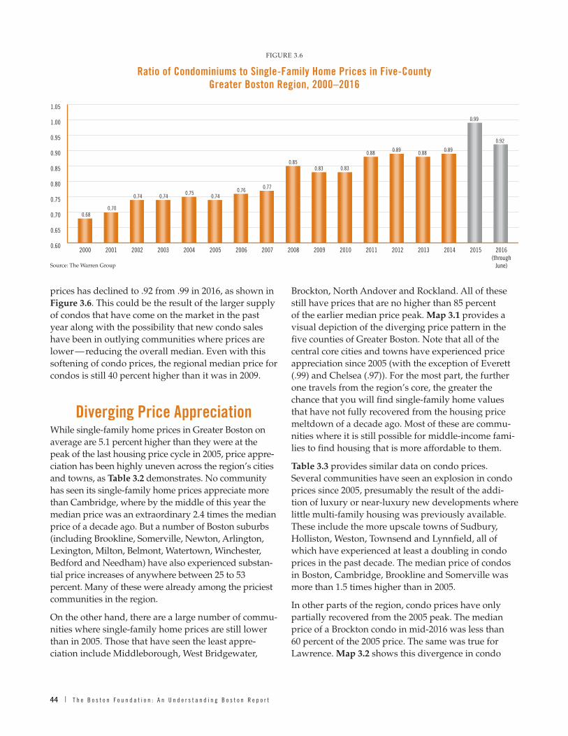
44 | T h e B o s t o n F o u n d a t i o n : A n U n d e r s t a n d i n g B o s t o n R e p o r t
prices has declined to .92 from .99 in 2016, as shown in Figure 3.6 . This could be the result of the larger supply of condos that have come on the market in the past year along with the possibility that new condo sales have been in outlying communities where prices are lower — reducing the overall median . Even with this softening of condo prices, the regional median price for condos is still 40 percent higher than it was in 2009 .
Diverging Price AppreciationWhile single-family home prices in Greater Boston on average are 5 .1 percent higher than they were at the peak of the last housing price cycle in 2005, price appre-ciation has been highly uneven across the region’s cities and towns, as Table 3.2 demonstrates . No community has seen its single-family home prices appreciate more than Cambridge, where by the middle of this year the median price was an extraordinary 2 .4 times the median price of a decade ago . But a number of Boston suburbs (including Brookline, Somerville, Newton, Arlington, Lexington, Milton, Belmont, Watertown, Winchester, Bedford and Needham) have also experienced substan-tial price increases of anywhere between 25 to 53 percent . Many of these were already among the priciest communities in the region .
On the other hand, there are a large number of commu-nities where single-family home prices are still lower than in 2005 . Those that have seen the least appre-ciation include Middleborough, West Bridgewater,
Brockton, North Andover and Rockland . All of these still have prices that are no higher than 85 percent of the earlier median price peak . Map 3.1 provides a visual depiction of the diverging price pattern in the five counties of Greater Boston . Note that all of the central core cities and towns have experienced price appreciation since 2005 (with the exception of Everett ( .99) and Chelsea ( .97)) . For the most part, the further one travels from the region’s core, the greater the chance that you will find single-family home values that have not fully recovered from the housing price meltdown of a decade ago . Most of these are commu-nities where it is still possible for middle-income fami-lies to find housing that is more affordable to them .
Table 3.3 provides similar data on condo prices . Several communities have seen an explosion in condo prices since 2005, presumably the result of the addi-tion of luxury or near-luxury new developments where little multi-family housing was previously available . These include the more upscale towns of Sudbury, Holliston, Weston, Townsend and Lynnfield, all of which have experienced at least a doubling in condo prices in the past decade . The median price of condos in Boston, Cambridge, Brookline and Somerville was more than 1 .5 times higher than in 2005 .
In other parts of the region, condo prices have only partially recovered from the 2005 peak . The median price of a Brockton condo in mid-2016 was less than 60 percent of the 2005 price . The same was true for Lawrence . Map 3.2 shows this divergence in condo
FIGURE 3 .6
Ratio of Condominiums to Single-Family Home Prices in Five-County Greater Boston Region, 2000–2016
0.60
0.65
0.70
0.75
0.80
0.85
0.90
0.95
1.00
1.05
2015 2016(through
June)
201420132012201120102009200820072006200520042003200220012000
0.680.70
0.74 0.740.75
0.740.76 0.77
0.850.83 0.83
0.88 0.89 0.88
0.92
0.99
0.89
Source: The Warren Group

T h e G r e a t e r B o s t o n H o u s i n g R e p o r t C a r d 2 0 1 6 | 45
TABLE 3.2
Ratio of Single-Family Home Prices 2016: Q2 vs. 2005
0.65 to 0.85
0.68 Dunstable
0.79 Plympton
0.80 Middleborough
0.82 Holbrook
0.83 West Bridgewater
0.83 Townsend
0.84 Randolph
0.84 Avon
0.84 Brockton
0.84 Rowley
0.84 North Andover
0.84 Marshfield
0.85 Rockland
0.85 Ayer
0.85 Georgetown
0.86 to 0.90
0.86 Amesbury
0.86 Bellingham
0.86 Nahant
0.86 Wareham
0.86 Shirley
0.87 Hanson
0.88 Abington
0.88 Medway
0.88 Lowell
0.88 Methuen
0.89 Salisbury
0.89 Canton
0.90 East Bridgewater
0.90 Groton
0.90 Stow
0.90 Boxford
0.90 Carlisle
0.90 Bridgewater
0.90 Plymouth
0.91 to 0.95
0.91 Pepperell
0.91 Swampscott
0.91 Westford
0.92 Lawrence
0.92 Maynard
0.92 Stoughton
0.93 Whitman
0.93 Marlborough
0.93 Franklin
0.93 Haverhill
0.94 Littleton
0.94 Duxbury
0.94 Boxborough
0.94 Sudbury
0.94 Scituate
0.95 Dracut
0.95 Holliston
0.95 Newbury
0.95 Lynn
0.95 Carver
0.95 Sherborn
0.96 to 1.00
0.96 Hudson
0.97 Lakeville
0.97 Andover
0.97 Chelsea
0.97 Millis
0.97 Norfolk
0.97 Pembroke
0.97 Foxborough
0.98 Dover
0.98 Salem
0.98 Hanover
0.98 Saugus
0.98 Groveland
0.99 Everett
0.99 Tyngsborough
0.99 Peabody
0.99 Danvers
0.99 Rockport
0.99 Framingham
0.99 Ashland
0.99 Plainville
0.99 Gloucester
0.99 Walpole
1.00 Kingston
1.00 Halifax
1.00 Cohasset
1.00 North Reading
1.00 Tewksbury
1.00 Boston
1.00 Lincoln
1.00 Weymouth
1.00 Ipswich
1.01 to 1.09
1.01 Winthrop
1.01 Malden
1.01 Norwood
1.02 Hull
1.02 Chelmsford
1.02 Billerica
1.02 Merrimac
1.02 Marblehead
1.03 Revere
1.04 Beverly
1.04 Hamilton
1.04 Dedham
1.04 Wilmington
1.05 Lynnfield
1.07 Acton
1.07 Middleton
1.08 Quincy
1.08 Newburyport
1.09 Wayland
1.09 Woburn
Over 1.10
1.10 Medfield
1.10 Wenham
1.10 Wakefield
1.10 Weston
1.11 Stoneham
1.11 Topsfield
1.11 Hingham
1.11 Norwell
1.12 Wrentham
1.13 Braintree
1.13 Essex
1.14 Westwood
1.14 Natick
1.15 Hopkinton
1.15 Burlington
1.15 West Newbury
1.15 Sharon
1.17 Waltham
1.18 Reading
1.22 Medford
1.22 Melrose
1.23 Concord
1.24 Manchester
1.24 Wellesley
1.25 Needham
1.25 Bedford
1.25 Winchester
1.27 Watertown
1.29 Belmont
1.33 Milton
1.35 Lexington
1.35 Arlington
1.45 Newton
1.48 Somerville
1.53 Brookline
2.40 Cambridge
Source: The Warren Group

46 | T h e B o s t o n F o u n d a t i o n : A n U n d e r s t a n d i n g B o s t o n R e p o r t
MAP 3 .1
Ratio of Single-Family Home Prices 2016: Q2 vs. 2005
Source: The Warren Group
0.675439 – 1.000000
Ratio of Single Family Home Prices 2016: Q2 vs. 2005
1.000001 – 2.397753
MAP 3 .2
Ratio of Condo Home Prices 2016: Q2 vs. 2005
Source: The Warren Group
0.000000 – 1.000000
Ratio of Condo Prices 2016: Q2 vs. 2005
1.000001 – 3.855769

T h e G r e a t e r B o s t o n H o u s i n g R e p o r t C a r d 2 0 1 6 | 47
TABLE 3 .3
Ratio of Condo Prices 2016: Q2 vs. 2005
0.40 to 0.65
0 .41 Marshfield
0 .57 Brockton
0 .58 Lawrence
0 .65 Pepperell
0.66 to 0.85
0 .67 Bedford
0 .70 Milton
0 .70 Hull
0 .72 Whitman
0 .73 Pembroke
0 .73 East Bridgewater
0 .76 Saugus
0 .76 Georgetown
0 .76 Norfolk
0 .77 Needham
0 .79 Lowell
0 .80 Andover
0 .80 Holbrook
0 .80 Halifax
0 .81 Bellingham
0 .82 Abington
0 .82 Wrentham
0 .84 Groveland
0 .84 Chelmsford
0 .84 Haverhill
0 .85 Boxboro
0 .85 Dracut
0 .85 Maynard
0.86 to 0.90
0 .87 Amesbury
0 .87 Shirley
0 .88 Ashland
0 .88 Duxbury
0 .88 Walpole
0 .88 Bridgewater
0 .88 Weymouth
0 .88 Franklin
0 .88 Tyngsboro
0 .89 Ayer
0 .89 Dedham
0 .90 Stoughton
0.91 to 0.95
0 .91 Swampscott
0 .91 Ipswich
0 .93 North Andover
0 .93 Merrimac
0 .94 Millis
0 .94 Revere
0 .94 Beverly
0 .95 Lynn
0.96 to 1.00
0 .96 Hudson
0 .96 Wareham
0 .96 Cohasset
0 .96 Norwood
0 .96 Woburn
0 .97 Rockland
0 .97 Westford
0 .98 Tewksbury
0 .98 Malden
1 .00 Wellesley
1 .00 Middleton
1 .00 Salem
1.01 to 1.09
1 .01 Groton
1 .01 Wilmington
1 .01 Peabody
1 .02 Stoneham
1 .02 Newbury
1 .03 Scituate
1 .03 Rockport
1 .04 Wenham
1 .04 Acton
1 .04 Braintree
1 .05 Danvers
1 .05 Salisbury
1 .06 Concord
1 .07 Methuen
1 .08 Canton
Over 1.10
1 .10 Plainville
1 .10 Framingham
1 .10 Burlington
1 .12 Quincy
1 .13 Medway
1 .14 Dover
1 .14 Lincoln
1 .15 Stow
1 .17 Sharon
1 .17 Chelsea
1 .17 North Reading
1 .17 Marlborough
1 .20 Plymouth
1 .22 Everett
1 .22 Waltham
1 .22 Rowley
1 .23 Wayland
1 .24 Winthrop
1 .26 Reading
1 .26 Newton
1 .27 Arlington
1 .27 Gloucester
1 .27 Marblehead
1 .33 Watertown
1 .35 Wakefield
1 .37 Medford
1 .38 Belmont
1 .38 Newburyport
1 .38 Middleboro
1 .41 Lakeville
1 .42 Billerica
1 .42 Winchester
1 .43 Natick
1 .43 Hanson
1 .44 Hingham
1 .51 Manchester
1 .51 Melrose
1 .54 Boston
1 .54 Hopkinton
1 .55 Foxboro
1 .55 Cambridge
1 .57 Brookline
1 .57 Lexington
1 .60 Medfield
1 .63 Somerville
2 .14 Lynnfield
2 .15 Townsend
2 .47 Weston
3 .46 Holliston
3 .86 Sudbury
Source: The Warren Group

48 | T h e B o s t o n F o u n d a t i o n : A n U n d e r s t a n d i n g B o s t o n R e p o r t
prices . Like single-family home prices, condo prices have appreciated faster in the urban core and gener-ally slower in the outer suburbs . The exceptions are the seacoast communities just north of Boston — Lynn, Beverly, Revere, Ipswich and Swampscott — which have all experienced condo prices in 2016 that are slightly lower than 2005 prices .
Duplex and Triple-Decker PricesIn last year’s Greater Boston Housing Report Card, we noted a spectacular increase in the price of duplex and triple-decker units, particularly the latter .4 Between 2009 and 2015 alone, the selling price of a single unit in a triple-decker had increased by 95 percent . We noted that what was driving these extraordinary price increases was the demographic shift in the region toward smaller households including undergraduate and graduate students and other young profession-als who were pairing up, tripling up, or perhaps even quadrupling up in three- and four-bedroom duplexes and classic triple-deckers . The demand was now so high for this housing stock that investors were bidding up the price to take advantage of skyrocketing rents or to flip such units as condos at super-inflated prices .
It would seem that at some point these prices would hit a peak and retreat somewhat like they did after 2007 . But this is not the case, at least in 2016 . Once
again triple-decker prices rose, reaching a new all-time high of more than $500,000 per individual unit (see Figure 3.7) . No doubt the continued influx of Millenni-als to the region and especially to the inner core contin-ues to fuel demand that far outstrips supply . Housing that was once the province of working families is now out of reach for many of them .
The Boston Rental MarketDuplexes and triple-decker unit prices have contin-ued to rise because the rental vacancy rate in Greater Boston remains at a level lower than at any time since the beginning of this century, as shown in Figure 3.8 . This creates a “sellers’ market” where prices — or in this case, rents — can be raised without much fear of having an unrented apartment . Through the second quarter of 2016, the vacancy rate remained at 3 .4 percent, the same as in 2015 . As we learned from a statistical analysis presented in the 2013 Greater Boston Housing Report Card, when the rental vacancy rate falls below 5 .5 percent in the region, rents tend to rise and they rise faster the lower the vacancy rate .5 Above 5 .5 percent, rents tend to stabilize and even can fall .
Indeed, this is precisely what has happened in Greater Boston as shown in Figure 3.9 . The estimated aver-age asking rent for apartments in the region reached an all-time high in 2016 . At $2,169, rents were up by
FIGURE 3 .7
Annual Median Price of Two-Unit in Five-County Greater Boston Region, 2000–2016 (Through June)
0
$100,000
$200,000
$300,000
$400,000
$500,000
2015 2016(through
June)
201420132012201120102009200820072006200520042000 2001 2002 2003
Two-Unit Three-Unit
$225,460
$273,328
$347,050
$412,859
$458,565
$492,182 $483,192
$454,028
$263,289$244,172
$275,885
$314,274
$355,418
$394,060
$443,084
$495,403 $500, 606
Source: The Warren Group

T h e G r e a t e r B o s t o n H o u s i n g R e p o r t C a r d 2 0 1 6 | 49
FIGURE 3 .9
Average Monthly Asking Rents and Effective Rent Boston Metro Area, 2000–2016 (Est.)
$0
$50
$1,000
$1,500
$2,000
$2,500
2015 2016(est.)
201420132012201120102009200820072006200520042000 2001 2002 2003
Asking Rent Effective Rent
$1,462$1,529 $1,537 $1,532 $1,553 $1,580
$1,644 $1,678$1,740 $1,695 $1,738 $1,773
$1,827$1,889
$1,986
$2,104$2,169
Source: Reis .com
FIGURE 3 .8
Greater Metro Boston Rental Vacancy Rate 2000–2016:II
0%
1%
2%
3%
4%
5%
6%
7%
2016:II2015201420132012201120102009200820072006200520042000 2001 2002 2003
Rent Stable Vacancy Rate: 5.5%
0.6
2.3
4.3
5.4
5.2
4.7
5.5 5.7
6.0
6.4
5.1
4.0 4.1
3.8
3.43.4
4.9
Source: US Housing Vacancy Survey Historical Data

50 | T h e B o s t o n F o u n d a t i o n : A n U n d e r s t a n d i n g B o s t o n R e p o r t
reached an all-time high in the region at $2,093, a monthly discount of just 3 .5 percent . Back in 2009, the effective rate discount was nearly 6 percent .
Rents in Greater Boston’s inner core — the ten-mile region in and around the city — are even higher than in Greater Boston as a whole, as shown in Figure 3.10 . By the first half of 2016, the average rent for an apart-ment was $2,957, up 59 percent since 2009, and 36 percent higher than the Boston metro average asking rent . On an annual basis this translates into a rent payment of more than $35,000 . To put this in perspec-tive, according to U .S . Census data for 2014, nearly 31 percent of all families in Boston had a total annual income that fell short of the average yearly rent in the city— as did more than 43 percent of non-family households .6 Regardless of the progress being made in the development of new rental housing in Boston and the region, demand keeps surging ahead of supply, leading to near record low vacancy rates and all-time record rents . As such, as Figure 3.11 demonstrates, the Boston metro area now has the third-highest effective rents in the country, topped only by New York and San Francisco .
FIGURE 3 .11
Average Monthly Effective Rents in Selected U.S. Metro Areas (Indexed to Boston), 2016: Q2
0.00
0.20
0.40
0.60
0.80
1.00
1.20
1.40
1.60
San F
rancis
co
New Yo
rkBost
on
Los An
geles
Washin
gton D
CSe
attle
Chicag
o
Phila
delph
ia
Minnea
polis
Baltim
ore
Portla
nd (O
R)
Denver
Atlan
ta
Housto
n
Pittsb
urg
Milwau
keeDall
as
Phoen
ix
Clevela
nd
Las V
egas
Detroit
1.36
1.11
1.00
0.880.82
0.730.67
0.57 0.57 0.57 0.56 0.54 0.540.48
0.44 0.410.35 0.34 0.33 0.33
0.44
Source: Rent Jungle
FIGURE 3 .10
Average Market Rent, Inner Boston Core 2009–2016:II
$1,859
$2,033
$2,158
$2,301$2,367
$2,427
$1,500
$1,700
$1,900
$2,100
$2,300
$2,500
$2,700
$2,900
$3,100
2016 I&II2015201420132012201120102009
$2,667
$2,957
Source: Reis .com
nearly 3 .1 percent over 2015 and were 25 percent higher than in 2010 . The only time that rents actually decreased over the past decade was in 2009, when the vacancy rate peaked at 6 .4 percent, well above the 5 .5 percent rent stabilized threshold . Effective rents in 2016, taking into account any and all discounts, also

T h e G r e a t e r B o s t o n H o u s i n g R e p o r t C a r d 2 0 1 6 | 51
What Does the Future Hold for Home Prices, Condo Prices
and Rents?Given the strength of the Greater Boston economy, the growth in the ranks of Millennials and seniors, and a housing supply that lags behind housing demand, what might we expect to be the trend in home and condo prices and apartment rents in the region? Figure 3.12 provides some historical evidence that might help answer this question . Between 2000 and 2004, the median condo price in the region surged by 63 percent followed by a 48 percent surge in the single-family median price . In contrast, average apart-ment rents increased by only 6 .2 percent . This period, of course, coincided with the housing boom when millions of households nationwide, including many in Greater Boston, were being enticed into homeowner-ship by relatively low mortgage rates and easy credit . As a result, the homeownership rate reached new historical highs . The shift from renting to ownership left rental vacancy rates somewhat higher and there-fore put a damper on rent increases .
In the following period, 2004–2009, the housing bubble would burst, resulting in price cuts for both condos and single-family homes . With rising foreclosures, a large number of former homeowners were forced into rental housing, driving vacancy rates down and lead-ing to increasing apartment rents . While home prices were falling by 12 percent and condo prices by nearly 3 percent, apartment rents increased by more than 9 percent .
Finally, in the period since 2009 Greater Boston has experienced a strong economy and population growth, particularly among Millennials and seniors, and a demographic trend toward delayed marriage and child-bearing . The result is a recovery of single-family home prices but an even greater surge in condo prices, with apartment rents in Greater Boston up nearly 41 percent since 2009 and rents in the inner core Boston communi-ties increasing the fastest of al—nearly 60 percent .
While it is always treacherous to try to predict the future in such volatile markets that depend on so many factors, we believe these data taken together suggest a near future that looks something like this:
■■ Single-family home prices will continue to rise modestly — mainly due to demographic shifts .
■■ Condo prices can be expected to increase more rapidly than single-family home prices as an increasing number of aging Baby Boomers choose to move to condos after putting their current single-family homes on the market .
■■ Rents will continue to surge as a result of a strong economy that attracts young workers to Greater Boston who prefer to rent or cannot afford homeownership .
■■ Rents in the inner core Boston communities will remain more than a third higher than the average rent in all of Greater Boston, reflecting the extraordi-nary demand for urban apartments .
■■ With demand for moderate-priced housing continu-ing to outstrip housing supply, despite all of the current efforts to expand this housing stock, work-ing families in Greater Boston will continue to face a tough housing market with high housing-cost burdens and, in many cases, the need to move farther from the inner core region to more distant suburbs .
The only way to ward off these outcomes is to redouble efforts at building more housing at affordable prices to meet the new demographics of Greater Boston .
FIGURE 3 .12
Percentage Change in Housing Prices Single Family Price vs. Condo Price vs. Apartment Rent
Greater Boston, 2000–2016
48.2%
63.0%
6.2%9.2%
25.5%
39.6% 40.6%
-12.0%
-2.8%
2009–20162004–20092000–2004-20%
-10%
0%
10%
20%
30%
40%
50%
60%
70% Single Family Home Prices
Condo PricesApartment Rents
Source: The Warren Group, Reis, Inc .

52 | T h e B o s t o n F o u n d a t i o n : A n U n d e r s t a n d i n g B o s t o n R e p o r t
CHAPTER FOUR
Family Homelessness, Housing Insecurity, and Children’s Need for Social Stability
In May 2016, the Federal Reserve Bank released a study that drew attention to the fragility of most Americans’ finances .1 It found that nearly two-thirds of those surveyed in 2015 would be unable to withstand a three-month financial disruption — even by borrow-ing — and that a stunning 47 percent would be forced to borrow or sell belongings to meet a $400 emergency . What is worse is that most of the respondents lived in less expensive locales than Greater Boston where, as we saw in Chapter 1, the cost of living is nearly 40 percent higher than that of all U .S . metro areas .
As we saw in Chapter 2, between 2009 and 2014 the Greater Boston homeownership rate declined by nearly 8 percentage points and the proportion of rent-ers increased commensurately . This shift toward rent-ing has put enormous pressure on the rental housing market, leading to the rising rents we disclosed in the last chapter . Combined with stagnating incomes, it is not surprising that half of Greater Boston renters pay more than 30 percent of their income on housing . And the worrisome decline in housing construction permits this year — with by far the most slippage in multi-unit structures — strongly suggests that Greater Boston is not going to build its way out of soaring housing costs anytime soon . As a result, the housing cost–burdened are in danger of slipping into housing insecurity, and the housing insecure are at risk of homelessness . As we shall see, the number of families with children who are threatened by or have fallen into homelessness has risen dramatically over the past five years .
Who are our subsidized family housing programs serving, how well are they meeting the needs of their users and those of the greater community, and where might improvements be made — in both concept and service structure?2 Essentially, what do we know about the affordable housing resources we have now and what more do we need to do to meet the region’s hous-ing needs for low-income households?
Housing-Subsidized HouseholdsAlthough many assume that recipients of subsi-dized housing benefits are also dependent on welfare programs, U .S . Department of Housing and Urban Development (HUD) data suggest otherwise . Figure 4.1 provides county-specific percentages of head of household income sources among those receiv-ing HUD housing assistance in 2015 . On average across all five counties, only 4 percent of these house-holds relied on traditional welfare programs as their principal source of income . Meanwhile, 26 percent of household heads were wage earners, and almost 68 percent received the majority of their income from sources other than welfare or wages, including Social Security, disability programs, unemployment insur-ance and family contributions .
Subsidized household heads are also predominately seniors and women — which accords with the large proportion of income classed as “other” (and includes Social Security) . Figure 4.2 shows that nearly 42 percent of these households receiving HUD hous-ing assistance are headed by people age 62 or older, followed by 35 percent between the ages of 25 and 50, nearly 22 percent between 51 and 60 years, and a tiny percentage below age 25 . HUD data also indicate that nearly 72 percent of Greater Boston subsidized households are headed by women — a figure that has remained more or less unchanged since at least 2010 . A plurality of these households are headed by whites (41%), followed by blacks (25%), white Hispanics (18%), Asian/Pacific Islanders (7%), black Hispanics (3 .7%), and a sprinkling of others (3 .6%) — proportions that also have not changed significantly since 2010 .3 Finally, nearly a third of HUD-subsidized households in Greater Boston include one or more children, rang-ing from 26 percent in Middlesex County to 35 percent in Plymouth County as pictured in Figure 4.3 .
Three federal HUD programs, administered through the state Department of Housing and Commu-nity Development (DHCD), provide most of the

T h e G r e a t e r B o s t o n H o u s i n g R e p o r t C a r d 2 0 1 6 | 53
Commonwealth’s subsidized housing for families in danger of homelessness or upon moving out of transitional homeless status: public housing, Section 8 project-based housing (which subsidizes property owners directly), and the Section 8 housing choice voucher program (or “tenant-based” subsidies) . The state offers its own smaller programs, the largest being the Massachusetts Rental Voucher Program (MRVP), which is a little more than one-third the size of HUD’s voucher program . DHCD administers approximately 20,500 federal rental assistance vouchers and 7,700 state rental vouchers .4 MRVP, one of the only state voucher programs in the country, has received rising support in recent years and has been instrumental in reducing the number of homeless families living in motels . This chapter concentrates on HUD programs because of the federal programs’ size and level of data capture .
Figure 4.4 provides a breakdown of HUD subsidy programs in Greater Boston . The housing choice voucher program is by far the largest with 44 percent of all housing-subsidized households in this category, followed by the project-based voucher program (31%) and public housing (18%) . Statewide figures track closely with those of Greater Boston .
FIGURE 4 .1
Majority Income Sources for HUD Housing Program Participants by County
2015
3%
24%22%
26% 26%
32%
60%
66%68%
74%71%
3% 3%6% 5%
Essex Middlesex Norfolk Plymouth Suffolk0%
10%
20%
30%
40%
50%
60%
70%
80%
Majority of IncomeFrom Welfare
Majority of IncomeFrom Wages
Majority of IncomeFrom Other Sources
Source: HUD, Picture of Subsidized Households, 2015
FIGURE 4 .2
Percentage of Heads of Household in Subsidized Housing by Age Group
2015
62 Years or More
51 to 61 Years
25 to 50 Years
24 Years or Less1%
28%
24%
47%
Source: HUD, Picture of Subsidized Households, 2015
FIGURE 4 .3
Distribution of Households with Children in HUD Subsidized Households by County, 2015
EssexCounty
MiddlesexCounty
NorfolkCounty
PlymouthCounty
GreaterBostonTotal
SuffolkCounty
0%
10%
20%
30%
40%
50%
60%
70%
80%
90%
100%
% With Children % Without Children
27% 26% 24% 35% 34% 30%
73% 74% 76% 65% 66% 70%
Source: HUD, Picture of Subsidized Households, 2015

54 | T h e B o s t o n F o u n d a t i o n : A n U n d e r s t a n d i n g B o s t o n R e p o r t
Figure 4.5 reveals that 45 percent of the federally subsidized housing in Greater Boston lies in Boston’s own Suffolk County, where 17 percent of all housing is subsidized in some fashion . This should come as no surprise since, statewide, poverty is still concentrated in cities and in particular neighborhoods within cities (about which we have more to say below), even as rural and suburban poverty have been on the rise .5
The Lack of Housing for Low-Income Households6
The situation for the housing insecure is grim and shows no signs of abating . As Figure 4.6 shows, more than half of those living in poverty (as defined by the U .S . Census) in four of the five counties compris-ing Greater Boston do not receive assistance from HUD housing programs, and these numbers have barely moved since 2013 . In the fifth county, Suffolk, the number of impoverished not served by HUD has risen by five percentage points, to 31 percent . Here it is important to bear in mind that housing assistance is not an entitlement program like Social Security, unem-ployment compensation, food stamps and agricul-tural price support programs . Rather, HUD programs maintain a finite level of support in the form of public
housing units (of which new construction has dried up) and a fixed number housing vouchers . Except in some cases where priority may be given to local resi-dents or victims of domestic violence or fire, access is given on a first-come, first-served basis . Unlike the state-funded program, the two voucher systems have barely expanded their number since 2003, with the exception of two programs targeted to vets and special needs families under the Veterans Administration Supported Housing Program and the Family Unifica-tion Program . As a result, a large and growing number of eligible families in need must wait until someone already receiving assistance gives up the voucher — voluntarily or involuntarily .
A strong deterrent to even applying for housing support is likely the long — and growing — waiting lists most applicants face . Figure 4.7 makes clear that between 2010 and 2013 average wait times for housing placement were already consistently high in all five counties, at a little more than two years each . In 2014 matters improved slightly for the two most urbanized counties of Norfolk and Suffolk, which saw wait times drop by three months in 2015 .
By contrast, average wait times in the counties furthest from the core suddenly soared, which could be partly attributable to as-yet unmet demand for senior housing
FIGURE 4 .4
Percentage of Households Served by HUD Subsidies by Program in Greater Boston, 2015
Public Housing18%
202/PRAC: 2%S236/BMIR: 2%
RentSup/RAP: 1%811/PRAC: 1%Mod Rehab: 1%
Housing ChoiceVouchers
44%
Project BasedSection 8
31%
Source: HUD, Picture of Subsidized Households, 2015
FIGURE 4 .5
Percentage of Total Housing Units in HUD Housing Programs by County, 2015
32%
17%
5% 5%4%
7%
Essex Middlesex Norfolk Plymouth Suffolk0%
2%
4%
6%
8%
10%
12%
14%
16%
18%
Source: HUD, Picture of Subsidized Housing, 2015

T h e G r e a t e r B o s t o n H o u s i n g R e p o r t C a r d 2 0 1 6 | 55
among retiring Baby Boomers ready to leave their single-family homes . Since 2013, average wait times nearly doubled in Essex County, rising to 50 months or more than four years in 2015, while average wait times in Middlesex County jumped by 59 percent (from 27 to 43 months) between 2013 and 2015 . Plymouth County saw the number fly up from 28 to 42 months in 2014,
and then come down a bit to 35 months in 2015 — still almost three years .
Local and regional programs that administer housing subsidies sometimes report even longer wait times for subsidized housing . The Metropolitan Boston Housing Partnership (MBHP), which handles hous-ing choice vouchers for more than 30 communities, is currently issuing vouchers to households that applied in July 2006 — more than ten years ago . MBHP inter-nal records also show that their own waiting list has nearly tripled between July 2005 and April 2016 (from 12,069 to 34,437 applicants), which is a slightly larger proportion than the statewide jump during the same period (39,988 to 109,248) .7 Whatever way you look at it, the need for subsidized housing that is affordable to households with the lowest incomes both in Greater Boston and statewide is not being met, and the situa-tion is exacerbated by rapidly rising housing costs .
Family HomelessnessAlthough the state Department of Housing and Community Development (DHCD) keeps records on the programs it administers, including homeless family shelters or “Emergency Assistance” (EA), accurate data on the homeless is notoriously difficult to come by . Two data-gathering efforts intended to supplement the state’s make clear that family homelessness has
FIGURE 4 .6
Percentage of Persons Living in Poverty That Are NOT Served by HUD Housing Programs, 2015
31%
51%53% 54%
56%
Essex Middlesex Norfolk Plymouth Suffolk0%
10%
20%
30%
40%
50%
60%
Source: U .S . Census, American Community Survey, 2010–2014, Table S1701; HUD, Picture of Subsidized Housing, 2015
FIGURE 4 .7
Average Number of Months on a HUD Housing Program Waiting List by County, 2010–2015
0
10
20
30
40
50
60
26 27 262523 22
2425
18
25 2527 27 28 27 28 28 28
42
35
26 27
32
50
27 27 27 27
4043
2010 2011 2012 2013 2014 2015
Essex Middlesex Norfolk Plymouth Suffolk
Source: HUD, Picture of Subsidized Households, 2015

56 | T h e B o s t o n F o u n d a t i o n : A n U n d e r s t a n d i n g B o s t o n R e p o r t
TABLE 4 .1A
Boston Point-In-Time Homeless Locations, 2010–2015 Number of Families*
Location of Families 2010 2011 2012 2013 2014* 2015* % Change
Congregate Shelters 281 254 281 354 511 500 77 .9%
Scattered Site Shelters 520 502 512 534 608 585 12 .5%
Families in Motels in Boston 120 135 159 151 176 123 2 .5%
Domestic Violence Programs 77 61 70 54 51 62 –19 .5%
Homeless Youth with Children 5 7 5 6 8 7 40 .0%
Hospital/Medical Facilities 3 4 1 2 3 6 100 .0%
Detox Facilities 15 26 27 25 29 27 80 .0%
Transitional Housing 137 93 111 108 157 142 3 .6%
TOTAL 1,158 1,082 1,166 1,234 1,543 1,452 25.4%
Source: Boston Public Health Commission Annual Homeless Census
* Data for years 2010–2013 were collected in December of each year . Data for 2014 were collected in February of 2015, and data for 2015 were collected in January of 2016 .
TABLE 4 .1B
Boston Point-In-Time Homeless Locations, 2010–2015 Number of Individuals in Families*
Location of Families 2010 2011 2012 2013 2014* 2015* % Change
Congregate Shelters 630 569 669 810 1,190 1,144 81 .6%
Scattered Site Shelters 1,825 1,851 1,804 1,812 2,057 2,074 13 .6%
Families in Motels in Boston 312 339 422 448 474 365 17 .0%
Domestic Violence Programs 179 147 140 125 104 135 –24 .6%
Homeless Youth with Children 10 15 10 12 15 15 50 .0%
Hospital/Medical Facilities 3 4 1 5 9 7 133 .3%
Detox Facilities 32 51 60 57 55 57 78 .1%
Transitional Housing 330 259 309 272 377 368 11 .5%
TOTAL 3,321 3,235 3,415 3,541 4,281 4,165 25.4%
Source: Boston Public Health Commission Annual Homeless Census
* Data for years 2010–2013 were collected in December of each year . Data for 2014 were collected in February of 2015, and data for 2015 were collected in January of 2016 .
TABLE 4 .1C
Boston Point-In-Time Homeless Locations, 2010–2015 Number of Individual Adults*
Location of Families 2010 2011 2012 2013 2014* 2015* % Change
Unsheltered Homeless/Street Count 182 181 193 180 139 167 –8 .2%
Emergency Shelters 1,380 1,301 1,381 1,530 1,763 1,805 30 .8%
Detox Facilities 655 653 694 747 614 625 –4 .6%
Hospital/Medical Facilities 207 216 218 253 235 207 0 .0%
Mental Health Facilities 259 273 293 268 150 134 –48 .3%
Transitional Housing 791 761 762 685 509 341 –56 .9%
Single Adults in Family Programs 0 0 20 23 6 24 2,400 .0%
Homeless/Runaway Youth 12 27 36 28 40 61 408 .3%
TOTAL 3,486 3,412 3,597 3,714 3,456 3,364 –3.5%
Source: Boston Public Health Commission Annual Homeless Census
* Data for years 2010–2013 were collected in December of each year . Data for 2014 were collected in February of 2015, and data for 2015 were collected in January of 2016 .

T h e G r e a t e r B o s t o n H o u s i n g R e p o r t C a r d 2 0 1 6 | 57
been rising and at a much faster rate than individual homelessness . According to the most recent point-in-time homeless census conducted by the Boston Public Health Commission in February 2016, summarized in Tables 4.1a–4.1c, family homelessness in the city jumped more than 25 percent between 2010 and 2015, from 1,158 families to 1,452 (although it dropped slightly by 6 percent since 2014), while the number of persons in homeless families increased from 3,321 to 4,165 . To put that number in perspective, Boston’s individual homelessness actually fell by 3 .5 percent, at least partially due to state and federal “Housing First” programs intended for individuals with high service needs and Veterans Administration programs for homeless veterans .
The other supplementary data-gathering effort is being undertaken by Horizons for Homeless Children (HHC) on a statewide basis . Beginning with a 2015 pilot project, HHC began reviving the intermittent work it had begun in 2003 to survey homeless fami-lies across a broader spectrum of shelters than those administered by the state DHCD for the purpose of improving and expanding service programs — educa-tional, play space and family support — that enhance children’s stability and improve their life chances . Using DHCD Bed Registry and Hotel data alone, they show that more than 7,500 children 18 years old and younger were living in state-funded Emergency Assis-tance housing as of February 2016, a 250 percent jump since 2003 . They also show that almost half of those children are under six years old; some 83 percent are younger than 13 . HHC’s survey is important because we do not have an accurate statewide count of home-less families or, more specifically, children, many of whom are in need of special services geared to their developmental needs .
In view of homeless children’s acute need for greater stability, and due to the need for greater cost effective-ness than temporary EA and transitional services can provide, the Commonwealth launched two programs designed to keep families sheltered . HomeBASE (2011) provides limited rental and household assistance to eligible homeless families, along with stabilization and job-search services once they secure housing . Resi-dential Assistance for Families in Transition (RAFT) provides short-term rental assistance to sustain fami-lies through passing crises such as job losses or health emergencies without losing their homes . As rents and housing prices began rising rapidly between July
2010 and November 2014, the number of families who applied for EA increased 85 percent, forcing the state to use scarce resources on temporary shelters and costly motel rooms .8
These two programs have experienced positive results, preventing families from becoming homeless and re-housing those who do enter shelter . Accord-ing to the DHCD’s EA 2016 fourth-quarter legislative report, the number of Massachusetts families receiving emergency assistance dropped by 16 percent between June 2015 and June 2016; families staying in overflow motels dropped a staggering 65 percent — its lowest level since 2008 when the program launched — and it is on course to reach zero by the end of 2018, as planned .9 That is both fiscal good news and a small step toward improving the prospects of homeless children and their families . However, the shift does not take into account the number of families turned away from shelters, mainly due to not meeting income eligibility require-ments . In August 2016, for example, fewer than half of applicants were placed in EA, or 417 of 892 .10 Because of the high rejection rate, some caseworkers informally discourage countless others — including many whose meager incomes are too high — from even applying .11
DHCD’s documentation of a downward trend in EA shelter family occupancy also does not take into account the lengthening duration of stays by families in emergency shelters . Figure 4.8, which covers fiscal years 2014–2016, shows that time spent in shelters has been trending upward at least since 2014 and has not fallen below 300 days since the second quarter of 2015 . So although state records show that the number of families entering the shelter system is diminishing, the fact that families are staying for longer periods is consistent with data suggesting that family homeless-ness has not declined and is likely rising . At least in Greater Boston, more families would qualify for EA if the state had in place an eligibility threshold based on the real cost of living in the region, as we explained in Chapter 1 .
From Housing Choice to Economic Mobility
With its two thoughtful diversion and prevention programs, state housing choice voucher program, and family right to shelter law — the first and only state-wide law in the country to date — the Commonwealth

58 | T h e B o s t o n F o u n d a t i o n : A n U n d e r s t a n d i n g B o s t o n R e p o r t
is widely considered a homeless policy national leader . Yet with the third-highest rents among U .S . metro areas, Greater Boston is sorely challenged . Nationwide, most housing experts regard housing choice voucher programs, which went into effect beginning in 1975, as a big improvement over public housing due to their greater flexibility for both tenants and landlords and their potential to deconcentrate poverty .12
By at least one important measure of success, however, the program shows signs of perpetuating economic stagnancy: by moving housing-insecure families from one impoverished neighborhood to another . The Metropolitan Boston Housing Partnership (MBHP) manages family housing choice vouchers for more than 30 communities across Suffolk, Middlesex and Norfolk counties — the region’s most urbanized coun-ties . Their records uncover several patterns . Table 4.2 lists the top ten destinations by ZIP code for housing choice voucher holders, which constitute 70 percent of overall destinations . The largest proportion of destina-tions, nearly 47 percent, is in Mattapan, Roxbury and the four ZIP codes of Dorchester .
Table 4.3 shows the top ten origination ZIP codes for each of the top ten destinations . What is striking about every one of these tables is the geographical proximity of the originations and destinations of voucher users, with many voucher users landing within the same ZIP code from which they moved . The trouble with this pattern is that, in most cases, it keeps low-income
families in neighborhoods of concentrated poverty, with all their attendant limitations .13
It is also the case, as Table 4.4 makes clear, that voucher users tend to remain in demographically similar — if not always the same — communities . For example, more than 85 percent of voucher users who
FIGURE 4 .8
Average Length of Family Stay in EA Shelters or Motels/Hotels Statewide FY 2014–2016 (Days)
0
50
100
150
200
250
300
350
400
2016:IV2016:III2016:II2016:I2015:IV2015:III2015:II2015:I2014:IV2014:III2014:II2014:I
195
225
273
227 229
285
310324 322
341
366
324
Source: Department of Housing and Community Development (DHCD) Quarterly Emergency Assistance Report
TABLE 4 .2
Top Ten Destinations by Zip Code for MBHP Family Voucher Choice Placement
2000–2016
Zip Town
Number of Families Moved
to Zip Code
Percent of Overall
Destinations Rank
02124 Dorchester Center 1,857 15 .8% 1
02125 Dorchester 984 8 .4% 2
02121 Dorchester 971 8 .3% 3
02122 Dorchester 837 7 .1% 4
02126 Mattapan 816 6 .9% 5
02119 Roxbury 719 6 .1% 6
02151 Revere 598 5 .1% 7
02136 Hyde Park 569 4 .8% 8
02150 Chelsea 515 4 .4% 9
02169 Quincy 441 3 .8% 10
Source: Metropolitan Boston Housing Partnership (MBHP)

T h e G r e a t e r B o s t o n H o u s i n g R e p o r t C a r d 2 0 1 6 | 59
TABLE 4 .3
Top Ten Originations by Zip Code for Each Destination
Dorchester Center (02124)
Zip CodePercent of Overall
Originations Town/Neighborhood Name
02124 24 .1% Dorchester Center
02121 10 .8% Dorchester
02119 8 .4% Roxbury
02125 8 .0% Dorchester
02126 7 .4% Mattapan
02122 5 .4% Dorchester
02301 2 .8% Brockton
02130 2 .3% Jamaica Plain
02120 2 .1% Roxbury Crossing
02131 1 .7% Roslindale
Dorchester (02125)
Zip CodePercent of Overall
Originations Town/Neighborhood Name
02124 19 .0% Dorchester Center
02125 16 .9% Dorchester
02119 9 .7% Roxbury
02121 6 .7% Dorchester
02126 5 .1% Mattapan
02122 4 .8% Dorchester
02301 2 .1% Brockton
02118 1 .9% Boston
02127 1 .8% Boston
02130 1 .8% Jamaica Plain
Dorchester (02121)
Zip CodePercent of Overall
Originations Town/Neighborhood Name
02124 18 .4% Dorchester Center
02121 12 .8% Dorchester
02125 9 .7% Dorchester
02119 9 .0% Roxbury
02126 4 .4% Mattapan
02122 3 .5% Dorchester
02136 2 .8% Hyde Park
02118 2 .7% Boston
02135 2 .6% Brighton
01902 2 .4% Lynn
Source: Metropolitan Boston Housing Partnership (MBHP)
Dorchester (02122)
Zip CodePercent of Overall
Originations Town/Neighborhood Name
02124 14 .3% Dorchester Center
02121 11 .5% Dorchester
02125 11 .5% Dorchester
02122 11 .0% Dorchester
02119 7 .9% Roxbury
02126 6 .2% Mattapan
02136 4 .2% Hyde Park
02130 2 .9% Jamaica Plain
02118 1 .7% Boston
02131 1 .7% Roslindale
Mattapan (02126)
Zip CodePercent of Overall
Originations Town/Neighborhood Name
02124 20 .1% Dorchester Center
02126 12 .1% Mattapan
02119 8 .7% Roxbury
02121 8 .5% Dorchester
02125 7 .4% Dorchester
02122 3 .8% Dorchester
02130 3 .4% Jamaica Plain
02131 2 .8% Roslindale
02136 2 .7% Hyde Park
02118 2 .6% Boston
Roxbury (02119)
Zip CodePercent of Overall
Originations Town/Neighborhood Name
02119 19 .7% Roxbury
02124 12 .2% Dorchester Center
02121 8 .5% Dorchester
02125 8 .1% Dorchester
02130 7 .5% Jamaica Plain
02126 4 .0% Mattapan
02122 3 .8% Dorchester
02118 3 .5% Boston
02136 2 .2% Hyde Park
01902 1 .9% Lynn
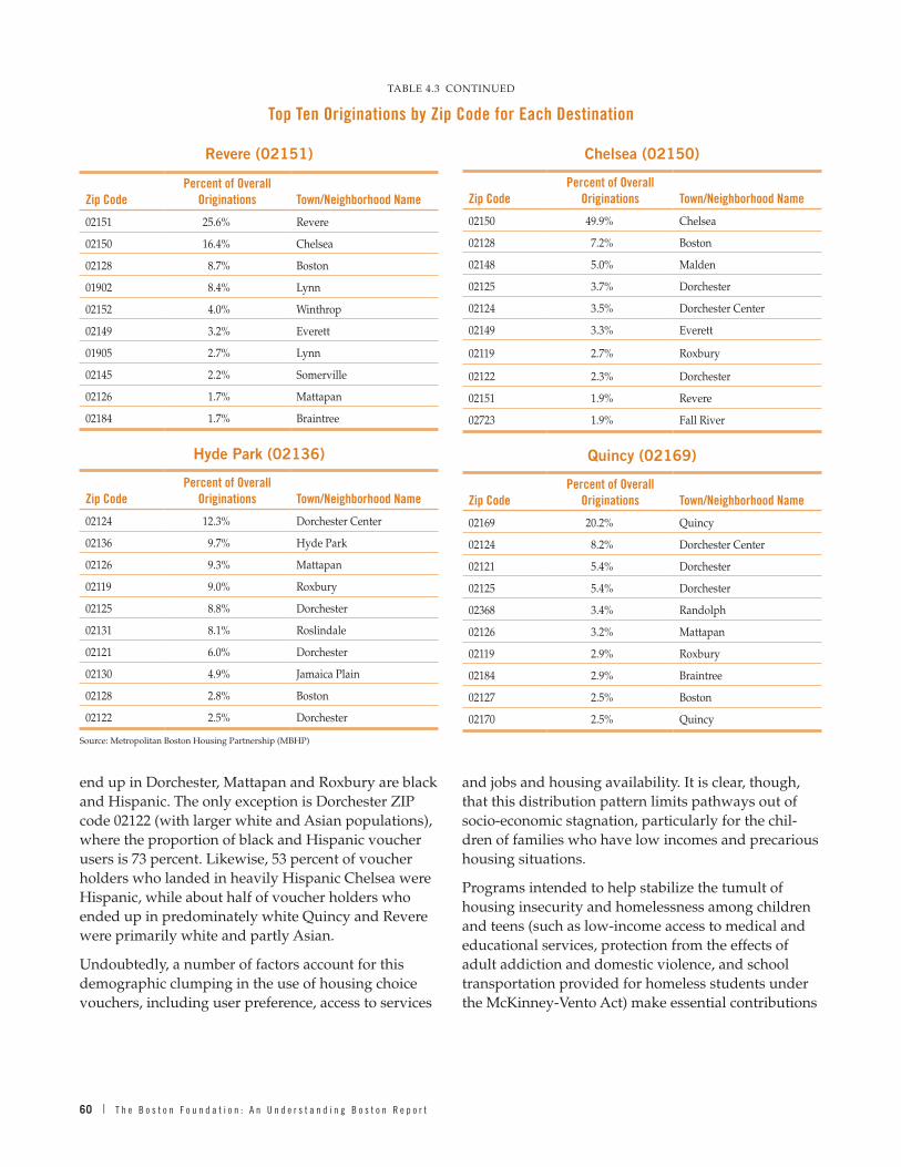
60 | T h e B o s t o n F o u n d a t i o n : A n U n d e r s t a n d i n g B o s t o n R e p o r t
end up in Dorchester, Mattapan and Roxbury are black and Hispanic . The only exception is Dorchester ZIP code 02122 (with larger white and Asian populations), where the proportion of black and Hispanic voucher users is 73 percent . Likewise, 53 percent of voucher holders who landed in heavily Hispanic Chelsea were Hispanic, while about half of voucher holders who ended up in predominately white Quincy and Revere were primarily white and partly Asian .
Undoubtedly, a number of factors account for this demographic clumping in the use of housing choice vouchers, including user preference, access to services
and jobs and housing availability . It is clear, though, that this distribution pattern limits pathways out of socio-economic stagnation, particularly for the chil-dren of families who have low incomes and precarious housing situations .
Programs intended to help stabilize the tumult of housing insecurity and homelessness among children and teens (such as low-income access to medical and educational services, protection from the effects of adult addiction and domestic violence, and school transportation provided for homeless students under the McKinney-Vento Act) make essential contributions
Chelsea (02150)
Zip CodePercent of Overall
Originations Town/Neighborhood Name
02150 49 .9% Chelsea
02128 7 .2% Boston
02148 5 .0% Malden
02125 3 .7% Dorchester
02124 3 .5% Dorchester Center
02149 3 .3% Everett
02119 2 .7% Roxbury
02122 2 .3% Dorchester
02151 1 .9% Revere
02723 1 .9% Fall River
Quincy (02169)
Zip CodePercent of Overall
Originations Town/Neighborhood Name
02169 20 .2% Quincy
02124 8 .2% Dorchester Center
02121 5 .4% Dorchester
02125 5 .4% Dorchester
02368 3 .4% Randolph
02126 3 .2% Mattapan
02119 2 .9% Roxbury
02184 2 .9% Braintree
02127 2 .5% Boston
02170 2 .5% Quincy
Revere (02151)
Zip CodePercent of Overall
Originations Town/Neighborhood Name
02151 25 .6% Revere
02150 16 .4% Chelsea
02128 8 .7% Boston
01902 8 .4% Lynn
02152 4 .0% Winthrop
02149 3 .2% Everett
01905 2 .7% Lynn
02145 2 .2% Somerville
02126 1 .7% Mattapan
02184 1 .7% Braintree
Hyde Park (02136)
Zip CodePercent of Overall
Originations Town/Neighborhood Name
02124 12 .3% Dorchester Center
02136 9 .7% Hyde Park
02126 9 .3% Mattapan
02119 9 .0% Roxbury
02125 8 .8% Dorchester
02131 8 .1% Roslindale
02121 6 .0% Dorchester
02130 4 .9% Jamaica Plain
02128 2 .8% Boston
02122 2 .5% Dorchester
Source: Metropolitan Boston Housing Partnership (MBHP)
TABLE 4 .3 CONTINUED
Top Ten Originations by Zip Code for Each Destination

T h e G r e a t e r B o s t o n H o u s i n g R e p o r t C a r d 2 0 1 6 | 61
to families trapped in the low end of our hourglass economy . For those fortunate enough to move off years-long waiting lists to finally acquire housing vouchers, having a “choice” in housing is an impor-tant — if also unstable — supplement to the old model of relying almost exclusively on public housing .
But housing choice should involve more than circu-lating through the same or similar neighborhoods; it should also provide location-based opportunities for educational advantages, upward mobility, and access to “social capital .” As policymakers work to wrestle down the effects of Greater Boston’s red-hot housing market on the poorest of our families, it is not enough to call on HUD or the state to release more housing vouchers (as essential as that is) or to put in place more services to mitigate the long-term effects of housing instability on children (as important as they are) . In addition, more must be done to ensure that program policies help break the cycle of socio-economically concentrated poverty through improved analysis of its sources, better and more coordinated data capture, and expansion of housing opportunities throughout the Greater Boston region .
TABLE 4 .4
Top Ten Destinations by Top Five Race/Ethnic Groups for MBHP Family Voucher Choice Placement, 2000–2016
Zip Code
Town / Neighborhood
Number of Families Moved Rank
% Black Non-
Hispanic% Black Hispanic
% White Hispanic
% White Non-
Hispanic % Asian % Other
02124 Dorchester Center 1,857 1 72 .1% 4 .6% 13 .2% 5 .2% 3 .6% 1 .4%
02125 Dorchester 984 2 58 .0% 7 .8% 19 .1% 8 .9% 5 .3% 0 .8%
02121 Dorchester 971 3 66 .8% 6 .4% 19 .5% 6 .1% 0 .5% 0 .7%
02122 Dorchester 837 4 59 .4% 4 .2% 11 .4% 12 .9% 10 .5% 1 .7%
02126 Mattapan 816 5 74 .3% 8 .1% 11 .6% 5 .1% 0 .0% 0 .9%
02119 Roxbury 719 6 63 .4% 6 .3% 22 .7% 6 .4% 0 .6% 0 .7%
02151 Revere 598 7 16 .6% 4 .7% 28 .1% 46 .5% 2 .3% 1 .8%
02136 Hyde Park 569 8 60 .5% 4 .6% 25 .5% 9 .3% 0 .0% 0 .2%
02150 Chelsea 515 9 17 .9% 4 .1% 52 .0% 24 .9% 0 .2% 1 .0%
02169 Quincy 441 10 33 .8% 3 .2% 10 .4% 45 .1% 5 .4% 2 .0%
Source: Metropolitan Boston Housing Partnership (MBHP)

62 | T h e B o s t o n F o u n d a t i o n : A n U n d e r s t a n d i n g B o s t o n R e p o r t
The City of Boston and the Commonwealth have long played an important role in encouraging the produc-tion of affordable housing dating back to the 1930s and the Great Depression . Time and time again, the state and the city have created new approaches to encourage, require, incentivize and finance housing for low-income and working households . Most of these programs have succeeded in meeting at least part of the housing challenge .
In this chapter we will take a historic tour of these programs, examine how they have been updated and funded in recent years, and propose policy improve-ments that are responsive to today’s distinct housing market challenges .
A Brief History of Housing Programs in Massachusetts
Back on October 1, 1935, the Boston Housing Author-ity (BHA) was established by Boston Mayor Fred-eric Mansfield and the Boston City Council, taking advantage of a Depression-era Massachusetts General Law that allowed cities and towns to establish hous-ing authorities .1 The first BHA housing projects were opened between 1938 and 1942 .2 After a pause in development during World War II, there was a prolif-eration of new public housing projects in Boston and a number of other Massachusetts cities . Today, the BHA runs 70 developments serving almost 26,000 resi-dents in more than 12,600 public housing units .3 These include, among others, one in Back Bay (St . Botolph Apartments for the elderly and disabled), three in Charlestown, six each in Brighton and South Boston, eight in Roxbury and ten in Dorchester .
In 1966, the Massachusetts Legislature created the Massachusetts Housing Finance Agency, now known as MassHousing, as an independent public authority charged with increasing affordable rental and for-sale housing in the Commonwealth . Since making its first loan in 1970, the agency has provided more than $19 billion in financing for the construction
CHAPTER FIVE
Public Policy and Public Spending on Housing in the Commonwealth
and preservation of affordable housing . It has also launched an array of programs to assist in the devel-opment of affordable housing, including the manage-ment of the Demonstration Disposition Project which provided funds for the renovation of HUD-foreclosed properties; the first-ever partnership between a hous-ing finance agency and a university (Northeastern) to build Davenport Commons, a combination student and affordable housing development; and the creation of a Priority Development Fund to provide gap financ-ing for developers and planning assistance grants for municipalities .4
In 1969, in an extraordinary display of courage, the Massachusetts Legislature and Governor Francis Sargent enacted Chapter 40B, the comprehensive permit act that reduced barriers created by local municipal building permit approval processes that stymied developers from building affordable housing . Its goal was to encourage the production of affordable hous-ing in communities throughout the Commonwealth by providing developers a “comprehensive permit” allowing them to build more dense developments in communities with less than 10 percent affordable hous-ing — overriding local zoning laws . Since the passage of 40B, more than 58,000 homes have been created for working families, seniors and people with disabilities all across the state because of this law . Nearly half of these have been developed by nonprofits .5
In 2000, Boston created its Inclusionary Development Policy (IDP) requiring developers who are seeking some form of zoning relief for buildings with ten or more units — or building on city-owned land — to set aside a percentage of units as affordable to moderate- and middle-income households . In addition to includ-ing units on site, under some circumstances developers can create the units off-site or contribute to a fund that helps create affordable units .
As of May of this year, under the inclusionary zoning policy, nearly 2,300 income-restricted housing units have been completed in the city or are currently under construction .6 Of these about 550 are new affordable

T h e G r e a t e r B o s t o n H o u s i n g R e p o r t C a r d 2 0 1 6 | 63
MassHousingMassHousing, the state agency created as a housing finance agency, has been redoubling its efforts in a number of critical ways — many aimed at meeting the needs of the Commonwealth’s aging demographic .7 It is now partnering with developers and owners to finance adaptable, affordable senior housing with sustainable funding for supportive services and cost-effective ways to improve quality of life and health outcomes . By fostering partnerships between lead-ers in the Commonwealth’s housing and health care industries, the agency is working to leverage existing funding sources to achieve better, more cost-effective outcomes for our growing senior population .
Together with the Department of Housing and Community Development (DHCD) and the Baker administration, MassHousing has led the effort to preserve affordable housing that is in danger of return-ing to market rate . MassHousing and DHCD have each committed $50 million to preserve affordability for low-income residents in properties where rent restrictions will expire between now and 2019 . Mass-Housing is working proactively to negotiate tenant protections and renewed use restrictions with owners wherever feasible .
In 2016, MassHousing funded a $100 million workforce housing program encouraging production of housing for those not served by the market or existing low-income programs . It has also been working with HUD and the U .S . Treasury to develop an HFA loan product to provide low-interest HUD-insured multi-family loans pursuant to a streamlined process . In the next few months, MassHousing expects to announce a joint funding program with DHCD to finance and subsidize the production of “community scale” developments of five to 20 units in small cities and towns .
owner-occupied units, with more than 1,700 new affordable rental units . As Table 5.1 shows, the afford-able units developed under inclusionary zoning repre-sent a little more than 11 percent of the total units in these developments with the overwhelming majority (2,175) reserved for “middle-income” households and about 100 for low-income families .
In 2004, the Smart Growth Zoning Overlay District Act (Chapter 40R) was enacted, encouraging communities to create dense residential or mixed-use smart growth zoning districts with a high percentage of affordable housing units, to be located near transit stations, in areas of concentrated development such as existing city and town centers, and in other highly suitable locations . Upon state review and approval of a local overlay district, communities become eligible for payments from a Smart Growth Housing Trust Fund, as well as other financial incentives . As we noted in Chapter 2, more than 3,300 units of housing have been developed under 40R statewide, nearly half of which are affordable for working households .
In 2005, Chapter 40R’s companion legislation, Chapter 40S, was enacted to ensure that communities adopting 40R can cover the costs of educating any school-age children who move into such districts . Qualifying communities can be reimbursed for the net cost of educating students living in new housing in smart growth districts . With the passage of 40S, the number of projects in communities adopting 40R has increased from a handful to 44 in 2016 .
So we have a long history of working on the afford-able housing challenge in the Commonwealth and in Boston . But as we have seen throughout this report, home prices and rents continue to rise and affordabil-ity is as serious a problem as ever .
TABLE 5 .1
Inclusionary Zoning Development in the City of Boston through May 2016
Total New UnitsAffordable New Units
Affordable New Owner Units
Affordable New Rental Units
Low Income (<60% AMI)
Middle Income (>60% AMI)
Complete 14,267 1,509 460 1,049 93 1,416
In Construction 5,600 764 94 670 5 759
TOTAL 19,867 2,273 554 1,719 98 2,175
Source: Boston Redevelopment Authority

64 | T h e B o s t o n F o u n d a t i o n : A n U n d e r s t a n d i n g B o s t o n R e p o r t
In addition, it is working to preserve the affordability of thousands of low-income units using taxable debt and no state subsidies, leveraging low interest rates to stabilize properties where necessary .
Also in 2016, the agency launched Operation Welcome Home, a home mortgage loan program providing flex-ible 100 percent financing to make homeownership a reality for veterans not served by existing programs .
On an ongoing basis, MassHousing helps approxi-mately 3,000 low- and middle-income families (up to 165% AMI) buy and stay in their own homes through favorable mortgage financing, homeownership coun-seling and high-touch loan servicing, resulting in rates of long-term default and foreclosure far below other government loan programs . Since 2004, MassHous-ing borrowers making down payments of less than 20 percent of purchase price receive MIPlus mortgage insurance, which pays the homeowner’s principal and interest for six months should they become unem-ployed . So far, approximately 900 homeowners have used this benefit to stay in their homes rather than face foreclosure . MassHousing is able to provide this bene-fit using the strength of its mortgage insurance fund .
New Approaches to Meeting the Housing Challenge
Over the past two years, both the Commonwealth and the City of Boston have redoubled their efforts at meeting the housing challenge . This includes a spate of new development awards offered by the state for the development, renovation and preservation of affordable rental housing; passage of a new statewide workforce housing trust fund; and proposed statewide legislation for zoning reform . In Boston, the mayor and his Department of Neighborhood Development have set housing targets and provided developers with a smoother path toward construction . All three of these new initiatives are needed and welcome .
Affordable Housing Development AwardsIn August of this year, the Baker-Polito administra-tion announced new development awards to create or preserve 1,420 housing units across the Common-wealth in 26 new projects . The awards include more than $31 million in state and federal low-income housing tax credits that will generate more than $218
million in equity for these projects . In addition, the administration is awarding more than $59 million in federal HOME funds and state capital funds for these projects . The administration also unveiled a five-year capital budget plan that includes a $1 .1 billion commitment to increasing housing production, which represents an 18 percent increase in funding for mixed-income and affordable housing production .8
Workforce Housing Trust FundAt the end of July 2016, the Massachusetts House and Senate authorized as part of its Economic Develop-ment Bill the creation of a Workforce Housing Trust Fund (WHTF) . The program’s goal is to provide suffi-cient funding to make market-rate residential devel-opments feasible in both existing buildings and in new construction projects in Gateway Cities — the 24 cities identified by the state as midsize urban centers that anchor regional economies but face social and economic challenges — 13 of which are in Greater Boston . The new law increases the Housing Develop-ment Incentive Program (HDIP) tax credit from 20 to 25 percent . The Commonwealth Executive Office of Housing and Economic Development has set aside $25 million over and above the current HDIP program cap of $10 million for piloting this new program .9
Historic Bill to Reform the State’s Housing and Zoning LawsIn June 2016, the Massachusetts Senate passed S. 2311, An Act to Promote Housing and Sustainable Develop-ment in the Commonwealth, which would provide cities and towns with new tools for planning, zoning and permitting . It will also help increase the production of housing for all ages and incomes, with provisions to preserve open space . The bill includes provisions that will:
■■ Require communities to increase “multi-family” zoning
■■ Allow homeowners to create “accessory dwelling units” on their property
■■ Reform special permit regulations, which are a common approval process, so that approval will no longer require a supermajority vote
■■ Provide variance reforms making it easier for prop-erty owners to make improvements
■■ Allow developers longer, more reasonable time peri-ods to use their permits

T h e G r e a t e r B o s t o n H o u s i n g R e p o r t C a r d 2 0 1 6 | 65
■■ Reform the appeals process so as to reduce frivolous lawsuits and lengthy court battles over development
■■ Encourage cities and towns to implement affordabil-ity requirements through inclusionary zoning
■■ Provide more training opportunities for local plan-ning and zoning board members
■■ Encourage cluster zoning to preserve open space and discourage sprawl
While the House took no action on this legislation in the current session, housing advocates are prepared to work hard in the next session to gain House approval and the Governor’s signature on what could be the most important change in zoning laws since the adop-tion of Chapter 40B in 1969 .
Public Spending on Housing in the Commonwealth
The Commonwealth has two sources of funds to assist homeowners, renters and developers of housing . One is from its own revenue, the other from a variety of federal programs . A large proportion of the state’s funds used for housing are annual operating funds; the remainder includes capital or trust funds used for investment in public housing and to subsidize affordable housing construction . All of these funds are processed through the state’s Department of Housing and Community Development . Traditionally, DHCD operating funds have been used largely to provide rental assistance and public housing subsidies, and to pay for administration of the agency . Since FY2010, operating funds for homelessness programs have also been administered by DHCD . As a result, efforts to address homelessness and the overall need for afford-able housing are increasingly integrated . DHCD also manages capital funds that preserve and create new affordable housing . These funds are authorized every five years through the passage of a housing bond bill . The most recent, for $1 .4 billion, was passed in late 2013 .
Federal funds for housing are made available directly to a number of local agencies, such as Massachusetts’ larger cities and local public housing authorities . But DHCD also receives and distributes federal funds for a number of subsidy programs including the Section 8 rental voucher program, new housing development and rehabilitation assistance, energy aid and various
neighborhood stabilization programs . While DHCD received a temporary increase in funds due to the 2009 American Recovery and Reinvestment Act (ARRA), the Budget Control Act of 2011 (“sequestration”) and partisan gridlock has made it difficult in recent years for HUD to increase funding . Nevertheless, DHCD had $965 million in resources in FY2016, and potentially will have $1 billion in FY2017 .
Operating Funds for Housing and Homelessness
From FY1990 to FY2001, DHCD operating funds for housing declined by an inflation-adjusted 54 percent . From FY2001 to FY2004, housing operating funds were slashed an additional 57 percent, falling to $90 million, well below the FY1990 record of over $390 million . While a portion of this funding, such as for the Hous-ing Innovations Fund, was shifted from the operating account to the capital account during this period, fund-ing still declined rapidly . Operating funds increased each year from FY2005 to FY2008 before being slashed again in the wake of the Great Recession in FY2009 (see Figure 5.1) . Since FY2010, the level of inflation-adjusted operating funds for housing programs (excluding funds for homeless programs) has vacil-lated between $129 million and $198 million per year . Fiscal year 2016 marked the high water mark in terms of funding since 2001 .
Up until FY2010, the Department of Transitional Assistance oversaw operating funds for homelessness programs . With the exception of FY2002 (a recession-ary year), homelessness funding was relatively stable from FY2001 to FY2007, ranging from $135 million to $140 million annually . With the FY2008 onset of the Great Recession, costs for the state’s homelessness programs increased, led by the Emergency Assistance (EA) program, which provides emergency shelter for families . As Massachusetts has a “right to shelter” law for eligible families (not individuals), EA costs esca-lated as the recession worsened . Even with an improv-ing economy since the end of the Great Recession, funding for homelessness programs has continued to increase so that by FY2016, the total devoted to such programs by the state reached $304 million in inflation-adjusted dollars, double the level in 2009 .
DHCD assumed the oversight of the homelessness programs in FY2010, more than doubling the operat-ing funds it managed . Bringing housing and home-lessness programs under one agency has provided

66 | T h e B o s t o n F o u n d a t i o n : A n U n d e r s t a n d i n g B o s t o n R e p o r t
an opportunity for integrating the two efforts, and has been crucial as the state attempts to respond to increased demand by families for the EA relief .
DHCD’s integrated approach is beginning to bear some fruit, although as we saw in Chapter 4, waiting lists and the duration of shelter stays continue to esca-late . Based on DHCD record keeping, from October 2014 to April 2016 the number of homeless families has declined 7 percent from 4,171 to 3,861 families, and the state has had success in placing families in shelter spaces and congregate housing rather than in motels . At the December 2013 peak, 2,134 families were still housed in motels, a number that dropped to only 256 families by October 2016 .10 In another attempt to reduce the need for EA, DHCD also has commit-ted additional resources to the Massachusetts Rental Voucher Program (MRVP) based on new state fund-ing . The state’s contribution to these vouchers has increased from $44 million in FY2013 to $92 .5 million in FY2016 . For FY2017 there is an 8 percent decline to $85 .3 million, as the state addresses a softening in the state’s tax receipts . Despite these attempts to reduce reliance on EA, DCHD spent a record $199 .5 million on the program in FY2016 . For FY2017, $155 .5 million has been budgeted for EA, and a supplemental appropria-tion has already been proposed . Overall, if the supple-mental appropriation does not pass, FY2017 operating
funds will be down 13 percent from FY2016, declining from $497 million to $433 million .
Federal Spending through DHCDThrough the 1990s, inflation-adjusted federal spend-ing through the Massachusetts DHCD was relatively stable . From FY2001 to FY2009, federal spending increased every year, with the exception of FY2005 and FY2007 (see Figure 5.2) . As a result of these increases, federal funds to DHCD peaked in FY2009, at $668 million . American Recovery and Reinvestment Act funds contributed to a further expansion of the state’s housing efforts, with $112 million in funding in FY2010 and $196 million in FY2011 . As a result, total federal funding to DHCD for housing peaked at $860 million in FY2011 .
However, once the ARRA funds were depleted and the federal implementation of “sequestration” took place, federal funds to DHCD declined to $440 million in FY2013 . Federal funding to Massachusetts recovered 7 .1 percent from FY2013 to FY2014, to $471 million, but over the next two years, funding has been rela-tively flat . For FY2017, some changes are expected in a number of federal programs . The McKinney Emer-gency Shelter Grants program is expected to get an additional $3 .8 million, boosting federal spending on homelessness by 25 percent . Other housing programs
FIGURE 5 .1
Real Operating Funds For Housing and Homelessness (Inflation Adjusted) FY2001–FY2017
0
50
100
150
200
250
300
350
400
450
500
2015 2016 201720142013201220112010200920082007200620052004200320022001
$210
$136
$130
$217
$129
$234
$160
$265
$134
$295
$180
$287
$147
$290
$193
$304
$178
$255
$152
$153
$111
$137
$115
$140
$135
$139
$155
$141
$153
$151
$168
$147
$90
$132
Mill
ions
Fiscal Year
Homeless Funds Housing Funds
Source: The Massachusetts Budget Dashboard; Massachusetts Budget and Policy Center

T h e G r e a t e r B o s t o n H o u s i n g R e p o r t C a r d 2 0 1 6 | 67
are expected to get increases, including a $40 million increase for the Federal Housing Voucher Program, $14 .7 million for the Housing Choice Voucher and VASH programs (providing vouchers for veterans) . Cuts are also likely coming, however, such as $6 .6 million to the Section 8 New Construction Program thus defunding the entire program, and a $5 .4 million cut in HOME Investment Partnerships .
Figure 5.3 shows changes in total Massachusetts DHCD funding from FY2001 to FY2017 (in FY2016 dollars), excluding spending on homelessness . While federal cash infusions in FY2010 and FY2011 pushed total funding close to the $1 billion threshold, cuts in FY2013 brought funding back down to $608 million . There were small increases in funds in FY2014 (4 .9 percent), a small decline in FY2015 (1 .2 percent), but
FIGURE 5 .2
Total Real Federal Spending (FY2016 $) FY2001–FY2017
2015 2016 201720142013201220112010200920082007200620052004200320022001
$757
$860
$666
$439$471
$498 $498
$558
Mill
ions
Fiscal Year
Federal Spending Federal ARRA Spending Federal Homelessness Spending
0
100
200
300
400
500
600
700
800
900
$415 $424
$501 $485$503
$463
$668
$484$519
*Note: Before FY2010, homelessness funds were managed by DTA, and are not included .
FIGURE 5 .3
Total Real DHCD Spending (FY2016 $), Including Federal Share and ARRA FY2001–FY2017 (Excluding Homeless Program Funds)
2015 2016 201720142013201220112010200920082007200620052004200320022001
$13
$16$12
$15 $15
$19
Mill
ions
Fiscal Year
State Spending Federal Spending Federal ARRA Spending
0
100
200
300
400
500
600
700
800
900
1,000
$874
$975
$812
$608$638 $630
$676$717
$576$625 $611 $601
$637 $618
$821
$651$609
Source: The Massachusetts Budget Dashboard, and the Massachusetts Budget and Policy Center
68 | T h e B o s t o n F o u n d a t i o n : A n U n d e r s t a n d i n g B o s t o n R e p o r t
increases of 7 .3 percent in FY2016, and an expected increase of 6 percent in FY2017, should bring funding for housing to $717 million next year, the highest level since FY2013 .
New Housing Policy in the City of Boston
Meanwhile, since being elected mayor in 2014, Mayor Marty Walsh has been a champion for affordable hous-ing . Housing a Changing City: Boston 2030, a compre-hensive housing plan introduced in October 2014, established the goal of producing 53,000 new units of housing in the city over the next 15 years . Notably, 20,000 of those units are to be middle-class affordable, and 8,000 will be low-income affordable . The plan includes 18,500 new dorm beds to reduce the impact of students on the housing market . To meet this ambi-tious housing goal, the city has taken a number of important steps:
■■ Neighborhood Homes Initiative (May 2015) . One million square feet of city-owned land is being made available to smaller contactor/builders to build middle-class affordable one- and two-family homes . The program’s first homes are now in construction .
■■ Inclusionary Development Policy Update (December 2015) . IDP is now applying market-appropriate rules to different market areas — with the highest cash-in-lieu requirements in luxury market areas, and lower requirements in lower-priced markets .
■■ Office of Housing Stability (Summer 2016) . This new division of the city’s Department of Neighborhood Development (DND) is dedicated to preventing displacement wherever possible . OHS’s initial outreach has been to tenants in properties that have recently changed hands (often a triggering event for rent increases by a new owner), and to tenants in foreclosed properties .
■■ Acquisition Opportunity Program (May 2016) . This new program funds nonprofit and for-profit devel-opers to acquire properties as they come on the market . City funds are used to ensure that exit-ing tenants are not displaced and that the prop-erty becomes a permanent part of the affordable housing supply .
■■ Workforce Housing Tax Incentive (Jan 2016) . The city proposed local home rule legislation that would
allow the city to abate property taxes for the first five years of new developments that are affordable to the middle class . The legislation was adopted by Governor Baker and turned into a statewide initia-tive as part of the Municipal Modernization Bill that was signed into law in July 2016 .
■■ Strategic Planning Areas . The city has begun rework-ing development rules in areas that are close to tran-sit and have significant amounts of underutilized land and commercial uses . Under the new rules, increased density will be made available to devel-opers in these areas . Two areas already have draft plans: Jamaica Plain/Roxbury and South Boston/Dorchester Avenue .
■■ New Homelessness Strategy. The city has put together an Action Plan to End Chronic and Veterans Home-lessness by 2018 .
■■ Density Bonus Program . A pilot Density Bonus Program has been launched as part of the Jamaica Plain/Roxbury Strategic Planning Area . Under this program developers can build to higher densities than local zoning prescribes in exchange for higher inclusionary affordable housing .
■■ Conservation Preservation Act . Mayor Walsh and members of the Boston City Council have endorsed a referendum on the November 2016 ballot that, if passed, would permit an increase in the CPA fee providing the city with additional funding for conservation and the production of affordable housing .
Time will only tell how successful these efforts will be, but the production data we reviewed in Chapter 2 suggests some progress is already being made to increase housing production in line with the city’s ambitious 53,000 unit goal established in 2014 .
Massachusetts Housing Partnership
Besides the public sector efforts undertaken by the Commonwealth, MassHousing and the City of Boston to meet housing goals, the Massachusetts Housing Partnership (MHP) has played a constructive role, as well . MHP is a statewide public nonprofit affordable housing organization that works in concert with the Governor and the state DHCD to help increase the supply of affordable housing in Massachusetts . It was

T h e G r e a t e r B o s t o n H o u s i n g R e p o r t C a r d 2 0 1 6 | 69
established in 1966 to increase the state’s overall rate of housing production and to work with cities and towns to demonstrate new and better ways of meeting the Commonwealth’s need for affordable housing . In 1990, the state legislature took that premise to heart, becoming the first and only state in the nation to pass an interstate banking act that requires companies that acquire Massachusetts banks to make funds available to MHP for affordable housing .11
MHP addresses challenges to the production of afford-able housing by offering:
■■ Community Assistance – Supporting local officials, housing authorities and community nonprofits in their efforts to develop affordable housing
■■ ONE Mortgage – Partnering with lenders to offer the state’s most affordable program for low- and moderate-income first-time home buyers
■■ Rental Financing – Using private sources of capital to provide long-term, fixed-rate financing for multi-family housing
In 2015 and 2016, MHP provided training and techni-cal assistance reaching 96 cities and towns in Greater Boston . Among the best examples of MHP’s early-stage community assistance is the successful rezon-ing of a commercial area in Needham to promote mixed use and allow 250 units of higher density multi-family housing .
Since 1990, MHP’s ONE Mortgage has helped nearly 19,800 low- and moderate-income families purchase their first homes and has delivered more than $3 .4 billion private mortgage financing . Over the same period, MHP has financed more than 22,000 rental apartments, using upwards of $1 billion in private bank capital as well as Fannie Mae and FHA lend-ing products . In the past two years, MHP has closed financing for 2,381 units of new rental housing in the Greater Boston region alone including projects in Dorchester, Roxbury, Revere, Brookline and Wayland .
Factors Determining Whether New Housing Will Be Produced
The Terner Center for Housing Innovation at the University of California Berkeley has recently produced a Housing Development Dashboard, an online tool that uses a great deal of data to determine
the likelihood that a particular housing development project will be undertaken .12 The dashboard has six key factors and works best for properties of 50 units or more .
Market Factors
■■ Target rate of return on the project
■■ Landowner willingness to sell
■■ Local rents and costs
Local Government Factors
■■ Fees or affordable housing requirements
■■ Local planning decisions
■■ Additional planning approvals
Based on data for the Greater Boston housing market, we can use the Terner Center factors to rate the prob-ability of housing development in the region .
In the Boston metro region there are five factors outlined in the Terner Dashboard that now are condu-cive to producing additional new housing in Greater Boston . These are as follows:
1 . Bank Loan Interest Rate: At 4 percent, nearly 80 percent probability of development. At 6 percent, 60 percent probability of development. Above 8 percent, probability falls toward zero.
With bank interest rates now well below 4 percent, bank financing is not a major barrier to housing development .
2 . Basic Permitting Time: Above six months, the probabil-ity of development falls precipitously. Above ten months, it falls to zero.
As late as 2014 in the city of Boston, the average time it took to receive a building permit varied from 14 months for multi-family developments to 18 months for four-unit structures . Clearly such wait times contributed to fewer housing units . By 2016, Boston had reduced its average wait times to no more than four months, helping to lead to the uptick in new housing development .
3 . Expected Rent Increase: Below 2 percent per year, little probability of development. At or above 3 percent expected yearly increase, probability rises rapidly to near 100 percent.

70 | T h e B o s t o n F o u n d a t i o n : A n U n d e r s t a n d i n g B o s t o n R e p o r t
Large annual increases in rents have contributed to the surge in housing development, especially for luxury units .
4 . Expected Construction Cost Increase: Below 2 percent per year, near 100 percent probability of development. At or above 3 percent yearly increase, probability falls below 50 percent.
Based on the development cost survey included in last year’s Greater Boston Housing Report Card, per square foot development costs increased from $242 in the period between 2004 and 2008 to $274 between 2011 and 2015 . This represents an aver-age annual increase of only 1 .7 percent . While the overall cost of development is often prohibitively expensive, the rate of inflation in development costs is apparently not a barrier to construction in Greater Boston .
5 . Parking: At zero parking spaces per unit, near 100 percent probability of development. Above one space per unit, probability falls precipitously.
Reduced parking requirements now being considered by a number of communities encourage development .
Unfortunately, there are an additional seven factors that are serving to discourage new housing develop-ment in Greater Boston . These are as follows:
1 . Target Return: The probability of housing development falls precipitously when the developer’s target rate of return exceeds 11 percent.
According to investment advisors, for private real estate funds currently in the market the greatest proportion are targeting net internal rates of return (IRRs) of 14-15 .9 percent . At least 40 percent of current real estate funds target at least a 16 percent IRR while fewer than 18 percent have a target of 11 .9 percent or less .13 As such, there are a limited number of developers — with most of these in the nonprofit world — who are willing to develop hous-ing in Greater Boston if the expected IRR is not well above the 11 percent . This factor alone could explain the lack of housing investment in all but luxury developments .
2 . Local Rents: There is little probability of development if expected monthly rent falls below $3.50/square foot of unit/month.
What this means is that a brand-new, small unit of 850 square feet must command a rent of roughly $2,975 a month to be worth developing, a rent too high for most working people .
3 . Low-Rise Construction Costs: If the all-in cost of development is above $250/gross square foot of building, development falls precipitously.
According to the detailed cost analysis carried out for last year’s Greater Boston Housing Report Card, total development cost now runs over $273 per square foot on average, reducing the ability to build affordable housing for middle-income families .
4 . Affordable Unit Percentage: Any percentage reduces development probability to 60 percent, but percentage has little impact beyond that.
While inclusionary zoning may be effective for the development of some affordable units, the down-side of this regulation may be fewer new housing developments in the region .
5 . Affordability Level: At 80 percent affordability, there is only a 40 percent probability of development. At 120 percent affordability, a 60 percent probability.
These probabilities suggest why it is so diffi-cult to build sufficient new housing for low-income households .
6 . Height: Above five stories, steel construction raises costs and the probability of development falls to zero .
This suggests why the only high-rise residential buildings in Boston have high-end luxury units . If housing is to be built for middle-income fami-lies, these units will have to be “stick-built” on platform structures .
7 . Average Unit Size: Below 850 square feet, probability of development falls below 60 percent. Above 850 square feet, probability is about 75 percent.
This factor may contribute to the difficulty of build-ing smaller housing units, unless they are specifi-cally targeted to particular demographic groups .

T h e G r e a t e r B o s t o n H o u s i n g R e p o r t C a r d 2 0 1 6 | 71
All in all, this analysis advises that more housing development is possible if public policy is aimed at continuing to streamline the regulatory process, thus speeding up permitting; keeping development costs from rising faster by making more land available for housing and finding new methods to reduce construc-tion costs; and making sure that workforce housing developments are free from required inclusionary zoning so as not to increase the cost to the developer . Targeting smaller housing units to younger residents and perhaps seniors ready to give up their large family homes may also make it possible to develop complexes that will appeal to these demographic groups . Given the difficulty of building new housing in Greater Boston that is affordable by working families, we will likely have to engage in “housing jujitsu” — creat-ing desirable housing choices for those who now live in existing housing units so that these units, such as duplexes and triple-deckers, can be repur-posed for the working families for whom they were originally constructed .
Millennial Village HousingSuch targeting of housing to graduate students, medi-cal interns and residents and other younger residents of Boston is the concept behind Millennial village housing now being discussed by architects, a number of young entrepreneurs, several college presidents and some developers in Greater Boston . The original concept was put forward in the 2010 Greater Boston Housing Report Card and was aimed primarily at hous-ing graduate students and reducing demand pressure on the existing private housing market .14 Since then, the idea has been expanded to a much broader group of 20 to 34 year-olds .
Under the original multi-university graduate student village plan, this housing would have had many of the following attributes:
■■ Several universities and colleges would collaborate on marketing a high-density graduate student resi-dential facility that would be centrally located near public transit, include commercial and retail space, and have common areas that could house seminar/meeting rooms and recreational space .
■■ Each village would be developed by a private sector developer with the universities and colleges participating in marketing the facility to their own
graduate students as well as providing a joint master lease agreement for a given number of units . The facility would remain on the city’s or town’s tax rolls .
■■ Each village could include efficiency units, one-, two- and even some three-bedroom units, includ-ing units for married couples with young children . Units could also differ in terms of amenities so that some smaller units could be aggressively priced while others could be more upscale .
■■ Each village could include commercial retail space that might include a small supermarket, a drycleaner or drugstore .
■■ Each village could have an underground garage with perhaps one space per three to five units, but include a Zipcar facility with vehicles ranging from Smart Cars to vans .
■■ Each village could include regular programming of seminars, lectures, film festivals and so on for residents and others sponsored by the collaborating universities and colleges to help bring residents of the village together and to open the village to partic-ipation in events by the wider community .
■■ If these villages also were open to graduate students after graduation for three to five years, it might serve to retain young professionals in the area, a major goal of state and local policy .
■■ Given that graduate students generally do not leave the city during the summer, most of the residents would be 12-month residents with little need for sub-leasing . With aggressive marketing by the universities, near 100 percent occupancy could be expected throughout the year .
The combination of a convenient location, attractive and affordable apartments, a large array of amenities, the ability to live with students from other schools, and other “village-like” attributes might make this type of development a top residential choice among gradu-ate students when they come to Boston and serve to help universities attract graduate students from other regions of the country and from abroad .
Most importantly, such a housing alternative could help move young residents out of the older housing stock in the region, opening up duplexes and triple-decker units which could become more affordable for working families in Greater Boston .

72 | T h e B o s t o n F o u n d a t i o n : A n U n d e r s t a n d i n g B o s t o n R e p o r t
makers and service workers to better target funding and programs .
■■ Although the Commonwealth commendably offers its own housing choice voucher program, MRVP data should be collected in a way that is consistent with HUD data so that program administrators, policy makers, and other analysts can more readily gain an understanding of overall housing voucher use and need .
■■ The agency might also track, perhaps in concert with the Department of Transitional Assistance, what becomes of children when they leave or age out of the system — from either subsidized hous-ing or the shelter system as a means of evaluating the efficacy of both housing programs and related social services .
■■ DHCD should also maintain data on EA waiting lists and formalize the pre-application screening process to include reporting on how many potential applicants are advised not to apply for EA, and why . Without these numbers, it is impossible to know how many people are so housing cost–burdened that they tried to apply for EA . This objective measure of subjective states of desperation would provide a more accurate sense of the scope of family insecurity and homelessness .
■■ Another form of accuracy is absolutely essential to program scope and efficacy: Eligibility thresh-olds for EA (and perhaps housing choice vouch-ers as well) should reflect the actual cost of living throughout Greater Boston . Using our cost-of-living calculations described in Chapter 1, the number of impoverished households in the region is approxi-mately 116,580 higher than standard government calculations indicate .
It is no wonder, then, that waiting lists for housing choice vouchers are so long that, as with EA, many families with children are not even bothering to apply — or so anecdotal evidence suggests . Federal and state government should pursue three policy changes to address this unmet need:
■■ Increase the availability of vouchers to a number commensurate with the full scope of the need .
■■ Require all local housing authorities and nonprofits to report their waiting list numbers on a regular basis, so that policy makers can work from a realis-tic picture of the volume of need .
Designing More Effective Policy to Combat Family Homelessness
and Housing InsecurityAs we noted in Chapter 4, declining homeownership and rising rents in Greater Boston, combined with much higher costs of living than the national median, have resulted in alarming levels of housing insecu-rity and homelessness among families with children . With federal, state and charitable funding, public and private entities have struggled to meet these families’ challenges — not only for housing but also for medi-cal, social, educational, child care, transportation and protective services for needs that vary by age and health . Much of this work is funded and tracked through the state Department of Housing and Commu-nity Development . The agency has done an admirable job of expanding its pool of emergency shelters and reducing the number of costly, inadequate motel rooms that have filled the shelter system gap since 1983 . The Commonwealth has also wisely increased funding of its housing choice voucher program (MRVP) — indeed, the state is one of only a few that have their own voucher programs — as well as its innovative Home-BASE and RAFT programs .
But there is room for improvement . Here are some steps the Commonwealth and the City of Boston could take to reduce homelessness and housing insecurity .
While DHCD does a decent job of collecting the data it is required to gather through reporting mandates and the like, its efforts are limited only to the programs under its purview . As such, it is extremely difficult to gain an accurate, evidence-based picture of the full breadth and complexity of family homelessness and housing insecurity, and the extent to which the needs of those who have fallen into these wrenching situa-tions are being met . We therefore strongly recommend that data gathering be enhanced in the following ways:
■■ DHCD should expand the scope of its data collec-tion beyond the shelters and motels it funds to include private shelters (such as FamilyAid Boston) and faith-based community rooms . If this ongoing project cannot be funded directly, perhaps it should proceed as a supplementary public-private venture .
■■ The DHCD data-gathering net should be expanded to include reasons EA applications were denied . This information in the aggregate would help policy

T h e G r e a t e r B o s t o n H o u s i n g R e p o r t C a r d 2 0 1 6 | 73
■■ As with EA applications, require housing voucher administrators, such as local housing authorities and nonprofits, to formalize the pre-application screening process to include reporting on how many potential voucher applicants are advised not to apply, and why .
Finally, as we saw in Chapter 4, most housing choice voucher users end up circulating within the same or similar communities, demographically speaking, without geographic pathways to social and economic mobility . It is not clear to what extent these popula-tion concentrations based on poverty, race and ethnic-ity are the result of individual preferences to be near established family and friends; individual need to be near transportation, jobs and services; limits on avail-able voucher housing; or unacknowledged structural coercion that made its way into the system . It is clear, though, that this form of circular settlement requires careful study, and then policy interventions that make it possible for those voucher holders who want to move into neighborhoods or communities with better schools and access to a greater range of services and social networks can do so .
It has become increasingly common for housing advo-cates to claim that housing should be regarded not only as a right, but as much a part of infrastructure as public transit, roads, sewer systems and energy services . This is especially the case in strong-market metro areas like Boston, where rental prices are the third highest in the country and gentrification threat-ens to deepen decades-long regional inequities . One way to do that, pioneered in Washington State, is to define housing as “infrastructure,” which would allow infrastructure bond financing to be used to invest in housing . Another way is to institute a universal hous-ing voucher system in which anyone is eligible for funding for appropriate housing rental vouchers above 30 percent of their wages . Neither of these approaches is inconsistent with building more of the right kind of housing to take the pressure off the market, and they might well be necessary until economic and popula-tion growth come into balance with the availability of housing .15

74 | T h e B o s t o n F o u n d a t i o n : A n U n d e r s t a n d i n g B o s t o n R e p o r t
CHAPTER SIX
Summary and Conclusions
We have covered a great deal of ground in this, the 14th edition of the Greater Boston Housing Report Card, so it is useful to summarize the main points in each chap-ter and provide concluding thoughts about what we have learned .
The demand for housing in the region is intimately tied to the growth of its economy and the expected growth in population . On both scores, the five coun-ties of Greater Boston have seen strong growth and we expect to see continued expansion in the future .
The Massachusetts Economy■■ Since at least 2009, the annual rate of growth in the
Massachusetts economy has been faster than that of the nation as a whole, with expected growth in 2016 exceeding 2 .5 percent .
■■ As part of that, since 2009 the number of jobs in the Commonwealth has increased by nearly 338,000, driving the current unemployment rate to just 3 .9 percent — close to what economists believe is “full employment .”
■■ For the third year in a row, real average wages have increased and by the end of 2015 were 5 .4 percent higher than in 2009 .
■■ Unfortunately, however, wage growth has been highly unequal, with the bottom 20 percent of jobholders experiencing nearly a 5 percent decline in their hourly wage since 2009 while those in the 80th percentile of the wage distribution received all of the gains .
■■ The Commonwealth’s job growth is mainly due to the strength of the economy in the five counties of Greater Boston, where between 2009 and December 2015 the number of jobs increased by 261,000, or 12 .2 percent .
Greater Boston’s Demographic and Economic Profile
A strong economy attracts new residents, and in Greater Boston this in-migration is taking place at an accelerating rate .
■■ Between 2010 and 2015, the population of Suffolk County increased by nearly 8 percent, more than double the rate of the Commonwealth as a whole . The population of Norfolk County increased by 5 .5 percent while Essex and Middlesex increased by 4 .4 percent and 3 .8 percent, respectively .
■■ Greater Boston’s population is aging . Back in 1990, half the region’s population was 33 .4 years or older . By 2014, the median age was 38 .5 .
■■ Greater Boston’s population is becoming steadily more diverse racially and ethnically . In 1990, 88 percent of the population was white; today the number is closer to 75 percent .
■■ Adjusting for the nearly 38 percent higher cost of living in Greater Boston compared with all other metro areas, the number of families in poverty is now more than 16 .2 percent (compared with an offi-cial poverty rate of 10 .6 percent) . Instead of 106,000 families in poverty, the adjusted threshold suggests something closer to 163,000 in poverty .
■■ While a higher proportion of the region’s popula-tion falls below this adjusted poverty threshold compared to the U .S . population as a whole, Greater Boston also has a much higher proportion of fami-lies with incomes above $150,000: 26 .3 percent in the region vs . only 13 .1 percent in the nation .
■■ The result is that Greater Boston is now ranked as having one of the most unequal — if not the most unequal — distribution of family income across all U .S . metro areas .

T h e G r e a t e r B o s t o n H o u s i n g R e p o r t C a r d 2 0 1 6 | 75
■■ Across the entire region, the number of permits for new housing units rose sharply from a little more than 4,700 in 2009 to nearly 14,000 in 2015 . Unfor-tunately, our best estimate for all of 2016 reveals a sharp drop in permitting — down to no more than 11,400 — a drop of nearly 18 percent .
■■ What might explain this is that just as the market for luxury housing is now nearly saturated, developers have not found a way to build affordable housing for working families and as a result they are pulling fewer permits .
■■ The most discouraging sign is that virtually all the decline in permitting is for multi-family housing with five or more units . In this category, permits are down from 9,042 in 2015 to 6,140 in 2016, a one-year drop of 32 percent .
■■ Single-family housing permits are actually up to more than 4,550 — the highest number since 2006 .
■■ Data on actual completed apartment units show a similar decline from nearly 7,000 units constructed in 2015 to only about 4,600 in 2016 .
■■ It turns out that the drop in permits is almost exclusively due to sharp reductions in Boston, Cambridge, Chelsea and Watertown . In Boston, new permits are down 29 percent from 4,813 in 2015 to 3,408 in 2016 . In Cambridge, they are down by a whopping 69 percent, while in Watertown and Chelsea they are down by 74 and 35 percent, respectively .
■■ As for multi-family housing with five or more units, Boston will issue no more than 2,800 permits for such housing in 2016 vs . nearly 4,600 in 2015 — a near 40 percent reduction . The losses in Cambridge and Chelsea also reflect sharp declines in multi-family apartment/condo housing permits .
■■ The one good piece of news is that the number of Massachusetts communities permitting no multi-family housing has dropped from 308 cities and towns in 2012 to only 114 municipalities in 2016 .
Housing Production in BostonAs noted, most of the decline in permitting has occurred in Boston, Cambridge and a few other communities . But there is some good news on the permit application side .
Home Sales in Greater BostonWe project that by the end of 2016, we will see new records in single-family and condominium sales volume in Greater Boston, despite a continued drop in homeownership rates .
■■ Single-family home sales in the region should exceed 34,100 this year, the third year in a row of increased sales and more than 50 percent higher than in 2011 . Such sales activity nearly equals the highest annual sales level since the beginning of this century .
■■ Similarly, condo sales should reach more than 19,000 this year, the fifth year in a row of increased sales and 55 percent higher than in 2009 .
■■ Single-family home sales were highest in both some of the least expensive communities and some of the wealthiest . Brockton, with a median sales price of $243,000, had more single-family home sales than any other community in Greater Boston . Newton ranked fourth in sales, despite having a median sell-ing price in excess of $1 .1 million .
HomeownershipHomeownership rates are down across the country and the same appears to be true in Greater Boston . Averaging more than 64 percent from 2005 through 2013, the rate is down to 58 .5 percent today . This likely reflects a number of factors including a delay in home-ownership among Millennials and possibly a decline in homeownership among seniors who are now consider-ing selling their large homes and renting smaller apart-ments . Among 20-34 year-olds, the homeownership rate is down from 40 .7 percent in 2000 to 30 .2 percent in 2014 . Even for 35-44 year-olds, the rate has declined over this period from 67 .2 to 58 .9 percent .
Housing Production in Greater Boston
In light of the growth in the economy and rising popu-lation, the demand for housing will continue to be exceptionally strong . The question is whether there is any chance that housing supply will catch up with demand in the near future . While there is some good news in the data, most of the data are not encouraging .

76 | T h e B o s t o n F o u n d a t i o n : A n U n d e r s t a n d i n g B o s t o n R e p o r t
■■ While the number of permits issued for new hous-ing units plummeted in 2016, the number of applica-tions for permits has risen sharply since 2014 . For all of the current year, we project total permit applica-tions for over 5,800 units of housing compared with fewer than 2,900 two years ago .
■■ Increased permitting comes partly from the city administration’s commitment to radically reducing the time it takes to obtain a housing permit . As late as 2014, it took on average more than 14 months to obtain a permit for a single-family home . Today the wait time is down to just 2 .5 months . For a more complex multi-unit development, the wait time is down from 14 months to four months .
■■ The increase in applications and the decrease in wait times portend more permitting in the near future and therefore more construction . But we will have to see whether these applications actually materialize into permits and then into construction .
■■ What is actually being produced raises another red flag, however . Between 1996 and 2003, the number of permits issued by Boston for affordable new units represented nearly 40 percent of all permits . By 2004 through 2010, the percentage was down to less than 26 percent . For the latest period (2011–2016) the percentage is down to only 18 percent . Once again, this points to the extreme difficulty of profitably building housing units that can be sold or rented at affordable prices .
Student HousingStudents living off-campus in Greater Boston continue to put immense pressure on rents . While there has been an increase in dorm beds in the city, the number of students living off campus is huge .
■■ Of the nearly 158,000 undergraduate and graduate students enrolled on campuses within the city of Boston, more than 83,000 live off-campus in private homes somewhere in Greater Boston .
■■ Of these, more than 35,000 are living within the city of Boston in single-family, two-family, three-family, or condo units .
■■ The real pressure on the region’s housing market comes from the more than 60,000 graduate students in Boston . More than 90 percent of them are living off-campus .
■■ Moreover, the growth in the region’s student body is mostly in the graduate student ranks, not among undergraduates . As such, the increase in student enrollments is coming predominantly among those who tend to live off-campus and is therefore adding to the enormous upward pressure on rents .
The Role of Chapter 40RThe 2004 Smart Growth Zoning Overlay District law (Chapter 40R) continues to help produce new hous-ing in Greater Boston . As of this year, more than 3,350 units of housing have been constructed in 26 communities in Massachusetts with another 1,445 units awaiting site plan approval . A total of 424 units were completed in 2016 alone .
■■ Of the total units completed, 92 percent are rental .
■■ Of the total units completed, nearly half (48%) are affordable .
Foreclosure Activity in Greater Boston
Despite a strong economy, foreclosure petitions are up for the fourth straight year . By the end of this year, we expect nearly 4,500 petitions will have been extended . This is nearly three times the number in 2013 and suggests that despite the overall health of the economy, there are still many families struggling to pay their mortgages .
Along with the rise in petitions, the number of homes lost to foreclosure deed has also increased for the fourth year, rising to over 1,540 compared with fewer than 740 in 2013 .
Home Prices and Rents in Greater Boston
In each successive report card, we have collected data on home prices and rents to measure their direction and magnitude . We have done this again in 2016 .
■■ Overall, home prices rose again in 2016 at a rate of nearly 5 percent according to the Case-Shiller single-family home price index .

T h e G r e a t e r B o s t o n H o u s i n g R e p o r t C a r d 2 0 1 6 | 77
■■ Nonetheless, while the recovery in home prices from their previous peak in 2005 is now complete, we have not seen the kind of price acceleration we witnessed during the 1988-1999 housing cycle . Back then, by this time in the cycle, single-family home prices were 20 percent higher than the previous peak . In this cycle, they are only 2 percent higher .
■■ This may reflect the fact that with Millennials delay-ing marriage and children, and student debt under-mining the ability to obtain mortgages, there is less demand pressure in the single-family market than during the last housing cycle .
■■ This is true despite the fact that the single-family home vacancy rate is still only about 1 percent in the region, half the rate needed to stabilize prices .
■■ According to the Warren Group, the median price of a single-family home in Greater Boston was up to more than $425,600, surpassing the previous 2005 peak of $405,000 .
■■ After rising by an extraordinary 145 percent between 2009 and 2015, the median price for a condo unit appears to have softened in 2016, falling to $391,000 . This may reflect something of an over-building of luxury units and the need to discount their price a bit .
■■ Like the distribution of income, single-family home prices are diverging rapidly in the region . In some of the toniest communities such as Brookline, Newton, Arlington, Lexington, Milton and Belmont, prices are up a minimum of 29 percent since 2005 . Cambridge leads all others with a median price today 2 .4 times the median back then .
■■ In contrast, a large number of communities in distant suburbs from Boston still have a long way to go before median prices return to their 2005 levels . In communities including North Andover, Avon and Townsend, single-family prices are still no more than 85 percent of their previous highs .
■■ Duplex and triple-decker prices continue to explode in the region . By June of 2016, the median triple-decker price exceeded $500,000 — more than double the price in 2009 . In just three years, the typical triple-decker has appreciated 27 percent . There is virtually no doubt that this is due to the extraor-dinarily high demand for these units by gradu-ate students and other young professionals who are joining up with roommates to rent them and
therefore making these properties valuable as an investment asset .
■■ Vacancy rates for rental units as a whole have remained at a level lower than at any time since 2001 . At 3 .4 percent in the second quarter of 2016, the vacancy rate was well below the 5 .5 percent rate needed to stabilize rents .
■■ Asking rents in Greater Boston reached an all-time high in 2016 at $2,169 per month — 28 percent higher than in 2009 and 48 percent higher than in 2000 .
■■ While the median price of a single-family home has increased by 25 .5 percent since 2009, the median price of a rental unit has increased by even more .
■■ In the inner core cities in and around Boston, aver-age market rent is even higher than the median and rising faster . By early 2016, the average monthly rent was $2,957, a whopping 59 percent higher than in 2009 .
■■ Nationwide, only two metro areas — San Fran-cisco and New York — have rents higher than Greater Boston .
What does all this mean for the future? Single-family prices should continue to rise, but quite moderately . Condo prices will continue to rise more rapidly . And rents will continue to soar as long as the population increases and the supply of new rental units remains weak .
Family Homelessness and Housing Insecurity
In this edition of the housing report card, we paid special attention to homeless families with children and those facing an insecure housing future in Greater Boston . This is what we found .
■■ Most of those who are in HUD housing programs have limited income supplied by Social Security, disability programs, unemployment insurance and family contributions . Very few are on tradi-tional family welfare programs while 26 percent are wage earners but earn so little they qualify for subsidized housing .
■■ Those households living in subsidized housing tend to be older . Nearly 42 percent are headed by some-one 62 or older; another 22 percent are headed by someone between the ages of 51 and 61 .

78 | T h e B o s t o n F o u n d a t i o n : A n U n d e r s t a n d i n g B o s t o n R e p o r t
■■ About a third of those in HUD subsidized housing are families with children .
■■ Of all those served by HUD housing programs, 44 percent benefit from housing choice Section 8 vouchers; 31 percent live in housing paid for by Section 8 project based vouchers; and 18 percent live in public housing projects .
■■ Suffolk County has the highest proportion of HUD subsidized housing units — 17 percent . The four other Greater Boston counties range from 4 percent (Norfolk) to 7 percent (Essex) .
■■ A majority of persons living in poverty are not served by HUD housing programs, with the excep-tion of Suffolk County where the percentage of the poor not benefiting from HUD programs is “only” 31 percent .
■■ Formal waiting lists to get into HUD subsidized housing are very long and in Essex, Middlesex and Plymouth counties getting longer . Today, a family averages more than four years on a HUD housing program waiting list in Essex County and 43 months in Middlesex County . Even in Suffolk County, it takes an average of more than two full years to move from application for housing to placement .
■■ Eligibility requirements do not factor in the real cost of living in Greater Boston communities . If that were taken into account, formal waiting lists would be even longer .
■■ Despite attempts to move more poor families to permanent housing, the average length of a family stay in an Emergency Assistance shelter or motel in Massachusetts is up to 324 days in 2016 from 195 days in 2014 .
■■ Finally, those who do receive vouchers end up in communities similar to those where they were homeless . Thus, they end up placed in neighbor-hoods that have concentrated poverty and therefore little improved opportunity for job placement or for the children’s exposure to educational and “social capital” opportunities .
Housing Policy in the Commonwealth and in Boston
Both the Commonwealth of Massachusetts and the City of Boston have long targeted housing as a critical ethical issue so as to provide decent housing for all its residents, as well as an economic issue necessary to maintaining economic expansion and retaining and attracting a well-trained and educated workforce . From the passage of Chapter 40B in 1969 to require new affordable housing in all communities across the state to the Chapter 40R incentives for smart growth zoning, the Commonwealth has used its legislative power to encourage housing development . The City of Boston and several other communities have used inclusionary zoning to set aside affordable units or payment-in-lieu fees in order to do the same .
Now we have a new set of policies to increase hous-ing supply to the point where it matches housing demand in order to moderate home price appreciation and reduce the rent burdens that afflict at least half the renter households in Greater Boston . To do this, a number of steps have been taken .
■■ The Baker-Polito administration has used more than $31 million in state and federal low-income hous-ing tax credits to leverage $218 million in equity to create or preserve more than 1,400 units of housing . In addition, the administration is awarding more than $59 million in federal HOME funds and state capital funds for these projects .
■■ In 2016, the administration also unveiled a five-year capital budget plan that includes a $1 .1 billion commitment to increasing housing production .
■■ The Massachusetts Senate passed far-reaching hous-ing legislation that would provide cities and towns with new tools for planning, zoning and permitting with the explicit goal of encouraging re-zoning for more housing in general and more affordable hous-ing in particular . The Massachusetts House will need to take up this legislation in its next session .
■■ Total federal and state funding for housing programs has increased from $608 million in 2013 to $717 million in 2016, an 18 percent increase .
■■ In the City of Boston, the Walsh administration has redoubled efforts around the production of hous-ing to meet its goal of 53,000 new units by 2030 . City land is being made available to developers of

T h e G r e a t e r B o s t o n H o u s i n g R e p o r t C a r d 2 0 1 6 | 79
middle-income housing . A new Office of Housing Stability has been created to help prevent displace-ment of residents from their homes . A new work-force housing tax credit has been proposed for the city and the Governor has been asked to allow local control for such a measure .
■■ In addition, a number of nonprofit institutions have increased their housing activity including Massachusetts Housing Partnership, which offers planning assistance to communities, a new mort-gage product for first-time homebuyers, and rental housing financing to provide long-term, fixed-rate financing for multi-family housing .
What Is Necessary to Assure Adequate Housing in
Greater Boston?A recent analysis of the barriers to housing develop-ment conducted at the Terner Center at the University of California Berkeley has provided new evidence of the most important factors that discourage the produc-tion of housing . These include:
■■ High target rates of return demanded by develop-ers, which make it difficult to produce housing that is affordable to working families
■■ Long and arduous permitting requirements
■■ Demands for substantially higher inclusionary zoning housing requirements
To meet Greater Boston’s housing needs today and into the future will require radical new thinking about zoning policy and opportunities to reduce the cost of housing construction so that reasonable target rates of return can be realized on workforce housing .
What will also be necessary is a radical rethinking of the kinds of housing we need to produce consistent with the rapidly changing demography of the region . This includes a priority on housing for Millennials and seniors and possibly the adoption of new construction techniques including panelized and modular units . Fortunately, there are an increasing number of devel-opers, architects and institutions in Greater Boston committed to finding answers to our housing chal-lenge . Now we must speed up the process of housing innovation so that the region can move from concept to construction .

80 | T h e B o s t o n F o u n d a t i o n : A n U n d e r s t a n d i n g B o s t o n R e p o r t
Chapter 1 1 . See Barry Bluestone, James Huessy, Eleanor White,
Charles Eisenberg and Tim Davis, The Greater Boston Housing Report Card 2015: The Housing Cost Conundrum (Boston, MA .: The Boston Foundation, November 2015), Chapter 1 .
2 . Data on Massachusetts and U .S . Gross Domestic Product are from Alan Clayton-Matthews, “Massachusetts Current and Leading Economic Indices,” MassBenchmarks, August 2016 .
3 . Data on Massachusetts employment has been compiled from the U .S . Bureau of Statistics and the Massachusetts Department of Labor and Workforce Development .
4 . See Deirdre Fernandes, “Mass Unemployment Rate at Lowest Point Since 2001,” The Boston Globe, September 15, 2016, p . 1 .
5 . See Louis Jacobson, “The Best of Times, the Worst of Times: A Ranking of State Economies,” Governing Magazine, August 22, 2016 .
6 . The monthly Business Confidence Index, initiated by AIM’s Board of Economic Advisors in July 1991, is based on a survey of AIM member companies across Massachusetts, asking questions about current and prospective business conditions in the state and nation, as well as in respondents’ own operations . On the Index’s 100-point scale, a reading above 50 indicates that the state’s employer community is predominantly optimistic, while a reading below 50 points to a negative assessment of business conditions . See Associated Industries of Massachusetts, “Business Confidence Index,” September 6, 2016 .
7 . Ibid ., p 2 .
8 . Massachusetts real wage estimates were calculated on the basis of nominal wages as reported in the ES-202 files of the Massachusetts Department of Labor and Workforce Development using the U .S . Consumer Price Index (CPI) for cities for all items to account for annual inflation .
9 . These wage data were released before the September report from the U .S . Census Bureau that trumpeted the fact that “middle class Americans finally got a raise in 2015 . . . and it was a big one .” According to these latest data, inflation-adjusted median household income nationwide jumped by 5 percent, or nearly $3,000,
between 2014 and 2015, the first meaningful increase since 2007 .
What this suggests is that finally, after years of an expanding economy and declining unemployment, there is enough competition in the U .S . labor market to force employers to compete for workers by offering higher wages and more weekly hours . This helped reduced the nation’s poverty rate from 14 .8 percent to 13 .5 percent .
While this is indeed good news, it requires context . Because wage stagnation and falling household incomes have occurred over such a long period, real median family income is still $1,400 less in 2015 than in 1999, more than a decade and a half ago . See Deirdre Fernandes and Evan Horowitz, “Incomes Leap for First Time in 8 Years,” The Boston Globe, September 14, 2016, p . 1 .
10 . See Massachusetts Budget and Policy Center, 2016 State of Working America, August 2016 .
11 . Data for county and state population estimates were calculated on the basis of the 1990, 2000 and 2010 Decennial Censuses and the 2010–2014 population estimates from the American Community Survey (ACS) . See American Factfinder http://factfinder/census .gov .
12 . The MAPC region is somewhat larger than the Five-County Greater Boston region since it includes portions of Bristol and Worcester Counties . Altogether, MAPC tracks 164 communities . The Five-County Greater Boston region includes 147 municipalities . We have adjusted the MAPC population estimates to the Five-County region by subtracting the Worcester and Bristol county estimates from the total . The Five-County region represents approximately 93 percent of the population of the MAPC “Metro Region .”
13 . The MAPC 2010–2030 published population projections for the five counties of Greater Boston differ slightly from the “adjusted” projections presented here . The Census population estimate for 2010 is 1 .2 percent higher than the MAPC figure for this year – perhaps as a result of a Census re-estimate since the completion of the 2010 Census . Based on this small difference, small adjustments were made to the 2020 and 2030 projections . The adjusted 2020 estimate is 1 .1 percent higher than the MAPC estimate . The 2030 estimate is within .02 percent of the MAPC projection . These small differences are well within forecast errors .
Endnotes

T h e G r e a t e r B o s t o n H o u s i n g R e p o r t C a r d 2 0 1 6 | 81
14 . The cost of living calculator has been developed by C2ER based on data for a set of categories of consumer expenditures with weights assigned to relative costs for the expenditure patterns of professional and executive households . The data for 2014 are found in http://www .infoplease .com/business/economy/cost-living-index-us-cities .html .
According to this measure, groceries, which make up 13 percent of the composite index, cost 13 .9 percent more in Boston than nationally . The cost of utilities, which comprise 10 percent of the composite index, are nearly 36 percent higher than the nation; transportation 7 .1 percent higher, health care 4 percent higher, and miscellaneous goods and services, clothing, restaurant meals, etc . 30 percent higher . The real outlier for Boston, not surprisingly, is housing costs . Accounting for 29 percent of the composite index, the cost of housing is 75 percent higher than the national average .
Chapter 2 1 . According to the U .S . National Bureau of Economic
Research (NBER) — the official arbiter of U .S . recessions — the Great Recession in the United States began in December 2007 and ended in June 2009, extending over 19 months . The Great Recession was instigated by the financial crisis of 2007–08 and the subprime mortgage meltdown of 2007–2009 .
2 . To estimate full-year 2016 sales data, we took the total 2015 sales in each city and town and multiplied it by 1 + the percentage increase in sales between the first six months of 2015 and the first six months of 2016 . To the extent that the change in sales during the first six months of the year reflects likely sales activity for the full year, these estimates should be close to the final sales figures for 2016 . The data on sales are from the Warren Group .
3 . See Joint Center for Housing Studies of Harvard University, The State of the Nation’s Housing 2016, August, 2016, p . 2 .
4 . See Barry Bluestone, James Huessy, Eleanor White, Charles Eisenberg and Tim David, Greater Boston Housing Report Card 2015, “Annual Number of Foreclosure Deeds of Single-Family Homes in Five-County Greater Boston Region, 2000–2015,” Figure 2 .9, p . 29, and 2016 estimates from the Warren Group .
5 . Joint Center for Housing Studies of Harvard University, The State of the Nation’s Housing 2016, op.cit., pp . 2-3.
6 . Comparable numbers for the United States suggest that what is happening to homeownership in Greater Boston is part of a nationwide trend . Between 2006 and 2015, the overall homeownership rate has dropped from 69 percent to 64 percent . Among 25 to 29 year-olds, the
decline has been even more precipitous: from 42 percent to 32 percent . Those 30 to 34 years old have seen their homeownership rates decline over this period by a full ten percentage points, from 56 percent to 46 percent with a similar double-digit decline for 35-39 year-olds from 66 percent to 55 percent . See Susan Wachter and Arthur Acolin, “Owning or Renting in the U .S .: Shifting Dynamics of the Housing Market,” Penn Institute for Urban Research, May 2016, Table 1 .
7 . See Matt Rocheleau, “Millennials Are Still Living at Home with Their Parents, According to Newly Released Census Data,” The Boston Globe, September 16, 2016 . According to the U .S . Census Bureau, New Jersey leads all states with 46 .9 percent of 18-34 year olds living with their parents . Connecticut was second with 41 .6 percent, followed by New York with 40 .6 percent . Nationally, the average was 34 .1 percent . See U .S . Census Bureau, New American Community Survey Statistics For Income, Poverty and Health Insurance Available For States and Local Areas September 15, 2016, Release Number: CB16-159 .
8 . One possibility is that younger individuals and families have decided to accumulate assets in other forms, particularly financial assets rather than a home purchase . But data from the Federal Reserve Board’s 2013 Survey of Consumer Finance, shows that assets outside of housing are down sharply from pre–Great Recession levels as well, and this is true for all age groups . See Dean Baker, “Homeownership Drop Is Bad News, but Not for the Reason You Think,” The New York Times, August 2, 2016 .
9 . See Gary V . Engelhardt, Michael D . Eriksen, William G . Gale and Gregory B . Mills, “What Are the Social Benefits of Homeownership? Experimental Evidence for Low-Income Households,” Electronic copy available at: http://ssrn .com/abstract=1752381 and “Social Benefits and Costs of Homeownership,” Affordable Housing Issues, Shimberg Center for Affordable Housing Studies, Volume XI, No . 3 ., April 2000 .
10 . See U .S . Census Bureau, Annual New Privately-Owned Residential Building Permits for Places in Massachusetts .
11 . The geographic area of the Boston Metropolitan Statistical Area (MSA) is larger than the Greater Boston region used in this report, the latter of which includes the five counties of Essex, Middlesex, Norfolk, Plymouth and Suffolk . The Boston MSA officially known today by the U .S . Census Bureau is called the “Boston-Cambridge-Newton, MA-NH Statistical Area” and includes in addition to the five Greater Boston counties two counties in New Hampshire: Rockingham and Strafford . Reis, Inc . uses this definition of region in compiling their housing data . The two New Hampshire counties add approximately 420,000 residents to the Greater Boston region population total .

82 | T h e B o s t o n F o u n d a t i o n : A n U n d e r s t a n d i n g B o s t o n R e p o r t
12 . For each Greater Boston Housing Report Card, we have relied on the U .S . Census Bureau’s data on “Annual New Privately-Owned Residential Building Permits .” We have used this data source for 2016 as well . However, given the dramatic reduction in permit activity in the city of Boston, we have calculated the number of residential permits from the actual list of permits issued by the city’s Inspectional Services Department . For unknown reasons, the actual number of permits in the ISD database and the number reported by the U .S . Census differ for each of the years we have tracked since 2011 . However, the trends are nearly the same and both sources reveal a sharp reduction in permits in 2016 (based on Census data through June and ISD data through August) . In the case of the latter, the number of permits issued increased substantially between 2012 and 2015, but our projection for all of 2016 suggests a 57 percent year-over-year reduction — somewhat lower than the 70 percent reduction in the Census data, but nonetheless a sizeable decline in permit activity .
Census ISD
2016 (Est .) 1,496 1,845
2015 4,955 4,256
2014 2,841 3,892
2013 2,561 2,335
2012 1,776 1,519
2011 785 1,795
Total 14,414 15,642
In addition, the number of permits on record at the city’s Department of Neighborhood Development (DND) also suggests a difference from both the Census numbers and ISD . In 2015, for example, DND reports a total 4,813 permits, a little less than the Census estimate and more than 500 above the ISD number . Much of this difference may simply lie in when permits are recorded and reported . Clearly with an estimated 3,408 permits issued by the end of this year, the DND estimate is more than twice as high as the Census estimate and 85 percent higher than ISD’s .
13 . It is important to note that the City of Boston’s Department of Neighborhood Development (DND) keeps its own permitting records using a method that is more conservative than the U .S . Census . DND uses a counting rule that any permit that has not been acted on (e .g ., pulling construction-related permits like excavation, gas and plumbing) within a year gets removed from the count as an inactive permit . It is only reactivated if at some point in the future, a Certificate of Occupancy is issued . As such, the historical series for permits in Boston comes closer to a count of actual housing starts than the Census data . Source: Personal correspondence from Kevin McColl, Policy Adviser, Department of Neighborhood Development, October 6, 2016 .
14 . Kevin McColl, Senior Advisor to the Chief of Housing, City of Boston, Speech before KFM Forum, October 18, 2016 .
15 . See Mayor Martin J . Walsh, “Housing a Changing City Boston 2030, Q2 Report,” September 2016 .
16 . These data were supplied to the Dukakis Center by staff at the City of Boston Department of Neighborhood Development, October 6, 2016 .
17 . “Housing a Changing City: Boston 2030, Q2 Report,” op.cit., p . 2 .
18 . See Department of Neighborhood Development, City of Boston, “Student Housing Trends: 2015–2016 Academic Year .” Of the 24 institutions of higher education with programs operating within the city, Northeastern University accounts for most of the growth in student population between 2013 and 2015 . In that time period, Northeastern saw its enrollment increase from 29,755 students to 31,981, an increase of 7 .5 percent while the overall increase across all 24 institutions was just 1 .5 percent including Northeastern .
19 . Our thanks to William Reyelt of the Massachusetts Department of Housing and Community Development (DHCD) for assembling these Chapter 40R statistics for us each year .
20 . HUD affordable housing refers to units that a household earning 80 percent of area median income can afford without having to pay more than 30 percent of their annual gross income .

T h e G r e a t e r B o s t o n H o u s i n g R e p o r t C a r d 2 0 1 6 | 83
Chapter 3 1 . The Case-Shiller Home Price Indices provided by
Standard and Poor are considered the best measures of U .S . residential real estate prices, tracking changes in the value of residential real estate both nationally as well as in 20 metropolitan regions . By tracking changes in the prices of the same homes, the index avoids the problem of other measures that can conflate changes in prices with changes in the types and sizes of homes being sold in a given housing market . However, the Case-Shiller Index is only available for entire metro areas and therefore cannot be used to track prices in individual municipalities . See http://us .spindices .com/index-family/real-estate/sp-case-shiller .
2 . For a discussion of the relationship between vacancy rates and home prices and rents, see Barry Bluestone, Mary Huff Stevenson and Russell Williams, The Urban Experience: Economics, Society, and Public Policy (New York: Oxford University Press, 2008), pp . 417-421 .
3 . The price level data are derived from data from the Warren Group which keeps track of actual home and condo sales in each city and town in Massachusetts . The Case-Shiller index is considered a somewhat more accurate measure of changes in home prices since it is based on repeat sales of the same single-family home . Some of the year-to-year changes in the Warren Group prices can be due to the fact that in one period, larger, more expensive homes are being sold while in another it is smaller, less expensive homes . In this case, the price level reflects both changes in price but also changes in types of dwellings on the market . This is particularly a problem in towns and cities with a small number of sales every year, but over the entire Greater Boston region one expects that this “quality difference” more or less averages out from year-to-year .
4 . See Barry Bluestone, James Huessy, Eleanor White, Charles Eisenberg and Tim Davis, The Greater Boston Housing Report Card 2015: The Housing Cost Conundrum, The Boston Foundation, November 2015 .
5 . See Barry Bluestone, Eleanor White, Noah Hodgetts, Michael Gleba, Nancy Lee, Monika Kondura and Tim Davis, The Greater Boston Housing Report Card 2013: What Follows the Housing Recovery? The Boston Foundation, October 2013, Figure 3 .11, p . 47 .
6 . See U .S . Census Bureau, American Factfinder, City of Boston, Annual Income, 2014 .
Chapter 4 1 . Federal Reserve Bank Board of Governors, “Report on
the Economic Well-Being of U .S . Households, 2015” (May 2016), p . 22 .
2 . For a good overview of the complexities of family homelessness in Massachusetts and the constellation of housing and service programs (or lack thereof) in place to address them, see Citizen’s Housing and Planning Association, On Solid Ground: Building Opportunity, Preventing Homelessness, February 2015 .
3 . HUD, Picture of Subsidized Households, 2015 . The data on women, race and ethnicity have been weighted based on population in each county .
4 . For the statewide federal rental assistance voucher number, See DHCD, “Moving to Work Program Annual Plan for Fiscal Year 2017,” Resubmitted to HUD June 29, 2016, Approved by HUD 7/20/16, p . 4 . MRVP numbers are from DHCD as of June 30, 2016 .
5 . According to the DHCD, between 2012 and 2013, 28 percent of all Massachusetts families applying for shelter originated from Boston, followed by 10 percent from Springfield, 7 percent from Worcester, and 5 percent from Brockton .
6 . The U .S . Census and HUD use different terminology and thresholds to define the most economically disadvantaged households in the United States . The Census uses the official “poverty threshold” first developed in 1964, which varies by family size and composition and is simply updated yearly by the Consumer Price Index to account for inflation . The Census poverty thresholds do not vary across metro areas despite large differences in area cost of living . In calculating a household’s income to compare with the official poverty threshold, the Census uses money income before taxes and does not include capital gains or noncash benefits (such as public housing, Medicaid, and food stamps) .
HUD used a system that ties income thresholds to local area median income (AMI) . Each designation refers to a percentage of area median income (AMI) where low-income = 80 percent of AMI, very low-income = 50 percent of AMI; extremely low-income = 30 percent of AMI . Only those households (adjusted from a family of four) designated very low- and extremely low-income are eligible for public housing or Section 8 vouchers .
7 . MBHP “Section 8 Waiting List” page, accessed 9/27/16 http://mbhp .org; “Section 8 Waitlist Historical Data,” chart provided by MBHP .

84 | T h e B o s t o n F o u n d a t i o n : A n U n d e r s t a n d i n g B o s t o n R e p o r t
8 . Note that by “costly,” we do not mean that these are high-end motels but that motel use (on average approximately $90 a night, usually without kitchen facilities) is more expensive than other forms of shelter . For an overview of HomeBASE, which notes that “overwhelming” demand as soon as the program was launched in 2011 prompted the legislature to change eligibility requirements, leading to a dramatic rise in the use of motels to supplement the emergency shelter system, see Metropolitan Boston Housing Partnership, Safe at Home: The Families of HomeBASE, May 2013 . For a brief history and two annual reviews of the RAFT program, see Metropolitan Boston Housing Partnership’s two RAFT in Review reports, published in September 2014 and September 2015 .
9 . Department of Housing and Community Development, Emergency Assistance Program Fourth Quarterly Report [to the legislature], (August 4, 2016), p . 1 .
10 . See DHCD, EA Monthly Report, Cumulative Data, August 2016 .
11 . In addition to meeting income eligibility requirements, applicants must also fall into one of four categories: 1) having moved around so often in others’ homes that it constitutes a threat to health and safety, which is by far the largest category; 2) domestic violence; 3) ejection from a living situation, such as extended family; or 4) dwelling has been deemed unfit for human habitation . For full account of eligibility requirements, see part one of Ruth
Bourquin, 2015 Emergency Assistance Advocacy Guide, Massachusetts Law Reform Institute, October 2015 .
12 . See Matthew Desmond, Evicted: Poverty and Profit in the American City (New York: Crown Publishers, 2016), pp . 301-303 . More broadly, Desmond’s ethnographic study argues that voucher housing programs have led to instability and further downward mobility in part because users are so low-income that they use up most of their wages in rent anyway, leaving little left for food, energy, and other necessities, making it difficult to meet housing standards, and in part because landlords are incentivized to be ruthless in their enforcement of said standards — often to the point of regular eviction .
13 . A similar geographical pattern is in effect with directly subsidized housing . See David Scharfenberg, “In Greater Boston, a Lopsided Geography of Affordable Housing,” The Boston Globe, September 2, 2016 .
Chapter 5 1 . See Lawrence J . Vale, From the Puritans to the Projects:
Pubic Housing and Public Neighbors (Cambridge, MA .: Harvard University Press, 2000) and Lawrence J . Vale, Reclaiming Public Housing: A Half Century Struggle in Three Public Neighborhoods (Cambridge, MA: Harvard University Press, 2002) .
2 . Lawrence J . Vale, From the Puritans to the Projects, op. cit., p . 161 .
3 . See Boston Housing Authority (http://www .bostonhousing .org/) .
4 . See http://www .masshousing .com/portal/server .pt/community/about_masshousing/221/history .
5 . See http://www .protectaffordablehousing .org .
6 . See Boston Development Authority, “What Is ‘Inclusionary Development’ and How Can I Learn More?” January 26, 2016 .
7 . Information on MassHousing programs was supplied by Eric Gedstad, Communications Director of the agency .
8 . See “Baker-Politio Administration Announces Affordable Housing Development Awards,” Office of the Governor, August 16, 2016 .
9 . See Concord Square Planning & Development, Inc ., “Massachusetts Workforce Housing Trust Fund as passed in the Economic Development Bill — House 4569,” July 31, 2016 .
10 . Massachusetts Department of Housing and Community Development homeless family case data, as of October 8, 2016 .
Number of Families in EA Shelters and Hotels/Motels
FY2011 FY2012 FY2013 FY2014 FY2015 FY2016
July 2,651 3,684 3,646 3,386 4,710 4,523
August 2,742 3,746 3,770 3,625 4,787 4,550
September 2,865 3,540 3,787 3,907 4,816 4,545
October 2,909 3,397 3,784 4,171 4,825 4,451
November 2,739 3,320 3,800 4,341 4,749 4,414
December 2,781 3,317 3,751 4,441 4,629 4,214
January 2,925 3,366 3,619 4,457 4,594 4,102
February 3,058 3,435 3,453 4,433 4,550 4,036
March 3,116 3,453 3,245 4,403 4,511 3,933
April 3,194 3,480 3,241 4,489 4,525 3,861
May 3,317 3,562 3,270 4,548 4,543
June 3,497 3,605 3,315 4,648 4,524
Source: DHCD
Note: Methodology for calculating shelter caseload changed in FY2015 from an average daily number to contracted units (minus vacancies) to an end-of-month count of occupied shelter units using DHCD’s bed registry .

T h e G r e a t e r B o s t o n H o u s i n g R e p o r t C a r d 2 0 1 6 | 85
11 . For more on the Massachusetts Housing Partnership, see http://www .mhp .net/about-us .
12 . For information on the Terner Center for Housing Innovation at UC Berkeley, see http://ternercenter .berkeley .edu .
This model draws inspiration from the very effective New York Times Buy Rent Calculator put together by Mike Bostock, Shan Carter and Archie Tse . Key assumptions are drawn from numerous discussions with developers, contractors and architects, as well as recent real estate feasibility studies done in San Francisco, Oakland and El Cerrito by AECOM, Seifel Consulting and Strategic Economics . Some basic assumptions for affordable condo purchase price calculations are drawn from the San Francisco Mayor’s Office of Housing’s Inclusionary Housing Program . Structure and basic assumptions are also drawn from various real estate classes at UC Berkeley — taught by Bill Falik, Dennis Williams and Carol Galante .
13 . For information on target rates of return see www .preqin .com/blog/0/5868/target-irrs-of-re-funds.
14 . See Barry Bluestone, Chase Billingham, Jessica Casey, Anna Gartsman, Eleanor White and Tim Davis, The Greater Boston Housing Report Card 2010: Taking Stock in a Perilous Time, The Boston Foundation, Chapter 4, October 2010 .
15 . On designating housing as infrastructure, see Kalima Rose and Teddy Ky-Nam Miller, Healthy Communities of Opportunity: An Equity Blueprint to Address America’s Housing Challenges (PolicyLink; Kresge Foundation: 2016), p . 28 . On the workings and advantages of universal voucher programs, see Matthew Desmond, Evicted: Poverty and Profit in the American City (New York: Crown Publishers, 2016), pp . 303-313 .

86 | T h e B o s t o n F o u n d a t i o n : A n U n d e r s t a n d i n g B o s t o n R e p o r t
Appendix A Municipal Scorecard Appendix A Municipal Scorecard, continuedProduction and Sales Production and Sales (cont.) Foreclosure Activity
Municipality
Total Housing
Units (2010 Census)
Units Permitted
in 2015
Units Permitted
2016 (Estimate)
% Change 2015 to
2016 (Estimate)
Number of Single Family Home
Sales 2015
Number of Single
Family Home Sales 2016 (Estimate)
Percent Change in Number of Single
Family Sales, 2015–2016 (Estimate)
Median Single Family Home Selling Price
2005
Median Single Family Home Selling Price
2015 Municipality
Median Single Family Home Selling Price
Through June 2016
Percent Change in
Median Single Family Sales Price, 2005–
June 2016
Percent Change in
Median Single Family Sales Price, 2015–
June 2016
Petitions to
Foreclose, 2015
Petitions to Foreclose,
2016 (Estimate)
Foreclosure Deeds 2015
Foreclosure Deeds 2016
(Estimate)
Percent Change in
Petitions to Foreclose, 2015–2016 (Estimate)
Percent Change in
Foreclosure Deeds,
2015–2016 (Estimate)
Abington 6,377 15 28 86 .7% 153 172 12 .4% $349,900 $300,000 Abington $308,500 –11 .8% 2 .8% 38 40 13 18 5 .3% 38 .5%
Acton 8,530 59 70 18 .6% 219 228 4 .1% $542,000 $530,900 Acton $577,500 6 .5% 8 .8% 10 6 3 2 –40 .0% –33 .3%
Amesbury 7,110 20 32 60 .0% 165 170 3 .0% $350,000 $320,000 Amesbury $300,000 –14 .3% –6 .3% 20 20 7 12 0 .0% 71 .4%
Andover 12,423 47 32 –31 .9% 377 364 –3 .4% $588,750 $576,000 Andover $568,500 –3 .4% –1 .3% 8 16 7 0 100 .0% –100 .0%
Arlington 19,974 188 100 –46 .8% 355 308 –13 .2% $501,000 $634,500 Arlington $676,000 34 .9% 6 .5% 3 12 0 0 300 .0% 0 .0%
Ashland 6,609 17 74 335 .3% 136 130 –4 .4% $416,250 $386,000 Ashland $412,500 –0 .9% 6 .9% 11 26 7 8 136 .4% 14 .3%
Avon 1,769 10 4 –60 .0% 58 60 3 .4% $320,000 $260,000 Avon $267,450 –16 .4% 2 .9% 12 10 3 12 –16 .7% 300 .0%
Ayer 3,462 43 24 –44 .2% 71 88 23 .9% $335,000 $315,000 Ayer $285,500 –14 .8% –9 .4% 10 10 6 6 0 .0% 0 .0%
Bedford 5,368 108 26 –75 .9% 162 138 –14 .8% $520,000 $646,000 Bedford $650,000 25 .0% 0 .6% 3 8 1 0 166 .7% –100 .0%
Bellingham 6,365 40 48 20 .0% 202 166 –17 .8% $320,000 $280,000 Bellingham $274,900 –14 .1% –1 .8% 38 64 22 18 68 .4% –18 .2%
Belmont 10,184 298 46 –84 .6% 171 132 –22 .8% $720,000 $907,000 Belmont $928,500 29 .0% 2 .4% 0 8 0 0 800 .0% 0 .0%
Beverly 16,641 10 10 0 .0% 381 352 –7 .6% $386,500 $385,000 Beverly $401,000 3 .8% 4 .2% 30 14 13 12 –53 .3% –7 .7%
Billerica 14,481 43 816 1,797 .7% 398 400 0 .5% $372,500 $358,000 Billerica $380,000 2 .0% 6 .1% 52 82 26 14 57 .7% –46 .2%
Boston 272,481 4955 3408 –31 .2% 1124 1036 –7 .8% $657,115 $592,138 Boston $657,496 0 .1% 11 .0% 159 208 37 68 30 .8% 83 .8%
Boxborough 2,073 255 4 –98 .4% 55 56 1 .8% $585,950 $565,000 Boxborough $550,000 –6 .1% –2 .7% 2 2 0 2 0 .0% 200 .0%
Boxford 2,757 5 14 180 .0% 114 114 0 .0% $650,000 $582,500 Boxford $585,000 –10 .0% 0 .4% 7 16 1 2 128 .6% 100 .0%
Braintree 14,302 16 14 –12 .5% 337 312 –7 .4% $385,000 $387,000 Braintree $435,000 13 .0% 12 .4% 26 40 5 12 53 .8% 140 .0%
Bridgewater 8,336 26 26 0 .0% 186 204 9 .7% $387,500 $332,250 Bridgewater $349,500 –9 .8% 5 .2% 40 42 16 20 5 .0% 25 .0%
Brockton 35,552 67 70 4 .5% 772 912 18 .1% $275,000 $220,000 Brockton $229,900 –16 .4% 4 .5% 280 336 94 132 20 .0% 40 .4%
Brookline 26,448 80 30 –62 .5% 192 158 –17 .7% $1,120,000 $1,587,500 Brookline $1,708,500 52 .5% 7 .6% 3 6 0 4 100 .0% 400 .0%
Burlington 9,668 226 630 178 .8% 215 210 –2 .3% $412,500 $451,000 Burlington $475,000 15 .2% 5 .3% 12 22 3 4 83 .3% 33 .3%
Cambridge 47,291 535 166 –69 .0% 100 96 –4 .0% $667,500 $1,225,000 Cambridge $1,600,500 139 .8% 30 .7% 3 4 1 0 33 .3% –100 .0%
Canton 8,762 209 96 –54 .1% 215 204 –5 .1% $511,250 $479,000 Canton $457,500 –10 .5% –4 .5% 9 20 3 2 122 .2% –33 .3%
Carlisle 1,758 9 2 –77 .8% 67 88 31 .3% $876,563 $799,000 Carlisle $789,050 –10 .0% –1 .2% 5 4 0 0 –20 .0% 0 .0%
Carver 4,600 7 18 157 .1% 140 96 –31 .4% $340,000 $291,750 Carver $322,500 –5 .1% 10 .5% 43 44 15 14 2 .3% –6 .7%
Chelmsford 13,807 60 22 –63 .3% 341 336 –1 .5% $373,700 $373,000 Chelmsford $379,900 1 .7% 1 .8% 19 26 10 8 36 .8% –20 .0%
Chelsea 12,621 223 144 –35 .4% 40 52 30 .0% $323,250 $305,000 Chelsea $312,500 –3 .3% 2 .5% 10 14 3 12 40 .0% 300 .0%
Cohasset 2,980 29 42 44 .8% 110 124 12 .7% $765,500 $743,500 Cohasset $765,000 –0 .1% 2 .9% 1 8 2 2 700 .0% 0 .0%
Concord 6,947 54 72 33 .3% 190 194 2 .1% $725,000 $883,500 Concord $889,000 22 .6% 0 .6% 4 14 0 2 250 .0% 200 .0%
Danvers 11,135 17 16 –5 .9% 279 242 –13 .3% $405,000 $405,000 Danvers $400,000 –1 .2% –1 .2% 22 36 14 8 63 .6% –42 .9%

T h e G r e a t e r B o s t o n H o u s i n g R e p o r t C a r d 2 0 1 6 | 87
Appendix A Municipal Scorecard Appendix A Municipal Scorecard, continuedProduction and Sales Production and Sales (cont.) Foreclosure Activity
Municipality
Total Housing
Units (2010 Census)
Units Permitted
in 2015
Units Permitted
2016 (Estimate)
% Change 2015 to
2016 (Estimate)
Number of Single Family Home
Sales 2015
Number of Single
Family Home Sales 2016 (Estimate)
Percent Change in Number of Single
Family Sales, 2015–2016 (Estimate)
Median Single Family Home Selling Price
2005
Median Single Family Home Selling Price
2015 Municipality
Median Single Family Home Selling Price
Through June 2016
Percent Change in
Median Single Family Sales Price, 2005–
June 2016
Percent Change in
Median Single Family Sales Price, 2015–
June 2016
Petitions to
Foreclose, 2015
Petitions to Foreclose,
2016 (Estimate)
Foreclosure Deeds 2015
Foreclosure Deeds 2016
(Estimate)
Percent Change in
Petitions to Foreclose, 2015–2016 (Estimate)
Percent Change in
Foreclosure Deeds,
2015–2016 (Estimate)
Abington 6,377 15 28 86 .7% 153 172 12 .4% $349,900 $300,000 Abington $308,500 –11 .8% 2 .8% 38 40 13 18 5 .3% 38 .5%
Acton 8,530 59 70 18 .6% 219 228 4 .1% $542,000 $530,900 Acton $577,500 6 .5% 8 .8% 10 6 3 2 –40 .0% –33 .3%
Amesbury 7,110 20 32 60 .0% 165 170 3 .0% $350,000 $320,000 Amesbury $300,000 –14 .3% –6 .3% 20 20 7 12 0 .0% 71 .4%
Andover 12,423 47 32 –31 .9% 377 364 –3 .4% $588,750 $576,000 Andover $568,500 –3 .4% –1 .3% 8 16 7 0 100 .0% –100 .0%
Arlington 19,974 188 100 –46 .8% 355 308 –13 .2% $501,000 $634,500 Arlington $676,000 34 .9% 6 .5% 3 12 0 0 300 .0% 0 .0%
Ashland 6,609 17 74 335 .3% 136 130 –4 .4% $416,250 $386,000 Ashland $412,500 –0 .9% 6 .9% 11 26 7 8 136 .4% 14 .3%
Avon 1,769 10 4 –60 .0% 58 60 3 .4% $320,000 $260,000 Avon $267,450 –16 .4% 2 .9% 12 10 3 12 –16 .7% 300 .0%
Ayer 3,462 43 24 –44 .2% 71 88 23 .9% $335,000 $315,000 Ayer $285,500 –14 .8% –9 .4% 10 10 6 6 0 .0% 0 .0%
Bedford 5,368 108 26 –75 .9% 162 138 –14 .8% $520,000 $646,000 Bedford $650,000 25 .0% 0 .6% 3 8 1 0 166 .7% –100 .0%
Bellingham 6,365 40 48 20 .0% 202 166 –17 .8% $320,000 $280,000 Bellingham $274,900 –14 .1% –1 .8% 38 64 22 18 68 .4% –18 .2%
Belmont 10,184 298 46 –84 .6% 171 132 –22 .8% $720,000 $907,000 Belmont $928,500 29 .0% 2 .4% 0 8 0 0 800 .0% 0 .0%
Beverly 16,641 10 10 0 .0% 381 352 –7 .6% $386,500 $385,000 Beverly $401,000 3 .8% 4 .2% 30 14 13 12 –53 .3% –7 .7%
Billerica 14,481 43 816 1,797 .7% 398 400 0 .5% $372,500 $358,000 Billerica $380,000 2 .0% 6 .1% 52 82 26 14 57 .7% –46 .2%
Boston 272,481 4955 3408 –31 .2% 1124 1036 –7 .8% $657,115 $592,138 Boston $657,496 0 .1% 11 .0% 159 208 37 68 30 .8% 83 .8%
Boxborough 2,073 255 4 –98 .4% 55 56 1 .8% $585,950 $565,000 Boxborough $550,000 –6 .1% –2 .7% 2 2 0 2 0 .0% 200 .0%
Boxford 2,757 5 14 180 .0% 114 114 0 .0% $650,000 $582,500 Boxford $585,000 –10 .0% 0 .4% 7 16 1 2 128 .6% 100 .0%
Braintree 14,302 16 14 –12 .5% 337 312 –7 .4% $385,000 $387,000 Braintree $435,000 13 .0% 12 .4% 26 40 5 12 53 .8% 140 .0%
Bridgewater 8,336 26 26 0 .0% 186 204 9 .7% $387,500 $332,250 Bridgewater $349,500 –9 .8% 5 .2% 40 42 16 20 5 .0% 25 .0%
Brockton 35,552 67 70 4 .5% 772 912 18 .1% $275,000 $220,000 Brockton $229,900 –16 .4% 4 .5% 280 336 94 132 20 .0% 40 .4%
Brookline 26,448 80 30 –62 .5% 192 158 –17 .7% $1,120,000 $1,587,500 Brookline $1,708,500 52 .5% 7 .6% 3 6 0 4 100 .0% 400 .0%
Burlington 9,668 226 630 178 .8% 215 210 –2 .3% $412,500 $451,000 Burlington $475,000 15 .2% 5 .3% 12 22 3 4 83 .3% 33 .3%
Cambridge 47,291 535 166 –69 .0% 100 96 –4 .0% $667,500 $1,225,000 Cambridge $1,600,500 139 .8% 30 .7% 3 4 1 0 33 .3% –100 .0%
Canton 8,762 209 96 –54 .1% 215 204 –5 .1% $511,250 $479,000 Canton $457,500 –10 .5% –4 .5% 9 20 3 2 122 .2% –33 .3%
Carlisle 1,758 9 2 –77 .8% 67 88 31 .3% $876,563 $799,000 Carlisle $789,050 –10 .0% –1 .2% 5 4 0 0 –20 .0% 0 .0%
Carver 4,600 7 18 157 .1% 140 96 –31 .4% $340,000 $291,750 Carver $322,500 –5 .1% 10 .5% 43 44 15 14 2 .3% –6 .7%
Chelmsford 13,807 60 22 –63 .3% 341 336 –1 .5% $373,700 $373,000 Chelmsford $379,900 1 .7% 1 .8% 19 26 10 8 36 .8% –20 .0%
Chelsea 12,621 223 144 –35 .4% 40 52 30 .0% $323,250 $305,000 Chelsea $312,500 –3 .3% 2 .5% 10 14 3 12 40 .0% 300 .0%
Cohasset 2,980 29 42 44 .8% 110 124 12 .7% $765,500 $743,500 Cohasset $765,000 –0 .1% 2 .9% 1 8 2 2 700 .0% 0 .0%
Concord 6,947 54 72 33 .3% 190 194 2 .1% $725,000 $883,500 Concord $889,000 22 .6% 0 .6% 4 14 0 2 250 .0% 200 .0%
Danvers 11,135 17 16 –5 .9% 279 242 –13 .3% $405,000 $405,000 Danvers $400,000 –1 .2% –1 .2% 22 36 14 8 63 .6% –42 .9%

88 | T h e B o s t o n F o u n d a t i o n : A n U n d e r s t a n d i n g B o s t o n R e p o r t
Appendix A Municipal Scorecard, continued Appendix A Municipal Scorecard, continuedProduction and Sales Production and Sales (cont.) Foreclosure Activity
Municipality
Total Housing
Units (2010 Census)
Units Permitted
in 2015
Units Permitted
2016 (Estimate)
% Change 2015 to
2016 (Estimate)
Number of Single Family Home
Sales 2015
Number of Single
Family Home Sales 2016 (Estimate)
Percent Change in Number of Single
Family Sales, 2015–2016 (Estimate)
Median Single Family Home Selling Price
2005
Median Single Family Home Selling Price
2015 Municipality
Median Single Family Home Selling Price
Through June 2016
Percent Change in
Median Single Family Sales Price, 2005–
June 2016
Percent Change in
Median Single Family Sales Price, 2015–
June 2016
Petitions to
Foreclose, 2015
Petitions to Foreclose,
2016 (Estimate)
Foreclosure Deeds 2015
Foreclosure Deeds 2016
(Estimate)
Percent Change in
Petitions to Foreclose, 2015–2016 (Estimate)
Percent Change in
Foreclosure Deeds,
2015–2016 (Estimate)
Dedham 10,191 14 12 –14 .3% 305 258 –15 .4% $404,500 $405,000 Dedham $422,000 4 .3% 4 .2% 30 20 7 4 –33 .3% –42 .9%
Dover 1,969 16 30 87 .5% 85 116 36 .5% $1,057,500 $976,000 Dover $1,031,429 –2 .5% 5 .7% 1 8 1 0 700 .0% –100 .0%
Dracut 11,351 49 252 414 .3% 277 322 16 .2% $314,000 $286,500 Dracut $297,000 –5 .4% 3 .7% 55 54 14 22 –1 .8% 57 .1%
Dunstable 1,098 13 10 –23 .1% 38 26 –31 .6% $570,000 $474,000 Dunstable $385,000 –32 .5% –18 .8% 2 2 3 0 0 .0% –100 .0%
Duxbury 5,875 175 92 –47 .4% 206 212 2 .9% $615,500 $580,000 Duxbury $577,500 –6 .2% –0 .4% 15 14 7 2 –6 .7% –71 .4%
East Bridgewater 4,906 32 14 –56 .3% 129 130 0 .8% $328,400 $289,000 East Bridgewater $294,000 –10 .5% 1 .7% 29 30 11 6 3 .4% –45 .5%
Essex 1,600 17 10 –41 .2% 41 46 12 .2% $485,000 $519,000 Essex $549,990 13 .4% 6 .0% 1 6 0 0 500 .0% 0 .0%
Everett 16,715 164 134 –18 .3% 114 98 –14 .0% $350,000 $307,500 Everett $345,000 –1 .4% 12 .2% 17 28 11 8 64 .7% –27 .3%
Foxborough 6,895 46 34 –26 .1% 182 184 1 .1% $399,900 $380,000 Foxborough $388,500 –2 .9% 2 .2% 20 30 11 6 50 .0% –45 .5%
Framingham 27,529 284 212 –25 .4% 657 520 –20 .9% $384,000 $358,000 Framingham $380,500 –0 .9% 6 .3% 45 58 18 30 28 .9% 66 .7%
Franklin 11,394 37 30 –18 .9% 280 282 0 .7% $433,455 $398,450 Franklin $405,000 –6 .6% 1 .6% 26 50 7 10 92 .3% 42 .9%
Georgetown 3,044 14 14 0 .0% 110 100 –9 .1% $450,000 $405,000 Georgetown $384,000 –14 .7% –5 .2% 17 16 6 8 –5 .9% 33 .3%
Gloucester 14,557 33 54 63 .6% 213 204 –4 .2% $389,000 $370,000 Gloucester $386,000 –0 .8% 4 .3% 21 32 7 6 52 .4% –14 .3%
Groton 3,989 19 16 –15 .8% 124 124 0 .0% $472,000 $431,500 Groton $423,200 –10 .3% –1 .9% 13 20 3 4 53 .8% 33 .3%
Groveland 2,439 8 6 –25 .0% 80 72 –10 .0% $386,750 $354,500 Groveland $380,000 –1 .7% 7 .2% 7 6 6 6 –14 .3% 0 .0%
Halifax 3,014 14 10 –28 .6% 90 60 –33 .3% $330,000 $258,500 Halifax $329,750 –0 .1% 27 .6% 19 8 6 6 –57 .9% 0 .0%
Hamilton 2,880 5 4 –20 .0% 97 104 7 .2% $525,000 $494,000 Hamilton $547,000 4 .2% 10 .7% 5 4 1 0 –20 .0% –100 .0%
Hanover 4,852 10 14 40 .0% 170 166 –2 .4% $450,000 $450,000 Hanover $440,000 –2 .2% –2 .2% 21 18 5 6 –14 .3% 20 .0%
Hanson 3,589 44 26 –40 .9% 113 122 8 .0% $362,450 $310,000 Hanson $315,000 –13 .1% 1 .6% 20 34 16 12 70 .0% –25 .0%
Haverhill 25,657 105 92 –12 .4% 470 462 –1 .7% $320,000 $280,000 Haverhill $299,000 –6 .6% 6 .8% 71 56 27 46 –21 .1% 70 .4%
Hingham 8,953 23 30 30 .4% 289 258 –10 .7% $665,000 $729,000 Hingham $740,000 11 .3% 1 .5% 20 26 3 2 30 .0% –33 .3%
Holbrook 4,274 4 6 50 .0% 131 138 5 .3% $324,450 $262,000 Holbrook $265,000 –18 .3% 1 .1% 24 42 17 16 75 .0% –5 .9%
Holliston 5,087 39 46 17 .9% 192 212 10 .4% $447,500 $429,000 Holliston $423,450 –5 .4% –1 .3% 15 16 4 6 6 .7% 50 .0%
Hopkinton 5,128 128 180 40 .6% 193 186 –3 .6% $559,000 $577,200 Hopkinton $642,000 14 .8% 11 .2% 12 26 4 6 116 .7% 50 .0%
Hudson 7,998 23 24 4 .3% 190 168 –11 .6% $356,000 $326,000 Hudson $340,000 –4 .5% 4 .3% 23 20 7 8 –13 .0% 14 .3%
Hull 5,762 9 8 –11 .1% 143 150 4 .9% $379,000 $339,000 Hull $385,000 1 .6% 13 .6% 24 34 9 16 41 .7% 77 .8%
Ipswich 6,007 20 16 –20 .0% 147 106 –27 .9% $517,500 $434,000 Ipswich $520,000 0 .5% 19 .8% 9 18 2 8 100 .0% 300 .0%
Kingston 5,010 59 62 5 .1% 170 152 –10 .6% $383,900 $363,000 Kingston $382,500 –0 .4% 5 .4% 22 24 6 14 9 .1% 133 .3%
Lakeville 4,177 19 86 352 .6% 136 132 –2 .9% $359,500 $296,853 Lakeville $347,000 –3 .5% 16 .9% 18 22 13 8 22 .2% –38 .5%
Lawrence 27,137 18 18 0 .0% 223 242 8 .5% $247,000 $210,000 Lawrence $228,000 –7 .7% 8 .6% 54 62 18 32 14 .8% 77 .8%

T h e G r e a t e r B o s t o n H o u s i n g R e p o r t C a r d 2 0 1 6 | 89
Appendix A Municipal Scorecard, continued Appendix A Municipal Scorecard, continuedProduction and Sales Production and Sales (cont.) Foreclosure Activity
Municipality
Total Housing
Units (2010 Census)
Units Permitted
in 2015
Units Permitted
2016 (Estimate)
% Change 2015 to
2016 (Estimate)
Number of Single Family Home
Sales 2015
Number of Single
Family Home Sales 2016 (Estimate)
Percent Change in Number of Single
Family Sales, 2015–2016 (Estimate)
Median Single Family Home Selling Price
2005
Median Single Family Home Selling Price
2015 Municipality
Median Single Family Home Selling Price
Through June 2016
Percent Change in
Median Single Family Sales Price, 2005–
June 2016
Percent Change in
Median Single Family Sales Price, 2015–
June 2016
Petitions to
Foreclose, 2015
Petitions to Foreclose,
2016 (Estimate)
Foreclosure Deeds 2015
Foreclosure Deeds 2016
(Estimate)
Percent Change in
Petitions to Foreclose, 2015–2016 (Estimate)
Percent Change in
Foreclosure Deeds,
2015–2016 (Estimate)
Dedham 10,191 14 12 –14 .3% 305 258 –15 .4% $404,500 $405,000 Dedham $422,000 4 .3% 4 .2% 30 20 7 4 –33 .3% –42 .9%
Dover 1,969 16 30 87 .5% 85 116 36 .5% $1,057,500 $976,000 Dover $1,031,429 –2 .5% 5 .7% 1 8 1 0 700 .0% –100 .0%
Dracut 11,351 49 252 414 .3% 277 322 16 .2% $314,000 $286,500 Dracut $297,000 –5 .4% 3 .7% 55 54 14 22 –1 .8% 57 .1%
Dunstable 1,098 13 10 –23 .1% 38 26 –31 .6% $570,000 $474,000 Dunstable $385,000 –32 .5% –18 .8% 2 2 3 0 0 .0% –100 .0%
Duxbury 5,875 175 92 –47 .4% 206 212 2 .9% $615,500 $580,000 Duxbury $577,500 –6 .2% –0 .4% 15 14 7 2 –6 .7% –71 .4%
East Bridgewater 4,906 32 14 –56 .3% 129 130 0 .8% $328,400 $289,000 East Bridgewater $294,000 –10 .5% 1 .7% 29 30 11 6 3 .4% –45 .5%
Essex 1,600 17 10 –41 .2% 41 46 12 .2% $485,000 $519,000 Essex $549,990 13 .4% 6 .0% 1 6 0 0 500 .0% 0 .0%
Everett 16,715 164 134 –18 .3% 114 98 –14 .0% $350,000 $307,500 Everett $345,000 –1 .4% 12 .2% 17 28 11 8 64 .7% –27 .3%
Foxborough 6,895 46 34 –26 .1% 182 184 1 .1% $399,900 $380,000 Foxborough $388,500 –2 .9% 2 .2% 20 30 11 6 50 .0% –45 .5%
Framingham 27,529 284 212 –25 .4% 657 520 –20 .9% $384,000 $358,000 Framingham $380,500 –0 .9% 6 .3% 45 58 18 30 28 .9% 66 .7%
Franklin 11,394 37 30 –18 .9% 280 282 0 .7% $433,455 $398,450 Franklin $405,000 –6 .6% 1 .6% 26 50 7 10 92 .3% 42 .9%
Georgetown 3,044 14 14 0 .0% 110 100 –9 .1% $450,000 $405,000 Georgetown $384,000 –14 .7% –5 .2% 17 16 6 8 –5 .9% 33 .3%
Gloucester 14,557 33 54 63 .6% 213 204 –4 .2% $389,000 $370,000 Gloucester $386,000 –0 .8% 4 .3% 21 32 7 6 52 .4% –14 .3%
Groton 3,989 19 16 –15 .8% 124 124 0 .0% $472,000 $431,500 Groton $423,200 –10 .3% –1 .9% 13 20 3 4 53 .8% 33 .3%
Groveland 2,439 8 6 –25 .0% 80 72 –10 .0% $386,750 $354,500 Groveland $380,000 –1 .7% 7 .2% 7 6 6 6 –14 .3% 0 .0%
Halifax 3,014 14 10 –28 .6% 90 60 –33 .3% $330,000 $258,500 Halifax $329,750 –0 .1% 27 .6% 19 8 6 6 –57 .9% 0 .0%
Hamilton 2,880 5 4 –20 .0% 97 104 7 .2% $525,000 $494,000 Hamilton $547,000 4 .2% 10 .7% 5 4 1 0 –20 .0% –100 .0%
Hanover 4,852 10 14 40 .0% 170 166 –2 .4% $450,000 $450,000 Hanover $440,000 –2 .2% –2 .2% 21 18 5 6 –14 .3% 20 .0%
Hanson 3,589 44 26 –40 .9% 113 122 8 .0% $362,450 $310,000 Hanson $315,000 –13 .1% 1 .6% 20 34 16 12 70 .0% –25 .0%
Haverhill 25,657 105 92 –12 .4% 470 462 –1 .7% $320,000 $280,000 Haverhill $299,000 –6 .6% 6 .8% 71 56 27 46 –21 .1% 70 .4%
Hingham 8,953 23 30 30 .4% 289 258 –10 .7% $665,000 $729,000 Hingham $740,000 11 .3% 1 .5% 20 26 3 2 30 .0% –33 .3%
Holbrook 4,274 4 6 50 .0% 131 138 5 .3% $324,450 $262,000 Holbrook $265,000 –18 .3% 1 .1% 24 42 17 16 75 .0% –5 .9%
Holliston 5,087 39 46 17 .9% 192 212 10 .4% $447,500 $429,000 Holliston $423,450 –5 .4% –1 .3% 15 16 4 6 6 .7% 50 .0%
Hopkinton 5,128 128 180 40 .6% 193 186 –3 .6% $559,000 $577,200 Hopkinton $642,000 14 .8% 11 .2% 12 26 4 6 116 .7% 50 .0%
Hudson 7,998 23 24 4 .3% 190 168 –11 .6% $356,000 $326,000 Hudson $340,000 –4 .5% 4 .3% 23 20 7 8 –13 .0% 14 .3%
Hull 5,762 9 8 –11 .1% 143 150 4 .9% $379,000 $339,000 Hull $385,000 1 .6% 13 .6% 24 34 9 16 41 .7% 77 .8%
Ipswich 6,007 20 16 –20 .0% 147 106 –27 .9% $517,500 $434,000 Ipswich $520,000 0 .5% 19 .8% 9 18 2 8 100 .0% 300 .0%
Kingston 5,010 59 62 5 .1% 170 152 –10 .6% $383,900 $363,000 Kingston $382,500 –0 .4% 5 .4% 22 24 6 14 9 .1% 133 .3%
Lakeville 4,177 19 86 352 .6% 136 132 –2 .9% $359,500 $296,853 Lakeville $347,000 –3 .5% 16 .9% 18 22 13 8 22 .2% –38 .5%
Lawrence 27,137 18 18 0 .0% 223 242 8 .5% $247,000 $210,000 Lawrence $228,000 –7 .7% 8 .6% 54 62 18 32 14 .8% 77 .8%

90 | T h e B o s t o n F o u n d a t i o n : A n U n d e r s t a n d i n g B o s t o n R e p o r t
Appendix A Municipal Scorecard, continued Appendix A Municipal Scorecard, continuedProduction and Sales Production and Sales (cont.) Foreclosure Activity
Municipality
Total Housing
Units (2010 Census)
Units Permitted
in 2015
Units Permitted
2016 (Estimate)
% Change 2015 to
2016 (Estimate)
Number of Single Family Home
Sales 2015
Number of Single
Family Home Sales 2016 (Estimate)
Percent Change in Number of Single
Family Sales, 2015–2016 (Estimate)
Median Single Family Home Selling Price
2005
Median Single Family Home Selling Price
2015 Municipality
Median Single Family Home Selling Price
Through June 2016
Percent Change in
Median Single Family Sales Price, 2005–
June 2016
Percent Change in
Median Single Family Sales Price, 2015–
June 2016
Petitions to
Foreclose, 2015
Petitions to Foreclose,
2016 (Estimate)
Foreclosure Deeds 2015
Foreclosure Deeds 2016
(Estimate)
Percent Change in
Petitions to Foreclose, 2015–2016 (Estimate)
Percent Change in
Foreclosure Deeds,
2015–2016 (Estimate)
Lexington 12,019 87 86 –1 .1% 437 362 –17 .2% $705,000 $925,000 Lexington $950,000 34 .8% 2 .7% 17 16 2 2 –5 .9% 0 .0%
Lincoln 2,617 5 6 20 .0% 57 56 –1 .8% $1,155,000 $945,000 Lincoln $1,157,500 0 .2% 22 .5% 1 4 1 0 300 .0% 0 .0%
Littleton 3,477 53 42 –20 .8% 112 104 –7 .1% $452,500 $428,250 Littleton $423,750 –6 .4% –1 .1% 16 18 3 12 12 .5% 300 .0%
Lowell 41,431 58 46 –20 .7% 490 522 6 .5% $274,900 $241,750 Lowell $242,500 –11 .8% 0 .3% 120 142 40 42 18 .3% 5 .0%
Lynn 35,776 20 174 770 .0% 602 612 1 .7% $290,000 $260,500 Lynn $275,000 –5 .2% 5 .6% 126 160 44 48 27 .0% 9 .1%
Lynnfield 4,354 24 22 –8 .3% 163 96 –41 .1% $560,000 $575,000 Lynnfield $587,000 4 .8% 2 .1% 10 28 4 4 180 .0% 0 .0%
Malden 25,161 10 12 20 .0% 258 228 –11 .6% $365,000 $359,700 Malden $370,000 1 .4% 2 .9% 29 56 6 10 93 .1% 66 .7%
Manchester 2,394 10 2 –80 .0% 67 38 –43 .3% $725,000 $783,500 Manchester $900,000 24 .1% 14 .9% 2 0 0 4 –100 .0% 400 .0%
Marblehead 8,838 5 10 100 .0% 285 248 –13 .0% $581,500 $590,000 Marblehead $595,500 2 .4% 0 .9% 12 12 0 12 0 .0% 1200 .0%
Marlborough 16,416 27 26 –3 .7% 259 282 8 .9% $359,950 $325,000 Marlborough $336,000 –6 .7% 3 .4% 40 44 9 16 10 .0% 77 .8%
Marshfield 10,940 35 34 –2 .9% 305 302 –1 .0% $432,000 $389,000 Marshfield $365,000 –15 .5% –6 .2% 44 68 12 10 54 .5% –16 .7%
Maynard 4,447 15 36 140 .0% 125 134 7 .2% $357,450 $335,000 Maynard $330,000 –7 .7% –1 .5% 12 14 5 4 16 .7% –20 .0%
Medfield 4,237 74 54 –27 .0% 180 136 –24 .4% $617,500 $662,750 Medfield $676,500 9 .6% 2 .1% 6 8 3 0 33 .3% –100 .0%
Medford 24,046 12 18 50 .0% 337 250 –25 .8% $399,900 $450,000 Medford $487,500 21 .9% 8 .3% 22 28 6 6 27 .3% 0 .0%
Medway 4,613 31 16 –48 .4% 152 158 3 .9% $436,570 $379,900 Medway $385,000 –11 .8% 1 .3% 15 18 6 8 20 .0% 33 .3%
Melrose 11,751 40 174 335 .0% 270 260 –3 .7% $428,950 $500,000 Melrose $523,250 22 .0% 4 .7% 10 14 1 4 40 .0% 300 .0%
Merrimac 2,555 26 28 7 .7% 84 76 –9 .5% $372,500 $334,839 Merrimac $381,389 2 .4% 13 .9% 11 4 6 8 –63 .6% 33 .3%
Methuen 18,340 116 124 6 .9% 506 418 –17 .4% $328,000 $278,250 Methuen $290,000 –11 .6% 4 .2% 81 86 26 38 6 .2% 46 .2%
Middleborough 9,023 201 142 –29 .4% 177 200 13 .0% $339,900 $297,000 Middleborough $273,250 –19 .6% –8 .0% 53 80 25 22 50 .9% –12 .0%
Middleton 3,045 27 46 70 .4% 73 80 9 .6% $582,500 $543,000 Middleton $622,750 6 .9% 14 .7% 3 10 3 2 233 .3% –33 .3%
Millis 3,158 13 20 53 .8% 88 94 6 .8% $386,500 $354,500 Millis $375,000 –3 .0% 5 .8% 11 10 6 4 –9 .1% –33 .3%
Milton 9,700 5 16 220 .0% 305 308 1 .0% $475,000 $565,000 Milton $632,500 33 .2% 11 .9% 25 30 4 6 20 .0% 50 .0%
Nahant 1,677 0 0 0 .0% 44 28 –36 .4% $557,750 $522,500 Nahant $479,250 –14 .1% –8 .3% 3 8 0 0 166 .7% 0 .0%
Natick 14,121 30 44 46 .7% 363 358 –1 .4% $459,450 $521,000 Natick $526,000 14 .5% 1 .0% 13 24 9 8 84 .6% –11 .1%
Needham 11,122 99 100 1 .0% 412 400 –2 .9% $663,750 $840,000 Needham $829,500 25 .0% –1 .3% 9 16 3 4 77 .8% 33 .3%
Newbury 2,936 19 12 –36 .8% 88 80 –9 .1% $452,500 $440,000 Newbury $428,750 –5 .2% –2 .6% 8 6 2 0 –25 .0% –100 .0%
Newburyport 8,264 24 20 –16 .7% 221 202 –8 .6% $456,175 $514,000 Newburyport $494,000 8 .3% –3 .9% 10 20 1 4 100 .0% 300 .0%
Newton 32,648 27 290 974 .1% 670 596 –11 .0% $760,000 $1,028,000 Newton $1,100,000 44 .7% 7 .0% 19 24 2 4 26 .3% 100 .0%
Norfolk 3,121 57 38 –33 .3% 139 142 2 .2% $505,000 $480,000 Norfolk $490,000 –3 .0% 2 .1% 10 18 3 2 80 .0% –33 .3%

T h e G r e a t e r B o s t o n H o u s i n g R e p o r t C a r d 2 0 1 6 | 91
Appendix A Municipal Scorecard, continued Appendix A Municipal Scorecard, continuedProduction and Sales Production and Sales (cont.) Foreclosure Activity
Municipality
Total Housing
Units (2010 Census)
Units Permitted
in 2015
Units Permitted
2016 (Estimate)
% Change 2015 to
2016 (Estimate)
Number of Single Family Home
Sales 2015
Number of Single
Family Home Sales 2016 (Estimate)
Percent Change in Number of Single
Family Sales, 2015–2016 (Estimate)
Median Single Family Home Selling Price
2005
Median Single Family Home Selling Price
2015 Municipality
Median Single Family Home Selling Price
Through June 2016
Percent Change in
Median Single Family Sales Price, 2005–
June 2016
Percent Change in
Median Single Family Sales Price, 2015–
June 2016
Petitions to
Foreclose, 2015
Petitions to Foreclose,
2016 (Estimate)
Foreclosure Deeds 2015
Foreclosure Deeds 2016
(Estimate)
Percent Change in
Petitions to Foreclose, 2015–2016 (Estimate)
Percent Change in
Foreclosure Deeds,
2015–2016 (Estimate)
Lexington 12,019 87 86 –1 .1% 437 362 –17 .2% $705,000 $925,000 Lexington $950,000 34 .8% 2 .7% 17 16 2 2 –5 .9% 0 .0%
Lincoln 2,617 5 6 20 .0% 57 56 –1 .8% $1,155,000 $945,000 Lincoln $1,157,500 0 .2% 22 .5% 1 4 1 0 300 .0% 0 .0%
Littleton 3,477 53 42 –20 .8% 112 104 –7 .1% $452,500 $428,250 Littleton $423,750 –6 .4% –1 .1% 16 18 3 12 12 .5% 300 .0%
Lowell 41,431 58 46 –20 .7% 490 522 6 .5% $274,900 $241,750 Lowell $242,500 –11 .8% 0 .3% 120 142 40 42 18 .3% 5 .0%
Lynn 35,776 20 174 770 .0% 602 612 1 .7% $290,000 $260,500 Lynn $275,000 –5 .2% 5 .6% 126 160 44 48 27 .0% 9 .1%
Lynnfield 4,354 24 22 –8 .3% 163 96 –41 .1% $560,000 $575,000 Lynnfield $587,000 4 .8% 2 .1% 10 28 4 4 180 .0% 0 .0%
Malden 25,161 10 12 20 .0% 258 228 –11 .6% $365,000 $359,700 Malden $370,000 1 .4% 2 .9% 29 56 6 10 93 .1% 66 .7%
Manchester 2,394 10 2 –80 .0% 67 38 –43 .3% $725,000 $783,500 Manchester $900,000 24 .1% 14 .9% 2 0 0 4 –100 .0% 400 .0%
Marblehead 8,838 5 10 100 .0% 285 248 –13 .0% $581,500 $590,000 Marblehead $595,500 2 .4% 0 .9% 12 12 0 12 0 .0% 1200 .0%
Marlborough 16,416 27 26 –3 .7% 259 282 8 .9% $359,950 $325,000 Marlborough $336,000 –6 .7% 3 .4% 40 44 9 16 10 .0% 77 .8%
Marshfield 10,940 35 34 –2 .9% 305 302 –1 .0% $432,000 $389,000 Marshfield $365,000 –15 .5% –6 .2% 44 68 12 10 54 .5% –16 .7%
Maynard 4,447 15 36 140 .0% 125 134 7 .2% $357,450 $335,000 Maynard $330,000 –7 .7% –1 .5% 12 14 5 4 16 .7% –20 .0%
Medfield 4,237 74 54 –27 .0% 180 136 –24 .4% $617,500 $662,750 Medfield $676,500 9 .6% 2 .1% 6 8 3 0 33 .3% –100 .0%
Medford 24,046 12 18 50 .0% 337 250 –25 .8% $399,900 $450,000 Medford $487,500 21 .9% 8 .3% 22 28 6 6 27 .3% 0 .0%
Medway 4,613 31 16 –48 .4% 152 158 3 .9% $436,570 $379,900 Medway $385,000 –11 .8% 1 .3% 15 18 6 8 20 .0% 33 .3%
Melrose 11,751 40 174 335 .0% 270 260 –3 .7% $428,950 $500,000 Melrose $523,250 22 .0% 4 .7% 10 14 1 4 40 .0% 300 .0%
Merrimac 2,555 26 28 7 .7% 84 76 –9 .5% $372,500 $334,839 Merrimac $381,389 2 .4% 13 .9% 11 4 6 8 –63 .6% 33 .3%
Methuen 18,340 116 124 6 .9% 506 418 –17 .4% $328,000 $278,250 Methuen $290,000 –11 .6% 4 .2% 81 86 26 38 6 .2% 46 .2%
Middleborough 9,023 201 142 –29 .4% 177 200 13 .0% $339,900 $297,000 Middleborough $273,250 –19 .6% –8 .0% 53 80 25 22 50 .9% –12 .0%
Middleton 3,045 27 46 70 .4% 73 80 9 .6% $582,500 $543,000 Middleton $622,750 6 .9% 14 .7% 3 10 3 2 233 .3% –33 .3%
Millis 3,158 13 20 53 .8% 88 94 6 .8% $386,500 $354,500 Millis $375,000 –3 .0% 5 .8% 11 10 6 4 –9 .1% –33 .3%
Milton 9,700 5 16 220 .0% 305 308 1 .0% $475,000 $565,000 Milton $632,500 33 .2% 11 .9% 25 30 4 6 20 .0% 50 .0%
Nahant 1,677 0 0 0 .0% 44 28 –36 .4% $557,750 $522,500 Nahant $479,250 –14 .1% –8 .3% 3 8 0 0 166 .7% 0 .0%
Natick 14,121 30 44 46 .7% 363 358 –1 .4% $459,450 $521,000 Natick $526,000 14 .5% 1 .0% 13 24 9 8 84 .6% –11 .1%
Needham 11,122 99 100 1 .0% 412 400 –2 .9% $663,750 $840,000 Needham $829,500 25 .0% –1 .3% 9 16 3 4 77 .8% 33 .3%
Newbury 2,936 19 12 –36 .8% 88 80 –9 .1% $452,500 $440,000 Newbury $428,750 –5 .2% –2 .6% 8 6 2 0 –25 .0% –100 .0%
Newburyport 8,264 24 20 –16 .7% 221 202 –8 .6% $456,175 $514,000 Newburyport $494,000 8 .3% –3 .9% 10 20 1 4 100 .0% 300 .0%
Newton 32,648 27 290 974 .1% 670 596 –11 .0% $760,000 $1,028,000 Newton $1,100,000 44 .7% 7 .0% 19 24 2 4 26 .3% 100 .0%
Norfolk 3,121 57 38 –33 .3% 139 142 2 .2% $505,000 $480,000 Norfolk $490,000 –3 .0% 2 .1% 10 18 3 2 80 .0% –33 .3%

92 | T h e B o s t o n F o u n d a t i o n : A n U n d e r s t a n d i n g B o s t o n R e p o r t
Appendix A Municipal Scorecard, continued Appendix A Municipal Scorecard, continuedProduction and Sales Production and Sales (cont.) Foreclosure Activity
Municipality
Total Housing
Units (2010 Census)
Units Permitted
in 2015
Units Permitted
2016 (Estimate)
% Change 2015 to
2016 (Estimate)
Number of Single Family Home
Sales 2015
Number of Single
Family Home Sales 2016 (Estimate)
Percent Change in Number of Single
Family Sales, 2015–2016 (Estimate)
Median Single Family Home Selling Price
2005
Median Single Family Home Selling Price
2015 Municipality
Median Single Family Home Selling Price
Through June 2016
Percent Change in
Median Single Family Sales Price, 2005–
June 2016
Percent Change in
Median Single Family Sales Price, 2015–
June 2016
Petitions to
Foreclose, 2015
Petitions to Foreclose,
2016 (Estimate)
Foreclosure Deeds 2015
Foreclosure Deeds 2016
(Estimate)
Percent Change in
Petitions to Foreclose, 2015–2016 (Estimate)
Percent Change in
Foreclosure Deeds,
2015–2016 (Estimate)
North Andover 10,964 243 22 –90 .9% 292 286 –2 .1% $581,250 $499,000 North Andover $490,000 –15 .7% –1 .8% 20 30 8 10 50 .0% 25 .0%
North Reading 5,633 20 32 60 .0% 174 160 –8 .0% $480,000 $472,700 North Reading $480,000 0 .0% 1 .5% 20 12 3 10 –40 .0% 233 .3%
Norwell 3,675 23 34 47 .8% 156 132 –15 .4% $548,000 $548,511 Norwell $610,000 11 .3% 11 .2% 12 14 6 2 16 .7% 0 .0%
Norwood 12,479 56 24 –57 .1% 227 248 9 .3% $404,000 $411,000 Norwood $410,000 1 .5% –0 .2% 21 42 2 10 100 .0% 400 .0%
Peabody 22,220 24 38 58 .3% 413 328 –20 .6% $385,000 $365,000 Peabody $380,000 –1 .3% 4 .1% 53 80 19 14 50 .9% –26 .3%
Pembroke 6,552 21 22 4 .8% 207 166 –19 .8% $350,050 $330,000 Pembroke $340,000 –2 .9% 3 .0% 47 36 14 18 –23 .4% 28 .6%
Pepperell 4,348 15 24 60 .0% 107 140 30 .8% $365,000 $310,000 Pepperell $331,250 –9 .2% 6 .9% 16 20 5 8 25 .0% 60 .0%
Plainville 3,482 58 34 –41 .4% 85 64 –24 .7% $379,000 $332,000 Plainville $376,000 –0 .8% 13 .3% 12 12 3 4 0 .0% 33 .3%
Plymouth 24,800 241 302 25 .3% 713 694 –2 .7% $350,000 $319,000 Plymouth $316,000 –9 .7% –0 .9% 161 176 52 70 9 .3% 34 .6%
Plympton 1,043 4 22 450 .0% 43 24 –44 .2% $400,000 $380,000 Plympton $316,000 –21 .0% –16 .8% 8 8 3 4 0 .0% 33 .3%
Quincy 42,838 208 86 –58 .7% 592 470 –20 .6% $375,000 $390,000 Quincy $406,000 8 .3% 4 .1% 64 66 13 10 3 .1% –23 .1%
Randolph 12,008 15 16 6 .7% 304 276 –9 .2% $350,000 $284,900 Randolph $292,500 –16 .4% 2 .7% 73 114 26 28 56 .2% 7 .7%
Reading 9,617 102 26 –74 .5% 261 222 –14 .9% $438,000 $512,000 Reading $519,000 18 .5% 1 .4% 14 14 3 14 0 .0% 366 .7%
Revere 22,100 53 24 –54 .7% 199 192 –3 .5% $340,000 $320,000 Revere $350,000 2 .9% 9 .4% 31 60 10 16 93 .5% 60 .0%
Rockland 7,051 11 10 –9 .1% 163 168 3 .1% $320,000 $270,000 Rockland $271,276 –15 .2% 0 .5% 30 34 16 18 13 .3% 12 .5%
Rockport 4,223 11 10 –9 .1% 76 72 –5 .3% $445,000 $475,000 Rockport $440,000 –1 .1% –7 .4% 8 6 2 2 –25 .0% 0 .0%
Rowley 2,253 3 0 –100 .0% 61 50 –18 .0% $466,250 $449,900 Rowley $392,500 –15 .8% –12 .8% 5 4 0 2 –20 .0% 200 .0%
Salem 19,130 11 8 –27 .3% 222 230 3 .6% $353,500 $341,500 Salem $345,000 –2 .4% 1 .0% 29 32 9 22 10 .3% 144 .4%
Salisbury 4,550 34 30 –11 .8% 74 76 2 .7% $335,000 $307,500 Salisbury $299,450 –10 .6% –2 .6% 13 12 8 6 –7 .7% –25 .0%
Saugus 10,775 11 18 63 .6% 301 246 –18 .3% $375,000 $335,000 Saugus $367,900 –1 .9% 9 .8% 35 52 6 14 48 .6% 133 .3%
Scituate 8,035 49 34 –30 .6% 303 256 –15 .5% $525,000 $490,000 Scituate $496,000 –5 .5% 1 .2% 24 20 8 10 –16 .7% 25 .0%
Sharon 6,456 10 8 –20 .0% 203 222 9 .4% $455,000 $506,000 Sharon $525,000 15 .4% 3 .8% 8 18 3 8 125 .0% 166 .7%
Sherborn 1,495 3 2 –33 .3% 67 98 46 .3% $750,000 $743,452 Sherborn $714,000 –4 .8% –4 .0% 4 4 2 2 0 .0% 0 .0%
Shirley 2,427 18 18 0 .0% 59 50 –15 .3% $340,000 $310,000 Shirley $293,000 –13 .8% –5 .5% 10 10 5 4 0 .0% –20 .0%
Somerville 33,720 604 62 0 .0% 105 78 –25 .7% $428,500 $625,000 Somerville $635,000 48 .2% 1 .6% 6 8 1 0 33 .3% –100 .0%
Stoneham 9,458 10 8 –20 .0% 197 204 3 .6% $420,000 $450,000 Stoneham $465,125 10 .7% 3 .4% 15 10 4 2 –33 .3% –50 .0%
Stoughton 10,787 21 90 328 .6% 262 262 0 .0% $353,750 $310,000 Stoughton $327,000 –7 .6% 5 .5% 43 58 13 18 34 .9% 38 .5%
Stow 2,526 6 12 100 .0% 70 88 25 .7% $493,750 $460,500 Stow $443,000 –10 .3% –3 .8% 4 4 1 0 0 .0% 0 .0%
Sudbury 5,951 28 24 –14 .3% 261 216 –17 .2% $737,000 $675,000 Sudbury $694,700 –5 .7% 2 .9% 8 18 4 2 125 .0% –50 .0%

T h e G r e a t e r B o s t o n H o u s i n g R e p o r t C a r d 2 0 1 6 | 93
Appendix A Municipal Scorecard, continued Appendix A Municipal Scorecard, continuedProduction and Sales Production and Sales (cont.) Foreclosure Activity
Municipality
Total Housing
Units (2010 Census)
Units Permitted
in 2015
Units Permitted
2016 (Estimate)
% Change 2015 to
2016 (Estimate)
Number of Single Family Home
Sales 2015
Number of Single
Family Home Sales 2016 (Estimate)
Percent Change in Number of Single
Family Sales, 2015–2016 (Estimate)
Median Single Family Home Selling Price
2005
Median Single Family Home Selling Price
2015 Municipality
Median Single Family Home Selling Price
Through June 2016
Percent Change in
Median Single Family Sales Price, 2005–
June 2016
Percent Change in
Median Single Family Sales Price, 2015–
June 2016
Petitions to
Foreclose, 2015
Petitions to Foreclose,
2016 (Estimate)
Foreclosure Deeds 2015
Foreclosure Deeds 2016
(Estimate)
Percent Change in
Petitions to Foreclose, 2015–2016 (Estimate)
Percent Change in
Foreclosure Deeds,
2015–2016 (Estimate)
North Andover 10,964 243 22 –90 .9% 292 286 –2 .1% $581,250 $499,000 North Andover $490,000 –15 .7% –1 .8% 20 30 8 10 50 .0% 25 .0%
North Reading 5,633 20 32 60 .0% 174 160 –8 .0% $480,000 $472,700 North Reading $480,000 0 .0% 1 .5% 20 12 3 10 –40 .0% 233 .3%
Norwell 3,675 23 34 47 .8% 156 132 –15 .4% $548,000 $548,511 Norwell $610,000 11 .3% 11 .2% 12 14 6 2 16 .7% 0 .0%
Norwood 12,479 56 24 –57 .1% 227 248 9 .3% $404,000 $411,000 Norwood $410,000 1 .5% –0 .2% 21 42 2 10 100 .0% 400 .0%
Peabody 22,220 24 38 58 .3% 413 328 –20 .6% $385,000 $365,000 Peabody $380,000 –1 .3% 4 .1% 53 80 19 14 50 .9% –26 .3%
Pembroke 6,552 21 22 4 .8% 207 166 –19 .8% $350,050 $330,000 Pembroke $340,000 –2 .9% 3 .0% 47 36 14 18 –23 .4% 28 .6%
Pepperell 4,348 15 24 60 .0% 107 140 30 .8% $365,000 $310,000 Pepperell $331,250 –9 .2% 6 .9% 16 20 5 8 25 .0% 60 .0%
Plainville 3,482 58 34 –41 .4% 85 64 –24 .7% $379,000 $332,000 Plainville $376,000 –0 .8% 13 .3% 12 12 3 4 0 .0% 33 .3%
Plymouth 24,800 241 302 25 .3% 713 694 –2 .7% $350,000 $319,000 Plymouth $316,000 –9 .7% –0 .9% 161 176 52 70 9 .3% 34 .6%
Plympton 1,043 4 22 450 .0% 43 24 –44 .2% $400,000 $380,000 Plympton $316,000 –21 .0% –16 .8% 8 8 3 4 0 .0% 33 .3%
Quincy 42,838 208 86 –58 .7% 592 470 –20 .6% $375,000 $390,000 Quincy $406,000 8 .3% 4 .1% 64 66 13 10 3 .1% –23 .1%
Randolph 12,008 15 16 6 .7% 304 276 –9 .2% $350,000 $284,900 Randolph $292,500 –16 .4% 2 .7% 73 114 26 28 56 .2% 7 .7%
Reading 9,617 102 26 –74 .5% 261 222 –14 .9% $438,000 $512,000 Reading $519,000 18 .5% 1 .4% 14 14 3 14 0 .0% 366 .7%
Revere 22,100 53 24 –54 .7% 199 192 –3 .5% $340,000 $320,000 Revere $350,000 2 .9% 9 .4% 31 60 10 16 93 .5% 60 .0%
Rockland 7,051 11 10 –9 .1% 163 168 3 .1% $320,000 $270,000 Rockland $271,276 –15 .2% 0 .5% 30 34 16 18 13 .3% 12 .5%
Rockport 4,223 11 10 –9 .1% 76 72 –5 .3% $445,000 $475,000 Rockport $440,000 –1 .1% –7 .4% 8 6 2 2 –25 .0% 0 .0%
Rowley 2,253 3 0 –100 .0% 61 50 –18 .0% $466,250 $449,900 Rowley $392,500 –15 .8% –12 .8% 5 4 0 2 –20 .0% 200 .0%
Salem 19,130 11 8 –27 .3% 222 230 3 .6% $353,500 $341,500 Salem $345,000 –2 .4% 1 .0% 29 32 9 22 10 .3% 144 .4%
Salisbury 4,550 34 30 –11 .8% 74 76 2 .7% $335,000 $307,500 Salisbury $299,450 –10 .6% –2 .6% 13 12 8 6 –7 .7% –25 .0%
Saugus 10,775 11 18 63 .6% 301 246 –18 .3% $375,000 $335,000 Saugus $367,900 –1 .9% 9 .8% 35 52 6 14 48 .6% 133 .3%
Scituate 8,035 49 34 –30 .6% 303 256 –15 .5% $525,000 $490,000 Scituate $496,000 –5 .5% 1 .2% 24 20 8 10 –16 .7% 25 .0%
Sharon 6,456 10 8 –20 .0% 203 222 9 .4% $455,000 $506,000 Sharon $525,000 15 .4% 3 .8% 8 18 3 8 125 .0% 166 .7%
Sherborn 1,495 3 2 –33 .3% 67 98 46 .3% $750,000 $743,452 Sherborn $714,000 –4 .8% –4 .0% 4 4 2 2 0 .0% 0 .0%
Shirley 2,427 18 18 0 .0% 59 50 –15 .3% $340,000 $310,000 Shirley $293,000 –13 .8% –5 .5% 10 10 5 4 0 .0% –20 .0%
Somerville 33,720 604 62 0 .0% 105 78 –25 .7% $428,500 $625,000 Somerville $635,000 48 .2% 1 .6% 6 8 1 0 33 .3% –100 .0%
Stoneham 9,458 10 8 –20 .0% 197 204 3 .6% $420,000 $450,000 Stoneham $465,125 10 .7% 3 .4% 15 10 4 2 –33 .3% –50 .0%
Stoughton 10,787 21 90 328 .6% 262 262 0 .0% $353,750 $310,000 Stoughton $327,000 –7 .6% 5 .5% 43 58 13 18 34 .9% 38 .5%
Stow 2,526 6 12 100 .0% 70 88 25 .7% $493,750 $460,500 Stow $443,000 –10 .3% –3 .8% 4 4 1 0 0 .0% 0 .0%
Sudbury 5,951 28 24 –14 .3% 261 216 –17 .2% $737,000 $675,000 Sudbury $694,700 –5 .7% 2 .9% 8 18 4 2 125 .0% –50 .0%

94 | T h e B o s t o n F o u n d a t i o n : A n U n d e r s t a n d i n g B o s t o n R e p o r t
Appendix A Municipal Scorecard, continued Appendix A Municipal Scorecard, continuedProduction and Sales Production and Sales (cont.) Foreclosure Activity
Municipality
Total Housing
Units (2010 Census)
Units Permitted
in 2015
Units Permitted
2016 (Estimate)
% Change 2015 to
2016 (Estimate)
Number of Single Family Home
Sales 2015
Number of Single
Family Home Sales 2016 (Estimate)
Percent Change in Number of Single
Family Sales, 2015–2016 (Estimate)
Median Single Family Home Selling Price
2005
Median Single Family Home Selling Price
2015 Municipality
Median Single Family Home Selling Price
Through June 2016
Percent Change in
Median Single Family Sales Price, 2005–
June 2016
Percent Change in
Median Single Family Sales Price, 2015–
June 2016
Petitions to
Foreclose, 2015
Petitions to Foreclose,
2016 (Estimate)
Foreclosure Deeds 2015
Foreclosure Deeds 2016
(Estimate)
Percent Change in
Petitions to Foreclose, 2015–2016 (Estimate)
Percent Change in
Foreclosure Deeds,
2015–2016 (Estimate)
Swampscott 5,888 139 98 –29 .5% 195 152 –22 .1% $516,150 $450,000 Swampscott $470,000 –8 .9% 4 .4% 10 28 2 6 180 .0% 200 .0%
Tewksbury 10,848 76 80 5 .3% 294 274 –6 .8% $380,000 $365,000 Tewksbury $380,000 0 .0% 4 .1% 39 50 11 16 28 .2% 45 .5%
Topsfield 2,175 3 6 100 .0% 85 84 –1 .2% $531,240 $507,000 Topsfield $589,350 10 .9% 16 .2% 5 10 3 4 100 .0% 33 .3%
Townsend 3,385 20 20 0 .0% 128 96 –25 .0% $288,950 $252,150 Townsend $240,500 –16 .8% –4 .6% 21 14 9 22 –33 .3% 144 .4%
Tyngsborough 4,206 37 24 –35 .1% 119 102 –14 .3% $384,950 $360,000 Tyngsborough $379,900 –1 .3% 5 .5% 8 22 6 10 175 .0% 66 .7%
Wakefield 10,500 12 16 33 .3% 242 214 –11 .6% $430,000 $455,500 Wakefield $472,000 9 .8% 3 .6% 16 12 3 2 –25 .0% –33 .3%
Walpole 9,040 25 32 28 .0% 252 262 4 .0% $462,500 $465,000 Walpole $460,000 –0 .5% –1 .1% 22 28 10 6 27 .3% –40 .0%
Waltham 24,926 43 54 25 .6% 390 382 –2 .1% $437,000 $469,500 Waltham $510,000 16 .7% 8 .6% 24 28 4 10 16 .7% 150 .0%
Wareham 12,256 26 40 53 .8% 387 402 3 .9% $270,000 $215,000 Wareham $232,000 –14 .1% 7 .9% 90 68 48 74 –24 .4% 54 .2%
Watertown 15,584 389 102 –73 .8% 102 100 –2 .0% $465,000 $559,500 Watertown $589,000 26 .7% 5 .3% 6 8 2 0 33 .3% –100 .0%
Wayland 5,021 78 26 –66 .7% 195 200 2 .6% $600,000 $689,250 Wayland $652,500 8 .8% –5 .3% 10 2 6 0 –80 .0% –100 .0%
Wellesley 9,189 95 92 –3 .2% 396 328 –17 .2% $971,250 $1,177,250 Wellesley $1,207,500 24 .3% 2 .6% 9 4 1 2 –55 .6% 100 .0%
Wenham 1,430 8 6 –25 .0% 61 60 –1 .6% $521,950 $519,000 Wenham $572,500 9 .7% 10 .3% 2 0 1 0 –100 .0% –100 .0%
West Bridgewater 2,669 15 16 6 .7% 80 88 10 .0% $350,000 $297,250 West Bridgewater $290,000 –17 .1% –2 .4% 8 22 3 8 175 .0% 166 .7%
West Newbury 1,580 23 14 –39 .1% 58 44 –24 .1% $480,000 $528,500 West Newbury $553,000 15 .2% 4 .6% 3 4 2 0 33 .3% 0 .0%
Westford 7,876 45 24 –46 .7% 240 218 –9 .2% $515,000 $482,500 Westford $469,000 –8 .9% –2 .8% 14 16 5 2 14 .3% –60 .0%
Weston 4,008 25 6 –76 .0% 151 126 –16 .6% $1,200,000 $1,350,000 Weston $1,320,000 10 .0% –2 .2% 4 4 0 2 0 .0% 0 .0%
Westwood 5,431 23 20 –13 .0% 193 190 –1 .6% $608,000 $655,000 Westwood $695,000 14 .3% 6 .1% 9 6 1 2 –33 .3% 100 .0%
Weymouth 23,480 102 58 –43 .1% 579 522 –9 .8% $345,000 $330,000 Weymouth $346,000 0 .3% 4 .8% 81 74 39 26 –8 .6% –33 .3%
Whitman 5,522 24 28 16 .7% 122 152 24 .6% $315,450 $274,500 Whitman $292,500 –7 .3% 6 .6% 29 34 10 20 17 .2% 100 .0%
Wilmington 7,808 46 20 –56 .5% 245 262 6 .9% $385,000 $410,000 Wilmington $402,000 4 .4% –2 .0% 31 38 13 8 22 .6% –38 .5%
Winchester 7,986 45 44 –2 .2% 269 228 –15 .2% $735,500 $918,000 Winchester $920,000 25 .1% 0 .2% 8 10 0 0 25 .0% 0 .0%
Winthrop 8,320 82 50 –39 .0% 101 108 6 .9% $380,000 $382,000 Winthrop $383,750 1 .0% 0 .5% 12 14 2 0 16 .7% –100 .0%
Woburn 16,309 43 36 –16 .3% 353 272 –22 .9% $390,000 $405,000 Woburn $424,250 8 .8% 4 .8% 23 38 7 4 65 .2% –42 .9%
Wrentham 3,869 48 62 29 .2% 149 124 –16 .8% $406,000 $430,000 Wrentham $455,000 12 .1% 5 .8% 16 18 5 6 12 .5% 20 .0%

T h e G r e a t e r B o s t o n H o u s i n g R e p o r t C a r d 2 0 1 6 | 95
Appendix A Municipal Scorecard, continued Appendix A Municipal Scorecard, continuedProduction and Sales Production and Sales (cont.) Foreclosure Activity
Municipality
Total Housing
Units (2010 Census)
Units Permitted
in 2015
Units Permitted
2016 (Estimate)
% Change 2015 to
2016 (Estimate)
Number of Single Family Home
Sales 2015
Number of Single
Family Home Sales 2016 (Estimate)
Percent Change in Number of Single
Family Sales, 2015–2016 (Estimate)
Median Single Family Home Selling Price
2005
Median Single Family Home Selling Price
2015 Municipality
Median Single Family Home Selling Price
Through June 2016
Percent Change in
Median Single Family Sales Price, 2005–
June 2016
Percent Change in
Median Single Family Sales Price, 2015–
June 2016
Petitions to
Foreclose, 2015
Petitions to Foreclose,
2016 (Estimate)
Foreclosure Deeds 2015
Foreclosure Deeds 2016
(Estimate)
Percent Change in
Petitions to Foreclose, 2015–2016 (Estimate)
Percent Change in
Foreclosure Deeds,
2015–2016 (Estimate)
Swampscott 5,888 139 98 –29 .5% 195 152 –22 .1% $516,150 $450,000 Swampscott $470,000 –8 .9% 4 .4% 10 28 2 6 180 .0% 200 .0%
Tewksbury 10,848 76 80 5 .3% 294 274 –6 .8% $380,000 $365,000 Tewksbury $380,000 0 .0% 4 .1% 39 50 11 16 28 .2% 45 .5%
Topsfield 2,175 3 6 100 .0% 85 84 –1 .2% $531,240 $507,000 Topsfield $589,350 10 .9% 16 .2% 5 10 3 4 100 .0% 33 .3%
Townsend 3,385 20 20 0 .0% 128 96 –25 .0% $288,950 $252,150 Townsend $240,500 –16 .8% –4 .6% 21 14 9 22 –33 .3% 144 .4%
Tyngsborough 4,206 37 24 –35 .1% 119 102 –14 .3% $384,950 $360,000 Tyngsborough $379,900 –1 .3% 5 .5% 8 22 6 10 175 .0% 66 .7%
Wakefield 10,500 12 16 33 .3% 242 214 –11 .6% $430,000 $455,500 Wakefield $472,000 9 .8% 3 .6% 16 12 3 2 –25 .0% –33 .3%
Walpole 9,040 25 32 28 .0% 252 262 4 .0% $462,500 $465,000 Walpole $460,000 –0 .5% –1 .1% 22 28 10 6 27 .3% –40 .0%
Waltham 24,926 43 54 25 .6% 390 382 –2 .1% $437,000 $469,500 Waltham $510,000 16 .7% 8 .6% 24 28 4 10 16 .7% 150 .0%
Wareham 12,256 26 40 53 .8% 387 402 3 .9% $270,000 $215,000 Wareham $232,000 –14 .1% 7 .9% 90 68 48 74 –24 .4% 54 .2%
Watertown 15,584 389 102 –73 .8% 102 100 –2 .0% $465,000 $559,500 Watertown $589,000 26 .7% 5 .3% 6 8 2 0 33 .3% –100 .0%
Wayland 5,021 78 26 –66 .7% 195 200 2 .6% $600,000 $689,250 Wayland $652,500 8 .8% –5 .3% 10 2 6 0 –80 .0% –100 .0%
Wellesley 9,189 95 92 –3 .2% 396 328 –17 .2% $971,250 $1,177,250 Wellesley $1,207,500 24 .3% 2 .6% 9 4 1 2 –55 .6% 100 .0%
Wenham 1,430 8 6 –25 .0% 61 60 –1 .6% $521,950 $519,000 Wenham $572,500 9 .7% 10 .3% 2 0 1 0 –100 .0% –100 .0%
West Bridgewater 2,669 15 16 6 .7% 80 88 10 .0% $350,000 $297,250 West Bridgewater $290,000 –17 .1% –2 .4% 8 22 3 8 175 .0% 166 .7%
West Newbury 1,580 23 14 –39 .1% 58 44 –24 .1% $480,000 $528,500 West Newbury $553,000 15 .2% 4 .6% 3 4 2 0 33 .3% 0 .0%
Westford 7,876 45 24 –46 .7% 240 218 –9 .2% $515,000 $482,500 Westford $469,000 –8 .9% –2 .8% 14 16 5 2 14 .3% –60 .0%
Weston 4,008 25 6 –76 .0% 151 126 –16 .6% $1,200,000 $1,350,000 Weston $1,320,000 10 .0% –2 .2% 4 4 0 2 0 .0% 0 .0%
Westwood 5,431 23 20 –13 .0% 193 190 –1 .6% $608,000 $655,000 Westwood $695,000 14 .3% 6 .1% 9 6 1 2 –33 .3% 100 .0%
Weymouth 23,480 102 58 –43 .1% 579 522 –9 .8% $345,000 $330,000 Weymouth $346,000 0 .3% 4 .8% 81 74 39 26 –8 .6% –33 .3%
Whitman 5,522 24 28 16 .7% 122 152 24 .6% $315,450 $274,500 Whitman $292,500 –7 .3% 6 .6% 29 34 10 20 17 .2% 100 .0%
Wilmington 7,808 46 20 –56 .5% 245 262 6 .9% $385,000 $410,000 Wilmington $402,000 4 .4% –2 .0% 31 38 13 8 22 .6% –38 .5%
Winchester 7,986 45 44 –2 .2% 269 228 –15 .2% $735,500 $918,000 Winchester $920,000 25 .1% 0 .2% 8 10 0 0 25 .0% 0 .0%
Winthrop 8,320 82 50 –39 .0% 101 108 6 .9% $380,000 $382,000 Winthrop $383,750 1 .0% 0 .5% 12 14 2 0 16 .7% –100 .0%
Woburn 16,309 43 36 –16 .3% 353 272 –22 .9% $390,000 $405,000 Woburn $424,250 8 .8% 4 .8% 23 38 7 4 65 .2% –42 .9%
Wrentham 3,869 48 62 29 .2% 149 124 –16 .8% $406,000 $430,000 Wrentham $455,000 12 .1% 5 .8% 16 18 5 6 12 .5% 20 .0%
Sources: Data on the number of sales and median sales prices, along with data on foreclosure petitions, auctions and deeds, were provided by the Warren Group . Foreclosure data
represent the number of foreclosures on single-family, 2-family, 3-family, 4 or more family, and condominium properties .
Data on building permits are taken from the U .S . Census Building Permit Survey .
2016 estimates for home sales were calculated based on number of sales through the end of the second quarter of 2016 multiplied by 2 .
2016 estimates for permit data were calculated based on the sum of all permits in a given town through June multiplied by 2 .

96 | T h e B o s t o n F o u n d a t i o n : A n U n d e r s t a n d i n g B o s t o n R e p o r t
NOTES:

PLY
MO
UT
H
BA
RR
E
BO
ST
ON
TAU
NT
ON
CA
RV
ER
HO
LD
EN
SU
TT
ON
RE
HO
BO
TH
CH
AR
LTO
N
MID
DLE
BO
RO
UG
H
GR
OTO
N
DO
UG
LAS
RU
TLA
ND
IPS
WIC
H
WA
RE
HA
M
AS
HB
Y
EA
ST
ON
SP
EN
CE
R
NO
RT
ON
LAK
EV
ILL
E
FR
EE
TO
WN
HAV
ER
HIL
L
AN
DO
VE
R
OX
FO
RD
ST
ER
LIN
G
WIN
CH
EN
DO
N
UP
TO
N
TR
UR
O
PR
INC
ET
ON
ST
OW
SA
ND
WIC
H
ST
UR
BR
IDG
E
WO
RC
ES
TE
R
AC
TO
N
UX
BR
IDG
E
RO
CH
ES
TE
R
AS
HB
UR
NH
AM
TOW
NS
EN
D
SH
AR
ON
HA
RV
AR
D
HU
BB
AR
DS
TO
N
WE
ST
FO
RD
FR
AN
KLI
N
DU
DLE
Y
TE
MP
LET
ON
BIL
LE
RIC
A
DR
AC
UT
BO
UR
NE
SU
DB
UR
Y
WE
ST
MIN
ST
ER
FALL
RIV
ER
CO
NC
OR
D
BO
LTO
N
BO
XF
OR
D
OA
KH
AM
DU
XB
UR
Y
DIG
HT
ON
FIT
CH
BU
RG
HIN
GH
AM
GR
AF
TO
N
HO
PK
INTO
N
ATT
LEB
OR
O
SW
AN
SE
A
LAN
CA
ST
ER
ME
TH
UE
N
CA
NT
ON
GA
RD
NE
R
LEO
MIN
ST
ER
BR
EW
ST
ER
NA
TIC
K
LEIC
ES
TE
R
MA
RS
HF
IELD
LYN
N
LUN
EN
BU
RG
RO
YA
LST
ON
WA
LPO
LE
QU
INC
YD
OV
ER
NE
WB
UR
Y
NO
RW
EL
L
RA
YN
HA
M
HA
LIF
AXP
EM
BR
OK
E
NE
WT
ON
ME
ND
ON
RO
WL
EY
DE
NN
IS
ES
SE
X
PE
TE
RS
HA
M
PE
PP
ER
EL
L
WE
STO
N
WR
EN
TH
AM
AU
BU
RN
MIL
LIS
FR
AM
ING
HA
MPA
XT
ON
BR
IDG
EW
AT
ER
BR
OC
KT
ON
SH
IRL
EY
HA
NS
ON
KIN
GS
TO
N
BO
YL
ST
ON
BE
RLI
N
MA
NS
FIE
LD
AYE
R
BE
RK
LE
Y
LOW
EL
L
MIL
TO
N
PE
AB
OD
Y
SC
ITU
AT
E
LIN
CO
LN
BE
VE
RLY
ATH
OL
HO
LLI
ST
ON
HA
RW
ICH
TE
WK
SB
UR
YC
HE
LM
SF
OR
D
MIL
FO
RD
LIT
TLE
TO
N
MIL
LB
UR
Y
BA
RN
ST
AB
LE
CA
RL
ISLE
HA
NO
VE
RN
OR
FO
LK
HA
MIL
TO
N
WE
BS
TE
R
FO
XB
OR
OU
GH
ME
DF
IEL
D
LEX
ING
TO
N
SH
ER
BO
RN
SO
UT
HB
RID
GE
BE
DF
OR
D
WO
BU
RN
SA
LIS
BU
RY
DU
NS
TA
BLE
DA
NV
ER
S
PLY
MP
TO
N
MA
RL
BO
RO
UG
H
WA
LTH
AM
AS
HL
AN
D
HU
DS
ON
HO
LLA
ND
WE
ST
BO
RO
UG
H
ME
DW
AY
NE
ED
HA
M
BR
AIN
TR
EE
DE
DH
AM
AM
ES
BU
RY
NE
WB
RA
INT
RE
E
SA
LEM
WE
LLF
LE
ET
RE
AD
ING
PL
AIN
VIL
LE
YAR
MO
UT
H
WE
NH
AM
AVO
N
WH
ITM
AN
MA
LD
EN
SE
EK
ON
K
PH
ILL
IPS
TO
N
WA
YL
AN
D
NO
RT
HA
ND
OV
ER
WA
RR
EN
SH
RE
WS
BU
RY
WE
YM
OU
TH
BE
LLIN
GH
AM
MA
RIO
N
HA
RD
WIC
K
BR
IMF
IEL
D
SA
UG
US
WIL
MIN
GT
ON
AC
US
HN
ET
BR
OO
KF
IELD
ST
OU
GH
TO
N
MID
DLE
TO
N
NO
RT
HB
RID
GE
TOP
SF
IEL
D
NO
RT
HB
OR
OU
GH
NO
RT
HB
RO
OK
FIE
LD
TY
NG
SB
OR
OU
GH
WE
ST
BR
OO
KF
IEL
D
AB
ING
TO
N
NO
RW
OO
D
LYN
NF
IEL
D
RA
ND
OLP
H
CO
HA
SS
ET
WE
ST
WO
OD
RO
CK
LAN
D
BU
RL
ING
TO
N
SO
UT
HB
OR
OU
GH
GE
OR
GE
TO
WN
WE
ST
NE
WB
UR
Y
WE
LLE
SL
EY
EA
ST
BR
IDG
EW
AT
ER
BL
AC
KS
TO
NE
ME
DF
OR
DC
LIN
TON
GLOU
CEST
ER
ME
RR
IMA
C
WE
ST
BO
YL
ST
ON
NO
RT
HR
EA
DIN
G
NO
RT
HA
TT
LE
BO
RO
UG
H
WE
ST
BR
IDG
EW
AT
ER
GR
OV
ELA
ND
SO
ME
RS
ET
RE
VE
RE
BO
XB
OR
OU
GH
WA
KE
FIE
LD
LAW
RE
NC
E
HO
LB
RO
OK
RO
CK
PO
RT
PR
OV
INC
ET
OW
N
ST
ON
EH
AM
CA
MB
RID
GE
BR
OO
KLI
NE
EA
ST
BR
OO
KF
IELD
MA
NC
HE
ST
ER
MA
YN
AR
D
NE
WB
UR
YP
OR
T
MIL
L VIL
LE
HU
LL
HO
PE
DA
LE
BE
LMO
NT
ME
LR
OS
E
AR
LIN
GT
ON
DA
RT
MO
UT
H
WIN
CH
ES
TE
R
EA
ST
HA
M
NE
WB
ED
FO
RD
EV
ER
ET
T
OR
LE
AN
S
SO
ME
RV
ILLE
EM
AR
BL
HE
AD
WA
TE
RT
OW
N
CH
EL
SE
A
SW
AM
PS
CO
TT
MA
TTA
PO
ISE
TT
NA
HA
NT
WA
LES
WIN
TH
RO
P
WE
ST
PO
RT
Five
-Cou
nty G
reat
er B
osto
n Re
gion
The
Grea
ter B
osto
n Ho
usin
g Re
port
Car
d 20
16Co
mm
uniti
es

U N D E R S T A N D I N G B O S T O N