un-habitat brand manual
TRANSCRIPT
UN
-HABITAT BRAN
D MAN
UAL V.2
1
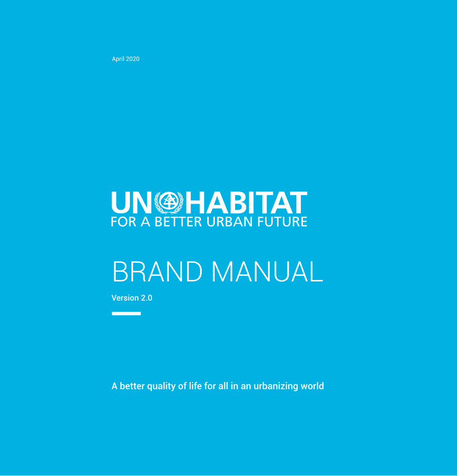
BRAND MANUALVersion 2.0
April 2020
A better quality of life for all in an urbanizing world
UN
-HAB
ITAT
BRA
ND
MAN
UAL
V.2
2
Our VisionThe UN-Habitat’s vision of “a better quality of life for all in an urbanizing world” is bold and ambitious. UN-Habitat works with partners to build inclusive, safe, resilient and sustainable cities and communities.
UN-Habitat promotes urbanization as a positive transformative force for people and communities, reducing inequality, discrimination and poverty.
Our MissionUN-Habitat promotes transformative change in cities and human settlements through knowledge, policy advice, technical assistance and collaborative action to leave no one and no place behind. Strengthening UN-Habitat’s brand is critical to deliver on our mission, in pursuit of our shared vision of a world where no one and no place is left behind.
One UN-Habitat, One BrandDivisions, branches, sections, regional and country offices, projects and programmes are not allowed to have their own sub-brands or logos.
The UN-Habitat logo should be used on invites, videos, presentations, websites, social media, publications, business cards, folders, press releases, t-shirts and other publicity products as presented in this guide.
The following exceptions apply:
1. Networks bringing together many partners such as GLTN or Habitat UNI.
2. Special events and campaigns that require a unique identity for promotion and advocacy by partners and the general public without legal permission. Use of such logos does not imply endorsement by UN-Habitat.
3. In rare circumstances, interagency programmes, projects or initiatives may have a timebound logo.
The Communications Section must approve all such special logos and their accompanying style guide.

UN
-HABITAT BRAN
D MAN
UAL V.2
3
ENGAGE AND INSPIRE
SIMPLIFYClarify and define our mission.
MOTIVATESpur action.
INFORMConvey values and attributes of our brand.
CONNECTUnify the programmes, partners and stakeholders.
UN-Habitat’s “brand,” is more than a logo or a tagline, it is what people say, think and feel about us. Our brand plays an important part in building support for our mission.
A strong, consistent and recognisable brand builds trust in UN-Habitat ability to deliver evidence-based solutions and strong results in countries.
The experience people get walking through our doors should be the same as when they visit our website, communicate to our staff, read our publications and interact with us on social media.
Brand Promise01

UN
-HAB
ITAT
BRA
ND
MAN
UAL
V.2
4
The brand manual provides direction on the key visual elements of the UN-Habitat brand. Our visual identity comprises of the following elements:
Our Visual Identity02
OUR LOGO The UN-Habitat logo and tag line (logo signature) must remain consistent and have a strong presence in all communications. The logo is the most recognisable visual element of our brand. It should appear on all communications and be applied to all UN-Habitat branded items.
OUR BRAND COLOUROur brand colour is the UN-Habitat blue, it is used in all our communications.
OUR FONTUN-Habitat’s official font is Roboto, it should be used in all web, social media and print communications.

UN
-HABITAT BRAN
D MAN
UAL V.2
5
LOGO SIGNATUREThe combination of the UN-Habitat logo and tag line makes up the complete logo signature. The logo signature must be applied consistently to all communications and branded items for recognition.
OUR LOGO SIGNATUREOur logo and tag line must remain consistent and have a strong presence.
OUR BRAND STATEMENT‘FOR A BETTE URBAN FUTURE’
LOGO VARIATIONS The blue logo should be used as the primary option whenever possible. Black and white versions are available for situations when the full colour version is illegible or cannot be produced, such as in black and white printing.

UN
-HAB
ITAT
BRA
ND
MAN
UAL
V.2
6
45mm45mm
CLEAR SPACE AND SCALE Always maintain the minimum clear space around the logo to preserve its integrity. The minimum clear space is determined by the height of the letter ‘U’ in ‘UN-Habitat’ and should be maintained on all four sides of the logo. The logo should not be placed too close to the edge of the page or be crowded by copy, photographs or graphical elements.
MINIMUM SIZEScale should always be considered when using the UN-Habitat logo. For the sake of legibility, the logo should never appear smaller than the minimum size shown on this page.

UN
-HABITAT BRAN
D MAN
UAL V.2
7
INCORRECT LOGO USAGEThe examples on this page demonstrate how the logo must never be used.
� DO NOT use old logo versions
� DO NOT rotate or distort the logo.
� DO NOT use a colour other than UN-Habitat blue, black or white for the logo.
� DO NOT disassemble the logo.
� DO NOT reposition or resize the elements of the logo.
� DO NOT use low resolution versions of the logo.
� DO NOT place the logo over an image that will make it illegible.
� DO NOT change or alter the text or typeface of the logo.
� DO NOT alter the tag line

UN
-HAB
ITAT
BRA
ND
MAN
UAL
V.2
8
LANGUAGE VERSIONS
These logos are available for download on HABNET:https://intranet.unhabitat.org/ and www.unhabitat.org/brand.
For more information contact [email protected]
ArabicChinese
EnglishFrench
SpanishRussian
UN
-HABITAT BRAN
D MAN
UAL V.2
9
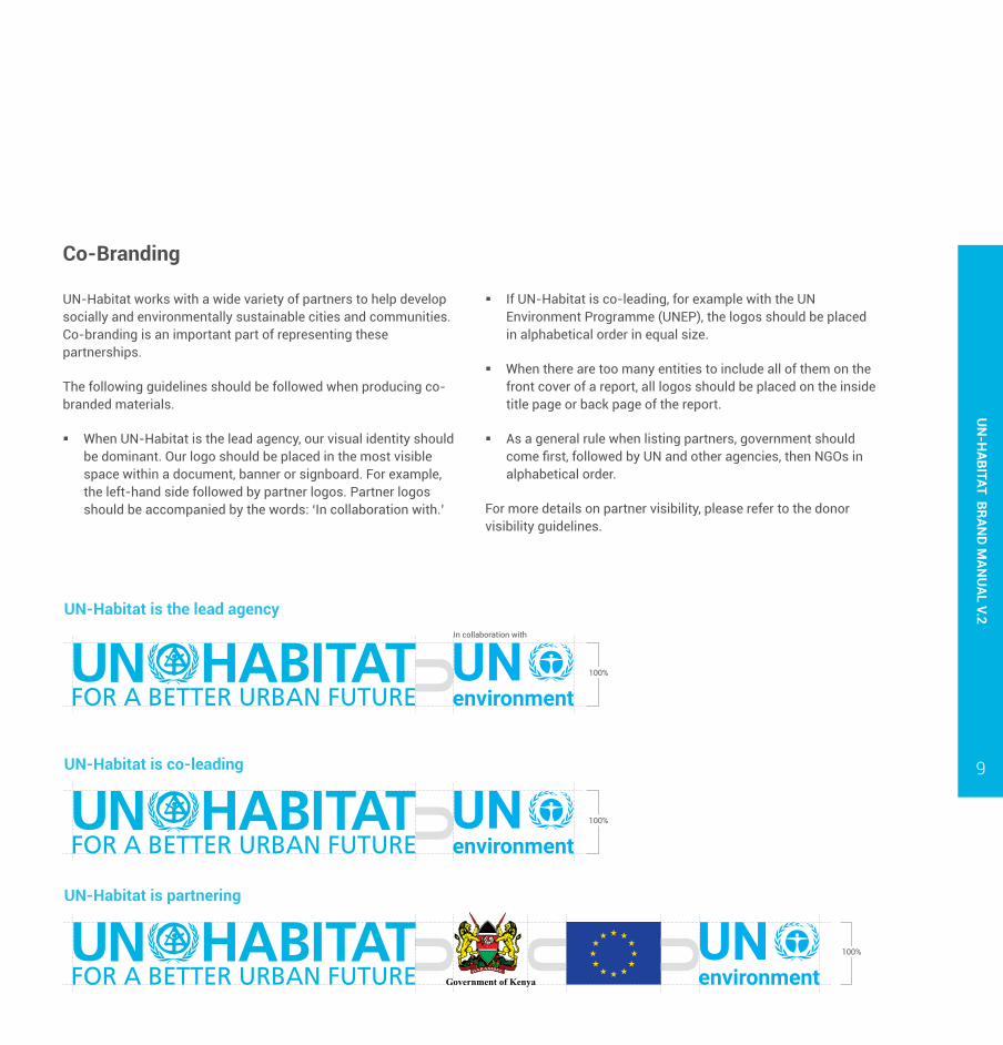
Co-Branding
UN-Habitat is the lead agency
UN-Habitat is co-leading
UN-Habitat is partnering
100%
100%
100%
UN-Habitat works with a wide variety of partners to help develop socially and environmentally sustainable cities and communities. Co-branding is an important part of representing these partnerships.
The following guidelines should be followed when producing co-branded materials.
� When UN-Habitat is the lead agency, our visual identity should be dominant. Our logo should be placed in the most visible space within a document, banner or signboard. For example, the left-hand side followed by partner logos. Partner logos should be accompanied by the words: ‘In collaboration with.’
� If UN-Habitat is co-leading, for example with the UN Environment Programme (UNEP), the logos should be placed in alphabetical order in equal size.
� When there are too many entities to include all of them on the front cover of a report, all logos should be placed on the inside title page or back page of the report.
� As a general rule when listing partners, government should come first, followed by UN and other agencies, then NGOs in alphabetical order.
For more details on partner visibility, please refer to the donor visibility guidelines.
In collaboration with

UN
-HAB
ITAT
BRA
ND
MAN
UAL
V.2
10
Colour is an important element of UN-Habitat’s visual identity. Consistent use of the UN-Habitat colour palette plays a key role in reinforcing the organisation’s image.
Colour Palette03
PRIMARY COLOURSUN-Habitat’s main brand color is the blue. It should be used as the main colour in most corporate communication materials and channels, from websites, social media, collaterals, key publications and office branding. Black and white are the alternative primary colours.
CMYK: C 81, M 4, Y 5, K 0PANTONE: 306CRGB: R 0, G 178, B 287WEB: #00b2e3
CMYK: C 0, M 0, Y 0, K 100PANTONE: BlackRGB: R 0, G 0, B 0WEB: #000000
CMYK: C 0, M 0, Y 0, K 0PANTONE: WhiteRGB: R 255, G 255, B 255WEB: #ffffff

UN
-HABITAT BRAN
D MAN
UAL V.2
11
SECONDARY COLOURSThe secondary accent colours may be used in some circumstances to support UN-Habitat’s design and messaging. They are useful for campaigns, event branding, calls to action, infographics, boxes and text boxes in publications and presentations, and as background containers around statements in social media and digital posts.
CMYK: C 61.46, M 0 Y 95.58, K 0PANTONE: 360CRGB: R 109, G 190, B 75WEB: #6dbe4b
CMYK: C 100, M 71, Y 22.16, K 5PANTONE: 7462CRGB: R 0, G 104, B 157WEB: #00689D
CMYK: C 0, M 71.86, Y 39.56, K 0PANTONE: 805CRGB: R 255, G 114, B 118WEB: #ff7276
CMYK: C 0, M 71.86, Y 39.56, K 0PANTONE: Cool Gray 8CRGB: R 255, G 114, B 118WEB: #ff7276
CMYK: C 0, M 45, Y 96, K 0PANTONE: Orange 1375CRGB: R 253, G 157, B 36WEB: #FD9D24
CMYK: C 0, M 82.4, Y 100, K 0PANTONE: 326CRGB: R 255, G 81, B 0WEB: #ff5100

UN
-HAB
ITAT
BRA
ND
MAN
UAL
V.2
12
Consistency in the use of a typeface plays an important role in reinforcing UN-Habitat’s brand. Maintaining rules of type layout will help ensure a unified visual identity.
PRIMARY TYPEFACERoboto is UN-habitat’s primary font for all communication products. It is an open source Google font and thus readily available for download. Roboto works well on web, print and mobile, is available in several weights. It also supports French, Spanish and Russian languages.
Roboto has a dual nature. It has a mechanical skeleton and the forms are largely geometric. At the same time, the font features friendly and open curves. It allows letters to be settled into their natural width. This makes for a more natural reading rhythm more commonly found in humanist and serif types.
AaRoboto
LightLight ItalicRegularRegular ItalicSemiboldSemiboldBoldBold ItalicExtraboldExtrabold Italic
Typography04
AaCalibri
Regular
Italic
Bold
Bold Italic
SYSTEM TYPEFACEIn certain situations, Roboto may be unavailable, it is acceptable to use an approved cross-platform system typeface, generally available on most computers. Calibri is UN-habitat’s system font. It may be used on desktop applications, including but not limited to Microsoft Word and PowerPoint such as letters, memos, project documents, email, etc. Calibri is also recommended for users without professional design software.

UN
-HABITAT BRAN
D MAN
UAL V.2
13
This section covers official communications including letters, business cards, email signatures and presentations.
Stationery05
LETTERHEAD
United Nations Human Settlements ProgrammeP.O. Box 30030, GPO Nairobi 00100, Kenya
T: +254-20-76263120 E: [email protected]
Aenean imperdiet aliquet nunc et ultrices. Nulla rhoncus pharetra lacus eu condimentum. Donec non velit porta, ullamcorper mauris molestie, congue libero.
pellentesque. Duis tincidunt mauris et viverra vestibulum. Curabitur dictum ornare nunc, sit amet imperdiet lectus vulputate sed. Nunc pretium nisi sapien, id viverra est maximus quis.
Morbi sodales euismod nunc, a imperdiet mi accumsan id. Suspendisse sollicitudin nec velit id convallis. Quisque aliquam maximus hendrerit. Suspendisse augue ante, vestibulum ut pulvinar at,
venenatis lacinia dui. Nulla sit amet risus malesuada, tempor erat ac, fermentum ante. Suspendisse vitae velit sed risus accumsan imperdiet. Vestibulum ante ipsum primis in faucibus orci luctus et ultrices posuere cubilia Curae; Sed sagittis eros id risus hendrerit feugiat. Vestibulum maximus ante eu nisl convallis, lacinia suscipit leo scelerisque. Nullam volutpat, mi a rutrum ultrices, est mauris rutrum leo, quis porttitor ante lacus vitae ligula.
Fusce elementum consequat libero varius cursus. Nunc eu vulputate risus, a aliquam nisi. Curabitur tincidunt tortor dapibus sapien elementum, ut rhoncus sapien vestibulum. Morbi varius a arcu vel
scelerisque mattis nec, euismod eget libero. Phasellus neque est, scelerisque in enim euismod, vehicula tristique lacus.
In condimentum justo in eros feugiat commodo. Mauris a odio vitae tortor lacinia pulvinar ac eget ligula. Nam posuere volutpat tortor eget tristique. Aliquam erat volutpat. Vestibulum ante ipsum primis in faucibus orci luctus et ultrices posuere cubilia Curae; Duis eget pharetra dui. Pellentesque mattis, ex commodo ornare sollicitudin, quam tortor rhoncus metus, et dignissim tortor purus id dui. Integer est quam, aliquet vitae varius vitae, scelerisque ut elit. Ut ornare suscipit nunc vestibulum congue. Sed nibh nunc, viverra a magna in, fermentum pellentesque orci. Vestibulum at tristique dui, id gravida massa. Cras nec auctor enim.
Sed Nibm Nun
August 19, 2019
INVITATION: 25TH ANNUAL EXECUTIVE BOARD MEETING
30mm
30mm
Text
Heading
UN-Habitat Address
Signatory and Designation
Title/ Heading
15mm
40mm

UN
-HAB
ITAT
BRA
ND
MAN
UAL
V.2
14
Victor MgendiHead, Production UnitCommunications BranchExternal Relations Division
+252 722 322388
United Nations Human Settlements ProgrammeP.O. Box 30030, GPO Nairobi 00100, Kenya
+252 20 7623397 www.unhabitat.org
54 mm
7 mm
7 mm
7 mm
5mm
1 5mm
1 5mm 1 0mm
85 mm
Font: ROBOTO (Regular)Size: 6.5pt
UN-Habitat Logo width: 35mmColour: Pantone 306C
Font: ROBOTO (Regular)Size:7/8pt
Font: ROBOTO (Bold and Regular for Designation)Size: 8pt
BUSINESS CARD

UN
-HABITAT BRAN
D MAN
UAL V.2
15
EMAIL SIGNATURE
To ensure consistency and adherence to the brand guidelines, all email signatures should follow this template format.
Template
[Name][Job title], [Unit or Section, if applicable]Division
Office: [Office number] | Mobile: [Mobile number]Email Address[Optional: Skype ID | Twitter | Facebook | Instagram]
UN-HabitatCity, Country | Building/Desk/Office[UN-Habitat local office address]www.unhabitat.org Maximum width
600pxPreferred width
300px
Preferred Height 70px
Maximum Height 120px

UN
-HAB
ITAT
BRA
ND
MAN
UAL
V.2
16
POWERPOINT TEMPLATE
PowerPoint presentations are often the first way external and internal audiences come into contact with our brand. The following best practices apply to presentartions:
� Use corporate system font, Calibri fonts
� Follow brand guidelines for logo visibility
� Don’t go less than 18 in font size (except for source at bottom)
� Use legible figures only
� Use brand blue for titles, black for bullet points to represent UN-Habitat in a consistent way, and to maximize visibility on screen
� Be consistent throughout presentation with your fonts, color schemes, bullet schemes, etc.
A template has been created to ensure consistent creation of presentations.
Download template here
Title goes here(max 3 decks)
Sub title goes here(Maximum 2 decks)
Title goes here(max 2 decks)
• Level 1 bullet goes here
– Level 2 bullet goes here

Photos © UN-Habitat/Julius Mwelu
UN
-HABITAT BRAN
D MAN
UAL V.2
17
Branded materials and signage
Programme materials target beneficiaries with specific messages. They also promote or inform donors, partners and other stakeholders about UN-Habitat programmes. They include roll-up banners, posters, stickers, signs and field visibility merchandise.
All branded materials must follow the brand guidelines in this manual, including using UN-Habitat typefaces and colors where UN-Habitat is the lead implementor. Our logo should be used
on programme materials together with donor logos to acknowledge support and funding in accordance with the co-branding guidelines.
Office branding and signage is also important in promoting UN-Habitat’s brand at country level. Guidelines on office branding are under development.
For more details on donors and partners, see donor visibility guidelines

UN
-HAB
ITAT
BRA
ND
MAN
UAL
V.2
18

UN
-HABITAT BRAN
D MAN
UAL V.2
19
www.unhabitat.org

Funded by European Union
Funded by European Union
UN
-HAB
ITAT
BRA
ND
MAN
UAL
V.2
20
StickersProject specific stickersGeneric stickers
UN
-HABITAT BRAN
D MAN
UAL V.2
21
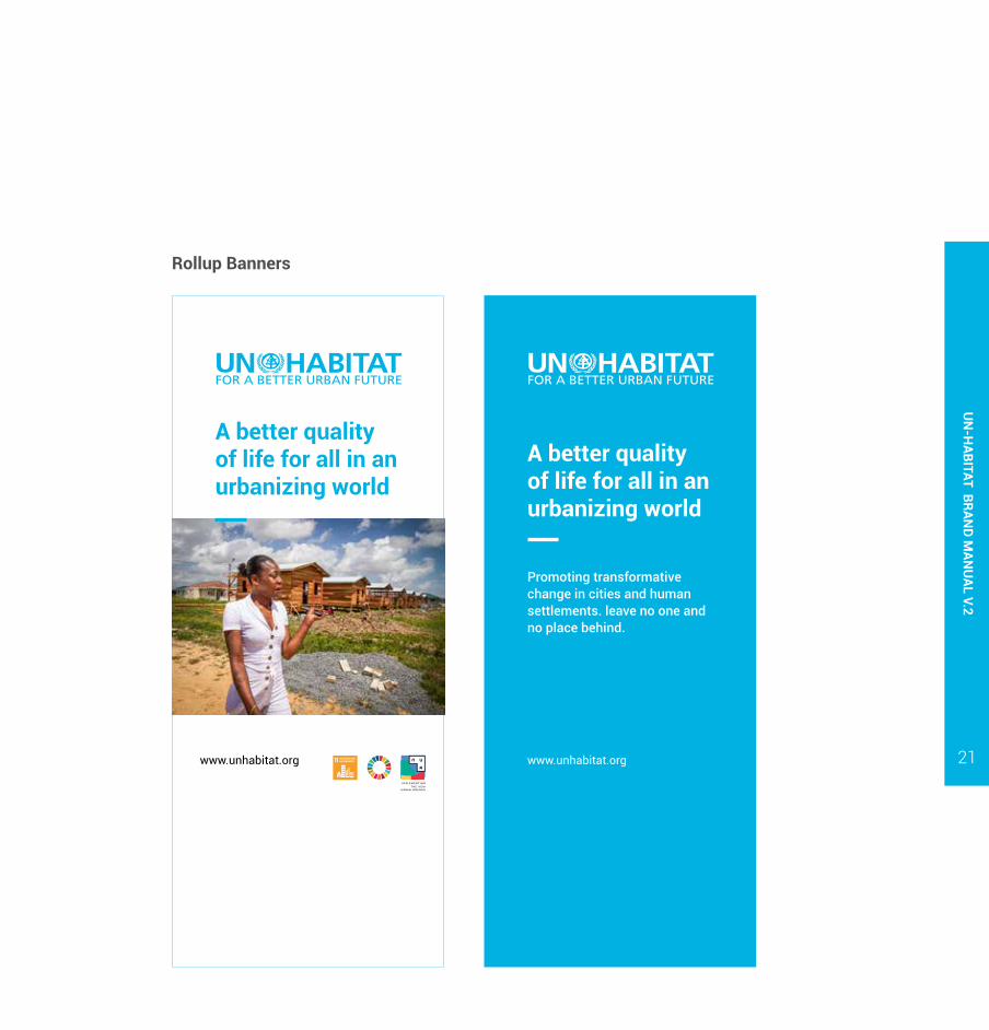
Rollup Banners
A better quality of life for all in an urbanizing world
A better quality of life for all in an urbanizing world
Promoting transformative change in cities and human settlements. leave no one and no place behind.
www.unhabitat.org www.unhabitat.org

Funded by European Union, Swedish International Development Cooperation Agency UKAID and USAID
Funded by European Union, Swedish International Development Cooperation Agency UKAID and USAID
Margins: Do not place any visual elements beyond 5cm mark from the edges of the banner. Only photos can bleed off the edges.
Minimum distance from the base: Do not place the logos below the 40 cm mark from the base of the banner.
Rollups banners: Logos should be placed strategically — either at the top or bottom of the rollup — and a clear area maintained around them, free of competing visual elements.
12cmMinimum print size on rollup banner
UN
-HAB
ITAT
BRA
ND
MAN
UAL
V.2
22

UN
-HABITAT BRAN
D MAN
UAL V.2
23
Press banners
On-site project visibility
Name of the Project(can be 2 or 3 lines)
Location of the project
Funded by Government of
2a
2a
2a
2a
2a
Size: For good visibility, UN-Habitat logo should not be smaller than a quarter the total length of the branded area of the sign
Blue White
www.unhabitat.org
www.unhabitat.org
www.unhabitat.org
www.unhabitat.org www.unhabitat.org
www.unhabitat.org www.unhabitat.org

UN
-HAB
ITAT
BRA
ND
MAN
UAL
V.2
24
An icon is a pictogram displayed on a screen or print layout in order to help the user navigate through the content in a easier way.
The icon itself is a small picture or symbol serving as a quick, “intuitive” representation of a software tool, function or a data file. UN-Hbaitat adopts line icon style.
Iconography06

UN
-HABITAT BRAN
D MAN
UAL V.2
25
Photography is a key element in UN-Habitat’s brand and can be used in a variety of communications tools. A single image can help humanize the UN-Habitat’s brand while conveying the impact our projects have on the beneficiaries we serve.
Photographs should focus on the human aspect of our work. Human interaction should be portrayed positively and authentically – avoid staged photos.
Photography07
Focus on local qualities, landscape and culture is important to convey a realistic impression as clearly as possible.
It is best practice to accompany every photo with a caption that tells the viewer who, what, where, when and why of the subject matter. All photos must be properly credited.
See UN-Habitat photography guidelines.
Education is a way out of poverty for the young generation in slums. Lost in her thoughts, a girl stands on the tracks in Bijoy Sarani Railway slum in Dhaka, Bangladesh. Every 15 minutes a train rolls by at full speed. 17 July 2019, Bangladesh, Dhaka. [UN-Habitat/Kirsten Milhahn]

UN
-HAB
ITAT
BRA
ND
MAN
UAL
V.2
26

UN
-HABITAT BRAN
D MAN
UAL V.2
27

UN
-HAB
ITAT
BRA
ND
MAN
UAL
V.2
28
UNITED NATIONS HUMAN SETTLEMENTS PROGRAMMEP.O. Box 30030, Nairobi 00100, Kenya
Contact information
Victor MgendiHead of [email protected] | Ext. 3397
Peter CheseretGraphic [email protected] | EXT. 3136