ui design - organizing the page
TRANSCRIPT
Prepared by Vinod Wilson – Architect – Crestron Electronics
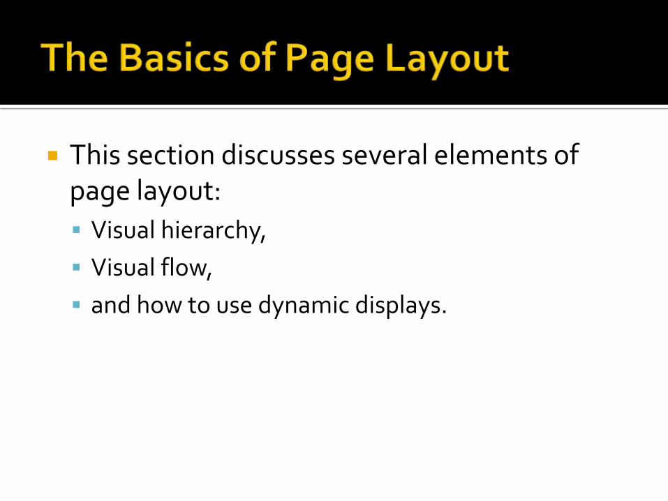
This section discusses several elements of page layout:
Visual hierarchy,
Visual flow,
and how to use dynamic displays.

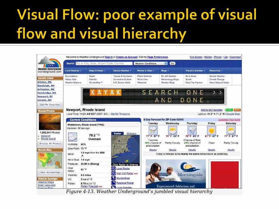
The concept of visual hierarchy plays a part in all forms of graphic design.
Put simply, the most important content should stand out the most, and the least important should stand out the least.
Also, titles ought to look like titles, subtitles ought to look like subtitles lists ought to look like lists
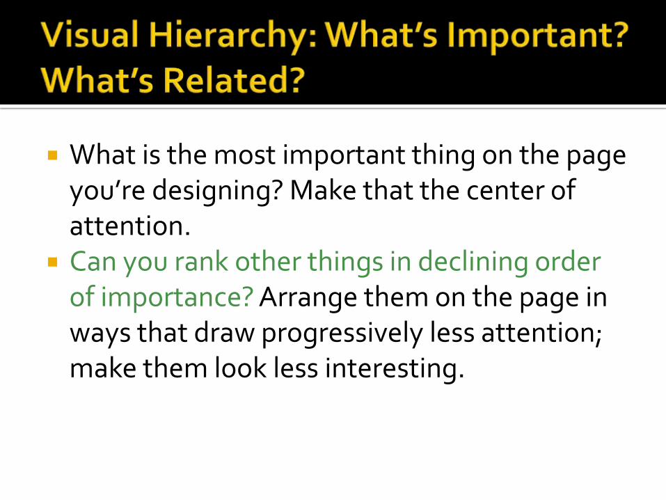
What is the most important thing on the page you’re designing? Make that the center of attention.
Can you rank other things in declining order of importance? Arrange them on the page in ways that draw progressively less attention; make them look less interesting.

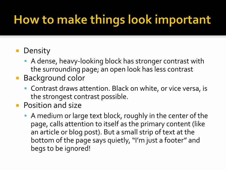
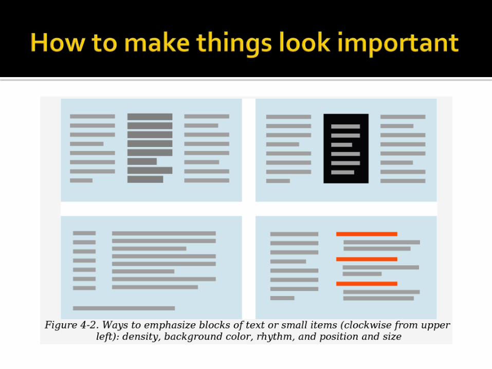
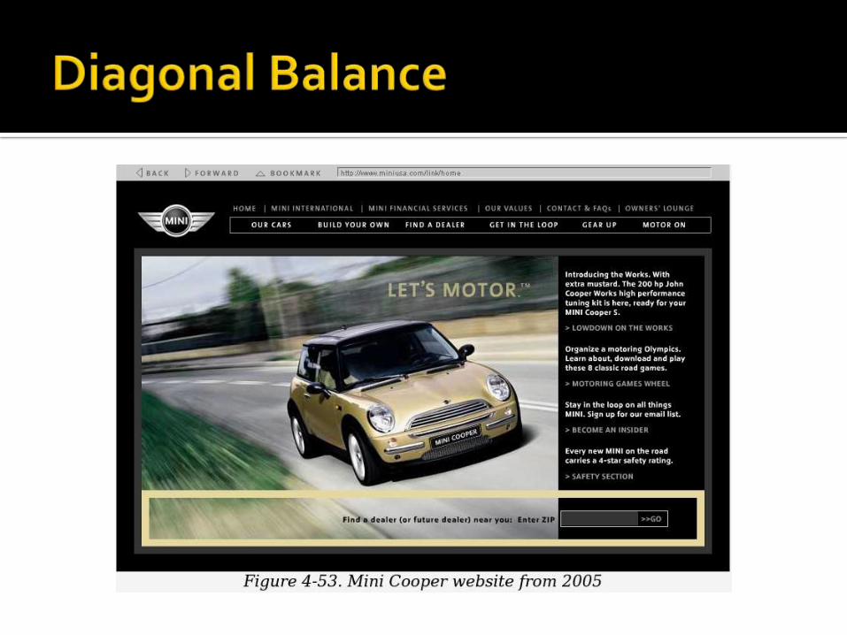
Density A dense, heavy-looking block has stronger contrast with
the surrounding page; an open look has less contrast Background color
Contrast draws attention. Black on white, or vice versa, is the strongest contrast possible.
Position and size A medium or large text block, roughly in the center of the
page, calls attention to itself as the primary content (like an article or blog post). But a small strip of text at the bottom of the page says quietly, “I’m just a footer” and begs to be ignored!
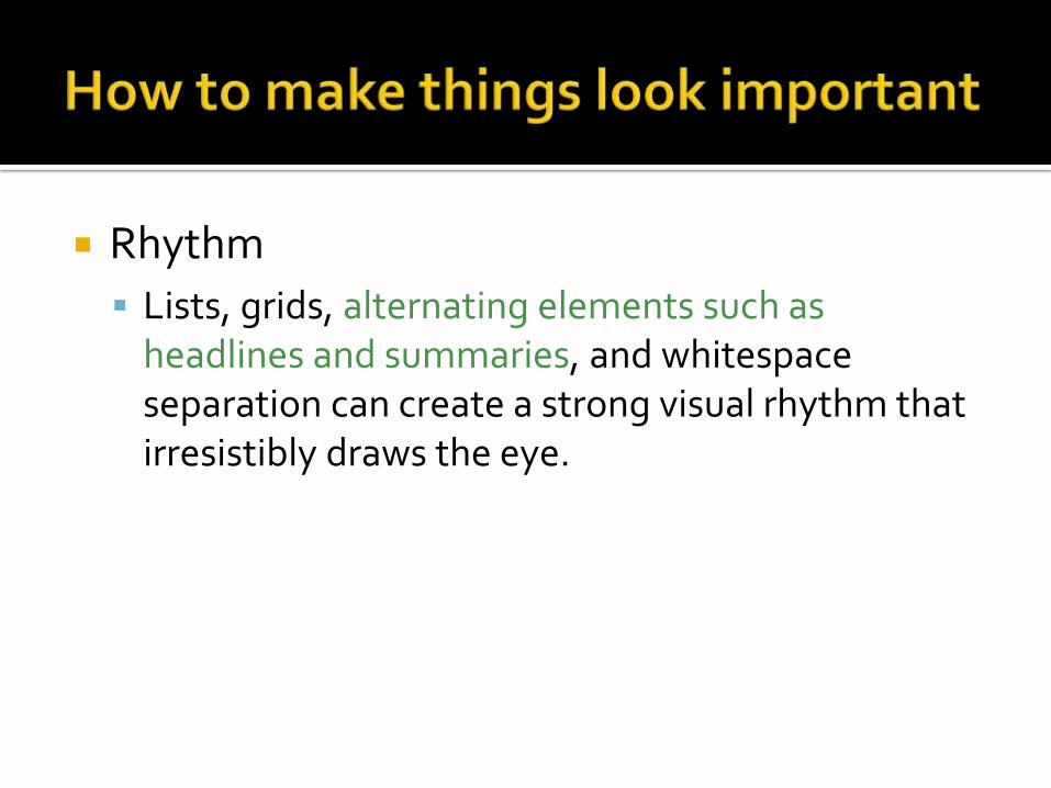
Rhythm
Lists, grids, alternating elements such as headlines and summaries, and whitespace separation can create a strong visual rhythm that irresistibly draws the eye.


Containment

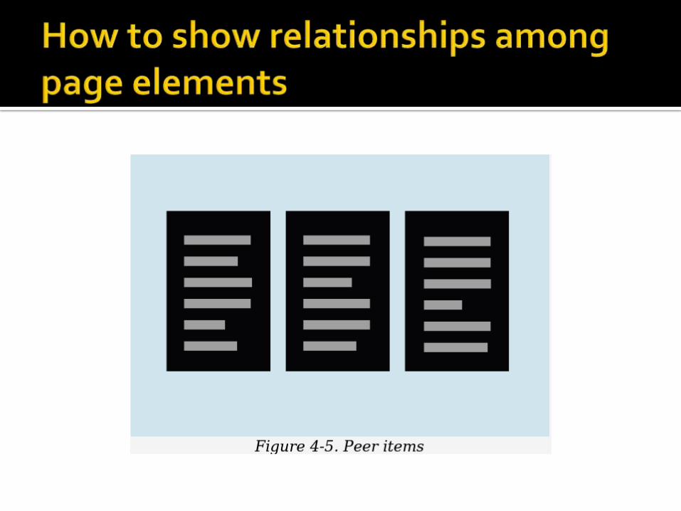
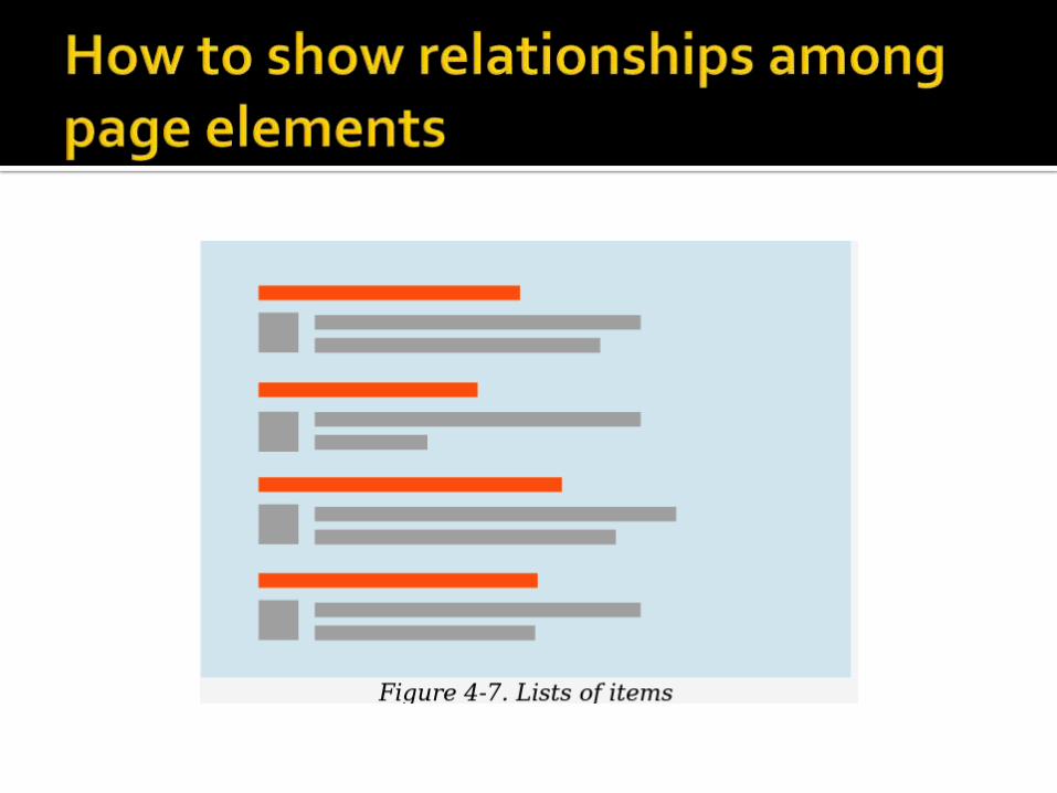
Visual flow deals with the tracks that readers’ eyes tend to follow as they scan the page.


Put calls to action after the text you want viewers to read first.

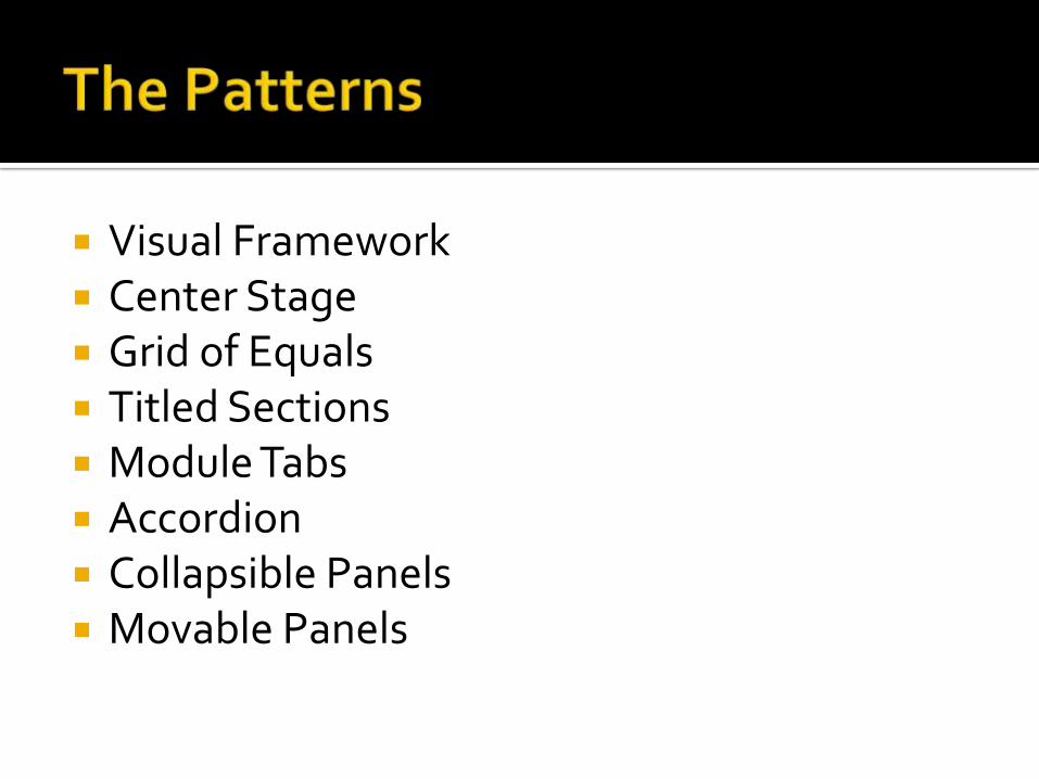
Visual Framework Center Stage Grid of Equals Titled Sections Module Tabs Accordion Collapsible Panels Movable Panels
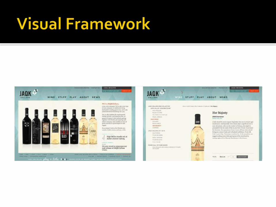
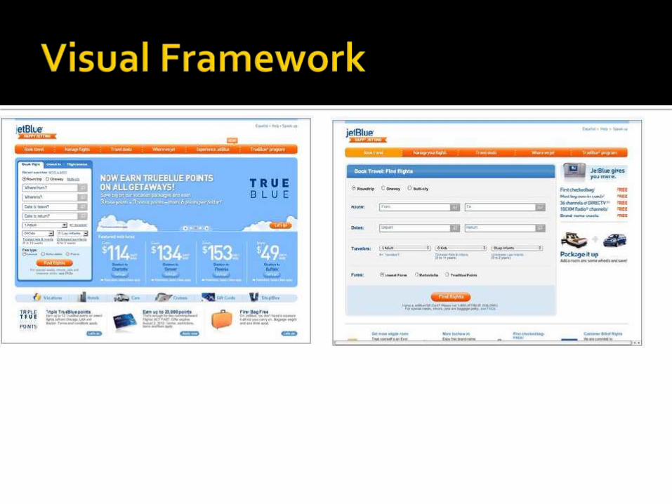
What Design each page to use the same basic layout,
colors, and stylistic elements, but give the design enough flexibility to handle varying page content.
Use when You’re building a website with multiple pages, or a UI
with multiple windows—in other words, almost any complex software.
You want it to “hang together” and look like one thing, deliberately designed; you want it to be easy to use and navigate.
Why
When a UI uses consistent color, font, and layout, and when titles and navigational aids—signposts—are in the same place every time, users know where they are and where to find things.
They don’t have to figure out a new layout each time they switch context from one page or window to another.
Have you ever seen a book in which the page numbers and headings were in a different place on each page?
A strong visual framework, repeated on each page, helps the page content stand out more.
How
Draw up an overall look-and-feel that will be shared among all pages or windows.
Home pages and main windows are “special” and are usually laid out differently from inner pages, but they should still share certain characteristics with the rest of the site.
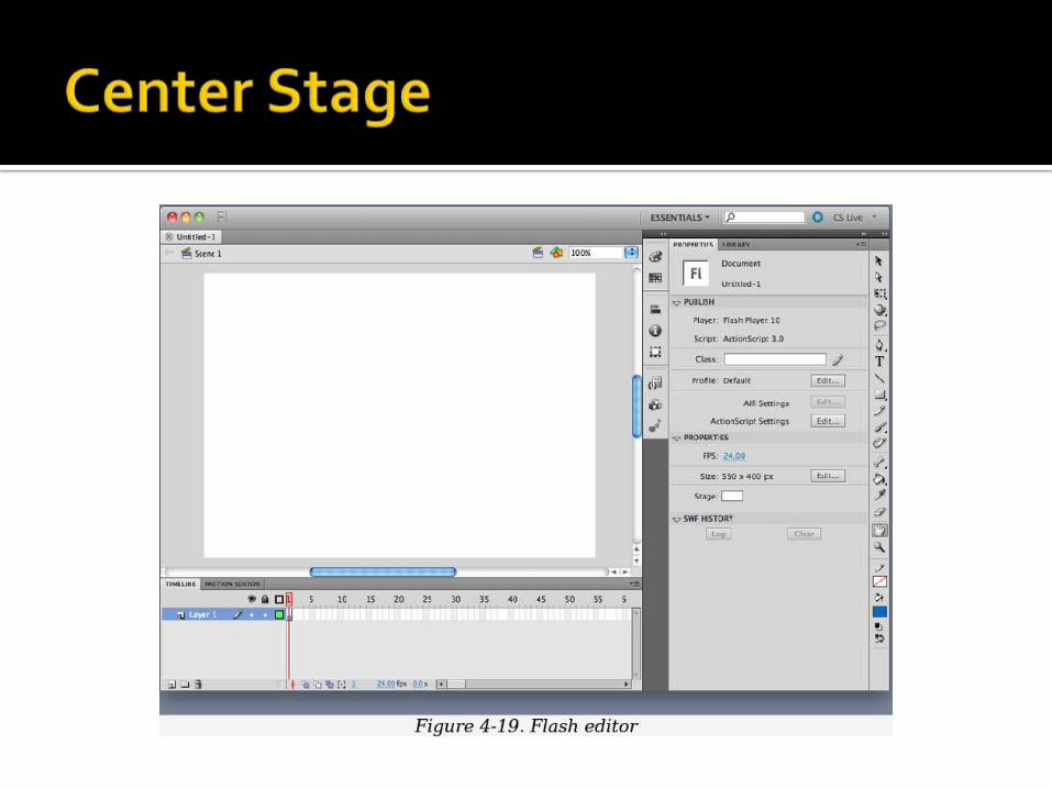

What Put the most important part of the UI into the largest
subsection of the page or window; cluster secondary tools and content around it in smaller panels.
Use when The page’s primary job is to show a single unit of coherent
information to the user, let him edit a document, or enable him to perform a certain task. Other content and functions are secondary to this one.
Many types of interfaces can use a Center Stage tables and spreadsheets, forms, and graphical editors all qualify. So do web pages that show single articles, images, or features.


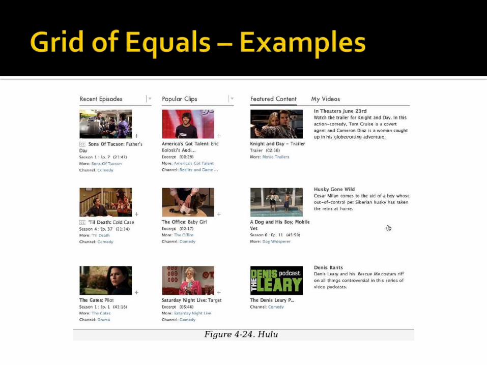
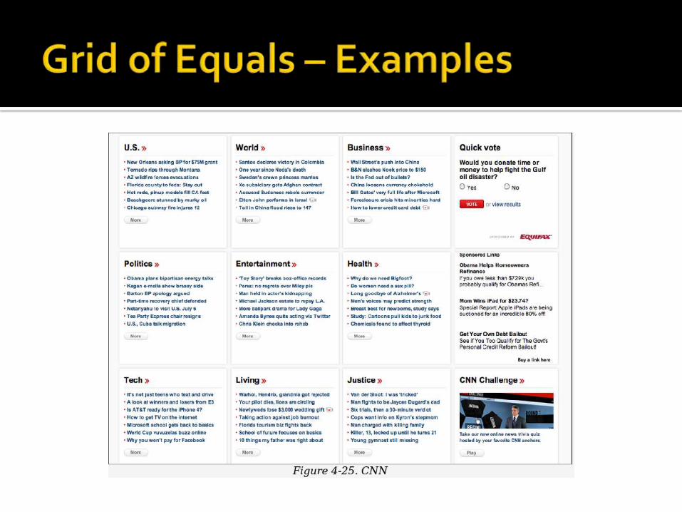
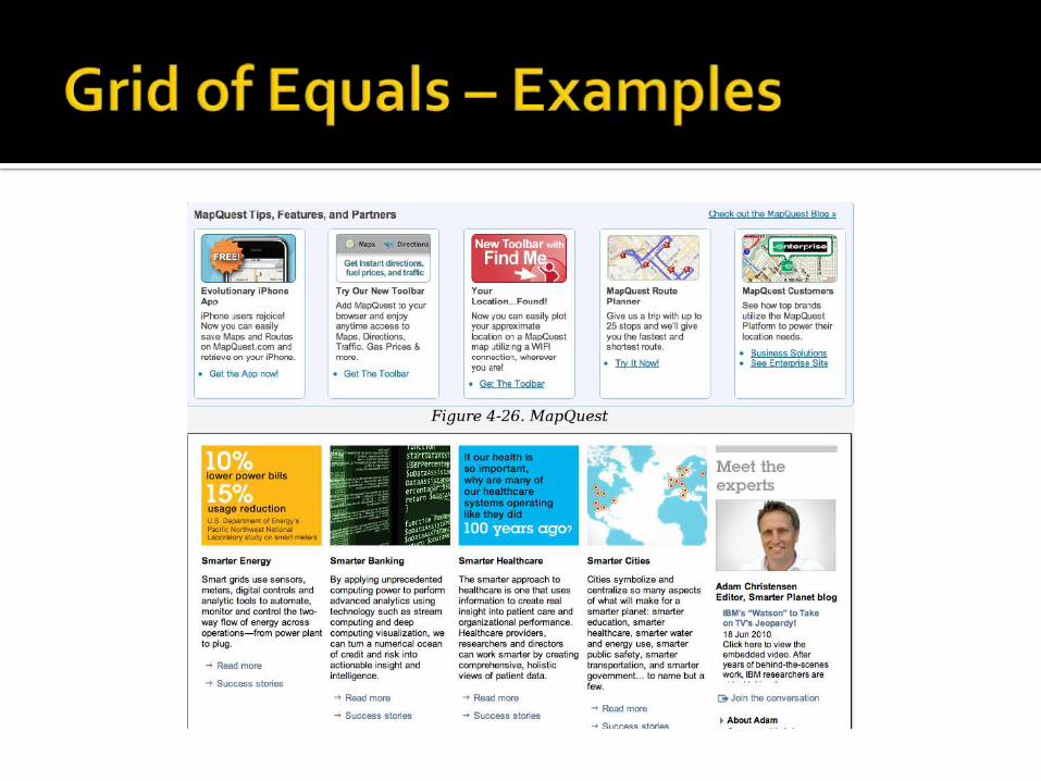
What Arrange content items in a grid or matrix. Each item
should follow a common template, and each item’s visual weight should be similar. Link to jump pages as necessary.
Use when The page contains many content items that have
similar style and importance, such as news articles, blog posts, products, or subject areas. You want to present the viewer with rich opportunities to preview and select these items

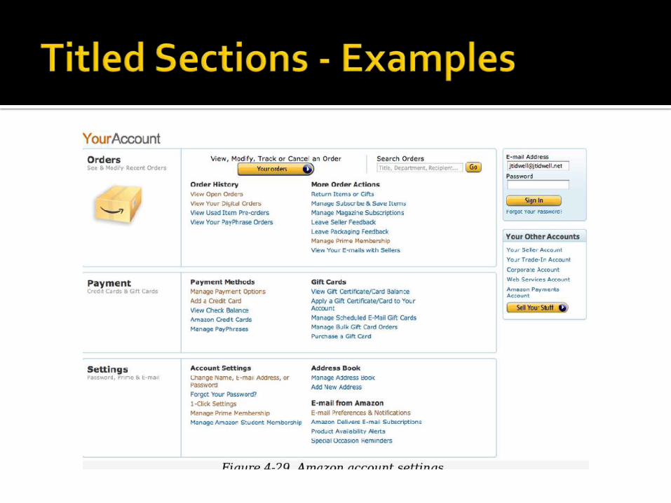
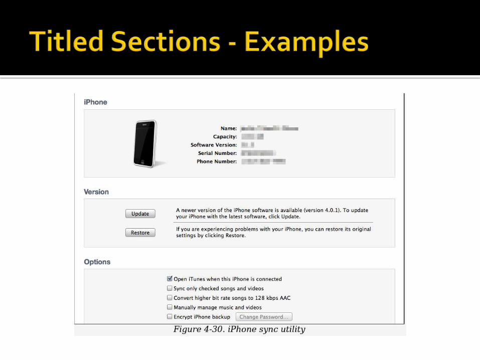
What Define separate sections of content by giving each
one a visually strong title, separating the sections visually, and arranging them on the page
Use when You have a lot of content to show, but you want to
make the page easy to scan and understand, with everything visible. You can group the content into thematic or task-based sections that make sense to the user.


What
Put modules of content into a small tabbed area so that only one module is visible at a time. The user clicks on tabs to bring different modules to the top.
Use when
You have a lot of heterogeneous content to show on the page, possibly including text blocks, lists, buttons, form controls, or images.

Some of the page content comes in groups or modules (or can be sorted into coherent groups). Those modules have the following characteristics: Users only need to see one module at a time.
They are of similar length and height.
There aren’t many modules—fewer than 10, and preferably a small handful.
The set of modules is fairly static; new pages won’t be added frequently, nor will existing pages be changed or removed frequently.
The modules’ contents may be related or similar to each other.


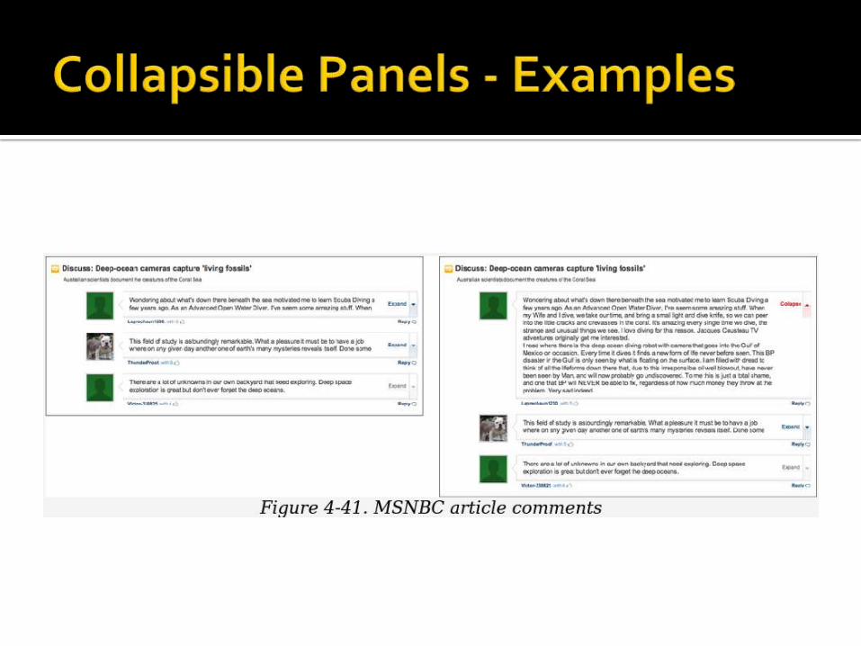
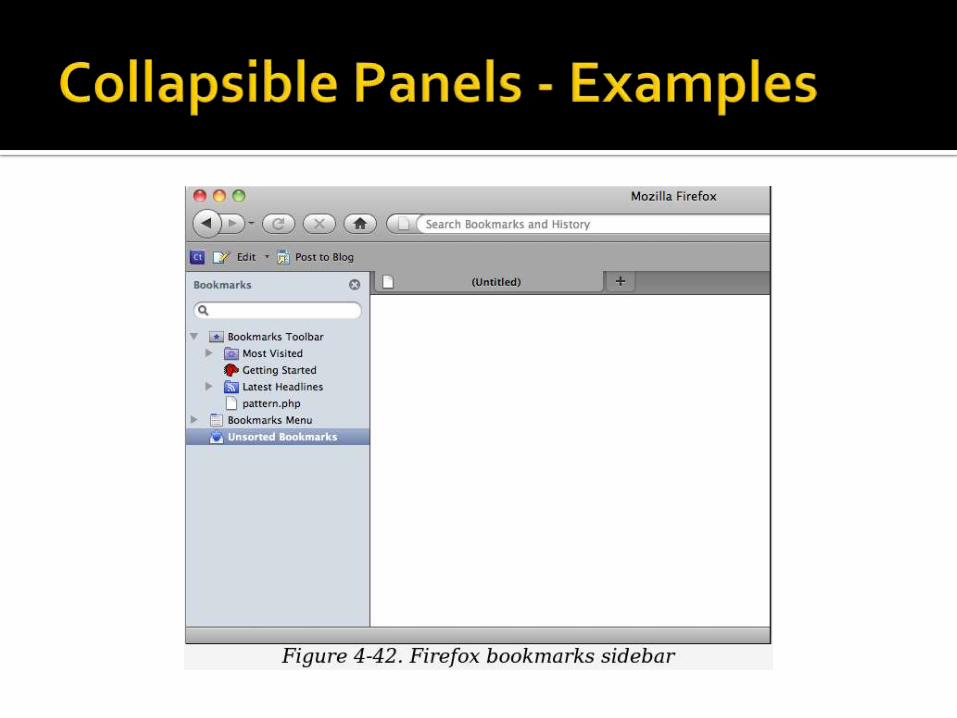
What Put secondary or optional material into panels
that can be opened and closed by the user. Use when
You have a lot of heterogeneous content to show on the page, possibly including text blocks, lists, buttons, form controls, or images. You don’t have room for everything. You might, however, have Center Stage content that needs to take visual priority
Some of the page content comes in groups or modules (or can be sorted into coherent groups). Those modules have the following characteristics:
Their content annotates, modifies, explains, or otherwise supports the content in the main part of the page.
The modules may not be important enough for any of them to be open by default.
Their value may vary a lot from user to user. Some will really want to see a particular module, and others won’t care about it at all.
Even for one user, a module may be useful sometimes, but not other times. When it’s not open, its space is better used by the page’s main content.
Users may want to open more than one module at the same time.
The modules have very little to do with each other. When Module Tabs or Accordion are used, they group modules together, implying that they are somehow related; Collapsible Panels do not group them.
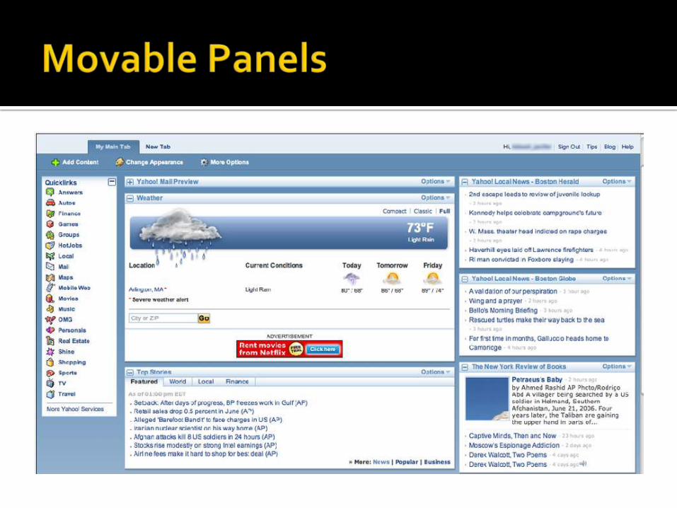

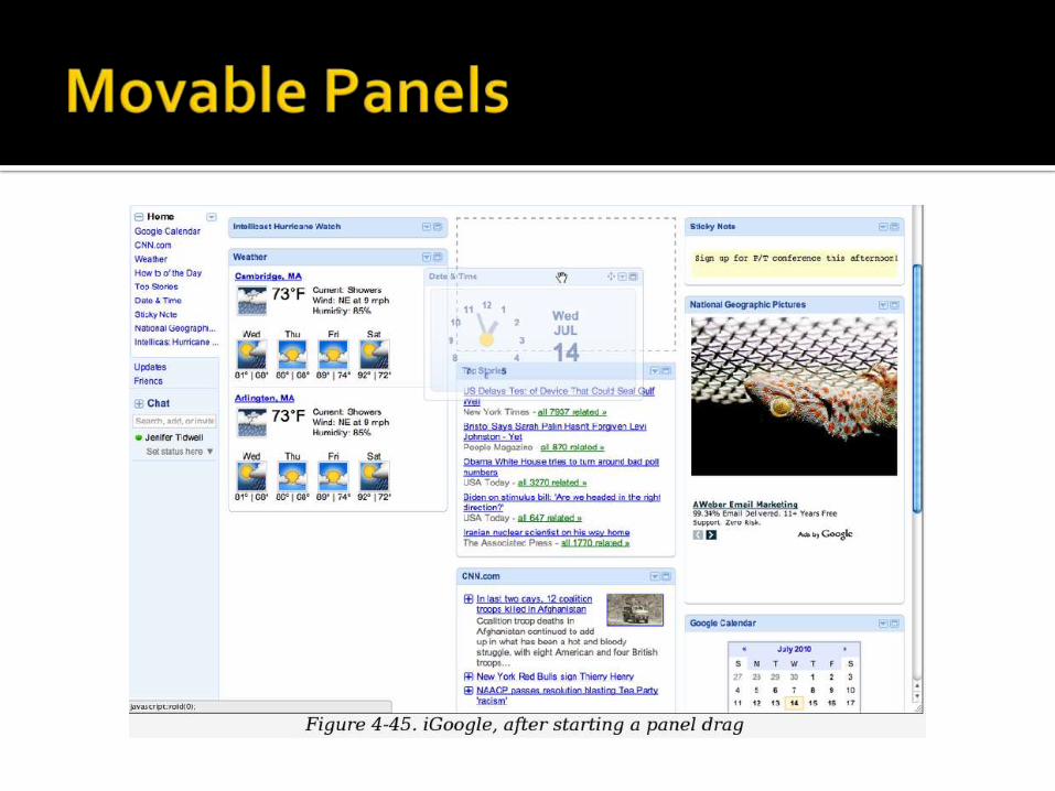
What Put modules of content into boxes that can be opened and closed
independently of each other. Arrange the boxes freely on the page, and let the user move them around into a custom configuration.
Use when You’re designing either a desktop application, or a website that most
users sign in to. News portals, Dashboard, and Canvas Plus Palette apps often use
Movable Panels. You want users to feel a sense of ownership of the software, or at least
have fun playing with it The page in question is a major part of the app or site—something
that users see often or for long periods of time. You have a lot of heterogeneous content to show on the page,
possibly including text blocks, lists, buttons, form controls, or images. You don’t have room for everything
Some of the page content comes in groups or modules (or can be sorted into coherent groups). Those modules have some of the following characteristics:
Users will almost certainly want to see more than one module at a time
Their value may vary a lot from user to user. Some people want modules A, B, and C, while others don’t need those at all and only want to see D, E, and F.
The modules vary a lot in size.
There are many modules—possibly so many that if all were shown at once, a viewer would be overwhelmed. Either you or the user should pick and choose among them.
You’re willing to let users hide some modules from view altogether (and offer a mechanism to bring them back).
The modules may be part of a tool palette or some other coherent system of interactive elements


What Starting with a very minimal UI, guide a user through
a series of steps by showing more of the UI as he completes each step
Use when▪ The user should be walked through a complex task step by
step, perhaps because the task is novel, rarely done, or outside the user’s domain knowledge.
▪ But you don’t want to force the user to go page by page at each step—you’d rather keep the whole interface on one single page
▪ Alternatively, the task may be branched, with different types of information required “downstream” depending on a user’s earlier choices.

What Starting with a UI that is mostly disabled, guide a user
through a series of steps by enabling more of the UI as each step is done.
Use when The user should be walked through a complex task step by
step, perhaps because the user is computer-naive or because the task is rarely done (as in a Wizard).
But you don’t want to force the user to go page by page at each step—you’d like to keep the whole interface on one page.
Furthermore, you want to keep the interface stable; you’d rather not dynamically reconfigure the page at each step, as you would with Responsive Disclosure
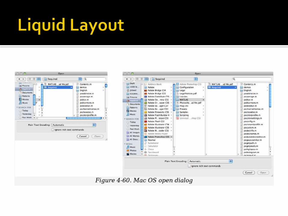
What
As the user resizes the window, resize the page contents along with it so that the page is constantly “filled.”