ui and controls new.docx · web view(in order to let android studio help you, try to type a bit...
TRANSCRIPT

Android UI Layouts and Basic ControlsIntroductionThe user interface or UI is the only thing and everything that the user can see and interact with your app. Nowadays, a typical UI is graphical based, comprising UI controls like textbox, button, checkbox, radio button, datepicker, and many more, and is presented in a variety of layouts.
The more common and more important UI layouts and UI controls as follows:
UI layoutso LinearLayout o RelativeLayout o TableLayout o FrameLayout o RadioGroup o ListView o GridView
UI Controlso Button o TextView o EditText o CheckBox o RadioButton o ToggleButton o Spinner o AutoCompleteTextView o Progress Bar o Pickers o ImageView
Every Android's user interface is composed of a hierarchical collection of View and ViewGroup objects.
The View class is the base class of all graphical UI objects collectively called UI controls or Widgets like Button, TextView, EditText, CheckBox, RadioButton, ImageView, Spinner, and many more, that you see on your Android device's screen. Every visible UI control occupies an area on your screen and provides the point of

interaction between you and the app through events like clicking, touching, and keying. You may relate the various View objects as household items like furniture and appliances in a house.
The ViewGroup class, on the other hand, is the invisible organizer that provides a variety of UI layouts to position the various View objects on your screen. For example, you may arrange the UI controls one above another in a linear fashion using LinearLayout layout, or relative to each other using RelativeLayout layout. In fact, ViewGroup class is also derived from View class, in other words, you can have a ViewGroup object (child) nested in another ViewGroup object (parent), and each can take on different layouts. You may relate the ViewGroup's layouts as the layout of rooms and space-area in the house.
This concept is best illustrated by the three diagrams from Figures 1 to 3.
First, the conceptual plan. The concepturalized UI in Figure 1 consists of a number of View objects organized into two ViewGroups - one ViewGroup is embedded in another. It is like an interior plan of a house that has one space nested in another, each may layout their own household items in a different way.
s
Figure 1: UI in Abstract Form
To realize the plan, we have decided that the overall UI layout should be RelativeLayout and the nested layout LinearLayout. We have also decided on the actual UI controls, TextView, EditText, CheckBox, and so on, to use for each View object in the respective layouts. The resulted concrete plan is shown in Figure 2. It is like deciding on the type of furniture and appliances and their positions in each space.
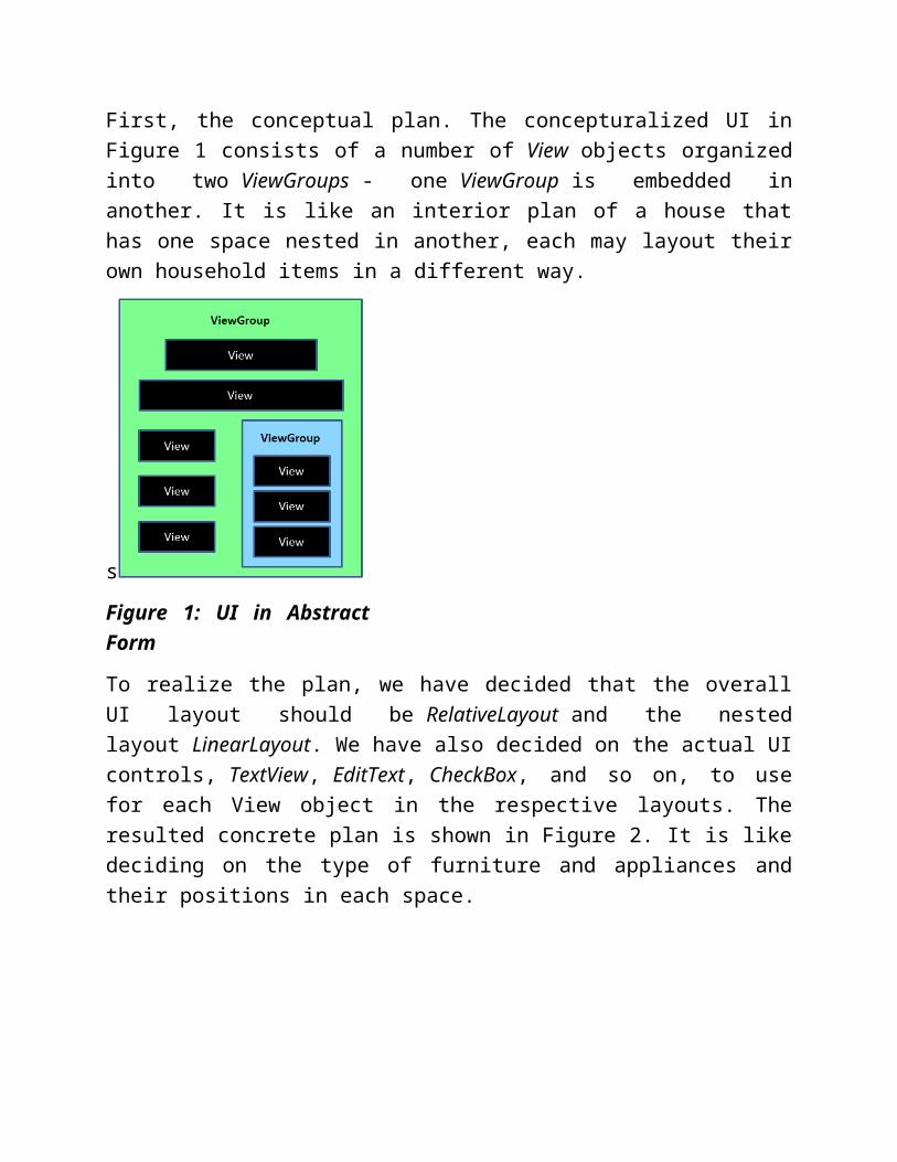
Figure 2: UI in Concrete Form
When the plan is implemented, you can see the UI on an Android Virtual Device (AVD) as shown in Figure 3.
Figure 3: UI in Implementation
Note that the basic building blocks of any Android's UI comprise View objects and ViewGroup objects. They work together to give users the look, feel, and interaction of an Android app. Since a UI is the only thing and everything that a

user sees and interacts with your app, the first thing that every new Android app developer has to learn is the building of UIs.
You will need an AVD or a physical device to test your app as you work on it.
I have used the following AVD configuration based on Nexus 4 as shown in Figure 4. Specially take note to uncheck the Keyboard option so that a soft keyboard will be available for use in the AVD. You are advised to use the same configuration for your AVD so that we can travel on the same path most of the time.
Figure 4: AVD Configuration
Launch your Android Studio. If it opens with an existing project, you should close it first by selecting File > Close Project in the menu bar which will close the existing project and bring you to the Welcome screen. When you are on the

Welcome screen, click New Project..., and follow the screenshots from Figures 5 to 9 to set up and launch a new Android project called "AndroidUIs" with a blank Activity template called "MainActivity".
Figure 5: Configure New Project

Figure 6: Select Form Factors
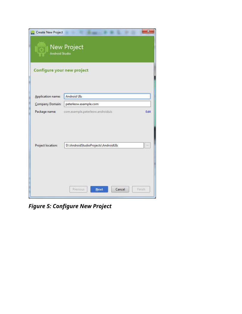
Figure 7: Add an Activity

Figure 8: Choose Options
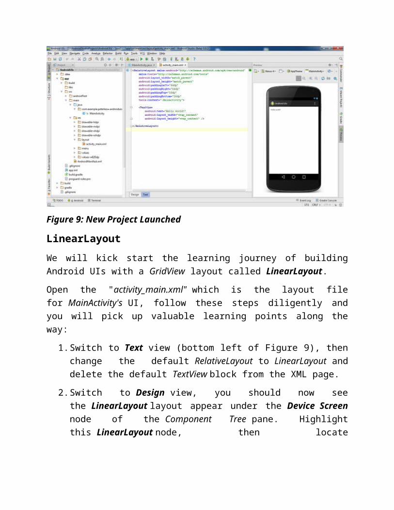
Android will build a new project with a default Activity called "MainActivity" and a default layout called "activity_main.xml" (Figure 9).

Figure 9: New Project Launched
LinearLayoutWe will kick start the learning journey of building Android UIs with a GridView layout called LinearLayout.
Open the "activity_main.xml" which is the layout file for MainActivity's UI, follow these steps diligently and you will pick up valuable learning points along the way:
1. Switch to Text view (bottom left of Figure 9), then change the default RelativeLayout to LinearLayout and delete the default TextView block from the XML page.
2. Switch to Design view, you should now see the LinearLayout layout appear under the Device Screen node of the Component Tree pane. Highlight this LinearLayout node, then locate the orientation property in the Properties pane below the Component Tree pane, click and set it to horizontal.
3. Drag and drop a Button control from the Widgets palette onto the virtual device's screen. The Button control is also appeared under the Device Screen node of the Component Tree pane. (Figure 12)

Figure 12: Drag and Drop a Button control
Continue to add one more Button controls from the Widgets palette onto the virtual device's screen. The two buttons will be placed side by side horizontally (Figure 13).
Figure 13: LinearLayout with two Button Controls
Learning Point 1:
The state (color, size, margin, padding, weight, etc) of each UI component can be altered through their properties. You can see a complete list of properties pertaining to a particular UI component on the Properties pane (bottom right) in Android Studio when you click on that component. That makes Android Studio a great tool to learn about the various UI components!
background
As the LinearLayout is not visible, let's change its background property to a new color as shown in Figure 14. (Make sure that you have selected the LinearLayout (Horizontal) in the Component Tree.) You will see that the whole screen is rendered with the new color, in other words, the LinearLayout covers the whole screen. Why is that so? The answer lies with the layout:width and layout:height properties of the LinearLayout. They both take the value of "match_parent" which means "as big as the parent screen".
Figure 14: Change background
Up to now, you have created the initial UI by merely dragging and dropping in the Design view. Aren't you curious what is happening behind the scene. Android Studio has translated all those you have done in the Design view into an XML file,

i.e. "activity_main.xml". Switch over to the Text view, you will see the XML code as shown in Figure 15.
Figure 15: activity_main.xml
Note the following attributes in the <LinearLayout> node that correspond to their respective properties in the Properties pane in the Design view.
android:orientation="horizontal"
android:layout_width="match_parent"
android:layout_height="match_parent"
android:background="#ffb9d7ff"
gravity
Keeping the LinearLayout (Horizontal) selected, expand the gravity property and check the checkboxes for the right and center values respectively. This will position the two buttons in the right-center of the whole screen. Try out other checkbox values (individually and then collectively) to see the effects.

Figure 16: Playing with gravity
Learning Point 2:
The gravity property of the LinearLayout is used to determine the positioning of its child Views. It can take one or more constant values (as shown in Figure 15) separated by '|', such as "center | right".

The following code would has been added as attributes to the <LinearLayout> node in the "activity_main.xml". Switch to Text view and look for it.
android:gravity="center|right"
Once you are done playing with the gravity property, undo any changes and recover the screen to the state as shown in Figure 14.
padding
Back to the screen in Figure 14, keeping the LinearLayout (Horizontal) selected, expand the padding property and enter 50dp and 70dp to the left and top parameters respectively. This will shift the two buttons rightwards and downwards by the stipulated amounts as shown in Figure 16. Try out other parameters with different values (individually and then collectively) to see the effects.

Figure 17: Playing with padding
Learning Point 3:
The padding property of the LinearLayout is used to specify the internal space between its border and its nearest child Views. You can specify paddings for the left, top, right, and bottom sides of the layout independently.

The following code would have been added as attributes to the <LinearLayout> node in the "activity_main.xml". Switch to Text view and look for them.
android:paddingLeft="50dp"
android:paddingTop="70dp"
Once you are done playing with the padding property, undo any changes and recover the screen to the state as shown in Figure 14.
layout:width, layout:height
Back to the screen in Figure 13, keeping the LinearLayout (Horizontal) selected, look for layout:width and layout:height properties in the Properties pane, change their value to "wrap_content". What did you see? The LinearLayout has been adjusted to just fitting the two buttons as shown in Figure 18.
Figure 18: Just Fitting
Learning Point 4:

The layout:width and layout:height properties of the LinearLayout allow you to set the width and height of the layout. You can specify width and height with exact measurements in dp (density-independent pixels) but more often than not, you will use one of these constants to set the width or height, namely "fill_parent", "match_parent", or "wrap_content". Note that fill_parent has been deprecated starting from API Level 8 and is replaced by match_parent.
The match_parent constant will stretch the layout to fit its parent GridView entirely (minus the padding, if any), e.g. the screen, whereas the wrap_content will size the layout to fit its entire child Views.
The android:layout_width and android:layout_height attributes in the <LinearLayout> node in the "activity_main.xml" would have been modified as shown. Switch to Text view and look for them.
android:layout_width="wrap_content"
android:layout_height="wrap_content"
Once you are done here, undo any changes and recover the screen to the state as shown in Figure 14.
Orientation
Back to the screen in Figure 14, keeping the LinearLayout (Horizontal) selected, look for orientation property in the Properties pane, change its value to "vertical". What did you see? The two buttons will now be stacked up vertically. You will also notice that the LinearLayout (Horizontal) has been changed to LinearLayout (Vertical) in the Component Tree pane (Figure 19).

Figure 19: Vertical Orientation
Learning Point 5:
The orientation property is privy to (special feature of) LinearLayout that makes it distinct from other GridViewlayouts. It takes the value of either "horizontal" or "vertical". It controls how the child Views are to be arranged in LinearLayout. Horizontal orientation will arrange them in one horizontal row of multiple columns, whereas vertical orientation in one vertical column of multiple rows. The default orientation is " horizontal " .

The android:orientation attribute in the <LinearLayout> node in the "activity_main.xml" would have been modified as shown. Switch to Text view and look for it.
android:orientation="vertical"
margin
Switch to the Text view, then add a line of code as shown in Figure 20.
Figure 20: Vertical Orientation
While you type along, Android Studio will offer you a dropdown list of suggested words to help you in auto-completing your code as shown in Figures 21 and 22. (In order to let Android Studio help you, try to type a bit slower; when the matched word appears, use arrow key to navigate to it and tab key to select it.)

Figure 21: Vertical Orientation
Figure 22: Vertical Orientation

The effect of this line of code is shown in Figure 23.
Figure 23: Vertical Orientation
You have just added a margin of 16dp outside the border surrounding the LinearLayout, the value of which is referenced from the "activity_vertical_margin" element in "dimens.xml" as shown in Figure 24. To refer to any resources in XML, the syntax is
@resourceType/resourceName
.

Figure 24: dimens.xml
Learning Point 6:
The "android:layout_margin" property sets the all-round margin for the layout which is the external space between the border of the current Views (e.g. layout) and the nearest external (Parent) Views. You can also specify individual margins for bottom, left, right, and top, as shown in Figure 25.
Figure 25: Variants of layout_margin
Summary:
LinearLayout is a ViewGroup object that arranges all child Views one by one in either horizontal or vertical direction as dictated by its distinct property called orientation. All the child Views of a LinearLayout are always placed

linearly one after another. A horizontal orientation will arrange them in only one row of multiple columns, whereas vertical orientation in one column of multiple rows. The default orientation is " horizontal " .
LinearLayout is the simplest and straight forward layout model of the GridView objects. But it has the least flexibility in that it only allows either horizontal or vertical layout. Although additional layouts can be achieved using nested LinearLayouts, i.e. one LinearLayouts within another LinearLayouts, it is not advisable as that will complicate your design and degrade the performance. If you find yourself using several nested LinearLayouts, it is time to consider a single RelativeLayout.
RelativeLayoutIn the current project, create a new Activity called "RelativeLayout" to practice on another GridView object - RelativeLayout.
Follow the trail as shown from Figures 26 to 27 to create the new Activity.
Figure 26: New Blank Activity

Figure 27: Set up New Activity
The "activity_relative_layout.xml" file created by the blank activity template comes with a RelativeLayout and a TextView that says "Hello world!". (Figure 28)

Figure 28: Drag and Drop a Layout
In the Design view, drag and drop a Button control from the Widgets Palette (Figures 29 and 30). As you are dragging over the screen, a dialog box pops up updating you with information about the margins to the right of and below <generated> (Figure 29). The <generated> refers to the "Hello world!" TextView control. In other words, it is showing you the relative position of the Button control to the TextView control.
Figure 29: Dragging a Button control

Figure 30: Dropped a Button control
Check out "the activity_relative_layout.xml" in the Text view (Figure 31).

Figure 31: LinearLayout with one Button Controls
You will notice that the TextView has been assigned a new android:id attribute as shown:
android:id="@+id/textView2"
and the new <Button> node has the following attributes referencing the "Hello world!" TextView through its android:id attribute. These attributes determine the position of this button in relation to the TextView.
android:layout_below="@+id/textView2"
android:layout_toRightOf="@+id/textView2"
android:layout_toEndOf="@+id/textView2"
The actual distances are determined by the following margins:

android:layout_marginLeft="23dp"
android:layout_marginTop="48dp"
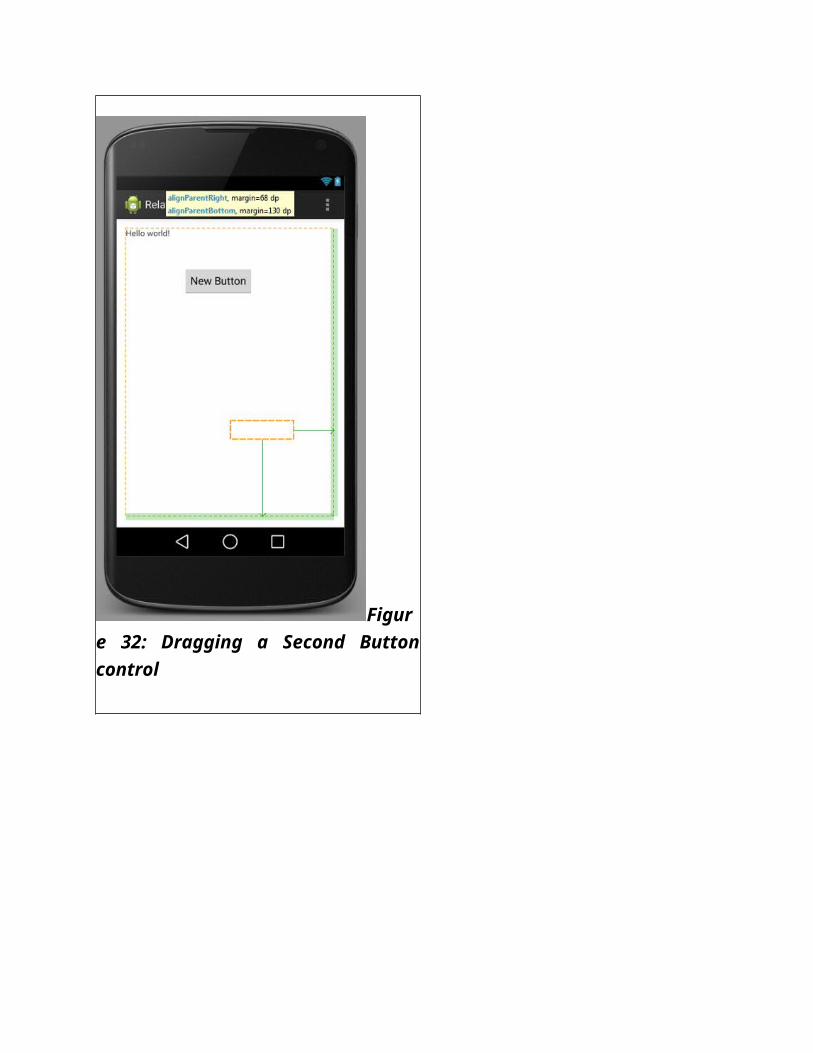
In the Design view, drag and drop a second Button control from the Widgets Palette (Figures 32 and 33) towards the bottom right of the screen. When the button is nearing the edge of the screen, a dialog box pops up updating you with information about the respective margins for aligning to the right and bottom of the parent ViewGroup, i.e. the RelativeLayout (Figure 32).
Figure 32: Dragging a Second Button control
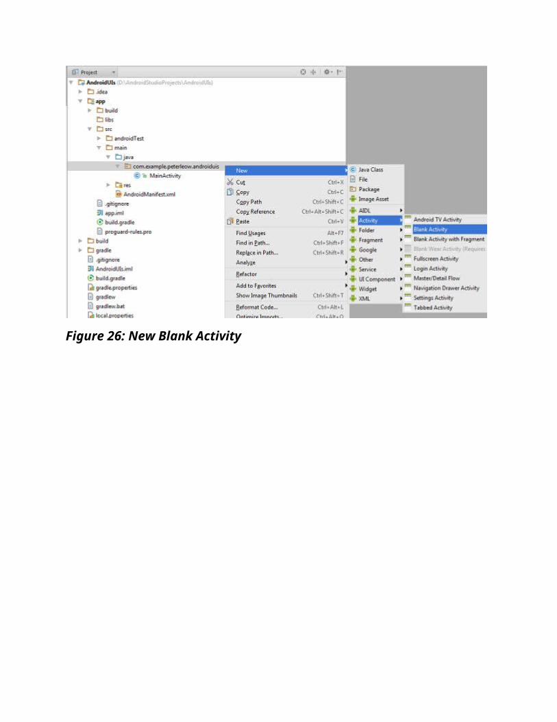
Figure 33: Dropped the second Button control
Check out the "activity_relative_layout.xml" in the Text view (Figure 34).

Figure 34: LinearLayout with two Button Controls
You will notice that a second <Button> node has been added. Pay attention to these attributes which determine the position of this second button in relation to its parent GridView, i.e. the RelativeLayout.
android:layout_alignParentBottom="true"
android:layout_alignParentRight="true"

android:layout_alignParentEnd="true"
The actual distances are determined by the following margins:
android:layout_marginRight="68dp"
android:layout_marginBottom="130dp"
Summary:
In RelativeLayout model, the positioning of its child Views is specified in either of the following ways:
In relation to its sibling Views using these attributes android:layout_above, android:layout_below, android:layout_toRightof, android:layout_toLeftof, android:layout_toStartof, and android:layout_toEndof, which take the value of the id of its siblings in the following syntax:
android:layout_below="@+id/viewName"
For example,
android:layout_below="@+id/textView2"
In relation to its parent GridView using these attributes android:layout_alignParentBottom, android:layout_alignParentTop, android:layout_alignParentLeft, android:layout_alignParentRight, android:layout_alignParentEnd, and android:layout_alignParentStart, which the value of either true or false.
While the RelativeLayout model provides the maximum flexibility for layout View objects on the UI, it requires more time to plan and design. For UI layout that simply requires a 2-D structure, use TableLayout.
TableLayoutIn the current project, create a new Activity called "TableLayout" to practice on another GridView object - TableLayout. Follow these steps:
1. Open the "activity_table_layout.xml" in the Design view, then delete the default RelativeLayout and TextView in the Component Tree pane.
2. Drag and drop a TableLayout layout from the Layouts palette onto the virtual device's screen.

3. Drag and drop a Large Text widget (which is actually a TextView View) onto the virtual device's screen (Figure 35) As you are dragging it across the screen, a 2-D grid appears and a dialog box pops up showing the current position in terms of index numbers of row and column. (The index number starts from zero.) Drop the TextView at (row 1, column 1) (Figure 36).
Figure 35: Dragging a Large Text
Figure 36: Added a Large Text

5. Let's change the default text to something else, say "Sign In". Follow the trail in Figure 37. Double-click on the TextView to bring out a dialog box. In the dialog box, click on the button that marked "..." beside the" text:" textbox to bring out the Resources window, then click on the New Resource button on the bottom left corner of this window and select New String Value....

Figure 37: Add new Resource
6. A new window opens for you to create a new string resource, enter the following values accordingly and hit OK (Figure 38).
Figure 38: Enter new Resource Values
7. The new string resource has been added to the "strings.xml". Check it out. (Figure 39).

Figure 39: New Resource added to strings.xml
8. If you look into the "activity_table_layout.xml" file (Figure 40), the android:text attribute of the TextView is now pointing to the new string resource through this syntax @string/sign_in.

Figure 40: TextView points to the new String Resource
9. The outcome of this is shown in Figure 41.
Figure 41: TextView shows new Value
Learning Point 7:
When you need a new text string, do not hard code it. Instead, you should create a new string resource that takes that text string as value. You will then reference this string resource in the XML or in code whenever you need to use text string

on any UIs. That is reusability and maintainability at its best. You should always visit Figures 37 to 41 for reference.
You will continue to build the TableLayout UI on your own. The completed UI should look like that in Figure 42. Beside the Large Text widget for the "Sign In..." label,
o Drag and drop two Medium Text Widgets onto the UI and change their text properties to "Email" and "Password" respectively. (Follow the steps from Figures 37 to 40.)
o Drag and drop an E-mail and a Password Text Fields (which are actually EditText Views) onto the UI and insert the words "Email" and "Password" into their respective hint properties. You should use the two string resources that you have created above. How? In the Properties pane, click in the text field beside the hint property, a button that marked "..." will appear, then click on it to bring out the Resources window (similar to what you see in Figure 37). This time, you should see the two strings you created above for "Email" and "Password" being listed, just use them. That is the beauty of reusability!
Note:
When set, the value of the hint property will be displayed in the EditText text field when the text field is empty.
o Lastly, drag a Button Widget onto the UI and change its text property to "Let me in!".

Figure 42: A TableLayout UI
The 2-D grid in Figure 44 should help you in visualizing the positioning of the various View controls in the TableLayout (Figure 43).
Figure 43: A TableLayout UI with Grid
To understand how TableLayout organizes the child Views, let's examine this code snippet from the "activity_table_layout.xml" (Figure 44).

Figure 44: Snippet of activity_table_layout.xml
Learning Point 8:
Each row in the TableLayout is appended as a <TableRow> node which contains the child Views. The order of the<TableRow> node is important. When this XML is referenced, the<TableRow> nodes will be traversed from top to bottom to

determine which one is on top and which is below. In other words, the order of the <TableRow> node in the XML file will translate literally into its row index in the TableLayout, i.e. the first one from the top of the file will appear as first row in the TableLayout, second one second row, and so on. On the other hand, the position of a child View in a particular row is indicated by the android:layout_column attribute:
android:layout_column="an integer indicating a zero-based column index"
for example,
android:layout_column="1"
which indicates the second column in a row.
In addition, a child View may occupy more than one column using android:layout_span attribute. Ultimately, the total column count of a TableLayout is determined by the row that has the most number of column.
FrameLayout, ImageView
A FrameLayout is a ViewGroup that divides the screen into blocks of area each of which is supposed to holds a single child View. You may place multiple child Views inside a single block, then the latter ones will overlay the preceding ones. The android:layout_gravity attribute of the child View will dictate which block it will go into. Let's build a page using FrameLayout as the layout model that contains an ImageView overlaid with a TextView.
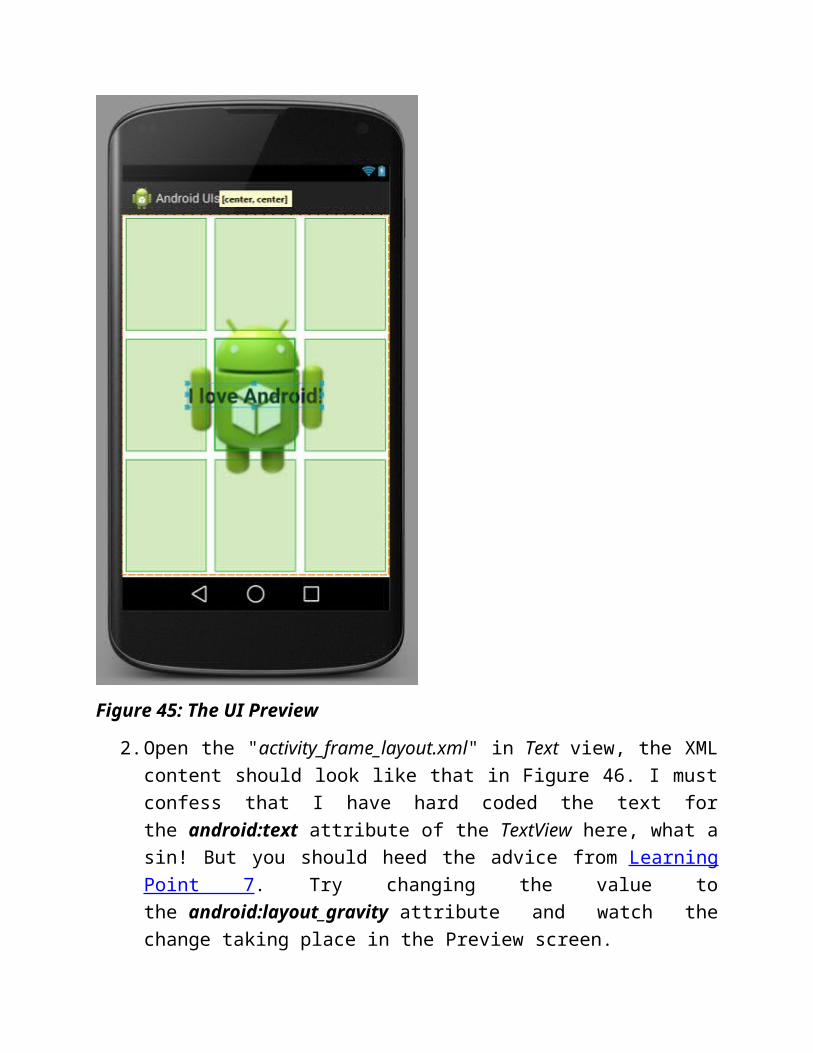
Create a new Activity called "FrameLayout", then follow these steps to create a UI that look like that in Figure 45.
o Open its layout XML file "activity_frame_layout.xml" in Design view
o Delete the default RelativeLayout and TextView
o Drag and drop a FrameLayout layout from the Palette to the screen
o Drag and drop an ImageView to the center of the screen and set its src property to "@drawable/ic_launcher"
o Drag and drop a Large Text to overlay the ImageView

Figure 45: The UI Preview
2. Open the "activity_frame_layout.xml" in Text view, the XML content should look like that in Figure 46. I must confess that I have hard coded the text for the android:text attribute of the TextView here, what a sin! But you should heed the advice from Learning Point 7. Try changing the value to the android:layout_gravity attribute and watch the change taking place in the Preview screen.
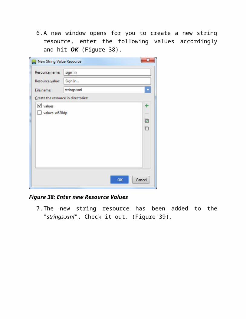
Figure 46: activity_frame_layout.xml
3. Run it on an AVD and you should see this as shown in Figure 47.

Figure 47: Text Selection in EditText
ButtonA Button control provides an area on the UI where a user can touch to initiate an action. You will create a number of buttons on the "MainActivity" so that we can navigate to the various layout pages that you have created so far.
Let's re-visit the "activity_main.xml" at Figure 22.
weight
Open the "activity_main.xml" in the Text view, then add the following code to the first and second Button nodes respectively.
android:layout_weight="1.0"

and
android:layout_weight="2.0"
The resulting code should look like that in Figure 48 and the screen in Figure 49:
Figure 48: android:layout_weight
Figure 49: The Outcome
What has happened? The first button has been given one-third of its parent GridView whereas the second button the remaining two-third. This is caused by the values of 1.0 and 2.0 being assigned to the android:layout_weight of the respective buttons. These values are relative and represent the proportion of the GridView that they will occupy. The same effect can be achieved by changing the values to 1.2 and 2.4. Try it!
Learning Point 9:

The android:layout_weight property sets the proportion of width or height (depending on orientation) that a View will occupy with relation to others in the LinearLayout. It will affect the width of Views in horizontal orientation and height in vertical orientation.
1. Remove the android:android_weight attribute from both buttons, add four more Button controls, set the android:layout_width attribute of all the five buttons to "match_parent", and change their android:textattribute to some newly created string resource. The final UI should look like that in Figure 50. (You have done all these before, so take it as a revision. ;P)

Figure 50: The new Look
2. The modified *activity_main.xml* should like that in Figure 51.


Figure 51: Modified activity_main.xml
Icon Caption
It is more common for a Button control to be rendered with a text caption, but it can also be rendered with an icon or both. Open "activity_main.xml" in the Text view, follow the trail from Figures 52 to 54 to add an icon on top of the text caption of the LinearLayout button. We will use the default icon called "ic_launcher" provided by Android Studio.
Figure 51: Add drawable to Button
Figure 53: Add drawable to Button
Figure 54: Add drawable to Button
There you are, the ic_launcher icon has been added on top of the LinearLayout button (Figure 55).
Figure 55: Added drawable to Button
Button Event

We will now add interactivity to the RelativeLayout button so that when a user touches it, the RelativeLayout page (Figure 33) should be displayed. Let's do it:
o Open *activity_main.xml* in the Text view, add the Android:onClick attribute to the <Button> node that renders the RelativeLayout button and assign it a the name of the method (event handler) that will take care of the touch event. For me, I named it "getRelativeLayoutPage". (Figure 56)
Figure 56: Add Android:onClick
o Open the *MainActivity.java* which is the Activity that hosts the layout in "activity_main.xml". The setContentView method inside the onCreate method will bind the "activity_main.xml " layout to the * MainActivity.java* . Add one method called "getRelativeLayoutPage" in the code as shown in Figure 56. If it complains of some error, this is because the View class is contained inside the android.view.View package which is not yet included. Fret not (don’t worry)! Just click on it once followed by Alt + Enter and this problem will go away instantly. Thanks to Android Studio.

Figure 57: Add Event Handler
o Add the highlighted code into the getRelativeLayoutPage method (Figure 58). If it complains of another error, this is because the Intent class is contained inside the android.content.Intent package which is not yet included. You should know to resolve it this time. Put cursor on error and press Alt+Enter.

Figure 58: Add drawable to Button
o *An Intent object is the Android's way of describing a message stating its "intention" to do something, i.e. to navigate to RelativeLayout. This Intent object is then passed to the startActivitymethod to carry out the intended action.
o Launch your app on an AVD or a physical Android device, it should start with the MainActivity page, touching the RelativeLayout button should bring you to the RelativeLayout page. Well done! you will do the same for the TableLayout and FrameLayout buttons. Your completed app should work as shown in Figure 58.
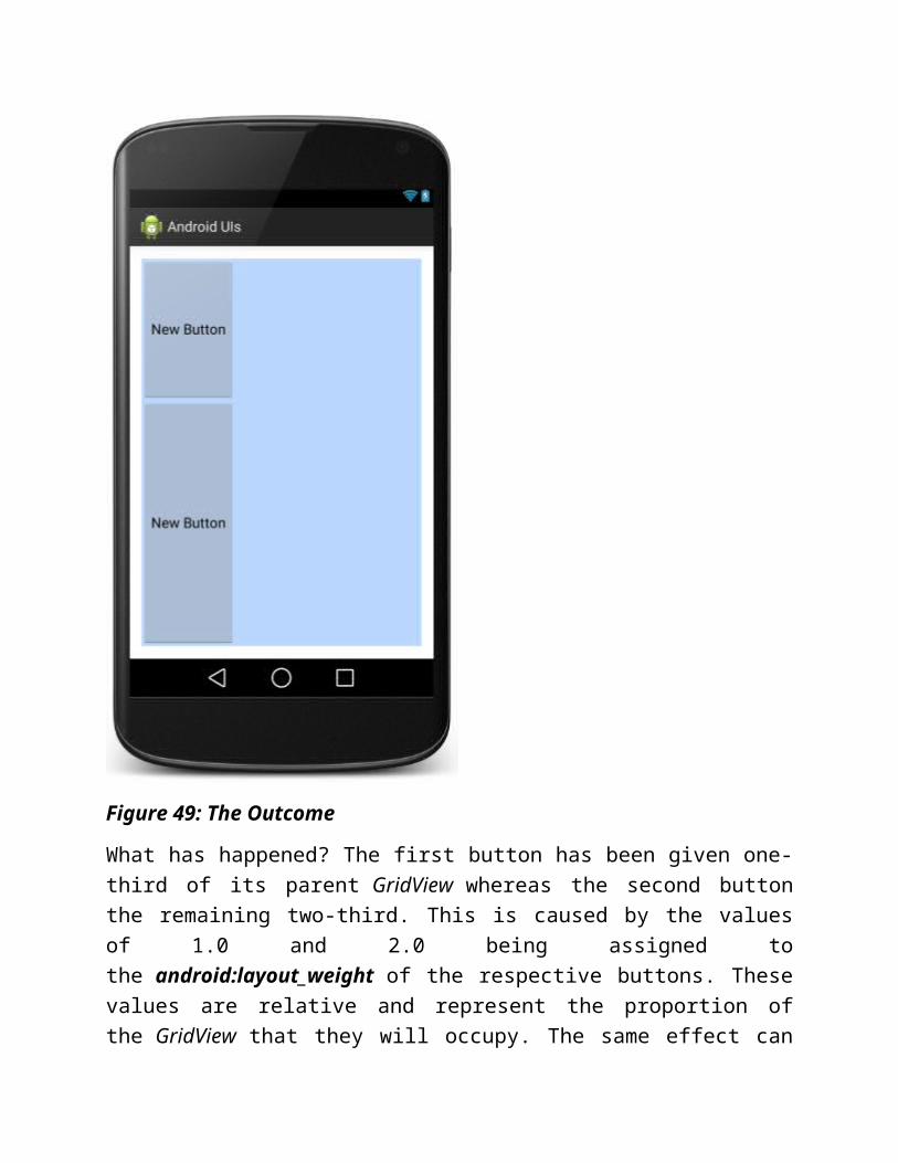
Figure 59: Button Action!
Custom Style
We can customize the background of the Button Control to represent the three states of a button - pressed, focused, and default (neither pressed nor focused) . Let's do it:
o Download the "android_icons.zip" to your computer and unzip to get three images, namely "ic_action_search", "ic_action_send", "ic_action_refresh". (These images are parts of the Action Bar Icon Pack from Android Developers.) Follow the trail from Figures 60 to 63 to import these images to the drawable resource folders.
Figure 60: Add new Image Asset

Figure 61: Import an Image

Figure 62: Import an Image

Figure 63: Import an Image
o Create a sub directory called "drawable" under the res directory (Figures 64 and 65).

Figure 64: Create a drawable directory
Figure 65: Create a drawable directory
o Add a drawable resource file called "button_custom" inside the drawable directory (Figures 66 and 67).
Figure 66: Add a drawable resource file
Figure 67: Add a drawable resource file
o The newly created drawable resource file will be saved as *button_custom.xml*. Your drawables should now contain these resources as shown in Figure 68.

Figure 68: All the drawable Resources
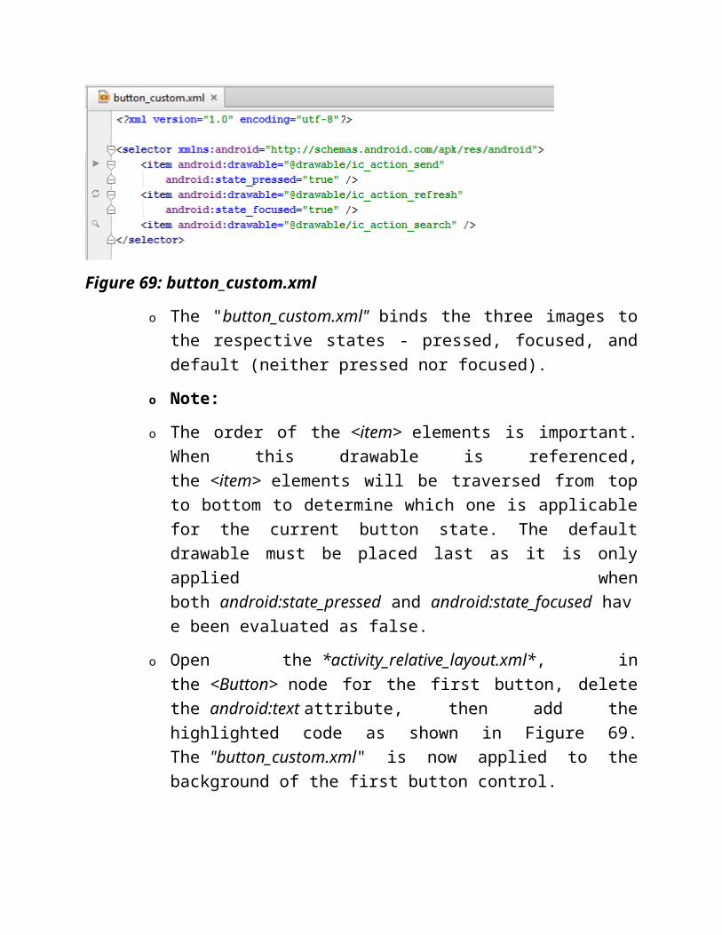
o Open the *button_custom.xml* and add the following code as shown in Figure 69.

Figure 69: button_custom.xml
o The "button_custom.xml" binds the three images to the respective states - pressed, focused, and default (neither pressed nor focused).
o Note:
o The order of the <item> elements is important. When this drawable is referenced, the <item> elements will be traversed from top to bottom to determine which one is applicable for the current button state. The default drawable must be placed last as it is only applied when both android:state_pressed and android:state_focused have been evaluated as false.
o Open the *activity_relative_layout.xml*, in the <Button> node for the first button, delete the android:text attribute, then add the highlighted code as shown in Figure 69. The "button_custom.xml" is now applied to the background of the first button control.

Figure 70: Add drawable to Button
o Launch your app on an AVD or a physical Android device, navigate to the RelativeLayout page. The background of the first button should
now appear as . Touching it will cause it to change to . When
the button got focused, its background will change to . (Figure 71)

Figure 71: Custom Button Works!
TextViewAs the name suggested, TextView is a View object that simply displays text to the user. By default it is not editable. It is commonly used to display heading, static textual information, and labels to other View objects.
Let's re-visit "activity_table_layout.xml" and take a closer look at one of its TextView object for "Sign In...".
1. Open the "activity_table_layout.xml" in Text view. Android Studio called this TextView "Large Text" in the Palette as its android:textAppearance attribute has been assigned the text size of "?android:attr/textAppearanceLarge" (Figure 72) which is equal to 22sp.

Similarly, there the two other TextViews being called "Medium Text" and "Small Text" by Android Studio. Their android:textAppearance attributes have been assigned the text sizes of "?android:attr/textAppearanceMedium" and "?android:attr/textAppearanceSmall" respectively. The text size for the former is 18sp whereas the later 14sp.
Figure 72: TextView
2. Add two lines to the TextView as highlighted in Figure 72.
Figure 73: TextView
3. In the first highlighted line, you have made the TextView selectable by setting its android:textIsSelectable attribute to "true", it allow users to make selection gesture on its content which in turn triggers the copy and paste function of the Android system.
4. In the second highlighted line, you have enabled the text to change color when it is touched by setting the android:textColorHighlight to some color value. When it is set to "true"
5. Try it up on an AVD or a physical device! Catch a glimpse of that running on my AVD (Figure 74). It works!

Figure 74: Highlight, Copy, Paste
EditTextThe EditText is an extension of TextView that possesses rich editing capabilities. It provide a text field to allow the user to input text. It can be either a single line or multiple line. Touching an EditText control places the cursor and automatically displays the soft keyboard. In addition to typing, EditText comes equipped with a variety of productive features, such as allow users to select, cut, copy, and paste text, input auto-completion, and customize keyboard to suit input type.
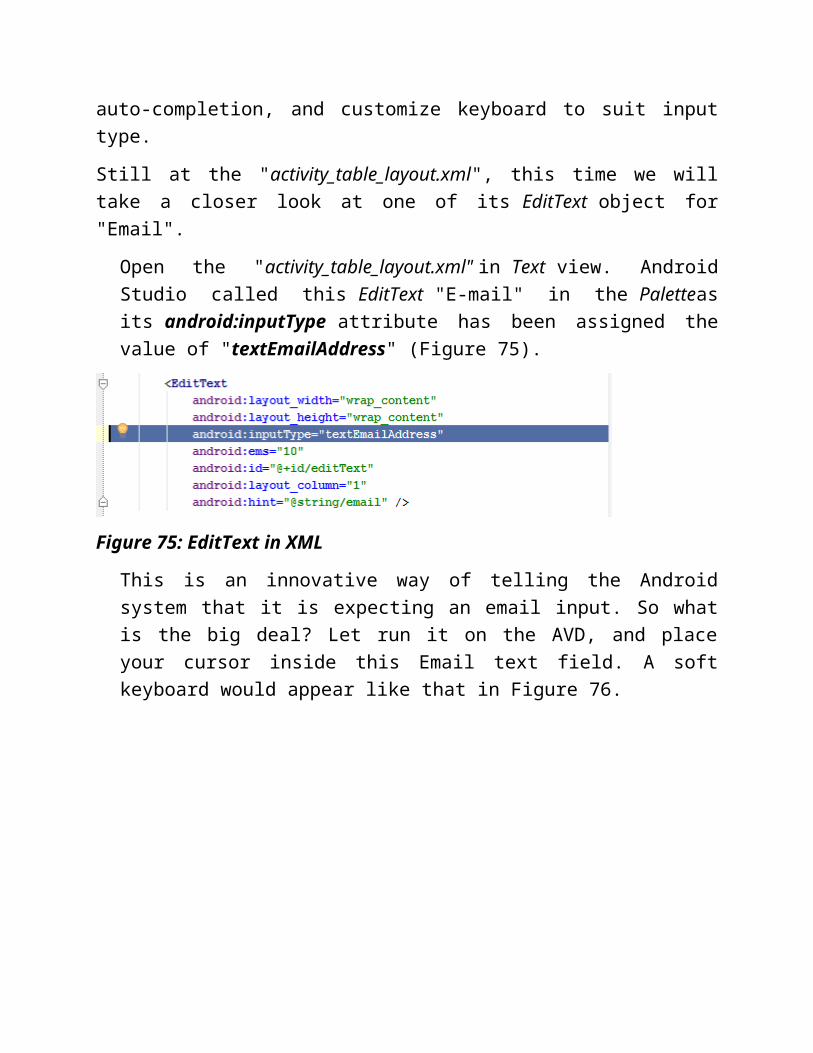
Still at the "activity_table_layout.xml", this time we will take a closer look at one of its EditText object for "Email".

Open the "activity_table_layout.xml" in Text view. Android Studio called this EditText "E-mail" in the Paletteas its android:inputType attribute has been assigned the value of "textEmailAddress" (Figure 75).
Figure 75: EditText in XML
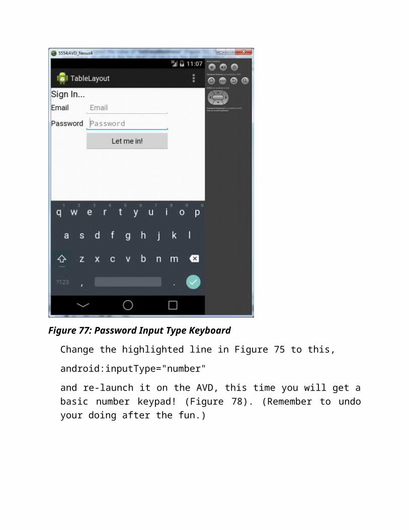
This is an innovative way of telling the Android system that it is expecting an email input. So what is the big deal? Let run it on the AVD, and place your cursor inside this Email text field. A soft keyboard would appear like that in Figure 76.

Figure 76: Email Input Type Keyboard
Keep staring at the soft keyboard (I mean it) while placing the cursor on the Password text field. Notice any changes on the keyboard, yes, the "@" key has been replaced with comma (Figure 77)

Figure 77: Password Input Type Keyboard
Change the highlighted line in Figure 75 to this,
android:inputType="number"
and re-launch it on the AVD, this time you will get a basic number keypad! (Figure 78). (Remember to undo your doing after the fun.)
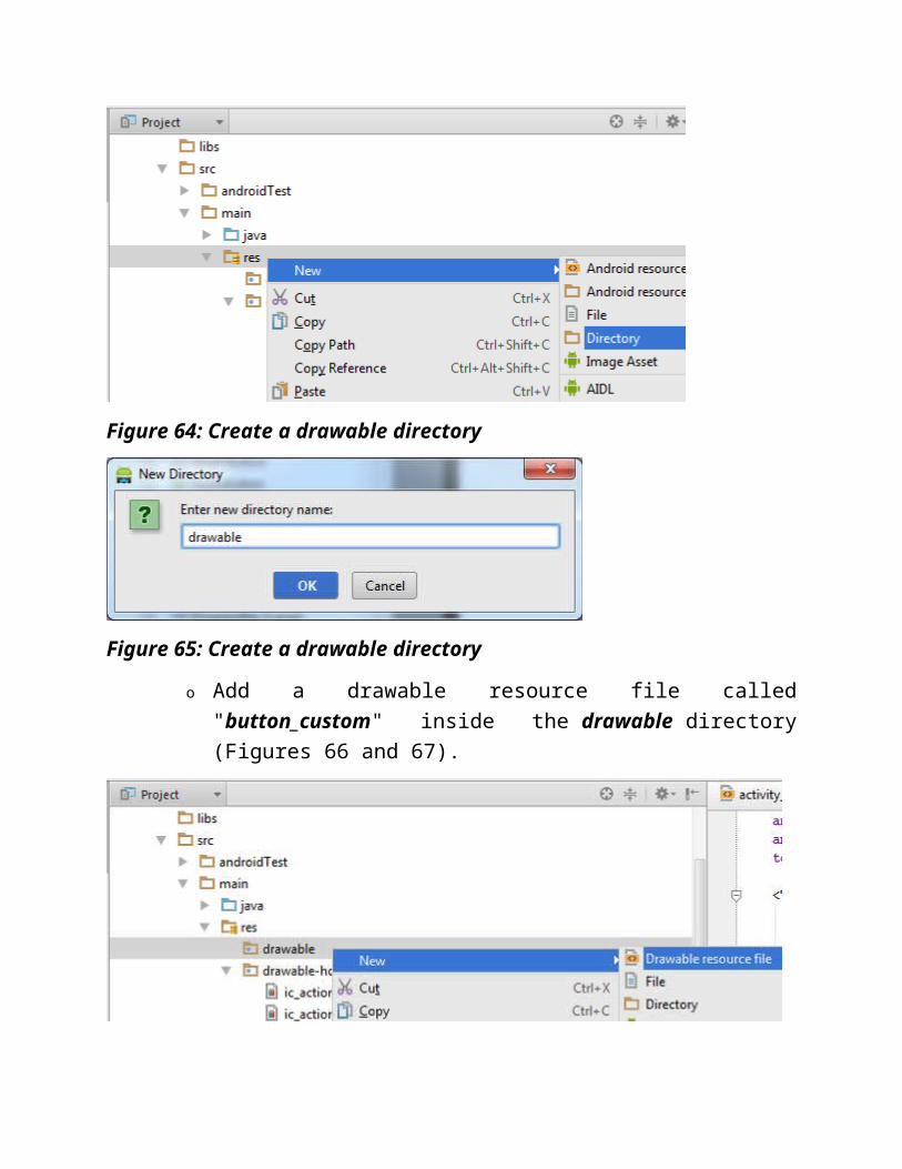
Figure 78: Number Pad
Learning Point 10:
We have seen that the android:inputType attribute of EditText can be used to indicate the type of text to be entered to the Android system which in turn provides the matching soft keyboard for use. Some of the more common input type values for this type of purpose are:
o "text" which is the default and calls for a normal text keyboard.
o "textEmailAddress" which calls for normal text keyboard that includes the @ key.
o "number" which calls for a basic number keypad.

o "phone" which calls for a phone dial pad.
In addition, the android:inputType attribute can also define other keyboard behaviors, such as to mask password text, allow multi-line input, or to capitalize a new sentence, and many more. Some of these input types are:
o "textPassword" which calls for normal text keyboard, but mask the text entered.
o "textMultiLine" which calls for normal text keyboard that allows users to enter long strings of text that include line breaks.
o "textCapSentence" which calls for normal text keyboard that capitalizes the first alphabet of each new sentence.
o "textAutoCorrect" which calls for normal text keyboard that provides helping words to correct common spelling errors.
You can specify multiple input types to the android:inputType attribute using the "|" separator. Like this
android:inputType="textCapSentence|textAutoCorrect"
2. The EditText come with the selection feature that enables you to cut, copy, and paste. Try it out on an AVD or a physical device, it work like a charm! (Figure 79).

Figure 79: Text Selection in EditText
More UI Controls
We have already dealt with these UI controls, namely Button, ImageView, TextView, and EditText. We will continue to explore many more UI controls - CheckBox, RadioButton and RadioGroup, ToggleButton , Spinner, AutoCompleteTextView, Progress Bar, and Pickers.
In the current project, get these things ready:
Create a new Activity called "LinearLayout"
Open its layout XML file "activity_linear_layout.xml" in Design view
Delete the default RelativeLayout and TextView
Drag and drop a LinearLayout layout from the Palette to the screen and set its orientation to "vertical" and its layout_width and layout_height to "fill_parent" or "match_parent".
CheckBoxA CheckBox allows users to select or unselect an option. We use a set of checkboxes when we want to allow uses to select multiple options that are mutually exclusive. Follow these steps to construct a list of checkboxes:
1. Open the "activity_linear_layout.xml" in Design view, drag and drop a new LinearLayout from the Palette onto the first LinearLayout and set its orientation to "horizontal" and its layout_height to "match_parent" so that you can drag and drop checkboxes inside. In this way, you have nested a LinearLayout inside another LinearLayout (Figure 80). You will build your CheckBoxes inside this inner LinearLayout.
Figure 80: Nested LinearLayout
2. Drag and drop a CheckBox widget onto the inner LinearLayout. Rename the CheckBox's text to "Jogging". Remember that you should create a string resource which you will referenced instead of hard coding it (81). (Remember Learning Point 7)
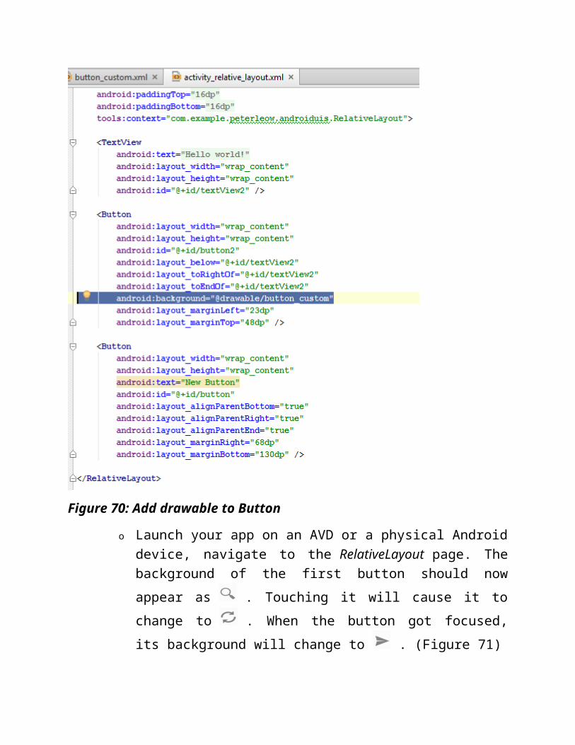
Figure 81: New String Value Resource
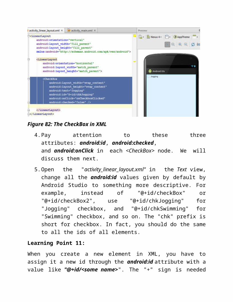
3. The "activity_linear_layout.xml" and the UI should look like those in Figure 82.

Figure 82: The CheckBox in XML
4. Pay attention to these three attributes: android:id, android:checked, and android:onClick in each <CheckBox> node. We will discuss them next.
5. Open the "activity_linear_layout.xml" in the Text view, change all the android:id values given by default by Android Studio to something more descriptive. For example, instead of "@+id/checkBox" or "@+id/checkBox2", use "@+id/chkJogging" for "Jogging" checkbox, and "@+id/chkSwimming" for "Swimming" checkbox, and so on. The "chk" prefix is short for checkbox. In fact, you should do the same to all the ids of all elements.
Learning Point 11:
When you create a new element in XML, you have to assign it a new id through the android:id attribute with a value like "@+id/<some name>". The "+" sign is needed for newly created element, it instructs the Android builder to create a new static variable in R.java class with a unique integer identifier. Once it is created, it can be referred to subsequent without the "+" sign, e.g. "@id/<some name>".
One important point that I must stress is that you should change all the android:id values given by default by Android Studio to something more descriptive. For example, instead of "@+id/checkBox" or "@+id/checkBox2", use "@+id/chkJogging" for "Jogging" checkbox, and "@+id/chkSwimming" for "Swimming" checkbox, and so on. The "chk" prefix is short for checkbox.

The android:checked attribute takes a boolean value of either true or false, true for checked whereas false unchecked. You can use this attribute to set the initial check state of a CheckBox.
Next come to the Android:onClick attribute. We have discussed this already at Button Event in Figure 55. The Android:onClick here has been assigned an event handler (method) called "onCheckboxClicked" in its Activity class which is the "LinearLayout.java".
6. Repeat steps 2 to 6 to create a few more checkboxes. After this, set the layout_height of the inner LinearLayout to "wrap_content". The completed UI should look like that in Figure 83.
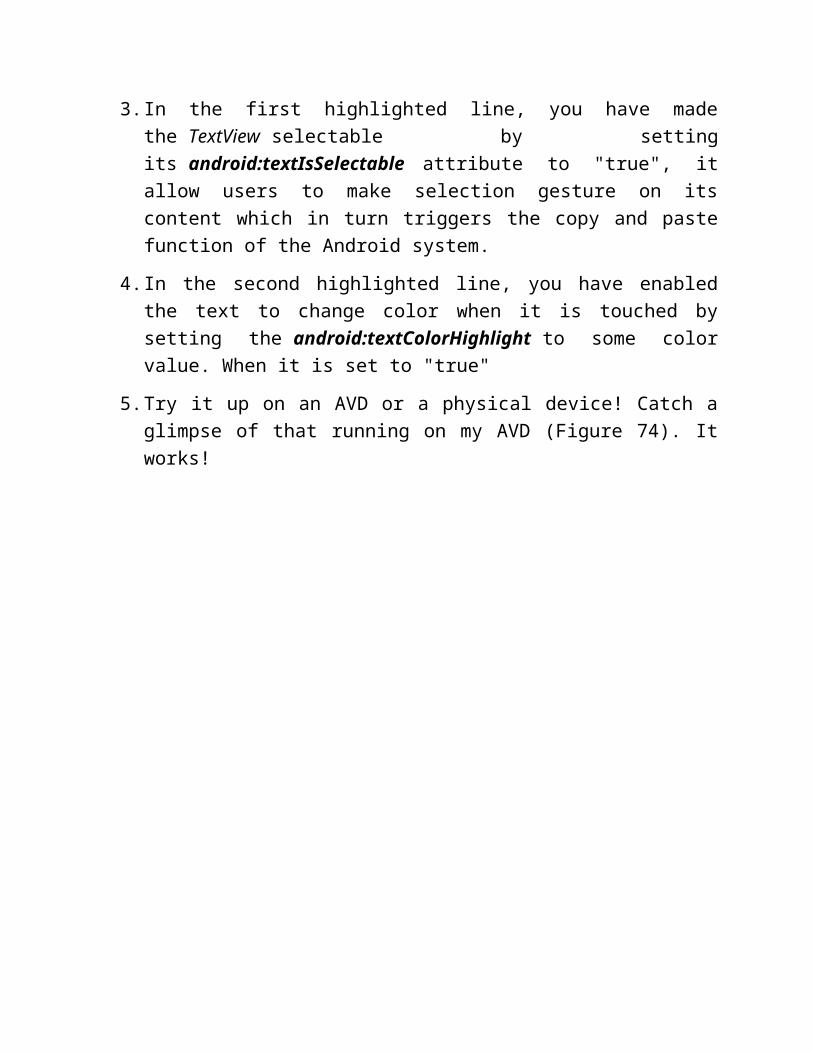
Figure 83: CheckBoxes
7. You will add a method to handle the check event in "LinearLayout.java". (If you encounter any error, refer to Figure 55 for help.) Open the "LinearLayout.java" that hosts the "activity_linear_layout.xml", add the "onCheckboxClicked" method like this (Figure 84);

Figure 84: Add Event Handler
In Android, the Java code for locating a particular View object (UI element) is,
ViewType viewObj = (ViewType) findViewById(R.id.<id_of_the_view>)
For example,
CheckBox chkJogging = (CheckBox) findViewById(R.id.chkJogging);
You may start to realize the good intention for using descriptive name for id
(Learning Point 11) - you know which View object you are referring by simply reading the id, you cannot do this with id that read "checkbox2" or "checkbox3", can you?
So what does the method do? Well, whenever you check or uncheck any checkbox, it will echo the names of all the checkboxes that are currently being checked via the Toast object. However, before you can test run it, it has to be navigated from the "MainActivity" page. Let's use the first button in the "MainActivity" page that reads "LinearLayout" to do this.
What are you waiting for, you have done similar exercises before, remember Figure 56.
o Open the "activity_main.xml" in Text view.
o Add this line to the first <Button> node:
android:onClick="getLinearLayoutPage"
o Add this method to the "MainActivity.java":
public void getLinearLayoutPage(View view) {
Intent intent = new Intent(getApplicationContext(), LinearLayout.class);
startActivity(intent);
}
and it is done!
Now, you can try it on an AVD or your Android device. It work like this (Figure 85).

Figure 85: CheckBoxes at work!
RadioButton, RadioGroupLike the CheckBox, a RadioButton offers users an option to choose. However, the radio button does not live alone. It belongs to a group of radio buttons whereby only one of them can be selected at any one time, such as the selection of gender. How to ensure that, the answer is "grouping them together in a RadioGroup". In this way, the system ensures that only one radio button can be selected at a time.
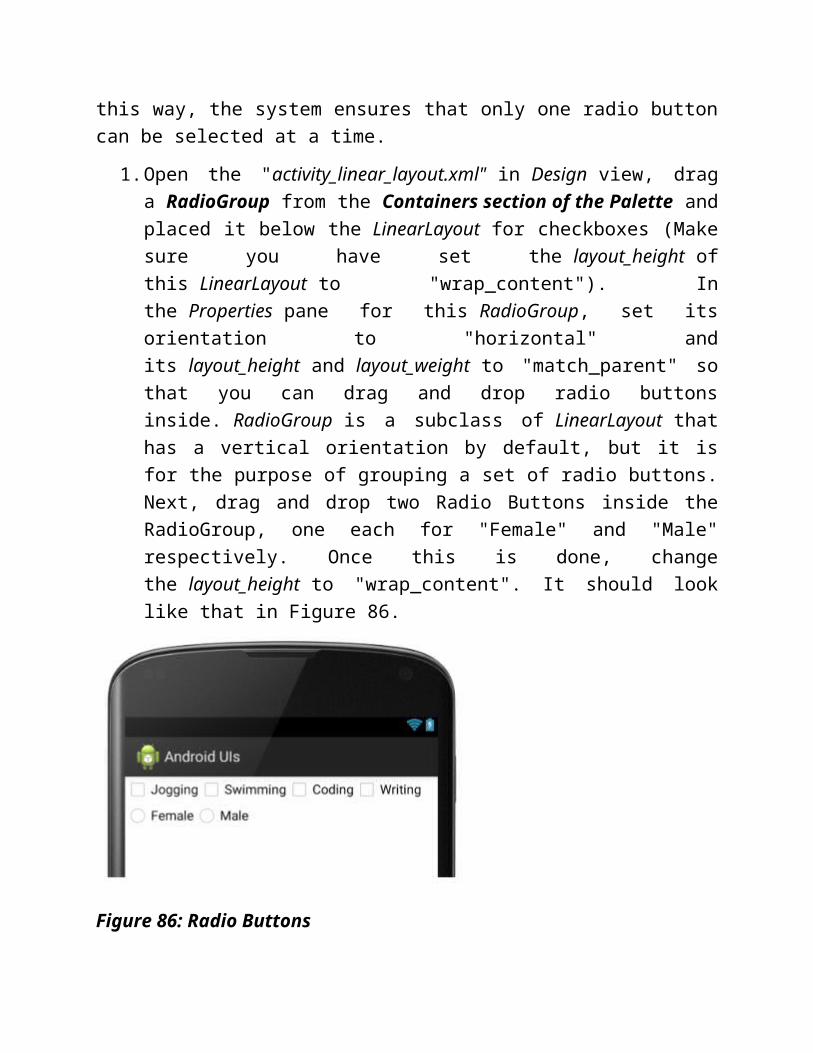
1. Open the "activity_linear_layout.xml" in Design view, drag a RadioGroup from the Containers section of the Palette and placed it below the LinearLayout for checkboxes (Make sure you have set the layout_height of this LinearLayout to "wrap_content"). In the Properties pane for this RadioGroup, set its orientation to "horizontal"
and its layout_height and layout_weight to "match_parent" so that you can drag and drop radio buttons inside. RadioGroup is a subclass of LinearLayout that has a vertical orientation by default, but it is for the purpose of grouping a set of radio buttons. Next, drag and drop two Radio Buttons inside the RadioGroup, one each for "Female" and "Male" respectively. Once this is done, change the layout_height to "wrap_content". It should look like that in Figure 86.
Figure 86: Radio Buttons
2. Open the "activity_linear_layout.xml" in Text view, assigned "onRadioButtonClicked" to the Android:onClick attribute. The completed XML for the radio buttons should look like that in Figure 87.

Figure 87: Radio Buttons in XML
3. Add the "onRadioButtonClicked" method to the "LinearLayout.java" like this (Figure 88);
Figure 88: Event Handler for Radio Buttons
4. This is how the completed UI look like in an AVD (Figure 89)
Figure 89: CheckBoxes at work!
Tip:
Use RadioButton when you want to show all the options to the users. Otherwise, you should consider using Spinner instead.
ToggleButtonA ToggleButton is an on/off switch. It can be used in turning on and off features like vibration mode, silent mode, WiFi connection, and so on. We will add a ToggleButton to the LinearLayout page to toggle WiFi connection.

1. Open the "activity_linear_layout.xml" in Design view, drag a ToggleButton widget from the Palette and placed it below the RadioGroup. Set its textOn and textOff properties to "WiFi On" and "WiFi Off" respectively (Figure 90)
Figure 90: ToggleButton
2. Open the "activity_linear_layout.xml" in Text view, assigned "onToggleClicked" to the Android:onClick attribute. The completed XML for the toggle button should look like that in Figure 91.
Figure 91: ToggleButton in XML
3. Add the "onToggleClicked" method to the "LinearLayout.java" like this (Figure 92);

Figure 92: Event Handler for ToggleButton
4. Add the following permissions to the "AndroidManifest.xml" (Figure 93) to allow your app to access and change the device's WiFi state while keeping the processor from sleeping or screen from dimming.
Figure 93: Set Permission in Manifest
5. You have to use a real device to test it. This is the screenshot from my device in landscape orientation (Figure 94).

Figure 94: ToggleButton at work!
SpinnerA Spinner is just a fanciful name for the all-too-familiar dropdown list. You will construct a Spinner in your app to contain the list of zodiac names. Whenever a selection is made, your app will echo the name of the zodiac selected.
1. In the "strings.xml", add a string array called "zodiac" as show in Figure 95. This will be the data source for binding to your spinner.

Figure 95: Data Source
2. Open the "activity_linear_layout.xml" in Design view, drag a Spinner widget from the Palette and placed it below the ToggleButton (Figure 96).
Figure 96: Spinner
3. Open the "activity_linear_layout.xml" in Text view, change the default value of android:id accordingly as shown in Figure 97.
Figure 97: Spinner in XML
4. In the "LinearLayout.java", create an ArrayAdapter and attach it to the spinner as shown in Figure 98.
Figure 98: Binding Spinner to Data Source
5. In the method, an ArrayAdapter, a subclass of Adapter class, is being used to bridge the data source, i.e. the string array resource called "zodiac" (Figure 94) referenced to in code via "R.array.zodiac", and the View, i.e. the Spinner. ArrayAdapter is also responsible for making a TextView for each item in the data source.
6. Test it on an AVD to see that it works as shown in Figure 99.

Figure 99: Spinner at work!
7. In order to capture the item selected from the spinner for further processing, you have to attach a "OnItemSelectedListener" to it. Follow these steps:
o Implement the "OnItemSelectedListener" interface on the LinearLayout.java class.
// import android.widget.AdapterView;
public class LinearLayout extends Activity implements AdapterView.OnItemSelectedListener {
// ... other code ...
}

o Implement the methods for the "OnItemSelectedListener" interface.
public void onItemSelected(AdapterView<?> parent, View view, int position, long id) {
String selectedItem = parent.getItemAtPosition(position).toString();
Toast.makeText(parent.getContext(), selectedItem, Toast.LENGTH_LONG).show();
}
public void onNothingSelected(AdapterView<?> parent) {
}
In the OnCreate method, attach the "setOnItemSelectedListener" to the spinner object.
Spinner spinner = (Spinner) findViewById(R.id.zodiac_spinner);
// set a listener on spinner
spinner.setOnItemSelectedListener(this);
The full code for capturing the item selected event on a spinner is shown in Figure 100.
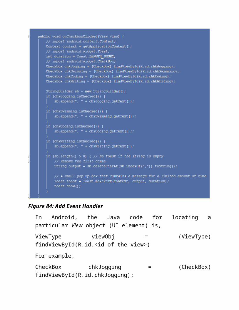
Figure 100: setOnItemSelectedListener on Spinner
8. Run it on the AVD, select an item from the spinner (Figure 101), and it should echo the name of the zodiac selected (Figure 102).

Figure 101: Select an "Leo"

Figure 102: Echo "Leo"
AutoCompleteTextViewWhen you are typing on a Google search box, you will get a list of suggested words appearing in a dropdown list. This is auto-complete. The Android framework provides the similar feature using the AutoCompleteTextView.The AutoCompleteTextView is a View that is similar to EditText, with the added capability of showing a list of suggested words from some data source automatically while the user is typing. You will construct aAutoCompleteTextView that draws the suggested words from the list of zodiac names that we used in the Spinner exercise.
1. Open the "activity_linear_layout.xml" in Design view, drag an AutoCompleteTextView widget (under the Expert section of the Palette) and placed it below the Spinner (Figure 103).
Figure 103: activity_linear_layout.xml
2. In the "LinearLayout.java", create an ArrayAdapter and attach it to the spinner as shown in Figure 104.

Figure 104: Binding AutoCompleteTextView to Data Source
3. Launch it on an AVD, type in a letter and watch the AutoCompleteTextView in action (Figure 105)

Figure 105: AutoCompleteTextView at work!
Progress BarIt is a common practice to show users a progress bar on their screen when they are uploading or downloading lengthy stuff from the Internet. In Android, the progress bar is implemented through a ProgressDialog class which is actually a UI by itself. You will create a progress bar on the "RelativeLayout" page and get it to simulate a task in progress upon a button click.
1. Open the "activity_relative_layout.xml" in Text view, change the android:text attribute and add an android:onClick attribute to the <New Button> node as shown:
android:text="Show Progress..."

android:onClick="showProgress"
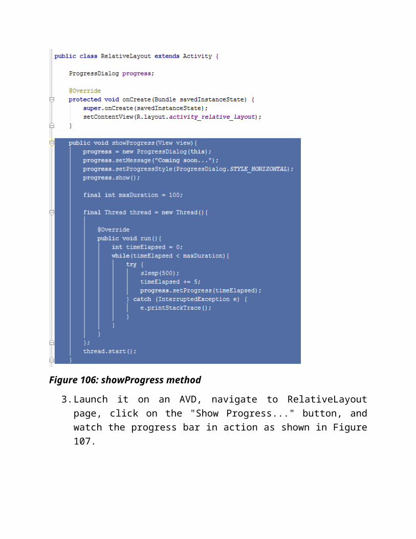
2. In the "RelativeLayout.java", add the showProgress method as shown in Figure 106. This method will be called when the "Show Progress..." button is clicked. The code will instantiate a ProgressDialog object and set some of its properties like setMessage and setProgressStyle. This ProgressDialog object will run in a separate thread so that it does not block the main UI thread.
Figure 106: showProgress method

3. Launch it on an AVD, navigate to RelativeLayout page, click on the "Show Progress..." button, and watch the progress bar in action as shown in Figure 107.
Figure 107: Progress Bar at work!
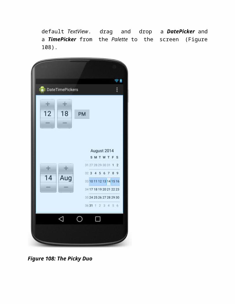
DatePicker and TimePicker.the DatePicker and TimePicker. They are the familiar faces on many web applications that ask you for date and time information. Just pick (click) a date or time, free of typing and thus free of hassle of having to handle formatting issues in code. You will construct a new Activity to explore them.
1. Create a new Activity called "DateTimePickers", leave the default RelativeLayout as it is, but remove the default TextView. drag and

drop a DatePicker and a TimePicker from the Palette to the screen (Figure 108).
Figure 108: The Picky Duo
2. Open the "activity_date_time_pickers.xml", you see the XML code as shown in Figure 109. Note the android:onClick attributes for the DatePicker and TimePicker.

Figure 109: activity_date_time_pickers.xml
3. Open the "DateTimePickers.java" that hosts the "activity_date_time_pickers.xml", insert the highlight code as shown in Figure 110. The getDate and getTime methods will be invoked to echo the date or time selected on the screen whenever a user click on the respective controls.

Figure 110: Methods to Handle Click Events
4. Once again, before you can test run it, it has to be navigated from the "MainActivity" page. Let's set up the "Pickers" button in the "MainActivity" page for this purpose.
o Open the "activity_main.xml" in Text view.
o Add this line to the fourth <Button> node:
android:onClick="getDateTimePickers"
o Add this method to the "MainActivity.java":
public void getDateTimePickers(View view) {
Intent intent = new Intent(getApplicationContext(), DateTimePickers.class);
startActivity(intent);
}
5. and it is done!

6. Run it, pick a date or time, then click on either of them. See it for yourself in Figure 111.
Figure 111: Pickers at work!
ListViewA ListView is a ViewGroup that displays a list of scrollable items from a data source via an Adapter. An Adapter acts as the middle man to pull rows of data from a data source such as an array or database, and to convert each row of data into a View which is then inserted into the ListView. The view in each row can be different and can be as complicated as you want (Figure 112). You will construct a ListView in your app to display the list of zodiac names that we used in the Spinner exercise.
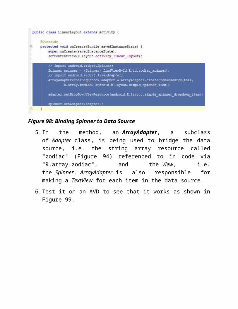
Figure 112: Adapter Explained (Click image to watch the Video)
1. Create a new Activity called "ListViewActivity", remove any default layout or view on the screen, drag and drop a ListView from the Palette to the screen (Figure 113).

Figure 113: activity_list_view.xml
2. Open the "ListViewActivity.java" that hosts the "activity_list_view.xml", insert the highlight code as shown in Figure 114.
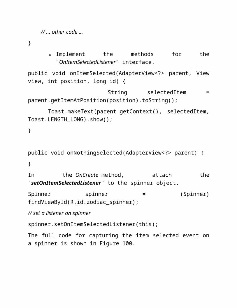
Figure 114: Binding ListView to Data Source
3. Before you can test run it, it has to be navigated from the "MainActivity" page. Let's set up the "ListView" button in the "MainActivity" page for this purpose.
o Open the "activity_main.xml" in Text view.
o Add this line to the fourth <Button> node:
android:onClick="getListViewPage"
o Add this method to the "MainActivity.java":
public void getListViewPage(View view) {
Intent intent = new Intent(getApplicationContext(), ListViewActivity.class);
startActivity(intent);
}
4. and it is done!
5. Run it and you should see this (Figure 115)

Figure 115: ListView at work!
GridViewA GridView is a ViewGroup that displays items in a 2-D scrollable grid and the grid items are obtained from a data source via a ListAdapter a subclass of the Adapter class. You will construct a GridView in your app to display a 2-D grid of image thumbnails. Whenever an item is selected, it will echo the index number of the image.
1. You may make use of the sample images from the "sample_photos.zip" for this exercise. Just download, unzip, and move the photos to the "res/drawable" folder.

2. Create a new Activity called "GridViewActivity", remove any default layout or view on the screen, drag and drop a GridView from the Palette to the screen and enter the various attributes in the "activity_grid_view.xml" accordingly as shown in Figure 116.
Figure 116: activity_grid_view.xml
3. Open the "GridViewActivity.java" that hosts the "activity_grid_view.xml", insert the highlight code as shown in Figure 117. The GridView is being captured via the findViewById method. The setAdapter method then sets a custom ImageAdapter as the source for all items to be displayed in this GridView. The next step will be to create this ImageAdapter class.

Figure 117: Binding GridView to Image Source Via ImageAdapter
4. Follow the trail in Figure 118 to create a new Java Class called "ImageAdapter" in the current project, then enter the following code into this class. The ImageAdapter class create an ImageView object for each of the images in the image array called "imageIds" and define its properties, e.g. GridView.LayoutParams(180, 180) sets the height and width for the ImageView.
Figure 118: Create a new Java Class
package com.example.peterleow.androiduis;
import android.content.Context;
import android.view.View;
import android.view.ViewGroup;

import android.widget.BaseAdapter;
import android.widget.GridView;
import android.widget.ImageView;
public class ImageAdapter extends BaseAdapter {
private Context context;
public ImageAdapter(Context c) {
context = c;
}
public int getCount() {
return imageIds.length;
}
public Object getItem(int position) {
return null;
}
public long getItemId(int position) {
return 0;
}
// create a new ImageView per image item
public View getView(int position, View convertView, ViewGroup parent) {

ImageView imageView;
if (convertView == null) {
imageView = new ImageView(context);
imageView.setLayoutParams(new GridView.LayoutParams(150, 150));
imageView.setScaleType(ImageView.ScaleType.CENTER_CROP);
imageView.setPadding(10, 10, 10, 10);
} else {
imageView = (ImageView) convertView;
}
imageView.setImageResource(imageIds[position]);
return imageView;
}
private Integer[] imageIds = {
R.drawable.photo_1, R.drawable.photo_2,
R.drawable.photo_3, R.drawable.photo_4,
R.drawable.photo_5, R.drawable.photo_6,
R.drawable.photo_7, R.drawable.photo_8,
R.drawable.photo_1, R.drawable.photo_2,
R.drawable.photo_3, R.drawable.photo_4,
R.drawable.photo_5, R.drawable.photo_6,
R.drawable.photo_7, R.drawable.photo_8,
R.drawable.photo_1, R.drawable.photo_2,
R.drawable.photo_3, R.drawable.photo_4,

R.drawable.photo_5, R.drawable.photo_6,
R.drawable.photo_7, R.drawable.photo_8,
R.drawable.photo_1, R.drawable.photo_2,
R.drawable.photo_3, R.drawable.photo_4,
R.drawable.photo_5, R.drawable.photo_6,
R.drawable.photo_7
};
}
Before you can test run it, it has to be navigated from the "MainActivity" page. Let's set up the "GridView" button in the "MainActivity" page for this purpose.
o Open the "activity_main.xml" in Text view.
o Add this line to the fifth <Button> node:
android:onClick="getGridViewPage"
o Add this method to the "MainActivity.java":
public void getGridViewPage(View view) {
Intent intent = new Intent(getApplicationContext(), GridViewActivity.class);
startActivity(intent);
}
5. and it is done!
6. Run it and say Cheese! (Figure 119)
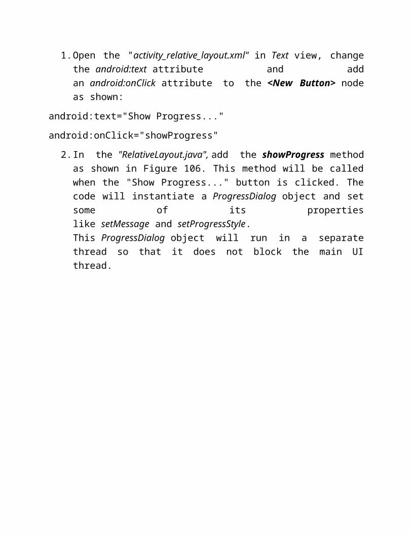
Figure 119: GridView at work!
ReflectionWe are nearing the rest stop. Let's pause for a while and reflect. Do you notice the differences between this group of Layout models - LinearLayout, RelativeLayout, and TableLayout, and this group - ListView and GridView. They both organize elements on the UI. However, the similarity stops here.
The former group deal mainly with UI controls like button, spinner, text fields and so on, which are usually created at design time in XML format.
On the contrary, the purpose of the latter is to tabulate data in either one- or two-dimension grid that are only known at runtime. An Adapter acts as the middle man
to draw and model the data before passing it to either the ListView or GridView for display.
Best Practices
Throughout the journey, I have cited some important learning points, tips, and summaries where applicable. In particular, I would like to stress these three points as best practices.
Learning Point 7 - When you need a new text string, do not hard code it. Instead, you should create a new string resource that takes that text string as value. You will then reference this string resource in the XML or in code whenever you need to use text string on any UIs. That is reusability and maintainability at its best. You should always visit Figures 37 to 41 for reference.
Learning Point 11 - Change all the android:id values given by default by Android Studio to something more descriptive. For example, instead of "@+id/checkBox" or "@+id/checkBox2", use "@+id/chkJogging" for "Jogging" checkbox, and "@+id/chkSwimming" for "Swimming" checkbox, and so on. The "chk" prefix is short for checkbox.
You have been building UI layouts by declaring them as XML elements and structured them in an XML file. Keep it that way! In fact, the Android framework allows you to create UI layouts at runtime using Java code. However, this approach should be avoided as far as possible as you will be mixing the presentation of your app from the code that controls its behavior. That violates the principle of "separation of concerns".
Tips
Last but not least, I would like to round up some tips that hopefully will make your Android development experience, especially with Android Studio, a less winding one.
Always start your AVD as early as possible and leave it running, of course, having more RAM and faster processors certainly help, else use a real device
Test your layout on both orientations, if you allow it, to make sure that your UI turns up as expected.
Your project fails to run!? Try some of these measures:

o Red colored code usually signifies missing packages. Place your cursor above it and Alt + Enter to import the necessary packages.
o Look through your XML files, make sure all nodes are well-structured and no missing node.
o Look for this menu icon on the menu bar that read "Sync Project with Gradle Files" to sync your project.
o On the menu bar, select Analyze > Inspect Code... which will opens an Inspection console that lists all potentials issues with your app. If you are patient and meticulous enough, you should be able to locate the faults here (Figure 120)
Figure 120: GridView at work!
o What is the last resort? The answer is "hitting File > Invalidate Caches / Restart... and pray!"
UI layouts
o LinearLayout
o RelativeLayout
o TableLayout
o FrameLayout
o RadioGroup
o ListView
o GridView
UI Controls
o Button
o TextView
o EditText
o CheckBox
o RadioButton
o ToggleButton
o Spinner
o AutoCompleteTextView
o Progress Bar
o Pickers
o ImageView