ubiquitous orporation style guide - … · example of an illustration formatted to the style guide...
TRANSCRIPT

UBIQUITOUS CORPORATION
STYLE GUIDE An official guide to the form and style of
Ubiquitous Corporation documents
2018

To verify that this is the latest version, please contact Mr. David M. Merchant in the Marketing and Communications Services Center at 555-0666 or look online on the Ubiquitous internal Moodle site for a link to the latest version. Project Editor: Mr. David M. Merchant Assistant Editor: Mr. Chad Lyles Proofreaders: Joshua Granger, Carla Haines, Kevin Haslauer, Maria Milczarek, Gabriella Perez, and Jessica Puckett. Special thanks to Dr. Steven A. Jones (Louisiana Tech University), Dr. Celia Lewis (Louisiana Tech University), and Dr. Tamara Powell (Kennesaw State University) for allowing us to use some of their course material.
While we have done our best to ensure that the information set out in this Guide is relevant, correct, and up to date, errors and omissions are inevitable. If you have any questions regarding the information presented in this guide, please send them by email to the Marketing and Communications Services Center at [email protected], or through the Ubiquitous internal Moodle site.

i
Table of Contents List of Symbols ............................................................................................................................... ii List of Illustrations ......................................................................................................................... iii Introduction: About This Guide ...................................................................................................... 1 Section 1: Basic Ubiquitous Logo Usage Guidelines ..................................................................... 2 Section 2: Writing Guidelines ....................................................................................................... 14 Section 3: Capitalization ............................................................................................................... 18 Section 4: Heading Levels ............................................................................................................ 19 Section 5: Lists .............................................................................................................................. 23 Section 6: Illustrations .................................................................................................................. 27 Section 7: Memo Specific Guidelines........................................................................................... 31 Section 8: Report Guidelines ........................................................................................................ 34 References ..................................................................................................................................... 41 Appendix A: Memo Masthead Example....................................................................................... 43 Appendix B: Cover Page Example ............................................................................................... 44 Appendix C: Title Page Example ................................................................................................. 45 Index ............................................................................................................................................. 46

ii
List of Symbols
Corp. Corporation CTRL the control key on a keyboard dpi dots per inch e.g. exempli gratia (Latin): “for example” HEX Hexadecimal color code (used in web pages) i.e. id est (Latin): “that is” MLA Modern Language Association mm millimeter RGB Red Green Blue color model (additive color model) URL Uniform Resource Locator, the address of a web page

iii
List of Illustrations Figures Figure 1. Standard Logo ..................................................................................................................2 Figure 2. Alternative Logo ...............................................................................................................3 Figure 3. Masterbrand Logo With Tagline ......................................................................................3 Figure 4. Masterbrand Logo With Signature and Tagline ...............................................................4 Figure 5. Sub-brand Text Colors Against a White Background ......................................................6 Figure 6. Sub-brand and Tagline Text Against a Black Background ..............................................6 Figure 7. Masterbrand Logo and Clear Space Proportions ..............................................................7 Figure 8. Examples of Improper Use of Sub-logos .........................................................................7 Figure 9. Examples of Improper Use of Taglines ............................................................................8 Figure 10. Ubiquitous Corporation Business Card Examples .........................................................9 Figure 11. Ubiquitous Corporation Masthead Examples ...............................................................10 Figure 12. Ubiquitous Corporation Envelope Style .......................................................................10 Figure 13. Ubiquitous Masterbrand Website Usage Example .......................................................11 Figure 14. Ubiquitous Masterbrand YouTube Profile Usage Example .........................................11 Figure 15. Ubiquitous Masterbrand Twitter Profile Usage Examples ...........................................11 Figure 16. Ubiquitous Masterbrand Vehicle Placement Examples ...............................................13 Figure 17. Graph With Unnecessary Borders Example ................................................................ 26 Figure 18. Graph Without Unnecessary Borders Example ............................................................27 Figure 19. Example of an Illustration Formatted to the Style Guide .............................................28 Figure 20. Memo Heading Segment ..............................................................................................29 Figure 21. Subsequent Memo Page Headers .................................................................................30 Tables Table 1. Approved Colors ................................................................................................................5 Table 2. Example #1 of a Table Formatted to the Style Guide ..................................................... 27 Table 3. Example #2 of a Table Formatted to the Style Guide ..................................................... 28

Ubiquitous Corporation Style Guide Introduction—1
Introduction: About This Guide Ubiquitous takes pride in the diversity, independence, initiative, and entrepreneurial spirit of the Ubiquitous community. But all Ubiquitous Corporation communication needs to be effective for both internal communications and crucial external communications (business partners and customers). Readers need to quickly navigate corporate documents to find the information they need and, once found, to easily understand what they read. This is especially true for international readers. This can only be done if the writing is consistent and clear. Since standard style guides give options for many elements and do not cover every situation, an organization style guide lists the decisions the organization has made for professional consistency and aesthetic appeal.
“If you can’t explain it simply, you don’t understand it well enough.” –Albert Einstein Writers, editors, and developers can use this document as a guide to writing style, usage, and Ubiquitous product terminology. Writers and editors should review this guide so that they become familiar with the range of issues involved in creating high-quality, readable, and consistent documentation. Ubiquitous developers and third-party developers should follow this guide when writing any text that users see, as well as when writing documentation for their users. In this Guide, style refers to recommended or accepted in-house usage, not to literary style. This style guide takes precedence over other sources or external examples. If you cannot find something in our style guide, check the references listed below.
• Chambers Dictionary (13th edition) • Merriam-Webster’s Collegiate Dictionary • The Elements of Style • Purdue Online Writing Lab: <http://owl.english.purdue.edu/owl/> • Technical Communication, 10th edition by Mike Markel • MIL-STD-961E w/Change 2 • GPO Style Manual
Ubiquitous Corporation Style Guide Section 1: Ubiquitous Logo Usage Guide—2
Section 1: Basic Ubiquitous Logo Usage Guidelines
At the heart of our identity is our essence, encapsulated in the phrase “Our Business Is Everything.” This is not only about the Ubiquitous Corporation, and the many fields it is involved with, but the people with whom Ubiquitous has contact with as well. Corporate values are scientific endeavor, corporate responsibility, and quality of life. 1.1 Masterbrand Logo The Ubiquitous logo is the most important part of our visual identity. It is Ubiquitous’ leading icon, incorporating every site, project, company, and division. When an organization, such as Ubiquitous, is made up of multiple components, most of which are in the public eye, it is important to make sure that the branding and visual representation is consistent and strong to avoid conflicting messages and images. If each Ubiquitous facility and center had their own logo, the Ubiquitous brand would become diluted and inconsistent. The masterbrand logo is to be used on all general Ubiquitous material, including marketing material and advertising activities.
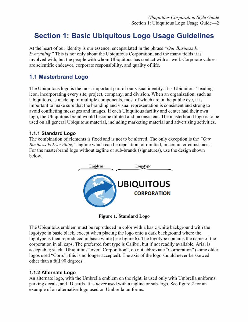
1.1.1 Standard Logo The combination of elements is fixed and is not to be altered. The only exception is the “Our Business Is Everything” tagline which can be reposition, or omitted, in certain circumstances. For the masterbrand logo without tagline or sub-brands (signatures), use the design shown below. Emblem Logotype
Figure 1. Standard Logo
The Ubiquitous emblem must be reproduced in color with a basic white background with the logotype in basic black, except when placing the logo onto a dark background where the logotype is then reproduced in basic white (see figure 6). The logotype contains the name of the corporation in all caps. The preferred font type is Calibri, but if not readily available, Arial is acceptable; stack “Ubiquitous” over “Corporation”; do not abbreviate “Corporation” (some older logos used “Corp.”; this is no longer accepted). The axis of the logo should never be skewed other than a full 90 degrees. 1.1.2 Alternate Logo An alternate logo, with the Umbrella emblem on the right, is used only with Umbrella uniforms, parking decals, and ID cards. It is never used with a tagline or sub-logo. See figure 2 for an example of an alternative logo used on Umbrella uniforms.

Ubiquitous Corporation Style Guide Section 1: Ubiquitous Logo Usage Guide—3
Figure 2. Alternate Logo 1.2 Tagline The tagline “Our Business Is Everything” (always written in italics) is an important phrase that emphasizes what encapsulates Ubiquitous’ essence. Earlier, our tagline was “Ubiquitous Sheltering Your Family.” The earlier tagline was too narrow and misled some of the public into thinking Ubiquitous was only an insurance corporation. It did not reflect properly the core business of Ubiquitous, biotechnology, nor the many fields it is involved with. The tagline does not have to be used, but when it is, it should never appear without the Ubiquitous masterbrand logo. It does not have to be incorporated into the logo, but should always be below the logo, never above it. When incorporated into the logo, a separator line is placed between it and the logo text, as is shown in figure 3.
Figure 3. Masterbrand Logo With Tagline
The tagline should never be in a font size equal to, or larger than, the logo. The preferred font type is the Ubiquitous Corporation font in italics, but if not readily available, you can also use Arial in italics. Font color is black, except when on a dark background when the text will be white. Do not highlight any of the logo text with a different color background. Capitalize each word in the tagline, and enclose in quotation marks. Do not punctuate the tagline. Do not use the tagline when there is an issue of its legibility. Do not use the tagline in sub-brand logos (see 1.4 for more information) or in the alternate logo. Align the end of the tagline vertically with the end of the masterbrand text. 1.3 Sub-brand Logos (Signatures) Signatures have been created as some Ubiquitous divisions benefit from clearly communicating their purpose, but still need to be perceived as part of the Ubiquitous family. Sub-brand logos should only be used on material specific to that division’s activity, or for material promoting that

Ubiquitous Corporation Style Guide Section 1: Ubiquitous Logo Usage Guide—4
division’s activities. Simply replace the tagline with the sub-brand text. The signature should not cover the Ubiquitous emblem, nor should it be more than one line. Font size should never be larger than the “Ubiquitous” text. Align the end of the sub-brand text vertically with the end of the masterbrand text. The tagline, if used, can be placed below the logo (but not within). Figure 4 shows a masterbrand logo with a signature and a tagline separated by a space (textbox or illustration).
Figure 4. Masterbrand Logo With Signature and Tagline 1.4 Co-Branding When Ubiquitous chooses to co-brand, the Ubiquitous logo must be represented in the following way:
• Both logos to be of equal size or height • Both logos to be position side by side, with the Ubiquitous logo, where possible, on the
right-hand side of the partner logo • The look and feel of the document should reflect that of the Ubiquitous master brand in
terms of style, typography, and colors. 1.5 Color Variants The following colors are approved for use in official Ubiquitous Corporation documents. Any deviation must be pre-approved by the Marketing and Public Relations Division. See the discussions below for approved colors for level headings, table headers, and logo sub-brand text.

Ubiquitous Corporation Style Guide Section 1: Ubiquitous Logo Usage Guide—5
Table 1. Approved Colors Color Sample Color Name HEX1 Code RGB2 Code Ubiquitous Red (official) #800203 128,2,3 Tech0F3 Red (official) #E31B23 227,27,35 Tan #F4DEC6 244, 222,198 Nectarine #ED8E4E 237,142,78 Lemon #F7E15A 247,225,90 Yellow #FFFF00 255,255,0 Apple Green #DFFF00 141,182,0 Green #008B16 0,139,22 Lime #43CA00 67,202,0 Teal #00758B 0,117,139 Ubiquitous Light Blue (official) #89C9FE 137,201,254 Ubiquitous Blue (official) #0369BC 3,105,188 Tech Blue (official) #002F8B 0,47,139 Purple #5C008B 92,0,139 Magenta #8B0074 139,0,116 White #FFFFFF 255,255,255 Light Cool Gray # D9D9D9 217,217,217 Cool Gray #A1A6A5 161,166,165 Black #000000 0,0,0 1.5.1 Level Heading Colors Use Tech Blue for level 1 and 2 headings in Ubiquitous documents. All other headings are in black. 1.5.2 Table Caption Colors Table captions (column headings) shall have a Ubiquitous Light Blue cell background with white text. 1.5.3 Logo Sub-brand and TaglineText Colors You may choose colored text for the sub-brand text, but the color must be Ubiquitous Red; otherwise, sub-brand text is black unless against a dark background when white is then used. The divider line is also black unless against a dark background when white is then used. Tagline text is always in black unless against a dark background when white is then used. 1 Hexadecimal colors are used in web pages. The color is defined by its mix of red, green, and blue colors using integers between 00 and FF to specify the intensity of each color component (00 being no intensity and FF being maximum intensity). 2 Red Green Blue color model (additive color model) 3 Tech refers to Louisiana Tech University.
Ubiquitous Corporation Style Guide Section 1: Ubiquitous Logo Usage Guide—6
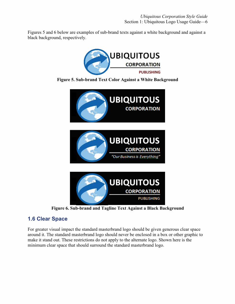
Figures 5 and 6 below are examples of sub-brand texts against a white background and against a black background, respectively.
Figure 5. Sub-brand Text Color Against a White Background
Figure 6. Sub-brand and Tagline Text Against a Black Background
1.6 Clear Space For greater visual impact the standard masterbrand logo should be given generous clear space around it. The standard masterbrand logo should never be enclosed in a box or other graphic to make it stand out. These restrictions do not apply to the alternate logo. Shown here is the minimum clear space that should surround the standard masterbrand logo.
PUBLISHING
Ubiquitous Corporation Style Guide Section 1: Ubiquitous Logo Usage Guide—7
¼X
¼X
X 2 X Emblem Logotype
¼X
½X
½X
X
¼X
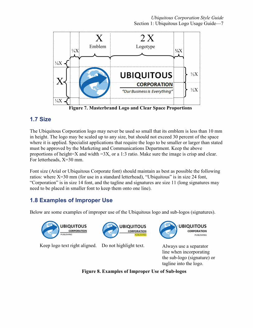
Figure 7. Masterbrand Logo and Clear Space Proportions
1.7 Size
The Ubiquitous Corporation logo may never be used so small that its emblem is less than 10 mm in height. The logo may be scaled up to any size, but should not exceed 30 percent of the space where it is applied. Specialist applications that require the logo to be smaller or larger than stated must be approved by the Marketing and Communications Department. Keep the above proportions of height=X and width =3X, or a 1:3 ratio. Make sure the image is crisp and clear. For letterheads, X=30 mm. Font size (Arial or Ubiquitous Corporate font) should maintain as best as possible the following ratios: where X=30 mm (for use in a standard letterhead), “Ubiquitous” is in size 24 font, “Corporation” is in size 14 font, and the tagline and signatures are size 11 (long signatures may need to be placed in smaller font to keep them onto one line).
1.8 Examples of Improper Use Below are some examples of improper use of the Ubiquitous logo and sub-logos (signatures).
Keep logo text right aligned. Do not highlight text.
Figure 8. Examples of Improper Use of Sub-logos
Always use a separator line when incorporating the sub-logo (signature) or tagline into the logo.

Ubiquitous Corporation Style Guide Section 1: Ubiquitous Logo Usage Guide—8
Below are additional examples of improper use of the Ubiquitous Corporation Logo as well as the improper use of the Ubiquitous Corporation tagline.
Figure 9. Examples of Improper Use of Taglines 1.9 Business Card Style Guide
The back of the business card should not be used to print additional information such as mission statements, addresses, or other visual identifiers. The back may be used to translate the card into a second language. The address is not usually translated as the English mailing address is required for correspondence. The corporation name should never be translated. See figure 10 below for an annotated example of how the front of the business card should be designed.
Never use the tagline without the masterbrand logo.
Only use a separator line when incorporating the tagline or signature into the logo. In the example above, since the tagline is not incorporated into the logo, nor is there a signature incorporated, the separator line needs to be removed.
The axis of the logo should never be skewed other than 90 degrees perpendicular to the horizontal.
“Our Business is Everything”
“Our Business is Everything” “Our Business is Everything”

Ubiquitous Corporation Style Guide Section 1: Ubiquitous Logo Usage Guide—9
Figure 10. Ubiquitous Corporation Business Card Examples
A. The logo should be placed according to the clear space rules in 1.6. B. Refer to section 4 for guidelines for punctuating abbreviations. C. Specific job title or position of the individual. D. Only the department name is used here. If the departmental signature is used in the logo,
the department name can be skipped here. E. The correct order is address, city, state (two-letter postal abbreviations), postal code,
country. No commas are used before the postal code. Double spaces are used between the state code and the postal code.
F. The business telephone number is preceded by “Tel” (no period or colon) followed by “Ext” (extension number, if used), “Fax,” and “Cell” (if used). If two numbers are listed on the same line, separate them by two spaces.
G. If there is room left, the tagline should be used, same clear space as the logo. H. The grey-toned area indicates the size and position for a maximum of one program or
initiative identifier.
1.10 Stationery—Letterhead (Masthead) Style Guide
The letterhead, the first page of a memo or letter, contains the masterbrand logo with either the tagline or, for inter-departmental use, the option of using the department signature (sub-logo). The masterbrand logo should be 30 mm in height and centered in the header. No other text or visuals should be included. Letterhead (masthead) templates can be downloaded from Ubiquitous’ internal Moodle site. See figure 10 below for memo masthead examples. An example of a masthead including a standard memo heading segment is found in Appendix A.
HUMAN RESOURCES

Ubiquitous Corporation Style Guide Section 1: Ubiquitous Logo Usage Guide—10
Figure 11. Ubiquitous Corporation Masthead Examples
1.11 Envelope Style Guide
The logo should be placed according to the clear space rules in 1.6. Put return address in US Postal Service standardized format (all caps). Include two spaces before the postal code. Below is an example of an official Ubiquitous Corporation envelope.
Figure 12. Ubiquitous Corporation Envelope Style 1.12 Website Usage
On Ubiquitous Websites, use the masterbrand logo with tagline in white on a transparent background. If used on a Website with a dark background, use the whiteout version (see 1.6). Do
HUMAN RESOURCE MANAGER ATTN: PERSONNEL OFFICE UBIQUITOUS CORPORATION 14582 ENNERDALE ST., SUITE 14005 RACCOON CITY, ND 57701
“Our Business Is Life Itself”
PUBLISHING

Ubiquitous Corporation Style Guide Section 1: Ubiquitous Logo Usage Guide—11
not use sub-logos. The logo should never appear at a size where the total width of the word “Ubiquitous” is less than 150 pixels0
4 at a resolution of 72 dpi (dots per inch).
150 pixels
Figure 13. Ubiquitous Masterbrand Website Usage Example
1.13 Social Media Standards: YouTube
All approved Ubiquitous channel names must follow the following format: www.Ubiquitous-corp.biz/UmbrellaProgramName. Prior to creating a channel, have an email address set up for that channel (for example, [email protected]). The username must be the same as the channel name. YouTube requires an 88-pixel x 88-pixel graphic to for each profile. Text should be avoided unless the words are short. Use the Ubiquitous emblem against a black background:
Figure 14. Ubiquitous Masterbrand YouTube Profile Usage Example
1.14 Social Media Standards: Twitter
Twitter requires an 80-pixel x 80-pixel graphic to identify each profile. You may use the Ubiquitous avatar or, for departments or programs accounts, you may choose to use a head shot of the spokesperson. Since Twitter resizes the image to as small as 20 pixels x 20 pixels, use of the logo is discouraged, use U in Calibri font, size 14, boldfaced, in Ubiquitous Blue color, enclosed in a black box.
An 80 pixels x 80 pixels avatar as it appears on the Profile page.
A 20 pixels x 20 pixels avatar as it appears in “Following” aggregated collages.
Figure 15. Ubiquitous Twitter Profile Usage Examples
4 A pixel is the smallest discrete component of an image on a monitor (usually a colored dot).
U

Ubiquitous Corporation Style Guide Section 1: Ubiquitous Logo Usage Guide—12
1.15 Social Media Standards: Facebook Facebook requires a 200-pixels (fixed) x 600-pixels (maximum) graphic to accompany each profile. You may choose to use one of the generic Ubiquitous Corporation avatars, Ubiquitous emblem, Ubiquitous logo or any rated G (General Audience) graphic as long as the Ubiquitous emblem is included. 1.16 Email Footer
You may include the Ubiquitous masterbrand logo with tagline (or signature) as email footer. Keep the logo width to 4 inches or less. Refer to 1.7 for other sizing restrictions. 1.17 Video Watermarking The Ubiquitous logo and tagline or signature should be included on videos produced for use on electronic media such as Websites, Facebook, and YouTube. The logo with tagline is placed in the top right. It should be watermarked at 50 percent of its full value. The logo should be no more than 1/5 the width of the video width. It should be given the same amount of clear space to maintain visual clarity. Refer to 1.6 for more information. 1.18 Vehicle Identification The Ubiquitous Corporation leases and owns a large fleet of vehicles. The following pages will help to guide the sizing and placement of the Ubiquitous masterbrand logo and emblems. 1.18.1 Color The Ubiquitous masterbrand logo (without tagline or signature) should appear in its color version whenever possible, on light-toned vehicles. For dark vehicles the white out text version of the logo should be used; the standard colored emblem is appropriate for any vehicle tone. It is important to evaluate the visual contrast of a vehicle color to determine whether the color version of the logo or the white out version should be used. The integrity of the logo and emblem must be respected at all times. Never recreate or modify in any way. 1.18.2 Size and Placement Use 30-inch wide (maximum) logos (with tag line) or 15-inch wide (maximum) emblems on driver’s doors. Use 12-inch wide (maximum) logos for the back of the vehicle (place to the right). Unless otherwise dictated by law, serial numbers are placed on the back of the vehicle (place to the left), if possible, and should be at least 2 inches in height, in boldface Arial font. Ideally, the bottom of the serial numbers should align with the bottom of “Corporation” in the logo to its right.

Ubiquitous Corporation Style Guide Section 1: Ubiquitous Logo Usage Guide—13
Optionally, but preferred, the Ubiquitous emblem may be used centered on the vehicle hood or front. Do not place logos or emblems where they cause a safety hazard (for example, blocking driver’s view) or in a manner prohibited by local laws.
Figure 16. Ubiquitous Masterbrand Vehicle Placement Examples

Ubiquitous Corporation Style Guide Section 2: Writing Guidelines—14
Section 2: Writing Guidelines
Consistent formatting and syntax make documents easier to use because users do not have to learn how to find the information they need each time they read a corporate document. The reader can predict where the information they need is located and how it will be presented. Consistent word choices make a document easier to use because users will not have to keep up with the word changes; this also makes translation of the document easier (and cheaper). Consistency also makes writing easier: you do not have to create a new design, organization, or vocabulary for the same writing need; the more often you use a set style, the faster you become at using it.
Aesthetics also contributes to readability. For instance, consider the following style rules:
• Try not to start a sentence with a number (spell it out the number if must start with it). • Avoid excessive use of acronyms and abbreviations. • Avoid excessive use of word combinations using the backslash (/).
If we ignored the above rules, we could end up writing sentences like the following: 199 MS/MA/PhD students/grads applied for an NSA pos. at a joint SRO LTU/GSU job fair.5
Not only is the sentence unappealing aesthetically, it is difficult to read as well as difficult (thus expensive) to translate into another language). Proper grammar, spelling, and usage are critical in technical writing. Even minor errors can make a document inefficient at best and ineffective at worst, leading to miscommunication and mistranslation. Such errors are also unprofessional and reflect poorly not only on the writer but on the Corporation as well. Check, double-check, and check again your grammar, spelling, and usage before submitting any Ubiquitous document. 2.1 Typeface Choices Below are font choices regarding font faces (families) and styles. The choices are based on web safe fonts in case your document is put up on the web, fonts that work well with each other, and what gives a professional impression. Web-safe fonts are fonts that are most likely already on a user’s device, which reduces a page’s loading time. Common fonts also help to make sure your page is seen correctly. For instance, differences in font families can help a reader to easily tell the difference between a page header and a line of text just being emphasized or a block of body text and lines of code that a reader needs to type. 5 This translates to “One hundred ninety-nine masters of science, masters of art, and PhD students and graduates applied for a National Security position or for an intern position at a standing room at a joint Louisiana Tech University and Grambling State University job fair.”

Ubiquitous Corporation Style Guide Section 2: Writing Guidelines—15
2.1.1 Font Face: Heading and Body Text Use the sans serif font Arial for headings and the serif font Times New Roman for the text, including tables, endnotes, page headers (not level headings), and footnotes. Using a sans serif font for headings and a serif font for body text helps to distinguish one from the other, especially to help distinguish text that is being emphasized from text that is a heading. Exception: for an IEEE document only use Times New Roman for both headings and body text. See below for font size decisions. 2.1.2 Font Face: Typed Code Always use Courier or Courier New font to help indicate code a reader needs to type in a program or computer. Whichever font you choose, use consistently in a document. For example:
To start the Red Queen server, type the following command: RUN RQ_Server
2.1.3 Font Sizes The font size for body text, including endnotes, figure and table titles, page headers (not level headings), tables, and typed code will be size 12. However, text in tables can be lowered to size 11 or size 10 (but no lower) if lowering the font size helps the table fit within the side or bottom margins of a page. Footnotes and source entries for figures and tables are in 10-point font. Font sizes for heading levels are size 18 for level 1 headings, 14 for level 2 headings, and 12 for all other headings. See section 4 for more information. 2.1.4 Font Style: Emphasized Text Emphasized information should be italicized, boldfaced, or larger (by one font size). Do not get carried away with emphasizing; over-use of emphasis is counter-productive. 2.1.5 Font Style: Italics In addition to emphasizing text, use italics for book and journal titles, and for foreign words. 2.1.6 Font Style: Underlining Underlining obscures letter descenders (for example, g, p, q, and y); this can make reading text difficult, especially for dyslexic readers. Also, because of the Web, many skimming readers will first think underlined texts are clickable links or Web addresses. Therefore, use underlining only for hypertext links in Web documents, unless used in quoted material or for illustrative purposes. 2.1.7 Font Style: Color All Times New Roman text will be black unless against a dark background where they will be white. Rare exceptions can be made, but there must be a specific reason for the color change, and the color used should be from the approved color list in section 1. Level 1 and level 2 heading text will be Tech Blue (see the approved color list in section 1 for color codes). All other heading text will be black.

Ubiquitous Corporation Style Guide Section 2: Writing Guidelines—16
2.2 Hyperlinks
Do not hyperlink text, except for documents produced specifically for Web pages or social media. For example, [email protected] is hyperlinked text. Either turn off your word processor’s automatic hyperlink feature or right-click on the link and choose “remove hyperlink.” The text will remain: [email protected]. For Web documents, since users should not have to find out where to click, links should be colored and underlined. Be consistent in your use as varying colors for links in a document can confuse users. The preferred color for unvisited links is blue. Whatever color you choose for linked text try to avoid using it for any other body text in the Web document or site, and make sure the contrast between the link and the background is not too weak, to where the link text is difficult to read. This goes for the visited link color choice as well. 2.3 Accessibility Guidelines One of Mike Markel’s eight measures of excellence mentioned in his textbook, Technical Communication, is accessibility. Accessibility refers to the ability of readers to find the information they need quickly and easily. This goes beyond using headings properly, dividing the information into small, independent chunks, and ordering information logically, but also designing for readers with disabilities. Some guidelines to consider:
• Use correct standard American English spelling, punctuation, and grammar • Avoid long noun strings, overly long sentences, and overly short sentences. • Avoid unnecessary jargon, slang, or archaic language. • Avoid unexplained terminology. • Avoid sports-specific and culture-specific references as they depend upon your reader
being knowledgeable of the sport or the culture referenced to understand the references; otherwise, your reference will have no meaning (or a different meaning) to them.
• While analogies are used often by scientists to help clarify abstract ideas, avoid using figurative language such as clichés, hyperbole, idioms, litotes metonyms, personification, and puns as these can be difficult to translate properly.
• Generally, do not use text below 10-point type size. • Avoid full justification. • Use “/” sparingly to combine words as this can be misread by a busy, skimming reader. • Generally, the spacing between letters should be kept at the word processor’s standard
default setting. Both closely and widely spaced typefaces are often difficult to read. • Avoid combining red and green colors in lettering as this is difficult for the color-blind to
read. Do not use color as your only indicator of emphasis or importance. Avoid using basic blue (default for linked text in most browsers) for non-linked text.
• Ensure you have enough contrast between text and background. A color contrast analyzer can be downloaded from <http://www.paciellogroup.com/resources/contrastanalyser/>.
• Ensure that boldfaced text does not become so thick that it reduces the white space within characters, making it difficult to distinguish between some characters.

Ubiquitous Corporation Style Guide Section 2: Writing Guidelines—17
• Limit using UPPER CASE. Most readers do not read every letter of a word—they recognize words by their shape. Putting words in all upper case makes all words take on a brick shape. This can be especially difficult to read for dyslexics.
• Limit UunderliningU. Underlining obscures descenders, the portions of letters that extend below the body of the letters (for example, g, p, q, and y). This can make reading difficult, especially for skimmers or dyslexics. Reserve underlining for links in interactive or Web documents.
• Use images or diagrams to assist in explaining complex things, but make sure that all visuals are crisp, clear, and relate directly to the text.
• Paper stock should be good quality, non-glare, and thick enough to ensure there is no show through. Glare from glossy paper can lessen legibility.
2.4. List of Symbols As an additional aid to both multicultural and non-subject matter expert readers, define all symbols, abbreviations, acronyms, and initialisms used in a report in a list of symbols or glossary, including those commonly used (those found in an American English standard dictionary). However, standard mathematical operators (√ or ÷, for example) do not need to be included. Special operators do, however. Exception: an abbreviation, acronym, initialism, or symbol used only once in a report does not have to be placed in a List of Symbols page. The abbreviation, acronym, initialism, or symbol still must be spelled out or defined when it is used. 2.5 American Versus British or Other Spelling Conventions For words that have more than one correct spelling depending upon whether you are using American conventions or British conventions, spellcheckers will not normally tell you which one is preferred. The Ubiquitous Corporation requires the American convention.

Ubiquitous Corporation Style Guide Section 3: Capitalization—18
Section 3: Capitalization
3.1 Capitalize
Capitalize Ubiquitous when referring to the Ubiquitous Corporation (the Ubiquitous health plan), capitalize Corporation when referring to the Ubiquitous Corporation (the Corporation’s health plan), and capitalize Program when part of a proper name (the Nemesis Program).
3.2 Title Case
Put titles in title case as recommended by The United States Government Printing Office Style Manual: Capitalize all words in titles, except for a, an, and, as, at, but, by, for, in, it, nor, of, on, or, the, to, and up. Exceptions: Always capitalize the first and last word in the title, the first word following a colon, words that follow hyphens in compound terms, and all prepositions that belong to a phrasal verb. For example:
Raccoon City: The Ten Top Restaurants The word the in the title follows a colon and is thus capitalized. How to Back Up a Flash Drive The preposition up is part of the phrasal verb back up and is thus capitalized. What the Red Button Is For The preposition for is the last word in the title (and yes, you can end a sentence with a preposition).
Please note that the standard reference resources use a slightly different style; as with any conflicts between the Style Guide and standard references, the Style Guide wins.
3.3 All Caps
Limit placing text all in UPPER CASE. All upper case text is harder to read for people with dyslexia.
3.4 Abbreviations
Follow American Standard English and MLA guidelines for capitalizing abbreviations. Generally, if the word being abbreviated is a proper noun, the abbreviation is also capitalized. There are some exceptions; for example, World Wide Web is capitalized but its abbreviation, when used as part of an Internet address, is not (http://www.domain.com). When in doubt, check the Merriam-Webster’s Collegiate Dictionary (primary source) or the American Heritage College Dictionary (secondary source). Check Merchant’s English Usage Guide for Technical Writers for information on using abbreviations in technical writing.

Ubiquitous Corporation Style Guide Section 4: Heading Levels—19
Section 4: Heading Levels
Headings help make information in your document more accessible. Try to not place two headings back to back without text between them. When dividing a section, you need at least two subsections. Do not skip levels; for example, the next level after a level 2 heading is a level 3, not a level 4. Never begin the sentence after a heading with this, it, or other pronoun referring to the heading. While five levels are allowed, you should try not to use more than four. If you need more than four levels, think about reorganizing the information. Also, be sure that you do not orphan or "bump" (means to separate) headings from the text that they introduce. Doing so is bad form, and it does erode the professional appearance of the document. Keeping these rudimentary standards in mind will allow you to place together a well-conceived document. Refer to 3.2 for capitalization guidelines. 4.1 Heading Placement
Do not place two headings (same level or not) back to back with no text between them. Do not orphan or "bump" (separate) headings from the text that they introduce. Doing so is bad form, and it does erode the professional appearance of the document. 4.2 Color Level 1 and level 2 heading text are colored Tech Blue6. All other heading text will be black. 4.3 Level 1 Level 1 headings are like chapter headings in a book. These are rarely used in memos and are not used in lists.
• Boldface, 18 points, Arial. • Centered. • Blank 12-point size line before the next line of text. • No ending punctuation (except if ending with a quoted title or trademark that includes
important punctuation like a question mark or exclamation mark).
6 Tech Reflex Blue: RGB 0, 47, 139; HEX. #002F8B

Ubiquitous Corporation Style Guide Section 4: Heading Levels—20
4.4 Level 2
Level 2 headings are the first levels in a memo, otherwise are level 1 subsections. • Boldface, 14-points, Arial. • No indention, no centering; align with the left margin. • Blank 12-point size line before the next line of text. • No ending punctuation (except if ending with a quoted title or trademark that includes
important punctuation like a question mark or exclamation mark).
4.5 Level 3
Level 3 headings are subsections for a level 2 section, and not for a level 1 section. • Boldface, 12-points, Arial. • No indention, no centering; align with the left margin. • No blank line before next line of text. • No ending punctuation (except if ending with a quoted title or trademark that includes
important punctuation like a question mark or exclamation mark).
4.6 Level 4
Level 4 headings are subsections for a level 3 section, and not for level 1 or 2 sections. • Boldface, italicized, 12-points, Arial. • On the same line as the body text. • Ending punctuation (at least a period).
4.7 Level 5
Level 5 headings are subsections for a level 4 section, and not for level 1, 2, or 3 sections. Try to divide your document into more than four levels.
• Italicized, 12-point font, Arial. • Indented an extra 0.5 inches (except when used in lists) from the left margin. • On the same line as the body text. • Ending punctuation (at least a period).
4.8 Parallelism For descriptive headings, be consistent (parallel) in the phrasing. For instance, do not have some level 3 headings in noun phrases and then switch to participial phrases for other level 3 headings in the same level 2 section.

Ubiquitous Corporation Style Guide Section 4: Heading Levels—21
Poor: Creating Headings in a Word Document Footer Creation in a Word Document Better: Creating Headings in a Word Document Creating Footers in a Word Document
4.9 Examples: Standard (Non-List) Headings Below are examples of formatting for headings. Refer to 5.2 for capitalization guidelines. See the next page for examples of headings in lists.
Level 1 Heading Example
Lorem ipsum dolor sit amet, incididunt ut labore et dolore magna aliqua. Ut “Klaatu barada nikto!” Gort quis nostrud “treguna, mekoides, et tracorum satis dee.” Sed do eiusmod elit.
Level 2 Heading Example
Lorem ipsum dolor sit amet, incididunt ut labore et dolore magna aliqua. Ut “Klaatu barada nikto!” Sed Tali'Zorah vas Neema do eiusmod elit:
• Chiktikka vas Paus • Keelah se'lai • Bosh'tet
Gort quis nostrud “treguna, mekoides, et tracorum satis dee.” Level 3 Heading Example Lorem ipsum dolor sit amet, incididunt ut labore et dolore magna aliqua. Ut “Klaatu barada nikto!” Gort quis nostrud “treguna, mekoides, et tracorum satis dee.” Sed do eiusmod elit. Level 4 Heading Example. Lorem ipsum dolor sit amet, incididunt ut labore et dolore magna aliqua. Ut “Klaatu barada nikto!” Gort quis nostrud “treguna, mekoides, et tracorum satis dee.” Sed do eiusmod elit.
Level 5 Heading Example. Lorem ipsum dolor sit amet, incididunt ut labore et dolore magna aliqua. Ut “Klaatu barada nikto!” Gort quis nostrud “treguna, mekoides, et tracorum satis dee.” Sed do eiusmod elit.
4.10 Examples: Headings in Lists Below are examples of formatting for headings in lists. Refer to 5.2 for capitalization guidelines. See the previous page for examples of standard (non-list) headings. Level 1 and 2 headings are never used in bulleted or numbered lists. For more on using lists, see Section 7.
Notice that when a level 2 section begins, there is a blank 12-font line before and after it.
Notice that a first-order list has a blank size-12 font Times New Roman line before and after it.

Ubiquitous Corporation Style Guide Section 4: Heading Levels—22
Level 1 Heading Example
Lorem ipsum dolor sit amet, incididunt ut labore et dolore magna aliqua et tlhIngan Hol: 1. 'IqnaH 2. 'IqnaH QaD 3. DenIb Qatlh
Ut “Klaatu barada nikto!” Gort quis nostrud “treguna, mekoides, et tracorum satis dee.” Sed do eiusmod elit. Level 2 Heading Example
Lorem ipsum dolor sit amet, incididunt ut labore et dolore magna aliqua. Ut “Klaatu barada nikto!” Gort quis nostrud “treguna, mekoides, et tracorum satis dee.” Sed do eiusmod elit:
1. Level 3 Heading, First Order List, Item 1
Lorem ipsum dolor sit amet, incididunt ut labore et dolore magna aliqua. Ut “Klaatu barada nikto!” Gort quis nostrud “treguna, mekoides, et tracorum satis dee.” Sed do eiusmod elit.
• Level 4 Heading, Second Order List, Item 1. Lorem ipsum dolor sit amet,
incididunt ut labore et dolore magna aliqua. Ut “Klaatu barada nikto!” Gort quis nostrud “treguna, mekoides, et tracorum satis dee.” Sed do eiusmod elit.
• Level 4 Heading, Second Order List, Item 2. Lorem ipsum dolor sit amet, incididunt ut labore et dolore magna aliqua. Ut “Klaatu barada nikto!” Gort quis nostrud “treguna, mekoides, et tracorum satis dee.” Sed do eiusmod elit.
2. Level 3 Heading, First Order List, Item 2 Lorem ipsum dolor sit amet, incididunt ut labore et dolore magna aliqua. Ut “Klaatu barada nikto!” Gort quis nostrud “treguna, mekoides, et tracorum satis dee.” Sed do eiusmod elit.
Gort quis nostrud “treguna, mekoides, et tracorum satis dee.”
(Notice that all list items that have a level heading require a blank size-12 Times New Roman font line before them. See the next section for more information about lists, including nested lists.)
Notice that a first-order list has a blank size-12 font Times New Roman line before and after it..

Ubiquitous Corporation Style Guide Section 5: Lists—23
Section 5: Lists Lists are useful for conveying sequential or itemized information. With paragraphs in list format, bullets or numbers can help readers to distinguish one part of a discussion from another. This visual form also helps the reader to see the structure of the discussion. The list format also makes finding specific information easier (for instance, the reader is only interested in quickly rereading or copying information from one stage of a discussion). Other uses for lists are checklists, making it easy for readers to check off information. However, do not overuse lists. 5.1 General Guidelines for All Lists Follow these guidelines to format and organize lists so that information is easy to find, and the discussion easy to follow.
• A list requires more than one item. • In lists of names, use alphabetical order to make it easier for a reader to scan and find a
specific name unless there is a good reason to do otherwise (explain the reason when introducing the list).
• If you begin a list with “for example,” “including,” or “such as,” do not use “etc.” or phrases like “and so forth” since it is already implied.
• All items in a list should be syntactically alike if possible; that is, all should be noun forms, phrases, or full sentences—whatever the context requires.
• When the sentence introducing the list ends with a noun or with the adverbial phrase “as follows,” use a colon at the end of the introductory sentence.
• Do not use a colon when the sentence introducing the list ends with a verb, a preposition, or an infinitive.
• Use serial commas for lists.
5.2 General Formatting Guidelines for Vertical Lists Most lists will be vertical lists. They usually consist of sentences or paragraphs. These guidelines are for first-level, or first-order, lists. Guidelines for nested lists are in 5.5. Guidelines for inline lists are given in 5.6.
• Include a blank size-12 Times New Roman font line before the first list item and after the last list item for first-level (first-order) lists. See 5.6 regarding spacing with nested lists.
• Indent the first list at 0.25 inches: the first line indent will be at 0.25 inches, and the hanging indent (the spacing between the list bullet or number and the list text) will be at 0.5 inches. See 5.6 below for indents with nested lists.
• Usually for a vertical list with short list items, putting an extra blank line between items is not recommended. For lengthy list items (for example, whole paragraphs), including a blank 12 point size line between list items may be helpful to the reader.
• Start each item with an uppercase letter unless the items are syntactically part of the introductory sentence (see example below).
Ubiquitous Corporation Style Guide Section 5: Lists—24
• If items are complete clauses, phrases, or sentences, end each item with a period or question mark, as appropriate, unless all the list items are syntactically part of a sentence (see example below).
• If the items are syntactically part of the sentence, use appropriate sentence punctuation; separate items in the list by commas or semicolons, as appropriate, and end with a period.
To successfully complete the assignment, students must
• read the assignment sheet, • start the assignment early, and • go to the Writing Center as needed.
5.3 Guidelines for Choosing Bullets, Letters, or Numbers Use bullets for lists that are not ordered or are ordered alphabetically but otherwise do not need to show a hierarchy, ranking, or sequence. You can use letters for both unordered and ordered lists. Use letters for lists that are unordered but where you will need to refer to list items later; finding “example F” is easier than finding the sixth example as the reader then has to count the bulleted items until they get to the right one which takes more time and there is always a chance of miscounting. Otherwise, use letters for ordered lists where you want to rank by a letter grade or if the ordered list is nested within another ordered list (for more information, see section 5.6). Use numbers to show hierarchy, ranking, or sequence. Use Arabic numerals for first-order lists (lists that are not nested within another list). Nested ordered lists require the use of Roman numerals and letters (for more information, see section 5.6). 5.4 Guidelines for Bulleted Lists
Use bullets for lists that are not ordered or are ordered alphabetically but otherwise do not need to show a hierarchy, ranking, or sequence. Use only the default Microsoft Office bullet types. See section 5.6 for bullet style choices. 5.5 Guidelines for Lettered or Numbered Lists Numbered lists must be preceded by introductory text that explains the rationale for the numbering. For embedded numbered lists, use parentheses around the numerals and either commas or semicolons, as appropriate:
T-viral infection symptoms include (1) high fever, (2) incessant itching, and (3) insatiate hunger.
For vertical numbered lists that are not nested, use Arabic numerals followed immediately by a period: 1.
Ubiquitous Corporation Style Guide Section 5: Lists—25
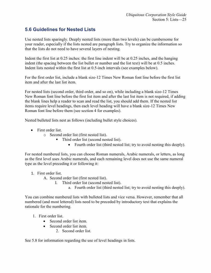
5.6 Guidelines for Nested Lists Use nested lists sparingly. Deeply nested lists (more than two levels) can be cumbersome for your reader, especially if the lists nested are paragraph lists. Try to organize the information so that the lists do not need to have several layers of nesting. Indent the first list at 0.25 inches: the first line indent will be at 0.25 inches, and the hanging indent (the spacing between the list bullet or number and the list text) will be at 0.5 inches. Indent lists nested within the first list at 0.5-inch intervals (see examples below). For the first order list, include a blank size-12 Times New Roman font line before the first list item and after the last list item. For nested lists (second order, third order, and so on), while including a blank size-12 Times New Roman font line before the first list item and after the last list item is not required, if adding the blank lines help a reader to scan and read the list, you should add them. If the nested list items require level headings, then each level heading will have a blank size-12 Times New Roman font line before them (see section 4 for examples). Nested bulleted lists nest as follows (including bullet style choices).
• First order list.
o Second order list (first nested list). Third order list (second nested list).
• Fourth order list (third nested list; try to avoid nesting this deeply).
For nested numbered lists, you can choose Roman numerals, Arabic numerals, or letters, as long as the first level uses Arabic numerals, and each remaining level does not use the same numeral type as the level preceding it or following it:
1. First order list.
A. Second order list (first nested list). I. Third order list (second nested list).
a. Fourth order list (third nested list; try to avoid nesting this deeply). You can combine numbered lists with bulleted lists and vice versa. However, remember that all numbered (and most lettered) lists need to be preceded by introductory text that explains the rationale for the numbering.
1. First order list. • Second order list item. • Second order list item.
2. Second order list. See 5.8 for information regarding the use of level headings in lists.

Ubiquitous Corporation Style Guide Section 5: Lists—26
5.7 Guidelines for Inline Lists Inline lists should use first, second, and third, or use numerals surrounded in parentheses, to enumerate items in a single sentence:
The supervisor wants reports on the ductility of iron and copper under (1) lunar surface conditions, (2) Martian surface conditions, and (3) both Martian moons’ surface conditions.
Enclosing in parentheses helps readability for a scanning reader. 5.8 Headings
You can use level 3 headings in a primary list (first order list), but not within nested lists. Depending upon aesthetics and what section heading the list begins in, a first order list can use a level 3 or a level 4 heading. Do not use level 5 headings in lists. See section 4 for examples.

Ubiquitous Corporation Style Guide Section 6: Illustrations—27
Section 6: Illustrations
Illustrations are important to technical communication. Illustrations include tables, charts, and graphs as well as figures, schematics, drawings, graphics, and photographs. Lists are usually not considered to be illustrations. A table is a data structure that organizes information into rows and columns. It allows information to be quickly accessed from specific rows. 6.1 Illustration Guidelines Follow the guidelines below to consistently format and present illustrations for Ubiquitous Corporation documents.
• Center illustrations on the pages where they appear. They should be inserted as close as
possible to the text it represents; moreover, they should be inserted after they are first introduced in the text, not before.
• Do not wrap text around illustrations. If an illustration is too large to fit across a page horizontally, it can be placed vertically (90 degrees perpendicular to the horizontal).
• Give all tables the designation “Table.” Everything else is designated as “Figure.” • The title of “Table,” with a name that identifies it, should be centered horizontally
directly above the table since readers tend to scan tables from top to bottom (but put source information directly below the table). Use font size 12, boldface, no italics.
• Table borders: Grid, Style plain single line, color black, width 1 point. • Table cell margins should be “0.08” for the left and right margins and “0.00” for the top
and bottom margins. • The title of “Figure” should be centered horizontally directly underneath a figure, with a
name that identifies it. Use font size 12, boldface, no italics. • Put titles in title case as discussed in section 3. • The full title for the illustration, tables or figures, should not exceed ten words. • Titles should be in noun form. Use participles instead of relative clauses. For example:
“Probes Succeeding in Reaching Mars” rather than “Probes That Succeeded in Reaching Mars.”
• Column heads in table header rows should be as brief as possible. Abbreviations are acceptable in column heads. Align text to the left, keep text level; however, text may be placed vertically (90 degrees perpendicular).
• Table header rows (column headings) shall have a Ubiquitous Light Blue cell background with black text. Set table header rows to repeat if the table splits across multiple pages.
• Evenly distribute data columns and rows when feasible. • Text within a table shall be in Times New Roman, font size 12; however, for tables with
a lot of text or which splits across two pages, the font size can be decreased to font size 11 or, at most, font size10, if that helps the table to fit within the margins of the page or to not be split across two pages. Remember, if a table splits across multiple pages, the header row must repeat at the top of the next page(s).
• Number illustrations sequentially as they occur in the document; number tables and figures separately. For example, the first table in the document is Table 1, even if it is not the first illustration in the document. Do not use decimal numbering (for example, Figure

Ubiquitous Corporation Style Guide Section 6: Illustrations—28
1.1 or Table 1.1). Do not punctuate the end of the title. For example:
Table 1. T-Virus Effectiveness Over Time
• The source information, if applicable, for each illustration should be centered underneath and single-spaced should it exceed one line of text. The word source is capitalized, boldfaced, in Times New Roman, and font size 10. Do not include HTTP:// in the URLs. Do not have the URL an active hyperlink (underlined, blue, clickable). Place a colon after the word “Source.” Punctuate the end of the source information. For example:
Source: Valentine, Alice. “2010 Security Update.” 2010 Annual Report. Arlay Labs, 2010 <www.arklaylabs.com/research/>.
• The best location for a plot legend is usually on the plotting area itself, but in a location
that is away from any of the plotted data. • Graphs with several curves, the uppermost curve corresponds to the uppermost legend
entry. Any other ordering can confuse the reader. • Extra borders for graphs and plots are unnecessary and generally distracting. They can
also get in the way of important information. Compare, for example, the two plot styles shown in below.
Incorrect: Graph with unnecessary borders.
Figure 17. [Graph With Unnecessary Borders Example.] Mean Pressure Drop—Mean Flow Characteristic for All Coronary Stenotic Models
The data and other information are better emphasized when the following are eliminated:
1. The border around the legend (labeled “1” in the incorrect example above). 2. The border around the plotting area (labeled “2” in the incorrect example above). 3. The border around the complete plot (labeled “3” i in the incorrect example above).
050
100
150
0 500 1000 1500 2000
Flow Rate (ml/min)
Pres
sure
Dro
p (m
m H
g)
40% Stenosis, Measurements40% Stenosis, Theory20% Stenosis, Measurements20% Stenosis, Theory
1
2
3

Ubiquitous Corporation Style Guide Section 6: Illustrations—29
Correct: Graph without unnecessary borders.
Figure 18. [Graph Without Unnecessary Borders Example.] Mean Pressure Drop—Mean Flow Characteristic for All Coronary Stenotic Models
6.2 Illustration (Table) Examples Below is an example of a table formatted to the above guidelines.
Table 2. [Example #1] Prevalence of Types of Medication Errors
Mode of Error Percentage Administering 58.0% Documenting or Transcribing 22.0% Dispensing 17.0% Monitoring 1.5% Patient Compliance 0% Prescribing 1.6% Total 100.0%
Source: Frith, Karen, H., et al. "Nurse Staffing Is An Important Strategy To Prevent Medication Errors In Community Hospitals." Nursing Economic$ 30.5 (2012): 288-294. CINAHL Complete. Web. 23 Apr. 2015
The information can be listed alphabetically (as in the above example), in descending order by percentage, or in procedural order. The ordering depends upon what is being emphasized. Listing in descending order by percentage enables the reader to quickly tell which mode of error is the greatest source of error and immediately which is the next major source of error. Listing in process or procedural order can help a reader to quickly tell if the errors tend to group around a particular process. For example, compare the table below with the table above.
050
100
150
0 500 1000 1500 2000
Flow Rate (ml/min)
Pres
sure
Dro
p (m
m H
g)
40% Stenosis, Measurements40% Stenosis, Theory20% Stenosis, Measurements20% Stenosis, Theory

Ubiquitous Corporation Style Guide Section 6: Illustrations—30
Table 3. [Example #2] Prevalence of Types of Medication Errors Mode of Error Percentage Prescribing 1.6% Documenting or Transcribing 22.0% Administering 58.0% Dispensing 17.0% Monitoring 1.5% Patient Compliance 0% Total 100.0%
Source: Frith, Karen, H., et al. "Nurse Staffing Is An Important Strategy To Prevent Medication Errors In Community Hospitals." Nursing Economic$ 30.5 (2012): 288-294. CINAHL Complete. Web. 23 Apr. 2015
6.3 Illustration (Figure) Example An example of an illustration formatted to the above guidelines.
Figure 19. Galaxy M81 Photographed in Ultraviolet Light Source: Galaxy M81 in Ultraviolet Light. N.d. NASA Jet Propulsion Laboratory. Mission: Science. Web. 19 March
2015. <http://missionscience.nasa.gov/>. 6.4 Referring to Illustrations (and Equations) When referring to a table, figure, or an equation in-text references, use lowercase. For example, “The effectiveness of the T-Virus over time is shown in table 1.” You can abbreviate figure to “fig.” and equation to “eq.” (“eqs.” for the plural) as long as it is not the first word of the sentence.

Ubiquitous Corporation Style Guide Section 7: Memo Specific Guidelines—31
Section 7: Memo Specific Guidelines Follow these guidelines specific to memos to consistently format and organize official Ubiquitous Corporation memos.
7.1 Document
In addition to the general document guidelines discussed in section 2, follow the memo specific guidelines below.
• Use the Ubiquitous letterhead in the page header of the first page of the memo. • For internal memos, include below the letterhead “interoffice” (without the quotation
marks) in boldface, 14-point font, and left aligned. External memos will have “memo” and memo of transmittals will have “memo of transmittal.”
• Have an effective subject line: specific while concise. • Use headings to separate sections. Level 1 headings are rarely used in memos. • Memos do not need to include trademark or copyright notices for brand names.
7.2 Heading Segment
The heading segment, which comes after the masthead7 logo, should be in two columns, each left justified. Include CC and Through fields as required.
Interoffice Memo8 9 To: Dr. William Birkin, Director of Research and Innovations10 CC: Through:
Dr. Albert Wesker, Head Researcher Mr. David M. Merchant, Intern Coordinator
From: Jill Valentine, Intern Subject:6 Report on Confluent English Courses into Undergraduate and Graduate English Major
Curriculum at Louisiana Tech University Date: May11 5, 2010
The purpose of this memo is to present…
Figure 20. Memo Heading Segment
7 See Appendix A for a masthead example. 8 Average internal memos will have “Interoffice Memo”; however, some report memos will have the report type here. 9 Insert a blank 12 font line. 10 Include full names and titles of the writer and readers; if space is tight, use first initials instead of full first names. 11 Write out the month (do not abbreviate).

Ubiquitous Corporation Style Guide Section 7: Memo Specific Guidelines—32
7.3 Subsequent Page Headers
In a page header justified with the left margin, starting with the second page, identify who the memo is addressed to, then on the next line the date the memo is being sent, and on the third line the page number:
Blank line
Memo to ____________ 12 October 12, 2011 Page 2 The memo should continue as if nothing was interrupting its progression.
Figure 21. Subsequent Memo Page Headers
7.4 Page Numbering
No page numbering on the first page. Starting with the second page, the page number should appear left justified, with Arabic numbering (start with “2”). 7.5 Purpose Statement All memos over one page in length will have a statement of purpose that explains in one to two sentences what your purpose for the memo is. (One sentence is preferred.) For one page memos, a purpose statement is optional. You may want to open by referring to the request for the document you are about to describe. Some examples:
• This memo recommends that… • This memo explains the advantages of… • The purpose of this memo is to present my findings… • This memo is in response to your request on July 20,... • In response to your request of December 21, I have analyzed the feasibility of…
7.6 Summary
Memos three pages or longer require a summary. For shorter memos, a summary is optional. Exceptions: incident or problem reports do not need a summary; extended definition memos do not need a summary either as the introduction section serves the same purpose.
7.7 Discussion (Main Body) of Memo
The main section is the discussion, conveying the detailed version of your message.
12 Put only the immediate audience’s full name with their title; however, if space is tight, you can use first initials instead of full first name.

Ubiquitous Corporation Style Guide Section 7: Memo Specific Guidelines—33
7.8 Memo Closing While memos do not have complimentary close and signature lines as letters and emails do, they usually end with one or more recommendations or a statement of what you want the reader to do next. End with a goodwill statement or a positive, forward-looking statement (for example, “Thank you…I look forward to…”), or both, as appropriate to your audience, purpose, and context. Often you should include a line that states if the reader has any questions to please contact you, giving your contact information (one phone number and one email address usually). Use your Ubiquitous-corp.biz email address in your contact information, not your university or private email address:
Do not hyperlink text, except for documents produced specifically for Web pages or social media. 7.9 Memo References Referenced information used in your document is best summarized or paraphrased. Keep quoting to a minimum. Whether quoted or paraphrased, all use of references should be cited to avoid plagiarism. Use the guidelines below to correctly format reference pages.
• Use the MLA (Modern Language Association) style hanging indentation for all entries
listed (See Appendix B for examples). • A reference section is just the next section in a memo; do not start on a separate page if
there is room to start it beneath the memo closing section. • Single-space within entries, with double-space (size 12 font) between entries. Double-
space means there is a blank line between lines of text. • Be careful of using “n.p.” for no publisher as the majority of academic, governmental,
and professional Websites have publisher information. Usually this information can be found at the bottom of the Website; otherwise, check the “About” or “Contact” sections.
• Make sure your reference section includes all references used (whether quoted from or not) in your memo.
• Et al. is not placed in italics in normal use; it does not have a period after et but does have one after “al”: “Ada Wong et al. argued…”
7.10 Attachments Whenever additional detailed information (For example, lists, graphs, tables, and schematics) is attached to a memo, refer to your attachment(s) in the body of the memo and add a notation after your closing:
Attached: Red Queen Defense Systems Schematics
Notice the hyphen.

Ubiquitous Corporation Style Guide Section 8: Report Guidelines—34
Section 8: Report Guidelines While a Memo of Transmittal is not part of your report, it is attached to the report copy that is sent to the person originally requesting the report (see section 7 for memo guidelines). Use section breaks to help you meet the numbering style requirements (see Ubiquitous’ internal Moodle for information on creating, editing, and deleting section breaks in Word). Keep in mind that while you will repeat some information two or more times in the report, do not just merely copy and paste: each section has a distinct purpose and different primary and secondary audiences. Therefore, you may need to rephrase, rewrite, and sometimes expand on what you have written before to address the needs of each section and its audiences. 8.1 Page Numbering
Although the Letter of Transmittal is clipped or attached to the front of the copy of the report being sent to the person who first requested the report, it is not included in the report pagination. Follow the guidelines below for paginating the report.
• No page numbering is visible on the Cover Page and Title Page. • Starting with the Abstract and ending with the List of Symbols, the page number should
appear centered in a footer starting with lowercase Roman numeral “iii” in 12-point font size.
• Starting with the Executive Summary and continuing throughout the report, the page numbers should appear justified with the right margin in a header, in size 12-point font (Times New Roman), starting with the Arabic numeral 1.
8.2 Page headers
No page headers visible on the Cover Page, Title Page, Abstract, Table of Contents pages, List of Illustrations, and List of Symbols. For pages with page headers, follow the guidelines below.
• For the Executive Summary and main body of the document, headers need to include the
report title on one line and the section title and page number on the next line (single-spaced), with all lines justified to the right. For example:
Feasibility Study on Confluent Literary Studies
Introduction—2
• Use basic black for the text. • Make sure that there is a blank 12-point line between the page number in the header and
the first line of text (or top of the first image) of the page. The best way is to include that blank line in your header.
Use an em dash.
Ubiquitous Corporation Style Guide Section 8: Report Guidelines—35
8.3 Cover Page
The first page of the front matter is the cover page. A cover page protects the document, presents the Corporation’s branding, and for confidential or secret reports, shields the nature of the report from accidental viewing by unauthorized readers. An example is found in the appendix.
• On the first line, type “Ubiquitous Approved Research Project” (without the quotes) as a
level 1 heading. • Add two blank 12-point Times New Roman lines, then type the due date centered in 14-
point Times New Roman font (non-boldfaced). • At the center of the page (that is, center vertically as well as horizontally), place the
Ubiquitous Corporation logo (see the internal Ubiquitous Moodle site for logos suitable for use in Ubiquitous documents)
• Add two blank 12-point Times New Roman lines after the logo and then type your name in boldface 14-point Times New Roman font (you will have two blank lines between the logo and your name).
• Add two blank 12-point Times New Roman lines after your name and then type the course title (ENGL 303) and the section number in boldface 14-point Times New Roman font (you will have two blank lines between your name and the course title).
• Do not show page numbers at the bottom or top of the page.
8.4 Title Page
The title page gives the title of the report, who it is for, who wrote it, and when it was written. An example of a title page is found in the appendix.
• One-third of the way down the page, type the title of your white paper or technical report
as a level 1 heading. For white paper, titles include the phrase “white paper on” and then your topic. For technical reports, title conveys your topic, ending with a colon and the phrase “White Paper on,” “A Recommendation Report,” or “A Feasibility Study” (whichever is appropriate).
• Add two blank 12-point lines and type “Prepared for:” in 12-point Times New Roman font (non-boldfaced), then type Dr. William Birkin and his title. Center it with your report title.
• For interns preparing reports, on the next line, but aligned with the beginning of Dr. Birkin’s name, type the Intern Coordinator’s full name and title in 12-point Times New Roman font (non-boldfaced).
• Double-space, then type “Prepared by:” in 12-point Times New Roman, then type your name in 12-point font (non-boldfaced), followed by a comma and the words “College Intern.” Align this information with the “Prepared by:” information and center it with your title.
• Double-space, then type the date the report is due in 12-point Times New Roman font. Center the date within the page margins.
• Use two-columns or a table, centered, to format the “Prepared for,” “Prepared by,” and the due or submission date elements of the title page.

Ubiquitous Corporation Style Guide Section 8: Report Guidelines—36
• Do not show page numbers at the bottom or top of the page. • Note: page 490 in Technical Communication has an excellent example (except we do not
include a logo or street address at the bottom of our reports).
8.5 Table of Contents
Having a correct and properly formatted table of contents is important for your documents’ accessibility. It also aids your documents’ professional appearance. Format as follows:
• Type the words “Table of Contents” as a level 1 heading at the top of the page. • All entries should be non-boldfaced, 12-point Times New Roman font, with no
indentation or centering. • Single space entries. • Any sub-entries should be italicized and 12-point Times New Roman font, with a 0.5-
inch indention. • Put entry titles in title case as discussed in section 3. • All page numbers (entries and sub-entries) are not boldfaced and reach the right margin.
Place a sequence of non-boldface dots (periods) starting, after a horizontal space, at the end of the heading and ending right before the page number.
• Use page number for the first page of the entry; do not show the page range.
See the table of contents for this Guide for a formatting example. Search Microsoft’s web site or search YouTube for information on creating a table of contents using Microsoft Word. 8.6 List of Illustrations
A list of illustrations helps readers to quickly locate important illustrations. Format as follows:
• Type the words “List of Illustrations” as a level 1 heading at the top of the page.
Exception: if the report only contains figures, call it a “List of Figures”; if it contains only tables, call it a “List of Tables.”
• Put entry titles in title case as discussed in section 3. Left align all entries titles. • Page numbers should not be boldfaced and should reach the right margin. Type a
sequence of dots starting at the end of the heading and ending right before the page number.
• List all figures first in the order they appear in the report, stating the page number for each. Before the entries, type the word “Figures” as a level 2 heading.
• All figure entries should be in 12-point Times New Roman font (non-boldfaced). • Single-space entries. • List all the tables last in the order they appear in the report, stating the page number for
each. Before the entries, type the word “Tables” as a level 2 heading. • All table entries should be in 12-point Times New Roman font (non-boldfaced). • Single-space entries. • Give all tables the designation of “Table.” Number them in numerical order of
appearance.
Ubiquitous Corporation Style Guide Section 8: Report Guidelines—37
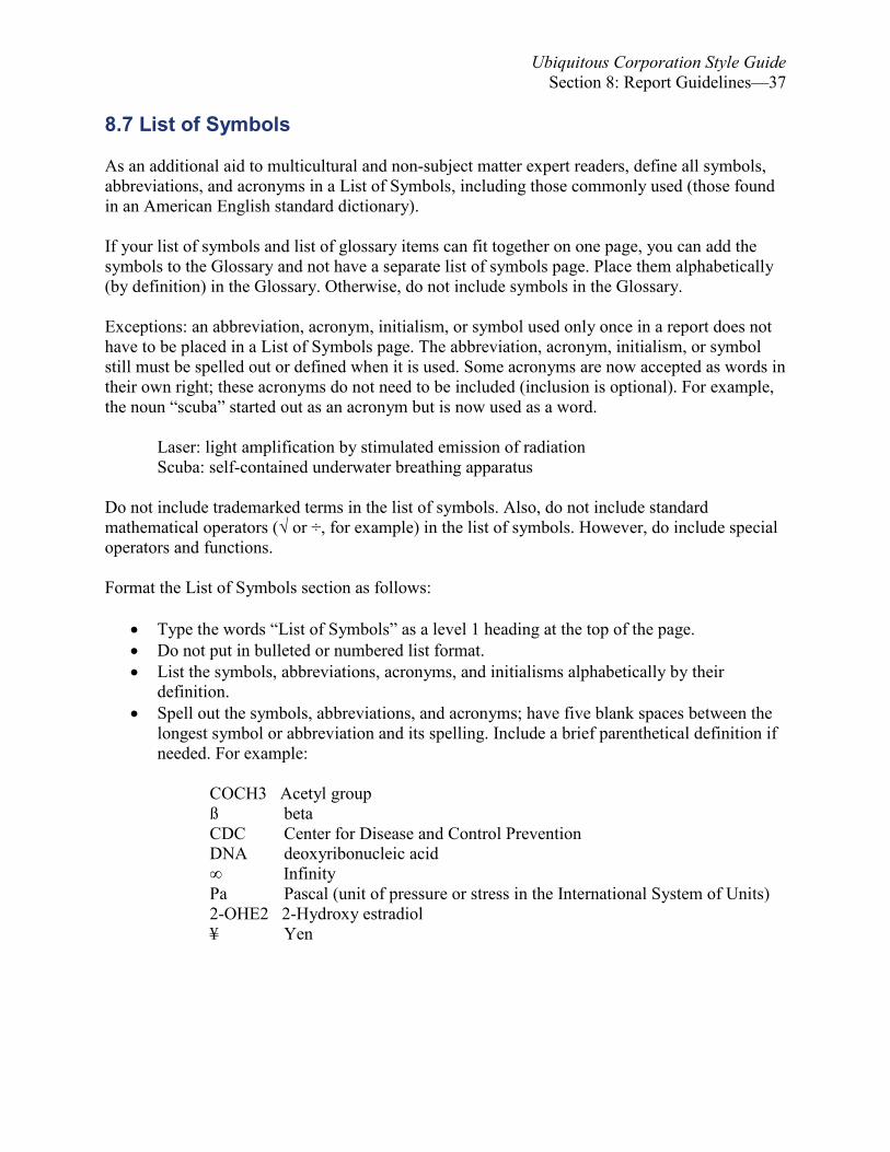
8.7 List of Symbols As an additional aid to multicultural and non-subject matter expert readers, define all symbols, abbreviations, and acronyms in a List of Symbols, including those commonly used (those found in an American English standard dictionary). If your list of symbols and list of glossary items can fit together on one page, you can add the symbols to the Glossary and not have a separate list of symbols page. Place them alphabetically (by definition) in the Glossary. Otherwise, do not include symbols in the Glossary. Exceptions: an abbreviation, acronym, initialism, or symbol used only once in a report does not have to be placed in a List of Symbols page. The abbreviation, acronym, initialism, or symbol still must be spelled out or defined when it is used. Some acronyms are now accepted as words in their own right; these acronyms do not need to be included (inclusion is optional). For example, the noun “scuba” started out as an acronym but is now used as a word.
Laser: light amplification by stimulated emission of radiation Scuba: self-contained underwater breathing apparatus
Do not include trademarked terms in the list of symbols. Also, do not include standard mathematical operators (√ or ÷, for example) in the list of symbols. However, do include special operators and functions. Format the List of Symbols section as follows:
• Type the words “List of Symbols” as a level 1 heading at the top of the page. • Do not put in bulleted or numbered list format. • List the symbols, abbreviations, acronyms, and initialisms alphabetically by their
definition. • Spell out the symbols, abbreviations, and acronyms; have five blank spaces between the
longest symbol or abbreviation and its spelling. Include a brief parenthetical definition if needed. For example:
COCH3 Acetyl group ß beta CDC Center for Disease and Control Prevention DNA deoxyribonucleic acid ∞ Infinity Pa Pascal (unit of pressure or stress in the International System of Units) 2-OHE2 2-Hydroxy estradiol ¥ Yen

Ubiquitous Corporation Style Guide Section 8: Report Guidelines—38
8.8 Abstract
As your audiences for the abstract are subject-matter-experts familiar with the subject, technical language is allowed here. The abstract should be a descriptive or topical abstract; thus, do not explain the criteria used, just provide the major findings, including your recommendations. Just describe the topics covered. Format the abstract as follows:
• Title the page “Abstract” (without the quotation marks) as a level 1 heading. • Below the page title, include the title of your report, enclosed in quotation marks, as a
level 1 heading. Make sure a blank 12-point line is between the page and report titles. • Next, type in 12-point font “Prepared by:” (without the quote marks) followed by your
full name and title. If spacing is tight, replace your first name with your first initial. Center the line and make sure there is a blank 12-point line above and below it. If the line wraps, make sure the second line lines up with your first name or first initial.
• Format the body of the abstract as one paragraph. • Keywords (in a horizontal listing) terms that you expect a researcher to likely use when
searching for your report electronically. You can include acronyms (without spelling them out) in the keywords. Include one blank 12-point line before the Keywords. Use normal (non-boldfaced, non-italicized) 12-point font. Left justify. Do not end a list of terms with a period, or include “and” before the last term. For example: Keywords: antibiotic, Aqua Cure, first aid spray, open wounds, ointment
• Do not use footnotes as users of abstract databases may not have immediate access to the
full report. • Do not use complex mathematical notations as abstract databases may not render them
correctly.
Word count for the abstract (includes keywords) should be from 100 to 250 words. It will probably be easier to write the abstract last as it is conceptually closer to the conclusion (the recommendation) than the introduction. 8.9 Acknowledgments Title the page “Acknowledgments” (without the quotation marks) as a level 1 heading. Below the page title, briefly write your acknowledgments. Make sure a blank 12-point line is between the page title and the acknowledgment text. 8.10 Remaining Body Sections Each section begins on its own page: at the top of the page, type the title (for example, Research Methods) as a level 1 heading. Each section may require subsections which may have their own subsections such as a level 2 subsection divided into two or more level 3 subsections. See section 4 for information on formatting section and subsection headings.

Ubiquitous Corporation Style Guide Section 8: Report Guidelines—39
8.11 Glossary
• Use level 1 heading for the title of the page. • Organize the Glossary alphabetically; for entries that start with a definite article (the) or
indefinite article (a, an), ignore the articles when alphabetizing. For example, “The Nemesis Project” would be included with the N entries, as if “the” was not there.
• If your list of symbols and list of glossary items can fit together on one page, you can add the symbols to the Glossary and not have a separate list of symbols page. Place them alphabetically (by definition) in the Glossary. Otherwise, do not include symbols in the Glossary.
• Put the term being defined in boldface, 12-point Times New Roman font. • Double-space between entries; in other words, include a blank 12 font size line between
each entry (see the example below). • Using hanging indents: the first line of the definition is left-justified to the margin, while
subsequent lines are indented 0.5 inches:
Antiviral: Any antimicrobial drug used for treating viral infections destroys viruses. Specific antivirals are used for specific viruses. An antiviral works by inhibiting the virus’ life-cycle.
Biocide: A substance that is poisonous to living organisms.
• Glossary words do not need to be footnoted in the document itself.
8.12 References Referenced information used in your document is best summarized or paraphrased. Keep quoting to a minimum. Whether quoted or paraphrased, all use of references should be cited to avoid plagiarism. Use the guidelines below to correctly format reference pages.
• A reference section for a report is a separate section, starting on its own page, unlike the
reference section in a memo. • Use the MLA (Modern Language Association) style hanging indentation for all entries
listed. • Single-space within entries, with double-space (put a blank size 12 font line) between
entries. • The majority of academic, governmental, and professional Websites have publisher
information. Usually this information can be found at the bottom of the Website; otherwise, check the “About” or “Contact” sections.
• Make sure your reference page(s) includes all references used (whether quoted from or not) for all sections of your document.
• Et al. is not placed in italics in normal use; it does not have a period after et but does have one after al: “Ada Wong et al. argued…”

Ubiquitous Corporation Style Guide Section 8: Report Guidelines—40
8.13 Appendices Each appendix should be its own document. No more than one document can be in an appendix. (For example, if Appendix E is a copy of a questionnaire, then Appendix F is the results of that questionnaire.) Label each appendix item with a letter of the alphabet: starting with the letter A, label the first page of each appendix document with its corresponding letter. Follow that letter with the actual title of the document the appendix houses (for example, Appendix B: Questionnaire on Researching Credible Solutions to Viral Infections in Adolescents). Put the label as a level 1 heading. Be sure to record the labels for the Appendices in the Table of Contents appropriately. If the document that the appendix houses is a previously written memo, it must maintain its original design, except for headers and footers. Headers and footers must be removed so the formatting established in the report’s design can be continued without disruption (maintaining document consistency and coherence). However, if the document placed in the appendix has a letterhead or masthead, then the letterhead must be retained within the body of the document, not the header; move, via copy and paste, the Ubiquitous Corporation letterhead from the first page header into the body text:
1. First, double-click the cursor in the header. 2. Select the letterhead and copy it (CTRL + C). 3. Delete the letterhead, 4. Paste (CTRL + V) the letterhead into the body beneath the appendix label.
Remove the References sections from the original documents included in your appendices. This step is necessary since the References document of the report will have all the research sources you have used for the Proposal assignment to your final report. You should, then, make sure your reference page(s) includes references for all documents included in the report.

Ubiquitous Corporation Style Guide References—41
References
Andrews, S (1996) “Lexical retrieval and selection processes: Effects of transposed-letter confusability.” Journal of Memory and Language, 35(6), 775-800.
Barr, Chris. The Yahoo! Style Guide. St. Martin’s Griffin. 2011. Casagrande, June. The best punctuation book, period. Ten Speed Press. 2014. Covery, Stephen. FranklinCovey Style Guide: For Business and Technical Communication. 5th
ed. Pearson FT Press. 2012. DeRespinis, Francis, et al. The IBM Style Guide. IBM Press. 2012. Healy, A. F. (1976). “Detection errors on the word The: Evidence for reading units larger than
letters.” Journal of Experimental Psychology: Human Perception & Performance, 2, 235-242.
Mayall, K., Humphreys, G.W., & Olson, A. (1997). “Disruption to word or letter processing?
The origins of case-mixing effects.” Journal of Experimental Psychology: Learning, Memory, & Cognition, 23, 1275–1286.
McCusker, L. X., Gough, P. B., Bias, R. G. (1981) “Word recognition inside out and outside in.”
Journal of Experimental Psychology: Human Perception and Performance, 7(3), 538-551.
McDonald, Ron. A Broadcast News Manual of Style. 2nd ed. Pearson. 1994. Merriam-Webster’s Guide to Punctuation and Style. 2nd ed. Merriam-Webster. 2001. Microsoft Manual of Style. 4th ed. Richmond: Microsoft Press. 2012. Rawlinson, G. E. (1976) “The significance of letter position in word recognition.” Unpublished
PhD Thesis, Psychology Department, University of Nottingham, Nottingham UK. Rayner, Keith, et al.“Raeding Wrods With Jubmled Lettres There Is a Cost.” Psychological
Science, 17(3), 192-193. Shillcock, R., Ellison, T.M. & Monaghan, P. (2000). “Eye-fixation behaviour, lexical storage and
visual word recognition in a split processing model.” Psychological Review 107, 824-851.
Strunk, William and E. B. White. The Elements of Style. Fiftieth Anniversary Edition. Pearson
Education. 2009. Style Guide. 11th Edition. The Economist. 2015.

Ubiquitous Corporation Style Guide References—42
Weiss, Edmond. The Elements of International English Style. Routledge. 2015. Wilson, Kevin and Jennifer Wauson. The AMA Handbook of Business Writing. AMACOM.
2010.

Ubiquitous Corporation Style Guide Appendix A: Memo Masthead Example—43
Appendix A: Memo Masthead Example
13 Memo of Transmittal 14 To: Through:15
Dr. William Birkin, Director of Research and Innovations Mr. David M. Merchant, Intern Coordinator
From: Jill Valentine Subject: Analytical Report for Validation of Confluent English Courses into
Undergraduate and Graduate English Major Curriculum at Louisiana Tech University
Date: May 5, 2010 16 17 18
13 One blank line: one font-size 12 Times New Roman blank line. 14 One blank line: one font-size 12 Times New Roman blank line. 15 Depending upon the audiences for the memo, the memo may require a CC or a Through field, or both, after the To field; some memos may not require a CC or a Through field; if that is the case, delete this line (do not leave a blank line—move the remaining fields up). 16 One blank line: one font-size 12 Times New Roman blank line 17 Insert a horizontal line in Microsoft Word by typing three dashes in a row and pressing the ENTER key. 18 One blank line before starting the body of the memo (usually the purpose statement): one font-size 12 Times New Roman blank line

Ubiquitous Corporation Style Guide Appendix B: Cover Page Example—44
Appendix B: Cover Page Example

Ubiquitous Corporation Style Guide Index —45
Appendix C: Title Page Example

Ubiquitous Corporation Style Guide Index —46
Index A
Abbreviations 14 Abstract 38 Accessibility Guidelines 16 Acronym 14, 17, 37
List of Symbols 37 Aesthetic appeal 14 All Caps 18 Appendices 40 Approved Colors 5 Articles 39 Attachments 33
B
Bullet (Lists) See Lists, See Lists Business Card Style 8
C
Capitalization 18 Clear Space 6 Clichés 16 Co-Branding 4 Color ii, 3, 5, 12, 16 Color Variants 4 Column heads 27 Confused Words 17 Courier 15 Cover Page 34, 35 Cover Page Example 44, 45 Criteria 38
E
Email 11, 12 Email address 33 Email Footer 12 Emblems 12 Envelope Style Guide 10 Equations and formulae
abbreviations 30 referencing in text 30
Et al. 33, 39 Etc. 23 Executive Summary 34, 38
F
Figurative language 16
G
Glossary 39 Graphs 28, 29
H
Heading Segment (Memo) 31 Headings 19
Color 19 Examples 21 In Lists Examples 21 Level 1 19 Level 2 20 Level 3 20 Level 4 20 Level 5 20 Lists 26 Orphaned 19 Parallelism 20
Hyperlink 16, 28, 33 Hyperlinks 16
I
Illustrations 27 Initialism 17, 37
K
Keywords 38
L
Legibility Guidelines 16 Letterhead Style Guide 9 List of Illustrations 36 List of Symbols 37 Lists
Bullet Styles 24, 25 Bulleted Lists 24 General Guidelines 23

Ubiquitous Corporation Style Guide Index —47
Headings 26 Inline 26 Nested Lists 25, 26 Numbered Lists 24 Vertical Lists 23
Logo 2 Logotype 2
M
Masterbrand 2 Masterbrand Logo 2, 3, 6, 9, 10, 12 Memo Closing 33 Memo Masthead Example 43 Memo of Transmittal 34 Memo Specific Guidelines 31 Memo Summary 32 MLA ii, 18, 33, 39 Modern Language Association See MLA Multicultural 17, 37
P
Page Headers 32, 40 Page Numbering 32 Parallelism 20 Purpose Statement 32
R
References 40 Memo 33 Report 39
Report Page Headers 34 Report Page Numbering 34 Report Specific Guidelines 34 Reports 33
S
Section Breaks 34
Signatures 3 Social Media Standards
Facebook 12 Twitter 11 YouTube 11
Source 28 Spacing Between Letters 16 Sub-brand Logos See Signatures Symbol 37 Symbols 17, 37, 39
T
Table borders 27 Table cell margins 27 Table of Contents 36, 40 Tagline 3 Tech Reflex Blue 5 Title Case See Capitalization title page 35 Title Page 34, 35 Trademark 19, 20
U
Underlining 17 Upper case 18
V
Vehicle Identification 12 Video Watermarking 12
W
Web Documents 16, 17 Website Usage 10 White Paper Guidelines 34 Word Count 38