twat - the making of
DESCRIPTION
A publication that me and Ryan Maceachern created to go along side a film we created for a uni briefTRANSCRIPT


WHEN YOU TAKE THE
ART TO THESTREETS, ITBECOMES SO MUCH MORE THAN JUST
WORDS ON A PAGE
2


- Brief- Poet- Artist- Poem

5
PRODUCED BY JAKE IVILL &
RYAN MACEACHERNTYPESET IN DIN BOLD &
GOTHAM LIGHT

BRIEF‘Inventory and your growing awareness of typography) you have the potential in this project to use words in combination with imagery or use words as the image.
In this project you are asked to explore the combination of words and image through movement. You will investigate a range of software technologies and processes used in the creation of time based graphics and sequences. Your task is to create a 90 second piece of moving image, which explores the manipulation of text/words and imagery. The work should evoke an atmosphere that conveys a sense of emotion appropriate to your allocated stimulus. You are asked to look at the creation of a dialogue of meaning or relationship between the two elements of words and image, through movement.
Graphic Design no longer sits still! Motion graphics is a term used to describe a broad range of solutions that designers employ for creating a dynamic and effective communication in the arenas of Film, Television and the Internet. [Movie trailers and opening film credits / television commercials / animated network identities / short promos and nextons between TV shows.]
This project continues your exploration of the relationship between words & images. Having completed an investigation of sequential photography [Every Object Tells A Story] and your own deconstruction of narrative structure [film synopsis] you now have the opportunity to examine this relationship further with the added dimension of time and movement. Drawing on the skills you learnt in the first semester projects, (‘Shifting image’ and
6
Introduction

form. It is not essential to be able to recognise a particular piece of work – you need to be looking at what qualities the works have, the composition, style, mark-making for example that you can use as a device in your piece to contribute to the mood and atmosphere and emotion conveyed in the words. This should enable you to apply your own interpretation of the artist’s style/characteristics to your work.
SOUND. You will select a sound file as a starting point to develop a soundtrack. You will need to incorporate the sound file within your track. Consider how you might build the sound-scape to evoke mood, atmosphere adding dramatic accents and pace to your work. Using the spoken word has particular challenges and should if used be handled sensitively as part of your sound design.
POET/SONGWRITER.
The name you receive will be the starting point on which you base your research. You are required to thoroughly research the literature of the poet/songwriter – to find a passage of text or entire poem/piece of prose on which to base the content of your work. This text will form the content of your work – and from this you will develop what the atmosphere, mood and emotion of the piece will be. This will additionally determine your audience – you should consider what kind of audience you expect to reach with the work, and the appropriateness of your solution.
ARTIST.
The artist will provide you with a palette to work from visually; this may inspire you to seek out particular qualities inherent in their work such as visual style, techniques, colour/shape or
OUTCOME 1 MOVING IMAGE7
Introduction

In pairs you will produce a multipage document to accompany your moving image piece. This should include some of the following components–
Introduction:Research/idea developmentPoem/songBackground detail of design processStoryboardStills from motion piece
CONSIDER:The different properties and qualities of print and screen-based work, how do you resolve your idea in both a moving and static format? What design decisions will you make working across different formats?
In developing your practical skills and technical abilities you are encouraged to experiment by linking the practical to your conceptual ideas. Do not concentrate solely on the technical challenges and limit your conceptual ideas.
OUTCOME 2 PRINT
8
Introduction

JOHNCOOPERCLARKE

11
What can you say about our John?Born in 1949 to George, an engineer and Hilda, an unpublished poet, John spent his childhood growing up in Salford, Lancashire.After teenage years as a Mod, John served a few jobs including an apprentice engineer, a lab technician at Salford University (then Salford Tech, where he was interviewed by another Manchester hero Tony Wilson, before his Factory Record Days, for Granada TV) and also a lead type compositor. After a brief unsuccessful marriage, and a stint living in Dorset, John returned to Manchester and started properly on the path for which he would become most famous for, his poetry, giving recitals at clubs and venues around the city.His biting, satirical, political and very funny verse delivered in his rapid-fire performance
8
POETJOHN COOPER CLARKE
style resonated with the punk movement that had begin to pick up speed in the late 70s and saw him begin to draw huge crowds in his own right after touring with most of punk’s seminal and ground breaking bands including Sex Pistols, Buzzcocks, The Fall, Elvis Costello and Siouxsie and the Banshees, to name but a few. The steep rise in his profile soon saw him begin to be supported by some of the very bands he had opened up for a few years previously (New Order actually supported him on no fewer than seven separate occasions).find himself performing to thousands across the UK, crowds gathered with open eyes and ears gazing up at his distinctive, and now iconic visual appearance (tall and thin with a mess of black hair, black sunglasses, drainpipe trousers and cuban-heeled boots) all
transfixed as he worked through a catalogue of work taken from his four studio albums and numerous singles.The decline of punk also saw a decline in John the man. He spent most of the 80s in a fight with a serious heroin addiction which saw his output wane dramatically. A tough battle which thankfully saw him win and kick the habit in the early 90s during which time, he met his current partner, Evie, who is also mum to John’s daughter, Stella, who was born in 1994.
12
Introduction


BOBAND
ROBERTASMITH
ARTISTBOB AND ROBERTA SMITH
School at Rome while still an undergraduate. Brill followed this with a MA at Goldsmiths College, London.Brill devised a number of artist personas and types of work and then sent examples of these to commercial galleries, where the first to gain a positive response was Bob and Roberta Smith.
Patrick Brill paints slogans in a unique brightly coloured lettering style on banners and discarded boards of wood and exhibits them in galleries of contemporary art across the world. The slogans are usually humorous musing on art, politics, popular culture, Britain and the world in general and they often support his activist campaigns, such as his 2002 amnesty on bad art at Perogi Gallery, New York. A recent
example of his gift for merging art & politics was illustrated in the exhibition Peace Camp. Bob & Roberta Smith took part in and curated the show held at The Brick Lane Gallery - the show & programme of events explored artists perceptions on Peace. The exhibition featured over 100 artists including Gavin Turk, Rebecca Taber, Wolfgang Tillmans, Abby Jackson and Seb Patene.Noted for sign painting, Bob and Roberta Smith also make sculpture using cement, as in his 2005 Cement Soup Kitchen at Beaconsfield Gallery, London.
“Patrick Brill grew attracted to postures of amateurism and failure. His more recent work has suggested an interest in the utopian impulse of art as an agent for social change,
15 Introduction
although this often seems hedged with doubt or irony” MORGAN FALCONER: “Bob and Roberta Smith” Grove Art Online. Oxford University Press,
Patrick Brill also performs music, often with a group known as The Ken Ardley Playboys, who had their first 45 released by Billy Childish on his label Hangman Records. Brill also hosts The Bob & Roberta Smith Radio Show called MAKE YOUR OWN DAMN MUSIC which is on Resonance FM.In March 2005 Bob and Roberta Smith was commissioned to act as curator on a series of five public art projects in the Thames Gateway area of Essex. The projects were collectively named Art U Need and were documented in a diary-format book by Smith in 2007.
Patrick Brill teaches at the Sir John Cass Department of Art, Media and Design, London Metropolitan University.A sculpture proposed by Bob and Roberta Smith was shortlisted for the fourth plinth in Trafalgar Square, London
16
Introduction

POEMTWAT
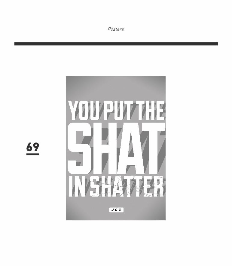
Like a Night Club in the morning, you’re the bitter end. Like a recently disinfected shit-house, you’re clean round the bend. You give me the horrorstoo bad to be true All of my tomorrow’sare lousy coz of you.You put the Shat in ShatterPut the Pain in SpainYour germs are splattered aboutYour face is just a stain
You’re certainly no raver, commonly known as a drag.Do us all a favour, here... wear this polythene bag.
You’re like a dose of scabies,I’ve got you under my skin.You make life a fairy tale... Grimm!
17 Introduction

People mention murder, the moment you arrive.I’d consider killing you if I thought you were alive.You’ve got this slippery quality,it makes me think of phlegm,and a dual personalityI hate both of them.
Your bad breath, vamps disease, destruction, and decay.Please, please, please, please, take yourself away.Like a death a birthday party,you ruin all the fun.Like a sucked and spat our smartie,you’re no use to anyone.Like the shadow of the guillotineon a dead consumptive’s face.Speaking as an outsider,what do you think of the human race
You went to a progressive
psychiatrist.He recommended suicide...before scratching your bad name off his list,and pointing the way outside.
You hear laughter breaking through, it makes you want to fart.You’re heading for a breakdown,better pull yourself apart.
Your dirty name gets passed about when something goes amiss.Your attitudes are platitudes,just make me wanna piss.
What kind of creature bore youWas is some kind of batThey can’t find a good word for you,but I can... TWAT.
18Introduction

19
We picked the poem TWAT because we felt it best reflected our ideas, the poem is clever, in the way that each line or two lines can stand-alone and they still conjure up thoughts, solely on their own. So when they are depicted as typographical posters, they will still have context and won’t just look like a bunch of words on a poster.
That was a big part for us, for the posters still to have context while alone. Also they’re very descriptive, so when it comes to actually making the posters, there was a lot of scope on what to do for them.
REASONS FOR CHOOSING TWAT
20


- Mood Boards- Artists- Film Makers


Inspiration
ARTISTJeff Canham
Canham is not Californian by birth. He studied graphic design in his hometown of Portland, Oregon, and then messed around looking for work, doing a short stint as a roofer, which he realised ’wasn’t much of a career path’. Then came the lucky break and a job at Surfer magazine in Los Angeles, the very same that David Carson cut his teeth on in the early 1990s, before designing the seminal Ray Gun. A chance encounter with New Bohemia Signs, one of only two companies that still produce traditional hand-painted signs in the US (both were founded by the same people), led to something of a life change. ’I just fell in love with what they were doing,’ he says. So much so that he joined New Bohemia Signs
as an apprentice, learning the ins and out of traditional hand sign-painting. He stayed for five years, until, as with Surfer magazine, he felt he had learnt as much as he was going to.Now Canham devotes himself equally to design, art projects and sign-painting, and isn’t bothered about categorisation, other than the suggestion, with a sarcastic laugh, ’Renaissance man’. ’It depends on the kind of job I am doing. I think my graphic design training upped the level of my sign-painting, and vice versa. I try to make the work function on more than one level, so that it is not digested in one take.’
Likewise, he is happy to straddle the digital-analogue divide, saying that there will be an element of both in all of his
31

Inspiration
work, and that he was lucky to be trained in the late 1990s, when ’you could be taught Photoshop and Illustrator alongside traditional stuff like cutting and pasting’. Either way, his adopted city continues to be a big inspiration. ’I love all the Victorian-era typography that’s still around San Francisco,’ he says, adding that he often travels around taking pictures and notes. Others, too, are waking up to the charm of the rapidly disappearing craft of hand-painted signs, and he has recently been interviewed for the film, The Sign Painters, due for release next year.
32

Inspiration
33

Inspiration
34

Inspiration
Young Jerks is the moniker for the Brooklyn based (yet frequently traveling) designer Dan Cassaro. Though Dan is obviously fantastic at everything from motion design to illustration, it’s his typography work that captivates me most. Often somewhere between computer rendered and hand done, and methodically organized to flowing and organic; Dan knows how to throw-down some letters.
35

Inspiration
DESIGNERDAN CASSARO
Describe your path to becoming a designer.
I didn’t always know that I wanted to be a designer—it happened much later for me. I was 23 when I went to school for design. I always knew I wanted to do something with the visual arts. After high school, I did a couple semesters at Alfred University, which is a fine arts college way, way, way upstate New York and as far away from Manhattan you can be while still being in New York. I think I was scared to go to art school in Manhattan. It didn’t really work out. I wasn’t ready and didn’t really know what I wanted to
do. I think I had a lot of hanging out left to do before I could make any important decisions about my life.I left college and moved around after that. There was a long period of time where I was waiting tables and figuring out what to do with myself. I lived in Connecticut and Savannah before eventually moving back to New York and going to the School of Visual Arts (SVA).
Even then, I think I went to design school on a whim; I’m not sure I even knew what graphic design was. Eventually, I fell in love with letters and typography and now it’s all I think about.
36

Inspiration37

Inspiration 38

Inspiration
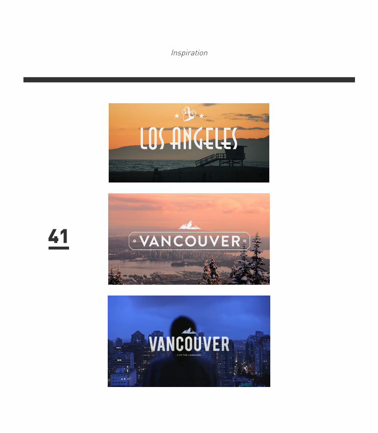
FILM MAKERGUSTAV JOHANSSON
Gustav Johansson. 25 year old stockholm based director and art director. Graduated from Berghs in 2009
39
Inspiration
A really great series of films directed by Gustav Johansson, with the typography being done by Albin Holmqvist. These shorts are all commercials for EF Language Schools, and show someone studying abroad travelling to each separate country and experiencing the culture.
The exact locations are London, Beijing, Paris, and Barcelona. I’m not sure if these will be shown on the television or if they are just for online use, but they really do represent the company well.
The type is probably the best part about these videos, it basically sets them apart from the rest of the pack. The cup of tea sequence in the London video brought a lot of joy to my eyes.
40
Inspiration
41

Inspiration
42

Inspiration
MOSS GRAFFITI
1 can of beer1/2 teaspoon sugar
Several clumps garden moss
You will also need a plastic container (with lid),
a blender and a paintbrush
To begin the recipe, first of all gather together several clumps of moss (moss can usually be found in moist, shady places) and crumble them into a blender. Then add the beer and sugar and blend just long enough to create a smooth, creamy consistency. Now pour the mixture into a plastic container.
Find a suitable damp and shady wall on to which you can apply your moss milkshake. Paint your chosen design onto the wall (either free-hand or using a stencil). If possible try to return to the area over the following weeks to ensure that the mixture is kept moist. Soon the bits of blended moss should begin to re-couperate into a whole rooted plant – maintaining your chosen design before eventually colonising the whole area.43

Inspiration
44

- BRAINSTORMING- INITIAL IDEAS- FINAL IDEA

Ideas
47

Ideas
48
Ideas
IDEA ONE
We would get a group of artists, designers, movie makers, photographers and other creatives and then get them to create art work to do with the lyrics and poet, and all having to revolved around typography.
We would then display all of these pieces of art in the public domian, choosing a very public location, maybe somewhere like the bear pit, or more city centered, and then we would film the peoples reactions to the work, and the art work on the walls, and how it progresses over a period of time.
This would solve a multi purpose of introducing the people to the art work and also the poet. While taking the art to the streets.
Hold an exhibiton in the streets of posters and art relevant to the lyrics and introduce people to the poet and the art
49

Ideas
IDEA TWOMake chosen lyrics into typographical poster, then fly poster them around Bristol. Thus beauitfiying the city.
We would split, on or two verses of the poems and then each create a series of typographical posters which we would make them specifically eye catching so then they stand out in the public domain and people will recognise them,.
We would them film them in situ, so them we can film peoples reactions to them, and then how they weather and last in the world.
We would be taking up spaces that are normally reserved for club night posters and posters for gigs and circuses, but we would be giving these spaces more purpose and also putting free art into the public domain, thus cementifying Bob and Roberta Smiths ethics and ideals.
50

Ideas
FINAL IDEA
We decided to go with the fly postering typographical posters idea, because we are both very strong at using type in a bold eye catching way. Also when we was looking at inspiration we was more and more getting pulled towards a certain style of filming that we both wanted to try out.
We also felt like it was the strongest idea that we had come up with. Then when we went on a little trip up to the suspension bridge and started filming to make a little short clip.
It cemented our decision to go ahead with that idea as the final outcome from that trip was good and we felt that it came out quite professional, using well framed shots and strong colour correction/grading.
51

Ideas
We then started experimenting with different ways to create type, we played around with letter press but soon realised this was an unrealistic way and that it would be far too time consuming, so we moved on to painting and again decided against it, as we didn’t feel like we could get the same consistency with the posters when we wanted to reproduce multiple ones, so when we started experimenting with making them on the computer, we soon decided that this would be the strongest and more time friendly way to create the posters.
52

Ideas
53

Ideas
54

- DESIGNING-FINAL POSTERS

Ideas
57

Ideas
58

Posters59

Posters 60

Posters
60

Posters
62

These are the final ten posters we settled on, they were split equally between us both and we took a line each so that then there wasn’t a massive divide in our styles. We also worked very closely together while doing them constantly sending each other sketches and work in progress shots so that then we came up with a style that we both could work in and made the work feel quite unanimous.
FINAL POSTERS
63


Posters
65

Posters
66

Posters
67

Posters
68
Posters
69

Posters
PAIN70

Posters 71

Posters
STAIN
72

Posters
73

Posters
74


- PROCESS-FILMING

Filming
77

Filming
78

Filming79

Filming 80


