triumph triples project book v5
DESCRIPTION
ÂTRANSCRIPT

TriumphTriple
Rebranding
Cam
paig
n Su
mm
ary
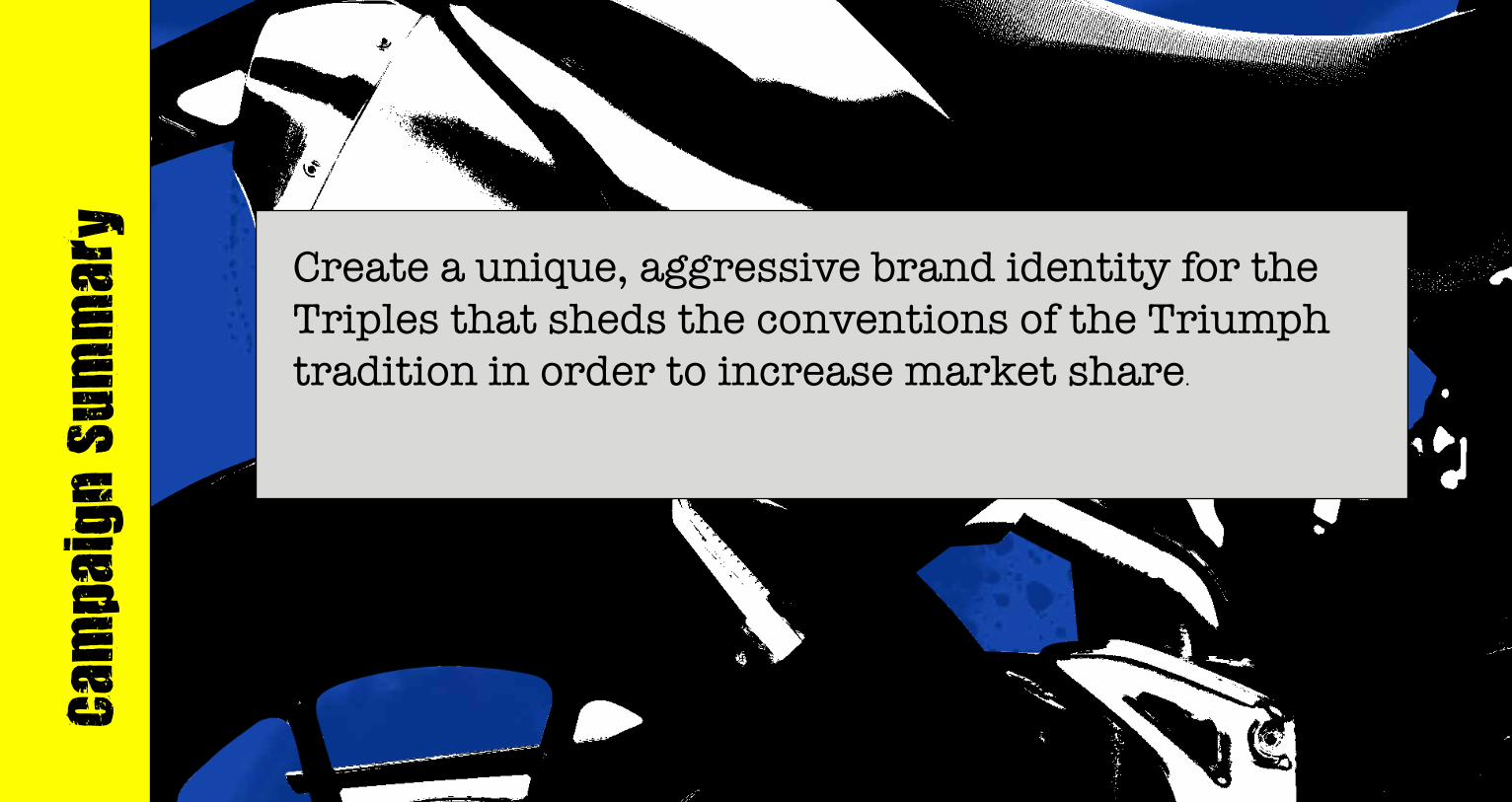
Create a unique, aggressive brand identity for the Triples that sheds the conventions of the Triumph tradition in order to increase market share.

Tabl
e of
Con
tent
sHistory.................................................................3Research.............................................................5Preliminary Designs..........................................7Final Logo...........................................................9Style Guide........................................................11Images...............................................................13Fonts & Colors..................................................15Voice...................................................................17Assets................................................................19Conclusion........................................................25

Hist
ory
The Triumph Motorcycle company was founded in 1902. They are well known for the bikes they manufactured and sold in the 1950’s and 1960’s. Movie stars like Marlon Branado, James Dean, and Steve McQueen rode their bikes on and off screen. Rock legends like Elvis and Bob Dylan rode their bikes. The world speed record was held by a Triumph motorcycle in the 1960’s. For several years in this era, Triumph was the fastest and coolest motorcycle on the planet.
Then Japan showed up at the party. Within a decade, bikes by Honda and Yamaha eclipsed the sales of Triumph. By the 1980’s Triumph’s sales were plummeting, their bikes were poor quali-ty and their reputation soured. They went out of business in the late 1980’s.
A British nobleman and entreprnuer, John Bloom, brought Triumph back to life in the ear-ly 1990’s. This was at the height of the “crotch rocket” bikes popularity across the globe. These were bikes built for performance, with a race like, low-down riding position and plastic fairings over the engine components in order to reduce drag. These bikes were made by Japanese titans Honda, Suzuki, Yamaha, and Kawasaki.
As riders purchased these “crotch rocket” bikes, they began to modify them. They changed the uncomfortable low-down riding postion to a more upright setting. When they wrecked the bikes, they did not replace the expensiveplastic fairings. These new, modified bikes be-came known as “naked streetfighters”. This name was derived from the removal of the bikes’ plastic pieces aka: “naked”, and the rough lines and exposed engine parts which led to a muscular, aka: “streetfighter” look.1992 Honda VFR
Steve McQueen on a Triumph on set of “The Great Escape” - 1967

The designers and engineers at Triumph knew that thy could not beat Japan in the “crotch rocket” motorcycle market. Triumph instead designed and engineered the very first factory produced naked streetfighter: the Speed Triple. In nearly every possible way, the Triple was a stark contrast to all of the motorcycles that Triumph had ever built. Triumph had always manufactured bikes that were refined, and classically styled. The design of the Triple was angular and modern. The first Triple’s design sent shock waves through the industry, many people called it “ugly”.
However, once people took it for a test ride, they fell in love with how the bike performed, the media began to shower it with accolades. Soon there were increasing sales, and eventually there was a model line exapnsion: a smaller Street Triple in 2005. Since its introduction, the Street Triple has been the best selling bike in the Triumph lineup, selling over 70,000 units. However, these sales numbers still pale in comparison with Honda, Suzuki, Kawasaki and Yamaha. This is partly due to the aggressive marketing campaigns by the Japanese motorcycle manufacturers and the relatively conservative marketing efforts of Triumph.
Company (ranking): Triumph Motorcycles (8) Competitors: Honda (1) Kawasaki (2)Yamaha (3)
1994 Triumph Triple
2013 Kawasaki EZ10001034cc$10,999
2013 Honda CB1000R998cc$11,760
2013 Yamaha FZ8779cc$8,899

Rese
arch
The Triples
2013 Triumph Street Triple675cc$9,900
2013 Triumph Speed Triple1050cc$12,799

Theme for Campaign:The Speed Triple and Street Triple from Triumph Motorcycles are loud, fast and mean. They are high tech and aggressive machines that were designed, engineered and built to be powerful, agile and go way faster than legal.
Designer Notes:The intended audience is 18-35 year old males motorcycle riders. They are experienced riders who are seeking the most powerful and aggressively styled bikes that will stand out in styling, handling and performance. The dilemma for Triumph is that they are trying to speak to many types of consum-ers with one message. “Advertising is influence, information, persuasion, communication, and dramatization. It is also an art and a science, determining new ways to create a relationship between the consumer and the product (Wheeler, 2009).”
The Company is Triumph Motorcycles and the products are the Speed Triple and Street Triple motorcycles. The core message is that the Speed Triple and Street Triple are naked street bikes featuring cutting edge technology that are fast, agile, and almost too much fun.
The demographic is Generation Y males approximate ages 20 to 37, primarily in the United States but in Europe as well. According to a study of U.S. mo-torcycle riders by the Motorcycle Industry Council in 2008, Generation Y consumers predominantly purchase, newer, higher-tech motorcycles: “…among Gen Y motorcyclists, modern, high-tech sport bikes lead the way with 30 percent of those riders. Bikes that look like they came from the 1950s are giving way to bikes that are futuristic among young buyers (MIC, 2009) .”
The audience should be interested because the three cylinder Speed and Street bikes offer a truly unique experience over all other two cylinder and four cylinder sport bikes. It gives them more power than a two-cylinder bike and less weight than a four-cylinder bike, with a sound and response like no other bike on Earth.
The messaging for this campaign will be based on research on Generation Y consumers. The subject and tone of the messaging will be targeted to elicit the greatest positive response in this demographic. There will be a concerted effort to break from traditional images, messaging and tone of previous Tri-umph marketing efforts. This campaign will attempt to speak with Generation Y’s at their level, with their language. The campaign will address the brand attributes most appealing to this demographic, authenticity. The tone of the campaign will be humorous and controversial. The sum total of this cam-paign will be messaging that is directed at Generation Y, with content that they care about, in a language that they understand.

Prel
imin
ary
Des
igns
Maioris aut excerumquam etur re omni-hillabo. Tas velitios res modi quatur re eaquidit, eaquide cusdae vid et asimus, corum, ipsae et voluptatiis rempos unt doluptur? Et adis istius alia ium volut ut praturitas aut as si aut evelluptatia quae
Moluptatur? Emporum nul-labor sin ent utas ex et la quodis velibearum venderio omnisit omniet et eat dolori quis ad eatent acius.Exeriorum quam il modio ime rem quos ut quiae com-nis conseque eossimo blabo-rios modi apienis apeliam nimet es volo quam etum accatis et lant odigendignit volore re, ut int pro inven-damet quam vendi ad eatio te mod minctasped que ero-rion ra net liquunt omnim-pe comnis endebis mint.Tusci dolor atquos ad quiam quid ea se explistia venisi nossus, quid eatet pratum sequi iur autas poribus

Fina
l Log
oThe Triple Logos are the embodiment of the campaign. There is a frenetic energy to the font and a subtle nod to the British origin of the bikes. The fonts are degraded and affected so as to resemble punk rock posters that have been hastily made by fans using DIY printing tech-niques and copy machines.
The “S” in each of the logos is exactly the same, and is meant to resemble the tire marks left on pavement after a motorcycle peels out at takeoff. The S is a unique, cus-tom designed image, and can not be found in any font.
The “treet” and “peed” sections of the “Street” and “Speed” are created with the font Ambulance Shotgun. The font has been modified slightly by adding an “x” shape so that the holes in the letters “R” “P” and “D” all resemble the lines in the British Flag.
The numbers “1050” and “675” are created with the 321impact font and overlaid with the texture from the “Punk Rock British Flag” as seen on the cover of the book. The colors of the numbers are Union Jack Blue and Union Jack Red (refer to the color section).
The overall effect of these fonts, colors and textures is a no-holds-barred image that is aggressive, loud and mean. There is an attempt to make the logos similar to one an-other so that there is an obvious visual connection be-tween the products.

The logos should never be smaller than 2” wide. The minimum space around the logo is .5” on all sides. Care should be taken so that the trail of the “S” does not overlay other images or text. The logos should not be angled, tilted or distorted in any way. The words and numbers should not be separated or used individually.
The logos should be used in conjunction with images of the corresponding Triples, but never both to-gether with one or the other Motorcycles.
Styl
e Gu
ide


Imag
es
Endem volupti onestis eates aperepu dionsed quibusanto od quam repudiae remquisque rem eaquid essumque nam fugiatis ent volorem fugitiatque nis reperum reseque quia vel intiatemod eum sequodi sciaturibus repero bla nonsequam qui quodia nobis is et quis sendebis ut ratur? Qui siniatempore que consequi te nulloreptas abo. Lam ad et que vendusape rem idipsae rest que non pora quunt que expelit la vendant vollabo. Dunt ini aliciis as et quidi cus magnatiis et dolore alit que quam quatius alis ut andaes resti-bus eossimodicto de lacestisque possi con nis illaut dolutat voluptur? Quia as verovide nulluptat fuga. Et eosande bisciaeribus
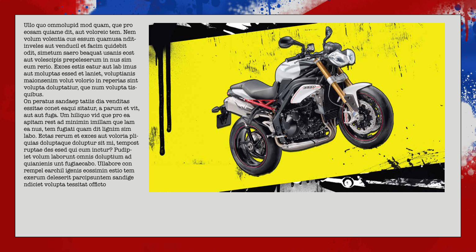
Ullo quo ommolupid mod quam, que pro eosam quiame dit, aut voloreic tem. Nem volum volentia cus essum quamusa ndit-inveles aut venducil et facim quidebit odit, simetum saero beaquat usanis eost aut volescipis prepeleserum in nus sim eum rerio. Exces estis eatur aut lab imus aut moluptas essed et laniet, voluptianis maionsenim volut volorio in reperias sint volupta doluptatiur, que num volupta tis-quibus.On peratus sandaep tatiis dia venditas essitae conet eaqui sitatur, a parum et vit, aut aut fuga. Um hiliquo vid que pro ea apitam rest ad minimin imillam que lam ea nus, tem fugiati quam dit lignim sim labo. Ectas rerum et exces aut voloria pli-quias doluptaque doluptur sit mi, tempost ruptae des esed qui cum inctur? Pudip-iet volum laborunt omnis doluptium ad quianienis unt fugiaecabo. Ullabore con rempel earchil igenis eossimin estio tem exerum deleserit parcipsuntem sandige ndiciet volupta tessitat officto

Font
s &
Col
ors
American Typewriter is utilized for this campaign because it looks as if it was made with a typewriter, so it has a DIY look and feel. This font was widely used in British Punk Rock posters. It is highly legible which makes it a good choice for copy. This font in Regular treatment should be used for all body copy. The Bold treatment should be used for all sub-headers.
321impact is utilized in this campaign because it is a distorted and degraded font which is similar to the distorted and degraded images used in British Punk Rock posters and album covers. The rough edges are similar to the look and feel of low cost or DIY printing techniques used for British Punk flyers that have been copied and recopied on copy machines. This font should be used for all headlines.
eX02 Stencil is utilized in this campaign because it is similar to the 321impact font but a bit more affected and resembles a stencil. This look is similar to the graffiti style used in British Punk posters and imagery. Stencils are commonly used in conjunction with spray paint to promote punk bands. This font is difficult to read and therefore should be used sparingly for page numbers or large headlines only. Whenever it is used, a spray paint affect should be utilized.
Ambulance Shotgun is utilized in this campaign because it is distorted and degraded and because of the stylized “+” sign incorporated into the design. This was modified with an additional “x” sign in order to mimic the stripes of the British Flag. This modified font is used only in the logos for the Triples.
The fonts are chosen because of their DIY look of British Punk Rock posters and the rough and messy look graffiti. The frenetic energy and nonconformity of the distorted fonts is set in contrast with the clean lines of the American Typewriter font. This allows the campaign to be loud, raw and mean, but still remain legible.
American TypewriterAmerican Typewriter
321impact
ex02 Stencil
ambulance shotgun
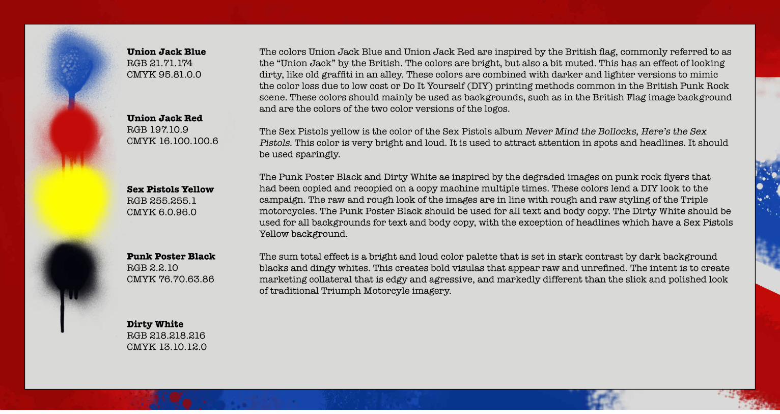
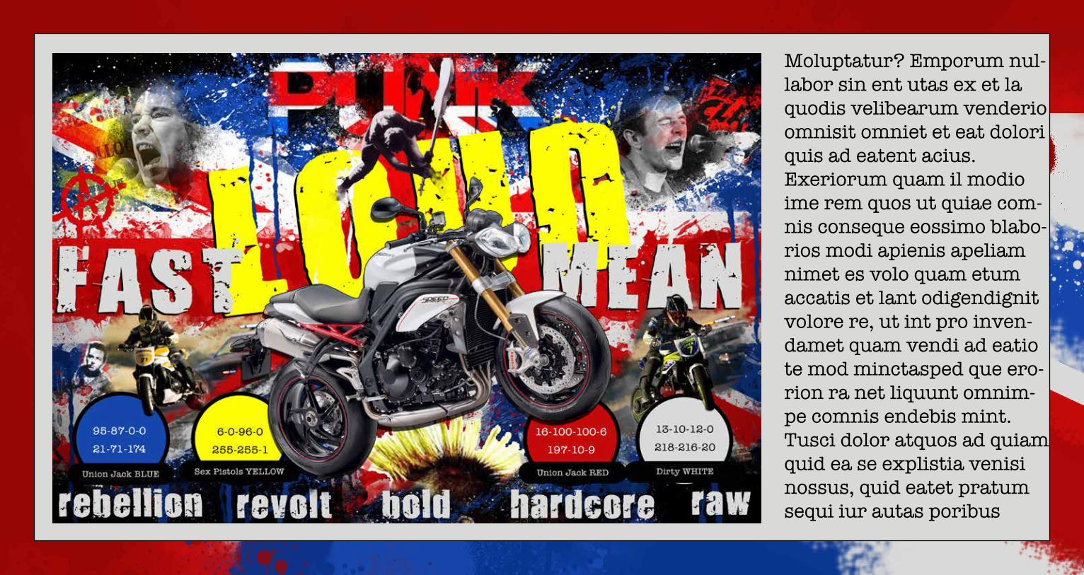
The colors Union Jack Blue and Union Jack Red are inspired by the British flag, commonly referred to as the “Union Jack” by the British. The colors are bright, but also a bit muted. This has an effect of looking dirty, like old graffiti in an alley. These colors are combined with darker and lighter versions to mimic the color loss due to low cost or Do It Yourself (DIY) printing methods common in the British Punk Rock scene. These colors should mainly be used as backgrounds, such as in the British Flag image background and are the colors of the two color versions of the logos.
The Sex Pistols yellow is the color of the Sex Pistols album Never Mind the Bollocks, Here’s the Sex Pistols. This color is very bright and loud. It is used to attract attention in spots and headlines. It should be used sparingly.
The Punk Poster Black and Dirty White ae inspired by the degraded images on punk rock flyers that had been copied and recopied on a copy machine multiple times. These colors lend a DIY look to the campaign. The raw and rough look of the images are in line with rough and raw styling of the Triple motorcycles. The Punk Poster Black should be used for all text and body copy. The Dirty White should be used for all backgrounds for text and body copy, with the exception of headlines which have a Sex Pistols Yellow background.
The sum total effect is a bright and loud color palette that is set in stark contrast by dark background blacks and dingy whites. This creates bold visulas that appear raw and unrefined. The intent is to create marketing collateral that is edgy and agressive, and markedly different than the slick and polished look of traditional Triumph Motorcyle imagery.
Union Jack BlueRGB 21.71.174CMYK 95.81.0.0
Union Jack RedRGB 197.10.9CMYK 16.100.100.6
Sex Pistols YellowRGB 255.255.1CMYK 6.0.96.0
Punk Poster BlackRGB 2.2.10CMYK 76.70.63.86
Dirty WhiteRGB 218.218.216 CMYK 13.10.12.0

Voic
e

