trending toward taupe from japan to new york -...
TRANSCRIPT

Not just another run at faded brown or a paler washed-up version of American
Primitive or Civil War repro styles, [taupe is] a distinct outlook on the whole color palette.
Summer 2010 was an unsettling time. The war in Afghanistan dragged on, BP had messed up the Gulf, and unemployment was rising. What was the fashion industry, always dependent on fads and disposable money, to do? The answer is nothing radical but it was slightly different. Fashion took a step sideways.
Trending Toward TaupeDespite Pantone’s beating the drum for Turquoise as the color of the year for 2010, style bloggers, who are often trend forecasters themselves, suggested that taupe might be just what cash-strapped fashionistas needed. At first it was a trickle—taupe nail polish was touted as “the least expensive fashion accessory” that summer. By autumn 2010, taupe was appearing in accessories such as shoes, socks, and purses. By the Oscars in 2011, taupe was seen all over the red carpet. Now taupe is über-popular in fashion.
It’s popular in home dec too—some variation of the color turns up in all the HGTV home remodeling shows. Interior design blogs and websites are knee-deep in taupe, but you may not recognize all the terms used. For instance, stainless steel appliances have been tremendously popular for the last decade, and stainless remains the finish of choice for home remodelers and professional cooks. But now a warmer but still
metallic shade is turning up in high-end kitchen appliances. It’s called “oil-rubbed bronze” and it’s a tick off the cool silver of stainless steel. Not quite gold, the warm metallic finish is—you guessed it—a new translation of taupe. When manufacturers of big-ticket consumer goods introduce a new color, you can be sure there’s enough popularity to warrant the shade.
If taken literally, taupe simply means “mole” in French, leading to its unglamorous definition “brownish gray.” But don’t let that throw you off in relation to the quilter’s definition of taupe. The taupe fabric palette is much bigger than Monsieur Mole.
fabric: Centenary XVIII from Lecien (above) and Serenity 17 by Daiwabo for E. E. Schenck Co. (below)
Detail of “Serene Glow” made with ombre and Serenity by Daiwabo taupes. Designed and
pieced by Judy Livingston and Chris Florence, quilted by Loretta Orsborn.
by Pepper Cory
continues page 12
When fashion stylists were starting to pant about grayed shades as newsworthy, quilters had already tuned in to taupe. Luana Rubin, founder of eQuilter.com, had done a 2010 turn on YouTube, displaying genuine taupe samples from her latest buying trip to Japan. By Fall Quilt Market that same year, Susan Briscoe, the Brit who brought sashiko into prominence in the U.K., came out with her book Japanese Taupe Quilts. The subtitle of Briscoe’s book emphasizes the therapeutic qualities of taupe: 125 blocks in calm and neutral colors. And the blurb at the bottom of the cover continues: Elegant designs to combine into works of tranquil beauty. Just what the doctor ordered! Shopowners who came to Market were finally getting it: Taupe was not just another run at faded brown or a paler washed-up version of American Primitive or Civil War repro styles; it was a distinct outlook on the whole color palette.
From Japan to New YorkHow taupe got to the American quilt scene is interesting. Like many immigrants, taupe had a “sponsor.” Maria Tamaoka, a quilt shopowner in Croton-on-Hudson, N.Y., was first
Page 10 FabShop News October 2012
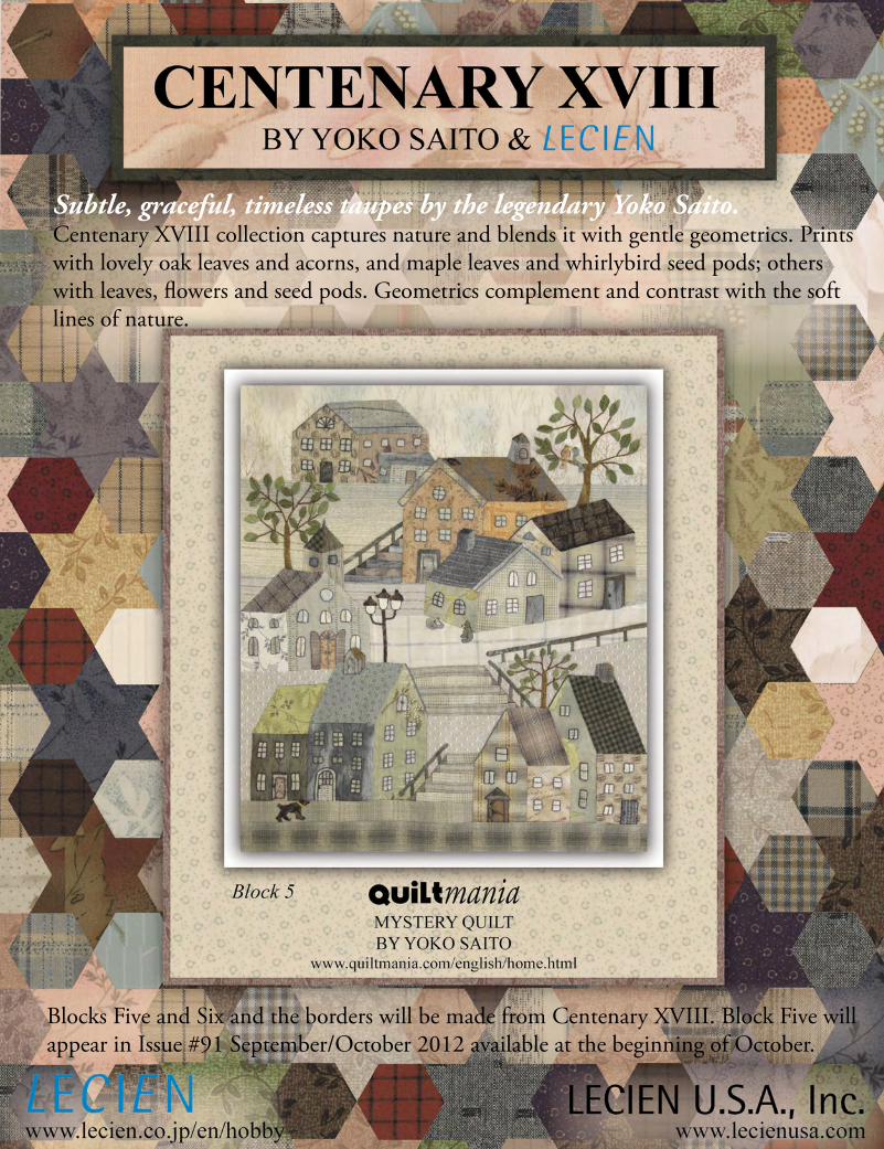
Subtle, graceful, timeless taupes by the legendary Yoko Saito. Centenary XVIII collection captures nature and blends it with gentle geometrics. Prints with lovely oak leaves and acorns, and maple leaves and whirlybird seed pods; others with leaves, flowers and seed pods. Geometrics complement and contrast with the soft lines of nature.
Blocks Five and Six and the borders will be made from Centenary XVIII. Block Five will appear in Issue #91 September/October 2012 available at the beginning of October.

fab
ric: M
rs. M
arch
fro
m L
ecie
n
30
20
1
30202
39028
39026
39030
39027
30205
continues page 14
continued from page 10
into the taupe tide thanks to her ties to Japan through her husband, Hilo. Maria Tamaoka had been teaching quilting to Japanese wives of American businessmen through her shop, Pinwheels, since 1991. In January 2002, combining business with a visit to Hilo’s family in Japan, Maria traveled to the prestigious Tokyo Dome quilt festival as a vendor. Pinwheels was successful selling American fabrics, such as Judie Rothermel’s reproduction prints from Marcus, but in subdued colors. This experience enhanced Tamaoka’s understanding of taupe as a style rather than a limited color scheme. By fall 2002, while Pinwheels vended at International Quilt Week
Yokohama, a fabric wholesale show was taking place simultaneously around the corner.
Tamaoka used her retailer credentials and attended as a buyer. She found Daiwabo
Co. and its taupe fabrics, and the love affair blossomed. Coming to Quilt Market Houston and introducing the rest of us to taupe was a natural conclusion.
Daiwabo, a manufacturer of high-end clothing in Japan, at first could ship its fabrics only within Japan. No problem: Hilo Tamaoka’s family business, a kimono accessories store in Kyoto, helped by taking delivery of the first taupe line. Maria Tamaoka remembers that she learned the hard way by labeling and paying duty on every piece of fabric she’d bought. Back at Pinwheels, she made a commitment to the palette and became the U.S. distributor of Daiwabo
fabrics. She said the term taupe was not initially used by the Japanese source to describe its fabrics. Instead, the whole grayed, subdued palette was thought of as deriving from nature.
Tamaoka describes herself as a traditionalist and finds that taupe suits her personal quilting style. She favors the darker end of the taupe scale (charcoals, greens, browns) and feels that the yarn-dyes from Daiwabo add textural appeal as well as color to any quilt project. She advises that even complex pieced blocks, when translated in taupe tones, look harmonious and pleasing. Her customers are now using yarn-dyed taupes as the background for wool appliqué work. “Taupe is so much more than brown!” Tamaoka says. “Plus, the authentic Japanese yarn-dyes have such a lovely feel—you get addicted to that extra textural sensation. And I love that Daiwabo prints, even the latest ones, harmonize with all their older fabrics. Unlike a lot of color trends, I think taupe has real longevity.”
West Coast WoodsyMeanwhile, on the West Coast, the distributor E.E. Schenck was exploring the taupe trend. Buying patterns from Daiwabo, E.E. Schenck prints taupes, but its fabrics have the familiar quilter’s hand. There’s more of a finish to E.E. Schenck’s taupes than those textural fabrics (yarn-dyes) imported straight from Japan. The first E.E. Schenck taupe collection was produced in 2005, and now the company is on its 17th collection of Serenity, its in-house taupe line. In general, taupe prints from this source are greener and bluer than from the Pinwheels source. Call these taupes “woodsier.”
E.E. Schenck buyer Judy Livingston offered that taupe fabrics are also available from sources other than Daiwabo. She cited the Mrs. March taupes from Lecien, Whimsicals from Red Rooster, and Buggy Barn from Henry Glass. E.E. Schenck recently employed longtime quilt designer Marti Michell to design a taupe block-of-the-month quilt, and poster-size prints of the quilt help sell the program for participating retailers.
Like others I interviewed, Livingston said that one of the reasons stores love taupes is that newer lines blend with the old. A store can run a taupe club or block-of-the-month
“A store can run a taupe club or block-of-the-month series and be assured
that all the fabrics will work together.”
Page 12 FabShop News October 2012

Tokyo by Red Rooster... Trusted, Reliable Reordering.
Celebrating 10 years 2002 - 2012
www.redroosterfabrics.com
The Art of
A world of color . . . imagine 101 possibilities!
FabShopNewsOct12.indd 1 8/16/12 1:18 PM

fab
ric: S
eren
ity b
y D
aiw
abo
for
EE S
chen
ck C
o.
10
61
5-B
B
11928-Y
11450-701
11291-D
90084-704
continues page 16
continued from page 12
series and be assured that all the fabrics will work together. Livingston mentioned two pattern designers in particular who have designed “taupe friendly” patterns: Sheryl Mycroft of Random Threadz and Stephanie Prescott of A Quilter’s Dream. E.E. Schenck carries these patterns and others that support the taupe trend.
Acting on Livingston’s suggestion, I contacted Random Threadz (randomthreadz.com), the successful online business of designer Sheryl Mycroft of Kalispell, Mont. She said, “[Taupe] is elegant, soft, and soothing. I love taupes paired with burgundy or plum. A little bit of color makes the design pop.” Her most successful patterns using taupes are Soliah, Gentle Journey, Hourglass, and Random Starz. She has been working with the taupe color scheme for eight years and said, “As a pattern designer, I appreciate that each new taupe line harmonizes with earlier fabrics. And when I design a quilt with taupes, I am aware of using fat quarters since so many stores sell the concept that way and lots of folks are taupe collectors.” She suggests that stores might start with taupes by offering precuts.
Dreaming of TaupeI also contacted A Quilter’s Dream (aquiltersdream.com), whose taupe-friendly patterns result from a collaboration between Stephanie Prescott and her mother, Susan. I asked Prescott when it was that she got excited about taupe,
Left: “Bits & Pieces II” block-of-the-month. Designed, pieced, and quilted by Karon Trybom of Kreative Threads using Serenity fabrics.
Below: “Gentle Journey” by Sheryl Mycroft. Made by Sheryl Mycroft in Serenity fabrics. Quilted by Vicki Ibison. randomthreadz.com
12155-700
Page 14 FabShop News October 2012

continues page 18
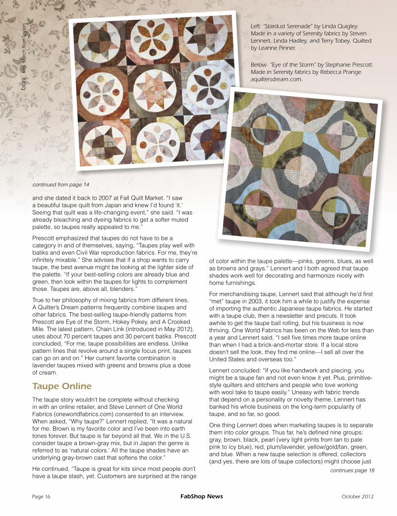
Left: “Stardust Serenade” by Linda Quigley.Made in a variety of Serenity fabrics by Steven Lennert, Linda Hadley, and Terry Tobey. Quilted by Leanne Pinner.
fab
ric: M
rs. M
arch
fro
m L
ecie
n
and she dated it back to 2007 at Fall Quilt Market. “I saw a beautiful taupe quilt from Japan and knew I’d found ‘it.’ Seeing that quilt was a life-changing event,” she said. “I was already bleaching and dyeing fabrics to get a softer muted palette, so taupes really appealed to me.”
Prescott emphasized that taupes do not have to be a category in and of themselves, saying, “Taupes play well with batiks and even Civil War reproduction fabrics. For me, they’re infinitely mixable.” She advises that if a shop wants to carry taupe, the best avenue might be looking at the lighter side of the palette. “If your best-selling colors are already blue and green, then look within the taupes for lights to complement those. Taupes are, above all, blenders.”
True to her philosophy of mixing fabrics from different lines, A Quilter’s Dream patterns frequently combine taupes and other fabrics. The best-selling taupe-friendly patterns from Prescott are Eye of the Storm, Hokey Pokey, and A Crooked Mile. The latest pattern, Chain Link (introduced in May 2012), uses about 70 percent taupes and 30 percent batiks. Prescott concluded, “For me, taupe possibilities are endless. Unlike pattern lines that revolve around a single focus print, taupes can go on and on.” Her current favorite combination is lavender taupes mixed with greens and browns plus a dose of cream.
Taupe OnlineThe taupe story wouldn’t be complete without checking in with an online retailer, and Steve Lennert of One World Fabrics (oneworldfabrics.com) consented to an interview. When asked, “Why taupe?” Lennert replied, “It was a natural for me. Brown is my favorite color and I’ve been into earth tones forever. But taupe is far beyond all that. We in the U.S. consider taupe a brown-gray mix, but in Japan the genre is referred to as ‘natural colors.’ All the taupe shades have an underlying gray-brown cast that softens the color.”
He continued, “Taupe is great for kits since most people don’t have a taupe stash, yet. Customers are surprised at the range
continued from page 14
Below: “Eye of the Storm” by Stephanie Prescott. Made in Serenity fabrics by Rebecca Prange. aquiltersdream.com.
of color within the taupe palette—pinks, greens, blues, as well as browns and grays.” Lennert and I both agreed that taupe shades work well for decorating and harmonize nicely with home furnishings.
For merchandising taupe, Lennert said that although he’d first “met” taupe in 2003, it took him a while to justify the expense of importing the authentic Japanese taupe fabrics. He started with a taupe club, then a newsletter and precuts. It took awhile to get the taupe ball rolling, but his business is now thriving. One World Fabrics has been on the Web for less than a year and Lennert said, “I sell five times more taupe online than when I had a brick-and-mortar store. If a local store doesn’t sell the look, they find me online—I sell all over the United States and overseas too.”
Lennert concluded: “If you like handwork and piecing, you might be a taupe fan and not even know it yet. Plus, primitive-style quilters and stitchers and people who love working with wool take to taupe easily.” Uneasy with fabric trends that depend on a personality or novelty theme, Lennert has banked his whole business on the long-term popularity of taupe, and so far, so good.
One thing Lennert does when marketing taupes is to separate them into color groups. Thus far, he’s defined nine groups: gray, brown, black, pearl (very light prints from tan to pale pink to icy blue), red, plum/lavender, yellow/gold/tan, green, and blue. When a new taupe selection is offered, collectors (and yes, there are lots of taupe collectors) might choose just
Page 16 FabShop News October 2012


1664
one color group they particularly like, or they might order all. I was surprised when Lennert told me how many customers, like kids in a candy store, choose to sample all the taupe shades. Simply put, many customers aren’t yet seeing taupe in their local stores. The taupe concept is still somewhat exotic and people are continuing to collect fabric for that masterpiece quilt they’ll make one day.
Thread companies have always had a lot of taupe shades on hand since the color is a default shade for many garment manufacturers. One company, Presencia, has recently taken the plunge to support the taupe palette with an introductory selection of a six-spool sampler of taupes in its most popular 50-weight cotton sewing thread. The pack retails for about $10.
‘Taupe’ of the IcebergThe basic brownish gray we may think of as taupe is just the tip of the iceberg. There’s actually a lot more to taupe than any one color. Taupe is an approach to color that’s steeped in a classical Japanese aesthetic—think stones, washed and worn wooden steps, the last leaf on the tree before snow, and all wreathed in fog and smoke. Taupe can be romantic, like a lovely landscape viewed through soft sheer curtains. Or taupe can be urban and hard-edged, a color scheme any sophisticated modern quilter might try.
Is taupe the next big thing in quilting? Will all your customers be clamoring for taupe? Probably not in the way of a hot fad. Taupe is not a cutie-pie trend, like aprons on everyone. Nor
continued from page 16 is it a novelty like Scottie dogs or elephants. Instead, taupe is like a time-out. When a quiltmaker is tired of high-contrast color combinations or wants to make a quilt that blends in rather than dominates, taupe will be a logical choice. And as East meets more West, taupe as a thoughtful style different from 19th-century-inspired browns will gain popularity.
Remember that taupe for quiltmakers’ purposes is now a very broad umbrella that covers lots of smoky shades. From the original made-in-Japan yarn-dyes to the West Coast woodsy prints, you can expect to see even more interpretations of the grayed and subtle taupe palette. Here’s a prediction: American quiltmakers can’t resist showing off fancy piecing and quilting. While they appreciate the origins of taupe and admire the prize-winning quilts from Japan that illustrate this style, they’re sure to add some sharp, interesting contrasting colors to the lineup. I can see taupe + electric blue or taupe + turquoise or citron yellow. Myself, I’d like to add a warm deep coral (orange-red) to the taupe.
Taupes are also one of the easiest color groups to mix with the ever-popular black-and-white scheme. The triumvirate of black plus white plus taupe is sophisticated and uptown. And a kid’s bedroom color scheme that’s currently popular and being described as “non-gender-specific” is taupe (seen as
fab
ric: S
eren
ity 1
7 b
y D
aiw
abo
for
EE S
chen
ck C
o.
“Think of taupe as a nice, quiet stroll in the woods.”
Page 18 FabShop News October 2012

Island BatikLeaders in Innovative Batik Design
islandbatik.com 888-522-2845 Visit us on
Pepper Cory is a regular columnist for FabShop News. She will be releasing a line of taupe-inspired fabrics called Town & Country through Studioe Fabrics in January. You can contact Pepper via email at [email protected]. Visit Pepper’s website at www.peppercory.com.
a warmer shade of gray) combined with cheerful yellow and clean white. This is a color scheme that can grow with a child.
Although some quiltmakers will fall headlong into taupe, most will use it a detour. Think of taupe as a nice, quiet stroll in the woods. If you as a store owner can show customers how to mix taupes with prints and colors you already stock, you’ll be widening their world. Take advantage of pattern companies that have excellent photographs of taupe-theme quilts. Taupe can even translate well in scrap quilts since combining many taupes in the same quilt produces a finished effect that is not high-contrast. At this point, taupes are not designer-specific. You’ll find taupes in many print styles and shades so you may want to hunt-and-peck while at Market. Some fabric companies may be offering interesting taupes and not even know it! See what I mean? Taupes sneak up on you!
After writing this article and thinking about taupe fabrics for two weeks, my eyes have been opened. Like the subtle shades themselves, taupe has crept into my quilt consciousness on little “mole” feet! I feel a taupe quilt coming on!
Left: “Scrap Happy Diamonds” by Cindi Edgerton. Pieced and quilted by Steven Lennert in taupe fabrics from Lecien, Westex, Daiwabo, Kinkame, and EE Schenck.
FabShop Members: Visit the fabshopnet.com members area to download a sneak peek of Town & Country and reference sheets of taupes by Lecien and EE Schenck.
October 2012 www.fabshopnet.com Page 19