titles designed by saul bass - hs mannheim designed by saul bass one is pressed to cite an example...
TRANSCRIPT

Titles Designed by Saul Bass
One is pressed to cite an example of an active, self-contained, and characteristic credits sequence in film prior to the work of Saul Bass. Undoubtedly, there are examples that presage Bass’ pioneering work; namely, the famous final credits of Citizen Kane reprise excerpts from the film, underscoring the footage with actors’ names. Likewise, overtures frequently preceded films of the ‘30s and ‘40s. Many of these are visually complimented by static credits, and in some cases a montage. And despite these examples, in regard to innovation, renown, and influence, Bass’ impact in credits design remains virtually unparalleled, even to this day. Bass’ expertise in design exhibits a range (his corporate identities and posters are also durable graphic statements), yet his distinguishing aesthetic is one of economy and simplicity. It is in this regard that his work in credits design is of particular significance—his opening for West Side Story, for example, is a solid block of color that morphs according to the overture. Elsewhere (and numerously), he employs hand-drawn type and cutout, construction paper shapes. In 1964, after sixteen years as a collaborator, Bass began directing his own films including The Searching Eye (1964), From Here to There (1964), and Why Man Creates (1968). His latter effort resulted in an Academy Award—an appropriate gesture of recognition, as Bass may be credited for enhancing the visual strategy of cinema, assigning it another dimension. Bass’ techniques are various and decidedly inconsistent: cutout animation, montage, live action, and type design to name only his more prominent exercises. Secondly, Bass exhibits an exemplary use of color and movement. Often sequences begin with a solid, empty frame of color (as with Exodus’ blue or North by Northwest’s green). His design tactic in this context, although characteristic, possesses subtly and variety. Bass died in 1996 at the age of 75.
by Rumsey Taylor

Carmen Jones, 1954
Saul Bass’ first set of film titles was also the first of many projects for independent director-producer Otto Preminger, initiating a collaboration that would last for twenty-five years and a dozen films. For Carmen Jones, as he would for so many of Preminger’s films, Bass created a distinctive, iconic image by which the film would be instantly recognizable. The single, line-drawn image of a rose engulfed in a red, snaking flame echoes the red skirt of Carmen Jones, the rose between her teeth, and the destructive passions she arouses in Joe, the hapless young military officer. The film itself is cited as a landmark film because of its all-black cast (its star, Dorothy Dandridge, was the first African-American woman to receive an Oscar nomination for a lead role) and Oscar Hammerstein’s reinvention of Bizet opera in African-American vernacular. Of course, given the film’s vintage, the film is as prickly and perhaps ill-considered as the original idea implies and, like its source material, is encoded with suspect notions about the evil, seductive powers of the black woman. Upon its release, James Baldwin famously lambasted the film for its parsing of stereotypes of light- and dark-skinned blacks. And enlivened as it is by Dorothy Dandridge’s scorching onscreen presence (revived in Preminger’s adaptation of Porgy and Bess five years later), the film nonetheless dispenses with the vocal talents of most of its performers in favor of those of “classically trained” (and often white) singers. As Jeff Smith has reported in his revealing essay on the film, Preminger and his producers seem to have equivocated on whether Dandridge and Harry Belafonte – though seasoned performers in the cabaret and calypso worlds, respectively – were up to the task of performing in the putatively superior musical form of opera.
by Leo Goldsmith

The Seven Year Itch, 1955
An empty screen is filled with pastel rectangles. Certain patches will swing open, like a door, and reveal a credit beneath in white calligraphic handwriting on black. The film title is revealed in four segments (one for each word), occupying the extent of the frame’s width. The horizontal bar of the “T” in “Itch” bends to scratch the vertical shaft. The remaining credits appear in a similar fashion, appearing in varied locations about the frame. Billy Wilder’s final director’s credit is black lettering on a white card, literally springing out of the plane attached to an unwound coil. A vehicle for Marilyn Monroe, The Seven Year Itch is a promotion of several controversies: temptation, infidelity, and, predominantly, sex. However, it is not Monroe’s character’s intention to encourage these traits—she is amiable, fashionable, and oblivious to the torment she elicits in men. Like this character the credits sequence is playful and fashionable; the color mimics her dress and her playful activity. Wilder’s final credit springs out of the plane and demonstrates the response of arousal Monroe famously elicited in this film’s archetypal image.
by Rumsey Taylor
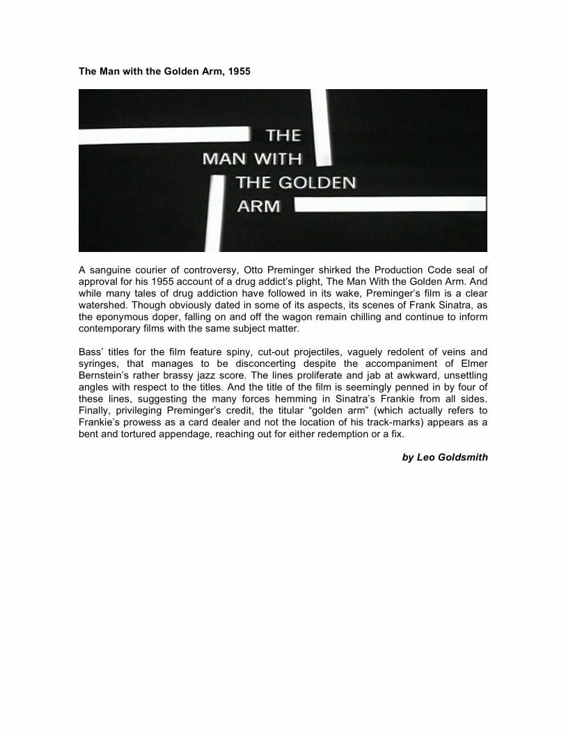
The Man with the Golden Arm, 1955
A sanguine courier of controversy, Otto Preminger shirked the Production Code seal of approval for his 1955 account of a drug addict’s plight, The Man With the Golden Arm. And while many tales of drug addiction have followed in its wake, Preminger’s film is a clear watershed. Though obviously dated in some of its aspects, its scenes of Frank Sinatra, as the eponymous doper, falling on and off the wagon remain chilling and continue to inform contemporary films with the same subject matter. Bass’ titles for the film feature spiny, cut-out projectiles, vaguely redolent of veins and syringes, that manages to be disconcerting despite the accompaniment of Elmer Bernstein’s rather brassy jazz score. The lines proliferate and jab at awkward, unsettling angles with respect to the titles. And the title of the film is seemingly penned in by four of these lines, suggesting the many forces hemming in Sinatra’s Frankie from all sides. Finally, privileging Preminger’s credit, the titular “golden arm” (which actually refers to Frankie’s prowess as a card dealer and not the location of his track-marks) appears as a bent and tortured appendage, reaching out for either redemption or a fix.
by Leo Goldsmith

Around the World in 80 Days, 1956
Around the World in 80 Days begins with a stolid intro by Edward R. Murrow. Stone-faced and sitting behind a large desk, Murrow gives a monotone account of technology and the fiction of Jules Verne, the author of the book on which the movie is based. When he is finished, the movie simply begins, with no opening titles in sight. Those scratching their heads as to where Saul Bass fits in will have to wait nearly three hours to get their answer: in this case, Bass designed the end title sequence for the movie. Although this might not sound extraordinary, Bass’ clever animation gave audiences an excuse to remain in their seats rather than sprinting out the door as soon as the first name flashed onscreen (as people often do nowadays). The lengthy animated sequence Bass designed summarized all the action that had come beforehand; in short, it was sort of a Cliffs Notes version of the film. It begins enticingly, with the words “Who Was Seen in What Scene… And Who Did What.” To represent the elderly men at the gentleman’s club, Bass uses playing cards with kings pictured on them, hinting at the men’s upper-crust status as well as their penchant for making wagers. Phileas Fogg’s loyal sidekick Passepartout is signified by a bicycle, while Fogg himself is shown as a ticking clock with a hat and legs. The two figures are shown racing throughout the long title sequence. In the intro to the DVD, Turner Classic Movies host Robert Osborne credits producer Mike Todd with coining the term “cameo” to lure stars into smaller parts in the film. To pay tribute to this, Bass allots most of the major talents with their own title card. This feature only adds to the audience engagement, for in some cases, filmgoers might be surprised to see who played what role when. Although Around the World in 80 Days has not proved to be as enduring a cinematic achievement as the Hitchcock or Preminger titles Bass worked on, his end sequence deserves a spot alongside larger-than-life producer Todd in the film’s historical legacy.
by Beth Gilligan

Bonjour Tristesse, 1958
Having cast aside the more minimalist aesthetic of his early title sequences for the manic abundance of his Around the World in Eighty Days titles, Bass seems to have continued his experimentations with more formally complex title sequences with his next two Preminger collaborations. Retaining his signature cut-out imagery, Bass integrates different transitions and dissolves, creating a palimpsest of bells for Saint Joan and a tapestry of flowers, shells, and raindrops for Bonjour Tristesse. Both films are literary adaptations, debuting Jean Seberg in a pair of somewhat improbable roles as French women. And though the films achieve only mixed results, both feature interesting formal experimentation concurrent with Bass’ own efforts in the title sequences. While Saint Joan is more notable for its script (adapted by Graham Greene from George Bernard Shaw’s play) than for any visual innovation, Bonjour Tristesse showcases Preminger’s widescreen compositional sense and the agility of his trademark tracking shots. It also displays his mastery of both black-and-white and Technicolor palettes, as the film moves from the monochrome present-day of Seberg’s disaffected Parisian socialite to the vibrant lustiness of her Mediterranean youth. Bass’ opening credits suggest the arc of Francoise Sagan’s story, with colorful abstractions of shells and coral that dissolve into stars and flowers. Finally, these flowers’ petals become raindrops and then – in the image that brands the film – tears. The themes of passion, metamorphosis, sexual awakening, and melancholy that mark the progress of the film all find resonance in these titles. Artfully, Preminger follows Bass’ credits with images of the black-and-white, present-day Paris, removing his audience from an abstract, colorful evocation of youth and into an already harsh and effete reality.
by Leo Goldsmith

Vertigo, 1958
The position of Hitchcock’s name in the credits sequence in Vertigo is a telling element. The film — said to be his most personal — concerns a search for female identity. Hitchcock’s name is associated with the most identifiable feature we see: her eye. This film concerns a man’s struggle to identify a woman; significantly, the first woman seen in the film is in this sequence, and is anonymous. As the camera closes in on the woman’s face, the screen becomes soaked in red, a fittingly dramatic color given the primal impulses highlighted in the movie. After zooming in on the woman’s eye, sprials of color begin to appear, signalling the workings of the inner mind. These shapes are significant not only in that they echo Madeline’s hairdo (which Scottie later insists Judy replicate), but also for the lack of control they represent. The spinning, dizzying sensation recreates the Scottie’s feelings of vertigo at great heights, with Bernard Herrmann’s powerful score underlining the action.
by Beth Gilligan and Rumsey Taylor

Anatomy of a Murder, 1959
By 1959, Saul Bass had become an integral part of Preminger’s production team and his title designs an important element of the pitching and marketing of the director’s films. Bass’ designs for Anatomy of a Murder were devised long before cameras began to roll, making clear the value that Preminger placed on Bass’ work and its role in positioning and branding his films. The titles for the film are among Bass’ most recognizable and, along with Duke Ellington’s score, lend the film its particular blend of sophistication and loose, improvisatory charm. Literalizing the film’s title, the credit sequence presents different cut-out (-off?) human limbs, which are in turn diced up into abstract decorative shapes. Echoing the deliberate manner in which the film dissects the circumstances of a murder case, the credits also provide some witty juxtapositions of titles and images: James Stewart naturally gets the head; Lee Remmick a leg; Duke an arm; and Preminger’s credit comes once a disembodied hand seems to cover the lens. The central image of the segmented corpse is so effective and simple that Spike Lee’s production company lifted it wholesale for the film, Clockers, until Bass threatened them with a lawsuit. True to Preminger’s appetite for provocation, Anatomy of a Murder is renowned for its use of some hitherto taboo words (ahem, panties) and its adoption of outré subjects such as rape and the insanity defense. But unlike some of his other notably controversial works, Anatomy of a Murder feels neither forced nor dated in its use of provocative subject matter. It is both a tightly constructed courtroom drama and an engaging ensemble character study, and like James Stewart’s rumpled Michigan lawyer, it remains at once clever and down-to-earth.
by Leo Goldsmith

North by Northwest, 1959
Trains figure prominently into North by Northwest, so it is no coincidence that Saul Bass would design a title sequence that opens with lines crisscrossing the screen like railroad tracks. After a few seconds, however, it becomes apparent that the lines have come to form a different shape - that of a skyscraper. In large block letters, the film’s title and the names of the featured actors s wiftly move up and down the screen like elevator cars. Soon after, the lines seamlessly merge into an actual shot of a building, with a sea of yellow taxis reflected in its mirrored façade. Bernard Herrmann’s score s wells in the background, and Bass’ titles continue to run as the action shifts to crowded Manhattan street scenes. The final credit (for the director) appears as a portly man (Hitch in his trademark cameo) races in attempt to catch a bus, only to see the doors shut in his face. The nameless city skyscraper and masses of people rushing run in strict contrast to the film’s most striking images: a crop-dusting plane hovering above a desolate stretch of land and a woman dangling off the top of Mount Rushmore. However, the anonymity suggested by the opening scenes foreshadows the shifting identities of the film’s main characters, played by Cary Grant and Eva Marie Saint. In an urban jungle like the one pictured, a case of mistaken identity hardly seems improbable. North by Northwest is a fast-paced thriller that keeps audiences on their toes; Bass’ opening segment gives audience a taste of the ride they’re in for.
by Beth Gil ligan

Psycho, 1960
Psycho was the third and final collaboration between Saul Bass and Alfred Hitchcock. While his work on Vertigo and North by Northwest was limited to the title sequences, in this case, Bass was also credited as a “pictorial consultant” for his role as an advisor on some of the movie’s critical sequences, including the famous shower scene. In an interview with François Truffaut, Hitch downplayed Bass’ role in the filming, but most other accounts credit him with fashioning the drawings that became the basis for several scenes. While his degree of input for the bulk of Psycho remains hard to pinpoint, Bass left his usual unmistakable imprint on the film’s title sequences. In this case, however, it seems unfair to single him out because the power of his title sequence is bolstered heavily by Bernard Herrmann’s tense, dramatic score. As the music swells, the horizontal and vertical lines that appear are driven across the screen in a stabbing motion, foreshadowing the action to come. Occasionally, a name that appears on screen (e.g. Alfred Hitchcock) becomes scrambled, perhaps suggesting the degree to which identities will be jumbled throughout the course of the film. As in the intro to North by Northwest, the lines that crisscross the screen in Psycho seamlessly fade into a shot of tall buildings, setting up the segue into the illicit meeting between Marion and her lover at a hotel.
by Beth Gil ligan

Spartacus, 1960
Spartacus is introduced in a patient montage of stone headdresses and busts. The faces are judicious, experienced, and silent behind the titles. The background is empty, and each sculpture is lit coolly in a blue or violet. Kubrick’s director’s credit arrives and the pace becomes urgent. The final statue crumbles partially, and the view zooms forward into its open eye. Strewn with these icons of Roman perseverance, Bass’ sequence for Spartacus is doubly representative of prowess and demise; the statues are pensive and respected, yet significantly (forwarded in the final headdress) faulted. The sequence denotes experience and temporary prestige.
by Rumsey Taylor

Exodus, 1960
As Otto Preminger’s films grew in scope (and length) in the late 1950s and early ’60s, Saul Bass’ titles became important factors in distinguishing the films from the other Hollywood epics of the time. For 1960’s Exodus, one of Preminger’s most exhausting and bombastic films, Bass opted for a simple image, one that encapsulates the protagonists’ struggle for the nation of Israel in a manner that is perhaps more effective than the rest of the film. Similar to the iconic credit sequence that Bass had created for Carmen Jones six years earlier, the central image is one of fire, though here it symbolizes nationalist fervor rather than lusty passion. In the midst of this flame is the central cut-out image of arms reaching up – in defiance, in struggle – against a backdrop of the rich, Mediterranean blue of the Israeli flag. As a result, the title sequence seems like something of a regression for Bass, returning him to the minimalism of his earliest credit sequences. But in its elegance and lack of presumption, this minimalism contrasts neatly with the massive, star-stuffed scale of the film’s narrative.
by Leo Goldsmith
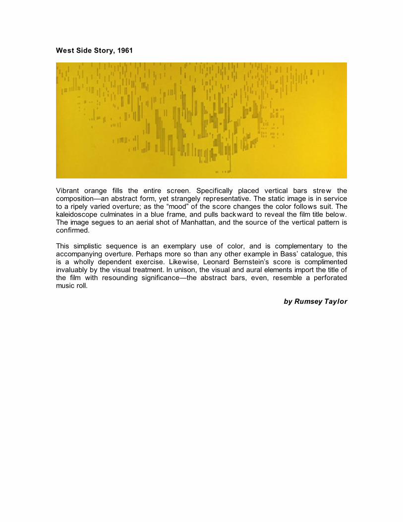
West Side Story, 1961
Vibrant orange fills the entire screen. Specifically placed vertical bars strew the composition—an abstract form, yet strangely representative. The static image is in service to a ripely varied overture; as the “mood” of the score changes the color follows suit. The kaleidoscope culminates in a blue frame, and pulls backward to reveal the film title below. The image segues to an aerial shot of Manhattan, and the source of the vertical pattern is confirmed. This simplistic sequence is an exemplary use of color, and is complementary to the accompanying overture. Perhaps more so than any other example in Bass’ catalogue, this is a wholly dependent exercise. Likewise, Leonard Bernstein’s score is complimented invaluably by the visual treatment. In unison, the visual and aural elements import the title of the film with resounding significance—the abstract bars, even, resemble a perforated music roll.
by Rumsey Taylor

West Side Story: the End Credits, 1961
West Side Story opens with only a title credit. In keeping with its prior incarnation as a stage musical, the players and company are given patient credits at the end of the film. Story is liberal escape from its Shakespeare source, transplanted in contemporary Manhattan and told in song and dance. Bass’ end credits sequence completes the transplant as a live-action montage of graffiti scrawled upon worn urban surfaces. The composition scrutinizes each wall, zooming, panning, and then halting patiently on each credit. Occurring after the tragedy that closes the film, Bass’ hand-scrawled type authenticates the environment and conflict.
by Rumsey Taylor

Advise & Consent, 1962
Otto Preminger’s polemic of American government and law opens with a crude illustration of the US Capitol. Its dome is unhinged, displaying the film’s title with the playful interactivity of a cookie jar. The analogy lampoons the political iconography, equating it with the mundane functionality of a household object. The credits appear in hand-drawn, cursive writing (Bass’ own), over cropped footage of an American flag bellowing in a slow-motion current against an empty, black background. The flag is robbed of its iconography. Perhaps enforced by the film stock, the color red is absent – no bloodshed – but more discrete is the absence of the flag's upper-left corner. The flag’s stars are omitted: no icons of unity to warrant the prize of liberty.
by Rumsey Taylor

It’s a Mad Mad Mad Mad World, 1963
Given the movie’s notorious running time, it seems appropriate that Saul Bass delivered one of his longest film title sequences here. Clocking in at a little over four minutes, this animated piece gave Bass the chance to display a wit that had often been buried in his serious collaborations with Otto Preminger and Alfred Hitchcock. Directed by Stanley Kramer and jam-packed with every working and/or semi-retired comedian in Hollywood, It’s a Mad, Mad, Mad, Mad World contains slapstick piled on top of slapstick, with a thin plot line about a hidden treasure of stolen money stringing the action together. To capture this antic spirit, Bass created a cartoon segment revolving around a white globe-shaped ball divided into symmetrical lines. The ball is carried onto the screen by a little man with a black hat who incidentally bears an uncanny resemblance to Boris from the Rocky and Bullwinkle cartoons. The background is red, and for the most part, Bass sticks to this simple color scheme. As the sequence progresses, the globe undergoes several transformations. After being hoisted onto the screen by the little man, it becomes a bouncing ball, trampling its carrier. In a knowing wink to the large volume of talent (and by association, clashing egos) involved in the film, a pair of scissors emerges from inside the ball, cutting out a square shape from which a hand sticks out and begins to rearrange the billing order of the actors’ names being shown alongside it. Soon after, the globe’s top half pops off to reveal fireworks, which in turn take the shape of the film’s title. Carnival-like music plays throughout these various incarnations, reinforcing the fairground spirit of the action to come. Although the film itself hasn’t aged especially well, the spirit of infectious fun Bass infuses into the title sequence still stands out.
by Beth Gil ligan

The Cardinal, 1963
In the opening frames of The Cardinal, with the sound of a bell ringing over a Roman square on the soundtrack, a black-robed, stone-faced clergyman exits a church and walks through a maze of cloisters, colonnades, and crumbling architecture. The title sequence is composed entirely of live-action images (with the exception of the characteristically Bass-ian typeface), but like Bass’ most richly animated title sequences, it functions to suggest the style and course of the film in graphical terms. The cardinal strides into and out of an elaborate series of frames – up staircases and across ornate piazzas – in a manner that prefigures the character’s professional course from a small Boston parish to the Vatican. Through a series of dissolves, the juxtaposition of staircases and Doric columns creates a tense network of competing horizontal, vertical, diagonal lines. This geometrical clash in the credit sequence is evocative of the knotty moral dilemmas that the protagonist will face in the rest of the film. Indeed, Preminger’s film is very much a stroll through the problems of being a Catholic. Like the credits, the film itself is rather confusing and all over the place. While the film is another of the director’s controversial message-films, Preminger resists the temptation to being wholly scathing (as in similar of his films, he never quite shows his hand). Nevertheless it exploits every available moral issue to hand: interfaith romance, abortion, Southern cross-burning, Nazis, etc. But as always in Preminger’s work, the film is spared by the surprising richness of the characters (headed by empty-slate Tom Tryon), which includes John Huston, Ossie Davis, Romy Schneider, and Burgess Meredith.
by Leo Goldsmith

In Harm’s Way, 1965
Preminger’s take on Pearl Harbor is a surprisingly effective film, and while it was made to coincide with the 20th anniversary of V-E Day, it is not an overly jingoistic affair. Again, the director provides a surfeit of locations, subplots, and minutes of running time, and again there is a glut of characters and big-name actors, but the acting is typically strong, featuring a fairly good, relatively vulnerable performance from John Wayne. The credit sequence that Saul Bass contributed to this film came at the end of the film (a rather novel idea at the time) with only a single title card at the beginning. As it stands, the end credits fit In Harm’s Way ideally, lending the film the gravitas that it requires without burdening the Duke with overly portentous dialogue. Instead, Bass provides an entire narrative in credits and ocean photography. Backed by the rise and fall of Jerry Goldsmith’s score, Bass’ titles follow the sea’s whims from calm to violent – culminating in a montage of explosions and mushroom clouds – and then to calm again. The imagery is an adequate suggestion of the course of the war after the film’s events, a wordless and objective expression in nature’s terms, and as such, it allows the drama of the film’s characters to resolve itself without any grand history lessons.
by Leo Goldsmith

Bunny Lake is Missing, 1965
Released only a few months after In Harm’s Way, Bunny Lake Is Missing is almost its sister film’s antithesis in Preminger’s oeuvre. Neat, concise, and, like some of its characters, tightly wound, the film boasts only a rather small cast and a clever plot device (which, incidentally, seems to have been totally ripped off for this fall’s Flightplan, with Jodie Foster). But even without the elegantly constructed mystery, the film features some excellent character-actor performances from a weary, restrained Larry Olivier, a perverted Noël Coward, and Keir Dullea doing his best Anthony Perkins (to say nothing of a brief, gratuitous appearance by the Zombies). The presence of Dullea (along with the mid-60’s England setting) lends more than a little touch of Kubrick’s creepiness to the film, and the result is an unnerving psychological thriller that, even with Olivier’s kind reassurances at the end, manages to leave a nasty taste in one’s mouth. Bunny Lake is a film that turns on the destruction of evidence, so Bass’ titles, which feature the tearing away of bits of paper to reveal the credits, precisely fit the film’s themes of concealment and revelation. The central image here – and the icon that helped to market the film – is that which accompanies Preminger’s credit: the shape of a little girl torn out of the black background. With this image, the titles also evoke the darker side of childhood, a sentiment reinforced with the first image of the film proper: the black background of the title sequence is torn away to reveal Dullea walking alone through a garden filled with toys but devoid of children.
by Leo Goldsmith

Seconds, 1966
“I’m ready for my close-up, Mr Bass.” Cecil B. DeMille has nothing on Saul Bass during the title sequence for Seconds, in which Mr. Bass uses the camera lens like an operating tool - an appropriate choice, as John Frankenheimer’s tale is one of identity alteration via experimental surgery - poking, prodding, stretching, and generally warping the poor head of his lone male subject. The relationship between deformed features and a deformed psyche is captured by the frightened subject’s expression, while the importance of cutting in the forthcoming story is introduced both anatomically, as well as filmically: teeth are shown glistening, a screen is split in half, shots are cut together briskly. As a whole, these titles match the narrative progression of the film it introduces: a man begins as unrecognizable, is interrogated by an instrument, turns out to be Rock Hudson, then finds himself in bandages as the film concludes. John Frankenheimer, screenwriter Lewis John Carlino, cinematographer James Wong Howe, and Saul Bass were ahead of their time with Seconds. All four filmmakers anticipated the panicked and uneasy relationships which inevitably develop between celebrity-obsessed cultures and the false promises plastic surgery offers, the horrors of wanting to be a movie star as well as the horrors of actually being a movie star, and the effect that a camera’s excessive scrutiny can have upon a person’s well-being, famous or otherwise. Bass’ extreme close-ups of orifices - mouths, ears, eyes, nostrils - reveal the inherent horrors contained in the human face, while simultaneously pointing out the hollowness at the center of the film’s experiment.
by Jason Wolowski

War of the Roses, 1989
The Basses embrace the formalities of matrimony to prepare viewers for the experience of martial combat ahead. Black titles are set over expensive-looking and smooth white cloth. The camera descends slowly, reminding one of a wedding procession, as David Newman’s score welcomes guests to the ceremony. Visually, we could be looking at a variety of things: the train to a wedding dress, clean linen sheets signifying the unpolluted slate of a new life together, or the black titles as place cards over a tablecloth. As the sequence unfolds, the score remains constant, but the cloth gradually becomes crumpled, indicating the disarrayed marriage at the core of Danny DeVito’s black comedy. The cloth eventually becomes entirely crumpled, only to be revealed in a clever visual joke as a handkerchief, into which DeVito’s cynical lawyer character blows his nose. The spotless cloth of the Bass sequence sets up DeVito to introduce an effortless and appropriate reference to the stained hanky in Othello, the relevance of phallocentrism (DeVito’s spewing nose) within the overall context of the Rose’s tale, and the idea of marriage as something which starts off pristine, only to become easily soiled with time. The folding of the cloth is also significant in that for one of the only times in their careers, the Bass’ embrace diagonal lines as a prominent stylistic element to their work. In the past, Saul Bass used the tension between vertical and horizontal lines as a symbolic divide between the sexes (see Psycho’s title sequence, as well as the contrast between horizontal and vertical buildings throughout Hitchcock’s film), but in DeVito’s film, the Rose’s inability to compromise retrospectively turns the gentle diagonals of the title sequence cloth into an overly-idealized and unattainable goal. Additionally, emphasizing a slowly wrinkling piece of material signifies the relevance of materialism throughout the film, including the joys of attaining material goods and, perhaps especially, the liberating joys of destroying them. For another great, early example of diagonals in a Saul Bass title sequence, please see Alfred Hitchcock’s North By Northwest.
by Jason Woloski

Goodfellas, 1990
Like Casino after it, GoodFellas opens with a reminder that the story about to be told is true, followed by a brief scene of un-contextualized violence, followed by a Saul and Elaine Bass title sequence. Unlike Casino, with GoodFellas the Basses embrace the power of sparseness and horizontality in order to convey the docudrama tone of the narrative they are serving. One by one, grey titles and names whiz by over a black background, only to re-emerge for a moment, perfectly still. The film’s title is the only word to appear in red. This dance between speeding up and stopping altogether anticipates the trajectory of Henry Hill‘s life, in which a career as a mafia foot soldier saw him moving ever more quickly, completely losing perspective along the way, until one day he found himself in the FBI’s witness relocation program, his life of excitement grinded to a halt. As was pointed out to me by Chiranjit Goswami, the ceaseless lateral repetition of the title sequence also captures the inability of Hill and his Irish-blooded partner Jimmy Conway to move up through the ranks of the Mafia. Like these protagonists, words can move violently over the screen but must always remain along the plateau that’s been set for them. The briefly frozen words in the credits anticipate the freeze frames to come. At various moments, Scorsese freezes Henry’s life in mid-action, usually so that Henry can narrate how significant the moment was to his life at the time. The influence of François Truffaut’s The 400 Blows upon GoodFellas can be found in these frozen moments, as well as in the conclusion of the film. Freeze frames were necessary for Henry to slow his life down to the point that the viewer could be brought up to speed. Henry as he exits the film, in a bathrobe in the middle of an FBI-approved suburban sprawl, does not need a freeze frame to capture how he feels. His life has been slowed down enough. Whereas Doinel’s face is shocked into uncertainty by the life that lies ahead of him, Henry is captured as the ex-foot soldier he is, miserably trapped in time.
by Jason Woloski
Cape Fear, 1991
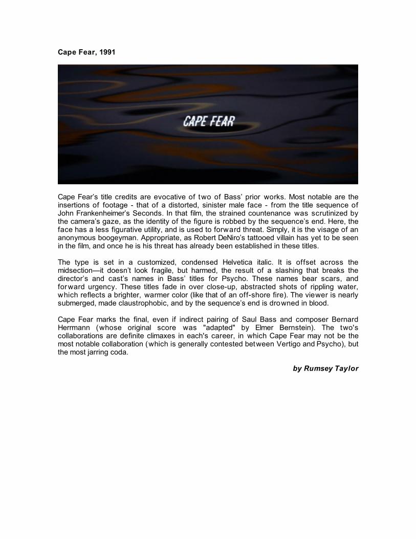
Cape Fear’s title credits are evocative of two of Bass’ prior works. Most notable are the insertions of footage - that of a distorted, sinister male face - from the title sequence of John Frankenheimer’s Seconds. In that film, the strained countenance was scrutinized by the camera’s gaze, as the identity of the figure is robbed by the sequence’s end. Here, the face has a less figurative utility, and is used to forward threat. Simply, it is the visage of an anonymous boogeyman. Appropriate, as Robert DeNiro’s tattooed villain has yet to be seen in the film, and once he is his threat has already been established in these titles. The type is set in a customized, condensed Helvetica italic. It is offset across the midsection—it doesn’t look fragile, but harmed, the result of a slashing that breaks the director’s and cast’s names in Bass’ titles for Psycho. These names bear scars, and forward urgency. These titles fade in over close-up, abstracted shots of rippling water, which reflects a brighter, warmer color (like that of an off-shore fire). The viewer is nearly submerged, made claustrophobic, and by the sequence’s end is drowned in blood. Cape Fear marks the final, even if indirect pairing of Saul Bass and composer Bernard Herrmann (whose original score was "adapted" by Elmer Bernstein). The two's collaborations are definite climaxes in each's career, in which Cape Fear may not be the most notable collaboration (which is generally contested between Vertigo and Psycho), but the most jarring coda.
by Rumsey Taylor

The Age of Innocence, 1993
This formalized, decorative introduction to Martin Scorsese’s Age of Innocence contains three layers of information: the principle actors are credited in an italicized serif typeface, seen atop a semi-transparent veil of lace and blooming flowers. The color scheme favors a membraneous red. The film concerns a debutant society of 1870’s New York. Large bonnets and top hats are the fashion ephemera of this setting, and Bass’ opening employs a tapestry of Romantic materials: lace and calligraphy, imposed over blooming flowers shot in time-lapse photography. Aligning the sequence with the film is a final segue to a shot of actual flowers that begins the film.
by Rumsey Taylor

Casino, 1995
Having been blown up by a car bomb, Sam Rothstein finds himself falling through a hyperbolized fireball as Bach‘s “Matthaus Passion” plays elegiac over the soundtrack. Rothstein is either in hell, or well on his way to it. Fire transitions into the crimson lights of the Las Vegas Strip, and Rothstein keeps falling. Flames shoot up from the bottom of the frame, engulfing a screen covered with abstractionist shots of Las Vegas signage and illumination. Rothstein descends quickly over the superimpositions, then disappears entirely. The Bass‘ vision of hell accurately summarizes the narrative ahead, without ruining any of the narrative surprises Scorsese has in store for the viewer. “Ace” Rothstein’s rise and fall was conducted in grand fashion, and while his journey hardly reflects the re-birthing themes introduced by Bach’s Easter piece, Rothstein nevertheless emerged as the sole survivor to his own story. Like many a great Bass sequence, the combination of image and sound urges the viewer to consider theme: Las Vegas as the most tempting hell on Earth, Rothstein’s desperate fear of losing control as reflected through his out of control freefall, and his increasing inability to maintain perspective on what is going on around him - see the size of his eyeglasses at the end of the film - even as his world becomes more hectic and bizarre. For someone who obsessively managed his surroundings and fought off chaos through a talent for prediction, numbers, and logic, the increasingly disarrayed and nonsensical imagery provided by the Bass’ is an underworld tailored to Rothstein’s particular weaknesses. Rothstein spent most of his Vegas days restraining unruliness, both in and out of the Tangiers’s pits. The Bass’ opening montage sets Rothstein well on his way to the calamitous life beyond repair Scorsese has in store for him.
by Jason Wolosk © 2004 notcoming.com