title inspiration & title breakdown
TRANSCRIPT

Title Inspiration
The titles off the thriller/horrors included below all have the same basic conventions.
The font appears to be small bus still provides an effective image for the audience due to the
colours used.
The colouring is used for effect to make the text stand out to the audience and leave an impression to encourage people to see the film. Inception has an almost typewriter font which links in with the type of film it is and its content. Seven uses a font that could be associated with a dark room used by detectives to uncover clues. This significantly links with the film and its content effectively. A very creative title.
Paranormal activity, one of the highest grossing low budget films of the decade uses very effective ‘haunting’ titles that slightly provides the image of a UAV light – a typical prop of this genre.
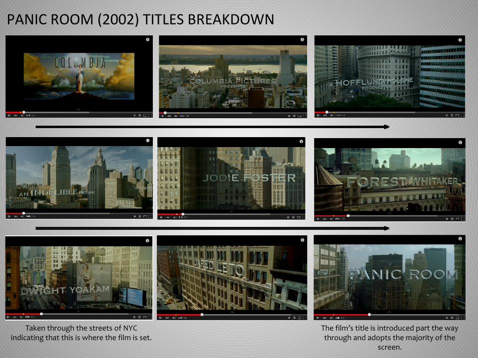
PANIC ROOM (2002) TITLES BREAKDOWN
The film’s title is introduced part the way through and adopts the majority of the
screen.
Taken through the streets of NYC indicating that this is where the film is set.
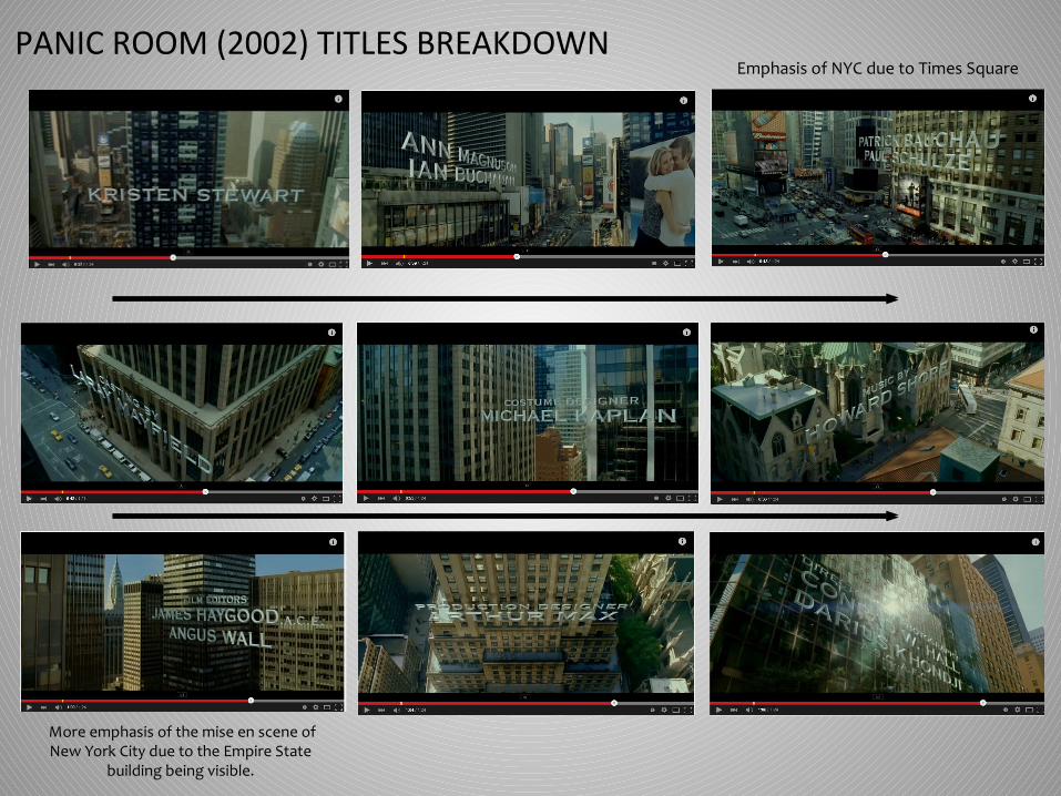
PANIC ROOM (2002) TITLES BREAKDOWN
More emphasis of the mise en scene of New York City due to the Empire State
building being visible.
Emphasis of NYC due to Times Square

PANIC ROOM (2002) TITLES BREAKDOWN
The final titles we see are is ‘directed by’ then the director’s
name underneath. Typical of film conventions it gives the film its
own brand because some people watch films simply because of who directed it. After this we
hear dialogue from someone in the background and a the
opening scene fades in as the titles fade out.