tips for small advertisers - elle media kit
TRANSCRIPT

USING THIS MANUAL
This manual was developed to try and help
educate some of our advertisers and help in mak-
ing the creation of their ads easier. We especially
suggest you read the sections on Color and
Resolution if you are new to making ads. You may
want to read the entire manual if you have time.
There are also program specific pages, about
Quark, InDesign, Illustrator, Photoshop and vari-
ous submission formats.
If you PDF reader supports internal links you can
move from one page to the next using the Blue
Arrows at the top right of each page.
Additionally if your PDF reader supports it you can
enable a separate pane of this document which is a
linked Table Of Contents by clicking Bookmarks.
If your reader does not support these features you
will find a way to move from page to page within
the interface of your reader.
Page 3 of this manual is a table of contents.
1
An example of how a manual might look in a PDF Reader, in this case Acrobat Reader 7.
If you click the Bookmarks Tab on the left you gain the vertical index which is alwaysavailable to navigate between pages.
The blue arrows go forward and back one page at a time.
Should these features be unavailable in your PDF Reader, somewhere on the interfacethere will be a way to move manually from one page to the next. In this version of AcrobatReader you will see navigation controls at the bottom, center of the window, for instance.

TIPS FOR CLASSIFIED ADVERTISERS
©Copyright 2008 Hachette Filipacchi Media, Inc.

CONTENTS
PAGE ....................CONTENT
AL
3 ............................................ CONTENTS
4-9 .............. UNDERSTANDING COLOR
10-11 UNDERSTANDING RESOLUTION
12.......... UNDERSTANDING SCANNING
13 .. UNDERSTANDING REGISTRATION
14 ........... UNDERSTANDING TRAPPING
15 ................ UNDERSTANDING FONTS
16 ............ FORMATS FOR SUBMISSION
17-18 ............................... QUARK USERS
19-20 ...........................INDESIGN USERS
21 ......................... ILLUSTRATOR USERS
22 .......................... PHOTOSHOP USERS
23 ............................. TIF AND JPG FILES
24 ............................ EPS AND PDF FILES
25 .......................................... FEEDBACK
3
1 ...........................USING THIS MANU2 ................................................... COVER

UNDERSTANDING COLOR
COLOR MODES
The proper color mode for any color photo,
color logo, or any other type of color graphics
used in a four color ad in one of our classified
sections is CMYK. It may be helpful to
understand what this and some other common
color modes mean.
CMYK stands for Cyan, Magenta, Yellow and
Black (K). These are called the FOUR PROCESS
COLORS which blend together to make all other
colors in the four color printing process.
RGB are the colors used by a monitor to display
colors, and unfortunately do not work for print
reproduction.
PANTONE and/or SPOT colors are built into
many desktop publishing programs. A typical
spot color is for instance, Pantone 110, a deep
orangish color. Spot colors are used by printers
and are specific ‘already mixed’ color inks, like
orange. For instance, you might have a business
card done with 2 colors, Black and Pantone 110
(Orange). The printer would actually use a black
and an orange ink.
Our magazines define all color images using the
CMYK model. In the case of an ad produced
using an orange color, that color must be ‘built’
out of the process colors. Yellow and magenta
would, for instance make an orange color.
So, ultimately all color materials need to be in
CMYK mode to reproduce properly in your ad.
Luckily, you can convert other colors to CMYK in
most desktop publishing programs if you have
already defined them in RGB or PANTONE.
Tonal Grayscale Images should be in Grayscale
Mode. Black and White Images (No Grayscale)
should be in Bitmap (B&W) Mode.
*Note that many scanners scan into RGB mode.
You may have to use your software to convert
your scanned images to CMYK. Be aware during
the conversion certain colors may appear duller
in CMYK then they did in RGB. See illustration
The Process Colors: C=Cyan,M=Magenta, Y=Yellow,K=Black
RGB colors: R=Red,G=Green, B=Blue
Such as Pantone 110 CV
Here we see how two or moreprocess colors (and shadesthereof) can be mixed to makenew colors.
Above RGB green is convertedfrom RGB to CMYK
4on bottom right.
UNDERSTANDING COLOR
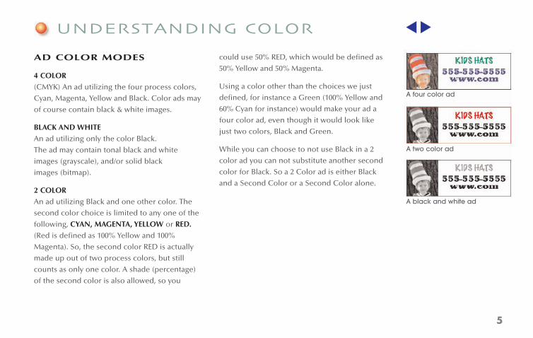
AD COLOR MODES
4 COLOR
(CMYK) An ad utilizing the four process colors,
Cyan, Magenta, Yellow and Black. Color ads may
of course contain black & white images.
BLACK AND WHITE
An ad utilizing only the color Black.
The ad may contain tonal black and white
images (grayscale), and/or solid black
images (bitmap).
2 COLOR
An ad utilizing Black and one other color. The
second color choice is limited to any one of the
following, CYAN, MAGENTA, YELLOW or RED.
(Red is defined as 100% Yellow and 100%
Magenta). So, the second color RED is actually
made up out of two process colors, but still
counts as only one color. A shade (percentage)
of the second color is also allowed, so you
could use 50% RED, which would be defined as
50% Yellow and 50% Magenta.
Using a color other than the choices we just
defined, for instance a Green (100% Yellow and
60% Cyan for instance) would make your ad a
four color ad, even though it would look like
just two colors, Black and Green.
While you can choose to not use Black in a 2
color ad you can not substitute another second
color for Black. So a 2 Color ad is either Black
and a Second Color or a Second Color alone.
5
A four color ad
A two color ad
A black and white ad

UNDERSTANDING COLOR
RICH BLACK
A problem which occurs frequently in ads which
are submitted is the unintentional or incorrect
use of Rich Black. Rich Black is black which is
defined not as 100%K (black) but as a some
combination of the four process colors. Ideally
text, especially when small should be defined as
100%K and not have any other colors in it.
Unfortunately the default black in many programs,
like Photoshop for instance, is a rich black. Look
at the representation of the default black in
Photoshop shown below.
So try and define the color black as 100% ahead
of time when making black text and thin rules.
Its okay to use rich black in solid areas of color
within certain limits. Look at the difference
between these two logos for instance. This
might actually be hard to see on your monitor
(it’s fairly obvious in print). The logo on right has
a rich black which has both Cyan and Magenta
added to it.
So why use a rich black at all? Because it has a
much darker, fuller look to it. There are some
limitations and risks associated with using rich
black however ... see the next page.
6

UNDERSTANDING COLOR
RICH BLACK
If the magazine prints slightly out of register
(which can happen occasionally even on the
best of printing presses) rich black used in fine
lines or small text can appear blurry. Here is a
enlarged illustration of what happens.
Had this type been made out of only 100%K
(Black) there would be no chance of this
happening. To be honest the advantage of rich
black (looking deeper and richer) is not really
noticeable in small text anyway, so you should
never use rich black in text unless it is very
large, like in a logo.
TOTAL INK COVERAGE
A similar issue to rich black is the ‘TOTAL INK
COVERAGE THRESHOLD’ Any individual area in
your ad can not exceed at total ink coverage of
320%. So when you are defining colors for your
ad limit the total of all four process colors to
320% For instance 100C, 20Y, 100M, 20K would
be acceptable, whereas 100C, 100Y, 50M, 100K
which would total to 350% would not be.
TOTAL INK COVERAGE IN
TONAL IMAGES
Scanned images if overly dark may have areas
which exceed 320% ink coverage as well. This
may be a bit harder for you to detect since you
don’t define the color ahead of time in a
scanned image. If the dark areas in your scan
look very dark try to adjust the tonality with
your photo editing software. If your artwork is
submitted with images which are overly dense
we will notify you and help correct your images
or possibly ask you to rescan them a bit lighter.
If a very small area(s) within your scanned image
exceeds 320% that’s okay, but if a larger portion
of your image is overly dark, that’s a problem.
See example at right.
7
The top illustration shows animage which has some areaswhich exceed 320%. In the second illustration these areasare highlighted in green.The third illustration shows thesame picture after it has beencolor corrected.

UNDERSTANDING COLOR
THE REGISTRATION COLOR
Depending on the program you are using to
make up your ad you may see a color called
‘REGISTRATION’ available for use. (It is
sometimes called ‘ALL TINT’ as well.) This color
is 100%C, 100%M, 100%Y and 100%K. Obviously
as we’ve just seen on the previous page this is
way past the acceptable 320% threshold for
ink coverage.
This color is not meant to be used inside your
ad. This color is used in certain cases outside
the ‘live area’ of a full page document to show
the printer where to crop the printed page and
to allow him to ‘register’ the four different
colors (C,M,Y,K) during the printing process.
You really don’t need to worry about this color
at all. Only full pages ads which have art that runs
off the edge of the printed page need registration
marks at all. See the section on Registration and
Bleed for clarification. WE DO NOT ALLOW
FULL PAGE BLEED ADS IN OUR CLASSIFIED
SECTIONS.
TIPS FOR CLASSIFIED ADVERTISERS
CLICK HERETO BEGIN
©Copyright 2008 Hachette Filipacchi Media, Inc.
Project6 3/22/08 2:03 PM Page 1
Registration color is used only outside the livearea of an ad to help the printer. Here forinstance you see registration and crop marks.
8

UNDERSTANDING COLOR
OVERPRINTING BLACK
Colors in many programs can be set to
overprint, though this is rarely the default
setting (except for black text as we will see).
You should really define colors by making them,
and not by setting colors to overprint. For
instance if you want a nice orange you would
make a color comprised of some combination
of Yellow and Magenta, and you would not set
those two colors to overprint by messing with
the preferences of the program.
Actually it is very unlikely that you ever
conceived of making a color in that way. But
there is one case were we do want a color to
overprint others.
That is Black when used in text. Generally
speaking text, when it occurs in front of another
color, and when the text is 100% black we want
it to overprint the color behind it. Luckily most
programs like Quark and InDesign do this by
default. The reason we want to set black text to
overprint is too avoid a small white gap which
can occur in the unlikely event the magazine
prints slightly off register.
At first glance this may seem odd since we just
got done telling you not to use rich black in
text. Does overprinting the black text cause it to
be rich black? Yes it does, but in a instance were
the text was 100%K and 100%M against a white
background, should the magazine print off
register you’d see Black type with slight Magenta
shadow. Here if the Black type is not set to
overprint that same off register printing would
cause Black type with a White shadow on a
Magenta background.
Basically what we’re getting at here is that you
should let your program overprint black text. If
you see this as an option make sure it is
enabled, if you don’t it is likely to be the default.
9
TEXT
TEXTTEXTIn the top illustration the blacktype is set to overprint, and inthe bottom illustration it is not.

UNDERSTANDING RESOLUTION
RESOLUTION
Ideally, COLOR and GRAYSCALE images should
be created/scanned at 300 dpi (dots per inch).
BITMAP images (black and white only) should
be created/scanned at 1200 dpi.
Create/scan your art/photos at the same size or
larger they will be used in your ad. Try to avoid
making your images unnecessarily large. For
instance if you need an image to be 2” square in
your document you should create/scan it at
about that size. An image for that same ad which
is 8” square and then scaled down to 25% is four
times more resolute then it needs to be.
DO NOT USE IMAGES WHICH ARE SCALED UP
IN YOUR AD. For instance if you have a 1 inch
square image at 300 dpi and you make it twice as
large in your ad, the resolution is now only 150
dpi and your ad will be rejected.
DO NOT USE WEB PAGE IMAGES IN YOUR AD.
One problem which can occur is that an
advertiser will use an image from their Web
Page in their ad. Well, on the your computer’s
screen which displays at 72 dpi the image looks
fine. But remember the proper resolution for
printing is 300 dpi.
Take a look at the two images at right, both
would actually look the same on your
computer’s screen. When printed however, they
look quite different!
The exception to this is if the image you pull of
your web site is much bigger than it needs to be
in your ad (four times bigger or better) you may
be able to use it. But generally its not a good idea.
300 dpi image when printed
72 dpi image when printed
10

UNDERSTANDING RESOLUTION
RESOLUTION INDEPENDENT FILES
There are many programs which you might use
to create graphics for your ad which can make
‘RESOLUTION INDEPENDENT’ files. Adobe
Illustrator is an example of a commonly used
desktop publishing program with this capability.
What this means is that the graphic, your logo
for instance, can be scaled up and down to any
size without ever worrying about what
resolution it was created at. You can see how
this would be handy for a logo for instance
which would doubtless be used in a variety of
different size ads over the years.
To understand the concept of this type of
graphic we need to understand two more
desktop publishing terms:
RASTER images are images like those you scan
which are scanned at a certain resolution and size.
VECTOR images are computer generated (not
scanned) and are resolution independent. These
images are often saved as EPS format files (Seethe file formats section for more information onfile types).
Okay, so how does this work? The computer
basically makes points connected by arcs/lines to
create shapes, and then fills them in with color or
shades of gray. Whatever size you scale the image
up or down to the computer will automatically
make it as resolute as it needs to be.
If this is all a bit confusing don’t worry. If you’re
unsure as to whether your program is making
Raster or Vector images just be sure to make
your images big enough so they don’t have to
be scaled up. Although if there is an option to
set the resolution you are almost certainly
making a Raster image.
Above we see a example of aresolution independent ‘vector’logo. The top illustration showsthe logo in a mode where youcan see the computer generat-ed structure. Notice the pointsand lines/arcs between them.
The bottom illustration showsthe logo in a mode as it wouldappear in print.
11

UNDERSTANDING SCANNING
SCANNED IMAGES
It might be helpful at this point to understand
the terminology of the different types of
scanned images.
CONTINUOUS TONE images are photos/slides like
the kind you get developed at your local photo
processing place, or prints you get from a
professional photographer. These are ideal for print
reproduction. They should be scanned at 300 dpi in
CMYK mode if color or Grayscale if tonal B&W.
Note: Some scanners scan only in RGB mode,
you may need to convert your images to CMYK
using a program like Photoshop. If you are
unable to make the conversion we will do it for
you. However be aware CMYK mode had a less
wide ‘gamut’ (range of colors) then does RGB
and some colors like a bright green for instance
may fade when converted to CMYK mode.
LINE DRAWINGS are solid black and white
A big problem can occur when you scan from
something which has already been printed. If
you look closely at any magazine or newspaper
you will notice that the pictures are made out of
little dots. These dots are called a HALFTONE.
When you scan this kind of ’PREPRINTED
IMAGE’, your scan has the dots or halftone in it.
The problem with this is that when the ad is now
printed it is again made into a halftone.
Unfortunately there is no way to make the
original dots in your scan line up with the new
dots in the halftone. Worse, an ugly hashmark-
like pattern called a ‘MOIRE PATTERN’ will likely
occur in the final printed ad and you will not be
able to see it ahead of time on your computer
screen or on a desktop printer’s output. You may
be able to ‘DESCREEN’ the image with a program
like Photoshop or your scanning software but
the results are sometimes less then stellar.
At left an RGB green is converted from RGB to CMYK
The top images shows closeupwhat a halftone screens lookslike. Normally the dots wouldlook much smaller, we’veexaggerated them here forclarification. The bottomimage which was a scan froma printed image shows whatthe ‘moire’ pattern might looklike upon final publication.
12
drawings or graphics (no grayscale) which you
should scan as in BITMAP Mode at 1200 dpi.

UNDERSTANDING REGISTRATION
REGISTRATION AND CROP MARKS
These special marks are needed only on full page
ads, and only if the full page ad ‘BLEEDS’. A bleed
is defined on an ad which prints all the way to the
edge of page. In order to prevent a small white
strip running up the side of the printed page
should the page print slightly off register, the
printer will request a 1/8 of inch off additional area
(or bleed) outside the ‘live area’ or actual size of
the printed page.
With this being said, ads in our classified sections,
even full page ones DO NOT BLEED. For instance
a full page ad might be 7x10” within a magazine
which has an actual size of 8x10.75”. Hence a white
border will appear around all sides of your ad.
So, you’d think you could pretty much just ignore
the registration marks altogether? Yes but, it
would be most helpful on our end if you could
make sure in whatever program you are making
your ad in that you turn off the registration/crop
marks. We receive a lot of ads were these marks
are present and have to manually strip them off
each time.
13
TIPS FOR CLASSIFIED ADVERTISERS
CLICK HERETO BEGIN
©Copyright 2008 Hachette Filipacchi Media, Inc.
Project6 3/22/08 2:03 PM Page 1
Registration color is used only outside the live area of an ad to helpthe printer. Here for instance you see registration and crop marks.

UNDERSTANDING TRAPPING
WHAT IS TRAPPING?
We think this worth explaining. But before we
do, let’s preface the discussion by saying
generally you won’t have to worry about it, since
trapping is applied on our end one full page at a
time. Leave your trapping settings on the default
and you should be okay. Don’t even worry about
it. However, if you don’t understand what
trapping is, read on...
Trapping is a small amount of overlap between
areas of different color which prevent a small
white gap from occurring in the unlikely event
that the page prints slightly off register.
Black text as we already mentioned we generally
want to overprint and not trap. This overprinting
of black achieves the same thing, eliminating
that small white gap when there is a shift in the
registration. Look at the examples at right to
see trapping in action.
In the illustration on top the circle has no trappingapplied. Should the page print slightly off registeryou might see a small white gap as shown.
The illustration at the bottom has trapping appliedand has created a very small ‘outline’ around thecircle which is a mixture of the color of the circleand the background.
Actually the trap is even smaller then shown hereand is really not noticeable unless it is not there andthe white gap appears as in the top example.
14

UNDERSTANDING FONTS
GENERALLY, ONLY MACINTOSH FORMATTED
FILES MAY BE SUBMITTED WITH FONTS.
Regrettably, PCs and Macs do not handle fonts
the same way and our magazines are processed
on Macs. Granted some Trutype and Open-Type
fonts are cross platform, but unless you are
expert on fonts and are using a Windows based
computer you are better off saving into a format
with the fonts embedded, such as PDF, or a
format with the fonts convert to outlines, such
as EPS.
POSTSCRIPT FONTS are those most often used
in creating graphics. They have two
components, a Printer font and Screen font.
Although since the advent of System X on the
Mac they are displayed with a single icon.
TRUTYPE FONTS have only one component and
as such are single file.
DO NOT USE ARTIFICIAL STYLES IN YOUR AD
An artificial font is one that is made Bold or
Italic by the program. For instance in Quark you
can choose the attribute Bold or Italic and apply
it to your type. However, what you should do is
pick the Bold or Italic version of that font rather
then picking the normal weight and then
applying the attribute. Only use ARTIFICIAL
styles if there is no version of the font you want
to use that will achieve the same result.
When gathering the fonts for an ad SEND ONLY
THOSE FONTS USED IN YOUR DOCUMENT.
Some advertisers have in the past just copied all
their fonts onto their disk. Such a disk stands a
good chance of being rejected. Use the
COLLECT feature in Quark, or the PACKAGE
feature in InDesign and let the program do they
work of gather the fonts (and the other files for
that matter) for you.
Be careful when submitting your files to include
fonts used in EPS files which may not be collected
by your program. Better yet, convert all fonts in
EPS files to outlines.
DO NOT USE SYSTEM FONTS such as Geneva,
Monaco or Charcoal. OS X users please do not
use OS X’s system ‘D-Fonts’. 15
CROSS PLATFORM FONTS:
Some Trutype fonts, and
Open type fonts are cross
platform, but most times
Postscript fonts are not.
Even if your Windows based
document uses common
fonts you may want to send
your ad as PDF since the
same name font on our
platform may break
differently, or appear slightly
different in size and weight.

FORMATS FOR SUBMISSION
ACCEPTABLE FORMATS
You may submit your ad in the following
formats, see the following pages for information
about some of these programs.
• Quark Xpress - MAC ONLY - WINDOWS user
save as PDF - Thru Version 7, all files collected.
• Adobe InDesign - MAC ONLY - WINDOWS
user save as PDF - Thru version CS2, all files
packaged. We will be accepting version CS3 by
May, 2008.
• Adobe Illustrator - WINDOWS users convert all
fonts to outlines, Mac users do the same or
include fonts - Thru version CS2, we will be
accepting version CS3 by May, 2008. Alternately
save Illustrator document as an EPS.
• Adobe Photoshop - WINDOWS user save as
as a Tif. - Thru Version CS2, CS3 by May, 2008.
• PDFX1-a. Other PDF formats may not be
acceptable. Embed all fonts, subset all fonts.
• TIF (No layers)
• EPS - Convert all fonts to outlines if possible.
• JPG - Convert to this format to email more
easily as the file size will be smaller. However,
do not work and repeatedly save in this format
as the quality declines very slightly each time
you save. Set quality settings to highest setting
possible.
Note: Quark (collected), InDesign(packaged)
and TIF files need to be Zipped (made into an
archive) if you are going to email them. All of
these files may be too big to email and may
need to be sent via a disk.
UNACCEPTABLE FORMATS
• Microsoft Word • Microsoft Publisher
• Excel • GIF • PICT • CorelDraw
• Anything else not in Acceptable list.
16
A Physical PrintedColor Proof of yourad should be forwarded to yoursalesperson by conventional mailwhenever possible.Make this the bestquality proof youcan. If you do notsend such a proofwe may be unableto detect a corruption in yourfile sent via emailsince we will havenothing to proof it against.
PDF or flatten and save as Tif. Mac users may
included. Or save as PDF or flatten and save
send font reliant file with layers if fonts are also

QUARK USERS
MAC FORMATTED
QUARK XPRESS
You’ll need to send the Quark Xpress document
itself, along with all Fonts (typefaces) and images
(photos, logos etc.) used in the document. You
may submit Quark Documents saved in version
3.0 thru 7.x format. We suggest you use Quark’s
COLLECT FOR OUTPUT feature (Go to FILE then
to COLLECT FOR OUTPUT) to gather up all
these materials.
Note: Version 4 and earlier do not gather the fonts.
DOUBLE CHECK THAT FONTS USED IN EPS
FILES THAT YOU MAY HAVE PLACED IN A
QUARK DOCUMENT WERE COLLECTED. Or
better yet, convert all fonts in nested EPS files
into outlines.
Also, you must SEND ONLY THOSE FONTS USED
IN YOUR DOCUMENT. Some advertisers have in
the past just copied all their fonts onto their
disk. Such a disk stands a good chance of being
rejected, as it is difficult to load so many fonts.
When defining a NEW COLOR in Quark, be sure
it is in the CMYK MODEL and that SPOT COLOR
IS NOT CHECKED. THEN, PLEASE NAME IT LIKE
THIS ‘YOUR COMPANY NAME-COLOR’, FOR
INSTANCE ‘ACMEBLUE’. For technical reasons
we don’t want to bore you with, naming your
colors by the default ‘NEW COLOR 1” and “NEW
COLOR 2” causes us untold problems.
When importing a picture into a picture box
first set the BACKGROUND COLOR OF THE BOX
TO BLACK and 0%. I know this sounds strange,
but the default setting on your copy of Quark
may well be NONE. The None setting can cause
ragged edges to appear and the highlights in
your picture to reproduce incorrectly.
Continues on next page...
17

QUARK USERS
However, if you are using an image which is
silhouetted with a CLIPPING PATH you may
want to make the background of the box a color
and let it show through, or set the background
to None if this picture silhouettes in front of
other graphics.
Please DO NOT USE CROP MARKS (registration
marks). DO NOT USE BLEED or leave any graphics
outside the live area of the ad.
DO NOT USE THE FEATURES WHICH ALLOW
YOU TO MAKE AND EDIT CLIPPING PATHS
FROM WITHIN QUARK XPRESS. They do not
work well, instead create clipping paths in
programs like Photoshop.
SAVING AS PDF
QUARK 5 or earlier: Do not save as a PDF.
QUARK 6:
Go to FILE> EXPORT AS PDF. Press the OPTIONS
button and go to the JOB OPTIONS tab. Here
set the options as shown at right.
Next go the OUTPUT tab and set options as
shown at right.
QUARK 7:
Go to FILE>EXPORT>EXPORT AS PDF and
choose PDF STYLE> PDFX1-a.
SAVING AS AN EPS
In all versions go to FILE>SAVE PAGE AS EPS.
Then open the EPS in Adobe Illustrator or
another vector based program and convert
the fonts to outlines. Resave in the EPS
format. Check your ad carefully and make
sure the conversion process
worked well.
WINDOWS QUARK USERS
Everything here applies to your ad as well,
except that you must submit either a PDF or
EPS made from your Quark file unless you
are positive your fonts will open on a mac.
(Many Trutype fonts are cross platform for
instance, most Postscript fonts are not). 18
Settings for PDF export in Quark 6

INDESIGN USERS
MAC FORMATTED INDESIGN
You’ll need to send the Adobe InDesign
document itself, along with all Fonts (typefaces)
and images (photos, logos etc.) used in the
document. You may submit Indesign
Documents saved in versions up to CS2.
suggest you use InDesign’s PACKAGE feature to
gather these materials.
SAVING AS A PDF:
In Indesign CS2 or CS3:
Go to FILE>EXPORT>FORMAT>ADOBE
PDF>SAVE> PDFX1a 2001. Turn the
compatability up to ACROBAT 6.
Next go to the MARKS AND BLEED Tab and be
sure that all the options for Marks and Bleed are
unchecked.
Then hit EXPORT.
Do not attempt to make a PDF from InDesign CS1.
Continues on next page... 19
Turn up to Acrobat 6
Be sure the Marksand Bleeds optionsare NOT enabled.
We will be accepting CS3 as of May, 2008. We

INDESIGN USERS
SAVING AS AN EPS:
FROM INDESIGN CS2 or CS3:
Go to
FILE>EXPORT>FORMAT>EPS>SAVE>ADVANCED>
TRANSPARENCY FLATTENER (SET TO HIGH)
>EXPORT.
Then open the EPS in Adobe Illustrator or
another vector based program and convert the
fonts to outlines. Resave in the EPS format.
Check your ad carefully and make sure the
conversion process worked well.
Do not attempt to make a EPS from ID CS1.
WINDOWS INDESIGN USERS
Everything here applies to your ad as well,
except that you must submit either a PDF or EPS
made from your InDesign file unless you are
positive your fonts will open on a mac. (Many
Trutype fonts are cross platform for instance,
most Postscript fonts are not).
20

ILLUSTRATOR USERS
ADOBE ILLUSTRATOR
Illustrator files up to version CS2 may be
2008. Mac users may supply native Illustrator
files along with associated fonts. Windows users
may do so only if you are sure your fonts will
load on a Mac (Many Trutype fonts are cross
platform for instance, most Postscript fonts
are not).
If you do choose to send fonts you must send
only those fonts used in your document. Some
advertisers have in the past just copied all their
fonts onto their disk. Such a disk stands a good
chance of being rejected, as it is difficult to load
so many fonts at once.
However on either platform it is probably
preferable to convert your fonts to outlines and
just send the single file. To do this select all and
go to TYPE and then to CREATE OUTLINES. Make
sure the type tool is not selected in the toolbox
when you do this or it may not work. You may
also want to Save as an EPS rather then send a
native Illustrator file.
When using Placed Images (pictures) in
Illustrator you can either EMBED them or leave
them LINKED. Linked images must be sent on
the disk in addition to the illustrator document.
Therefore it is advisable to always embed all
placed images.
21
submitted. We will accept CS3 files as of May,

PHOTOSHOP USERS
PHOTOSHOP
Photoshop documents up to version CS2 may be
submitted. We will accept CS3 documents as of
submitted which is font reliant, however unless
you supply the fonts we will have to flatten the
file (rasterize it) before final output. If you are
using a Windows based computer we may not
be able to load your fonts.
Therefore it preferable that all Photoshop
documents be saved as PDFX1-a files or TIF files.
If the ad contains text, especially small black text
you are better of with a PDF:
Go to FILE>SAVE AS>FORMAT:PHOTOSHOP PDF
(Uncheck Color: embed profile - if one is
checked)> SAVE>SAVE ADOBE PDF>PDFX1-a
2001 option> SAVE PDF.
If your ad is mostly just pictures and you have
only minimal large type, you may want to use a
TIF file. A TIF file must be flattened (have no
layers). Here go to SAVE AS>TIF>UNCHECK
EMBED PROFILE IF ANYTHING IS CHOSEN
THERE>SET COMPRESSION TO NONE>
UNCHECK SAVE LAYERS IF THERE ARE ANY
LAYERS>SAVE.
See the TIF FILE section of this manual for an
example of the limitations of this format.
22
May, 2008. A Photoshop document can be

TIF & JPG FILES
TIF FILES
Tif (.tif or .tiff) files may be submitted, but must be
flattened (not have layers). A Tif file is essentially
one solid piece and is a picture format. That
being said please understand that the entire
picture is a RASTER file (as though scanned) and
as such is not a VECTOR file (as though
computer generated). Hence everything in a Tif
is reproduced as one single picture and is
broken down into the Halftone Screen (little
dots that make up pictures in printing).
Leave the compression options on a TIF file set to
NONE if possible.
It is preferable to send a TIF file in ZIPPED
(archived) form if emailing as they sometimes
corrupt when sent through email.
So a Tif will work fine for most things, but with
small black text you’ll see that the text is made
up of the little dots and is not as solid looking as
the type would have been when produced by a
program Quark or InDesign, or when saved
properly as an EPS or PDF from a variety of
Desktop Publishing programs.
See illustration at right to understand what we
are talking about here.
JPG FILES
A JPG (.jpg) file may also be submitted and has
the same limitations for small black text that a
Tif files does. The main reason for using a JPG is
that the file can be compressed to a very small
file size and can be easily transmitted by email.
That being said you should leave the quality
settings on HIGH to avoid degradation of the
image. Also, be aware the JPG is a lossy format,
meaning it loses quality very slightly each time it
is resaved. So save into the format for emailing
purposes but do not create and constantly save
your ad in this format while you are working.
Saving just the one time will usually not make
any noticeable difference.
23
The illustration above showssmall black text broken upinto the halftone screen whensubmitted as part of a pictureformat, like a .tif or .jpg file.
Right below it is the sametype set in a program andsaved as a Vector graphic.
NOTE: REMEMBER COLOR ALL PICTURES SHOULD BE IN CMYK MODE.

EPS & PDF FILES
EPS FILES
When we talk about EPS files we are most often
talking about files which are saved from a
program like Illustrator or Freehand. These are
(with the exception of scanned pictures/
graphics which might be placed within these
files) VECTOR BASED, resolution independent
files which can be resized up and down without
and loss of quality.
There is a detailed explanation of this in the UNDER–
STANDING RESOLUTION section of this manual.
It is often helpful in such programs as Illustrator
to convert the fonts to outlines so the file can
be sent as one piece and not need to have the
fonts attached. See the ILLUSTRATOR USERS
section of this manual.
There are however, a myriad of other programs
which can also save into the EPS format, and
some of them produce RASTER images, which
are not resolution independent and do lose
quality if sized up. Refer to your program’s
documentation to be sure.
PDF FILES
PDF is a format similar to EPS, and widely used
to transfer documents both for Print and the
Web. Most programs nowadays have an option
to save as a PDF.
If there are options available when you are
saving to PDF, choose PDFX1-a as your first
choice, if that is not available choose PRINT or
PRESS quality.
InDesign and Quark users please see the InDesign
and Quark sections of this manual.
EMBED ALL FONTS and set Subset preference to
SUBSET BELOW 100% when possible.
If this all seems confusing, make your PDF and
get it in early, we’ll let you know if there is an
issue with it and help you resolve the problem if
one comes up.
24NOTE: REMEMBER COLOR ALL PICTURES SHOULD BE IN CMYK MODE.

FEEDBACK
This manual was developed to try and help
educate some of our advertisers and help in
making the creation of ads easier. It will evolve
over time and be updated. If you have any
comments/suggestions or have found any errors
in this document please let us know. Email Tony
Thanks
25