tipografía · con serifas serifs originated in the latin alphabet with inscriptional...
TRANSCRIPT
tipografíaUno

tipografíaUno

Semana 2

Clasificación Tipográfica
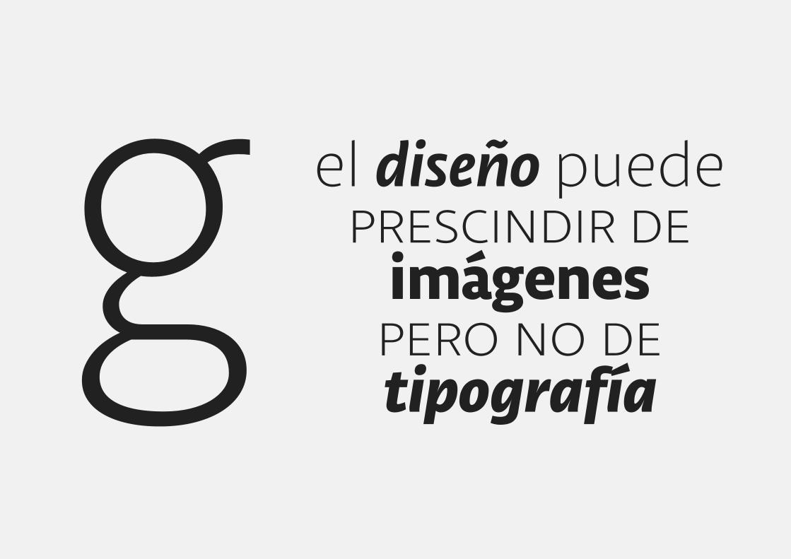
el diseño puedeprescindir de
imágenes pero no de tipografía
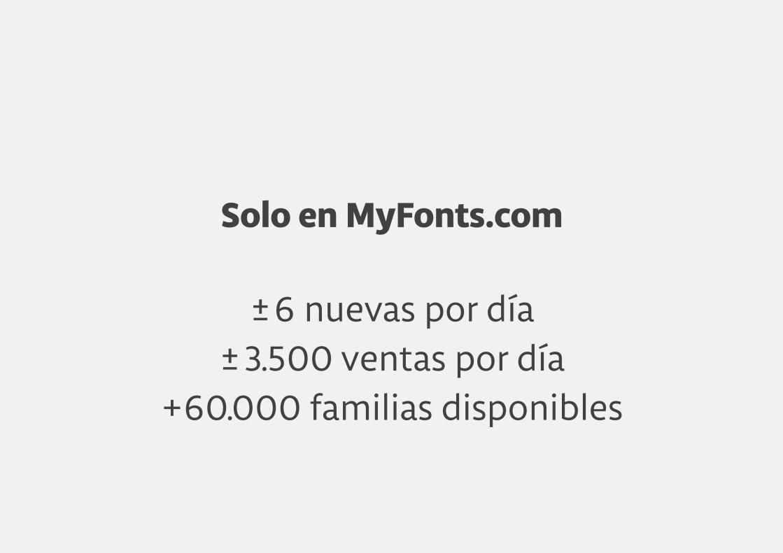
Solo en MyFonts.com
±6 nuevas por día±3.500 ventas por día
+60.000 familias disponibles


H

H
H
H H
H
H H
HH

H H
H HH

H H
HH
HH
H HH
HH
HH
H HH
H
HH
HH
H H
HH
H
HH
HH
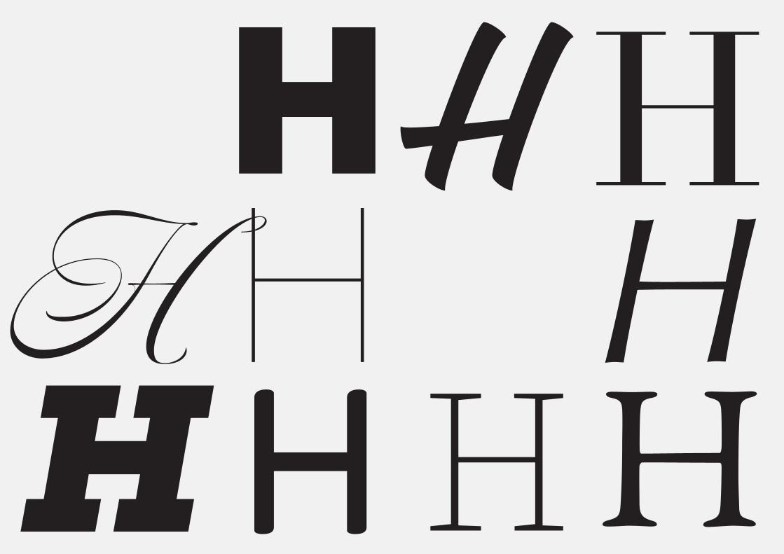
H H
HH
HH
HH
HH

HH H
HH
HH
HH
HH

HH H
HH
HHH
HH
HH


¿Para qué?

Observar, analizar y comprender para buena elección

Argumentar decisionesimportantes de diseño

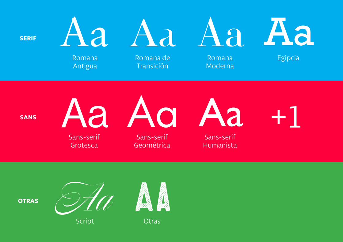
Sistemas de Clasificación
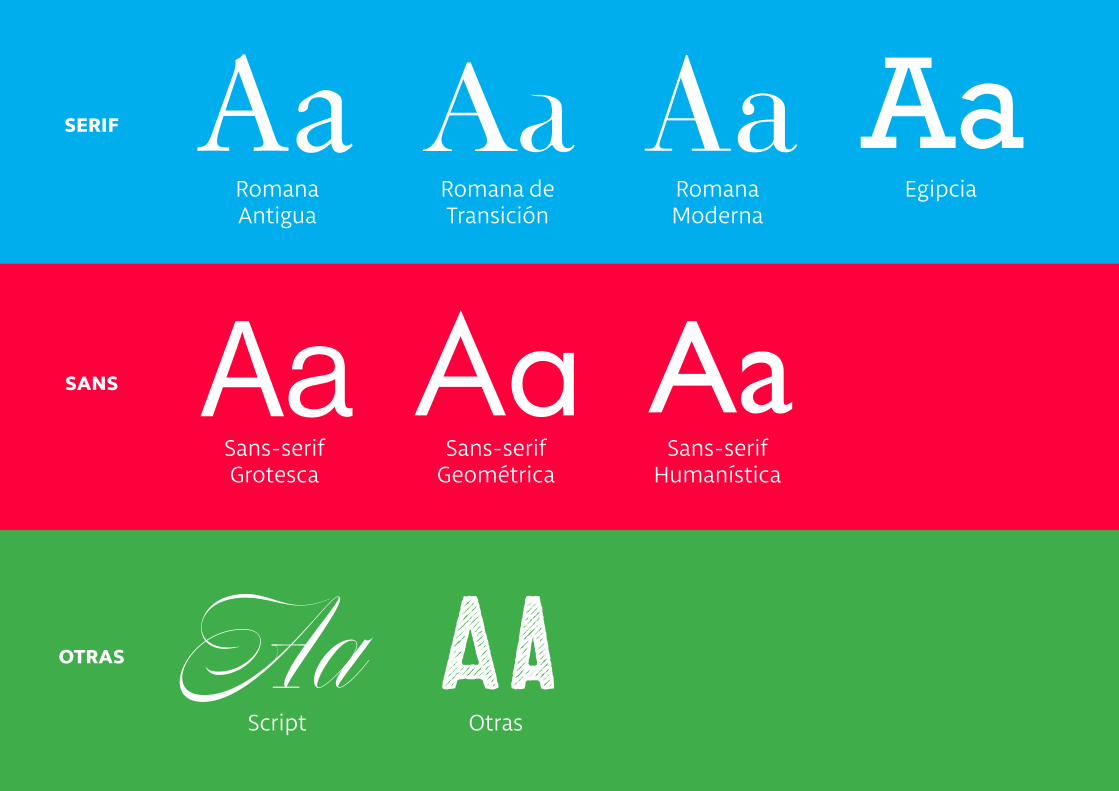
Aa
Aa
Aa
Aa
Aa
Aa
Aa
Aa
Aaserif
Romana Antigua
Sans-serifGrotesca
Script Otras
Sans-serifGeométrica
Sans-serifHumanística
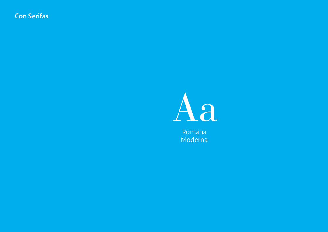
Romana de Transición
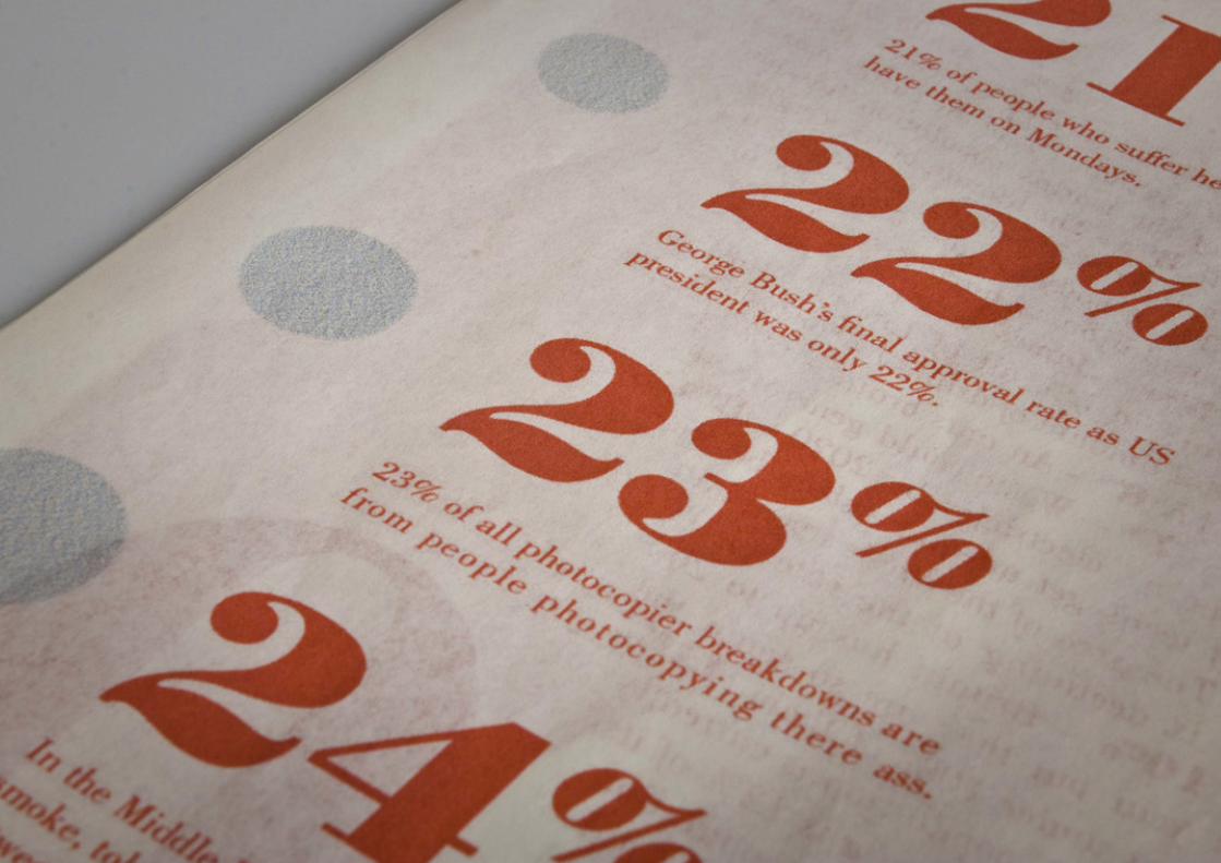
Romana Moderna
Egipcia
sans
otras

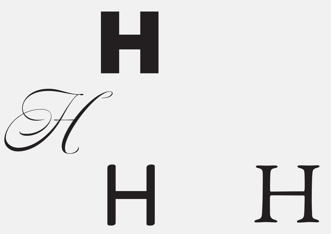
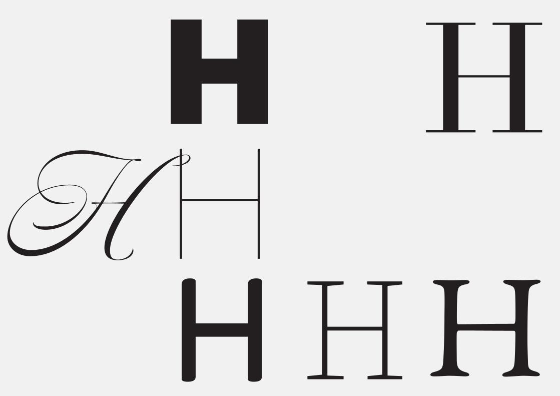
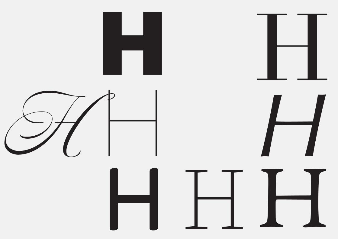
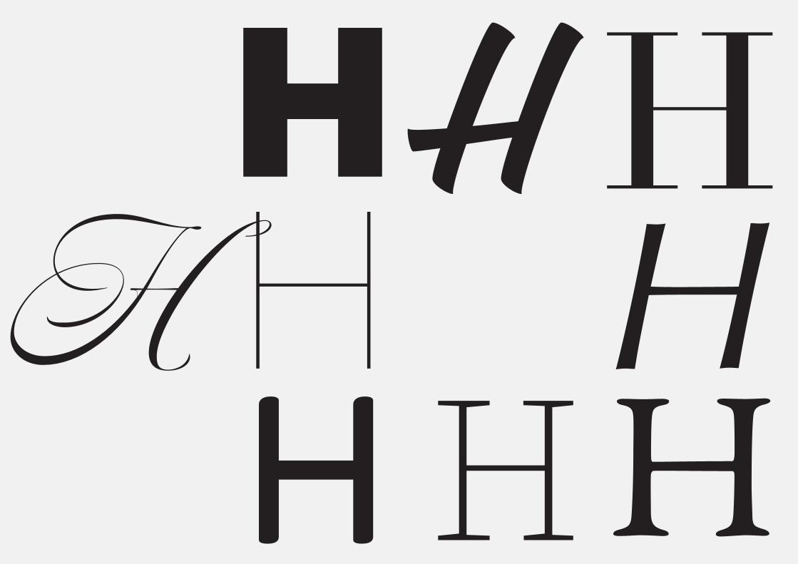
¿Serifs?

Con Serifas

Con Serifas
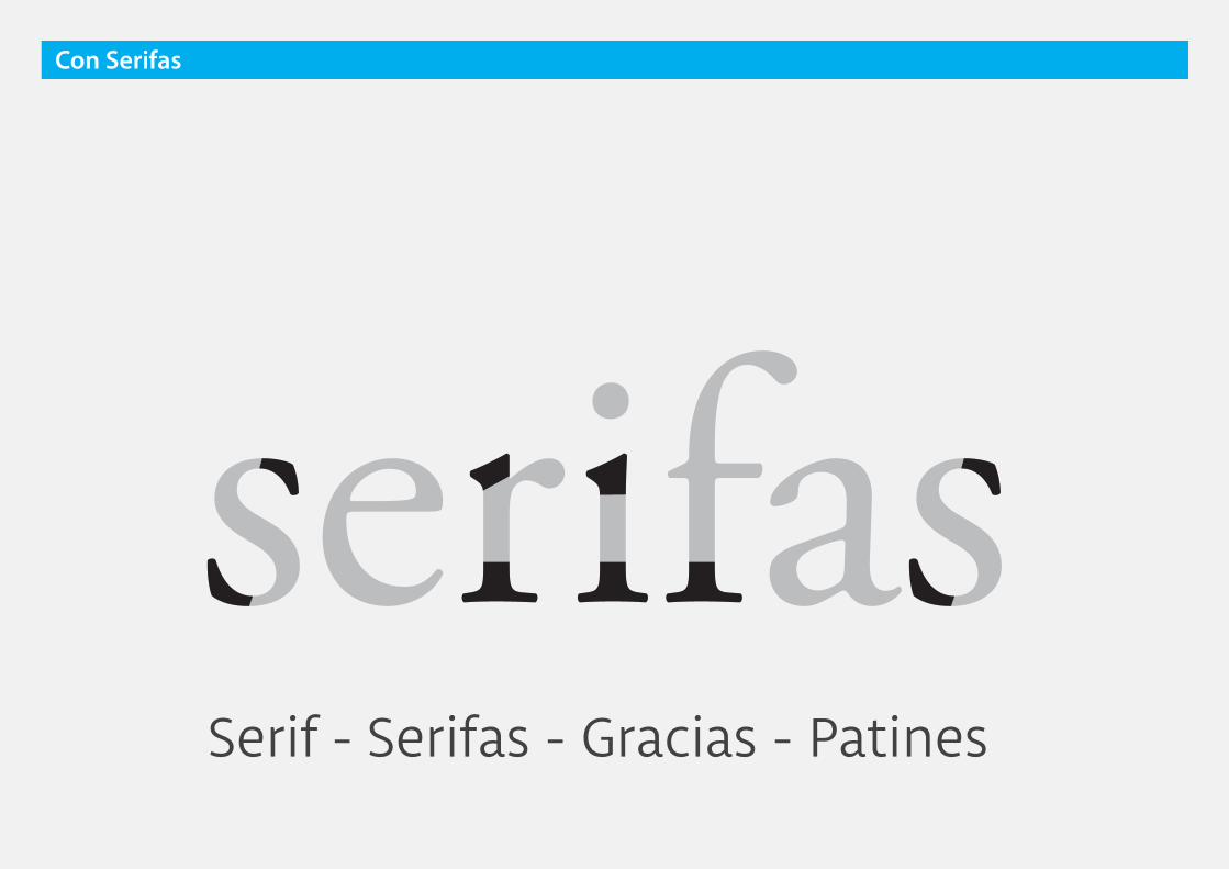
Serif - Serifas - Gracias - Patines
Con Serifas
Con Serifas

Con Serifas
Generan una fuerte líneahorizontal

Con Serifas
Mantiene el hilo condutor
de la lectura
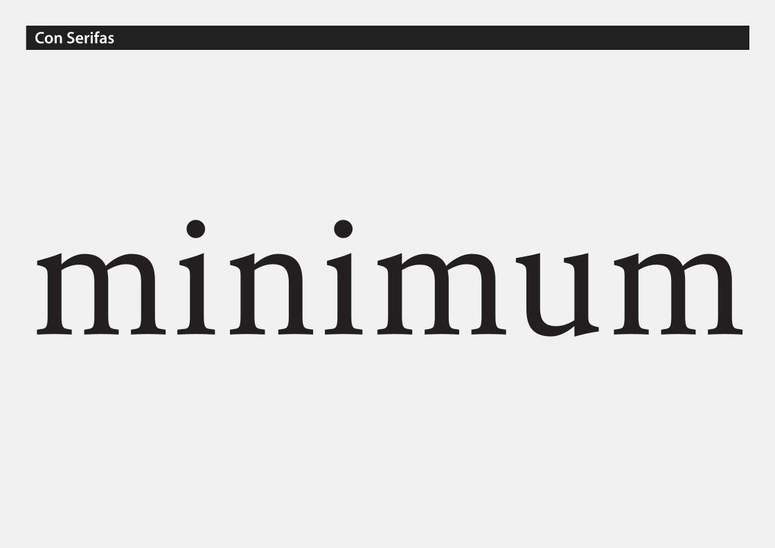
Con Serifas
minimum

Con Serifas
minimum

Con Serifas
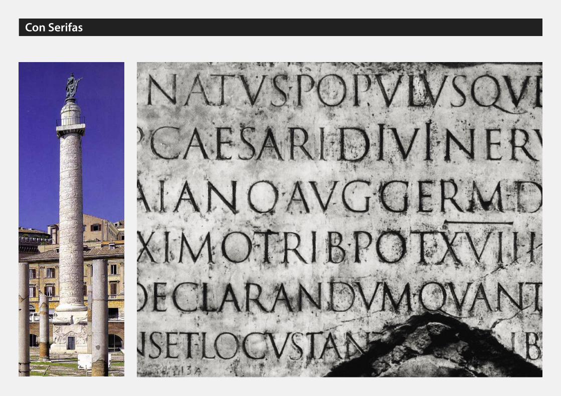
Serifs originated in the Latin alphabet with inscriptional lettering—words carved into sto-ne in Roman antiquity. The explanation proposed by Father Edward Catich in his 1968 book The Origin of the Serif is now broadly but not universally accepted: the Roman letter out-lines were first painted onto stone, and the stone carvers followed the brush marks which flared at stroke ends and corners, creating serifs. Another theory is that serifs were devised to neaten the ends of lines as they were chiseled into stone. The origin of the word serif is obscure, but apparently almost as recent as the type style. In The British Standard of the Ca-pital Letters contained in the Roman Alphabet, forming a complete code of systematic rules for a mathematical construction and accurate formation of the same by William Hollins, it defined surripses, usually pronounced surriphs, as projections which appear at the tops and bottoms of some letters, the o and q excepted, at the beginning or end, and sometimes at each, of all." In 1827, a Greek scholar, Julian Hibbert, printed with his own experimental uncial Greek types, remarking that the types of Bodoni's Callimachus were "ornamented (or rather disfigured) by additions of what I believe type-founders call syrifs or cerefs." The ol-dest citations in the Oxford English Dictionary are 1830 for serif and 1841 for sans serif. The OED speculates that serif was a back-formation from sanserif. Webster's Third New Interna-tional Dictionary traces serif to the Dutch noun schreef, meaning "line, stroke of the pen", related to the verb schrappen, "to delete, strike through". Schreef now also means "serif" in
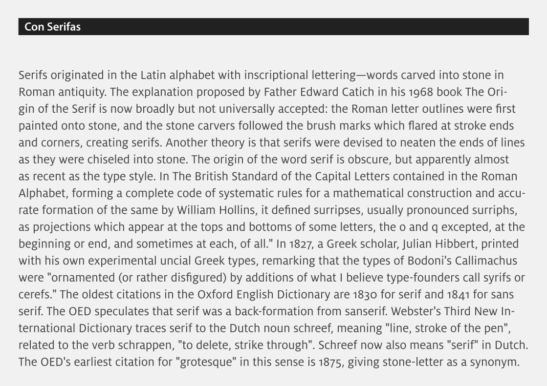
Serifs originated in the Latin alphabet with inscriptional lettering—words carved into stone in Roman antiquity. The explanation proposed by Father Edward Catich in his 1968 book The Ori-gin of the Serif is now broadly but not universally accepted: the Roman letter outlines were first painted onto stone, and the stone carvers followed the brush marks which flared at stroke ends and corners, creating serifs. Another theory is that serifs were devised to neaten the ends of lines as they were chiseled into stone. The origin of the word serif is obscure, but apparently almost as recent as the type style. In The British Standard of the Capital Letters contained in the Roman Alphabet, forming a complete code of systematic rules for a mathematical construction and accu-rate formation of the same by William Hollins, it defined surripses, usually pronounced surriphs, as projections which appear at the tops and bottoms of some letters, the o and q excepted, at the beginning or end, and sometimes at each, of all." In 1827, a Greek scholar, Julian Hibbert, printed with his own experimental uncial Greek types, remarking that the types of Bodoni's Callimachus were "ornamented (or rather disfigured) by additions of what I believe type-founders call syrifs or cerefs." The oldest citations in the Oxford English Dictionary are 1830 for serif and 1841 for sans serif. The OED speculates that serif was a back-formation from sanserif. Webster's Third New In-ternational Dictionary traces serif to the Dutch noun schreef, meaning "line, stroke of the pen", related to the verb schrappen, "to delete, strike through". Schreef now also means "serif" in Dutch. The OED's earliest citation for "grotesque" in this sense is 1875, giving stone-letter as a synonym.
Con Serifas

Aa
Aa
Aa
Aa
Aa
Aa
Aa
Aa
Aaserif
Romana Antigua
Sans-serifGrotesca
Script Otras
Sans-serifGeométrica
Sans-serifHumanística
Romana de Transición
Romana Moderna
Egipcia
sans
otras

Con Serifas
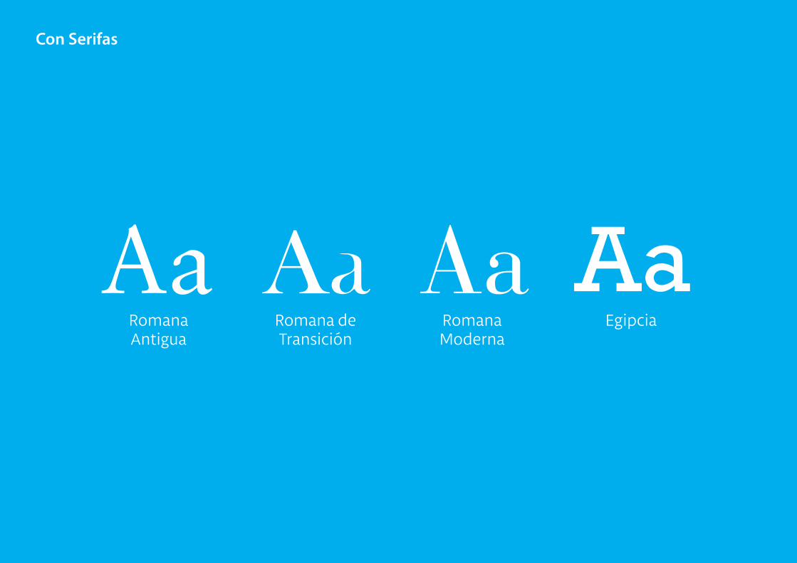
Aa Aa Aa AaRomana Antigua
Romana de Transición
Romana Moderna
Egipcia

Con Serifas
AaRomana Antigua

Con Serifas
RomanaAntigua

Otros nombres: Garaldas, Venecianas, Humanistas
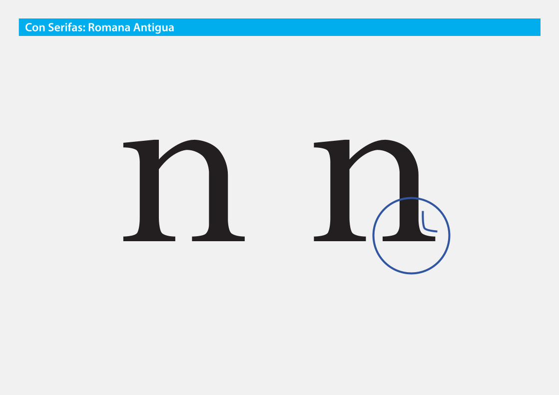
Con Serifas: Romana Antigua

❶ Serifas: Triangulares
con acordamiento
Con Serifas: Romana Antigua

n nCon Serifas: Romana Antigua
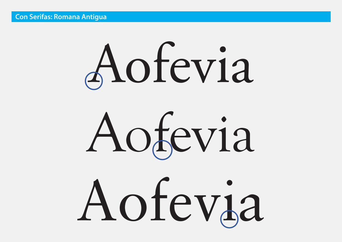
AofeviaAofeviaAofevia
Con Serifas: Romana Antigua

Con Serifas: Romana Antigua
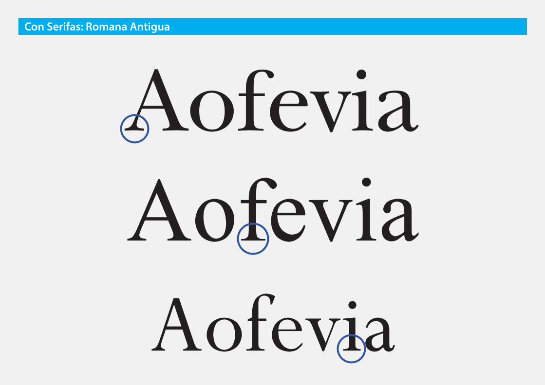
❷ Modulación: Media
Gran influencia caligráfica
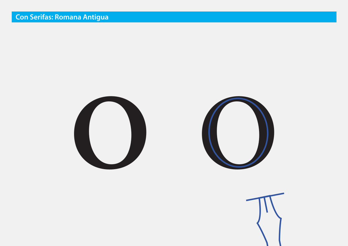
o oCon Serifas: Romana Antigua

AofeviaAofeviaAofevia
Con Serifas: Romana Antigua
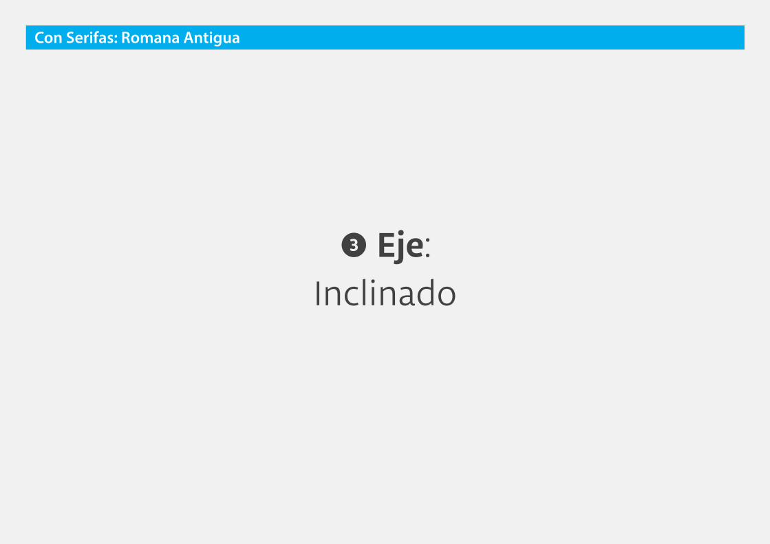
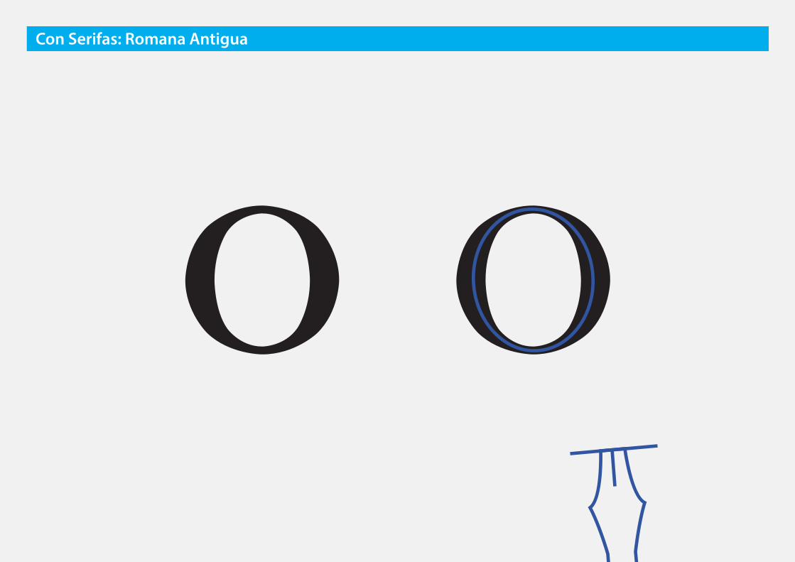
❸ Eje: Inclinado
Con Serifas: Romana Antigua
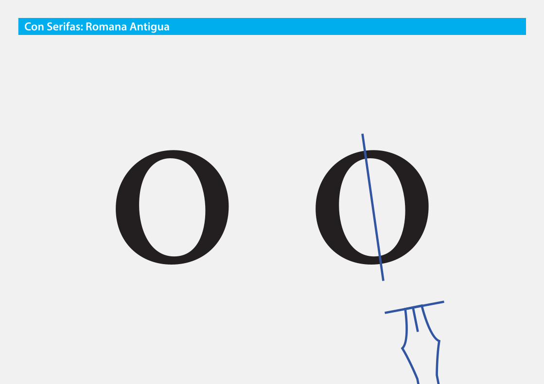
o oCon Serifas: Romana Antigua
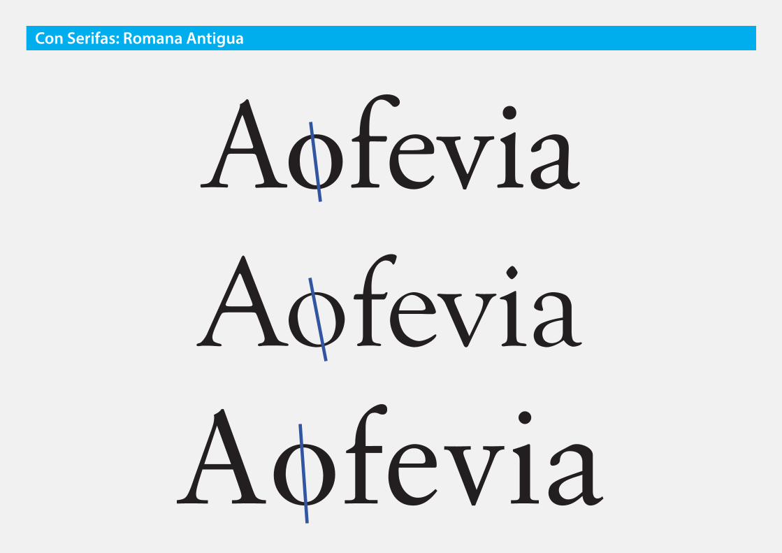
AofeviaAofeviaAofevia
Con Serifas: Romana Antigua
Con Serifas: Romana Antigua
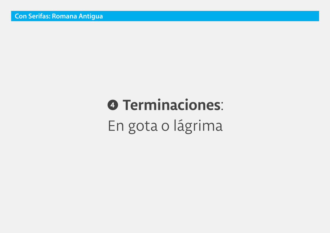
❹ Terminaciones: En gota o lágrima
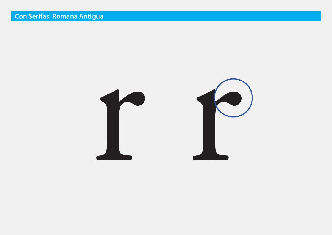
r rCon Serifas: Romana Antigua

AofeviaAofeviaAofevia
Con Serifas: Romana Antigua

romana antigua
¿Para qué usarlas?
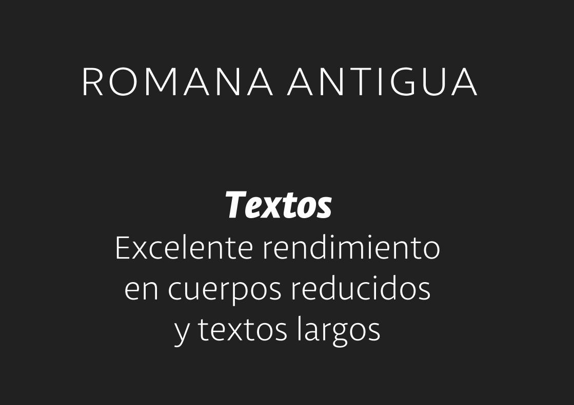
romana antigua
TextosExcelente rendimientoen cuerpos reducidos
y textos largos


romana antigua
TítulosImpacto mediano-bajo,
transmite formalidad

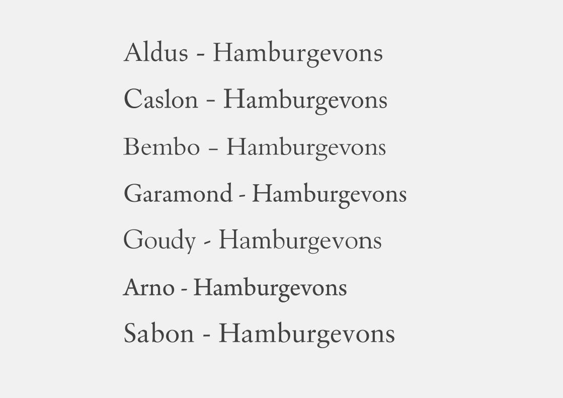
Aldus - Hamburgevons
Caslon - Hamburgevons
Bembo - Hamburgevons
Garamond - Hamburgevons
Goudy - Hamburgevons
Arno - Hamburgevons
Sabon - Hamburgevons

Con Serifas
Aa Aa Aa AaRomana Antigua
Romana de Transición
Romana Moderna
Egipcia
Con Serifas
AaRomana Moderna
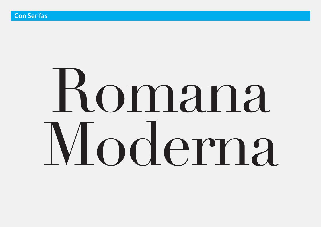
RomanaModerna
Con Serifas

Con Serifas: Romana Moderna
Otros nombres: Didonas

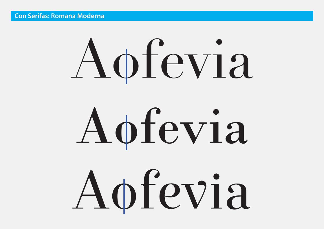
❶ Serifas: Rectangulares
filiformes
Con Serifas: Romana Moderna

n nCon Serifas: Romana Antigua

AofeviaAofeviaAofevia
Con Serifas: Romana Moderna

Con Serifas: Romana Moderna
❷ Modulación: Extrema
Desligada de la caligráfica

o oCon Serifas: Romana Antigua

AofeviaAofeviaAofevia
Con Serifas: Romana Moderna

Con Serifas: Romana Moderna
❸ Eje: Vertical

o oCon Serifas: Romana Antigua
AofeviaAofeviaAofevia
Con Serifas: Romana Moderna
Con Serifas: Romana Moderna
❹ Terminaciones: En botón

r rCon Serifas: Romana Antigua
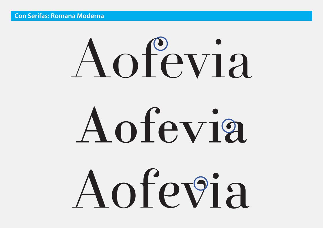
AofeviaAofeviaAofevia
Con Serifas: Romana Moderna
romana moderna
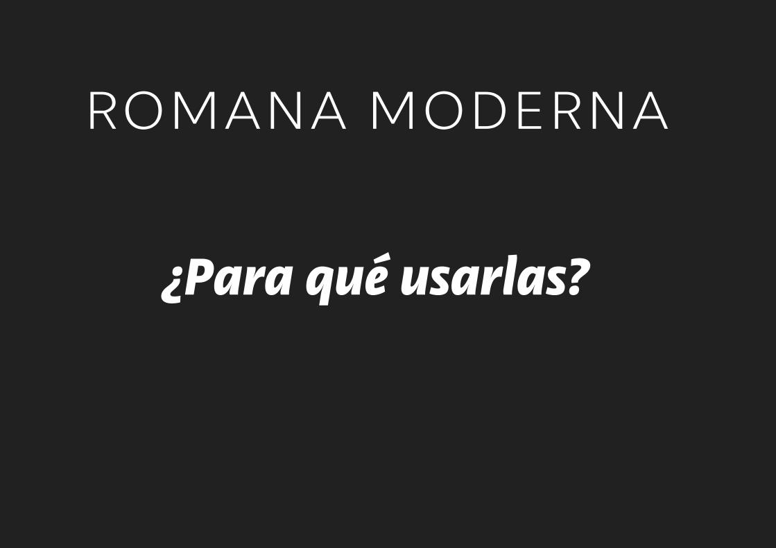
¿Para qué usarlas?
romana moderna
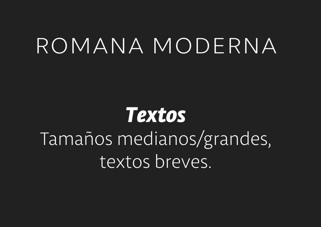
TextosTamaños medianos/grandes,
textos breves.
romana moderna
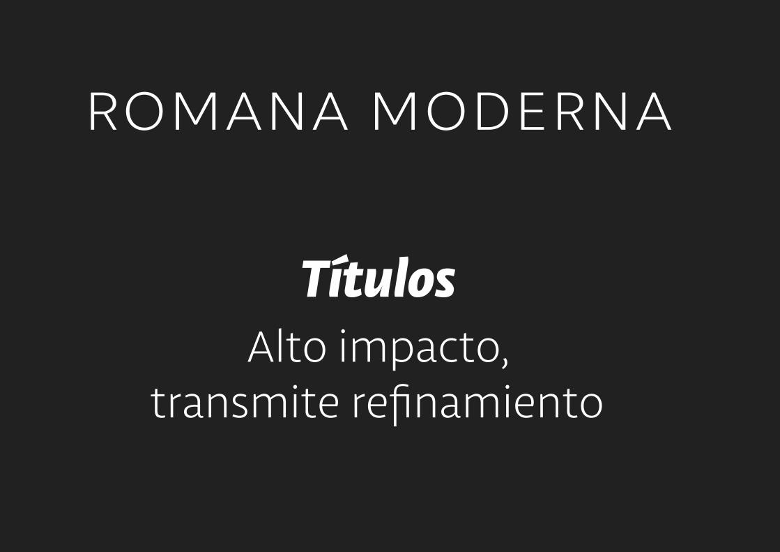
TítulosAlto impacto,
transmite refinamiento


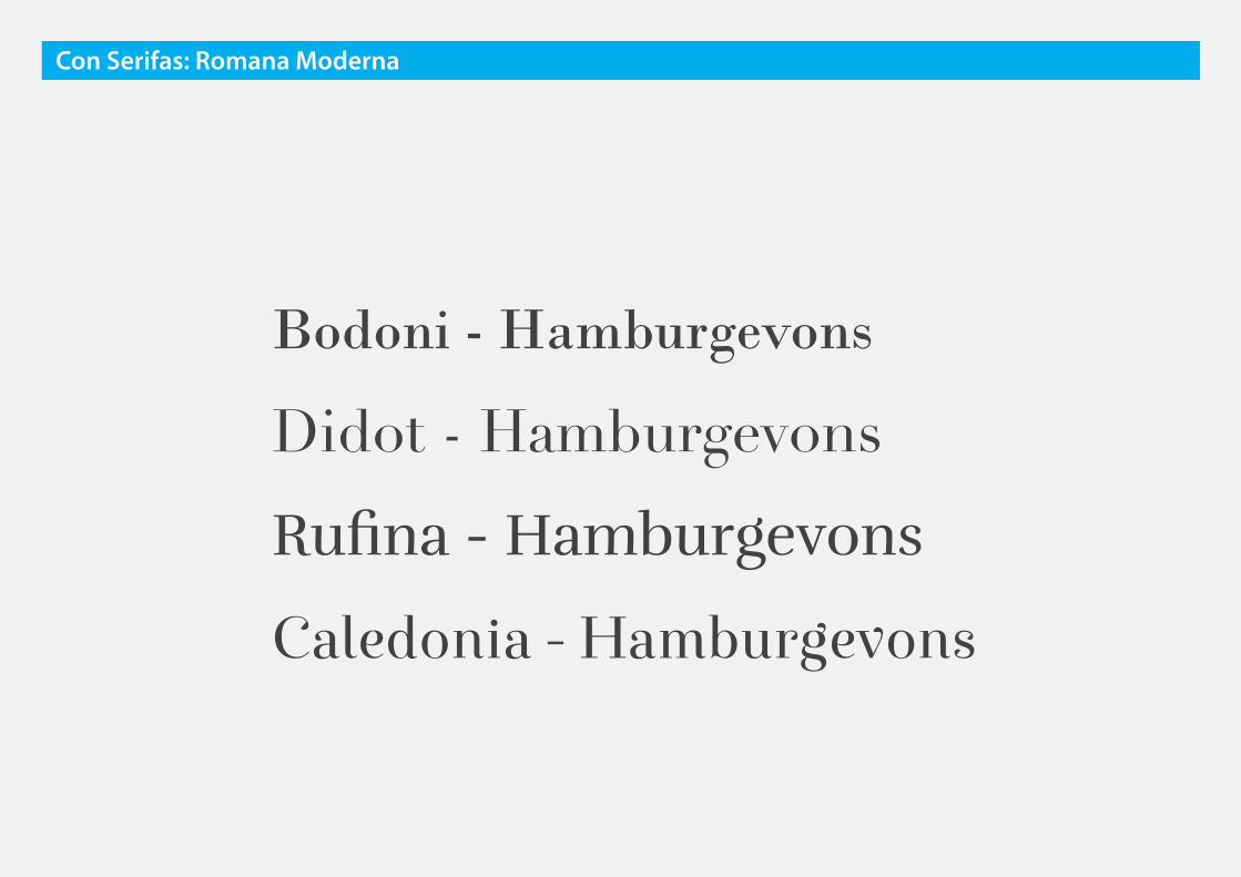
Bodoni - Hamburgevons
Didot - Hamburgevons
Rufina - Hamburgevons
Caledonia - Hamburgevons
Con Serifas: Romana Moderna
Con Serifas
Aa Aa Aa AaRomana Antigua
Romana de Transición
Romana Moderna
Egipcia
Con Serifas
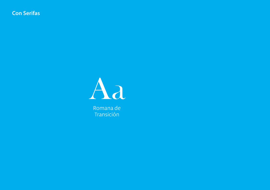
AaRomana de Transición
Con Serifas
Romana deTransición

❶ Serifas: Triangulares
con acordamiento
Con Serifas: Romana Antigua
n nCon Serifas: Romana Antigua
AofeviaAofeviaAofevia
Con Serifas: Romana Antigua

Con Serifas: Romana Antigua
❷ Modulación: Media-alta
influencia caligráfica
o oCon Serifas: Romana Antigua

AofeviaAofeviaAofevia
Con Serifas: Romana Antigua
❸ Eje: Algo inclinado
Con Serifas: Romana Antigua

o oCon Serifas: Romana Antigua

AofeviaAofeviaAofevia
Con Serifas: Romana Antigua

Con Serifas: Romana Antigua
❹ Terminaciones: En gota o botón

r rCon Serifas: Romana Antigua

AofeviaAofeviaAofevia
Con Serifas: Romana Antigua

r. de transición
¿Para qué usarlas?

r. de transición
TextosBuen rendimiento
en cuerpos reducidos y textos largos

r.de transición
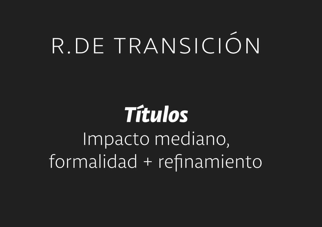
TítulosImpacto mediano,
formalidad + refinamiento


Baskerville - Hamburgevons
Perpetua - Hamburgevons
Bell - Hamburgevons
Georgia - Hamburgevons
CS - Hamburgevons

Con Serifas
Aa Aa Aa AaRomana Antigua
Romana de Transición
Romana Moderna
Egipcia

Con Serifas
AaEgipcia

Egipcias
Con Serifas

Con Serifas: Egipcias
Otros nombres: Slab Serif,Mecanas
Con Serifas: Egipcias
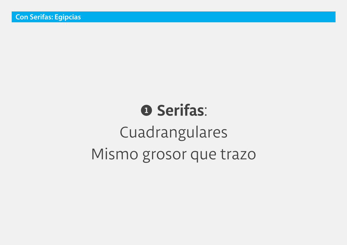
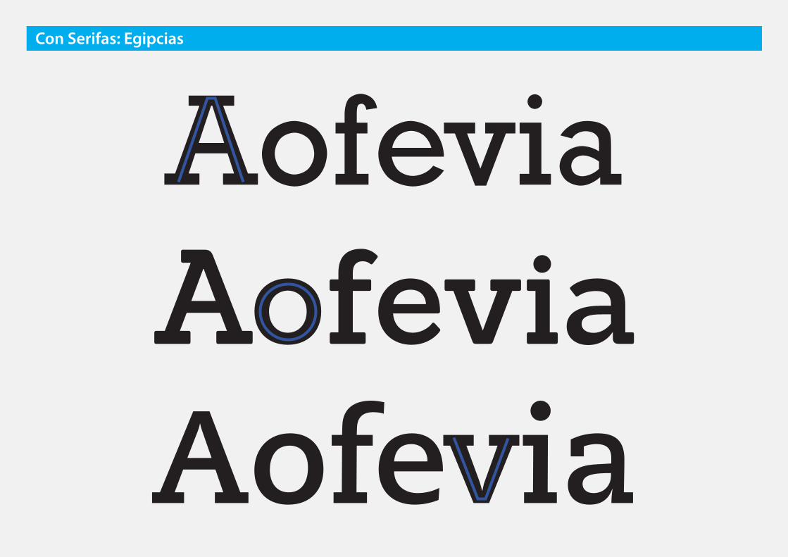
❶ Serifas: Cuadrangulares
Mismo grosor que trazo

n nCon Serifas: Romana Antigua

AofeviaAofeviaAofevia
Con Serifas: Egipcias
Con Serifas: Egipcias
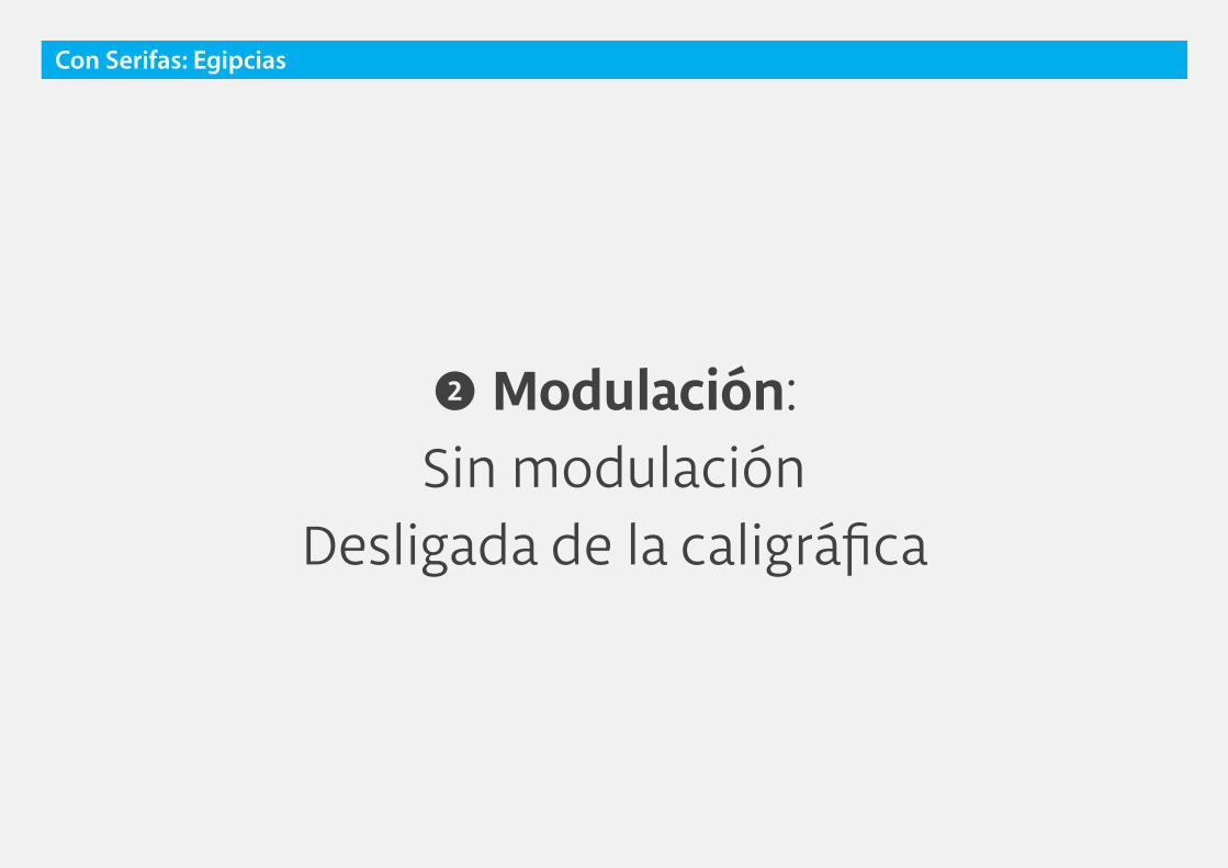
❷ Modulación: Sin modulación
Desligada de la caligráfica

o oCon Serifas: Egipcias
AofeviaAofeviaAofevia
Con Serifas: Egipcias

❸ Eje: Nulo
Con Serifas: Egipcias
Con Serifas: Egipcias
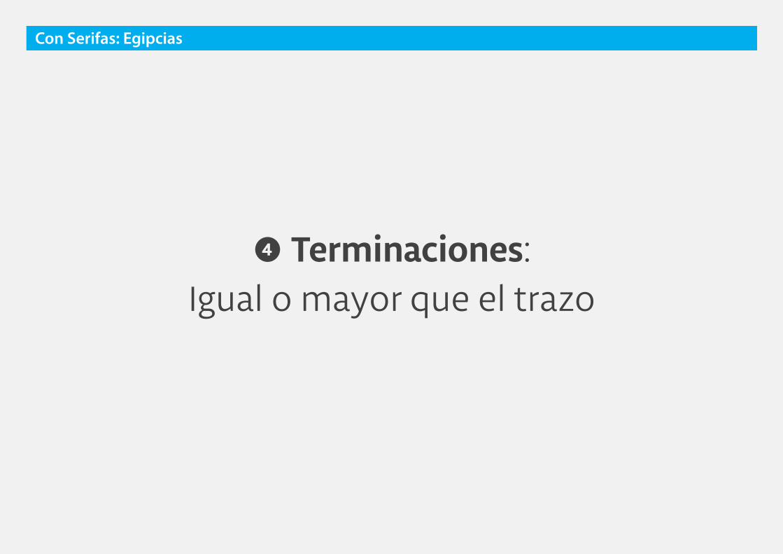
❹ Terminaciones: Igual o mayor que el trazo

c cCon Serifas: Egipcias

AofeviaAofeviaAofevia
Con Serifas: Egipcias
egipcias
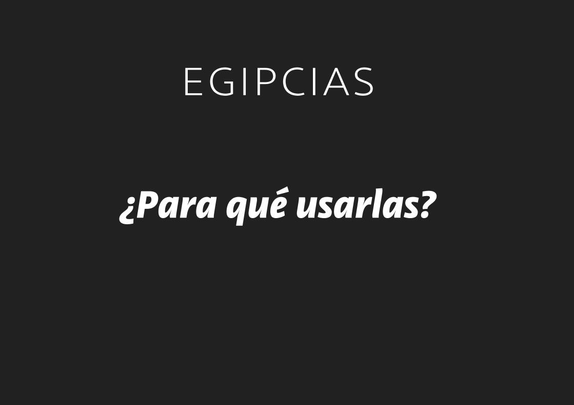
¿Para qué usarlas?

egipcias
TextosTamaños medianos/grandes,
textos breves/medianos.

egipcias
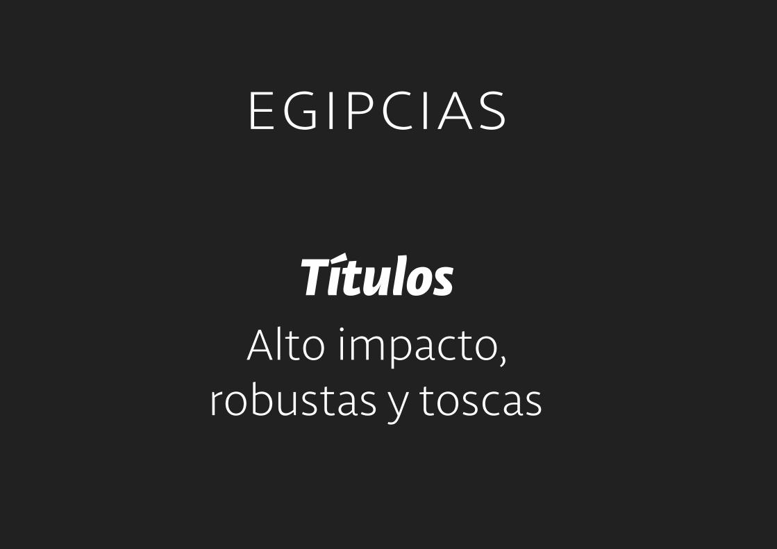
TítulosAlto impacto,
robustas y toscas


Rockwell - Hamburgevons
Caecilia - Hamburgevons
Adelle - Hamburgevons
Sanchez - Hamburgevons
ATR - Hamburgevons
Con Serifas: Egipcias

Aa
Aa
Aa
Aa
Aa
Aa
Aa
Aa
Aaserif
Romana Antigua
Sans-serifGrotesca
Script Otras
Sans-serifGeométrica
Sans-serifHumanística
Romana de Transición
Romana Moderna
Egipcia
sans
otras

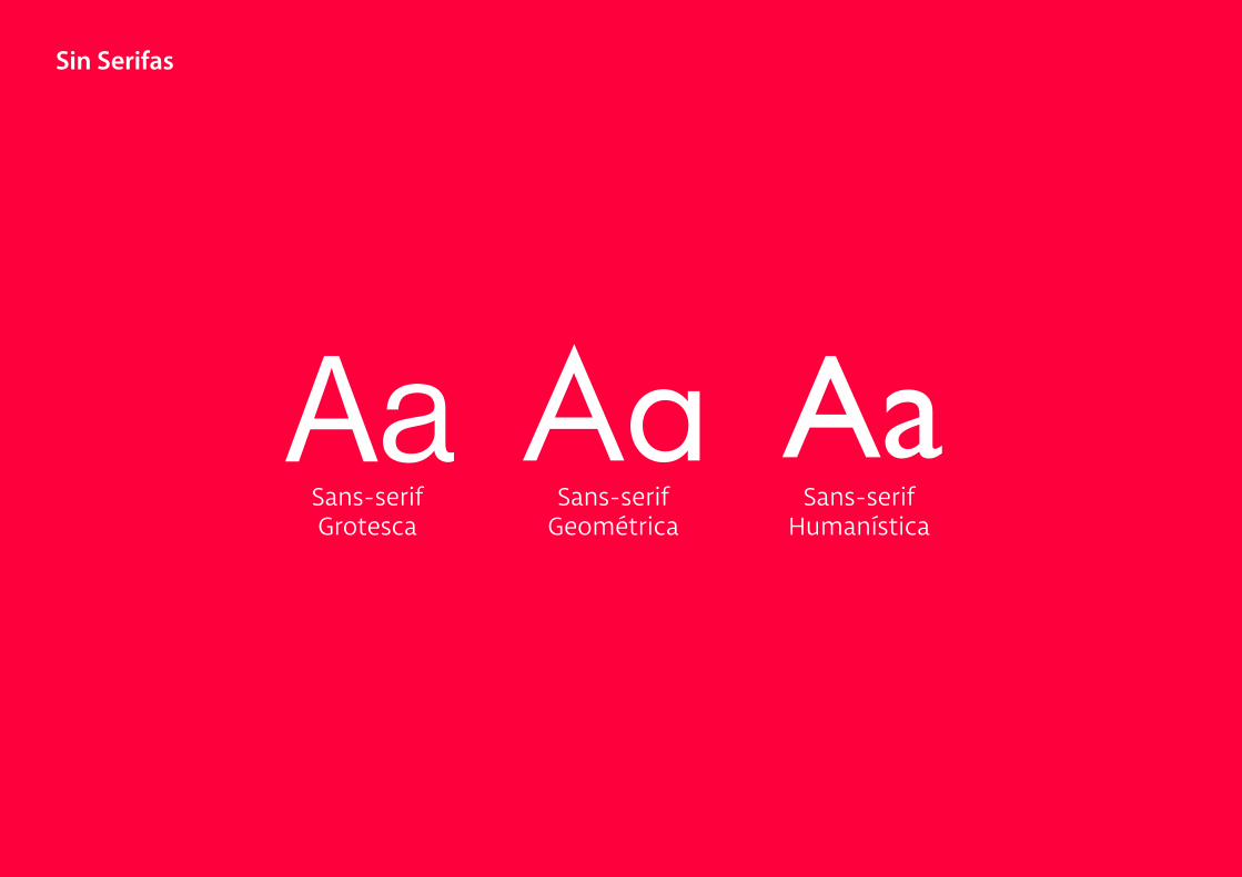
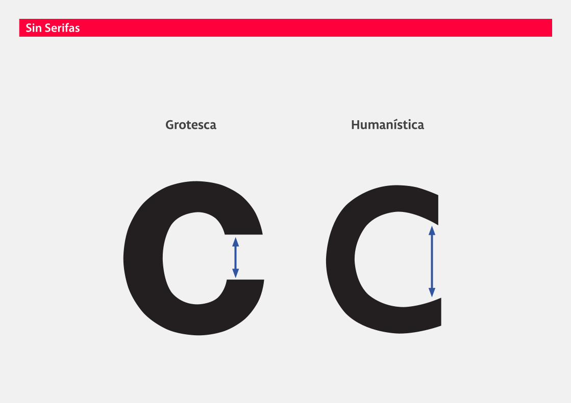
Sin Serifas
Sin Serifas
Aa Aa AaSans-serifGrotesca
Sans-serifGeométrica
Sans-serifHumanística

Sans-serif
Sin Serifas

Otros nombres: Palo seco
Sin Serifas

Sin Serifas
❶ Serifas: No
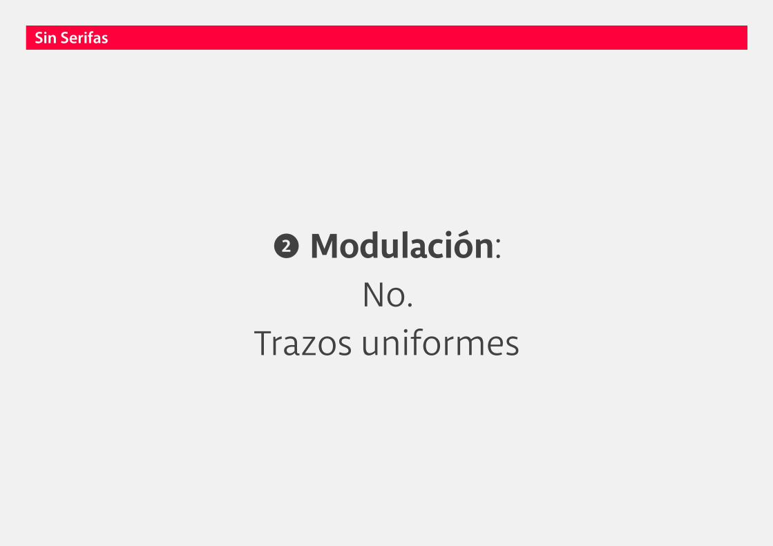
❷ Modulación: No.
Trazos uniformes
Sin Serifas

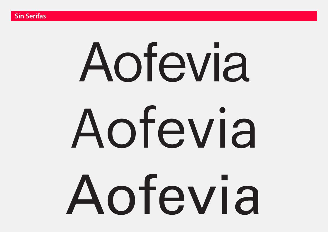
AofeviaAofeviaAofevia
Sin Serifas
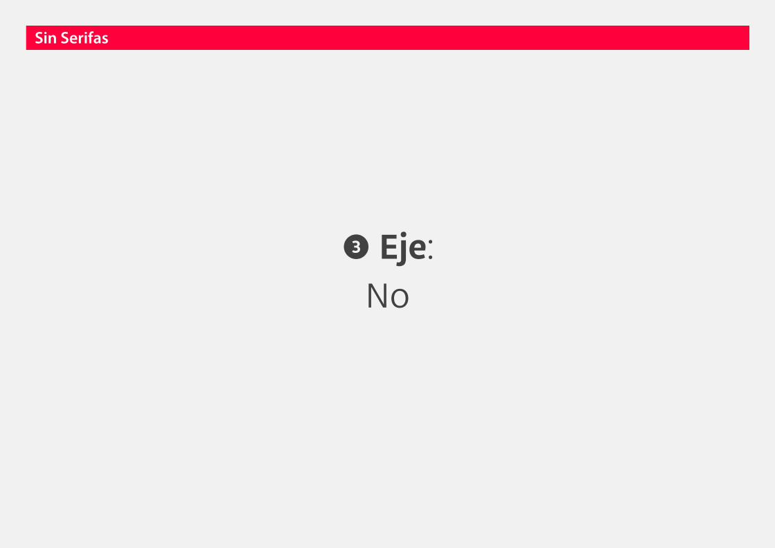
❸ Eje: No
Sin Serifas
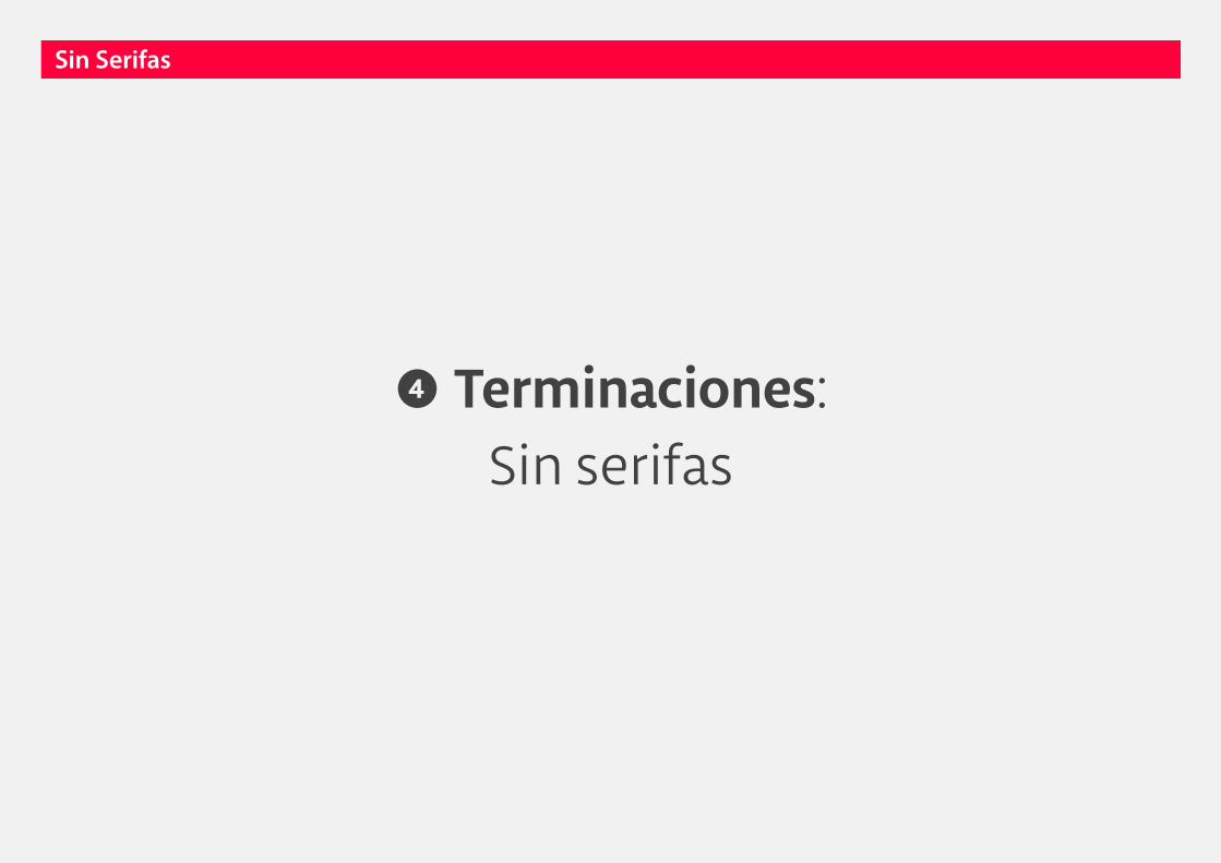
❹ Terminaciones: Sin serifas
Sin Serifas

AofeviaAofeviaAofevia
Sin Serifas

Sin Serifas
Aa Aa AaSans-serifGrotesca
Sans-serifGeométrica
Sans-serifHumanística

Sin Serifas
AaSans-serifGrotesca

Abertura: Pequeña
Característica: Primeros tipos sin serif
Sin Serifas

c cSin Serifas
Grotesca
AofeviaAofeviaAofevia
Sin Serifas
grotesca
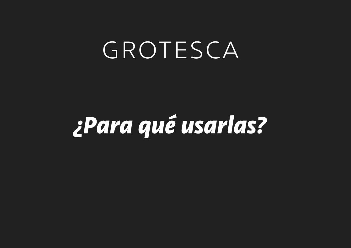
¿Para qué usarlas?

grotesca
TextosTamaños medianos/grandes,
textos breves/medianos.


grotesca
TítulosAlto impacto,
rígidas, modernas

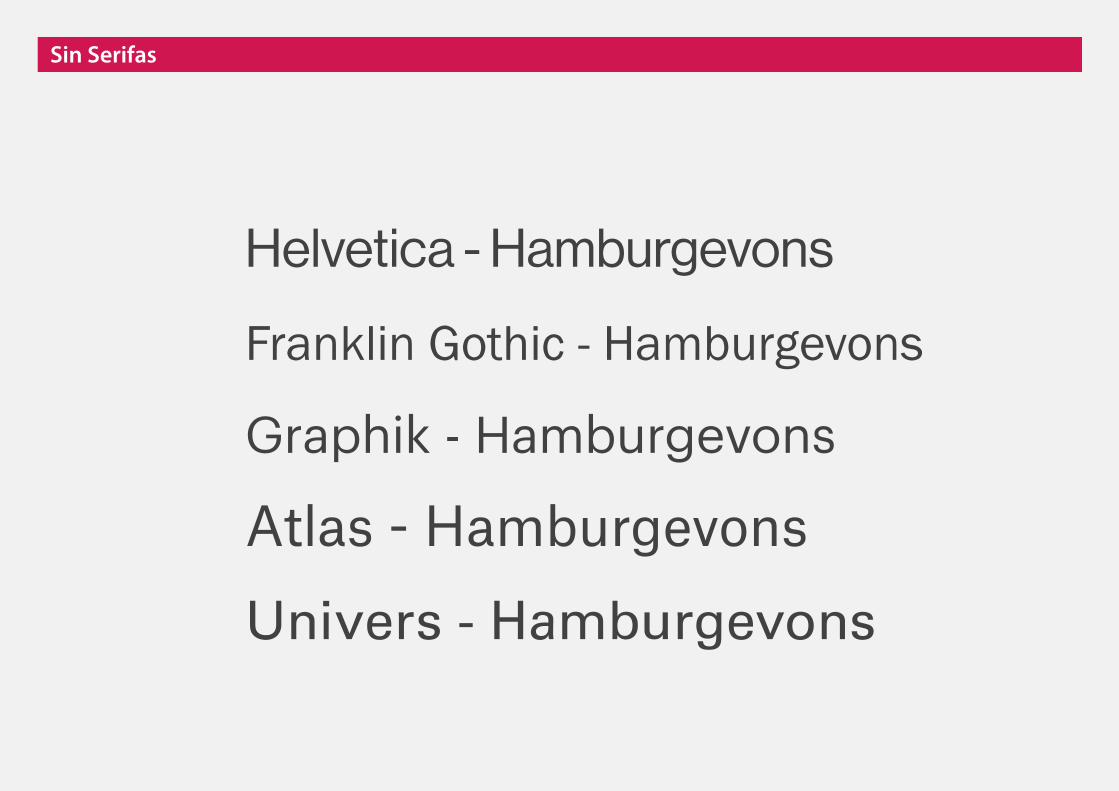
Helvetica - Hamburgevons
Franklin Gothic - Hamburgevons
Graphik - Hamburgevons
Atlas - Hamburgevons
Univers - Hamburgevons
Sin Serifas

Sin Serifas
Aa Aa AaSans-serifGrotesca
Sans-serifGeométrica
Sans-serifHumanística
Sin Serifas
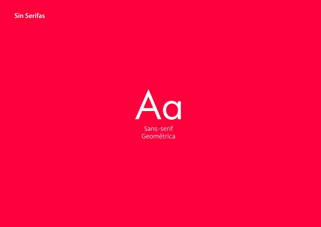
AaSans-serif
Geométrica
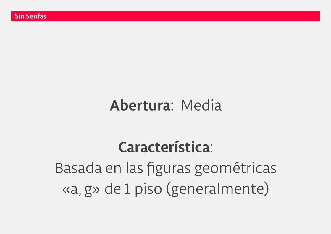
Abertura: Media
Característica: Basada en las figuras geométricas
«a, g» de 1 piso (generalmente)
Sin Serifas

Sin SerifasSin Serifas
HOA
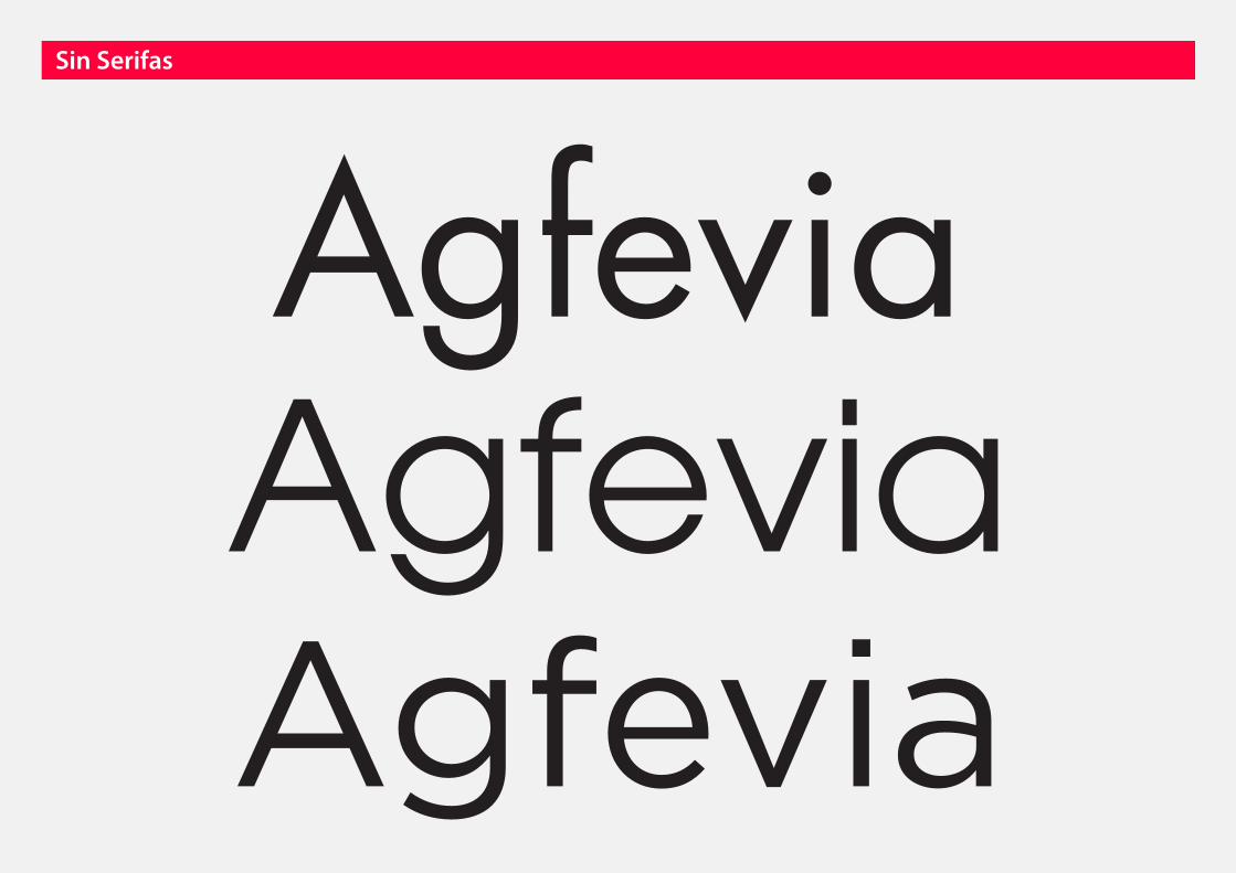
AgfeviaAgfeviaAgfevia
Sin Serifas
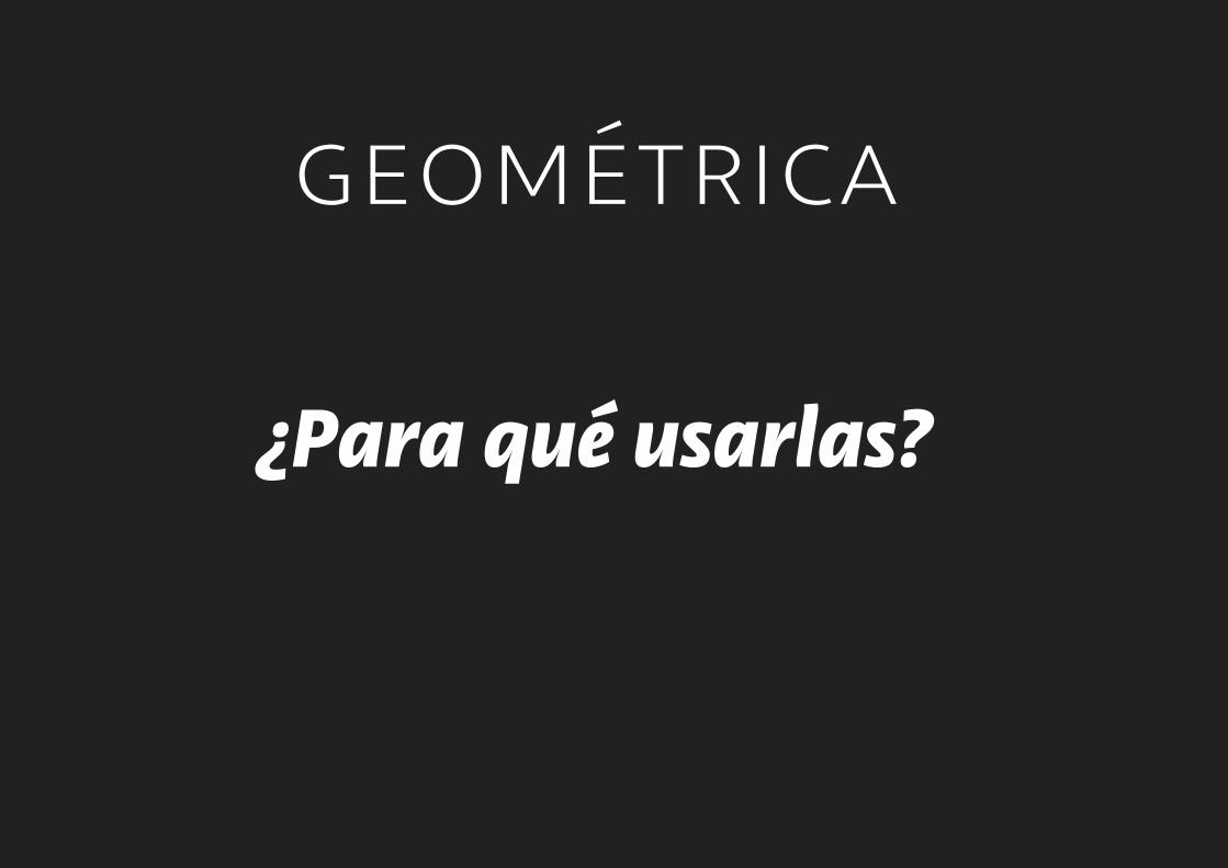
geométrica
¿Para qué usarlas?
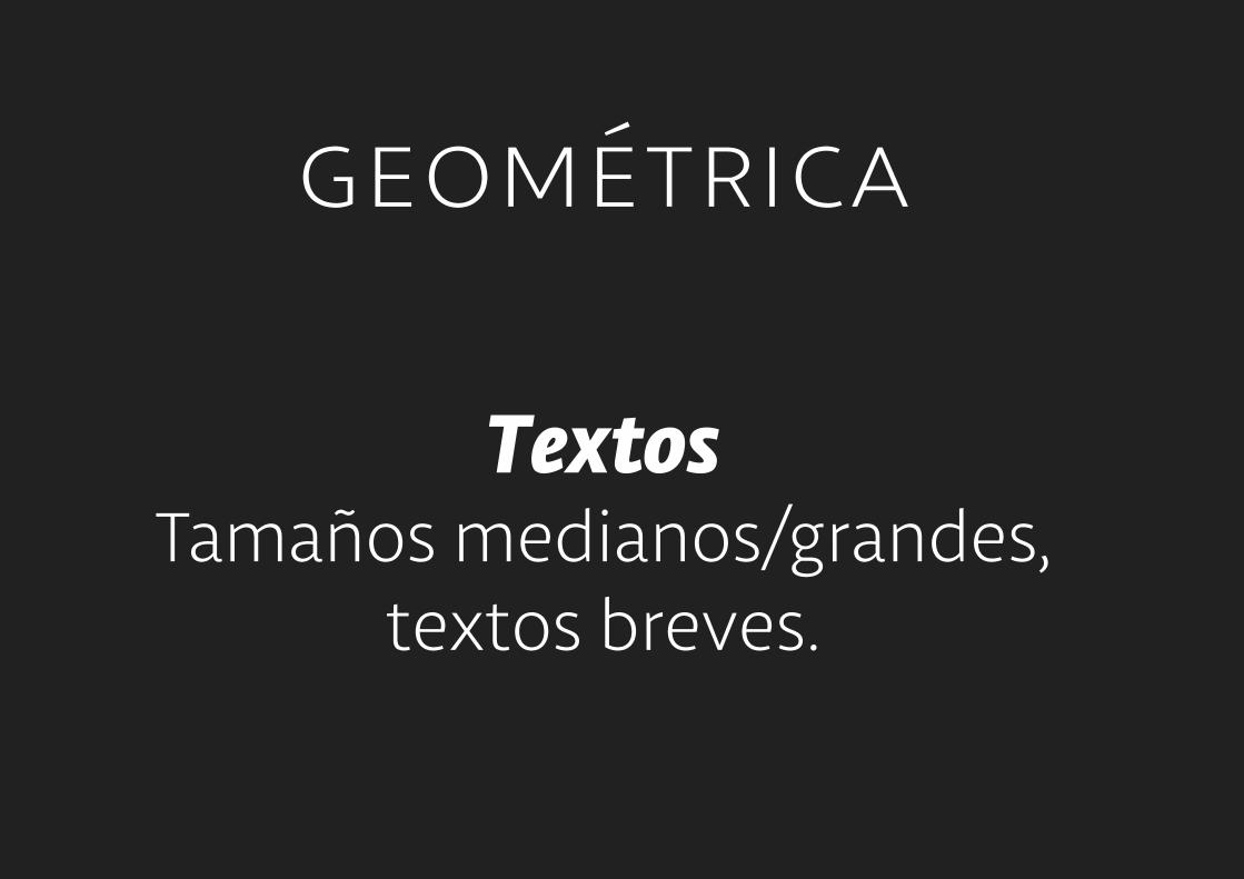
geométrica
TextosTamaños medianos/grandes,
textos breves.


geométrica
TítulosAlto impacto,
simples, rígidas


Futura - Hamburgevons
ITC Avant Garde - Hamburgevons
Gotham - Hamburgevons
Avenir - Hamburgevons
Proxima Nova - Hamburgevons
Sin Serifas

Sin Serifas
Aa Aa AaSans-serifGrotesca
Sans-serifGeométrica
Sans-serifHumanística

Sin Serifas
AaSans-serif
Humanística

Abertura: Grande
Característica: Basada en las formas romanas
«a, g» de 2 pisos (generalmente)
Sin Serifas
c cGrotesca Humanística
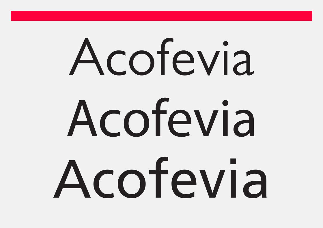
AcofeviaAcofeviaAcofevia

humanística
¿Para qué usarlas?

humanística
TextosTamaños diversos,
textos cortos/largos.


humanística
TítulosImpacto,
complejas, sueltas


Gill Sans - Hamburgevons
Frutiger - Hamburgevons
Myriad - Hamburgevons
Meta - Hamburgevons
Verdana - Hamburgevons
Sin Serifas

Aa
Aa
Aa
Aa
Aa
Aa
Aa
Aa
Aaserif
Romana Antigua
Sans-serifGrotesca
Script Otras
Sans-serifGeométrica
Sans-serifHumanista
Romana de Transición
Romana Moderna
Egipcia
sans
otras

Ejercicios de hoy(logos)

Ejercicios de hoy(letras parte 2)

Aa
Aa
Aa
Aa
Aa
Aa
Aa
Aa
Aaserif
Romana Antigua
Sans-serifGrotesca
Script Otras
Sans-serifGeométrica
Sans-serifHumanista
Romana de Transición
Romana Moderna
Egipcia
sans
otras
Aa
Aa
Aa
Aa
Aa +1
Aa
Aa
Aa
Aaserif
Romana Antigua
Sans-serifGrotesca
Script Otras
Sans-serifGeométrica
Sans-serifHumanista
Romana de Transición
Romana Moderna
Egipcia
sans
otras
TipoTipoTipo