this is a test - stanford solar...
TRANSCRIPT
1

2
Sun|trek
Projects for Schools Using REAL Solar Data http://www.suntrek.org/classroom-projects/Projects-for-schools-using-real-solar-data.shtml
Here are three sets of projects for schools based on the following themes:
Solar Images and Data Space Weather Effects
Spectra
Each of these projects is intended for use by high school students uses and/or links to authentic solar data provides a context for consideration of ’How Science Works’ aspects such as
data handling, calibration, and resolution consists of two or more student activities, with separate supporting notes
(and sample answers) for teachers. is linked to additional resources including those on the pages on the Sun|trek
website and the Stanford Solar Center.
These Sun|trek projects have been produced by Helen Mason, University of Cambridge, and Miriam Chaplin, Educational Consultant, in collaboration with Deborah Scherrer of the Stanford Solar Center.
Acknowledgements: This work has been funded by the Science and Technology Facilities Council (STFC). Several of the activities have been adapted from the Stanford Solar Center and from Sten Odenwald’s Space Math problems http://solar-center.stanford.edu/solar-math/ with the kind permission of the author. The entire Space Math program can be found at: http://spacemath.gsfc.nasa.gov/. Adaptation for US schools by Deborah Scherrer with funding from NASA’s SDO/HMI and IRIS missions. We are also grateful for the use of data and images from the following solar space projects: SDO, SOHO and Hinode. SDO is a NASA mission. SOHO is a project of international cooperation between ESA and NASA. Hinode is a Japanese mission developed and launched by ISAS/JAXA, with NAOJ as domestic partner and NASA and STFC (UK) as international partners. It is operated by these agencies in co‐ operation with ESA and NSC (Norway). Our thanks also go to Deborah Scherrer (at the Stanford Solar Center), Dave Pike, Caroline Alexander, and Peter Young for their help and advice. Web designs by www.IMDC.co.uk.

3
Table of Contents
SOLAR IMAGES AND DATA .......................................................................................... 4
Student Activity 1: Picking out the details (interpreting recent images of the Sun) ....................... 4 Part A: An image of the Sun from the Hinode satellite (fig 1) .............................................................................. 4 Part B: An image from the SDO satellite (fig 2) .......................................................................................................... 5 Part C: A solar active region seen by SOHO/EIT and SDO/AIA ........................................................................... 6
Student Activity 2: Handling faint and bright images ................................................................................. 8 Part A: Handling faint details in images ........................................................................................................................ 8 Part B: Handling very bright images ............................................................................................................................... 9
Student Activity 3: Handling data from the Solar Dynamics Observatory ........................................ 11
Teacher Notes – Solar Images and Data ......................................................................................................... 13 Outline of student activity 1: Picking out the details (interpreting recent images of the Sun) ..................... 13 Outline of student activity 2: Handling faint and bright images ...................................................................... 14 Outline of student activity 3: Handling data from SDO............................................................................................. 15 Background information and Resources..................................................................................................................... 16
SPACE WEATHER EFFECTS ......................................................................................... 17
Student Activity 4: Space weather effects on a solar telescope ............................................................. 17
Student Activity 5: Space weather and dodgy data .................................................................................... 19
Teacher Notes - Space Weather Effects .......................................................................................................... 21 Outline of student activity 4: Space weather effects on a solar telescope ........................................................... 21 Outline of student activity 5: Space weather and dodgy data .................................................................................. 22 Background information and Resources ......................................................................................................................... 22
SPECTRA ................................................................................................................... 24
Student Activity 6: Spectra: A tale of two elements ................................................................................... 24
Student Activity 7: Spectra: Solar Fingerprints ............................................................................................... 27
Teacher Notes - Spectra........................................................................................................................................ 29 Outline of student activity 6: Spectra: A tale of two elements ........................................................................... 29 Outline of student activity 7: Spectra: Examining solar fingerprints ............................................................. 30 Background information and Resources..................................................................................................................... 31

4
Solar Images and Data
Student Activity 1: Picking out the details (interpreting recent images of the Sun) Although astronomers have been able to observe sunspots on the surface of the Sun since the first telescopes were built in the 17th century, some solar features have only been observed recently. The imaging equipment on the Solar Dynamics Observatory (SDO) satellite and the Hinode satellite have much greater resolution than on earlier satellites, such as the Solar and Heliospheric Observatory, SOHO. This increased spatial resolution allows scientists to see features that would previously have been too small to pick out. X-ray bright points (called ‘solar fireflies’ on Sun|trek) are areas of intense, very short wavelength (X-ray and UV) light. They were observed in the 1990s by YOHKOH, a Japanese satellite, and seen clearly by the X-ray telescope on the Hinode satellite. They can also be seen in the image from the SDO satellite, taken on March 30, 2010. In this activity you will examine images of the Sun taken by instruments on Hinode and on SDO and find out the size of features that were being observed. To learn more, go to the ‘Solar fireflies’ section of the ‘Magnetic Sun’ adventure on the Sun|trek website.
Part A: An image of the Sun from the Hinode satellite (fig 1)
Hinode's X-ray Telescope (XRT) can see the details in some of the X-ray bright points and allows scientists to see small regions of hot gas (one million degrees Celsius) trapped in magnetic loops. In the Hinode image, individual X-ray bright points are circled in green. Fig. 1 - Hinode/XRT image This Hinode/XRT image was taken on March 16, 2007. The image is 300 x 300 pixels in size. Each pixel views an area on the Sun that is 1 arcsecond x 1 arcsecond.

5
Note: in astronomy angles are often quoted in arcseconds where 1 degree = 3600 arcseconds. Questions about the Hinode image 1. If the diameter of the Sun is 1800 arcseconds, and the Sun has a diameter of
1,392,000 km, what is the scale of the image in kilometers per arcsecond? 2. The image is 300 pixels wide, equivalent to 300 arcseconds (each pixel is 1
arcsecond). How many kilometers is the width of the image equivalent to? 3. Measure the width of the image in millimetres. How many kilometers does each
millimetre of image represent? 4. What is the size, in kilometers, of the smallest circled bright point in the image?
Information on the Hinode satellite: http://www.suntrek.org/magnetic-sun/Hinode/Hinode_instruments.shtml
Part B: An image from the SDO satellite (fig 2) The SDO image shows a full-disk, multi-wavelength, extreme ultraviolet image of the Sun taken by the AIA (Atmospheric Imaging Assembly) instrument. False colors are used to show different gas temperatures, and so pick out different features:
reds are relatively cool plasma heated to 60,000 °C blues, greens and white are hotter plasma with temperatures around 1 million °C.
Fig. 2 - SDO/AIA image The image of the Sun, to the right, was taken by SDO on March 30, 2010. It uses false color to show different gas temperatures. Questions about the SDO image 5. The diameter of the Sun is
1,392,000 kilometers. Measure the diameter of the Sun in the SDO image in millimetres. What is the scale of the SDO image in kilometers/millimetre?
6. What are the smallest features you can find on this image, and how large are they in kilometers? How does this compare to the size of the Earth if the diameter of Earth is 12,756 kilometers?
7. Where are the brightest regions (hottest gas) located in this image? See http://www.suntrek.org/blog/solar-dynamics-observatory-sdo for information on the SDO satellite.

6
Part C: A solar active region seen by SOHO/EIT and SDO/AIA The SDO image in Figure 3 shows a full disk image with a small area identified by a box. Two larger images of this area are shown from the EUV Imaging Spectrometer (EIT) on SOHO and the SDO/AIA. The images are both taken in the same wavelength band, and show an active region, with large loops of hot plasma being guided by the Sun’s magnetic field. The scale in arcseconds is given on the x-axis and y-axis. Each pixel of the SOHO/EIT image is 2.6 arcseconds. In contrast, each pixel of SDO/AIA images is 0.6 arcseconds. Notice how much the spatial resolution has improved between SOHO and SDO, and how much more detail can be seen in the SDO images. Fig. 3 - SDO/AIA This image of the Sun was taken by SDO/AIA in the wavelength band around 17.1nm. It uses a false color (yellow) to show hot plasma at around 2 million °C.
7. What is the scale of the SDO image of the active region in arcseconds/millimeter? 8. Measure the size of one of the loops in millimeters (this can be done with a piece of string!). Convert this into arcseconds, and then into kilometers (using the answer from Question 1.) 9. How does this compare to the size of the Earth, if the diameter of Earth is 12,756 kilometers?

7
Below are two images of the active region shown in the box on the Full Sun image. The left hand image is taken with SOHO/EIT and the right hand image is taken with SDO/AIA. Notice the significantly improved resolution in the AIA image. Fig. 4 - SOHO/EIT images (left) and SDO/AIA (right)
See http://www.suntrek.org/blog/solar-dynamics-observatory-sdo for information on the SDO satellite. See http://sdowww.lmsal.com/ for daily images from the AIA instrument of the SDO satellite. See http://www.suntrek.org/solar-spacecraft/soho-and-friends/soho-and-friends.shtml for information about the SOHO satellite. See: http://sohowww.nascom.nasa.gov/data/realtime-images.html for daily images from the SOHO satellite. Image credits: Hinode/XRT image, March 16 2007 False color SDO/AIA image, March 30 2010 SDO/AIA image of whole solar disk, June 12 2010 SOHO/EIT and SDO/AIA images of active region, June 12 2010 Thanks to Caroline Alexander for providing these images!

8
Student Activity 2: Handling faint and bright images
Part A: Handling faint details in images
Digital images are built up from many pixels. When many individual images are taken of the same scene, the data value for the same pixel can vary from image to image. This variation is called ‘background noise’. An important issue in capturing useful images is distinguishing faint features (‘signals’ or ‘sources’) against background noise. In the first part of the activity, you will see how averaged data for each pixel in a picture is used to distinguish faint details from noise. When we combine images together, we can use data averaging to make faint details stand out more clearly. To see why this happens, let's imagine a picture that consists of a string of just 5 pixels (out of the 5 million pixels that might exist in a typical digital camera image!). Let's take a snapshot of exactly the same scene 9 times without moving the camera, and note the values of the intensity numbers in each pixel. Here's what you might get:
Pixel Pictures Average
value for pixel
1 2 3 4 5 6 7 8 9
1 120 122 120 123 110 114 112 110 110
2 125 115 110 130 115 110 113 110 109
3 130 133 131 128 130 130 131 129 130
4 122 125 123 120 110 105 115 120 110
5 122 125 123 109 110 114 120 105 115
Scientists try to discriminate between background 'noise' and 'source' whenever they look at an image. Background noise has the property that it averages to a relatively constant intensity that is nearly the same everywhere in the picture. A source, however, tends to stand out in only a few pixels, and with an intensity brighter than the background. Questions 8. Work out the average value for each pixel. 9. From the five pixels in the table above, which pixels do you think have mostly
‘noise’ and which have mostly ‘source’? 10. How easy would it have been if you only had the 2 images below to work with in
trying to study the faint source in the field? 11. If you are trying to detect a faint source against a bright background, what is a good
strategy to use? 12. The two images below are from an infrared sky survey. The left image is a single
image with an exposure of 7.8 seconds. The right imag is an average of over 5000 images, each with an exposure of 7.8 seconds. Can you find 5 stars that are present in the ‘co-added image’, but not visible in the ‘single’ image?

9
Single exposure (7.8 seconds) Average of 5000 images (each with an exposure of 7.8 seconds) Image credits: These two images are from the 2MASS infrared sky survey. The right image is an average of over 5000 images like the one at the top. Taken from a Spacemath project by Sten Odenwald.
Part B: Handling very bright images
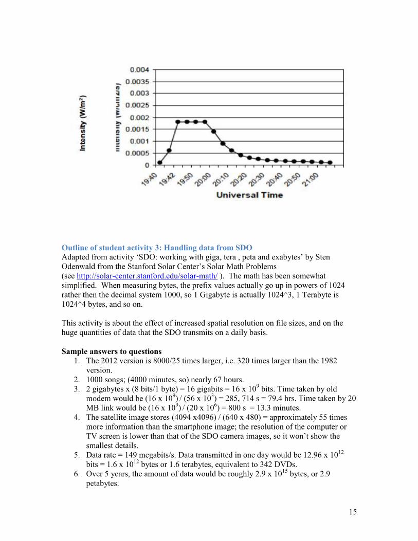
Distinguishing faint sources from background noise is a common problem for many scientists. Solar astronomers often face a different problem: the intensity of the light from a solar flare can be so great that detectors cannot record its true value. This is what happened during the November 4, 2003 solar flare, when the GOES satellite measured the intensity of the flare as its light increased to a maximum and then decreased. The problem was that the solar flare was so bright that the instrument could not record the most intense phase of the brightness evolution - what astronomers call the flare’s light curve. The plot below shows the light curve for two different X-ray energies, and you can see how its most intense phase near 19:50 UT has been clipped. This is a common problem with satellite detectors and is called 'saturation'. To work around this problem and to recover at least some information about the flare's peak intensity, scientists resorted to mathematically fitting the pieces of the light curve that they were able to measure, and interpolated the data using their mathematical model to estimate the peak intensity of the flare.

10
Image credit: GOES satellites Questions 13. Re-plot the data in the table for the red curve. From
the trend on either side of the saturated region, estimate the peak intensity.
Universal time (UT)
Intensity (W/m2)
19:40 0.00010 19:41 0.00060 19:42 0.00180 19:45 saturated 19:50 saturated 19: 55 0.00180 20:00 0.00140
20:05 0.00090
20:10 0.00060
20:15 0.00040
20:20 0.00030
20:25 0.00025
20:30 0.00020
20:35 0.00019
20:40 0.00017 20:45 0.00016
20:50 0.00015
20:55 0.00014
21:00 0.00012
21:05 0.00010

11
Student Activity 3: Handling data from the Solar Dynamics Observatory The instruments on NASA's Solar Dynamics Observatory provide scientists with HD-quality viewing of the solar surface in nearly a dozen different wavelength bands. High-resolution images contain much more data than lower-resolution images, and one of the biggest challenges is how to handle all the data that the satellite will return to Earth. It is not surprising that the design and construction of this data-handling network took nearly 10 years1. Here are some units and prefixes you may need to help you answer the questions below: 1 byte = 8 bits Kilo = 1,000 =103 = 1 thousand Mega = 1,000,000 = 106 = 1 million Giga = 1,000,000,000 = 109 = 1 billion Tera = 1,000,000,000,000 = 1012 = 1 trillion Peta = 1,000,000,000,000,000 = 1015 = 1,000 trillion Exa= 1,000,000,000,000,000,000 = 1018 = 1 million trillion2 Questions 14. In 1982 an IBM PC desktop computer came equipped with a 25 MB (25 megabyte)
hard drive. This is the amount of information the computer can store. In 2012, the hard drive on an ordinary desktop computer or even a mobile device such as an iPod is likely to be 8 GB (8 gigabytes) or more. How many times bigger is this compared to the 1982 hard drive?
15. An 8 GB iPod is used to store music from iTunes. If one typical 4-minute, uncompressed, MPEG-4 song occupies 8 megabytes, how many uncompressed songs could be stored on the device? How many hours of music could be stored on it? (Note: music is actually stored in a compressed format so the actual number is much higher.)
16. How long would it take to download 2 gigabytes of music from the iTunes store using an old-style 1980's telephone modem with a bit rate of 56,000 bits/sec? How long would it take with a modern fiber-optic cable or a Wi-Fi link, with a bit rate of 20 megabits/sec?
1 The small Stanford programming team accomplished this nearly-impossible task. 2 This is slightly simplified. When measuring bytes, the prefix values actually go up in
powers of 1024 rather then the decimal system 1000, so 1 Gigabyte is actually 1024^3, 1
Terabyte is 1024^4 bytes, and so on.
12
17. Each image taken by the AIA cameras on the SDO satellite is 4096 x 4096 pixels. If you take a quick photo of your friends using a smartphone, the image is probably 640 x 480 pixels. How many times more information is stored in the SDO image, compared to the smartphone camera image? A typical computer screen or HD-TV (high definition TV) screen might have a resolution of 1920 x 1080 pixels. Would the screen be able to show the smallest details that could be captured in an image taken by the SDO cameras?
18. SDO satellite's AIA cameras take images every 3/4 of a second, generating 67 megabits/sec of data. The other two instruments, HMI and EVE, generate 62 megabits/sec of data. The satellite itself also generates 20 megabits/sec of 'housekeeping' information to report on the health of the satellite. How many bytes of data is this per day? If a single DVD can store about 4.7 gigabytes of information, how many DVDs would be needed to store the data generated by SDO each day?
19. How much data will SDO generate over its planned 5-year mission?
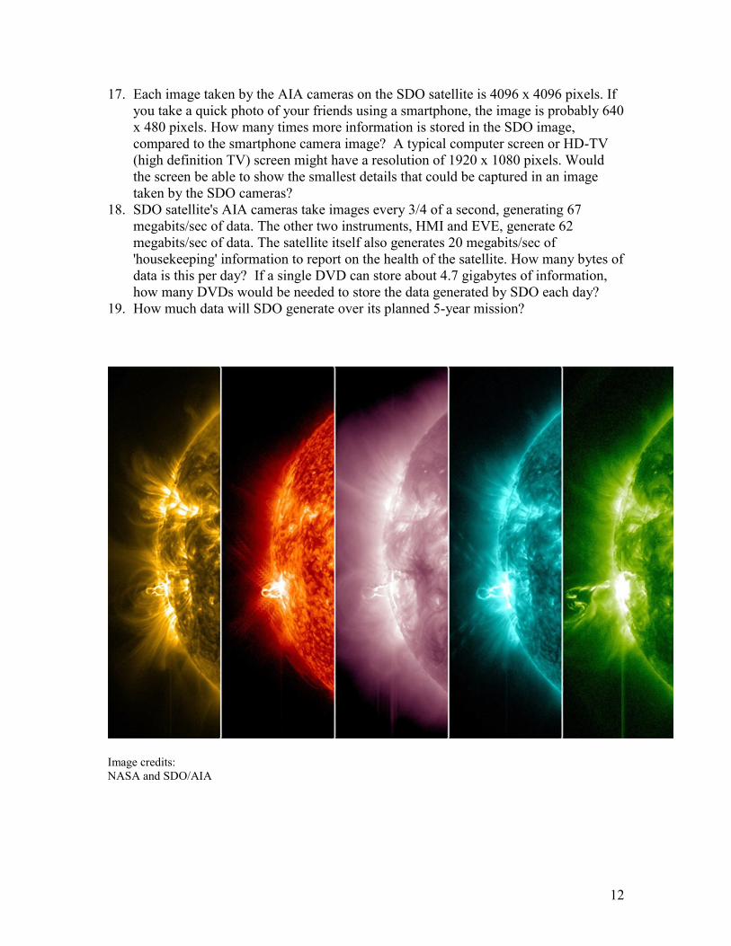
Image credits: NASA and SDO/AIA

13
Teacher Notes – Solar Images and Data Intended age range: 9-10th Grade Science curriculum links Main content links: Communications; Electromagnetic spectrum/Light; Magnetism and Electromagnetism ‘How Science Works’ /science skills aspects: data analysis, interpretation of images, measurements, resolution, choice of instruments and methods, impact of developments in science and technology Key ideas in these activities:
Vast improvement in image quality for solar observations: illustrated with images from the Solar Dynamics Observatory, SDO, compared to the Solar and Heliospheric Observatory, SOHO.
Increased spatial resolution gives greater detail, but the cost of this is massively increased file sizes.
False color images are used to convey more information. Real data are ‘messy’ and have to be interpreted to extract useful information.
Outline of student activity 1: Picking out the details (interpreting recent images of the Sun) This activity is adapted from ‘Hinode sees mysterious microflares’, and ‘SDO reveals details on the Sun’s surface’ by Sten Odenwald, from the Stanford Solar Center’s Solar Math Problems (see http://solar-center.stanford.edu/solar-math/ ). This activity is about interpreting images to find the size of features that can be resolved using recent solar telescopes. The features picked out are called ‘X-ray bright points’ because they are small, bright regions as seen in X-ray and UV emission. They sometimes produce small flare-like activity. Note: 1 arcsecond is a unit of angular measure. When instruments observe the Sun from Earth, one arcsecond is equal to about 725 km on the Sun's surface (it varies a little according to where the Earth is in its orbit). To demonstrate how small it is, 1 arcsecond is the angle covered by a US nickel at a distance of 4.5 km! See the Sun|trek Factary ‘A’ for further information (http://www.suntrek.org/factary/a.shtml ). Sample answers to questions (Fig. 1 - Hinode image)
1. The scale is 773 km/arcsecond 2. The image width is 300 arcseconds, equivalent to 231,900 km (approx. 232,000
km). 3. For an image 115 mm wide, 1 mm would represent 232000 ÷ 115 = 2020 km. 4. The smallest point has dimensions equivalent to roughly 2000-4000 km.

14
(Fig 2. - SDO image) 5. For an image of overall width 125mm, the diameter of the Sun is 98 mm, so the
scale is 1,392,000 km/98 mm = 14,200 km/mm. 6. Students should see numerous bright points dotted across the surface. The
smallest of these are about 0.5 mm across or 7,000 km. This is slightly larger than ½ the diameter of Earth.
7. The hottest gas in the corona is in ‘active regions’ and in the small point-like ‘bright regions’ that are generally no larger than the size of Earth. The X-ray Bright Points are like mini-active regions scattered all over the Sun.
8. If this project sheet is printed on A4 paper, the scale is 200 arcseconds in 5.2mm. 9. A loop is around 185 arcseconds long, which is about 143,000km (answers may
vary a little depending on which loop is chosen). 10. This is about 11 times the diameter of the Earth.
Outline of student activity 2: Handling faint and bright images This activity is adapted from ‘How to make faint things stand out in a bright world’ and ‘SDO and reconstructing a solar flare’ by Sten Odenwald, from the Stanford Solar Center’s Solar Math Problems (see http://solar-center.stanford.edu/solar-math/ ). This activity is about the problems of handling real data, that is, distinguishing faint details from noise, and about dealing with ‘saturation’, when images are too bright for the equipment to record true intensity values. Sample answers to questions
1. The average values are: 116, 115, 130, 117, 116. 2. The averages show that pixels 1, 2, 4 and 5 have very similar averages, while
pixel 3 has a quite a different value. Pixels 1, 2, 4 and 5 behave like noise in a roughly constant intensity background, while pixel 3 seems to be a source.
3. It would have been very difficult because the background noise level that was detected in Pixel 2 of Picture 4 was as intense as the faint source itself in Pixel 3.
4. It is a good idea to take as many pictures as you can, then average the pictures together to make a faint source stand out.
5. There are plenty of examples for students to identify. The top image was taken by a 1.5 m telescope that can detect light at an infrared wavelength of 2.2 x 10⁻⁶ m. (Sunlight has a wavelength of around 0.6 x 10⁻⁶ m.) The exposure for the top image was only 7.8 seconds. The bottom image represents an exposure of 7.8 x 5000 = 39,000 seconds (averaged to a single exposure) and it is possible to see stars nearly 10,000 times fainter than in the single, short exposure image.
6. Sample image of re-plotted data. Extrapolating the curves on either side of the plateau gives an intersection value of 0.0035 to 0.004 W/m2. (NB. The Solar Math activity from which this was adapted includes two further more advanced problems that involve the use of algebra and calculus.)
15
Outline of student activity 3: Handling data from SDO Adapted from activity ‘SDO: working with giga, tera , peta and exabytes’ by Sten Odenwald from the Stanford Solar Center’s Solar Math Problems (see http://solar-center.stanford.edu/solar-math/ ). The math has been somewhat simplified. When measuring bytes, the prefix values actually go up in powers of 1024
rather then the decimal system 1000, so 1 Gigabyte is actually 1024^3, 1 Terabyte is
1024^4 bytes, and so on. This activity is about the effect of increased spatial resolution on file sizes, and on the huge quantities of data that the SDO transmits on a daily basis. Sample answers to questions
1. The 2012 version is 8000/25 times larger, i.e. 320 times larger than the 1982 version.
2. 1000 songs; (4000 minutes, so) nearly 67 hours. 3. 2 gigabytes x (8 bits/1 byte) = 16 gigabits = 16 x 109 bits. Time taken by old
modem would be (16 x 109) / (56 x 103) = 285, 714 s = 79.4 hrs. Time taken by 20 MB link would be (16 x 109) / (20 x 106) = 800 s = 13.3 minutes.
4. The satellite image stores (4094 x4096) / (640 x 480) = approximately 55 times more information than the smartphone image; the resolution of the computer or TV screen is lower than that of the SDO camera images, so it won’t show the smallest details.
5. Data rate = 149 megabits/s. Data transmitted in one day would be 12.96 x 1012 bits = 1.6 x 1012 bytes or 1.6 terabytes, equivalent to 342 DVDs.
6. Over 5 years, the amount of data would be roughly 2.9 x 1015 bytes, or 2.9 petabytes.

16
Background information and Resources Key terms corona plasma flare spectrometer ultraviolet radiation X-ray You can find explanations of these terms in the Sun|trek Factary at http://www.suntrek.org/factary/factary.shtml The ‘solar images and data’ activities link to the following Sun|trek pages: Sun|trek adventure: magnetic sun: solar fireflies http://www.suntrek.org/magnetic-sun/solar-fireflies/solar-fireflies.shtml iSuntrek: http://www.suntrek.org/blog/solar-dynamics-observatory-sdo and http://www.suntrek.org/blog/the-sun-gets-active-with-x-class-solar-flares Other useful activities and resources (i.e. not Sun|trek): Stanford Solar Center resources for teachers: http://solar-center.stanford.edu/teachers/ Space Math @ NASA: http://spacemath.gsfc.nasa.gov/ Solar math: http://solar-center.stanford.edu/solar-math/
In ‘Number’ section: Faint things in a bright world; SDO: working with giga, tera , peta and exabytes In ‘Algebra and calculation section’: Solar flare reconstruction (Problem 1) In ‘Geometry’ section: Hinode sees mysterious micro-flares In ‘Measurement’ section: Hinode satellite views the Sun; SDO and Speed of an eruptive prominence; SDO reveals details on the Sun’s surface
Hands-on solar learning activities at http://www.lmsal.com/YPOP/Classroom/index.html Fun with pixels http://www.lmsal.com/YPOP/Classroom/Lessons/Pixels/

17
Space Weather Effects
Student Activity 4: Space weather effects on a solar telescope
‘Space weather’ effects are caused by types of solar activity known as solar flares and Coronal Mass Ejections (CMEs), which produce sudden bursts of very fast-moving charged particles. These high-energy bursts cause problems for communications systems in several ways. For example, high energy particles directly affect the sensitive electronic equipment on satellites, corrupting data. In this activity, you will look at the effect of high-energy particles on some satellite images. The effect on a solar telescope, the Solar and Heliospheric Observatory (SOHO) Solar flares can severely affect sensitive instruments in space and corrupt the data that they produce.
On July 14, 2000, the Sun produced a powerful X-class flare that was captured by instruments on board the Solar and Heliospheric Observatory (SOHO). The EUV Imaging Telescope (EIT) operating at a wavelength of 195 Angstroms (19.5 x 10⁻⁹ m) showed a brilliant flash of light (left image). This wavelength is in the ultraviolet, which we cannot see, so the green image you see is a false-color image: the color could be anything, the astronomers just happened to choose green. The bright patches on the image show up where the gas in the solar atmosphere is particularly hot. During a solar flare the temperature can be as high as 10 million degrees Celsius.
When the high energy particles from the solar flare arrived at the SOHO satellite some time later, they caused the imaging equipment to develop ‘snow’ as the individual particles streaked through the sensitive electronic equipment. SOHO is in an unusual orbit, going around the Sun with the Earth, at a distance from Earth that is 1/100th of the way from the Earth to the Sun.

18
The images below were taken by SOHO LASCO (Large Angle Spectroscopic COronagraph). These images were taken in ‘white light’, that is, visible wavelength range. The Sun is blocked out by a disk (in a similar way to when the Moon blocks out the solar disk during a total eclipse). The size of the Sun is shown as the white circle inside the disk. We can see material streaming out from the Sun. The images show what happened to the LASCO instrument when a shower of fast particles from the solar flare arrived at the SOHO spacecraft. The date and time information (year/month/day hr : min) is given in the lower left corner of each image.
Questions
1. Use the SOHO/EIT image to find out at what time the solar flare first erupted on the Sun.
2. At about what time did the LASCO imagers begin to show significant signs of the particles having arrived (‘snow’ effect)?
3. If the SOHO satellite is located approximately 148 million kilometers from the Sun, what was the approximate speed of the arriving particles?
4. If the speed of light is 300,000 km/sec, what is the speed of the particles as a percentage of the speed of light?
5. Suggest why it can be difficult to protect sensitive equipment on board space telescopes from damage caused by very high-energy particles ejected from the Sun.
Image credits EUV Telescope image; Sequence of images from SOHO /LASCO

19
Student Activity 5: Space weather and dodgy data
‘Space weather’ effects are caused by types of solar activity known as solar flares and Coronal Mass Ejections (CMEs), which produce sudden bursts of very fast-moving charged particles. These high energy bursts cause problems for communications systems in several ways:
High energy particles directly affect the sensitive electronic equipment on satellites, corrupting data. Disturbances to the atmosphere affect how radio waves are transmitted, refracted and reflected, disrupting radio communications; the slight expansion of the atmosphere can also mean that some satellites in lower orbits are slowed down enough to eventually fall out of orbit.
In this activity, you will look at how space storms can affect data from GPS satellites. The effect of space weather on a GPS satellite GPS satellites are ‘global positioning’ satellites. They are what ‘satnav’ systems depend on. The two images below show the measurements of a location from a GPS receiver over a 24 hour period. You can see an interactive version on http://www.suntrek.org/sun-earth-connection/what-is-space-weather/space-weather-affect/communicating-satellites.shtml The image on the left shows ‘raw‘ measurements, while the one on the right shows the same measurements after they have been corrected for the effect of variations in the ionosphere (a part of the Earth’s upper atmosphere).
Image credits ‘Raw’ and corrected measurements of location Artist illustration of events on the Sun changing the conditions in near-Earth space. Credit: NASA.

20
Questions 1. First, mark where the center of each scatter seems to be on each of the images: this is
the average of all the measurements. 2. Is the average position the same for the two images? 3. Which image shows the greatest range of values?
One way to decide might be to look at where the furthest point away from the average is for each image, then compare the distances.
Another method might be to draw a circle on each image that has the ‘average’ position as the center and that looks ‘shaded in’ so it contains most of the points. Try to get the shading density as similar as possible for the two images. Which image gives the smaller circle?
Which method gives a better idea of “what the spread is like”? 4. Now mark where you think the ‘true’ position is on each image, by finding the point
where the longitude error and the latitude error are both 0 m. 5. Does the ‘true’ position lie on the same point as the average position for each image?
In which image are the two values closer? This image shows improved accuracy. 6. Read the section on the Sun|trek website (www.suntrek.org) called ‘What is space
weather?’ in the Sun|trek adventure ‘Sun Earth connection’. Explain how changes in the atmosphere between the ground and a satellite can sometimes make it difficult to get accurate GPS information.

21
Teacher Notes - Space Weather Effects Intended age range: 9-10th grade Science curriculum links Main content links: speed and acceleration, energy, communications ‘How Science Works’ /science skills aspects: risk, impact of developments in science and technology, data analysis, measurements, accuracy and precision, sources of error
Outline of student activity 4: Space weather effects on a solar telescope (This activity is adapted from ‘Data corruption by high energy particles’, one of the ‘Solar Math‘ activities listed below (Numbers and Operations, problem 8) developed by Dr Sten Odenwald). This first activity is about data corruption caused by high-energy particles from solar flares hitting the sensing equipment of a solar telescope, SOHO. Students could also watch the ‘snowstorm’ effect of the particles arriving at the SOHO spacecraft on the video sequence on the Sun|trek webpage ‘What is space weather?’ in the ‘Sun-Earth connection’ adventure, at http://www.suntrek.org/sun-earth-connection/what-is-space-weather/what-is-space-weather.shtml. Solar flares are huge explosions on the Sun that happen when there are dramatic changes in the magnetic field. The energy released by these changes in the magnetic field causes an increase in temperature at this part of the Sun to in excess of 10 million degrees Celsius, and a surge of very high-energy particles and Coronal Mass Ejections (CMEs) with speeds of several hundred km/s. Note: SOHO is in a different orbit to most other satellites. It is not in orbit around the Earth, but orbits the Sun, at a distance from the Earth of 1/100th of the way between the Earth and the Sun. Sample answers to questions for Student Activity 4 The image from EIT (EUV Imaging Telescope on the SOHO satellite) shows a time of 10:24 or 10 hours and 24 minutes Universal Time in the bottom left hand corner. Images are taken at set intervals, so this is the closest time to when the solar flare occurred. The solar flare shows very bright emission, with a horizontal streak where the detectors have been saturated and bled along the row.
1. The top sequence shows no ‘snow’ at 10:30 UT, but that the ‘snow began to fall’ at 10:54 UT. The second sequence shows that some snow is present on the first image at 10:42 UT. The snowfall is much heavier in the later images. We take 10:42 UT as the time when the first particles started to arrive at the SOHO spacecraft.
2. The elapsed time between the sighting of the flare by EIT (10:24 UT) and the beginning of the snow seen by LASCO (10:42 UT) is 10:42 UT – 10:24 UT = 18 minutes. The speed of the particles was about 148 million km/18 minutes or 8.2 million km/minute.
3. Converting 8.2 million km/minute into km/sec we get 137,000 km/sec. Comparing this to the speed of light we see that the particles traveled at (137,000/300,000) x 100% = 46% the speed of light!

22
4. There is not much warning for satellites, as particles can arrive less than half an hour after the solar flare.
Outline of student activity 5: Space weather and dodgy data This activity is about how satellite data can be affected by solar storms, in particular the effects on GPS data caused by changes in the ionosphere. Questions 1-5 are intended to encourage exploration of the two images and discussion about accuracy and precision in a new context. To answer question 6 correctly, students need to realize that changes in the density of the atmosphere affect by how much electromagnetic waves are refracted. To help students understand how this might affect information from the GPS satellites, you might remind them how difficult it is to judge distances underwater when you are looking from above the surface from the side of a pool.
Background information and Resources NOTE: students may be more familiar with space weather effects such as the aurora borealis. The two activities are about effects on satellites, rather than effects on the Earth, but the adventures on the Sun|trek website also include information and resources related to effects on the Earth. Key terms corona plasma ion/ionization sunspots Coronal Mass Ejection (CME) solar flare solar explosion solar wind magnetosphere solar cycle space weather You can find explanations of these terms in the Sun|trek Factary at http://www.suntrek.org/factary/factary.shtml Links to Sun|trek website pages Sun|trek adventure: Sun-Earth Connection http://www.suntrek.org/sun-earth-connection/sun-earth-connection.shtml The adventure includes short video and animation clips and still images such as aurorae, power cables overloading, and what happens when high-energy particles from a CME hit a solar telescope. You can also access these files from the Sun|trek Gallery, at http://www.suntrek.org/gallery/gallery.shtml The Sun|trek website has two related activities suitable for grades 6-9 (‘Space storms’ and ‘Spotting magnetic storms’) on the School Projects page: follow the Sun-Earth link http://www.suntrek.org/classroom-projects/Sun-Earth.shtml. For older students, there is also more information on making and using magnetometers on the Sun|trek website http://www.suntrek.org/sun-earth-connection/ringing-magnetospheric-bell/make-your-own-magnetometer.shtml and also on the AuroraWatch UK website, http://aurorawatch.lancs.ac.uk/ at http://aurorawatch.lancs.ac.uk/detectors/results.

23
Further information can be found about solar space observations from SDO, solar flares and the aurora on the iSuntrek website: http://www.suntrek.org/blog/solar-dynamics-observatory-sdo http://www.suntrek.org/blog/the-sun-gets-active-with-x-class-solar-flares http://www.suntrek.org/blog/the-northern-lights-aurorae-borealis You can find a poster at: http://www.suntrek.org/images/Surviving-near-our-Sun-poster.jpg Other useful activities and resources from external sites (i.e. not Sun|trek): From the Stanford Solar Center http://solar-center.stanford.edu/teachers/ Solar math http://solar-center.stanford.edu/solar-math/ In ‘Number’ section: 8 Data corruption by high energy particles; 16 Solar storm timeline; In ‘Data analysis’ section: 6 Solar flares, CMEs and aurorae; 8 Do fast CMEs produce intense SPEs? 15 Magnetic storms 1; In ‘Problem solving’ section: 2 Solar storm timeline; 3 Solar storms and airline travel (risks); 4 Solar storms in the news. (This uses archived sources and asks students to evaluate the credibility of different sources and to compare different historical explanations of aurorae.) NOAA Space Weather Prediction Center http://www.swpc.noaa.gov/Education/index.html Follow the Materials for the classroom link, ‘Teaching space weather’ on this page or go to http://www.swpc.noaa.gov/info/School.html. There is a PowerPoint presentation and accompanying teacher notes. NOAA Solar Events http://www.oar.noaa.gov/k12/html/solarevents2.html Includes Student activity book http://www.oar.noaa.gov/k12/pdfs/solsall.pdf Solar events activity key http://www.oar.noaa.gov/k12/pdfs/solkey.pdf Effects of the Sun on our planet http://solar-center.stanford.edu/webcast/wcpdf/sunonearth9-12.pdf The activity on the effects on radio reception might be useful as an extension activity for older students.
24
Spectra
Student Activity 6: Spectra: A tale of two elements
Early in the 19th century, scientists observed that a spectrum of light from the Sun shows many fine dark lines in an otherwise continuous spectrum: this is called the Fraunhofer spectrum. The dark lines in the Fraunhofer spectrum are where light of a particular wavelength has been absorbed by the chromosphere (a layer in the solar atmosphere just above the surface, called the photosphere). The scientists realized that the pattern of dark lines was a combination of the absorption spectra of different elements: here was a way of identifying what elements are present close to the surface of the Sun. During a total eclipse of the Sun, the Moon blocks out the bright emission from the surface of the Sun (solar disk) and we can see the solar atmosphere, called the corona or ‘crown’, which is much fainter. Later in the 19th century, scientists studying solar spectra in the visible wavelength range during total eclipses noticed bright lines that did not match with the emission lines of known elements. The scientists who observed these unidentified bright lines proposed that they were the emission lines of new elements: one of these new elements was named ‘helium’ (from ‘helios’, the Greek word for Sun) and the other was called ‘coronium’ (because it was observed in the spectrum produced by light from the corona). About 25 years after the discovery of the bright yellow ‘helium’ line in the solar spectrum (from the chromosphere), a scientist was able to isolate a substance on Earth that produced a matching emission line. The existence of the element helium was confirmed. The same could not be said of ‘coronium’. Scientists eventually discovered that the bright green ‘coronium’ line was in fact emitted by iron atoms that had lost many electrons. Atoms that have lost electrons are called ions. This explanation indicated a very high and unexpected temperature for the corona of around 1,000,000 °C. Questions 1. Why is the corona not normally visible, except during an eclipse? 2. What evidence led scientists to suggest the existence of two previously unknown elements? 3. What was the evidence that the element ‘helium’ existed? 4. Why did the production of spectral lines from ions suggest that the element coronium did not exist? 5. Suggest why it took so long before anyone was able to produce emission lines from ions such as the kind producing the ‘coronium’ line. 6. What did this discovery suggest about the temperature of the corona compared to the surface of the Sun? Why was this surprising? 7. Draw two diagrams of the Sun side by side, showing the difference between the ‘old’ model (before the spectral lines were linked to ions) and the ‘new’ model that replaced it.

25
8. Use information from two sources to find out more about the discovery of helium. Write a brief summary or create a poster presentation of what you found out.
Information sheet Take a look at these sections on Sun|trek: http://www.suntrek.org/hot-solar-atmosphere/solar-fingerprints/fraunhofer-spectrum.shtml http://www.suntrek.org/sun-as-a-star/suns-vital-statistics/what-the-suns-made-of.shtml http://www.suntrek.org/hot-solar-atmosphere/solar-fingerprints/million-degree-rainbow.shtml Spectra
Hot objects emit a continuous spectrum of electromagnetic radiation. A graph of brightness against wavelength is a smooth curve with a single peak. The position of the peak shifts to shorter wavelengths as the object gets hotter.
An emission spectrum is produced by light emitted by a single element when very hot. It looks like a set of bright lines. The spectrum only contains certain wavelengths, so a graph of brightness against wavelength looks like a set of very sharp peaks. Each element has its own emission spectrum.
An absorption spectrum is produced when light passes through a very hot material and some wavelengths are absorbed. It looks like a set of dark lines against a bright continuous spectrum. The dark lines in an absorption spectrum for an element are at the same wavelengths as the bright lines of the element’s emission spectrum.

26
Temperatures
The temperature of the Sun’s core is about 15,000,000 °C The temperature of the Sun’s surface (the photosphere) is about 6000 °C The temperature of the chromosphere, just above the photosphere, is around
20,000 °C The temperature of the corona (the Sun’s atmosphere) is about 1,000,000 °C.
You can find more information on the Sun|trek website (http://www.suntrek.org/ ) in these Sun|trek adventures: Hot solar atmosphere Solar surface and below The Sun as a Star Useful terms corona photosphere ion /ionization spectra spectral line spectrometer You can find explanations of these terms in the Sun|trek Factary at http://www.suntrek.org/factary/factary.shtml
Eclipse image © Miloslav Druckmuller, Peter Aniol,
and Vojech Rusin; used with permission

27
Student Activity 7: Spectra: Solar Fingerprints Solar astronomers use spectra to learn about the Sun. One of the things they can tell from spectra is what ions are present. How solar astronomers interpret the spectra from a part of the Sun depends on what the temperature of that part of the Sun is. The temperature of ‘quiet’ regions of the Sun’s atmosphere is around 1 million degrees Celsius (1 M°C) while the temperature of active regions of the Sun is much higher, at around 2 – 3 million degrees Celsius (2 – 3 M°C). The two charts below are spectra taken from Hinode/EIS. One is from a quiet region of the Sun and the other is from an active region. They have not been labeled: you will need to decide which one is which!
26.0 26.5 27.0 27.5Wavelength / nm
0.0
0.2
0.4
0.6
0.8
1.0
No
rma
lized
in
tensity
26.0 26.5 27.0 27.5Wavelength / nm
0.0
0.2
0.4
0.6
0.8
1.0
No
rmaliz
ed
in
ten
sity

28
The table below shows the wavelengths of light produced by different ions in the wavelength range being studied. The spectra show the intensity (brightness) of light at each wavelength: the taller the peak, the greater the intensity of the light emitted at that wavelength. The peaks are higher because the light intensity is greater when there are more of the ions that are emitting that wavelength of light. The temperatures in the right hand column show the temperature at which a tall peak appears for that wavelength. Notice that there can be several lines for the same ion. Ion Wavelength (nm) Temperature (M°C) Si10+ 25.837 1.41 Si10+ 26.106 1.41 Fe16+ 26.298 2.82 S10+ 26.428 1.41 Fe14+ 26.479 2.00 Mg6+ 27.040 0.45 Fe14+ 27.052 2.00 Si10+ 27.199 1.41 Fe14+ 27.420 2.00 Si7+ 27.537 0.63 Questions 1. Look at the spectra. What is the range of wavelengths being studied in the spectra? 2. What part of the electromagnetic spectrum does this correspond to? 3. Look at the left hand column of the table. How many electrons have been lost from a magnesium atom to produce an Mg6+ ion? 4. What is the temperature at which Mg6+ ions are produced most strongly? What about Si 10+? 5. Which ions are produced most strongly at 2 M°C or above? 6. Identify the peaks associated with each ion from the table on the two spectra. 7. Label the peaks that identify one of the spectrum plots as the one from an active region. 8. Which plot is the ‘quiet region’ spectrum and which is the ‘active region’ spectrum?
The solar spectrum (visible light)
29
Teacher Notes - Spectra Intended age range: 9-10th grade Science curriculum links Main content links: Electromagnetic spectrum, light and waves, atomic spectra, ionization, stars (emission spectra and absorption spectra, temperature) ‘How Science Works’ /science skills aspects: measurements, calibration, reviewing scientific ideas and evidence; analyzing data
Outline of student activity 6: Spectra: A tale of two elements The story of helium is quite well known, but the story of coronium less so. This activity is about reconciling evidence with different models. The existence of spectral lines that did not match the lines produced by known elements led scientists to propose the existence of new elements. Helium was eventually isolated on Earth and provided a fit with an existing model. However, the existence of spectral lines produced by ions meant that an alternative model was needed to account for the production of such lines in spectra from the corona, one where the corona was at a much higher temperature (1,000,000°C) than the surface (6,000°C). If students are doing this activity in the context of work on spectra they should already know how emission spectra are formed before doing the activity. They do not need to know about the emission spectra of ions at this level, but it could be explained that, as each electron is removed, this affects the energy levels of the remaining electrons: changes in the energy levels will mean changes in the wavelengths of the spectral lines. For question 8, internet searches for ‘discovery of helium’ or ‘discovery of helium 1868’ will give a range of suitable sites, for example: Wikipedia: Solar eclipse of August 18, 1868 http://en.wikipedia.org/wiki/Solar_eclipse_of_August_18,_1868 The Universe today: Who discovered helium? http://www.universetoday.com/53563/who-discovered-helium/ An element of interest…helium http://www.chemmybear.com/helium.html Sample answers to questions 1. Most of the time, light from the ‘visible surface’ of the Sun is so bright that it swamps the light from the corona (it is over one million times brighter), but during an eclipse the light from the visible surface is blocked, so we can see the less intense light from the corona. 2. Scientists expected every observed line to correspond to lines in the spectra of known elements. When they observed lines at different wavelengths, they concluded they must therefore belong to other elements that simply hadn’t been identified yet. 3. An element was isolated on Earth that produced an emission line at the same wavelength as the one attributed to ‘helium’.

30
4. If a line at the correct wavelength could be produced by a known element (as this one was), then it was not necessary to claim that it was produced by an unknown element. 5. The conditions for producing ions like these are very special. Removing electrons needs a lot of energy, and the higher the temperature the more electrons an atom can lose. 6. The corona must be at a high enough temperature for atoms to lose electrons. The temperature of the surface was not hot enough for this. To produce the spectral lines observed, the corona must be at a higher temperature than the surface! You might expect the corona to be cooler than the surface because it is further away from the center of the Sun. 7. ‘Old’ model shows corona at a lower temperature than the surface; ‘new’ model shows corona at a much higher temperature than the surface. 8. Students might choose to write about one or more of the scientists involved in the discovery of helium. For example, during the 1868 eclipse Sir Joseph Norman Lockyer and Pierre Janssen were working independently, but both men saw a strong yellow emission line, 588 nm, coming from the edge of the Sun. Each scientist attributed this line to a new element and reported their findings independently; this new element called ‘helium’ was eventually isolated on Earth by Sir William Ramsay in 1895.
Outline of student activity 7: Spectra: Examining solar fingerprints
The two spectra are real and recent spectra from Hinode/EIS. Although students may be familiar with the idea of ionization, the idea of ions that have lost 6 or more electrons is likely to be new. The key to identifying the ‘active’ region spectrum is to relate this to the presence of tall peaks for Fe14+ and Fe16+. Sample answers to questions 1. 25.8 to 27.8 nm. 2. This is in the ultraviolet part of the spectrum. 3. 6 electrons. 4. Mg 6+ is produced strongly at 0.45 M°C, Si10+ at 1.41 M°C. 5. Fe14+ and Fe16+. 6. to 8. The ions that are the markers for the higher temperature of the active region are shown in red.

31
Background information and Resources Key terms corona plasma ion /ionization photosphere chromosphere spectra spectral line spectrometer ultraviolet radiation X ray You can find explanations of these terms in the Sun|trek Factary at http://www.suntrek.org/factary/factary.shtml The ‘spectra’ activities link to the following Sun|trek adventures: Hot solar atmosphere http://www.suntrek.org/hot-solar-atmosphere/hot-solar-atmosphere.shtml Solar surface and below http://www.suntrek.org/solar-surface-below/solar-surface-below.shtml and The Sun as a Star http://www.suntrek.org/sun-as-a-star/sun-as-a-star.shtml

32
Other useful activities and resources from external sites: Build your own spectroscope -- from the Stanford Solar Center (http://solar-center.stanford.edu/activities/cots.html) Punch-out spectrographs are available at low cost through Stanford, appropriate for grades 4-12. There are copious additional resources for teachers on how to teach spectroscopy. Here are two:
Fingerprints in starlight http://solar-center.stanford.edu/activities/FingerprintsInSunlight/ This is for US grades 9 – 12 and includes a PowerPoint presentation, demonstrations and activities to introduce spectroscopy to older students. Study guide Sun & stars 5-8 http://solar-center.stanford.edu/activities/SunAndStars5-8.pdf This has some helpful information for students and teachers, and the ‘Science Exploration Guide Sheets’ for students include sheets for recording Spectroscopic observation and a Spectra Reference Chart that shows spectra of several elements. Students examine a solar spectrum and use the reference chart to identify elements present. (NB, wavelengths are in Å)
Stanford Solar Center Resources for Teachers http://solar-center.stanford.edu/teachers/ This link includes a large selection of resources and activities for teachers, all related to solar science.
http://solar-center.stanford.edu