think with your eyes - iowa state · pdf filethink with your eyes: considerations when...
TRANSCRIPT
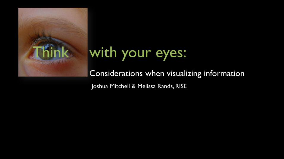
Think with your eyes:
Considerations when visualizing information
Joshua Mitchell & Melissa Rands, RISE
“Well, it depends on who you talk to. Some
people say it is strictly traditional charts and
graphs. Others have a more liberal view where
anything that displays data is visualization,
whether it is data art or an Excel
spreadsheet…in the end it really doesn’t
matter that much.
Just make something that works for your
purpose.” Yau, N. (2011), p. xxi
What is
visualization?
Why visualize?
We visualize to help ourselves and others
think about and understand information
Works best when displaying information as familiar, easy to recognize patterns
Should allow us to see what is meaningful
Should allow us to make sense of what we are seeing
Should help us make comparisons and examine relationships
Visualizing information
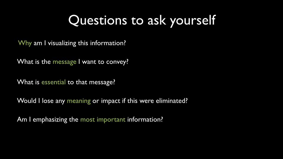
Questions to ask yourself
Why am I visualizing this information?
What is the message I want to convey?
What is essential to that message?
Would I lose any meaning or impact if this were eliminated?
Am I emphasizing the most important information?

Quantitative data visualization
Tables are used when
• Individual values are important
• Individual values need compared
• Precise values are required
• Information has more than one
unit of measure
Figures are used when
• The message is in the shape,
not the value
• Revealing relationships
among multiple values
“Graphical excellence is that which gives to the viewer the greatest number
of ideas in the shortest time with the least ink in the smallest space.”
Tufte, E., 2001, p. 51
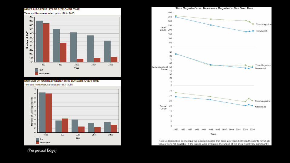
(Perpetual Edge)

(Perpetual Edge)
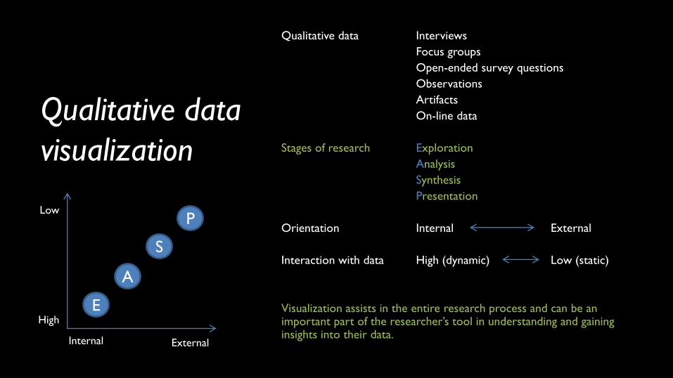
Qualitative data
visualization
Qualitative data Interviews
Focus groups
Open-ended survey questions
Observations
Artifacts
On-line data
Stages of research Exploration
Analysis
Synthesis
Presentation
Orientation Internal External
Interaction with data High (dynamic) Low (static)
Visualization assists in the entire research process and can be an important part of the researcher’s tool in understanding and gaining insights into their data.
E
A
S
P
Internal External
High
Low
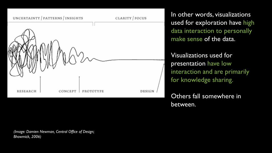
In other words, visualizations
used for exploration have high
data interaction to personally
make sense of the data.
Visualizations used for
presentation have low
interaction and are primarily
for knowledge sharing.
Others fall somewhere in
between.
(Image: Damien Newman, Central Office of Design;
Bhowmick, 2006)
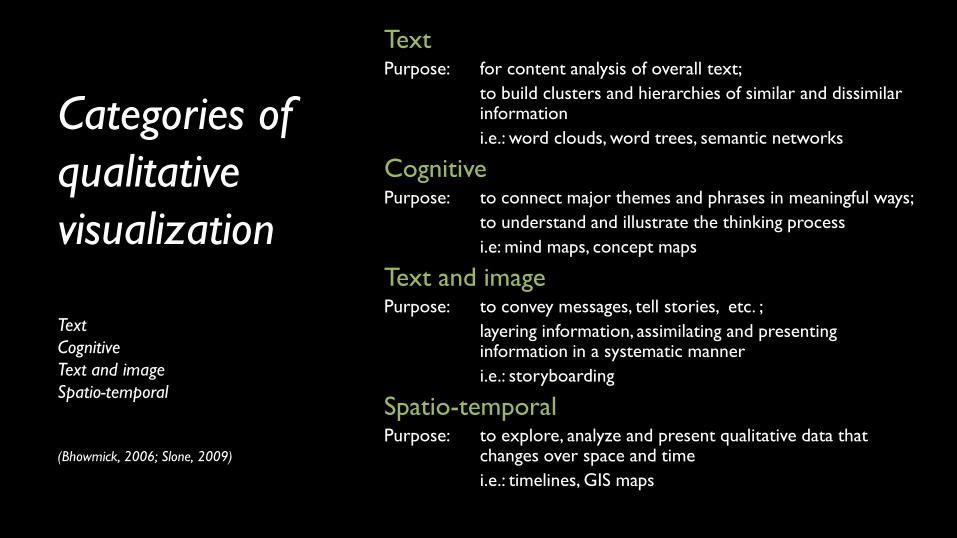
Categories of
qualitative
visualization
Text
Cognitive
Text and image
Spatio-temporal
(Bhowmick, 2006; Slone, 2009)
Text Purpose: for content analysis of overall text;
to build clusters and hierarchies of similar and dissimilar information
i.e.: word clouds, word trees, semantic networks
Cognitive Purpose: to connect major themes and phrases in meaningful ways;
to understand and illustrate the thinking process
i.e: mind maps, concept maps
Text and image Purpose: to convey messages, tell stories, etc. ;
layering information, assimilating and presenting information in a systematic manner
i.e.: storyboarding
Spatio-temporal Purpose: to explore, analyze and present qualitative data that changes over space and time
i.e.: timelines, GIS maps
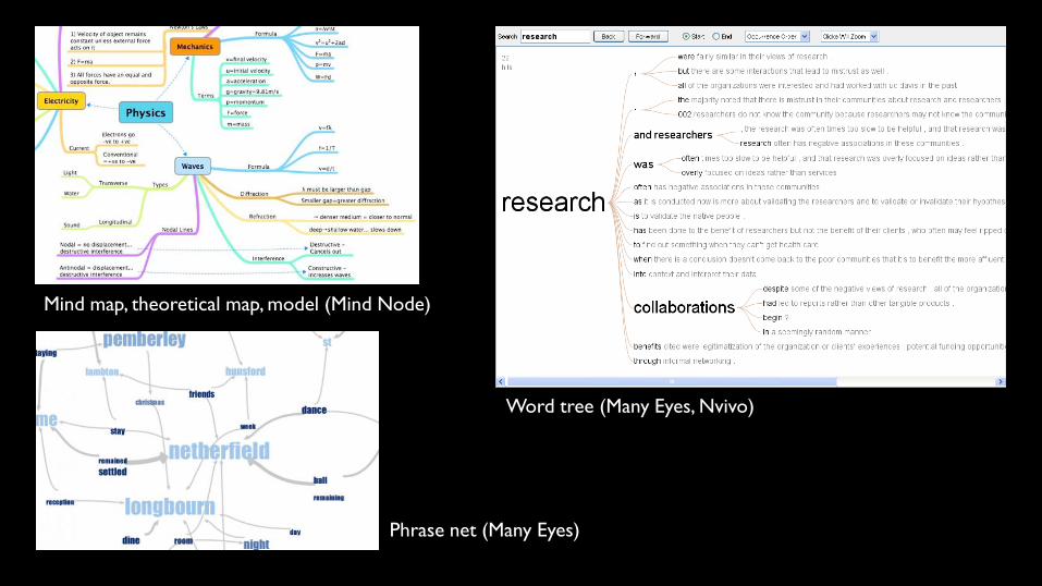
Word tree (Many Eyes, Nvivo)
Mind map, theoretical map, model (Mind Node)
Phrase net (Many Eyes)
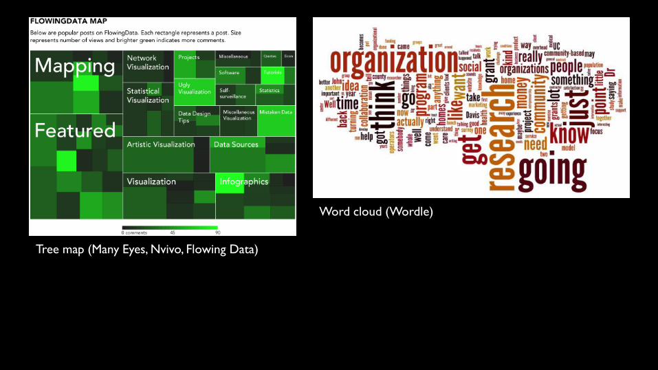
Tree map (Many Eyes, Nvivo, Flowing Data)
Word cloud (Wordle)
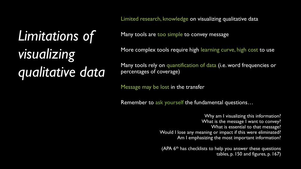
Limitations of
visualizing
qualitative data
Limited research, knowledge on visualizing qualitative data
Many tools are too simple to convey message
More complex tools require high learning curve, high cost to use
Many tools rely on quantification of data (i.e. word frequencies or percentages of coverage)
Message may be lost in the transfer
Remember to ask yourself the fundamental questions…
Why am I visualizing this information?
What is the message I want to convey? What is essential to that message?
Would I lose any meaning or impact if this were eliminated? Am I emphasizing the most important information?
(APA 6th has checklists to help you answer these questions
tables, p. 150 and figures, p. 167)
What questions do you have?
Examples
Shape and value http://www.perceptualedge.com/example2.php
Emphasis and purpose http://www.perceptualedge.com/example18.php
Confusion and clarity http://www.perceptualedge.com/example15.php

C. J. Minard, Tableaux Graphiques et Cartes Figuratives, no. 28 – “one of the best statistical graphs ever”, E. Tufte, The Visual Display
of Quantitative Information, 2001.
Resources Literature
Bhowmick,T. (2006). Building an Exploratory Visual Analysis Tool for Qualitative Researchers. Proceedings of AutoCarto 2006. Retrieved from: http://www.cartogis.org/docs/proceedings/2006/bhowmick.pdf
Few, S. (2004). Show me the Numbers: Designing Tables and Graphs to Enlighten. Oakland, CA: Analytics Press.
Few, S. (2009). Now You See It: Simple Visualization Techniques for Quantitative Analysis. Oakland, CA: Analytics Press.
Slone, D. (2009). Visualizing Qualitative Information. The Qualitative Report, 14(3). 489-497.
Tufte, E. (2006). The Visual Display of Quantitative Information. Cheshire, CT: Graphics Press.
Yau, N. (2011). Visualize This: The FlowingData Guide to Design, Visualization, and Statistics. Indianapolis, IN: Wiley.
Websites
Perpetual Edge: http://www.perceptualedge.com/examples.php
Many Eyes: http://www-958.ibm.com/software/data/cognos/manyeyes
Flowing Data: http://flowingdata.com/
Training
Lynda.com: http://www.iastate.edu/lynda/ login with your Iowa State NetID and password