the world's 100 largest cities : a case stidy of inequality
TRANSCRIPT
The World’s 100 Largest Cities: A case study of inequality
KEY WORDS: Teaching; Quality of l ife; Poverty; Third world.
David Drew and Dave Steyne Sheffield Hallam University, UK.
Summary Data are presented here for the hundred largest cities in the World. They form part of a case study to teach students about exploratory data analysis but are of added interest in providing a focus on poverty and underdevelopment in the Third World and the contrast between this and the wealth of the First World.
+ INTRODUCTION + + THE DATASET + NE thing we do not expect from our students is an 0 automatic interest in data analysis or statistics as
a subject. In England, experience has shown us that only a small minority of students of the social sciences come with a developed interest in statistics. Their interest has to be won. These students are unlikely to be strong in mathematics and they will probably find the more mathematical parts of the subject difficult. One way out of this problem is to link the teaching of statistics and data analysis closely to sociology itself, to play down the role of mathematics and to get students involved in practical data analysis. This is the approach used in the excellent book by Marsh, (1988) and this approach seems to work for our students.
The case study here enables students to practise their knowledge of Minitab and to produce boxplots, tables, descriptive statistics and a correlation matrix. At a statistical level, i t enables them to gain experience in discussing data sources, investigating reliability and validity, producing tables and graphics, integrating these into a report and discussing results. It allows us to show the importance of good, well constructed tables and the need for a sociological interpretation of the data; exploring data is about discovering patterns but this cannot be done without a sociological framework. The case study can also provide an introduction to multivariate analysis using cluster analysis. It has been used successfully in a course on Research Methods for undergraduate social science students.
The data set comprises of ten indicators for the 100 largest cities of the world taken from a study by a Washington DC based environmental organisation (see Camp, Barberis and Hinds, 1990, and the Guardian, 1990). The list of areas was prepared by a metropolitan area expert from Rand McNally and Company and the data relates to 1989 for all variables.
The statistics were collected for each metropolitan area by means of a 13-page in-country questionnaire and there is an extensive list of acknowledgements in the original report to the planners and statisticians who compiled the information for each city. The aim of the survey was to collect data ‘concerning living standards relevant across national boundaries without cultural bias’ (Camp, Barberis and Hinds, 1990). The two urban areas for which data was not obtainable are Yangon, Myanmar (Rangoon, Burma) and Bucharest (Romania). A total of 162 questionnaires were completed and returned, many with multiple respondents, and often representing official sources.
Data was collected on anumber of groups of variables. These were:
POPULATION To obtain the most reliable current demographic data for use in the creation of later indicators, the questionnaire asked for official population figures and age, sex and household breakdowns. It also asked for the latest estimates of total population available, whether official or not.

PUBLIC SAFETY As a measure of the level of personal security and the degree of violent crime found in the metropolitan area, the questionnaire asked for the annual number of homicides.
FOOD COSTS As a general indicator of wealth and poverty, the questionnaire asked for the percentage of household income spent on food.
LIVING SPACE AND HOUSING STANDARDS To determine the level of crowding and provide an indicator of the degree of substandard housing, respondents were asked questions about the number of housing units, rooms per housing unit, and, in separately ranked variables, the existence of electric and water connections.
COMMUNICATIONS To provide ameasure of city infrastructure, in particular modem communications, respondents were asked how many working telephones exist. They were also asked to give an estimate of what percentage of calls actually make a successful connection.
EDUCATION To collect internationally comparable data on educational standards, specifically secondary school enrolment, the questionnaire asked what percentage of children aged 14-17 (or comparable age group) are in school.
PUBLIC HEALTH To provide a general indicator of the standard of public health, respondents were asked the infant mortality rate.
PEACE AND QUIET Since there is a lack of specific data on environmental noise pollution, the questionnaire asked respondents to give a subjective assessment of the level of ambient noise by ranking their own cities on a 10 point scale. The high, middle and low points of the scale were defined in non quantitative terms.
TRAFFIC FLOW In order to develop an internationally comparable measure of urban traffic congestion, the questionnaire asked the distance to the nearest airport and how long it would take to drive by private car from the airport to the central business district during the morning rush hour.
As well as these characteristics we ourselves added our own designation of area into three groups; The First World, China and the Third World. The inclusion of China as a separate group was simply because we felt that Chinese cities might show interestingly different characteristics to those of the other two groups. From these groups of variables, the variables given in Table 1 were selected.
Table 1. Variables selected for analysis.
1. Population (in millions). 2. Public safety: Murders per 100,000 people. 3. Food cost: Percentage of income spent on
food. 4. Living space: Persons per room. 5. Housing standards: Percentage of houses with
water/electricity . 6. Communications: Telephones per 100 people. 7. Education: Percentage of children in second-
ary school. 8. Public health: Infant deaths per 1OOOlive births. 9. Peace and quiet: Levels of ambient noise
(1-10). 10. Traffic flow: Miles per hour in rush hour. 1 1. Designation: 1 = First World
2 = China 3 = Rest of the World
12. Metropolitan area name.
+ THEANALYSIS + Many different analyses are possible with data of this
type. We found it useful topresent students with problems of both a closed and open-ended kind, that is we asked them to consider particular boxplots and tables, but we also asked them to analyse the data after this in any way they thought appropriate. This enabled them to develop their own hypotheses and test them against the data. This met the objective that weaker students could complete the assignment satisfactorily whilst stronger students could go further and develop their own ideas.
At a substantive level the data can be related to the recent history of colonialism and imperialism in the Third World. WhenBritain, France and the other colonial powers conceded independence to their colonies they left behind poorly developed infrastructures in all areas, notably health, education and housing and the economic infrastructure was dependent almost wholly on foreign owned companies (for an analysis of this see Rodney, 1972 and Miles, 1989). Industry continues to be owned, in the post-colonial period, by multinational companies and the newly independent countries developed a reliance on their former colonisers and the banks. They borrowed to develop the infrastructure they desperately needed and debt and further poverty was a result of this. The ‘quality of life’ indicators in the case study reflect the effect of this set of conditions. By the late 1980’s the spiral of debt had continued and in many cases the economic position of these Third World countries had become even worse than before.
The data can be used to discuss issues of reliability and validity. Considerable detail is given in the original data source about the limitations of the data and the ways in
18 Teaching Statistics. Volume 17, Number I , Spring 1995

which approximations had to be made in order for estimates to be obtained (for further details see Camp, Barberis and Hinds, 1990). For example to obtain the murder rate for Johannesburg, data had to be combined for the (largely white) municipality and the (largely black) township of Soweto. Whilst in general, statistical estimates for socio-economic characteristics will be prone to a large number of sources of error, the resources that some governments devote to collecting data will be more than for others and this will be reflected in the quality of the data.
As far as validity is concerned it is not possible to tell from the original study what was the exact purpose for which the data was collected. The question of whether or not the chosen indicators adequately reflect the quality of life and what this means could be discussed with students. We have preferred to tackle the problem in a different way and that is to suggest that some of these variables can be used as measures of the particular problems that are experienced in Third World cities. Poverty, for example, is measured in an indirect way by the percentage of household income spent on food, the problems of education infrastructure by the percentage
Depth
50.5 25.5
1
of children in secondary schooling and the problems of social conflict by the murder rate.
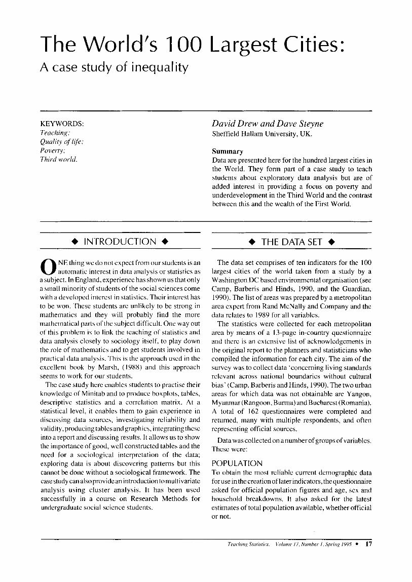
We carried out univariate, bivariate and multivariate analyses. Taking the percentage of income spent on food as an example it is found that this ranges from 9 percent in Washington DC to 80 percent in Ho Chi Minh City, Vietnam with a median of 35 percent (see Table 2 and Figure 1). Much higher percentages of income are spent on food in the Third World and in China (see Table 3) . The boxplots illustrate this and allow us to see that Katowice inPoland is an outlier for First World countries. If we consider the cities where the highest percentages of income are spent on food then cities in India, Latin America, Africa, South East Asia and China are well represented (see Table 4). This table also suggests that the poorest cities are also the ones where the take-up of places in secondary schools is low although there is evidently not a close correlation between this and the percentage of income spent on food.
If we take the percentage of households with water/ electricity as a measure of housing quality and the infant death rate as a measure of health then we might expect to find an association between housing conditions and
Percentage of income spent on food
35 Median 21 47 26 Midspread 9 80 71 Range
C h i n ; l I
Percentage of children in secondary school
* E l *
I Murders per 100,000 people
A l l C i t i e s - I f I a - 1 c34
15 30 45 60 75
Fig. 1. Boxplot of food costs by city group.
Table 3. Medians for selected variables by city group
Group 7 First World China Rest of World
Percentage of income spent on food
17 54 40
35
I I
90 76 61
3.1 2.5 6.0
76 I 4.1
Tcoc.hiri,y Stuti.stic,s. Volume 17. Nunrher I , Spins? 1995 19
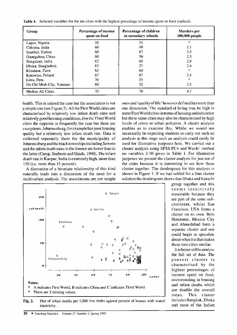
Table 4. Selected variables for the ten cities with the highest percentage of income spent on food (ranked).
’ Percentage of income Percentage of children spent on food in secondary schools
58 31 60 49 60 67 60 56 62 60 63 37 63 60 67 87 70 55 80 52
35 76
Group
Lagos, Nigeria Calcutta, India Istanbul, Turkey Guangzhou, China Bangalore, India Dhaka, Bangladesh Kinshasa, Zaire Katowice, Poland Lima, Peru Ho Chi Minh City, Vietnam
Median All Cities
health. This is indeed the case but the association is not a simple one (see Figure 2). All the First World cities are characterised by relatively low infant death rates and relatively good housing conditions. For the Third World cities the opposite is frequently the case but there are exceptions. Johannesburg, for example has poor housing quality but a relatively low infant death rate. Data is collected separately there for the municipality of Johannesburg and the black townships including Soweto and the infant death rates in the former are lower than in the latter (Camp, Barberis and Hinds, 1990). The infant death rate in Kanpur, India is extremely high, more than 150 (i.e. more than 15 percent).
A discussion of a bivariate relationship of this kind naturally leads into a discussion of the need for a multivariate analysis. The associations are not simple
15 B
infdeath
100
5 0
B
Notes:
Murders per 100,000 people
* 1.1 3.5 2.5 2.8 2.4
2.1
2.1
*
*
4.1
ones and ‘quality of life’ however defined has more than one dimension. The standard of living may be high in some First World cities in terms of housing and education but these same cities may also be characterised by high levels of crime or urban pollution. A cluster analysis enables us to examine this. Whilst we would not necessarily be expecting students to carry out such an analysis at this stage such an analysis could easily be used for illustrative purposes here. We carried out a cluster analysis using SPSS-PC+ and Wards’ method on variables 2-10 given in Table 1 . For illustrative purposes we present the cluster analysis for just ten of the cities because it is interesting to see how these cluster together. The dendrogram for this analysis is shown in Figure 3. If we had settled for a four cluster solution the dendrogram shows that Dhaka and Karachi
c Kanpur
C Recife
C
Kinshasa C
C cc C
C
C JohannesSurg
I , 30 45 6 0 75 90 185
Uater
* *
A indicates First World, B indicates China and C indicates Third World There are 2 missing values.
Fig. 2. Plot of infant deaths per 1,000 live births against percent of houses with water/ electricity.
group together and this s e e m s i n t u i t i v e l y reasonable because they are part of the same sub- continent, whilst San Francisco, USA forms a cluster on its own. Belo Horizonte, Mexico City and Ahmedabad form a separate cluster and one could begin to speculate about what it is that makes these two cities similar.
It is better still toanalyse the full set of data. The p o o r e s t c l u s t e r i s characterised by the highest percentages of income spent on food, overcrowding in housing and infant deaths which are double the overall mean. This cluster includes Bangkok, Dhaka and most of the Indian
20 Teaching Stutisfics. Volume 17, Number I , Spring 1995

I R e s c a l e d D i s t a n c e C l u s t e r C o m b i n e
C A S E Label
L I S B O N P0RTUG.G PUSAN SOUTH KOREA TASHKENT USSR LONDON UK MEXICO C I T Y E E L 0 HORIZONTE MMEDABA I N D I A KARACHI PAKISTAN DHAKA BANGLADESH S h V FRANSICO USA
Seq
a 3
4 1 5 9
10 6 7 2
0 5 10 15 2 0 I I I I I
I
1
Fig. 3. Dendrogram using Ward’s method and ten cities selected at random (standardised data).
cities. Many of the characteristics are shared by afurther rather interesting cluster although this cluster is less extreme. This cluster is characterised by a particularly high murder rate, one that is 4.5 times the average overall. Thiscluster includesCapeTown (South Africa), Manila (Philippines) and Rio de Janeiro (Brazil). This suggests that high levels of urban crime and sociat conflict are an important additional dimension to the poverty and decay of some Third World cities. It may be that large inequalities in the distribution of wealth within such cities contribute to and exaggerate these problems (Cape Town may well be an example of this).
As a teaching vehicle this data allows a number of points to be made. Boxplots provide a succinct and very useful data summary. Tables need to be clear and carefully drawn up. Minitab is an easy and powerful package to use, sorting and ranking data for example is particularly easy to do. Univariate and bivariate analysis may take us a long way with the data but multivariate analysis can take us further.
+ CONCLUSION + We feel it is important to present students with
challenging but tractable problems. At this level of teaching there is a tremendous variability in the background and experience of the students. Many students lack confidence but suitable case studies should be able to give confidence to the weaker students and stretch the able or more accomplished ones.
Computing developments have greatly enhanced the potential interest of our courses by removing the drudgery of computation. Students can see that computing (in this case Minitab) is interesting, easy and fun. We need to meet the challenge to develop case studies which capitalise on this.
We feel it is important that statistics and social science problems are seen to be inextricably linked. Only in this way will we get to see social science students becoming interested and involved in data analysis. The teaching of data analysis in social science is much more enjoyable now than it was when we started nearly twenty years ago. Our graduates need to be given new competencies in order to come to grips with the subject.
+ NOTES + The data set and accompanying documentation can be
obtained free of charge by sending an unformatted 3.5 inch disk to Dr David Drew, School of Computing and Management Sciences, Sheffield Hallam University 100 Napier Street, Sheffield, S11 8HD. We would like to thank Elizabeth Coates for drawing our attention to this data set and Tina Beatty and Paresh Pate1 for originally undertaking the cluster analysis.
References Camp, S., Barberis, M., and Hinds, I. (1990). Cities:
L$e in the Worlds I00 Largest Metropolitan Areas. Population Crisis Committee. Washington DC. Suite 550. I 120 19th Street N.W. Washington
Guardian (1990). Manchester 8th in World quality league. Guardian Dec 29th, 1990.
Marsh, C. ( 1 988). Exploring Data. Cambridge: Polity Press.
Miles, R. (1989). Racism. London and New York: Routledge.
Rodney, W. (1972). How Europe Underdeveloped Africa. London: Bogle-L’Ouverture Publications.
DC. 20036-3605.
Teaching Statistics. Volume 17, Number I . Spritz!: 1995 21