the weeknd – trilogy album case study
TRANSCRIPT
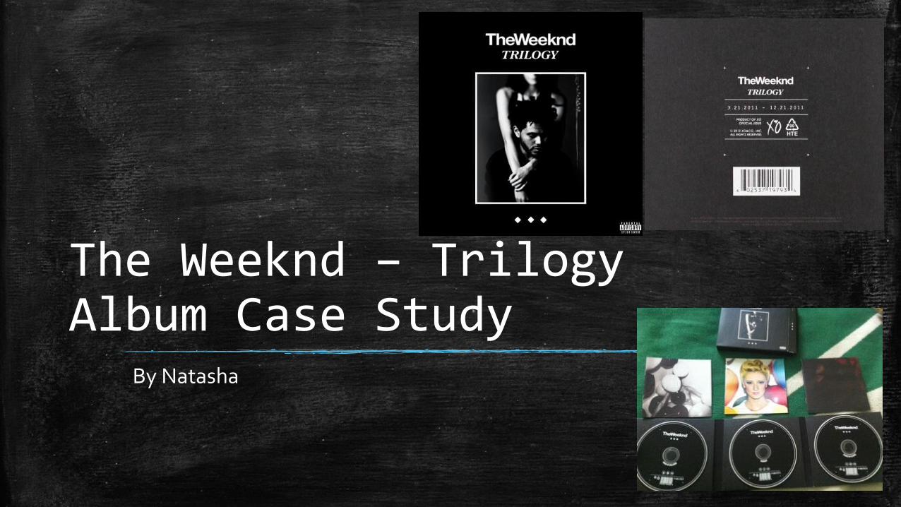
The Weeknd – Trilogy Album Case Study
By Natasha
Use of Images
▪ The album cover has a simple layout where there is a small image in the middle of the cover with a white border around it while the rest of the album remains black. This is simple yet effective as there is not too much going on on the cover so it’s easy on the eyes.
▪ There are 3 diamonds on the bottom of the album and this is to represent the 3 separate CDs that come inside.
▪ The image is a medium shot with a straight on angle which is enough to show The Weeknd’s emotion.
▪ The Weeknd’s body language is quite timid. He is looking away which suggest that he is not confident and looks almost guilty. The female has her arms around him and most of her face is cut off which is done to concentrate on the interaction between him and the female. Her arms are crossed over which suggests that she is also a bit shy. This kind of body language is used because it links in with many songs in his album.
Lighting and Text
▪ The lighting is very dark because the majority of the album is black. I think this is used to set the tone of the music/genre. The image used on the album is dim and a little blurred. The woman behind him is slightly out of focus and his face is in focus which is used to highlight his emotion. Its all quite blended well together and also in black and white.
▪ The text used is bold lettering for the artists name and italics but bold for the album name. I like the italics or something similar to fancy lettering for the name: Professional as I think it fits the name because its simple and overall looks good.
Linking it to our CD Digipack
▪ The use of the interaction between The Weeknd and female on the front of the cover can link to our music video as there is some link between the narrative story female and the actual singer. This inspires us to use a similar interaction between the two. The unconfident vibe we get from the cover can be applied to the emotions of the female on our album cover.
▪ The album shows us that to fit in with The Weeknd’s style we should make our cover simple but still fitting in with the theme and style we used in our music video. For example we used a lot of the bad TV effect in our video so we could try to incorporate that into it.
▪ Like Trilogy we can use the lighting to indicate the mood of the music video. Trilogy uses dim lighting and a lot of ours uses shadows so we could add that in. We can also represent the female’s past and present story using lighting like we did in our video. For example, dimmer and shadowed lighting to represent her past as a stripper and lighter, bright lighting to show her success as a model.