the visualization pipeline - school of computingcsilva/courses/cs5630/lec02-notes.pdf · the...
TRANSCRIPT

“book” — 2007/8/28 — 15:02 — page 9 — #13
3
The Visualization Pipeline
The visualization pipeline refers to the steps that data undergoes as it is trans-formed from raw formats into final visualizations. The term has both an abstractmeaning, in the sense of a high level characterization of the main processing steps;and a concrete one, where the high level representation is mapped to a set of com-putational steps, or procedures. Often in visualization, these computation stepsare organized in terms of a dataflow program. We will cover each of these con-cepts below.
3.1 Dataflow Programming and Scripting
Visualization systems (as other large-scale software projects) are often built inmultiple layers. The idea is to create abstractions that make them more under-standable, flexible, and easier to use. One of the most common and useful ab-stractions for visualization systems is the notion of a dataflow computation.
The terms dataflow,workflow, pipeline, andnetwork as pertains tovisualization are oftenused interchangeably.
A dataflow is a directed graph where nodes represent computations and edgesrepresent streams of data: each node or module corresponds to a procedure thatis applied on the input data and generates some output data as a result. The flowof data in the graph determines the order in which the processing nodes are exe-cuted. In a dataflow computing model, a change in one variable should force therecalculation of other connected variables (for instance, cells in a spreadsheet).In visualization, it is common to refer to a dataflow network as a “visualizationpipeline”.
Workflows are more general than dataflows. In traditional dataflows, the flowof the data is fixed by the graph, and the firing (execution) of the different mod-ules is data driven. Workflows, on the other hand, specify the movement of in-formation through a work process. Here, it is possible to specify how tasks arestructured, who performs them, what their relative order is, how they are syn-chronized, how information flows to support the tasks, and how tasks are beingtracked. Workflows are commonly used in the scientific community to intercon-nect tools, handle multiple data formats and large quanitities of data. Although,technically speaking, the term “workflow” represents a different concept, for ourpurposes, dataflow, workflow, pipeline, and network as pertains to visualization
9

“book” — 2007/8/28 — 15:02 — page 10 — #14
10 3. The Visualization Pipeline
Figure 3.1. The conceptual model of a module.
are used interchangeably.
The actual computation is performed by the modules by operating on theirdata. It is sometimes useful to think of the modules as doing different parts ofthe computation. Common types include: modules that generate data (sources),consume data (sinks), and operate on data by applying algorithms to the data(processes). In their most general form, each module has a set of inputs, set ofoutputs, a set of parameters, and, in certain systems, some form of GUI that canbe used for interacting with the modules (see Figure 3.1). In general, these inputsand outputs are called “ports”. It is useful to enforce “types” in these systems,only allowing connections between ports of compatible types.
The order of execution of modules in a dataflow network is also very impor-tant, and system dependent. There are many tricky issues involved, in particularfor very large datasets where it may be necessary to perform computations undera “streaming model”, that is, instead of assuming that all the data is available atonce to a particular model, it might be necessary to change the algorithms to beable to work on small chunks of data, which are streamed piece by piece throughthe processing pipeline. We will limit our discussion of the execution strategiesto a minimum, since these are out of the scope of our text.
As in other areas of scientific computing, over the last ten years or so, tra-ditional programming of dataflow networks has been replaced by scripting. Weuse the term scripting to mean programming in higher level dynamically typedlanguages (e.g., Python or Tcl). Scripting has shown to be very useful in “glue-ing” many pieces of software, in particular in the realm of scientific computing. Itsimplifies writing user interfaces, providing modern interfaces to old codes, rapidprototyping, etc. Because scripting languages are often compiled “on the fly”,they can also be used by advanced users for extending system functionality atruntime, without the need for expensive recompilation steps. Scripting in Pythonor Tcl are the defacto standards for programming with the popular VisualizationToolkit (VTK) that will be described below.

“book” — 2007/8/28 — 15:02 — page 11 — #15
3.2. The Visualization Pipeline as a Dataflow Network 11
Figure 3.2. The visualization pipeline.
3.2 The Visualization Pipeline as a Dataflow Network
Now let us go back to the notion of a visualization pipeline as a means to cre-ate visual representations of raw data. It is fairly common to break up (at least,conceptually) the visualization pipeline into three main phases: filter, map, andrender, that each data item will pass through to be visualized (see Figure 3.2). Inpractice, there might be steps that need to happen before (e.g., reading the datafrom disk and uncompressing it) or after (e.g., image deliveray). Also, dependingon the exact visualization algorithm being applied, one can think of “skipping” astep. This “3-stage pipeline” is a bit too simplistic, but despite its potential faults,it helps to provide a general framework for setting up visualization pipelines.
The goal of the filtering phase is to perform data preparation. It can take theraw simulated or sensored data and transform it into another form that is moreinformative or less voluminous. It might also be generating auxiliary informa-tion that is not readily available, but is necessary for later processing steps. Forinstance, it might be doing data resampling, interpolation, or gradient calculation.
The mapping phase will turn the filtered data into geometric primitives thatcan be rendered. For instance, it might generate OpenGL display lists from trian-gulated models or create polygonalized versions of glyphs.
The rendering phase takes the geometric phase and creates pictures from them,taking advantage of graphics hardware where possible. The goal here is to gener-ate actual images from the descriptions generated in the previous steps.
The relationship between the conceptual visualization pipeline, and its im-plementation as a dataflow network can be a bit fuzzy. To make things moreconcrete, in Figure 3.3 we show a dataflow network that has been segmented intofilter, map, and render phases.
3.3 Dataflow Programming with the Visualization Toolkit
Kitware’s Visualization Toolkit (VTK) [Kitware b] is an open source, object-oriented toolkit with based on the dataflow programming model. This modelallows complex applications to be built upon smaller pieces. For efficiency, thecore components of the system are written in a compiled language (C++). Forflexibility and extensibility, an interpreted language can be used for higher levelapplications (Python, Tcl, or Java). This scripting capability and large core of

“book” — 2007/8/28 — 15:02 — page 12 — #16
12 3. The Visualization Pipeline
Figure 3.3. An example dataflow categorized within the visualization pipeline.
algorithms has promoted VTK to its current status as a one of the most popularvisualization packages for researchers. In addition, larger systems such as Par-aView [Kitware a] leverage the toolkit to provide specific applications with aninterface that is much simpler for an end user than scripting.
VTK uses two models for creating a visualization [Schroeder et al. 96,Schroederet al. 06, Kit 06]. The visualization model takes information and produces a geo-metric representation that the graphical model displays to the screen. The graphi-cal model consists mainly of the following basic objects:
• Render Windows: The object which manages a window on the display de-vice.
• Renderers: The object which coordinates the lights, cameras, and actors ofthe scene and draws them into the render window.
• Props: The objects added to the renderers to create a scene. The props arethe things that you see in the scene.
• Mappers: The object that refer to an input data object and knows how totransform and render it.
• Properties: The object that contains rendering parameters such as color andmaterial properties.
These objects are abstract base classes in VTK, and their derived objects are nodesthat can be connected together to form a scene graph, an acyclic, directed graphthat defines the rendering process.
The visualization model of VTK uses the graphical model in a dataflow paradigmto create visualization pipelines. There are two object types in the visualizationmodel:

“book” — 2007/8/28 — 15:02 — page 13 — #17
3.3. Dataflow Programming with the Visualization Toolkit 13
Figure 3.1: The Python script for a simple VTK example the resulting visualization.
• Process Objects: The sources, filters, and mapper algorithms that manipu-late the data.
• Data Objects: The datasets that define the dataflow through the network.
The process objects are the modules that are connected into a dataflow networkusing SetInput() and GetOutput() methods. The execution of the dataflow withinVTK is controlled in response to demands for the data (demand-driven) or inresponse to user input (event-driven).
As a simple example, consider the Python script in Figure 3.1 that describesa simple VTK pipeline for extracting and displaying an isosurface (or contour)from a 3D structured dataset. First, the vtkStructuredPointsReader sourcemodule reads the data object from a file. Next, a vtkCountourFilter filtermodule takes the data object and produces another different data object. ThevtkPolyDataMapper mapper module then transforms the data object into geo-metric primitives which are managed by a vtkActormodule. Finally, the vtkRenderermodule is responsible for drawing an image from the geometric primitives into awindow that is managed by the vtkRenderWindow module.

“book” — 2007/8/28 — 15:02 — page 14 — #18
14 3. The Visualization Pipeline
3.4 Dataflow Programming with VisTrails
Scripting provides the power to rapidly create visualization pipelines. However,there are limitations to using scripts for anything but small tasks. In particular, theuser needs to expend substantial effort managing the data (e.g., scripts, raw data,data products, images, and notes) and maintaining complex scripts is difficultfor anyone but the creator. Visual programming interfaces have been developedto simplify the task of workflow creation, modification, and reuse. They havethe following advantages over scripting: they allow modular reuse and applica-tion interoperability, debugging and monitoring of the workflow execution, au-tomated data managemement (e.g., provenance), and immediate validation (e.g.,data, structural, and semantic typing) [Gertz and Ludasher 06]. Some examplesof systems for visual programming workflows are VisTrails [Callahan et al. 06b],MayaVi [Ramachandran 01], SCIRun [Parker and Johnson 95], AVS [Upson etal 89], and OpenDX [IBM ].
Unlike other visualization systems, VisTrails captures detailed provenance ofthe exploratory process. VisTrails uses an action-based provenance model thatuniformly captures both changes to parameter values and to pipeline definitionsby unobtrusively tracking all changes that users make to pipelines in an explo-ration task [Callahan et al. 06a]. We refer to this detailed provenance of thepipeline evolution as a visualization trail, or a vistrail. The stored provenanceensures reproducibility of the visualizations, and it also allows scientists to easilynavigate through the space of pipelines created for a given exploration task. TheVisTrails interface gives users the ability to query, interact with, and understandthe history of the visualization process. In particular, they can return to previousversions of a pipeline and change the specification or parameters to generate anew visualization without losing previous changes. Another important feature ofthe action-based provenance model is that it enables a series of operations thatgreatly simplify the exploration process and have the potential to reduce the timeto insight. In particular, it allows the flexible re-use of pipelines and it provides ascalable mechanism for creating and comparing a large number of visualizationsas well as their corresponding pipelines.
The VisTrails system consists of three major components. The Builder isused to visually create and maintain the visualization pipelines. The History Treeprovides an interface for accessing the complete provenance of the explorationprocess. Finally, the Spreadsheet is used for comparative visualization of the
VisTrails softwareand documenta-tion is available athttp://www.vistrails.org.
pipeline executions. More detail on creating and managing workflows with Vis-Trails is available in the user’s guide [?] on the project web page.
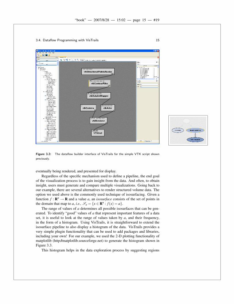
Dataflow programming in VisTrails Builder is straightforward. Figure 3.2shows the VTK script described in the previous section as a pipeline within Vis-Trails. Modules are shown as gray rectangles with input ports on top, and outputports on bottom. Connections defining the dataflow between modules are shownwith curved black lines. Labels on each module indicate the corresponding VTKclass. In this figure, it is natural to think of data flowing from top to bottom,
“book” — 2007/8/28 — 15:02 — page 15 — #19
3.4. Dataflow Programming with VisTrails 15
Figure 3.2: The dataflow builder interface of VisTrails for the simple VTK script shown
previously.
eventually being rendered, and presented for display.Regardless of the specific mechanism used to define a pipeline, the end goal
of the visualization process is to gain insight from the data. And often, to obtaininsight, users must generate and compare multiple visualizations. Going back toour example, there are several alternatives to render structured volume data. Theoption we used above is the commonly used technique of isosurfacing. Given afunction f : Rn → R and a value a, an isosurface consists of the set of points inthe domain that map to a, i.e., Sa = {x ∈ Rn : f (x) = a}.
The range of values of a determines all possible isosurfaces that can be gen-erated. To identify “good” values of a that represent important features of a dataset, it is useful to look at the range of values taken by a, and their frequency,in the form of a histogram. Using VisTrails, it is straightforward to extend theisosurface pipeline to also display a histogram of the data. VisTrails provides avery simple plugin functionality that can be used to add packages and libraries,including your own! For our example, we used the 2-D plotting functionality ofmatplotlib (http://matplotlib.sourceforge.net) to generate the histogram shown inFigure 3.3.
This histogram helps in the data exploration process by suggesting regions

“book” — 2007/8/28 — 15:02 — page 16 — #20
16 3. The Visualization Pipeline
Figure 3.3: Multiple libraries are combined to create two seperate visualizations of the same
data. The histogram uses Matplotlib.
of interest in the volume. The plot shows that the highest frequency features liebetween the ranges [0,25] and [58,68]. To identify the features the correspond tothese ranges, we need to explore these regions directly through visualization.
VisTrails provides an interface for parameter exploration. The interface allowsthe user to specify a set of parameters to explore, as well as how to explore, group,and display them. As a simple two dimensional example, we show an explorationof the isosurface value as four steps between 50 and 70 and display them hori-zontally in the VisTrails Spreadsheet. We also show an exploration of a volumesimplification method vertically in the same Spreadsheet. Figure 3.4 shows theinterface as well as the results of this exploration. The VisTrails Spreadsheet pro-vides the means to compare visualizations in different dimensions (row, column,sheet, time). The cells in the Spreadsheet can be linked to synchronize the interac-tions between visualizations. We note that VisTrails leverages the dataflow spec-ifications to identify and avoid redundant operations. By using the same cachefor different cells in the spreadsheet, VisTrails allows the efficient exploration ofa large number of related visualizations.

“book” — 2007/8/28 — 15:02 — page 17 — #21
3.4. Dataflow Programming with VisTrails 17
Figure 3.4: Parameter exploration is performed in VisTrails using a simple interface. The
results are computed efficiently by avoiding redundant computation and displayed in the
spreadsheet for interactive comparative visualization.